
Responsive Web Design and Development with HTML5
Empty your mind, be formless. Shapeless, like water. If you put water into a cup, it becomes the cup. You put water into a bottle and it becomes the bottle. You put it in a teapot it becomes the teapot. Now, water can flow or it can crash. Be water my friend.
—Bruce Lee
This chapter is focused on providing you an overview of how responsive web design came into existence, starting with a trip down memory lane and then an idea of where we are going. The remainder of the chapter then focuses on the three core ingredients that make up any responsive web design, including a ramp-up on the latest HTML5, CSS3, and jQuery features. We then end the chapter with some key strategies in your solutions whether you are developing for SharePoint or not.
Our Scenario
In Chapter 3 we introduce the web design process and how it will apply to a scenario we build throughout this book. For now, let’s look at an example of responsive web design in action based on the site this book uses to demonstrate branding and responsive web development on the SharePoint 2013 platform. In Figure 2-1 we can see the Specter Group site that we will be building for three primary groups of screen resolutions: desktop, tablet, and mobile. All three views leverage the same custom components but the visualization of the content changes based on the screen resolution.
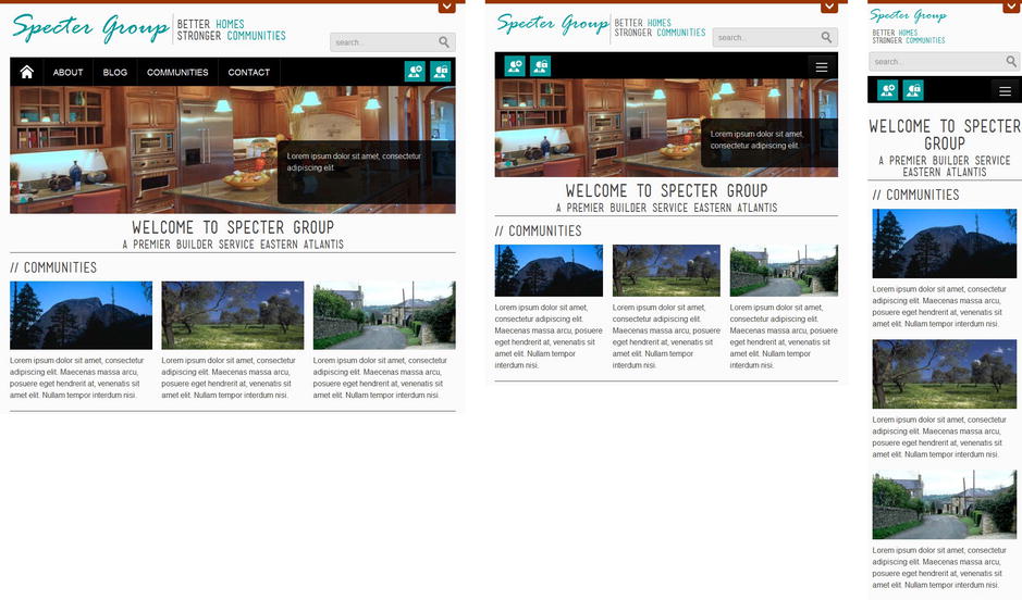
Figure 2-1. Specter Group web site in desktop, tablet, and mobile views
As you can see based on the screen resolution of the browser and device, the same content will be displayed but visualized differently.
Through the rest of this chapter, we seek to help you understand, and teach the tools required to implement responsive web design and continue improving your skills.
Above the Fold
Remember when we first started building web sites, in the late 1990s, one of the first things that we’d do is browse the web to see if any sites would inspire us. For those web sites that awed us, we’d not only appreciate how beautiful the design was, but we’d also look at the source code to view how the designers leveraged HTML and CSS. At that time, HTML was still in its infancy, and the browser wars between Internet Explorer and Netscape Navigator were in full swing. Browser vendors were actually providing browser-specific HTML and CSS tags that swayed web designers to build sites that worked better in a specific browser versus another.
Web designers would proudly display a banner in the footer such as the once popular banner shown in Figure 2-2. This was a way to tell their visitors what browser would provide them the optimal experience.

Figure 2-2. Typical banner you would see when viewing a site
Targeting web sites for a specific browser worked well for web designers, as they did not have to build and test for multiple browsers. But how did visitors feel when they visited a site with a banner? The banner was a constant reminder that their browser was not properly equipped. Typically, they would get a gentle reminder to upgrade their browser; worse, the site would refuse to load. Seeing such a banner on a web site could make users cringe. Why? Designers were defining what browsers we could use to browse their sites, and in a sense, the Internet as a whole. This went against everything the web was envisioned for: a universally accessible resource. Aren’t we glad that Tim Berners-Lee, inventor of the World Wide Web and director of the W3C, felt the same way?
Anyone who slaps a “this page is best viewed with Browser X” label on a Web page appears to be yearning for the bad old days, before the Web, when you had very little chance of reading a document written on another computer, another word processor, or another network.
—Tim Berners-Lee, Technology Review (July 1996)
The single most important optimization that you can do for any web site is to optimize what content they see above the fold. Figure 2-3 shows how little of the Specter Group site you would be viewing if it weren’t for the recent advances made on viewports.
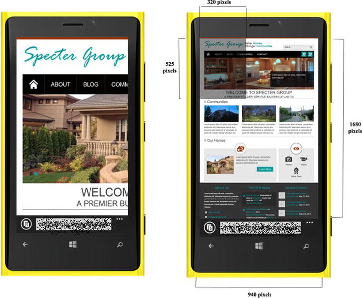
Figure 2-3. Without the viewport defined, the left image is the limited section of the site (right image) you would be viewing
Visually, the first viewable portion of any device’s browser is called the viewport. As web developers, you have the ability to define the viewport. In the past, you had to design specifically for above the fold. Apple recognized this early on and provided a metatag named Viewport as part of their release of the iPhone. With the viewport not set, it was always a problem for web sites. You missed so much of the site that usually with previous smart phones, we had to squint, zoom, and pan web sites and try to click on links for sites that were not optimized. Smart phones have come of age but web sites are still lagging.
There’s nothing wrong with optimizing for the common browsers that your visitors are using. However, for users who are still viewing your site on older browsers or mobile browsers, do the right thing and give them an alternative. It might not look as polished or as sophisticated, but as long as the site is functional, you’ve done your visitors a service. If you want to continue building a site that targets specific browsers, you are practicing browser-centric design, a slippery slope to follow.
In this chapter we investigate the general concepts of a current technique used to build both modern and stylish sites that are backward-compatible with older browsers, referred to as responsive web design. We review the origins of responsive web design and how it evolved. We’ll also have a quick look at some of the new features of HTML5, CSS3, and jQuery that make responsive web design more practical. We continue by diving into the basics of what makes a site a candidate for responsive web design and finish with a look at some of the best practices of implementing responsive web design.
Change Is the Only Constant
Over the past decade, the popularity of mobile devices has made it far more important for web designers to keep mobile devices in mind when designing web sites. Mobile users are expected to outpace desktop users by the time you are reading this book. Whether it is mice and keyboards, phone keyboards, game consoles, or touch interfaces, users expect that when they interact with a web site it caters to their method of input. As the web grows to multiple device form factors, visitors want a unique experience regardless of the unique combination of form factor, input mechanism, browser, and screen resolution they are using. Web designers are continuing to evolve their design methodologies, so it is important to see where we came from, before we know where we are now and where we are going.
When web development started gaining popularity, web designers leveraged the functionalities the latest web technologies had to offer and showcased them in modern browsers. This was great for those visitors who had modern browsers, but visitors with older browsers were unfortunately left behind. When browsers encountered tags that they didn’t recognize or couldn’t display, the browsers would not crash. Instead the markup was ignored and the browser would do its best to display the remaining web site markup.
The concept of graceful degradation was introduced as best practice for providing the best experience to users with the latest modern browsers. For those who didn’t have a modern browser, web designers would not provide equivalents. Visitors with the latest modern browsers felt like first-class citizens and interacted with the site as web designers intended. Those without the latest web browsers were at least given a web site that degraded gracefully to a lower level of functionality.
One simple example of graceful degradation is the “alt” attribute for images. When the alt attribute is used properly, it displays a text alternative that conveys the same information as the image. Visitors who can’t view the image or have browsers that can’t display images get to see the alternate texts. Given that an image is worth a thousand words, it’s still fair to say that the text equivalent is not aesthetically pleasing, which slightly degrades the user experience.
Although in theory graceful degradation seemed to make sense, what happened in practice was that web designers built sites for those with the most modern browsers. Visitors with older browsers were left with limited or reduced functionality as the web designers did not design or code sites that would in fact degrade gracefully. In essence, graceful degradation worked as a basic measure, but in practice it did not help.
Progressive Enhancement
Progressive enhancement, on the other hand, begins with the basic version of the site to ensure that it works on all browsers. Web designers can then add enhancements specifically for modern browsers. Progressive enhancement focuses on content first rather than functionality, which is important, as content is truly the only reason any one of us browse or build web sites in the first place. As a comparison, graceful degradation prioritized presentation and functionality before content and progressive enhancement prioritized content to the top of the web designer’s priority list.
 Note Aaron Gustafson wrote a great article, “A List Apart,” detailing the differences between graceful degradation and progressive enhancement. For the use of Peanut M&M’s as an analogy alone, it’s well worth the read at http://sprwd.com/5rzfdkd.
Another factor that helped push progressive enhancement as a favorable approach over graceful degradation was how quickly older browsers were not supported by web designers. More often than not, web designers were asked to support older browsers. As we know, older browser versions and browser vendors render HTML and CSS tags differently. This is a battle web designers find it hard to win, as they are always trying to achieve pixel-perfect solutions. The argument went that it didn’t make sense to be putting in twice the effort for a smaller subset of visitors who were still using older browsers. Focusing on content and ensuring that all visitors are able to view content in all browsers was a reasonable goal and any advanced functionality web designers wanted to make available could be tailored to the browsers that supported them.
The simplest example of progressive enhancement is the use of the external CSS style sheet. Modern browsers apply the external CSS style sheet to the site, whereas non-CSS browsers simply ignore it. For non-CSS browsers this means that only the content loads up and the browsers present it using built-in styles.
Progressive enhancement builds a rich experience on top of an accessible core without compromising that core. It improves on graceful degradation by prioritizing content over presentation. This is a great step forward and is still the basis of modern web design, but then mobile devices came along.
Separate Mobile Site
By the time progressive enhancement had become popular, the mobile phone revolution was gaining speed. Web designers were being sanctioned to build sites tailored for mobile devices, primarily by building separate mobile sites. They were even going so far as having separate mobile domains to tailor to mobile visitors. But it wasn’t until the iPhone was introduced in 2007 that mobile usage really started gaining speed. Mobile sites all of sudden not only became mainstream, but web designers were starting to create feature-rich separate mobile sites tailored to the iPhone. In a matter of just a few years, web designers were now being asked to ensure that their sites were viewable and functional on multiple devices.
Creating separate mobile sites and ensuring that they worked on a multitude of devices was popular for a while. However, as the sheer number of smart devices grew, this approach simply became uneconomical. Web designers now had to consider the user experience for each variation of mobile device, browser, operating system, and display resolution, and how to best take advantage of each combination. Further complicating matters, web design had to be completely reimagined for the keyboard and touch interface.
The same code base typically wasn’t used for both sites (larger and smaller devices) and because of that, development costs were higher. Web designers learned very quickly and this time around, they knew there had to be a better way. The problems faced in developing separate mobile sites ended up being the same problems web designers faced when developing sites for larger devices (i.e., different browsers on desktops).
Note There are benefits to creating mobile-specific sites. Read Nielsen Norman Group’s recommendations, which are outlined in Mobile Site vs. Full Site at http://sprwd.com/7ecobq. What approach will you take for your project?
Progressive enhancement, graceful degradation, and separate mobile sites all have their place in a web designer’s toolbox. However, having web designers create specialized web sites for specific devices was not a favorable approach. Necessity is the mother of innovation, and web design needed a savior: Let us introduce responsive web design. Responsive web design is about developing a site from the beginning for all screen resolutions, browsers, and devices.
Responsive web design is all about building a web site that is resolution and device independent. It is an evolution of web design, rather than a revolution. Why? Primarily because the foundation of responsive web design stems from two existing web design approaches: graceful degradation and progressive enhancement. The term responsive web design was coined by Ethan Marcotte in the popular article at A List Apart, “Responsive Web Design” (http://sprwd.com/3u6qod), as an approach that popularized the use of flexible grid layouts, flexible images, and media queries into one unified methodology.
Tip Interested in diving straight into how responsive web design works in SharePoint 2013? Skip over to Chapter 5 to learn how to convert your fixed-width designs to be responsive.
If we are to truly have a responsive methodology to web design, we should design for the smallest viewport first and then progressively enhance the design and content for larger viewports. We can create one web site that adapts based on the features available on that device as well as screen size.
Note Learn more about the specifics of responsive web design in the section, “Responsive Web Design: The Core Ingredients” later in this chapter.
Adaptive Design
Does it stop at responsive web design? Not at all. Responsive web design is just the latest design principle in ever evolving web design methodologies. Keep in mind that responsive web design is not a silver bullet and has limitations as it is based around the fluid grid. What if we still want to build tailored or semi-tailored experiences for different viewports all in one site? Web designers started looking at the principles of responsive web design and including the principle of feature detection in progressive enhancement. This has evolved into a general methodology, adaptive web design.
As a web designer, wouldn’t you want to keep an eye on your visitors and what device they are using to experience your site and how? Now that the site has been built from the ground up to leverage responsive web design based on device capabilities, browser capabilities, and browser resolution, what happens next?
Analytics and usage patterns are really the driving factor behind adaptive design. Don’t we want to know what devices, browsers, and resolutions are most popular? Which ones are the least popular? Is there a segment of the site’s visitors that have not been looked after? If so, is there a good enough reason for this? All these questions and more are important. After the site launch, there are quite a few opportunities you can take advantage of to adapt your current design; here are a few:
- Feature detection. Why not detect and apply only those features that the device and browser can handle? This is similar to progressive enhancement, but might differ because this does not only include improving the site based on available features, but possibly modifying the layout or content of the site based on the device.
- Device APIs. Take advantage of functionality device manufacturers provide via APIs to leverage device accelerometers and even functionality like near field communication (NFC) as part of the user experience that’s provided to enhance the site visitors’ experience.
- Performance. Having taken advantage of responsive web design, is there a large audience of members that need a targeted web design because of their low bandwidth? Why not consider a solution to address this for your users? This could be as simple as removing the use of images for navigation and instead using text and CSS.
- Touch optimization. Have you considered leveraging gestures to browse and interact with your web site? As more devices provide touch-focused user interface, why not have your web site take advantage of this?
- Platform optimization. One of the things you’ll quickly learn is that you can start looking at analytics to view which device and operating system combination is most popular for visitors browsing your site. Why not provide them tips to have your web site be pinned on their mobile home page? If part of the site’s marketing strategy is to provide a mobile application, why not suggest that to the visitors on their first visit.
Adaptive design and responsive web design are both paradigm shifts for many web designers to start building a single web site that tailors to different devices, browsers, and resolutions. It provides web designers the opportunity to focus on content first and then layer on functionality.
A web designer’s design process never stops. It consistently continues to improve and the expectation is that it’ll help us to keep improving our processes. As students of web design, let’s ensure that we all take an oath to keep evolving, improving, responding, and adapting our designs and in turn, enriching the experience of those visitors who use our sites.
Responsive Web Design: The Core Ingredients
The three fundamental ingredients that make the responsive web design recipe are:
- Fluid grid. This is about building your designs on a grid so that it can adjust to different environments.
- Flexible media (i.e., images). They can adapt to grow or shrink to fit with a flexible grid column, yet take it a step further and don’t display (or even load) a higher resolution image, meant for the desktop, on a screen that is as small as a smart phone.
- Media queries. Driven by CSS, allow the web designers to apply different CSS style rules based on characteristics (most commonly the screen width).
Let’s take a closer look into these three pillars of responsive web design.
Fluid Grid
As part of the creative design process, designers use a grid system to align and organize elements in a visually pleasing way on a particular page layout. The grid system uses a combination of margins, rows, and columns. The driving force behind leveraging a grid system in your designs is alignment. The alignment helps visitors recognize patterns and these patterns simplify designs to make them easily recognizable.
Building a grid system, in theory, is fairly easy. For instance, you start your design with a 1,000-pixel-wide container and you want to split it up into three (equally sized) columns. Each column would be one third the size of the container, or 333 1/3 pixel per column. That doesn’t exactly add up, so we add 10-pixel margins on each side of every column. This means we also must subtract the 20 pixels from the width of each column. Adding the three columns, roughly 313 pixels wide for each column, 10 pixel margins on each side and we still end up with a container 999 pixels wide, not 1,000 pixels wide. You might continue this process to splitting your design to enforce structure using grids. Figure 2-4 shows how a sample of a site page might look with grids defining where the content can be placed.
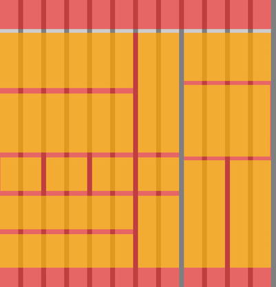
Figure 2-4. Web page divided in a grid-based approach
Taking a step back and looking at this image allows you to appreciate some of the beauty that can be achieved using a grid system.
You could continue the process of creating this pixel-perfect grid using HTML and CSS, but why go through all that trouble when someone else already has?
Note The CSS visual model is all lines and boxes, which lends itself to the grid system. The advantage of CSS allows us to take a box—any box—and do with it what we want, independent of its surrounding boxes. Read more about the CSS basic box model from http://sprwd.com/43caf3.
Nathan Smith created the 960 Grid System as a simple way to lay out web sites using a grid that is 960 pixels wide. Using this system, the 960-pixel-width container can now be split into 12- or 16-column grids. In the 12-column version, shown in Figure 2-5, the narrowest column is 60 pixels wide. Each column after that increases by 80 pixels. Ten-pixel margins surround the container and a 10-pixel gutter is also included to separate the columns. Overall, this grid system was one of the most popular and helped pave the way for many different iterations.
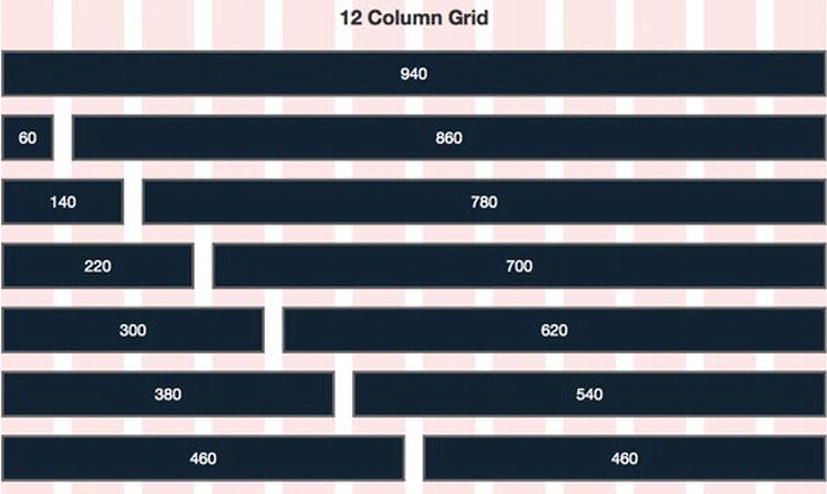
Figure 2-5. 12-column variation of the 960 Grid System
The 960 Grid System helped many designers build their designs using the appropriate CSS classes. The CSS classes they used determined the width and surrounding margins for that column(s). With responsive web design, we are building for mobile first and adding features as the resolution increases. Fluid grids expanded on this concept with the grid system(s) in place, to allow for grid column widths to adapt dependent on the device viewport. If the viewport was 768 pixels or 1,200 pixels, the main container and its encompassing columns would adjust accordingly.
Tip To learn more about CSS frameworks and the chosen framework in this book, refer to Chapter 5.
Media Queries
Media queries, an aspect of CSS, are not new. CSS2 have supported media-dependent styles but they were limited to basic media differentiations such as for screen or for print. As an example, in Listing 2-1 and Listing 2-2 we see two different methods using CSS2 standards to link to different style sheets based on the media or styles that reference media.
Listing 2-1. HTML <link> Tag Utilizing Value CSS2 Media Queries
<link rel="stylesheet" type="text/css" media="screen" href="styles-screent.css">
<link rel="stylesheet" type="text/css" media="print" href="styles-print.css">
Listing 2-2. HTML Styles Utilizing Value CSS2 Media Queries
<style type="text/css">
   @media screen {
       body {font-family: sans-serif; }
   }
   @media print {
      body {font-family: serif; }
   }
</style>
CSS3 builds on media queries previously available by allowing us to filter by more viewport values. Of most importance to responsive web design are viewport width filters. You don’t necessarily have to have multiple style sheets to accommodate all the different screen sizes and browsers that your visitors might use. However, if you do prefer a different style for each design, you can use the code in Listing 2-3, for example, to do so.
Listing 2-3. In-Line Media Query
<link rel="stylesheet" media="screen and (max-device-width: 480px)" href="480px.css" />
<link rel="stylesheet" media="screen and (min-width: 600px)" href="large.css" />
For CSS3-capable browsers, the styles found in small.css will only be used if the maximum device width of the device is 480px. Two important notes are in order here. First, different browsers will handle a media query in a <link> tag differently. As an example, even though Firefox 9.0 and older versions support media queries, the min-width media query is not recognized but the rules inside the style sheets are still parsed and applied.
Note For information on which browsers support media queries, review http://sprwd.com/puxa8x.
Second, older browsers such as Internet Explorer 8.0, which do not support media queries, will ignore the media value and thus download and parse all linked to styles. This could be a problem, so for now, we will want to always include @media blocks in our style sheets as shown in Listing 2-4.
Listing 2-4. @media CSS3 Tag
@media screen and (max-width: 600px) {
   .sixhundredmaxwidth {
      clear: both;
      font-size: 1.3em;
   }
}
Going back to Listing 2-3, the large.css will only be loaded if the minimum width of the browser is 600px. There are those who prefer, for the sake of efficiency, to have a single CSS file that contains all the styles for different browsers and sizes. This eliminates the need for multiple requests for several different sheets. You can achieve media queries with each individual CSS declaration by using a @media CSS block as seen in Listing 2-4.
In this example we are specifying that the sixhundremaxwidth CSS class should only load when the maximum browser width is 600px. In Listing 2-5, we leverage the mobile handheld’s ability to handle orientation for containers or sections labeled landscape.
Listing 2-5. Seek Orietation Feature for Intranet
@media screen and (orientation: landscape) {
   .landscape {
      width: 30%;
      float: right;
   }
}
There are many benefits to leveraging media queries in your web sites. Keep these basic techniques in mind as future chapters build on what we’ve just seen.
Flexible Media
Traditionally, any content (text, images, or video) on the web was designed to be suitable for a fixed-width experience. Now that you are building for a responsive web site, you need to start considering how media is going to be viewed on different viewports.
When designing for a responsive web site, say that your <h1> tag is styled with a font size of 26 pixels for the desktop view. What would the font size be for the tablet view or mobile view? You will need to account for font type that is proportionate to the sizes of the view. Similarly, the same thought process can be applied images, video, and other media.
In terms of text, it’s a little bit easier to tame how content is viewed on different viewports. Everyone has his or her own approach, but one of the widely accepted best practices is to start with a base font size from which all other font sizes are proportioned.
Note If you would like to dive deeper into text sizing, make sure you read the A List Apart article, “How to Size Text in CSS,” at http://sprwd.com/99qqfnn.
Resizing a font is one thing, but trying to resize images and other forms of media introduces other problems. The first problem that you typically face is that if you have a fluid grid layout, media (e.g., images) are typically added using a fixed width. When you resize the image container, the image width does not change and therefore won’t resize to fit within a fluid layout. There is a relatively easy fix to this problem that prevents images from exceeding the width of their containers, shown in Listing 2-6.
Listing 2-6. Flexible Image CSS Property
img {
   max-width: 100%;
}
A few years ago, defining the maximum width to 100 percent introduced issues with height and width aspect ratio. However, current browsers will resize images proportionally so that the image’s aspect ratio remains intact. What’s great about this simple approach is that we can actually apply this magic rule (max-width) to other media-ready elements (see Listing 2-7).
Listing 2-7. General Flexible Media Including Older Browser Support
img, embed, object, video {
   max-width: 100%;
   // support for IE5.5, IE6, IE7
   width: expression(this.width > 400 ? 400 : true);
}
This only works if your targeted browsers support the max-width property. Therefore, Listing 2-7 also includes code to support browsers, such as Internet Explorer 5.5, Internet Explorer 6.0, and Internet Explorer 7.0. However, we now run into our second problem. Even if you resize media on your site to dynamically fit within its container, you are still loading the same file for different devices.
Tip Although setting the video width to 100 percent is a good first step, you might want to go a step beyond and have height calculated based on the width. Read the article “Creating Intrinsic Ratios for Video” from A List Apart at http://sprwd.com/2nbt2z.
As a quick example of this download issue, say we have a large, high-resolution image we place on a particular page and say this image has a file size of 80k because it should display on a 960-pixel-wide design. If we intend to use this same image for a mobile device that has a 320-pixel-wide viewport, the mobile browser will still download the entire 80k image and resize it to fit the viewport. That is a large file to download considering how small it could be if instead we could have provided a smaller image. Furthermore, we might not have even wanted to display the large image at all on a smaller viewport. We’d try to hide the media using display: none. Despite the right intentions, a mobile browser might still download the image before it was hidden.
The second problem can be addressed by leveraging media queries. This means that you can have multiple images with different sizes for each device and browser combination. This obviously poses a different problem, as it can be burdensome to create so many variations of images. Proper planning would be required.
Note Loading device optimized media works when the browser supports it, but what happens when the visitor is using an older browser? SharePoint 2013 includes a new feature called Image Renditions. Learn more at http://sprwd.com/46xffr.
This was just a brief introduction to the three key elements of what makes responsive web design: fluid grids, flexible images, and media queries. The key to remember when designing your site is that responsive web design is not perfect. In the next section, we review a few of the gotchas and best practices when making responsive design part of your web development workflow.
Using the Right Tools
Responsive web design is a paradigm shift in designing web sites primarily because it gained momentum when the development languages matured and the web design community evolved. Responsive web design leverages a blend of different features from HTML5, CSS3, jQuery, and other web technologies that allow web sites to adapt to the device’s environment.
You’ve had the opportunity to read how responsive web design evolved, and you’ve also had an opportunity to view screenshots of a sample site we build throughout this book that uses responsive design principles. Now, let’s take the opportunity to go under the hood and learn how responsive web design is developed. Once you’ve become accustomed to the core functionality, we’ll share some advice on how to continue adapting. Without these basic skills and an understanding of the underlying technologies, you will likely find it difficult to not only brand your SharePoint 2013 sites, but more important, brand them using responsive design principles.
HTML5
HTML5 is the latest markup standard that aims to improve how content is structured and presented. One of the biggest aims is to improve the markup language with support for the latest media. This section covers the new HTML5 features, and we look specifically at how the DOCTYPE has evolved and one of the biggest changes to come HTML5, semantic elements.
What’s New in HTML5?
HTML5 offers many new features that have become popular or defined by the web design community. Here is a list of the key notable features:
- Better browsers. Browser vendors are encouraged more than ever to support web standards and even extend the functionalities of HTML5. This competition is and will continue to greatly benefit users.
- Accessibility improvements. ARIA attributes are included in the HTML5 standard to ensure that visitors have access to the same information regardless of how they browse the web.
- Geolocation. With the approval of the user, you can use his or her geographical position to help visitors plot their position on a map, such as finding the nearest coffee shop relative to a visitor’s current location.
- No third party API needed. In the HTML5 world, when it is complete, plug-ins and third-party APIs will be second class. Your web browser will be the first-class citizen and most probably the only software you need to browse the web.
- Video tag. The popularity of YouTube, Netflix, and Hulu have driven built-in support for video streaming. More and more people want browsers to be able to stream video content as quickly and smoothly as possible. The HTML5 video tag provides a seamless video experience across all devices. Unfortunately like the third-party API feature, the video tag is still not widely supported in the same manner across different browsers and thus is not ready for prime time.
- Awesome mobile support. HTML5 on mobile devices supports advanced functionality similar to desktops, such as Offline Web Storage, GeoLocation API, Canvas Drawing, and CSS3 to name a few. HTML5 applications, like Windows Modern apps, can even run on mobile devices without a browser.
- Immersive experiences. HTML5 gives web designers much more control over the browser and allows them to develop games and applications that were once not possible in the browser. An example is http://www.soul-reaper.com, an HTML5 scroll book that uses the new Canvas tag, a part of HTML5.
- Smart new canvas feature. Taking advantage of what Apple started, the canvas element is a rectangle in your page where you can use JavaScript to draw almost anything (2D shapes, bitmap images, etc.) you want.
- Form fields and validation. There’s no need to leverage existing JavaScript plug-ins to do form validation anymore. Validating form fields can now be handled with only HTML5. You’ll also see a host of new form fields, everything from e-mail and telephone to autofocus.
- Semantic tags. Originally a hot topic of HTML5 allowing us to create any tag name we want such as <header>, <footer>, <nav>, <section>, and <article>, semantic tags, although nice for the web developer, have been declining in use on HTML5 sites as they are not well defined. For accessible sites we are often better off using ARIA attributes such as role rather than semantic tags such as <nav> or <article>.
It’s worth noting that although HTML5 makes good on the promise of moving the web forward, the standard is still in the works. HTML5 is not one big feature but a collection of features. Many of the features (tags) just listed are supported by modern browsers but do not have widespread adoption.
Out of the many tags that are not ready for prime time, as previously mentioned, the HTML5 Video tag is not gaining support from major video-producing web sites because there is no standard video format. Users are not able to display full-screen video, and content protection issues exist. Feature support with other browsers is starting to pick up with browser vendors but there are some concerns from many inside and outside the industry.
With HTML5 you can accomplish a site’s functionality natively without the need for plug-ins. Although we cannot detect for full HTML5 support, as support for HTML5 features increases, we can use tools to detect for “feature” support, meaning we can detect if say, geolocation, is available. Based on whether it is or is not, you can present the visitor different experiences with the site. In terms of HTML5 JavaScript API support, if your browser does not support it as of yet, your browser will still act as if these features are not present and simply run the JavaScript as before.
The full specification of HTML5 has not been confirmed, and likely will not be until 2020 or beyond, yet many of the major browsers have already started supporting HTML5 features. In the past, you needed multiple plug-ins to achieve many of the features visitors have learned to expect from web sites. Leveraging multiple custom plug-ins can be both a positive and a negative. The great thing to remember is HTML5 builds on the most successful format ever, HTML4.
What’s a DOCTYPE?
At the top of every page, as per HTML standards, a DOCTYPE (short for document type declaration) defines for the browser which version of HTML you are using. All major browsers use DOCTYPEs to properly render web pages. The syntax in Listing 2-8 tells browsers whether CSS is stored externally and Listing 2-9 shows whether deprecated tags are used as well as external CSS.
Listing 2-8. HTML 4.01 Strict Syntax Tells the Browser That Presentational Markup Will Be Exclusively Stored in CSS Files
<!DOCTYPE HTML PUBLIC "-//W3C//DTD HTML 4.01//EN" "http://www.w3.org/TR/html4/strict.dtd">
<html>
   ...
</html>
Listing 2-9. XHTML 4.01 Transitional Syntax Adheres to the Strict Syntax But Deprecated Tags Are Allowed
<?xml version="1.0" encoding="UTF-8"?>
<!DOCTYPE html PUBLIC "-//W3C//DTD XHTML 1.0 Transitional//EN"
    "http://www.w3.org/TR/xhtml1/DTD/xhtml1-transitional.dtd">
<html xmlns="http://www.w3.org/1999/xhtml" xml:lang="en" lang="en">
   ...
</html>
If you are using an incomplete or outdated DOCTYPE, or no DOCTYPE at all, then most browsers switch to Quirks like mode, where the browser assumes you’ve written invalid markup and code.
Note Document Type Definitions (DTDs) define the document structure with a list of legal elements and attributes. DOCTYPEs have always included reference DTDs as part of their definition. Two such examples of DTD are Strict and Transitional.
HTML5 still uses a DOCTYPE declaration but does not reference any DTD. There’s no need to specify whether the doctype declaration is strict, transitional, frameset, or XHTML 1.1. This approach is so much better than what we had previously. All the DOCTYPE contains is the tag name of the root element of the document, HTML, as shown in Listing 2-10.
Listing 2-10. HTML5 Doctype Includes Only the Tag Name of the Toot Element of the Document
<!doctype html>
<html>
   ...
</html>
This is very simple doctype that will cause even browsers that don’t support HTML5 to enter into standards mode. Standards mode means that popular HTML tags will still be supported, however, and if the browser does not support the new features of HTLM5 then the browser will ignore them.
SharePoint 2013 enforces XHTML compliance to ensure that an HTML document follows W3C best practices. Listing 2-11 shows how the HTML5 DOCTYPE should look in your HTML files, in particular HMTL files used by SharePoint 2013.
Listing 2-11. HTML5 Doctype to Make it SharePoint Compliant
<!DOCTYPE html>
<html>
   ...
</html>
Tip For your HTML document to be compliant with SharePoint 2013, the DOCTYPE tag must be in all caps.
Listing 2-12 shows a simple HTML5 document with minimum number of tags required.
Listing 2-12. Simple HTML5 Example
<!DOCTYPE html>
<html>
   <head>
      <title>Page Title</title>
   </head>
   <body>
      Content goes here....
   </body>
 </html>
As you’ll notice the DOCTYPE declaration is clean and generally HTML5 has not changed what we’ve already learned.
The Semantic Web
HTML and browsers both have always been fairly forgiving when structure was not followed. Previously, in HTML4, we used <div> or <span> tags to signify different sections of the HTML page and we used other elements such as <h1>, <h2>, <h3>, <h4>, <h5>, or <h6> to provide heading titles as a quick example. If used well, div tags generally worked well to not only form a document structure, but also to style content within a particular <div> block. As you know, leveraging CSS between different div tags is easy as we just specify descriptive ID (unique per page) or CLASS values. We are all familiar with this knowledge, so to start, Listing 2-13 shows a sample HTML5-compliant document with HTML4 tags.
Listing 2-13. Sample HTML5 Document That Uses Only HTML4 Tags
<!DOCTYPE html>
<html>
<head>
   <title>HTML5 compliant with HTML4 markup</title>
</head>
<body>
   <div id="header">logo</div >
   <div id="nav">item 1, item 2, item 3</div>
   <div class="article">
      <div class="section"></div>
   </div>
   <div id="sidebar">related links</div>
   <div id="footer">copyright</div>
</body>
</html>
The problem with HTML4 markup is that the <div> tag gets used for more than just defining a section. Anyone viewing the markup, let alone a browser rendering the page, might find it difficult to answer the question, “Is that <div> block a part of the outline of the page, defining a section or a subsection, and so on, or is it primarily used for presentational purposes such as for styling?” DIV elements gained quite a bit of popularity and it seems that the W3C was looking to supplement how <div> tags were be used and decided to include dozens of new tags, that is, these semantic tags.
The general mindset was that the use of <div> tags in HTML4 lacked the necessary semantics for describing the different sections. This “improper” use of <div> tags has a direct impact on accessibility and assistive technology but also sectioning (which is driven by the document outlining algorithm).
Over the course of the past decade, developers and designers have always developed sites to fit their needs. As the popularity of search engines has grown, their ability to understand unstructured HTML has improved as well. Search engines, like Google, were interested in knowing how sites were structured so that they could deliver better search results. Google embarked on this initiative to find out and interestingly enough, despite millions of sites being developed differently, Google found that majority of them follow a similar structure: header, navigation, body content, footer, and so on. The result of this research has been very helpful to support the vision of the “semantic web” of Tim Berners-Lee. He originally expressed his vision of the semantic web as follows:
I have a dream for the Web … [in which computers] become capable of analyzing all the data on the Web—the content, links, and transactions between people and computers. A "Semantic Web," which should make this possible, … the day-to-day mechanisms of trade, bureaucracy and our daily lives will be handled by machines talking to machines.
—Tim Berners-Lee, Weaving the Web (1999)
The vision of Berners-Lee, the interest in search engines that better understand content and return search results, and the need of the web designer community has driven the surge of microformats. With the general progression of the web, HTML5 now allows new semantic elements. The HTML5 specifications outline both textual and structural “semantic” elements, everything from the <header>, <footer>, <nav>, <section>, <aside>, and <article> to the <meter> and <progress> elements.
Tip Want to read more about the truth about structuring HTML5 and semantic tags? Check out The Truth About HTML5 by Luke Stevens. An enlightening excerpt of this book is available at http://sprwd.com/5pohtwg.
We intend to use the semantic tags HTML5 provides throughout this book so let’s discuss common ways in which new, popular HTML5 semantic tags are utilized. Besides the <section> element, there are many other commonly used tags that we have already mentioned but now define in greater detail.
- section. A section element defines a portion of your page that should create a new section of the outline of the page. Examples of sections would be chapters, the various tabbed pages in a tabbed dialog box, or the numbered sections of a thesis. A web site’s home page could be split into sections for an introduction, news items, and contact information.
- header. A header element is intended to contain a site’s top header bar, or a section’s heading (an h1–h6 element or an hgroup element), but this is not required. The header element can also be used to wrap a section’s table of contents, a search form, or any relevant logos.
- nav. The nav element represents a section of a page that links to other pages or to parts within the page.
- article. An article element represents a self-contained composition in a document, page, application, or site that is, in principle, independently distributable or reusable, for example, in syndication. This could be a forum post, a magazine or newspaper article, a blog entry, a user-submitted comment, an interactive widget or gadget, or any other independent item of content.
- footer. The footer element represents a footer for its nearest ancestor sectioning content or sectioning root element. A footer typically contains information about its section such as who wrote it, links to related documents, copyright data, and the like.
Note Although new semantic tags are only available in HTML5, older browsers such as Internet Explorer 8 will render the content within a new HTML5 block. The catch is that the older browsers will not apply any styling to tags, or content within tags, it does not recognize. Fortunately for us, a quick, easy-to-deploy JavaScript fix named html5shiv was developed. Learn more at http://sprwd.com/3bttbp. Html5shiv provides us a backstop, thus giving us little reason not to use HTML5 tags if we want to.
Now that you’ve been acquainted with the new sectioning elements introduced by HTML5, where does that leave the <div> element? It is still recommended for backward compatibility if we do not wish to require html5shiv to allow HTML5 tags in older browsers. When an element is being used simply for styling purposes or as a convenience for scripting, a <div> element could still be used.
Taking our HTML4 example document from Listing 2-13, we can replace the div elements with the new elements: header, nav, section, article, aside, and footer (see Listing 2-14).
Listing 2-14. HTML4 Example Updated Using HTML5 Semantic Tags
<!DOCTYPE html>
<html>
<head>
   <title>HTML5 document</title>
</head>
<body>
   <header>...</header>
   <nav>...</nav>
   <article>
      <section>
          ...
      </section>
   </article>
   <aside>...</aside>
   <footer>...</footer>
</body>
</html>
This does not stop you from continuing to use <div> tags in your HTML5 markup; however, there are benefits to using the HTML5 semantic elements. First, you are providing structure to your web content. Another benefit is that with this structure in place, you can shift your focus to accessibility. You can add accessibility information to HTML elements using the Accessible Rich Internet Applications specification [WAI-ARIA]. This specification can be implemented in conjunction with HTML5 and will further promote accessibility features in your web sites. When considering leveraging WAI-ARIA attributes within your web sites, you’ll have to consider when and when not to use similar HTML5 elements.
Note To learn more about HTML and ARIA, please visit http://sprwd.com/7jux6r.
Your experience with HTML development provides you a solid foundation to leverage HTML5 features in your existing solutions; just make sure you use the HTML5 DOCTYPE.
In theory, the HTML5 specification makes sense, but in the real world it seems things were taken to an extreme when introducing new tags. The web design community doesn’t see a value in these additional semantic tags because the core problem that existed with <div> tags will still exist. The core problem is the lack of education on how HTML documents should be structured. Introducing new elements is a good first step, but education on how to effectively leverage these new semantic elements should not be left to the web design community; rather, it should be driven by the W3C to ensure that everyone is on the same page. The W3C has tried to introduce a more semantic web with HTML5 and they might not have fixed the issue, but it appears as though it’s an issue they want to tackle.
CSS3
We know that CSS stands for Cascading Style Sheets and that it’s a markup language that alters, and gives style, to a web site. CSS gives us the ability to separate presentation from HTML markup and further allows us to reuse the styles defined in the CSS for all pages in your web site.
CSS Basics
Although we are assuming you are already familiar with basic CSS, we review a very simple example to make sure we are on the same “page” so to speak. The CSS provided in Listing 2-15 declares that all text within the paragraph <p> tag, wherever it is in your document, should be colored red.
Listing 2-15. Change Paragraph Text Color to Red
p { color: red; }
If you have multiple paragraphs of text that are inside <p> tags throughout your HTML page, they will all be colored red. Sometimes you want a bit more control. CSS gives us the ability to control which elements we style and which ones we don’t. We can describe elements using IDs and classes. Both classes and IDs are ways of further clarifying which elements we’re planning to alter. In Listing 2-16 we see HTML markup for two paragraphs defined by an ID attribute and a CLASS attribute and in Listing 2-17 we see how we can style the different paragraph blocks.
Listing 2-16. Paragraph Tag With ID Attribute and CLASS Attribute
<p id="intro">Introducing our latest solution. </p>
<p class="aside">Check out what else we have to offer</p>
Listing 2-17. CSS to Style IDs and CLASS Attributes
p#intro { font-size: 125%; }
p.aside { font-style: italic; }
What’s the difference between classes and IDs? IDs are unique identifiers that should only show up once on the HTML page, whereas classes are not unique and can be used multiple times in a given page, such as the example in Listing 2-18.
Listing 2-18. CSS With Multiple CLASS Attributes and a Single Style ID
<p id="intro">Introducing our latest solution. </p>
<p class="aside">Check out what else we have to offer</p>
<p class="aside">Make sure you connect with our partners</p>
We obviously know that CSS is much more complex than this. If you’d like to learn more, there are hundreds of books dedicated to CSS and all its features.
Note New to CSS? We recommend learning from veteran web developer and trainer Jeffrey Way, who has created a free video-based course, 30 Days to Learn HTML & CSS (see http://sprwd.com/8h3avv).
Let’s go ahead and move on to some of the new CSS3 features.
New CSS3 Features
CSS3 offers a huge variety of new ways to impact your designs, which before required a combination of CSS and JavaScript. Like HTML5, the CSS3 specification is not yet complete and is instead being completed in modules. A few of the modules have been completed and are part of the specification, others are being finalized, and some are being depreciated. We’d like to bring your attention to a few features that are becoming a part of the CSS3 specification due to their popularity as well as their importance with responsive web design, which we use throughout the rest of this book.
Media Queries
We already reviewed media queries earlier in this chapter, but let us review them again because of their importance in responsive web design. Listing 2-19 shows how you can leverage media queries to apply a color background for a specific resolution.
Listing 2-19. Apply a Color Background if the Viewing Area Is Smaller Than 800px
@media screen and (max-width: 800px) {
   .class {
      background: #ccc;
   }
}
Media queries become even more powerful as you can combine conditions. You can add multiple conditions and even load your style sheets based on these conditions. Listing 2-20 provides an example of how you can load a specific style sheet based on the media type and device width.
Listing 2-20. Load a Different Style Sheet Based on Media Type and Maximum Device Width
<link rel="stylesheet" type="text/css" media="only screen and (max-device-width: 480px)"
    href="small-device.css" />
The conditions are not just limited to width or max-device-width; there’s also height, orientation, and resolution to name just a few.
Note Want to learn more about media queries and all for their different options? Read the W3C’s recommendation on Media Queries at http://sprwd.com/6zpojss.
Keep in mind that using media queries for mobile devices does not mean you have a mobile optimized site. To be truly mobile optimized, your markup and media need to be refactored for mobile devices. That means media queries are great when you are designing the presentation for different media types, but it does not mean you are optimizing for them.
Tip The Specter Group site presents content and navigation differently based on the viewport, but more can be done to optimize media. To learn more about this, make sure you read Chapter 6.
Browser-Specific Prefixes
Vendors who build browsers are free to implement extensions to the CSS specifications that are specific to their browsers. There are various reasons to support this flexibility, from adding new features to providing early access for CSS properties that have not been finalized by the W3C.
As an example, a common problem that web designers faced was how to have opacity implemented the same in all browsers (see Listing 2-21). Opacity is currently a part of the CSS3 specification, but few browsers actually supported it a few years back.
Listing 2-21. How to Achieve Opacity Across Major Browsers Using Vendor-Specific CSS
.opacity-test{
   background: red;
   filter: progid:DXImageTransform.Microsoft.Alpha(opacity=60);    /* IE filter extension */
   width:100%;               /* Required for IE filter */
   -webkit-opacity: 0.6;     /* Webkit extension */
   -moz-opacity: 0.6;        /* Mozilla extension */
   opacity: 0.6;             /* the correct CSS3 syntax */
}
The code in Listing 2-21 shows how to implement opacity in multiple browsers. Each browser will read this CSS differently. For example, Internet Explorer will use the filter property and ignore the other opacity declarations because it does not recognize them. Older Gecko browsers that don’t understand the CSS3 opacity property will respect the –moz-opacity property. Safari will respect the -webkit-opacity property. Finally the CSS3 opacity property will be respected by modern browsers. Of course, a browser that doesn’t support element opacity will ignore the entire CSS block, which we as web designers might have to consider as well.
There are many other examples of browser-specific CSS extensions that are now part of the CSS3 specifications. Another great example is Resizing (see Listing 2-22). Resizing gives the user control to resize a specific container’s vertices: Horizontal, vertical, or both vertices are supported.
Listing 2-22. Resize CSS3 Property
.resizable {
        padding: 10px;
        border: 1px solid;
        resize: both;
        overflow: auto;
}
If you applied this CSS class to a container (e.g., a textarea), the visitor will have the ability to resize the container from the bottom right, as shown in Figure 2-6.
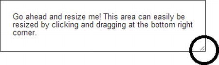
Figure 2-6. Resizable text box that allows users to change their height and/or width
There are many more features that have been added to the CSS3 specification that have removed the need for JavaScript, jQuery, and even effects that were only possible using images. JavaScript has been vastly popular for a number of reasons, including its ability to animate elements. CSS3 includes support for transitions and transforms. This functionality is gaining popularity as performance on mobile browsers is far better than using jQuery functions such as “animate.” This is the benefit for a lot of the new CSS3 features and this goes beyond transition and transform. Other notable new CSS3 features are the following:
- border-radius gives you the ability to control the roundness of borders around containers.
- box-shadow allows you to add shadows to any container.
- text-shadow lets you add shadows to text elements.
We hope these features have intrigued you enough to learn more about CSS3 and what the specifications have to offer.
Note Want to learn more about CSS3? Visit http://sprwd.com/qoyqnpw.
jQuery and Responsive Web Design
Now that you have a basic knowledge of HTML and CSS, we would like to bring your attention to one of the most popular JavaScript libraries, jQuery. If you are not already familiar with jQuery, it is a lightweight, very well supported JavaScript library that lives by the motto, “Write less, do more.” From day one, the purpose of jQuery has been to make it easier to use JavaScript on your web site. jQuery takes a lot of common tasks that require multiple lines of JavaScript code to accomplish and wraps it into methods that you can call with a single line of code. The ease of use, popularity, and vast feature set of jQuery has meant that it’s the best tested cross-browser library. There’s a lot of good to be said about jQuery because much of its functionality has been included in HTML5 specifications.
jQuery Basics
Although other JavaScript libraries exist, jQuery is by far the most popular and has been wildly adopted as a part of many web sites. It has become so popular that many of the big companies use it, including Google, Microsoft, IBM, and Netflix. If you are new to this side of the world, let’s take the opportunity to go through a few basic jQuery scripts.
Note Although the demo site we build throughout this book uses jQuery extensively and includes many additional jQuery plug-ins, jQuery itself is not required for many responsive sites. That being said, we highly recommend you become comfortable with jQuery, as it is not too difficult to use, and many responsive techniques such as responsive navigation will rely on jQuery (see Chapter 6).
jQuery is provided as a single JavaScript file from <jquery.org>, although you can use a minified or developer version of the JavaScript file. We recommend the minified version for performance issues. Because this is just a JavaScript file, we can load it via a <script> tag in our HTML <head> section. A growing trend has been to add this and other JavaScript files just before the ending </body> tag to help increase page load time. For SharePoint we suggest adding your jQuery library reference to your <head> section, as we might want to include additional jQuery plug-ins to specific page layouts, and it is much easier to add these to the <head> section as well.
Note Learn how to link to the jQuery library using SharePoint 2013’s new HTML master pages found in Design Manager, discussed in Chapter 4.
Another popular technique to link to a jQuery library is to use a Content Delivery Network (CDN) such as Google or Microsoft’s ASP.NET code CDN. Listing 2-23 shows how to link to a CDN to load the jQuery library and also provide an additional method to load a local copy of the jQuery Library.
Listing 2-23. A Method to Load the jQuery First by CDN Using a Local Copy as a Backup
<html>
<head>
   <title>...</title>
   <script src="//ajax.aspnetcdn.com/ajax/jQuery/jquery-1.9.1.min.js"></script>
   <script>window.jQuery || document.write('<script src="/js/jquery-1.9.1.min.js"></script>')</script>
</head>
<body>
...
</body>
</html>
Tip Using a CDN for libraries can provide high performance and high availability for common objects across sites such as the jQuery library. However, always provide a link to a local cached version as a fallback.
Changing Styles
Now that we have linked to jQuery, our site can begin including jQuery code. As a starting point, let’s take a look at how selectors work with jQuery. Imagine your HTML5 markup’s body tag includes a <div> tag with CLASS attribute’s value set to boxes. There’s content inside the <div> container and you’d like change the font color. Yes, you could do this with CSS as well, but for the sake of simplicity, let’s assume we want to use jQuery instead (see Listing 2-24).
Listing 2-24. Change Font Color With jQuery
...
<body>
<div class="boxes">
   <!—some content-->
</div>
<script>
   $(".boxes").css("font-color", "red");
</script>
</body>
...
jQuery allows for the use of chaining functions as well as calling functions within functions. For our next example, let’s take the same <div> in Listing 2-24, but using the jQuery hover function, we change the background color over the <div> to green whenever a site visitor hovers over the <div> and switch it back to transparent on hover-out (see Listing 2-25).
Listing 2-25. jQuery Hover Example
<script>
   $('.boxes').hover(function() {
      $(this).css('background-color','green'),
    }, function() {
      $(this).css('background-color','transparent'),
   });
</script>
Changing the DOM
jQuery’s power doesn’t stop at just modifying CSS styles on the fly but also the document object as we saw in Listing 2-25. Listing 2-26 is another quick example that toggles content visibility.
Listing 2-26. Toggle Displaying Content
...
<body>
<h1>Showing and Hiding</h1>
<p>With jQuery, it's easy to show and hide elements dynamically.</p>
<h2>Item One</h2>
<p>Lorem ipsum dolor sit amet, consectetur adipiscing elit.</p>
<h2>Item Two</h2>
<p>Lorem ipsum dolor sit amet, consectetur adipiscing elit.</p>
<h2>Item Three</h2>
<p>Lorem ipsum dolor sit amet, consectetur adipiscing elit.</p>
<script>
   $(function() {
      $('h2’).next('p').hide();
      $('h2').click(function(e) {
         $(this).next('p').toggle();
      });
   });
</script>
When you click one of the headings, it pops open, moving the remaining content down the page. Clicking the same heading hides the paragraph again. Each heading and its related paragraph work independently of the others, all thanks to just a few lines of jQuery (see Figure 2-7).
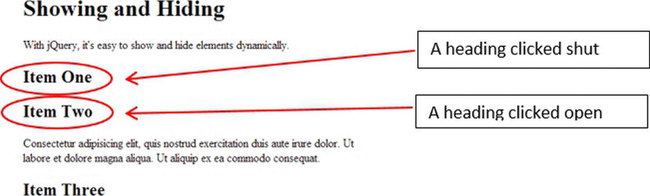
Figure 2-7. Leverage jQuery to toggle content visibility
This is not a book on jQuery, but hopefully if you are not already familiar with jQuery this extremely brief introduction gives you an idea of the power and ease. jQuery is useful in building feature-rich responsive sites on SharePoint. Learn more about jQuery at jquery.org. Although there are hundreds of additional online and print-based resources, we recommend Pro jQuery by Adam Freeman (Apress, 2012) and Pro SharePoint with jQuery by Phill Duffy (Apress, 2012). Even though Pro SharePoint with jQuery is geared toward SharePoint 2010, we think you might find it useful with SharePoint 2013 as well.
Responsive and jQuery
Why jQuery? CSS3 media queries do a decent job of resizing the overall layout, but CSS won’t help when we need to resize and optimize all of those individual elements and features. This includes navigation controls, forms, images, sliders, and carousels that all need to be optimized. We quickly look at two uses for jQuery in helping with responsive web design although there are almost countless other examples.
Resizing containers to fit within a screen resolution is relatively straightforward with CSS3 and media queries. The difficult part comes when the screen resolution isn’t the only thing you’d like to be inquiring about. Mobile devices have introduced functionality that includes items like rotation, device width, and even device orientation, which media queries are not currently able to handle. With that being said, the industry standard is feature detection.
JavaScript frameworks like Modernizr, jQuery, and jQuery Mobile can directly test browser support for HTML and CSS features. These frameworks, if given access, can also identify the device or browser user agent to properly alter the design to fit your needs.
Menu to a Drop-Down for Small Screens
We mentioned previously that navigation is a notorious struggling point for responsive web design and SharePoint does not make it any easier. In Chapter 6 we review navigation in detail, and we see how we can leverage jQuery, including additional jQuery plug-ins to help make a top navigation bar respond to different screen resolutions (see Figure 2-8).
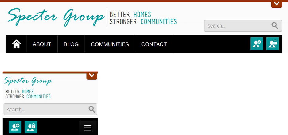
Figure 2-8. Using jQuery to manage responsive navigation. The top image shows the desktop view and the bottom image shows the mobile view
Keep Adapting Responsibly
We might wish that all web browsers provided the same functionality, but we learned a long time ago this is not the case. Initially bandwidth was an issue, but when modems gave way to DSL, Cable, T1, fiber, and other dedicated Internet connections, bandwidth became less of a concern to many web developers for desktop users. To add to our complexities in delivering a good experience to our web site visitors, we must once again consider precious bandwidth for our less connected mobile friends. Just because we can do something with HTML5, CSS3, and jQuery does not necessarily mean we should. Take advantage of technology appropriately based on necessity, not based on considering older browsers, slower hardware, and limited bandwidth.
The approach of detecting browser and device width via media queries is not perfect and relying on jQuery is hazardous if the client browser does not have JavaScript enabled. Once you start coding a web site design, you will run into a common dilemma: Should you use multiple CSS files or have one CSS file with media queries within it? What do we do with no support for CSS3 and JavaScript disabled? We should practice responsible HTML, CSS, and JavaScript coding principles now if never before. The best solution is to code responsibly and make use of CSS fallbacks that allow the browser to ignore CSS properties that it doesn’t recognize, nor a design that requires JavaScript.
CSS Style Sheet or Style Sheets?
If we have multiple CSS style sheets, we can use <link> tag-based media queries to help filter what style sheets should load on a particular client device, but as we mentioned different browsers treat <link> tag-based style sheets differently. Further, more files to download increases the number of HTTP requests that the client makes on every page load. Each page request has overhead, not only in CPU cycles but also additional packet overhead.
On the other hand, having one style sheet that utilizes media queries to handle all devices is not advantageous, as it forces low bandwidth or mobile devices to download and process the complete CSS style sheet, much of which it won’t need.
A robust solution centers on a “mobile first” strategy. In this strategy, we build toward mobile devices first; thus we start by building for mobile users and limited display devices and add on functionality as devices allow. (Sounds like progressive enhancement, doesn’t it? Are you starting to see how many methodologies are related?) In this case our first style sheet would be a basic or base style sheet that requires no media devices and at most helps style our fluid grid site so that it can scale in a basic manner on any device without the need for CSS3 or JavaScript.
Our next series of style sheets would be linked to using <link> tags with included media queries. We could include style sheets for mobile, tablet, and desktop enhancements. Why include a mobile style sheet? We might want to include additional CSS3 tagging, transactions, and so on, that could require JavaScript-based feature detection, or we simply want to increase the mobile browsing experience with additional enhancements if allowed. We must remember that our additional style sheets should also include media queries in case a browser decides to, or is unable to, filter by the <link>-based media query. Refer to Listing 2-27 for an example of linking to multiple style sheets and Listing 2-28 for an excerpt of the style sheets themselves.
Listing 2-27. Linking to Multiple Style Sheets
<!DOCTYPE html>
<html>
<head>
   <title></title>
   <link rel="stylesheet" type="text/css" href="basic.css" />
   <link rel="stylesheet" type="text/css" media="all and (max-width: 767px)” href="mobile.css" />
   <link rel="stylesheet" type="text/css" media="all and (min-width: 768px) and (max-width: 959px)”
      href="tablet.css" />
   <link rel="stylesheet" type="text/css" media="all and (min-width: 960px)" href="desktop.css" />
</head>
...
</html>
Listing 2-28. basic.css, mobile.css, tablel.css, and desktop.css Style Sheets
basic.css
body {
   font-family: sans-serif;
   color: #222;
   font-size: .6em;
}

mobile.css
/*any screen smaller than most tablets*/
@media all and (max-width: 767px) {
   body {
      color: #444; /*change the font color*/
      font-size: .8em;
   }
}

tablet.css
/*any screen between most tablets and a minimal desktop experience based on a 960px grid*/
@media all and (min-width: 768px) and (max-width: 959px) {
   body {
      color: #666; /*change the font color*/
      font-size: .95em;
   }
}

desktop.css
/*any screen based on a general desktop experience with a max width of 1200px*/
@media all and (min-width: 960px) {
   body {
      color: #888; /*change the font color*/
      font-size: 1.1em;
   }
}
The simplicity of this approach provides us the ability to limit the bytes downloaded, yet at the same time provides a reasonable experience on most any device. This is easy in theory but difficult in practice as sites grow in complexity, which changes the way most web developers have been building web sites; that is, focusing on the desktop experience.
Note Throughout this book, each chapter builds on the last. For this reason our case study relies on one primary style sheet that uses media queries. This one style sheet allows us to easily highlight what additional CSS styles were required at each step of our design process. Ideally we would utilize the process just described, but in practice, for teaching purposes, this adds an extra level of unnecessary complexity.
Don’t forget that a site should at least load and be functional without requiring JavaScript. This might mean our CSS, by default, should hide some aspects of our site, such as rotating banners based on our minimal site requirements. If you “require” JavaScript you are doing some of your potential visitors a disservice. If you are running a public-facing site on SharePoint, you can limit the damage inflicted when a visitor accesses your site yet doesn’t allow JavaScript. There’s an advantage to limiting your reliance on JavaScript, as it provides improvements for search engine optimization as well as accessibility. For your site administrators, you will have to require JavaScript, as much of SharePoint’s administrative functionality is driven off of the Office Suite bar and the ribbon.
Once you have finished the primary build of your site, you might find it advantageous to minimize and combine your JavaScript and jQuery plug-ins into one large .js file. Even if all plug-ins and scripts are not required on every page, once the script has been downloaded, most browsers will cache this file. Further, keep in mind that the fewer files our page downloads, the fewer HTTP requests your site visitors make. This is beneficial, as it will help improve performance and page load time.
There’s Always a Better Approach
Responsive web design as a methodology is still improving and is often supplemented with additional design theories that we have already reviewed including adaptive web design, mobile first, and in SharePoint 2013, supplemented with separate mobile, like features found in device channels. It is important to remember that there is no silver bullet approach; rather, each project is unique and might use a combination of approaches to achieve the desired outcome. Here’s what you can do to tailor user experiences to your visitors:
- Review your traffic logs and determine what mobile devices are accessing your site today.
- Test your site on those devices and determine where the experience breaks down.
- Develop an action plan to address the issues that you face. Focus on the critical path and test.
Once you’ve addressed this, pat yourself and your team on the back and when you’re ready, go back go to Step 1 and start again, as the landscape will likely have changed and you do not want to be left behind.
Summary
In this chapter we provided an overview of web design methodologies and their evolution. The web design community has come along from graceful degradation and progressive enhancement to where we are now, responsive web design. Responsive web design is a different approach to building web sites and it’s important for designers to understand the pros and cons before they start diving into the specifics.
What’s truly amazing is that there are only three core ingredients for responsive web design: fluid grid, media queries, and flexible media. Starting with building a design based on a grid so that your designs have structure. Making that grid fluid helps when you start taking advantage of media queries to present content for different viewports. Once both of these elements are in place, you can then start looking at making your media content flexible for each viewport. These three elements are simple in principle, but implemented together and effectively they can drastically improve the user experience for your visitors.
We wanted to continue empowering you and further expand your knowledge by introducing you to leveraging HTML5, CSS3, and jQuery features. For any professional web designer, these three web technologies are at the core of the toolbox. You’ll find leveraging these three standards will ensure your web site takes advantage of specifications that aim to greatly improve the web. In turn, you’ll be building toward a semantic (structured) web that will help all of your visitors including those who need assistive technologies to view the web.
Responsive web design is a fairly young web technology and in an agile fashion, it’ll continually evolve to become better. This chapter ends with guidance and best practices to consider. The list is not exclusive, and it will continually be updated. We encourage you to do the same; that is, keep adapting responsively.
Now that we have this knowledge, we can continue on to Chapter 3, where we guide you through the process of capturing requirements for a web site that uses responsive web design and how this fits into your design workflow. We use this plan along with our understanding of the underlying technology throughout the rest of this book, learning how we can combine responsive web design and SharePoint 2013 into one cohesive unit.