
Building Site Structure and Navigation
In this chapter we review common types of navigation a site might incorporate, including horizontal navigation, vertical navigation, footer-based navigation, and social media icon bars. We investigate different options available to us in SharePoint 2013 that can assist us with integrating and managing these different navigation components. With the addition of managed metadata-driven navigation in SharePoint 2013, we can build even more custom, complete navigation structures, still managed by SharePoint, than we could with SharePoint 2010. By the end of the chapter we will have learned how to configure a SharePoint 2013 web site to allow for managed metadata-driven navigation as well as how to modify an HTML master page and other branding elements to include responsive-friendly navigation elements.
We start this chapter with a review of site structure planning and navigation methods available in SharePoint 2013. We continue with a deep dive into term stores and managed metadata. If you are already familiar with managed metadata and term stores, you can skip ahead to the rest of this chapter, specifically the sections “How SharePoint 2013 Builds the Navigation Bar” and “Style and Make the Navigation Bar Responsive.”
 Note This chapter focuses on managed metadata-based navigation. To learn how to configure navigation for cross-site publishing, please refer to Chapter 8.
Our Scenario
The public Specter Group web site requires multiple forms of navigation including a primary top horizontal navigation bar as well as footer-based navigation. Specter Group wants to leverage the latest tools in SharePoint 2013 to help manage their navigation structure throughout their web site solution. Finally, any navigation component added to the web site must fit within the responsive framework chosen for this project. Navigation must be visible as well as fully functional across multiple devices with different limitations of available features.
Determine Site Structure
A prerequisite to successful site navigation that enables your site visitors to find content relevant to their needs begins with a site map. Your site map is a list of site web pages, sites, and other documents that will be contained in your site. Normally a site map is represented as a hierarchical tree, providing a tree of logically connected branches and nodes, displaying how pages are connected. Once you have an understanding of what pages will exist within a site, you can begin to build a strategy to provide navigation within your site.
Note To review information architecture and a sample site map, refer to Chapter 3.
Primary Navigation Methods in SharePoint 2013
Before we dive into methods of branding our site navigation, we must begin by investigating available navigation management methods. SharePoint 2013 provides two primary tools that we can use to help manage our site navigation: structured navigation and managed navigation. We can also create custom, possibly nonmanaged navigation methods that include panels, bars, and tool panes we code directly into master pages and page layouts as well as our own .NET navigation providers.
Managed Navigation
SharePoint 2013 introduces a new method of managing our navigation. We can now use managed metadata and the Managed Metadata Service to build taxonomies or terms and term sets to build our navigation structure.
Note Learn how to use the Term Store for managed navigation later in the chapter in the section “Using the Term Store for Navigation.”
Pros
- Based around your taxonomy. You can build your navigation based around your own organization’s language and terms.
- Complex navigation structures. Your term set and list of terms can be as simple or complex as your business requirements.
- Friendly URLs. Managed navigation allows you to use specific friendly URLs such as /a-new-article instead of /post.aspx?ID=12.
- Separation of site structure and navigation structure. Your site navigation need not be tied to your site structure. This allows you to create navigation around business concepts without having to rearrange your site.
- Customize with a browser or with code. You can manage your navigation term store via the browser although because managed navigation leverages the Managed Metadata Service, a comprehensive API exists that you can use to manage terms and term sets.
- Term set management can be delegated to specific users based on sets or subsets of terms.
Cons
- One term set per site. You can link a site to only one term set, so if you want to have your global navigation and current navigation both use managed navigation, they must use the same term set. You can specify if you want a particular term displayed in the global navigation, current navigation, or both.
- No audience targeting. Unlike with structured navigation (covered in the next section) where you can target navigation items to specific users and groups, managed navigation does not currently provide the same functionality. All valid navigation nodes will be displayed to all site visitors.
- Link to a page. Term-driven pages with a friendly URL must link to a page; they may not link to general libraries such as a document library.
- Unique term sets. A term set can be linked to only one site. If you want to reuse a term set you must first create a second term set and then pin terms from one term set to another. Learn how to share term sets across sites in the section “Share Managed Navigation Across Site Collections” later in this chapter.
- Term Store Management browser compatibility. At the time of publication of this book, you should only manage your term store with Internet Explorer 8 or newer.
Structured Navigation
Structured navigation was the primary navigation management method available in SharePoint 2010 and is still available in SharePoint 2013. Structured navigation depends on the site structure or site map of your site. We are allowed to specify if we want to include subsites, site pages, or sibling sites and if we want to simply inherit the structured settings from a particular site’s parent site. We can also insert custom headings, links and, sublinks within our site structure navigation.
Pros
- Automatically based on site structure. Structured navigation uses the structure or site map of your site. Once you configure your site to use structured navigation, depending on your settings, as sites and pages are added to your site collection, your navigation bars will automatically reflect your changes.
- Audience targeting. You can specify a specific audience or group of users that should be shown a particular navigation node. This allows you to easily create different site navigation dependent upon who visits a given page.
- Browser-based management. You manage your structured navigation in a browser.
- Custom links. Although the primary navigation is based on your site structure, you can also add additional links, headings, and links within headings.
- Similar rendered HTML. SharePoint 2013 uses a similar HTML structure for structured navigation as for managed navigation.
Cons
- Based on site structure. Yes, this is a con as well as a pro, depending on your site requirements. If you want to rearrange your navigation, you will have to rearrange your site structure. This can often be difficult with more complex site navigation requirements. Additionally, business requirements may dictate your navigation structure be different than your site structure.
- All sites, subsites, and pages are included. With structured navigation, if you select to include pages, all pages (or published pages in publishing sites) are included. Note that you can hide subsites from being included.
- Custom link hierarchy. You can only have up to two levels of custom links. You can create custom headings where headings can be either text or links. Headings can have child links but headings cannot have child headings. This means you can only have two levels of custom links.
- No structure sharing. Structured navigation may not be shared across site collections, nor may be it used by other sites, only inherited by direct descendent child sites.
You will find no requirement that you must use SharePoint to manage your site navigation. You can always create your own navigation bars (i.e., top navigation or current navigation) using HTML or HTML5 that you include directly in your master pages and page layouts. You could also create your own site map provider, your own .NET controls, or even a new SharePoint 2013 App. Although navigation not managed by SharePoint is beyond the scope of this book, we continue our review of the pros and cons of custom navigation.
Pros
- Complete control. You can decide exactly how you want your navigation to appear, including your own HTML rendering as well as navigation data sources.
- Overcome SharePoint navigation obstacles. Custom site map providers can help overcome issues of managed or structured navigation. Custom web parts, controls, or SharePoint 2013 Apps can provide missing functionality.
Cons
- New pages or sites might require assistance. If you hard-code your navigation into your master page, say using an unordered list of navigation items, new pages, new sites, or modifications to your site structure might require modifications to your master page.
- Custom code required. Building your own site map providers or navigation apps will most likely require Visual Studio 2012 and custom coding.
- Future compatibility. Custom navigation solutions are less likely to be compatible with future versions of SharePoint. You might need to rebuild your custom navigation solutions if you upgrade your site to a new version of SharePoint.
Note The custom code component of custom navigation will cause most SharePoint deployments to decide to use structured navigation or the new managed navigation provided in SharePoint 2013. Because structured navigation was originally introduced in SharePoint 2010, we focus our attention on managed navigation through the remainder of this book. Branding structured navigation and managed navigation is the same, as both methods render the same HTML markup we see later in this chapter in the section, “How SharePoint 2013 Builds the Navigation Bar.”
Using the Term Store for Navigation
SharePoint 2010 provided tools to help manage navigation, both global navigation (i.e., the top, horizontal navigation bar) and the current navigation (i.e., the left, vertical navigation bar). We were limited to either having SharePoint manage navigation for us based on the site structure, using structured navigation, or we had to use static navigation based on a list of links, groups, and sublinks. Structured navigation allowed SharePoint to manage navigation based on our site structure but was limiting because it strictly followed how we created the hierarchy of our sites, subsites, and pages. A problem could arise when we needed to create site hierarchies for governance reasons that did not directly relate to how we want navigation structured. If we instead went with static navigation based on a list of links, groups, and sublinks, we had to manually manage our navigation menus and we were limited to only one level of dynamic navigation. Finally, with either method, we were unable to create search engine friendly URLs, such as http://www.spectergroup.com/about instead of http://www.spectergroup.com/pages/aboutus.aspx.
SharePoint 2013 provides a new tool for navigation management that helps solve some of these issues, along with providing us the added functionality of linking to catalogs and catalog categories, by allowing us to use managed metadata and a term store to store and manage our navigation. Additional improvements include the ability to provide SEO-friendly URLs to their actual sites such as our previous example, http://www.spectergroup.com/about.
What Is Metadata-Driven Navigation?
The quick and dirty definition of metadata as used by SharePoint boils down to data about data. SharePoint 2010 introduced the Managed Metadata Service, which allowed us to store term sets (words) as well as provide central location to store content types (Chapter 7). Term sets allowed us to create a hierarchy of terms for our sites, site collections, and web applications that were unique to our business needs. SharePoint 2013 looks to leverage the Managed Metadata Service and in particular term sets to drive our navigation. Our site navigation can link to a particular term set in a Managed Metadata Service, and then each term in the term set corresponds to a particular node in the navigation structure. Further, each node can have a set of properties that define how it will be displayed and utilized.
Before we get to how to link a site to a term set, we must first look at term stores and the Managed Metadata Service. Because multiple site collections, across web applications even, can share the same navigation term set, configuration and storage of term sets must occur at a central location, i.e. the farm. In particular, term sets are managed by the Managed Metadata Service, which we configure in Central Admin.
A default installation of SharePoint 2013 includes the creation of a standard Managed Metadata Service Application. Your SharePoint administrator might have also already configured this for you, but if not, you will need to create and configure a Managed Metadata Service Application to utilize the SharePoint 2013 metadata-driven navigation.
Note The Managed Metadata Service provides valuable tools to help manage and maintain your site taxonomy. We review how to use managed metadata for navigation, a small but important use of the Managed Metadata Service. To learn about managed metadata, term store management, taxonomy, and how to make a general plan for your site, visit http://sprwd.com/zujbab.
Configure the Metadata Hub
Before you can use metadata-driven navigation you need to make sure that your site can access the Managed Metadata Service and that the Application Pool and Managed Metadata Web Service have been started in your SharePoint farm. Often this will be handled by an organization’s SharePoint farm administrator, but when the designers are also the farm administrators, we will quickly review the process to enable managed metadata.
To quickly check to see if your farm has been configured for managed metadata, log in to the root of your project site collection as a site collection administrator and navigate to your site collection’s Site Settings page (Settings  Site Settings on the ribbon). On the Site Settings page, in the Site Administration section, click Term store management.
If the Term Store Management Tool page displays an error, “The Managed Metadata Service or Connection is currently not available. The Application Pool or Managed Metadata Web Service may not have been started. Please Contact your Administrator,” as shown in Figure 6-1, you or your SharePoint farm administrator will either need to set up and configure the Managed Metadata Service, or there is an issue with how the Managed Metadata Service was configured. Fixing a broken Managed Metadata Service is beyond the scope of this book, but we can easily create a new Managed Metadata Service instance.
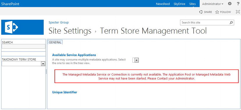
Figure 6-1. Site Collection Term Store Management Tool error, with no Managed Metadata Service available
Configure the Managed Metadata Service
Configuring the Managed Metadata Service for your farm requires access to Central Administration as well as access to a database that will store metadata. Otherwise the process is simple and straightforward.
- 1. Log in to SharePoint 2013 Central Administration with a user account that has farm administrator permissions.
- 2. You need to make sure that the Managed Metadata Web Service has been started first. Click Application Management on the left menu, then under the Service Applications section, click Manage services on server.
- 3. On the Services on Server page, make sure that Managed Metadata Web Service has a status of Started. If its status is Stopped, click Start to start the Managed Metadata Web Service.
- 4. Click Application Management on the left menu, then under Service Applications, click Manage service applications.
- 5. On the Service Applications page, on the ribbon within the Create section, click New, then in the New drop-down list, click Managed Metadata Service. A Create New Managed Metadata Service dialog box, shown in Figure 6-2, opens.
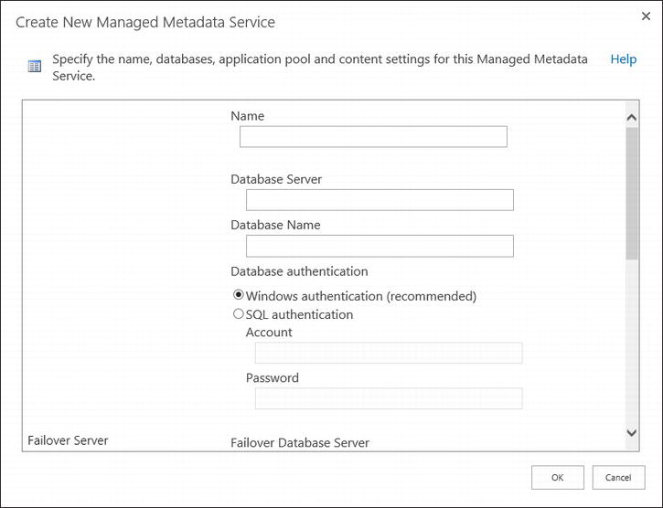
Figure 6-2. Create New Managed Metadata Service dialog box
- 6. Provide values as requested by the dialog box:
- a. Name: The name of this unique Managed Metadata Service in your farm. You might have multiple metadata service applications running in your farm and your site can use multiple metadata service applications as well. For our case, we name this new instance Specter Managed Metadata.
- b. Database Server: This is the name of the database server you wish to have store your Managed Metadata Application for this instance. This does not have to be the same database server as the one hosting your SharePoint 2013 sites.
- c. Database Name: This is the name of the database you would like created on your database server. This must be a unique database name for each metadata service application. In our case we want this new instance to create a new database named Specter Managed Metadata DB.
- d. Database authentication: You must provide an account that has access to your database server to create the new database and have access to the database itself.
- e. Failover Database Server: This is the location of your failover database server if you have one. This is not required and for our installation we leave this blank.
- f. Application Pool: Either select an existing application pool that you would like this metadata service application to use, or create a new one. If you create a new one you also need to provide the authentication credentials for this new pool to use. In our case we are going to create a new application pool named SharePoint - Specter Managed Metadata.
- g. Content type hub: Managed metadata also serves as the backbone for enterprise content types. This facility in SharePoint allows you to manage content types in a single site collection, known as the content type hub, which may then be consumed by other site collections. You may provide the URL of the site collection you wish to associate as the Content Type Hub for this Managed Metadata Service. Be aware that additional setup is required in the content type hub site collection and changing a hub is not trivial. In our case we leave this blank for now, although in Chapter 7 we review how to configure a content type hub.
- h. Report syndication import errors from Site Collections using this service application: Select this check box if you wish web applications that import the content types from the content type hub associated with this service to log errors that might occur on import or export of content types.
- i. Add this service application to the farm’s default list: Select this check box if you wish to add this service application to the Default proxy group of your farm. New web applications automatically create connections to service applications in the Default proxy group.
- 7. Click OK to create the new Managed Metadata Service Application. It might take a few minutes for SharePoint to create your new service, but once the process has been completed, you should see your new service listed in the Service Application List (see Figure 6-3). A common error might include incorrect or invalid credentials for your database or application pool.
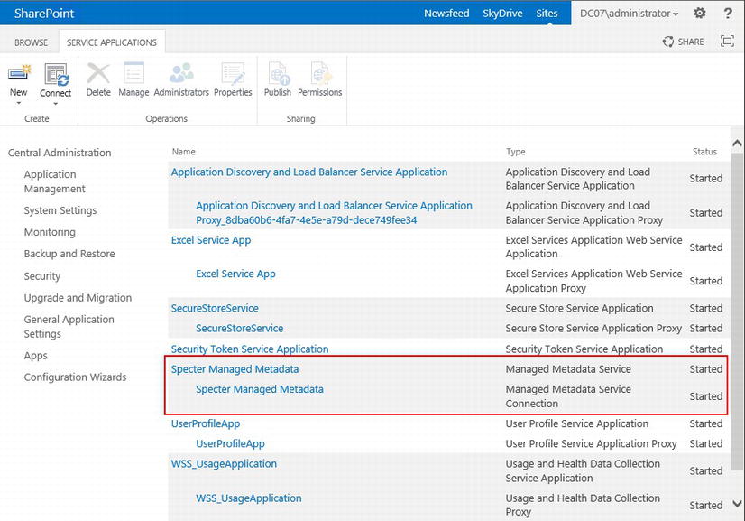
Figure 6-3. After the new Managed Metadata Service Application has been created
- 8. By default, a new Managed Metadata Service will be available to all web applications. You can configure a web application’s Service Applications to not link to your new Managed Metadata Service if you need to. Navigate to Application Management Manage web applications Select your web application Service Connections (on the ribbon).
Note It might take a few minutes before you can use the Managed Metadata Service in your site collection.
At this point your site collection will have access to your new Metadata Service Application. Return to the root of your site collection, and navigate to the Term Store Management Tool (Site Settings Site Administration Term Store Management). You should now see your new metadata service application (see Figure 6-4).
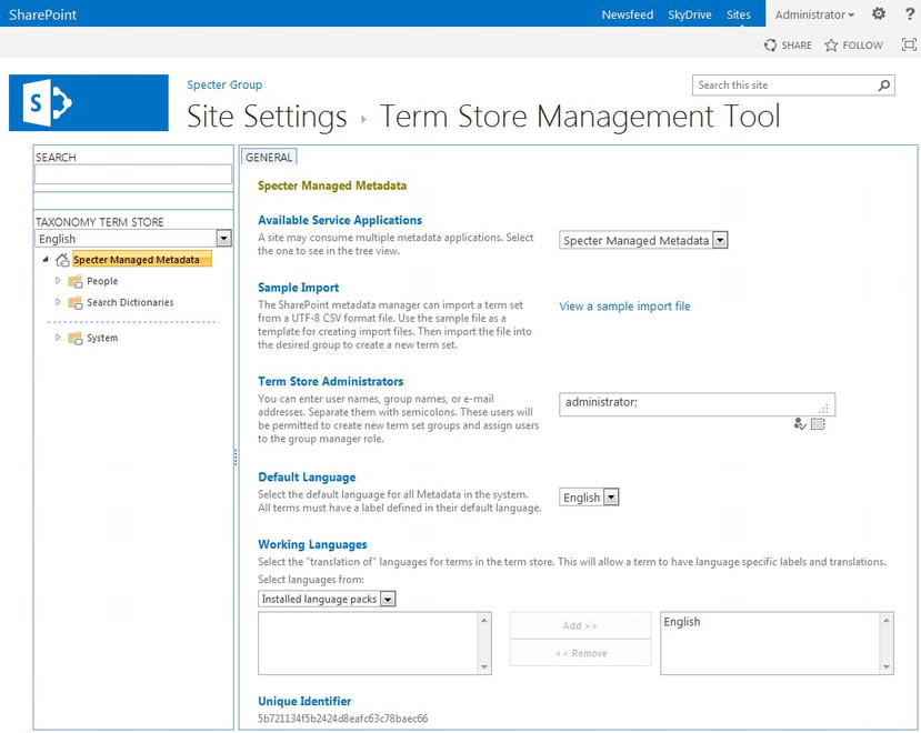
Figure 6-4. Term Store Management Tool with available Metadata Service Application
Tip PowerShell fans can configure a metadata service application using PowerShell. Learn more about how to use PowerShell cmdlets for metadata management from http://sprwd.com/3fqk8uf.
Create a Term Set
Once you have your Managed Metadata Service application configured on your farm and you have linked your web application to at least one metadata service application, you are ready to create a term set for your site navigation. In this walkthrough, we are going to create a term set that we intend to use for our top, global navigation bar.
Tip A site can only link to one term set for navigation. You cannot use managed metadata for the global navigation that binds to one term set while using managed metadata for the current navigation that binds to a different term set all within the same site. You can configure terms to show in only global or current navigation, allowing you to filter terms in one term set.
Within a particular site, there are multiple ways to load your site’s Term Store Management Tool. One is the general method we have already used in the previous section: Use your Site Settings page, and within the Site Administration section, click Term store management. You may also access the Term Store Management Tool directly from the Navigation Settings page. A link to the Navigation Settings page is also found on the Site Settings page within the Look and Feel section under Navigation.
On the Navigation Settings page, if either the Global Navigation or Current Navigation has been selected to use Managed Navigation, a new section appears, Managed Navigation: Term Set. This section allows you to select the term set you wish this site to use for managed navigation. Beneath the term set selection box you will find a Term Store Management Tool link, shown in Figure 6-5, that also takes you directly to the Term Store Management Tool page.
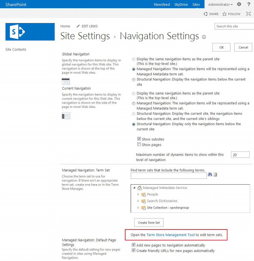
Figure 6-5. Term Store Management Tool access via Navigation Settings
Note As of the printing of this book, Internet Explorer 9+ should be used to utilize the Term Store Management Tool, as many settings appear not to save correctly in other browsers.
Once you load the Term Set Management Tool, you should see a page similar to what we saw in Figure 6-4. You are now ready to add your Term Set. For this walkthrough, we will add a Term Set to the metadata service application, “Specter Managed Metadata” created in the previous section.
- In the Term Store Management Tool, in the navigation pane found to the left, hover over and right-click your metadata service application, in our example, Specter Managed Metadata. In the drop-down menu that appears, click New Group to create a new group to hold our navigation term set. You can skip this step if you already have a group in which you wish to place your term set.
If a drop-down menu does not appear when you click your metadata service application, you most likely do not have permissions to administer your application. Your account must be included in the Term Store Administrators list, seen in Figure 6-4.
- For your new group, provide a group name. In our example we create a group named Navigation that will hold our navigation term set for our site and any other site or site collection that might require its own term set for navigation.
- Once your new group has been created, the group’s General tab will appear to the right. You can customize the group name, provide a description for this group, and manage group managers and contributors. This allows you to provide management rights to those users or user groups that need management access to this metadata group.
- To create a new term set under your new group, right-click your new group and select New Term Set in the group drop-down menu.
- A new term set appears under your Group. Provide your term set with a name, in our example Specter Global Navigation.
- Once the term set has been created, its properties will appear to the right. The different properties found within each tab are explained in detail, but the two important properties we are most concerned with are found on the Intended Use and Custom Sort tabs.
- a. Click the Intended Use tab and select the Use this Term Set for Site Navigation check box. This allows this term set to be made available on our site’s navigation settings page. This setting also provides additional properties for our terms within the term set that are unique to navigation. Click Save to update the term set.
- b. Click the Custom Sort tab and select Use custom sort order. This setting allows you to sort your terms manually so that they are listed in your navigation bar in the order you intend, not alphabetically by default. Once you add terms you can either return to this tab to modify the sort order of your terms or reorder your navigation terms directly in the navigation bar.
Note We review managing navigation terms in the navigation bar later in this chapter in the section “Managing Navigation Quick Edit Mode.” - You are now ready to add terms to your term set. Right-click your term set and on the term set drop-down list, click Add Term to add a new term. Once the term has been created, provide it a name and press Enter. You can now add another term, or right-click the term to create a child term. You can add as many terms, child terms, grandchild terms, and so on, as needed. Figure 6-6 shows our example term set with a series of terms that will be used by the Specter Group for its global navigation.
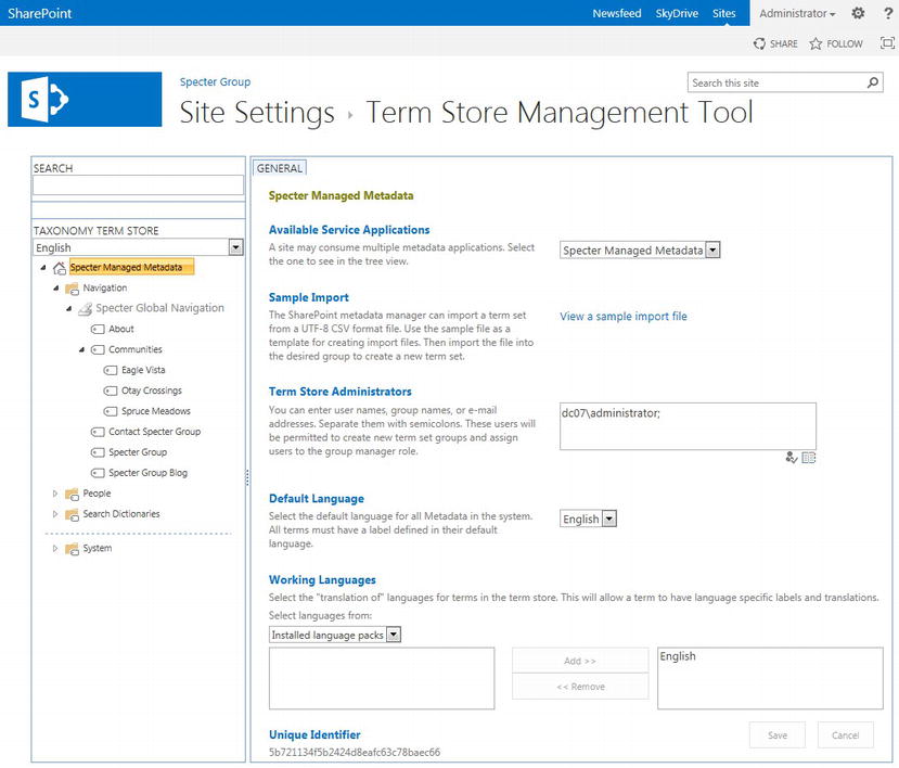
Figure 6-6. Specter Global Navigation Term Set with related terms corresponding to the site map
Note For every term created, it would be best to have already created a new page that the term will reference, although this is not required. To learn how to create content pages from OOTB and custom page layouts, refer to Chapter 7.
Managing Terms
In the previous section we created a term set in our metadata service application. We then created terms and child terms that matched our site map as described in Chapter 3. You might notice that the term names we provided are not necessarily what we want displayed in our navigation bar. Further, the order of navigation terms is not correct. Once your terms have been created, you can manage term properties as well as the order of terms via the Term Store Management Tool.
By default, when you provide a term its name, your navigation bar will display the term name. To configure a particular term’s properties, click a particular term in the left navigation pane of the Term Store Management Tool to load that term’s property list. In this example we click the Specter Group term found under the Specter Global Navigation term set we created in the previous section. This term is supposed to represent the Home link we require in our global navigation. Once we click this term, the term’s property tabs will load with the General tab preselected.
Note The Navigation and Term-Driven Pages tabs are only available in term sets that have been configured for the Intended Use of Use this Term Set for Site Navigation. Review the earlier section “Create a Term Set” to see how to set this term set property.
Term Properties General Tab
The General tab shown in Figure 6-7 contains general properties for each term. For the purposes of general navigation, you will likely not need to modify any general properties. Note that the Default label contains the title that will appear in the term list for this term while also serving as the default value displayed in a navigation bar. This can be overwritten in the Navigation tab.
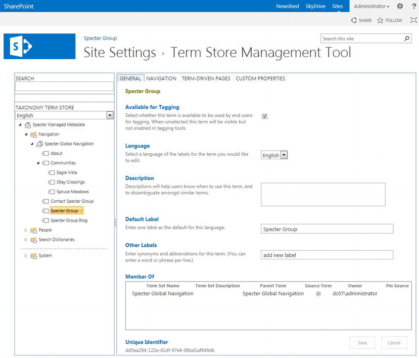
Figure 6-7. Term Properties General tab
Term Properties Navigation Tab
The Navigation tab shown in Figure 6-8 contains the core properties for configuring how a term will act within a navigation bar.
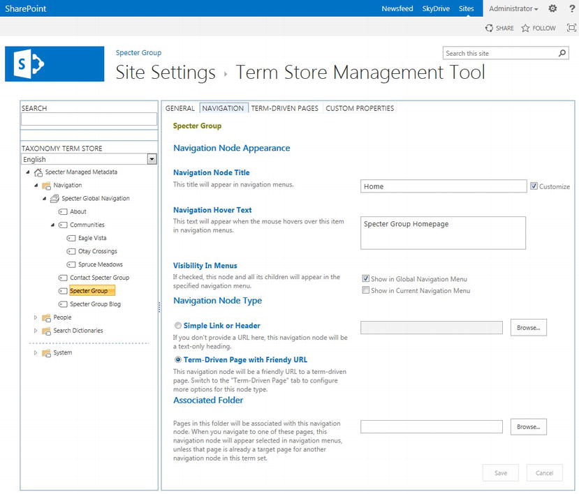
Figure 6-8. Term Properties Navigation tab
- Navigation Node Title: This title is what will appear in navigation menus. To customize this title you will need to select the Customize check box next to the title and then modify the title. Because we do not want to display Specter Group for a link back to our home page, we customize this title to Home.
- Navigation Hover Text: The text, if any, that should appear when the mouse hovers over this term in the navigation menu. This is optional but we set this to Specter Group Homepage.
- Visibility in Menus: These two options allow us to solve a potential issue with managed metadata-driven navigation for global and current navigation. Remember that a particular site can only link to one term set for navigation. If you want to use managed navigation for both global and current navigation, but you require different menu items in each navigation menu, you can use the Visibility in Menus options to select where this particular term should be displayed. As an example, when you would like this term to only display in the global navigation, clear Show in Current Navigation Menu. In our case we want the home link to only show in the global menu so we clear Show in Current Navigation Menu.
- Navigation Node Type: Here we can set how we want this navigation node to link to its URL or page. If you want to link to a relative or absolute URL like we did in SharePoint 2010, or if you want to link to an outside URL, select Simple Link or Header and then provide a URL to the right. Examples might include http://www.spectergroup.com/pages/contact.aspx,/pages/contact.aspx, or even just contact.aspx. Because the navigation menu could appear on any page level of your site, it is recommended to always provide an absolute URL, though, never a relative URL. Note that there are cases when relative paths might be beneficial, including when you wish to develop your site in one location yet deploy it to a production environment.
Tip If this particular node needs to be a header and not a clickable link to another page, select Simple Link or Header and leave the address box to the right empty.
- If, on the other hand, you would like to create a friendly URL for this term, for example, instead of linking to http://www.spectergroup.com/pages/about.aspx to link to the About page you would like a friendly URL of http://www.spectergroup.com/about, select Term-Driven Page with Friendly URL. You can configure this friendly URL on the Term-Driven Page tab.
Note A friendly URL must have a target page within the current site collection. If you want to link a term to another site collection, even within the same web application, you will need to configure this term to use Simple Link or Header. You may not use a friendly URL to link to the other site collection’s pages. However, a single content page can have multiple friendly URLs.
- Associated Folder: Often when browsing through a site, it is helpful for visitors to know what section of the site they are in. One common method is to highlight the node in the navigation bar that relates to the section they are currently viewing. As an example, say a visitor is on the Spruce Meadows page in the community area. It might be helpful to highlight the Community tab in the navigation menu. Because friendly URLs are no longer directly associated with site structure, the Associated Folder allows you to set a folder that contains pages that should highlight this navigation node when a site visitor navigates to one of the folder’s pages.
- The folder in question does not have to exist in your site structure; rather the folder may exist in your site structure (i.e., /pages) or only in friendly URLs. As an example, refer to the two pages in Table 6-1 along with Figure 6-8 for a visual example.
Table 6-1. Example Friendly URLs With Their Associated Target Pages
| Term | Friendly URL | Target Page |
|---|---|---|
| Communities Spruce Meadows | /communities/communities/spruce-meadows | /pages/communities.aspx/pages/spruce-meadows.aspx |
If the Associated Folder for the term Communities is set to /communities, then whenever a visitor navigates to /communities/spruce-meadows, the term Communities in the navigation bar is highlighted as SharePoint adds the class “selected” to the Communities list item in the rendered HTML.
Tip Before switching to a different Term Property tab, be sure to click Save at the bottom of the existing tab to save any changes you made.
Term Properties Term-Driven Pages Tab
The Term-Driven Pages tab shown in Figure 6-9 contains properties that allow us to configure what the friendly URL looks like and what page should actually be loaded when a visitor navigates to this friendly URL.
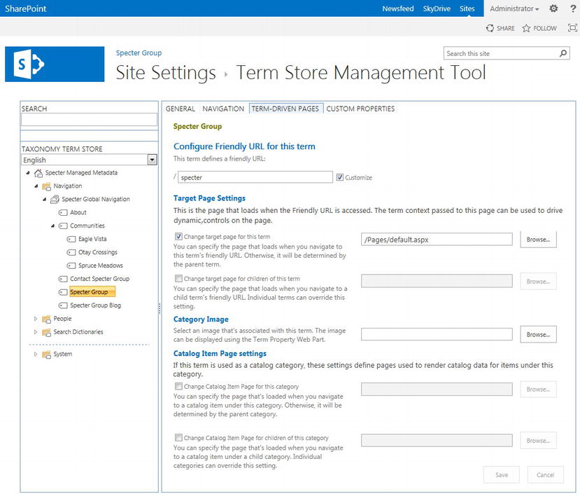
Figure 6-9. Term Properties Term-Driven Pages tab
- Configure Friendly URL for this term: By default, the friendly URL will be the term name with spaces replaced by - and other special characters removed. If you would like to customize the friendly URL, select the Customized check box and provide the new friendly URL. In our case we change specter-group to just home. This gives us an absolute URL of http://www.spectergroup.com/home, although we only need to provide “home” in the friendly URL text box.
- Target Page Settings: You can override an existing default target for this term that might have been set by its parent by providing a target page for this term, say /pages/default.aspx for our home page. Remember that the target page must be local to the current site collection. You may also provide a default target for all child terms of this particular term. Child terms can always override this default target on their own Term-Driven Pages tab.
- Category Image: If you would like to associate an image with this term, you can set the location of that image. By default this image will not be displayed in a navigation menu, nor would it be displayed on a particular page associated with this term, but you can reference and display this image using the Term Property Web Part.
- Catalog Item Page settings: The last two settings on this tab provide the targets for pages that are loaded when this term is used as a catalog category. In the case of our global navigation, this is not needed and thus is ignored.
Customize Term Order
When you first create a term set, then add terms to the term set, terms will be automatically sorted alphabetically. This is also true of child terms added to parent terms. Normally the terms will need to be sorted manually and fortunately this is an easy task. To provide a custom order for a set of terms, click the parent term set or term depending on which level you wish to order. In our example, we click the Specter Global Navigation term set to order its child terms. Note that ordering the child terms under the Communities term can be handled the same way. Once the term set (or term) properties loads, click the Custom Sort tab to load the properties page, which allows us to customize the sort order.
Note Only terms with child terms will display the Custom Sort tab.
To provide your own custom sort order, select Use custom sort order. As soon as you do, the child terms will appear below the sort options, allowing us to set the order in which we want the terms displayed. The lower the number, the sooner on the list it will appear. Click Save to save your term order. In Figure 6-10, notice the old sort order highlighted on the left and the new sort order we wish highlighted to the right. In Figure 6-11 you can see the new sort order of the terms, highlighted on the left.
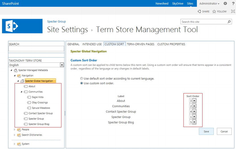
Figure 6-10. Custom Sort tab
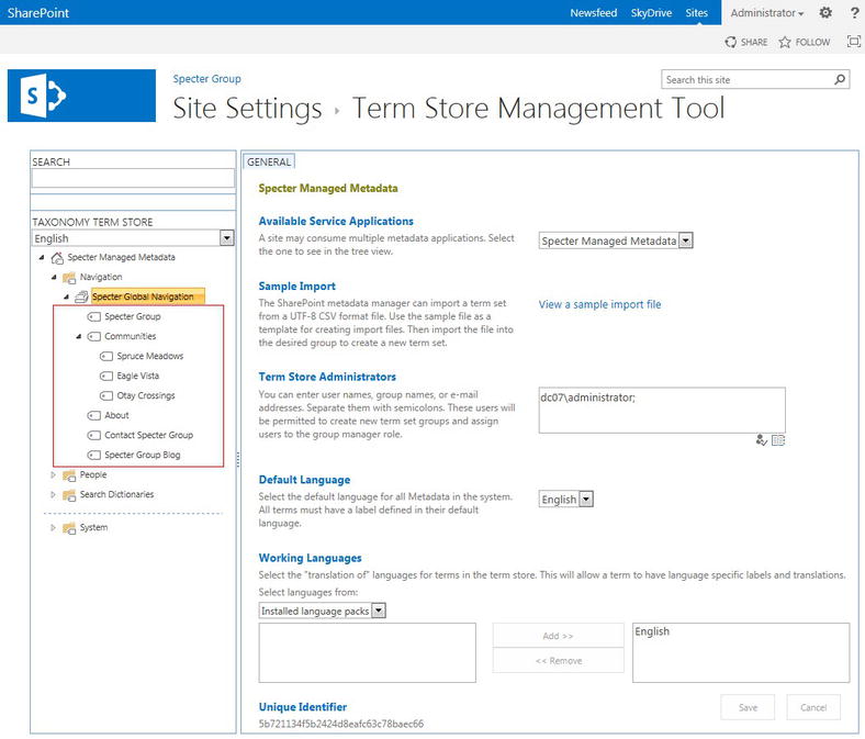
Figure 6-11. Custom sorted terms in Specter Group navigation term set
Set a Term Set for Navigation
At this point we have created and configured a metadata service application in our SharePoint 2013 farm to store our term sets. We then created a term set using the Term Store Management Tool within our working site collection. We finally created, configured, and ordered our set of terms that represents the site map we created in Chapter 3. It is now time to modify our site’s navigation properties to use our term set.
- From your root site in your site collection, navigation to your Site Settings page.
- In your root site’s Site Settings page, in the Look and Feel section, click Navigation to load your site’s Navigation Settings page.
- Configure Global Navigation to use Managed Navigation: The navigation items will be represented using a Managed Metadata term set.
- Once you select the Managed Navigation option, a new section appears lower down on the Navigation Settings page entitled Managed Navigation: Term Set (see Figure 6-12). You should already see your Managed Metadata Service, in our case Specter Managed Metadata. Drill down the settings tree until you see your navigation term set, in our case Specter Global Navigation, found in the Navigation group.
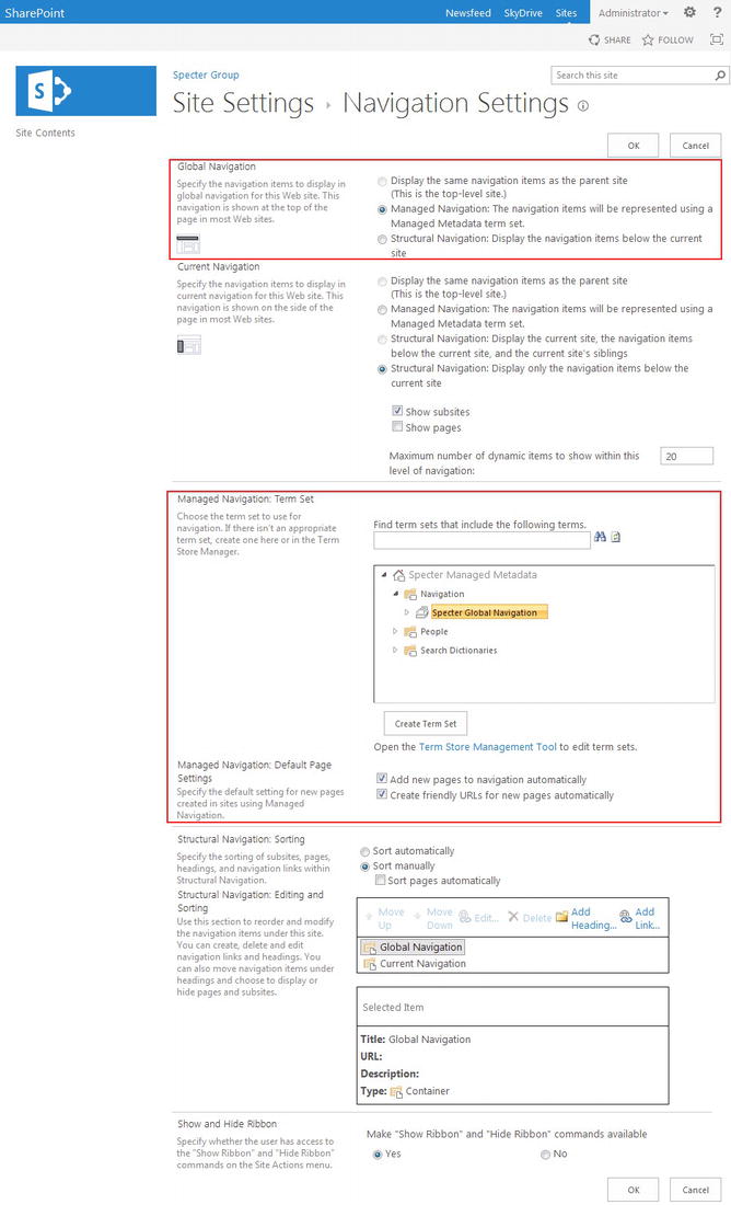
Figure 6-12. Navigation Settings configured to use managed navigation for global navigation
- Click OK at the bottom of the page to save your settings. Referring to Figure 6-13, notice that the global navigation has been replaced by the terms in our term set.
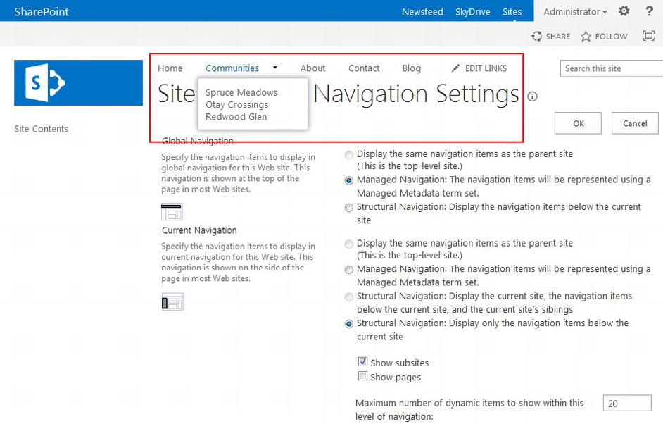
Figure 6-13. Managed navigation term set used for global navigation
By default, new pages you add to your site after you have configured your site to use managed navigation will automatically be added to your term set and friendly URLs will also be generated. You can modify these settings by clearing the check boxes within the Managed Navigation: Default Page Settings section.
Note You can also create a new term set as well as open the Term Store Management Tool directly from the Navigation Settings page.
Managing Navigation Quick Edit Mode
An excellent addition to managed navigation includes the ability to managed a navigation bar directly inline, meaning that if you are logged into your site with an account with sufficient permissions, you will see an Edit Links button to the right of (or below) your navigation menu. This gives you the ability to manage your navigation menus without having to return directly to the Term Store Management Tool. Using the inline Edit Links feature, you can show and hide links, rename a link’s display title, reorder links by dragging and dropping them in place, manage submenu links, and even add new links.
Note Once a link has been created you can only edit the target URL using the Term Store Management Tool.
If you wish to create a new link with a friendly URL you need to use the Term Store Management Tool. Quick Edit mode does not give you all of the tools associated with the Term Store Management Tool, but it does provide access to many features you might require when quickly updating the navigation. We review the available Quick Edit Mode actions next. Review Figure 6-14 for a visual example.
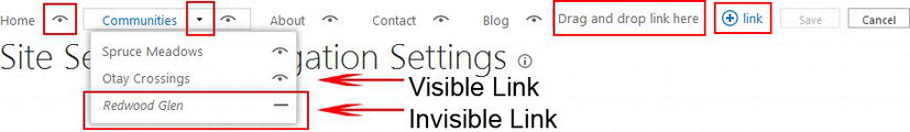
Figure 6-14. Managed navigation Quick Edit mode key elements and actions
Show or Hide a Link
A visible link will include an open eye icon as marked by Visible Link in Figure 6-14. When you click this icon, the link is hidden in the standard navigation menu and the icon is replaced with a closed eye icon, as marked by Invisible Link in Figure 6-14. Clicking this closed eye icon causes a link to again be displayed.
Edit a Link Title
Click a link title to enter an edit mode to rename the link as well as to review the link’s target URL or friendly URL.
Reorder Links
If you click a link title, you can drag the link anywhere else in the navigation menu, including moving the link to a submenu, by hovering over the submenu’s parent link. This causes the submenu to appear so that you can drop the link into the submenu.
Managed Submenu Links
A down arrow will appear to the right of a link that has a submenu. If you click that arrow, the submenu appears and you can manage submenu links in the same manner as you manage top-level links. If a submenu link has an arrow pointing to the right then this sublink has its own submenu. Click the right arrow to make its submenu appear.
Add New Links
There are two ways to add new links via Quick Edit mode. The first is to drag and drop a link into the menu where the text Drag and drop link here is displayed. The second way is to click (+) link found at the right of the Quick Edit menu. When you click (+) link, an Add a link dialog box appears, allowing you to provide the display text as well as the target URL. If you wish to link to a friendly URL that does not yet have a term associated with it, you will need to create the link via the Term Store Management Tool.
Share Managed Navigation Across Site Collections
A limitation to managed navigation is that a term set can only be used by one site, unless subsites are configured to use the parent site’s navigation. Primarily this will cause a problem when two or more site collections are supposed to have the same navigation menu. When you attempt to configure a site to use a term set for managed navigation already used by a different site, the error shown in Figure 6-15 will appear.
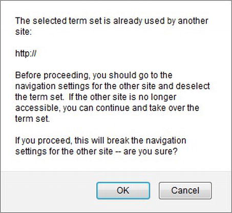
Figure 6-15. Warning when attempting to use a term set for a second site
If you click OK, the first site that was using this term set for managed navigation will no longer display the navigation menu for which the term set was being used.
Fortunately term sets offer a solution. When term sets were first introduced in SharePoint 2010, an option to reuse a term was available. Reusing a term would create a linked term within two term sets. An administrator could then modify a reused term in any term set and all replicated terms would be updated. SharePoint 2013 provides for reusing terms, but it also provides a new option, pinning a term. When you pin a term from one term set to another, the pinned term, in the destination term set, is created as read only. Changes to properties are only allowed at the source term. When used for a term in a term set that is intended for navigation, this holds true, although properties in the Navigation and Term-Driven tabs can be updated in each term and changes are not replicated.
Note To learn how to reuse a term set in cross site publishing, please refer to Chapter 8.
Reuse Terms with Pinning
Creating a term set for each site collection in an overall web site strategy using pinning is simple to set up, although a few pitfalls exist. First, you have to create and manage a term set per site collection. You will only have to pin first-tier terms to the destination term set, as child terms will automatically be replicated. Second, if you intend to use friendly URLs, the friendly URL will always include the path to each site collection, which would mean you will have multiple apparent paths to a particular page, even if only one target page exists.
As an example of this concern, consider our About Us page with a physical location of www.spectergroup.com/pages/aboutus.aspx. We can create a term, About Specter, with a friendly URL of “about,” which translates to www.spectergroup.com/about and a target URL of /pages/aboutus.aspx. Remember that the target page for a friendly URL has to be a relative path; it cannot be an absolute URL.
If we create a second term set for our Communities subsite collection, and then pin the About Specter term to the second term set, all properties stay the same. When you navigate to the Communities site collection and click About in the navigation menu, you will notice that you are directed to the address www.spectergroup.com/sites/community/about, not www.spectergroup.com/about. Both friendly URLs have the same target (i.e., www.spectergroup.com/pages/aboutus.aspx) but different visible URLs. This is normally not an issue for site visitors but is worth considering.
Follow these steps to create a term set with pinned terms from a source term set.
- In the Term Store Management Tool, right-click the Navigation group we created in the previous section and click New Term Set. Provide a new name and press Enter.
- Configure this term set just as we did in the earlier section, “Create a Term Set.”
- Right-click the new term set and click Pin Term with Children. A dialog box will appear that displays your Taxonomy Term Store. Click the Navigation term group and notice that term sets are listed, except the term set to which you are attempting to pin a term. This is expected, as you cannot pin a term within the same term set. Expand the terms in the source term set, in our case Specter Global Navigation, and select a parent term to pin. Click OK.
- The term from the source term set is now pinned in your destination term set. Notice the icon next to the pinned term in both the source and destination term sets. The source term displays an icon that tells you this term is being reused. The destination term displays an icon showing that it is a pinned term. Refer to Figure 6-16 for an example of pinned terms. If you click either the source or destination term, on its General tab, at the bottom, you also can see membership information, including how the term is shared and pinned.
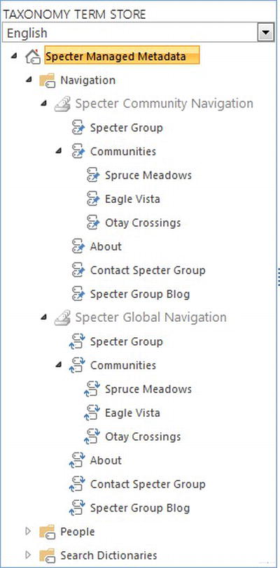
Figure 6-16. Terms from source term set, Specter Global Navigation, pinned to the destination term set, Specter Community Navigation
- Repeat step 3 for each top-level term in your source term set to replicate your term set structure.
- You can now configure your other site collection to use this new term set for its managed navigation by following the steps previously outlined in the earlier section “Set a Term Set for Navigation.
How SharePoint 2013 Builds the Navigation Bar
Before we can begin successfully styling SharePoint’s global navigation as well as its current navigation, it is important to know how SharePoint renders the navigation in HTML. First, both the global navigation menu and the current navigation menu use very similar HTML. The primary difference between the two being a class that SharePoint adds to the containing div just before the menu’s root unordered list, either ms-core-listMenu-horizontalBox for the global navigation in horizontal display mode or ms-core-listMenu-verticalBox for the current navigation in vertical display mode. If you have branded navigation menus in SharePoint 2010 in the past, then the HTML and associated CSS in SharePoint 2013 will look similar.
Add the Top Navigation Snippet to a Master Page
Before we can look at the HTML SharePoint generates, we must first add the Top Navigation snippet to our HTML master page. Load Design Manager in a browser, navigate to 4. Edit Master Pages, and click the master page to which you wish to add the Top Navigation snippet. Once the Master Page Preview page loads, click Snippets in the upper right corner.
Note For an in-depth review of the Snippet Gallery available for master pages in Design Manager, refer to Chapter 4.
In the Snippet Gallery, click the Top Navigation icon found in the Navigation section of the ribbon to load the Top Navigation component. As we saw in Chapter 4, we can customize the snippet in the right pane. The HTML we need to add to our master page is located at the bottom left under HTML Snippet. Before we copy the HTML snippet to the clipboard, we need to make a few changes. Refer to Figure 6-17 for an overview of the Top Navigation snippet in the Snippet Gallery and Table 6-2 for explanations of the properties.
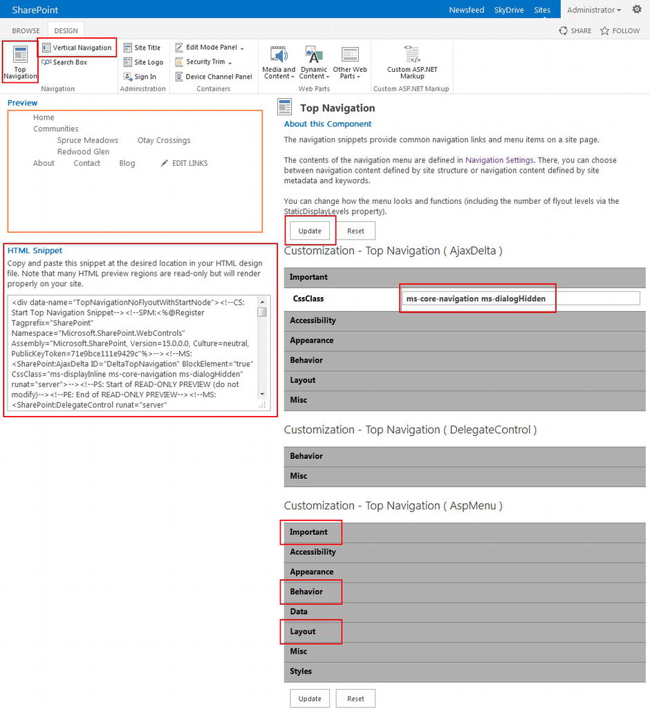
Figure 6-17. In Design Manager's HTML master page Snippet Manager, configure the Top Navigation snippet
Table 6-2. Explanations of the Top Navigation Properties
| Property | Explanation |
|---|---|
| CssClass (Top Navigation (AjaxDelta)) | We remove ms-displayinline as that class will cause the navigation items to include display: inline-block, which we do not require based on how our navigation was prototyped. |
| AdjustForShowStartingNode | By setting this to true, the number of static display levels is corrected when you have only one static level of navigation based on managed navigation, but two levels for structured navigation. |
| StaticDisplayLevels | We normally would show two levels of navigation at all times with structured navigation, whereas with managed navigation we actually only want to show one. By setting this property to 2 and AdjustForShowStartingNode to true, this Top Navigation snippet works for both structured and managed navigation. In general the StaticDisplayLevels property sets how many levels of your navigation structure to show as static links. |
| CssClass (Top Navigation (AspMenu)) | If we want to add a class to the direct parent of our navigation unordered list, we can set the CssClass for the AspMenu. |
| MaximumDynamicDisplayLevels | We are requesting that up to two additional levels of navigation are displayed in dynamic menus. In general the MaximumDynamicDisplayLevels property sets how many levels, after the static levels are displayed, to then show as dynamic menus. |
| RenderingMode | There are two rendering modes, List and Table. Table is the SharePoint 2007 rendering mode that generates a table for the navigation bar. We prefer the navigation bar be rendered as an unordered list. |
- 1. Under Customization - Top Navigation (AjaxDelta), select Important and set CssClass to ms-core-navigation ms-dialogHidden.
- 2. Under Customization - Top Navigation (AspMenu), make the following changes:
- a. Important AdjustForShowStartingNode = True
- b. Important StaticDisplayLevels = 2
- c. Appearance CssClass = nav-container
- d. Behavior MaximumDynamicDisplayLevels = 2
- e. Layout RenderingMode = List
- 3. Click Update to update the HTML Snippet window. We can now copy and paste the HTML snippet to our master page.
Note We investigate static and dynamic levels of navigation in greater detail in the section “Static Levels and Dynamic Levels” later in this chapter.
To add the Top Navigation snippet to our master page, we open our custom master page we added and updated in Chapters 4 and 5 in our web site editor tool. We need to find the location where the Top Navigation snippet should go, so we look for the HTML comment <!--nav snippet-->, and its corresponding end tag, <!--end nav snippet--> (see Listing 6-1).
Listing 6-1. Original Static Navigation From Master Page
...
<!--nav snippet-->
<ul class="root">
   <li class="current-menu-item"><a href="index.html">HOME</a></li>
   <li><a href="about.html">ABOUT</a></li>
   ...
</ul>
<!--end nav snippet-->
...
Note During the HTML prototype phase of your project, it is best to include HTML comments that will help you find components that should be replaced by snippets similar to <!--nav snippet-->.
We are now ready to replace the HTML in Listing 6-1 with the Top Navigation snippet we just created, which should look like Listing 6-2.
Listing 6-2. Top Navigation HTML Snippet Added to Our Custom Master Page (Preview HTML and Some Properties Removed for Readiblity)
...
<div class="nav nav-collapse collapse">
   <!--nav snippet-->
   <!--CS: Start Top Navigation Snippet-->
   <!--SPM:<%@Register Tagprefix="SharePoint" Namespace="Microsoft.SharePoint.WebControls" %>-->
   <!--MS:<SharePoint:AjaxDelta ID="DeltaTopNavigation"
         CssClass="ms-core-navigation ms-dialogHidden">-->
      <!--PS: Start of READ-ONLY PREVIEW (do not modify)--><!--PE: End of READ-ONLY PREVIEW-->
      <!--MS:<SharePoint:DelegateControl runat="server" ControlId="TopNavigationDataSource">-->
         <!--PS: Start of READ-ONLY PREVIEW (do not modify)-->...<!--PE: End of READ-ONLY PREVIEW-->
         <!--MS:<Template_Controls>-->
            <!--MS:<asp:SiteMapDataSource SiteMapProvider="SPNavigationProvider" ID="topSiteMap">-->
            <!--ME:</asp:SiteMapDataSource>-->
         <!--ME:</Template_Controls>-->
      <!--ME:</SharePoint:DelegateControl>-->
      <a name="startNavigation"></a>
      <!--MS:<asp:ContentPlaceHolder ID="PlaceHolderTopNavBar" runat="server">-->
         <!--MS: <SharePoint:AspMenu ID="TopNavigationMenu" runat="server" DataSourceID="topSiteMap"
               UseSimpleRendering="true" Orientation="Horizontal" StaticDisplayLevels="2"
               AdjustForShowStartingNode="true" MaximumDynamicDisplayLevels="2"
               CssClass=" nav-container"> -->
            <!--PS: Start of READ-ONLY PREVIEW (do not modify)-->...
            <!--PE: End of READ-ONLY PREVIEW-->
         <!--ME:</SharePoint:AspMenu>-->
      <!--ME:</asp:ContentPlaceHolder>-->
      <!--PS: Start of READ-ONLY PREVIEW (do not modify)--><!--PE: End of READ-ONLY PREVIEW-->
   <!--ME:</SharePoint:AjaxDelta>-->
   <!--CE: End Top Navigation Snippet-->
   <!--end nav snippet-->
   <!--used if we want to have a select dropdown for nav on mobile-->
   <div id="nav-select-holder">
   </div>
</div>
...
Save the master page and load your home page in a browser. We are assuming that the custom master page has been set as your site’s Custom Master Page. The top navigation will probably not look correct. We learn how to style our top navigation in the section “Style and Make the Navigation Bar Responsive” later in this chapter. If we open the source view of our home page in the browser and look for the comment <!--nav snippet--> again, we see that the Top Navigation snippet produced the HTML code in Listing 6-3. We have removed IDs as well as other HTML properties or tags that are not important for our understanding of the HTML and each tag’s associated classes or styling.
Listing 6-3. HTML Produced by SharePoint When Rendering the Top Navigation Snippet
<div class="nav nav-collapse collapse">
   <!--nav snippet-->
   <div id="DeltaTopNavigation" class="ms-core-navigation ms-dialogHidden">
      <a name="startNavigation"></a>
      <div id="" class="nav-container noindex ms-core-listMenu-horizontalBox">
         <ul class="root static">
            <li class="static"><a class="static" href="/home"><span>
                  <span class="menu-item-text">Home</span></span></a></li>
            <li class="static">...<!--Additional top level links-->...</li>
            <li class="static"><a class="static" href="/communities"><span>
               <span class="menu-item-text">Communities</span></span></a>
               <ul class="static">
                  <li class="dynamic"><a class="dynamic" href="/communities/spruce-meadows"><span>
                     <span class="menu-item-text">Spruce Meadows</span></span></a></li>
                  <li class="dynamic">...<!--Additional community links-->...</li>
               </ul>
            </li>
            <li class="static"><a class="static" href="/contact"><span>
               <span class="menu-item-text">Contact</span></span></a></li>
         </ul>
      </div>
   </div>
   <!--end nav snippet-->
</div>
There are a few aspects of this HTML that we want to pay attention to. First, notice how all of our top-level links (Home, Communities, About, etc.) are all within the same <ul> tag. This is a benefit of managed navigation because with structured navigation this is not the case. With structured navigation, Home is the only top-level list item; the other top-level links are actually in a sublist. This can cause branding difficulties that managed navigation helps avert. Refer to Listing 6-4 to see a standard structured navigation menu rendered by SharePoint in the next section.
Note To learn more about the difference between structured navigation HTML and how static and dynamic levels play a different role in HTML, review the next section, “Static Levels and Dynamic Levels.”
Also in Listing 6-3, look in the first div with the ID of DeltaTopNavigation. Notice the class value, "ms-core-navigation ms-dialogHidden" is the same that we set in Customization - Top Navigation (AjaxDelta) Important CssClass. Look down to the next div, the div with the ID of "" (i.e. it has no ID). Notice how this class value contains "nav-container", which we set in Customization - Top Navigation (AspMenu) Appearance CssClass. Many snippets might have different properties that can affect specific elements of itself both before and after final rendering to the client browser.
The rendered HTML in Listing 6-3 is much more responsive friendly. Next, notice the containing div has an ID of DeltaTopNavigation. We can use this ID to help style the navigation elements for only this top navigation menu if we do not want to style all unordered lists with a class of ms-core-listMenu-horizontalBox the same. The remaining HTML appears just as it did in SharePoint 2010. Static list items will always have a class static applied to them and list items with dynamic children will also contain the class dynamic-children. A dynamic unordered list will contain the class dynamic as will its child list items and child anchor tags. Using a combination of these classes we can quickly brand the navigation menu as well as make it responsive which we cover in the section “Style and Make the Navigation Bar Responsive” later in this chapter.
Static Levels and Dynamic Levels
Two important settings for how navigation will function include the number of static and dynamic levels you wish to display in a navigation menu. When you create a navigation snippet, either top or vertical, within the Customization - Top Navigation (AspMenu) section, under Important you can set the number of StaticDisplayLevels. Under Behavior you can set the number of MaximumDynamicDisplayLevels. If you consider the hierarchy of links in your navigation structure, you can consider the level of a given link as the distance it is from the top-most level, which starts at 1. In our term set, Home, About, Blog, Community, and Contact are all at level 1 and the three links under Community are at level 2. Our StaticDisplayLevels setting dictates how many static levels to show on the navigation menu, meaning navigation items to always show. The MaximumDynamicDisplayLevels setting thus controls how many levels should be displayed in dynamic menus under our static items.
With managed navigation, this creates a beneficial outcome that we can use to our advantage. In particular in SharePoint 2010 and SharePoint 2013 structured navigation, the home page was always considered the first static level and all of our other top-level links were the second static level of navigation. The catch is that the second static level is an unordered list of list items, but was included in the first level’s first list item. This rendered the HTML in Listing 6-4.
Listing 6-4. Sample HTML Rendering of Structured Navigation (Certain Tags and Tag Properties Removed for Simplicity)
<div class="nav nav-collapse collapse">
   <!--nav snippet-->
   <div id="DeltaTopNavigation" class="ms-core-navigation ms-dialogHidden">
      <a name="startNavigation"></a>
      <div id="" class="nav-container ms-core-listMenu-horizontalBox">
         <ul class="root static">
            <li class="static"><a class="static">Home</a>
               <ul class="static">
                  <li class="static">...<!--Additional top level links-->...</li>
                  <li class="static"><a class="static">Communities</a>
                     <ul class="static">
                        <li class="dynamic"><a class="dynamic">Spruce Meadows</a></li>
                        <li class="dynamic">...<!--Additional community links-->...</li>
                     </ul>
                  </li>
                  <li class="static"><a class="static">Contact</span></span></a></li>
               </ul>
            </li>
         </ul>
      </div>
   </div>
   <!--end nav snippet-->
   <!--used if we want to have a select dropdown for nav on mobile-->
   <div id="nav-select-holder"></div>
</div>
Having a list and a sublist of items that should all be displayed at the same level can cause a headache in responsive design. We might want to collapse the navigation for smaller devices based on a particular node’s navigation level. We have to somehow handle the fact that the first two levels count as the first level and all additional levels of navigation are displayed one level at a time.
With managed navigation, we can have all static links on one level, thus alleviating many of our initial headaches. The rendered HTML in Listing 6-3 is much easier to style, as all top-level links are in our root unordered list. This also allows us to leverage the Bootstrap framework to make the navigation bar responsive.
Style and Make the Navigation Bar Responsive
In the preceding section, we added the Top Navigation snippet to our master page in Design Manager. We then looked at the HTML SharePoint generates when it renders the Top Navigation snippet. We must now view the top navigation in the browser, fix any style issues that arise when using SharePoint for our navigation instead of static navigation, and finally look at how to make our navigation responsive.
Style the Navigation Bar
We saw in Listing 6-3 how SharePoint 2013 renders navigation in HTML. Let us now look at how this looks in a browser and fix any styles that SharePoint might have tweaked (see Figure 6-18).
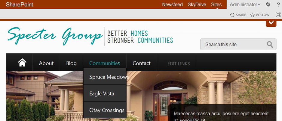
Figure 6-18. Top Navigation as displayed in a browser after snippet insertion
Tip Although our examples that follow might be specific to our demo design, the theory and practice we use to solve these problems will help you solve specific problems you run into when converting your navigation to managed navigation with SharePoint.
Here are the known issues: The navigation menu has been dropped down by one pixel. The drop-down arrow rendered by SharePoint for Communities should be hidden or moved to the right. The drop-down menu does not appear correct. The Edit Links font color is incorrect and there are spacing issues in Quick Edit mode. We review each problem and how to fix it. The replacement CSS is provided in Listing 6-5.
Listing 6-5. CSS Updated to Fix Layout of Top Navigation Snippet Rendered HTML
/*top nav*/
/*center menu*/
nav#topnav .ms-core-listMenu-horizontalBox {
   display: block;
}
/*hide or provide padding for downdown arrow*/
nav#topnav .ms-core-listMenu-horizontalBox .dynamic-children.additional-background {
   padding-right: 20px;
   /*background: transparent none;*/ /*unhide to hide the down arrow*/
}
/*remove border from menu items*/
nav#topnav .ms-core-listMenu-horizontalBox li.static > .ms-core-listMenu-item {
   border: none;
}
/*correct location of dropdown menu*/
nav#topnav .nav ul.root > li ul {
   border: none;
   top: 54px !important;
}
/*fix height of dropdown menu list items*/
nav#topnav .nav ul.root > li ul li a {
   height: 25px;
}
In Figure 6-19 we see that SharePoint is rendering our links with a class, ms-core-listMenu-horizontalBox. This style, included in corev15.css, includes a border, which although transparent, causes all of our links to be out of line. A hover event also causes the Home icon on the right to not work correctly. We can correct this by overriding the border style to "border: none;".
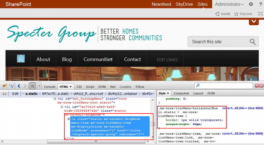
Figure 6-19. Additional border on items
Figure 6-20 shows that SharePoint adds a span with class dynamic-children for list items with dynamic menus. Normally this would have right padding to provide space for the arrow, but our styles are overriding this, as we removed the padding and margin for all children of unordered lists within nav#topnav .nav. We can either add space for the down arrow or hide the down arrow. In our walkthrough, we will add the right padding back in by providing a more targeted style, nav .navbar .nav .dynamic-children.additional-background.
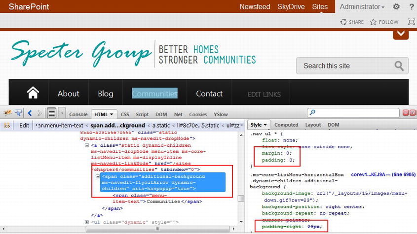
Figure 6-20. Drop-down arrow span
Figure 6-21 shows us two problems that must be addressed: The drop-down menu placement is incorrect and the drop-down menu itself is not the correct size. As we see highlighted in Figure 6-21, SharePoint provides drop-down functionality that is overriding our menu placement as well as drop-down menu width. We can solve this by overriding nav#topnav .nav ul.root > li > ul as well as children of dynamic menus with nav#topnav .nav ul.root ul.dynamic ul.dynamic.
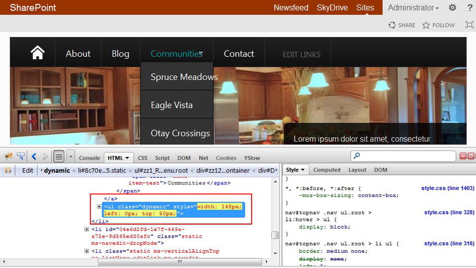
Figure 6-21. Drop-down menu location and border
Using the same technique of using our developer toolbar, we can find the causes of the Edit Links and Quick Edit mode style issues as well. The CSS required to fix these issues is provided in Listing 6-6. In Figure 6-22 we can see the corrected top navigation menu.
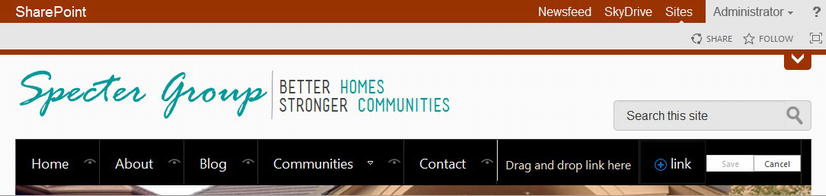
Figure 6-22. Top navigation in inline Edit mode with updated CSS
Listing 6-6. CSS Updated to Fix Layout of Top Navigation While in Inline Edit Mode
/*edit links font*/
nav#topnav .nav .ms-metadata {
   font-size: inherit;
   font: inherit;
   color: #fff;
}
/*images within nav should not use respponsive properties*/
nav#topnav .nav img {max-width: none;}
nav#topnav .nav .ms-navedit-hidespan {display: block;}
/*force the edit node text icon into a box*/
nav#topnav .nav a.ms-navedit-hidelink {
   padding: 21px 0px 0px !important;
   margin: 0px !important;
   display: block !important;
   overflow: hidden !important;
   height: 17px !important;
}
/*remove border added to node table*/
nav#topnav .nav .ms-core-listMenuEdit, nav#topnav .nav .ms-core-listMenuEdit:hover {
   border: none;
}
/*edit node text padding*/
nav#topnav .nav .ms-navedit-hiddenAppendArea {
   padding: 20px 10px 10px;
   color: #F3E4C8;
}
/*edit link node text on dynamic menus requires background*/
nav#topnav .nav .dynamic .ms-navedit-deletelinkCell {
   background: #333333 none;
}
/*add a link should float left*/
nav#topnav .nav .ms-navedit-addNewLink {
   display: inline-block !important;
}
/*bump save and cancel buttons down*/
nav#topnav .nav .ms-navedit-editButton {
   margin-top: 20px;
}
nav#topnav .nav .ms-core-listMenu-horizontalBox span.ms-list-addnew-imgSpan16 {
   vertical-align: middle;
   margin-right: 5px;
}
/*reset the first node to not show a home icon, rather text*/
nav#topnav .nav ul.root > li.ms-navedit-dropNode:first-child {
   height: auto;
   padding: 0px;
}
nav#topnav .nav ul.root > li.ms-navedit-dropNode:first-child a {
   background: transparent none;
   height: auto;
   overflow: visible;
   padding: 21px 20px;
   text-indent: 0;
   white-space: nowrap;
   width: auto;
}
/*end quick edit mode*/
Make the Navigation Bar Responsive
The general problem we are attempting to solve when making a navigation menu responsive is how our navigation menu will work on mobile devices or devices that have a smaller viewport. Further, how can we display a complex navigation structure that works well for desktop users as well as mobile users? To compound our problems, we must also consider what functionality is available on any given client, most pertinent to navigation, the hover or mouse-over event. Many tablets and other mobile devices do not include the ability to react to a hover action so our navigation must take this into account. By default, the top navigation bar SharePoint generates for us depends on a hover event for a drop- down menu to appear and we must handle this first. After we see how we can trap the hover/mouse-over event, we will cover three methods of making a navigation bar responsive with their pros and cons: floating navigation, drop-down navigation, and collapsing navigation.
Hover and Mouse-Over Navigation and SharePoint
Multi-tiered navigation menus often provide access to submenus via a hover or mouse-over event. If you have worked with the SharePoint 2010 top navigation menu, this will be familiar to you, as this was how SharePoint 2010 provided access to submenus. In the previous section we mentioned that the HTML produced by SharePoint when rendering the navigation control is the same for SharePoint 2010 and SharePoint 2013. This would lead us to conclude that access to submenus would be the same as well, and we would be correct.
As we have already mentioned, we cannot depend on a client device, such as a smart phone or tablet, having a hover or mouse-over event. More generally, not all of your site visitors will have a mouse any longer. We need a way to supplement SharePoint’s top navigation menu to provide a way to click an icon to open a submenu. If we want to use the Top Navigation snippet we will have to add JavaScript code to provide this functionality.
In Listing 6-7 through Listing 6-9, we will once again leverage jQuery to supplement SharePoint’s OOTB navigation. We will grab an instance of the top navigation menu, then looping through each menu item, check to see if any child menu items are available. If so, we modify the parent item to provide a click event as well as the hover event to cause a menu to appear or disappear.
In Listing 6-7, we trigger our BindTopNav function after our document is ready by using the alias safe jQuery(document).read(function($) {}); function. In BindTopNav we remove the s4-tn class as SharePoint 2013 adds styles that we do not want to have to worry about. We then grab a reference to our navigation unordered list, #topnav ul.root. Using this reference, we loop through every anchor tag (link) that includes the class dynamic-children that SharePoint adds to any menu item with a submenu.
For each such anchor found, we bind a new jQuery hover event to the anchor’s parent li element, and then bind a jQuery click event to not only the anchor but also anchor’s child span as well. We need to use a little math to determine where the user clicked (or touched), be it the anchor text or the down arrow. In Listing 6-8 and Listing 6-9 we introduce our custom HoverTopNav function as well as our custom DropTopNav function.
Listing 6-7. jQuery to Override the SharePoint OOTB Top Menu Hover Drop-Down
jQuery(document).ready(function($) {
   BindTopNav($);
});
function BindTopNav($) {
   /*grab top nav SP generated list*/
   var u = $('#topnav ul.root'),
   if (u.length > 0) {
      /*loop through every nav item that has dynamic children*/
      u.find('a.dynamic-children').each(function() {
         /*get current link parent li and first child span*/
         var l = $(this).parent('li'),
         var s = $(this).children('span').eq(0);
         /*override parent li hover event to show dropdown*/
         l.hover(
            function () {HoverTopNav($, $(this),''),},
            function () {HoverTopNav($, $(this),'o'),}
         );
         /*trap link click*/
         $(this).bind('click',function(e) {
            /*do math to determine if click was the link text, or the dropdown arrow*/
            var w = $(this).outerWidth(true);
            var s = $(this).children('span').eq(0);
            var rs = parseInt($(this).css("padding-right")) + parseInt($(this).css("margin-right")) +
                  parseInt(s.css("padding-right")) + parseInt(s.css("margin-right"));
            var x = e.pageX - $(this).offset().left;
            if (x > (w-rs))
               DropTopNav($, $(this));
            else
               return true;
            return false;
         });
         /*need to trap link span too for some browsers*/
         s.bind('click',function(e) {
            /*do similar math to determine if click was link text or arrow*/
            var w = $(this).outerWidth(true);
            var rs = parseInt($(this).css("padding-right")) + parseInt($(this).css("margin-right"));
            var x = e.pageX - $(this).offset().left;
            if (x > (w-rs))
               DropTopNav($, $(this).parent('a').eq(0));
            else
               window.location.href = $(this).parent('a').eq(0).attr('href'),
            return false;
         });
      });
   }
}
Now that we have bound our new hover and click events to our navigation bar, we need to tell the client browser what to do on a hover or click event. In Listing 6-8 we call the DropTopNav function unless the mobile navigation button, .navbar .btn-navbar-close, is displayed. If this button is displayed then we are showing our mobile navigation, meaning that we do not want any hover events for our navigation menu.
Listing 6-8. jQuery HoverTopNav Function
/*triggered when a nav link is hovered*/
function HoverTopNav($, l, a) {
   if (l.length > 0) {
      var m = $('.navbar .btn-navbar-close'),
      if (m.length > 0) {
         /*only down dropdown on hover if not mobile nav view*/
         if (m.css('display') != 'inline-block')
            DropTopNav($, l.children('a.dynamic-children').eq(0), a);
      }
   }
}
In Listing 6-9 we see the function, DropTopNav introduced in Listing 6-8. DropTopNav takes the link that was clicked and either hides or shows the link’s submenu by switching the submenu’s “display” style to either “none” or “block”. The function also adds a class selected to the link that was clicked if the submenu is displayed in case we wish to provide additional styling to the link.
Listing 6-9. jQuery DropTopNav Function Drops or Hides a Dynamic Menu
/*triggered when a nav link is clicked*/
function DropTopNav($, l, a) {
   if (l.length > 0) {
      var u = l.siblings('ul').eq(0);
      if (u.length > 0) {
         /*if the sub menu is hidden, then show or vice-versa*/
         if (l.hasClass('selected') || (a=='o')) {
            u.css('display','none'),
            l.removeClass('selected'),
            u.find('ul.dynamic').css('display','none'),
            u.find('a.dynamic-children').removeClass('selected'),
         }
         else {
            u.css('display','block'),
            l.addClass('selected'),
         }
      }
   }
}
Floating Navigation
Floating navigation provides an easy, almost do-nothing approach to responsive navigation. The navigation menu items float within their container so with larger viewport widths, say widths over 768 pixels, this normally means a standard navigation menu. On a tablet or mobile device, the navigation menu items might not appear on one line, so we allow additional elements to float to the next line as seen in Figure 6-23. Using media queries, we can also create an additional breakpoint (i.e., 480 pixels) so that with smaller viewports display each menu item on its own line.
Figure 6-23. Mobile view with floating navigation
The pros of floating navigation include simplistic and straightforward navigation for the end user as well as the benefit of not requiring the use of JavaScript or jQuery.
Unfortunately, floating navigation does not work well if you intend to have drop-down submenus, as you can see in Figure 6-23. Drop-down menus would require secondary-level navigation. Further, the navigation might take up valuable real estate at the top of a site on a mobile device.
Implementing Floating Navigation
Floating navigation assumes a few basic tenets, that being that the menu items are floating and that the container holding the menu items will grow as menu items require additional lines. In Listing 6-10 we introduce the straightforward HTML code adding floating navigation in our sample master page.
Listing 6-10. Top Navigation HTML for Floating Navigation for All Views (Top Navigation Snippet Has Been Removed But Would Be Same as in Listing 6-2)
<div class="nav">
  <!--nav snippet-->
  <!--CS: Start Top Navigation Snippet-->
  ...
  <!--CE: End Top Navigation Snippet-->
  <!--end nav snippet-->
</div>
If we compare Listing 6-10 with Listing 6-2, we see that we removed nav-collapse and collapse from the first div class, as we do not need Bootstrap collapsing navigation. Our navigation items already float left within their container, so all that remains for us is simple styles to remove additional borders so that hanging borders do not appear on smaller viewports. The styles are provided in Listing 6-11.
Listing 6-11. Floating Navigation for All Viewports
/*floating navigation*/
/*top level nav container show no long float and should have grow in height as needed*/
nav#topnav {
   height: auto;
}
/*require that each menu item display inline*/
nav#topnav .nav ul.root > li {
   display: inline-block;
   border: none;
}
/*remove any border so we do not have hanging borders*/
nav#topnav .nav ul.root > li a {
   border: none;
}
/*end floating navigation*/
We do not need to use media queries, as we will have our top navigation float for all viewports. If you intend to have a different type of navigation bar for large and small viewports, you might need to use media queries if you only require mobile top navigation to float. Besides setting the primary nav container (nav#topnav) height to grow as menu items float to a second or more lines, we also force list items to display as an inline block. Finally we set a menu item padding to take less space than in a desktop view, while still providing a mobile-friendly button to click.
Drop-Down Navigation
Drop-down selection list navigation afforded an early approach to handle issues encountered with floating navigation in mobile and tablet views, implemented as a <select> list in HTML as seen in Figure 6-24.
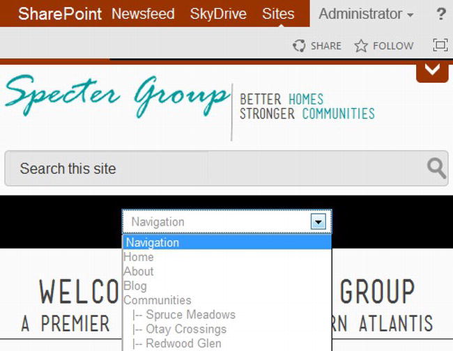
Figure 6-24. Drop-down navigation in mobile view
There are two leading ways of implementing drop-down navigation for mobile devices, one being to create a second navigation structure in the master page, then containing both navigation bars in a separate div. Using media queries, we could code which menu should be shown at what viewport width. This is not a recommended approach, as we have to create the second navigation menu, which is not only difficult with SharePoint, but also requires a visitor to download two versions of your navigation menu.
A second approach uses JavaScript to build the mobile drop-down navigation menu based on the primary navigation menu at the client side. A drawback to this approach includes the requirement of JavaScript or jQuery, but is far easier to maintain in the long run.
Implementing Drop-Down Navigation
Drop-down navigation for narrow viewports requires that we first add a container or tag where we will insert our <select> menu (see Listing 6-12). We then use a JavaScript function (see Listing 6-13) to parse our top navigation menu, create a new select HTML element, update the select tag to include navigation nodes from our primary navigation menu, and finally add the select menu to our page. Our last step includes updating our style sheet to provide the client properties as to when each menu should be displayed or hidden, as well as to provide general styling to the two menus (see Listing 6-14).
Listing 6-12. Top Navigation HTML for Drop-Down Navigation in Mobile Views (Top Navigation Snippet Has Been Removed But Would Be Same as in Listing 6-2)
<nav id="topnav">
  <div class="navbar">
    <div class="navbar-inner">
      <div class="container">
        <div class="nav nav-select">
          <!--nav snippet-->
          <!--CS: Start Top Navigation Snippet-->
          ...
          <!--CE: End Top Navigation Snippet-->
          <!--end nav snippet-->
          <div id="nav-select-holder">
          </div>

        </div>
      </div>
    </div>
  </div>
</nav>
Notice how we added a new class, nav-select to the div with class, nav. Notice also that we added a new div with ID nav-select-holder at the end of the div with class nav-select. Our nav-select-holder div will contain our select element.
Listing 6-13. jQuery/JavaScript to Parse Top Navigation List Menu, Create and Populate Select Element
// Responsive Combo Navi - Alternative, only execute if select element container exists
if ($("#nav-select-holder").length > 0) {
   // Create the drop-down base
   $("<select id='comboNav' />").appendTo("#nav-select-holder");
   // Create default option "Navigation"
   $("<option />", {
      "selected": "selected",
      "value"   : "",
      "text"    : "Navigation"
   }).appendTo("#nav-select-holder select");

   // Populate drop-down with menu items
   $("#topnav .nav li a.menu-item").each(function() {
      var el = $(this);
      var lev = el.parents('ul').length;

      $("<option />", {
         "value"   : el.attr("href"),
          "text"    :  (lev < 2) ? el.text(): '|-- ' + el.text(),
         "style"   : 'padding-left: ' + ((lev-1) * 10) + 'px'
      }).appendTo("#nav-select-holder select");
   });
   $("#comboNav").change(function() {
      location = this.options[this.selectedIndex].value;
   });
}
Note Listing 6-13 required jQuery and must be called during the page load event, such as within a jQuery(document).ready(function($) { }); block.
Listing 6-14. CSS With Media Query for Smaller Viewports for Drop-Down Navigation
/*topnav mobile drop-down fixes */
/*hide the select menu for default viewports*/
nav#topnav #nav-select-holder {
   display: none;
}
/*use Media Query to apply additional styling for smaller viewports*/
@media (max-width: 979px) {
   /*force the height of the main nav bar*/
   nav#topnav .navbar-inverse .navbar-inner {
      height: 59px;
   }
   /*hide the normal navigation bar*/
   nav#topnav .nav-select ul.root {
      display: none;
   }
   /*display the select navigation container*/
   nav#topnav .nav-select #nav-select-holder  {
      display: block;
      text-align: center;
      padding-top: 10px;
   }
   nav#topnav .nav-select #nav-select-holder  select {
      margin: 5px 0px;
   }
}
/*end topnav mobile drop-down fixes */
Using the media query, @media (max-width: 979px), our CSS code will only fire on viewports with widths less than 980px (standard tablets). We hide the standard, default navigation menu and show our drop-down navigation and finally provide additional spacing around our select element to provide for a cleaner look.
Collapsing Navigation
Collapsing navigation strives to solve many of the issues of a multileveled navigation structure and hover limitations while still providing a navigation menu that fits a site’s branding without having to resort to a Select menu that might look out of place. The theory of collapsing navigation states that when a viewport width hits a certain pixel threshold, the navigation menu should collapse into a single line with a menu icon that will provide a one-click action to cause the navigation menu to expand. Submenus are hidden as well, but a submenu icon could appear next to its parent menu item, allowing a site visitor the ability to drill down the navigation tree. Based on our Specter Group site, let’s look at collapsing navigation in practice in a mobile view in Figure 6-25.
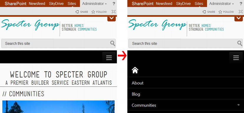
Figure 6-25. Collapsing navigation (hidden and displayed) in mobile view
Collapsing navigation can often be difficult to implement, as it requires a similar setup as drop-down navigation but must also include additional functionality to allow for the expansion of submenus. Fortunately the Bootstrap framework contains built-in functionality to provide collapsing navigation once we configure the navigation snippet properly and provide a few extra fixes.
Implementing Collapsing Navigation
Collapsing navigation in Bootstrap does not require additional code on our part assuming proper HTML is added to our master page to provide for the first-level navigation expansion icon. We review the HTML for Bootstrap collapsing navigation (see Listing 6-15) as well as additional CSS required to style the collapsing menu (see Listing 6-16).
Listing 6-15. Top Navigation HTML for Bootstrap-Based Collapsing Navigation in Mobile Views (Top Navigation Snippet Has Been Removed But Would Be Same as in Listing 6-2)
<nav id="topnav">
    <div class="container-fluid">
        <div class="row-fluid">
            <div class="span12">
                <div class="navbar navbar-inverse">
                    <div class="navbar-inner">
                        <div class="container">
                            <a class="btn btn-navbar" data-toggle="collapse" data-target=".nav-
                                collapse">
                                <span class="icon-bar"></span>
                                <span class="icon-bar"></span>
                                <span class="icon-bar"></span>
                            </a>
                            <div class="nav nav-collapse collapse">
                                <!--nav snippet-->
                                <!--CS: Start Top Navigation Snippet-->
                                ...
                                <!--CE: End Top Navigation Snippet-->
                                <!--end nav snippet-->
                        </div>
                    </div>
                </div>
            </div>
        </div>
    </div>
</nav>
There are two blocks of code we must examine closely. The first is an anchor tag that we add just before our div with class nav. This anchor tag provides us a button we can use to show or hide the collapsing navigation. It includes three icon bars that has become a standard “menu” icon. The second modification is the addition of two classes to our nav div, which now includes the nav-collapse and collapse classes that are provided in the Bootstrap CSS.
Listing 6-16. CSS With Media Query for Smaller Viewports for Bootstrap-Based Collapsing Navigation
@media (max-width: 979px) {
   /*allow the top nav container to grow as menu grows*/
   nav#topnav {
      height: auto;
   }
   nav#topnav .navbar-inverse .navbar-inner {
      border: none;
      height: auto;
   }
   nav#topnav .navbar .nav {
      float: none;
      margin: 0px;
   }
   /*remove the right border, add a top border, and have each nav item display one per line*/
   nav#topnav .nav ul.root > li {
      border-right: none;
      border-top: 1px solid #2F2F2F;
      display: block;
      float: none;
      height: auto;
      background: #000 none;
   }
   nav#topnav .nav ul.root > li:first-child, nav#topnav .nav ul.root > li a {
      padding: 15px 20px;
      border-top: none;
   }
   /*for links with dynamic children, provide remove from drop-down arrow*/
   nav .navbar .nav .dynamic-children.additional-background {
      padding-right: 10% !important;
      width: 90%;
      display: block;
      background-image: url('/_layouts/15/images/menu-down.gif'),
   }
   /*turn off any hover event*/
   nav#topnav .nav  ul.root > li:hover > ul, nav#topnav .nav  ul.root ul > li:hover > ul {
      display: none;
   }
   /*do not allow inline editing of links while in mobile view*/
   .ms-core-listMenu-horizontalBox > .ms-core-listMenu-root > .ms-listMenu-editLink {
      display: none !important;
   }
   /*set dynamic menus to not float*/
   nav#topnav .nav ul.root ul.dynamic, nav#topnav .nav ul.root ul.dynamic ul.dynamic {
      float: none !important;
      left: auto !important;
      top: auto !important;
      position: relative !important;
   }
   nav#topnav .nav ul.root > li ul li a {
      padding: 15px 20px;
      border-top: none;
   }
}
Using the media query, @media (max-width: 979px), our CSS code will only fire on viewports with widths less than 980px (standard tablets). We hide the standard, default navigation menu and display the collapse menu icon. Bootstrap handled the menu icon so that when clicked, a navigation menu appears. The remaining CSS styles provided reformat the menu items to appear one per line with a divider between each line.
Other Mobile-Friendly Navigation Methods
There are quite a few other techniques to provide navigation functionality on nondesktop devices besides the three we reviewed. Some of these include off-canvas navigation and Hide ’n Cry (attributed to Brad Frost; see bradfrostweb.com).
Off-Canvas Navigation
With off-canvas navigation, the navigation menu is hidden off canvas, or outside of the viewport of the client device. When a menu icon is clicked, the navigation will slide in to the viewport screen, often “pushing” the content of the site out of the way. This is a popular menu system seen in many mobile apps. Off-canvas navigation provides a modern approach to mobile-first web site design that also allows for complex navigation structures as the navigation menu can be provided in its own window.
In Figure 6-26 we see to the left our normal collapsing navigation similar to Figure 6-25. To the right we see what happens when a user clicks the menu icon. The entire site shifts to the left (or it could be to the right) and the menu appears from “off canvas.”
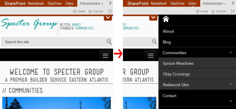
Figure 6-26. Off-canvas navigation
Hide ’n Cry is the name of a method attributed to Brad Frost (bradfrostweb.com). The theory behind this method is that we simply hide the navigation for mobile viewers because we want to limit what they can do with the site. This does not appear to be a valid solution for most web sites, but might be feasible for certain sites. A slight corollary is to create a greatly reduced navigation menu for mobile visitors. This provides some navigation to mobile users but goes against the general theory of responsive web design, which holds that content available to a desktop user ideally is available to mobile users as well.
Other Forms of Navigation
There are additional common forms of navigation that you are probably familiar with that are also natively available in SharePoint 2013, or are easy to add. Let’s review a few of these.
Current Navigation
Current navigation in SharePoint 2013 is what we used to call Quick Launch navigation in SharePoint 2010. Current navigation is often a vertical bar or column navigation menu, normally placed on the left or right side of a web page. Current navigation used to be very common on all pages of a web site, including the home page, but current trends are to not include a vertical navigation bar on the home page.
In SharePoint 2013, current navigation can be configured in a similar manner as global navigation by browsing to the Navigation Settings page, found in the Look and Feel section of your Site Settings page. You can configure current navigation to inherit current navigation settings from its parent, managed navigation, and two types of structured navigation (refer to Figure 6-27).
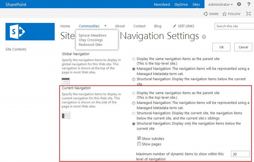
Figure 6-27. Current navigation configuration found on the Navigation Settings page
Remember that a site can only link to one term set for managed navigation, meaning that if you intend to have both global and current navigation use managed navigation, you will need to create your terms in your term set carefully and correctly configure your term properties.
Note To learn how to configure managed navigation, review the section “Using the Term Store for Navigation” earlier in this chapter.
As with the Top Navigation snippet, you can find the Vertical Navigation snippet in the master page Snippet Gallery (see Figure 6-28).
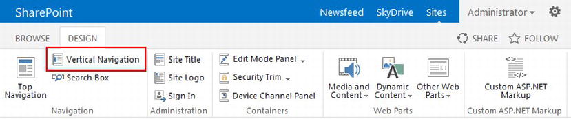
Figure 6-28. Vertical Navigation snippet in the master page Snippet Gallery
As with the Top Navigation snippet, quite a few properties are available for customizing the Vertical Navigation snippet, although the important properties include CssClass, as well as the static and dynamic levels properties. These properties provide similar functionality to the Top Navigation snippet. Once you have configured your snippet, you are ready to copy and paste the generated snippet code to either your master page or your page layouts, even if you wish to only have vertical navigation on specific pages.
Normally the current navigation snippet is added to the master page so that it can be shared across all pages in your site. For collaboration sites this is desirable, but for publishing sites, we might only want vertical navigation on particular page layouts. If you include the vertical navigation in the master page, then your custom page layouts that should not include the vertical navigation will have to hide it somehow. The common method is to use an inline style, but in a responsive framework, this can cause undesirable flickering as well as problems with grid columns. We address how to implement hiding a vertical navigation menu in a page layout in Chapter 7.
Another interesting aspect of the current navigation is the added ability in SharePoint 2013 for Focus on Content. In Figure 6-29 notice the new icon highlighted on the right. If you click this icon on a page using an OOTB master page, the current navigation should be hidden and your content area fills up the remaining space. Click the icon again and your current navigation should reappear. This “magic” is performed by SharePoint with the simple addition of the class ms-fullscreenmode added to the main <body> tag. You can utilize this OOTB ribbon function and the class added for you to hide and display your custom current navigation as well as other aspects of your site design.
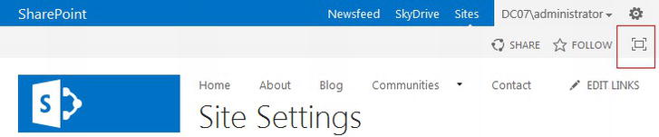
Figure 6-29. Focus on Content button in ribbon
Note To learn how to add the current navigation to a page layout as well as hide the current navigation in a page layout if the current navigation menu is included in the master page, refer to Chapter 7.
Breadcrumb Navigation
Breadcrumb navigation has been with us for a long time and its inclusion in web sites comes and goes with the trends. Breadcrumbs provide the ability to assist visitors with where they currently are on the site, and in particular how they got there. Breadcrumbs provide a quick representation of where the current page exists in the site structure of the site and where each parent node of the current page is displayed along with a link. See Figure 6-30 for an example of breadcrumb navigation.
Figure 6-30. Breadcrumb navigation
The obvious place to go looking for the breadcrumb snippet is the Snippet Gallery, but you will find there is not a breadcrumb snippet readily available. You need to create your own snippet from custom ASP.NET markup. This is an advanced topic that requires some understanding of ASP.NET controls.
To help you get started, you can use code and controls SharePoint provides out of the box. In particular code blocks are already provided in OOTB master pages such as seattle.master found in the /∼catalogs/masterpage library. If you open seattle.master and look for the breadcrumb ASP.NET markup, you will find the ASP.NET code shown in Listing 6-17.
Listing 6-17. ASP.NET Code From seattle.master That Generates Breadcrumbs
<SharePoint:AjaxDelta id="DeltaPlaceHolderPageTitleInTitleArea" runat="server">
   <asp:ContentPlaceHolder id="PlaceHolderPageTitleInTitleArea" runat="server">
      <SharePoint:SPTitleBreadcrumb
         runat="server"
         RenderCurrentNodeAsLink="true"
         SiteMapProvider="SPContentMapProvider"
         CentralAdminSiteMapProvider="SPXmlAdminContentMapProvider">
         <PATHSEPARATORTEMPLATE>
            <SharePoint:ClusteredDirectionalSeparatorArrow runat="server" />
         </PATHSEPARATORTEMPLATE>
      </SharePoint:SPTitleBreadcrumb>
   </asp:ContentPlaceHolder>
</SharePoint:AjaxDelta>
It would be nice if you could copy and paste this directly to our HTML master page, but you cannot because HTML master pages might not include ASP.NET controls. You must first convert this to a snippet.
- Open the Snippet Gallery for your master page.
- Click the Custom ASP.NET Markup icon in the ribbon.
- This will load the Create Snippets From Custom ASP.NET Markup. Paste the ASP.NET code from Listing 6-17 in the text box at the lower right of the page. Click Update to update the HTML Snippet.
- The HTML Snippet will update with the HTML-friendly code in Listing 6-18. You can now copy and paste this to your HTML master page.
- You can use these steps to quickly generate a snippet based on any ASP.NET markup.
Listing 6-18. HTML Snippet Generated by the Snippet Gallery for a Breadcrumb
<!--CS: Start Create Snippets From Custom ASP.NET Markup Snippet-->
<!--SPM:<SharePoint:AjaxDelta id="DeltaPlaceHolderPageTitleInTitleArea" runat="server">-->
<!--SPM:  <asp:ContentPlaceHolder id="PlaceHolderPageTitleInTitleArea" runat="server">-->
<!--SPM:    <SharePoint:SPTitleBreadcrumb runat="server" RenderCurrentNodeAsLink="true"
      SiteMapProvider="SPContentMapProvider"
      CentralAdminSiteMapProvider="SPXmlAdminContentMapProvider">-->
<!--SPM:      <PATHSEPARATORTEMPLATE>-->
<!--SPM:        <SharePoint:ClusteredDirectionalSeparatorArrow runat="server" />-->
<!--SPM:      </PATHSEPARATORTEMPLATE>-->
<!--SPM:    </SharePoint:SPTitleBreadcrumb>-->
<!--SPM:  </asp:ContentPlaceHolder>-->
<!--SPM:</SharePoint:AjaxDelta>-->
<!--CE: End Create Snippets From Custom ASP.NET Markup Snippet-->
If you add the HTML Snippet in Listing 6-18 to your custom master page, load a page in the browser, and view the source HTML, you will find a breadcrumb similar to Listing 6-19 or Listing 6-20. Notice that the separator image and spans are different between the two listings, as you have to provide special styling for each type of breadcrumb even though they both come from the same SPTitleBreadcrumb control. In particular in Listing 6-19, all breadcrumb nodes are contained within their own span, whereas in Listing 6-20 only the separator image is contained within its own span.
Listing 6-19. Rendered Breadcrumb Navigation: Type One With Some Properties Removed for Feadability
<span id="DeltaPlaceHolderPageTitleInTitleArea">
   <span>
      <a href="#"><img alt="Skip Navigation Links" /></a>
      <span>
         <a href="/_catalogs/masterpage/Forms/AllItems.aspx">Master Page Gallery</a>
      </span>
      <span>
         <img src="/_layouts/15/images/spcommon.png?rev=23">
      </span>
      <span>
         <a href="/_catalogs/masterpage/Forms/AllItems.aspx">Specter Group</a>
      </span>
      <a id="ctl00_PlaceHolderPageTitleInTitleArea_ctl00_SkipLink"></a>
   </span>
</span>
The HTML provided in Listing 6-20 will be most commonly found in Site Settings pages, whereas the HTML provided in Listing 6-19 will be common throughout content pages, lists, and libraries.
Listing 6-20. Rendered Breadcrumb Navigation: Type 2 With Some Properties Removed for Readability
<span id="DeltaPlaceHolderPageTitleInTitleArea">
   <a href="settings.aspx">Site Settings</a>
   <span>
      <span>
         <img src="/_layouts/15/images/spcommon.png?rev=23">
      </span>
   </span>
   Site Master Page Settings
</span>
To add a breadcrumb to the example master page we have been using throughout this chapter to produce the results in Figure 6-30, we must add Listing 6-17 to the master page as well as provide additional styling.
In Listing 6-21, we add the snippet from Listing 6-18 to our master page above our header’s search box.
Listing 6-21. Add Breadcrumb Snippet to Master Page
<header>
   <!--header container, row, logo, etc. removed-->
   <div class="span4">
      <div class="sp-breadcrumb">
         <!--CS: Start Create Snippets From Custom ASP.NET Markup Snippet-->
         <!--Snippet from Listing 6-18-->
         <!--CE: End Create Snippets From Custom ASP.NET Markup Snippet-->
      </div>
      <div class="searchbox">
         <!--search box snippet-->
         <!--end search box snippet-->
      </div>
   </div>
   <!--end header container removed-->
</header>
SharePoint provides OOTB styling for breadcrumbs but we want to ensure that the breadcrumb matches our branding. Listing 6-22 provides additional styles for the breadcrumb navigation. The styles help position the breadcrumb above the search box, modify the text and link colors to match our branding, and finally provide media queries to reshape the breadcrumb depending on the viewport.
Listing 6-22. Styles for Breadcrumb Navigation
/*target the right span in the header. Allows us to position breadcrumb*/
header .span4 {
   position: relative;
}
/*position the breadcrumb in the header*/
.sp-breadcrumb {
   display: block;
   position: absolute;
   right: 0px;
   top: 30px;
   color: #444;
   white-space: nowrap;
}
/*fix bootstrap image resize issue for seperator image*/
.sp-breadcrumb img {
   max-width: none;
   width: auto;
}
/*change links and text to match branding*/
.sp-breadcrumb a {
   color: #009899;
}
@media (max-width: 979px) {
   /*for tablets, descrease font size and move up with search box*/
   .sp-breadcrumb {
      font-size: 14px;
      top: 24px;
   }
}
@media (max-width: 767px) {
   /*for smaller devices, drop breadcrumb to its own line*/
   .sp-breadcrumb {
      position: relative;
      right: auto;
      top: auto;
      padding: 0px 10px;
   }
}
At this point your breadcrumb should look similar to Figure 6-30, although the separator image will be different. We now provide CSS to make two additional changes. The first modification we will make includes changing the separator image. The second change we will make is we want to hide the navigation for tablet and mobile views based on the Bootstrap model.
Change the Separator Image
To change the image that separates the breadcrumb hierarchical items, we can provide our own PathSeparatorTemplate to the SPTitleBreadcrumb control in Listing 6-18. Unfortunately this will not always work, as SharePoint renders the breadcrumb in different ways depending on the page, as we saw in Listing 6-19 and Listing 6-20. We fix this by providing a PathSeparatorTemplate as well as a separator class to the SPTitleBreadcrumb control as seen in Listing 6-23.
Listing 6-23. Breadcrumb Snippet With Separator Class and New Separator Template
<!--CS: Start Create Snippets From Custom ASP.NET Markup Snippet-->
<!--SPM:<SharePoint:AjaxDelta id="DeltaPlaceHolderPageTitleInTitleArea" runat="server">-->
<!--SPM:  <asp:ContentPlaceHolder id="PlaceHolderPageTitleInTitleArea" runat="server">-->
<!--SPM:    <SharePoint:SPTitleBreadcrumb runat="server" RenderCurrentNodeAsLink="true"
      SiteMapProvider="SPContentMapProvider"
      class="breadcrumb-separator"
      CentralAdminSiteMapProvider="SPXmlAdminContentMapProvider">-->
<!--SPM:      <PATHSEPARATORTEMPLATE>-->
<!--SPM:      <asp:Image id="BCSeperator" runat="server" GenerateEmptyAlternateText="true"
                        ImageUrl="/_catalogs/masterpage/img/breadcrumb-separator.png" />-->

<!--SPM:      </PATHSEPARATORTEMPLATE>-->
<!--SPM:    </SharePoint:SPTitleBreadcrumb>-->
<!--SPM:  </asp:ContentPlaceHolder>-->
<!--SPM:</SharePoint:AjaxDelta>-->
<!--CE: End Create Snippets From Custom ASP.NET Markup Snippet-->
To provide our own separator image for all breadcrumbs, we can use the styles provided in Listing 6-24. We can add additional styling that acts differently if the breadcrumb includes a wrapper span with a class of sp-breadcrumb-separator.
Listing 6-24. CSS to Change the Breadcrumb Separator Image
/*separator image*/
/*hide the OOTB separator image*/
#DeltaPlaceHolderPageTitleInTitleArea > span > span img{
   display: none;
}
/*a second-level span should only contain the separator, so provide our image*/
#DeltaPlaceHolderPageTitleInTitleArea > span > span {
   background: transparent url('../img/breadcrumb-separator.png') no-repeat 0 6px;
   margin: 0px 0px 0px 5px;
   width: 8px;
   height: 17px;
   display: inline-block;
}

/*if breadcrumb-separator container exists, we have to provide different styles*/
/*display, move image out of the way and provide a new background that uses our separator image*/
#DeltaPlaceHolderPageTitleInTitleArea > span.breadcrumb-separator > span img{
   text-indent: -9999px;
   overflow: hidden;
   background: transparent url('../img/breadcrumb-separator.png')
      no-repeat 0 6px;
   margin: 0px 5px;
   width: 8px !important;
   height: 17px !important;
   display: inline-block !important;
}
/*second-level span may include text or separator, so we need to reset its styles*/
#DeltaPlaceHolderPageTitleInTitleArea > span:first-child > span,
#DeltaPlaceHolderPageTitleInTitleArea > span.breadcrumb-separator > span {
   background: transparent none;
   margin: 0px;
   width: auto;
   height: auto;
   display: inline;
}
The first two styles provide an alternate separator image for pages that render the breadcrumb in HTML similar to Listing 6-20. The first style hides any img found within a span that is a direct descendant of DeltaPlaceHolderPageTitleInTitleArea. The second style allows for a direct descendant span of DeltaPlaceHolderPageTitleInTitleArea to be an inline block with a fixed width and height that has a background image set by the background property.
The next two styles provide overrides for those cases where the breadcrumb has spans surrounding each of the breadcrumb nodes as shown in Listing 6-18. The first of these two styles uses the separator image that SharePoint provided, but moves the images out of the way and provides a new background. The second style resets the breadcrumb spans to flow inline without set dimensions. Your breadcrumb should now look exactly like Figure 6-30.
Hide Breadcrumb Navigation for Tablet and Mobile Views
Although the breadcrumb navigation rendered by SharePoint is responsive friendly, as it will float and stack elements as the viewport width shrinks, what if we wanted to simply hide the breadcrumb navigation on mobile devices? You could use the style shown in Listing 6-25.
Listing 6-25. CSS to Hide the Breadcrumb Navigation in Tablet and Mobile Views
<style>
@media (max-width:979px) {
   #DeltaPlaceHolderPageTitleInTitleArea {
      display: none;
   }
}
</style>
Using media queries, you can create a media query that states that if the viewport in question is less than 980 pixels wide then apply the following styles, the styles in question being to hide the div container holding our breadcrumb navigation.
Footer Navigation
The footer navigation bar is normally not a particular snippet that you add to a master page, but rather a section in and of itself where you might place active as well as static links, content, contact information, a map, and so on. As an example, the Specter Group required a footer navigation bar that included common links, contact information, and a live Twitter feed, as highlighted in Figure 6-31.
Figure 6-31. Specter Group primary footer
Note Refer to Chapter 5 for an in-depth look at the footer and how to make it responsive.
We can see that much of the footer is actually used for social functions, which we cover in greater detail in Chapter 13, including how to include a Twitter feed. What we see in the rightmost column though is an extension of a navigation menu bar. Although these navigation items are static links not handled by SharePoint, we can use this type of space for important links that we want to provide on every page throughout our site, but are not important enough to take up valuable resources at the top of each web page.
Other common uses of footer bars and footer navigation include providing a space for an aggregated link farm for outside sites or space for disclaimers and use policies. You could even manage your footer navigation using managed metadata by using jQuery to parse navigation links from your primary or current navigation and including them in your footer navigation. You could also forego your top navigation or current navigation and use the Top Navigation or Horizontal Navigation snippets in your footer instead.
Summary
In this chapter we reviewed the new navigation structure provided in SharePoint 2013, that being metadata-driven navigation. This huge improvement over previous versions of SharePoint provides outstanding ability to modify and maintain a site’s navigation as well as share a navigation structure across multiple site collections. Once the managed metadata store is configured in the farm, a term set can be quickly created, utilized, and even customized in line with browser-based tools.
We then looked at the top navigation snippet, added this to a HTML master page and saw common methods of styling a SharePoint navigation menu. We reviewed how to make a horizontal navigation bar responsive as well as considered caveats for different methods. We finished with a look at additional forms of web site navigation, including vertical navigation, a breadcrumb, footer navigation, and a social toolbar.