
Making Your Master Page Responsive
The previous chapter walked us through importing an HTML prototype and its related branding assets into SharePoint 2013 using Design Manager. Now, what would you end up with? A newly branded site on one of the most powerful WCM platforms available on the market. It is a fairly impressive feat for a process that used to take expert SharePoint designers weeks or more to complete with previous versions of SharePoint.
Now that we’ve converted our design files using the SharePoint 2013 Design Manager, this chapter is going to take a standard master page and apply the core responsive web design principles that were discussed in Chapter 2. Before we dive into the actual work, we’ll share the benefits of creating your own CSS framework versus one that’s already been created. We then break down the process of adapting your master page to be responsive by splitting the work into major sections. Last but not least, we close this chapter by sharing solutions to some of the common issues when dealing with older browsers, SharePoint 2013 and responsive design principles.
Our Scenario
As stated in Chapter 3, Specter Group wishes to have a new public-facing web site built on the SharePoint 2013 platform that site visitors may access from any device, from desktops to smart phones. The decision was made to capitalize on responsive web design principles that would utilize only one branding effort, yet at the same time adapt to any viewport. A site design was created based on traditional web design practices and converted to a SharePoint 2013 HTML master page (Chapter 4). Specter Group further required that this be a responsive site, so we must convert the HTML master page’s HTML and CSS to use responsive design properties such as the fluid grid and flexible media.
One of the biggest challenges (perhaps even the biggest challenge) in responsive design is how a web site’s mobile layout can achieve content parity. Content parity is part of the W3C’s “One Web” philosophy, also known as thematic consistency of resource identified by a URI:
Whereby content should be accessible on a range of devices irrespective of differences in presentation capabilities and access mechanism.
—Mobile Web Best Practices 1.0
(http://sprwd.com/45dij34)
This quote says that it is alright to optimize the presentation of content as long as the content remains accessible in some way, shape, or form.
Rome wasn’t built in a day, and neither are web sites. You understand that. Over the years, we’ve all gone through the painstaking process of building web sites from scratch; learning about the different CSS and JavaScript classes, controls, and constructs. Try out hacks and invent some of our own. We’ve even learned to love some of the plug-ins and frameworks delivered by others. This process has helped us understand how to build better web sites. Looking at what others use to build their own sites has also taught us how to include tricks into our own personal framework.
We wanted to write a book that would give everyone, beginners as well as experienced designers, an opportunity to build a responsive web site together, no matter where you were in your career or your project. Our hope is to educate you on the process that we felt would give you a breadth of experience as well as share some of the lessons learned.
In this chapter, we are going to continue our journey by converting a fixed-width design that treats nondesktop users as second-class citizens to one that treats every browser regardless of device as a first-class citizen. Here’s to the web, where we all stand up and demand equality regardless of our choice in device, operating system, resolution, or browser: One web!
Responsive Design in Principle
Responsive web design was inspired by Nicholas Negroponte’s concept of responsive architecture, in which the structure changes its shape, form, color, or character responsibly based on environmental conditions. Responsive web design is a “write once, run everywhere” style of building web sites. How you start to build it is just as important as what you end up with. As they say, before you know where you’re going, you have to know where you came from.
We start with a look at different approaches to building a responsive site. In particular, there are two approaches you can take to converting your design to become responsive: starting from scratch, or using an existing framework.
Building a Responsive Site from Scratch
You could take the approach of going through the tedious task of creating your own responsive framework. Taking this approach gives you greater flexibility to change it easily whenever design preferences or requirements change. The most important value that comes out of building your own CSS framework is that instead of spending time learning someone else’s framework, you focus on learning something more valuable: CSS specifications. Your own design and thus code would be optimized for your specific solution, but every time you want to add another feature, you would have to build it from scratch.
If this is your first foray into designing a responsive site, particularly one built on SharePoint 2013, we highly recommend you hold off on building your own responsive framework from scratch, primarily because of the effort involved. There’s no point in building a perfectly optimized solution that is three months too late. There are many benefits to building your own, but this book isn’t focused on helping you build your own framework. The goal for this book is about providing value and to get you up to speed quickly on building a responsive web site in SharePoint 2013. In the next section, “Leverage a Responsive Framework,” we have a look at our second option, which builds on leveraging a preexisting framework.
If you are set on creating your own responsive framework, or simply do not want to use any framework and just code a fluid grid that contains your content, we would like to give you a few recommendations. As a starting point we’d recommend dividing your style sheets into multiple files. This way you can build your style sheets one step at a time. Here’s a sample of how you could break down the style sheets:
- reset.css: Includes CSS to reset all padding, margins, and border values as each browser treats the box model differently.
- base.css: Includes the core styles that will be used throughout the site.
- typography.css: All styles that are related to text styles, header tags, and so on.
- layout.css: All styles related to the structure of the page.
- form.css: All styles related to forms.
- table.css: All styles related to tables.
- browser.css: You can actually create a separate CSS file for each browser.
- print.css: Styles used when the visitor wants to print the page.
One of the things that we truly enjoyed when we first started designing web sites was building the underlying framework from scratch. In the long run, the process would take us longer but it helped us to understand the plumbing of how things fit together. We also didn’t inherit bugs or flaws that were created by someone else. On the flip side, though, we might miss bugs and flaws in our design or implementation that might have been handled or solved in an existing framework.
This again is advice for those of you who are adventurous and learning. Here are a few tips to consider before moving your style sheets into production:
- Combine them into one style sheet. This will improve performance, as the browser only has to download one file.
- Test on browsers. If your project does not allow you to do usability testing, at least test your solution in the most popular browsers that you expect will be used on your web site.
- Follow specifications. The general approach is to first follow the CSS specifications and then look at best practices that make sense for your site.
- Clean code. Ensure that your code is clean, well structured, and properly documented. It’ll go a long way toward troubleshooting any errors.
- Validate your code. W3C provides a validation service, http://validator.w3.org, to ensure the technical quality of web pages. It’s a first step to check your site for well-formed markup, which helps with browser compatibility and site usability.
Leverage a Responsive Framework
We want to focus on showcasing the capabilities of responsive design, leveraging a preexisting framework that would get us started quickly. There are quite a few prebuilt and well-supported responsive frameworks and most any of them could be converted to work with SharePoint 2013. The following sections list some of the more popular CSS frameworks that have helped us rapidly develop web sites in the past. These frameworks have been helpful because they eliminate our need to re-create a feature-rich structure for every web site project, and to top it off, responsive layouts are a part of each framework.
Zurb Foundation (http://foundation.zurb.com/) is a 12-column, future-friendly responsive grid framework that includes dozens of styles and elements to help you quickly put together clickable prototypes. Foundation lets you quickly put together page layouts for mobile devices and the desktop. The grid is built to create a rock-solid experience on all kinds of devices with the exact same markup. Foundation has a simpler, less bloated feel to it, compared to the other frameworks, which we really appreciate. It really is amazingly easy to download it and start turning out web pages in no time.
Foundation includes a download customization tool that we can use to customize the foundation framework to only include features that we want. This allowing us to have an even leaner framework geared around our specific needs. There are example demos as well as extensive online documentation and a good size user-base.
Skeleton (http://www.getskeleton.com/) is a small collection of CSS and JavaScript files that has built its foundation on a 960-pixel-wide grid. It seamlessly scales down to downsized browser windows, tablets, and mobile phones (in both landscape and portrait). Skeleton is fairly lightweight and is primarily used for building responsive web sites. Its focus is to provide a responsive framework that is mobile-friendly. The boilerplate template is appealing if your web site is light on features or you want a bare-bones framework you can build on.
Skeleton is so lean to begin with that there are no automated framework customization tools and the online documentation is not a full as Zurb Foundation. There is a sizable user base, but a smaller one than for Foundation at the time of this publication.
Bootstrap from Twitter (http://twitter.github.com/bootstrap/) is a front-end CSS toolkit for rapidly developing web applications. It is a collection of CSS and HTML conventions.
This framework is a Swiss Army knife for developers, as it contains dozens of tools and utilities. Depending on your individual project, some you’ll find very useful and others you’ll never touch. Bootstrap is specifically built to be used for quickly building sites as well as giving you the opportunity to make it your own. Bootstrap provides a breadth of features that makes it easy for any novice to leverage its features and build a site fairly quickly.
A full download of the Bootstrap framework is quite large and most likely will include tools, plug-ins, and other components you will never use. There is a very powerful online customization tool that gives you options galore, allowing you to strip down Bootstrap to just the essentials. The Bootstrap site contains ample documentation and the user base is by far the most widespread of the different frameworks. There are quite a few additional plug-ins and add-ons that have been created by the Bootstrap community, most of which can easily be ported to Bootstrap.
It is for these reasons that we selected the Bootstrap framework as the recommended framework for this book. This does not mean that the other frameworks won’t work for your project, nor does it mean that you cannot follow along with the web design process we continue throughout this book. Almost all popular frameworks contain a grid with columns, so you will be primarily replacing Bootstrap markup with your framework markup as you work through our examples.
Additional Important Frameworks
Besides taking advantage of CSS frameworks, you also want to take advantage of JavaScript frameworks. They can dramatically improve your development time, as many of the problems we will face have been faced by others and they have provided solutions.
jQuery has become a major tool for any web development nowadays. It’s the most popular JavaScript library not just because it contains functionality to navigate the DOM, create animations, and handle events, but it also allows you to create custom plug-ins on top of jQuery. We use jQuery extensively throughout our responsive development process. You can download the latest jQuery library at (jquery.org) .
Modernizr is a favorite JavaScript framework and one that is widely used by the development community. Modernizr is a powerful JavaScript library that provides web designers a quick and lightweight library to detect features available in browsers, such as CSS3 and HTML5 features. As an example, we can use Modernizr to detect if a browser allows for the CSS3 “transition” style. If “transition” is available, using additional CSS alone, we can provide additional CSS markup that will only be implemented by those browsers that support the style.
Keep Learning
Once you start looking at existing frameworks you will start seeing the value of leveraging the expertise of experienced designers and developers in your projects. Typically, hundreds if not thousands of developers and designers have spent time testing the frameworks, reporting bugs, and providing fixes. Frameworks are a product of the community’s efforts and you’d be hard pressed not to consider this an option.
Bootstrap was selected as the primary CSS framework for our demonstrations as it provided more features, documentation, and community support than the other frameworks. The framework encompasses quite a few features, and it does provide the ability to download only what you need for your project.
These frameworks are here to help ease the learning curve, so why not use them? After all, you might learn a thing or two about the way these frameworks leverage CSS and JavaScript. We recommend that you add these to your arsenal of development tools. By leveraging numerous frameworks and features, you will be able to convert and build a responsive site relatively quickly.
Now that we’ve looked at the two different development strategies, let’s dive into the process of converting a fixed-width HTML master page to a fully responsive HTML master page.
Be Like Water
Adapting a general web site to be responsive can be a fairly easy task if your original HTML prototype already leveraged Bootstrap. This would not be unusual because of the popularity of Bootstrap, but we must assume our design team didn’t know any better and gave us an HTML prototype built on no framework. Therefore, if our HTML prototype did not leverage Twitter Bootstrap, and thus our HTML master page did not either, we might need to rewrite some of the HTML markup to take advantage of the framework.
We’ve distilled the process into three primary steps to integrate a framework and make your existing fixed-width designs responsive:
- Prepare your design. Download the framework’s files and add them to your solution.
- Leverage the grid system. Adapt your design to follow the grid system, one container at a time.
- Make it responsive. Take advantage of the framework to ensure that it’s responsive.
Follow along as we take the steps to device freedom.
Prepare Your Design for a Framework
To prepare your design, you need to download your framework files, in this case the Bootstrap files, and add them to your solution.
Launch your browser and open http://twitter.github.com/bootstrap/. To download the entire Bootstrap framework, click the large Download button in the middle of the home page, or our recommendation, click Customize in the top navigation menu so that you can build your own download package. On the Customize and Download page, click Toggle All found just to the right of “1. Choose components.” This will deselect all the components that are a part of Bootstrap so that we can add back in only those that we want. For the bare minimum, we suggest the following components, as seen in Figure 5-1.
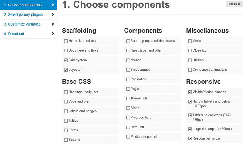
Figure 5-1. Selected minimal Twitter Bootstrap CSS framework components
- Scaffolding
- Grid system
- Layouts
- Responsive
- Visible/hidden classes
- Narrow tablets and below (<767px)
- Tablets to desktops (767-979px)
- Large desktops (>1200px)
- Responsive navbar
You might want to also include the following additional components.
- Scaffolding
- Normalize and reset
- Body type and links
- Components
- Button groups and dropdowns
- Navs, tabs and pills
- Navbar
- Breadcrumbs
- Pagination
- JS components (all of them)
Next, scroll down to the jQuery plug-ins, and click Toggle all. We are not planning on using any of the Bootstrap jQuery plug-ins in this book, but you might want to include some of them so that you can use them throughout your web site build out.
 Note Before you add a component or jQuery plug-in, do yourself a favor and research that particular component or plug-in first and try to determine if you are actually going to use it or not. If you do not think you are going to use it, don’t include it.
Now go ahead to the bottom of the page and click Customize and Download. If you did not customize the Twitter Bootstrap download as documented earlier, you’d be adding a lot of unnecessary files and page weight to your project. We can get a minimal very feature-rich custom bootstrap.min.css down to 22 kb (370 kb smaller than the full download).
Note By clicking the big button that says Download Bootstrap, you add a total of 392 KB to your branding solution, based on Twitter Bootstrap version 2.3.0. Later in this chapter, we review how you can take a look at performance.
Add a Framework to Your HTML Master Page
Adding your framework assets, most likely consisting of at least a CSS style sheet or two, possibly some images, and a JavaScript file or two, should follow the same process we used in Chapter 4.
Note Refer to Chapter 4 if you wish to review how to connect to your SharePoint site using WebDAV. For the following walkthrough, the master page and associated files are stored in the Master Page Gallery SpecterGroup directory (i.e. /_catalogs/masterpage/SpecterGroup/).
With Bootstrap, once you extract the framework package that you downloaded in the previous section to your workstation, open your SharePoint Master Page Gallery in your preferred method, be it Dreamweaver, SharePoint Designer, Windows Explorer, or something else. We recommend adding your framework assets to the same location as your custom HTML master page, in our case /_catalogs/masterpage/SpecterGroup. For our example of Bootstrap, Bootstrap files should be fairly easy to move into our branding solution folder structure, as our solution from Chapter 4 has a similar directory naming convention to how Bootstrap is structured (the css folder contains style sheets, the js folder contains JavaScript files, and the img folder contains images). You might find it easier to match your branding solution to a framework’s directory structure rather than the other way around.
Tip Once you have uploaded your framework assets to your SharePoint Master Page Gallery, do not forget to publish a major version of all new files.
Alternative Design File Deployment Locations
Although best practices include deploying all design files to the Master Page Gallery, there are other locations that you still might consider for your particular solution. We are only talking about your design files, such as your style sheets, images, and JavaScript files, though, as your master pages and page layouts (Chapter 7) should always be placed in your Master Page Gallery.
As mentioned in Chapter 4, you could also use your site collection’s Style Library to house design files, although that is not recommended because the Style Library is geared for only your root web in your site collection, whereas each site and subsite could have its own Master Page Gallery. If you intend to have only one master page for an entire site collection, the Style Library might be a good location for your design files.
You may also deploy design files directly to the SharePoint server file system; that is, the SharePoint hive. Your SharePoint hive, often referred to as the 15 hive for SharePoint 2013, is a folder structure found on each SharePoint server in your farm, normally located in C:Program FilesCommon FilesMicrosoft SharedWeb Server Extensions15. Access to this folder normally requires server Administrator privileges as well as access to the server console itself. Deploying design files to the proper Layouts folder, C:Program FilesCommon FilesMicrosoft SharedWeb Server Extensions15TEMPLATELAYOUTS, might require custom code. This option affects the entire server and all web applications that are hosted on that server. Any SharePoint site can use any design file that is deployed to the Layouts directory. The advantage of the Layouts directory is that the information is stored in the file system and not in a particular web applications database. The obvious downside is that it might be difficult to customize files stored in the Layouts folder as well as much more difficult to package and redeploy your branding solution.
Tip Refer to Chapter 4 for a review of design packages, a new feature of SharePoint 2013 that allows you to easily create and deploy branding solutions.
Link an HTML Master Page to a Framework
At this point we have added our framework files (i.e., the Bootstrap framework), into SharePoint, so now let’s update our solution to reference our framework. With your web editor of choice, such as Dreamweaver, open your HTML (i.e., /_catalogs/masterpage/spectergroup/SpecterGroup.html) for editing. You must add a <link> to your framework style sheet, bootstrap.min.css, which we placed in the /_catalogs/masterpage/spectergroup/css folder, somewhere in the <head> section of your HTML master page. We recommend adding the link to your framework before any other style sheets you might have already included, allowing you to override the framework if you need to instead of having the framework override your custom styles.
In Chapter 4 we assumed the HTML prototype properly links to a style sheet using the common <link> tag, but with SharePoint there are actually three ways in which SharePoint designers can add references to style sheets.
Use the SharePoint:CssRegistration Control
The SharePoint:CssRegistration server control generates a <link> element into the resulting HTML page that applies the specified style sheet. This has benefits over the HTML markup, as it gives you control over the order in which a CSS style sheet is applied (before or after other CSS files). This is the same way we could link to a style sheet with SharePoint 2010 sites, although with HTML master pages we must use the Design Manager Markup. Listing 5-1 shows valid methods in which to use a SharePoint:CssRegistration control in a HTML master page (or HTML page layout, refer to Chapter 7). Invalid or non-recommended ways to use a SharePoint:CssRegistration control are shown in Listing 5-2.
Listing 5-1. Vaild Snippet Markup for SharePoint:CssRegistration Control
<!--MS:<SharePoint:CssRegistration Name="/_catalogs/masterpage/spectergroup/css/bootstrap.css"
runat="server">-->
<!--ME:</SharePoint:CssRegistration>-->
<!--MS:<SharePoint:CssRegistration Name="/_catalogs/masterpage/spectergroup/css/bootstrap.css"
After="Themable/corev15.css" runat="server">-->
<!--ME:</SharePoint:CssRegistration>-->
<!--SPM:<SharePoint:CssRegistration Name="/_catalogs/masterpage/spectergroup/css/bootstrap.css"
runat="server" />-->
<!--MS:<SharePoint:CssRegistration
Name="<% $SPUrl:∼sitecollection/_catalogs/masterpage/spectergroup/css/bootstrap.css %>"
After="Themable/corev15.css" runat="server">-->
<!--ME:</SharePoint:CssRegistration>-->
Listing 5-2. Invalid Snippet Markup for SharePoint:CssRegistration Control
<!--MS:<SharePoint:CssRegistration
  Name="<% $SPUrl:∼sitecollection/_catalogs/masterpage/spectergroup/css/bootstrap.css %>"
  After="Themable/corev15.css" runat="server">-->
<!--ME:</SharePoint:CssRegistration>-->

<!--MS:<SharePoint:CssRegistration Name="css/bootstrap.css" runat="server">-->
<!--ME:</SharePoint:CssRegistration>-->

<!--SPM:<SharePoint:CssRegistration
  Name="<% $SPUrl:∼/_catalogs/masterpage/spectergroup/css/bootstrap.css%>" runat="server" />-->

<!--SPM:<SharePoint:CssRegistration Name="/_catalogs/masterpage/spectergroup/css/bootstrap.css%>"
  runat="server"></SharePoint:CssRegistration>-->
Tip Refer to Chapter 4 for a review of Design Manager Markup (i.e., snippets).
In Listing 5-1 we see how we can use <!—MS:--><!—ME:--> blocks as well as the <!—SPM:--> block. We can also see how we can use the CssRegistration control After property to specify a style sheet after which this style sheet should always load. Also note, though, that we always have to provide a full path to the style sheet.
In Listing 5-2 we see that we should not provide a relative URL to the style sheet, nor can we use <% SPURL:∼sitecollection/ ...%> to provide a variable path based on the site collection location. Further, when we use the <!—SPM:--> block, the closing tag must be included in the opening tag. If you intend to create redeployable design packages, you will find it best to use the SharePoint:CssRegistration control with <% SPURL:∼sitecollection/ ...%> as this will allow a CSS style sheet to be accessible no matter the location of the site collection.
Use an Alternative CSS URL
We still have the ability to set one Alternate CSS style sheet via Site Settings (Site Settings  Look and Feel Master Page). This approach allows site administrators to lock down one specific style sheet, but only one style sheet. This is not practical when the customizations to the design are not just style based, typically covered by a CSS file, versus structural changes, which is where master pages and page layouts come into play.
Use the HTML <link> Tag
The HTML <link> tag is generally the easiest way to link to a style sheet with HTML master pages. It does not take advantage of any benefits that SharePoint’s server tags provide such as caching, control over cascading, or access to dynamic CSS file paths. On the plus side, SharePoint will handle the directory path for us assuming that the style sheets are in a subdirectory of the HTML master page. Refer to Listing 5-3 for an example.
Listing 5-3. Standard <link> Tag
<link rel="stylesheet" href="css/bootstrap.min.css" />
The Alternative CSS URL provides a less than ideal method to link to a framework style sheet, although the SharePoint:CssRegistration control would be okay if we used a name with a value of <% SPURL:∼sitecollection/ ...%>. Because the SPURL name is less clear than a <link> tag, and SharePoint will handle the full href path to our style sheet in HTML master pages with a <link> tag, the <link> tag is our preferred method to move forward. In our HTML master page we will find our other links to style sheets and add our new link just before them. In Listing 5-4 we can see a portion of our new <head> section with a link to our framework added, which is no different than adding a general style sheet reference in a generic HTML file.
Note Depending on how you downloaded your framework, you might have a framework style sheet and another style sheet to provide responsive functionality. In Listing 5-3 we link to one custom Bootstrap style sheet that contains the primary framework as well as responsive overrides. In Listing 5-4 you can see how we instead link to the entire Bootstrap framework as well as Bootstrap’s second “responsive” style sheet. We recommend a custom Bootstrap framework as linked to in Listing 5-3, but linking to the original, full Bootstrap might be helpful during development.
Listing 5-4. HTML to Reference Framework Style Sheet in <head>
<head>
  <!--beginning removed for simplicity-->
  <!--DC:Specter Group Bootstrap Version-->
  <meta name="description" content="" />

  <!--Our framework stylesheet-->
  <link rel="stylesheet" href="css/bootstrap.css" />
  <link rel="stylesheet" href="css/bootstrap-responsive.css" />

  <!--originally included stylesheets-->
  <link rel="stylesheet" href="css/superfish.css" />
  <link rel="stylesheet" href="css/nivo-slider.css" />
  <link rel="stylesheet" href="css/isotope.css" />
  <link rel="stylesheet" href="css/elements.css" />
  <link rel="stylesheet" href="css/style.css" />
  <!-- Modernizr enables HTML5 elements & feature detects for optimal performance.
    Include html5shiv 3.6. Our version is a custom build.
    Create your own custom Modernizr build:www.modernizr.com/download/-->
  <script src="js/modernizr-2.6.2.custom.js">//<![CDATA[//]]>
  </script>
  <!--remaining head bloc removed for simplicity-->
</head>
By including these references, we are giving our site the opportunity to take advantage of all the hard work that’s been put into Bootstrap. What impact does this have now though? With the current addition of your framework style sheet, there will likely be little visual change. However, as you start browsing the site, you’ll notice some issues here and there. A common issue with many frameworks including Bootstrap and in particular Bootstrap’s Responsive add-on is that many SharePoint images and icons might break. The ribbon might start breaking (see Figure 5-2) and many fonts, content, and form elements could look incorrect. Every framework is different and its element resets might cause different issues. We view common SharePoint/Bootstrap conflicts in the section “Fix Common Responsive Issues with SharePoint” later in this chapter.
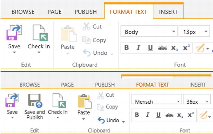
Figure 5-2. The top image shows how the ribbon styling looks without any custom styles and the bottom image shows how the ribbon looks after custom styling is applied
We’ve included the reference to our framework but we haven’t changed our design files to take advantage of it fully. Let’s do this next.
Bootstrap, like many other CSS frameworks, takes advantage of grids, which allow you to stack content elements on top of one another as well as next to each other. This grid system provides web designers with a structured approach to design. Previously, web site developers used HTML tables to design web sites. In today’s design world, tables for layout are considered obsolete. There were rendering issues across different browses, they provided too much baked-in “style” with the HTML itself, which is a big no-no, and finally they do not scale well for mobile devices. It made sense for the web development community to look for something to replace them.
The way any grid system works is that containers are stacked horizontally. Each single container contains one or more rows and each row contains one or more columns. What really gives the grid-based design flexibility is that you can include a container inside a column. Most grid frameworks include this functionality so now a column can have its own set of rows and columns. Refer to Figure 5-3 for an example of containers that contain rows and columns.
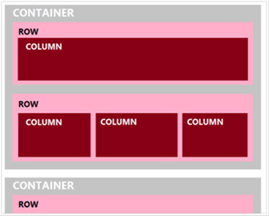
Figure 5-3. Sample grid with containers, rows, and columns
With Bootstrap’s fixed-width grid system, each row container allows up to 12 columns with a total width of 940 pixels. Each column’s width is 60 pixels and there’s 10 pixels of padding on either side of each column, thus 20 pixels of padding between any two columns. Figure 5-4 shows how this works.
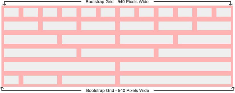
Figure 5-4. Bootstrap’s grid system based on 60-pixel-wide columns
Note Although the fixed container is 940 pixels wide, with the Bootstrap responsive features included the grid will adapt between 724 and 1,170 pixels wide. For viewports less than 767 pixels wide, the columns instead stack vertically and become fluid to fill up the entire width of the viewport.
Keep in mind that a CSS grid is essentially built on the row and span (column) methodology. To implement a grid using CSS, the steps are as follows.
- Create a div container that will hold all your markup inside of it. This typically is in the form of a primary div such as <div class="container">...</div>.
- Inside the div container, start creating your markup using a series of row containers.
- Within each row, create one or more span (column) div containers as well as nested rows to break a column into even more rows and columns.
Given that Bootstrap uses a 12-column grid, make sure that each row you create, including nested rows with columns, has a total of 12 spans (columns).
In Listing 5-5 we create a simple Bootstrap-driven grid that has two rows. The first row will have one column that spans the length of 12 column units. The second row will have two columns, the first column spans the length of 3 column units and the second column spans the length of 9 column units.
Listing 5-5. Sample Bootstrap Grid with Two Rows
<div class="container">
  <div class="row">
    <div class="span12">
      Row 1 - column 1
    </div>
  </div>
  <div class="row">
    <div class="span3">
      Row 2 - column 1
    </div>
    <div class="span9">
      Row 2 - column 2
    </div>
  </div>
</div>
As long as you ensure each row’s set of column(s) spans a total of 12 column units, you’re in good shape. The key is to realize that you can build simple and quite complex layouts using this grid system that combines multiple containers, multiple rows, and multiple spans.
Tip To learn more about the Bootstrap scaffolding, visit the Bootstrap documentation at http://sprwd.com/d73xauy for more examples, as well as a deeper look at the underlying HTML.
Add Bootstrap to an HTML Master Page
Updating an HTML master page to fully utilize a grid-based framework can be difficult without a well-laid plan. The best way to describe the process is for us to go through our sample Specter Group solution. Remember that most popular grid frameworks use similar tagging so the methodology would be similar. We go through our HTML master page we created in Chapter 4 and recently updated in the earlier section, “Prepare Your Design for a Framework,” and now transform the HTML to leverage the Bootstrap framework, section by section.
Follow along and you can apply the same principles to convert your designs to use any framework.
Tip You can download the finished source code for this conversion as well as all source code created in this book at http://sprwd.github.io/BookSourceCode/. Or check out a working demo of the converted HTML master page in a Cloudshare virtual machine at http://sprwd.com/sprwd-cs-demo.
Divide an HTML Master Page into Rows and Columns
Our approach to converting our markup over to Bootstrap, or any framework for that matter, will be to divide and conquer. We’ll start with the containers and then we’ll split the design into rows. Once we’ve addressed that, we’ll split each row into columns.
The first step is to divide the design visually into major components. Previewing our master page from Chapter 4, we can see the following major components:
- Header: Contains the Specter Group logo, tagline, search, and the social media drop-down list.
- Top Navigation: Contains the home button, navigation items, registration, and login icons.
- Main Content: This will vary based on the page layout that we are on.
- Footer: Contains the About Us, Twitter News, Recent Posts, Copyright, and Legal related links.
By starting here, we can convert this design over to Bootstrap fairly quickly and have a working prototype.
What we’d want to do is go through each major component’s div container and add <div class="container">...</div> around the content. Once you’ve done that, you’ll want to look at each container and split that into rows and columns. Because we are dealing with only the master page at this time, each container (Header, Top Navigation, Main Content, and Footer) will map over well to individual rows. See Figure 5-5.
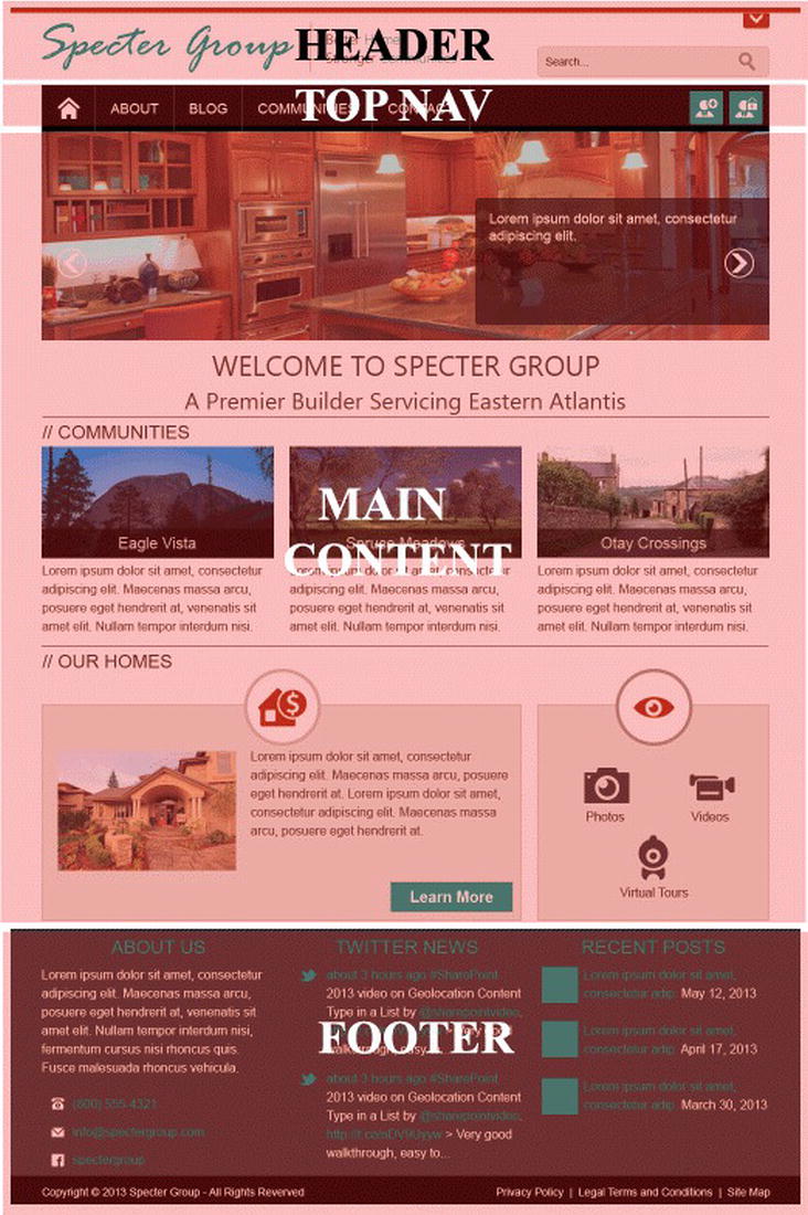
Figure 5-5. Specter Group home page split into major components
For each row, you’ll want to split it into columns, as long as the number of columns totals 12 for each row. In Figure 5-6 you can see visually that each row of columns is split to provide a sum total of 12. If our HTML markup follows a grid-based design, the conversion over to Bootstrap should work fairly painlessly.
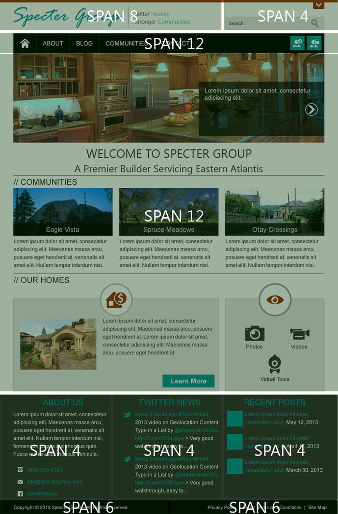
Figure 5-6. Specter Group home page split into rows and columns
Note Notice in Figure 5-6 the main content area is one column with a span of 12. We look at page layouts in more detail in Chapter 7.
In Listing 5-6 we can see the original HTML structure from our HTML master page in Chapter 4, although much of the “content” has been removed for the sake of simplicity.
Listing 5-6. Type HTML Structure without a Grid Framework
<body>
   <div id="s4-workspace">
      <div id="s4-bodyContainer">

         <!-- HEADER -->
         <header>
            <!-- header wrapper -->
            <div class="wrapper cf">...</div>
            <!-- ENDS header wrapper -->
         </header>
         <!-- ENDS HEADER -->

         <!-- nav -->
         <nav id="topnav">
            <!--navigation wrapper-->
            <div class="wrapper cf">...</div>
            <!--end navigation wrapper-->
         </nav>
         <!-- ends nav -->

         <!-- MAIN -->
         <div role="main" id="main">
            <!--Main content wrapper-->
            <div class="wrapper cf">...</div>
            <!--end Main content wrapper-->
         </div>
         <!-- ENDS MAIN -->

         <footer>
            <!-- wrapper -->
            <div class="wrapper cf"></div>
            <!--end wrapper-->
            <!-- bottom footer-->
            <div class="footer-bottom">
               <div class="wrapper cf"></div>
            </div>
            <!--end bottom footer-->
         </footer>
      </div>
   </div>
</body>
Now that we have seen visually how we want to divide our page and understand the process of taking any design and converting it to a grid-based framework, we can move into the details part of this chapter. We walk through breaking up each primary section in Listing 5-6 one section at a time. A few quick notes are in order, though. We will not touch the SharePoint provided s4-workspace or s4-body-Container divs, as all SharePoint pages will need those. Second, we leave the HTML5 tags, <header>, <nav>, and <footer> as larger wrappers. This will not cause a problem with our grid as long as we leave the width set to “auto,” which is the default, for these three tags.
Bootstrap and the Header
Referring to Listing 5-6, we can find the <header> block near the top of the document. We can see it has one primary wrapper div. Let’s look at more of the <header> HTML in Listing 5-7.
Listing 5-7. Header Code After Design Manager Conversion
<header>
   <!-- header wrapper -->
   <div class="wrapper cf">
      <div id="logo">
         <!--logo snippet-->
      </div>
      <div class="tagline">
         <!--h2 tag lines-->
      </div>
      <div class="searchbox">
         <!--search box snippet-->
      </div>
      <div class="social cf">
         <!--social icons-->
      </div>
   </div>
   <!-- ENDS header wrapper -->
</header>
What we need to do is change the class attribute value of the first div container, from wrapper cf to container to provide for our fixed container. For each container, we must have a row container, so we will add a new div, <div class"row"> right after the <div class="container">. We’ll want to close the row container by adding a </div> before the end of the container div.
Now that we’ve wrapped the logo, tagline, searchbox, and social containers in Bootstrap’s container and row components, it’s time to wrap each of the smaller components into columns. The logo and tagline will be wrapped around by <div class="span8"> container and the searchbox will be wrapped around by <div class="span4">.
What about the div, social? We are throwing a curve ball here. You can add containers into a row if you want that will not be a span, but only if that div has a position of absolute or fixed, because we need to take the additional div outside of the flow of a row’s columns. In our case, <div class="social cf"></div> has an absolute position and thus will not ruin the flow of the columns.
Refer to Listing 5-8 for the updated <header>.
Listing 5-8. Header Tag Converted to Leverage Bootstrap Framework
<header>
   <div class="container ">
      <div class="row ">
         <div class="span8">
            <div id="logo">
               <!--logo snippet-->
            </div>
            <div class="tagline">
               <!--h2 tag lines-->
            </div>
         </div>
         <div class="span4">
            <div class="searchbox">
               <!--search box snippet-->
            </div>
         </div>
         <div class="social cf">
            <!--social icons-->
         </div>
      </div> <!--end row-->
   </div> <!--end container-->
</header>
Bootstrap and Navigation
Although we dive much deeper into navigation in Chapter 6, let’s see how to prepare the main navigation container to be Bootstrap friendly. Before we make changes to our Top Navigation, let’s have a quick look at the code in Listing 5-9.
Listing 5-9. Top Navigation Code after Design Manager Conversion
<nav id="topnav">
   <div class="wrapper cf">
      <!--nav snippet-->
      <div class="nav">
         <!--Navigation List-->
      </div>
      <!--end nav snippet-->
      <!--MS:<SharePoint:SPSecurityTrimmedControl runat="server"
            AuthenticationRestrictions="AnonymousUsersOnly">-->
         <div class="site-access cf">
            <!--Site access links-->
         </div>
      <!--ME:</SharePoint:SPSecurityTrimmedControl>-->
   </div>
</nav>
As we saw from Figure 5-6, the top navigation should be wrapped around in a single container, with a single row and span (12 column units wide), as shown in Listing 5-10.
Listing 5-10. Nav Tag Converted to Leverage Bootstrap Framework
<nav id="topnav">
   <div class="container ">
      <div class="row ">
         <div class="span12">
            <div class="navbar navbar-inverse">
               <div class="navbar-inner">
                  <div class="container">
                     <a class="btn btn-navbar" data-toggle="collapse" data-target=".nav-
                         collapse">
                        <span class="icon-bar"></span>
                        <span class="icon-bar"></span>
                        <span class="icon-bar"></span>
                     </a>
                     <div class="nav nav-collapse collapse">
                        <!--nav snippet-->
                     </div>
                     <!--end class nav-->
                  </div>
                  <!--end container-->
               </div>
               <!--MS:<SharePoint:SPSecurityTrimmedControl runat="server"
                     AuthenticationRestrictions="AnonymousUsersOnly">-->
                  <div class="site-access cf">
                     <!--site access links-->
                  </div>
               <!--ME:</SharePoint:SPSecurityTrimmedControl>-->
            </div>
         </div><!--end span 12-->
      </div> <!--end row-->
   </div> <!--end container-->
</nav>
Note Listing 5-10 provides further framework code to utilize Bootstrap Navbar components. Refer to Chapter 6, or you can learn more about Bootstrap Navbars at http://sprwd.com/zdpdxn.
Bootstrap and Main Content
The Main Content of a particular page will be defined by page layouts (Chapter 7) or system pages that SharePoint provides for us. This being the case, our HTML master page only needs to provide us one primary container, row, and column. Refer to Listing 5-11 for the original HTML that utilized a wrapper and Listing 5-12 now using the Bootstrap framework.
Listing 5-11. Main Content Code after Design Manager Conversion
<div role="main" id="main">
   <div class="wrapper cf">
      <!--main content placerholder-->
   </div>
</div>
Listing 5-12. Main Content Converted to Leverage Bootstrap Framework
<div role="main" id="main">
   <div class="container ">
      <div class="row ">
         <div class="span12">
            <!--main content placerholder-->
         </div>
      </div>
   </div>
</div>
There are a few trade-offs that we are making in Listing 5-12. In particular, we are assuming that there will not be a Quick Launch (Vertical Navigation) in the HTML master page. This can be problem for an HTML master page that you intend to use as a System (Default) master page as well as a Site (Custom) master page. System pages often require the Quick Launch for additional navigation and simply removing it from the master page might cause those system pages to no longer function correctly.
One solution would be to divide the “main” row into two columns, the left for the Quick Launch and the right for the main content placeholder. Refer to Listing 5-13 for the HTML, and refer to Chapter 6 to learn how to add additional snippets such as the Vertical Navigation (Quick Launch) snippet. The catch with this layout is, if we want to have a page layout that does not include the Quick Launch, how can we remove this only for specific page layouts? We review this in Chapter 7, but you need to know now that you need to prepare your master page first depending on your requirements.
Listing 5-13. Main Content with an Additional Column for the Quick Launch
<div role="main" id="main">
   <div class="container ">
      <div class="row ">
         <div class="span3">
            <!—Vertical Navigation Snippet-->
         </div>
         <div class="span9">
            <!--main content placerholder-->
         </div>
      </div>
   </div>
</div>
Bootstrap and a Footer
Now that we’ve gone through the process of using the Bootstrap-specific CSS classes, the last major container is the Footer. Again referring to Figure 5-6, we see that the Footer is actually broken into two rows, the top row having three columns and the second row having two columns.
Let’s split up the Footer into smaller chunks so that we can work through this easily. To start with, we’ll want to make sure that all content inside the Footer is wrapped inside a container. Our converted design already has two places where there exists a div container with two class attributes wrapper and cf. Replace both of these with a CSS class container to take advantage of Bootstrap’s grid system.
Now that we have our container defined around our two pieces of content, we can break up the rest of the footer design into two rows and columns. We’ll do that for each row of content and further define column spans (where applicable).
It is not uncommon to have used unordered lists (<ul><li> blocks) for columns in a design without a framework, which is what we see in our footer’s first primary row that has three columns. We remove this list-based approach yet keep the tags for the content, and added spans; that is, <div="span4">. Our second Footer was much easier, as it only had two columns, so we can add <div class="span6"> around each container. Listing 5-14 shows you the code for the footer after the conversion and Listing 5-15 shows you how the code looks after integrating it with Bootstrap.
Listing 5-14. Footer Code after Design Manager Conversion
<footer>
   <!-- wrapper -->
   <div class="wrapper cf">
      <ul class="cols cf">
         <li class="col">
            <div class="col-block">
               <!--left column-->
            </div>
         </li>
         <li class="col">
            <div class="col-block">
               <!--middle column-->
            </div>
         </li>
         <li class="col">
            <div class="col-block">
               <!--right column-->
            </div>
         </li>
      </ul>
      <!-- ENDS columns -->
   </div>
   <!--end wrapper-->
   <!-- bottom footer-->
   <div class="footer-bottom">
      <div class="wrapper cf">
         <div class="copyright">
            <!--copyright-->
         </div>
         <div class="sitemap">
            <!--sitemap list-->
         </div>
      </div>
   </div>
   <!--end bottom footer-->
</footer>
Listing 5-15. Footer Converted to Leverage Bootstrap Framework
<footer>
   <div class="container ">
      <div class="row ">
         <!--columns-->
         <div class="span4">
            <!--left column-->
         </div>
         <div class="span4">
            <!--middle column-->
         </div>
         <div class="span4">
            <!--right column-->
         </div>
         <!-- ENDS columns -->
      </div>
      <!--end row-->
   </div>
   <!--end container-->

   <!-- bottom footer-->
   <div class="footer-bottom">
      <div class="container ">
         <div class="row ">
            <div class="span6 copyright">
               <!--copyright-->
            </div>
            <div class="span6 sitemap">
               <!--sitemap list-->
            </div>
         </div>
      </div>
   </div>
   <!--end bottom footer-->
</footer>
Make It Responsive
Now that we have referenced Twitter Bootstrap files in our new design and converted each of the major containers to leverage Bootstrap, it is finally time to start making the site responsive. By leveraging a framework like Bootstrap, the general process is extremely quick and easy, although SharePoint will add a few more curve balls our way that we will need to handle.
First we need to make sure that our framework is set for responsive design. In Listings 5-3 and 5-4 we provided two different methods to link to the Bootstrap framework to provide responsive functionality but your framework might already have it included, or you might need to link to yet another style sheet. Refer to the section “Add a Framework to Your HTML Master Page” earlier in this chapter for further guidance.
Before we turn on the responsive grid, we need to set up the viewport properly. We already know that the viewport is the screen or monitor on which we are viewing a site. For desktop browsers, your viewport is your browser window; with mobile devices, your viewport is normally the full width of the given screen.
When the iPhone was developed, Apple knew that many sites would not be mobile friendly for a while so there had to be a way to view a non-mobile-friendly site on a small screen. They came up with panning and zooming, thus allowing you to pan around a given page and then zoom in and zoom out as necessary. But at what zoom level or pixel width should the page first load?
Traditionally on mobile devices, a mobile device will assume that a given page is not mobile ready and thus should be rendered as if on a desktop. This likely would be in the 960-pixel-wide range, but zoomed out so that the user can see the entire site, even if it is extremely small. The user can then zoom in on a particular part of the page and pan as necessary.
But what about those of us who have considered mobile devices and do not want a mobile device to try to figure anything out? A new meta tag has been provided that most mobile devices recognize that gives us the ability to tell a device to set the site width to the viewport’s native width, and start the zoom at 100% (see Listing 5-16).
Listing 5-16. Viewport Meta Tag
<meta name="viewport" content="width=device-width, initial-scale=1.0" />
The meta tag in Listing 5-16 tells the browser to adjust the viewport (the visible part of the browser where your web site loads) to be the same width as the device when the user loads your page in the device’s browser. Then, with the initial-scale option, it tells the browser to proportionately zoom the page to best display the web site for that device screen size. In Listing 5-17 we see how we add this to our HTML master page <head> section.
Listing 5-17. Viewport Meta Tag in HTML Master Page <head>
<!DOCTYPE html[]>
<html class="no-js" lang="en">
   <head>
      <meta http-equiv="X-UA-Compatible" content="IE=10" />
      <meta name="description" content="" />

      <meta name="viewport" content="width=device-width, initial-scale=1.0" />

      <!--CS: Head Contents Snippet-->

      <!--Our stylesheets-->
      <link rel="stylesheet" href="css/bootstrap.css" />-->

      <!-- Our scripts-->
      <script src="js/modernizr-2.6.2.custom.js">//<![CDATA[//]]>
      </script>

      <!--[if gte mso 9]>
      <xml>
         <mso:CustomDocumentProperties>
            <!--Document properties-->
         </mso:CustomDocumentProperties>
      </xml>
      <![endif]-->
   </head>
   <!--rest of HTML MasterPage-->
Media Queries
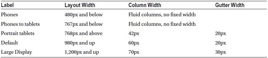
Bootstrap, by default, includes targeted media queries starting with smaller smart phones and working its way up to a large display, viewports that are 1,200 pixels across and wider. Basically, each media query changes the size of the columns to reflow the layout to something more appropriate for the viewport. Table 5-1 lists the viewport sizes that Bootstrap supports natively.
Table 5-1. Viewports Bootstrap Responsively Supports Out of the Box
Note Review media queries in detail in Chapter 2.
The first media query (480 pixels and below) targets smart phones and pretty much breaks everything down to a single, 100 percent width column. This might be a bit oversimplified for your tastes, but the beauty of frameworks like this is that they’re only suggestions; you’re encouraged to customize to your heart’s content.
The next media query targets portrait tablets with a range of 480 to 767 pixels, then up to 980 pixels for portrait tablets and on up to standard desktops and large displays. For the static grid, individual columns start at 70 pixels wide, then jump down to 60 pixels and finally down to 42 pixels before going 100 percent width for mobile (see Figure 5-7).
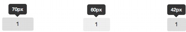
Figure 5-7. Column widths based on viewport and media query
Because Bootstrap has media queries built in, your project might have a need to develop custom media queries. Listing 5-18 shows an example of media queries that target specific viewports.
Listing 5-18. Base Sample Media Queries
/**  Large Desktop */
@media (min-width: 1200px)  { ... }

/** Portrait tablet to landscape and desktop */
@media (min-width: 768px) and (max-width: 979px) { ... }

/** Landscape phone to portrait tablet */
@media (max-width: 767px) { ... }

/** Landscape phone and lower */
@media (max-width: 480px) { ... }
At this point we have added the Bootstrap framework including adding the responsive components. We then included the viewport meta tag. Figure 5-8 shows what our Specter Group site looks like now at different resolutions. Many of the changes that you are seeing are due to developers specifying how the different elements interact.
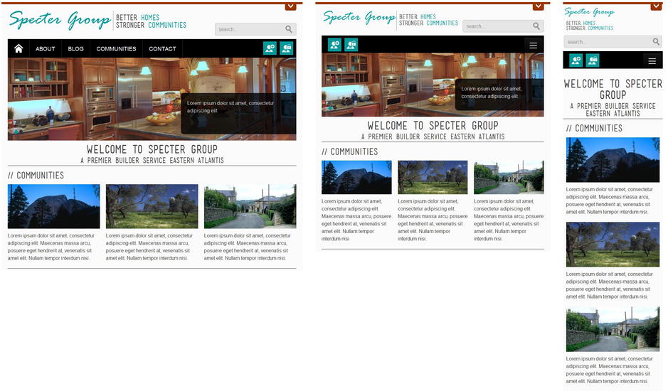
Figure 5-8. Specter Group site at 960 pixels, 768 pixels, and 320 pixels wide
Continually testing a responsive site design in multiple devices can be very time consuming. Fortunately there are a few different tools available to us. No matter what, if you need to make sure your site responds correctly on a given device you will need to test it on that device.
First, you can always resize your browser window on your development workstation with any modern browser including Internet Explorer 9 and above. If you did everything right, your site should shrink with your browser window.
A second method, and our preferred method because it integrates with Firebug really well, is the Responsive Design View (Ctrl+Shift+M) available in current versions of Firefox. To find this, load your page in Firefox and go to Tools Web Developer Responsive Design View or press Ctrl+Shift+M. Your page will now load in a window within your browser window. At the top left you can get the exact dimensions of a viewport on which you would like to preview your site. Plus you have the ability to use Firebug to figure out how styles are being applied to every element on your page.
From Fixed to Fluid
We hope by now you are starting to see the power of a framework to provide the base frame on which we can build a responsive site. We were able to quickly convert our fixed-width site to a responsive site by adding Bootstrap, then after breaking up our site design into rows and columns and providing a viewport meta tag, we had a responsive site.
Bootstrap still has more to offer. At the highest level, Bootstrap provides two types of containers:
- A container CSS class that has a fixed width based on a default of 940 pixels, or modified based on media queries.
- An alternative container-fluid CSS class has a fluid width that is based on percentages.
We used container for all of our main component areas but what if we fluid containers, rows, and columns? All we need to do now is go back through our HTML master page and append -fluid after each container and row value. Let’s take an example from one of the sections we just completed, the Footer. Refer to Listing 5-19 for the Footer now with fluid containers.
Listing 5-19. Footer Converted from Responsive Fixed Widths to Fluid
<footer>
   <div class="container-fluid">
      <div class="row-fluid ">
         <!--columns-->
         <div class="span4">
            <!--left column-->
         </div>
         <div class="span4">
            <!--middle column-->
         </div>
         <div class="span4">
            <!--right column-->
         </div>
         <!-- ENDS columns -->
      </div>
      <!--end row-->
   </div>
   <!--end container-->

   <!-- bottom footer-->
   <div class="footer-bottom">
      <div class="container-fluid ">
         <div class="row-fluid ">
            <div class="span6 copyright">
               <!--copyright-->
            </div>
            <div class="span6 sitemap">
               <!--sitemap list-->
            </div>
         </div>
      </div>
   </div>
   <!--end bottom footer-->
</footer>
As you can see in Listing 5-16, we simply changed the class attribute value for the container wrapper from container to container-fluid and also changed the class attribute values for each from row to row-fluid. The site design will now flow to always fill up the entire viewport.
Fix Common Responsive Issues with SharePoint
At this point we should have a fully fluid, responsive HTML master page. We have provided no additional custom styles besides the Bootstrap framework based on the HTML prototype provided to us. If we now preview the HTML master page with just Bootstrap included and the basic grid applied, we will see quite a few layout issues arise. Most of these layout issues are common across many frameworks and you would likely run into some of these with your own custom responsive grids as well.
We now review common issues with responsive design and SharePoint. Each issue starts with a screenshot or “problem” followed by an explanation as to what is happening and, most important, the CSS necessary to fix the problem. Most of the CSS we provide will work to fix the general issue described, although some of our solutions have styles specific to Bootstrap and our sample design. It is our aim that the explanation of the cause of each problem along with our fix will enable you to provide the specific styling necessary for your particular problems.
Images and Icons
The first problem that will likely jump out at you with a responsive framework is that the ribbon appears completely broken, as shown in Figure 5-9. Because like a majority of public-facing sites, 95+ percent of your users are visitors, it’s fine if you disable many SharePoint features (like the ribbon) for the front end of a public-facing SharePoint site. For your content editors and administrators, who rely heavily on the ribbon, though, this is completely unacceptable, so it needs to be fixed.
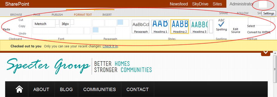
Figure 5-9. Disappearing images from the ribbon and elsewhere throughout the web site
The Explanation
Probably the most common and frustrating problem with responsive frameworks and SharePoint is the frameworks need to do two things. First, most responsive frameworks reset the box-sizing style to “border-box” instead of “content-box”.
Tip To learn more about box-sizing, refer to http://sprwd.com/gamhnty.
In a nutshell, box-sizing allows us to specify how we want the browser to calculate the CSS box model. In particular, should the “width” of a box or container include padding and the border, or is the width just what is inside of the padding? Content-box means that the specified width and height do not include margins, borders, or padding. Border-box, on the other hand is similar to how Internet Explorer determines width and height when a document is rendered in Quirks mode, meaning the width and height include the border and padding, but not the margin.
Why does all of this matter? Well, for most responsive frameworks to work, we want to provide a specific width, possibly a fluid width, of a container, but still provide a fixed padding. With a content-box this is not possible, as the ratio of the width to the padding is an unknown variable.
The second issue causing the ribbon grief is that frameworks will reset all images to max-width 100 percent and width to auto. This ensures that an image will never fall outside of a given container (row and column), at the same time allowing the image to scale to a container. With the ribbon, that just wreaks havoc.
The Fix
The general fix is quite easy, although there are some special cases to consider. First, we need to reset our box-sizing to content-box for all elements because that is what SharePoint expects. Now that breaks the grid, so we can turn the box-sizing back to border-box for any row or container that begins with the phase “span,” such as span1, span4, span12, and so on.
Second, reset the images as well to no max-width but use a similar trick as for the box-sizing by allowing images within our framework columns to reset to use responsive properties.
Finally there are special cases where SharePoint uses its own containers that begin with “span,” thus we need to provide additional overrides for the site actions as well as a few list pages. Listing 5-20 shows the code for repairing the images in the ribbon.
Listing 5-20. Custom Styles Fixing Responsive Images in Ribbon
*, *:before, *:after {
   -webkit-box-sizing: content-box; /*border-box causes many issues with SP*/
   -moz-box-sizing: content-box; /*border-box causes many issues with SP*/
   box-sizing: content-box; /*border-box causes many issues with SP*/
}
* [class^="span"], * [class^="span"]:before, , * [class^="span"]:after {
   -webkit-box-sizing: border-box; /*re-enable border-box for framework spans*/
   -moz-box-sizing: border-box; /*re-enable border-box for framework spans*/
   box-sizing: border-box; /*re-enable border-box for framework spans*/
}
img {
   max-width: none;
   width: auto;
}
* [class^="span"] img {
   max-width: 100%; /*for images inside span grid*/
}
#scriptWPQ2 img, img.ms-webpart-menuArrowImg, #applist img {
   /*within a span may still need to have width of image not 100% for SP2013 OOTB features/imges*/
   width: auto;
   max-width: none;
}
.ms-siteactions-imgspan {
   float: none;
   margin: 0px;
}
Figure 5-10 shows what the ribbon looks like after this code has been applied.
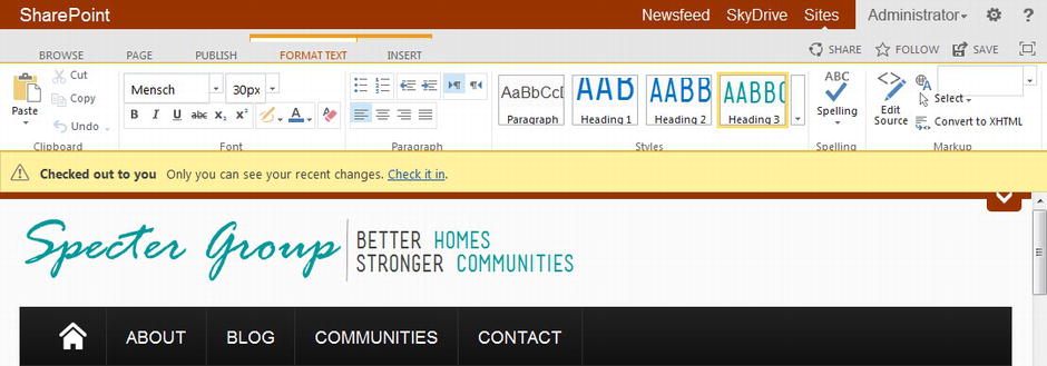
Figure 5-10. Ribbon icons and other SharePoint images fixed
Ribbon Spans and Ribbon Drop-Down Menus
Now that the ribbon image issues have been solved, look at Figure 5-10 again. Notice anything wrong with the tabs in the upper left? How about the font drop-downs?
The Explanation
It so happens that the tabs are inside of containers that start with the phrase “span” again. Because Bootstrap reset spans to float left, this will cause problems with our tabs. Other frameworks might not have this issue, but you might find your framework breaks other SharePoint elements for similar reasons.
The drop-downs are causing issues because Bootstrap resets the styling of many form elements. Using Firebug we can quickly find out what styles need updating.
The Fix
Because we know that any span in the ribbon, such as the div with an ID of s4-ribbonrow, should not use our framework, we only need to override any container that starts with the keyword “span” to not float. We also reset the margin and line height to fit what SharePoint would prefer.
As for the input field, because ribbon input elements contain the same class, we can narrow down a style to just inputs within the ribbon and override their padding and height to again what SharePoint prefers. Listing 5-21 shows these changes.
Listing 5-21. Custom Styles to Fix Ribbon Layout Issues
#s4-ribbonrow [class*="span"] {
   float: none;
   margin-left: 0px;
   line-height: 1.2em;
}
input.ms-cui-cb-input {
   height: 14px;
   padding: 3px 7px 2px;
}
Figure 5-11 shows the ribbon with the fixes applied.
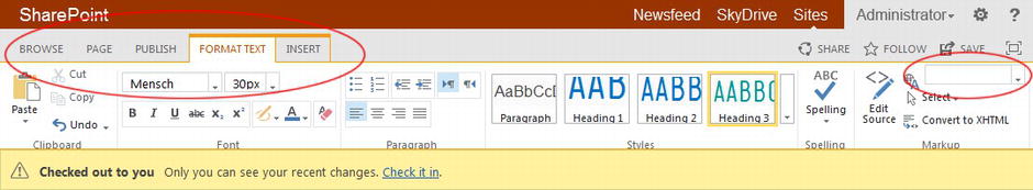
Figure 5-11. Ribbon tabs and drop-down menus fixed
Stop Fluid Behavior for Extra Large Viewports
In a previous section of this chapter, “From Fixed to Fluid,” we reset our containers and rows so that they would be fluid. In general this is very much what responsive is all about. But how is your site going to look on very wide viewports, say viewports 1,600 pixels wide or larger? Do you really want your images to scale to that large? How about if we limit our site to grow to no more than 1,200 pixels wide for now?
The Explanation
The containers themselves are set to grow indefinitely so we are going to have to override this. We are going to have to be careful, though, because we cannot provide a blanket reset to all container-fluid tags to provide a fixed max width because what if we have containers within containers?
The Fix
The fix is easy: All we need to do is provide a max width to container-fluid elements that are directly after our own main containers such as header and nav and footer, as shown in Listing 5-22. We can use the same max-width in our #main container as well. We are placing this in a media query because we ideally want the left and right margin set to auto only when we are setting the max-width style.
Listing 5-22. Set a Maximum Width of a Fluid Web Site
@media (min-width: 1200px) {
   header > .container-fluid, nav#topnav > .container-fluid, footer > .container-fluid,
   .footer-bottom  > .container-fluid  {
      max-width: 1160px;
      margin-left: auto;
      margin-right: auto;
   }
   #main {
      max-width: 1200px;
      margin-left: auto;
      margin-right: auto;
   }
}
Rotating Images
jQuery-based rotating banners and images are very popular and there are many that are now responsive friendly. Even so, there might be an issue with how images transition from one to the other. In Figure 5-12 we can see that as the second image is sliding in both the height and width are scaling, when ideally there should be no scaling at all.
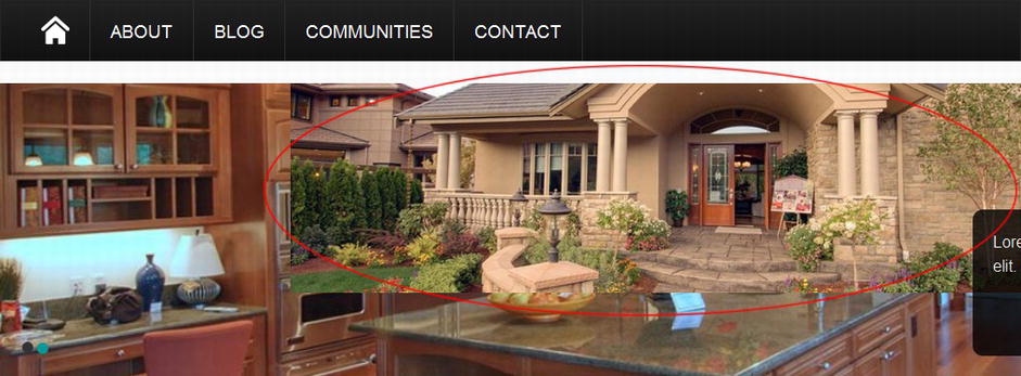
Figure 5-12. Rotating images impropertly transitioning
The Explanation
Yet again the framework’s reset of all image properties is getting in our way. We will use a similar trick as when we fixed the ribbon icons here as well.
The Fix
All we need to do is tell the images within the slider that their height should be fixed to the container height, as shown in Listing 5-23. Using the containing class of our slider, we specify a height for only images within our sliders.
Listing 5-23. Force a Set Height for Rotating Images
.theme-nivo-specter .nivoSlider img {
    height: 100% !important;
}
In Figure 5-13 we can see how our incoming image is not scaling its height any longer.
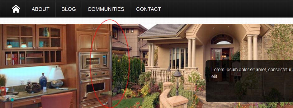
Figure 5-13. Rotating image with a fixed height
When developing an HTML prototype, it might be very common to create our own wrappers and containers that have grid-like behaviors. We might then have a need for absolute positioned elements within a particular wrapper, which is, of course, not a problem assuming that our wrapper has a “position” of relative or absolute. But what happens when you replace your wrappers within a framework container, row, or column? Normally these containers do not have a position of relative associated with them, so if you need to position a child element within a grid container, row, or column, you will have to do some additional work.
There are quite a few of these issues in our demo design because of how the HTML prototype was built to reflect the design requirements for Specter Group. We will look at one particular issue, the Search box. If you refer to Figure 5-11, look in the header toward the right and you will notice that the Search box is missing. Let’s see what we can do to fix that.
The Explanation
If you don’t set a particular container, row, or column to have a CSS position of absolute or relative, a child container with an absolute position will be positioned based on the first element in its ancestry with a relative position. This could produce an unexpected result, which is exactly what is happening with our Search box.
The Fix
All we need to do is make sure that the container (container, row, or column) of an absolute positioned element is set to relative and the child element should appear where we want it. You can see in Listing 5-24 that we set the container-fluid that appears right after <header> to be relative, so any element in its lineage would be positioned based on that container-fluid.
Listing 5-24. Fix Absolutely Positioned divs in a Grid Framework
header > .container-fluid {
   position: relative;
}
header .searchbox {
   bottom: auto;
   right: auto;
   position: relative;
   float: right;
   margin-top: 60px;
   text-align: left;
   width: 260px;
}
header #searchInputBox input[type=text]{
   box-shadow: none;
   transition: none;
   -moz-transition: none;
   -webkit-transition: none;
}
What we decided to do, though, was to have the Search box not be absolutely positioned, but rather float to the right and use padding to get into the right space. We made this decision because we wanted it to always flow within the fluid container. We also provided a few additional styles to remove some of the styling SharePoint provides to search boxes.
Take a look at Figure 5-14. The Search box is now in the correct place, but we see that the Social bar tab just above and to the right of the Search box does not have the correct padding to the right. This element is positioned absolutely to the container-fluid but remember that Bootstrap uses 20-pixel padding, so we will simply move the tab over a full 20 pixels to match, as shown in Listing 5-25.
Figure 5-14. Rotating image with a fixed height
Listing 5-25. Account to Framework Padding
header .social {
   right: 20px;
}
Not Enough Padding or Spacing Between Rows and Columns
What if you want more padding or spacing between rows and columns? We can see in Figure 5-15 that our footer does not have the spacing we are looking for, nor are the Heading elements centered.
Figure 5-15. Improper spacing between rows and columns
The Explanation
This is another common problem when transitioning from our own HTML coding to a framework. If you recall from the earlier section in this chapter, “Bootstrap and a Footer,” we moved our footer columns from an unordered list to Bootstrap span columns. The styling applied to the unordered list must be moved over to the footer spans now.
The Fix
All we really need to do is take the styling that we had applied to the footer unordered list and replace many of the ul and li elements with span4 as we are using a three-column layout, as shown in Listing 5-26. As for the footer-bottom block, we simply need to specify additional padding to the Bootstrap container we added.
Listing 5-26. Provide Additional Padding and Margins for Grid Elements
footer {
   padding-top: 10px;
}
footer .span4 h1, footer .span4 h2, footer .span4 h3, footer .span4 h4,
      footer .span4 h5,  footer .span4 h6 {
   font-weight: normal;
   margin-bottom: 20px;
   padding-bottom: 0;
   padding-top: 0;
   text-align: center;
}
footer .footer-bottom  .container-fluid {
   padding: 15px 20px;
}
footer .footer-bottom p, footer .footer-bottom li {
   font-size: 13px;
}
footer .footer-bottom .copyright, footer .footer-bottom .sitemap {
   min-height: 0px;
}
footer .footer-bottom  .sitemap {
   text-align: right;
}
Figure 5-16 shows the fixed footer.
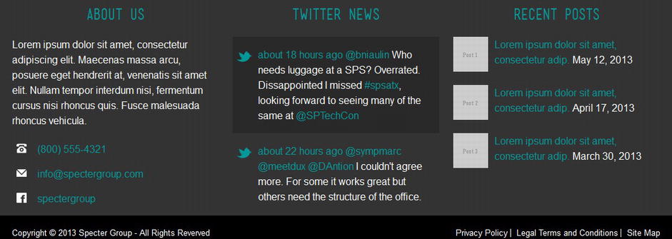
Figure 5-16. Grid spacing reset for specific elements
Smaller Viewport Layouts Break
A responsive framework provides most of the tools we need to make the grid itself responsive, but that does not mean all of the elements of our web site will scale the way we want them to. Custom media queries come to the rescue.
Our design requires a few different fixes for multiple viewports, so we look at the header for an example. In particular we look at the logo, tagline, and Search box and see how these elements react at different viewport widths. In Figure 5-17, note how the header looks in 768-pixel- and 320-pixel-wide viewports in comparison with the header in Figure 5-14.
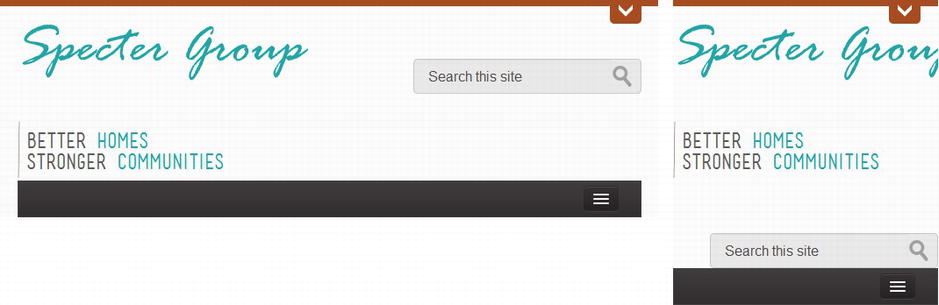
Figure 5-17. Broken layouts on 768- and 320-pixel-wide viewports
The Explanation
Just because we use rows and columns does not mean our elements within these rows and columns will scale in a graceful manner. We will need to provide our own styles within media queries to help fix our layout based on different viewport widths.
Note Ideally all elements will be within their own rows and columns and would scale automatically, but in practice that is often not the case.
The Fix
Using breakpoints of viewports under 979 pixels (tablets), under 767 pixels (small tablets), and under 479 pixels (smart phones), we will scale particular elements and change their positioning. In Listing 5-27, look at how we scale the logo. First we tell the logo container to always only take up only 50 percent of the width of the column, yet the image inside should always fill up the entire #logo container. For small tablets, provide additional margin at the top and left of the logo so that it does not butt up right next to the viewport frame.
Listing 5-27. Media Query Enclosed Styles Providing Layout Fixes for the Header
@media (max-width: 979px) {
   header #logo {
      width: 50%;
   }
   header #logo img {
      display: block;
      width: 100%;
      max-width: 100%;
      height: auto;
   }
   header .tagline h2 {
      font-size: 20px;
   }
   header .searchbox {
      margin-top: 50px;
   }
}
@media (max-width: 767px) {
   header #logo img {
      margin: 10px 0px 0px 5px;
   }
   header .tagline h2 {
      font-size: 16px;
   }
   header .searchbox {
      margin: 10px 1% 10px;
      float: left;
      width: 98%;
   }
   header #searchInputBox input[type="text"] {
      width: 80%;
   }
   header .searchbox a {
      float: right;
      margin-right: 2%;
   }
   header .social {
      right: 1%;
   }
}
@media (max-width: 479px) {
   header .tagline {
      background: transparent none;
      display: block;
      margin: 5px 10px;
      min-height: 0px;
      padding: 0px;
      vertical-align: top;
   }
   header .tagline h2 {
      font-size: 16px;
   }
}
Also check out the search box. Once we hit the smaller tablet viewports we no longer float the block right, but rather float it left. Further we tell the element to fill up 98 percent of the width of the column, thus making the search scale to the entire column now.
Figure 5-18 shows these fixes.

Figure 5-18. Fixed layouts on 768- and 320-pixel-wide viewports
Using the preceding techniques we can provide additional styles to our different media queries to fix other layout issues that we encounter with different viewports. This includes issues elsewhere on our HTML master page, such as the footer and particular content blocks. You might even decide to hide elements at particular viewports by simply setting an element’s display property to “none.” See Listing 5-28, where we hide the tagline for smart phones and how that would look in Figure 5-19.
Listing 5-28. Hide the Tagline for Viewport Less Than 479 Pixels Wide
@media (max-width: 479px) {
   header .tagline {
      display: none;
   }
}
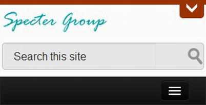
Figure 5-19. The tagline has been hidden for small viewports
Other Hints and Suggestions
You will certainly find that moving to a responsive grid will cause new problems that you must work through one by one. If your original HTML prototype was created well, then moving over styles that reference your specific grid containers, rows, and columns should not be too difficult with the help of a developer tool such as Firebug. Don’t forget about the Responsive Design View in Firefox as well (Tools Web Developer Responsive Design View or Ctrl+Shift+M).
You might also have noticed that in many of our fixes, we used our HTML5 elements to help narrow our styles to specific containers or rows. Using our own specific wrapper elements or even adding additional IDs or classes to grid elements will help you target styles to specific elements without accidently breaking other aspects of your web site.
Tip Refer to this book’s Github repository at https://github.com/SPRWD to see the entire updated style sheet in the Chapter 5 folder.
Dealing with Older Browsers
Let’s share some of the challenges that you’ll face when dealing with older browsers and the options available to handle each challenge.
Here is a tip to keep in mind: You can either have a design that tries to accomplish all functionality in older browsers, or you can create individual master pages targeted for specific browsers. You don’t have to deliver a pixel-perfect version of your site for all browsers. As long as the core functionality is accessible, that’s a great starting point. Instead, you can start with design iterations that might look the same but will most probably have limited functionality. As long as your visitors can view the same content and have the navigation controls to navigate the site, you are a step ahead.
Be Progressive Across All Browsers
A common concern among developers is ensuring that their sites render the same across all browsers, including older ones such as Internet Explorer 8 and older. That might not always be necessary, as a better route is to consider progressively enhancing your site by offering a solid working baseline experience to users with legacy browsers while providing a richer interface to those users with modern browsers. It’s an uphill battle to have your site look pixel perfect in all browsers and it is a battle you aren’t going to win. If you know you have to target a particular older browser in your organization such as Internet Explorer 7, then there might be a need to invest the time to verify your site works on that browser at the level you require. Otherwise, look to develop for IE 8+ and you will hit more than 98 percent of your site’s visitors.
One popular workaround to allow HTML5 semantic tags in legacy browsers is to use JavaScript. A JavaScript workaround was discovered by Sjoerd Visscher and it enabled styling for HTML5 elements by non-HTML5 browsers such as IE 8 and older. Why is this a problem for HTML5 elements? Browsers typically won’t apply styling to elements that they don’t recognize.
To use this script, simply download html5shiv from http://sprwd.com/33hgajz and add a link to the JavaScript library in your code (ideally minified). Refer to Listing 5-24. The caveat here is that you must include the link to html5shiv before the <body> element (i.e., in the <head>).
Another common linking method is to use a Content Delivery Network (CDN) such as http://html5shiv.googlecode.com/svn/trunk/html5.js. Many JavaScript libraries such as Modernizr (http://modernizr.com/) already include html5shiv, so you might notice that we do not have to link directly to html5shiv in our examples because we are relying on Modernizr.
Tip Modernizr is a JavaScript library that provides HTML5 and CSS3 feature detection.
Because we only use html5shiv for IE 8 and older, there is a special tag we can provide that tells particular versions of IE that they should process the following HTML, whereas other browsers will ignore it. We also use this conditional HTML coding in Listing 5-29.
Listing 5-29. Conditional Reference to html5shiv
<head>
...
<!--[if lt IE 9]>
   <script type="text/javscript"
       src="http://html5shiv.googlecode.com/svn/trunk/html5.js"></script>
<![endif]-->
...
</head>
Tip Including JavaScript files after style sheets helps with performance as it tells the browser that it should load style sheets before JavaScript files. Many even recommend placing JavaScript files just before the closing </body> tag because of performance, but with SharePoint and especially jQuery libraries and plug-ins, it is recommended that you add script links to the <head>.
Another option, although we agree it does not quite strike an accord with the One Web philosophy, is to detect what browser your visitors are using and prompt them to upgrade their browser, as shown in Figure 5-20. As you might expect, there’s JavaScript already available that does this work for you.
Figure 5-20. Did you know that your browser is out of date?
This is an interesting option because you are supporting the stance that users should upgrade to newer browsers. This is a bold, yet possible stance to take when it’s a public-facing site and your list of supported browsers has to constantly grow. At some point you might have to let older browsers go, although hopefully using a progressively enhanced site, your site will still function on older browsers. For an intranet this might be harder to enforce, as there could be other reasons why you must support older browsers.
To enable this browser upgrade notification, download the solution zip file that contains the JavaScript as well as a few images from http://sprwd.com/g7qpixw and save them to your project solution library. In your master page, right after the <body> element, add the code shown in Listing 5-30.
Listing 5-30. Adding the Browser Upgrade Notification Script
<body>
   ...
   <!--[if lte IE 6]>
      <script src="js/ie6/warning.js"></script> <script>window.onload=function(){e("js/ie6/")}</script>
   <![endif]-->
   ...
</body>
Tip Keep in mind that after you add any new solution, jQuery code, or CSS that you should test SharePoint functionality. This is even more true when you start mixing different versions of the same framework, like jQuery. SharePoint 2013 leverages jQuery 1.7 and your custom jQuery solutions might leverage the latest jQuery version. Test and test again.
Device channels are a new feature added to SharePoint 2013, originally designed as an updated approach to developing mobile-friendly sites. Previous versions of SharePoint included a Mobile View. This was very limiting and only designed for collaboration sites, not publishing sites. We briefly introduced device channels in Chapter 1, but let’s investigate them a little further and see how they can help us.
Device channels allow us to map devices and browsers to appropriate master pages. For each device channel, we can define devices that are applicable to it by adding device inclusion rules with user agent substrings, and then we associate a master page with each device channel (see Figure 5-21). Device channels are especially useful when we need to define a web site rendering that is optimal for a specific device.
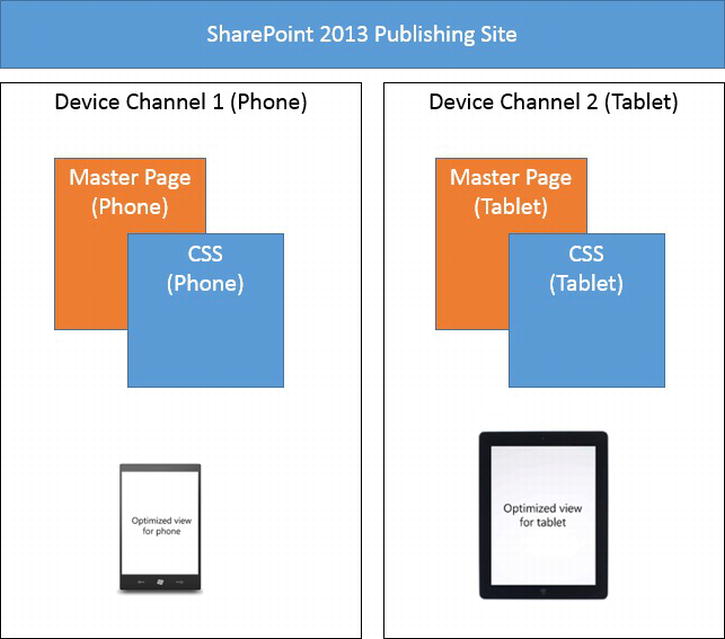
Figure 5-21. Device channels may be mapped to devices, each with its own master page, CSS, and so on
All of this means we can create a custom master page for a series of one or more devices and tailor that particular master page specifically for those devices. All of our master pages, for all of our device channels, would still reside on one site, and would use the same content, content pages, and page layouts. Device channels allow you to customize page layouts by the use of device channel panels.
Device channels provide us a hybrid approach of a separate mobile site without the need for actually creating a separate site for each tailored interface, just a tailored master page and possibly customized page layouts.
Device Channels and Responsive Web Design
If device channels are designed to provide mobile views, you might ask yourself why we are bothering with responsive web design.
The first answer to that question is that because a device channel is mapped to devices (i.e., user agents), then what do we do with the ever increasing number of devices? Do you want to try to manage that list? We sure do not.
Second, there are no standards for viewport widths, so we might have to create a device channel for so many different viewport widths it could quickly become unmanageable.
Third, you have to maintain each master page for each device channel. One branding effort can be difficult enough to build, test, debug, and maintain; adding channels means multiplying that effort.
Responsive web design is not perfect by any means, and device channels do provide the advantage of tailored designs for specific browsers or devices. It is our opinion that the positives of an adaptive site design regardless of the browser and viewport is generally preferable to a rigid design that must be manually adapted and mapped to specific devices.
When We Might Use Device Channels
Device channels definitely can have their place in the web designer’s process. The opportunity is great to leverage the functionality of device channels provided by SharePoint 2013 and build a master page or master pages tailored to specific browsers or devices.
We propose two possible sound reasons why device channels might come in handy. Remember that device channels are mapped to the user agent and not an actual device. This means we can map to not just an iPhone, but to a specific browser version such as IE 7 or IE 8 regardless of the device.
Let us say that before you begin developing your web site you analyze existing web traffic logs and find that a very large percentage of your users are accessing your web site using a specific device, say a Surface Pro. You could create a solution that includes two device channels, one for most visitors and a second specifically for Surface Pro users. This second device channel might not need to be responsive, nor would you have to provide much client-side feature detection because you know what features are and are not available. A device channel just for this specific device might open the doors to a truly unique experience for specific visitors. If you are building an intranet or extranet, you might know that your web site users will only be using either a specific desktop browser or a specific smart phone to access your web site. If that is the case, then device channels might once again make sense.
Device channels could also be leveraged to provide a lighter or less feature-rich version of a site design that works well in, say, Internet Explorer 8 or older. This way you could create a device channel mapped to an HTML5 master page for most visitors with modern browsers that is responsive and a second device channel just for older versions of IE that does not use HTML5, CSS3, and maybe even limits JavaScript as well.
There are likely many more good reasons why device channels might make sense for your organization and we expect some interesting insights into special cases for device channels over the next few years.
Create a Device Channel
We now walk through how to create a device channel in SharePoint 2013. You’ll first want to browse to the Design Manager in a browser by clicking the Settings icon and then selecting Design Manager.
From the left navigation menu, select the menu item 2. Device Channels, as shown in Figure 5-22. The Manage Device Channels page will load. Click Create a Channel, found just under the main page title, to create a new device channel.
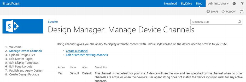
Figure 5-22. Manage Device Channels page
The New Device Channel dialog box will appear, as shown in Figure 5-23. You will need to enter information related to your custom device channel:
- In the Name text box, enter a name for the device channel.
- In the Alias text box, enter an alias for the device channel.
- In the Description text box, enter a brief description of the devices or browsers that the channel will capture.
- In the Device Inclusion Rules text box, enter the user agent substrings for the channel. A request for a web page will use this channel if any of the strings that you provide match any part of the user agent string of the requesting agent.
As an example, Windows Phones have user agent strings that contain the substring “Windows Phone”. If you wanted a device channel for all Windows Phones, a Device Inclusion Rule need only contain the rule, “Windows Phone” and not the entire long user agent, Mozilla/5.0 (compatible; MSIE 9.0; Windows Phone OS 7.5; Trident/5.0; IEMobile/9.0).
- If you are ready to make the channel available to render pages, select the Active check box.
- Once you have entered in all of the required information, click Save to save your new device channel.
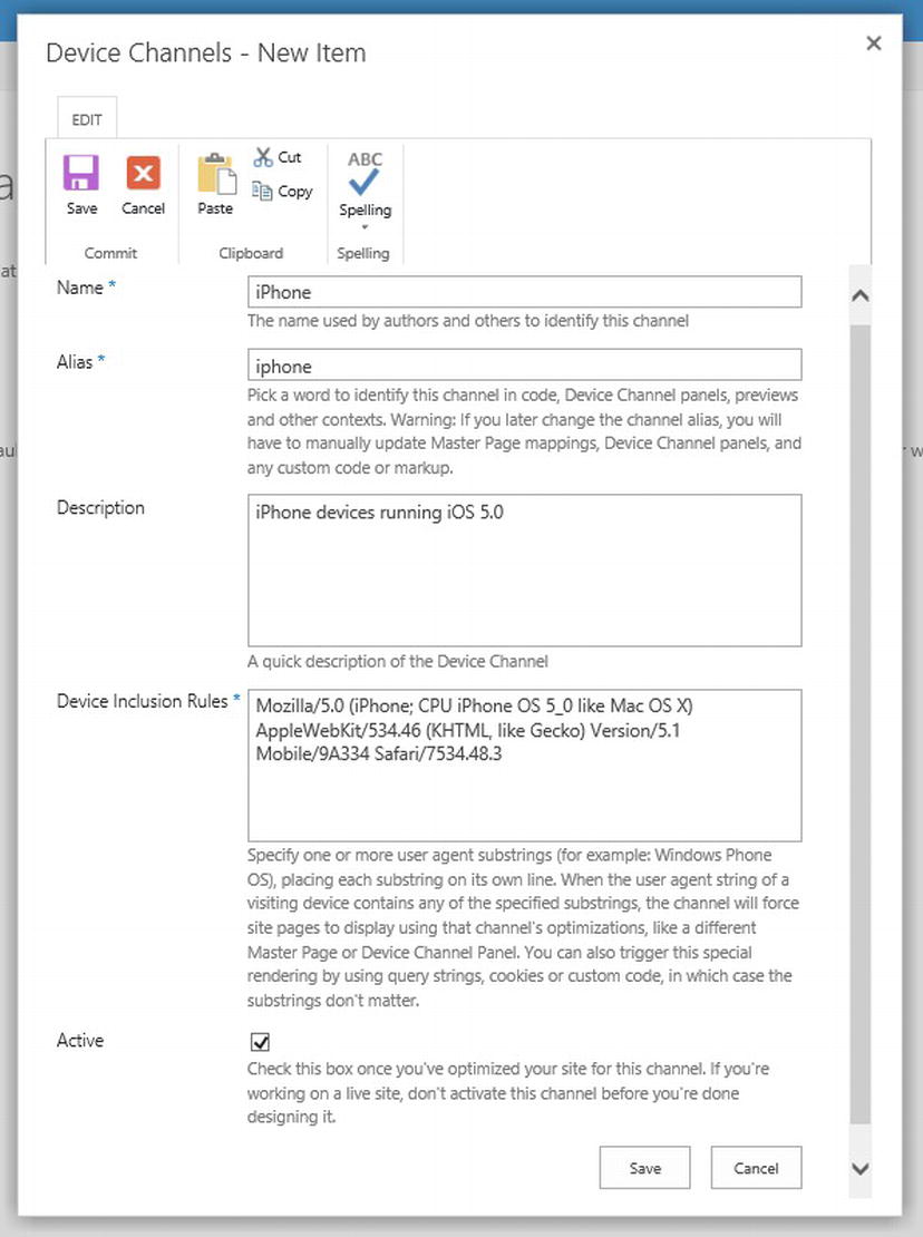
Figure 5-23. Sample device channel created for iPhones
Note If you’d like to see an exhaustive list of user agent strings, go to http://sprwd.com/narb3md. To view the user agent string for your browser and device combination, browse to their home page at http://sprwd.com/aaxtzbp.
Assign a Master Page to a Device Channel
Once a device channel has been configured and a master page has been created that a particular device channel should use, it is time to assign the master page to the device channel. In Chapter 4, we showed you how to assign a master page as a Site (custom) master page. Once you have more than one device channel, that master page settings page will allow you to assign a master page per device channel.
Open your Site Settings page in a browser and under Look and Feel click Master Page.
On your Site Master Page Settings page, next to Site Master Page, you should see each device channel you created, as shown in Figure 5-24. You can now set any valid, published master page to each device channel. Notice that you can only set a specific site master page to each device channel, and your system master page will be the same for all devices. This means that all system pages and other pages that use the system master page will always use the same master page.
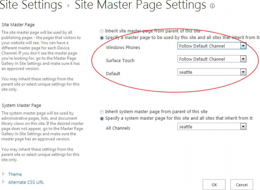
Figure 5-24. Set master pages for specific device channels
Changing Your User-Agent String
When a browser requests a web page from a web server, a browser will send along a user-agent (UA) string that identifies the browser type and version to the web server. The chosen UA string will be sent across the network as a header in every request. Many web sites change their appearance based on user strings, which, as we have mentioned, is also how device channels work.
For development and testing purposes, changing your user-agent string could be very beneficial and there are a variety of browser-specific tools you can use to accomplish this. As an example, in Internet Explorer 10, we can change the user-agent string by enabling the Developer Toolbar by pressing F12 and then selecting a different browser mode from Tools Change user agent string, as shown in Figure 5-25.
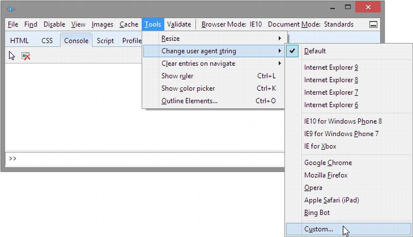
Figure 5-25. Change the user agent in Internet Explorer using the IE Developer Toolbar
Note In Internet Explorer 8, 9, and 10, you can press F12 to open the Internet Explorer Developer Toolbar. It’s fairly similar in functionality to Firebug for Firefox and other browser-specific web developer toolbars. It allows you to select nodes within the DOM, view and edit properties, and so on, which comes in very handy when trying to understand how HTML markup helps build sites.
The Internet Explorer Developer Toolbar is a powerful tool similar to Firebox for Firebug. If you would like to see how your site is rendered in a previous version of Internet Explorer, you can change the Browser Mode setting on the IE Toolbar.
Summary
In this chapter we looked at different options to use to integrate responsive design theories with our SharePoint 2013 HTML master pages. We looked at creating a responsive infrastructure from scratch but quickly realized leveraging an existing responsive framework such as Twitter Bootstrap would alleviate much of the hassle of creating the initial responsive skeleton or grid. We reviewed how we can go about merging an existing HTML master page with a framework and then looked at common problems or concerns that might arise when moving to responsive design. We finished with a look at how to handle older browsers, including a look at device channels and how they might be useful.
In the next two chapters we continue the process of building the basic framework of our responsive site by first looking at navigation and then continuing on to page layouts.