
Designing a Responsive Web Site
Any seasoned web professional knows that planning prior to implementation is key to the success of any project. Planning a web site project is a critical task and possibly the most important. It helps us gain focus and clarity by defining objectives for the project, and forces us to solidify the overall goals for what the stakeholder hopes to achieve, considering the end user experience. Planning a SharePoint web site project also requires considering the implementation of the various SharePoint-specific features.
To successfully build a web site, we start with information gathering. This requires learning about and understanding the goals of our users, and the tasks they need to carry out to ensure we fulfill their needs. This might seem simple, but often it is challenging to understand how a user will respond, or what specific experience he or she might have. Further, this might require us to challenge our assumptions about our users.
This chapter aims to walk you through the process of designing a SharePoint 2013 public web site for a fictitious company we will call Specter Group, a construction and architecture firm. Although this process isn’t SharePoint-specific, it is certainly great to follow when building public-facing web sites as well as organizational intranets and extranets on SharePoint 2013 as the chosen Web Content Management (WCM) platform, and we highly recommend you do this to increase the probability of success of your project. We approach this process applying a user-centered design method, providing you with examples of the exercises that are typical along the way, including responsive design wireframing for tablet and mobile devices.
Our Scenario
Specter Group has requested that we build them a new public-facing Internet site built on the SharePoint 2013 platform. They have ideas of what their web site’s aims are, but they are not detailed. In this scenario we walk through the site design and planning process, a general process for any web site including intranets, extranets, and public-facing sites. Using user-centered design, we review user analysis, task analysis, information architecture, and finally wireframing, site design and site mockups. By the end of this process we expect to have enough guidance and site design materials so that we can hand off the web site build-out process to the web development team.
The SharePoint Web Site Design Approach
There have been many techniques developed throughout the years to help design any sort of product, many of which have also been adapted for designing web sites. One such technique, activity-centered design, focuses on the activities of the user while using given software. A second method, contextual design, is taught as a medium to teach user-centered design; its core principle is to understand a user’s intent, drives, and desires within the context of using the software or product in question. The other fairly common approach is task analysis, which is based on the concept that no matter what, users will always be executing tasks on the web site, and it helps to thoroughly understand the steps in the execution of these tasks, sometimes in person, as the user is actually using the web site.
Our preferred method is the user-centered design (UCD) methodology, which focuses on catering to the users rather than forcing the users to change how they do things using the product (or at times causing users to experience frustration). This is a great approach to follow when building a web site. But what exactly is UCD? Microsoft provides a great explanation:
This philosophy, called user-centered design, incorporates user concerns and advocacy from the beginning of the design process and dictates that the needs of the user should be foremost in any design decisions.
—Microsoft Corporation
(http://sprwd.com/26h2wop)
It is this philosophy or methodology that we use throughout this chapter to discover who our web site audience is. Knowing that, we can determine web site features that ultimately cater to their needs and make the web site both relevant and valuable to them. We focus on key activities (see the section “Key User-Centered Design Activities We Use” later in this chapter) that help determine our web site structure and navigation all the way to a point where we have wireframes and full-fidelity mockups at the end of this chapter.
The Return on Investment of Usability
Given the extensive time dedicated to usability, some might wonder if it is really worth investing a considerable amount of time in figuring out the best user experience (UX) possible, and if a healthy return on investment (ROI) exists. In other words, can a project stakeholder justify spending such time in conducting usability testing and design?
For e-commerce sites, it is typical to get a sense of ROI by analyzing the number of transactions, visitors, and abandoned shopping carts on the web site. Regardless of whether your web site is an e-commerce site or an informational site, there is most likely a way to measure its success. For example, to measure the ROI for a corporate intranet that has a technical support ticketing feature, you can compare how many ticket submissions versus phone calls happen within a certain time frame. Another metric would be tracking the speed with which support tickets are resolved or closed.
In the case of our web site project, we know Specter’s first goal is to showcase properties available to prospects, so tracking how many people actually purchased (the conversion rate) would be a one of the metrics to have in determining the ROI.
Key User-Centered Design Activities We Use
For our web site project, we’d like to walk you through the UCD process in the context of planning a SharePoint 2013 public-facing web site, using only select activities from the process as outlined in the following list. These activities are the bare minimum in our mind and certainly can be augmented to fit your particular web site project. We start by formulating the vision, goals, and objectives that will help drive the rest of the activities.
- Vision, goals, and objectives: To create a user-centric web site, we must first clearly define the organization’s vision, goals, and objectives. To do this, we might find that an organization can answer key questions, such as these: Who are the users of our web site? What are their goals or tasks when visiting our web site?
- User analysis: In this activity we focus on learning who our web site users are, their characteristics, interests, and maybe even their experience level. This information is then used to develop user-specific personas that we use to inform our UCD.
- Task analysis: Once we’ve defined our audience or identified our users, we must understand the tasks they will carry out when visiting our web site. This activity focuses on determining some of the key user tasks based on the type of user. In other words, we identify what our users are trying to achieve when visiting our web site.
- Information architecture and interaction design: This activity focuses on ensuring our users can find what they need in the most efficient manner. The structure, navigation, and taxonomy used for the site all play a key role in ensuring we allow users to find what they need quickly. The web site goals help us determine the information architecture, as we know the user’s goals and have gone through task analysis activities as well.
- Wireframing and design: This activity focuses on a simple representation of our information architecture and interaction design. It illustrates key features, content, and typically navigation. It also visually calls out page features with brief explanations of the page elements. Wireframes help all project members, including developers and project managers, understand what the product will look like; however, this is not meant to dictate how the web site ultimately will look. Design comps, or mockups of how the site will look, add detail and provide a sense of what the look and feel of the site will be.
 Note This chapter outlines a simple, agile, and yet effective UCD process you can use when planning your web site. You can go through as much iteration as needed to achieve the desired outcome. For an extensive list of UCD activities and additional guidance, visit www.usability.gov.
Vision, Goals, and Objectives
One problem often encountered within a project is unclear objectives and goals. Many times, there are multiple people working on a web site project, each of whom has a different idea of the overall objectives and goals. Having a clear understanding about the user needs and business goals is necessary prior to developing any mockup or snippet of code if we are to expect a successful outcome.
Our first task is to write a statement to describe Specter Group’s business goals, although typically the project sponsor or project managers on the business side will have articulated this for us. Specter Group created the following statement for their web site business goals.
BUSINESS GOALS
The purpose of the new Specter Group web site is to showcase the various construction projects to prospective buyers of properties currently being built with the purpose of enticing them and ultimately converting them to actual buyers. Our secondary goal is to build a community comprised of property owners, and connect them with their respective neighbors to promote more interaction and bring each community closer. We envision our community members staying up-to-date with their community while on the go, and for that matter, we would like to ensure the new Specter web site allows for a seamless user experience on mobile devices.
The business goals statement does not cover the intended purpose for the intended user audience; it also does not provide details on what end users can expect to get out of the web site. Therefore we then need to articulate end users’ expectations and needs. The user needs statement can be written by stakeholders or in other cases project managers who have a clear understanding of the vision of the web site. Specter Group created the following user needs statement.
USER NEEDS
Specter web site members will need the ability to communicate with their neighbors in a casual and effective way via blog posts, announcements, or discussion boards. In addition, members will need the ability to share pictures with their community as desired. Users who are not members will need to be able to view property information, blog posts, and news that Specter Group publishes on the Specter public web site.
User Analysis and Persona Development
The user analysis activity within the UCD process is considered one of the core activities, as it is the means to get to know our audience, and how they will use the web site. To do that, we start creating personas. A persona is a fictional characterization of a web site user. The use of personas first surfaced in 1998 in the book titled The Inmates Are Running the Asylum by Alan Cooper, and shortly thereafter was widely adopted in various software projects due to its effectiveness. As time went by, further proof surfaced of the benefits of using personas.
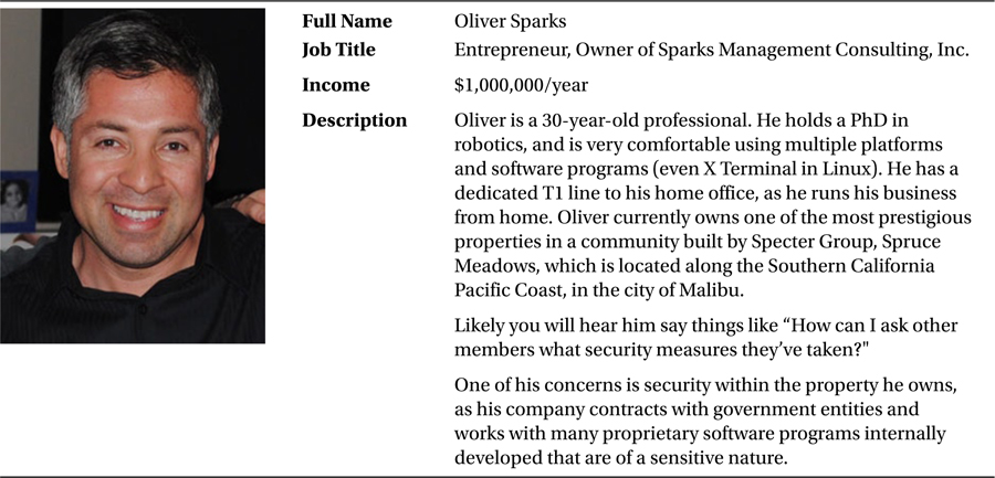
Developing sample personas will help our design process in keeping a very realistic perspective of our users and what they can accomplish on the SharePoint web site, be it an intranet, extranet, or public-facing web site such as the Specter site. For example, in our analysis, if we were to ask ourselves, “Is Oliver, a community member, able to participate on a discussion on a community he does not belong to?” we can immediately start thinking about the need to plan permissions and roles for each community within SharePoint. Asking that kind of question and other relevant questions when doing analysis can help develop the web site features in alignment with the user’s expectations as you can imagine.
Note We cover specific use tasks or scenarios later in this chapter to help you understand what each persona can potentially do while visiting the Specter public web site, but first we will craft our personas to gain insight on our web site audience.
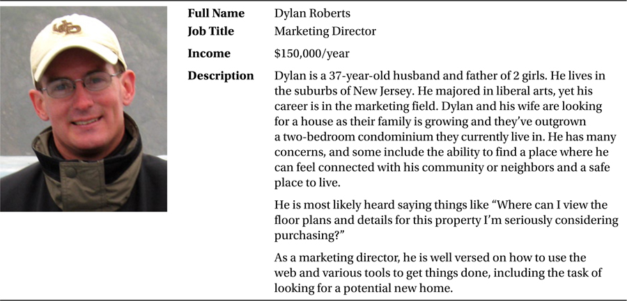
How does one create a persona? Personas can be as simple as a paragraph or a full-blown profile that can include demographics such as age, gender, income, name, technical experience level, a picture, and other characteristics. For the Specter web site, we realized there are at least three personas: a public web site user, a community member, and the web site administrator. Let’s start by describing what the public web site user’s characteristics look like.
We know that Specter’s web site is public; however, one of the goals is to reach out to those people who have purchased a property and encourage them to join the online community created for their neighborhood. This persona is crafted in a way to reflect that type of person, as shown in Table 3-1.
Table 3-1. Public Web Site Persona
Community Member
A member of the Specter web site needs to efficiently communicate with his or her community. We accomplish this by allowing the member to post news, add new discussion topics, and add new blog posts. Table 3-2 shows the community member persona.
Table 3-2. The Community Member Persona
Specter Web Site Administrator
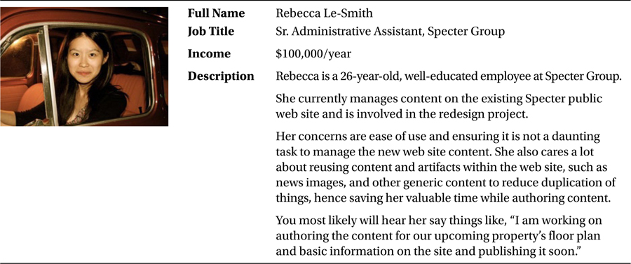
The web site administrator shown in Table 3-3 has the capability to add, edit, and delete various types of content including blog posts, news, and new community web sites. Having content structured correctly in addition to an intuitive authoring site is paramount for this role to be successful.
Table 3-3. The Community Member Persona
Task Analysis and Persona Task Definitions
The next activity within our process is to identify the common tasks for our users. We’ve created our personas, so we can now use them in the context of the user tasks.
User tasks help us understand the potential interaction between a user and the system, in our case the Specter Group web site and related community sites. Depending on the complexity and needs of a project, task analysis can range from “casual” to what is known as “fully dressed.” We want to keep things relatively simple and therefore have decided to document things using the casual approach, which has minimal information, yet is invaluable in our design process.
User Tasks
We start by asking ourselves relevant questions that can help determine what the common user tasks are for a given persona. For example, what are the users trying to accomplish on the web site?
If we were to come up with at least one task per persona for the Specter web site, this is what each task might look like.
PUBLIC WEB SITE USER
Dylan would like to get familiar with the upcoming properties Specter Group is showcasing on the web site. He browses to the Communities home page, and views properties by type. He then is able to preview all properties of that type and see a primary picture, description, and year built. Dylan then proceeds to fill out the contact form on the Specter web site to inquire on a property.
COMMUNITY MEMBER
Oliver recently experienced a theft and wants to post an alert to his community members about this incident. He browses his community web site and posts a new discussion board topic and later receives responses from his neighbors. Oliver obtains helpful tips, and awards a badge to his neighbor Sally after she provided him with a helpful tip.
WEB SITE ADMINISTRATOR
Rebecca wants to showcase an upcoming property on which Specter Group is finalizing construction. She logs into the web site, and she then creates a new community web site. She proceeds to add a primary picture, a description, year built, and location for use on a map. She then publishes the home page and all artifacts.
These tasks are simple, yet effective in providing insight as to the expectations of each user on the web site. Typically one can develop one to five tasks per persona if the system is simple, and 15 or more per persona for complex systems.
Information Architecture and Interaction Design
Now that we have gone through the process of creating personas and user tasks, we can start looking at how our users will find information on our web site. When we think of web application development we should be thinking of two main principles: interaction design and information architecture. Interaction design (IxD) is used to describe possible user behavior and defining how the web site will accommodate and respond to that behavior. Information architecture, as we’ve seen earlier, is focused on the categorization of information and determining how to present the information to our users.
The practice of information architecture is mostly used to create organizational and navigational systems (in our case the web site) that allow users to move through the web site content efficiently and intuitively.
Because the practice of information architecture calls for creating categorization schemes, we’ve created ours and mapped them directly to the end users’ needs. The basic information structure unit is a called a node and this node can be a group of information or an actual piece of information. For example, on the Specter web site, this can be a blog that holds all posts or it can be a blog post.
For the communities’ information architecture we used a top-down approach and started with the broadest category or node called “Communities” (global navigation menu item), which in our case is a group of information. The second-level node is the actual community and the most granular piece of information we deal with at this level is items such as a blog post or news article.
The wireframing or skeleton of the site can define the placement of many user interface elements, but the structure defines how users arrive to a page and where they will end up when they have completed their tasks (see the section “Wireframing and Design” later in this chapter).
The site structure we have come up with is shown in Figure 3-1. The information is presented in a way that directly reflects the web site objectives as previously discussed (see the section “Vision, Goals, and Objectives” earlier in this chapter).
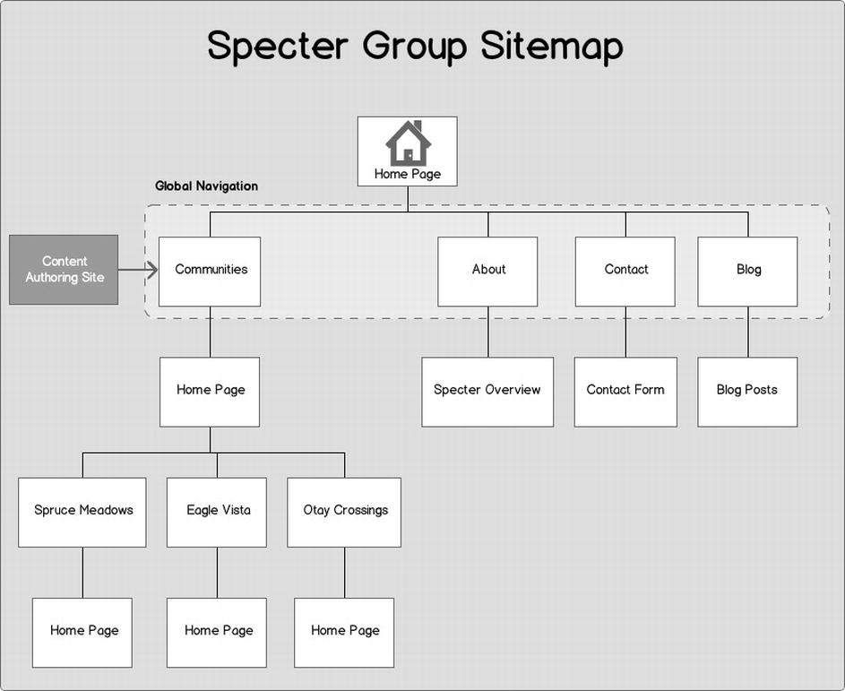
Figure 3-1. Specter Group site map structure
After learning about the Specter Group needs and the intended audience, as well as the overall site objectives, we started exploring how to present the main pieces of information via the global navigation. The global navigation is highlighted using a dotted section on Figure 3-1. The global navigation options are very few, and this is intentional as we feel the user has clear options to select from to immediately go to the main content areas regardless of whether the user is public or a registered member.
Tip One key element of building a proper site navigation and structure is to label artifacts appropriately. This plays an important role in ensuring users do not get lost on the web site and can efficiently find information with minimal effort.
Because we are building a SharePoint web site, we must plan and think of SharePoint-specific features to implement; one of them is the authoring of content. Therefore on our site map we’ve depicted where the content is authored and published. This authoring web site is where content such as floor plans, blog posts, and news items is authored and then published to the Specter Group public web site. This directly affects how we can make use of the new Cross-Site Collection Publishing feature and how we choose to configure it.
This stage of the design process is also a great time to start planning the SharePoint logical design, which includes among other things, site collections, sites, and content databases to ensure proper capacity and permissions planning. Any design team on a SharePoint implementation should be at least thinking of the SharePoint-specific planning involved to ensure the highest rate of success on any given implementation.
Note Given the site map structure, you will notice there is an authoring site. This maps to the new SharePoint 2013 Cross-Site Collection Publishing feature, which you can learn more about in Chapter 8.
Providing our users with the ability to navigate to areas that matter the most to them is essential, and the navigation element is the vehicle to achieve this. You can think of the navigation as the mechanism to the information architecture and structure we previously designed. There are common challenges in designing the proper or optimal navigation to any web site, and SharePoint web sites certainly are no exception. In fact, if you’ve played with SharePoint enough, you’d agree; it has a plethora of menu options and links on any given page that can easily confuse a user.
You can see from our example, shown in Figure 3-2, that we’ve designed the navigation on our site based on three basic principles:
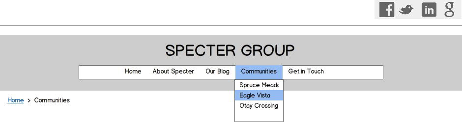
Figure 3-2. Specter web site global navigation
- We must allow users to get from one web page to another intuitively.
- We should make it easy for users to sense how menu items are related to each other.
- We should ensure the navigation element helps users understand what the relationship is between the menu item they clicked on, and the page they actually landed on; it should be obvious.
In our experience, most sites provide more than one navigation element, each one with a different purpose. Some of those could be social navigation bars or a site map and breadcrumbs as shown in Figure 3-2.
Planning web site navigation based on the principles we’ve already outlined is key. SharePoint navigation planning also requires special attention; this stage in the design process allows us to think of what type of navigation we might opt to use and why. Questions that we must inevitably ask ourselves are the following:
- Do we use static term-driven navigation or a hierarchy-based navigation?
- Do we use metadata navigation for some of the global navigation nodes?
If the client needs an ecommerce site, it might make sense to leverage the new metadata navigation to provide the list of products and product details. Imagine then using the new display templates customized to add a “Purchase” button, for example. The possibilities are endless. Understanding the many new navigation options in SharePoint 2013 at the design stage will certainly yield greater success and a product that is intuitive to use from an end user’s perspective.
Even if the structure of the web site is perfectly represented, web site users must still understand the vocabulary; that is, labels, terminology, or descriptions to help them find the information they are looking for within our site structure. Our intention should be to use the same language with which our users are familiar.
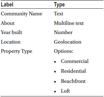
The Specter web site project certainly is a candidate for this metadata or common vocabulary. A great example of using this metadata within the Specter web site project is creating the definition of what a community is; in other words, we need to provide information about the information, which is exactly what the term metadata means. Table 3-4 shows us the metadata that describes a Specter Community.
Table 3-4. The Specter Community Metadata
Tip See Chapter 7 for a step-by-step exercise on implementing the metadata, term sets, and page layouts for the Specter Group web site on SharePoint 2013.
There are more benefits to having metadata created. What are some of those? Once the metadata is in place, the web site search engine can use it to refine searches, and different types of content can be connected or rolled up, filtered, and presented in a single page. On the site map listing, each community makes use of the metadata listed in Table 3-4 and this allows for construction of the navigation and other elements of the site.
As we go through planning our taxonomy, we must start thinking of some of the benefits and reasons why we need to carefully plan this as it relates to the SharePoint side of things. Some of those are the following:
- The ability to tag content that can be rolled up via search WebParts to leverage the new search-driven content features.
- The ability to customize the search user experience including the advanced search page, results page, and adding refiners to drill down on content results.
- Using terms, for example, allows for quick changes across the web site(s), sometimes to directly address compliance.
- Consistent use of corporate terminology.
Some of the specific SharePoint components we might start planning at this stage include the managed metadata service application, terms and term sets, content types, enterprise keywords, and the metadata hub, as a central location from where all managed metadata is syndicated across all web applications.
Planning these SharePoint components within the site structure and taxonomy planning stage can easily allow for the project team to draft configuration design documents specific to SharePoint as well.
Wireframing and Design
The structure is in place, and now it needs refinement. We now start identifying the elements of the interface, elements such as pages and the components within them. This activity is referred to as interface design and it will help make our web site structure more concrete as we are putting a visual representation to the conceptual structure previously developed. This includes refining the appropriate navigation spaces and the content areas within the pages. We start by creating wireframes, or a representation of a site void of imagery, typography, and normally of actual content. Wireframes allow us to see where elements on a given web page will go without having to worry about what the final site will actually look like. We complete what the final site will look like during the design phase after wireframes have been created and approved.
Tip For wireframing, we’ve used the popular Balsamiq Mockups software available for PC and Mac at http://balsamiq.com. There are also many free add-on controls (including the Bootstrap Grid System) and you can purchase the desktop version or use their web-based version.
Site Template (Skeleton)
The surface of a web site, or the end result, typically the imagery, buttons, photographs, and other elements, is what is on top of the skeleton or wireframe of a site. The skeleton or wireframe defines and optimizes the arrangement of these elements for maximum impact or to reach the intended effect.
Wireframing is the first step in solidifying what the user interface will look like. Having navigation in place, we now need to come up with conceptual wireframes of what the pages a user arrives at will look like.
One of the greatest challenges in designing interfaces is ensuring we show the most important information to the users as they navigate the interface. Good interface design practices ensure that the most relevant information is presented to the user so that he or she does not have to struggle to find it, but instead finds it readily available. This can be done by making some of the most important or relevant elements on the page larger or more prominent, such as news article titles or a login button.
We believe the most direct method of explaining wireframe is by example. Using the information we have gathered thus far for the Specter Group web site, we now proceed by creating wireframes. Our first wireframe is the overall site template that will be used for the base of our SharePoint 2013 HTML Master Page, and it covers general site elements such as the header, main content area, and footer. These components are annotated as shown in Figure 3-3.
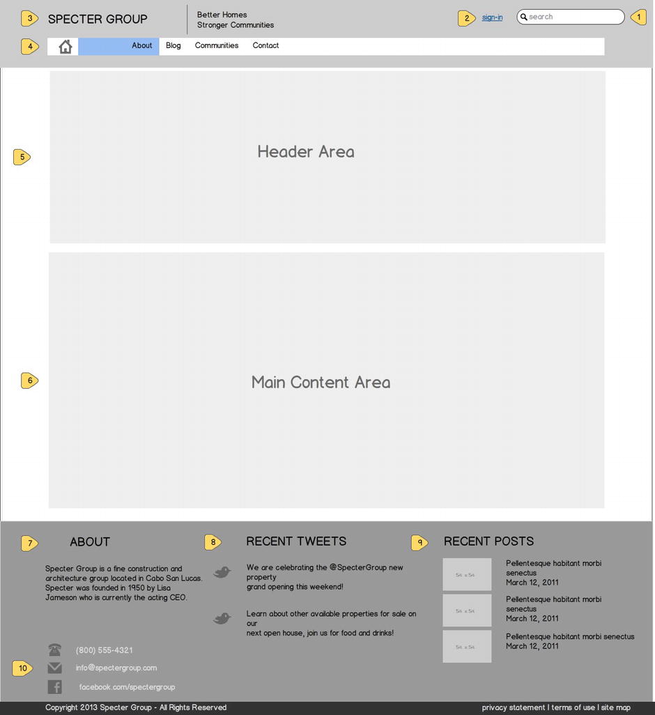
Figure 3-3. The Specter Group web site template shows each component and how it will appear
Tip See Chapter 4 for a walkthrough on creating an HTML Master Page in SharePoint 2013 and Chapter 5 for a step-by-step guide on incorporating responsive design with SharePoint 2013 Master Pages.
The following list provides more detail on the required capabilities for each component as per the Specter Group web site design requirements:
- Search Box: Allows for searching across the entire Specter web site.
- Login: This button appears when the user is not logged in. When the user is in fact logged in, the standard user actions SharePoint menu is shown.
- Specter Logo Image
- Top Navigation: This top displays the first-level pages of the Specter web site. The Communities menu displays existing Communities via a fly-out menu.
- Header Area: This area can be used to add widgets.
- Main Content Area: This is the standard main content area.
- About: This is static text.
- Recent Tweets: This widget shows the most recent tweets from Specter’s Twitter handle.
- Recent Posts: The most recent blog posts published by Specter that are tagged “Public” will be shown here.
- Contact Information
The Responsive Wireframing Approach
Specter Group is interested in catering to the audience that heavily uses their mobile devices to browse for properties for sale as an example. They are also interested in making sure community members can access the web site on the go and post news, share pictures, or add discussion topics via their mobile devices. To satisfy this requirement, we have also worked on an approach to visualize how the web site will look on the various supported widths of mobile devices which include tablets, desktops, laptops, and smart phones, as shown in Figure 3-4.
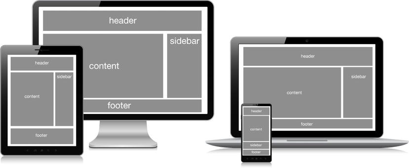
Figure 3-4. Responsive design wireframing caters to various screen sizes and adjusts content elements accordingly
Tip For an introduction to responsive web design, take a look at Chapter 2. Refer to Chapter 5 for a step-by-step guide on making an HTML master page responsive.
Supported Mobile Views
The full desktop experience is shown in Figure 3-5, supporting up to 1200×800 resolution. When viewing the Specter web site (see Figure 3-6) on tablets such as an iPad, several components adjust in size, including the logo. A smart phone view, such as for an iPhone (see Figure 3-7) is where we see a dramatic change in the user interface; all sections are adjusted to the mobile device width, including the logo. The top navigation now uses a drop-down list, and the footer content is rearranged appropriately and increases the overall height of our view. The user must scroll down to continue viewing the content.
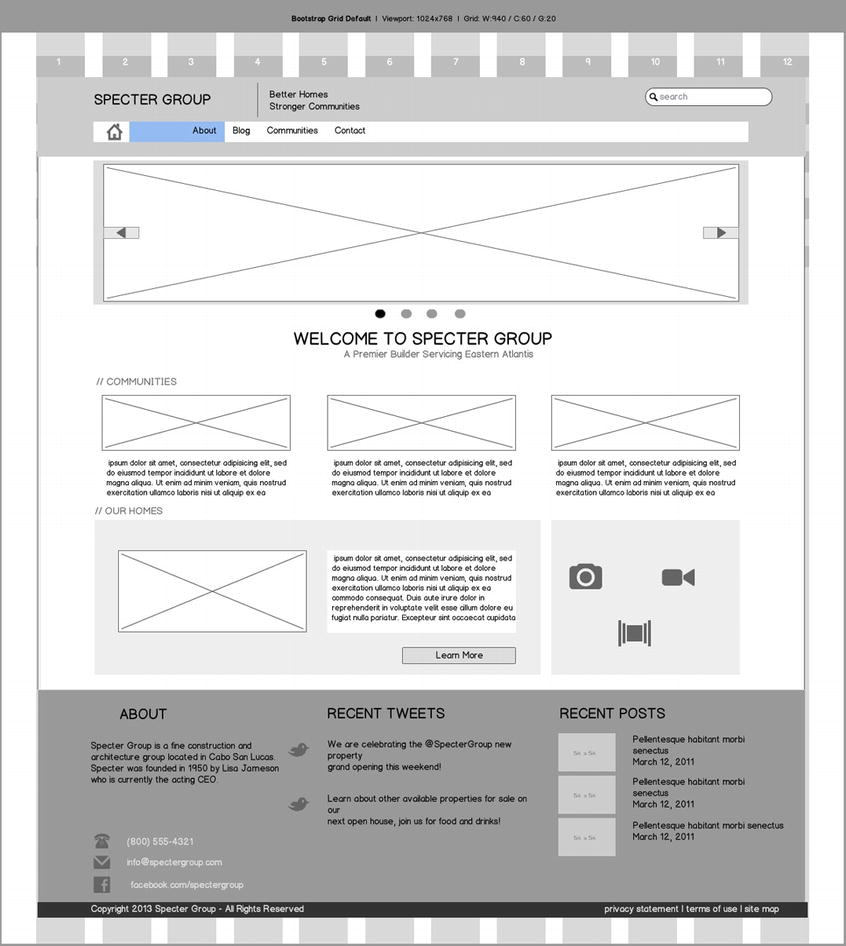
Figure 3-5. Full desktop wireframe of Specter Group home page
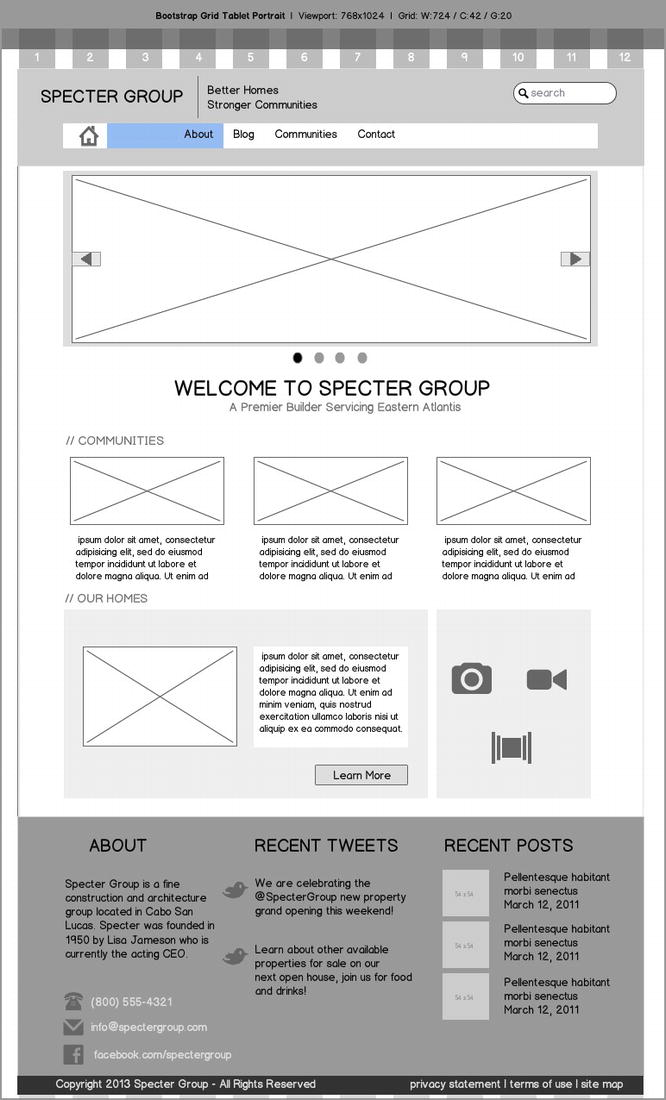
Figure 3-6. iPad (tablet) view of the home page
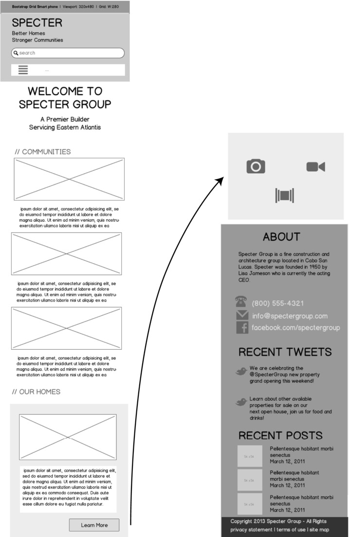
Figure 3-7. iPhone (smart phone) layout view of the home page. The top of the page is on the left and the bottom is on the right
You will notice how we include a grid system as part of our responsive design wireframing; this is a great way to visualize how the various elements on a page adjust as the screen dimensions change.
Wireframing Top-Level Pages
Building on the general wireframe created in Figure 3-4, expanded on to show the home page in Figure 3-5, and finally optimized for mobile devices in Figure 3-6 and Figure 3-7, we now look at other wireframe layouts for additional subpages. This section describes the top-level page layouts for the Specter Group web site. These layouts map to the SharePoint 2013 publishing page layouts and therefore serve as our blueprint for building publishing page layouts for the Specter web site.
What Is a SharePoint Publishing Page Layout?
What is a SharePoint page layout and how does it relate to the site template, otherwise known as the HTML master page within SharePoint 2013? We can think of the HTML master page as the site template, from which all site pages are derived. The page layout is actually just handling the content, whereas the HTML master page or site template handles the overall header, footer, and other common page elements. The master page and page layout are merged at runtime to render our page as shown in Figure 3-8.
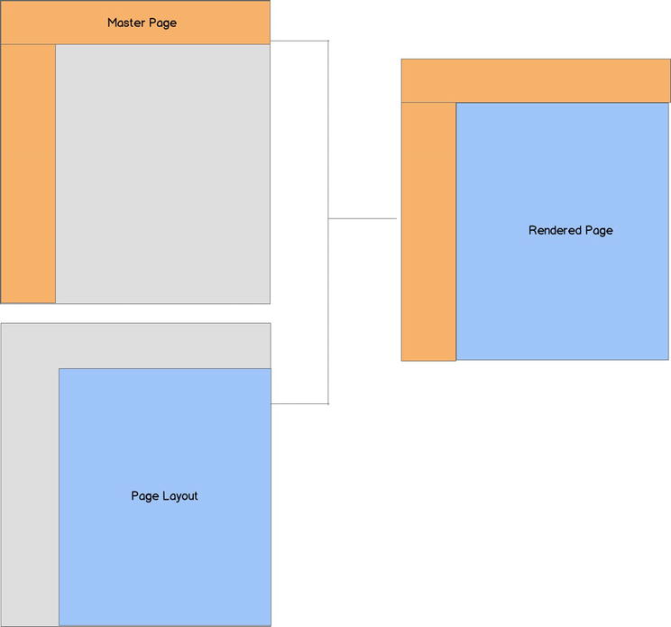
Figure 3-8. Master page and page layout rendering model
Tip For a detailed walkthrough on creating the custom publishing page layouts, see Chapter 7.
This is the landing page to which first time visitors and newly registered members are taken. It is also the default page a member is redirected to when signing in. The home page has two main sections, a header area and a main content area (see Figure 3-9).
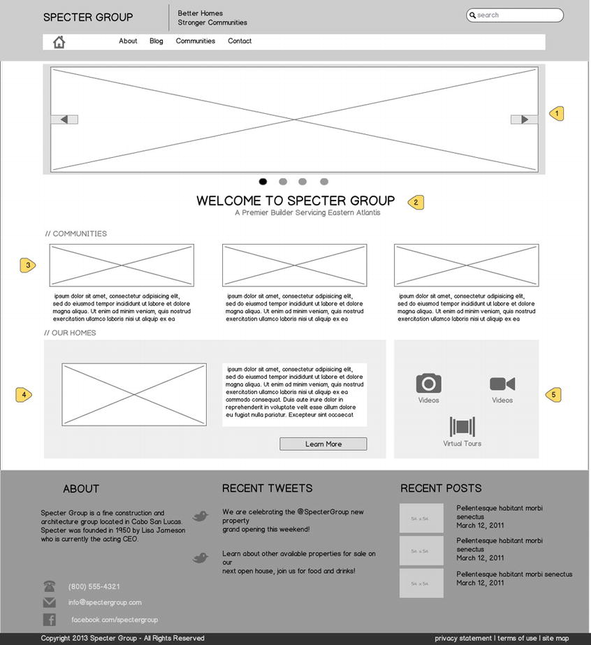
Figure 3-9. The Specter web site home page
- News gallery: The news gallery displays Specter Group news articles that are public and are viewable by nonregistered users. Each news item has a picture and short blurb. The news gallery is displayed as a slider.
- Page title: This component can be edited when the page is in edit mode.
- Communities: This area displays the latest communities with basic descriptions.
- Our Homes: This area features a residential home with a description and a button to obtain more details.
- Media: This section has links to photos, videos, and virtual tours for various properties.
Blog Page
The Blog page displays recent blog posts published by Specter Group and is rendered as shown in Figure 3-10. The blog categories are also retrieved and displayed on the right side.
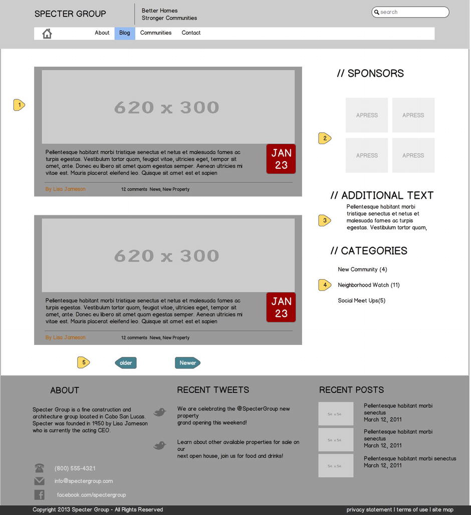
Figure 3-10. Blog page wireframe
This layout is used to create additional site pages; it uses the Specter custom branding background within the content area as shown in Figure 3-11.
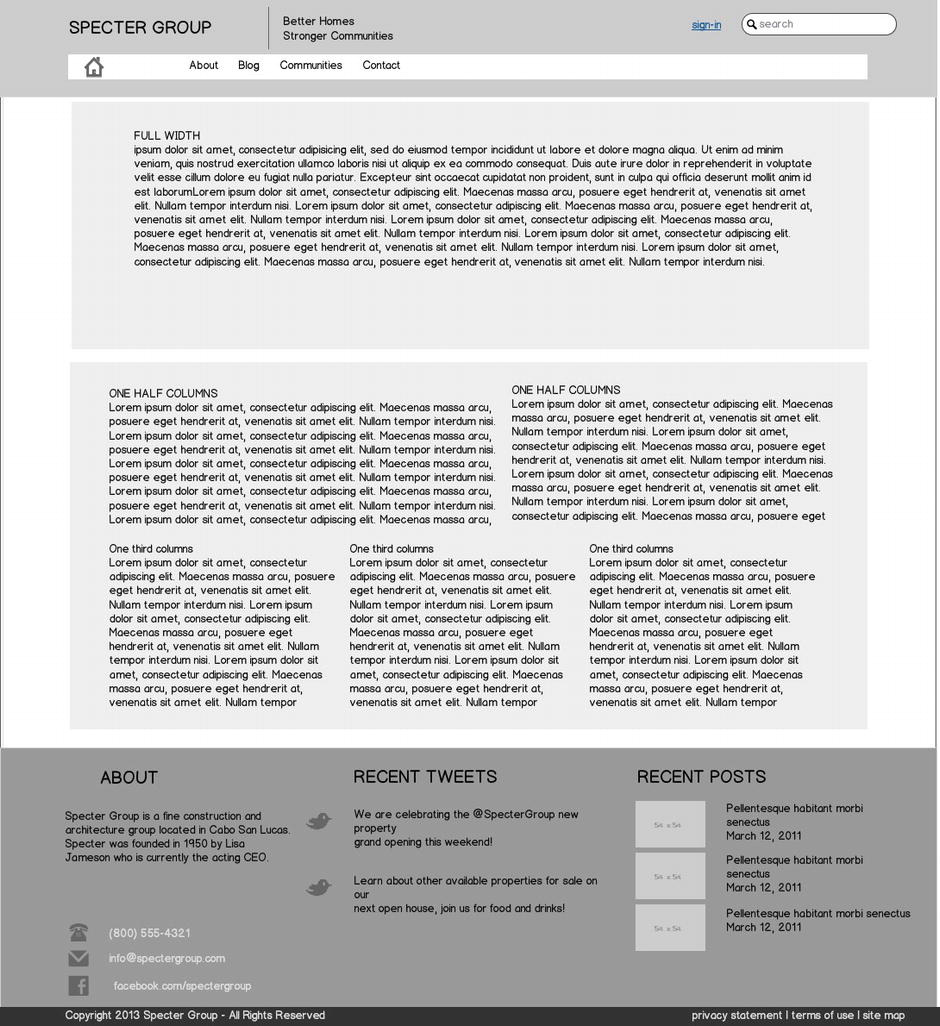
Figure 3-11. The subpage used to create additional pages
Communities Page
The Communities page showcases the Specter properties using an elegant filtering (see Figure 3-12) mechanism that allows a user to view properties by type such as Loft, Residential, Beachfront, and Commercial.
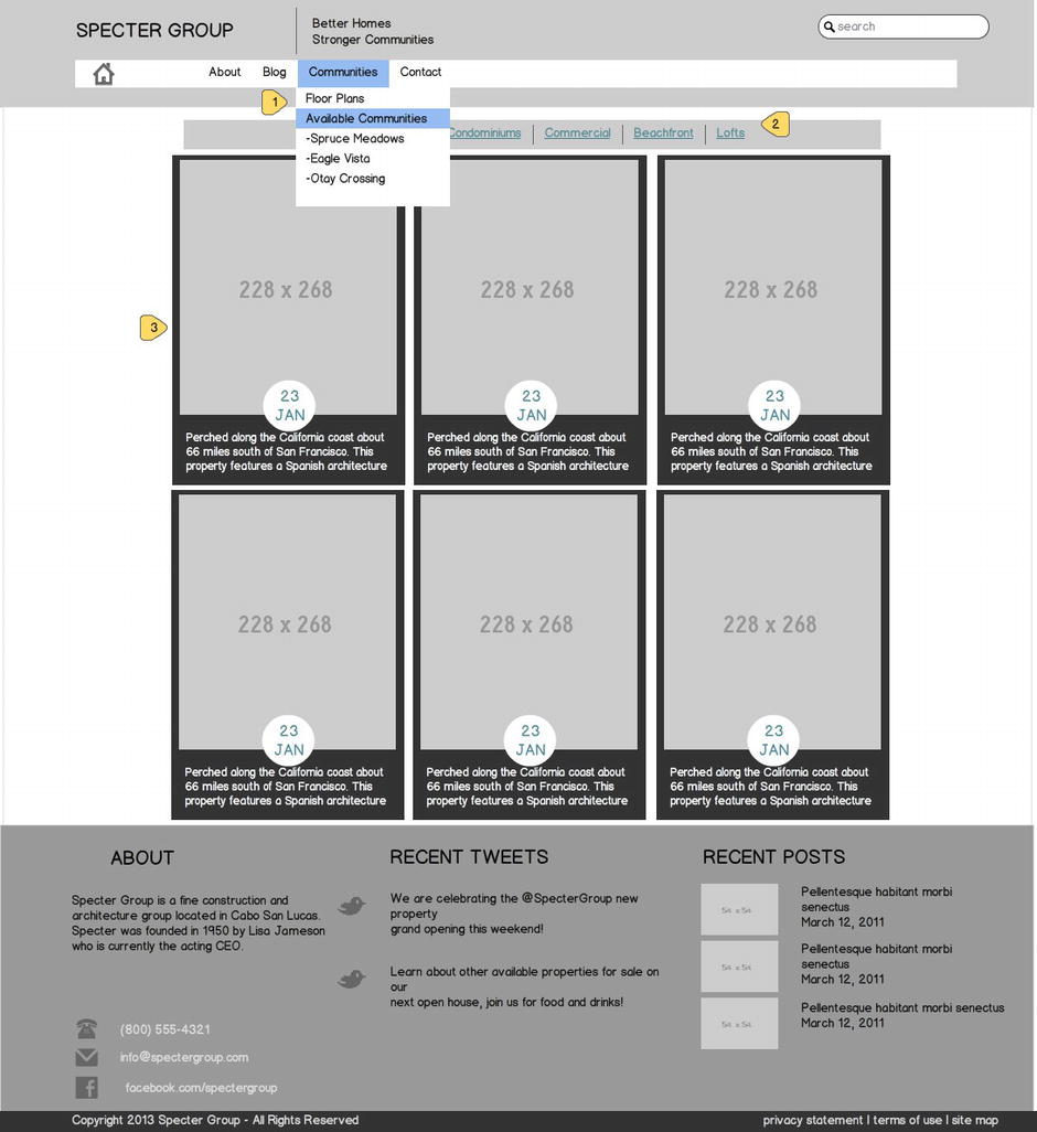
Figure 3-12. Communities home page on the Specter public web site
Tip You will learn how to filter and roll up the content we’ve been planning for using SharePoint 2013 new Cross-Site Publishing features and search-driven WebParts in Chapters 8 and 9.
- The top navigation Communities label takes the user to this view. When a user hovers over the menu, however, a fly-out menu displays all community web sites, and clicking on any of those will take the user to the home page of said community.
- Each property is rendered with a main picture, year built, and a brief overview.
Community Site Home Page
Each community will have the same capabilities and features as described on the home page section. The community home page wireframe is shown in Figure 3-13. The home page allows a community member access to all features available, such as creating a news article, creating a blog post, or adding a new discussion topic. A member also has the ability to share pictures or videos that are viewable via the media slider in the top section of the home page.
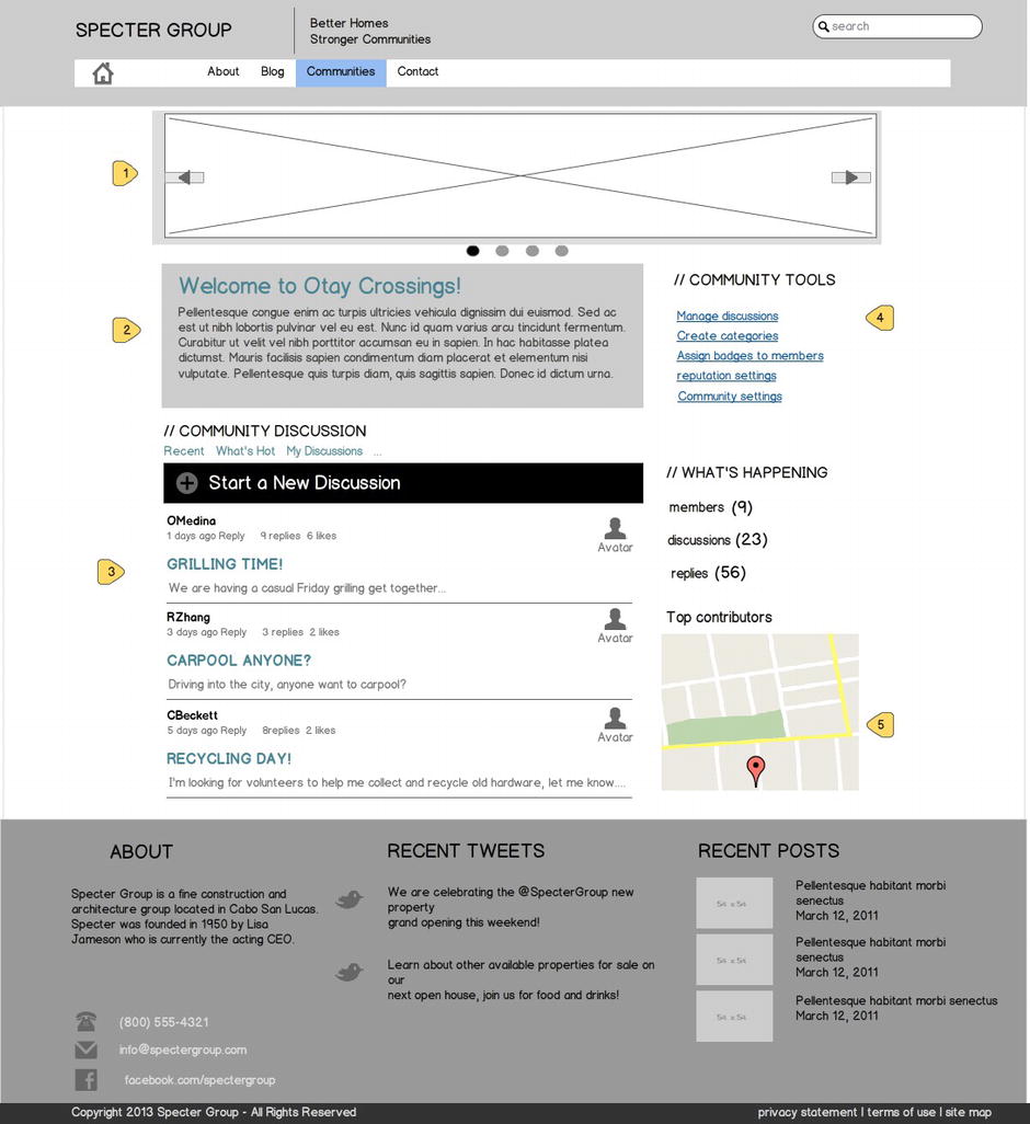
Figure 3-13. Community home page wireframe
- Community media slider: This component shows pictures and videos shared by community members.
- Community welcome and overview: This area allows for display of an overview about the community.
- Discussion board: This area displays the latest discussions and allows users to easily create new ones.
- Community Tools: This section allows for setting preferences and changing overall settings for a community.
- Map: This map displays the actual location of the community with a pin. When a user clicks on the pin, a bubble displays the community address details.
Tip For a step-by-step walkthrough on implementing geolocation (Item 5 in the preceding list), see Chapter 12 on how to integrate the new Geolocation field and HTML5 geolocation features in SharePoint 2013.
Design Comps
Once the wireframes have been created and approved, it is time to create the mockup or high-fidelity composition (comps) of how the web site will appear. This, of course, is an important step as we need the project sponsor buy-in. Full-fidelity compositions are typically implemented using tools of the trade such as Adobe Photoshop or Adobe Fireworks. Creating design comps is often the first truly “fun” phase of a web site design project (if you are the web designer) as you and the stakeholders finally get to see what the final web site will look like. This can be an exciting process with many opinions.
Unfortunately design comps are often the first phase for many projects (see the Tip that follows). By following the UCD process, however, including IA and wireframing, you should have such a good idea of how the web site will look by the time you get to design comps. This allows you to focus on design, imagery, typography, and polish, impressing everyone with a web site design that is not only highly functional and meets the goals of the business, but also looks outstanding.
Tip Design comps are often the first aspect of a project you or the project sponsor might want completed, but skipping the previously outlined steps including user analysis, task analysis, information architecture, and in-depth wireframing will provide a shaky foundation that no amount of "pretty paint" in a design comp can fix. One other thing to consider is that comps take more time to create and therefore iterations are lengthier, as opposed to wireframes. You have been warned!
The intent of producing design comps is to show all the pieces working together, and at this point we can see a one-to-one correlation between the components on the wireframe and the design comp. This is also where the stakeholder has a first look at the overall new design. We can see the new styles, typography, and global elements as well as the brand or identity applied, as seen in Figure 3-14.
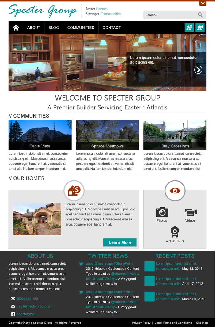
Figure 3-14. Full-fidelity mockup of the site template
The following comp showcases the new look of the Specter web site that follows the wireframe concepts and translates them into a full-fidelity comp.
Note You will notice we are not providing comps for all top-level pages, nor are we delving into how to generate CSS and HTML from the PSD or even creating Photoshop files, as this is outside the scope of this book. You can download and review all PSD comps including the full HTML version of the entire site for our book resource site at https://github.com/SPRWD.
Summary
In this chapter we have walked through the general process of planning a web site, practical for public-facing web sites, intranets, and extranets. As a demonstration, we used this process to provide the web site planning of the fictitious Specter Group public-facing web site using elements of the UCD approach. We walked through crafting examples of the business objectives and pivoted on those to further build the user analysis to understand our audience. We reviewed the importance of information architecture and site structure and the use of wireframes to bring a visual representation of that architecture, and finally to produce full-fidelity design comps.
In Chapter 4 we walk through the process for creating a SharePoint HTML master page based on the HTML handed off by the design team, which includes artifacts such as CSS and images. Chapter 5 then walks you through step-by-step instructions on how you can integrate the Twitter Bootstrap Responsive Grid System that comes with the framework on the custom HTML master page we create.