12
Schedule Control
There can't be a crisis next week. My schedule is already full.
Henry Kissinger
Major topics in this chapter are schedule control tools:
- Jogging Line
- B-C-F (Baseline-Current-Future) Analysis
- Milestone Prediction Chart
- Slip Chart
- Buffer Chart
- Schedule Crashing
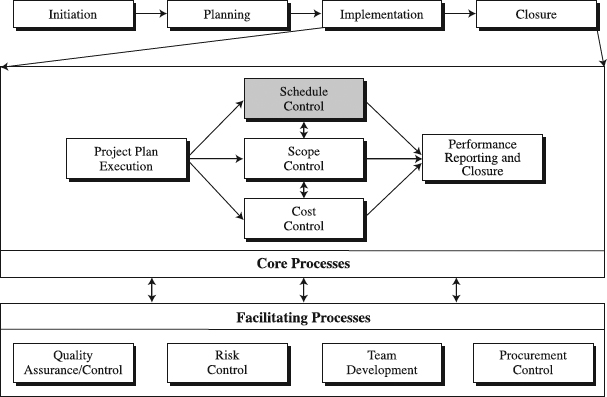
Figure 12.1 The role of schedule control tools in standardized project management process.
With these tools we will step into schedule control, doing our best to keep in check project schedule updates caused by the project plan execution. Coordinated with tools of scope and cost control, the updates become an important input into the performance reporting and closure of the project (see Figure 12.1). In that effort, a significant role belongs to facilitating processes of the project implementation phase. The purpose of this chapter is to help practicing and prospective project managers accomplish the following:
- Learn how to use various schedule control tools in the proactive cycle of project control.
- Choose schedule control tools that match their project situation.
- Customize the tools of their choice.
Mastering these skills is crucial to project planning and building a standardized PM process.
The Jogging Line
What Is the Jogging Line?
In a traditional sense, the Jogging Line spells out the amount of time each project activity is ahead or behind the baseline schedule. In that manner, the line indicates the fraction of completion for each activity to its left, and what remains to be completed to its right (see Figure 12.2). In recent, more innovative applications, the line is viewed as a step in the proactive management of the schedule. In particular, the amount of time each activity is ahead or behind the baseline schedule is used to predict the project completion date and map corrective actions necessary to eradicate any potential delay.
Constructing a Jogging Line
Prepare Information Inputs. To build a Jogging Line, you need quality information, including:
- The baseline schedule, whether a Gantt Chart or Time-scaled Arrow Diagram (TAD)
- Performance reports or verbal information about actual performance
- Change requests.
The first two components provide information on the planned progress (baseline) and the actual progress (report or verbal information) that the Jogging Line compares to establish where the project stands. Since the changes in the course of project implementation may occur such that they extend or accelerate the baseline, it is beneficial to take them into account when considering schedule progress and predicting completion date.
Figure 12.2 An example of the Jogging Line for a project.
Be Proactive: Five Questions of the Proactive Cycle of Project Control
Schedule control is no more than an application of the proactive cycle of project control (PCPC). It can be performed by answering the following five questions:
- What is the variance between the baseline and the actual project schedule?
- What are the issues causing the variance?
- What is current trend—the preliminary predicted completion date if we continue with our current performance?
- What new risks may pop up in the future and how could they change the preliminary predicted completion date?
- What actions should we take to prevent the predicted completion dates from happening and deliver on the baseline?
The purpose of the first question is to establish the variance—that is, whether the project or a specific activity is ahead of or behind the time plan (for more details about the schedule variance, see Chapter 14). Understanding what issues cause the variance is what the second question is after. Given current variance and productivity and current issues, the third question strives to identify where the project (activity) schedule may end up in the future. But since the future is unknown, it is better to explore now what new risks may pop up in the future and further endanger the schedule completion. This is the focus of question number four. Finally, question five nails down the most important step: act, act, act! Or in other words, it specifies how to act in order to crash all variances, disturbances, and derailments and come out on top, reaching the schedule goal.
Every review of schedule progress, no matter what tool is used, should be driven by these five questions of schedule-oriented PCPC. Do it every time, whether reviewing the schedule for an activity, milestone, or entire project. Doing it this way is about reaching the heart of schedule control—being proactive, always looking into the future.
Do a Rehearsal with Activity Owners. Like in the days of managing-by-walking-around, we suggest the project manager first see each activity (or work package) owner privately, one-on-one. Ask about
- The progress of tasks that the activity comprises (for more details, see the box “When Assessing the Actual Status, Go for Satisficing” later in this chapter)
- Whether the progress differs from the plan, and if so, what causes and issues led to it
- When they anticipate finishing the tasks
- What can be done to finish them as planned; what help you can offer
All these questions are about the constituent tasks of an activity (work package). Now is the time to ask how the answers to the task questions will translate into the activity progress—ahead or behind the plan, predicted completion date, and major corrective actions. Essentially, a meeting like this is a rehearsal for the project progress meeting that will draw the Jogging Line. Its fundamental purpose is to train and prepare the activity owners for the project progress meetings by using a proactive cycle of project control (see the box on page 384, “Be Proactive: Five Questions of the Proactive Cycle of Project Control”). Sure, this looks like a time-consuming rehearsal for people with a busy work schedule. But probably one or two rehearsals will be necessary for the activity owners to learn how to prepare for the progress meetingAfter that, the meeting may be a few minutes long or it can be done over the phone or via e-mail. Or, if the activity (work package) managers learned how to prepare, no rehearsals would be necessary.
Call the Progress Meeting. Progress meetings instill the discipline and regularity in reviewing strides that you make in the project. They should be called on a regular basis—once a month for a long project or once a week for a short project, for example. The meetings may be formal, sit-down meetings with an official scribe, in which case, a clear and timed agenda should be communicated beforehand to the attendees. Or, in a high-tech organization, long on workload and short on time, it is perfectly appropriate to stage short, on-the-go, stand-up meetings. Again, the key to it is regularity and meeting discipline.
Proactive Cycle of Project Control and Deming's PDSA Cycle
The five questions of PCPC are in perfect harmony with Deming's plan-do-study-act, a never-ending circular approach to improvement (see the box titled “How Are Quality Improvement Map and PDSA Cycle Related?” in Chapter 14). Once the schedule baseline is established in the plan step and project work is being carried out in the do step, PCPC questions one, two, three, and four come into play in the study step (see Figure 12.3). Here the schedule variance is established, its cause determined, and trend forecasted based on current issues and future risks. Then, in the act step, question five leads to the identification of connective actions, which will be planned for and implemented in the plan-do steps of the next PDSA cycle.
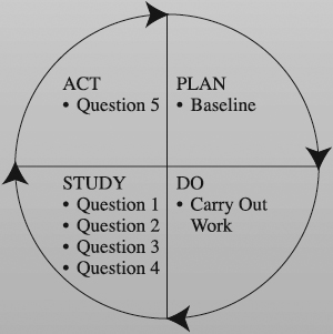
Figure 12.3 Proactive cycle of project control is part of the plan-do-study-act cycle.
Ask about the Activity's Actual Progress. The same five questions of PCPC that were asked in the rehearsal with the activity owners should be used again to assess their progress. For clear understanding of the relationship between PCPC and Deming's Plan-Do-Study-Act cycle, see the box on page 385, “Proactive Cycle of Project Control and Deming's PDSA Cycle.”
Where there are interfaces and dependencies between activity owners, focusing on them is crucial, since that is where the potential seams may appear on the project. Depending on the culture of the organization, activity owners can bring written reports or just verbal information to the meeting.
Draw the Jogging Line. Drawing the line includes several steps:
- Begin with the project baseline schedule.
- Mark on the schedule's calendar the date of the progress meeting, whether it's called data date [3] or, more informally and also more traditionally, the reporting date.
- From that date, draw a line vertically down until reaching the first activity in the schedule. The activity owner will tell how many days the activity is ahead or behind the baseline. It is of vital importance that their information is reliable. If that's not the case, see what may happen in the box that follows, “Garbage In, Garbage Out.”
- Draw a horizontal line to the left off the data date for as many days as the actual schedule is behind. Or, if you are ahead of the schedule, draw the horizontal line to the right off the data date for as many days.
- At that point, draw a vertical line crossing the first activity.
- Repeat the whole exercise with all other activities.
- When vertically crossing the last activity, draw the line horizontally back to the data date and then turn vertically down. In this way, the Jogging Line begins from and ends at the data date.
Predict Project Completion Date. Knowing how much each activity is ahead of or behind the schedule prepares you for making an educated forecast of the project completion date and identifying early actions to finish on time. Details about this are described in the box “Forgetting Trend Analysis: Déjà Vu?” later in this chapter.
Garbage In, Garbage Out
“In a progress meeting, an activity owner told me his deliverable was three weeks behind the schedule. A week later, he reported that he caught up with the deliverable and was right on schedule. Knowing that he was the only person working on the activity, I polled several experts: ‘how many hours would it take to complete the catch up work?’ The answer was ‘about 150 hours.’ You think he could do that? No! He is not on top of things, and submits inaccurate reports. Tell me, then, how can I be proactive and predict the project completion date?” This is a story we heard from a project manager in a leading software firm. The moral to the story: poor activity reports, poor trend forecast.
Utilizing the Jogging Line
When to Use. Large and small as well as complex and simple projects are a fertile ground for the Jogging Line's use. In such situations, when it comes to tracking progress only, the line is equally a nice fit with both the Gantt Chart and TAD. When you are relying on the Jogging Line for its innovative forecasting use in larger and complex projects, it is easier to apply it in a TAD (see the box that follows, “Using a Jogging Line in a Project War Room is a Blast”). Because TAD includes dependencies between activities, it is easier and more reliable to translate the amount of time each project activity is ahead or behind the baseline schedule into the projected completion date for the project. This is not the case when working on small and simple projects. There, having the dependencies is not an issue, and the Gantt Chart will suffice. At any rate, the Jogging Line may be used in all progress reviews, whether formal or informal.
Time to Develop. A reasonably skilled and prepared project team can prepare a Jogging Line for a 25-activity Gantt Chart or TAD in 15 to 30 minutes. As the number of team members grows, so does the necessary time.
Benefits. The value of the Jogging Line is in both its historic and forecasting power. The former means that it accurately tells an activity owner and the project team the history of the activity's progress. Using the history, then, of course, they can forecast future schedule trend and strategize actions to deliver the project as planned. For more details about trending see the box titled “Forgetting Trend Analysis: Déjà Vu?” later in this chapter.
Advantages and Disadvantages. The major advantages of the Jogging Line is that it is
- Visual. It vividly indicates the work done, supplying the project team with an invaluable communication means.
- Simple. In a matter of minutes, almost any project participant can read and draw the Jogging Line.
- Proactive. When used for predicting trends, the Jogging Line helps build an anticipatory mindset, equipping the project team to act in advance to combat an expected difficulty.
Using a Jogging Line in a Project War Room Is a Blast
There is something ritual about major project progress meetings in Southern Systems. A huge TAD is sitting on the wall of the project war room, ornamented with strips of adhesive tape, all of them differently colored. No secrets here, each tape is a Jogging Line, visually displaying progress in a certain week. Well armed with information, activity owners report on where their activities are compared to the baseline, filling the air with their passionate voices, interacting with the users of their activity outputs, and taping a piece of Jogging Line for their activities. Like fortune-tellers, they anticipate their activity future to help visualize when their project will end. Obviously, they are happy to be needed by their company, working on this product development project.
The major shortcoming of the Jogging Line is that it may be
- Time-consuming. It may take time to prepare good information to draw the line and predict a trend.
- Demanding when forecasting completion. The Jogging Line shows how far behind or ahead the activity currently is. It does not automatically forecast how far ahead or behind it will be at completion. Rather, the project team has to make that forecast. B-C-F Analysis displays this more effectively.
Variations. There are several Gantt Chart-based tools for schedule control that project teams usually consider before discovering the value of the Jogging Line (see Figure 12.4):
- Shaded Bar Method
- Plan vs. Actual Bar Method
- % Complete with Plan vs. Actual Bar Method
The Shaded Bar Method uses shading to indicate the portion of the activity that has been completed. While very visual, that shaded portion cannot show when the implementation of the activity started, how much of the activity scope was really completed, and how much the actual implementation is behind or ahead of the schedule. Only one of these shortcomings is resolved by the Plan vs. Actual Bar Method, which visually compares the plan bar with the actual bar—we see when the implementation of the activity started. % Complete with Plan vs. Actual Bar Method also relies on the plan and actual bar but adds percent complete for each bar. The strongest of these three methods, % Complete with Plan vs. Actual Bar Method, suffers from an inability to reveal how much the actual implementation of an activity is behind or ahead of the schedule. By adding actual bars, it also increases the number of bars on the Gantt Chart, making it more complex. Faced with this increased complexity, many would see the Jogging Line as more effective.
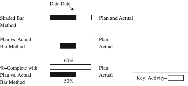
Figure 12.4 Less effective alternatives to the Jogging Line.
The Jogging Line often goes by the name of time line [9]. A variation of the Jogging Line is called the zigzag line. The zigzag line connects data date on the calendar with the point of actual fraction of completion on the first activity to the point of actual fraction of completion on the second activity and continuing through points of actual fraction of completion of other activities. Perhaps the single most important variation is the Jogging Line that replaces each activity with one project, becoming a great tool for multiproject managers eager to track the schedule of their multiple projects. On a single sheet, you can portray the Jogging Line for 20+ projects.
Customize the Jogging Line. A focused adaptation of the Jogging Line accounting for a project's specifics is a must and provides the project with the best-possible benefits. Above are a few examples of adaptations.
Summary
This section featured the Jogging Line, a tool that spells out the amount of time each project activity is ahead or behind the baseline schedule. Large and small as well as complex and simple projects can use the Jogging Line, and it meshes equally well with both the Gantt Chart and TAD. The value of the Jogging Line is in both its historic and forecasting power. Because it shows the history of the activity's progress, it can help forecast a future schedule trend and strategize actions to deliver the project as planned. To sum up, the following box highlights the key points in developing the Jogging Line.
Jogging Line Check
Check to make sure you developed a good Jogging Line
- The line should be continuous.
- It should start at the data date.
- It should cross each activity (or project) to indicate its time variance—that is, the amount of time each activity (project) is ahead of or behind the baseline schedule.
- It should end at the data date.
- It should be drawn on an appropriate baseline schedule in the form of a TAD or Gantt Chart.
B-C-F Analysis
What Is B-C-F Analysis?
The B-C-F Analysis, which stands for Baseline-Current-Future Analysis, compares the baseline project schedule with two predicted schedules—the first one based on the current schedule performance and the second one derived from the worst-case future scenario (see Figure 12.5). As a result, we detect schedule trend, or in other words, where our schedule is going. Most importantly, if the trend is unfavorable, it forces us to design actions to prevent it, and to many users this is the ultimate purpose of all of these proactive schedule control tools.
The three schedules can be either in the format of the Gantt Chart or TAD. Whatever the format, the B-C-F schedule is no more than an application of the old tools with a new twist of anticipatory attitude. Simply, this tool is much more about a novel mind set than about a novel tool design.
Performing the B-C-F Analysis
Prerequisites to an effective B-C-F Analysis are
- The baseline schedule, whether a Gantt Chart or TAD
- Performance reports or verbal information about actual performance
- Change requests
Figure 12.5 An example of B-C-F Analysis.
The baseline schedule—the first prerequisite—is the first part of the analysis. Performance reports or verbal information about actual performance help establish where the project stands, thus serving as an input in predicting the current schedule. Another input into the current schedule building is information on change requests.
Draw a Jogging Line. The B-C-F Analysis begins with the steps that we described in developing the Jogging Line. In that process the goal is to perform a rehearsal with activity owners, call the progress meeting, ask about activities' actual status (see the box that follows, “When Assessing the Actual Status, Go for Satisficing”), and draw a Jogging Line over the project baseline schedule. This should tell clearly how much each activity is ahead of or behind schedule.
Prepare the Current Schedule. Armed with the knowledge of how much each activity is ahead of or behind the baseline schedule, what current issues are, and what remains to be done, forecast when each of the activities will be completed. This will produce a new duration for each activity, when it was started, and when it will be finished. Using this information, a new schedule will be drawn (a Gantt Chart or TAD). This is the current schedule, reflecting how the project is expected to unfold in the future given the activity performance of the past.
When Assessing the Actual Status, Go for Satisficing
To respond to question one of PCPC—What is the schedule variance between the baseline and the actual project schedule?—you must first assess the “actual” schedule status. A productive way to do this is to apply schedule variance (SV) or schedule performance index (SPI) discussed in Chapter 13 on Earned Value Analysis. Each of them aims at establishing the actual amount of completed scope of work for each point in time on the schedule and finding the variance by comparing it with the baseline. Which method should you use?
The majority of managers use the satisficing approach when making complex and unprogrammed decisions [4]. They don't search for a perfect solution, since it requires time and resources they may not have on their hands. So, they don't seek for being perfectly rational. Rather, their goal is to find a solution that is good enough and fits in with how much time and resources they have. This means they are boundedly rational, or satisficing, a word combined from two words, satisfactory and sufficing.
Then, how does a project manager go about a satisficing approach when assessing the actual status? Take, for example, a small and simple project, one of five the manager is concurrently managing. She is not satisficing if she spends hours to find out that the project is 7.2 days late. The cost of acquiring this information is too high for her, although it appears like a perfectly rational approach. Instead, she may spend half an hour with her team in an informal PCPC-based meeting to establish that the project is approximately a week to ten days behind. When satisficing, the crux of the matter is to match the size and complexity of the project with the possible solution to a decision problem and your available time. Generally, most of the project manager's project decisions could benefit from such an approach.
Develop a Future Schedule. To develop this schedule, you should ask, “What risks may pop up in the future and sink our ship?” This is a worst-case scenario type of planning, in which the axe of the Murphy's law—if things might go wrong, chances are they will—is hanging above the project's head (see the box titled “Forgetting Trend Analysis: Déjà Vu?” later in this chapter). Visualizing threats, dangers, and risks that the project may encounter in its march toward the end helps in developing the future schedule. If it doesn't work, asking seasoned project managers about their worst experiences with the same type of project is another alternative. For example, one of them may say her technology vendor went belly up during her project and set her back by six months. Brainstorming with team members to identify such risks is helpful as well, especially if the organization has a risk checklist (see the box that follows, “Issue Database: A Checklist for Future Schedules”) [10].
Once the risks have been identified, the next step is to figure out how each of them can impact future schedules (see the box titled “Issues and Risks” later in this chapter). For this, the project team needs to look closely at the dependencies between activities in the current schedule. Will the risk impact activities on the critical or noncritical path? If the impacted activities are on a noncritical path, will the whole total float be eaten up? How much could it push out the completion of impacted activities? If the critical path is impacted, how much will the project completion be pushed out? When the team develops answers to these questions, take the current schedule and extend activity durations accordingly to obtain the future schedule.
Action, Action, and Action. The major purpose of all preceding steps is to equip the project with an early warning signal. A signal that says, “take action to resolve the issues causing the current schedule variance and mitigate risks to future schedule.” If the issues cannot be put to a stop, there is a need to rechart the future schedule and find alternatives that would lead the project team to deliver as expected per the baseline schedule. Two approaches are handy here: fast-tracking and crashing, or their combination.
Issue Database: A Checklist for Future Schedules
When developing the future schedule in the B-C-F Analysis, a project team in a high-tech organization first goes to its issue database as a checklist (see Chapter 15 for information about issue databases). These issues that already happened in past projects may hit their project in the future. Therefore, they are potential risks to their project. For each issue in the database, the project team asks: “Could this issue become a risk in our project? Would its impact on our project be different from the impact it had on the past projects? Would actions taken in the past projects work in our project, or would we have to use different actions to defend against such risks?” The database is built over time to include crucial lessons learned about major issues and their impact in past projects. So, it is both experiential and realistic. Using this tactic saves a lot of time in meetings, helps build future schedules of better quality, and uses past experience in mitigating risks.
- Go back to the future schedule and focus on hard and soft dependencies between activities.
- Turn any of the sequential activities with hard dependencies into overlapping activities as much as possible, while still observing the hard dependencies.
- Reexamine all soft dependencies in order to overlap as many activities as much as possible.
- Also, given the soft dependencies, pick activities that can be performed out of the sequence established in the schedule.
Although all of these changes can help accelerate the project, you need to search for more opportunities. Crashing the schedule by throwing in more resources to reduce duration of activities on the critical path can provide additional time savings (see the “Schedule Crashing” section later in this chapter). Fast-tracking and crashing, however, may substantially increase the number of critical activities and paths, putting more pressure on project time management. In situations like this, you must live with an attitude of “if it is to be, it's up to me.” In other words, get to work (see the box that follows, “Tips for B-C-F Analysis).
Utilizing B-C-F Analysis
When to Use. B-C-F Analysis is very beneficial to those using Gantt Charts or TADs. In projects with Gantt Charts, applying B-C-F Analysis requires knowing well the dependencies between activities, even if they are not shown on the Gantt. When dependencies are formally identified via TAD, the stage is well set for the B-C-F Analysis. In both applications, the bottom line is to be proactive (see the box that follows, “This Is Exactly What I Need”) and insist on applying the B-C-F Analysis consistently in progress reviews, both formal and informal ones. The analysis is more applicable to smaller and medium-sized projects than to large and complex projects.
Time to Perform. A reasonably skilled and prepared project team of smaller size can prepare a B-C-F Analysis for a 25-activity Gantt Chart or TAD in 45 to 60 minutes. The necessary time will expand as the team size is increased.
Tips for B-C-F Analysis
- Give rehearsals for the B-C-F progress meetings ritual significance. The better the meetings are, the better the analysis.
- Ask for good enough, not perfect, current and future schedules. The focus is on trend, not precision.
- Insist on maximum interaction among activity owners in progress meetings to help them understand how they impact each other and the project.
- Observe which activity owners tend to be too optimistic or pessimistic when forecasting completion times. They may need personal coaching to overcome these tendencies.
“I run five-six projects at a time in a matrix environment filled with a constant pressure to deliver faster. Typically, my teams use Gantt charts with about ten activities and meet once a week for 45 minutes to review schedule progress. When the meeting is over, I know no more than how much project activities are delayed. Reporting this to my boss is embarrassing, because he always tells me to be more proactive, asking me when the project will be completed. I don't know what to do,” confided a project manager. When introduced to B-C-F Analysis, his reaction was, “This is exactly what I need.”
Benefits. B-C-F Analysis is one of those simple tools that helps reach the ultimate in project management: predictability of the project schedule. Through consistent forecasting of the activity and project completion date in progress reviews, combined with deep understanding of the root causes of the reasons for schedule delay and reinforced with remedial actions, B-C-F Analysis prepares the project team to see and tell the future of their project schedule.
Advantages and Disadvantages. The advantages of B-C-F Analysis are that it is
- Visual. It provides a graphic representation of the project schedules that is conducive to dynamic and productive communication between the project team and management and within the project team.
- Proactive. It helps prevent project fires by acting now instead of later when the fires are burning and are difficult to extinguish.
On the other hand, B-C-F- Analysis may
- Pose a behavioral resistance. Many project participants are not used to being proactive. Rather, they prefer to respond to unfavorable project situations when they occur. Asking them to use the analysis may mean fighting their resistance, an uneasy proposition to many project managers.
- Be complex. In projects with large schedules with many dependencies, the application of B-C-F Analysis may be too challenging and time-consuming.
Variations. Multiproject managers tend to use B-C-F Analysis as a tool for schedule control of multiple projects they manage concurrently. In that case, each line in three schedules represents not a project activity but a project. Essentially, the analysis produces the baseline, current, and future schedules for a group of projects—for example, four to seven projects.
Customize the B-C-F Analysis. What we have described so far is a generic analysis. It may be good for any project, but more often than not, you need to adapt it to specifics of the project situation to get the most out of it. The examples above illustrate the adaptation.
Summary
B-C-F Analysis was the central point in this section. This tool compares the baseline project schedule with two predicted schedules—the first one based on the current schedule performance and the second one derived from the worst-case future scenario. Whether this is done with Gantt Charts or TADs, B-C-F Analysis offers a proactive scheduling approach. In particular, by means of consistent forecasting of the schedule, B-C-F Analysis prepares the project team to visualize the future of their project schedule and devise actions necessary to get there. The analysis is more applicable in smaller and medium-sized projects than in large and complex ones. The following box recaps the key points in performing B-C-F- Analysis.
B-C-F Analysis Check
Check to make sure you performed the analysis effectively. The analysis should include the following:
- Baseline schedule, Gantt Chart, or TAD
- Data date
- Current schedule, developed on the basis of performance reports or verbal information about actual performance
- Future schedule, based on current schedule and information about risks
- Specified actions that could help deliver the project per baseline schedule, if the future schedule indicates a negative trend.
Milestone Prediction Chart
What Is the Milestone Prediction Chart?
Like other proactive schedule control tools, the Milestone Prediction Chart anticipates the expected rate of future project progress. Unlike other proactive schedule control tools, it focuses in those predictions on major project events—milestones and project completion. Note in Figure 12.6 that a vertical axis shows the team's predicted completion date for a specific milestone, while the horizontal axis shows the actual date the prediction was made. Obviously, the beginning point on the horizontal axis is the time when the schedule baseline is prepared, and its milestone dates are marked on the vertical axis. After the beginning point, the project work is kicked off and the horizontal axis represents the actual project time line; the team reviews progress regularly and makes milestone predictions. By connecting all predictions for a particular milestone into a line, we can obtain the milestone trend line. If the line approaches the completion line going upward, we would know that there would be the milestone slip. Delivering the milestone right on time would produce a line approaching the completion line horizontally. If we estimate an early milestone completion, the completion line would be approached downward. Although it is effective in predicting milestone progress, the chart is even more effective if used to develop actions required to eliminate any potential deviation from the baseline milestone schedule.
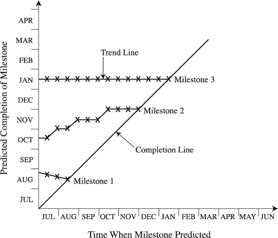
Figure 12.6 An example of the Milestone Prediction Chart.
Constructing the Milestone Prediction Chart
Prepare Information Inputs. The following quality inputs are necessary to build the chart:
- The baseline schedule, preferably with dependencies
- Performance reports or verbal information about actual performance
- Change requests
The first baseline's purpose here is to provide the planned milestones to be entered on the vertical axis. Also, the schedule reveals activity dependencies necessary for the milestone impact analysis. Future predictions of milestones (for importance of predictions, see the box that follows, “Forgetting Trend Analysis: Déjà Vu?”) will be based on performance reports or verbal information, as well as on change requests that are being reviewed or are in preparation.
Forgetting Trend Analysis: Déjà Vu?
Western corporations invented quality management, forgot it, and relearned it in hard battles with the Japanese counterparts [1]. Are we seeing the same phenomenon of forgetting when it comes to trend analysis, questions three and four of our PCPC? Our experience shows that the majority of projects in their schedule control and progress reports place an emphasis on the history part, leaving out the trend forecast of the completion date. As experts wrote a long time ago, the purpose of the project control is “No sudden shocks, please!” [5]. In other words, we predict trend because it is much better if we could know in good time what is going to happen, “rather than just watch it happen” [5]. This makes trend analysis–where we are going–the single most important piece of information in project control.
Our managers, especially those in the time-to-market business, hate to suddenly hear that the schedule is going to slip. To them, it is much more meaningful to learn that ahead of time, if the project is going to be delayed indeed. Having a trend projection, then, provides the managers with “early warning signals” so they can act while it is still possible to reverse unfavorable trends [5]. Are these comments belittling the role and value of the historic information in schedule control, question one and two in PCPC? Not really. What we are saying is that history, of course, can't be influenced and the future can, so it is more important for the project team to use that historic information to forecast a future schedule trend and strategize actions to deliver the project as planned. It is for this reason that trend analysis should be the central piece of the schedule control.
Do a Rehearsal with Milestone Owners. Good preparation for progress meetings that are chartered with developing the Milestone Prediction Charts has a tremendous impact on how well you control a project. This is the reason we say that rehearsal with milestone owners is indispensable. Because the rehearsal with milestone owners is essentially the same as the one with activity owners, you can refer to the “Do a Rehearsal with Activity Owners” subsection in the “Jogging Line” section in this chapter. That will help you design an appropriate process for the rehearsal with the milestone owners, which would also include their rehearsal with owners of activities that constitute the milestones.
Call the Progress Meeting. In terms of substance, the “Call the progress meeting” subsection in the “Jogging Line” section of this chapter holds true here as well. Where the difference may occur is the meeting attendance roster. The project manager typically needs milestone owners to attend, and they may want their activity owners to attend. All of them need disciplined and regular meetings with a clear and timed agenda, where invaluable information is exchanged for the benefit of proactive milestone schedule control. It is an imperative to use a proactive control approach (see the box titled “Be Proactive: Five Questions of the Proactive Cycle of Project Control” earlier in this chapter).
Ask about the Milestone's Actual Progress. Formally or informally, based on verbal or written information, milestone owners need to provide answers to the rehearsal questions again in the progress meeting. Since cracks on the project usually appear during interfaces between milestones or their constituent activities, the project team has the benefit of scanning and dissecting the interfaces and their related dependencies. In this process, the understanding of the interfaces and the impact they may have on milestone progress that the team wants to predict will be enhanced. Face-to-face, enriched exchange of information between milestone owners and others involved has no par (see the box that follows, “It is the Tool”).
Draw the Milestone Prediction Chart. To draw the chart:
- Mark milestones from the baseline schedule on the vertical axis of the chart—these are “as planned” milestones.
- Next, draw the completion line. Because the vertical and horizontal scales use the same project schedule as the basis, the line has a 45°angle relative to both scales.
Then the first progress meeting is held. The process is as follows:
- Well prepared, the owner of the first milestone crisply describes its actual progress (for more details see the box titled “When Assessing the Actual Status, Go for Satisficing” earlier in this chapter), potential variance from the baseline, as well as current issues causing the variance, and gives a preliminary prediction of the milestone completion. Relying on a schedule indicating the dependencies between milestones/activities, the owner opines how the actual status of the milestone can impact the progress of other dependent milestones. A pointed discourse unfolds.
- Owners of dependent milestones ask for more information and share their opinion about their actual progress, variance, and current issues. They also give a preliminary prediction of their milestone completion, analyze their actual impact on dependent milestones, and review possible future risks that may further derail the milestones.
- At this point, preliminary predictions of milestone completions are made; however, the job is not done yet. Measures must be taken to prevent possible slips. Everybody goes back to the drawing board, analyzing dependencies between milestones/activities. Given the hard and soft dependencies, which activities can be overlapped? Which need to be compressed? The resulting agreement produces corrective actions and final predicted milestone completion dates. Those are marked on the Milestone Prediction Chart at the date of the prediction.
This exercise should be repeated every time the progress is reviewed. Once a milestone is completed, mark it on the completion line.
Utilizing the Milestone Prediction Chart
When to Use. The Milestone Prediction Chart is primarily designed to project the completion date for major milestones [11]. It includes no more than six to seven milestones on the highest level of the project, small or large. Despite this, quite a few project managers apply it with minor milestones, numbering in the tens. They seem to not be hindered by what to us appears as an overcrowded and ineffective chart. Whether built on major or minor milestones, using the chart proactively calls for good understanding of dependencies between milestones. Geared with such understanding, the project team can build reasonably good charts in regular progress reviews, both formal and informal ones.
Time to Develop. To a smaller, well-versed project team, building a prediction chart with six or seven milestones should take no longer than 30 minutes. Adding more team members will inevitably increase the building time.
It Is the Tool
It took about 30 minutes. That's how much a group of senior program managers from high-tech organizations allowed for a presentation titled—“A Few Good Project Control Tools.” They looked at the project control acumen of the tools in terms of their ability to track progress, reveal trend, and instill a proactive approach. Jogging Line, B-C-F Analysis, Slip Chart, Earned Value Analysis, Milestone Analysis, and Milestone Prediction Chart were briefly reviewed. At the end, the program managers were asked to pick one of these tools they believed had the highest acumen for a high, summary level of the project control. The majority of them selected the Milestone Prediction Chart as their first choice.
Benefits. The basic value of the Milestone Prediction Chart is in its ability to create a sense of predictability of the major project events, or milestones. Through an environment of disciplined progress reviews, the chart helps predict completion dates for major milestones on a regular basis, helping identify trends and leading to actions to correct possible negative trends. Strongly based on the knowledge of the internal dynamics of the project, this proactive approach forces the project team to look into the schedule of milestones on the higher level of the project.
Advantages and Disadvantages. The Milestone Prediction Chart features the following:
- Graphic appeal. The clarity of direction of the line connecting milestone predictions is unmatched and is likely a major reason for the affinity that higher-level managers have for this tool. As an expert commented, “These graphic representations are nearly infallible in improving schedule predictions over trying to use PERT or Gantt Charts alone” [12].
- Simplicity. It may take no more than several minutes to master reading or interpreting the prediction chart, even by laypeople.
- Potential for improvement. Openly charting milestone predictions will make project teams better estimators of their progress [12].
Disadvantages are as follows:
- In corporate cultures that are not in a relentless pursuit of excellence, the chart may be used as a means of catching people when their schedule indicates a trend of slipping. This may be viewed as a threat among staff and deserves consideration before you use the chart.
- A chart graphing a larger number of milestones—for example, 15—may become too crowded and convoluted to comprehend.
- Not all milestone owners understand fully the dependencies of previous milestones to their own. This can lead to inaccurate estimates of milestone completion.
| Customization Action | Examples of Customization Actions |
| Define limits of use. | Use the prediction chart to graph both projects and milestones. |
| Include no more than six milestones or projects in the chart. | |
| Use only for major milestones on the summary level of the project. | |
| Amend an existing feature. | Move the completion line to the right (keeping it at 45°). For example, the horizontal axis begins from January, and the vertical one six months later. This is good when graphing project completions that take a longer time. |
Milestone Prediction Chart Check
Check to make sure you developed a good prediction chart. It should show the following:
- Baseline and predicted completion dates for each milestone and the entire project
- Dates of the prediction
- Trend line connecting all predictions for a certain milestone
- The completion line
Variations. A very popular variation leaves out other milestones and predicts and tracks project completion date only. Although ten or so projects can be included in the chart, be aware that too many projects may make it very confusing. Mark predicted completion dates for each project, then connect predictions for an individual project to get a line indicating the trend for the project. Similarly to the Milestone Prediction Chart, projects right on schedule approach the completion line horizontally. Those finishing earlier than scheduled bend downward, while poorly behaved ones approach upward. This variation is used by multiproject managers as well as their bosses.
Customize the Milestone Prediction Chart. Since we presented a generic type of the Milestone Prediction Chart, you should adapt it to satisfy needs of your projects in order to get the best value out of it. In the box above is an illustration how that can be done.
Summary
Described in this section was the Milestone Prediction Chart. Through a disciplined approach, the chart helps predict completion dates for major milestones on a regular basis, helping identify trends and leading to actions to correct possible negative trends. The Milestone Prediction Chart is primarily valued for its ability to create a sense of predictability of the major project milestones. Adapting the chart to specific project needs additionally increases its benefits. In the box above we summarize the key points in developing the Milestone Prediction Chart.
Slip Chart
What Is the Slip Chart?
The Slip Chart tracks progress and signals the trend of the project schedule. In the former purpose, the chart estimates how much time the project is ahead of or behind the baseline schedule at the time of reporting (see Figure 12.7). When consecutive estimates are linked, the latter purpose is revealed in the form of the trend line. As a result of more practitioners subscribing to proactive project control, the Slip Chart took on another purpose: helping predict the project completion date and plan for corrective actions to fight potential completion date slips. While this does not alter the basic design of this tool, it does require an innovative frame of mind to use it.
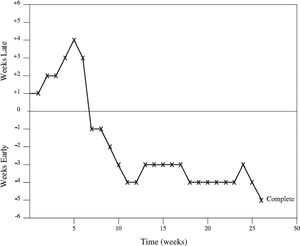
Figure 12.7 An example of the Slip Chart.
Developing the Slip Chart
Prepare Information Inputs. The probability of having a good Slip Chart rises with the quality of the following inputs:
- The baseline schedule, preferably a Critical Path Diagram, although a Gantt Chart can be used
- Performance reports or verbal information about actual performance
- Change requests
While serving as a benchmark to establish the magnitude of the slip, the schedule's dependencies and the critical path help fathom and chart the corrective actions as well. Against the benchmark will be compared the actual progress information from performance reports. Change requests in preparation, and their impact on the schedule, are another critical ingredient to figure out the magnitude of the slip.
Remember questions two and four in PCPC? Here they are:
- What are the issues causing the variance?
- What new risks may pop up in the future, and how could they change the preliminary predicted completion date?
The former uses the term issues, the latter risks. What is the difference between issues and risks? Without a pretense to deal with the semantics of the difference, let's take a look at their use in the industry. According to PMBOK, “Reports commonly used to monitor and control risks include Issues Logs…” [3]—the two terms can be used interchangeably. Some project managers believe that risks and issues define different concerns and should, therefore, be defined into different categories that need different managerial responses [7]. This is how we use them here.
An issue has already happened, and it is the difference between what should be and what is. Its time horizon includes the past and the present. For example, a loss of a team member is an issue that led to a month delay (variance). In contrast, risk can be characterized as what could happen to the detriment of the project [8]. For example, “a possibility of losing the project manager could cause a late completion of the project.” Apparently, risks are in the future. Consequently, while we strive to resolve an issue, our managerial response is to prevent or mitigate a risk (see Chapter 9).
Back to our question “What are the issues causing the variance?” The aim is to identify what's happened that caused the schedule variance and needs to be treated. On the other hand, answers to “What new risks may pop up in the future and how could they change the preliminary predicted completion date?” seek to find future candidate events that need to be responded to in order to mitigate their impact on the project schedule.
Do a Rehearsal with Activity Owners. Doing the homework to professionally prepare for progress meetings to develop a Slip Chart is half of the success. The mechanism for this—rehearsals with activity owners—is well described in “Do a Rehearsal with Activity Owners” in the “Jogging Line” section. Since the project team deploys the mechanism, do not forget that not all activities are created equal. Activities on the critical path are the hard core of the project assignment. Their deviation from the baseline schedule and mutual impact will be the primary determinants of the overall project slip. To exercise proper management caution, do not ignore near-critical activities and paths, the secondary determinants. They may easily slip to become critical.
Call the Progress Meeting. The information for this action has been described in “Call the Progress Meeting” in the “Jogging Line” section of this chapter. Use it with an open mind, adapting it to the specific situation.
Ask about the Activity's Actual Progress. This is the time when the activity owners share the substance they prepared in the rehearsal. The eyes of the project team are primarily on those who own critical activities, and secondarily on near-critical activities owners. With a vivid portrayal of activities' actual progress, variance from the baseline, current issues causing the variance (see the box on page 403, “Issues and Risks”), one after another, the owners deconstruct activity dependencies to assess their impact on the progress of subsequent activities. Other owners join the impact analysis, receiving and giving more information with the purpose of calculating how slips of individual activities on the critical path combine to establish how much the slip is. More precisely, how much is the critical path—that is, the whole project—late (behind the baseline) or early (ahead of the baseline). For this, the satisficing approach should be applied (see the box titled “When Assessing the Actual Status, Go for Satisficing” earlier in this chapter).
Draw the Slip Chart. Several actions are involved in drawing the chart:
- Find on the Slip Chart form the time of the first progress meeting, or the data date.
- If late, go up the vertical axis as much as you are late to mark your slip point. When early, do the same, only go downward.
- Connect point zero on the horizontal axis with the slip point.
- Repeat at each data date, creating a line consisting of connected slip points. For example, as Figure 12.7 indicates, the slip is one week at the end of week 1 and four weeks at the end of week 4. With a strong corrective action, the project is brought to be one week ahead of schedule at the end of week 7. Having the line connecting slip point is usually where the conventional application of the Slip Chart ends.
Project teams with an anticipatory mind set take the Slip Chart use further—into the prediction land.
In the Prediction Land. Here the owners pin down current issues and future risks, making the preliminary predictions of project completions (see the box titled “Be Proactive: Five Questions of the Proactive Cycle of Project Control” earlier in this chapter). To prevent slips that are possible to prevent, they scrutinize dependencies between activities, soft and hard. Looking for ways to fast-track or crash the schedule, at the meeting the team comes up with required remedial actions and a final predicted project completion date (for an example of inappropriate prediction, see the box that follows, “The Window May Be Closed”). Perhaps one of the most important project rituals, future-oriented progress reviews are destined to make or break a project. Rooting them in the trend analysis is instrumental in making them effective.
Soon after the start of a hardware development project, its Slip Chart showed a three-week slip. The team added the slip to the baseline completion date, predicting the project would be three weeks late. Here is an example of how this extrapolation may be a risky business. One of the project's later critical activities, one-week-long rapid prototyping, is subcontracted to a vendor, who accepted the activity's start date with the comment, “If you come to us a week later, that's fine. If you come later than that, our window will be closed. At that time, add seven extra weeks to the planned delivery date for the prototype, for we will be having another project at the time.” Apparently, the extrapolation is misleading. The predicted completion date is not three but at least seven weeks late. The moral to the story: Do not extrapolate; be proactive! Follow the cycle of the proactive project control, or the window will close on you.
Utilizing the Slip Chart
When to Use. Small and simple projects can benefit from the Slip Chart. So can large and complex projects. When applied to track progress in these projects, the chart can work off both the Gantt Chart and network diagrams (except the Critical Chain Schedule). Working off the latter is easier and more accurate because the amount of time each activity is behind or ahead of the baseline schedule can smoothly be translated into the amount of time the critical path is ahead of or behind the baseline schedule. As we know, the amount of time the critical path is ahead of or behind the schedule is equal to the overall project's time ahead of or behind the baseline. In contrast, with the absence of dependencies between activities, the Gantt Chart may pose a challenge when you are converting each activity's amount of time behind or ahead of the baseline schedule into an overall project's time behind or ahead of the schedule. It is this same reason that makes the prediction of the project completion date off the Slip Chart based on network diagrams easier than based on the Gantt Chart.
Time to Develop. A smaller, knowledgeable team may be able to develop a Slip Chart for a 25-activity Gantt Chart or Time-scaled Arrow Diagram in about 30 minutes. The growing team size is likely to increase the time.
Benefits. The Slip Chart's value is primarily in its ability to record the history of project progress and thus reveal the historic trend [13]. For this value to be further enhanced, an extra step, typically part of the proactive approach arsenal, needs to be taken—use the historic trend to forecast future schedule trend and organize actions to deliver the project as planned. Misusing the chart is bound to reduce its value (see the box that follows, “Three Errors”).
Executives in a vehicle manufacturing company love Slip Charts. Consequently, all major product development projects they oversee are required to submit the chart. Says a project manager, “My team gets together on a regular basis and the major emphasis is on activity owners reporting the progress status. I, then, sit down all by myself, prepare the Slip Chart, and send it to the execs. They review it and tell us what corrective actions to take.” There are at least three errors here related to the use of the chart. First, the team doesn't use the chart to predict the future trend. Second, the team doesn't identify the corrective actions. Finally, the execs identify the actions without having full understanding of these issues involved, robbing the team of their ownership. The lesson here is to follow the proactive cycle of project control when using the clip chart.
Advantages and Disadvantages. The advantages of Slip Charts are that they are
- Visual. The chart graphically communicates to the project participants the amount of time the project is ahead of or behind the baseline schedule and reveals the historic trend.
- Simple. Even to a person lacking project sophistication, it doesn't take more than a few minutes to figure out the Slip Chart.
- Proactive. Because it is only when used for forecasting future trends, the Slip Chart instills an anticipatory way of thinking. This helps the project team detect early warning signals of a problem and act to prevent it from happening.
On the other hand, more often than not, the Slip Chart is also
- Time-consuming. It takes time to prepare sound progress information and turn it into a project slip time.
- Reactive. Unfortunately, too many users see the chart as “project historian,” not even attempting to use it for trend prediction and other steps in the proactive cycle of project control.
| Customization Action | Examples of Customization Actions |
| Define limits of use. | Use the Slip Chart for all projects with the net work diagram (except the Critical Chain Schedule). |
| Add a new feature. | Use the Slip Chart for predictions of the project completion date and other steps in the proactive cycle of project control. |
Check to make sure you developed a complete Slip Chart. It should show:
- The data dates
- The amount of slip at each data date
- A continuous historic trend line, connecting all points indicating slips at the time of data date
Variations. This tool can be used as the multiproject Slip Chart, with a separate line for each project. Having more than five or six projects can make it overly busy and less effective. Some companies use a version of the tool to show days of the critical path on the x-axis and a number of days of positive or negative total project float on the y-axis. For example, at one-half of the critical path completed (x-axis), the project may have a negative float of five days (y-axis), meaning it is five days behind the baseline schedule.
Customize the Slip Chart. The generic Slip Chart that we have described needs to be adapted in order to account for the specific situation of a company's projects. Consider the examples above as a primer when thinking how to adapt the chart.
Summary
We presented the Slip Chart in this section. This tool tracks how much time the project is ahead of or behind the baseline schedule and signals the historic trend of the project schedule. Using the historic trend, you can forecast the future schedule trend and organize actions to deliver the project as planned. Small and simple projects can benefit from the Slip Chart, as can large and complex ones. The chart can work off both the Gantt Chart and network diagrams (except the Critical Chain Schedule). In the box above are key points in developing the Slip Chart.
Buffer Chart
What Is the Buffer Chart?
A Buffer Chart measures the status of buffers established by the Critical Chain Schedule (CCS) to provide an early warning system in order to protect the project's due date. First, the Buffer Chart takes an instantaneous snapshot of buffers' percent consumed relative to the percentage of the work completed on the Critical Chain (see Figure 12.8). Consecutive snapshots taken at regular periodic intervals are then linked on the chart to obtain a line indicating the trend. For example, in Figure 12.8 the line suggests that the buffer is being consumed at a faster pace than the pace of progress in completing the Critical Chain. In other words the line answers the question “How are we doing today?” providing information to make a proactive decision to impact the value of the buffer. In Figure 12.8 that decision might be to take an action in order to recover the project buffer.
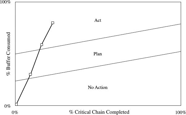
Figure 12.8 An example of the Buffer Chart.
Developing the Buffer Chart
Prepare Information Inputs. The preparation of the following inputs is of critical value in effectively using the Buffer Chart:
- The CCS
- Performance reports or verbal information about actual performance
- Change requests
The first two inputs provide a baseline and the actual status information to calculate the values for the x and y axes in the chart, percent complete of the critical chain, and percent of the buffer used. The inclusion of change requests in the analysis is necessary to visualize the extent of change of the values.
Do a Rehearsal with Activity Owners. Professionals do homework to prepare for a progress meeting to develop a buffer chart. A good mechanism to check on the activity owner's preparation is a rehearsal. Conceptually, the rehearsal is similar to what is described in the “Jogging Line” section in “Do A Rehearsal with Activity Owners.” The practical questions, though, differ and will be addressed in “Ask about the Activity's Actual Progress.”
Call the Progress Meeting. Essentially, calling a progress meeting to build a Buffer Chart is very much like progress meetings we described in the “Jogging Line” section of this chapter. In a nutshell, regularity (usually weekly but at least monthly), combined with substantive issues and a disciplined approach, is what drives meaningful progress meetings.
Ask about the Activity's Actual Progress. In the meeting's spotlight are those owning activities that are being executed, primarily on the CC (Critical Chain) and secondarily on the subordinate merging paths. With their activity status information prepared and tested in the rehearsals (see the box titled “Be Proactive: Five Questions of the Proactive Cycle of Project Control” earlier in this chapter), the activity owners clearly answer the crucial question of “How many days are remaining on this project activity?” While measuring the project health in this fashion is beneficial for overall good control of the project, it also helps with the next step—monitoring the buffers. Actual progress assessment benefits from the satisficing approach (see the box titled “When Assessing the Actual Status, Go for Satisficing” earlier in this chapter).
Monitor the PB and each CCFB. Knowing how many days remain on activities underway indicates the completion date for the activity. The date, then, provides background information to answer the next question, “What percentage of each buffer is consumed?” The emphasis in this monitoring is on all buffers, PB (project buffer), and CCFBs (critical chain feeding buffers) on the merging paths. Typically, the monitoring occurs in a climate without pressure or focus on the estimated activity completions [14]. Rather, there is a realistic expectation that the estimates may vary on a daily basis and may even go beyond their baseline duration estimates. As long as the activity owners continue sticking with CC principles of work and behavior, actual durations of their activities are of no concern.
Monitor the completion of the CC. While the consumption of a buffer is of utmost significance, its consequences can only be understood in the context of our performance on the activity chain associated with the buffer. In particular, in the meeting the team needs to estimate the percentage of work that is completed on CC and other activity chains. When this information is available, the team can compare the percentage of each buffer consumed with the percent complete of the activity chain associated with the buffer and be able to establish the project's status or health at any given time. This comparison is conveniently illustrated on the Buffer Chart (Figure 12.8).
Draw the Buffer Chart. To develop a chart as shown in Figure 12.8, begin with marking the percent CC (or activity chain associated with the buffer) completed on the horizontal axis at the time of the progress meeting. Go vertically upward until reaching a point equal to the percent of buffer consumed, and connect this status point with point zero on the horizontal axis. Repeat drawing status points in each progress meeting, creating a line consisting of connected consecutive status points.
Use the Buffer Chart in a Proactive Manner. The purpose of the chart is to provide an anticipatory tool with clear decision criteria. In the box that follows, “Using the Buffers,” we explain the decision criteria and possible actions as proposed by Goldratt, who pioneered the chart. Following his criteria, for the chart to be beneficial, it should be updated as frequently as one-third of the total buffer time. The reason is simple—the decision criteria are based on thirds of the buffer length. For example, whether a buffer is less or more than a third of the total buffer late (less or more than 5 days for a 15-day buffer) determines the type of action we take. In contrast, the chart in Figure 12.8 uses different decision criteria. See the box titled “You Need to Experiment” for an explanation.
Utilizing the Buffer Chart
When to Use. Being an integral part of the CCS, the Buffer Chart's use is closely linked to how the CCS is used. Accordingly, the most appropriate application of the Buffer Chart is in a dedicated project team, destined to significantly slash the project cycle time. Geared with all necessary resources, the team is part of a company with a strong performance culture, relentlessly working to exceed its customer expectations, delivering maximum value to its shareholders, and providing strong growth opportunities to its employees.
Using the Buffers
Buffers—expressed in time units—are used to measure activity chain performance. The crucial point is to establish explicit action levels for decisions expressed in terms of the buffer size, measured in days (see Figure 12.9). Goldratt, the developer of the CC scheduling method, proposes the following decision criteria [2]. If a buffer is negative—for example, the latest activity on the chain is late compared to its original completion date—and you penetrated the first third of the buffer, take “No action” (see the graph). Should you start consuming the middle third, it is time to assess the problem and develop a “Plan” of action. Once you are within the final third, you need to “Act.” Note that these hold true for both the project buffer (PB) and critical chain feeding buffers (CCFBs). If these decision criteria were used, the lines separating “No action,” “Plan,” and “Act” zones in Figure 12.8 would be horizontal.
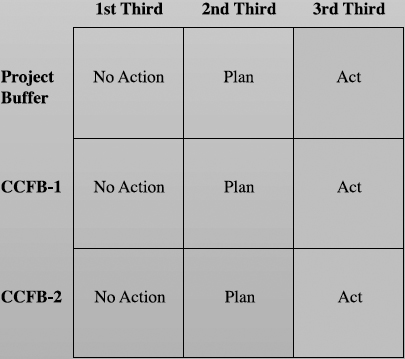
Figure 12.9 Using buffers.
Time to Develop. A well-trained and prepared, smaller project team can develop the Buffer Chart for a 100-activity Critical Chain Schedule in one to two hours. As the number of team members grows, so does the necessary time.
Benefits. The value of the Buffer Chart is in its “proactive rather than reactive” use. It prompts the project team to first take an “out the windshield” look at the project health and second, if that health is not good enough, to act now rather than later to secure steps necessary to deliver a project as expected [6].
Advantages and Disadvantages. The Buffer Chart has advantages in that it is
- Visual. Its graphical message is clear to a project user: This is the percentage complete for both the activity chain and the associated buffer. And, here is the line revealing the historic trend.
- Simple. Reading off the chart poses no challenge to any project participant. The chart's words such as “plan” or “act” (Figure 12.8) are understandable even to a layperson.
- Partially proactive. The chart is designed to act as an early warning system, prompting the project team to take different actions in situations with different levels of buffer consumption. The fact that the real actions are taken only after a significant portion of the buffer is consumed makes the approach partially proactive.
You Need to Experiment
The Buffer Chart is a new tool based on a distinctive philosophy of CC scheduling. To really comprehend its potential and put it to best-possible use, you need to experiment with it and find the comfort zone. For example, some companies modified the original criteria for using the buffers. Rather than relying on thirds of the buffers as decision levels given by the originator of the tool, they chose decision levels that change as the consumption of CC changes. Look at the chart in Figure 12.8. Decision levels are borderlines between zones of “No action,” “Plan,” and “Act,” mandating which action type to use. And, the higher the percent of CC completed, the higher are decision levels. This, of course, makes sense in general—the more work the project team completes, the more buffer consumption the project team can tolerate. But an exact amount of “More” should be picked by the company to fit its business purpose and nature of projects [6]. The moral to the story: Experiment to find the decision levels that best fit the company's projects.
On the other hand, the Buffer Chart can be described as
- Time consuming. It takes time to prepare dependable status information and translate it into a Buffer Chart.
- A new tool based on a new paradigm of CC; therefore, learning and becoming comfortable with it may take time.
Customize the Buffer Chart. Modifying the generic Buffer Chart described in this section helps fit it to the project needs of the company. The examples above as well as the “You Need to Experiment” box illustrate the modification.
Summary
This section dealt with the Buffer Chart, which measures the status of buffers established by the Critical Chain Schedule to provide an early warning system in order to protect the project's due date. This nature of the warning system comes from the Buffer Charts “proactive rather than reactive” use. In particular, it requires the project team to take a look at the schedule health, and when that health is not good enough, to act now rather than later to secure steps necessary to deliver a project as expected. The following box summarizes the key points in building the Buffer Chart.
Buffer Chart Check
Check to make sure you developed a dependable and complete Buffer Chart, which should show at progress status points:
- The percentage of CC completed
- The percentage of buffer consumed
- Whether the status point is in the “No action,” “Plan,” or “Act” zone
- A continuous historic trend line, connecting all status points.
Schedule Crashing
What Is Schedule Crashing?
Schedule Crashing is a method of shortening the total project duration without changing the project logic, which means that the sequence of dependencies between project activities remains the same [15]. To compress the duration, the project usually deploys more resources in performing activities. As a consequence, the total project cost grows (see Figure 12.10).
Performing Schedule Crashing
Schedule Crashing requires a process of disciplined and patient steps outlined here, which we will follow in crashing the schedule example from seven to four days (Figure 12.10).
Prepare Information Inputs. The result of Schedule Crashing heavily hinges on quality inputs, including:
- The baseline schedule in any network format except Critical Chain
- Performance reports or verbal information about actual performance
- Change requests
- Resource and cost information
The network diagram provides the job logic and the baseline, which is called the “normal schedule.” When the baseline is compared with the actual status information, the schedule variance is identified. Further increase of the variance is possible because of the project changes, prompting us to include change requests in the analysis. To figure out the optimum way of the crashing, we rely on resource and cost information.
Develop a Normal, Cost-Loaded Schedule. This is the baseline schedule developed in the phase of project planning. Here resources are assigned to project activities, and their costs are calculated. Without this resource and cost information, Schedule Crashing the way we define it here is not possible. In Figure 12.10 we give an example of a normal schedule (starting position) with duration and cost for each activity in the table.
Develop a Crash, Cost-Loaded Schedule. Preserving the project sequence of dependencies between activities:
- Estimate for each activity the shortest possible time to complete it.
- Ask the activity owners and team, “What resources do we need to complete each activity in this way? How much does it cost?” This is sometimes a painstaking exercise, requiring a lot of quick and good information. Also, it may take multiple iterations to develop these estimates, called crash durations (time) and crash cost. In that process, various challenges will be encountered. For example, some activities cannot be completed in shorter time than the normal schedule shows, or say you need to rent a small piece of testing equipment, but only the big one (and more costly) is available. Not surprisingly, some resources that the project needs may not be available, although there is a budget for them. Generally, these estimates will be developed following the rules of time and cost estimating, which are heavily dependent on the knowledge of project technology and productivity of resources. Once crash durations and crash cost are prepared, the crash schedule is ready. In Figure 12.10 duration and cost for each activity in the crash schedule is given in the table.
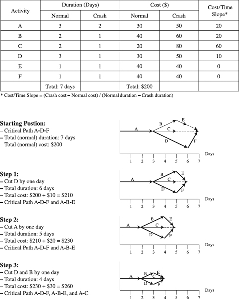
Figure 12.10 An example of Schedule Crashing.
Compute Cost/Time Slope. All activities are not created equal. Some of them are more costly to shorten than the others. Calculating the cost/time slope will show the cost of reducing duration of each activity by one day. Use the following formula to compute the slope for each activity (see table in Figure 12.10):
Cost/time slope = (crash cost − normal cost)/(normal time − crash time)
This has created the basis to identify the cheapest activities to crash. But don't start crashing yet. First, the sequence of crashing activities needs to be figured out.
Crash the Critical Path Only. The critical path is the longest path in the network schedule, composed of activities whose float is zero. The duration of the critical path is the minimum time to complete all project activities. Therefore, the duration of the critical path is equal to the total project duration. The only way to shorten the project duration, then, is to shorten duration of activities on the critical path (see the box that follows, “Wasting Money By Crashing Noncritical Activities”). Simply, crashing the critical path duration by a certain number of days will translate into reducing the total project duration by the same number of time units of the schedule (we will use days). Now look at the network diagram and identify the critical path (in Figure 12.10 we showed critical path for each schedule with a bold line). Working off a TAD (time-scaled diagram) is the easiest way to crash the schedule because it shows activities with and without float visually, which is why we use it in our example in Figure 12.10.
First Crash Critical Activities That Are Cheapest to Crash. When crashing, we want to do it with the minimum cost increase. For this reason, we don't choose to crash just about any activity on the critical path. Rather, we focus on the cheapest one to shorten first, by selecting a critical activity with the least cost/time slope. In our example in Figure 12.10, activity D has the least cost/time slope on the critical path, $10/day. Cut it by one day. Now the schedule is one day shorter, or six days long, and its cost equals the normal cost of the schedule plus the cost/time slope of the activity that was cut, which makes $210 (see Step 1 in Figure 12.10). Continue with cutting critical activities one day at a time, first those with the least cost/time slope—see Steps 2 and 3—until reaching the desired schedule duration of four days and its cost ($260).
Wasting Money By Crashing Noncritical Activities
How often does a project schedule slip? In our experience, project delays are widespread and many of those projects take actions to accelerate and catch up with the baseline schedule. A frequent action of this type is to throw in additional resources indiscriminately and shorten duration of project activities. Since all too often the schedule does not show dependencies, and accordingly the critical path, both critical and noncritical activities. are crashed. Crashing noncritical activities increases the total project cost without compressing the schedule. What a waste of money! The only way to reduce a project's duration without changing the project logic is to crash critical activities.
When There Are Multiple Critical Paths, Crash All of Them Simultaneously. It is a rare privilege to have a single critical path. More often than not, as we crash activities on the original critical path (activities A-D-F in Figure 12.10), new critical paths appear. After cutting D in the first step, there are two critical paths—A-D-F and A-B-E. When this happens, to shorten the total project duration, shorten duration of all, in our case both, critical paths at the same time. This is why in Step 2, we cut activity A, which is on both critical paths, and in Step 3, we cut D on one critical path and B on another critical path.
Failing to shorten one of them will leave the total project duration unchanged; simply, the longest path(s) determines the total duration. As multiple critical paths are crashed simultaneously, follow the rule of first crashing the least slope activity on each of the paths. Having multiple paths is why we enforce the rule of “crash one day at a time?” Because when the original critical path is crashed by one day, a new critical path may emerge. This new critical path would not be discerned if we cut the original critical path by two or more days at a time. In that case the shortened schedule would not have the lowest cost, since we might have missed shortening cheaper activity on the new critical path than the one crashed on the original critical path.
Utilizing Schedule Crashing
When to Use. Schedule Crashing primarily is a method involving two project scenarios. In the first, the project is in the planning stage, the execution has not started yet, and the project team proposes a schedule for management approval. Management finds the schedule too slow and demands it be shortened. To accomplish this, the team goes back to the drawing board, employing Schedule Crashing. The second scenario occurs when the project is underway and its schedule slips [16]. To catch up, the team may use the Schedule Crashing procedure. While for both scenarios the team can apply Schedule Crashing alone, many teams combine it with fast-tracking. Remember, fast-tracking changes the project logic, altering the dependencies between project activities. Because many smaller projects do not employ network diagrams but stick with Gantt and Milestone Charts, Schedule Crashing is generally a choice for larger projects.
Time to Use. Crashing a 250-activity network diagram in a half-day to one-day time is realistic for a skilled, smaller project team. Expect this time to increase with the increase of the team size, since larger teams need more time for internal communications. Crashing off a time-scaled diagram may help reduce the time because of the diagram's visual appearance.
Benefits. The value of Schedule Crashing lies in its capacity to provide a roadmap for shaving an amount of time off the project schedule. Step-by-step, it shows which activities to crash, what resources it takes, and how much it costs. To all organizations cherishing time-to-market speed, or more generally, fast cycle times, this capacity is a significant benefit (see the box on page 417, “Five Golden Rules Of Schedule Crashing”).
Five Golden Rules Of Schedule Crashing
- Crash only activities on the critical path.
- Crash by one time unit of the schedule at a time. (e.g., one day at a time)
- When there are multiple critical paths, crash all of them simultaneously.
- First crash critical activities that are cheapest to crash (the least cost/time slope).
- Don't crash noncritical activities.
Advantages and Disadvantages. The strong points of Schedule Crashing come from its internal mechanism:
- Clear steps. The procedure lays down an easy-to-understand and stable sequence of crashing steps. With a very limited training measured in tens of minutes, a person familiar with the network diagram can internalize these steps.
- Cost minimization. To organizations focusing on cost management, Schedule Crashing offers an opportunity to reduce duration of their projects while minimizing the cost of the reduction.
Schedule Crashing poses challenges that make it
- Complex for larger projects. Because of the inherent complexity of larger networks with multiple critical paths, crashing them may be an overwhelming task for many (computers significantly reduce the complexity).
- Time-consuming. Just as developing a sizeable network diagram takes time, so does crashing it, especially so when multiple scenarios are tested.
Variations. Companies competing on fast cycle times tend to apply Schedule Crashing without cost analysis. They do not calculate and apply the least cost/time slope as a guide in determining the sequence of activities to crash. Rather, they throw in more resources that they need to shorten duration of critical activities, and in the end may or may not calculate the total cost. A typical driver of such behavior is their perceived lack of time and need to follow crashing procedure oriented toward cost minimization.
Customize Schedule Crashing. To get the best value out of Schedule Crashing, we advise adapting its generic procedure to account for the project situation. Examples that follow illustrate possible adaptation.
| Customization Action | Examples of Customization Actions |
| Define limits of use. | Schedule Crashing in larger projects needs to be based on a network diagram. |
| Schedule Crashing will be used in combination with fast-tracking. |
Check to make sure you crashed your scheduled properly. The crashed schedule should have
- Unchanged dependencies between project activities
- The duration you targeted
- The lowest cost of crashing
Summary
This section focused on Schedule Crashing, a tool for shortening the total project duration without changing the project logic. Used primarily in larger projects, Schedule Crashing helps when a project needs to be accelerated. Step-by-step, Schedule Crashing indicates which activities to crash, what resources it takes, and how much it costs. In the box above, we offer the key points in Schedule Crashing.
Concluding Remarks
The six tools reviewed in this chapter are designed for different project situations. In most projects the project manager can afford to use one, possibly two, of them, facing the problem of eliminating the others. To help in this effort, the table that follows lists situations and each tool's suitability for them. If these are not sufficient to characterize the project, add more of them and mark how they favor the tools used. The tool with the highest number of marks is probably the most appropriate to deploy. Using more than one is also a viable option, considering that some of them finely complement and reinforce each other, as indicated in the chapter material. Whatever tool is selected, its real essence is the application in the proactive cycle of project control mode.
A Summary Comparison of Schedule Control Tools
References
1. Summers, D. C. S. 2000. Quality. 2d ed. Upper Saddle River, N.J.: Prentice Hall.
2. Goldratt, E.M. 1997. Critical Chain. Great Barrington, Mass.: North River Press.
3. Project Management Institute. 2000. A Guide to The Project Management Body of Knowledge. Drexell Hill, Pa.: Project Management Institute.
4. Simon, H. 1987. “Making Management Decisions: The Role of Intuition and Emotion” Academy of Management Executive, 1: 57–64.
5. Kharbanda, O. P., E. A. Stalworthy, and L. F. Williams. 1980. Project Cost Control in Action. Farnborough, U.K.: Gower Publishers.
6. Kania, E. 2000. “Measurements for Product Development Organizations, A Perspective from Theory of Constraints.” Visions 24(2): 17–20.
7. Githens, G. D. and R. J. Peterson. 2001. “Using Risk Management in the Front End of Projects.” at The Project Management Institute Annual Seminars and Symposium. Nashville.
8. Wideman, M. 1992. Project and Program Risk Management. Newton Square, Pa.: Project Management Institute.
9. Hed, S. R. 1973. Project Control Manual. Geneva: Sven Hed.
10. Lientz, B. P. and K. P. Rea. 1999. Breakthrough Technology Project Management. San Diego: Academic Press.
11. Weisflogg, U. 1998. “Servant Leadership as the Means for Collective Action in Project Management.” at International Conference on Management of Technology. Orlando, Florida.
12. Silverberg, E. C. 1991. “Predicting Project Completion.” Research-Technology Management 34(3): 46–47.
13. Rosenau, M. D., et al. 1996. The PDMA Handbook of New Product Development. New York: John Wiley & Sons.
14. Leach, L. P. 1999. “Critical Chain Project Management Improves Project Performance.” Project Management Journal. 30(2): 39–51.
15. Kerzner, H. 2001. Project Management: A Systems Approach to Planning, Scheduling, and Controlling. New York: John Wiley & Sons.
16. Meredith, J. R. and S. J. Mantel. 2000. Project Management: A Managerial Approach. 4th ed. New York: John Wiley & Sons.