
Chapter 13
Exploring Data Analysis
IN THIS CHAPTER
![]() Understanding the Exploratory Data Analysis (EDA) philosophy
Understanding the Exploratory Data Analysis (EDA) philosophy
![]() Describing numeric and categorical distributions
Describing numeric and categorical distributions
![]() Estimating correlation and association
Estimating correlation and association
![]() Testing mean differences in groups
Testing mean differences in groups
![]() Visualizing distributions, relationships, and groups
Visualizing distributions, relationships, and groups
Data science relies on complex algorithms for building predictions and spotting important signals in data, and each algorithm presents different strong and weak points. In short, you select a range of algorithms, you have them run on the data, you optimize their parameters as much as you can, and finally you decide which one will best help you build your data product or generate insight into your problem.
It sounds a little bit automatic and, partially, it is, thanks to powerful analytical software and scripting languages like Python. Learning algorithms are complex, and their sophisticated procedures naturally seem automatic and a bit opaque to you. However, even if some of these tools seem like black or even magic boxes, keep this simple acronym in mind: GIGO. GIGO stands for “Garbage In/Garbage Out.” It has been a well-known adage in statistics (and computer science) for a long time. No matter how powerful the machine learning algorithms you use, you won’t obtain good results if your data has something wrong in it.
Exploratory Data Analysis (EDA) is a general approach to exploring datasets by means of simple summary statistics and graphic visualizations in order to gain a deeper understanding of data. EDA helps you become more effective in the subsequent data analysis and modeling. In this chapter, you discover all the necessary and indispensable basic descriptions of the data and see how those descriptions can help you decide how to proceed using the most appropriate data transformation and solutions.
 You don’t have to type the source code for this chapter manually. In fact, it’s a lot easier if you use the downloadable source. The source code for this chapter appears in the
 P4DS4D2_13_Exploring_Data_Analysis.ipynb source code file. (See the Introduction for details on where to locate this file.)
The EDA Approach
EDA was developed at Bell Labs by John Tukey, a mathematician and statistician who wanted to promote more questions and actions on data based on the data itself (the exploratory motif) in contrast to the dominant confirmatory approach of the time. A confirmatory approach relies on the use of a theory or procedure — the data is just there for testing and application. EDA emerged at the end of the 70s, long before the big data flood appeared. Tukey could already see that certain activities, such as testing and modeling, were easy to make automatic. In one of his famous writings, Tukey said:
“The only way humans can do BETTER than computers is to take a chance of doing WORSE than them.”
This statement explains why, as a data scientist, your role and tools aren’t limited to automatic learning algorithms but also to manual and creative exploratory tasks. Computers are unbeatable at optimizing, but humans are strong at discovery by taking unexpected routes and trying unlikely but in the end very effective solutions.
If you’ve been through the examples in the previous chapters, you have already worked on quite a bit of data, but using EDA is a bit different because it checks beyond the basic assumptions about data workability, which actually comprises the Initial Data Analysis (IDA). Up to now, the book has shown how to
- Complete observations or mark missing cases by appropriate features
- Transform text or categorical variables
- Create new features based on domain knowledge of the data problem
- Have at hand a numeric dataset where rows are observations and columns are variables
EDA goes further than IDA. It’s moved by a different attitude: going beyond basic assumptions. With EDA, you
- Describe of your data
- Closely explore data distributions
- Understand the relations between variables
- Notice unusual or unexpected situations
- Place the data into groups
- Notice unexpected patterns within groups
- Take note of group differences
You will read a lot in the following pages about how EDA can help you learn about variable distribution in your dataset. Variable distribution is the list of values you find in that variable compared to their frequency, that is, how often they occur. Being able to determine variable distribution tells you a lot about how a variable could behave when fed into a machine learning algorithm and, thus, help you take appropriate steps to have it perform well in your project.
Defining Descriptive Statistics for Numeric Data
The first actions that you can take with the data are to produce some synthetic measures to help figure out what is going in it. You acquire knowledge of measures such as maximum and minimum values, and you define which intervals are the best place to start.
During your exploration, you use a simple but useful dataset that is used in previous chapters, the Fisher’s Iris dataset. You can load it from the Scikit-learn package by using the following code:
from sklearn.datasets import load_iris
iris = load_iris()
Having loaded the Iris dataset into a variable of a custom Scikit-learn class, you can derive a NumPy nparray and a pandas DataFrame from it:
import pandas as pd
import numpy as np
print('Your pandas version is: %s' % pd.__version__)
print('Your NumPy version is %s' % np.__version__)
from sklearn.datasets import load_iris
iris = load_iris()
iris_nparray = iris.data
iris_dataframe = pd.DataFrame(iris.data, columns=iris.feature_names)
iris_dataframe['group'] = pd.Series([iris.target_names[k] for k in iris.target], dtype="category")
Your pandas version is: 0.23.3
Your NumPy version is 1.14.5
NumPy, Scikit-learn, and especially pandas are packages under constant development, so before you start working with EDA, it’s a good idea to check the product version numbers. Using an older or newer version could cause your output to differ from that shown in the book or cause some commands to fail. For this edition of the book, use pandas version 0.23.3 and NumPy version 1.14.5.
 This chapter presents a series of pandas and NumPy commands that help you explore the structure of data. Even though applying single explorative commands grants you more freedom in your analysis, it’s nice to know that you can obtain most of these statistics using the
 describe method applied to your pandas DataFrame: such as, print iris_dataframe.describe(), when you’re in a hurry in your data science project.
Measuring central tendency
Mean and median are the first measures to calculate for numeric variables when starting EDA. They can provide you with an estimate when the variables are centered and somehow symmetric.
Using pandas, you can quickly compute both means and medians. Here is the command for getting the mean from the Iris DataFrame:
print(iris_dataframe.mean(numeric_only=True))
Here is the resulting output for the mean statistic:
sepal length (cm) 5.843333
sepal width (cm) 3.054000
petal length (cm) 3.758667
petal width (cm) 1.198667
Similarly, here is the command that will output the median:
print(iris_dataframe.median(numeric_only=True))
You then obtain the median estimates for all the variables:sepal length (cm) 5.80
sepal width (cm) 3.00
petal length (cm) 4.35
petal width (cm) 1.30
The median provides the central position in the series of values. When creating a variable, it is a measure less influenced by anomalous cases or by an asymmetric distribution of values around the mean. What you should notice here is that the means are not centered (no variable is zero mean) and that the median of petal length is quite different from the mean, requiring further inspection.
When checking for central tendency measures, you should:
- Verify whether means are zero
- Check whether they are different from each other
- Notice whether the median is different from the mean
Measuring variance and range
As a next step, you should check the variance by using its square root, the standard deviation. The standard deviation is as informative as the variance, but comparing to the mean is easier because it’s expressed in the same unit of measure. The variance is a good indicator of whether a mean is a suitable indicator of the variable distribution because it tells you how the values of a variable distribute around the mean. The higher the variance, the farther you can expect some values to appear from the mean.
print(iris_dataframe.std())
The printed output for each variable:
sepal length (cm) 0.828066
sepal width (cm) 0.433594
petal length (cm) 1.764420
petal width (cm) 0.763161
In addition, you also check the range, which is the difference between the maximum and minimum value for each quantitative variable, and it is quite informative about the difference in scale among variables.
print(iris_dataframe.max(numeric_only=True)
- iris_dataframe.min(numeric_only=True))
Here you can find the output of the preceding command:
sepal length (cm) 3.6
sepal width (cm) 2.4
petal length (cm) 5.9
petal width (cm) 2.4
Note the standard deviation and the range in relation to the mean and median. A standard deviation or range that’s too high with respect to the measures of centrality (mean and median) may point to a possible problem, with extremely unusual values affecting the calculation or an unexpected distribution of values around the mean.
Working with percentiles
Because the median is the value in the central position of your distribution of values, you may need to consider other notable positions. Apart from the minimum and maximum, the position at 25 percent of your values (the lower quartile) and the position at 75 percent (the upper quartile) are useful for determining the data distribution, and they are the basis of an illustrative graph called a boxplot, which is one of the topics discuss in this chapter.
print(iris_dataframe.quantile([0,.25,.50,.75,1]))
In Figure 13-1, you can see the output as a matrix — a comparison that uses quartiles for rows and the different dataset variables as columns. So, the 25-percent quartile for sepal length (cm) is 5.1, which means that 25 percent of the dataset values for this measure are less than 5.1.
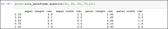
FIGURE 13-1: Using quartiles as part of data comparisons.
The difference between the upper and lower percentile constitutes the interquartile range (IQR) which is a measure of the scale of variables that are of highest interest. You don’t need to calculate it, but you will find it in the boxplot because it helps to determinate the plausible limits of your distribution. What lies between the lower quartile and the minimum, and the upper quartile and the maximum, are exceptionally rare values that can negatively affect the results of your analysis. Such rare cases are outliers — and they’re the topic of Chapter 16.
Defining measures of normality
The last indicative measures of how the numeric variables used for these examples are structured are skewness and kurtosis:
- Skewness defines the asymmetry of data with respect to the mean. If the skew is negative, the left tail is too long and the mass of the observations are on the right side of the distribution. If it is positive, it is exactly the opposite.
- Kurtosis shows whether the data distribution, especially the peak and the tails, are of the right shape. If the kurtosis is above zero, the distribution has a marked peak. If it is below zero, the distribution is too flat instead.
Although reading the numbers can help you determine the shape of the data, taking notice of such measures presents a formal test to select the variables that may need some adjustment or transformation in order to become more similar to the Gaussian distribution. Remember that you also visualize the data later, so this is a first step in a longer process.
The normal, or Gaussian, distribution is the most useful distribution in statistics thanks to its frequent recurrence and particular mathematical properties. It’s essentially the foundation of many statistical tests and models, with some of them, such as the linear regression, widely used in data science. In a Gaussian distribution, mean and median have the same values, the values are symmetrically distributed around the mean (it has the shape of a bell), and its standard deviation points out the distance from the mean where the distribution curve changes from being concave to convex (it is called the inflection point). All these characteristics make the Gaussian distribution a special distribution, and they can be leveraged for statistical computations.
You seldom encounter a Gaussian distribution in your data. Even if the Gaussian distribution is important for its statistical properties, in reality you’ll have to handle completely different distributions, hence the need for EDA and measures such as skewness and kurtosis.
As an example, a previous illustration in this chapter shows that the petal length feature presents differences between the mean and the median (see “Measuring variance and range,” earlier in this chapter). In this section, you test the same example for skewness and kurtosis in order to determine whether the variable requires intervention.
When performing the skewness and kurtosis tests, you determine whether the p-value is less than or equal 0.05. If so, you have to reject normality (your variable distributed as a Gaussian distribution), which implies that you could obtain better results if you try to transform the variable into a normal one. The following code shows how to perform the required test:
from scipy.stats import skew, skewtest
variable = iris_dataframe['petal length (cm)']
s = skew(variable)
zscore, pvalue = skewtest(variable)
print('Skewness %0.3f z-score %0.3f p-value %0.3f'
% (s, zscore, pvalue))
Here are the skewness scores you get:
Skewness -0.272 z-score -1.398 p-value 0.162
You can perform another test for kurtosis, as shown in the following code:
from scipy.stats import kurtosis, kurtosistest
variable = iris_dataframe['petal length (cm)']
k = kurtosis(variable)
zscore, pvalue = kurtosistest(variable)
print('Kurtosis %0.3f z-score %0.3f p-value %0.3f'
% (k, zscore, pvalue))
Here are the kurtosis scores you obtain:
Kurtosis -1.395 z-score -14.811 p-value 0.000
The test results tell you that the data is slightly skewed to the left, but not enough to make it unusable. The real problem is that the curve is much too flat to be bell shaped, so you should investigate the matter further.
It’s a good practice to test all variables for skewness and kurtosis automatically. You should then proceed to inspect those whose values are the highest visually. Non-normality of a distribution may also conceal different issues, such as outliers to groups that you can perceive only by a graphical visualization.
Counting for Categorical Data
The Iris dataset is made of four metric variables and a qualitative target outcome. Just as you use means and variance as descriptive measures for metric variables, so do frequencies strictly relate to qualitative ones.
Because the dataset is made up of metric measurements (width and lengths in centimeters), you must render it qualitative by dividing it into bins according to specific intervals. The pandas package features two useful functions, cut and qcut, that can transform a metric variable into a qualitative one:
cutexpects a series of edge values used to cut the measurements or an integer number of groups used to cut the variables into equal-width bins.qcutexpects a series of percentiles used to cut the variable.
You can obtain a new categorical DataFrame using the following command, which concatenates a binning (see the “Understanding binning and discretization” section of Chapter 9 for details) for each variable:
pcts = [0, .25, .5, .75, 1]
iris_binned = pd.concat(
[pd.qcut(iris_dataframe.iloc[:,0], pcts, precision=1),
pd.qcut(iris_dataframe.iloc[:,1], pcts, precision=1),
pd.qcut(iris_dataframe.iloc[:,2], pcts, precision=1),
pd.qcut(iris_dataframe.iloc[:,3], pcts, precision=1)],
join='outer', axis = 1)
This example relies on binning. However, it could also help to explore when the variable is above or below a singular hurdle value, usually the mean or the median. In this case, you set pd.qcut to the 0.5 percentile or pd.cut to the mean value of the variable.
Binning transforms numerical variables into categorical ones. This transformation can improve your understanding of data and the machine-learning phase that follows by reducing the noise (outliers) or nonlinearity of the transformed variable.
Understanding frequencies
You can obtain a frequency for each categorical variable of the dataset, both for the predictive variable and for the outcome, by using the following code:
print(iris_dataframe['group'].value_counts())
The resulting frequencies show that each group is of the same size:
virginica 50
versicolor 50
setosa 50
You can try also computing frequencies for the binned petal length that you obtained from the previous paragraph:print(iris_binned['petal length (cm)'].value_counts())
In this case, binning produces different groups:
(0.9, 1.6] 44
(4.4, 5.1] 41
(5.1, 6.9] 34
(1.6, 4.4] 31
This example provides you with some basic frequency information as well, such as the number of unique values in each variable and the mode of the frequency (top and freq rows in the output).
print(iris_binned.describe())
Figure 13-2 shows the binning description.

FIGURE 13-2: Descriptive statistics for the binning.
Frequencies can signal a number of interesting characteristics of qualitative features:
- The mode of the frequency distribution that is the most frequent category
- The other most frequent categories, especially when they are comparable with the mode (bimodal distribution) or if there is a large difference between them
- The distribution of frequencies among categories, if rapidly decreasing or equally distributed
- Rare categories
Creating contingency tables
By matching different categorical frequency distributions, you can display the relationship between qualitative variables. The pandas.crosstab function can match variables or groups of variables, helping to locate possible data structures or relationships.
In the following example, you check how the outcome variable is related to petal length and observe how certain outcomes and petal binned classes never appear together. Figure 13-3 shows the various iris types along the left side of the output, followed by the output as related to petal length.
print(pd.crosstab(iris_dataframe['group'],
iris_binned['petal length (cm)']))

FIGURE 13-3: A contingency table based on groups and binning.
Creating Applied Visualization for EDA
Up to now, the chapter has explored variables by looking at each one separately. Technically, if you’ve followed along with the examples, you have created a univariate (that is, you’ve paid attention to stand-alone variations of the data only) description of the data. The data is rich in information because it offers a perspective that goes beyond the single variable, presenting more variables with their reciprocal variations. The way to use more of the data is to create a bivariate (seeing how couples of variables relate to each other) exploration. This is also the basis for complex data analysis based on a multivariate (simultaneously considering all the existent relations between variables) approach.
If the univariate approach inspected a limited number of descriptive statistics, then matching different variables or groups of variables increases the number of possibilities. Such exploration overloads the data scientist with different tests and bivariate analysis. Using visualization is a rapid way to limit test and analysis to only interesting traces and hints. Visualizations, using a few informative graphics, can convey the variety of statistical characteristics of the variables and their reciprocal relationships with greater ease.
Inspecting boxplots
Boxplots provide a way to represent distributions and their extreme ranges, signaling whether some observations are too far from the core of the data — a problematic situation for some learning algorithms. The following code shows how to create a basic boxplot using the Iris dataset:
boxplots = iris_dataframe.boxplot(fontsize=9)
In Figure 13-4, you see the structure of each variable’s distribution at its core, represented by the 25° and 75° percentile (the sides of the box) and the median (at the center of the box). The lines, the so-called whiskers, represent 1.5 times the IQR from the box sides (or by the distance to the most extreme value, if within 1.5 times the IQR). The boxplot marks every observation outside the whisker (deemed an unusual value) by a sign.

FIGURE 13-4: A boxplot arranged by variables.
Boxplots are also extremely useful for visually checking group differences. Note in Figure 13-5 how a boxplot can hint that the three groups, setosa, versicolor, and virginica, have different petal lengths, with only partially overlapping values at the fringes of the last two of them.
import matplotlib.pyplot as plt
boxplots = iris_dataframe.boxplot(
column='petal length (cm)',
by='group', fontsize=10)
plt.suptitle("")
plt.show()

FIGURE 13-5: A boxplot of petal length arranged by groups.
Performing t-tests after boxplots
After you have spotted a possible group difference relative to a variable, a t-test (you use a t-test in situations in which the sampled population has an exact normal distribution) or a one-way Analysis Of Variance (ANOVA) can provide you with a statistical verification of the significance of the difference between the groups’ means.
from scipy.stats import ttest_ind
group0 = iris_dataframe['group'] == 'setosa'
group1 = iris_dataframe['group'] == 'versicolor'
group2 = iris_dataframe['group'] == 'virginica'
variable = iris_dataframe['petal length (cm)']
print('var1 %0.3f var2 %03f' % (variable[group1].var(),
variable[group2].var()))
var1 0.221 var2 0.304588
The t-test compares two groups at a time, and it requires that you define whether the groups have similar variance or not. Therefore, it is necessary to calculate the variance beforehand, like this:
variable = iris_dataframe['sepal width (cm)']
t, pvalue = ttest_ind(variable[group1], variable[group2],
axis=0, equal_var=False)
print('t statistic %0.3f p-value %0.3f' % (t, pvalue))
The resulting t statistic and its p-values are
t statistic -3.206 p-value 0.002
You interpret the pvalue as the probability that the calculated t statistic difference is just due to chance. Usually, when it is below 0.05, you can confirm that the groups’ means are significantly different.
You can simultaneously check more than two groups using the one-way ANOVA test. In this case, the pvalue has an interpretation similar to the t-test:
from scipy.stats import f_oneway
variable = iris_dataframe['sepal width (cm)']
f, pvalue = f_oneway(variable[group0],
variable[group1],
variable[group2])
print('One-way ANOVA F-value %0.3f p-value %0.3f'
% (f,pvalue))
The result from the ANOVA test is
One-way ANOVA F-value 47.364 p-value 0.000
Observing parallel coordinates
Parallel coordinates can help spot which groups in the outcome variable you could easily separate from the other. It is a truly multivariate plot, because at a glance it represents all your data at the same time. The following example shows how to use parallel coordinates.
from pandas.plotting import parallel_coordinates
iris_dataframe['group'] = iris.target
iris_dataframe['labels'] = [iris.target_names[k]
for k in iris_dataframe['group']]
pll = parallel_coordinates(iris_dataframe, 'labels')
As shown in Figure 13-6, on the abscissa axis you find all the quantitative variables aligned. On the ordinate, you find all the observations, carefully represented as parallel lines, each one of a different color given its ownership to a different group.
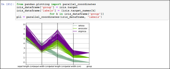
FIGURE 13-6: Parallel coordinates anticipate whether groups are easily separable.
If the parallel lines of each group stream together along the visualization in a separate part of the graph far from other groups, the group is easily separable. The visualization also provides the means to assert the capability of certain features to separate the groups.
Graphing distributions
You usually render the information that boxplot and descriptive statistics provide into a curve or a histogram, which shows an overview of the complete distribution of values. The output shown in Figure 13-7 represents all the distributions in the dataset. Different variable scales and shapes are immediately visible, such as the fact that petals’ features display two peaks.
cols = iris_dataframe.columns[:4]
densityplot = iris_dataframe[cols].plot(kind='density')

FIGURE 13-7: Features’ distribution and density.
Histograms present another, more detailed, view over distributions:
variable = iris_dataframe['petal length (cm)']
single_distribution = variable.plot(kind='hist')
Figure 13-8 shows the histogram of petal length. It reveals a gap in the distribution that could be a promising discovery if you can relate it to a certain group of Iris flowers.

FIGURE 13-8: Histograms can detail better distributions.
Plotting scatterplots
In scatterplots, the two compared variables provide the coordinates for plotting the observations as points on a plane. The result is usually a cloud of points. When the cloud is elongated and resembles a line, you can deduce that the variables are correlated. The following example demonstrates this principle:
palette = {0: 'red', 1: 'yellow', 2:'blue'}
colors = [palette[c] for c in iris_dataframe['group']]
simple_scatterplot = iris_dataframe.plot(
kind='scatter', x='petal length (cm)',
y='petal width (cm)', c=colors)
This simple scatterplot, represented in Figure 13-9, compares length and width of petals. The scatterplot highlights different groups using different colors. The elongated shape described by the points hints at a strong correlation between the two observed variables, and the division of the cloud into groups suggests a possible separability of the groups.

FIGURE 13-9: A scatterplot reveals how two variables relate to each other.
Because the number of variables isn’t too large, you can also generate all the scatterplots automatically from the combination of the variables. This representation is a matrix of scatterplots. The following example demonstrates how to create one:
from pandas.plotting import scatter_matrix
palette = {0: "red", 1: "yellow", 2: "blue"}
colors = [palette[c] for c in iris_dataframe['group']]
matrix_of_scatterplots = scatter_matrix(
iris_dataframe, figsize=(6, 6),
color=colors, diagonal='kde')
In Figure 13-10, you can see the resulting visualization for the Iris dataset. The diagonal representing the density estimation can be replaced by a histogram using the parameter diagonal=’hist’.

FIGURE 13-10: A matrix of scatterplots displays more information at one time.
Understanding Correlation
Just as the relationship between variables is graphically representable, it is also measurable by a statistical estimate. When working with numeric variables, the estimate is a correlation, and the Pearson’s correlation is the most famous. The Pearson’s correlation is the foundation for complex linear estimation models. When you work with categorical variables, the estimate is an association, and the chi-square statistic is the most frequently used tool for measuring association between features.
Using covariance and correlation
Covariance is the first measure of the relationship of two variables. It determines whether both variables have a coincident behavior with respect to their mean. If the single values of two variables are usually above or below their respective averages, the two variables have a positive association. It means that they tend to agree, and you can figure out the behavior of one of the two by looking at the other. In such a case, their covariance will be a positive number, and the higher the number, the higher the agreement.
If, instead, one variable is usually above and the other variable usually below their respective averages, the two variables are negatively associated. Even though the two disagree, it’s an interesting situation for making predictions, because by observing the state of one of them, you can figure out the likely state of the other (albeit they’re opposite). In this case, their covariance will be a negative number.
A third state is that the two variables don’t systematically agree or disagree with each other. In this case, the covariance will tend to be zero, a sign that the variables don’t share much and have independent behaviors.
Ideally, when you have a numeric target variable, you want the target variable to have a high positive or negative covariance with the predictive variables. Having a high positive or negative covariance among the predictive variables is a sign of information redundancy. Information redundancy signals that the variables point to the same data — that is, the variables are telling us the same thing in slightly different ways.
Computing a covariance matrix is straightforward using pandas. You can immediately apply it to the DataFrame of the Iris dataset as shown here:
iris_dataframe.cov()
The matrix in Figure 13-11 shows variables present on both rows and columns. By observing different row and column combinations, you can determine the value of covariance between the variables chosen. After observing these results, you can immediately understand that little relationship exists between sepal length and sepal width, meaning that they’re different informative values. However, there could be a special relationship between petal width and petal length, but the example doesn’t tell what this relationship is because the measure is not easily interpretable.
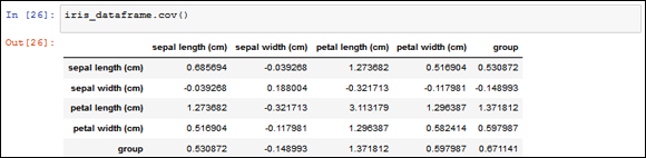
FIGURE 13-11: A covariance matrix of Iris dataset.
The scale of the variables you observe influences covariance, so you should use a different, but standard, measure. The solution is to use correlation, which is the covariance estimation after having standardized the variables. Here is an example of obtaining a correlation using a simple pandas method:
iris_dataframe.corr()
You can examine the resulting correlation matrix in Figure 13-12:

FIGURE 13-12: A correlation matrix of Iris dataset.
Now that’s even more interesting, because correlation values are bound between values of –1 and +1, so the relationship between petal width and length is positive and, with a 0.96, it is almost the maximum possible.
You can compute covariance and correlation matrices also by means of NumPy commands, as shown here:
covariance_matrix = np.cov(iris_nparray, rowvar=0)
correlation_matrix = np.corrcoef(iris_nparray, rowvar=0)
In statistics, this kind of correlation is a Pearson correlation, and its coefficient is a Pearson’s r.
Another nice trick is to square the correlation. By squaring it, you lose the sign of the relationship. The new number tells you the percentage of the information shared by two variables. In this example, a correlation of 0.96 implies that 96 percent of the information is shared. You can obtain a squared correlation matrix using this command: iris_dataframe.corr()**2.
 Something important to remember is that covariance and correlation are based on means, so they tend to represent relationships that you can express using linear formulations. Variables in real-life datasets usually don’t have nice linear formulations. Instead they are highly nonlinear, with curves and bends. You can rely on mathematical transformations to make the relationships linear between variables anyway. A good rule to remember is to use correlations only to assert relationships between variables, not to exclude them.
Using nonparametric correlation
Correlations can work fine when your variables are numeric and their relationship is strictly linear. Sometimes, your feature could be ordinal (a numeric variable but with orderings) or you may suspect some nonlinearity due to non-normal distributions in your data. A possible solution is to test the doubtful correlations with a nonparametric correlation, such as a Spearman rank-order correlation (which means that it has fewer requirements in terms of distribution of considered variables). A Spearman correlation transforms your numeric values into rankings and then correlates the rankings, thus minimizing the influence of any nonlinear relationship between the two variables under scrutiny. The resulting correlation, commonly denoted as rho, is to be interpreted in the same way as a Pearson’s correlation.
As an example, you verify the relationship between sepals’ length and width whose Pearson correlation was quite weak:
from scipy.stats import spearmanr
from scipy.stats.stats import pearsonr
a = iris_dataframe['sepal length (cm)']
b = iris_dataframe['sepal width (cm)']
rho_coef, rho_p = spearmanr(a, b)
r_coef, r_p = pearsonr(a, b)
print('Pearson r %0.3f | Spearman rho %0.3f'
% (r_coef, rho_coef))
Here is the resulting comparison:Pearson r -0.109 | Spearman rho -0.159
In this case, the code confirms the weak association between the two variables using the nonparametric test.
Considering the chi-square test for tables
You can apply another nonparametric test for relationship when working with cross-tables. This test is applicable to both categorical and numeric data (after it has been discretized into bins). The chi-square statistic tells you when the table distribution of two variables is statistically comparable to a table in which the two variables are hypothesized as not related to each other (the so-called independence hypothesis). Here is an example of how you use this technique:
from scipy.stats import chi2_contingency
table = pd.crosstab(iris_dataframe['group'],
iris_binned['petal length (cm)'])
chi2, p, dof, expected = chi2_contingency(table.values)
print('Chi-square %0.2f p-value %0.3f' % (chi2, p))
The resulting chi-square statistic is
Chi-square 212.43 p-value 0.000
As seen before, the p-value is the chance that the chi-square difference is just by chance. The high chi-square value and the significant p-value are signaling that the petal length variable can be effectively used for distinguishing between Iris groups.
The larger the chi-square value, the greater the probability that two variables are related, yet, the chi-square measure value depends on how many cells the table has. Do not use the chi-square measure to compare different chi-square tests unless you know that the tables in comparison are of the same shape.
The chi-square is particularly interesting for assessing the relationships between binned numeric variables, even in the presence of strong nonlinearity that can fool Person’s r. Contrary to correlation measures, it can inform you of a possible association, but it won’t provide clear details of its direction or absolute magnitude.
Modifying Data Distributions
As a by-product of data exploration, in an EDA phase you can do the following:
- Obtain new feature creation from the combination of different but related variables
- Spot hidden groups or strange values lurking in your data
- Try some useful modifications of your data distributions by binning (or other discretizations such as binary variables)
When performing EDA, you need to consider the importance of data transformation in preparation for the learning phase, which also means using certain mathematical formulas. Most machine learning algorithms work best when the Pearson’s correlation is maximized between the variables you have to predict and the variable you use to predict them. The following sections present an overview of the most common procedures used during EDA in order to enhance the relationship between variables. The data transformation you choose depends on the actual distribution of your data, therefore it’s not something you decide beforehand; rather, you discover it by EDA and multiple testing. In addition, these sections highlight the need to match the transformation process to the mathematical formula you use.
Using different statistical distributions
During data science practice, you’ll meet with a wide range of different distributions — with some of them named by probabilistic theory, others not. For some distributions, the assumption that they should behave as a normal distribution may hold, but for others, it may not, and that could be a problem depending on what algorithms you use for the learning process. As a general rule, if your model is a linear regression or part of the linear model family because it boils down to a summation of coefficients, then both variable standardization and distribution transformation should be considered.
Apart from the linear models, many other machine learning algorithms are actually indifferent to the distribution of the variables you use. However, transforming the variables in your dataset in order to render their distribution more Gaussian-like could result in positive effects.
Creating a Z-score standardization
In your EDA process, you may have realized that your variables have different scales and are heterogeneous in their distributions. As a consequence of your analysis, you need to transform the variables in a way that makes them easily comparable:
from sklearn.preprocessing import scale
variable = iris_dataframe['sepal width (cm)']
stand_sepal_width = scale(variable)
Some algorithms will work in unexpected ways if you don’t rescale your variables using standardization. As a rule of thumb, pay attention to any linear models, cluster analysis, and any algorithm that claims to be based on statistical measures.
Transforming other notable distributions
When you check variables with high skewness and kurtosis for their correlation, the results may disappoint you. As you find out earlier in this chapter, using a nonparametric measure of correlation, such as Spearman’s, may tell you more about two variables than Pearson’s r may tell you. In this case, you should transform your insight into a new, transformed feature:
from scipy.stats.stats import pearsonr
tranformations = {'x': lambda x: x,
'1/x': lambda x: 1/x,
'x**2': lambda x: x**2,
'x**3': lambda x: x**3,
'log(x)': lambda x: np.log(x)}
a = iris_dataframe['sepal length (cm)']
b = iris_dataframe['sepal width (cm)']
for transformation in tranformations:
b_transformed = tranformations[transformation](b)
pearsonr_coef, pearsonr_p = pearsonr(a, b_transformed)
print('Transformation: %s Pearson's r: %0.3f'
% (transformation, pearsonr_coef))
Transformation: x Pearson’s r: -0.109
Transformation: x**2 Pearson’s r: -0.122
Transformation: x**3 Pearson’s r: -0.131
Transformation: log(x) Pearson’s r: -0.093
Transformation: 1/x Pearson's r: 0.073
In exploring various possible transformations, using a for loop may tell you that a power transformation will increase the correlation between the two variables, thus increasing the performance of a linear machine learning algorithm. You may also try other, further transformations such as square root np.sqrt(x), exponential np.exp(x), and various combinations of all the transformations, such as log inverse np.log(1/x).
Transforming a variable using the logarithmic transformation sometimes presents difficulties because it won’t work for negative or zero values. You need to rescale the values of the variable so that the minimum value is 1. You can achieve that using some functions from the NumPy package: np.log(x + np.abs(np.min(x)) + 1).