
The aim of this chapter is to explain the capabilities of reports and dashboards of the Salesforce platform. Data visualization helps to communicate information clearly and effectively through graphical means. The reports and dashboards feature provided by the Salesforce platform empowers administrators to make reports on the Salesforce data. To build sophisticated reports on the platform, one has to rely on development efforts using the Visualforce technology of Salesforce or the analytics API, or using tools such as QlikView or Tableau. The report builder is still an important utility, and once mastered by an admin, it can be used to build some basic and medium-complexity reports. As we explore more on reports in this chapter, we will see different types of reports, the usage of custom report types, dashboards, analytic snapshots on the platform, and some important formulae functions that can be used on reports, such as PARENTGROUPVAL and PREVGROUPVAL.
Let's familiarize ourselves with the report builder in Salesforce.com (SFDC). Navigate to the Reports tab in SFDC by clicking on the + symbol next to all the tabs (the symbol that's used to view all the other tabs, which are by default off).
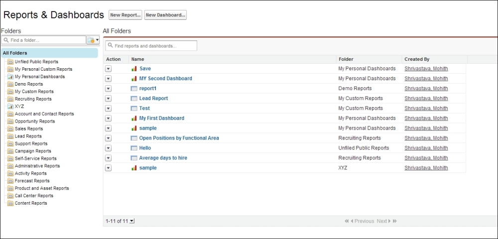
As shown in the following screenshot, on clicking the Reports tab, a screen will be displayed where there are predefined folders; on clicking each folder, you will see various reports. Most of them are standard and they come out of the box. It's important to explore these reports so that they can be modified or adopted for your business process.
The following screenshot shows the page view once the user has navigated to the Reports tab:
To create a new folder, click on the folder icon, as shown in the following screenshot:
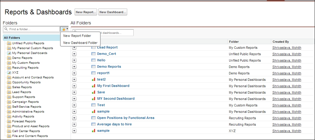
To make searching for various folders simpler, there is a simple search icon, which is present both at the folder and report level.
There are four possible types of reports one can have, which are as follows:
- Tabular report
- Summary report
- Matrix report
- Joined report
This is a very basic type of report, where we will be able to tabulate data from objects and other related objects. The maximum number of rows that will be returned by a report is 2,000 records. The steps for the creation of reports are as follows:
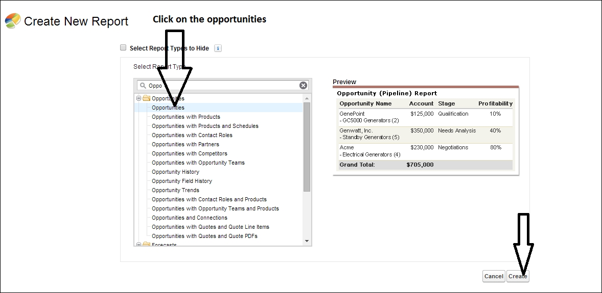
- Click on the Reports tab and then click on the New Report button, as shown in the following screenshot:
- Click on the object for which the report needs to be created.
- Then, click on the Create button to start drafting tabular reports.
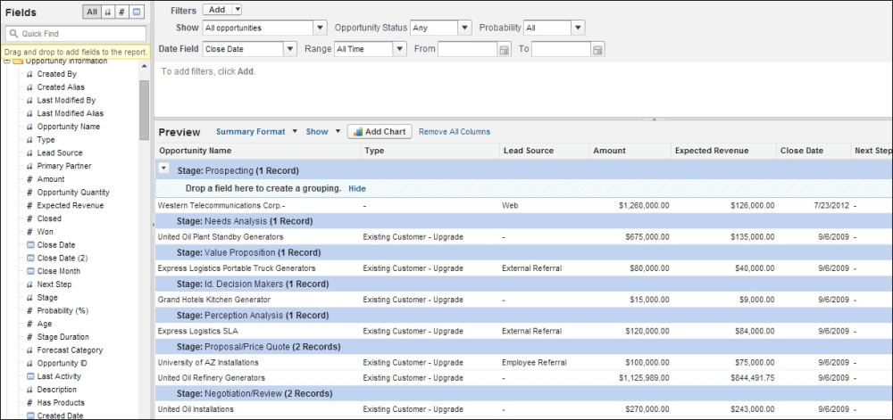
The following screenshot illustrates the steps to draw a tabular report for all opportunities in our organization. In this process, we will dive deeper into each of the components of the report builder that's provided.
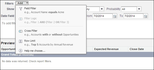
For the data that has been displayed in the preceding screenshot, one can apply various filters such as Field Filter, Cross Filter, and Row Limit. They are described as follows:
- Field Filter: This implies filtering data based on the field values. An example could be filtering only opportunities that are closed-won. Closed-won opportunities are the ones that the sales rep has successfully won. This will require a simple field filter at the field opportunity stage.
- Cross Filter: This implies selecting data with or without the associated child records. For example, for opportunities, one can have them with or without activities.
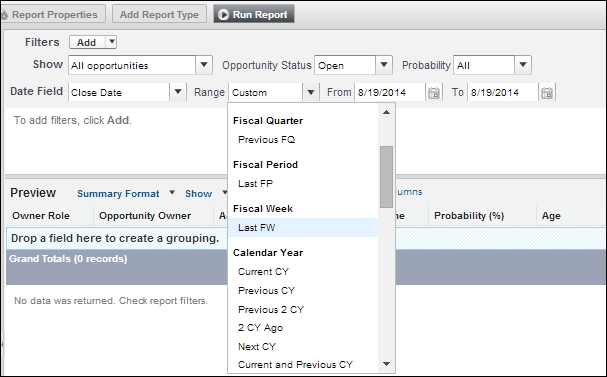
- Row Limit: This implies applying sorting of the records with specific fields along with limiting the number of rows. Let's say I need the top 20 opportunities among all the opportunities; I will add a row limit with Opportunity Amount as the field and the limit number as
20.
The following screenshot shows the different types of filters that are possible on reports:
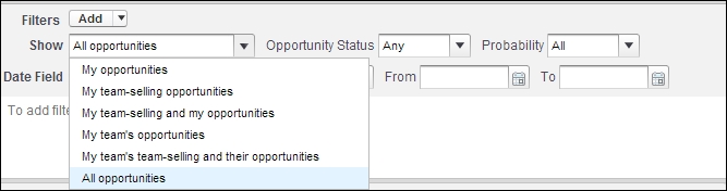
We will discuss more on data visibility in Chapter 4, Record-level Access, Security, and Audit Features; however, for now, let's understand that to pull data related to visibility or security (role hierarchy, which we will explore later), we have a filter in the report builder as shown in the following screenshot. The Show variable in the report builder defines data that should be pulled for reports, whether it's as per My team, My, or for All. This depends on who the end user of this report will be; for example, for the VP (Vice President) of a company, we will show a report on all opportunities. If it's only for the sales representative, it is advisable to only show his/her opportunities or opportunities that he/she owns (my opportunities). The options shown in the following screenshot will be available for all objects, but the option values won't match exactly. For example, if you are creating a report on a custom object, the team options won't be present.
Let's extend the tabular report we have built so far to create a summary report. All that's needed is to start grouping the report by Stage or any other relevant field. We will build the summary formula field, which will help us calculate the average and sum for each column (for the number, percent, and currency fields only).
One has to drag a field to the top row to achieve grouping. The following screenshot shows a summary report grouped by the Stage field of the opportunity. An opportunity's Stage field tracks the stage of the opportunity.
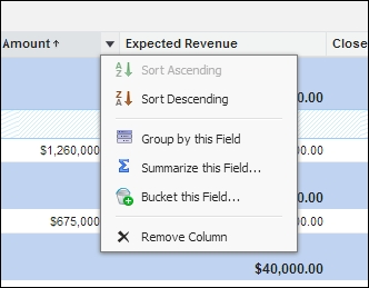
In summary reports, the greatest advantage is that we can summarize a column, as shown in the following screenshot. For example, if we want to summarize the opportunity amount for each stage, we will group the report by each stage and then summarize it.
There are two important functions in report formulae, which are given less importance but have a greater utility. They are PARENTGROUPVAL and PREVGROUPVAL.
For the report we have built so far, we are going to show the amount or revenue generated with respect to the total yearly amount for each month (as a percentage). For example, the percentage of the contribution of opportunities each month compared to the total revenue generated yearly can be calculated using the PARENTGROUPVAL function. The following screenshot shows the expected revenue that has been added as a column in the report using the PARENTGROUPVAL formula:
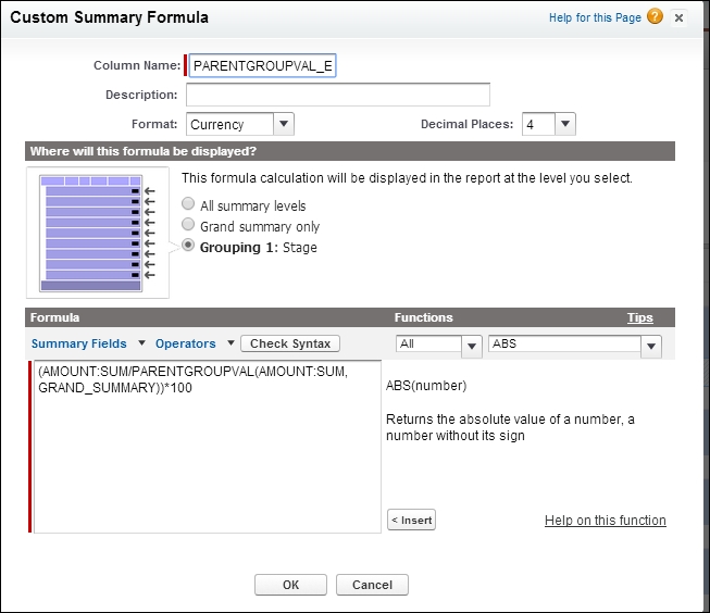
Open the formula editor and write the following formula:
(AMOUNT:SUM/PARENTGROUPVAL(AMOUNT:SUM, GRAND_SUMMARY))*100
It's important to understand the formula's end results. This formula yields the percentage contribution of the opportunity amount in each month to the total amount or revenue generated yearly.
Note
For more information on PARENTGROUPVAL, watch the video at https://www.youtube.com/watch?v=7pn-9yCLgRE.
This is useful to calculate the amount of opportunities for each month with respect to the yearly total. The PARENTGROUPVAL formula helps to find the relative percentage of each grouping with respect to the parent sum obtained after the grouping.
You can use the PREVGROUPVAL function to calculate values relative to a peer grouping. If there's no peer grouping, the function will return a null value.
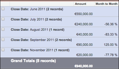
This function provides the value for the peer grouping on the same hierarchy level. This allows you to prepare reports that show, for example, a month-to-month opportunity comparison.
Please note that these functions are also applicable to the matrix report type that we will be diving into next.
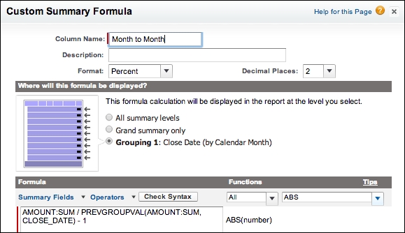
An example PREVGROUPVAL formula may look as follows:
AMOUNT:SUM - PREVGROUPVAL(AMOUNT:SUM, CLOSE_DATE)
The preceding formula calculates how the opportunity amount has progressed month-wise. The difference or trend between each month can be calculated using the PREVGROUPVAL function. The report has been assumed to be grouped by Close Date, as shown in the following screenshot:
The following screenshot displays the Month To Month column added to a report formed using the PREVGROUPVAL function:
With the term matrix, we can imagine both columns and rows. Matrix reports allow us to group at both the row and column levels. A summary report can be converted into a matrix report by selecting Matrix from Report Type from the summary report. Let's convert our summary report that we have created so far to the matrix format, as shown in the following screenshot:
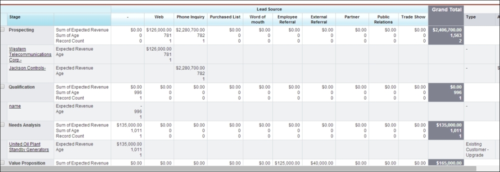
We have changed our summary report into a matrix report and grouped it by a column. Here, we have Lead Source as the grouping column:
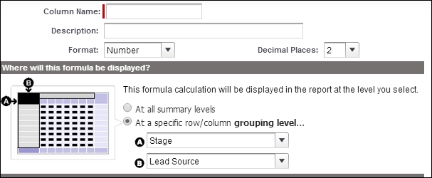
The preceding screenshot shows the report's formula field that gives us the option to display the data at both the row and column level. Also, the PREVGROUPVAL and PARENTGROUPVAL formula functions are also applicable to matrix reports.
Joined reports can create a join between either two summary reports, a summary and matrix report, or two matrix reports. Each report forms a subreport that can be sorted or filtered. The add-on feature of a joined report is so that each report can be based on two different report types. Have a look at the following screenshot:
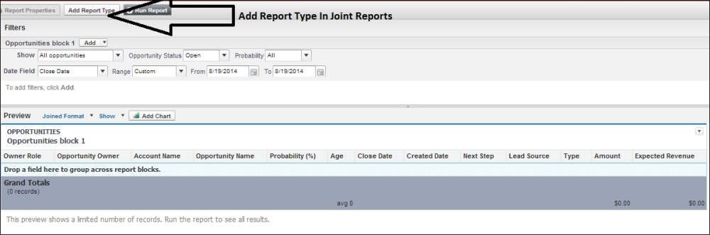
The first thing to observe in a joined report is that we have the Add Report Type button enabled; hence, we can add one more report type and join it to the existing report. So, joined reports are two different reports merged into one report.
Note
The groupings of joined reports remain unaltered if you decide to change from a summary report to a joined report. If matrix reports are converted to joined reports, the same effect in grouping is observed similar to the observation that is made when matrix reports are converted to summary reports.
An example of a joined report is our existing report merged with another report, let's say, another account report. The common fields have to be dropped in an area, as shown in the previous screenshot, and both reports can access these fields.
Up to five different reports can be combined and a single report can be generated from joined reports.
All these reports (tabular, summary, matrix, and joined) cannot display data of more than 2,000 rows. This is an important limitation of Salesforce reporting, and you always have the option to use the Export Details button to export the complete data.