Figure 4-1: Use the Ribbon to change the current view.
Chapter 4
Getting a New View
In This Chapter
 Knowing when to create a view
Understanding view formats
Working with various views
Managing views that already exist
Displaying views by using Web Parts
As I explain in Chapter 3, SharePoint creates web pages that you use to create and edit list items, such as tasks and calendar events. SharePoint also lets you create additional pages, or views, that you can use to customize the display of your information. In Excel, you might hide rows and/or columns to create a new view of the data. In a database, you may query only certain fields and use criteria to create a specific snapshot of data. The concept is similar here.
Common reasons for creating new views include showing only active items, only tasks associated with a certain person, only documents in a certain category, and so on. These views help users find or focus on certain data in the list without having to see everything, all the time.
An important and related topic to views is Metadata Navigation. This is a new feature in SharePoint 2010 that dynamically creates views based on the managed metadata and choice column types and content types used in your list or library. Given how closely this topic is tied to managed metadata, I cover it in detail in Chapter 25.
In this chapter, I explain your options for manually creating new views and how to modify existing views.
Viewing the View
Each SharePoint list comes with at least one view, the All Items view, which is a public view available to list users. Document libraries start with the All Documents view. Certain lists come with several more predefined views, such as the Discussion Board list, which has special views for showing threaded discussions.
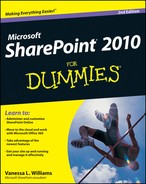
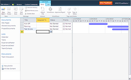
You use the SharePoint Ribbon to access the options for changing a list’s or library’s views. Figure 4-1 shows the List tab under List Tools (use the Library tab under Library tools in libraries), where you can see the commands that are available for changing the current views or creating new views.

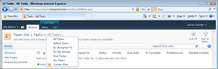
You can easily switch among views using the breadcrumb path found on the Browse ribbon. Click the last node in the path to view a list of available views. Figure 4-2 shows a tasks lists with the All Tasks view displayed.
Figure 4-2: Switching among views using the breadcrumb list.
Anyone with Design and Full Control permissions (Designer and Owners) can make Public and Personal views for the list. However, Site Members (Contributors) can create Personal views for their own use.
 Use a view instead of folders. When you organized files on your network, folders were the predominant method of subdividing your content. In SharePoint, you gain great power in using columns in combination with views to hide/show what users need to see. Folders take extra effort for the user to drill down and then navigate back up to look for other content. Views coupled with built-in sorting and filtering header options allow the user to easily and quickly find different content by toggling back and forth.
Getting to Know Your View Formats
SharePoint provides five predefined formats for creating new views. These formats jump-start your view creation experience by determining how information appears on the web page:
 Standard: This is the default view when you first access a library or list. The document or title item is in hyperlink format with an Edit menu for accessing properties and other options, and the rest of the list resembles a table without borders.
Datasheet: An editable spreadsheet format. Although any list has the option to Edit in Datasheet format, certain views may make sense to be created in this format if users will edit multiple items at a time.
Calendar: As you would expect, this view displays as a Calendar. You need at least one date field in your list to create a Calendar view.
Gantt: If you are familiar with project management charts, you recognize the Gantt view as showing tasks along a time line. This view makes it possible to do simple project-management tracking using a SharePoint list.
Access View: This view creates an Access database with a linked table to your SharePoint list so that you can create a form or report in Access based on your SharePoint list. Lookup tables and a user list are also linked as tables in this option.
Custom View In SharePoint Designer: If you have SharePoint Designer 2010 installed on your computer, you have the option to use it to create custom views.
You may not see all the view formats listed previously. Your options are dependent on which client software, such as Excel, Access, and SharePoint Designer, is installed on your computer.
In the rest of the chapter, I walk you through creating a view using each of these view formats.
Creating a Standard View
The most common kind of view you create in a SharePoint list or library is a public, Standard view. A public view can be used by anyone to view the contents of a list or library.
Standards views have the following traits:
They’re accessible by all browsers, including Firefox.
They have the most configuration options, such as filtering, grouping, and editing options.
They’re available for all lists and libraries.
They don’t require any special columns for configuring the view. Other view formats, such as a Calendar view, require date columns.
To create a new Standard view:
1. Browse to the list or library where you want to create the new view.
2. Click the List or Library Ribbon to access options for managing views.
In a calendar list, click the Calendar tab to manage the list’s views.
3. Click the Create View button.
A list of view format options appears.
4. Click the Standard View link to create a view that looks like a web page.
After selecting your view format, the next page displays your options for creating the new view. I call this page the View Definition page for clarity throughout the chapter.
5. In the View Name field, type the name you want to call this view.
The View Name field has two purposes:
• It provides the friendly name that can be selected to display the view.
• It provides the filename for the web page, which is part of the web address.
I suggest giving the page a name that’s easy to remember. For example, if your view will group by department, entering the name GroupByDepartment creates a web page named GroupByDepartment.aspx. You can change the friendly name after the filename has been created.
6. To set this view as the default view for the list or library, select the Make This the Default View check box.
If this isn’t the default view, users can select the view from a drop-down list on the Ribbon.
7. In the View Audience field, select the Create a Public View radio button.
Optionally, you can create a private view that only you can see. You must have at least Designer or Owner permissions to create a public view.
8. In the Columns section of the page, place a check in the Display column next to any columns you want to display, as shown in Figure 4-3.
You can also indicate the relative order that columns appear on the screen using the Position from Left column. See more on choosing columns in the “Choosing columns for your view” section, later in this chapter.
9. (Optional) In the Sort section, use the drop-down lists to select the first column you want to sort by and then select the second column to sort by.
The default sort option is ID, which means that items will be sorted by the order they were entered in the list.
10. Select the remaining options to configure your view, such as the columns you want to filter or group on.
Figure 4-3: Create a new view and select the columns you want to show.

Some of the options you can choose from are
• Select Tabular View to include check boxes next to items for bulk operations.
• Select Inline Editing to allow your users to add a new item directly in the Standard view rather than opening a new window.
• In the Totals section, select which columns to aggregate using Count or Sum functions.
• In the Folders section, specify whether items should appear inside folders or flat as if the folders don’t exist.
• Item Limit allows you to limit the items that are displayed on a single page. This can improve the performance of the view.
I discuss additional options in more detail in the “Filtering lists with views” and “Grouping results” sections, later in this chapter.
11. Click OK to create the view.
The new view appears in the browser.
If you created a public view, SharePoint creates a new web page using the name you specified in Step 5. Users can select this view from the drop-down list in the Manage Views Section of the Ribbon.
Experimenting with all these options is the best way to discover what works for your site. Item Limits, for example, is great for List View web Parts where you want to control the amount of space the list view takes up on a page.
Choosing columns for your view
When you choose the columns to display in your view, you see many columns that are usually behind the scenes, including Edit menu options. These include
Edit (Linked to Edit Item): Displays an icon that a user can click to edit the item. This column is useful when you don’t want to display the Title column.
Title (Linked to Item): Displays the Title column with a hyperlink to the list item or document. When a user clicks the hyperlinked title, a web page opens and displays the list item or opens the document.
Title (Linked to Edit with Edit Menu): When a user hovers her mouse over this column, the Edit menu appears.
I may want Edit menu columns on my list page for a member to modify items, but I generally don’t want them in my List View Web Parts on home pages and publishing pages (in that case, I just want users to click a link to open a document or only view the list as a table).
Other columns you may have available to add to your view include
ID displays the identity number of the item. The ID number is used to display the item’s values in a form.
Version displays the version number of the item or document. This allows you to easily see what the latest version of a document is.
Checked Out shows who has the document checked out.
Folder Item Count displays the number of folders contained within a folder.
Child Item Count displays the number of items contained with a folder.
Content Type displays the content type associated with the list item or document. When this column is displayed in Datasheet view, you can change the content type associated with the item (read more about content types in Chapter 25).
When you create a view, you often realize that you want to display a column that’s based on a value calculated from another column. For example, if your list displays an anniversary date, you may want to calculate years of service. You can do that by creating a new column and then displaying it in your view. (See Chapter 11 for details on working with calculated columns.)
You can also modify and create views using SharePoint Designer. In Designer, you have access to even more columns and the ability to use formatting and formula tools to further transform the presentation of your content.
Filtering lists with views
You can use the filtering options of views to limit the items displayed. You can choose which columns to filter on and how to apply the filter. You can use filters to display lists where a certain column is equal to some value or not equal to some value, or where an item was created between a certain date range.
You can create filters using columns that are based on String, Number, Currency, or Choice data types. However, you can’t filter on lookup columns or multiline text fields.
Building a filter is like writing an equation; for example, x > y. In this case, x is the column you want to filter on, and y is the value you want to test the column contents against. The operator in between determines what the test evaluates. This test gives the system a TRUE or FALSE response to your equation.
Available operators are
Equality: Is Equal To or Is Not Equal To
Comparison: Is Greater Than or Is Less Than
Substring: Contains or Begins With
The filtering equation is evaluated for each item in your list. If the equation is TRUE, the item is included in the list; otherwise, it’s excluded.
If you don’t see the results you expect to see in your view, your filter is probably evaluating to FALSE.
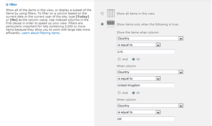
For numerical values, you usually use the Equality or Comparison operators. When you create filtered views based on string (text) values, you want to be familiar with your data before trying to create the filter. For example, if you want to filter a Contact list to display only those contacts in the U.K., you have to ask how the value for the U.K. has been entered in the list. Is it U.K., United Kingdom, or both? You can use a Datasheet view to quickly scan the data to determine the range of possible values.
One way to get around this problem is by validating your data when it’s being inputted. You can use Choice columns to do that or use SharePoint 2010’s validation features. (See Chapter 11 for details.)
Say you discover that your data includes both values — U.K. and United Kingdom. You could go through and make all the data consistent. Or you could filter for both values using the Or option, as shown in Figure 4-4.
Figure 4-4: Select the column to filter the view.
You can also use the constants Today and Me to filter your columns. (See Chapter 11 for details on using these constants.)
Grouping results
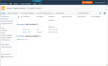
You can configure your view to group together items based on a common value in a column. For example, you can group a list of contacts that all share the same department or company.
Figure 4-5 shows the grouping options. You can indicate whether to automatically collapse or expand grouped items and how many items to display per page.
Figure 4-5: You can group items based on a shared value.
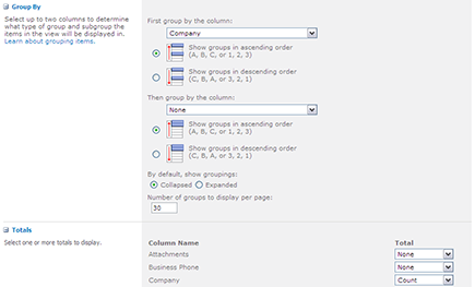
Figure 4-6 shows a list of contacts grouped by department. Use the plus and minus signs to expand or contract the grouped items.
Don’t forget the Totals option! Often when grouping data, you want to create totals. For example, grouping on Inventory by Category and totaling the Qty creates subtotals for the Category grouping as well as an overall total for the list.
Figure 4-6: Expand or contract grouped items.
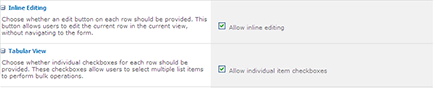
Allowing editing options
You can configure your views so that they aren’t just views — they can be used for data entry as well. SharePoint 2010 has added new options to improve the data entry experience. The two options that make that possible are inline editing and Tabular view, as shown in Figure 4-7.
Figure 4-7: Use these options to extend your views.
Inline editing displays a form in your view that allows users to enter a new item or edit existing items. To use the form, a user with permission to edit the list can click an icon to create a new list item or click any item to edit it. Figure 4-8 shows an item being edited inline. The icon below the item being edited can be used to add a new item to the list.
Having the option to edit and add items inline is valuable for creating data entry applications. You can use the inline editing option in a Web Part so that users can add or edit items right on the home page of your team site. (See Chapter 9 for details on working with Web Parts.)
Tabular view displays check boxes next to each item in the view. By clicking one or several check boxes, a user can use the Ribbon to perform actions, such as checking in, on the selected items.
Figure 4-8: You can edit items inline in your view.

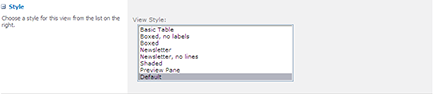
Choosing a display style
SharePoint 2010 provides several preformatted view styles that you can use to control the display of your view. The default view style displays your list data in rows. You can use several additional styles. Many of these are especially helpful in configuring List View Web Parts:
Basic Table displays lists in a simple table.
Boxed and Boxed, No Labels displays list items as a series of cards, with or without column labels. This display is similar to the Address Card view in Outlook.
Newsletter and Newsletter, No Lines displays a table with a streamlined format.
Shaded displays items in rows, with each alternate row shaded.
Preview Pane displays a list of items on the left and previews the details on the right. This is a great way to display a lot of information in a compact display.
Many users overlook these effective display styles. Again, experimenting is the best way to find out how a display style can improve a user’s experience with the data.
Figure 4-9 shows the style options you can choose from when configuring your view.
Figure 4-9: You can change the format of the view.
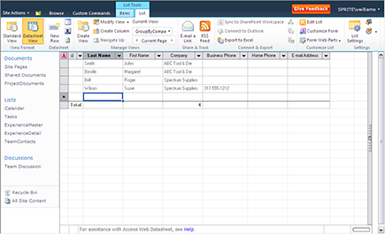
Managing List Data in a Datasheet View
Datasheet views are great for performing bulk updates on list items and document properties in a library. A Datasheet view displays a list in a spreadsheet. Datasheet views work only in Internet Explorer browsers.
With Datasheet views, you can
Support most column types including Text, Choice, Date, Number, and lookup columns. Datasheet views don’t work with Rich HTML columns. Additionally, not all column features work as expected in a Datasheet view. In short, when Datasheet views work, they work great. You just have to test your column types before getting overly ambitious.
Use the arrow keys to move around in the view like a spreadsheet.
Copy and paste values, which is another great way to make bulk updates to a list. I often use this approach instead of importing a spreadsheet as a custom list, which I discuss in Chapter 11.
Right-click a column heading to display additional options, such as hiding the column or setting the column’s width.
Create a Datasheet view on the fly from any Standard view by clicking the Datasheet View button in the List tab on the SharePoint Ribbon.
Drag and drop the columns in a Datasheet view to reorder them.
A Datasheet view is a great way to quickly change the content type of a list item or document. Just add the content type column to your Datasheet view. (I explain how to attach multiple content types to a single list or library in Chapter 25.)
You create a Datasheet view just like you create a Standard view, although you have fewer configuration options. You can sort, filter, display totals, and set the item limit on Datasheet views.
Figure 4-10 shows a Contact list in a Datasheet view. If a column can’t be edited because of the column’s data type, the message Read-Only appears in the lower-right corner of the datasheet. The message Pending Changes appears in the lower-left corner when updates are made to the database.
Figure 4-10: Use a Datasheet view to update data.
Depending on which Office applications you have installed, you may be able to access additional options for managing list data in Datasheet view. You can access these options by clicking the task pane in the far right of the Datasheet view. This pane shows options for working with the list in Microsoft Access and Excel, as shown in Figure 4-11.
Figure 4-11: Use Access and Excel to work with your list.

Using Ad Hoc Views
Users can make Ad Hoc views in any Standard or Datasheet views by using the headers of the columns to sort and filter the data on-the-fly. These ad hoc changes aren’t saved with the list the way defined views are. Helping your users be productive by using these ad hoc options may involve training tips or help support. Follow these steps to create an ad hoc view:
1. Click a column heading in Standard or Datasheet view.
A drop-down list appears on the column header cell.
2. Click the drop-down list and select whether you want to sort ascending or descending, or to filter the list based on data in that column.
Clicking the column header also toggles the sort order between ascending and descending.
Filtering options appear as distinct data from the values in the column (for example, if Marketing appears ten times in the column, it appears only once as a filter choice).
3. Select a value from the Filter list.
Filtering hides rows that don’t contain that value.
A Filter icon appears in the column header to indicate a filter is applied.
4. To remove the filter, click the drop-down list again and select Clear Filter from [Column Name].
If you want to access your Ad Hoc view again, simply save it as a favorite in your web browser. You can even copy the web address from the address bar in your browser and send it to other people.
Creating a Calendar View
To create a Calendar view, you must have at least one Date field in your list. The predefined SharePoint Calendar list, not surprisingly, uses this view as its default. A Calendar view helps users visually organize their date-driven work and events.
To create a Calendar view, start as you’d begin to create a Standard view (refer to the earlier section, “Creating a Standard View”), but in Step 4, select the Calendar View. Like the Gantt view (which I describe in the following section), you see new options on the View Definition page. You have a section for Time Interval, where you select the date column to use as the Begin and End fields for the view.
You also have selections to make for Calendar columns including Month/Week/Day Titles and Week/Day Sub Heading Titles (optional). Choose the column of data you want visible on those days in the different calendar layouts.
There is also a scope option for the default display — Month, Day, or Week. As expected, several options aren’t available for Calendar views including sorting, totals, item limits, and styles; however, filtering choices are important and often used with Calendar views.
Calendar views can also be used with Calendar overlays, which allow you to display more than one calendar view in a calendar. See Chapter 3 for more details on Calendar overlays.
Displaying Tasks in a Gantt View
To create a Gantt view, your list needs to contain task/project management information relative to that view format. The predefined SharePoint Tasks list contains these types of columns, including Title (task title), Start Date, Due Date, % Complete, and Predecessors (optional).
The View Definition page includes Gantt view options not seen in other views based on the five columns mentioned previously.
The Gantt view is a split view (see Figure 4-12), where you see a spreadsheet of data on the left and the Gantt chart on the right. A split bar between the two views can be moved by users to see more or less of one side. Unlike Standard or Datasheet views, the column headers don’t allow you to sort or filter the data but do allow you to hide or configure the columns shown. You can create a custom list or modify the Tasks list to add more columns for this spreadsheet side if you want.
Figure 4-12: The Gantt chart columns available in Gantt view.
You can synchronize tasks with project plans in Microsoft Project 2010. In Project, choose Save & Send ⇒ Sync with Tasks List and enter the URL for your tasks list.
Managing Existing Views
Chances are you’ll want to modify your views over time. In the following sections, I explain how to modify your views and set one as the default view that users see when they browse to your list or library. SharePoint also provides a couple of built-in views that you may want to customize.
Modifying your views
After creating your fabulous new view, you’ll quickly realize that you need to change it. Maybe you forgot a column, it doesn’t sort the way you want it to, or the grouping is just all wrong.
To modify a view, follow these steps:
1. Browse to the list or library where you want to modify the view.
2. Display the view you want to modify.
To change the view that is currently displayed:
a. Click the Library or List tab on the Ribbon.
b. In the Manage Views section, click the Change View drop-down list and select the view you want to modify.
3. Click the Modify This View button in the Manage Views section of the Ribbon.
A View Properties page similar to the Create View page appears, enabling you to edit the view’s properties.
4. Make your desired changes to the view, such as selecting or removing columns, or setting sorting or filtering options as described earlier in this chapter.
5. Click OK to save your changes to the view.
 Public views are visible to everyone, but private views can only be used by the person who creates them.
Setting the default view
To change the default view, select the Make This the Default View check box when you create or modify a view. This removes the default view property from the current default view and makes the view you’re working with the new default.
Most libraries or lists have only one default view, the exception being the Discussion Board list, which has both subjects and replies as default views. Keep in mind that if you make a view a default view, it must be a public view.
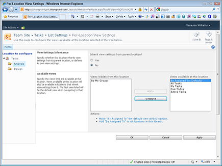
One of the cool new features in SharePoint 2010 is the ability to set default views per location. That just means that for each level in your library or list, you can designate which view is the default and which views can be selected.
For example, say you have a Tasks that uses Summary Tasks. Each Summary Task you create is a location in your list. (In a document library, a folder is a similar construct.) For each Summary Task, you can set a different default view and make some views unavailable.
You need to have the Manage Lists permissions in order to set Per-Location View Settings. This setting is accessible from the List Settings or Library Settings page, which I describe in more detail in Chapter 10. Figure 4-13 shows a Summary Task location called Analysis configured with the By Assigned To view as the default view. The By My Groups view is removed for that Summary Task.
Per-location views also work with metadata navigation, which I describe in Part V.
Other SharePoint built-in views
In addition to the other view formats I discuss earlier in this chapter, two other options fall under the view discussion:
Mobile: Simplified, text-only views of your libraries and lists for use on a mobile device. Mobile is actually a section on the View Definition page. You can enable a view to be a Mobile view or set it as the default Mobile view. (Mobile views must be public.)
You can also set the number of items to display for Mobile views. If you don’t see the Mobile section in your View Definition page, this type of view can’t be displayed in Mobile format.
RSS: SharePoint generates RSS feeds for libraries and lists. (See Chapter 5 for more on how users subscribe to and view SharePoint RSS feeds.)
Figure 4-13: Configure views per location.
Displaying Views via Web Parts
Throughout this chapter, I make references to List View Web Parts to point out what view properties are helpful and applicable to this type of view.
You want to display your list with other text and Web Parts in multiple locations, such as team site home pages, Web Part pages, or publishing pages. In these situations, you don’t want your users to interact with the list page itself with all the editing options. You just want them to see several columns to access a document or view a list item.
Chapter 9 goes into detail about using Web Parts, including linked Web Parts, connections, and master/detail settings. However, you need to know that each list generates a List View Web Part that can be used on Web Part pages and publishing pages, in multiple locations if necessary. Each of these Web Parts has a Properties panel that allows you to change the view in that instance of the Web Part.
Predefined SharePoint lists may have specific views that are defaults for Web Parts (for example, Announcements has a special default view that can’t be recreated in the browser for other lists). Custom lists generally show all columns when first generated.
After selecting the Modify Shared Web Part command on the Web Part, you can use the Selected View drop-down list in the Web Part Properties panel to apply another view, or you can also click the Edit the Current View hyperlink to modify the view on-the-fly. Depending on the complexity of your choices, creating a view first to apply to the Web Part(s) may be a better long-term maintenance strategy.
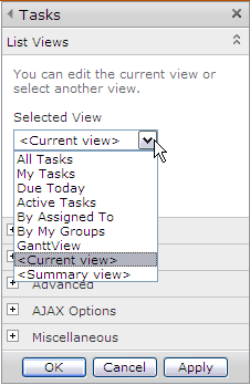
Figure 4-14 shows the List Views options in a List View Web Part for a Tasks list.
Figure 4-14: Change the view in a List View Web Part.
 What I’ve been calling the List View Web Part is technically the XSLT List View Web Part, or XLV. In the browser, this Web Part behaves very similar to how it behaved in previous versions of SharePoint. Crack open a view in SharePoint Designer 2010, however, and it’s a whole new world. These Web Parts still use Collaborative Application Markup Language (CAML) to specify queries. However, CAML is no longer used for specifying the display. Instead, the industry standard Extensible Stylesheet Language, the XSLT in the name of the Web Part, is used to specify the display of the list’s content.
..................Content has been hidden....................
You can't read the all page of ebook, please click here login for view all page.