- Cover
- Title
- Copyright
- Dedication
- Acknowledgments
- About the Author
- Contents
- Chapter 01 Essential Gear
- There Is Some Stuff Ya Kinda Have to Have
- You’re Going to Need a Sturdy Tripod
- Avoid Using the Center Column
- Extending Your Tripod’s Legs
- Hanging Weight for Sturdiness
- How to Splay the Legs
- Get Really Low Using a Platypod
- You’ll Want a Ballhead
- You’ll Need a Cable Release
- Get Your Horizon Line Straight, Method 1
- Get Your Horizon Line Straight, Method 2
- The Awesomeness of a Quick Release Plate and an L-Bracket
- In Every Landscape Photographer’s Bag: A Circular Polarizer
- You’ll Need a Graduated ND Filter
- And, You’ll Probably Want an ND Filter
- Seeing Your LCD in Bright Daylight
- You’ll Need a Small, Powerful Flashlight
- The Greatest Stuff on Earth: Gaffer’s Tape
- A Good, Cheap Lens Cloth
- Which Type of Memory Card to Use
- A Drive for Backing Up in the Field
- Extra Batteries (Especially in Cold Weather)
- A Good Backpack (but Not a Big One)
- Chapter 02 Camera Settings & Lenses
- How to Get the Right Settings for the Job
- Set Your Camera at Its Lowest Native ISO
- Shoot in Aperture Priority Mode
- Which Aperture (F-Stop) to Use
- What Shutter Speed to Use
- Shoot in RAW (Wider Dynamic Range)
- Right Now, Go Turn On Your Highlight Warning
- Is the Highlight Warning You’re Seeing Really Accurate? Well . . . No
- How to Deal with Clipped Highlights
- Which Metering Mode to Use
- When to Switch to Spot Metering
- Set Your White Balance to Cloudy
- You Have to Check Sharpness During the Shoot
- Live View Super-Sharp Focus Trick
- Which Focus Mode to Use
- Mirror Lockup
- Your Cable Release Alternative
- Wide-Angle Lens (Why and Which One)
- When to Use Ultra-Wide Lenses
- Chapter 03 Before Your Shoot
- The Art of Prepping for Success
- Do Your Research
- Start with Pinterest
- Then, Check 500px.com
- Google Images Search & Google Maps
- Location Scouting
- Great Landscapes Make Great Landscape Shots
- When to Shoot: Dawn
- When to Shoot: Dusk
- What to Shoot Other Times
- Shooting at Blue Hour
- What Time to Get There for Sunrise Shoots
- What to Do the Night Before Your Dawn Shoot
- Chapter 04 Composition
- Framing Is Everything!
- Choosing Your Shooting Position
- Should You Shoot Tall or Wide?
- Where to Focus
- Or Use Infinite Focus, So Everything’s in Focus
- Where to Put the Horizon Line
- How to Lead the Viewer’s Eye
- Drawing the Viewer’s Eye Using Negative Space
- Drawing Their Eye with Light
- Why You Need a Foreground Object
- You Need a Clear Subject
- Simplify the Scene
- Avoiding the Border Junk That Ruins Images
- Why We Need Clouds in Our Shots
- Getting Still Water Reflections
- Taking Great Shots of Mountains
- Mountains as Backgrounds
- Photographing Mountains from Down Low
- Shooting with the Sun in the Frame
- Shoot Right Before or Right After Bad Weather
- Study Other Landscape Photographers’ Work
- Chapter 05 HDR & Panos
- Ummm, It’s How to Make HDRs and Panos
- The Advantage of Panos Versus Wide-Angle
- Camera Settings for Shooting Panos
- Picking a Lens for Panos That Limits Edge Distortion
- Make Certain Your Camera Is Level
- Keeping Your Camera Centered
- Three Advantages to Shooting Them Tall
- Put Your Ballhead’s Notch on the Left for Tall Panos
- The Key to Panoramas That Stitch Together Perfectly
- The Two-Finger Trick Pano Helper
- Pano Trick for Keeping More with Less Cropping
- Be Quick About It
- Shooting Vertical Panos
- Shooting Multi-Row Panos
- How to Stitch Your Shots Into a Pano
- Which Is Best: Auto Crop or Boundary Warp?
- Stacking Your Panos to Keep Things Tidy
- Printing Panoramas
- How to Shoot HDR Images
- How to Merge Those Into a Single HDR Image
- Creating HDR Panos
- Chapter 06 Long Exposures
- The Art of Showing Movement
- It Starts with a Tripod and Cable Release
- Start with Auto Focus, Then Switch to Manual
- Turn Off IS/VR
- Where to Set Your ISO
- How Long to Keep Your Shutter Open
- How to Shoot Longer Than 30 Seconds
- Cover Your Viewfinder to Avoid Light Leak
- Why You’d Want to Lock Your Shutter Release
- You’ll Need an ND (Neutral Density) Filter
- Stack ND Filters for Even Longer Exposures
- Try Using Live View to Focus
- Take a Second Shot in Aperture Priority Mode for Sharp Detail
- Long Exposure Noise Reduction
- Making Waterfalls and Streams Look Silky
- You Want the Clouds Moving
- How to Do Light Painting
- Chapter 07 Starry Skies & The Milky Way
- Shooting the Heavens
- Your Goal: a Landscape Shot with a Starry Sky
- Avoid Light Pollution
- Check the Weather, ‘Cause You’re Gonna Need a Cloudless, Clear Sky, Too!
- The Moon Is Your Enemy
- The Milky Way Is Only Visible for a Few Months Each Year
- Where Exactly Will the Milky Way Be? There’s an App for That
- Red Light Headlamp for Night Shooting
- Hold Your Camera Steady
- You’ll Need to Shoot in Manual Mode
- Here’s the F-Stop to Use
- Here’s How Long to Set Your Shutter Speed
- When to Bump Up Your ISO
- You Need to Shoot in RAW
- Use a Very-Wide-Angle Lens
- Turn Off IS/VR
- How to Set Your Focus on Stars, Method 1
- How to Set Your Focus on Stars, Method 2
- Use Live View to Focus
- Use Focus Peaking for Super-Sharp Stars
- Lighting Your Foreground Landscape, Method 1
- Lighting Your Foreground Landscape, Method 2
- Post-Processing Milky Way Shots
- Chapter 08 Post-Processing
- Take Your Images from Flat to Fantastic!
- Opening JPEG or TIFFs in Camera Raw
- Choosing a Better Starting Place
- Set Your White Balance First
- Choosing a More Creative White Balance
- Now Set Your White and Black Points
- Setting the Exposure Slider
- Fixing Damaged Highlights (Clipping)
- Opening Up Dark Shadow Areas
- Enhancing Detail and Texture
- Making Your Colors Look More Vibrant
- Adding a Graduated ND Filter in Post
- Cropping and Straightening
- Converting to Black and White
- Two Methods for Adding Contrast
- Removing Haze from Your Scenes
- Correcting Lens Problems
- Dealing with Purple or Green Color Fringing (Chromatic Aberrations)
- Sharpening Your Landscape Images
- Creating Reflections
- Dealing with Glows
- Post-Processing Focus-Stacked Images
- Blue Sky Trick
- Using the Auto Button as a Starting Place
- Adding That “Dreamy Look”
- Cloud Replacement, Technique #1
- Cloud Replacement, Technique #2
- Removing Distracting Stuff
- Noise Reduction Just Where You Need It
- Combining Long Exposure Images
- Get Detail in the Moon by Combining Images
- Chapter 09 Even More Tips
- Really, There’s More? Yes, More!
- Rain Gear (and Why You Need It)
- How to Dry Your Wet Gear
- Small Ponds or Puddles for Reflections
- Cloudy Days—Enjoying Nature’s Softbox
- Don’t Shoot Black & White In-Camera
- Putting People in Your Landscape
- Creating Mystery with Fog and Atmospheric Effects
- De-fogging Your Lens
- The Secret to Getting an Amazing Sky
- How to Get Detail in the Moon
- Longer-Lasting Batteries in Cold Weather
- Creating Beams of Light in Forests
- Creating Sun Starbursts
- Increasing Your Depth of Field Through Focus-Stacking
- Avoiding Sensor Dust
- Changing Lenses On Location
- Your “Landscape Assistant” Phone App
- Shooting Time-Lapse Photography
- Chapter 10 Landscape Recipes
- How to Cook Up Some Tasty Looks
- You’ll Need These Two for Most of These Recipes
- Leading Lines Composition
- Mirror-Like Reflections
- Strong Foreground Elements
- Dramatic Skies
- Mountaintops
- Waterfalls
- Creeks with Silky Water
- Oceanside Sunrise
- Daytime Landscape
- Long Exposure Water
- HDR Landscape
- Mountainscape with Layers
- Simplicity
- Panoramic Images
- Low-Angle Wide
- Atmospheric Effects
- Canyon Slots
Choosing a More Creative White Balance
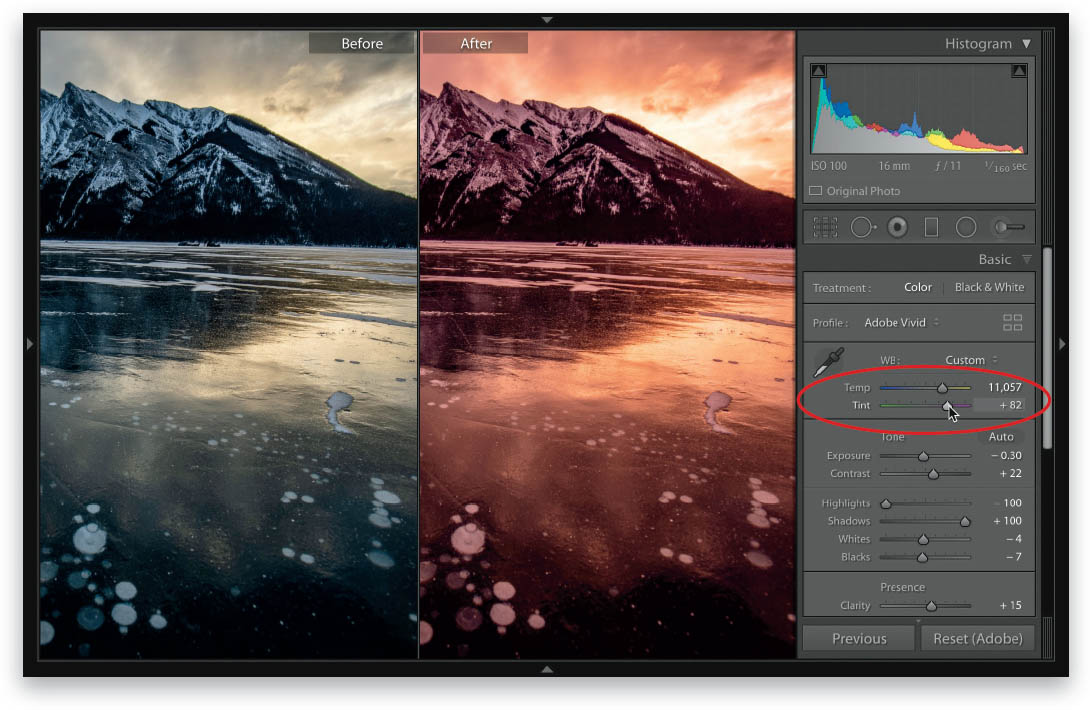
If, instead of picking an accurate white balance, you want to pick a more creative one (making the white balance look better than it did when you actually took the photo), then I would switch to the two white balance sliders, Temp (Temperature) and Tint, found near the top of the Basic panel. The nice thing about these sliders is that the color bars that appear right under the sliders themselves let you know which way to drag to get which color. For example, if you want more blue in your white balance, simply drag the Temp slider over toward blue. If you want less blue (you want a warmer color), drag to the right toward yellow. Super-easy to use (thanks to those color bars).
-
No Comment
..................Content has been hidden....................
You can't read the all page of ebook, please click here login for view all page.