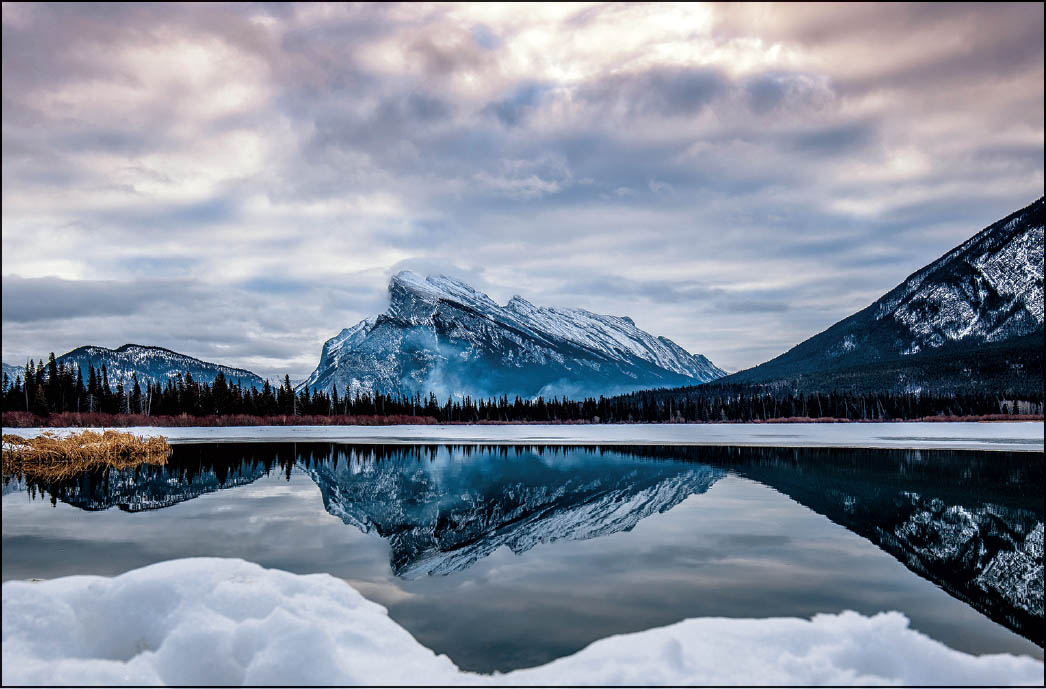
Where to Put the Horizon Line

This is a key composition decision, but luckily we have a guideline that helps make this decision fairly easy—use a part of the Rule of Thirds composition concept, which works perfectly for landscape images. Start with this thought: generally, the worst possible place for you to place the horizon line in your image would be in the center. Now, that’s not just for horizon lines—in general, dead center is dead boring—but it’s particularly lame and average for horizon lines. So, where would be a more interesting place to position the horizon line in your image? Using the Rule of Thirds concept, it would be to position it either at the bottom third of your image or the top third. So, how do you know whether to position it in the bottom or top third? It’s incredibly simple, because the rule is: show more of whatever looks most interesting. For example, let’s say you have an interesting rock formation in front of you as your foreground, but the sky above it is bland and cloudless. Well, you can pretty much figure what I’m going to tell you—show less sky, right? You do that by positioning the horizon line in the top third of the frame. That way, you’ll see more interesting rock formation and less boring, cloudless sky. If the sky looks amazing, and you want it to be the hero of your shot, then you’d show more of the sky (and less of the foreground), putting the horizon line near the bottom third of your image, so you see more sky. By the way, these “thirds” don’t have to be exact, so don’t sweat getting a perfect third—it’s a compositional concept, not a federal law, so you have some leeway (it might look better with the horizon line at 1/4 of the way from the bottom of the frame rather than at 1/3).
