
2.6 The Design and Styling of Future Things
2.6.1 Introduction
Design and styling of new products used to be easy. Modernism depicted that the new product should be designed to fit the utility function of the object efficiently, and that the shape should be geometric and clean. Postmodernism of the 1980s, however, re-introduced the idea of cultural reference and emotion in product design. From then on, products had to communicate not only a utility function but also cultural context and moral values (Krippendorff, 2007). Increased interest in the perception of these products by their intended users added a role for psychology and emotion in product design in the late 1990s (Desmet, 2002). Finally, the idea of product experience, introduced in the beginning of the twenty-first century, added an important role for the use of products (Green, 2002). From then on, using products should also be pleasurable and provide a memorable experience (Schifferstein and Hekkert, 2007). A lot of work has been done on mastering this increasing complexity, mostly relying on step-by-step methodology.
The design and styling of innovative products are even more complicated, depending on their innovativeness. When incremental innovation is applied, the characteristics of relating products can provide a reference for the design of new ones. One can think of the classic example of the first generation of cars, which looked like “carriages without horses.” However, in the case of breakthrough innovations, the intended new objects have no real “predecessor” in their existence, in other words, there is no reference to determine how they should look. To match the example of the introduction of the car, one can think of the first successful airplane by the Wright brothers, which showed little resemblance to birds (or anything else).
This newness is best suited with an umbrella methodology based on insights from creativity. Our design educational practice shows that the search for suitable product concepts beyond the obvious can be facilitated by bringing the design challenge to a higher level of abstraction (Eggink, 2009b), as for instance depicted by TRIZ, and more recently also adopted by the Vision in Product Design (ViP) method (Hekkert and Dijk, 2001). To stay with our example of the car as a carriage without a horse, one should not try to design the next generation of carriages, but rather “a means of individual people transport with the use of combustion engine technology.”
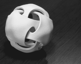
With regard to the development of innovative aesthetics in particular, in our postmodern twenty-first-century society, the image of products has sometimes become more important than the product itself (Baudrillard, 1994; Jameson, 1991). Then it is not the physical product, but the perception of the product by the user, that determines its existence (Crilly, Moultrie, and Clarkson, 2004). Bernhard Bürdek argued as early as 1991 that the functionalist idea of “form follows function” cannot play its central role in the development of aesthetics anymore, because of the increased importance of “visually anonymous” electronics and information technology (Bürdek, 1996). Electronics and interfaces simply do not have a particular shape, like steam engines or bicycles used to have. Naylor and Ball (2005) illustrated this ambiguity effectively with the supposedly functional shape of a neutral box that could be “anything” (Figure 2.6.1). This abstract nature of technology even increases when considering developments in bio- and nanotechnology (Drukker, 2009). Interestingly, in contrast, developments in materials and computerized production techniques enable us to make nearly any shape we want (Figure 2.6.2). In this context, the communication function of aesthetics – telling the user what the product is and how to use it – is therefore very important. It is this combination of circumstances that provides the designer with a powerful influence on the recognition and acceptance of innovative product concepts by their intended users.
Figure 2.6.1 The Generic Keypad by Naylor and Ball (2005, p. 62) illustrates the problem of product ambiguity
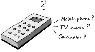
Figure 2.6.2 Example of a complex shape that is produced with the use of rapid prototyping techniques
2.6.2 Communication
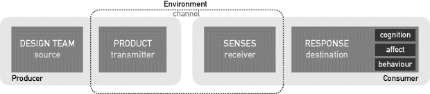
The communication function of design is easily understood, following the communication model of Crilly, Moultrie, and Clarkson (2004) (Figure 2.6.3). The consumer response at the right side of Figure 2.6.3 is steered by the information that is received through the senses. The interpretation of that information leads to (re)cognition, a certain level of affect (like or dislike), and a particular behavior. To evoke the desired recognition, liking, and behavior, the product has to transmit the right information. Therefore, the design team has to put the right idea into the styling of the product. For example, a sustainable car concept has to transmit the idea of environmental friendliness. If the intended consumer associates the styling of the concept with spoiling fuel instead, he or she will not show the desired behavior (using and liking the car).
Figure 2.6.3 Basic model of product communication by Crilly, Moultrie, and Clarkson (2004, p. 551)
The communicated idea can support the usability of the product. The do-it-yourself cordless drill and jigsaw in Figure 2.6.4 are clear about where the user should put his or her hands to hold and manipulate the objects. The rather smoothly curved handlebar sections reflect the form-language of the human body. Especially with the jigsaw, this is in sharp contrast with the rather technical expression of the ‘dangerous’ part of the device, surrounding the saw blade. The cordless drill also has a shape that literally points towards the hole that is to be drilled. In contrast to that, the styling of the “white box” design of the little iPod on the right, does not provide such a clue how to hold and manipulate it.
Figure 2.6.4 Products that communicate how to hold and use them (left and middle), and an example that does not (right)

The idea that the product transmits does not necessarily have to do with the primary functionality of the object. The iPod Nano in Figure 2.6.5 expresses the idea of “simplicity,” which is a metaphor for the interface's ease of use. The rather chaotic styling of the ghetto blaster on the right is expressing “complexity” as a metaphor for value for money; the consumer gets a lot of options when purchasing the device. Especially with the design of innovative products, where the perception of the consumer is already challenged by a lack of reference from predecessors, the central message to communicate should not be too complex. When the central idea of the product is clear, the shape and functionality of the product can be designed in a focused way, with the result that the consumer will recognize the benefits easier (Eggink, 2009a).
Figure 2.6.5 The iPod Nano from 2005 successfully communicates “simplicity” (left), whereas the music device on the right communicates the opposite
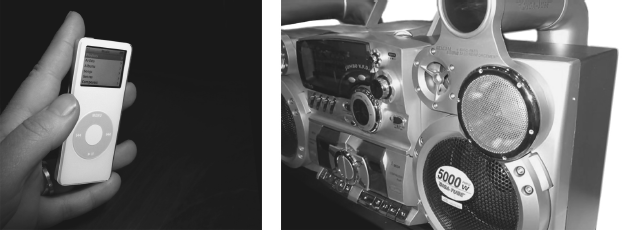
The iPod, for example, was one of the greatest recent successes in handheld devices. But its shape was not very pleasant to hold in your hand, and successors with better functionality. However, the central idea of “simplicity” was very dominantly implemented, stressing the problem that often occurred when introducing new consumer electronics: people being afraid that they could not cope with the new product's complexity.
This communication of the design idea should be regarded as a cultural phenomenon; the response of the consumer is determined by his or her cultural context or so-called cultural capital. In fact, the message is best understood when the sender and receiver share a common frame of reference. A red car, for instance, connotes “fastness” and “danger,” because people learn that red depicts danger as in traffic lights. They can also associate the color with the fast cars of the Ferrari brand.
The designer has to constantly search for the right cultural references that contain the desired message, then transform the characteristics of these cultural references into the styling of the new object. This transformation of cultural meanings can be executed on different levels of abstraction (Nijkamp and Garde, 2010), from the simple use of the color red for “danger” to the implementation of form complexity as a metaphor for advanced technology that can be seen in the object of Figure 2.6.2, which was issued to promote the possibilities of rapid prototyping.
2.6.3 Acceptance
New products have to build an “audience.” Early industrial designer Raymond Loewy said in his autobiography, “A lot of people are open to new things, as long as they look like the old ones” (Loewy, 1951). Loewy translated this in the famous MAYA (most advanced yet acceptable) principle, which suggests that things should look new, but not too much. This is unfortunately a relative and therefore very subjective guideline, because it is never clear what is “too much.” This MAYA principle has a background in social studies on people's aesthetic preferences, where it is argued that people long for both ease of recognition and the excitement of newness (Armstrong and Detweiler-Bedell, 2008). In other words, it is the ever-existing paradox of comfort versus thrill. However, in their illustrative research on typicality, novelty, and aesthetic preference, Hekkert, Snelders, and van Wieringen (2003) conclude that people have aesthetic preference for objects that are both typical and novel:
In sum, it seems that our results provide an empirical basis for the industrial design principle coined MAYA by Raymond Loewy.... In order to create a successful design, the designer should strike a balance between novelty and typicality in trying to be as innovative as possible while preserving, as much as possible, the typicality of the design. The fact that this is feasible is due to the fact that the correlation between novelty and typicality, although highly negative, falls short from being perfect. (p. 122)
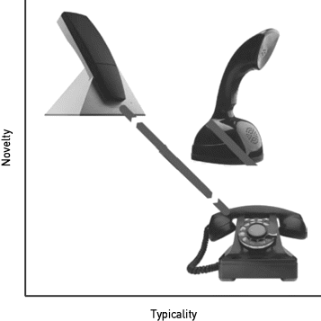
In fact, the interpretation by Hekkert, Snelders, and van Wieringen (2003) turns the MAYA principle into a very useful tool. The transformation of terms puts an end to the endless discussions on whether an advanced design is still acceptable or too advanced, because now a new design should be both advanced (novel) and acceptable (typical). This is, of course, only possible when typicality and novelty are considered two different variables, and not each other's opposites. This is best understood when the opposite of typical is seen as different, and the opposite of novel is seen as expected (Eggink, 2010). The historic example of the red Ericophone in Figure 2.6.6 is a telephone design where both typicality and novelty score high. The Ericophone is novel because of the upright position of the handset (with the dial at the bottom of the base) and typical because of the familiar shape and form language of the handset, which is copied from the traditional black model.
Figure 2.6.6 Example of the relationship between novelty and typicality in telephone designs. The gray arrow depicts the (normal) highly negative correlation
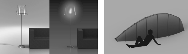
This principle can be implemented in many different ways. In the Gina concept car by German car manufacturer BMW, for example, the bodywork is innovatively executed in fabric, covering a tubular frame. Because the fabric was made in one continuous piece covering the whole body, this solution resulted in a form of wrinkling of the bodywork when the doors were opened. This wrinkling of body coverings is very new within the styling of cars, but at the same time very recognizable for the user because it associates with skin. Master student Industrial Design Engineering Jan Willem Peters explored the principle in his master graduation project and came up with a range of other examples. Amongst others he designed a lampshade-fireplace, and a tent with the shape of a leaf (Figure 2.6.7). The lampshade-slash-fireplace looks very familiar in a living room context, but is new because of the gel burner that is providing a real fire, situated somewhere one does not expect. The tent concept transforms the shape of a leaf into a small shelter. The familiar structure of the veins of the leaf is combined with the structural support for the tent.
Figure 2.6.7 Lampshade-Fireplace and Tent concept by Jan Willem Peters, combining familiar shapes in a new context (tent) and combining a new functionality with a familiar context (fireplace)
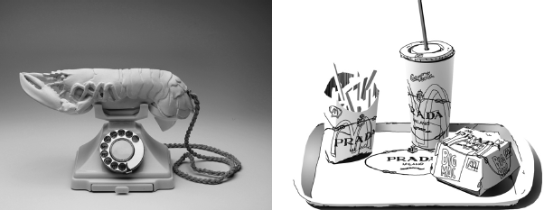
So the combination of newness and recognition is typically achieved when something widely known is presented or applied in a new, unfamiliar context (Eggink, 2011b). This principle can be traced back to the practice of “displacement” by the early twentieth-century Surrealists, and is still a powerful mechanism for cultural meaning making (Figure 2.6.8).
Figure 2.6.8 Aphrodisiac Telephone by Salvador Dalí, from 1936 (1936, courtesy Museum Boymans-van Beuningen, Rotterdam; photo Tom Haartsen) and Prada Value Meal by Tom Sachs (1997) share the same principle of meaning making
2.6.4 Method
When the novelty–typicality principle is combined with the outline for stimulating creative solutions on a higher level of abstraction as was derived from TRIZ, we can put this in a scheme as depicted in Figure 2.6.9. The design challenge of the new product is elevated to a general level on the left. Here the central idea to be communicated should be established from relevant product categories and related cultural references. From there, the implementation of newness and typicality on an abstract level can be facilitated by associative and competing products or imagery.
Figure 2.6.9 Basic model of innovative design and styling, by Stevens (2008–2010)
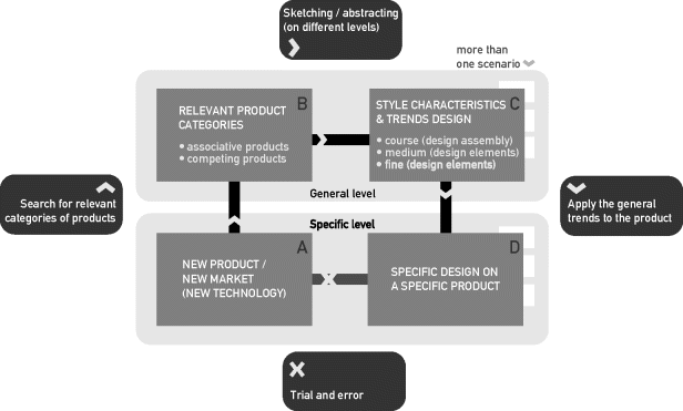
On the right side of the model in Figure 2.6.9, the insights should be applied to the specific product design, resulting in a concrete object that incorporates the abstract product idea. Within this process, an exploration of different design possibilities, based on future trends and scenario development, could ensure that the specific design fits the desired future context.
2.6.5 Examples
Two examples will be given of the actual development of the styling of future concepts. Both originate from the teaching practice at the Industrial Design Engineering curriculum of the University of Twente in the Netherlands.
The first example is from a design course in cooperation with Dutch sports car manufacturer Donkervoort. The assignment was to develop future concepts for a genuine sports car experience in a society context that has more and more traffic restrictions. Leendert Verduijn, Bernd Worm, and Frank Scholder approached the problem by first visualizing the intrinsic contradiction of the assignment (Figure 2.6.10).
Figure 2.6.10 Visuals depicting the central problem statement and the desired solution for the design: combining the racing car with the intrinsic freedom of city running
The visualized argument is that developments in electronic driver assistance, in combination with road safety and increased density, will put the driver in a stringent harness (Figure 2.6.10, left), leading to illusionary freedom (Figure 2.6.10, middle). The solution for a true sports car experience has to lie in substantially less car instead of more car (Figure 2.6.10, right). Presented in this way, the visualizations stimulate the designer to look for creative solutions that lie behind the obvious, and they also support the evaluation of design ideas (Eggink, 2011a).
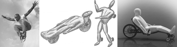
The implementation of this abstract idea is shown in Figure 2.6.11. Instead of a sports car, the students designed a minimalistic construction that stays as close to the body as possible, reminiscent of the inspiration source from popular youth culture, city running or Parkour. The eventual concept is a clear combination of novelty and typicality (Figure 2.6.11, right). The back half looks like a lightweight motorcycle, and the front half like a skateboard (the associative and competing products as mentioned in the upper-left corner of the basic model in Figure 2.6.9). The posture of the driver resembles that on a reclining bicycle, but the absence of the driving train renders a different effect. The sense of freedom for the user is established by minimizing the parts in the front. Because no part of the construction is in the sight of the user, the shape reflects an urge forward and there is no visible protection that blocks the user's idea of freedom.
Figure 2.6.11 From central idea to design concept: The electric driven tricycle can be folded into the shape of a wheeled suitcase so that the fun can be combined with public transport before or after use
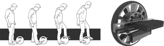
The second example is from a master course named Create the Future, where student groups first have to create a future context for their designs through systematic scenario development (Eggink, Reinders, and van der Meulen, 2009). Within this future context, the groups have to develop a product concept, and in this particular example the group created a future electric mobility concept named Amplified Walking. The central idea is that the electrically driven device amplifies the movements that you normally make when you are walking, stepping, or running (Figure 2.6.12). Ingenious electronic feedback will keep the user stabilized in the same manner as the two-wheeled Segway does.
Figure 2.6.12 The amplified walking concept, by Alfred Doppenberg, Ronald van Galen, Mark Grob, and Elias van Hoek
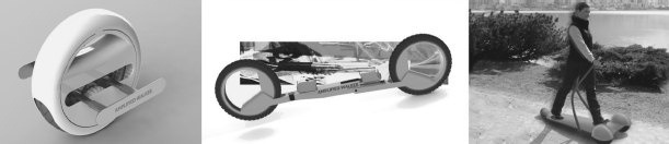
The amplified walking concept was developed for a future scenario context where consumer involvement with new developments was very high. This resulted in a product architecture based on building blocks that should be possible to construct in endless combinations, like a form of mass customization. The group presented three different product architectures, likely to be built by different user groups. All three also combined a form of newness with recognition of the typical features of the user group's main inspiration sources (Figure 2.6.13). The first one combines the appearance of a unicycle with the styling of a white iPad. The second one is a mix of skateboard and mountain bike. The third concept resembles a typical fitness device, targeted on elderly people.
Figure 2.6.13 Three possible implementations of the amplified walking concept
2.6.6 Conclusions
Design and styling have major influences on perceptions of innovative product concepts. The right styling depends on a profound mix of both novel and typical styling items. This combination of items has to communicate the desired attributes of the product, by means of association with the cultural background of the intended user. For clear acceptance of the communicated message, it should be not too complicated. One central idea is easier to communicate and can at the same time perform a guiding role in the design's detailed development. Two example projects have shown how styling features and product architecture can go hand in hand to express the desired feelings around future product concepts.