
The user of a web application should be able to easily navigate through its pages. You have already encountered three navigational features in your use of APEX: links, breadcrumbs, and the navigation menu. This chapter examines these features in detail and shows you different ways to use them in your applications.
Lists
In common parlance, a list is simply a collection of things. In APEX, however, a list is a collection of links. A list is a useful navigation tool, for the obvious reason that clicking a link takes you to a new page.
For a good example of an APEX list, consider again the SQL Workshop home screen, as shown in Figure 1-3. Its Create Object region is a list that enables quick access to the various object–creation wizard pages. That list has an entry for each kind of SQL object, with its link taking you to the creation wizard for that object.
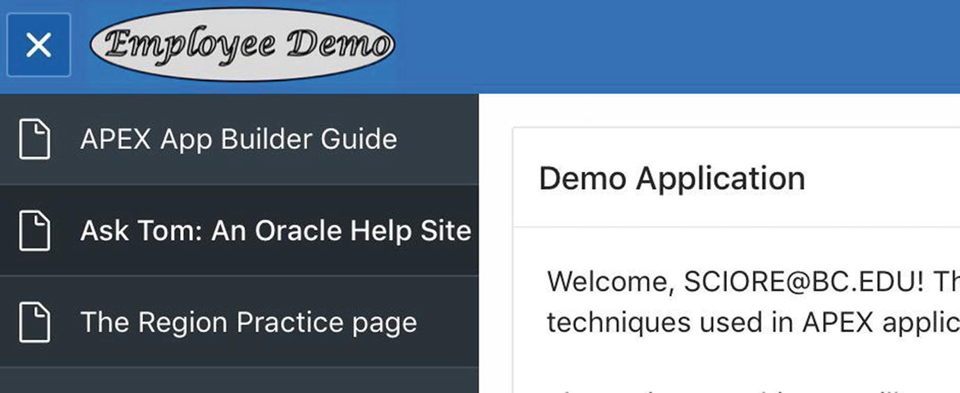
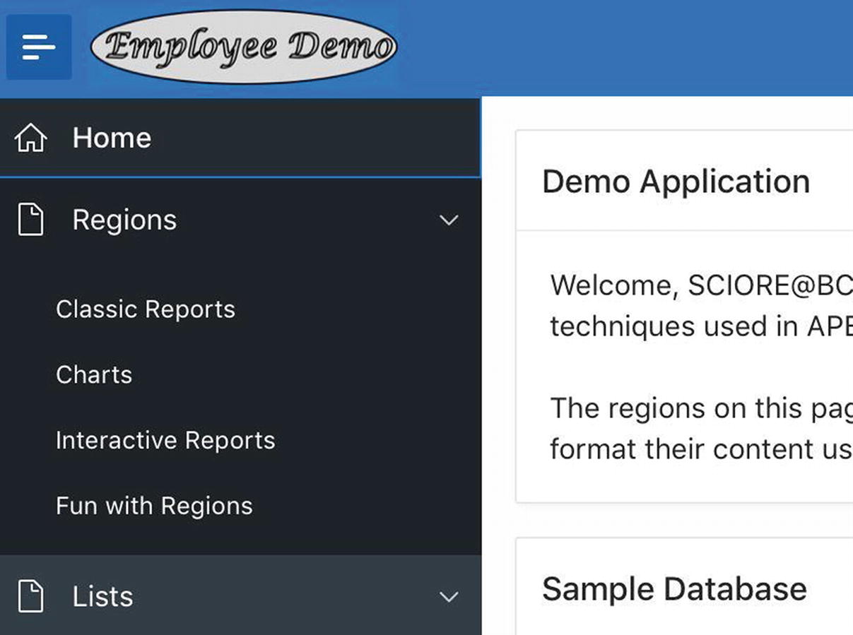
For another example, recall the home page of the Employee Demo application, as shown in Figure 3-17. Its References region is a list with links that take you to selected web pages.
Perhaps the most notable example of a list is the navigation menu. Each of its entries is a link that takes you to the specified page of the application.
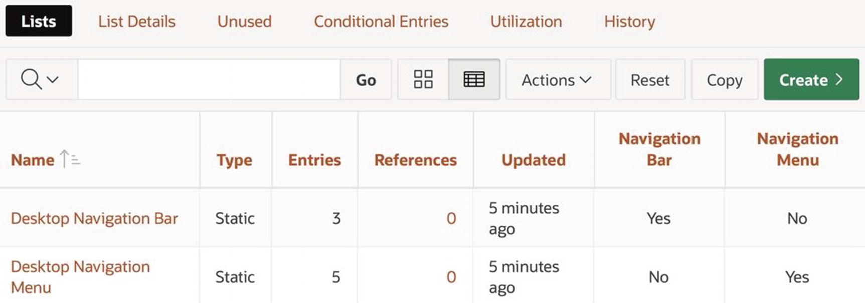
List manager
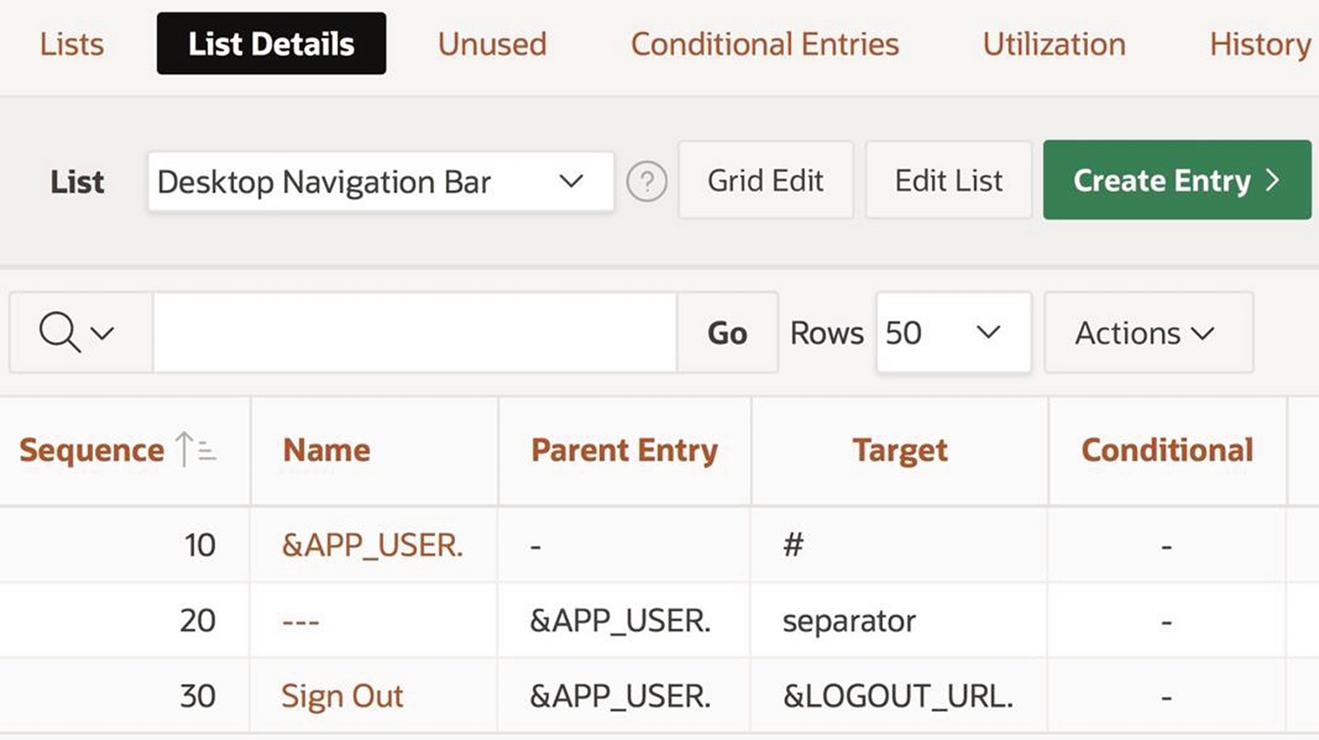
The figure shows that the application already has two lists: Desktop Navigation Bar and Desktop Navigation Menu. APEX treats these lists in a special way—their respective entries are displayed in the navigation bar (which runs across the top of the page) and the navigation menu (which runs down the left side of the page).
Viewing List Details
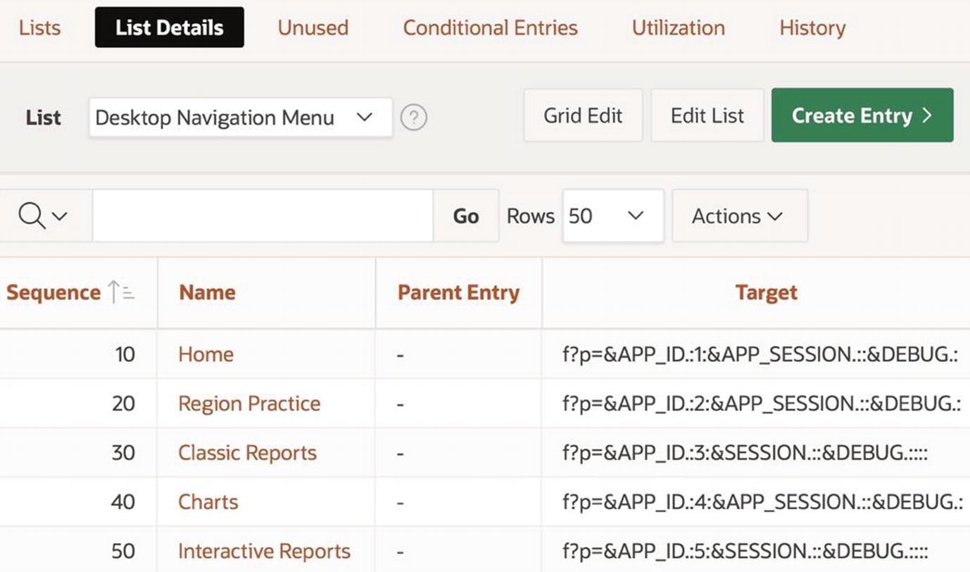
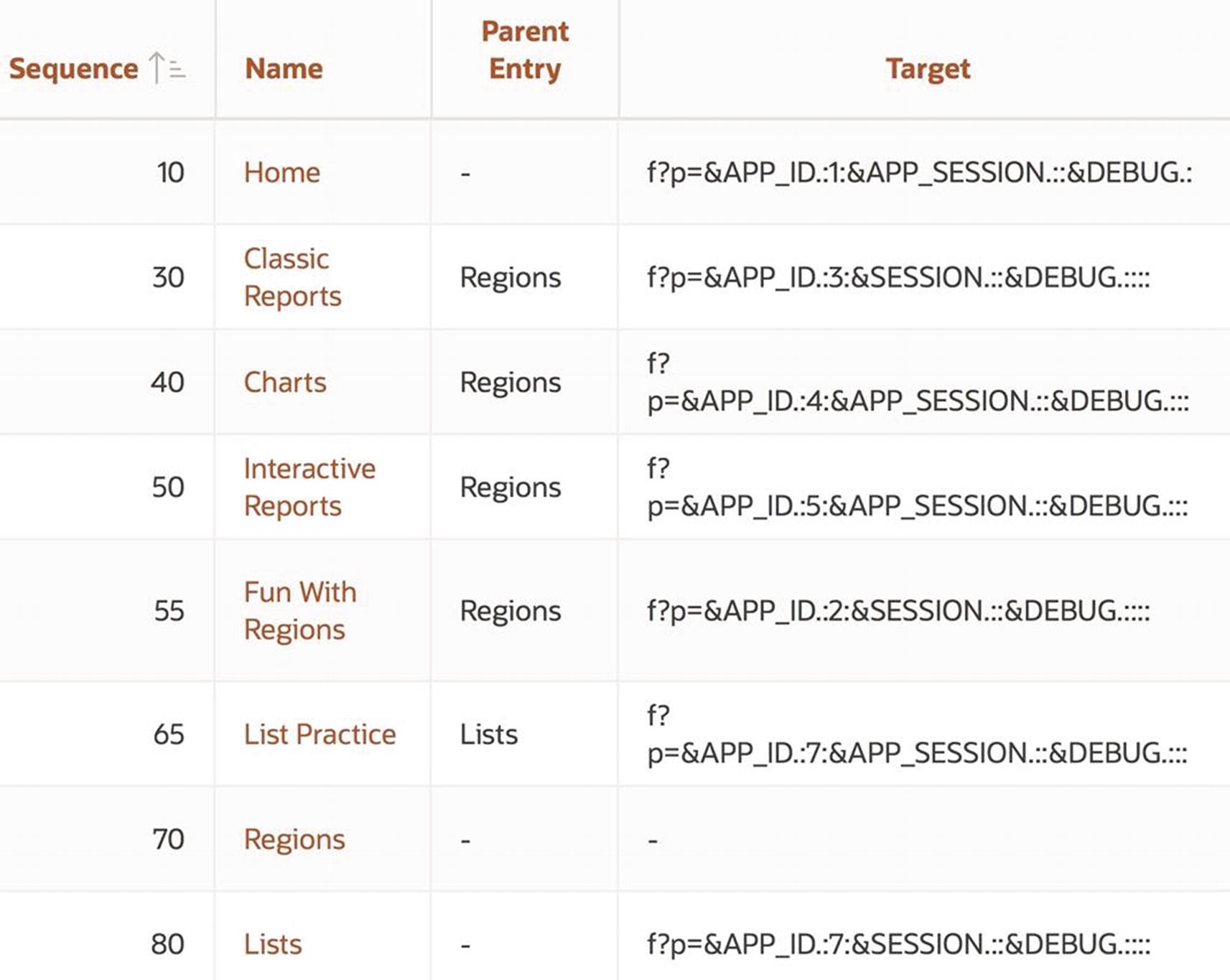
Details of the Desktop Navigation Menu list
The sequence numbers determine the order in which the entries appear in the list.
The name of an entry specifies how it is displayed in the list.
The target of an entry is the URL that is called when the link is clicked.
Note in the figure that each target URL refers to a page of the current application, using the syntax described in Chapter 2. One new aspect of that syntax is the string “&DEBUG.”, which appears as the fifth argument to each URL. This portion of the URL specifies that the application should continue to use the current debug mode (which is an issue of minor concern, and is ignored in this book).
Editing List Entries
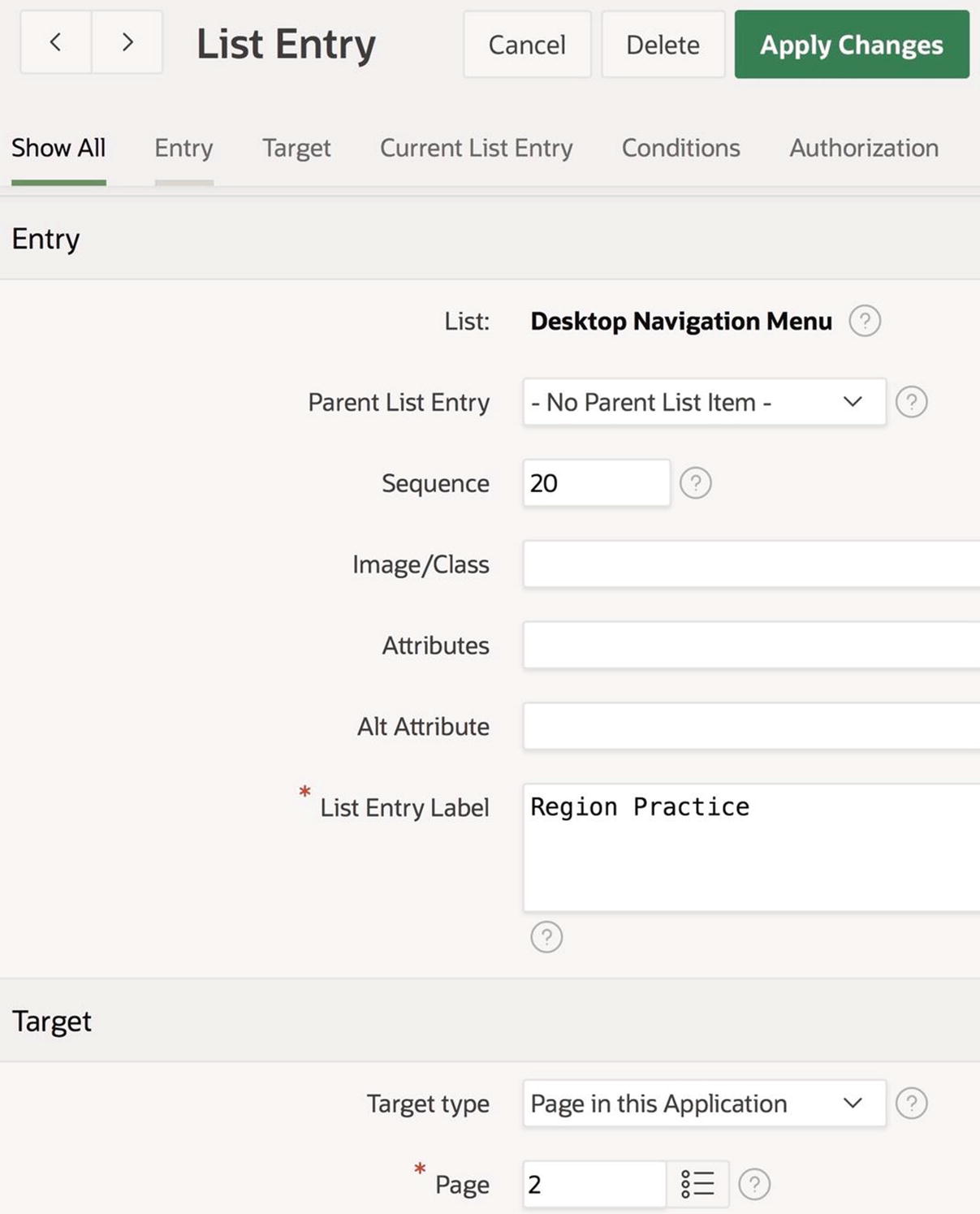
List Entry screen for the Region Practice page
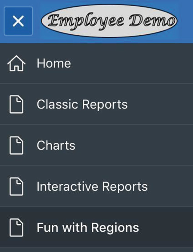
Modified navigation menu
Creating New List Entries
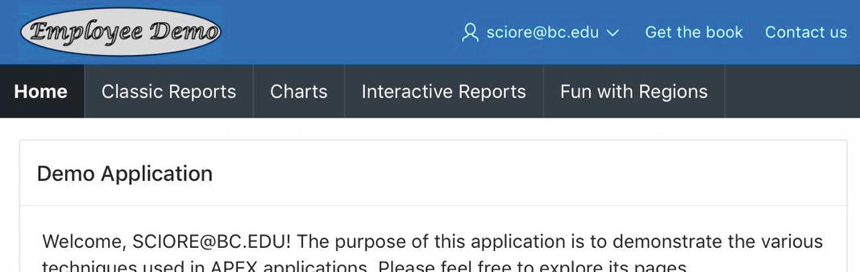
Now turn your attention to the Desktop Navigation Bar list. The navigation bar in an APEX application runs across the top of each page. By default, the left side of the navigation bar displays the logo, and the right side displays the current user name (as in Figure 2-8 of Chapter 2). The general intent of the navigation bar is to provide quick links to common tasks. For example, the logo is actually a link to the home page, and the username is a menu that has a link to a procedure that logs out the user. Navigation bars typically contain links for displaying a site map, online help, or contact information.
Details of the Desktop Navigation Bar list
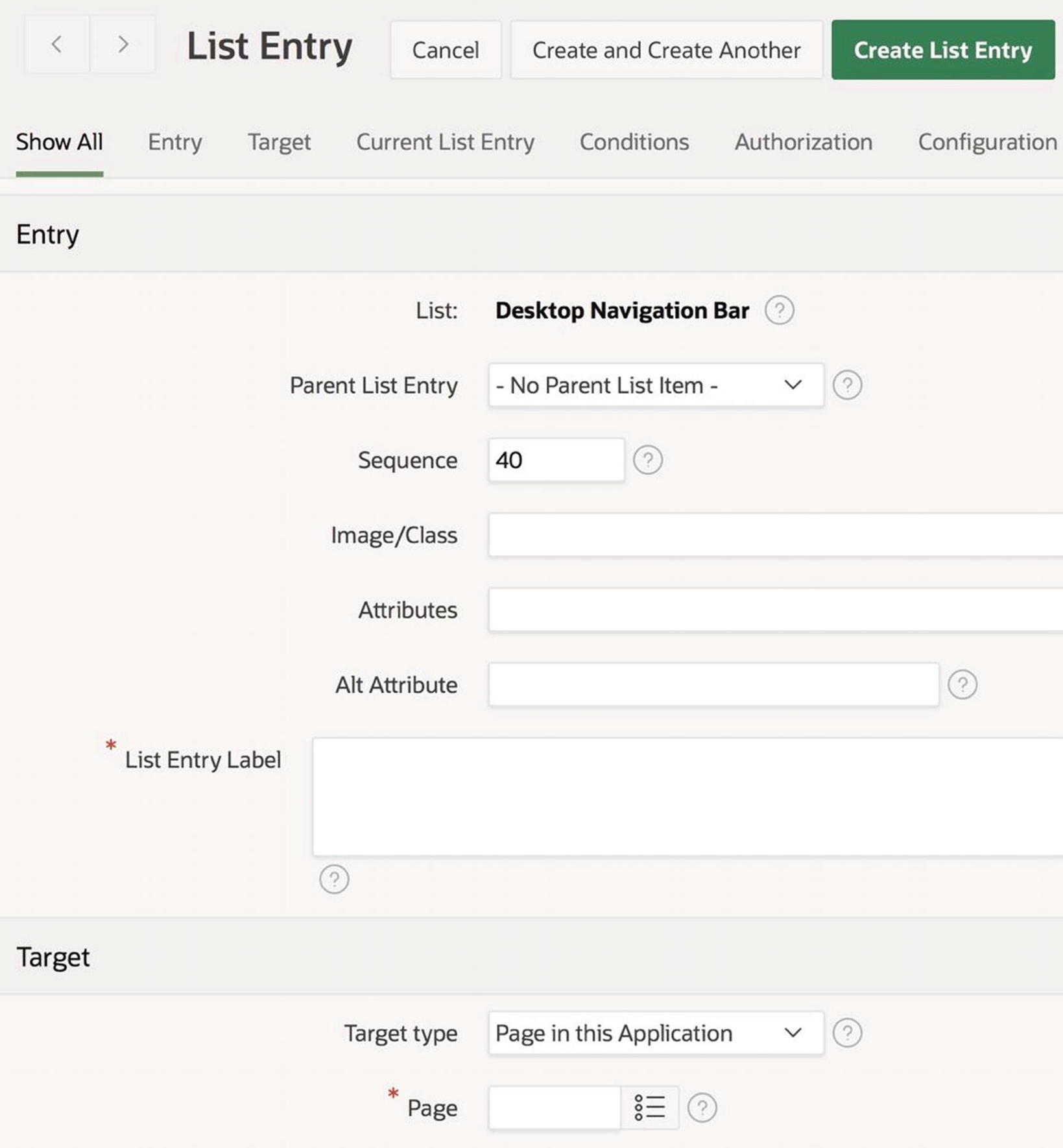
List Entry screen for creating a list entry
To create the link to this book’s web page, you only have to enter a value for the property List Entry Label (I entered Get the Book) and set the target. Here, the target is a URL, so you set the Target type property to URL and its URL Target property to www.apress.com/9781484261651. Then click Create List Entry.
While you’re at it, you might as well create the link to the Contact Info page now, even though the page does not yet exist. Assuming that it will be page 6, create a new list entry and set its List Entry Label to Contact Us, its Target type to Page in this Application, and its Page value to 6. Then return to the home page for the application.
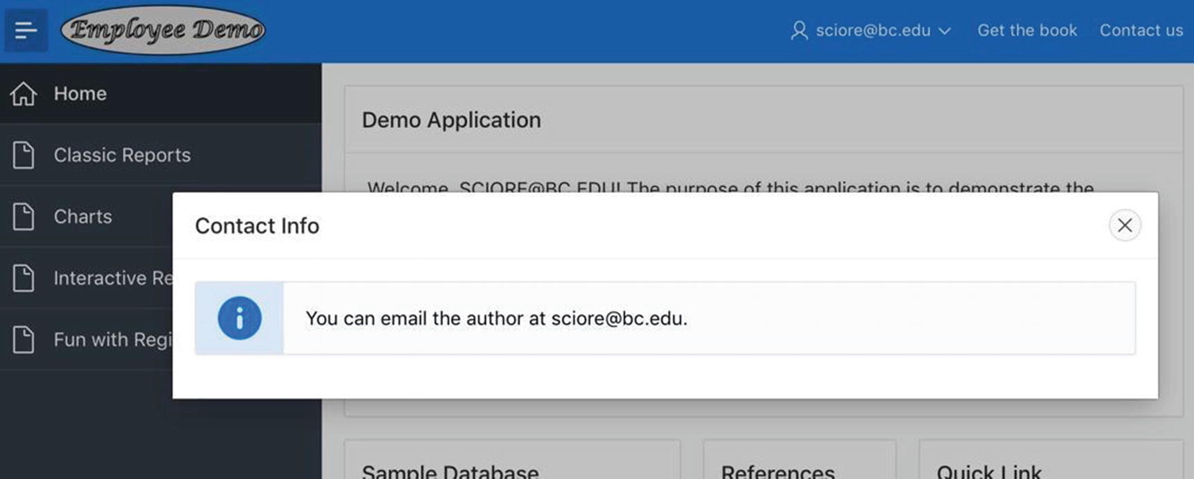
Using the Contact Us link on the navigation bar
Creating a New List
Let’s create a list to hold the three links of the References region on the home page. Return to the list manager screen of Figure 4-1. Clicking the Create button brings up the APEX list creation wizard. This wizard has four screens. On the first screen, choose to create the list From Scratch. On the second screen, give the list a name (say, References), and set its type to Static.
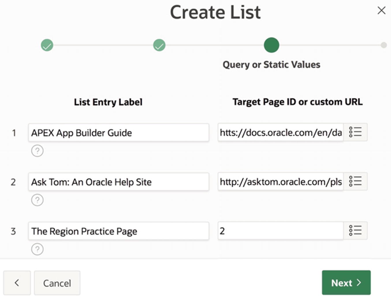
The third Create List screen
The final screen asks if you want to create a region for the list. Because you have not yet learned about list regions, select No. Then click Create List to create the list. The list manager should now display the entry for your new list.
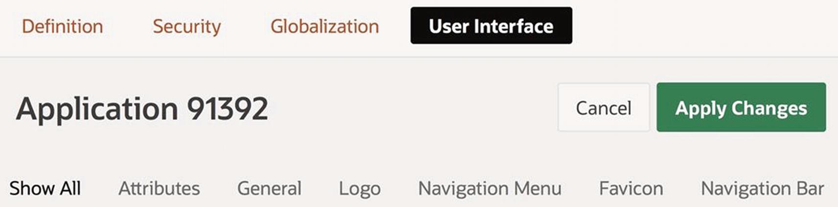
Modifying the Navigation Interface
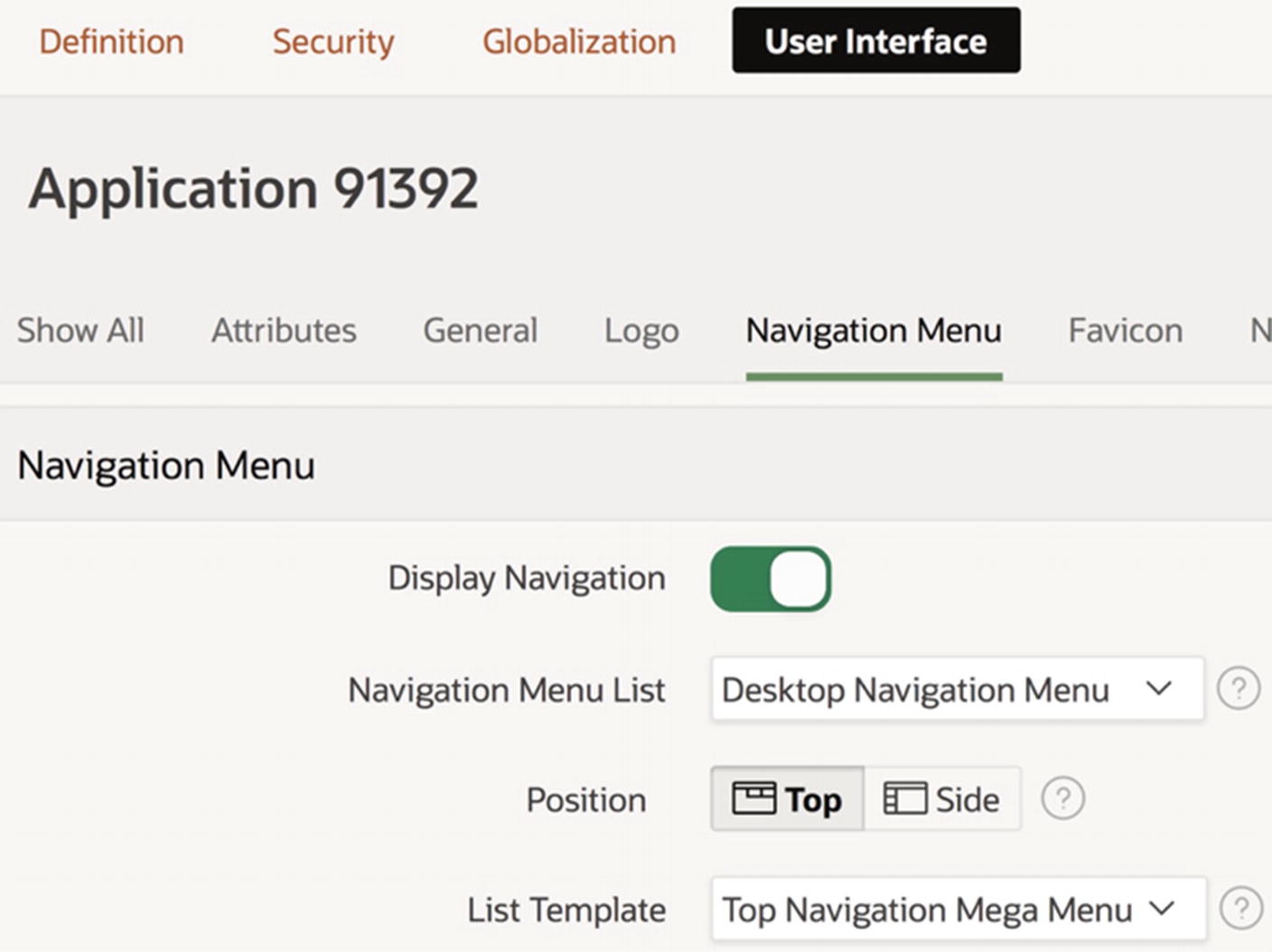
By default, the Desktop Navigation Menu list is displayed down the left side of the page, and the Desktop Navigation Bar list is displayed along the top. You can change these defaults by modifying the application’s properties.
An application’s user interface properties
Note the selector bar along the bottom of the figure that lists the property sections. You might remember the Logo properties from Chapter 3 (refer to Figure 3-21). Right now, however, you are interested in the Navigation Menu and Navigation Bar sections. Their properties allow you to configure the navigation menu and navigation bar.
Configuring the Navigation Menu
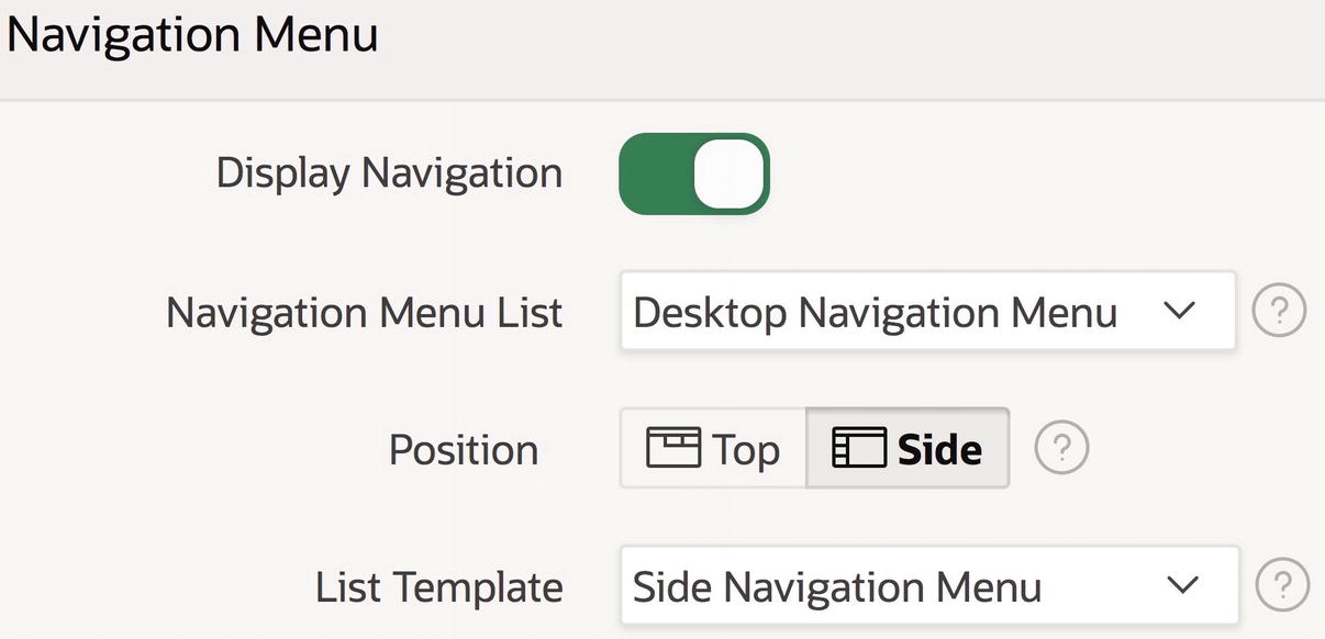
Application’s Navigation Menu properties
References list is now the navigation menu
You can also choose the value -Select Navigation Menu List- as the navigation menu. Doing so sets the Navigation Menu List property to null, which causes APEX to not render the navigation menu area at all.
Navigation menu now appears along the top
Configuring the Navigation Bar
The application’s Navigation Bar properties

Navigation menu now appears in the navigation bar
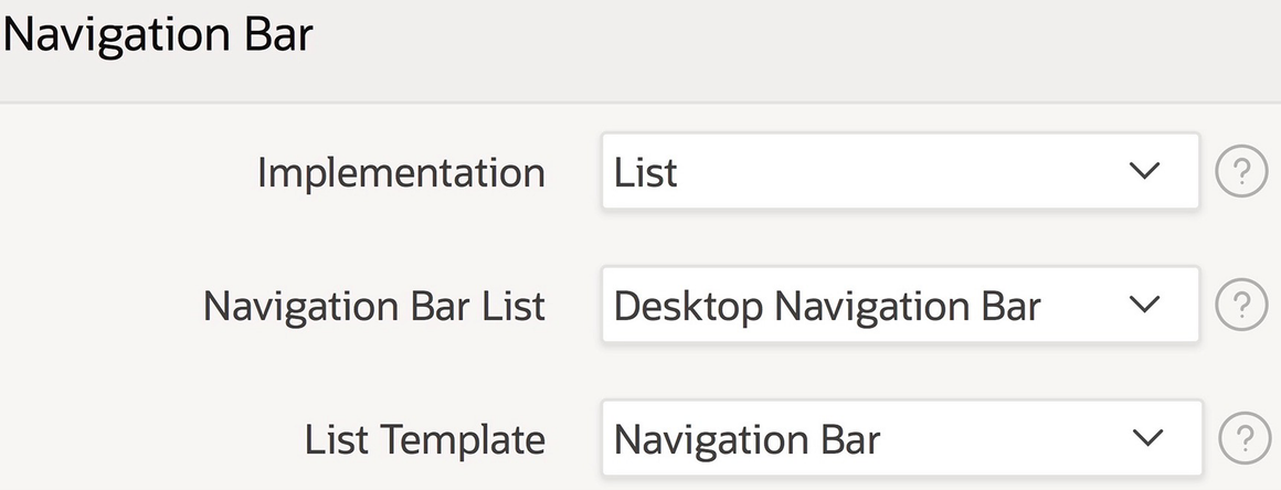
List Regions
For the contents of a list to be visible on a page, the list must be assigned to a location on that page. The navigation bar and navigation menu locations are predefined. If you want a list to appear anywhere else, you must place it in a region that you create. The region should be of type List, and its source should be the name of the list.

List Practice page
To build this page, you should create a new page and add four new regions to it. I titled these regions References Using Cards, References Using Links, References as a Navigation Bar, and Navigation Menu. The first region has a column span of 7; the second region begins a new column of the same row; and the other two regions begin new rows.
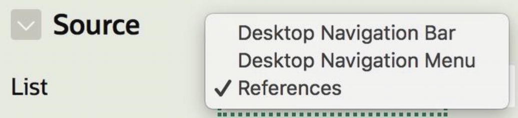
Selecting the source of a list region
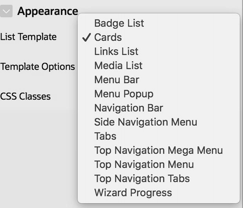
Possible list template values
To produce the page shown in Figure 4-15, you should set the template of the References Using Cards region to Cards, the template of the References as a Navigation Bar region to Menu Bar, and the template of the Navigation Menu region to Navigation Bar. For fun, you also might want to experiment with assigning other templates to these regions, such as Badge List, Media List, and Tabs.
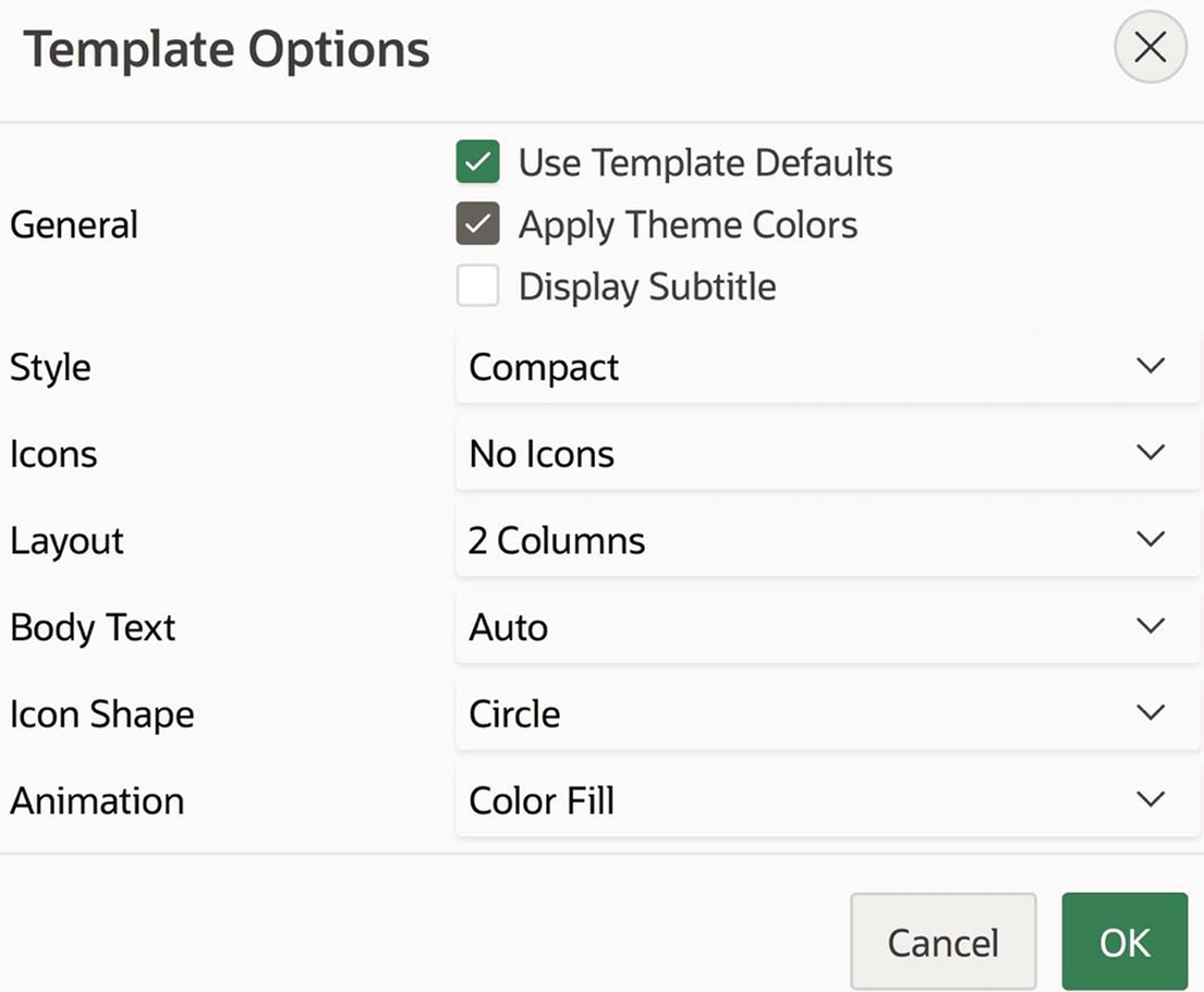
Options for the Cards template
In addition to choosing a list template, recall that you can also customize a region by choosing a region template. (Figure 3-10 in Chapter 3 showed the possible templates.) The top three regions of Figure 4-15 use the Standard template , which displays a header containing the region name. The bottom region uses the Tabs Container template . This template displays its contents with no additional border; in fact, it looks a lot like a menu bar. This region demonstrates how you can use a list region to mimic a menu bar that appears somewhere other than the default places on the page.
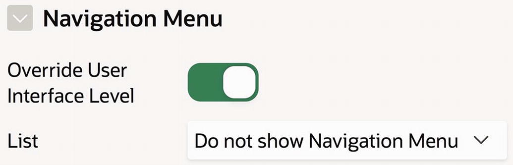
Configuring the navigation menu for a single page
Turning on the Override User Interface Level property causes the List property to be displayed. You can then choose the list that will be the navigation menu for the page, or you can choose to not specify the navigation menu.
Storing links in a list and displaying them in a list region is an important technique; it is far superior to manually formatting the links in HTML, as you did on the References region of the home page. One reason is that the template of a list region takes responsibility for formatting the list entries; you just need to choose the template you want. In other words, a list region separates the content (the source list) from the formatting (the list template). Writing HTML code to implement a list is not only tedious, but it also intermixes content and formatting. Any decision to change the format of the entries would require you to rewrite the HTML.
A second advantage of using a list region is that it will automatically be updated as the list changes. This is especially important for regions that display the Desktop Navigation Menu list. For example, whenever you create a navigation menu entry for a new page, the Navigation Menu region of Figure 4-15 will adjust accordingly.
Hierarchical Lists
The Employee Demo application currently has six entries in its Desktop Navigation Menu list. Because there are so few entries, it is reasonable to simply display them linearly along the side (or top) of the page. However, as the number of entries grows, a long linear list becomes unwieldy. The common solution is to display the entries hierarchically.
The APEX navigation bar (shown in Figure 1-3) is a case in point. Its first tab (containing the logo) corresponds to the APEX home screen; the other tabs correspond to general categories of the APEX site. Each category tab has a primary target page, which acts as the home screen for that category. Clicking the main portion of a category tab takes you to that page. Each category tab also has a down arrow; clicking it displays a menu of secondary tabs for that category. The result is a functional but clean interface, with the secondary tabs hidden until needed.
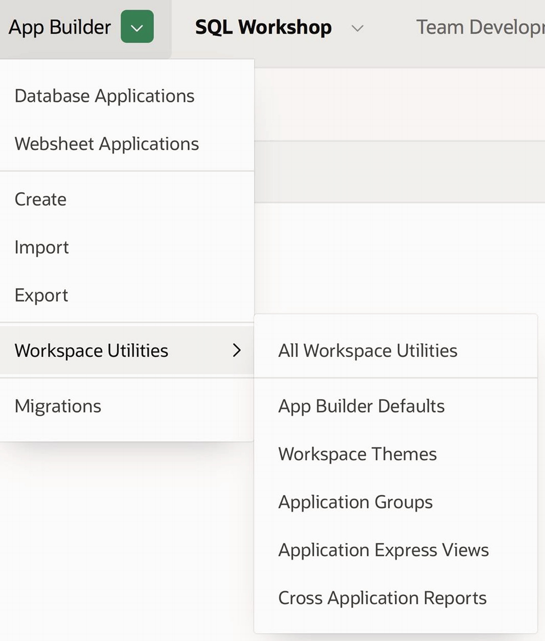
App Builder menu in the APEX navigation bar
A Regions hierarchy that contains the pages Region Practice, Classic Reports, Charts, and Interactive Reports
A Lists hierarchy that contains the page List Practice
Each hierarchy corresponds to a chapter of the book—the Regions hierarchy contains the pages developed in Chapter 3, and the Lists hierarchy contains the page from Chapter 4. As the book progresses, I shall keep to this convention, creating a new hierarchy for the pages developed in each chapter.
But before you begin to create the hierarchies, you need to consider how you will configure each root entry. Clearly, the value of its Parent List Entry property should be null, denoting that it is a root. However, what value should you give to its Target properties?
There are three reasonable strategies: you can create a dedicated “home screen” to be the target, or you can set the target to be the same as the target of one of its children, or you can set the target to be null. APEX adopts the first strategy—it has a home screen for the application builder, one for the SQL workshop, and so on. Adopting the second strategy has the effect of making the chosen target be the default page for that section. And adopting the third strategy makes it impossible to choose the parent, thereby forcing the user to select one of the children. This book shall follow the convention that a root having a single child will have that child be its target, whereas a root having several children will have a null target.
To create this hierarchical list, begin at the List Details screen for the Desktop Navigation Menu, which appeared in Figure 4-2. Create two new list entries to be the roots of the two hierarchies, and set their target pages according to the preceding convention: the target of the Regions entry should be null, and the target of the Lists entry should be the List Practice page.
Entries for a hierarchical navigation menu
Hierarchical navigation menu
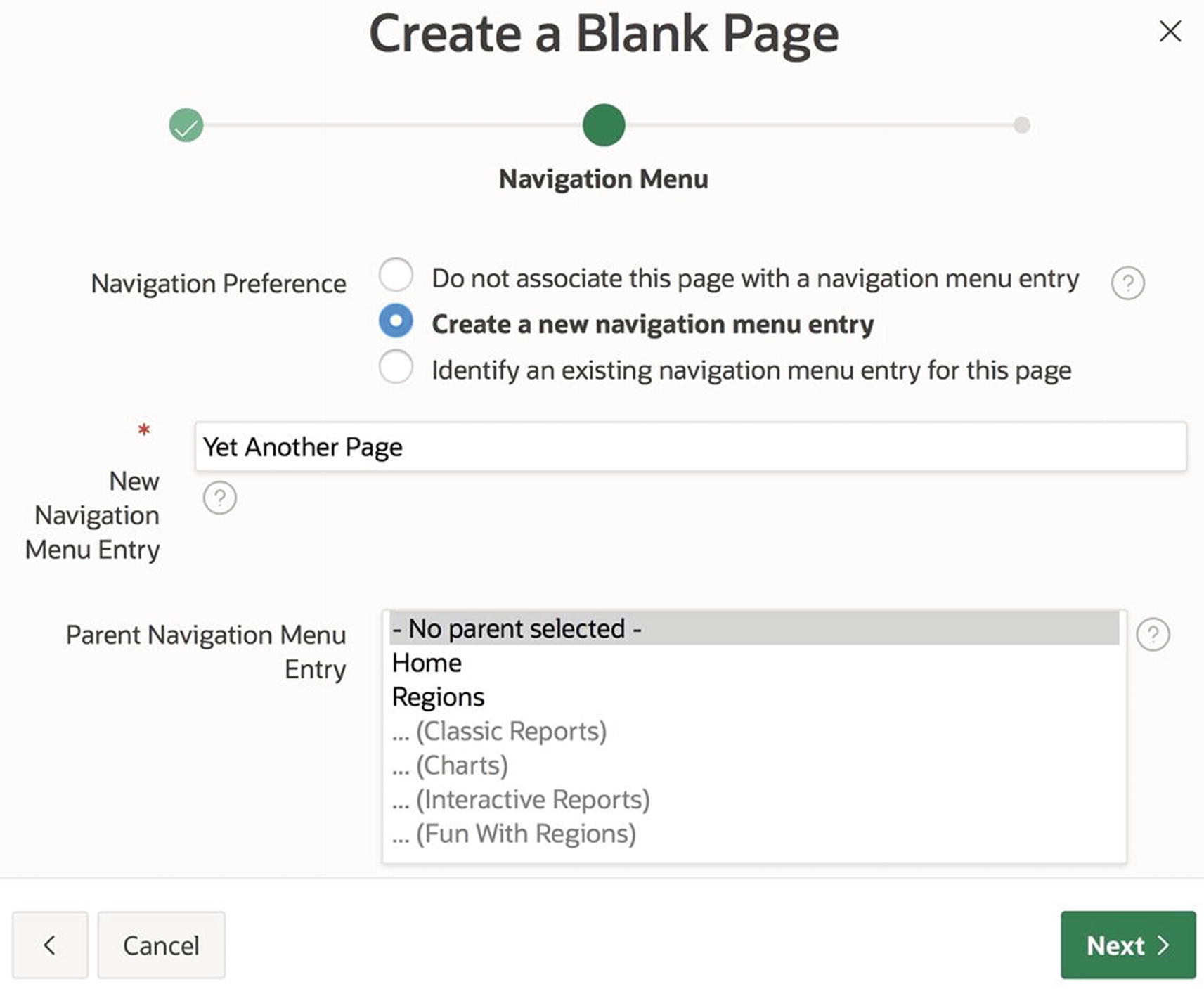
Specifying the menu hierarchy during page creation
The item labeled Parent Navigation Menu Entry displays every entry in the navigation menu list. (You need to scroll through the list to see them all.) The default value is -No parent selected-, which causes the new menu entry to be a root. If you want the new entry to be a child of another entry, you must specify a parent. Ideally, you should be able to just select the entry you want from the list. However, some of the entries are grayed out and are not selectable. In particular, the selectable entries are the ones that either are already parents or are “potential parents” in the sense that they have no target. Most of the time, the parent you want will be selectable. But if you want your new entry to be a child of one of the grayed out entries, you must assign its parent via the list manager.
Mega Menus
Hierarchical navigation menus improve the user experience in two ways. First, they structure the menu entries, so that users can more easily understand what actions are available. Second, they reduce the amount of screen real estate that the menu requires.
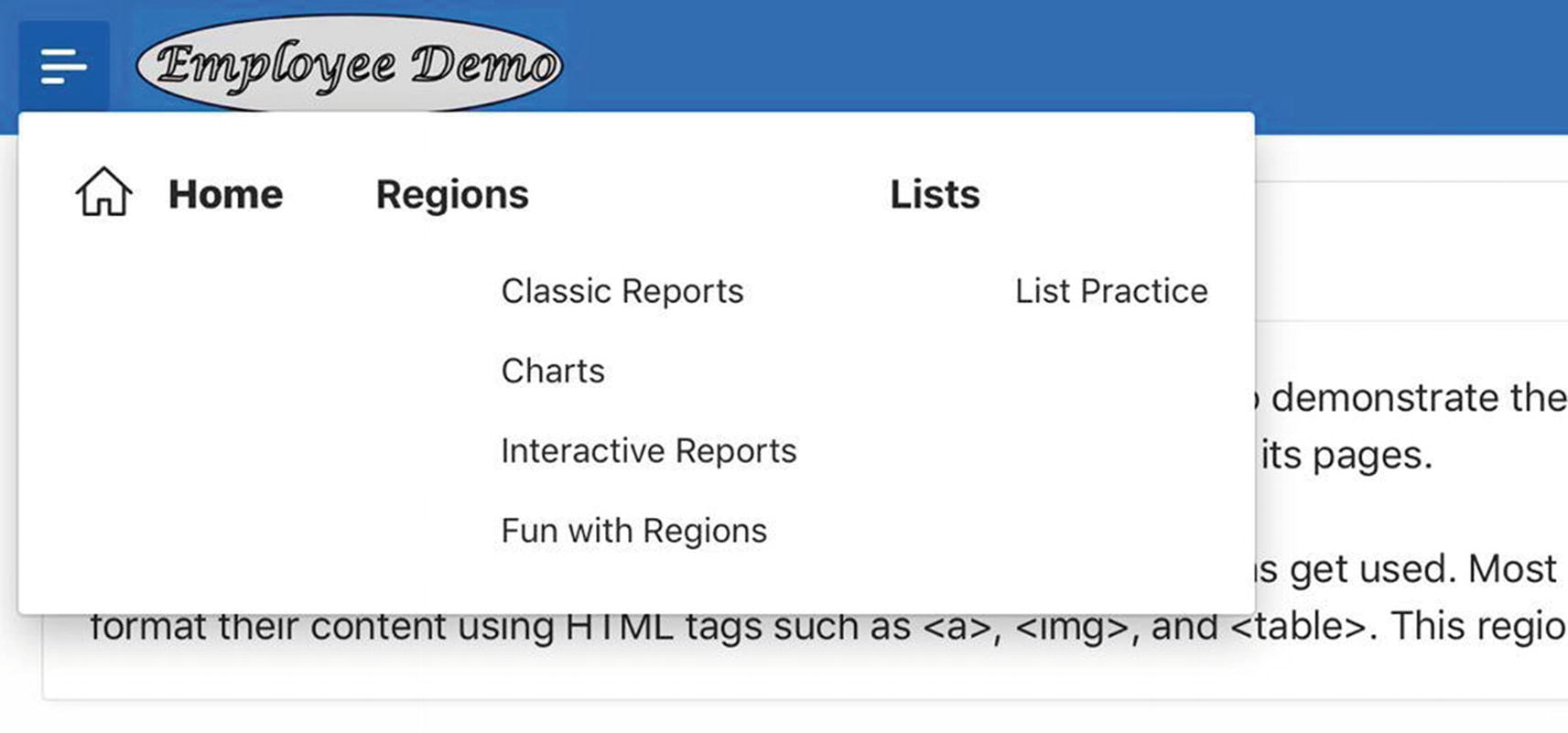
A mega menu
Specifying a mega navigation menu
Page Hierarchy
A large web application contains too many pages for all of them to be in the navigation menu. Instead, the navigation menu contains the application’s landing pages—those pages that denote the start of the most prominent tasks.
Typically, the set of all pages in an application also has a hierarchical structure. An explicit rendering of this page hierarchy is called a site map. Consider, for example, the pages in an APEX site. Their root in the hierarchy is the APEX home page. The children of the root correspond to the various categories of the application, such as the app builder, the SQL workshop, and the team development tools. Each category has a “home page” that heads a subtree containing the pages of its category.
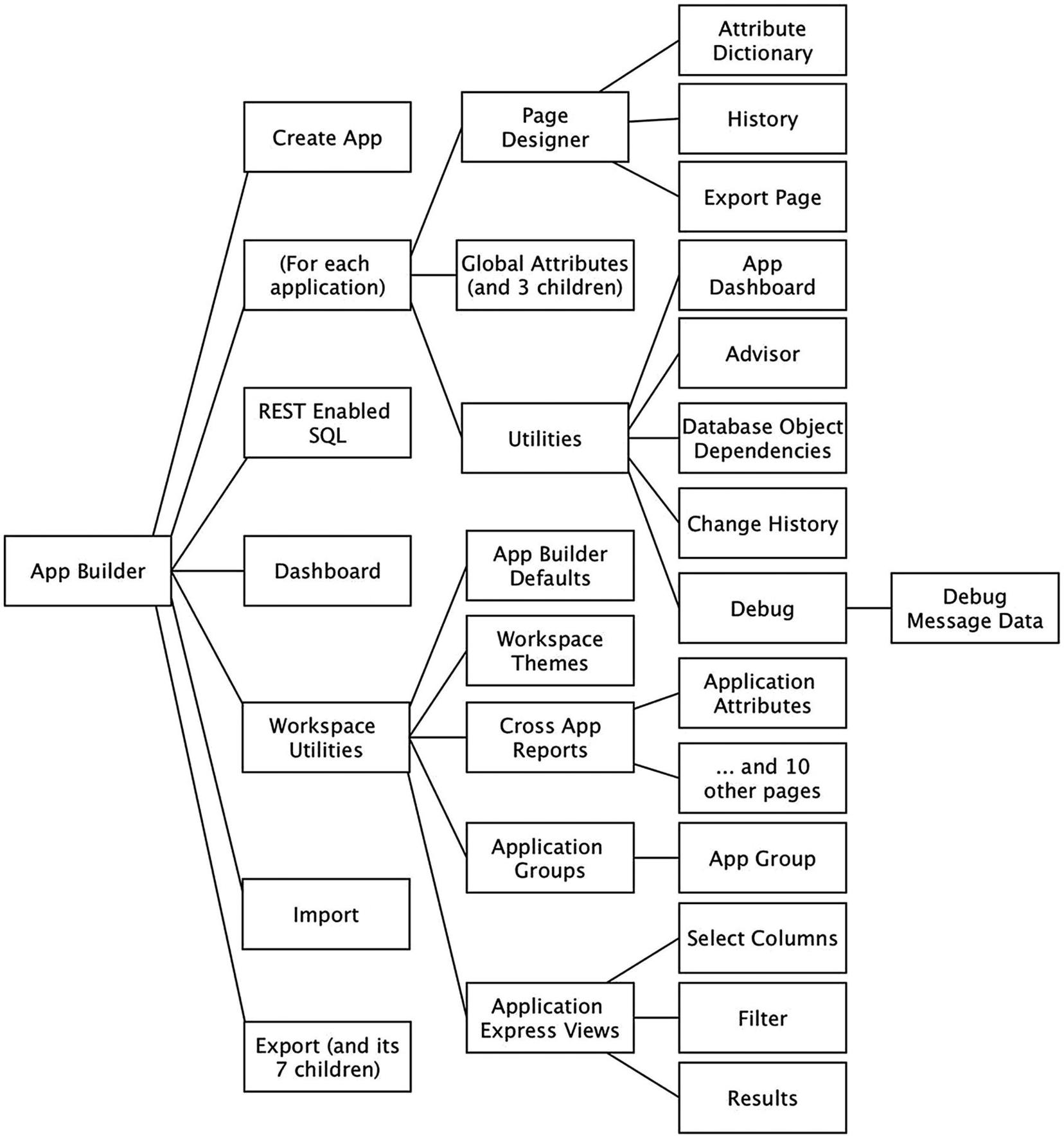
App builder’s page hierarchy
It is worthwhile to compare this page hierarchy with the app builder’s navigation menu. The navigation menu covers most (but not all) of the pages at the first three levels of the tree. Prominently missing from the navigation menu are entries corresponding to the subtree for each application; these pages are instead accessed from icons and buttons on the app builder home page.
Breadcrumbs
This path is known as a breadcrumb. Not all APEX screens display their breadcrumbs, but if they do, they display them below the navigation bar. Note that the first entry in an APEX breadcrumb is displayed as a circled up arrow, which denotes the root page of the hierarchy.
As an exercise, navigate to other pages on the APEX site and notice their breadcrumbs. In fact, see if you can find all of the pages listed in Figure 4-26. A breadcrumb is clickable. Clicking any portion of its path takes you to that corresponding page.
The navigation menu and breadcrumb are complementary navigation tools. The navigation menu is the same for all pages, and its entries encompass the entire functionality of the application. By looking at the menu, a user can determine the appropriate starting page for any desired action. On the other hand, a page’s breadcrumb is specific to that page and provides context about where the page is located within the page hierarchy. For example, suppose that you are looking at the app builder’s Application Attributes page. Its breadcrumb tells you that the page is one of the cross-application reports. That information might motivate you to click the breadcrumb to explore other cross-application reports.
In APEX, the entire page hierarchy is called a breadcrumb object. A breadcrumb object is essentially a hierarchical list—it contains an entry for each page in the hierarchy, with each entry (except the root) having a parent.
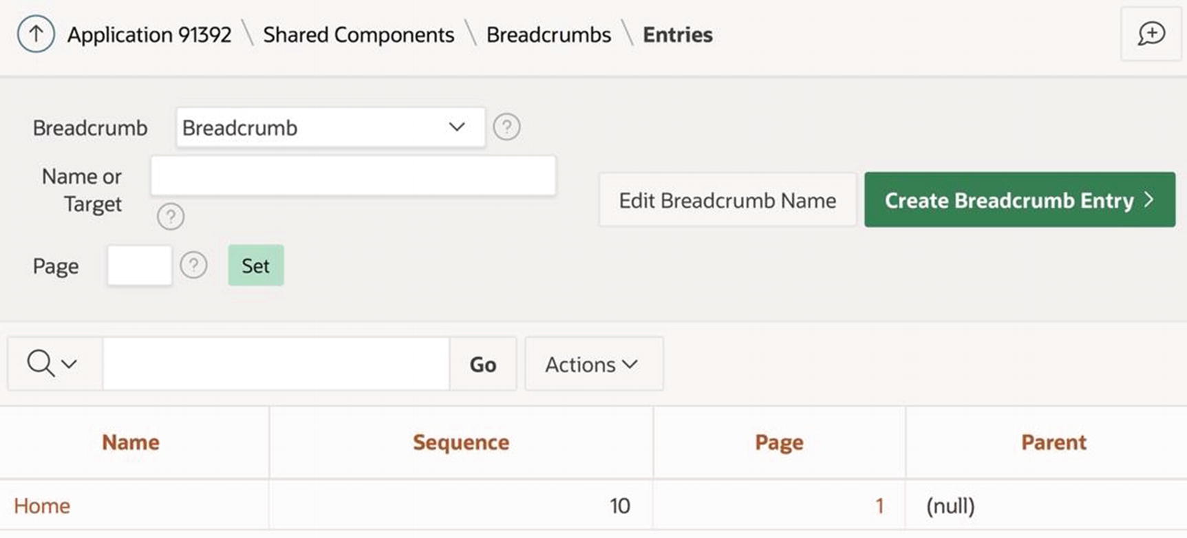
Breadcrumb manager
The figure shows that there is only one breadcrumb entry, which corresponds to the home page. This entry was created automatically when I created the application. Note that the entry still exists, even though I deleted its breadcrumb region from the home page.
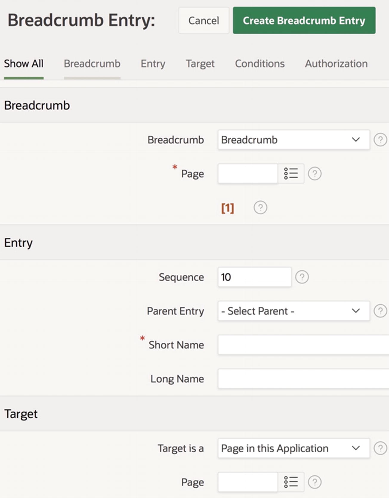
Breadcrumb Entry screen
The Page property (in the Breadcrumb section) specifies the page.
The Parent Entry property specifies the parent.
The Short Name property specifies how the page will be displayed on the breadcrumb. Choosing the page’s name is often reasonable.
The Page property (in the Target section) specifies what happens when a user clicks that breadcrumb entry. It typically has the same value as the earlier Page property.
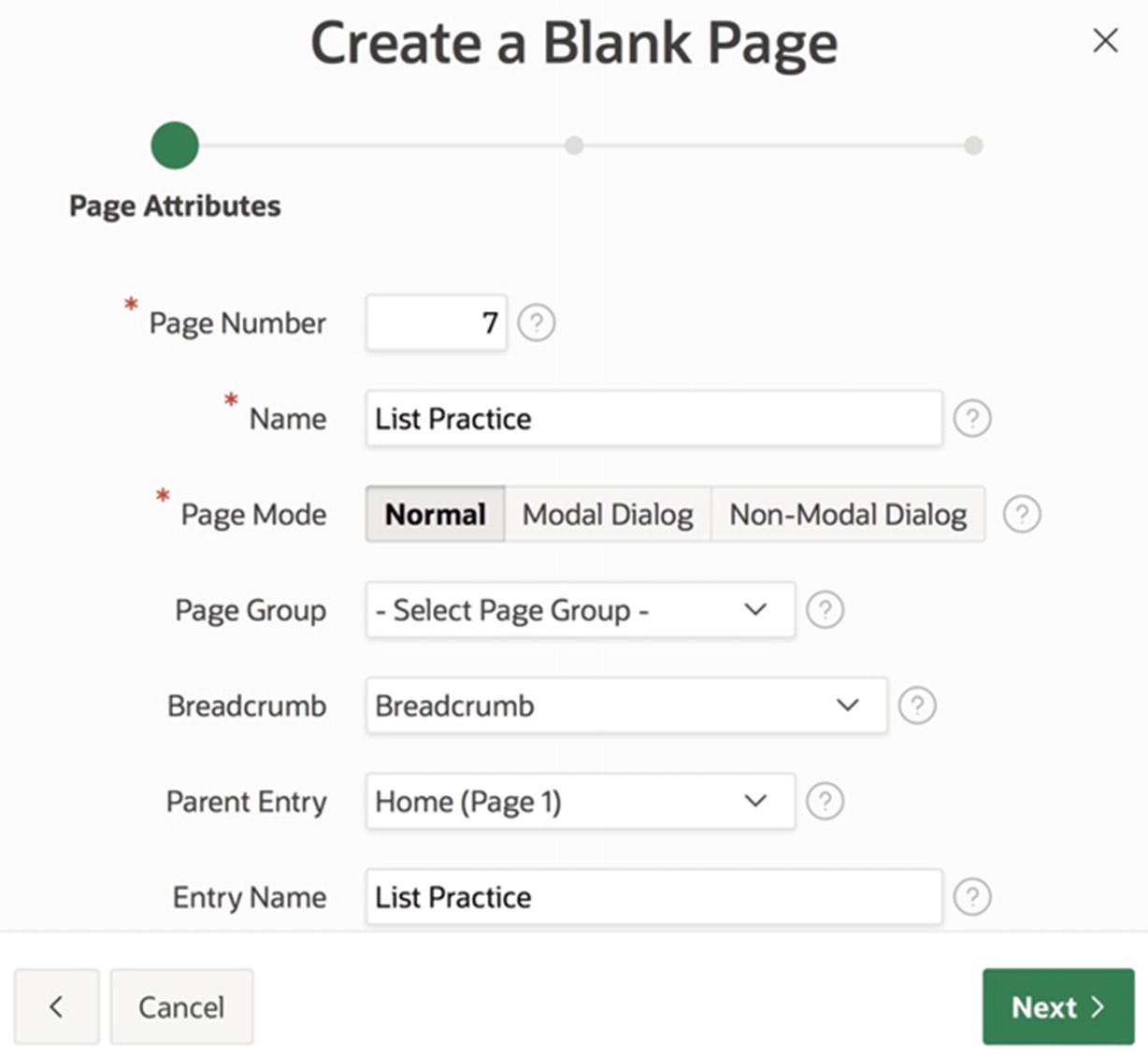
Let’s create a breadcrumb entry for page 7, the List Practice page, which will be a child of the home page. Enter 7 for the Breadcrumb Page and Target Page properties, 1 for the Parent Entry property, and List Practice for the Short Name property .
Creating a breadcrumb entry during page creation
Breadcrumb Regions
Add a new region to the page.
Set the type of the region to be Breadcrumb.
Set the source of the region to be the Breadcrumb object.
Assign the region to the Breadcrumb Bar position.
Set the region template to Blank with Attributes, so that it will display without a border or title.
Set the region template options so that the breadcrumb is displayed with sufficient margins.

Breadcrumb object in a breadcrumb region
Global Page
The standard way to display a list or a breadcrumb object is by placing it in a region on a page. This technique provides for considerable flexibility—each page can display the list or breadcrumb in a different location and with a different template. However, you often don’t want this much flexibility. Suppose instead that you want every page to display a list or breadcrumb exactly the same way. The easiest way to enforce this uniformity is to use the global page.
The global page is a special page whose contents are included in every other page of the application. If you place the breadcrumb region of Figure 4-30 or the Navigation Menu region of Figure 4-15 in the global page, those regions will appear uniformly on all pages of the application. APEX creates the global page during application creation; by convention, the global page has page number 0.
One of the nice things about a breadcrumb region is that APEX will render it on a page only if the page has a breadcrumb. That is, if you put the breadcrumb region in the global page, it will appear only on those pages that actually have a breadcrumb.
Summary
The dominant navigational tool in APEX is the list of links, otherwise known as a list. The entries of the built-in Desktop Navigation Bar list are displayed in the application’s navigation bar, and the entries of the Desktop Navigation Menu list appear in the application’s navigation menu. The list manager allows you to edit the contents of these lists, and the application’s User Interface properties allow you to customize their location and style.
You can also use the list manager to create lists of your own. You can display a list on a page by placing it in a region of type List. Each list region has a Template property that lets you customize how the list is displayed.
A list can be hierarchical, in the sense that a list entry can be the parent of one or more subentries. This hierarchy provides a structure to the list entries. This structure is especially useful for the navigation menu list because it allows the menu to contain a large number of entries without overwhelming the user.
Another navigational tool is the breadcrumb. To define a breadcrumb for a page, you must first understand how the page fits within the hierarchy of all application pages. A page’s breadcrumb is the path in the hierarchy from that page to the root. To display a breadcrumb on a page, you must place it in a region of type Breadcrumb. It is common to place the breadcrumb region in the application’s global page (page 0) so that it appears in the same place on every page.