
A page’s content is divided into rectangular areas called regions . Consider, for example, the APEX SQL Workshop home screen of Figure 1-3, which shows seven regions. Six of these regions have titles: Recently Created Tables, Recent SQL Commands, Recent SQL Scripts, About, Schema, and Create Object. The seventh region, which contains the five large buttons, is untitled.
The Recently Created Tables, Recent SQL Commands, and Recent SQL Scripts regions contain reports and have the type Classic Report.
The Create Object region contains a list of links and has type List.
The About, Schema, and untitled regions have type Static Content.
A region can also contain controls —that is, items and buttons. In Figure 1-3, the Schema region contains a select list item and a button, and the untitled region contains five large buttons. Because APEX considers a region’s controls to be distinct from its content, any region, regardless of type, can contain controls. This chapter focuses on a region’s content; controls will be discussed in Chapters 5 and 6.
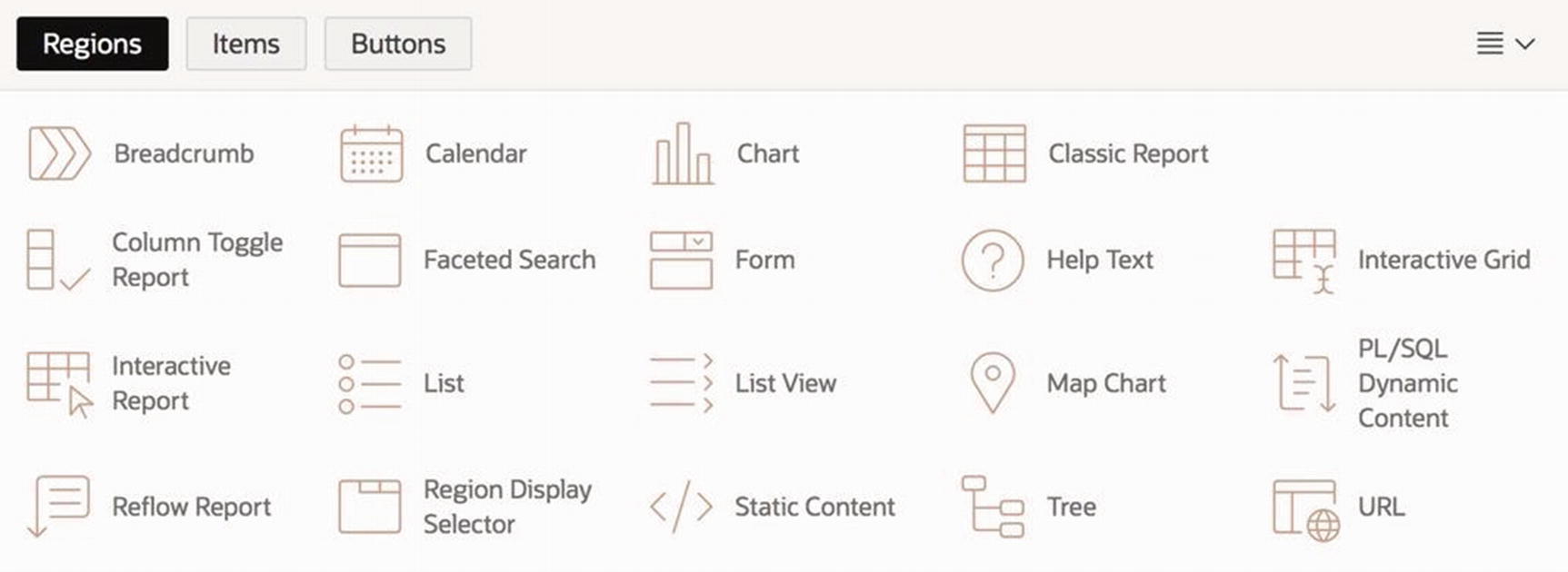
APEX supports many different region types. This chapter covers four fundamental types: Static Content, Classic Report, Chart, and Interactive Report. Subsequent chapters introduce other region types: Breadcrumb and List in Chapter 4, Region Display Selector in Chapter 6, Form in Chapter 10, and Interactive Grid in Chapter 11.
Creating and Deleting Regions
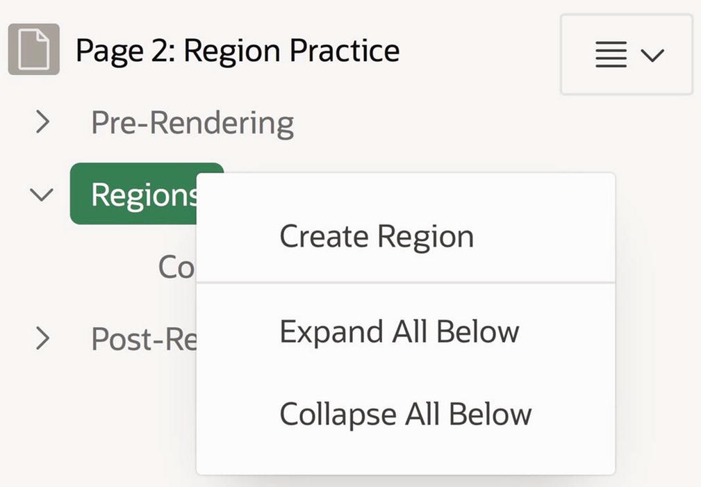
Right-click the Regions node to create a new region
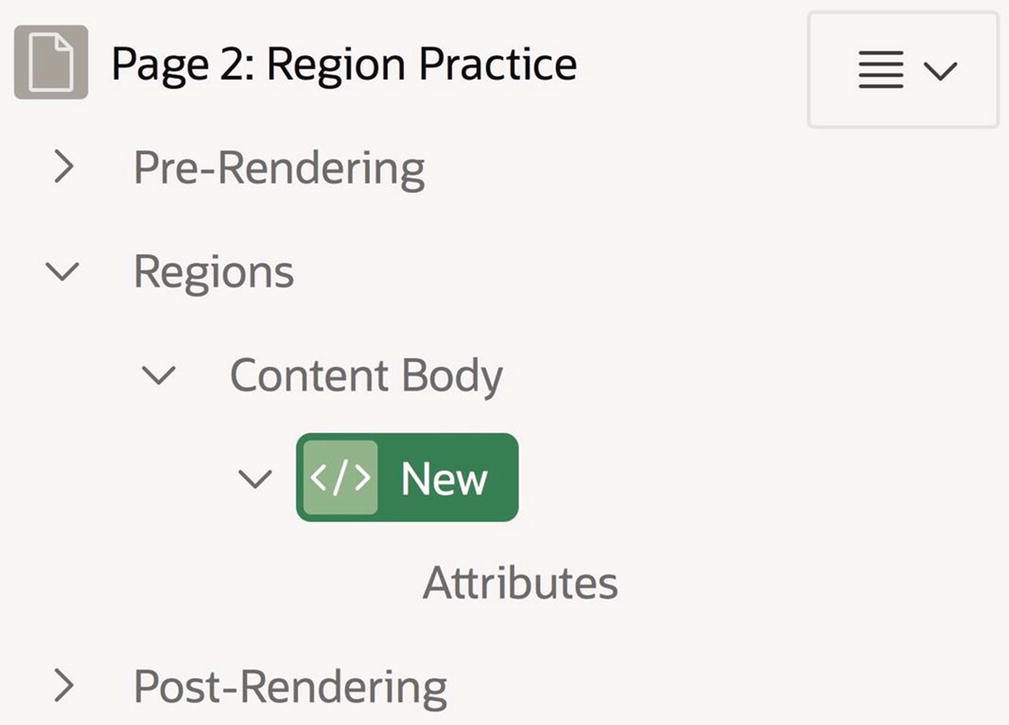
APEX adds a new region to the page
It might seem strange that APEX uses two components in the rendering tree to represent a single region. The reason is that the properties of these components have separate concerns. In particular, the region component (here labeled New) contains properties common to all regions, whereas the Attributes component contains properties specific to the region’s type. The type-independent properties will be discussed in the next section, with the type-specific properties following.
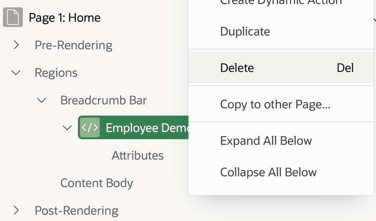
Deleting a region
Type-Independent Region Properties
To edit the type-independent properties of a region, first select the region’s node in the rendering tree. The property editor will then display all type-independent properties for that region and their values. These properties are grouped into sections , according to their purpose. Here, I will discuss four important sections: Identification, Source, Layout, and Appearance.
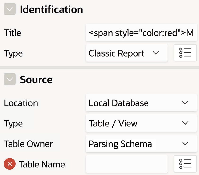
Identification and Source Sections
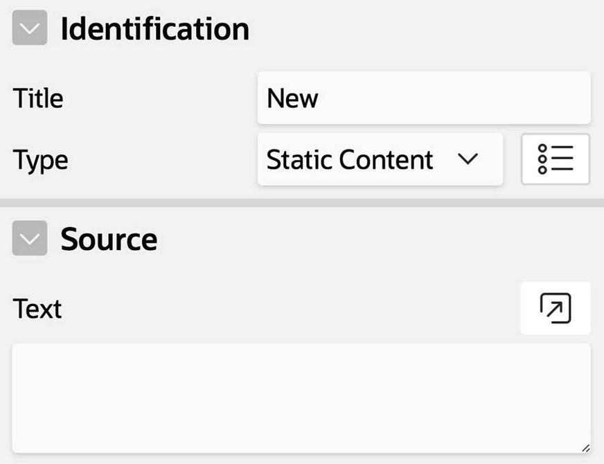
Identification and Source properties for a new region
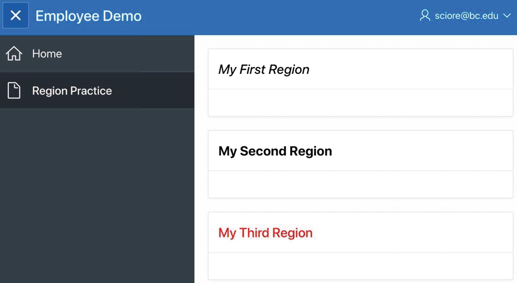
Three regions on the Region Practice page
A region’s content is determined by its Type property and Source section. The type of a region specifies what kind of content it holds, and the Source section specifies the actual content. For example, if the region’s type is Static Content, then its Source section contains the text the region should display; if a region’s type is Classic Report, then its Source section specifies the table that the region should display.
New regions are assigned the type Static Content, and its source text is empty. For fun, let’s assign some source text to the regions My First Region and My Second Region. I went for something simple, namely, This is my first region and This is my second region.
The default Source properties of a classic report
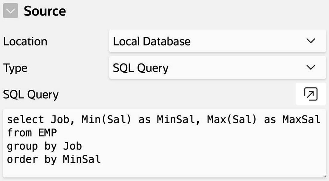
Alternatively, the source of a report can be an SQL query. To try it out, change the source type to SQL Query. This will cause the Table Name property to be replaced with the property SQL Query, again with a red error indicator. Enter the query select * from DEPT and watch the indicator disappear.
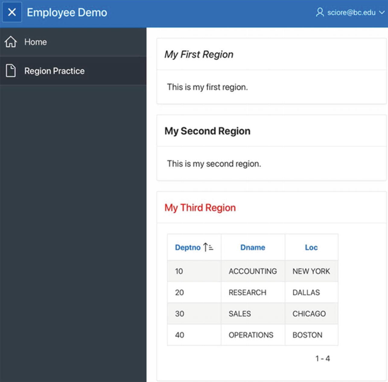
Each region has a non-empty source
Layout Section
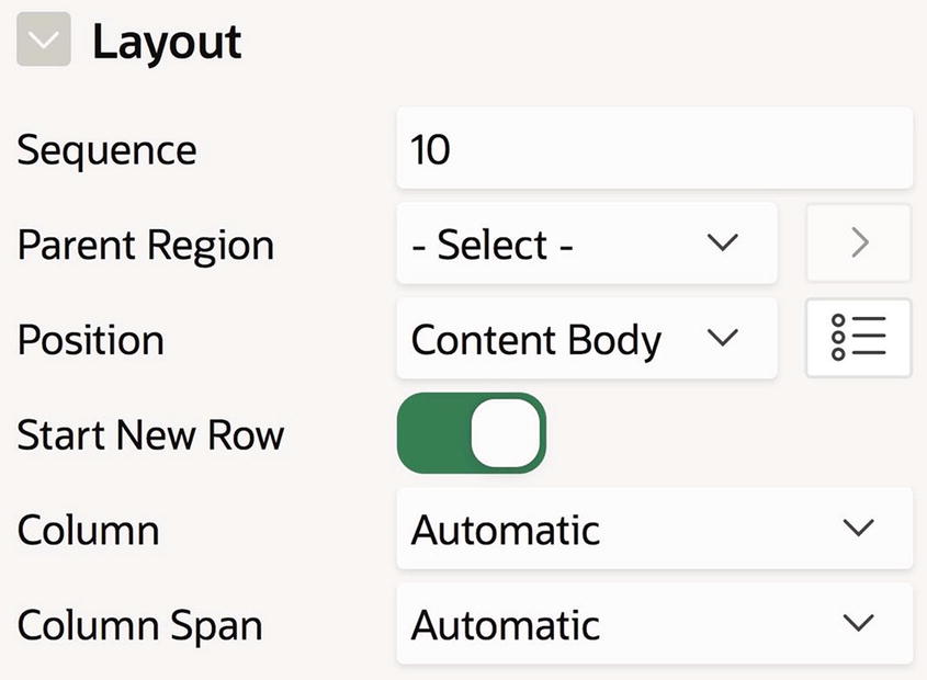
Default Layout section for a region
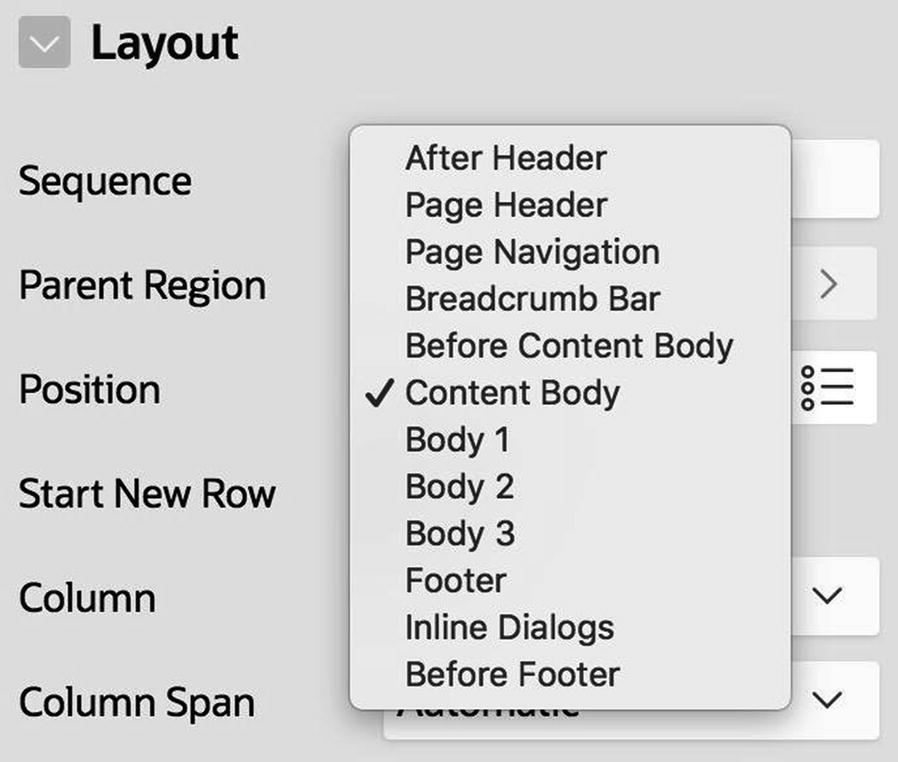
Possible region positions
These positions are listed in the order they appear on the page, from top to bottom. Most positions have specific purposes. For example, the Content Body position is the primary location for general-purpose regions, the Page Navigation position is intended for the navigation menu along the left side of the page, and the Breadcrumb Bar is for breadcrumb regions.
Some of these positions (namely, After Header, Body 1, Body 2, Body 3, Footer, and Before Footer) are legacy positions. That is, they exist only to support applications written with older versions of APEX. New applications should not use them.
The set of possible region positions is determined by the page’s template. When a page is created, it is assigned the default template defined by the application’s theme. For example, the default page template for the Universal theme is called Standard.

Page template options
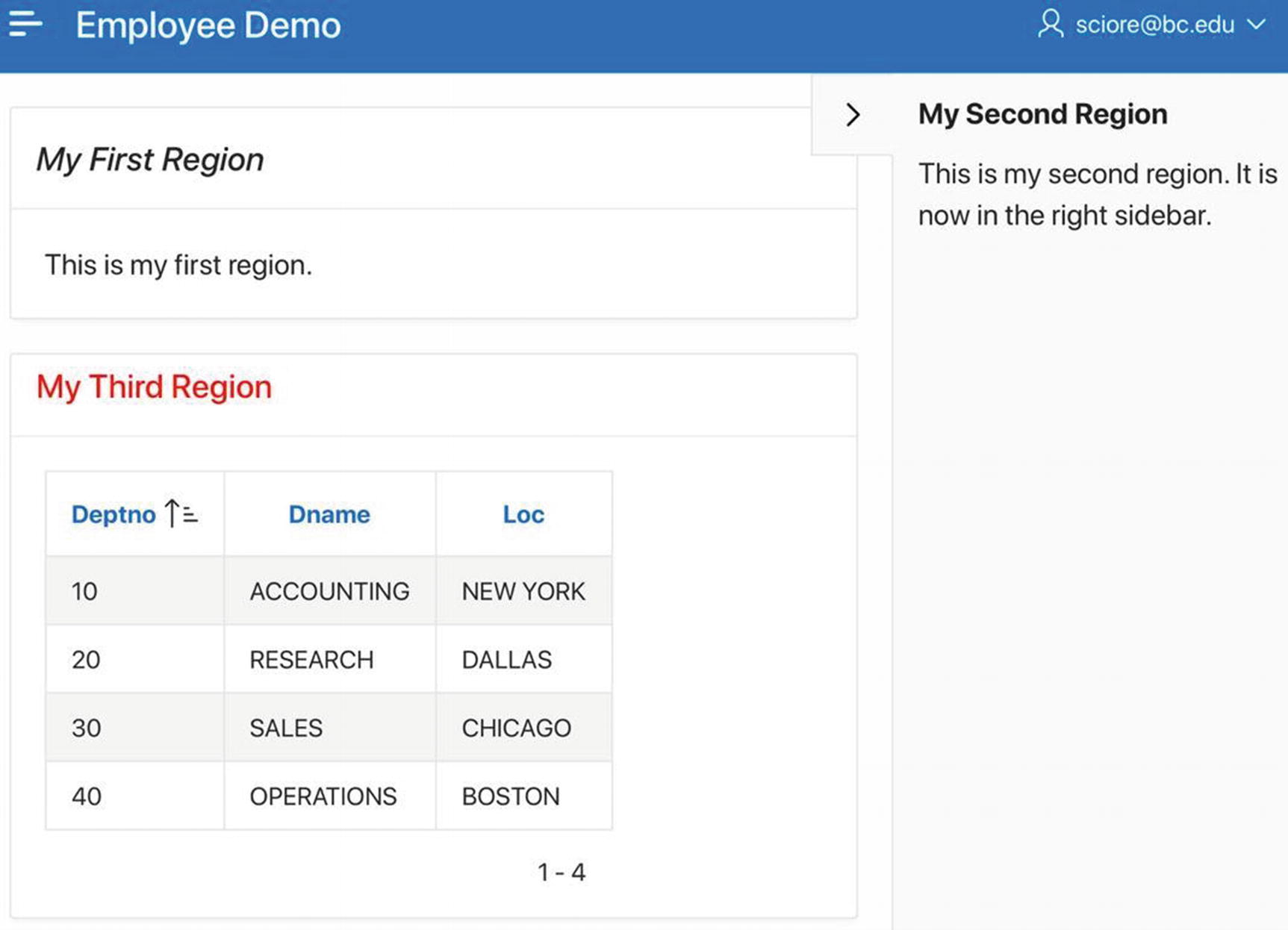
Adding a region to the right sidebar
The Layout section also has a property Sequence , which can be seen in Figure 3-8. If two regions are located in the same position on a page, their Sequence value determines the order in which they are placed in that position. Regions are assigned sequence numbers in the order in which they were created, but you can change that order by simply assigning different values to Sequence. For example, the My First Region and My Third Region regions are both located in the Content Body position, with sequence numbers of 10 and 30, respectively. If you change the sequence number of My Third Region to 5, the rendered page will look similar to Figure 3-11, except that My Third Region will appear above My First Region.
Although it is good to experiment with placing regions in various positions on the page, most regions on a page are usually located in the same position (in particular, Content Body). In this case, the remaining properties of the Layout section determine the relative location of the regions within that position.
In the same row and column as the previous region (in which case it is displayed beneath the previous region)
In the next column of the current row
In the first column of a new row
Specifying row and column region positioning
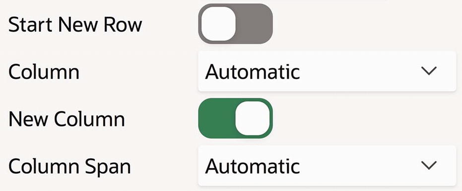
After assigning each region to a row and column, APEX then determines the size and location of the regions within the position. To do so, APEX uses the values of the Column and Column Span properties (shown in Figure 3-12) to determine the offset and width of each region in a row.
The Column property specifies the offset of the region within its row. APEX divides the width of a position into 12 “grid points”; the value of Column is a number from 1 to 12, denoting one of those points. A value of 1 specifies that the region begins at the far left of the position; a value of 7 specifies that the region begins in the position’s center. The Column Span property specifies the width of the column. Its value is also a number from 1 to 12, denoting the width in grid points.
My Third Region starts a new row, its Column value is 3, and Column Span value is 8. That is, its width is two-thirds the size of the position and centered.
My First Region starts a new row, its Column value is 1, and the Column Span value is 4. Thus, its width is one-third the size of the position and left justified.
My Second Region does not start a new row. Its Column value is 9, and the Column Span value is 4. Thus, its width is also one-third the size of the position, but right justified.
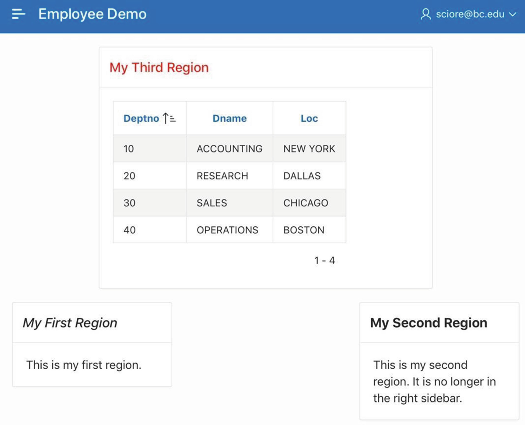
Another way to display the Region Practice regions
If you do not need such fine control over the placement of the regions in a row, you can assign the Automatic value to their Column and Column Span properties (as in Figure 3-8). In this case, APEX will place the regions in the row according to its best judgment.
Appearance Section

Options for a region’s Template property
The Standard template , which is the most common, displays the region’s title in a border across the top. Many of the other templates have special purposes, such as Alert, Inline Dialog, Login, Title Bar, and Wizard Container.
The Collapsible template is similar to Standard , with the addition of a small button in the top-left corner. Clicking the button toggles between hiding the body of the region and displaying it. A region using the Buttons Container or Blank with Attributes template is untitled; the main difference between these templates is that a button region has a border, whereas a blank region does not.
Drag and Drop
Turn your attention to the middle panel of the page designer, and in particular the Layout tab. Clicking this tab causes the middle panel to display a stylized representation of the page’s content. The panel has an area corresponding to each region position, and each area contains a representation of the regions assigned to that position.

Page layout area
The grid layout gives you a visual approximation of the layout of the rendered page while you are designing it. When you change the Position and Layout property values of a region, the grid layout will change accordingly.
If you click the title bar of a region in the grid layout, the properties for that region appear in the property editor. You can also drag a region to another location on the grid layout. As you drag, the available positions are highlighted in yellow, and drop-off spots within those regions are indicated by an outlined rectangle. You can drop a region to an empty position, the Sub Regions section of another region (so that the region is now a child of the other region), or above, below, left, or right of another region (to add the region to that position's grid). As you do so, you will see that the region’s Layout properties change correspondingly.
Region gallery
This use of the gallery is a convenient way to create a region, with the added benefit that APEX assigns appropriate values to its type and location properties for you. But once it has been created, such a region becomes the same as any other region. In particular, a region's properties (including its type and location) can be modified at any time, without restriction, regardless of how it was created.
Static Content Regions
A static content region can display text or formatted HTML code. The APEX screens contain several examples of static regions. For example, consider once again the SQL Workshop home screen from Figure 1-3. The region titled About on the right side of the page is a static content region whose source is the displayed text. The source contains HTML tags that cause Learn More... to be formatted as a link.
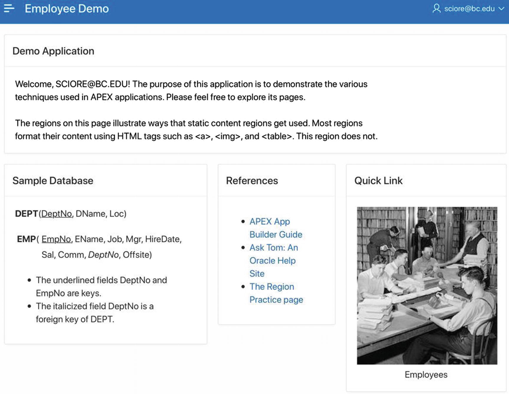
Home page with four static content regions (photo courtesy of Library of Congress, Prints & Photographs Division, LC-H261-4562)
Go to the page designer for the home page and create four new regions. These regions by default will have the type Static Content, which is what you want.
Assign the titles Demo Application, Sample Database, References, and Quick Link to the regions, in that order.
Place the regions in the Content Body position, and use their Layout properties to specify their placement on the page. In particular, the Demo Application and Sample Database regions start new rows, and the other two regions start new columns. The Sample Database, References, and Quick Link regions should have column spans of 5, 3, and 4, respectively.
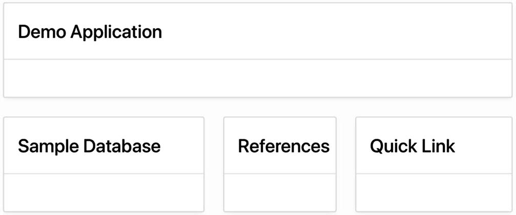
Structure of the home page
The next step is to add content to these regions. The following sections address the relevant issues.
Formatted vs. Unformatted Text

Type-specific properties for a static content region
An Output As value of HTML specifies that the region’s source contains HTML code. APEX will send this code as-is to the browser when it renders the page, so that the browser can format the source accordingly.
On the other hand, a value of Text (escape special characters) specifies that the source should be displayed exactly as it appears. In this case, APEX needs to transform the text so that there are no HTML tags for the browser to execute. It does so by replacing certain characters (such as < and >) with different characters that happen to print the same (such as < and >). This transformation is called escaping the characters. The result is text that looks like HTML code, but really is not.
The description of the EMP and DEPT tables makes use of the bold, italic, and underline tags.
To get the fields of EMP to line up in two rows, it uses a borderless table having two columns: the first row consists of “EMP(” in one column and the fields in the second column, and the second row consists of nothing in the first column and the remaining fields in the second column.
The bullet list is implemented as an unordered list in HTML, and each bullet point is a list item.
Source of the Sample Database Region
Source of the Demo Application Region
The beginning of this listing makes reference to “&APP_USER.”. This string is called a substitution string, and APEX interprets it as the name of the user. This topic is addressed next.
Substitution Strings
The variable APP_USER holds the username of whoever is currently logged in. If the application does not require users to log in, the value of the variable is APEX_PUBLIC_USER.
The variable APP_ID holds the ID of the current application.
The variable APP_SESSION holds the ID of the current session.
To refer to the value of a variable from within HTML text, you prepend the character & and append the period character (.) to the variable name. Such an expression is called a substitution string. In other words, the substitution string for a variable named X is written “&X.” . When the APEX server renders a page, it textually replaces the substitution string by the value of its variable.
For example, the substitution string &APP_USER. appears in the source of the Demo Application region. When the APEX server renders the page, it textually replaces the substitution string with the value of the variable APP_USER, which in this case is [email protected].
Referring to APEX Pages
Source of the References Region
The HTML <a> tag specifies a link; its argument is the URL of the target location. The first link in the listing is a typical link, which refers to a page on an external website. The second link refers to a page of another APEX application—in particular, page 1 of application 100 on the APEX server at asktom.oracle.com. Note how the link uses the “f?p=” notation, as described in Chapter 2.
The concept of a session will be covered in Chapter 6. For the moment, it suffices to know that APEX uses a session identifier to indicate related page accesses. By passing the current session ID into the URL, you ensure that the current session will continue when the link is followed. Note that the second link in the region did not include a session identifier. This was appropriate because the link was beginning a new session with the Ask Tom application.
Referring to Local Images
An HTML <img> tag displays an image; its argument is the URL of the image file. If the URL is a reference to a file on another web server, an absolute URL works fine. However, if you plan to store an image file on the APEX web server, then you should use a relative URL. The format of this URL is determined as follows.

Files section of the Shared Components screen
You have two options to choose from: Static Application Files or Static Workspace Files. The difference between them is one of visibility. An application file can be referenced from a specific application only, whereas a workspace file can be accessed by any application in the workspace. Whichever option you click, you will be taken to a screen that lets you choose your file. Then click the Upload button to upload it.
Note the two different uses of the period character in this tag. The first one is part of the substitution string notation and will be replaced by the path to the image directory when the page is rendered; the second one is part of the filename.
Source of the Quick Link Region
This code uses the <img> tag to display the employees.jpg image and then uses <a> and </a> tags to wrap this image in a link. Consequently, clicking the image takes the user to page 3 of the application (which means that the link will be nonfunctional until the next section, in which page 3 is created).
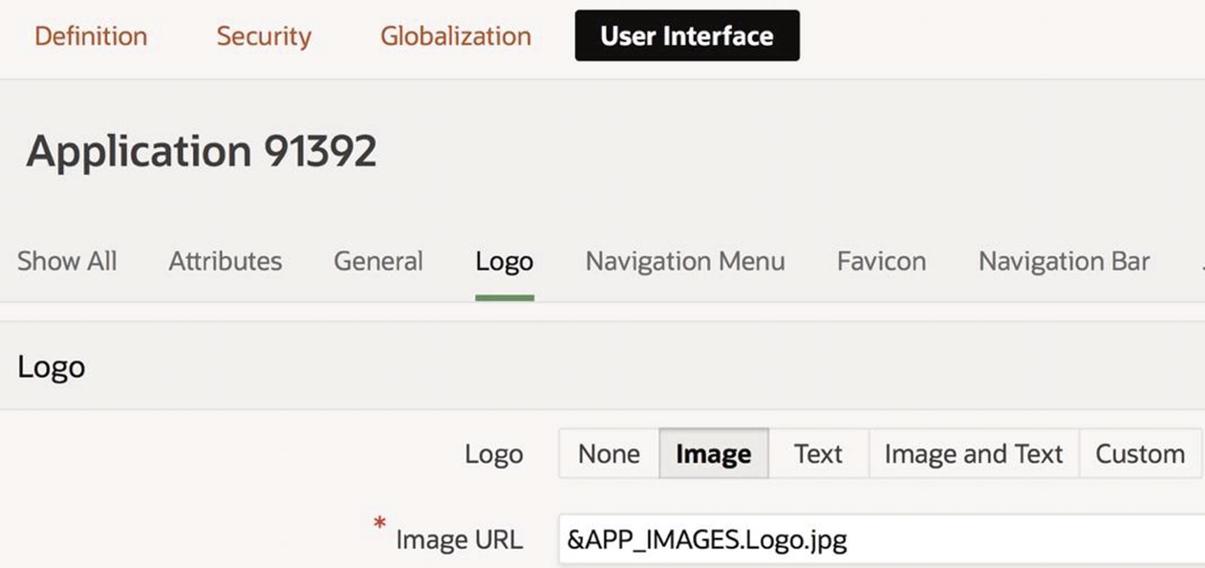
Specifying an image logo
Logo corresponding to Figure 3-21
Classic Report Regions

The default employee report
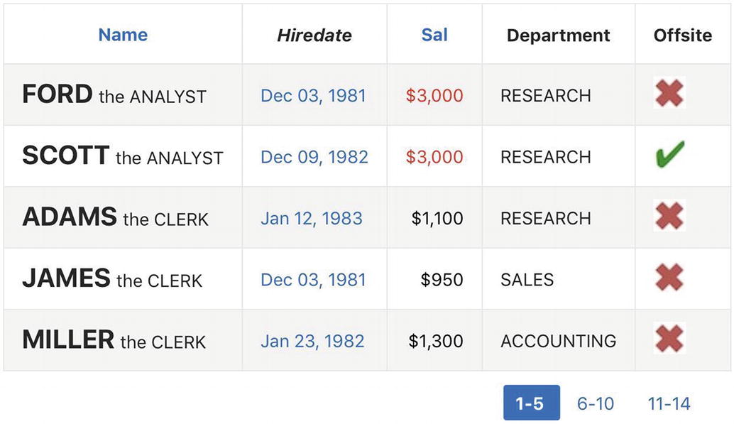
The formatted employee report
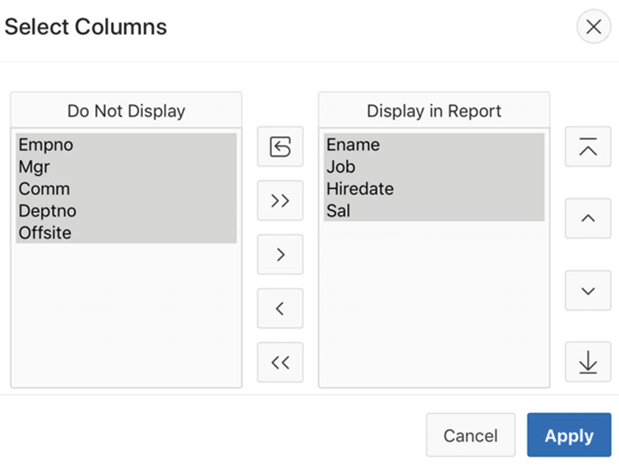
The columns EmpNo and Job are not displayed.
The column headers for EName and DeptNo have been renamed, and the header for Hiredate is in italics.
The records can only be sorted by employee name or salary.
Employee names are accentuated by writing them in a larger font and in bold and include the employee’s job.
Hire dates are formatted differently from the default report and are links.
Salary values are formatted as currency and aligned right, and values over $2,500 are colored red.
Department values are shown as department names instead of department numbers.
Values for the Offsite column are displayed as images instead of text.
Fewer rows are displayed at a time, with pagination controls.
Create a new blank page named Classic Reports and having page number 3. Tell the wizard to create a navigation menu entry for the page, also named Classic Reports.
Go to the page editor for this page and create two new regions. Title the regions Default Report and Formatted Report, and place them in the Content Body position of the page.
Set the type of each region to be Classic Report having the source query given earlier.
Configure their Layout properties so that the Formatted Report region starts a new row. (Or if you prefer to see the reports side by side, set the properties so that Formatted Report does not start a new row.)
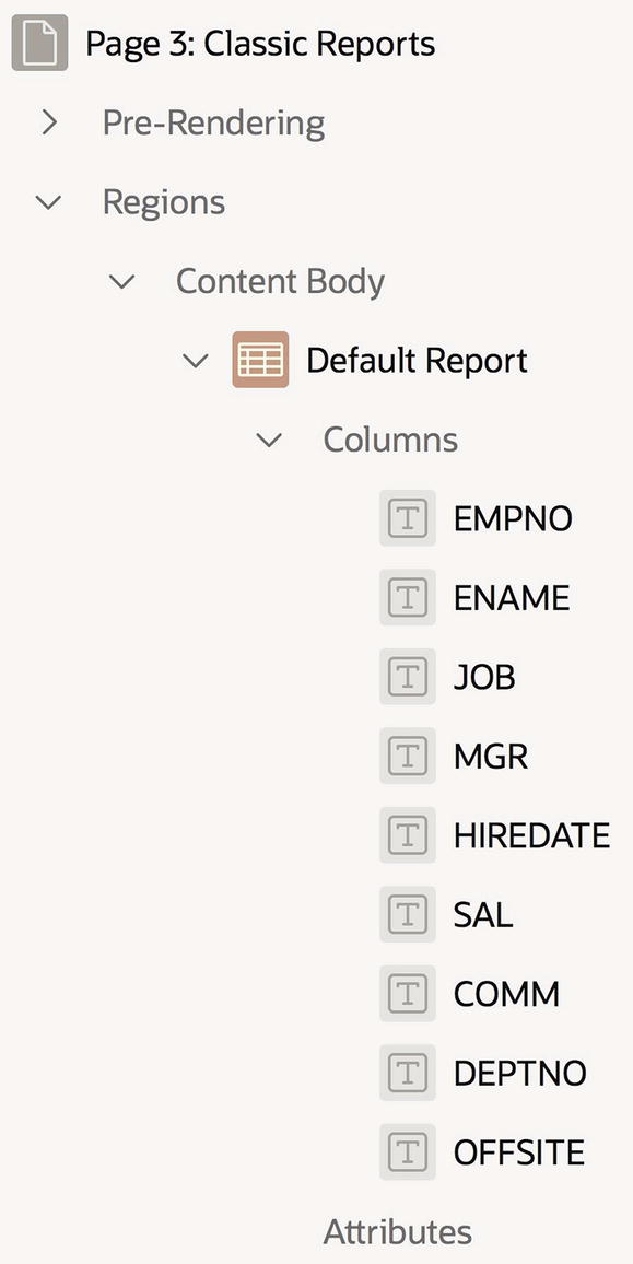
Rendering tree for a Classic Report region
Column-Specific Properties
Each column in a report has its own set of properties. When you select a column node in the rendering tree, the property editor shows you its column-specific properties. These properties are grouped into several sections, which are discussed next.
Identification

Specifying the type of the ENAME column
The Type property specifies how APEX should display the column values. The possible type values are shown in Figure 3-26. The type Plain Text is the default and says to display the value as is. The type Link says to display the value as a link, the type Display Image as an image, and the type Percent Graph graphically. The type Hidden Column says not to display the values at all.
In the Default Report region, all columns are plain text. The columns of the Formatted Report region have the following types: ENAME, SAL, and OFFSITE are plain text, EMPNO and JOB are hidden, HIREDATE is a link, and DEPTNO is plain text based on a list of values. In your application, you can change the type of the two hidden columns now. However, you need to wait until later in the chapter before you can change the type of HIREDATE and DEPTNO.
Column Heading
A column’s Heading section contains two properties for customizing the column’s report header. The Heading property contains the value that is displayed in the column header. By default, this is the column name, but it can be changed. For example in my application, I changed the header for ENAME to be Name and the header for DEPTNO to be Department.

Specifying the header of the HIREDATE column
By default, column headings are aligned in the center of the column. This is almost always what you want. However, the Alignment property lets you specify a different alignment if for some reason this seems appropriate.
Column Layout
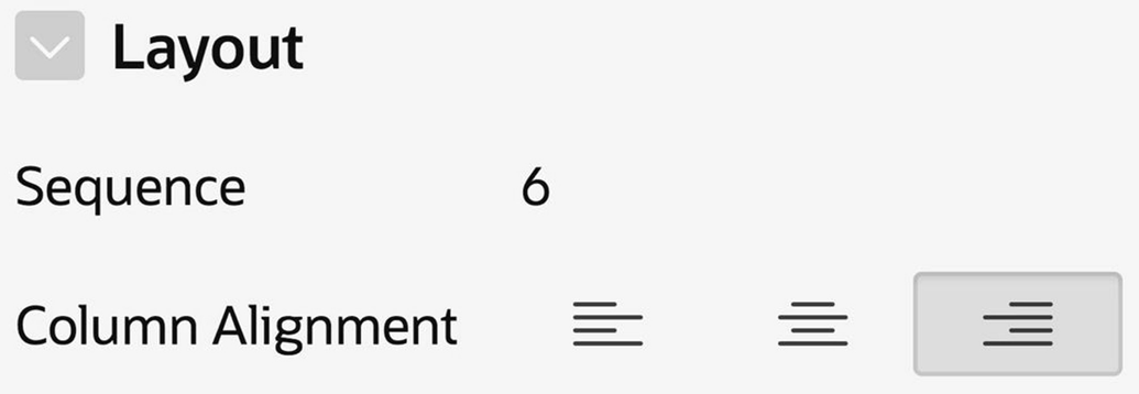
Specifying the layout of the SAL column
Sort Order
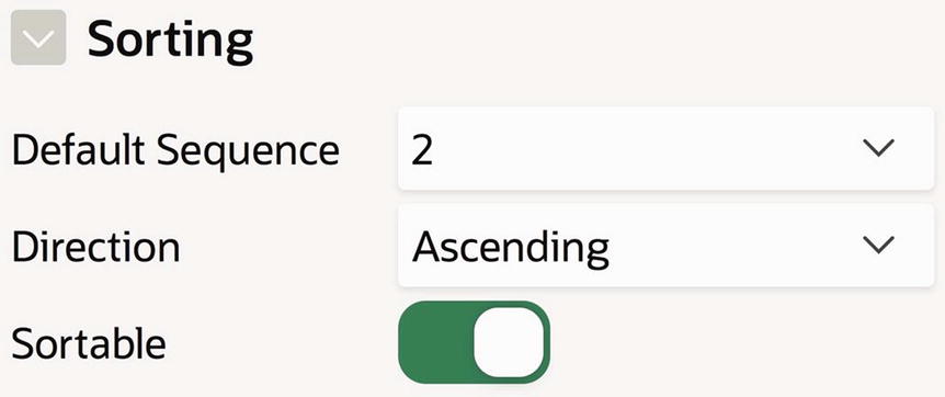
Specifying the sort behavior of the ENAME column
The Default Sequence property specifies the initial sort order. Each column that participates in the initial sort order will have a value for Default Sequence, with the primary sort column having value 1. In Figure 3-29, ENAME has sequence 2. Not shown is the sequence property for JOB, which has sort sequence 1. Together, they imply that the report will be rendered with the rows sorted by job, and two employees having the same job will be listed alphabetically by name (as you can see in Figure 3-24).
The Sortable property specifies whether a user is able to interactively sort on the column. By default, all columns are sortable. In the Formatted Report region, I turned off sortability for all columns except ENAME and SAL.
The initial sort sequence is completely independent of sortability. For example, the Formatted Report region is initially sorted by the JOB column, even though the column is not even visible.
List of Values
Consider the DEPTNO column in the formatted report. It displays values from the DEPT table, even though the report mentions only the EMP table. How can this be?
The answer is that the values in the column have not changed; they are still department numbers. However, you can set up a correspondence between department names and numbers and tell APEX to display the name corresponding to a given department number. This correspondence between the return value (the department number) and its display value (the department name) is called a list of values.
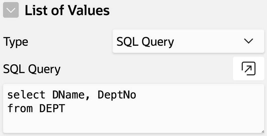
Formatting the DEPTNO column using a list of values
Format Masks
You occasionally might want to display a number as a string having a particular format. For example, you might use a comma to separate every three digits, you might have a prescribed number of digits to the right of the decimal point, or you might prefix the number with a currency character. Date values can also be written in different formats. In each case, you can use a format mask to express your desired format.
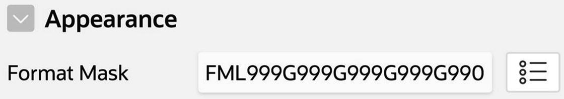
My format mask for SAL
For example, to get the mask for the SAL column, I chose the currency format $5,234.10 from the format list, which produced the mask FML999G999G999G999G990D00. However, because the EMP table stores salary values in whole dollars, I did not want to display the decimal point and the two digits to its right. So I removed the D00 from the end of the mask.
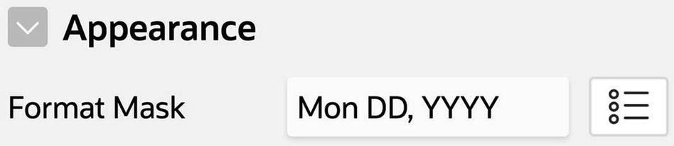
My format mask for HIREDATE
For a complete description of format mask syntax, search the Oracle SQL documentation for “format models.”
Column Formatting
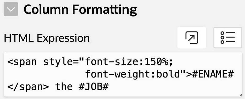
Formatting the ENAME column
Note that the expression #JOB# makes sense, even though the JOB column is not visible in the report. In fact, one of the common reasons for having nonvisible columns in a report is so you can use their values elsewhere in the report.
Link Columns
The HireDate values in Figure 3-24 are formatted as links. In particular, clicking a hire date (say, Dec 03, 1981) redirects the browser to the URL http://www.infoplease.com/year/1981.html, which gives the current events of that year.
Note that the second argument to the <a> tag is target="_blank". This argument causes the target page to open in a new browser tab, which in this case seems reasonable.
The problem with this HTML expression is that it always redirects to the page for 1981, regardless of the hire date. We need a way to extract the hire year from the hire date, which unfortunately is not possible in HTML.
A consequence of using this new source query is that HIREYEAR will now be a column of the report. Since you don’t want to see it in the report, you should set its type to Hidden Column.
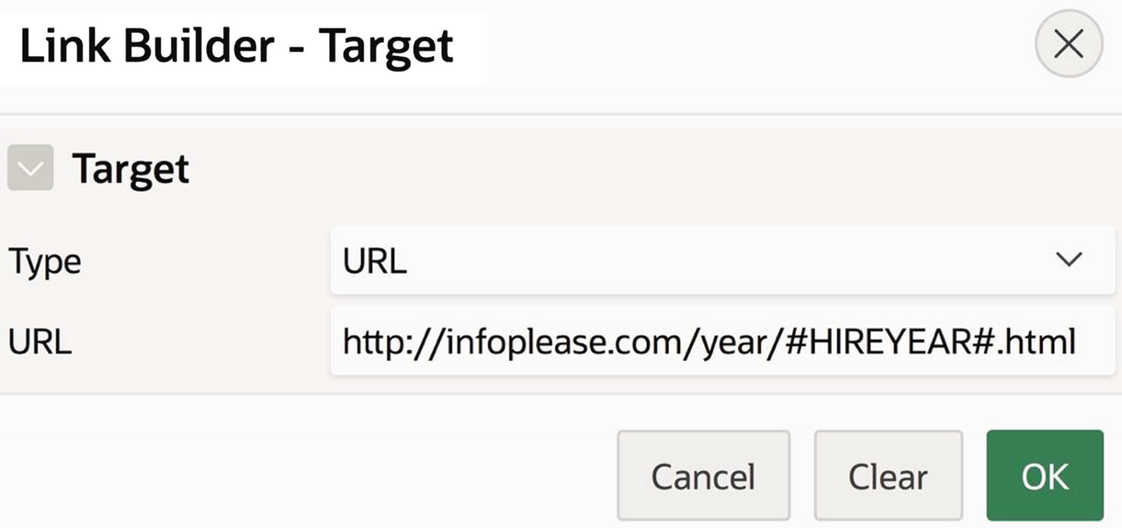
Using the Link Builder page
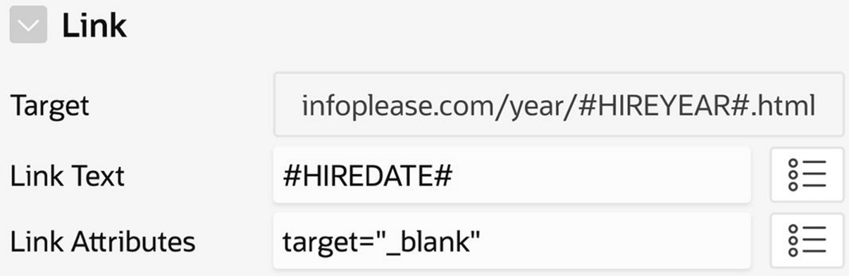
Link properties for the HIREDATE column
Conditional Formatting
Finally, you should set the type of columns SALCOLOR and OFFSITEIMAGE to Hidden Column.
Report-Specific Properties
Report-specific properties of a classic report region
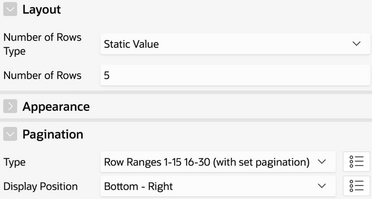
The Number of Rows property specifies how many rows of the report to display at a time. By default, the value is 15, but I changed it to 5 in the Formatted Report region. The pagination Type property allows you to select the format of the pagination controls. The option shown in the figure was used for the Formatted Report region in Figure 3-24. The best way to understand the other options is to try each one on your report to see its effect.
Using the Source Query for Formatting
Although the previous sections have focused on how to use APEX to format the rows of a source query, it is important to realize that you can get many of these same features by using a more precise source query. Here are some examples for the Formatted Report demo region.
Instead of hiding a column, it might be more appropriate to simply not include it in the query. In particular, the EmpNo column serves no purpose in the formatted report and is better off being left out of its source query entirely. On the other hand, the columns Job, SalColor, OffsiteImage, and HireYear are needed for the formatting of other columns, so they must appear in the source query and therefore must be of type Hidden Column.
If you don’t want the user to be able to change the sort order of the records interactively, it is easier to specify the sort order in the source query than to set the sortability property of each column individually.
In this case, it is hard to say which of these two approaches is better than the other. The list-of-values approach requires that APEX search the list of values for each row of the report, which is potentially more expensive than simply doing the join in one shot. On the other hand, the list-of-values approach is simpler and more directly conveys the intent of the designer.
The rule of thumb is that the source query should specify what you want displayed, whereas the column properties should specify how you want them displayed. In some cases (such as hidden columns), this distinction is clear. In others (such as using a list of values), it is less so.
Chart Regions
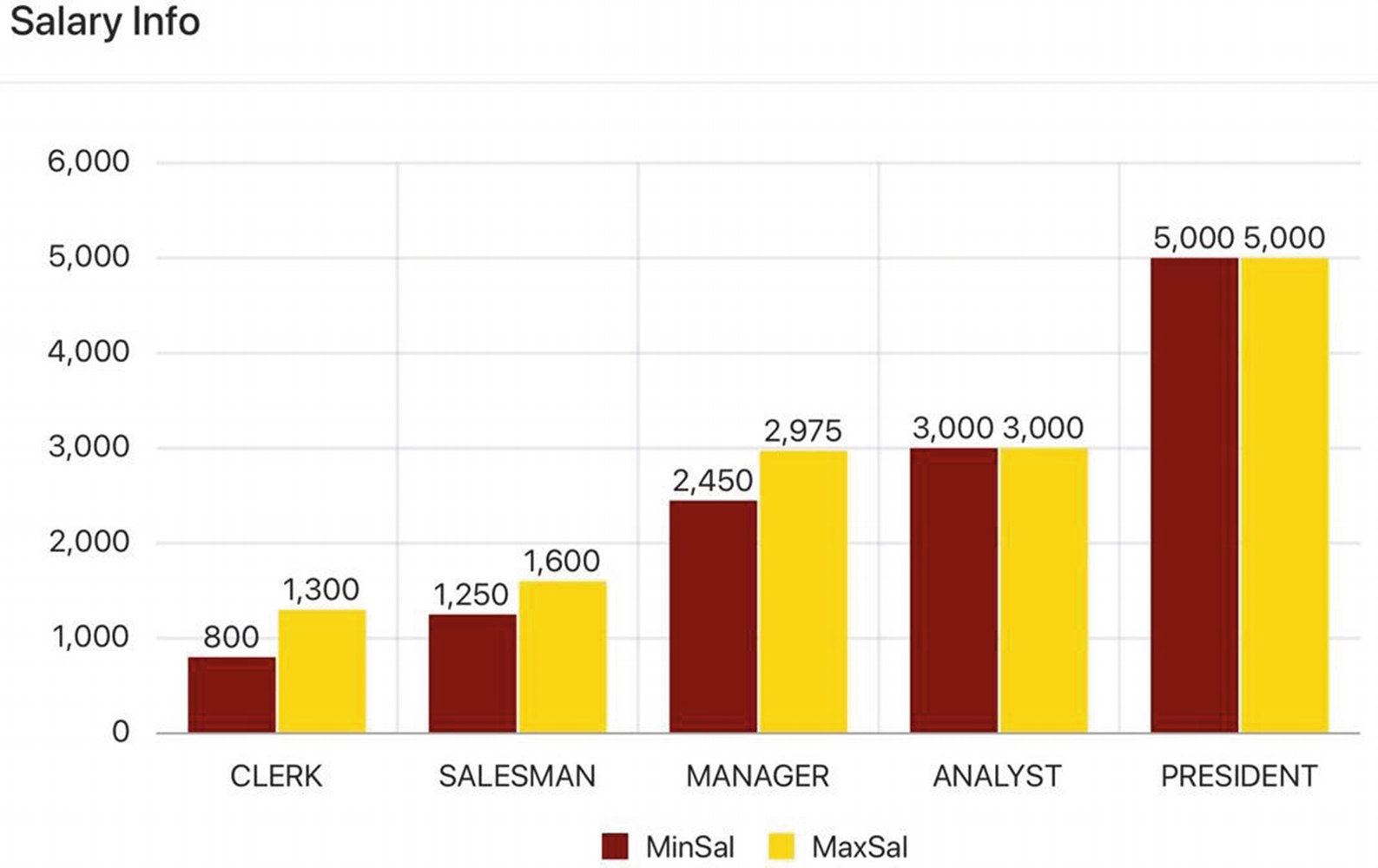
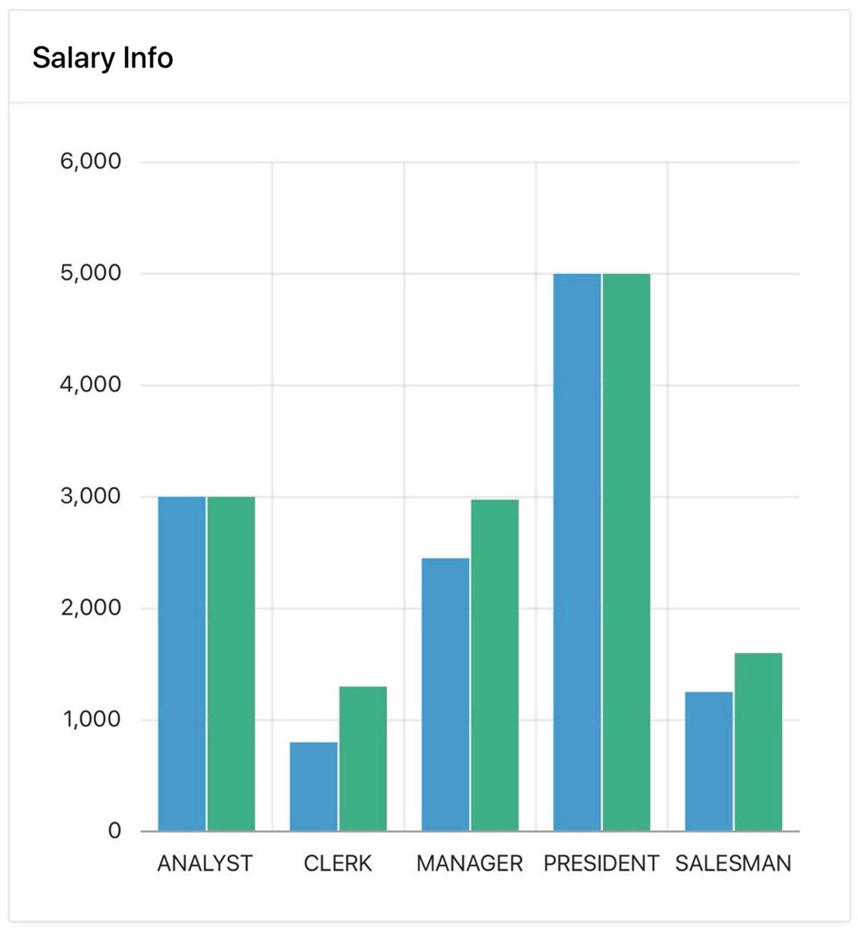
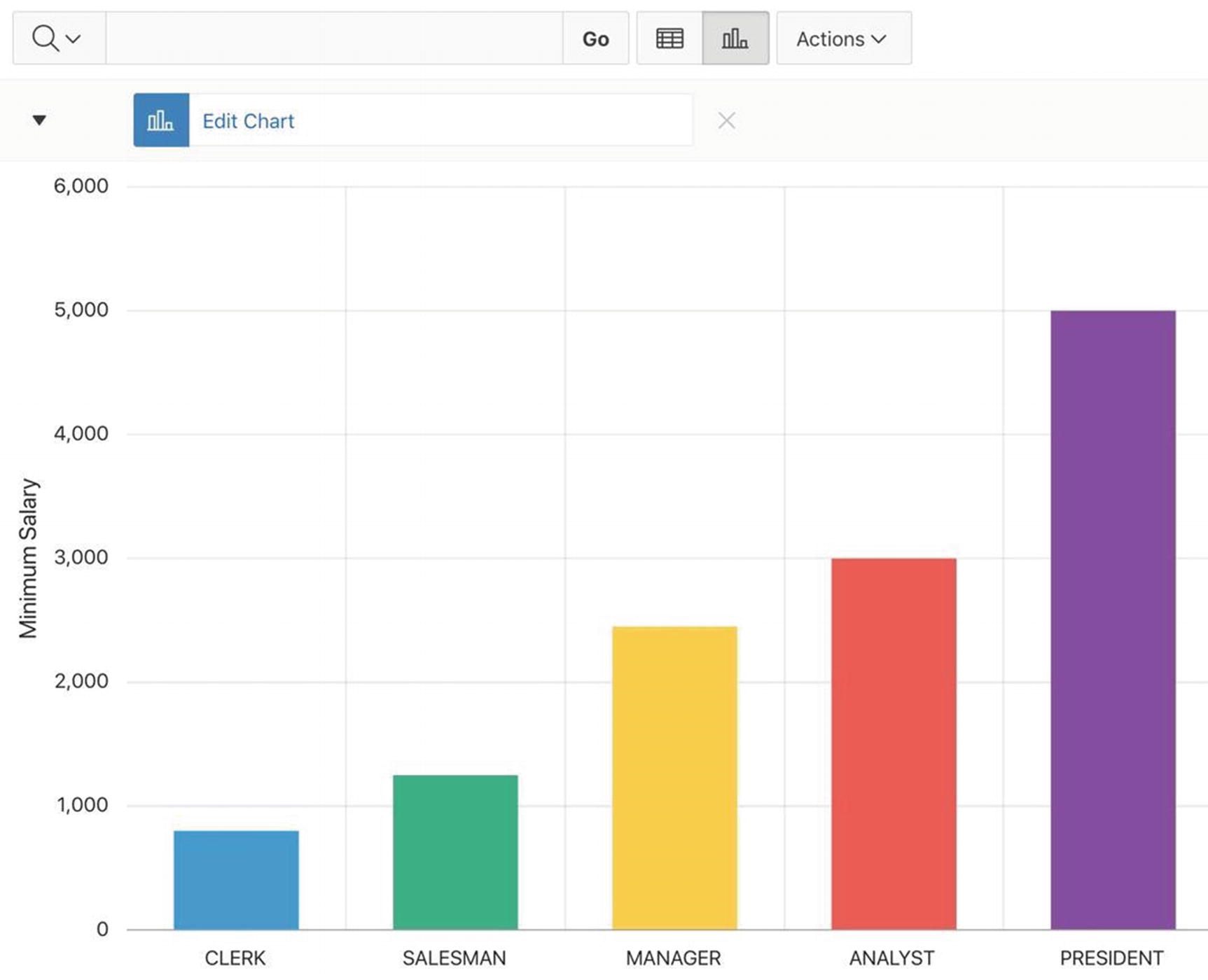
The Salary Info chart region
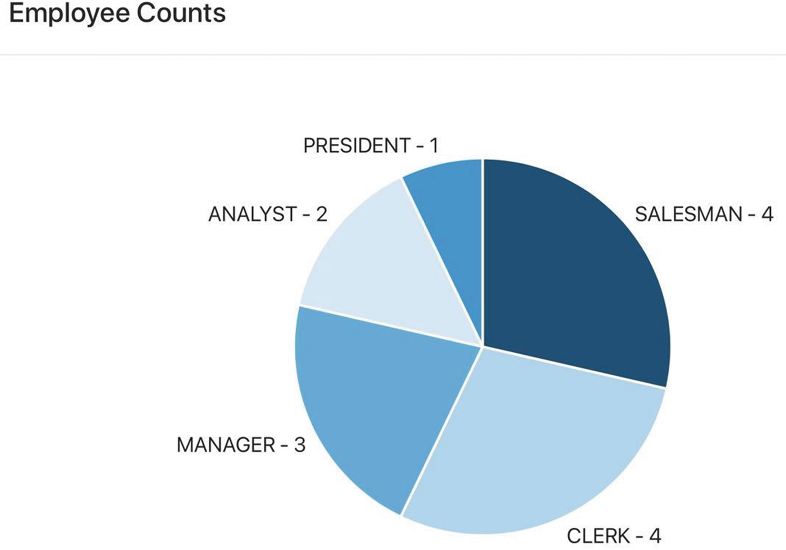
The Employee Counts chart region
The bar chart consists of ten data points, giving the minimum and maximum salaries of employees at each job. These points are organized into two series of five points each.
The pie chart consists of five data points, one for each job. The label of each point is the name of the job, and the value is the number of employees having that job. The chart displays a section of the pie for each label in proportion to its value. For example, two of the fourteen employees are analysts, so the size of the ANALYST section is two-fourteenths the size of the pie.
Creating a Chart Region

Rendering tree for the two chart regions
From this figure, you can see that a chart has four kinds of properties: type-independent properties (denoted by the region name), chart-specific properties (denoted by Attributes), properties specific to each chart series (denoted by Series), and properties associated with the chart axes (denoted by Axes). By default, a chart is created with one series (named New), but you can rename the series and add others.
Each series in Figure 3-39 is flagged with a red error indicator to tell you that the chart needs further configuration. Details of this configuration are discussed next.
Configuring a Chart
Specifying the source of the Salary Info chart
Configuring a Chart Series
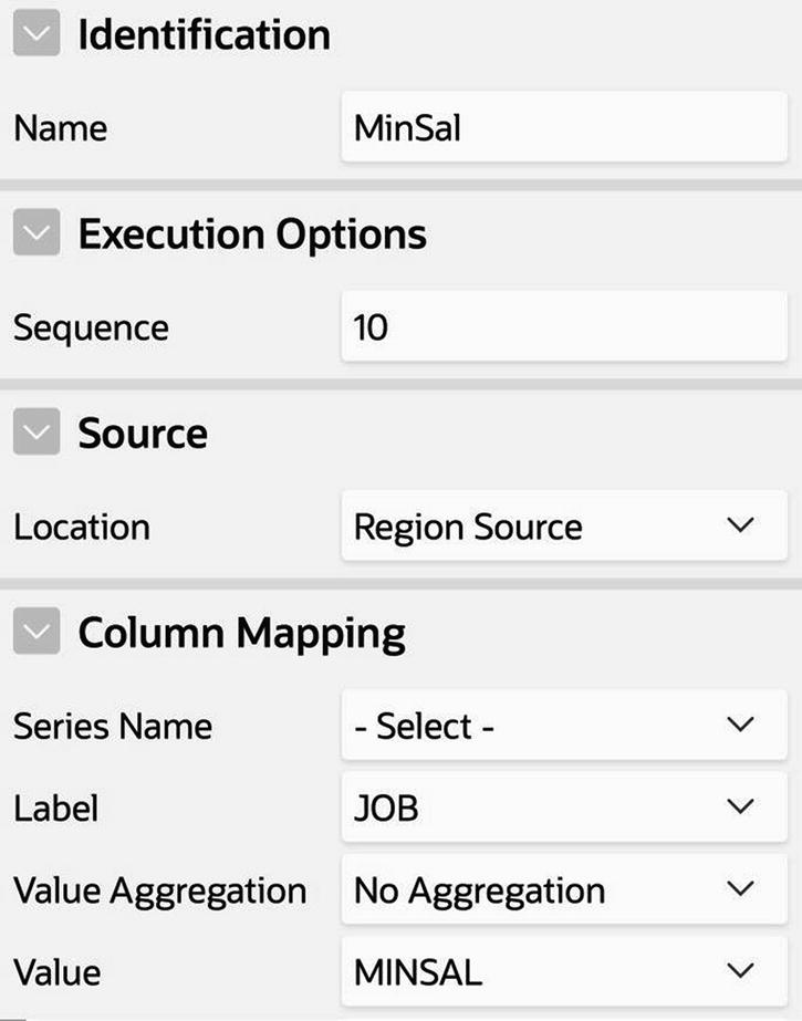
Specifying a series for the Salary Info chart
The Identification section allows you to choose a name for the series. Because this series will hold the minimum salaries per job, I named it MinSal. (You will also need to create another series to hold the maximum salaries, but not yet.)
The Source section is where you specify the source of the series. Since you have already defined a source for the region, you should choose Region Source. Your other option, not discussed here, is to have each series define its own source. This flexibility is useful in situations where you are comparing data from different tables, but leads to complexity beyond the scope of this book.
The Column Mapping section requires you to specify values for the properties Label and Value. The Label value will be the name of the source column that holds the labels, in this case JOB. The Value value will be the name of the source column holding the values for this series, in this case MINSAL.

A first approximation to the Charts page
Multi-Series Charts
Adding a second series to the chart
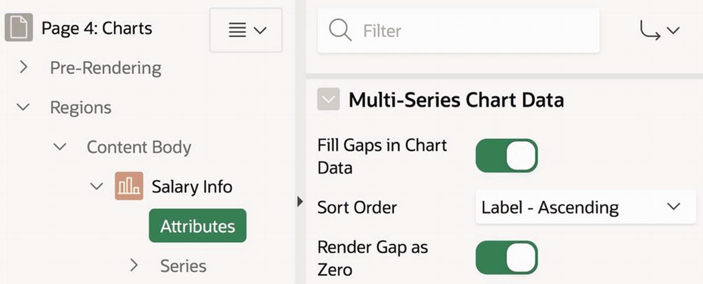
Multi-Series Chart Data properties
Fortunately, this complexity is irrelevant if all the series in your chart use the same source. All you need to do is turn off the Fill Gaps in Chart Data property, and sorting goes back to normal.
Customizing a Chart
APEX supports several chart types. The default type of a new chart is a bar chart, but you can use the Chart section (from the Attributes component of the rendering tree) to change it. For example, go to the Chart section of your Employee Counts region and change its chart type to Pie.
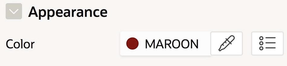
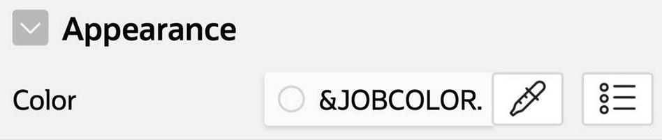
Specifying the color of a bar chart series
APEX also assigns a color to each label value of a pie chart, using a palette of bright colors. But suppose you want a different palette. It’s not immediately clear how to use the Color property in Figure 3-45, because it applies to the entire series. For example, if you set the color to MAROON, then every segment in the pie chart would be maroon. What you need is a way to specify a color for each label.
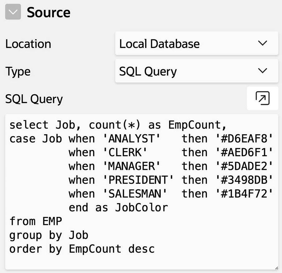
Modifying the pie chart source to include colors
Specifying the pie chart colors
Another way to customize a chart is to display a legend. For example, Figure 3-37 displays a legend underneath the chart. A legend explains the meaning of each color on the chart. Multi-series charts use legends to convey the meaning of each series. Pie charts use legends to identify the segments. Consequently, Figure 3-38 does not need a legend because the label values are displayed directly with each segment.
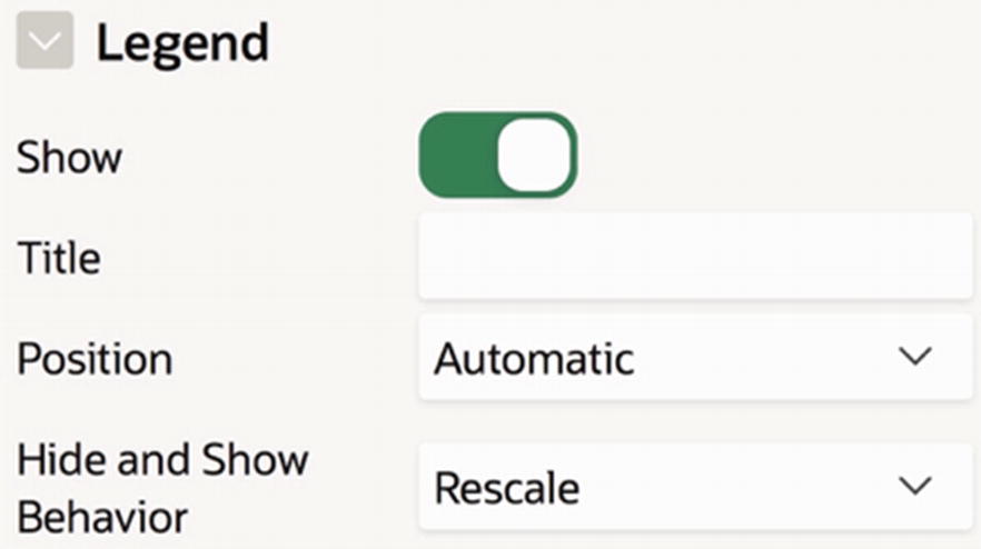
Some chart legend properties
The most important property is Show, which toggles the visibility of the legend on the page. It usually suffices to use the default value for the other properties, although you should try out the options to see what happens. Especially notable is Hide and Show Behavior. If its value is None, then clicking the legend does nothing. Otherwise, clicking a series name on the legend toggles the visibility of that series in the chart and recomputes the chart accordingly. This behavior is especially interesting for a pie chart, where the legend identifies slices instead of series. As an experiment, enable the legend of the Salary Info chart and set the Hide and Show Behavior value to Rescale. Then run the page, click some legend values, and watch the chart adjust itself.
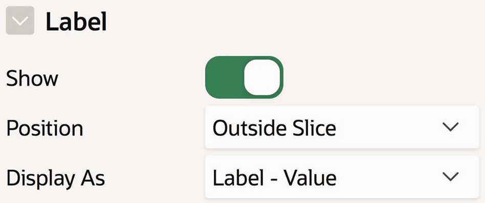
Label properties for the pie chart

Configuring the values along the y axis
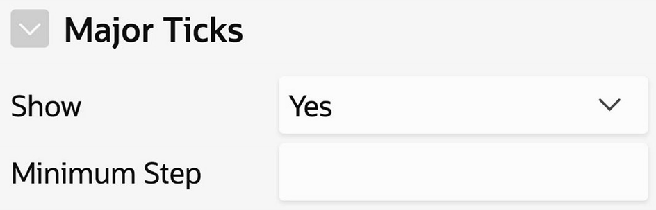
Configuring when y-axis ticks are displayed
APEX has many chart-configuration properties. The best way to understand them is to experiment. Edit the two charts by changing their properties in various ways. For example, move the legend around, change the color scheme and background, include or remove labels or values on the chart, and so on.
Interactive Report Regions
The previous sections have examined how a page designer can use properties to customize classic reports and charts so as to improve the user experience. An interactive report enables users to perform some of this customization themselves, as they view the page.
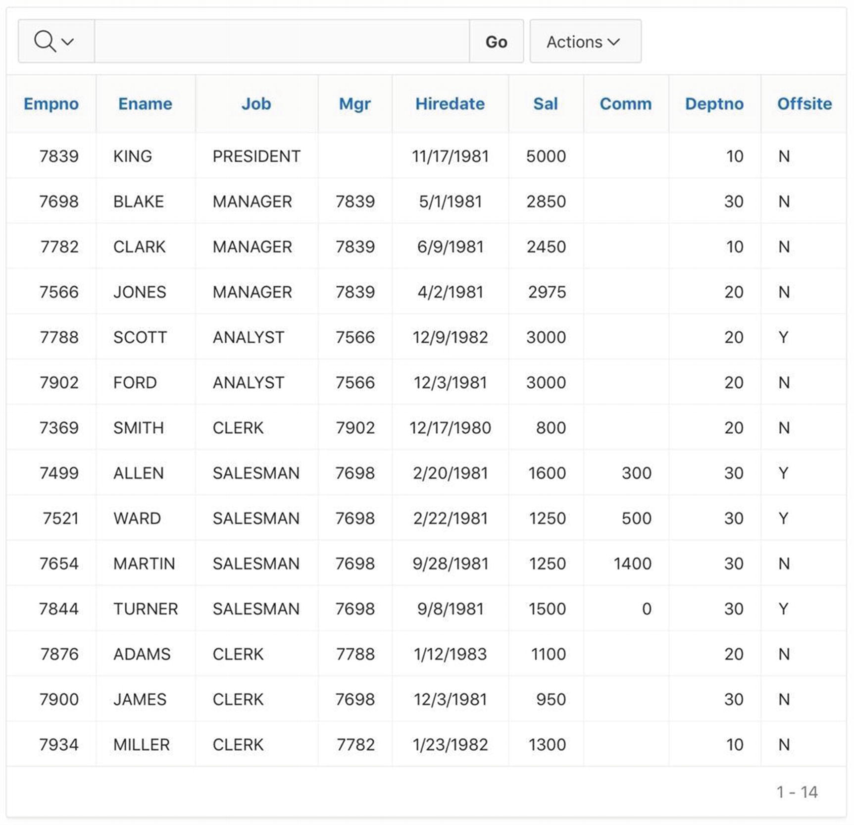
Interactive report region on the EMP table
An interactive report region has a default template that is different from the other report types you have seen. Those regions used the Standard template, whereas Figure 3-52 uses the Interactive Report template. The most obvious difference is that an Interactive Report template does not display its title across the top.
As always, you can change a region’s template from its Appearance section in the property editor.
Apart from its region template, Figure 3-52 looks a lot like a classic report region. In fact, all the properties of classic report regions also apply to interactive report regions—you can specify the region’s position on the page, its source query, and the format of each column. If you want, you can configure this region so that it looks exactly like the formatted report of Figure 3-24. However, I would like to keep it unformatted to better focus on the customization that is specific to interactive reports.
The one new feature in Figure 3-52 is the row of items above the report, which is called the search bar. The search bar lets users interactively customize the report, by filtering its rows, hiding columns, sorting, creating charts, and performing simple calculations on its values. Although not shown in the figure, an interactive report can also display a link column that allows users to examine the report rows individually.
The following sections address issues surrounding the search bar and link column—in particular, how they are used and how an application designer can configure their properties.
Using the Search Bar
The search bar contains four items: the magnifying glass, text box, Go button, and Actions button. The first three items let a user filter the rows of the report. The user enters a search string in the box, clicks the magnifying glass to choose the column to search (All Columns can also be chosen), and clicks Go. The records not containing the search text will be filtered from the report.
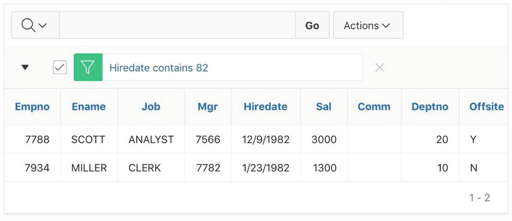
Result of filtering the report of Figure 3-52
Note that the region now has a row below the search bar that describes the filter. You can click the checkbox on the left to enable/disable it, or you can click the X on the right to permanently remove it.
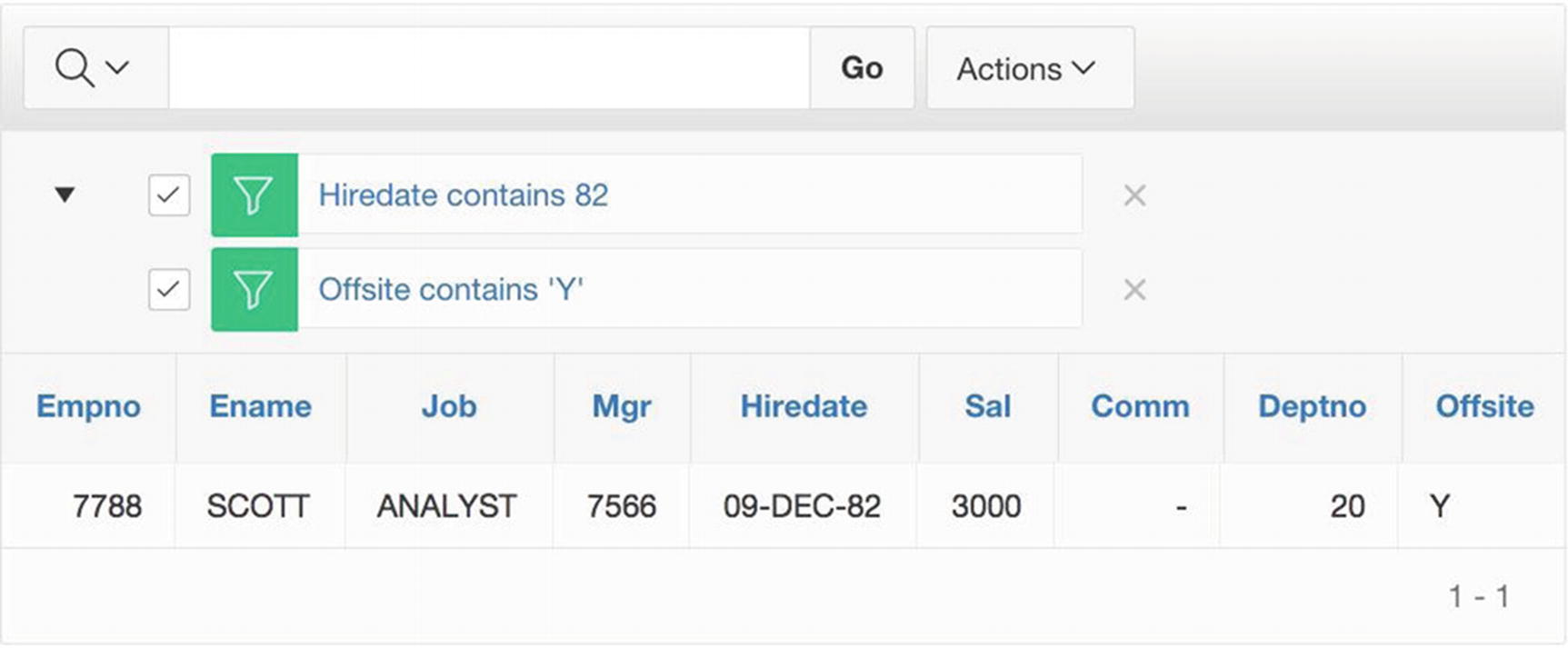
Adding a second filter to the report of Figure 3-53
In general, a user can explore the contents of a report by creating multiple filters and selectively enabling various subsets of them.
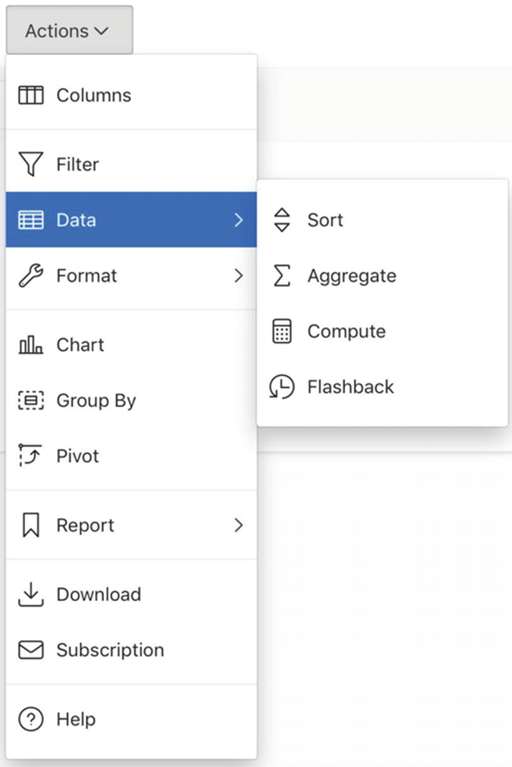
Actions menu
Columns
Specifying the columns to display
Filter

Filter dialog box
Sort

Sort dialog box
Highlight
The Highlight operation is in the Format submenu. It allows the user to highlight rows or cells that satisfy a specified criterion. Recall that the formatted classic report of Figure 3-24 displayed high salary values in red. This is a form of highlighting. The Highlight operation allows the user to express this and other forms of highlighting easily.
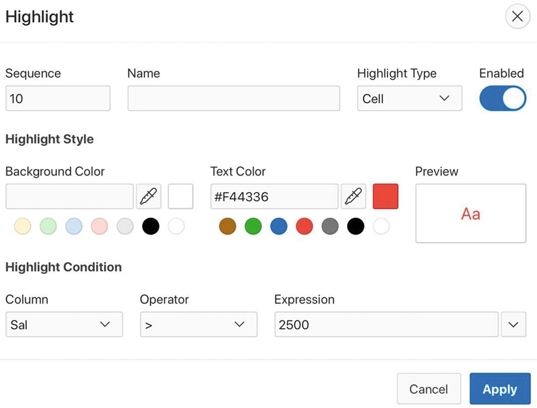
Highlight dialog box
Rows Per Page
The Rows Per Page operation is also in the Format submeu. It allows the user to change the report pagination at will. Clicking the menu item displays a submenu in which the user can choose from a list of possible rows per page.
Chart
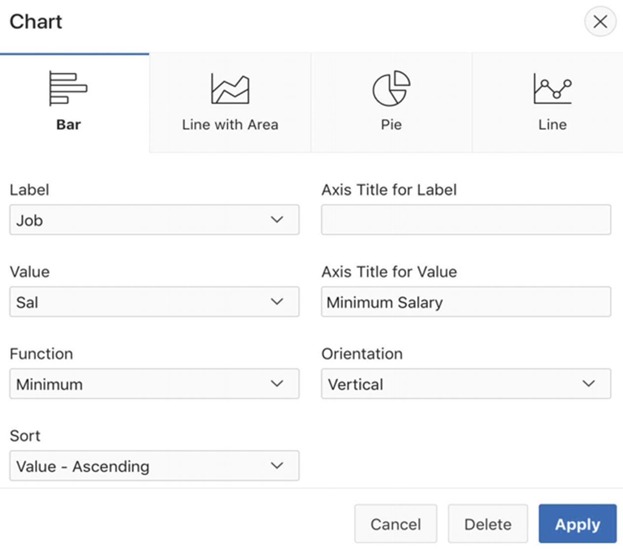
Chart dialog box
Interactive chart
There are two things worth noting in this figure. First, many aspects of the chart are not customizable. For example, a chart can have only a single series and the color palette is fixed. Second, the search bar has been extended to include two report/chart buttons to the left of the Action button. The user can use these buttons to toggle between the interactive report and its chart.
Configuring the Search Bar
The search bar has a lot of functionality. However, not all applications need all the functionality. An interactive report region has properties that allow the application developer to limit this functionality. This section examines those properties.

Rendering tree for the Interactive Reports page
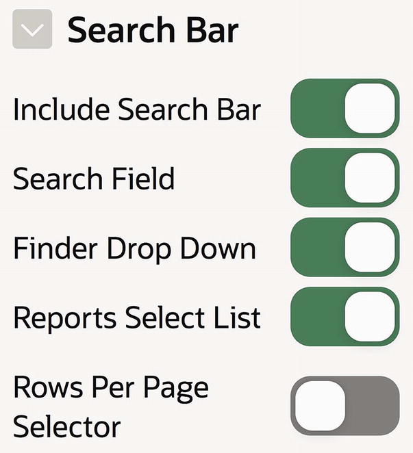
Properties to configure the search area

Some properties of the Actions Menu section
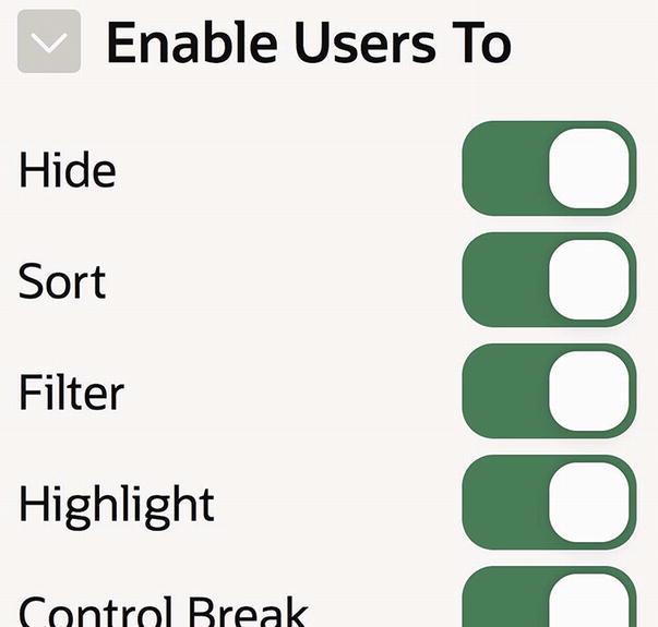
Some properties of a column’s Enable Users To section
Link Column

Interactive report with its link column
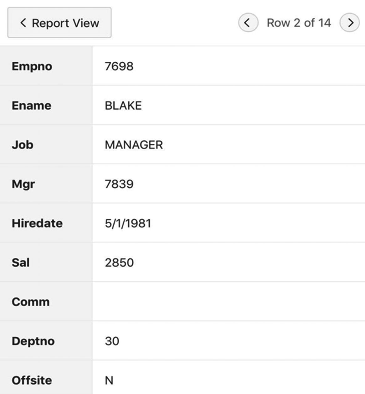
Interactive report in single row view
Properties to enable single-record view
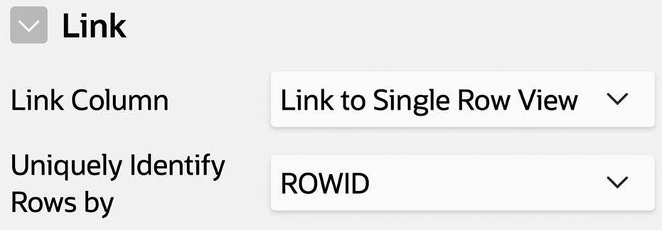
To enable the link column, set the value of the Link Column property to Link to Single Row View. (You can also set it to link to an arbitrary URL, but this choice is less interesting.) You then have to specify which row is to be selected when the link is clicked. The value ROWID says to use the row that was clicked, which is the most natural.
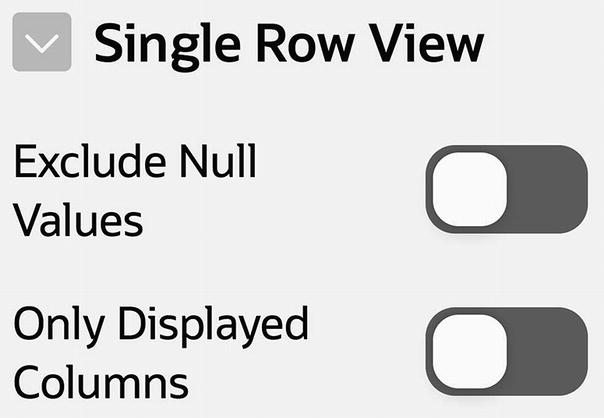
Single Row View properties
Summary
This chapter focused on the design and use of APEX regions. You began by examining different ways to create a region, the properties needed to specify its location on a page, and its look and feel. You then explored four common region types: Static Content, Classic Report, Chart, and Interactive Report. You looked at how regions of each type are used and how to take advantage of their type-specific properties to format them effectively.
A static content region is used primarily to display HTML code. You examined the APEX-specific nuances associated with relative references—in particular, how to refer to an image stored on the APEX server and how to link to a page of the current application. These relative references relied on the value of certain APEX built-in variables, such as APP_IMAGES and APP_ID. You saw how to use substitution strings to access the value of these variables.
A classic report region displays the output of an SQL query. You saw how to use APEX properties to customize the way the region is displayed. Of particular interest is a column’s HTML Expression property, which lets you format a column value by wrapping it in an HTML expression. You also saw how to perform conditional formatting by modifying the report’s source query.
A chart region displays a chart. You saw how to use an SQL query to specify the content of the chart and how to take advantage of the properties that configure the way the chart looks.
An interactive report region displays a report, similar to a classic report region. The interactive report differs in two ways. First, its search bar enables users to customize the report interactively. Second, its link column allows users to view the report in single-record mode. You examined the functionality provided by these features and compared them with what is possible using classic report and chart regions. You also saw how an application developer can enable only parts of this functionality by setting the properties of the interactive report region, as desired.