This chapter begins an examination of the APEX app builder. You will learn about the basic tools for creating applications and pages—notably, the Create Application wizard and Create Page wizard—and use them to build a multi-page application that can be run from any browser. You will also see how to use the APEX page designer to modify the properties of the pages in your application. Although these pages will have no content to speak of, the techniques in this chapter provide the basis for the content-creation techniques of subsequent chapters.
Creating an Application
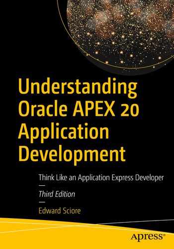
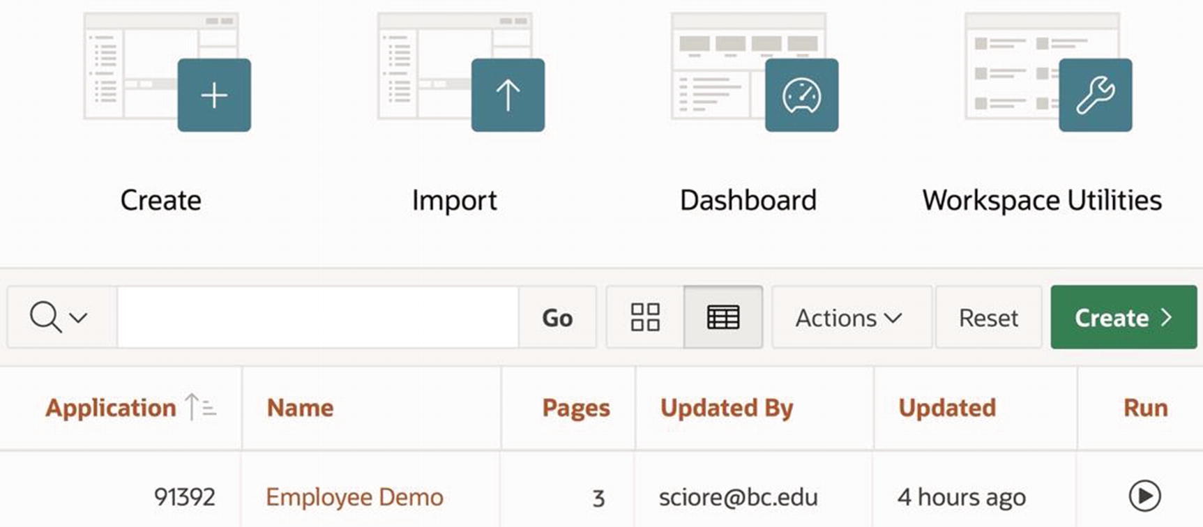
App builder home screen
Figure 2-1 shows the two buttons you can use to create a new application: a large Create button at the top left and a smaller green Create button on the far right of the search bar. Clicking either button brings up the Create Application wizard.
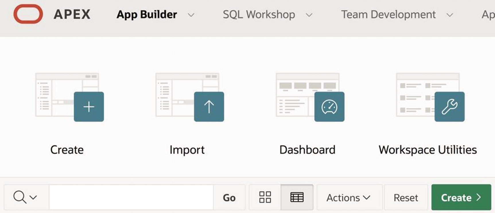
First screen of the Create Application wizard
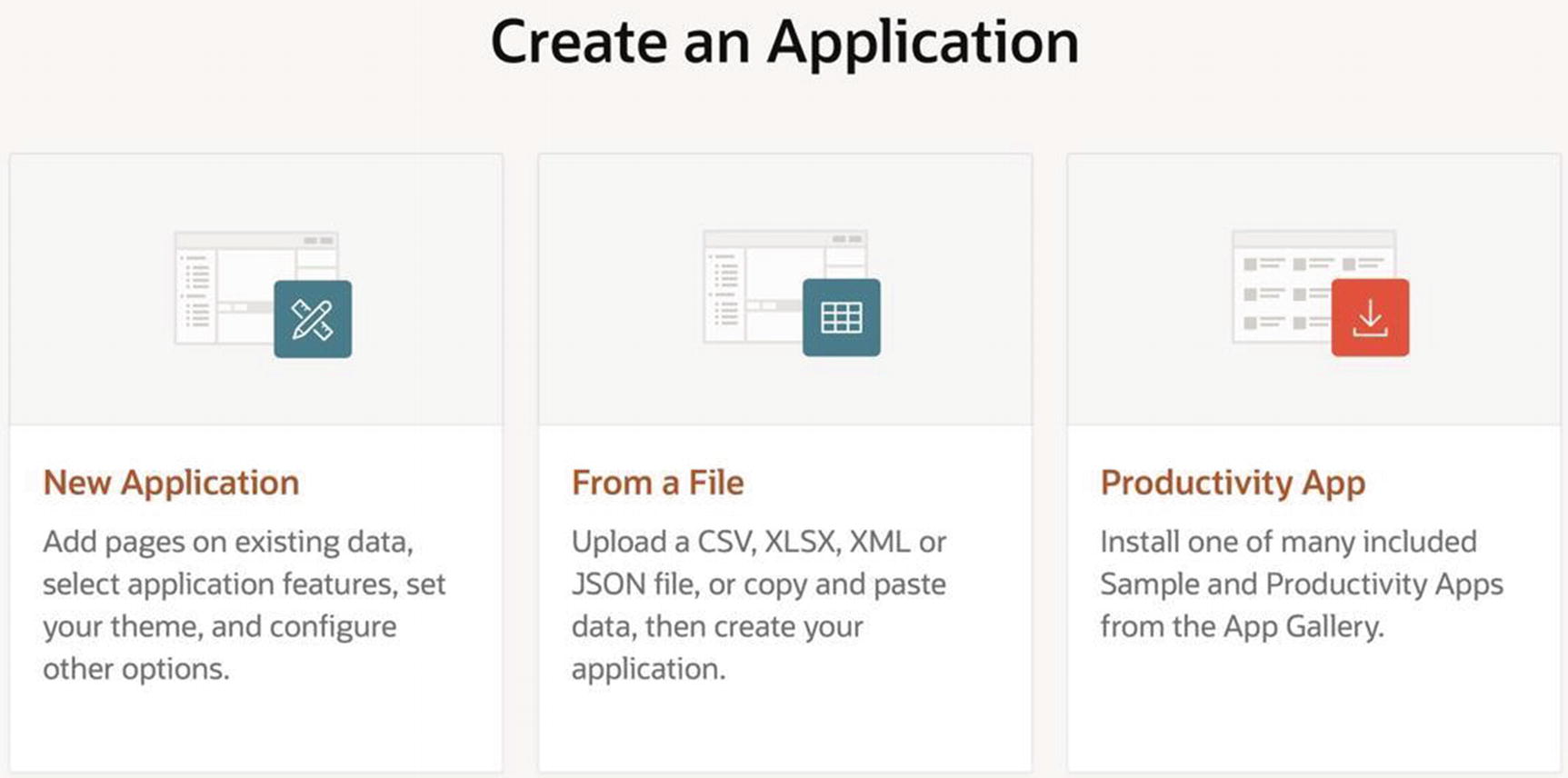
Second screen of the Create Application wizard
The Pages section of the screen asserts that the new application will have a single blank page, named Home. You can edit that page by clicking the Edit button, and you can add additional pages. Although this ability can be useful for experienced developers, it is not necessary—you can easily add and edit pages after the application has been created. It is simplest to leave the default pages as they are.
The Features section allows you to specify several useful features common to typical websites. These features can be added at a later point, so there is no need to specify them now.
The Settings section contains some additional settings. The Application ID value is assigned by the wizard, and uniquely identifies your application on the APEX server. My Employee Demo application was assigned the number 91392; yours will be different. The other property worth mentioning here is Authentication. The value of this property determines how people log in to your application. The default is Application Express Accounts, which will allow users to log in only if they have an account on your workspace. The other option is Database, which will only allow users of the underlying database to log in. For the moment, keep the default. Chapter 13 will revisit this choice when it examines the various authentication options.
An updated app builder home screen
Editing Application Properties

Home screen of a newly created application

Editing an application’s properties
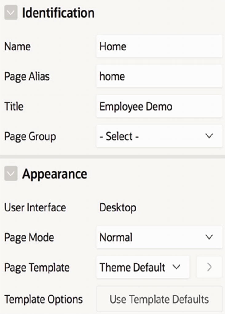
The screen organizes the application’s properties into sections for manageability. Figure 2-6 displays the Name section and its five properties. The first property, Application, holds the ID assigned to that application and cannot be modified. The other properties are modifiable; simply type the desired value into the text box (or select a value from the select list in the case of Application Group) and click the Apply Changes button. For us, the only interesting property is Name, which lets you change the application name.
The label of some properties contains a red asterisk. The asterisk means that the property must have a non-null value.
To the right of each property is a small question mark icon. Clicking that icon displays help text for that property, which is especially useful when a property is unfamiliar to you and you want to understand its purpose. As an experiment, click the help icon for each of the properties in the Name section and see if their purpose is what you expected.
Looking again at Figure 2-6, notice the row of tabs above the Name section. The first tab is labeled Show All, and is currently selected; the others are labeled by section names. The Show All tab displays the properties of all sections in a single screen. Clicking one of the section tabs displays the properties for that section. Again, clicking the help icon for the properties in each section is a useful exercise, if only to get a sense of what kind of customization is possible. Most of the properties will seem obscure because you have not delved very deeply into APEX. Certainly none of them (apart from Name) is interesting at this point.
Your application has still more properties. Look at the four links at the top of Figure 2-6, labeled Definition, Security, Globalization, and User Interface. Note that Definition is selected, meaning that you have so far seen only the definition properties. Click the other three links to get a quick look at the other properties. The security properties govern various security restrictions and are the subject of Chapter 13. The globalization properties allow you to modify the time/date settings. And the user interface properties govern certain page display issues. Here, the Logo section is of interest—it lets you manage the logo that appears at the top left of each page of the application. By default, the logo is the name of the application, but you can specify any desired text or even an image. For example, you may have noticed that the APEX screens all have an image-based Oracle logo. We will return to the Logo properties in Chapter 3.
Deleting an Application
There are two ways to delete an application. The right side of the application’s home screen contains a task labeled Delete This Application ; clicking the link performs the deletion. Alternatively, on the application’s global properties screen (refer to Figure 2-6), you can click the Delete button to the left of the Apply Changes button; this button appears when the Definition properties are shown.
Running an Application Page
A web application is a collection of web pages. By running a page, you are asking APEX to render it in your browser. The term running an application is shorthand for running its home page. There are two ways to run a page: from within APEX (as a developer) and from outside of APEX (as a user). Each is considered in the following sections.
Running a Page from Within APEX
The easiest way to run an application from within APEX is to click the big Run Application button on the top left of the application’s home screen (refer to Figure 2-5). Alternatively, you can go to the entry for the application in the app builder’s home screen (Figure 2-4) and click its Run button.
To run an arbitrary page of an application, you must open the page designer for that page. (The page designer will be discussed later in this chapter, but you can find a screenshot of it in Figure 2-12.) Click the green arrow button on the top right of the designer to run the page.
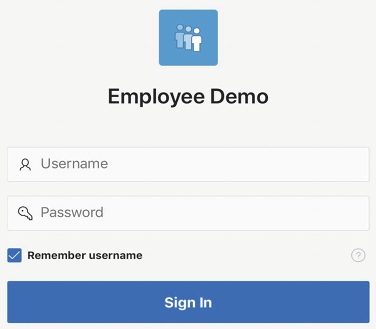
Logging into your application
If you are the administrator of the workspace (which occurs when you register for an apex.oracle.com account), then you are likely to be the only person having an account in the workspace. If you would like others to be able to use your application, then you have two choices: you can create additional accounts in your workspace, or you can use another authentication method. These options will be discussed in Chapter 13.
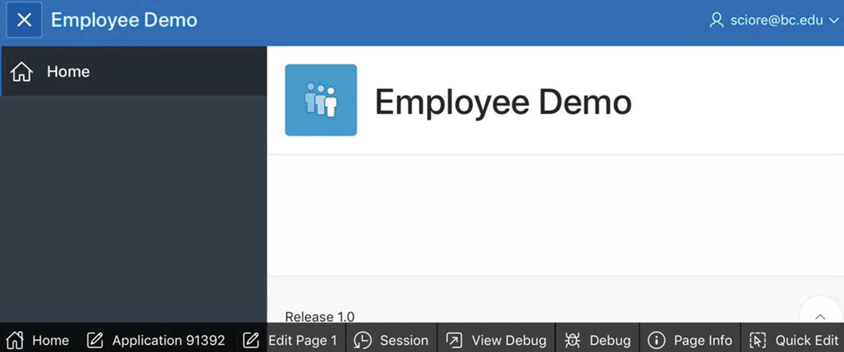
Newly created home page run from within APEX
Figure 2-8 also shows a row of buttons along the bottom of the page. These buttons, known as the developer toolbar , appear whenever you run a page from within APEX. Three buttons are particularly useful for building and debugging your application. The Edit Page button takes you to the page designer for the current page so that you can edit it. The Application button takes you to the home page for the current application so that you can work on a different page. And the Session button pops up a window that displays the current state of the application so that you can verify that it is behaving correctly. This latter topic will be discussed in Chapter 6.
If you wish, you can remove the toolbar from your application. Look again at the Application Properties page of Figure 2-6, and note that it has a section named Availability. This section has the property Status, which specifies how the application is accessed. The default value is usually Available with Developer Toolbar, which specifies that the toolbar will be visible to developers. If you don’t want the toolbar, change the value to Available.
Running a Page from Outside APEX
The APEX Create Application wizard assigns an ID number to each new application. You can see from Figure 2-3 that my Employee Demo application was assigned the ID 91392. This number is displayed throughout the app builder; in fact, it has appeared in every figure since then (except Figure 2-7). APEX also assigns an ID number to every page of an application. By default, the ID of the home page is 1, the global page (to be discussed in Chapter 4) is 0, and the login page is 9999.
To run a page from outside of APEX, you need its URL. This URL consists of some characters that identify the APEX server, followed by the application ID and page ID. For example, the URL for my Employee Demo home page is
https://apex.oracle.com/pls/apex/f?p=91392:1
Up through the characters f?p=, this URL is the same for every APEX application hosted by the apex.oracle.com server. The characters following the equals sign are the application ID and page ID, separated by a colon. If you omit the page ID from the URL, APEX assumes that you mean page 1.
If you are logged into the application’s workspace when you submit this URL, then the developer toolbar will be displayed at the bottom of the screen just as if you had run the application from within APEX. Otherwise, you will see the page without it, exactly as a regular user does.
Creating a New Page
There are several ways to create a new page for your application, but the most direct way is to click the Create Page button on the application’s home screen (refer to Figure 2-5). Doing so brings up the Create Page wizard . You should use this wizard to create a second page for your application.
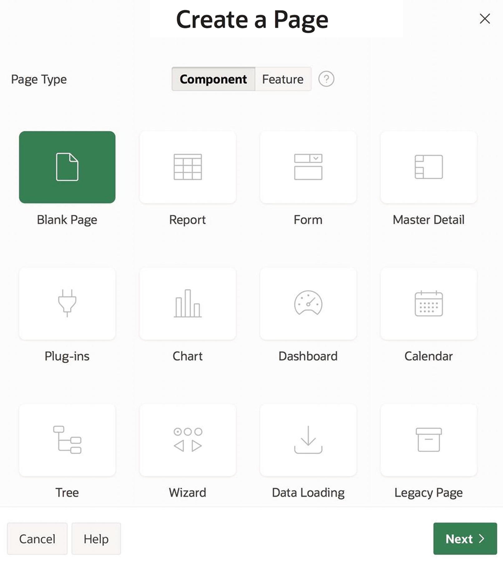
First screen of the Create Page wizard
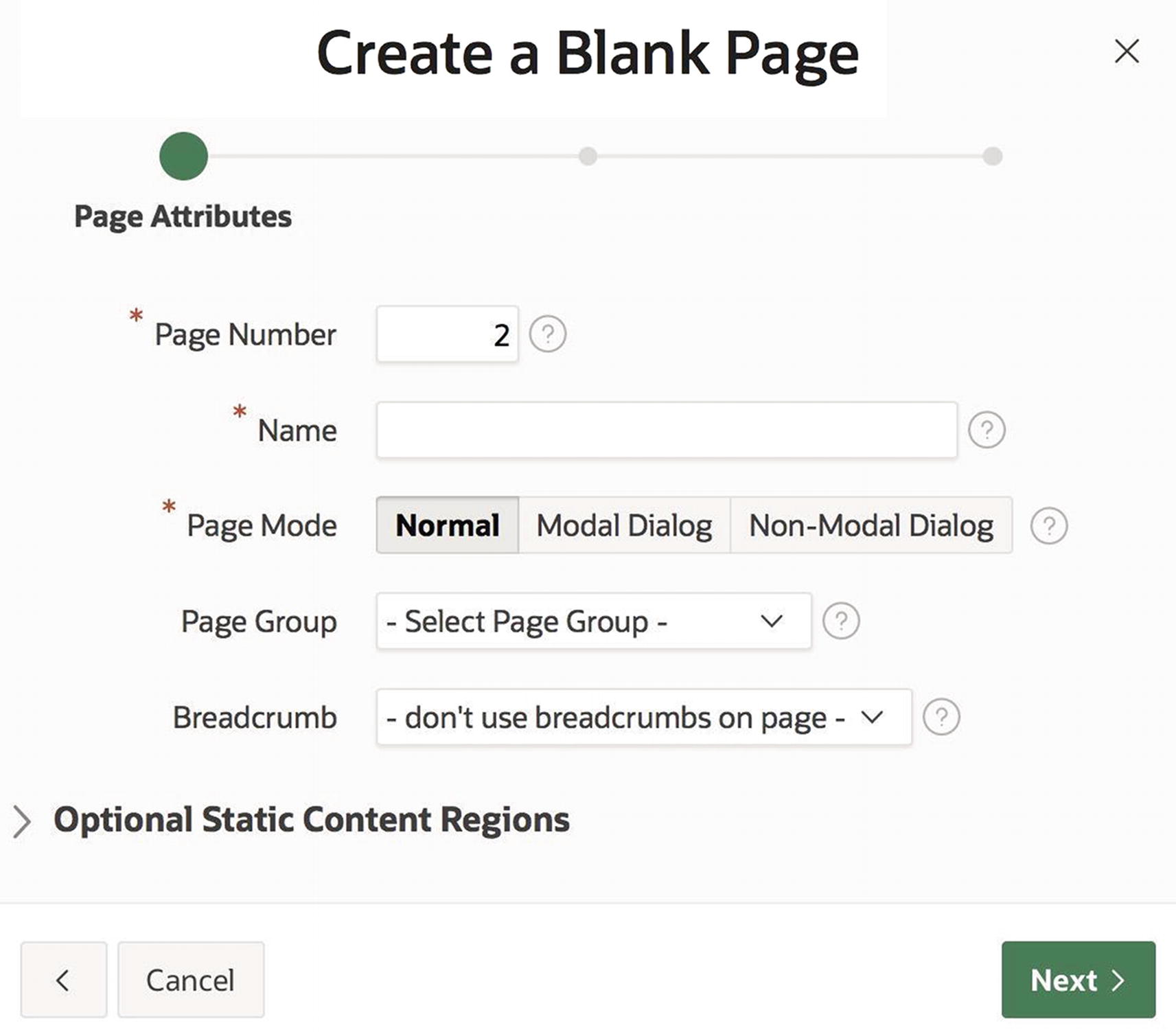
Second screen of the Create Page wizard
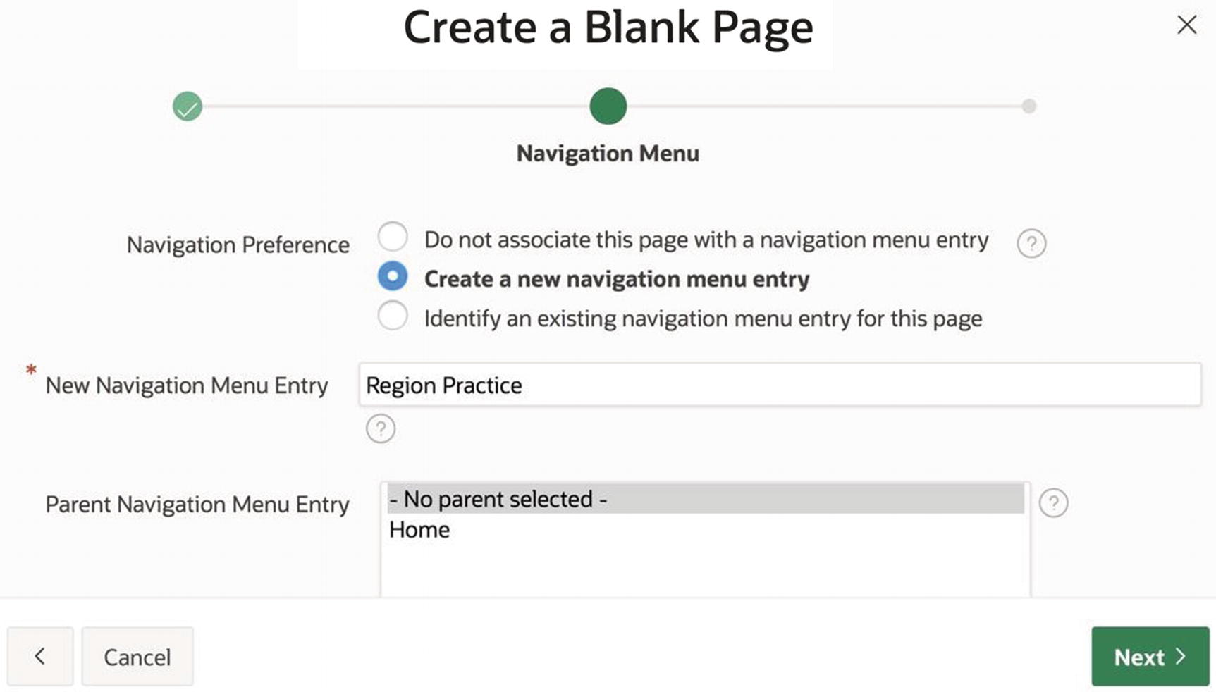
Third screen of the Create Page wizard
The fourth wizard screen (not shown) asks for confirmation. When you click its Finish button , APEX will bring you to the page designer for your new page. But before you delve into the page designer and its use, you should take a look at the page you just created.
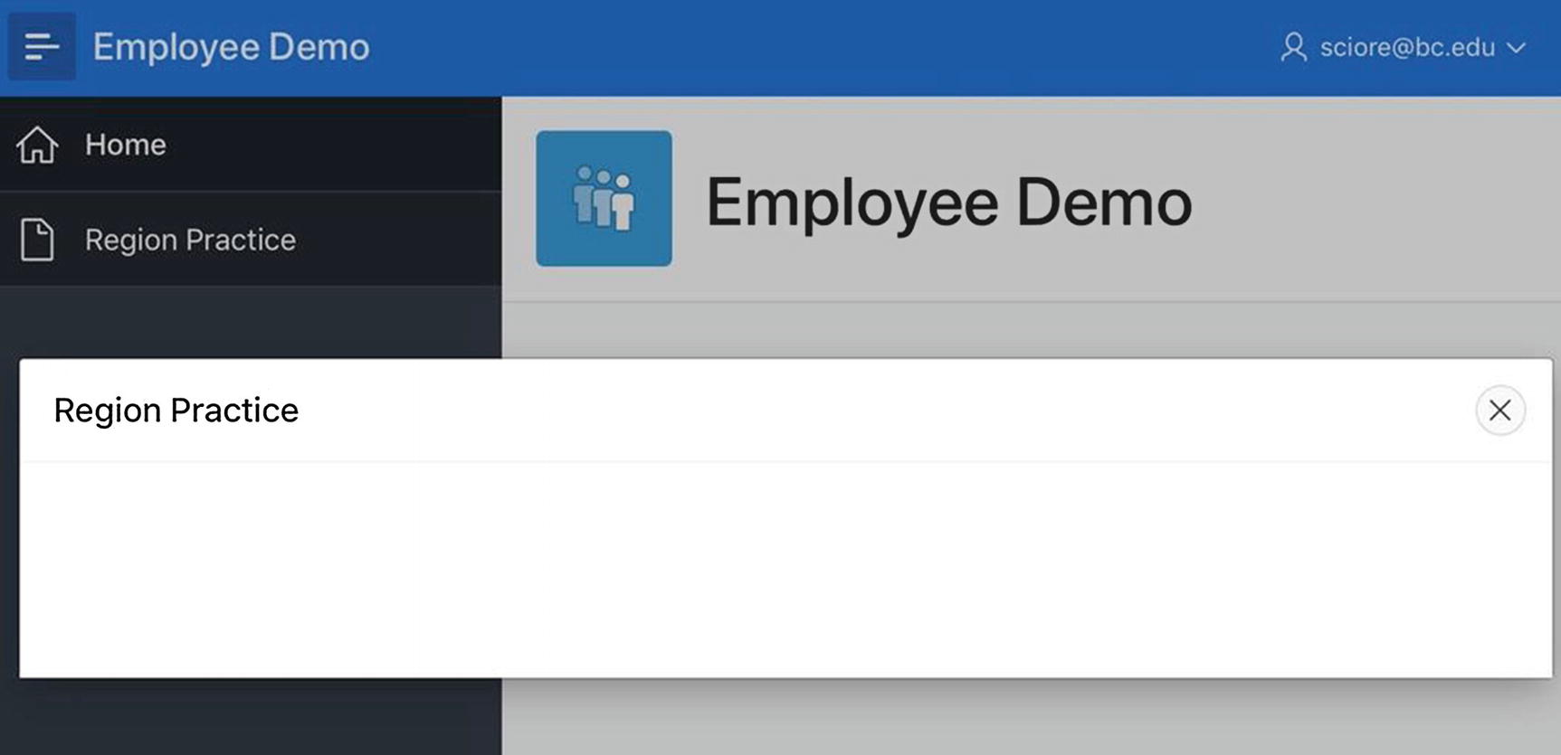
Return to your application’s home screen (Figure 2-4), either by clicking the link on the page designer’s breadcrumb or by clicking the App Builder tab and then selecting the icon for your application. The screen should now contain an icon for page 2. Run your application and observe that the navigation menu now has two entries. Click the Region Practice entry to see your new page. Note that this page has even less content than the home page, because it is missing the breadcrumb. Also note that you can move between the pages by clicking their navigation menu entries.
Page Designer
The APEX page designer screen lets you manage the properties and content of your pages. Because a page can have several kinds of component and each component can have numerous properties, the page designer is extremely dense and can be daunting for beginners. In this book, you will learn about the different parts of the page designer gradually, on an as-needed basis. Each time a new APEX feature is introduced, you will also see how it relates to the page designer. This section introduces the basic functionality of the page designer.
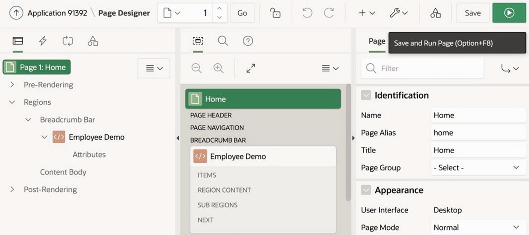
Page designer for the home page
The undo and redo buttons (to the right of the lock) restore the page to a previous state in the typical way.
The utilities button (labeled with a wrench) has a menu item that lets you delete the page.
The save button saves your changes to the page.
The run button (on the right of the save button) saves the page and then runs it.
The page designer supports an iterative page development methodology. The idea is to edit the contents of a page from within the page designer and then run the page. After examining the output, you return to the page designer and repeat the process until the page is satisfactory.
Below the toolbar are three vertical panels that form the heart of the page designer. The left panel displays the components on the page. The right panel specifies the properties of a selected component and is called the property editor. The middle panel provides utility functions.
The middle panel has three tabs, which correspond to the utility functions layout, page search, and help. The layout tab, which is selected in Figure 2-12, displays a visual representation of the page layout. You can change the size of the middle panel by dragging its left and right borders, and you can click the icons at the top of the panel to move between the tabs.
The left panel, which shows the page’s components, has four tabs: Rendering, Dynamic Actions, Processing, and Page Shared Components. The panel can display the contents of only one tab at a time. You select the tab you want by clicking one of the four icons at the top of the panel. This book focuses on the Rendering and Processing tabs and begins with the Rendering tab. The Processing tab will be introduced in Chapter 7.
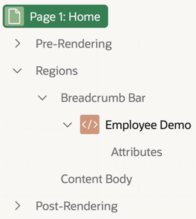
The rendering tree for the home page
The vast majority of components on a page are in the Regions subtree, so let’s explore it more closely.
The real estate of a page is divided into positions. For example, the Breadcrumb Bar position runs along the top of the page, and the Content Body position encompasses the main central area of the page. Each region in a page is assigned to a position.
The Regions subtree is structured as follows: its child nodes denote page positions, and each position node has a child node for each region assigned to that position. Thus in Figure 2-13, the two children of Regions correspond to the positions Breadcrumb Bar and Content Body. The position Breadcrumb Bar has a child that denotes the region Employee Demo, and the position Content Body has no regions, and thus no children.
In addition, each region node has a child node named Attributes, and it may have other children, depending on its type. The purpose of these nodes will be covered in Chapter 3.
If a node in the rendering tree has children, then it will have a collapse/expand arrow to its left. Clicking an arrow expands the node to show its children; clicking it again collapses the node to hide the children. You can also right-click a node to recursively collapse or expand the node’s subtree.
Property Editor
The property editor is the right panel of the page designer. Its role is to display the properties of whatever component is selected in the left panel.
The property editor for the home page
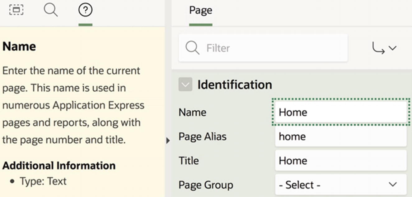
The Name property identifies the page from within the app builder. You gave the page a name when you created it, and you can change the name here if you decide on a better one.
The Title property identifies the page to a user. Browsers typically display the page title in a browser tab. The property currently has the value Employee Demo. For fun, change its value to This is my home page, rerun the page, and observe the change in the browser tab.
The Page Mode property specifies how the page is to be used. There are three possible values: Normal, Modal Dialog, and Non-Modal Dialog.
Most pages in a web application are normal. A browser displays a normal page by simply replacing whatever page was previously there. The history of a browser tab (or window) can be thought of as the sequence of accesses to normal pages.
A non-modal dialog page opens in a new browser window. Such pages are typically used as auxiliary pages, peripheral to the primary flow of normal pages. You saw an example of a non-modal page when you examined the SQL command tool in Chapter 1. Its screen, shown in Figure 1-11, is a normal page. But when you click its Find Tables button, the Table Finder window pops up, as shown in Figure 1-12. The content of that window is a non-modal dialog page. You can keep it open for as long as you want, move it around on the screen however you like, and transfer control between it and the current normal page whenever you want.
A modal dialog page corresponds to a dialog box. It opens on top of the current normal page and will not let the user do anything else until it is closed. The app builder’s Create Page wizard, shown in Figures 2-9 through 2-11, is composed of modal pages. Although you cannot tell from those figures, the wizard screens appear on top of the application’s home screen. All components of the underlying screen (such as buttons, links, and tabs) are disabled until the user exits the wizard.
As a side note, not all wizards in APEX are modal. One example is the Create Application wizard, whose screens appeared in Figures 2-2 and 2-3. These screens are normal pages that masquerade as modal dialog boxes. You can tell this in two ways: they do not sit on top of a previous normal page, and you can escape from the wizard at any point by clicking a menu bar tab.
Region Practice as a modal dialog page

Region Practice as a non-modal dialog page
Accessing Built-in Help
So far, you have seen two different ways to edit properties: the Application Properties screen of Figure 2-6 (for editing the properties of an application) and the property editor in Figure 2-12 (for editing the properties of a specified page). One interesting difference between these two interfaces is the way they provide built-in help. To read the help text for an application property, you click the question mark icon to its right. To read the help text for a page property, you use the Help section of the page designer.
Using built-in help
Summary
In this chapter, you began your journey through the APEX app builder. You saw how to create an application, populate it with pages, and run them from a browser. You also saw how to use the APEX page designer to view and change the properties of a page.
So far, the pages in your application are devoid of content. The remaining chapters of this book examine the different types of content you can add to your pages. Chapter 3 introduces regions.