
This book has so far focused on how an application can display information to users. In this chapter and the next, you will examine the components that allow users to send information back to the application. These components, which are items and buttons, are known as form controls because they typically appear in web forms.
APEX supports many types of items, which look and behave quite differently from each other. However, they all can be understood as variations of a few basic concepts. The main purpose of this chapter is to explore these concepts and examine how they are embodied in the different item types.
Items
An item is an element of a web page that holds a value. Each item has a type, such as Text Field, Checkbox, or Select List. Each item type has a specific way of displaying its value and letting users modify that value.
Different item types in an APEX screen
The APEX app builder supports 22 different item types. These item types can be grouped into three categories: text-based items let you specify a value by typing it, list-based items let you specify a value by choosing it from a list, and display-based items prevent you from specifying values. Figure 5-1 contains examples of all three item categories. These categories and their item types will be discussed throughout this chapter.
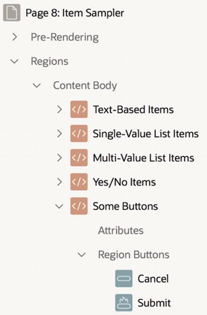
Item Sampler Page
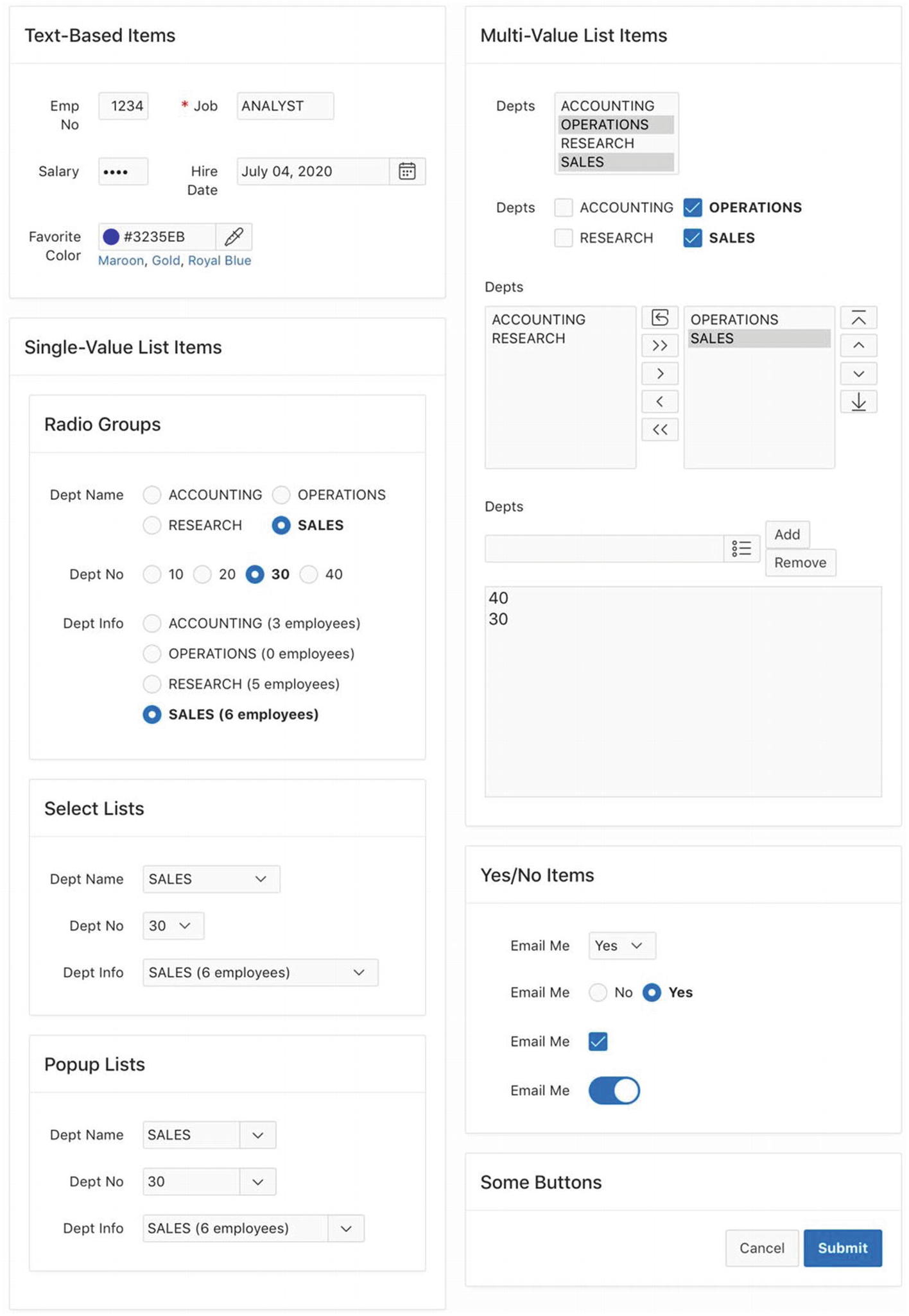
Item Sampler page
Text-Based Items begins a new row.
Single-Value List Items is in the same row and column, which causes it to be placed underneath Text-Based Items.
Radio Groups, Select Lists, and Popup Lists each have the parent region Single-Value List Items and begin a new row.
Multi-Value List Items begins a new column of the same row.
Yes/No Items and Some Buttons are in the same row and column.
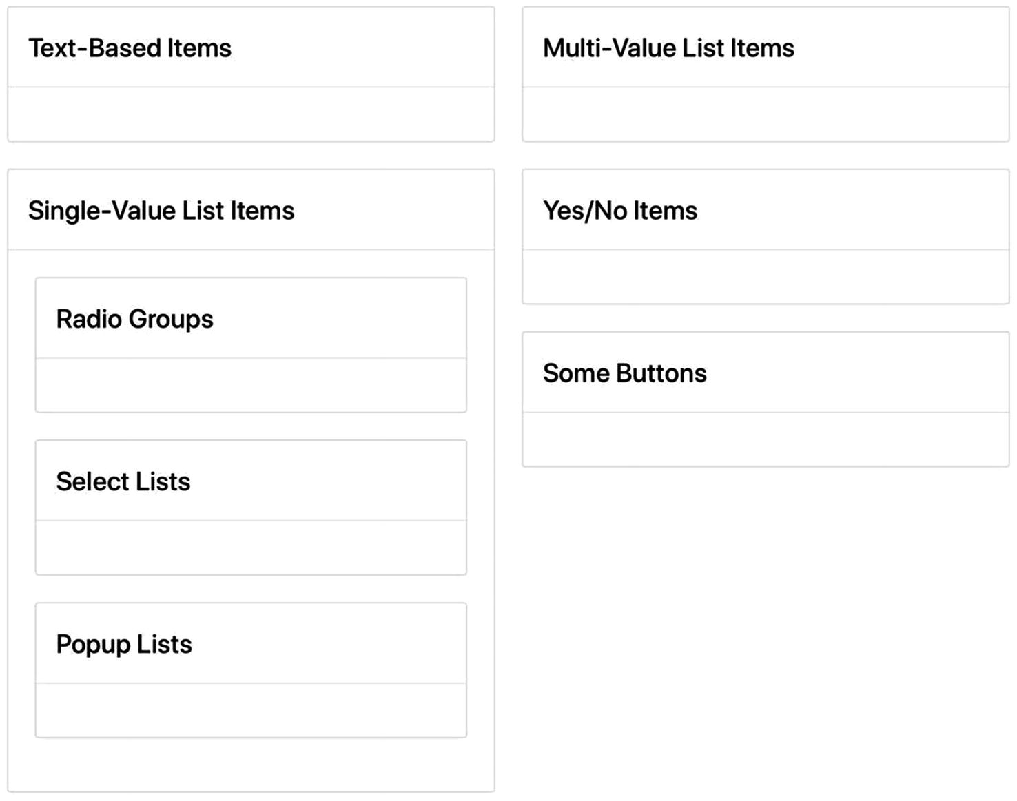
Structure of the Item Sampler page
Creating and Deleting Items
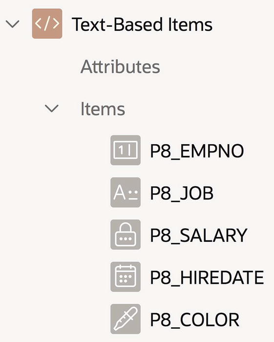
The rendering subtree for the Text-Based Items region
To create an item for a region, right-click the region’s entry in the rendering subtree and select Create Page Item. APEX will then insert a node into the Items subtree for that region. When you click that node, the properties for the item are displayed in the property editor.
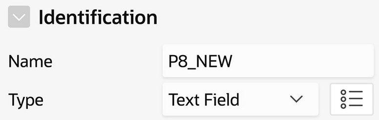
Item’s identification section
The name of this new item is P8_NEW. The prefix denotes the page containing the item, which in this case is page 8. When creating an item, you should rename the suffix from NEW to something more meaningful, but keep the prefix. The APEX community strongly suggests using the page number as the prefix of an item’s name, and there is no reason not to follow along.
The Type property specifies the type of the item. By default, the type is Text Field, but you can click the select list to choose from the 22 different item types supported by APEX.

Item gallery
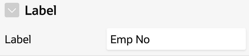
Specifying the label of an item
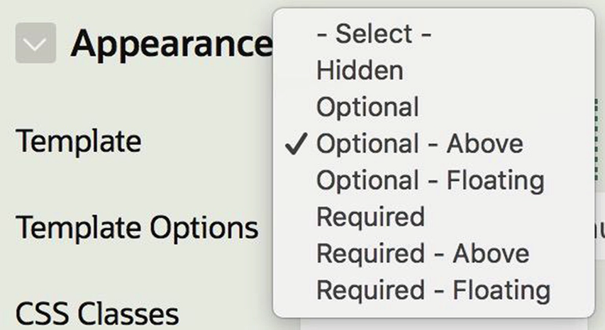
Specifying the appearance of an item
The items in the Item Sampler page mostly use the Optional template. The two larger items in the right column use Optional-Above, to conserve horizontal space. And the item labeled Job at the top of the left column uses the Required template. The purpose of the Required template is to warn the user that this item value must be filled in. The item’s Value Required property (which is in its Validation section) enforces this restriction and will be discussed in Chapter 8.
To delete an item, right-click its entry in the rendering tree and select the Delete option.
You are now ready to create all 22 items of the Item Sampler page, placing them in the appropriate regions with appropriate labels. In particular, the Text-Based Items region has five items, the Single-Value Items regions have three items each, the Multi-Value Items region has four items, and the Yes/No Items region has four items.
Items in the Item Sampler page
Region | Name | Label |
|---|---|---|
Text-Based Items | P8_EMPNO | Emp No |
P8_JOB | Job | |
P8_SALARY | Salary | |
P8_HIREDATE | Hire Date | |
P8_COLOR | Favorite Color | |
Radio Groups | P8_RADIO_NAME | Dept Name |
P8_RADIO_NO | Dept No | |
P8_RADIO_INFO | Dept Info | |
Select Lists | P8_SELECT_NAME | Dept Name |
P8_SELECT_NO | Dept No | |
P8_SELECT_INFO | Dept Info | |
Popup Lists | P8_POPUP_NAME | Dept Name |
P8_POPUP_NO | Dept No | |
P8_POPUP_INFO | Dept Info | |
Multi-Value List Items | P8_M_SELECT | Depts |
P8_CHECKBOX | Depts | |
P8_SHUTTLE | Depts | |
P8_LIST | Depts | |
Yes/No Items | P8_YN_SELECT | Email Me |
P8_YN_RADIO | Email Me | |
P8_YN_CHECKBOX | Email Me | |
P8_YN_SWITCH | Email Me |
Positioning an Item
Your next task is to position the items within their region. APEX displays a region’s items in rows, either at the top or bottom of the region. The region’s Item Display Position property (in the region’s Appearance section) lets you specify whether its items appear above or below its content. This property is irrelevant for the Item Sampler page because its regions have no other content, but will become useful for the pages of the next chapter.
An item’s Layout section determines its position within its region. APEX positions items within a region similar to how it positions regions within a page. Items are placed into rows from left to right according to the value of their Sequence property, moving to a new row whenever its Start New Row property is selected. The width of the region is divided into 12 grid points. Each item (including its label, if it is displayed to the left of the item) has a starting grid point and a width in grid points.

Specifying an item’s position in its region
When an item’s label is displayed to its left, APEX needs to decide how much of the item width to devote to the label and how much to the item. The property Label Column Span, shown in Figure 5-9, specifies how many grid points to devote to the label. The default value is usually very good. But if a label is excessively long or requires special treatment, it might be better to specify the label span explicitly (or to specify a Floating or Above label template).
You are now able to position your Item Sampler items in their regions. Most items can use their default layout properties, the only exception being the items in the Text-Based Items region. Items P8_EMPNO and P8_SALARY each begin a new row and have a column span of 4; items P8_JOB and P8_HIREDATE each begin a new column. The item P8_COLOR begins a new row.
The items on your page now have the proper structure, but they still have the default type Text Field. This situation is addressed next.
Text-Based Items
The Text-Based Items region of Figure 5-2
The following subsections consider the various text-based item types and their properties, followed by a discussion of some properties common to all text-based items.
Text Fields
Text Field is the default item type. It is also the simplest item type, in that there is no restriction on what values you can enter into the input box. The value of the item is whatever you type into the input box.
Number Fields
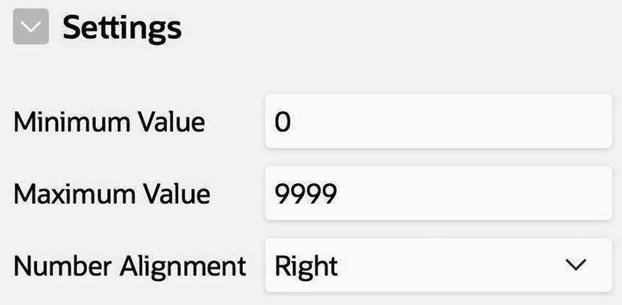
Properties relevant to number fields
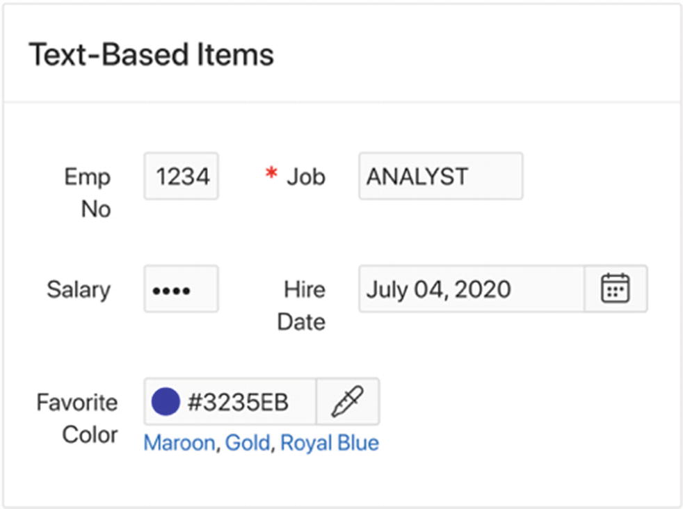
Password Items
The item P8_SALARY is a password field, which differs from a text field in that its value is not displayed on the page. Instead, its characters are replaced by circles when the value is being entered and are displayed that way when the page is rendered.
Text Fields with Autocomplete
A text field with autocomplete is a text field with an associated list of suggested values. As you type into the input box, the page displays a menu of matching values. If you click a displayed value, then APEX automatically enters that value into the input box. For example, the item P8_JOB is a text field with autocomplete, whose associated list consists of the five current job titles. When I typed a into the box, APEX displayed the job title ANALYST (because it was the only job beginning with a); I was then able to click that title without the need for further typing.
Autocomplete fields make it easy for users to enter the most common values, but do not require them to pick from those values. Even after selecting a suggested value from the list, a user is free to alter that value via continued typing.

Specifying the autocompletion list
There are two ways to specify the list. Figure 5-12 demonstrates the first way, which is via an SQL query. The query contains one column, and its output values constitute the list. This method of expressing the list is dynamic because the list changes as the job titles in the database change.
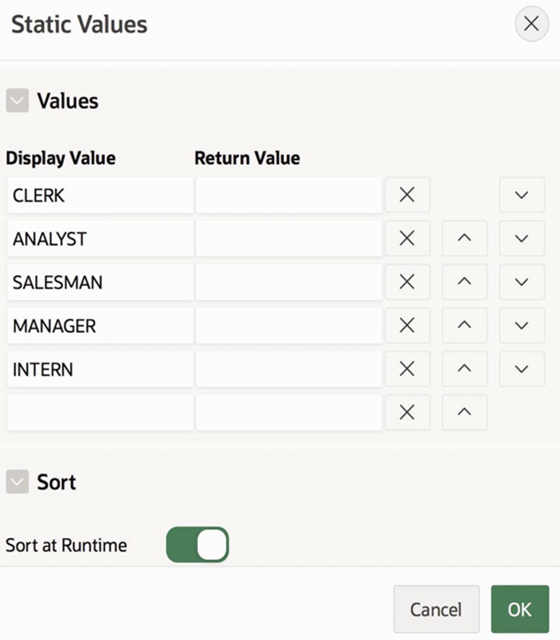
Static specification of the autocompletion list
A static specification is preferable when the value list is fixed and well-known. In Figure 5-13, for example, the static specification enables INTERN to be on the list, even though there are no current employees having that job.
You might recall from Chapter 3 that report columns can have the type Plain Text (based on List of Values), which used a list of values to translate actual column values to their displayed values. That list of values was also specified in a List of Values property section, via an SQL query. The mechanism is similar to how autocompletion values are specified. For example, compare Figure 3-30 with Figure 5-12; the only difference is that an autocompletion SQL query has one output column instead of two.
This similarity explains why the Static Values screen in Figure 5-13 has a column for display values and return values—the screen is also used when defining value lists that perform translation. This latter use of value lists will come up again in this chapter, during the discussion of list-based item types.
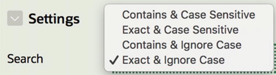
Possible Search values for an autocomplete item
Color Pickers
Item P8_COLOR has the type Color Picker . Colors on the computer are typically represented by their red, green, and blue component values, with each component having a value from 0 to 255. For example in Figure 5-10, the value chosen for P8_COLOR has (red, green, blue) component values of (50, 53, 235). That color is mostly blue, with a little green and red.
These component values can be represented compactly as a hexadecimal number. Because a two-digit hexadecimal number can represent 256 different values, a six-digit number can represent every possible color. In Figure 5-10, that color is represented by the number #3235EB. Note that 32 is the hexadecimal value of 50, 35 is the hexadecimal value of 53, and EB is the hexadecimal value of 235.
An APEX color picker item lets you type the value of the color if it is known. Or you can click the eyedropper icon to choose the desired color from a color wheel, and APEX will display the corresponding numeric value in the input box. The links under the color picker are quick picks, which will be discussed a bit later.
Date Pickers
The item P8_HIREDATE has the type Date Picker. Date picker items consist of an input box and a calendar icon. As with all text-based items, the user is free to type the desired date into the input box. But the user can also click the icon to bring up a calendar and then navigate the calendar to select a date, which causes the textual representation of the date to appear in the input box.
Properties relevant to Date Picker items
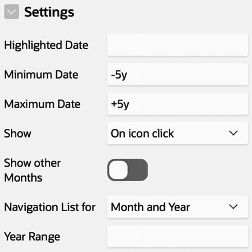
The Highlighted Date property specifies the date that the calendar initially selects; by default, it is the current date. The Minimum Date and Maximum Date property values can be specified in several ways. In Figure 5-15, the values -5y and +5y specify 5 years ago and 5 years in the future, respectively. The property Show allows you to configure when the calendar is displayed. The calendar can be shown when the icon is clicked (as in Figure 5-10), shown on mouse rollover, or always displayed on the page. The Navigation List for property allows you to configure the calendar for quicker access to dates. By default, the calendar has buttons to navigate only to the previous and next months. You can set the property so that there are also menus for moving directly to a specified month, year, or both. Finally, the Year Range property is an alternative way to specify the maximum and minimum dates, in which you give the allowable range of years. For example, entering the value 2018:2025 would allow only dates between the years 2018–2025.
Properties of All Text-Based Items
Properties common to all text-based items
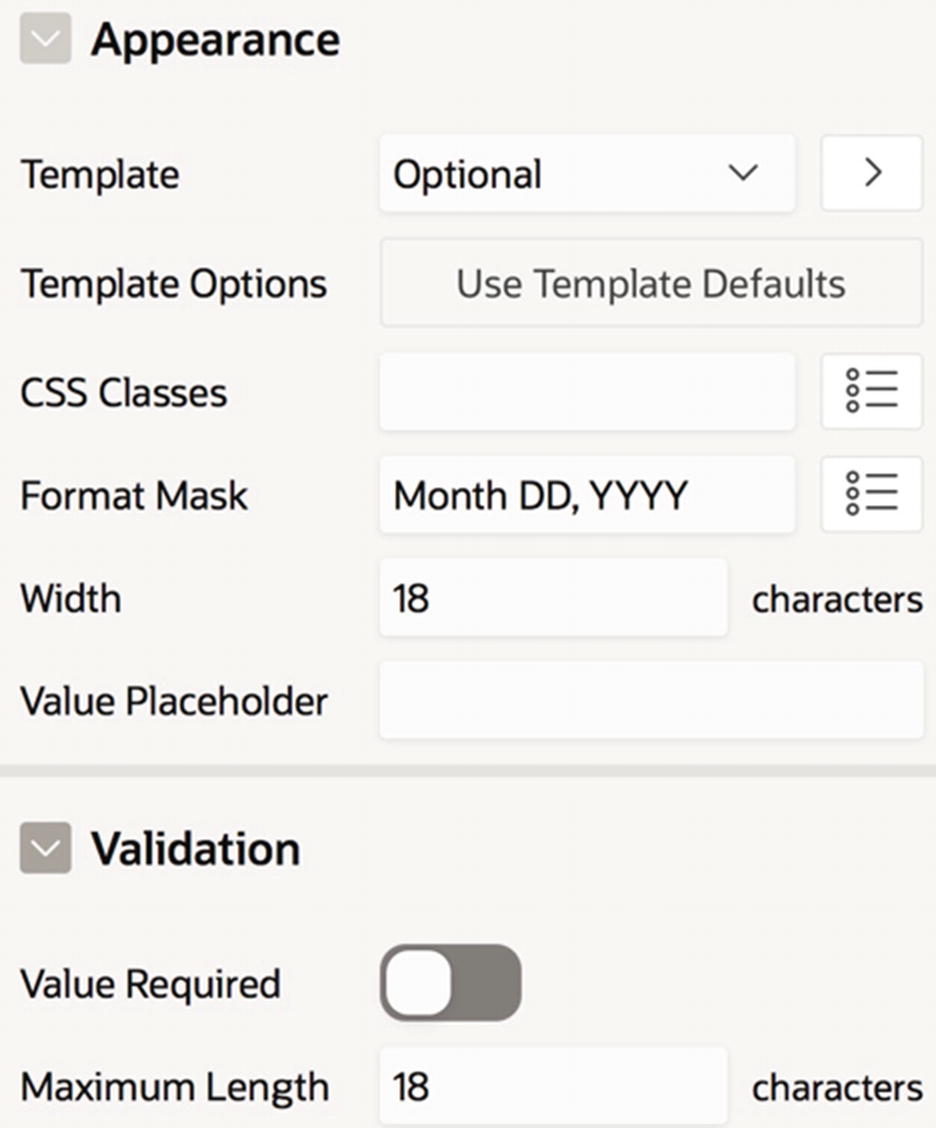
The Format Mask property works the same way as in reports. The value of the property is an expression that describes how the item value gets displayed. In Figure 5-16, the Hire Date item has a format mask of Month DD, YYYY.
The Width property specifies the size of the input box in characters. P8_HIREDATE has a width of 18, as that is large enough to hold all dates. For the other items in Figure 5-10, P8_EMPNO and P8_SALARY have widths of 6, and P8_JOB and P8_COLOR have widths of 10.
The Maximum Length property specifies the maximum number of characters that a user can type into the input box, regardless of its width. The difference between item width and maximum length is as follows. A user can enter a value that is longer than the width of the input box—if so, APEX will scroll the value within the box. But if a user tries to enter a value that is longer than the maximum length, then APEX will refuse to accept the extra characters.
For example, in Figure 5-16, P8_HIREDATE has the same values for Width and Maximum Length , meaning that a user cannot enter a value longer than the size of the input box. For another example, try setting the maximum length of P8_EMPNO to 4; you will discover that you simply cannot enter more than four digits into the input box, even though there is room.
By default, the maximum length is blank, denoting no maximum. A good design rule is to specify a maximum length for all text-based items. In Chapter 13, you will see how an item with no maximum length (or an unreasonably large one) can contribute to serious security loopholes.
Another section common to text-based items is Quick Picks, which enables you to specify commonly used values for the item. For example, the Favorite Color item in Figure 5-10 has three quick-pick values, which display as links below the item. The value shown in its text box is the result of my clicking the link for Royal Blue.
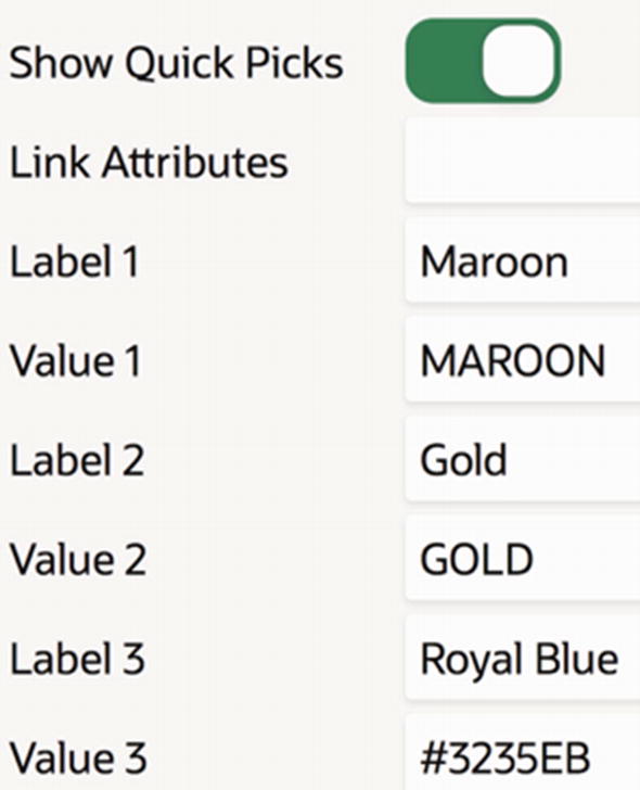
Specifying an item’s quick picks
Quick picks are useful because they enable users to quickly enter item values. In fact, many items in APEX screens contain quick picks. For example, the properties CSS Classes and Format Mask in Figure 5-16 have a context menu to the right of their text box, as does the Type property in Figure 5-5. Clicking the context menu displays a list of quick-pick values for that item. Sadly, although APEX screens have multiple ways to implement quick picks (such as context menus or links), applications that you can write using APEX are limited to just one way (namely, as links beneath the item).
Items having quick picks are similar in spirit to autocomplete items. Both enable a user to eliminate (or reduce) typing by choosing from suggested values. The difference is that the autocompletion menu gets filtered as the user types, whereas quick picks are presented to the user all at once. Consequently, an item can have arbitrarily many autocompletion values, whereas APEX limits an item to ten quick picks.
List-Based Items
Unlike a text-based item, a list-based item does not have an input box. Instead, a list-based item presents the user with a list of possibilities to choose from. Moreover, the value that a user chooses is not necessarily the value assigned to the item. That is, the item presents a list of display values to the user; when the user selects a display value, a corresponding return value is assigned to the item.
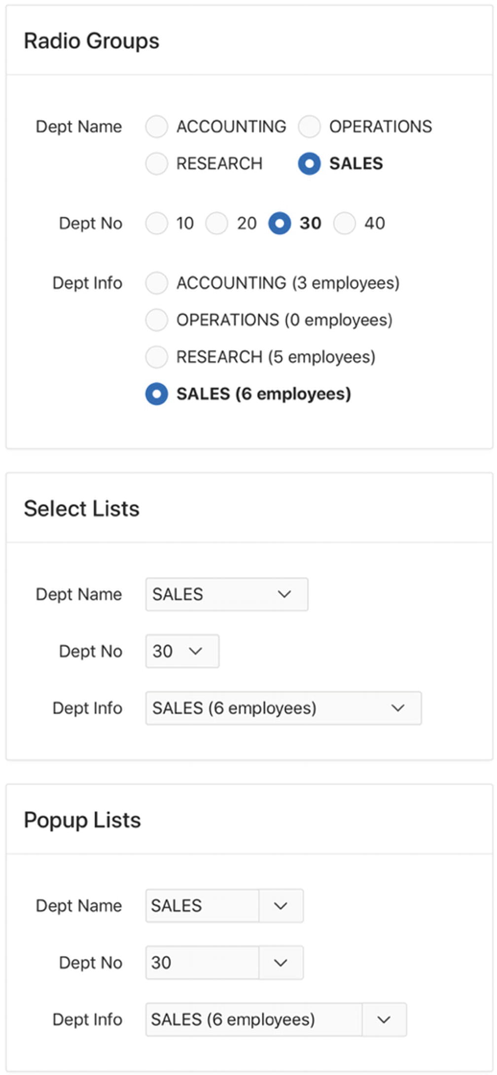
Single-value list items
These nine items have identical functionality: a user selects a department, and the corresponding department number is assigned to the item. The items differ only in what their display values are and how they present those values to the user.
Consider first the radio groups. In a radio group, all the display values appear on the page, and the user selects a desired value by clicking it. Each radio group in the Radio Groups region has different display values: the first group displays the list of department names, the second displays the list of department numbers, and the third displays each department name with the count of its employees in parentheses.
Now consider the select lists. When a user clicks a select list, a menu of display values appears. The display values in the first select list are identical to those of the first radio group, and similarly for the other two select lists.
Finally, consider the pop-up lists. When a user clicks the arrow to the right of the item, a menu of display values appears for the user to pick from. The display values of the three pop-up lists are the same as the corresponding display values of the other two regions.
A pop-up list differs from a select list in that it also has a search box. The user can type a prefix of the desired value into the search box and click the magnifying glass; the displayed list of values will be filtered to include only the values having that prefix. Pop-up lists make it possible to select from a lengthy value list without a lot of scrolling.
The Settings section of a radio group item has the property Number of Columns. This property specifies the placement of the radio buttons on the page. In Figure 5-18, you can see that the first radio group has two columns, the second group has four columns, and the third group has one column.
The most important issue for a list-based item is how to specify its display values and return values. You can specify these values dynamically, via an SQL query, or statically, via explicit values. All nine items in Figure 5-18 are specified dynamically, so I shall begin the discussion there.
Dynamic List–Based Items
An SQL query to specify the correspondence between display values and return values will have two columns: the first column gives the display values, and the second column gives the return values. The names of these columns are not important.
This query is specified in the item’s List of Values section. This is the same section as in Figure 5-12, which specified the value list for autocomplete text items; the only difference is that list-based items require a two-column query.
You are now ready to configure the items P8_RADIO_NAME, P8_SELECT_NAME, and P8_POPUP_NAME. Set their Type property to Radio Group, Select List, and Popup List, respectively, and set their List of Values properties to the preceding SQL query. You should also set the Number of Columns property for P8_RADIO_NAME to 2.
The names of the columns can be anything; SQL requires only that they be different from each other.
You should configure the items P8_RADIO_NO, P8_SELECT_NO, and P8_POPUP_NO analogously to the preceding three items. Set their Type property to Radio Group, Select List, and Popup List, respectively, and their List of Values properties to the preceding SQL query. You should also set the Number of Columns property for P8_RADIO_NO to 4.
The left join in the query ensures that all departments are included, even those with no employees.
Static List–Based Items
When you use a query to specify the values of a list-based item, APEX will execute that query each time it renders the page. If the output of the query will never change, then you can use a static expression to avoid the call to the database.
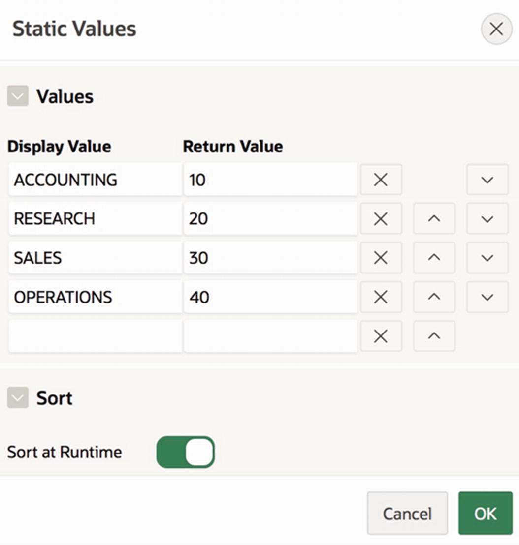
Static values for a list-based item
Multi-Value List Items
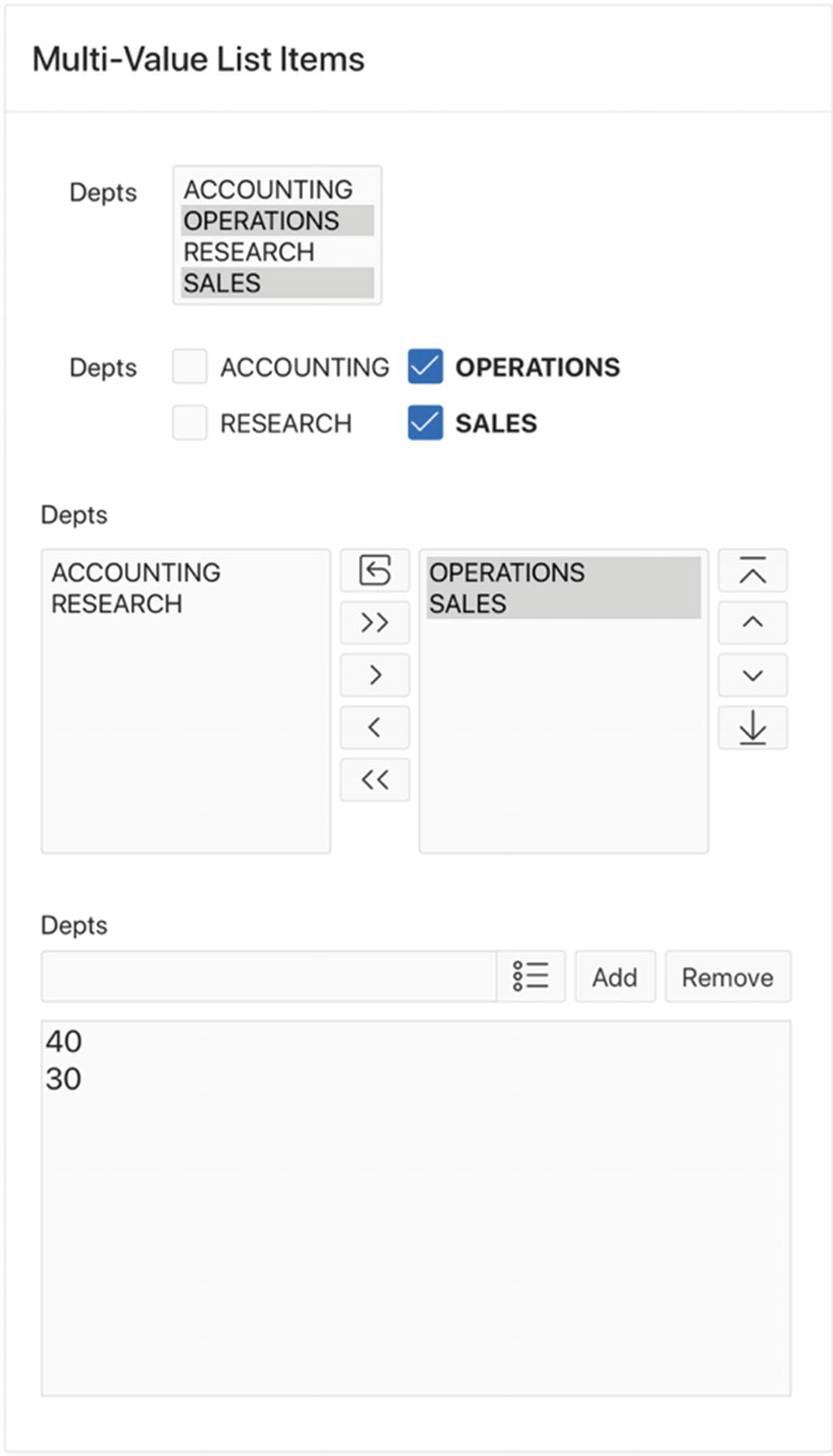
Multi-value list items
The main issue is how to assign a single return value to an item that has multiple display values selected. APEX uses the convention that the value of a multi-value item is a string consisting of the selected return values separated by colons. If no display values are selected, then the item’s value is null. For example, the items in Figure 5-20 all have the value 40:30.
Let’s examine these four item types. The first item, P8_M_SELECT, is a select list; that is, the same item type as in the Single-Value List region. To specify that the item is to be a multi-value select list, you set its Allow Multi Selection property (in the Settings section) to Yes. The value of its Height property (in the Appearance section) determines how many menu rows to display. All other properties are configured the same.
Note that the multi-value select list P8_M_SELECT looks and behaves differently from the single-value select list P8_SELECT_NAME. The multi-value list displays the menu on the page at all times, instead of on demand. (And if the list has more items than can be displayed on the page, a scrollbar appears so that the user can scroll through the values.) A user can choose additional menu items from the multi-value list by holding the control or command key while clicking, depending on the operating system.
The second item in the region, P8_CHECKBOX, is a checkbox group. Checkbox groups are configured exactly the same as radio groups. Checkbox groups behave differently from radio groups in that multiple checkboxes can be selected, and clicking a box toggles its value.
The third item, P8_SHUTTLE, is a shuttle list, which is very similar to a multi-value select list and is configured the same way. The difference between them is that a multi-value select list denotes selected values by highlighting them, whereas a shuttle has separate menus for displaying the selected and unselected values.
The fourth item, P8_LIST, is a list manager, which is a cross between an autocompletion text box and a pop-up list. Similar to autocompletion, a user can enter any value into the input box and click the Add button to add it to the selected value list. Alternatively, the user can click the pop-up arrow to bring up a menu of values to choose from, with the selected value getting added to the input box. It is important to note, however, that although the pop-up list shows display values, it places return values in the input box. Thus, Figure 5-20 shows that the department numbers 30 and 40 are selected, even though the pop-up list displays department names.
Yes/No Items
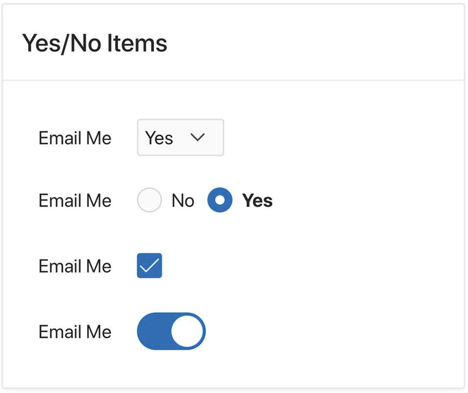
Yes/No items
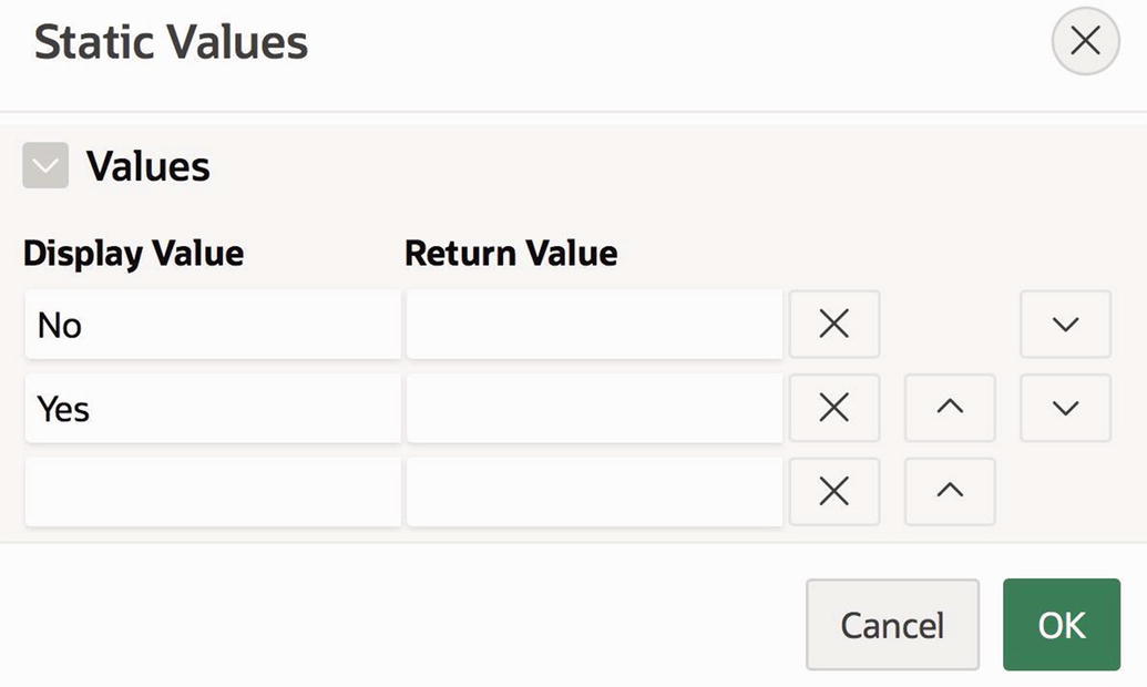
Static values for the yes/no select list and radio buttons

Static values for the Yes/No checkbox
The fourth item, P8_YN_SWITCH, has the type Switch. It does not need configuration. By default, it has no display values and two predefined return values: Y if the switch is on and N if it is off.
Display-Based Items
There are two other useful item types that do not appear in the Item Sampler page: Display Only items and Hidden items. These items differ from the others you have seen in that there is no way for a user to assign a value to them; their values can be assigned only by the APEX server.
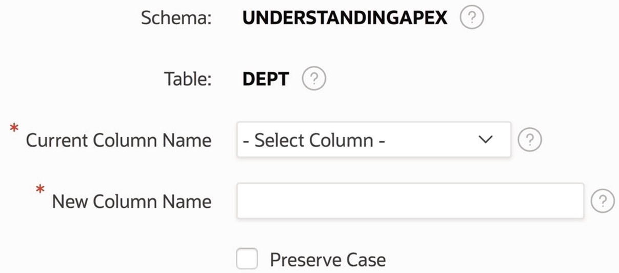
A display-only item has a label and a textual value, similar to a text field; the difference is that the value is not in an input box and is not editable. For example, refer again to Figure 5-1; the fields labeled Schema and Table are display only.
Hidden items are not visible, and users have no idea that they exist. They are typically used to hold the value of an operation so that another operation can use it. You will see examples of this technique in Chapter 6.
Initial Item Values
When APEX renders a page, it assigns an initial value to each item on the page. If the item is text based, APEX places that value inside that item’s input box; if the item is list based, APEX uses that value to determine the corresponding initial display value.
APEX determines this initial value in one of two ways: it can evaluate the item’s source expression, or it can use a value previously stored in the session state. Because the concept of session state has not yet been covered, assume for now that session state values are always null.
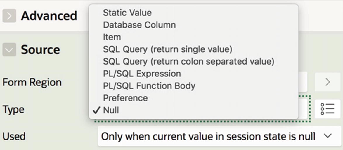
Item’s source properties
The Type property specifies the type of the source expression; Figure 5-24 shows all possible source types. Three common choices are Null (which is the default), Static Value, and SQL Query (return single value). Choosing a type other than Null will cause the property editor to display an area for entering the source expression.
The Used property specifies when the source expression is applicable. The default choice, shown in Figure 5-24, is to use the session state if it is not null, and the source expression otherwise. The other choice, not shown in the figure, is to always use the source expression. These choices will be discussed in Chapter 6.
A source expression whose type is Static Value is typically a constant. For example, suppose instead that you want the initial value of the items in Figure 5-18 to be the sales department. Simply set the source expression for each item to be 30. If you want the initial value of the multi-value list items in Figure 5-20 to be both the operations and sales departments, set the source expression of those items to be 30:40.
One issue that arises with list-based items is how they should respond to an initial value that is not one of their specified return values. For example, suppose that you assign the static value 85 to be the source of the list-valued items. What should the items display, given that there is no department numbered 85? There are two options: accept the value and add it (temporarily) to the list, or reject the value and display an arbitrary value from the list. This choice is specified by the Display Extra Values property in the List of Values section, as shown in Figure 5-12. In most cases, it makes no sense to display a value that is not a valid selection option, so Display Extra Values should usually be turned off.
Buttons
A button performs an action when clicked. An APEX button has two fundamental actions: it can redirect or it can submit. The term redirect simply means to move to another web page. In this respect, the button acts like an HTML link. The term submit means to have the web server process the current page. This processing can involve setting the session state and performing operations on the database, as well as moving to another page. Chapters 6 through 10 will cover in detail the uses of redirect and submit actions.
As an example, let’s see how to add two buttons to the Some Buttons region of the Item Sampler page: a Cancel button with the action Redirect to page 8 and a Submit button with the action Submit.
Adding buttons to the rendering tree
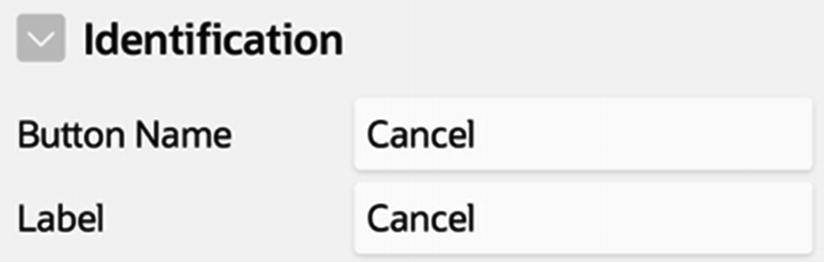
Identifying a button

Possible button actions
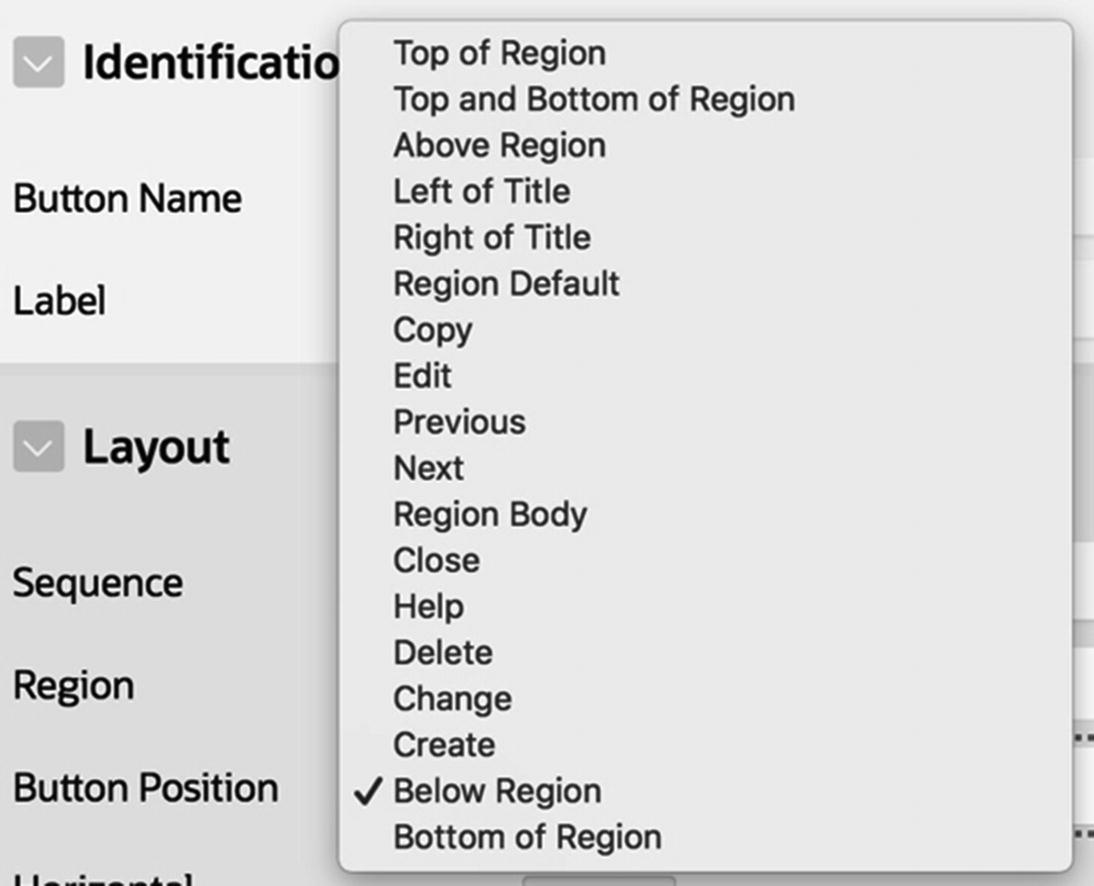
Possible button positions
In the region’s header
At the top or bottom of the region
At predefined locations in the region
In the region body
The values Left of Title and Right of Title place the button in the region’s header, to the left or right of the title. If several buttons are in the same position, their relative position is determined by their sequence numbers.
The values Top of Region, Top and Bottom of Region, Above Region, Below Region, and Bottom of Region display buttons at the top or bottom of the region. When you choose one of these values, the property editor displays the Horizontal Alignment property, which lets you specify whether the button should appear at the left or right side of the region. The buttons in Figure 5-2 are positioned at the top of the region, aligned to the right.
Many page templates have specially designated positions for certain buttons. Their purpose is to ensure that buttons common to multiple regions are located in the same place in those regions. The button positions Copy, Edit, Previous, Next, Close, Help, Delete, Change, and Create correspond to these special-purpose buttons, although you are free to use them for any button. Of particular note are the positions Copy and Edit, which display the button at the far right of the header.
The Region Body position is different from the others because it places the button among the region’s items. When you choose this value, a Layout section appears for you to specify the position of the button relative to the other items in the region. Moreover, the button’s node in the rendering tree shows up in the subtree for the region’s items.
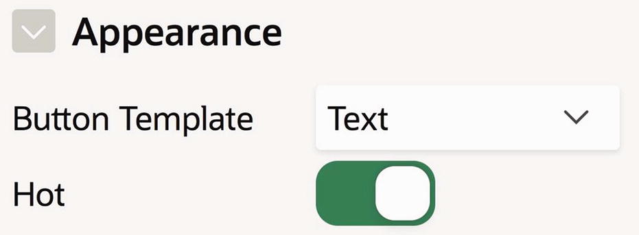
Specifying a hot button
Summary
An item is a page element that holds a value. There are many item types, which differ in the way in which they display their value on the page and how they help users specify that value. Of primary importance is the distinction between text-based items and list-based items.
A text-based item displays its value in an input box, and users can specify a value by typing it into the input box. The text-based item types support the entry of unusual values (such as colors and dates), aid in data entry (such as autocompletion), and restrict allowable values (such as number fields).
A list-based item forces a user to choose from a given list of values. This list can be defined dynamically, via an SQL query, or statically via explicit values. In every case, there is a distinction between the display values (the values presented to the user) and the return values (the value that is actually held by the item). The various list-based item types differ primarily in how they present the display values on the page.
The purpose of an item is to allow a user to send a value to the server. Chapter 6 examines this issue and provides examples that show typical uses of items in web applications.