
11
Now That You Know Who These People Are, and How Many, Where Are They?
OK, YOU NOW understand the U.S. population on a generational basis. At this point you should be able to answer some basic questions about these generations in relation to markets.
Such as, which generation represents the largest potential market?
Did you answer Generation Y? If so, give yourself a gold star.
Which generation is going to have the biggest impact on healthcare over the next twenty years?
I trust that you answered the Baby Boomers. While I only alluded to this potential impact, it couldn’t be more obvious to anyone who understands the generations and/or has done some basic counting.
Which generation, despite its large numbers, is likely going to struggle as it follows its predecessor generation?
No doubt you were reading carefully and correctly answered Generation X, and understand that this is due to its relative low birth numbers and the lower earning power of the immigrant component of its population.
If you take these six generations and mix them together, what do you have?
The roughly 320 million people who constitute the resident population of the United States. And while counting 320 million people certainly presents difficulties, think about this: These 320 million people are interspersed across a country that covers more than 3.5 million square miles. If all things were equal, this would mean that something along the lines of ninety people lived in every square mile of the country.
But of course, it’s not that easy, as the population is not evenly spread out across the country. While the overall U.S. population usually experiences steady growth, on a regional, state-wide, county, city, and even neighborhood basis, populations are often in flux in one way or another. Some places never seem to change, while other places change so fast that they’re hardly recognizable twenty years after you last saw them. Populations are not static, and Americans tend to move around a lot. And even the places that never seem to change undergo population shifts that may appear subtle on the surface but may lead to any number of unexpected consequences as the years pass by. For example, the slow erosion of a school’s student body ultimately leading to school closures, or the “geriatrification” of a town to the point where the town council realizes that the majority of its citizens are on fixed incomes and can’t afford any more tax hikes.
Consider this hypothetical location-based demographic scenario: In 1990 two brothers, Phil and Ted, received the exclusive right to franchise McDonald’s restaurants in their respective counties. Phil has the franchise rights for the fictitious Mayberry County, North Carolina, while Ted has the franchise rights for the equally made-up Moosejaw County, Maine. We’ll say that both counties are an equal mix of rural and urban and include one county seat city and four small towns, with the 100,000 population of each county distributed in this mix in a similar fashion. Each county is equal distance from its respective state population center and/or state capital, and both have similar breakdowns of employment opportunities with two textile mills, 100 small-scale farms, a furniture-making factory, a pharmaceutical plant, and sixty retail establishments. Finally, we’ll assume that the populations of these fictional counties will grow in approximation to the average population growth of their respective states.
Assume that Phil and Ted each opened their first McDonald’s in 1990. As of 2015, how do you think each of the brothers has fared with his business and how many restaurants do you believe each brother has opened in his respective county?
Stumped?
Well, given that the state of North Carolina’s population has almost doubled since 1990 and that its population’s median age has been steadily declining to a recent low of about 36, I would posit that Phil has opened at least four McDonald’s restaurants and is feeling fairly well off. But because the state of Maine’s population has hardly grown at all, and its median age has been steadily rising to a recent high of almost 42, I would suggest that Ted is still operating just the one restaurant and perhaps struggling to get his second kid through college.
Granted, this is a very simplistic hypothetical scenario, and certainly other factors would likely play a role in the level of success for these brothers’ respective businesses, but absent population growth there is usually little reason for the expansion of such businesses.
In fact, I know of several towns in North Carolina that only had one McDonald’s restaurant back in 1990, but now have anywhere from three to eight. Likewise, I know of towns in Maine that today still only have the same one McDonald’s restaurant that they had back in 1990.
Let me restate the premise of this chapter: Population changes can have vast and profound impacts on countries, regions, states, counties, and towns. Population increases can provide a boost to an area’s economy by driving the growth of industries, services, jobs, and tax revenues. And while not the only catalyst for driving economic growth, population increases are certainly one of the linchpins needed for perpetuating economic growth, as a fall in population can put the brakes on the “perpetual” part of the growth and lead to a decline in industries, services, jobs, and tax revenues. In many cases, economic stagnation begets population decline, but in some instances population declines can presage economic downturns; no matter which comes first, these population declines are almost always indicative of current or imminent economic deterioration.
And while an increasing population is generally beneficial for economies on the local, state, regional, and national levels, a growing population also presents numerous challenges, such as the need for more government services such as schools, hospitals, and social assistance, along with whatever infrastructure may be needed to support the additional population. The composition and the rate of the increasing population brings additional challenges and potential stressors on all levels.
Consider these questions relating to population growth: Is the increase being driven primarily by
![]() births?
births?
![]() births with a lack of elderly-related mortality?
births with a lack of elderly-related mortality?
![]() highly educated immigrants looking for high-tech work?
highly educated immigrants looking for high-tech work?
![]() undereducated immigrants looking for any work?
undereducated immigrants looking for any work?
![]() under-30s looking for work and the good life?
under-30s looking for work and the good life?
![]() Baby Boomers seeking paradise in retirement?
Baby Boomers seeking paradise in retirement?
![]() urbanites moving to the country?
urbanites moving to the country?
![]() rural folks moving to the city?
rural folks moving to the city?
![]() or, and most likely, some combination of all of the above?
or, and most likely, some combination of all of the above?
Consider also: Is the increase looking like
![]() a fifty-year population double?
a fifty-year population double?
![]() a thirty-year population double?
a thirty-year population double?
![]() a twenty-year population double?
a twenty-year population double?
![]() a ten-year population double?
a ten-year population double?
![]() indeterminable because it’s coming in spurts and sputters?
indeterminable because it’s coming in spurts and sputters?
All of the above composition and rate scenarios present significant challenges but also offer opportunities. And these composition and rate scenarios, along with scenarios related to population declines, play out in a wide variety of ways depending upon the city, state, and region.
So, let’s take a closer look at the demographics of the country on a regional basis.
TABLE 11.1
REGIONAL RATES OF POPULATION CHANGE 1990–20151
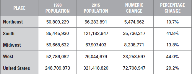
TABLE 11.2
REGIONAL GROWTH BY DECADE—1990S VERSUS 2000S

REGIONAL RATES OF POPULATION CHANGE 2010–2015
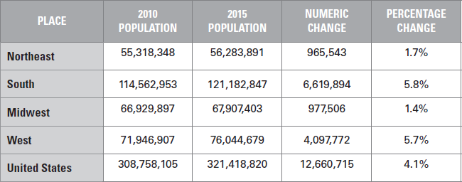
We have three tables showing different values for varied time periods, but all telling a similar story. As a budding demographer, you should be able to look at these tables and tell me this story.
You can hardly fail to notice the phenomenal population growth of the South and West, and that growth in the Northeast and Midwest is comparatively muted. But if you look closer, you should notice that not only is the growth in the Northeast and Midwest significantly weaker than that of the South and West, but that their rates of growth are in significant decline.
While the overall greater than 10 percent population increase experienced by the Northeast and Midwest between 1990 and 2015 would suggest healthy population growth, the Northeast’s growth dropped by more than 60 percent between the 1990s and 2000s, while that of the Midwest dropped by 54 percent. As can be seen, the South’s growth hardly dropped at all, while that of the West fell by a relatively modest 16 percent.
Looking at the current decade, it would appear from the “2010–2015” table that the Northeast should be able to maintain, if not exceed, its 2000s growth rate, while the Midwest seems to be heading for a further decline. The South and West, meanwhile, seem to be heading for modest declines.
The overall takeaway from this is that in considering increasing population as a positive factor, the South and West are on target to be the primary economic beneficiaries of population growth, as both regions are experiencing well-above-average growth, while the Northeast and Midwest are experiencing significant below-average growth.
According to the 2010 Census, the U.S. population grew by about 27.3 million from 2000 to 2010, and, according to recent Census Bureau estimates, grew by another 12.6 million from 2010 until July of 2015, for a combined total of almost 40 million. Regionally just over 52 percent (20,946,027) of the nation’s 2000 to 2015 growth occurred in the South and about 33 percent (12,846,747) in the West. The Midwest accounted for only about 9 percent (3,514,627) of the nation’s growth, while the Northeast accounted for less than 6 percent (2,689,513). The natural increase—births minus deaths—was strongest in the South and West, while the Northeast and Midwest lagged considerably. In fact, in looking at the 2010 to 2015 period, the North recorded 35 percent more births than deaths, while the Midwest recorded 41 percent more births than deaths. The South recorded 52 percent more births than deaths during this period, but was far outdone by the West, which recorded 90 percent more births than deaths.
I would surmise that the relative high number of births compared to deaths in the South and West are due in part to the large Hispanic populations in each, as Hispanic families in America have historically had the highest fertility and birthrates. I would also posit that the ratio is much stronger in the West than the South because mortality rates are generally highest in the Southern states.
Perhaps more telling from an economic standpoint are the rates of net migration, and, in particular, rates of domestic migration into or out of the regions. Net migration, which accounts for both the total number of international migration into the country and domestic interstate resident migration, represented population declines in excess of 500,000 for both the Northeast and Midwest but accounted for about 50 percent of the population increases in both the South (6.2 million) and West (3.1 million) from 2000 to 2008. While 3,609,854 domestic U.S. residents moved into the South and 445,496 moved into the West, almost 2.5 million migrated out of the Northeast and about 1.6 million departed from the Midwest during this time frame.
This decline reversed to a small degree for the Northeast between 2010 and 2015 but continued in the Midwest.2 In the Northeast, the 1,247,700 domestic residents who moved out of the Northeast between 2010 and 2015 were offset by about 1.4 million international migrants3 for a net migration gain of about 152,000. In the Midwest, 962,626 domestic residents moved out while just under 700,000 international migrants moved in, for a net migration loss of 269,501.
Those migratory population declines for the Northeast and Midwest represented gains for the South and West, which took in about 1.8 million and 350,000 domestic migrants, respectively, along with about 1.9 million and 1.3 million respective international migrants.
TABLE 11.4
COMPONENTS OF POPULATION CHANGE 2010–2015
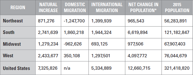
*If you take the time to calculate the numbers in this table—for which I would commend you for your interest in “counting”—you will notice that the sums of the natural increases, domestic migration, and international migrations do not necessarily add up to the net changes in population. This is because the U.S. Census Bureau includes a “residual” in this number to account for “changes in the population that cannot be attributed to any specific demographic component.” I toyed with using the “true” net change in population numbers according to calculating the aforementioned sums but decided that for the sake of consistency I should utilize the “official” numbers despite the odd variance and potential confusion that might ensue should a reader count my sums.
It is interesting to note that the regions with the smallest overall populations, the Northeast with almost 56.3 million and the Midwest with around 67.9 million, experienced large outflows of resident domestic migration, while the West (about 75 million) and particularly the South (just over 121 million) experienced healthy inflows. This would seem to follow the adage of “people want to go where the people are.”
Also of significance within the “Components of Population Change 2010–2015” table is the large population number of international migrations. With the 5,334,889 international migrants representing just under 43 percent of the country’s growth, the United States remains very much a nation of immigrants.
State population trends are far more complicated than regional trends, but in general states in the South and West experienced the healthiest population increases from 2000 to 2015. The states of Texas (plus more than 6.6 million), California (plus almost 5.3 million), and Florida (plus about 4.3 million) experienced the largest numerical population increases, followed by Georgia (plus 2 million), North Carolina (plus 2 million), and Arizona (plus 1.7 million). On the opposite end of the spectrum, Rhode Island (plus 7,615), Michigan (plus 16,357) and West Virginia (plus 43,767) recorded the smallest population increases during the 2000 to 2015 time frame.
But these large and small numbers tell only part of the story for these states, much as the numbers for the other states tell only part of their story. California’s growth numbers, while certainly big, have significantly subsided from previous decades when it held the title of fastest-growing state, and domestic migration has reversed for perhaps the first time in history, with the state recording out-migration of more than a quarter million people between 2010 and 2015. Or take Michigan, which experienced a loss of about 54,000 residents between 2000 and 2010, but gained back over 38,000 between 2010 and 2015, thanks to a favorable birth-to-death ratio (net migration losses amounted to almost 100,000 during this time). Even Florida, with the second largest numerical increase, experienced a period of population decline, albeit brief, following the housing market meltdown of 2008. Or take North Dakota, which was suffering population declines in the early 2000, only to experience significant migratory population gains in recent years due to the shale oil boom—little doubt that North Dakota will soon see signs of domestic migration reversal with the relative collapse of the price of oil.
And I’m just scratching the surface with regard to how complicated each state’s demographics can be. In fact, during the various research I’ve conducted, I am always amazed by how different each state can be with regard to its respective demographics. Take my own state, Connecticut. Because Generations X and Y are proportionally smaller than that of the nation as a whole, and its Baby Boomer population is proportionally much bigger than that of the rest of the country, we Boomers still totally rule the roost. In fact, Generation Y, which is set to have such a big impact on the rest of the country, is, relatively speaking, a nonevent in the state of Connecticut.
And other than Fairfield County, international migration is not boosting Connecticut’s population ranks, as the 104,537 domestic residents who moved out of the state between 2010 and 2015 were not supplanted by the 88,195 international migrants who moved into the state.
Hispanics? Sure, there are almost 500,000 within the state’s 3.6 million population, but almost 60 percent of them are second- and third-generation Puerto Ricans. And, as these Puerto Ricans are essentially Americans and share a similar relative low fertility rate, they are unlikely to provide a population boost similar to that of the rest of the nation’s Hispanic influx.
While I’m happy to be ruling the roost in Connecticut, I know that the state’s demographics portend trouble ahead. Our Baby Boomer population is poised to overwhelm the state’s healthcare and senior care services, with elderly populations set to rise from 44 percent to more than 125 percent by 2025 depending upon the town. My own town of Haddam is projected to see its elderly population more than double in the next ten short years. Meanwhile, we don’t have a robust Generation X and Y following on our heels, and their smaller numbers might hinder their ability to carry our load. Adding insult to injury, Generation Z is also coming up quite short compared to the rest of the country. The state’s youth population age 25 and under is projected to drop by almost 7 percent over the next ten years. It is clear that Connecticut towns will need to take a hard look at closing and consolidating schools. The upside is that schools are far and away the biggest local tax burden. Will taxes go down? They should. But don’t get excited—diminishing populations of children don’t bode well for the future of any Connecticut town. I am hoping that the remaining Generation Y young married couples have three kids each!
While people are people, demographers also keep track of the racial and ethnic composition of populations. This has become increasingly important in recent years, as the nation’s population growth is no longer being driven by the majority White population. As you may recall from Chapter 4, Hispanics are experiencing the greatest rate of growth, while the White population is hardly growing at all. In fact, Whites are expected to lose their majority status by about 2045 if not sooner. Of course, there will be regional variations in the growth, or lack thereof, as you will see in the coming chapters on each region.
TABLE 11.5
RACIAL AND ETHNIC COMPOSITION OF U.S. POPULATION 2014
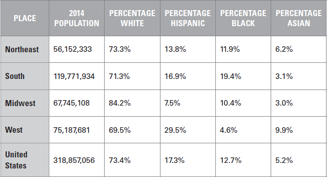
*Because Hispanic is not a “race,” and not all “races” are accounted for, the percentages in this table are not supposed to add up to 100. The percentages of each of these population groups should be considered individually in relation to the total population.
At this juncture, I’m going to ask you to consider what you’ve learned in this chapter and to apply this demographic information to your business acumen.
What do you take away from this demographic sketch of the regions and commentary on a few states? That you should avoid the Northeast and Midwest and focus on the South and West? That Texas, California, and Florida represent boomtowns, while Michigan, West Virginia, and Rhode Island are turning into wastelands? That Connecticut’s healthcare sector is about to be overburdened to the point of catastrophe?
Well, not exactly what I was looking for from you, but if such thoughts are crossing your mind it means that you are considering the implications of the demographics. And that is the point of this whole book—to show you the demographics while encouraging you to always consider their implications. And thus far you have learned how to count the people and figure out who they are, and now you are learning about where they are and where they are likely to go and/or grow. Please keep considering the potential implications as we explore these three dynamics with a closer look at each of the regions and their states.