The WPF (Windows Presentation Foundation) Designer allows you to build WPF windows interactively much as the Windows Forms Designer lets you build Windows Forms. It provides a WYSIWYG (what you see is what you get) surface where you can add controls to a window. If you select one or more controls on the designer's surface, the Properties window displays the objects' properties and lets you edit many of them.
In addition to the WYSIWYG design surface, the designer provides an XAML (Extensible Application Markup Language) code editor. Here you can view and edit the XAML code that defines the user interface. This lets you edit properties and arrange controls in ways that are impossible using the WYSIWYG designer.
This chapter provides an introduction to the WPF Designer. It explains how to add controls to a window, move and size controls, set control properties, and add code to respond to control events.
Visual Studio's Windows Forms Designer has been around for a long time and over the years it has become extremely powerful. In contrast, the WPF Designer is relatively new and lacks many of the features included in its more mature cousin.
Although the WPF Designer is a WYSIWYG tool, it has a lot of weak spots. A small sampling of these weaknesses includes:
You cannot graphically put controls inside controls that are not primarily used as containers. For example, you cannot graphically put a Grid control inside a Button. You need to resort to XAML to do this.
The Properties window does not provide editors for many types of objects, and many of the editors it does provide are incomplete. For example, the Properties window provides no tools for recording property animations and no tools for building styles or templates.
The Properties window provides no descriptions for the selected property, so you must look in the documentation for help. Even the tooltips are weak, saying things like ClickMode: ClickMode.
The designer surface has no snap-to-grid mode.
The XAML code editor's IntelliSense is incomplete and doesn't provide help in many places where it would be useful (although it's much better than nothing).
The WYSIWYG designer has enough weaknesses that it is often easier to build parts of a user interface by using the XAML code editor. For example, the designer provides no methods for making resources, styles, and templates, three items that are essential for building a maintainable interface. Fortunately, these things are not too difficult to build in the XAML code editor.
In all fairness, the WPF Designer has improved greatly since its first version and includes several enhancements added since the previous version, including better enumerated property support and primitive brush editors. It also crashes much less often and gets confused about how to draw its controls much less frequently. Hopefully it will catch up with the Windows Forms Designer some day.
All of these issues aside, the WPF Designer is a powerful tool. It lets you quickly build the basic structures of a WPF window and layout controls. You may need to rearrange controls somewhat and build additional elements such as resources and styles in the XAML editor, but the WYSIWYG surface can get you started.
Though the XAML editor also has shortcomings, it does provide the tools you need to fine-tune the user interface initially built by the designer surface. Together the two pieces of the WPF Designer give you everything you need to build aesthetically pleasing and compelling WPF user interfaces.
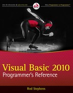
Figure 5-1 shows the Visual Studio IDE displaying the WPF Designer. You can rearrange the IDE's windows, but normally the Toolbox is on the left and the Properties window is on the right, below Solution Explorer. The WPF Designer is shown in the middle with its WYSIWYG design surface on top and its XAML code editor on the bottom.
You can click the up and down arrow label between the WYSIWYG designer and the XAML editor to make the two switch panes. This is useful if you make one pane large and the other small. Then you can quickly switch back and forth, moving the one you want into the bigger pane as you move from using the WYSIWYG designer to the XAML editor.
If there is an error in the XAML code, the designer may display a message at its top indicating that there are errors. You can click that label to open the Error list to see the types of errors. You can then fix them in the XAML editor and refresh the designer.
The WPF Designer allows you to add controls to a form in several ways that are similar to those provided by the Windows Forms Designer. If you are familiar with that topic you might want to skip this section.
First, if you double-click a control on the Toolbox, Visual Studio places an instance of the control on the window in a default location and at a default size. You can then use the mouse to move and resize the control.
Second, if you click a control in the Toolbox, the mouse cursor changes to a crosshair while the mouse is over the window. If you click the window, Visual Studio adds a control at that location with a default size. Instead of just clicking, you can click and drag to specify the new control's location and size.
If you hold down the Ctrl key when you select a tool from the Toolbox, that tool remains selected even after you create a control on the window so you can add another instance of the control. For example, suppose you need to create a series of TextBoxes to hold a user's name, street, city, state, and ZIP code. Hold the Ctrl key and click the TextBox tool in the Toolbox. Then you can quickly click five times to create the TextBoxes. Click another tool or the arrow tool in the Toolbox to stop adding TextBoxes.
When you first create a control, the designer selects it. The designer indicates that the control is selected by surrounding it with light gray boxes. In Figure 5-1, the button in the lower right is selected.
To select a control on the designer later, simply click it. You can also click and drag to select a group of controls. As you drag the mouse, the designer displays a rectangle so you can tell which controls will be selected. When you release the mouse button, all of the controls that overlap the rectangle at least partly are selected.
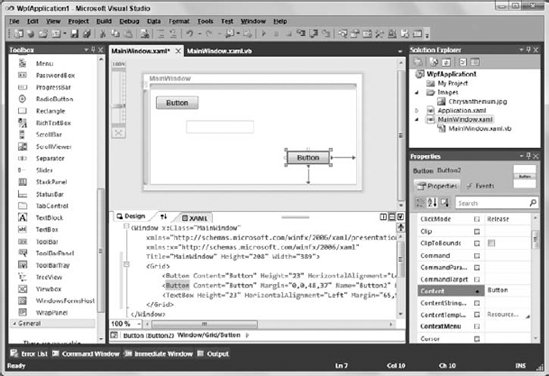
When you select a group of controls, the designer surrounds them with little marks that look like crop marks or frame marks. In Figure 5-2, the text box and the lower-right button are selected.
After you have selected some controls, you can Shift+Click to add new controls to the selection or Ctrl+Click to toggle a control's membership in the selection. You can also Shift+Click-and-drag or Ctrl+Click-and-drag to add or toggle groups of controls from the selection.
Note
You can quickly deselect all controls by pressing the Escape key.
A particularly useful technique for building a series of similar controls is to build one and then use copy and paste to make others.
For example, suppose you want to build a contact form with fields for name, street, city, state, and ZIP code. You could build a Label control that contains the text "Name" and a TextBox next to it. You can set the TextBox's properties such as its size, MaxLength, and MaxLines properties. Then you can click and drag to select both controls, press Ctrl+C to copy them to the clipboard, and press Ctrl+V to paste new copies of the controls onto the window. The new TextBox will have the same size, MaxLength, and MaxLines properties as the original TextBox, and will be next to the new Label. You can then drag the two controls into position and paste again to make two more.
Moving most controls in the WPF Designer is easy. Simply click and drag the control to its new position.
Container controls work slightly differently. When you select a container such as a Grid, StackPanel, or WrapPanel, the designer displays a drag handle above and to the left of the control. This handle looks like a small box containing arrows pointing up, down, left, and right. Click and drag this handle to move the container and the controls it holds.
To move a group of controls, select the controls that you want. Then click one of the controls and drag to move the whole group. If one of the controls is a container, you can click and drag its move handle to reposition the group.
Note that you can drag controls in and out of container controls such as the Grid or StackPanel. When you drag a control over a new container, the cursor acquires a little curvy arrow and the designer grays out the rest of the window's controls so only the new container is white and you can see where the control will land if you drop it.
As you drag a control, the designer displays snap lines to show how the control lines up with other controls. It displays lines when the control's edges align with another control's edges. For some controls, it displays lines when the control's text baseline aligns with the text baseline of other controls.
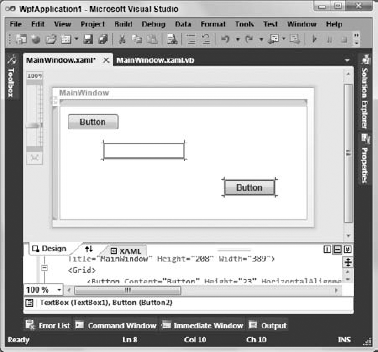
Figure 5-3 shows the designer dragging the lower button. Four snap lines show that this control's edges line up with the left and right edges of the upper button, the left edge of the GroupBox control at the bottom, and the upper edge of the Ellipse control to the right. Numbers on each snap line show the distance between the moving control and the controls with which it is aligned.
Resizing a control is almost as easy as moving one. Click a control to select it. Then click and drag one of its edges or one of the light gray boxes surrounding the control to change its size.
WPF controls provide a fairly complex set of properties to determine how they are anchored to their containers. Fortunately, the WPF Designer provides aids to make understanding control anchoring easier.
When you select a control, the designer displays symbols next to the control's edges showing how it is anchored. An arrow from the control's edge to the corresponding container edge means the control's edge remains the same distance from the container's edge even when the container resizes. In Figure 5-1, the selected button's lower and right edges are connected to its container's lower and right edges. When the window resizes, the button moves to stay the same distance from those edges.
A circle near the selected control's edge means that edge remains the same distance from the control's opposite edge. In Figure 5-1, the circles mean the selected button's left and top edges move when its lower and right edges move, so the control stays the same width and height.
If the button's left and top edges were also connected to the container with arrows, the button would grow when the container grew.
You can easily change a control's edge anchors by simply clicking the symbol. If you click a circle, the designer changes that anchor to an arrow and vice versa.
When you select a control, the Properties window allows you to view and edit the control's properties. For Boolean properties, the Properties window displays a box that you can check or uncheck to indicate whether the property's value should be True or False.
For many other properties, you can simply click the property and type a new value for the control in a text box. Unfortunately, the Properties window doesn't give you much help, and you need to know what to type.
For example, you can set a control's Margin property to a blank string to indicate no margins; to a single number to make its left, top, right, and bottom margins the same; to two numbers separated by commas to set the control's left/right and top/bottom margins; or to four numbers separated by commas to set the control's left, top, right, and bottom margins, respectively. You cannot set this property to three numbers or more than four numbers, but the Properties window doesn't give you any hints that this is the case.
If you select a group of controls, you can sometimes use the Properties window to give all of the controls the same property value all at once. For example, suppose you select a group of TextBoxes. Then you can use the Properties window to give them the same values for their Width, Height, Margin, MaxLength, and many other properties.
Sometimes, this even works if you select different kinds of controls at the same time. For example, if you select some TextBoxes and some Labels, you can set all of the controls' Width, Height, and Margin properties at the same time. You cannot set the controls' MaxLength properties because the Labels do not have a MaxLength property.
After you have added the appropriate controls to a form and set their properties, the next step is to add code to the form that responds to control events and manipulates the controls.
You can add some kinds of code declaratively in the XAML editor. For example, you can make a trigger respond to a change in a control's property or to a control's event.
You can also write Visual Basic source code to respond to control events just as you would in a Windows Forms application. If you double-click a control on the WPF Designer, Visual Studio creates an empty event handler to catch the control's default event, and it opens the event handler in the code editor.
For example, the following code shows the event handler the IDE built for a Button control. The default event for a Button is Click so this code is a Click event handler. Note that I added the line continuation in the first line so that it would fit in the book. Visual Studio makes that all one long line.
Private Sub Button1_Click(ByVal sender As System.Object, _
  ByVal e As System.Windows.RoutedEventArgs) Handles Button1.Click

End Sub
Private Sub btnExit_Click() Handles btnExit.Click

End Sub
Another way to build an event handler and open the code editor is to select the control on the WPF Designer. Then click the Events icon (the lightning bolt) near the top of the Properties window to make the window show a list of events for the control. Double-click an event in the window to open a new event handler for it in the code editor.
You can also create a new event handler within the code editor. The upper-left part of the code editor displays a dropdown listing the window's controls. If you select a control from the list, you can then pick an event for that control from a second dropdown in the code editor's upper right. If you select an event, the code editor makes a corresponding empty event handler.
The WPF Designer allows you to build windows for use in WPF applications. It lets you add controls to the window, and to resize and move the controls. Together with the Properties window, it lets you view and modify control properties, and create event handlers to interact with the controls.
This chapter introduces the WPF Designer and explains how you can take advantage of its features. Other chapters provide much more of the detail that is necessary for building windows. Chapter 11, "Selecting WPF Controls," and Chapter 12, "Using WPF Controls," provide more information about the kinds of controls you can use with the WPF Designer. Chapter 13, "WPF Windows," says more about WPF windows and pages.
Chapter 6, "Visual Basic Code Editor," describes the code editor that you can use to edit the code that sits behind Windows Forms and WPF control events. Later chapters explain the Visual Basic language that you use within the code editor.