Visual Basic .NET provides a rich assortment of controls that you can use to build applications. Nevertheless, those controls may not always be able to do what you need. In that case, you may want to build a control of your own. Building your own control lets you get exactly the behavior and appearance that you want.
Custom controls solve three significant problems. First, they let you package a particular behavior or appearance so that you can easily reuse it later. If you need to draw one engineering diagram, you can draw it on a PictureBox. If you need to draw many engineering diagrams (possibly in different applications), it would be easier to make an EngineeringDiagram control that can make all of the diagrams.
Second, developers are familiar with controls and comfortable using them. Any experienced Visual Basic developer understands how to create instances of a control, set its properties, call its methods, and respond to its events. If you build a custom control to perform some complex task, developers already know a lot about how to use it. You just need to explain the specific features of your control.
Finally, controls can easily save and restore property information at design time. A developer can set properties for a control at design time, and the control uses those properties at runtime. This is useful for graphical controls, where properties such as Text, BackColor, and BorderStyle determine the controls' appearance. It is also useful for non-graphical controls such as database connection, data adapter, DataSet, and DataView controls that use properties to determine what data is loaded and how it is arranged.
This chapter explains how to build custom controls. There are three main approaches to building custom controls.
First, you can derive a control from an existing control. If a control already does most of what you want your custom control to do, you may be able to inherit from the existing control and avoid reimplementing all of its useful features.
Second, you can compose your control out of existing controls. For example, you might want to make a color selection control that enables the user to select red, green, and blue color components by using scroll bars, and then displays a sample of the resulting color. You could build this control using three scroll bars and a PictureBox. This gives you the advantages provided by the constituent controls without requiring you to reimplement their functionality.
Third, you can build a custom control from scratch. This is the most work but gives you absolute control over everything that the control does.
This chapter explains the basics of building a control library project and testing its controls. It also describes the three approaches to building custom controls: deriving from an existing control, composing existing controls, and building a control from scratch.
A component is similar to a control that is invisible at runtime. Like controls, you can place components on a form at design time. Unlike controls, however, components do not sit on the form itself. Instead, they sit in the component tray below the form at design time, and they are invisible to the user at runtime. Most of this chapter's discussion of custom controls applies equally to custom components.
Building a custom control requires six basic steps:
Create the control project.
Make a Toolbox icon.
Test in the UserControl Test Container.
Make a test project.
Test the control in the test project.
Implement properties, methods, and events.
The following sections describe these steps.
To make a new control library in Visual Basic, select the File menu's New Project command, select the Windows Forms Control Library template, enter the project's name, and click OK. The library can contain several controls, so it may not always make sense to name the library after a single control. This example assumes that you are building a control that displays a smiley face. In that case, you might name the library FaceControls in case you want to add bored, sad, and other faces later.
Initially, Visual Basic gives the control library a single UserControl object named UserControl1. Change this file's name to something more descriptive such as SmileyFace. If you look at the file in the code editor, you should find that Visual Basic has automatically changed the control's class name to match.
Add code to the control to make it do whatever you want it to do. For a SmileyFace control, you might add properties such as FaceColor, NoseColor, and EyeColor. The control's Paint event handler will draw the smiley face.
Next use the Build menu to compile the control library. The project's bin directory contains the library's compiled .dll file.
If you add the control to the Toolbox now, you'll see a default image that looks like a gear. To make your control display something more meaningful, you must set its Toolbox icon.
You can set the control's Toolbox icon by adding a ToolboxBitmap attribute to the control's class. The constructor for the ToolboxBitmap attribute can take as parameters the name of the bitmap file, or a class that contains the bitmap resource to use, or a class and the name of a bitmap resource to use (if the class contains more than one bitmap resource). This section assumes that you will use the last method. See the online help for more information. The web page msdn.microsoft.com/system.drawing.toolboxbitmapattribute.aspx describes the ToolboxBitmapAttribute class and its constructors.
Open Solution Explorer and double-click the My Project entry to view the project's property pages. Click the Resources tab and open the Add Resource drop-down list. Select the Add Existing File command, and select the bitmap file to create a new bitmap resource. Double-click the new bitmap to open it in the integrated Bitmap Editor and modify it if necessary. Use the Properties window to make the bitmap 16 × 16 pixels in size.
Set the pixel in the lower-left corner to the color that you want to use as the Toolbox bitmap's transparent color. Visual Basic will replace the pixels having this color with the Toolbox's background color. Draw and save the bitmap, and then close it.
Click the bitmap file in Solution Explorer and open the Properties window. Select the file's Build Action property, click the drop-down arrow on the right, and select Embedded Resource. Now when you compile the control library, this bitmap will be embedded as a resource inside the .dll file.
Next, open the control's module in the code editor, and insert a ToolboxBitmap attribute in front of the control's class declaration, as shown in the following code. This example tells Visual Basic that the control's Toolbox icon should come from the SmileyFaceTool.bmp resource embedded in the SmileyFace class. Note the line continuation character at the end of the first line so that the ToolboxBitmap statement is on the same code line as the class declaration.
<ToolboxBitmap(GetType(SmileyFace), "SmileyFaceTool.bmp")>
Public Class SmileyFace
...
End Class
Now when you build the control library, the SmileyFace control includes the information it needs to display its Toolbox bitmap.
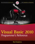
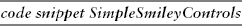
If you use the Debug menu's Start command to execute a control library project, Visual Studio displays a sample control in the UserControl Test Container shown in Figure 22-1. The drop-down list at the top lets you select different controls in the project. You can use the property grid on the right to experiment with different property values to see how the control behaves.
Example project FaceControls, which is available for download on the book's web site, contains the SmileyFace control shown in Figure 22-1.
As its name implies, the UserControl Test Container only displays UserControls. If you create a control that inherits from the Control class or from some other control, the UserControl Test Container does not list it and will not display it. In that case, you must skip this step and move on to the next one, making a test project.
The UserControl Test Container only lets you test UserControls, not those that inherit from the Control class or some other control. It also only lets you test a control's properties. You can see the control's design-time behavior, but not how its methods and events work at runtime.
To test controls that are not UserControls and to test the control's runtime behavior, you must build a test project. You can either build a completely separate project, or you can add a new Windows application to the control's project.
To add an application to the control's project, open the File menu's Add submenu and select New Project. Select the Windows Application template, give the project a meaningful name (such as FaceControlsTest), and click OK. This adds the test project to the same solution that already contains the control library.
To make Visual Basic start execution with the test project, open the Solution Explorer, right-click the new project, and select Set as StartUp Project.
The FaceControls example solution, which is available for download on the book's web site, contains the FaceControls control library in addition to the test application FaceControlsTest.
When you open the new project's form, the Toolbox will contain a FaceControls Components section (assuming that the control project is named FaceControls) that holds icons representing the controls defined by the control library. You can use these tools just as you would use any other control tools.
After you add it to the Toolbox, you can use the control on the test project's form just as you can use any other control. Click the Toolbox icon to select the control, and click and drag to place an instance of the control on the form. Double-click the control to place an instance of the control in a default location with a default size. Initially, Visual Basic sets the controls' names to their class's name followed by a number, as in SmileyFace1, SmileyFace2, and so forth.
Use the Properties window to set the controls' properties at design time. Use code to examine and modify the controls' properties, methods, and events at runtime.
At this point, you can test the control, but if you haven't given it any properties, methods, and events, you can only work with the default behavior that it inherits from its parent class. If the control is to do something useful, you must give it new properties, methods, and events.
Controls implemented from scratch often use Paint event handlers to draw the control. Composite controls often respond to events raised by their constituent controls and take actions, which may include raising new events for the form containing the control. (A composite control combines several other controls into a new control. For more information, see the section "Composite Controls" later in this chapter.)
When a developer places the control on a form, the Properties window automatically displays any public properties that are not read-only. This feature is remarkably intelligent. If a property has the Integer data type, the Properties window will only allow the developer to enter an integer. If a property has an enumerated type, the Properties window automatically displays a drop-down list containing the allowed values.
If a property has the Font data type, the Properties window automatically provides an ellipsis to the right of the property's value and displays a font selection dialog box if the user clicks it. Similarly, if the property is a Color, Image, or Date, the Properties window provides an appropriate dialog box or drop-down list to let the user select the property's value.
If a property's data type is OleDbDataConnection, DataSet, TextBox, Label, or some other control or component type, the Properties window provides a drop-down list that lets the developer select from any appropriate item on the form. If the data type is TextBox, the drop-down will list all of the form's TextBoxes.
In fact, the Properties window can even handle custom controls and components that you build yourself. For example, suppose that you create a control named EmployeeRegister. You can then create another control that has a property of type EmployeeRegister. If the developer selects the control, opens the Properties window, clicks that property, and clicks the drop-down arrow on the right, Visual Basic will display a list of any EmployeeRegister controls on the form.
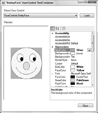
Even more miraculously, the Properties window can handle collections of objects that you define. For example, suppose your code defines a WorkItem class. It then defines a UserControl class named WorkItemLister that has a property named WorkItems of type List(Of WorkItem).
If you add a WorkItemLister object to a form and select it, the Properties window lists the WorkItems property's value as (Collection) and displays a drop-down arrow to the right. If you click the arrow, Visual Basic displays the collection editor shown in Figure 22-2. This collection editor lets you build WorkItem objects at design time.
Similarly, the UserControl Test Container can let you view and edit the control's WorkItem property.
Example project WorkItemControls, which is available for download on the book's web site, includes a control project containing WorkItem controls in addition to a test project.
After you perform the six basic steps for building a custom control, there are a couple more steps you may want to take.
When you create a control library, Visual Studio automatically adds the control to any other projects that are part of the same solution. If you create separate applications that are not part of the control library's solution, however, you must add the controls to the Toolbox manually. To add the controls, follow these steps.
Open a form in the form designer.
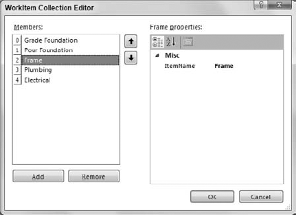
Right-click the Toolbox and select Choose Items.
On the Choose Toolbox Items dialog box shown in Figure 22-3, click the Browse button.
Select the .dll file in the control library's bin folder, and click Open to make the controls appear in the dialog's .NET Framework Components tab.
Select the check boxes next to the controls (they should be checked by default), and click OK.
If you change the control's Toolbox icon, you must rebuild the control library's .dll file. Then open the test project's form, right-click the Toolbox, select Add/Remove Items again, click the Browse button, and reselect the control library's .dll file.
You can modify a control's behavior by adding attributes to its properties, methods, and events, and to its Class statement. The following code demonstrates some of the most useful control (or component) and property attributes for a UserControl named EmployeeRegister:
Imports System.ComponentModel

<ToolboxBitmap(GetType(EmployeeRegister), "EmployeeRegisterTool.bmp"),
 DefaultProperty("TextValue"),
 DefaultEvent("TheEvent"),
 DesignTimeVisible(True)>
Public Class EmployeeRegister
    ' Declare a public event.
    Public Event TheEvent()
    ' The TextValue property.
    Private m_TextValue As String = "Default Value"
    <Description("The object's text value."),
     Category("String Values"),
     Browsable(True),
     DefaultValue("Default Value")>
    Public Property TextValue() As String
        Get
            Return m_TextValue
        End Get
        Set(ByVal value As String)
            m_TextValue = value
        End Set
    End Property
End Class
The ToolboxBitmap attribute tells Visual Basic that it can find a Toolbox bitmap for the class in the assembly containing the EmployeeRegister type, and that the bitmap resource's name is EmployeeRegisterTool.bmp.
The DefaultProperty attribute sets the component's default property. If you click an EmployeeRegister control in the form designer, the property named TextValue is initially selected in the Properties window.
The DefaultEvent attribute indicates the component's default event. If you double-click an EmployeeRegister control in the form designer, Visual Basic opens the code editor and displays the control's default event handler.
The DesignTimeVisible attribute determines whether the component is visible on the form designer at design time. If you set this to False, the control or component does not appear in the Toolbox. You can use this attribute to build a control that the program can create and manipulate at runtime but that the developer cannot create at design time.
The TextValue property's Description attribute gives the text displayed at the bottom of the Properties window when you select the property.
The Category attribute determines the category that contains the property when you select the Property window's Categorized button. This attribute's value can be any string. The Property window will make a new category with this name if it doesn't name an existing category.
The Browsable attribute determines whether the Property window displays the property. If you set this value to False, developers cannot set the property's value at design time.
Finally, the DefaultValue property determines the default value for the property. If you set a control's property to this value, Visual Basic does not store the property's value with the form. Later, when it reloads the form, Visual Basic does not load any value for the property. This code shows one way to initialize a property's value when it declares Private m_TextValue As String = "Default Value". To avoid confusion, you should generally initialize the private variable representing a property to the same value you set with DefaultValue attribute.
When you right-click a property in the Properties window and select the Reset command, Visual Basic sets the property to the value defined by the DefaultValue attribute. This is particularly useful for images and other objects where you might want to make the default value Nothing.
Example project EmployeeRegisterTest, which is available for download on the book's web site, includes the EmployeeRegister control.
You can learn more about the ToolboxBitmap attribute at msdn.microsoft.com/system.drawing.toolboxbitmapattribute.aspx. You can learn more about other attribute classes at msdn2.microsoft.com/library/2e39z096.aspx.
A control or component can use its predefined DesignMode property to determine whether it is running at design time or runtime and take different actions if that is appropriate. For example, a control might allow the developer to manipulate its data directly at design time but prevent the user from changing the data at runtime.
The following code shows how the control can check whether it is running at design or runtime:
If Me.DesignMode Then
    '  Let the developer manipulate the data at design time.
    ...
Else
    ' Don't let the user change the data at run time.
    ...
End If
Example project ShowModeTest, which is available for download on the book's web site, includes a simple control that displays a label indicating whether it is running in design mode or run mode.
If an existing control does almost what you need to do, you can derive a new control from the existing one. That enables you to take advantage of all of the existing control's features while adding new ones of your own.
To make a derived control, start a control library project as usual and give the library a meaningful name. Discard the default UserControl1 class, add a new class, and give it an appropriate Inherits statement. For example, the following code derives the RowSortingListView class from the ListView class:
Public Class RowSortingListView
    Inherits ListView

End Class
That's about all there is to building a derived control. Now you just need to write code that implements new features and modifies inherited features. One particularly common task for derived controls is overriding the functionality provided by the parent control class. The RowSortingListView control provides a good example.
The standard ListView control lets a program display data items with subitems in a variety of ways. The control can display items as large icons, small icons, a list showing the items' names, or a detail list showing the items and their subitems. The list and detail displays even allow you to sort the items in ascending and descending order. Unfortunately, the ListView control doesn't use the subitems in the sort even to break ties. It sorts only on the main items' names.
For example, suppose that several items all have the item value Book and their first subitems contain book titles. If you set the ListView control's Sorting property to Ascending or Descending, the control will group these items together because they all have the same item value: Book. Unfortunately, the items' order in the list is arbitrary. The control does not sort the Book items by their titles.
Fortunately, the ListView control provides a back door for implementing custom sort orders. To implement a custom sort order, you set the ListView control's ListViewItemSorter property to an object that implements the IComparer interface. To satisfy the interface, this object must provide a Compare function that compares two ListView items and returns −1, 0, or 1 to indicate whether the first item should be considered less than, equal to, or greater than the second item.
The ListViewComparerAllColumns class shown in the following code implements the IComparer interface. Its private m_SortOrder variable tells the object whether to sort in ascending or descending order. The class's constructor takes a parameter that sets this value. The Compare function converts the generic Objects that it is passed into ListViewItems. It calls the ListViewItemValue helper function to get strings containing the items and their subitems separated by Tab characters. It then uses the String class's Compare method to determine which value should come first in the sort order.
' Implements a ListViewItem comparer
' that sorts on all columns.
Private Class ListViewComparerAllColumns
    Implements IComparer

    ' Ascending or Descending.
    Private m_SortOrder As SortOrder

    ' Initialize with a sort order.
    Public Sub New(ByVal sort_order As SortOrder)
        m_SortOrder = sort_order
    End Sub

    ' Compare two items' subitems.
    Public Function Compare(ByVal x As Object, ByVal y As Object) As Integer _
     Implements System.Collections.IComparer.Compare
        ' Get the ListViewItems.
        Dim item_x As ListViewItem = DirectCast(x, ListViewItem)
        Dim item_y As ListViewItem = DirectCast(y, ListViewItem)
        ' Get the ListViewItems' values.
        Dim values_x As String = ListViewItemValue(item_x)
        Dim values_y As String = ListViewItemValue(item_y)

        ' Compare the values.
        If m_SortOrder = SortOrder.Ascending Then
            Return String.Compare(values_x, values_y)
        Else
            Return String.Compare(values_y, values_x)
        End If
    End Function
    ' Return a delimited string containing all of
    ' the ListViewItem's values.
    Private Function ListViewItemValue(ByVal lvi As ListViewItem,
     Optional ByVal delimiter As String = vbTab) As String
        Dim txt As String = ""
        For i As Integer = 0 To lvi.SubItems.Count − 1
            txt &= delimiter & lvi.SubItems(i).Text
        Next i
        Return txt.Substring(delimiter.Length)
    End Function
End Class

The RowSortingListView control uses the ListViewComparerAllColumns class and the following code to sort its data using all of the items' values and their subitems' values. To provide the new sorting behavior, the control must override the Sorting property defined by the parent ListView class.
' Reimplement the Sorting property.
Private m_Sorting As SortOrder
Public Shadows Property Sorting() As SortOrder
    Get
        Return m_Sorting
    End Get
    Set(ByVal Value As SortOrder)
        ' Save the new value.
        m_Sorting = Value
        ' Make a new ListViewItemSorter if necessary.
        If m_Sorting = SortOrder.None Then
            MyBase.ListViewItemSorter = Nothing
        Else
            MyBase.ListViewItemSorter =
                New ListViewComparerAllColumns(m_Sorting)
        End If
    End Set
End Property

The control defines a private m_Sorting variable to store the property's value and declares property procedures to let the program get and set it. The property is declared with the Shadows keyword, so it hides the definition of the parent class's Sorting property. That prevents the developer or a program that uses the RowSortingListView control from using the original ListView version of the property.
The Sorting Property Get procedure simply returns the value of m_Sorting.
The Property Set procedure saves the new value. Then if the new Sorting value is None, the code sets the control's inherited ListViewItemSorter property to Nothing to remove any previously installed sorter object. If Sorting is not None, the code sets the control's ListViewItemSorter property to a new ListViewComparerAllColumns object configured to sort the items in the proper order.
Adding new properties and methods that don't shadow those of the base class is even easier. Simply declare the property or method as you would for any other class. You can also create new events for the derived control just as you would add events to any other class.
Example program RowSortingListViewTest, which is available for download on the book's web site, demonstrates the RowSortingListView control.
The RowSortingListView control's code implements a Sorting property that shadows the property in its parent class. You can provide new versions of methods and events in the same way.
For example, normally, the ListView control raises a ColumnClick event when the user clicks a column header. By default, the RowSortingListView control inherits that behavior, so it also raises the event when the user clicks a column header.
The following code replaces the parent class's ColumnClick event with a new version. The event declaration uses the Shadows keyword so this version hides the parent's version from the program that uses the RowSortingListView control so the program cannot receive the original version of the event.
The inherited version of ColumnClick passes the event handler a parameter that gives information about the event. The new version just returns the index of the column clicked. The control's ColumnClick event handler (which handles the MyBase.ColumnClick event) raises the new event handler. The control could also raise the event from some other code or not at all.
Public Shadows Event ColumnClick(ByVal column_number As Integer)

Private Sub RowSortingListView_ColumnClick(ByVal sender As Object,
 ByVal e As System.Windows.Forms.ColumnClickEventArgs) _
 Handles MyBase.ColumnClick
    RaiseEvent ColumnClick(e.Column)
End Sub
The following code shows how a program could handle the new event. This code simply displays the column number that the user clicked.
Private Sub RowSortingListView1_ColumnClick(ByVal column_number As Integer) _
 Handles RowSortingListView1.ColumnClick
    MessageBox.Show(column_number)
End Sub

Example program RowSortingListViewTest demonstrates this technique.
In the same way, you can shadow a method provided by the parent class. The following code shows how the RowSortingListView class can replace its parent's Clear method. Instead of removing all of the data from the control, this version removes only items with text value "Book."
Public Shadows Sub Clear()
    For Each item As ListViewItem In Me.Items
        If item.Text = "Book" Then item.Remove()
    Next item
End Sub

Sometimes you might want to completely hide a parent feature rather than replace it with a new version. For example, suppose you want to make a grid-like control that uses some of the special features of the ListView control. You decide to derive your control from the ListView control, but you don't want to write code to handle any of the control's display modes except the detail view. You can rely on developers' common sense and ask them not to use features that involve other display modes, or you can hide those features to prevent the developers who use your control from doing something stupid. In that case, you need to hide the properties, methods, and events that deal with the other display modes.
Hiding an event is easy. Declare a new event with the Shadows keyword as described in the previous section and then never raise the event. A program using the control can write an event handler for the event, but it will never be called.
Unfortunately, you cannot completely hide inherited properties and methods from the program using the control, but you can shadow them and make the new version do nothing or throw an exception. The following code declares a shadowing version of the ListView control's Clear method. If the program invokes this method, the control throws the MissingMethodException.
Public Shadows Sub Clear()
    Throw New System.MissingMethodException("RowSortingListView", "Clear")
End Sub
The following code defines a shadowing version of the Tag property. It gives the property the BrowsableAttribute with the value False. This prevents the property from appearing in the Properties window at design time. If the program tries to read or set the control's Tag property at runtime, the control throws a MissingFieldException.
<System.ComponentModel.BrowsableAttribute(False)>
Public Shadows Property Tag() As Object
    Get
        Throw New System.MissingFieldException("RowSortingListView", "Tag")
    End Get
    Set(ByVal Value As Object)
        Throw New System.MissingFieldException("RowSortingListView", "Tag")
    End Set
End PropertyA composite control combines several existing controls into one new control. For example, the ColorScrollerTest program, which is available for download on the book's web site and shown in Figure 22-4, defines a ColorScroller control that contains three labels, three scroll bars, and a panel. At runtime, the user can drag the scroll bars to select a color's red, green, and blue components. The control displays a sample of the color in the panel on the right.
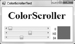
Figure 22.4. The ColorScroller control lets the user select a color interactively by dragging scroll bars.
To build a composite control, start a new control library project as usual. Give the library a meaningful name, and change the name of the default control UserControl1 to something more descriptive.
Next, in Solution Explorer, double-click the control to open it in the form designer. Use the Toolbox to add constituent controls to the UserControl just as you would add controls to a form. Set the controls' design-time properties using the Properties window.
Edit the code of the UserControl to make the constituent controls work together to provide the behavior that you want. For the ColorScroller control shown in Figure 22-4, you would make the scroll bars' events adjust the color displayed in the sample area on the right. You can handle the constituent controls' events, get and set their property values, and invoke their methods. You can also define new properties, methods, and events for the composite control.
The following code shows how the ColorScroller control works. It starts by declaring the ColorChanged event to tell the program when the user changes the control's selected color. It then includes property procedures that define the SelectedColor property. The Property Get procedure uses the Color class's FromArgb to convert the scroll bars' values into a color. The Property Set procedure sets the control's Red, Green, and Blue properties to the components of the new Color value. The Red Property Get procedure returns the value of the red scroll bar. The Property Set procedure sets the red scroll bar's value, displays the value in the red label, displays a sample of the current color, and raises the ColorChanged event. The Green and Blue property procedures are basically the same so they are not shown here. When the user changes the red scroll bar's value, the hbarRed_Scroll event handler sets the control's new Red property value. The event handlers for the Green and Blue scroll bars are similar, so they are not shown here.
Public Class ColorScroller
    ' Tell the program that the color has changed.
    Public Event ColorChanged(ByVal new_color As Color)

    ' Get or set the currently selected Color.
    Public Property SelectedColor() As Color
        Get
            Return Color.FromArgb(
                255,
                hbarRed.Value,
                hbarGreen.Value,
                hbarBlue.Value)
        End Get
        Set(ByVal value As Color)
            Red = value.R
            Green = value.G
            Blue = value.B
        End Set
    End Property
    ' Get: Return the color component value.
    ' Set: Set the scroll bar value,
    '      display the color, and
' raise the ColorChanged event.
Public Property Red() As Byte
Get
Return CByte(hbarRed.Value)
End Get
Set(ByVal Value As Byte)
hbarRed.Value = Value
lblRed.Text = hbarRed.Value.ToString
panSample.BackColor = SelectedColor
RaiseEvent ColorChanged(SelectedColor)
End Set
End Property
' Green and Blue property procedures omitted...
' The user has changed a color value.
' Set the appropriate color component value.
Private Sub hbarRed_Scroll() Handles hbarRed.Scroll
Red = CByte(hbarRed.Value)
End Sub
' Green and Blue scroll bar Scroll event handlers omitted..
End Class
Composite controls are useful when you can build the behavior you want by using existing controls. They are most useful when you will need to use the combined controls many times, either in the same application or in several applications. If you need to implement these features only once, you can simply place the constituent controls right on a form and include code to handle their events.
Composite controls are also useful for keeping the related controls and their code together. This keeps the details of the controls and their code separate from the rest of the application. If the interactions among the controls are complex, it may make sense to build a separate UserControl to simplify the project.
Composite controls (or any control, for that matter) also provide a nice, clean separation between developers. If you build a complex control and add it to a large project, other developers can interact with the control only through the properties, methods, and events that it exposes. They cannot access the constituent controls directly, and that removes a potential source of bugs.
If no existing control or group of controls can provide the behavior that you want, you can build a control completely from scratch.
To build a control from scratch, start a new control library project as usual. Give the library a meaningful name and remove the default control UserControl1.
Add a new class, open it in the code editor, and add the statement Inherits Control. Then add whatever code you need to make the control do what you want.
The following code shows how the SimpleSmiley control works. When the control receives a Paint or Resize event, it calls subroutine DrawFace, passing it the Graphics object on which it should draw. Subroutine DrawFace clears the control using the parent's background color. It then calls a series of Graphics object methods to draw a smiley face on the control's surface. This drawing code isn't terribly relevant for this discussion, so it is omitted here to save space.
<ToolboxBitmap(GetType(SimpleSmiley), "SmileyFaceTool.bmp")>
Public Class SimpleSmiley
    Inherits Control
    Private Sub SimpleSmiley_Paint(ByVal sender As Object,
     ByVal e As System.Windows.Forms.PaintEventArgs) Handles Me.Paint
        DrawFace(e.Graphics)
    End Sub
    Private Sub SimpleSmiley_Resize(ByVal sender As Object,
     ByVal e As System.EventArgs) Handles Me.Resize
        Me.Invalidate()
    End Sub
    ' Draw the smiley face.
    Private Sub DrawFace(ByVal gr As Graphics)
        If (Me.ClientSize.Width = 0) Or
           (Me.ClientSize.Height = 0) Then Exit Sub

        gr.Clear(Me.BackColor)
        gr.SmoothingMode = Drawing2D.SmoothingMode.HighQuality
    ' Drawing code omitted...
    End Sub
End Class
Example solution SimpleSmileyControls uses similar code to build a SimpleSmiley control. The test program SimpleSmileyControls demonstrates the control.
When you build your own control from scratch, you can make it do just about anything that you like. The obvious drawback is that you need to write code to make it do everything that you want. If there's already a control that does almost what you need, it is generally easier to derive a control from that one rather than building one from scratch.
If you can display the data in standard controls such as Label, TextBox, or TreeView controls, it would be easier to build a composite control. If you must display information by drawing it yourself anyway, a composite control won't help, so you might want to use this kind of control. For example, if you are building a mapping or drafting system, you might want to build a control from scratch to load and display maps and architectural drawings.
A component is basically a control with no visible appearance at runtime. Instead of appearing on the form at design time, a component appears in the component tray below the form. Figure 22-5 shows a form containing several components.
You can select a component in the component tray and then view and modify its properties in the Properties window. In Figure 22-5, the FontDialog1 component is selected, so the Properties window is displaying that component's properties.
Building a component is just as easy as building a control. In fact, components are often easier to build because they don't have any visible components to implement and debug.
To make a new component, open the Project menu and select Add Component. Leave the Component Class template selected, enter the name you want to give the component, and click OK.
Because a component is invisible at runtime, the component designer (the component's equivalent of the form designer) does not display a visible area. The designer does have a component tray, however, and you can place other components there to build composite components much as you can build composite controls.
You can add properties, methods, and events to the component just as you would add them to a control. You can also use the same attributes to modify the component and its properties and events. For example, you can give the component a Toolbox bitmap, a default property and event, add descriptions to properties, and assign properties to categories. In addition to displaying the bitmap in the Toolbox, Visual Basic also displays it in the component tray below the form when you add an instance of the component to the form.
You can make a control invisible at runtime by setting its Visible property to False. For example, the following code shows how the InvisibleControl class works. Whenever it needs to draw itself, the control's DrawControl method sets the control's Visible property equal to its DesignMode property, so the control is visible at design time and hidden at runtime.
Public Class InvisibleControl
    Private Sub InvisibleControl_Paint(ByVal sender As Object,
     ByVal e As System.Windows.Forms.PaintEventArgs) Handles Me.Paint
        DrawControl(e.Graphics)
    End Sub

    Private Sub InvisibleControl_Resize() Handles Me.Resize
        Me.Invalidate()
    End Sub

    Private Sub DrawControl(ByVal gr As Graphics)
        Me.Visible = Me.DesignMode

        gr.Clear(Me.BackColor)
        Dim pen_wid As Integer =
            (Me.ClientSize.Width + Me.ClientSize.Height)  20
        Using the_pen As New Pen(Me.ForeColor, pen_wid)
            gr.DrawEllipse(the_pen,
                pen_wid  2, pen_wid  2,
                Me.ClientSize.Width - pen_wid,
                Me.ClientSize.Height - pen_wid)
        End Using
    End Sub
End Class
Example program InvisibleControlTest, which is available for download on the book's web site, uses similar code in its InvisibleControl.
If you want a control to be invisible at runtime, you should consider making it a component instead of a control. Components take fewer resources and don't take up space on the form at design time. The only reason you should use the Visible property to make a control invisible is if you want it to display some sort of complex data at design time, instead of an icon in the component tray, and you want the data hidden from the user at runtime.
There are several ways you can build objects that sit on a form at design time. Depending on the features you need, these objects can inherit from the Component, Control, and UserControl classes. They can also inherit from an existing control class such as a Button, TextBox, or ListView.
The Component class is the simplest of these classes. It doesn't take up space on the form at design time, so it is appropriate when you don't want an object that is visible to the user. If you want a class with properties that you can set at design time, but that should be invisible at runtime, build a Component.
The Control class is visible on the form at design and runtime but it is simpler than the UserControl class and uses fewer resources. Unlike a UserControl, it cannot contain constituent controls. If you want a control that draws itself without using any constituent controls, make your control inherit from the Control class.
The UserControl class is visible on the form at design and runtime. Unlike the Control class, it can contain constituent controls. If you want a control that uses constituent controls, make your control inherit from the UserControl class.
Finally, if some existing class provides some of the features that you need to use, make your control inherit from that class. The standard Visual Basic controls are very powerful and extensively tested, so you can save yourself a considerable amount of time by taking advantage of their existing features.
Most of this chapter explains how to build a control library containing any number of controls and components. You can compile the library into a .dll file and use it in executable applications.
You can also build custom controls or components within an executable project. In that case, the controls or components are compiled into the executable rather than a separate .dll file, so you cannot use them in other applications. If these are very specialized objects that you probably won't need to use in other applications, this is not a major disadvantage and saves you the trouble of installing an extra .dll file with the application.
To add a custom UserControl to a project, open the Project menu and select Add User Control. Leave the User Control template selected, enter a name for the control, and click Add. Add constituent controls to the UserControl as usual.
Initially, the control does not appear in the Toolbox, so you cannot use it on a form. Select the Build menu's Build command to compile the control and the rest of the project. Visual Basic places the new control in a Toolbox section named after the project. If the project's name is Billing, it places the control in a Toolbox section named Billing Components. Now you can use the control as usual.
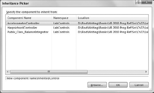
To build a UserControl that inherits from an existing UserControl class, select the Project menu's Add New Item command. In the resulting dialog, select the Inherited User Control template, enter a name for the control, and click Add. The Inheritance Picker dialog box shown in Figure 22-6 lists compiled components in the current project. Select the control from which you want to inherit and click OK.
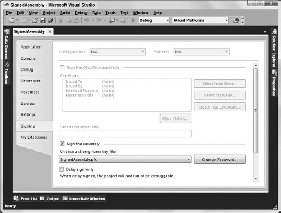
Figure 22.6. Use the Inheritance Picker to make a control that inherits from an existing UserControl.
Add properties, methods, and events to the control as usual. Select the Build menu's Build command to compile the control and add it to the Toolbox.
Alternatively, you can create a new class and add an Inherits statement that makes the class inherit from the previously built UserControl.
To build a control that inherits from the Control class in an executable project, select the Project menu's Add Class command. Leave the Class template selected, enter a name for the control, and click Add. Add the statement Inherits Control to the control's code.
Add properties, methods, and events to the control as usual. For example, you may want to give the control Paint and Resize event handlers so that it can draw itself. Select the Build menu's Build command to compile the control and add it to the Toolbox.
To build a control that inherits from a predefined control, select the Project menu's Add Class command. Leave the Class template selected, enter a name for the control, and click Add. Add an Inherits statement that makes the class inherit from another control.
Add properties, methods, and events to the control as usual. For example, you may want to override the parent class's behaviors. Select the Build menu's Build command to compile the control and add it to the Toolbox.
To add a component to an executable project, select the Project menu's Add Component command. Leave the Component Class template selected, enter a name for the component, and click Add.
Add properties, methods, and events to the component as usual. Then select the Build menu's Build command to compile the component and add it to the Toolbox.
This chapter implicitly assumes that any custom controls or components that you build are safe and trustworthy. It assumes that you don't need to worry about a control installing a virus on your computer or deleting a bunch of files. That's certainly true when you use a control that you write yourself (unless for some reason you want to destroy your operating system).
It's also true when you build a custom component inside an executable application. If a project's files include a custom control that the program uses, you know that the control is as safe as you write it.
In contrast, suppose you download a control library DLL from the Internet. If you use the controls in the DLL in your application, you cannot tell if the controls are safe. You can't even always tell if the DLL you download is the one that the author originally posted. It is possible that some scofflaw replaced the original DLL with a virus-infested version. In fact, it's possible that a prankster has replaced a DLL that you built yourself with another version that looks similar but that has malicious side effects.
Visual Studio provides two approaches for combating these problems: making a strongly named assembly and using a signature authority.
A strongly named assembly includes a manifest identifying the files that the assembly contains and a digital signature. Another program can verify the digital signature to verify that the assembly has not been tampered with since it was created.
Unfortunately, that doesn't guarantee that the assembly is actually what you think it is. An attacker could make a new assembly and then strongly sign it. If you verify the signature, you can tell that the attacker's version of the assembly hasn't been tampered with since it was written and that the viruses it contains are the original ones. The Microsoft web page Code Security and Signing in Components at msdn2.microsoft.com/txzh776x(vs.71).aspx says:
Although providing a strong name for your assembly guarantees its identity, it is by no means a guarantee that the code can be trusted. Put another way, the strong name uniquely identifies and guarantees the identity of the assembly, but does not guarantee that you wrote it. Nevertheless, a trust decision can reasonably be made based on strong-name identity alone, provided that the assembly is a well-known assembly.
(Go to msdn.microsoft.com/en-us/library/txzh776x.aspx for the most recent version of this Web page.)
Although this is a pretty big loophole, it's still better than nothing.
To sign an assembly, start a new Visual Basic project as usual. Typically the assembly will be a DLL, control library, or other code project rather than a main program such as a Windows Forms or WPF application.
In Project Explorer, double-click My Project to open the project's Property pages and select the Signing tab, as shown in Figure 22-7.
Select the "Sign the assembly" check box. Then, open the key file drop-down list and select <New . . . >. On the resulting dialog box, enter the name that you want to give the file and optionally enter a password to protect the file. Then click OK.
At this point, Visual Studio builds the key file. It looks like gibberish, but contains all the ingredients needed to sign the assembly. When you build the assembly, Visual Studio uses the key file to sign the result. Build a main program, reference the assembly, and use its methods as you normally would.
When the executable program needs to use the assembly, it loads the assembly, hashes it, and verifies that the hash matches the signature. If the hash doesn't match, the program assumes the assembly has been corrupted and refuses to use it.
Signing an assembly ensures that some villain hasn't meddled with the assembly since it was signed. If you built the assembly yourself, that gives you some assurance that the code is safe.
However, if someone else built the assembly and posted it on the Web, the signature only guarantees that the assembly contains whatever the original author put in it. It doesn't guarantee that that author didn't insert a virus. In fact, it doesn't guarantee that a hacker didn't replace the original author's assembly with a spoofed version signed by the hacker.
If you write an assembly that you want to share with others, you can make using your assembly safer by using a certificate authority.
A certificate authority is a company that sells digital certificates that guarantee the authenticity of a piece of signed code. The company verifies your identity, so it is certain that you are who you claim you are. It then gives you a certificate that you can use to sign assemblies. Later, when someone uses your assembly, they cannot only verify that it has been signed and that it has not been corrupted since you wrote it, but they can also verify that you wrote it.
Hackers won't use certificate authorities to spread viruses because they would have to identify themselves to the authority, and that would give you a way to track them down and sue them. The certificate still doesn't guarantee that the code is safe, but it does establish accountability if the code turns out to be dangerous.
For information on signing assemblies and using certificate authorities, see the Microsoft web pages Signing an Assembly with a Strong Name at msdn2.microsoft.com/library/aa719592.aspx and Code Security and Signing in Components at msdn2.microsoft.com/library/txzh776x.aspx.
Visual Basic provides a large assortment of controls that you can use on your forms. When they don't do exactly what you need, you can build others.
If an existing control does most of what you need, derive a new control from that one. If a group of controls together with their properties, methods, and events can do what you need, combine them into a composite control that inherits from the UserControl class. If you want to build a new control from scratch, make a class that inherits from the Control class. Finally, if you want an object that is available at design time but invisible at runtime, build a component.
When you build a control or component, you can use attributes to give extra information to Visual Studio. The ToolboxBitmap, DefaultProperty, DefaultEvent, DesignTimeVisible, Description, Category, Browsable, and DefaultValue attributes are some of the more useful attributes for control and component classes.
Visual Basic provides many other features that you can use to build other kinds of control-related classes and their properties. An extender provider class adds new properties to the other controls on a form much as the ErrorProvider and ToolTip controls do. A type converter (which translates data from one type to another) can translate between values and text for display in the Properties window and can generate a customized list of choices for a property drop-down list. A UI type editor enables you to build a graphical editor that the developer can use to view and manipulate special property values. These are more advanced topics that lie beyond the scope of this book. My book Expert One-on-One Visual Basic 2005 Design and Development (Stephens, Wrox, 2006) explains these techniques. For more information, see the book's web pages on Wrox.com or www.vb-helper.com/one_on_one.htm.
Controls provide an interface between the user and the program. The user views controls to get information from the program and manipulates the controls to provide information to the program. Chapter 23, "Drag and Drop, and the Clipboard," covers another important way for the user to move data in and out of the program. It explains how the user can use drag and drop and the clipboard to move data between the program and other applications.