
Appendix A
Useful Control Properties, Methods, and Events
A control interacts with a program or user through properties, methods, and events. Although each type of control provides different features, they are all derived from the Control class. This class provides many useful properties, methods, and events that other controls inherit if those other controls don’t take special action to override them. The following sections describe some of the most useful of these inherited features.
PROPERTIES
The following table lists properties implemented by the Control class. All controls that inherit from this class inherit these properties unless those other controls override the Control class’s behavior.
| PROPERTY | PURPOSE |
| BackColor | The control’s background color. |
| BackgroundImage | The control’s background image. |
| BackgroundImageLayout | Determines how the control’s background image is used to fill the control. This can be Center, None, Stretch, Tile, or Zoom. |
| Bottom | The distance between the top edge of the control’s container and the bottom edge of the control in pixels. This is read-only. Modify the Top and Height properties to change this value. |
| Bounds | Determines the control’s size and location, including nonclient areas. |
| Capture | Determines whether the control has captured the mouse. |
| CausesValidation | Determines whether the control makes other controls validate when it receives the focus. |
| ClientRectangle | Represents the control’s client area. |
| ClientSize | Holds the control’s height and width. |
| ContainsFocus | Indicates whether the control or one of its child controls has the input focus. This is read-only. |
| ContextMenuStrip | The context menu strip associated with the control. |
| Controls | Collection containing references to the controls contained within this control. |
| Cursor | The cursor that the control displays when the mouse is over it. |
| DataBindings | The control’s DataBindings, used to bind the control to a data source. |
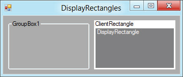
| DisplayRectangle | A Rectangle giving the control’s display area. Figure A-1 shows two GroupBoxes with the same size. The GroupBox on the right contains two labels that cover its ClientRectangle and DisplayRectangle. |
| Dock | Determines the edge of the control’s parent to which the control is docked. This can be Left, Right, Top, Bottom, Fill, or None. |
| Enabled | Determines whether the control will interact with the user. |
| Focused | Indicates whether the control has the input focus. This is read-only. |
| Font | The control’s font. |
| ForeColor | The control’s foreground color. |
| Handle | The control’s window handle. This is read-only. |
| HasChildren | Indicates whether the control holds any child controls. This is read-only. Also see the Controls property. |
| Height | The control’s height in pixels. |
| InvokeRequired | Returns True if the calling code is running on a thread different from the control’s thread and therefore must use an invoke method to interact with the control. See also the Invoke method. |
| Left | The X coordinate of the control’s left edge in pixels. |
| Location | The position of the control’s upper-left corner. |
| Margin | Determines the spacing between this control and another control’s margin within an arranging container. |
| MaximumSize | The control’s largest allowed size. |
| MinimumSize | The control’s smallest allowed size. |
| ModifierKeys | Indicates which modifier keys (Shift, Ctrl, and Alt) are pressed. This is read-only. |
| MouseButtons | Indicates which mouse buttons (Left, Right, Middle, None) are pressed. This is read-only. |
| MousePosition | The mouse’s current position in screen coordinates (where the point (0, 0) is in the screen’s upper-left corner). This is read-only. |
| Name | The control’s name. |
| Padding | The spacing of the control’s contents. |
| Parent | The parent containing the control. |
| PreferredSize | A size that is big enough to hold the control’s contents. |
| Region | Determines the control’s window region. This is the area in which the control may draw. |
| Right | The distance between the left edge of the control’s container and the right edge of the control in pixels. This is read-only. Modify the Left and Width properties to change this value. |
| Size | The control’s size including client and nonclient areas. |
| TabIndex | The control’s position in its container’s tab order. If more than one control has the same TabIndex, they are traversed front to back using the stacking order. |
| TabStop | Determines whether the user can tab to the control. |
| Tag | This property can hold any object that you want to associate with the control. |
| Text | The control’s text. |
| Top | The Y coordinate of the control’s top edge in pixels. |
| TopLevelControl | The control’s top-level ancestor. Usually that is the outermost Form containing the control. This is read-only. |
| Visible | Determines whether the control is visible. |
| Width | The control’s width in pixels. |
FIGURE A-1: The DisplayRectangle property gives the area in which you should normally place items within a control.
METHODS
The following table lists useful methods implemented by the Control class. All controls that inherit from this class inherit these methods unless they override the Control class’s behavior.
| METHOD | PURPOSE |
| Sub BringToFront() | Brings the control to the front of the stacking order. |
| Function Contains(ByVal target As Control) As Boolean | Returns True if target is contained by this control. |
| Function CreateGraphics() As Graphic | Creates a Graphics object that you can use to draw on the control’s surface. |
| Sub DrawToBitmap(ByVal bm As Bitmap, ByVal rect As Rectangle) | Draws an image of the control including contained controls onto the Bitmap in the indicated Rectangle. |
| Function Focus() As Boolean | Gives the control the input focus. |
| Function GetChildAtPoint (ByVal pt As Point) As Control | Returns the control’s child that contains the indicated point. If more than one control contains the point, the method returns the control that is higher in the stacking order. |
| Function GetPreferredSize (ByVal proposed_size) As Size | Returns a size that is big enough to hold the control’s contents. |
| Function GetType() As Type | Returns a Type object representing the control’s class. You can use this object to get information about the class. |
| Sub Invalidate() | Invalidates some or all of the control and sends it a Paint event so that it redraws itself. |
| Sub Invoke(ByVal delegate As Delegate) | Invokes a delegate on the thread that owns the control. |
| Function PointToClient (ByVal screen_point Point) As Point | Converts a Point in screen coordinates into the control’s coordinate system. |
| Function PointToScreen (ByVal control_point As Point) As Point | Converts a Point in control coordinates into the screen coordinate system. |
| Function RectangleToClient (ByVal screen_rect As Rectangle) As Rectangle | Converts a Rectangle in screen coordinates into the control’s coordinate system. |
| Function RectangleToScreen (ByVal control_rect As Rectangle) As Rectangle | Converts a Rectangle in control coordinates into the screen coordinate system. |
| Sub Refresh() | Invalidates the control’s client area, so the control redraws itself and its child controls. |
| Sub Scale(ByVal scale_factor As Single) | Scales the control and any contained controls by multiplying the Left, Top, Width, and Height properties by scale_factor. |
| Sub Select() | Moves the input focus to the control. Some controls have overloaded versions. |
| Function SelectNextControl (ByVal ctl As Control, ByVal forward As Boolean, ByVal tab_stop_only As Boolean, ByVal include_nested As Boolean, ByVal wrap As Boolean) As Boolean | Moves the input focus to the next control contained within this one. |
| Sub SendToBack() | Sends the control to the back of the stacking order. |
| Sub SetBounds(ByVal x As Integer, ByVal y As Integer, ByVal width As Integer, ByVal height As Integer) | Sets the control’s position and size. |
| Sub Show() | Displays the control by setting its Visible property to True. |
| Function ToString() As String | Returns a textual representation of the control. This is generally the type of the control followed by its most commonly used property. |
| Sub Update() | Makes the control redraw any invalidated areas. |
EVENTS
The following table lists useful events implemented by the Control class. All controls that inherit from this class inherit these events unless they override the Control class’s behavior.
| EVENT | PURPOSE |
| Click | Occurs when the user clicks the control. This event is at a higher logical level than the MouseClick event, and it can be triggered by actions other than a mouse click (such as pressing the Enter key or a shortcut key). |
| ControlAdded | Occurs when a new control is added to the control’s contained child controls. |
| ControlRemoved | Occurs when a control is removed from the control’s contained child controls. |
| DoubleClick | Occurs when the user double-clicks the control. |
| Enter | Occurs when the control is entered. This event fires before the GotFocus event. |
| GotFocus | Occurs when the control receives the input focus. This event fires after the Enter event. Generally, the Enter event is preferred. |
| HelpRequested | Occurs when the user requests help for the control. For example, if the user moves the focus to a TextBox and presses F1, the TextBox raises this event. |
| Invalidated | Occurs when part of the control is invalidated. |
| KeyDown | Occurs when the user presses a key while the control has the input focus. |
| KeyPress | Occurs when the user presses and releases a key while the control has the input focus. |
| KeyUp | Occurs when the user releases a key while the control has the input focus. |
| Leave | Occurs when the input focus leaves the control. This event fires before the LostFocus event. |
| LostFocus | Occurs when the input focus leaves the control. This event fires after the Leave event. Generally, the Leave event is preferred. |
| MouseClick | Occurs when the user clicks the mouse on the control. |
| MouseDoubleClick | Occurs when the user double-clicks the mouse on the control. |
| MouseDown | Occurs when the user presses a mouse button down over the control. |
| MouseEnter | Occurs when the mouse enters the control. |
| MouseHover | Occurs when the mouse hovers over the control. |
| MouseLeave | Occurs when the mouse leaves the control. |
| MouseMove | Occurs when the mouse moves over the control. |
| MouseUp | Occurs when the user releases a mouse button over the control. |
| MouseWheel | Occurs when the user moves the mouse wheel while the control has the input focus. |
| Move | Occurs when the control is moved. This event fires before the LocationChanged event fires. |
| Paint | Occurs when the control must redraw itself. Normally the program draws on the control during this event (if it draws on the control at all). |
| Resize | Occurs while the control is resizing. This event occurs after the Layout event but before the SizeChanged event. |
| SizeChanged | Occurs while the control is resizing. This event occurs after the Layout and Move events. |
| TextChanged | Occurs when the control’s Text property changes. |
| Validated | Occurs when the control has successfully finished validating its data. |
| Validating | Occurs when the control should validate its data. |