Inspecting the Inspectors
While a fair amount of storyboard time is spent in the content area at the center of the window, the inspector area on the right is often where the action is. Whatever is selected in the content area—a view controller in the document outline, a view, a button, an auto layout constraint, etc.—its properties will be shown in the various inspectors on the right.
For iOS, there are six inspectors, indicated by a toolbar atop the utilities area, which itself can be shown or hidden by a button in the main toolbar. In order, the inspectors are: File, Quick Help, Identity, Attribute, Size, and Connection. macOS adds two additional inspectors: Bindings and View Effects. The inspectors can be shown (un-hiding the utilities area if necessary) with keyboard shortcuts ⌥⌘1 through ⌥⌘6 (or through ⌥⌘8 on macOS).

When you’re editing code, the inspectors don’t do much for you, but when building UIs, they’re crucial. In fact, they have lots of neat abilities that many developers don’t know exist.
Identity Inspector
The first two inspectors aren’t used often. You first saw the File Inspector back in Understanding Projects and Files, where you used it to view or edit the path to a file in the project. With storyboards, there are check boxes to opt-in to new Xcode features like the “Safe Area” that keeps the UI away from the iPhone X’s sensor assembly (aka, “the notch”). If you’re internationalizing a project, the localization section here lets you decide if this file will have language-specific variants. And then the second inspector, Quick Help, offers a top-level view of the documentation for the current selection in the storyboard.
Where things get really interesting is in the third inspector, the Identity Inspector (⌥⌘3). The first field in this inspector is well-known to all iOS developers: the “Class” field is where you can change the class of an object in the storyboard. The most common use is to change the generic UIViewController to a class of your own making; this is how you tie the storyboard to the specific behavior of the app code. If you were to create a subclass of common views like UIButton or UILabel, you can use this same technique to have the storyboard create an instance of your custom subclass.

A little further down in the Identity Inspector, there is an empty table called “User Defined Runtime Attributes”, which is secretly one of the most awesome things in Xcode. This allows you to set any non-private property of the selected object. Here’s a silly example: if you select a view, you can press the plus button (+) to create a new entry in the table, use the Key Path backgroundColor, change the type to “Color” and pick a color. Run the app, and bam!—the view now has the specified background color. What’s happening is that backgroundColor is a property of UIView, and this lets you set that value.
OK, not that big of a deal, since views have color controls in the next inspector. The big win of the User Defined Runtime Attributes table is that it lets you edit any non-private property, even those that aren’t otherwise editable here in Interface Builder. Better yet, the use of the term “Key Path” is your hint that this uses key-value coding, which means you can set properties of properties, by using a dot-separator syntax.
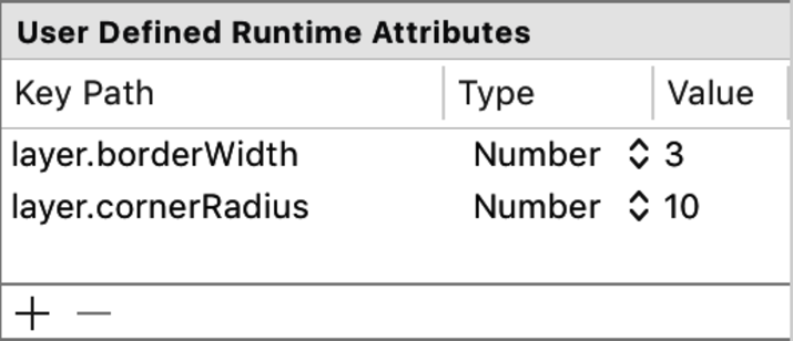
Here’s a useful example of this: every UIView has a CALayer to show its contents. The CALayer class has some interesting properties for managing its border, such as borderWidth and cornerRadius. Those values don’t have dedicated editors—in fact, Interface Builder has no representation of the layer at all. But you can set those properties of the layer with this table, using key paths on the view: layer.borderWidth, and layer.cornerRadius.
As it turns out, this is the common recipe for creating rounded borders on iOS, as seen in the figure. The one catch is that the editor can only handle certain types for the values of the properties set via the table. These include common types like booleans, numbers, and strings, as well as essential geometric types like point, size, and rectangle. You can also specify a color. But it only gets you so far. For example, CALayer also has a borderColor property, that would tempt you to add layer.borderColor to your table. But that won’t actually work, since the type of that property is actually a CGColor, and the table can only set a UIColor. So if you want a border color other than black, you’ll have to set that property in code.
Still, this can be a terrifically useful technique, particularly with your own custom views, view controllers, and even the arbitrary objects mentioned earlier. Any non-private property can be set this way, so if it makes more sense to customize an object in the storyboard, expose a property as one of these editable types, and then configure it directly from the storyboard.
Attributes Inspector
If you’ve only been using Xcode and storyboards for a while, it’s possible the only inspector you’ve ever used is the Attributes Inspector (⌥⌘4). This is where you go to change the text of a button or label, or customize a font. But there’s a lot more in here than it might originally appear.
The Attributes Inspector is split into sections, with subclass-specific behavior at the top, then through its superclass’ editors, down to the common-to-all-UIViews behavior in the bottom section. So, top to bottom, for buttons it goes button, control, view, and for text views, it goes text view, scroll view, view.
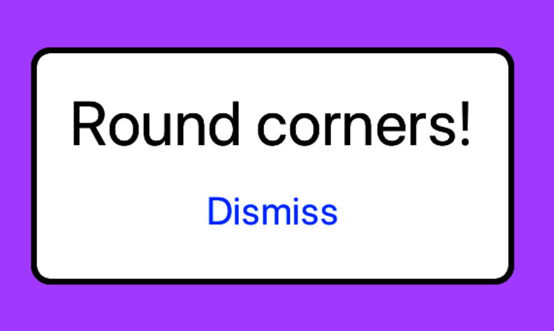
Common View Attributes
Head to the bottom and look at the attributes common to all views. Some of the settings here are going to depend on the type of the view. For example, most views have “Scale to Fill” for their “Content Mode”, but labels use “Left”. You rarely need to edit this, nor do you often need to mess with the “Stretching” geometry.
The third field, “Tag” can be useful for quick-and-dirty apps. Usually, to find a specific subview in code, you need to connect an IBOutlet, which in turn means custom subclasses, control-drags to make the connections, and those tried-and-true techniques. But another option is to just use this field to set the tag of the subview to some agreed-upon integer value, and then find it in code with the UIView viewWithTag(_:). Obviously, there are lots of ways for this to break if the tag value in the storyboard doesn’t match what the code is expecting. It tends to be hacky, but it’s there if you need it.
The “Interaction” section’s check boxes will tend to be dictated by the type of view you’re working with. “User Interaction Enabled” determines if touches are accepted, so buttons and sliders will enable it, and labels won’t. But that doesn’t mean you can’t! You can turn any view into a de facto button by adding a tap gesture listener to it, but for the recognizer to get the taps, you’d have to enable user interaction here.
The “Alpha” setting lets you make your view (and all of its subviews) partially or completely translucent, which can be nice for certain effects. You can also animate the view’s alpha in code for a fade-out effect.
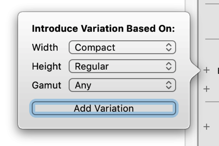
The background color is self-explanatory, except to note that the red diagonal line represents a default color (which could be white, clear, or some other color entirely). Like many of the attributes, background color has a small plus (+) button to its left. This lets you create a second value for the attribute which only applies for certain combinations of size class and color gamut. This is used for creating device-specific tweaks to your views. A given background color might be fine on iPhone but overkill on the iPad. In that case, make the iPad color the default, then add a variation for the compact width size class—the variant color will only be used for portrait layout on iPhones (and a few edge cases that we’ll discuss later).
The “Drawing” section has a few settings that aren’t always intuitive by name, but are hugely important. “Opaque” means that a given view draws all pixels within its bounds rectangle and doesn’t need to be composited with any views below it—supposedly, this can improve drawing performance if you’re really sure you don’t need any compositing. “Hidden” makes a view invisible and prevents it from receiving touch events, while still participating in auto layout, which means it keeps its shape and size. “Clips to Bounds” means that any subview that goes outside the bounds of this view will have its drawing cut off at this view’s bounds.
Other View Subtype Attributes
There are a few other attributes specific to subclasses of UIView that are worth understanding:
-
Labels—The “Lines” field defaults to a single line. If you have an arbitrarily long string as its text, set the value to 0 to create a variable-height label. This will make the label exactly as tall as it needs to be, provided you also change the “Line Break” setting to “Word Wrap" or “Character Wrap”. Your auto layout code (see next section) will also need to tolerate the variable height of the label.
-
Buttons—Buttons can have different titles or images for each of the four states: default, highlighted, selected, and disabled. For a play/pause style button, rather than changing its title in code, you can set the default title to “play”, the highlighted title to “pause”, and then just toggle the button’s isHighlighted property to change the title.
-
Sliders—If you leave “Continuous Events” selected, then any method you connect to the value-changed event will receive many callbacks as the user drags the playhead. If this check box is deselected, a single callback is delivered when the user lifts their finger to end the interaction.
-
Table Views—Most of the time, you’ll create table views that are connected to objects implementing the UITableViewDataSource and UITableViewDelegate protocols to provide table contents at runtime and handle user interactions with the table. But if a table will always have the exact same contents—such as for a settings UI—you can change the “Content” setting to “Static Cells”, and then add and layout all the table cells directly in the storyboard.
Size Inspector
The important thing to remember about the Size Inspector is never trust the Size Inspector.
OK, kidding, but just barely. In an app that uses auto layout (see next section), the sizes and locations of views are a result of auto layout’s calculations. As a result, while it looks like you can edit your views’ origin points or sizes, it’s all an illusion. These are simulated sizes and locations. Put in a different x for your button and it’ll move in the storyboard, but you’ll also see the various orange indicators telling you the view is now misplaced.
For the most part, the Size Inspector is useful for looking at what auto layout has done for you, and tweaking the layout constraints directly, which you’ll do soon.

There is one place the Size Inspector is truly useful, albeit still in a “simulated” size way. If you use a pop over with iOS, the view controller you’re popping up will still appear in Interface Builder as the full-size screen of the currently selected device. This is true even if you set the view controller’s “Use Preferred Explicit Size” in the Attributes Inspector. It won’t matter on iPhones, where pop overs fill the screen. But on iPads, you don’t want to be designing for a 300x300 pop over with a 768x1024 preview.
In this case, select the view controller (not the view!), and go to its Size Inspector. Change the “Simulated Size” from “Fixed” to “Simulated”, and then enter the size and width in which you want to work. Keep in mind, this is just a preview (and it will be ignored on iPhones, where the pop over will fill the screen), but it will be a more accurate representation of how your layout will look on iPads.
Connections Inspector
The last inspector, at least on iOS, is the Connections Inspector (⌥⌘6). This is where you can inspect and set connections—IBActions and IBOutlets—from storyboard objects into your code.
Fixing Broken Connections
A good way to understand how and why this inspector works is to consider a common problem it solves. Imagine you have a label that you connected to your code as a property named usernameLabel. But then you decide that’s an imprecise name, so in the code you rename it to loginLabel.
You run the app again… and it crashes immediately upon reaching this scene.
What happened? Start by looking at the console output:
| | *** Terminating app due to uncaught exception 'NSUnknownKeyException', |
| | reason:'[<BrokenConnectionSample.ViewController 0x7fa0f2402420> |
| | setValue:forUndefinedKey:]: this class is not key value coding-compliant |
| | for the key usernameLabel.' |
Oops, somewhere in the code, the name usernameLabel is still hanging around. And that’s because you made this change in the code, but not in the storyboard. Select the view controller in the code, bring up its Connections Inspector, and you’ll see the offending party, as revealed by the following figure:
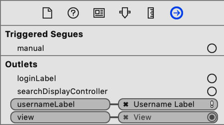
The exclamation point next to “Username Label” indicates this is a connection to an outlet property that doesn’t exist in the code (because you deleted it). You can also see that the “Login Label” remains unconnected. The fix is to click the (x) button next to “Username Label” to delete the broken connection. And then you can drag from the circle “Login Label” over to the View Controller icon, where the drop target will offer the correctly named loginLabel outlet.
Outlet Collections
Another useful but overlooked feature of the Connections Inspector is the idea of the outlet collection. The idea is that you can create a connection to multiple objects in a storyboard, which a normal outlet can’t do. An outlet collection is simple enough in code—it’s just an array of some UIKit class, marked with the @IBOutlet attribute, so Interface Builder knows to pick it up from the code:
| | @IBOutlet var allFields: [UITextField]! |
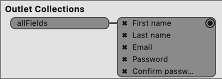
Once this is in the view controller, the property will appear in the “Outlet Collections” section of the Collections Inspector. From here, you can drag connections from the circle to the right of the property name, over to different objects in your storyboard, one after the other. In the following figure, the five text fields in the scene are wired-up:
With the outlet collection set up, you can now access the array of text fields and perform actions on all of them. A simple example is to clear the contents of every text field, and kick the user out of editing any they might be currently editing (by calling resignFirstResponder):
| | @IBAction func clearAllFields(_ sender: Any) { |
| | for field in allFields { |
| | field.text = nil |
| | field.resignFirstResponder() |
| | } |
| | } |
This is much nicer than having to put all of the fields in an array manually, which you’d have to do in viewDidLoad, to ensure they had already been loaded. Also be aware that the order in which you make your connections to the outlet collection is preserved as the order of the array. This matters if you want to use the collection for something like validation, where you want to fail on the first invalid field, and not just check them in a random order.