

Statistical Quality Control

Chapter Outline
15-1 Quality Improvement and Statistics
15-1.1 Statistical Quality Control
15-1.2 Statistical Process Control
15-2 Introduction to Control Charts
15-2.2 Design of a Control Chart
15-2.4 Analysis of Patterns on Control Charts
15-3 ![]() and R or S Control Charts
and R or S Control Charts
15-4 Control Charts for Individual Measurements
15-6.1 P Chart (Control Chart for Proportions)
15-6.2 U Chart (Control Chart for Defects per Unit)
15-7 Control Chart Performance
15-8.1 Cumulative Sum Control Chart
15-8.2 Exponentially Weighted Moving-Average Control Chart
Bowl of beads
The quality guru W. Edwards Deming conducted a simple experiment in his seminars with a bowl of beads. Many were colored white but a percentage of red beads was randomly mixed in the bowl. A participant from the seminar was provided a paddle made with indentations so that 50 beads at a time could be scooped from the bowl. The participant was allowed to use only the paddle and instructed to scoop only white beads (repeated multiple times with beads replaced). The red beads were considered to be defectives. Of course, this was difficult to do, and each scoop resulted in a count of red beads. Deming plotted the fraction of red beads from each scoop and used the results to make several points. As was clear from the scenario, this process was beyond the participant's ability to make simple improvements. The process needed to be changed (reduce the number of red beads), which is the responsibility of management. Furthermore, many business processes have this type of characteristic, and it is important to learn from the data whether the variability is common, intrinsic to the process, or is the result of some special cause. This distinction is important for the type of process control or improvements to be applied. Refer to the example of control adjustments in Chapter 1. Control charts are primary tools to understand process variability, and that is main topic of this chapter.
![]() Learning Objectives
Learning Objectives
After careful study of this chapter, you should be able to do the following:
- Understand the role of statistical tools in quality improvement
- Understand the different types of variability, rational subgroups, and use of a control chart to detect assignable causes
- Understand the general form of a Shewhart control chart and how to apply zone rules (such as the Western Electric rules) and pattern analysis to detect assignable causes
- Construct and interpret control charts for variables such as
 , R, S, and individuals charts
 - Construct and interpret control charts for attributes such as P and U charts
- Calculate and interpret process capability ratios
- Calculate the ARL performance for a Shewhart control chart
- Construct and interpret a cumulative sum and exponentially weighted moving-average control chart
- Use other statistical process control problem-solving tools
15-1 Quality Improvement and Statistics
The quality of products and services is a major decision factor in most businesses today. Regardless of whether the consumer is an individual, a corporation, a military defense program, or a retail store, a consumer making purchase decisions is likely to consider quality of equal importance to cost and schedule. Consequently, quality improvement is a major concern to many U.S. corporations.
Quality means fitness for use. For example, we purchase automobiles that we expect to be free of manufacturing defects and that should provide reliable and economical transportation, a retailer buys finished goods with the expectation that they are properly packaged and arranged for easy storage and display, or a manufacturer buys raw material and expects to process it with no rework or scrap. In other words, all customers expect that the products and services they buy meet their requirements. Those requirements define fitness for use.
Quality or fitness for use is determined through the interaction of quality of design and quality of conformance. By quality of design, we mean the different grades or levels of performance, reliability, serviceability, and function that are the result of deliberate engineering and management decisions. By quality of conformance, we mean the systematic reduction of variability and elimination of defects until every unit produced is identical and defect free.
Some confusion exists in our society about quality improvement; some people still think that it means gold-plating a product or spending more money to develop a product or process. This thinking is wrong. Quality improvement means better quality of design through improved knowledge of customers' requirements and the systematic elimination of waste. Examples of waste include scrap and rework in manufacturing, inspection and testing, errors on documents (such as engineering drawings, checks, purchase orders, and plans), customer complaint hotlines, warranty costs, and the time required to do things over again that could have been done right the first time. A successful quality-improvement effort can eliminate much of this waste and lead to lower costs, higher productivity, increased customer satisfaction, increased business reputation, higher market share, and ultimately higher profits for the company.
Statistical methods play a vital role in quality improvement. Some applications are outlined here:
- In product design and development, statistical methods, including designed experiments, can be used to compare different materials, components, or ingredients, and to help determine both system and component tolerances. This application can significantly lower development costs and reduce development time.
- Statistical methods can be used to determine the capability of a manufacturing process. Statistical process control can be used to systematically improve a process by reducing variability.
- Experimental design methods can be used to investigate improvements in the process. These improvements can lead to higher yields and lower manufacturing costs.
- Life testing provides reliability and other performance data about the product. This can lead to new and improved designs and products that have longer useful lives and lower operating and maintenance costs.
- Regression methods are often used to determine key process indicators that link with customer satisfaction. This enables organizations to focus on the most important process measurements.
Some of these applications have been illustrated in earlier chapters of this book. It is essential that engineers, scientists, and managers have an in-depth understanding of these statistical tools in any industry or business that wants to be a high-quality, low-cost producer. In this chapter, we provide an introduction to the basic methods of statistical quality control that, along with experimental design, form the basis of a successful quality-improvement effort.
15-1.1 STATISTICAL QUALITY CONTROL
This chapter is about statistical quality control, a collection of tools that are essential in quality-improvement activities. The field of statistical quality control can be broadly defined as the use of those statistical and engineering methods in measuring, monitoring, controlling, and improving quality. Statistical quality control is a field that dates back to the 1920s. Dr. Walter A. Shewhart of Bell Telephone Laboratories was one of the early pioneers of the field. In 1924, he wrote a memorandum showing a modern control chart, one of the basic tools of statistical process control. Harold F. Dodge and Harry G. Romig, two other Bell System employees, provided much of the leadership in the development of statistically based sampling and inspection methods. The work of these three men forms much of the basis of the modern field of statistical quality control. The widespread introduction of these methods to U.S. industry occurred during World War II. Dr. W. Edwards Deming and Dr. Joseph M. Juran were instrumental in spreading statistical quality-control methods since World War II.
The Japanese have been particularly successful in deploying statistical quality-control methods and have used such methods to gain significant advantage over their competitors. In the 1970s, U.S. industry suffered extensively from Japanese (and other foreign) competition; that has led, in turn, to renewed interest in statistical quality-control methods in the United States. Much of this interest focuses on statistical process control and experimental design. Many U.S. companies have implemented these methods in their manufacturing, engineering, and other business organizations.
15-1.2 STATISTICAL PROCESS CONTROL
It is impractical to inspect quality into a product; the product must be built right the first time. The manufacturing process must therefore be stable or repeatable and capable of operating with little variability around the target or nominal dimension. Online statistical process control is a powerful tool for achieving process stability and improving capability through the reduction of variability.
It is customary to think of statistical process control (SPC) as a set of problem-solving tools that may be applied to any process. The major tools of SPC* are
- Histogram
- Pareto chart
- Cause-and-effect diagram
- Defect-concentration diagram
- Control chart
- Scatter diagram
- Check sheet
Although these tools are an important part of SPC, they compose only the technical aspect of the subject. An equally important element of SPC is attitude—the desire of all individuals in the organization for continuous improvement in quality and productivity through the systematic reduction of variability. The control chart is the most powerful of the SPC tools.
15-2 Introduction to Control Charts
15-2.1 BASIC PRINCIPLES
In any production process, regardless of how well-designed or carefully maintained it is, a certain amount of inherent or natural variability always exists. This natural variability or “background noise” is the cumulative effect of many small, essentially unavoidable causes. When the background noise in a process is relatively small, we usually consider it an acceptable level of process performance. In the framework of statistical quality control, this natural variability is often called a “stable system of chance causes.” A process that is operating with only chance causes of variation present is said to be in statistical control. In other words, the chance causes are an inherent part of the process.
Other kinds of variability may occasionally be present in the output of a process. This variability in key quality characteristics usually arises from three sources: improperly adjusted machines, operator errors, or defective raw materials. Such variability is generally large when compared to the background noise, and it usually represents an unacceptable level of process performance. We refer to these sources of variability that are not part of the chance cause pattern as assignable causes. A process that is operating in the presence of assignable causes is said to be out of control†.
Production processes often operate in the in-control state, producing acceptable product for relatively long periods of time. Occasionally, however, assignable causes occur, seemingly at random, resulting in a “shift” to an out-of-control state in which a large proportion of the process output does not conform to requirements. A major objective of statistical process control is to quickly detect the occurrence of assignable causes or process shifts so that investigation of the process and corrective action can be undertaken before many nonconforming units are manufactured. The control chart is an online process-monitoring technique widely used for this purpose.
Recall the following from Chapter 1. Figure 1-11 illustrates that adjustments to common causes of variation increase the variation of a process whereas Fig. 1-12 illustrates that actions should be taken in response to assignable causes of variation. Control charts may also be used to estimate the parameters of a production process and, through this information, to determine the capability of a process to meet specifications. The control chart can also provide information that is useful in improving the process. Finally, remember that the eventual goal of statistical process control is the elimination of variability in the process. Although it may not be possible to eliminate variability completely, the control chart helps reduce it as much as possible.
A typical control chart is shown in Fig. 15-1, which is a graphical display of a quality characteristic that has been measured or computed from a sample versus the sample number or time. Often, the samples are selected at periodic intervals such as every few minutes or every hour. The chart contains a center line (CL) that represents the average value of the quality characteristic corresponding to the in-control state. (That is, only chance causes are present.) Two other horizontal lines, called the upper control limit (UCL) and the lower control limit (LCL), are also shown on the chart. These control limits are chosen so that if the process is in control, nearly all of the sample points fall between them. In general, as long as the points plot within the control limits, the process is assumed to be in control, and no action is necessary. However, a point that plots outside of the control limits is interpreted as evidence that the process is out of control, and investigation and corrective action are required to find and eliminate the assignable cause or causes responsible for this behavior. The sample points on the control chart are usually connected with straight-line segments so that it is easier to visualize how the sequence of points has evolved over time.
Even if all the points plot inside the control limits, if they behave in a systematic or nonrandom manner, this is an indication that the process is out of control. For example, if 18 of the last 20 points plotted above the center line but below the upper control limit, and only two of these points plotted below the center line but above the lower control limit, we would be very suspicious that something was wrong. If the process is in control, all plotted points should have an essentially random pattern. Methods designed to find sequences or nonrandom patterns can be applied to control charts as an aid in detecting out-of-control conditions. A particular nonrandom pattern usually appears on a control chart for a reason, and if that reason can be found and eliminated, process performance can be improved.

FIGURE 15-1 A typical control chart.
A close connection exists between control charts and hypothesis testing. Essentially, the control chart is a series of tests of the hypothesis that the process is in a state of statistical control. A point plotting within the control limits is equivalent to failing to reject the hypothesis of statistical control, and a point plotting outside the control limits is equivalent to rejecting the hypothesis of statistical control.
We give a general model for a control chart. Let W be a sample statistic that measures some quality characteristic of interest, and suppose that the mean of W is μW and the standard deviation of W is σW.*. Then the center line, the upper control limit, and the lower control limit become
Control Chart Model

where k is the “distance” of the control limits from the center line expressed in standard deviation units. A common choice is k = 3. Dr. Walter A. Shewhart first proposed this general theory of control charts, and those developed according to these principles are often called Shewhart control charts.
The control chart is a device for describing exactly what statistical control means; as such, it may be used in a variety of ways. In many applications, the control chart is used for online process monitoring. That is, sample data are collected and used to construct the control chart, and if the sample values of ![]() (say) fall within the control limits and do not exhibit any systematic pattern, we say the process is in control at the level indicated by the chart. Note that we may be interested here in determining both whether the past data came from a process that was in control and whether future samples from this process indicate statistical control.
(say) fall within the control limits and do not exhibit any systematic pattern, we say the process is in control at the level indicated by the chart. Note that we may be interested here in determining both whether the past data came from a process that was in control and whether future samples from this process indicate statistical control.
The most important use of a control chart is to improve the process. We have found that, generally
- Most processes do not operate in a state of statistical control.
- Consequently, the routine and attentive use of control charts identifies assignable causes. If these causes can be eliminated from the process, variability is reduced and the process is improved.
This process-improvement activity using the control chart is illustrated in Fig. 15-2. Notice that:
- The control chart only detects assignable causes. Management, operator, and engineering action usually are necessary to eliminate the assignable cause. An action plan for responding to control chart signals is vital.
In identifying and eliminating assignable causes, it is important to find the underlying root cause of the problem and to attack it. A cosmetic solution does not result in any real, long-term process improvement. Developing an effective system for corrective action is an essential component of an effective SPC implementation.
We may also use the control chart as an estimating device. That is, from a control chart that exhibits statistical control, we may estimate certain process parameters, such as the mean, standard deviation, and fraction nonconforming or fallout. These estimates may then be used to determine the capability of the process to produce acceptable products. Such process capability studies have considerable impact on many management decision problems that occur over the product cycle, including make-or-buy decisions, plant and process improvements that reduce process variability, and contractual agreements with customers or suppliers regarding product quality. Such estimates are discussed in a later section.

FIGURE 15-2 Process improvement using the control chart.
Control charts may be classified into two general types. Many quality characteristics can be measured and expressed as numbers on some continuous scale of measurement. In such cases, it is convenient to describe the quality characteristic with a measure of central tendency and a measure of variability. Control charts for central tendency and variability are collectively called variables control charts. The ![]() chart is the most widely used chart for monitoring central tendency, and charts based on either the sample range or the sample standard deviation are used to control process variability. Many quality characteristics are not measured on a continuous scale or even a quantitative scale. In these cases, we may judge each unit of product as either conforming or nonconforming on the basis of whether or not it possesses certain attributes, or we may count the number of nonconformities (defects) appearing on a unit of product. Control charts for such quality characteristics are called attributes control charts.
chart is the most widely used chart for monitoring central tendency, and charts based on either the sample range or the sample standard deviation are used to control process variability. Many quality characteristics are not measured on a continuous scale or even a quantitative scale. In these cases, we may judge each unit of product as either conforming or nonconforming on the basis of whether or not it possesses certain attributes, or we may count the number of nonconformities (defects) appearing on a unit of product. Control charts for such quality characteristics are called attributes control charts.
Control charts have had a long history of use in industry. There are at least five reasons for their popularity:
- Control charts are a proven technique for improving productivity. A successful control chart program reduces scrap and rework, which are the primary productivity killers in any operation. If you reduce scrap and rework, productivity increases, cost decreases, and production capacity (measured in the number of good parts per hour) increases.
- Control charts are effective in defect prevention. The control chart helps keep the process in control, which is consistent with the “do it right the first time” philosophy. It is never cheaper to sort out the “good” units from the “bad” later on than it is to build them correctly initially. If you do not have effective process control, you are paying someone to make a nonconforming product.
- Control charts prevent unnecessary process adjustments. A control chart can distinguish between background noise and abnormal variation; no other device, including a human operator, is as effective in making this distinction. If process operators adjust the process based on periodic tests unrelated to a control chart program, they often overreact to the background noise and make unneeded adjustments. These unnecessary adjustments can result in a deterioration of process performance. In other words, the control chart is consistent with the “if it isn't broken, don't fix it” philosophy.
- Control charts provide diagnostic information. Frequently, the pattern of points on the control chart contains information that is of diagnostic value to an experienced operator or engineer. This information allows the operator to implement a change in the process that improve its performance.
- Control charts provide information about process capability. The control chart provides information about the value of important process parameters and their stability over time. This allows an estimate of process capability to be made. This information is of tremendous use to product and process designers.
Control charts are among the most effective management control tools, and they are as important as cost controls and material controls. Modern computer technology has made it easy to implement control charts in any type of process because data collection and analysis can be performed in real time, online at the work center.
15-2.2 DESIGN OF A CONTROL CHART
To illustrate these ideas, we give a simplified example of a control chart. In manufacturing automobile engine piston rings, the inside diameter of the rings is a critical quality characteristic. The process mean inside ring diameter is 74 millimeters, and it is known that the standard deviation of ring diameter is 0.01 millimeters. A control chart for average ring diameter is shown in Fig. 15-3. Every few minutes a random sample of five rings is taken, the average ring diameter of the sample (say ![]() ) is computed, and
) is computed, and ![]() is plotted on the chart. Because this control chart utilizes the sample mean
is plotted on the chart. Because this control chart utilizes the sample mean ![]() to monitor the process mean, it is usually called an
to monitor the process mean, it is usually called an ![]() control chart. Note that all the points fall within the control limits, so the chart indicates that the process is in statistical control.
control chart. Note that all the points fall within the control limits, so the chart indicates that the process is in statistical control.
Consider how the control limits were determined. The process average is 74 millimeters, and the process standard deviation is σ = 0.01 millimeters. Now if samples of size n = 5 are taken, the standard deviation of the sample average ![]() is
is
![]()
Therefore, if the process is in control with a mean diameter of 74 millimeters, by using the central limit theorem to assume that ![]() is approximately normally distributed, we would expect approximately 100(1 − α)% of the sample mean diameters
is approximately normally distributed, we would expect approximately 100(1 − α)% of the sample mean diameters ![]() to fall between 74 + zα/2(0.0045) and 74 − zα/2(0.0045). As discussed previously, we customarily choose the constant zα/2 to be 3, so the upper and lower control limits become
to fall between 74 + zα/2(0.0045) and 74 − zα/2(0.0045). As discussed previously, we customarily choose the constant zα/2 to be 3, so the upper and lower control limits become
![]()
and
![]()

FIGURE 15-3 ![]() control chart for piston ring diameter.
control chart for piston ring diameter.
as shown on the control chart. These are the 3-sigma control limits referred to earlier. Note that the use of 3-sigma limits implies that α = 0.0027; that is, the probability that the point plots outside the control limits when the process is in control is 0.0027. The width of the control limits is inversely related to the sample size n for a given multiple of sigma. Choosing the control limits is equivalent to setting up the critical region for testing the hypotheses
![]()
where σ = 0.01 is known. Essentially, the control chart tests this hypothesis repeatedly at different points in time.
In designing a control chart, we must specify both the sample size to use and the frequency of sampling. In general, larger samples make it easier to detect small shifts in the process. When choosing the sample size, we must keep in mind the size of the shift that we are trying to detect. If we are interested in detecting a relatively large process shift, we use smaller sample sizes than those that would be employed if the shift of interest were relatively small.
We must also determine the frequency of sampling. The most desirable situation from the of view of detecting shifts would be to take large samples very frequently; however, this is usually not economically feasible. The general problem is one of allocating sampling effort. That is, either we take small samples at short intervals or larger samples at longer intervals. Current industry practice tends to favor smaller, more frequent samples, particularly in high-volume manufacturing processes or when a great many types of assignable causes can occur. Furthermore, as automatic sensing and measurement technology develops, it is becoming possible to greatly increase frequencies. Ultimately, every unit can be tested as it is manufactured. This capability does not eliminate the need for control charts because the test system cannot prevent defects. The increased data expand the effectiveness of process control and improve quality.
When preliminary samples are used to construct limits for control charts, these limits are customarily treated as trial values. Therefore, the sample statistics should be plotted on the appropriate charts, and any points that exceed the control limits should be investigated. If assignable causes for these points are discovered, they should be eliminated and new limits for the control charts determined. In this way, the process may be eventually brought into statistical control and its inherent capabilities assessed. Other changes in process centering and dispersion may then be contemplated.
15-2.3 RATIONAL SUBGROUPS
A fundamental idea in the use of control charts is to collect sample data according to what Shewhart called the rational subgroup concept. Generally, this means that subgroups or samples should be selected so that to the extent possible, the variability of the observations within a subgroup should include all the chance or natural variability and exclude the assignable variability. Then, the control limits represent bounds for all the chance variability, not the assignable variability. Consequently, assignable causes tend to generate points that are outside of the control limits, and chance variability tends to generate points that are within the control limits.
When control charts are applied to production processes, the time order of production is a logical basis for rational subgrouping. Even though time order is preserved, it is still possible to form subgroups erroneously. If some of the observations in the subgroup are taken at the end of one eight-hour shift and the remaining observations are taken at the start of the next eight-hour shift, any differences between shifts are handled as chance variability when, instead, it should be considered as assignable variability. This makes detecting differences between shifts more difficult. Still, in general, time order is frequently a good basis for forming subgroups because it allows us to detect assignable causes that occur over time.
Two general approaches to constructing rational subgroups are used. In the first approach, each subgroup consists of units that were produced at the same time (or as closely together as possible). This approach is used when the primary purpose of the control chart is to detect process shifts. It minimizes variability due to assignable causes within a sample, and it maximizes variability between samples if assignable causes are present. It also provides better estimates of the standard deviation of the process in the case of variables control charts. This approach to rational subgrouping essentially gives a “snapshot” of the process at each point in time when a sample is collected.
In the second approach, each sample consists of units of product that are representative of all units that have been produced since the last sample was taken. Essentially, each subgroup is a random sample of all process output over the sampling interval. This method of rational subgrouping is often used when the control chart is employed to make decisions about the acceptance of all units of product that have been produced since the last sample. In fact, if the process shifts to an out-of-control state and then back in control again between samples, it is sometimes argued that the first method of rational subgrouping defined earlier is ineffective against these types of shifts, and so the second method must be used.
When the rational subgroup is a random sample of all units produced over the sampling interval, considerable care must be taken in interpreting the control charts. If the process mean drifts between several levels during the interval between samples, the range of observations within the sample may consequently be relatively large. It is the within-sample variability that determines the width of the control limits on an ![]() chart, so this practice results in wider limits on the
chart, so this practice results in wider limits on the ![]() chart. This makes it more difficult to detect shifts in the mean. In fact, we can often make any process appear to be in statistical control just by stretching out the interval between observations in the sample. It is also possible for shifts in the process average to cause points on a control chart for the range or standard deviation to plot out of control even though no shift in process variability has taken place.
chart. This makes it more difficult to detect shifts in the mean. In fact, we can often make any process appear to be in statistical control just by stretching out the interval between observations in the sample. It is also possible for shifts in the process average to cause points on a control chart for the range or standard deviation to plot out of control even though no shift in process variability has taken place.
Other bases for forming rational subgroups can be used. For example, suppose that a process consists of several machines that pool their output into a common stream. If we sample from this common stream of output, it is very difficult to detect whether or not some of the machines are out of control. A logical approach to rational subgrouping here is to apply control chart techniques to the output for each individual machine. Sometimes this concept needs to be applied to different heads on the same machine, different workstations, different operators, and so forth.
The rational subgroup concept is very important. The proper selection of samples requires careful consideration of the process with the objective of obtaining as much useful information as possible from the control chart analysis.
15-2.4 ANALYSIS OF PATTERNS ON CONTROL CHARTS
A control chart may indicate an out-of-control condition either when one or more points fall beyond the control limits, or when the plotted points exhibit some nonrandom pattern of behavior. For example, consider the ![]() chart shown in Fig. 15-4. Although all 25 points fall within the control limits, the points do not indicate statistical control because their pattern is very nonrandom in appearance. Specifically, we note that 19 of the 25 points plot below the center line, but only 6 of them plot above. If the points are truly random, we should expect a more even distribution of points above and below the center line. We also observe that following the fourth point, five points in a row increase in magnitude. This arrangement of points is called a run. Because the observations are increasing, we could call it a run up; similarly, a sequence of decreasing points is called a run down. This control chart has an unusually long run up (beginning with the 4th point) and an unusually long run down (beginning with the 18th point).
chart shown in Fig. 15-4. Although all 25 points fall within the control limits, the points do not indicate statistical control because their pattern is very nonrandom in appearance. Specifically, we note that 19 of the 25 points plot below the center line, but only 6 of them plot above. If the points are truly random, we should expect a more even distribution of points above and below the center line. We also observe that following the fourth point, five points in a row increase in magnitude. This arrangement of points is called a run. Because the observations are increasing, we could call it a run up; similarly, a sequence of decreasing points is called a run down. This control chart has an unusually long run up (beginning with the 4th point) and an unusually long run down (beginning with the 18th point).
In general, we define a run as a sequence of observations of the same type. In addition to runs up and runs down, we could define the types of observations as those above and below the center line, respectively, so two points in a row above the center line would be a run of length 2.
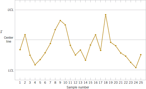
A run of length 8 or more points has a very low probability of occurrence in a random sample of points. Consequently, any type of run of length 8 or more is often taken as a signal of an out-of-control condition. For example, 8 consecutive points on one side of the center line indicate that the process is out of control.
Although runs are an important measure of nonrandom behavior on a control chart, other types of patterns may also indicate an out-of-control condition. For example, consider the ![]() chart in Fig. 15-5. Note that the plotted sample averages exhibit a cyclic behavior, yet they all fall within the control limits. Such a pattern may indicate a problem with the process, such as operator fatigue, raw material deliveries, and heat or stress buildup. The yield may be improved by eliminating or reducing the sources of variability causing this cyclic behavior (see Fig. 15-6). In Fig. 15-6, LSL and USL denote the lower and upper specification limits of the process, respectively. These limits represent bounds within which acceptable product must fall, and they are often based on customer requirements.
chart in Fig. 15-5. Note that the plotted sample averages exhibit a cyclic behavior, yet they all fall within the control limits. Such a pattern may indicate a problem with the process, such as operator fatigue, raw material deliveries, and heat or stress buildup. The yield may be improved by eliminating or reducing the sources of variability causing this cyclic behavior (see Fig. 15-6). In Fig. 15-6, LSL and USL denote the lower and upper specification limits of the process, respectively. These limits represent bounds within which acceptable product must fall, and they are often based on customer requirements.
The problem is one of pattern recognition, that is, recognizing systematic or nonrandom patterns on the control chart and identifying the reason for this behavior. The ability to interpret a particular pattern in terms of assignable causes requires experience and knowledge of the process. That is, we must not only know the statistical principles of control charts, but we must also have a good understanding of the process.
The Western Electric Handbook (1956) suggests a set of decision rules for detecting nonrandom patterns on control charts. Specifically, the Western Electric rules conclude that the process is out of control if either
- One point plots outside 3-sigma control limits.
- Two of three consecutive points plot beyond a 2-sigma limit.

FIGURE 15-5 An
chart with a cyclic pattern.
FIGURE 15-6 (a) Variability with the cyclic pattern. (b) Variability with the cyclic pattern eliminated.

- Four of five consecutive points plot at a distance of 1 sigma or beyond from the center line.
- Eight consecutive points plot on one side of the center line.
We have found these rules very effective in practice for enhancing the sensitivity of control charts. Rules 2 and 3 apply to one side of the center line at a time. That is, a point above the upper 2-sigma limit followed immediately by a point below the lower 2-sigma limit would not signal an out-of-control alarm.
Figure 15-7 shows an ![]() control chart for the piston ring process with the 1-sigma, 2-sigma, and 3-sigma limits used in the Western Electric procedure. Notice that these inner limits (sometimes called warning limits) partition the control chart into three zones A, B, and C on each side of the center line. Consequently, the Western Electric rules are sometimes called the run rules for control charts. Notice that the last four points fall in zone B or beyond. Thus, because four of five consecutive points exceed the 1-sigma limit, the Western Electric procedure concludes that the pattern is nonrandom and the process is out of control.
control chart for the piston ring process with the 1-sigma, 2-sigma, and 3-sigma limits used in the Western Electric procedure. Notice that these inner limits (sometimes called warning limits) partition the control chart into three zones A, B, and C on each side of the center line. Consequently, the Western Electric rules are sometimes called the run rules for control charts. Notice that the last four points fall in zone B or beyond. Thus, because four of five consecutive points exceed the 1-sigma limit, the Western Electric procedure concludes that the pattern is nonrandom and the process is out of control.
15-3  and R or S Control Charts
When dealing with a quality characteristic that can be expressed as a measurement, monitoring both the mean value of the quality characteristic and its variability is customary. Control over the average quality is exercised by the control chart for averages, usually called the ![]() chart. Process variability can be controlled by either a range chart (R chart) or a standard deviation chart (S chart), depending on how the population standard deviation is estimated.
chart. Process variability can be controlled by either a range chart (R chart) or a standard deviation chart (S chart), depending on how the population standard deviation is estimated.
Suppose that the process mean and standard deviation μ and σ are known and that we can assume that the quality characteristic has a normal distribution. Consider the ![]() chart. As discussed previously, we can use μ as the center line for the control chart, and we can place the upper and lower 3-sigma limits at
chart. As discussed previously, we can use μ as the center line for the control chart, and we can place the upper and lower 3-sigma limits at

When the parameters μ and σ are unknown, we usually estimate them on the basis of preliminary samples taken when the process is thought to be in control. We recommend the use of at least 20 to 25 preliminary samples. Suppose that m preliminary samples are available, each of size n. Typically, n is 4, 5, or 6; these relatively small sample sizes are widely used and often arise from the construction of rational subgroups. Let the sample mean for the ith sample be ![]() i. Then we estimate the mean of the population, μ, by the grand mean
i. Then we estimate the mean of the population, μ, by the grand mean
![]()
Thus, we may take ![]() as the center line on the
as the center line on the ![]() control chart.
control chart.
We may estimate σ from either the standard deviation or the range of the observations within each sample. The sample size is relatively small, so there is little loss in efficiency in estimating σ from the sample ranges.
 and R Charts
The relationship between the range R of a sample from a normal population with known parameters and the standard deviation of that population is needed. Because R is a random variable, the quantity W = R/σ, called the relative range, is also a random variable. The mean and standard deviation of the distribution of W are called d2 and d3, respectively. The values for d2 and d3 depend on the subgroup size n. They are computed numerically and available in tables or computer software. Because R = σW,
![]()
Let Ri be the range of the ith sample, and let
![]()
be the average range. Then ![]() is an estimator of μR and from Equation 15-4 we obtain the following.
is an estimator of μR and from Equation 15-4 we obtain the following.
Estimator of σ from R Chart
An unbiased estimator of σ is
![]()
where the constant d2 is tabulated for various sample sizes in Appendix Table XI.
Therefore, once we have computed the sample values ![]() and
and ![]() , we may use as our upper and lower control limits for the
, we may use as our upper and lower control limits for the ![]() chart
chart
Define the constant
![]()
Now, the ![]() control chart may be defined as follows.
control chart may be defined as follows.
![]() Control Chart (from
Control Chart (from ![]() )
)
The center line and upper and lower control limits for an ![]() control chart are
control chart are
![]()
where the constant A2 is tabulated for various sample sizes in Appendix Table XI.
The parameters of the R chart may also be easily determined. The center line is ![]() . To determine the control limits, we need an estimate of σR, the standard deviation of R. Once again, assuming that the process is in control, the distribution of the relative range, W, is useful. We may estimate σR from Equation 15-4 as
. To determine the control limits, we need an estimate of σR, the standard deviation of R. Once again, assuming that the process is in control, the distribution of the relative range, W, is useful. We may estimate σR from Equation 15-4 as
![]()
and the upper and lower control limits on the R chart are
Setting D3 = 1 − 3d3/d2 and D4 = 1 + 3d3/d2 leads to the following definition.
R Chart
The center line and upper and lower control limits for an R chart are
![]()
where ![]() is the sample average range, and the constants D3 and D4 are tabulated for various sample sizes in Appendix Table XI.
is the sample average range, and the constants D3 and D4 are tabulated for various sample sizes in Appendix Table XI.
The LCL for an R chart can be a negative number. In that case, it is customary to set LCL to zero. Because the points plotted on an R chart are non-negative, no points can fall below an LCL of zero. Also, we often study the R chart first because if the process variability is not constant over time, the control limits calculated for the ![]() chart can be misleading.
chart can be misleading.
and S Charts
Rather than base control charts on ranges, a more modern approach is to calculate the standard deviation of each subgroup and plot these standard deviations to monitor the process standard deviation σ. This is called an S chart. When an S chart is used, it is common to use these standard deviations to develop control limits for the ![]() chart. Typically, the sample size used for subgroups is small (fewer than 10) and in that case there is usually little difference in the
chart. Typically, the sample size used for subgroups is small (fewer than 10) and in that case there is usually little difference in the ![]() chart generated from ranges or standard deviations. However, because computer software is often used to implement control charts, S charts are quite common. Details to construct these charts follow.
chart generated from ranges or standard deviations. However, because computer software is often used to implement control charts, S charts are quite common. Details to construct these charts follow.
Section 7-3 stated that S is a biased estimator of σ. That is, E(S) = c4σ where c4 is a constant that is near, but not equal to, 1. Furthermore, a calculation similar to the one used for E(S) can derive the standard deviation of the statistic S with the result σ![]() . Therefore, the center line and 3-sigma control limits for S are
. Therefore, the center line and 3-sigma control limits for S are
Assume that there are m preliminary samples available, each of size n, and let Si denote the standard deviation of the ith sample. Define
![]()
Because E(![]() ) = c4σ, we obtain the following.
) = c4σ, we obtain the following.
Estimator of σ from S Chart
An unbiased estimator of σ
![]()
where the constant c4 is tabulated for various sample sizes in Appendix Table XI.
When an S chart is used, the estimate for σ in Equation 15-15 is commonly used to calculate the control limits for an ![]() chart. This produces the following control limits for an
chart. This produces the following control limits for an ![]() chart.
chart.
![]() Control Chart (from
Control Chart (from ![]() )
)
![]()
A control chart for standard deviations follows.
S Chart
![]()
The LCL for an S chart can be a negative number; in that case, it is customary to set LCL to zero.
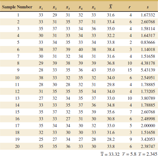
Example 15-1 Vane Opening A component part for a jet aircraft engine is manufactured by an investment casting process. The vane opening on this casting is an important functional parameter of the part. We illustrate the use of ![]() , R, and S control charts to assess the statistical stability of this process. See Table 15-1 for 20 samples of five parts each. The values given in the table have been coded by using the last three digits of the dimension; that is, 31.6 indicates 0.50316 inch.
, R, and S control charts to assess the statistical stability of this process. See Table 15-1 for 20 samples of five parts each. The values given in the table have been coded by using the last three digits of the dimension; that is, 31.6 indicates 0.50316 inch.
The quantities ![]() = 33.3 and
= 33.3 and ![]() = 5.8 appear at the foot of Table 15-1. The value of A2 for samples of size 5 is A2 = 0.577 from Appendix Table XI. Then the trial control limits for the
= 5.8 appear at the foot of Table 15-1. The value of A2 for samples of size 5 is A2 = 0.577 from Appendix Table XI. Then the trial control limits for the ![]() chart are
chart are
![]()
or
![]()
For the R chart, the trial control limits are
![]()
The ![]() and R control charts with these trial control limits are shown in Fig. 15-8. Notice that samples 6, 8, 11, and 19 are out of control on the
and R control charts with these trial control limits are shown in Fig. 15-8. Notice that samples 6, 8, 11, and 19 are out of control on the ![]() chart and that sample 9 is out of control on the R chart. (These points are labeled with a “1” because they violate the first Western Electric rule.)
chart and that sample 9 is out of control on the R chart. (These points are labeled with a “1” because they violate the first Western Electric rule.)
![]() TABLE • 15-1 Vane-Opening Measurements
TABLE • 15-1 Vane-Opening Measurements
For the S chart, the value of c4 = 0.94. Therefore,
![]()
and the trial control limits are
![]()
The LCL is set to zero. If ![]() is used to determine the control limits for the
is used to determine the control limits for the ![]() chart,
chart,
![]()
and this result is nearly the same as from ![]() . The S chart is shown in Fig. 15-9. Because the control limits for the
. The S chart is shown in Fig. 15-9. Because the control limits for the ![]() chart calculated from
chart calculated from ![]() are nearly the same as from
are nearly the same as from ![]() , the chart is not shown.
, the chart is not shown.
Suppose that all of these assignable causes can be traced to a defective tool in the wax-molding area. We should discard these five samples and recompute the limits for the ![]() and R charts. These new revised limits for the
and R charts. These new revised limits for the ![]() chart are
chart are

FIGURE 15-8 The ![]() and R control charts for vane opening.
and R control charts for vane opening.

FIGURE 15-9 The S control chart for vane opening.
and for the R chart,

The revised control charts are shown in Fig. 15-10.
Practical Interpretation: Notice that we have treated the first 20 preliminary samples as estimation data with which to establish control limits. These limits can now be used to judge the statistical control of future production. As each new sample becomes available, the values of ![]() and r should be computed and plotted on the control charts. It may be desirable to revise the limits periodically even if the process remains stable. The limits should always be revised when process improvements are made.
and r should be computed and plotted on the control charts. It may be desirable to revise the limits periodically even if the process remains stable. The limits should always be revised when process improvements are made.

FIGURE 15-10 The ![]() and R control charts for vane opening, revised limits.
and R control charts for vane opening, revised limits.
Computer Construction of and R Control Charts
Many computer programs construct ![]() and R control charts. Figures 15-8 and 15-10 show charts similar to those produced by computer software for the vane-opening data. Software usually allow the user to select any multiple of sigma as the width of the control limits and use the Western Electric rules to detect out-of-control points. The software also prepares a summary report as in Table 15-2 and excludes subgroups from the calculation of the control limits.
and R control charts. Figures 15-8 and 15-10 show charts similar to those produced by computer software for the vane-opening data. Software usually allow the user to select any multiple of sigma as the width of the control limits and use the Western Electric rules to detect out-of-control points. The software also prepares a summary report as in Table 15-2 and excludes subgroups from the calculation of the control limits.
![]() TABLE • 15-2 Summary Report from Computer Software for the Vane-Opening Data
TABLE • 15-2 Summary Report from Computer Software for the Vane-Opening Data
Exercises FOR SECTION 15-3
![]() Problem available in WileyPLUS at instructor's discretion.
Problem available in WileyPLUS at instructor's discretion.
![]() Go Tutorial Tutoring problem available in WileyPLUS at instructor's discretion.
Go Tutorial Tutoring problem available in WileyPLUS at instructor's discretion.
15-1. ![]() Control charts for
Control charts for ![]() and R are to be set up for an important quality characteristic. The sample size is n = 5, and
and R are to be set up for an important quality characteristic. The sample size is n = 5, and ![]() and r are computed for each of 35 preliminary samples. The summary data are
and r are computed for each of 35 preliminary samples. The summary data are
(a) Calculate trial control limits for ![]() and R charts.
and R charts.
(b) Assuming that the process is in control, estimate the process mean and standard deviation.
15-2. ![]() Twenty-five samples of size 5 are drawn from a process at one-hour intervals, and the following data are obtained:
Twenty-five samples of size 5 are drawn from a process at one-hour intervals, and the following data are obtained:
![]()
(a) Calculate trial control limits for ![]() and R charts.
and R charts.
(b) Repeat part (a) for ![]() and S charts.
and S charts.
15-3. ![]() Control charts are to be constructed for samples of size n = 4, and
Control charts are to be constructed for samples of size n = 4, and ![]() and s are computed for each of 20 preliminary samples as follows:
and s are computed for each of 20 preliminary samples as follows:
![]()
(a) Calculate trial control limits for ![]() and S charts.
and S charts.
(b) Assuming the process is in control, estimate the process mean and standard deviation.
15-4. ![]() Samples of size n = 6 are collected from a process every hour. After 20 samples have been collected, we calculate
Samples of size n = 6 are collected from a process every hour. After 20 samples have been collected, we calculate ![]() = 20.0 and
= 20.0 and ![]() / d2 = 1.4.
/ d2 = 1.4.
(a) Calculate trial control limits for ![]() and R charts.
and R charts.
(b) If ![]() / c4 = 1.5, calculate trial control limits for
/ c4 = 1.5, calculate trial control limits for ![]() and S charts.
and S charts.
15-5. ![]() The level of cholesterol (in mg/dL) is an important index for human health. The sample size is n = 5. The following summary statistics are obtained from cholesterol measurements:
The level of cholesterol (in mg/dL) is an important index for human health. The sample size is n = 5. The following summary statistics are obtained from cholesterol measurements:
![]()
(a) Find trial control limits for ![]() and R charts.
and R charts.
(b) Repeat part (a) for ![]() and S charts.
and S charts.
15-6. An ![]() control chart with three-sigma control limits has UCL = 48.75 and LCL = 42.71. Suppose that the process standard deviation is σ = 2.25. What subgroup size was used for the chart?
control chart with three-sigma control limits has UCL = 48.75 and LCL = 42.71. Suppose that the process standard deviation is σ = 2.25. What subgroup size was used for the chart?
![]() 15-7.
15-7. ![]() An extrusion die is used to produce aluminum rods. The diameter of the rods is a critical quality characteristic. The following table shows
An extrusion die is used to produce aluminum rods. The diameter of the rods is a critical quality characteristic. The following table shows ![]() and r values for 20 samples of five rods each. Specifications on the rods are 0.5035 ± 0.0010 inch. The values given are the last three digits of the measurement; that is, 34.2 is read as 0.50342.
and r values for 20 samples of five rods each. Specifications on the rods are 0.5035 ± 0.0010 inch. The values given are the last three digits of the measurement; that is, 34.2 is read as 0.50342.


(a) Using all the data, find trial control limits for ![]() and R charts, construct the chart, and plot the data.
and R charts, construct the chart, and plot the data.
(b) Use the trial control limits from part (a) to identify out-of-control points. If necessary, revise your control limits, assuming that any samples that plot outside the control limits can be eliminated. Estimate σ.
![]() 15-8.
15-8. ![]() The copper content of a plating bath is measured three times per day, and the results are reported in ppm. The
The copper content of a plating bath is measured three times per day, and the results are reported in ppm. The ![]() and r values for 25 days are shown in the following table:
and r values for 25 days are shown in the following table:

(a) Using all the data, find trial control limits for ![]() and R charts, construct the chart, and plot the data. Is the process in statistical control?
and R charts, construct the chart, and plot the data. Is the process in statistical control?
(b) If necessary, revise the control limits computed in part (a), assuming that any samples that plot outside the control limits can be eliminated.
![]()
15-9. ![]() The pull strength of a wire-bonded lead for an integrated circuit is monitored. The following table provides data for 20 samples each of size 3.
The pull strength of a wire-bonded lead for an integrated circuit is monitored. The following table provides data for 20 samples each of size 3.

(a) Use all the data to determine trial control limits for ![]() and R charts, construct the control limits, and plot the data.
and R charts, construct the control limits, and plot the data.
(b) Use the control limits from part (a) to identify out-of-control points. If necessary, revise your control limits assuming that any samples that plot outside of the control limits can be eliminated.
(c) Repeat parts (a) and (b) for ![]() and S charts.
and S charts.
![]() 15-10. The following data were considered in Quality Engineering [“An SPC Case Study on Stabilizing Syringe Lengths” (1999–2000, Vol. 12(1))]. The syringe length is measured during a pharmaceutical manufacturing process. The following table provides data (in inches) for 20 samples each of size 5.
15-10. The following data were considered in Quality Engineering [“An SPC Case Study on Stabilizing Syringe Lengths” (1999–2000, Vol. 12(1))]. The syringe length is measured during a pharmaceutical manufacturing process. The following table provides data (in inches) for 20 samples each of size 5.


(a) Using all the data, find trial control limits for ![]() and R charts, construct the chart, and plot the data. Is this process in statistical control?
and R charts, construct the chart, and plot the data. Is this process in statistical control?
(b) Use the trial control limits from part (a) to identify out-of-control points. If necessary, revise your control limits assuming that any samples that plot outside the control limits can be eliminated.
(c) Repeat parts (a) and (b) for ![]() and S charts.
and S charts.
![]()
15-11. ![]() The thickness of a metal part is an important quality parameter. Data on thickness (in inches) are given in the following table, for 25 samples of five parts each.
The thickness of a metal part is an important quality parameter. Data on thickness (in inches) are given in the following table, for 25 samples of five parts each.

(a) Using all the data, find trial control limits for ![]() and R charts, construct the chart, and plot the data. Is the process in statistical control?
and R charts, construct the chart, and plot the data. Is the process in statistical control?
(b) Use the trial control limits from part (a) to identify out-of-control points. If necessary, revise your control limits assuming that any samples that plot outside the control limits can be eliminated.
(c) Repeat parts (a) and (b) for ![]() and S charts.
and S charts.
15-12. Apply the Western Electric Rules to the following ![]() control chart. The warning limits are shown as dotted lines. Describe any rule violations.
control chart. The warning limits are shown as dotted lines. Describe any rule violations.
15-13. Apply the Western Electric Rules to the following control chart. The warning limits are shown as dotted lines. Describe any rule violations.

![]() 15-14. Web traffic can be measured to help highlight security problems or indicate a potential lack of bandwidth. Data on Web traffic (in thousand hits) from http://en.wikipedia.org/wiki/Web_traffic are given in the following table for 25 samples each of size 4.
15-14. Web traffic can be measured to help highlight security problems or indicate a potential lack of bandwidth. Data on Web traffic (in thousand hits) from http://en.wikipedia.org/wiki/Web_traffic are given in the following table for 25 samples each of size 4.


(a) Use all the data to determine trial control limits for ![]() and R charts, construct the chart, and plot the data.
and R charts, construct the chart, and plot the data.
(b) Use the trial control limits from part (a) to identify out-of-control points. If necessary, revise your control limits, assuming that any samples that plot outside the control limits can be eliminated.
![]()
15-15. Consider the data in Exercise 15-9. Calculate the sample standard deviation of all 60 measurements and compare this result to the estimate of σ obtained from your revised ![]() and R charts. Explain any differences.
and R charts. Explain any differences.
![]()
15-16. Consider the data in Exercise 15-10. Calculate the sample standard deviation of all 100 measurements and compare this result to the estimate of σ obtained from your revised ![]() and R charts. Explain any differences.
and R charts. Explain any differences.
![]()
15-17. An ![]() control chart with 3-sigma control limits and subgroup size n = 4 has control limits UCL = 48.75 and LCL = 40.55.
control chart with 3-sigma control limits and subgroup size n = 4 has control limits UCL = 48.75 and LCL = 40.55.
(a) Estimate the process standard deviation.
(b) Does the response to part (a) depend on whether ![]() or
or ![]() was used to construct the
was used to construct the ![]() control chart?
control chart?
![]()
15-18. An article in Quality & Safety in Health Care [“Statistical Process Control as a Tool for Research and Healthcare Improvement,” (2003) Vol. 12, pp. 458–464] considered a number of control charts in healthcare. The following approximate data were used to construct ![]() − S charts for the turn around time (TAT) for complete blood counts (in minutes). The subgroup size is n = 3 per shift, and the mean standard deviation is 21. Construct the
− S charts for the turn around time (TAT) for complete blood counts (in minutes). The subgroup size is n = 3 per shift, and the mean standard deviation is 21. Construct the ![]() chart and comment on the control of the process. If necessary, assume that assignable causes can be found, eliminate suspect points, and revise the control limits.
chart and comment on the control of the process. If necessary, assume that assignable causes can be found, eliminate suspect points, and revise the control limits.
![]()
15-4 Control Charts for Individual Measurements
In many situations, the sample size used for process control is n = 1; that is, the sample consists of an individual unit. Some examples of these situations follow:
- Automated inspection and measurement technology is used, and every unit manufactured is analyzed.
- The production rate is very slow, and it is inconvenient to allow sample sizes of n > 1 to accumulate before being analyzed.
- Repeat measurements on the process differ only because of laboratory or analysis error as in many chemical processes.
- In process plants, such as papermaking, measurements on some parameters such as coating thickness across the roll differ very little and produce a standard deviation that is much too small if the objective is to control coating thickness along the roll.
In such situations, the individuals control chart (also called an X chart) is useful. The control chart for individuals uses the moving range of two successive observations to estimate the process variability. The moving range is defined as MRi = |Xi − Xi−1| and for m observations the average moving range is m
![]()
An estimator of σ is
![]()
where the value for d2 corresponds to n = 2 because each moving range is the range between two consecutive observations. Note that there are only m − 1 moving ranges. It is also possible to establish a control chart on the moving range using D3 and D4 for n = 2. The parameters for these charts are defined as follows.
Individuals Control Chart
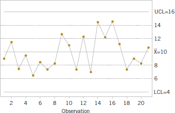
The center line and upper and lower control limits for a control chart for individuals are
and for a control chart for moving ranges

Note that LCL for this moving range chart is always zero because D3 = 0 for n = 2. The procedure is illustrated in the following example.
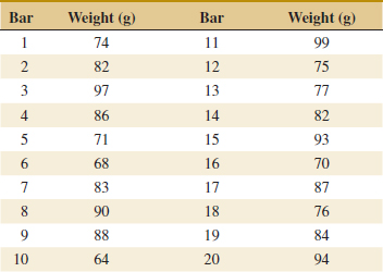
Example 15-2 Chemical Process Concentration Table 15-3 has 20 observations on concentration for the output of a chemical process. The observations are taken at one-hour intervals. If several observations are taken at the same time, the observed concentration readings differ only because of measurement error. Because the measurement error is small, only one observation is taken each hour.
![]() TABLE • 15-3 Chemical Process Concentration Measurements
TABLE • 15-3 Chemical Process Concentration Measurements

To set up the control chart for individuals, note that the sample average of the 20 concentration readings is ![]() = 99.1 and that the average of the moving ranges of two observations shown in the last column of Table 15-3 is
= 99.1 and that the average of the moving ranges of two observations shown in the last column of Table 15-3 is ![]() = 2.59. To set up the moving-range chart, we note that D3 = 0 and D4 = 3.267 for n = 2. Therefore, the moving-range chart has center line
= 2.59. To set up the moving-range chart, we note that D3 = 0 and D4 = 3.267 for n = 2. Therefore, the moving-range chart has center line ![]() = 2.59, LCL = 0, and UCL = D4
= 2.59, LCL = 0, and UCL = D4![]() = (3.267)(2.59) = 8.46. The control chart is shown in Fig. 15-11, which was constructed by computer software. Because no points exceed the upper control limit, we may now set up the control chart for individual concentration measurements. If a moving range of n = 2 observations is used, d2 = 1.128. For the data in Table 15-3, we have
= (3.267)(2.59) = 8.46. The control chart is shown in Fig. 15-11, which was constructed by computer software. Because no points exceed the upper control limit, we may now set up the control chart for individual concentration measurements. If a moving range of n = 2 observations is used, d2 = 1.128. For the data in Table 15-3, we have

The control chart for individual concentration measurements is shown as the upper control chart in Fig. 15-11. There is no indication of an out-of-control condition.
Practical Interpretation: These calculated control limits are used to monitor future production.

FIGURE 15-11 Control charts for individuals and the moving range from computer software for the chemical process concentration data.
The chart for individuals can be interpreted much like an ordinary ![]() control chart. A shift in the process average results in either a point (or points) outside the control limits or a pattern consisting of a run on one side of the center line.
control chart. A shift in the process average results in either a point (or points) outside the control limits or a pattern consisting of a run on one side of the center line.
Some care should be exercised in interpreting patterns on the moving-range chart. The moving ranges are correlated, and this correlation may often induce a pattern of runs or cycles on the chart. The individual measurements are assumed to be uncorrelated, however, and any apparent pattern on the individuals' control chart should be carefully investigated.
The control chart for individuals is not very sensitive to small shifts in the process mean. For example, if the size of the shift in the mean is 1 standard deviation, the average number of points to detect this shift is 43.9. This result is shown later in the chapter. Although the performance of the control chart for individuals is much better for large shifts, in many situations the shift of interest is not large and more rapid shift detection is desirable. In these cases, we recommend time-weighted charts such as the cumulative sum control chart or an exponentially weighted moving-average chart (discussed in Section 15-8).
Some individuals have suggested that limits narrower than 3-sigma be used on the chart for individuals to enhance its ability to detect small process shifts. This is a dangerous suggestion, for narrower limits dramatically increase false alarms and the charts may be ignored and become useless. If you are interested in detecting small shifts, consider the time-weighted charts.
Exercises FOR SECTION 15-4
![]() Problem available in WileyPLUS at instructor's discretion.
Problem available in WileyPLUS at instructor's discretion.
![]() Go Tutorial Tutoring problem available in WileyPLUS at instructor's discretion.
Go Tutorial Tutoring problem available in WileyPLUS at instructor's discretion.
![]() 15-19.
15-19. ![]() Twenty successive hardness measurements are made on a metal alloy, and the data are shown in the following table.
Twenty successive hardness measurements are made on a metal alloy, and the data are shown in the following table.


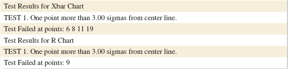
(a) Using all the data, compute trial control limits for individual observations and moving-range charts. Construct the chart and plot the data. Determine whether the process is in statistical control. If not, assume that assignable causes can be found to eliminate these samples and revise the control limits.
(b) Estimate the process mean and standard deviation for the in-control process.
![]() 15-20.
15-20. ![]() In a semiconductor manufacturing process, CVD metal thickness was measured on 30 wafers obtained over approximately two weeks. Data are shown in the following table.
In a semiconductor manufacturing process, CVD metal thickness was measured on 30 wafers obtained over approximately two weeks. Data are shown in the following table.
(a) Using all the data, compute trial control limits for individual observations and moving-range charts. Construct the chart and plot the data. Determine whether the process is in statistical control. If not, assume that assignable causes can be found to eliminate these samples and revise the control limits.
(b) Estimate the process mean and standard deviation for the in-control process.

![]() 15-21.
15-21. ![]() An automatic sensor measures the diameter of holes in consecutive order. The results of measuring 25 holes are in the following table.
An automatic sensor measures the diameter of holes in consecutive order. The results of measuring 25 holes are in the following table.

(a) Using all the data, compute trial control limits for individual observations and moving-range charts. Construct the control chart and plot the data. Determine whether the process is in statistical control. If not, assume that assignable causes can be found to eliminate these samples and revise the control limits.
(b) Estimate the process mean and standard deviation for the in-control process.
![]()
15-22. ![]() The viscosity of a chemical intermediate is measured every hour. Twenty samples each of size n = 1 are in the following table.
The viscosity of a chemical intermediate is measured every hour. Twenty samples each of size n = 1 are in the following table.
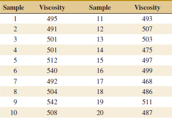
(a) Using all the data, compute trial control limits for individual observations and moving-range charts. Determine whether the process is in statistical control. If not, assume that assignable causes can be found to eliminate these samples and revise the control limits.
(b) Estimate the process mean and standard deviation for the in-control process.
![]()
15-23. ![]() The following table of data was analyzed in Quality Engineering [1991–1992, Vol. 4(1)]. The average particle size of raw material was obtained from 25 successive samples.
The following table of data was analyzed in Quality Engineering [1991–1992, Vol. 4(1)]. The average particle size of raw material was obtained from 25 successive samples.
(a) Using all the data, compute trial control limits for individual observations and moving-range charts. Construct the chart and plot the data. Determine whether the process is in statistical control. If not, assume that assignable causes can be found to eliminate these samples and revise the control limits.
(b) Estimate the process mean and standard deviation for the in-control process.
![]() 15-24. Pulsed laser deposition technique is a thin film deposition technique with a high-powered laser beam. Twenty-five films were deposited through this technique. The thicknesses of the films obtained are shown in the following table.
15-24. Pulsed laser deposition technique is a thin film deposition technique with a high-powered laser beam. Twenty-five films were deposited through this technique. The thicknesses of the films obtained are shown in the following table.

(a) Using all the data, compute trial control limits for individual observations and moving-range charts. Determine whether the process is in statistical control. If not, assume that assignable causes can be found to eliminate these samples, and revise the control limits.
(b) Estimate the process mean and standard deviation for the in-control process.
![]() 15-25. The production manager of a soap manufacturing company wants to monitor the weights of the bars produced on the line. Twenty bars are taken during a stable period of the process. The weights of the bars are shown in the following table.
15-25. The production manager of a soap manufacturing company wants to monitor the weights of the bars produced on the line. Twenty bars are taken during a stable period of the process. The weights of the bars are shown in the following table.
(a) Using all the data, compute trial control limits for individual observations and moving-range charts. Determine whether the process is in statistical control. If not, assume that assignable causes can be found to eliminate these samples, and revise the control limits.
(b) Estimate the process mean and standard deviation for the in-control process.
![]()
15-26. An article in Quality & Safety in Health Care [“Statistical Process Control as a Tool for Research and Healthcare Improvement,” (2003 Vol. 12, pp. 458–464)] considered a number of control charts in healthcare. An X chart was constructed for the amount of infectious waste discarded each day (in pounds). The article mentions that improperly classified infectious waste (actually not hazardous) adds substantial costs to hospitals each year. The following tables show approximate data for the average daily waste per month before and after process changes, respectively. The process change included an education campaign to provide an operational definition for infectious waste.
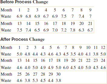
(a) Handle the data before and after the process change separately and construct individuals and moving-range charts for each set of data. Assume that assignable causes can be found and eliminate suspect observations. If necessary, revise the control limits.
(b) Comment on the control of each chart and differences between the charts. Was the process change effective?
![]()
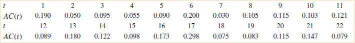
15-27. An article in Journal of the Operational Research Society [“A Quality Control Approach for Monitoring Inventory Stock Levels,” (1993, pp. 1115–1127)] reported on a control chart to monitor the accuracy of an inventory management system. Inventory accuracy at time t, AC(t), is defined as the difference between the recorded and actual inventory (in absolute value) divided by the recorded inventory. Consequently, AC(t) ranges between 0 and 1 with lower values better. Extracted data are shown in the following table.
(a) Calculate individuals and moving-range charts for these data.
(b) Comment on the control of the process. If necessary, assume that assignable causes can be found, eliminate suspect points, and revise the control limits.
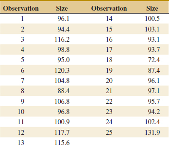
15-5 Process Capability
It is usually necessary to obtain some information about the process capability, that is, the performance of the process when it is operating in control. Two graphical tools, the tolerance chart (or tier chart) and the histogram, are helpful in assessing process capability. The tolerance chart for all 20 samples from the vane-manufacturing process is shown in Fig. 15-12. The specifications on vane opening are 0.5030 ± 0.0010 in. In terms of the coded data, the upper specification limit is USL = 40 and the lower specification limit is LSL = 20, and these limits are shown on the chart in Fig. 15-12. Each measurement is plotted on the tolerance chart. Measurements from the same subgroup are connected with lines. The tolerance chart is useful in revealing patterns over time in the individual measurements, or it may show that a particular value of ![]() or r was produced by one or two unusual observations in the sample. For example, note the two unusual observations in sample 9 and the single unusual observation in sample 8. Note also that it is appropriate to plot the specification limits on the tolerance chart because it is a chart of individual measurements. It is never appropriate to plot specification limits on a control chart or to use the specifications in determining the control limits. Specification limits and control limits are unrelated. Finally, note from Fig. 15-12 that the process is running off-center from the nominal dimension of 30 (or 0.5030 in).
or r was produced by one or two unusual observations in the sample. For example, note the two unusual observations in sample 9 and the single unusual observation in sample 8. Note also that it is appropriate to plot the specification limits on the tolerance chart because it is a chart of individual measurements. It is never appropriate to plot specification limits on a control chart or to use the specifications in determining the control limits. Specification limits and control limits are unrelated. Finally, note from Fig. 15-12 that the process is running off-center from the nominal dimension of 30 (or 0.5030 in).
The histogram for the vane-opening measurements is shown in Fig. 15-13. The observations from samples 6, 8, 9, 11, and 19 (corresponding to out of-control points on either the ![]() or R chart) have been deleted from this histogram. The general impression from examining this histogram is that the process is capable of meeting the specification but that it is running off-center.
or R chart) have been deleted from this histogram. The general impression from examining this histogram is that the process is capable of meeting the specification but that it is running off-center.
Another way to express process capability is in terms of an index that is defined as follows.
Process Capability Ratio
The process capability ratio (PCR) is
![]()
The numerator of PCR is the width of the specifications. The limits 3σ on either side of the process mean are sometimes called natural tolerance limits, for these represent limits that an in-control process should meet with most of the units produced. Consequently, 6σ is often referred to as the width of the process. For the vane opening, where our sample size is 5, we could estimate σ as
![]()
Therefore, the PCR is estimated to be
![]()
The PCR has a natural interpretation: (1/PCR)100% is just the percentage of the specifications' width used by the process. Thus, the vane-opening process uses approximately (1/1.55)100% = 64.5% of the specifications' width.

FIGURE 15-12 Tolerance diagram of vane openings.
Figure 15-14(a) shows a process for which the PCR exceeds unity. Because the process natural tolerance limits lie inside the specifications, very few defective or nonconforming units are produced. If PCR = 1, as shown in Fig. 15-14(b), more nonconforming units result. In fact, for a normally distributed process, if PCR = 1, the fraction nonconforming is 0.27%, or 2700 parts per million. Finally, when the PCR is less than unity, as in Fig. 15-14(c), the process is very yield-sensitive and a large number of nonconforming units is be produced.
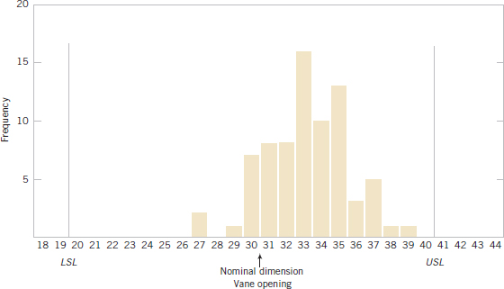
FIGURE 15-13 Histogram for vane opening.
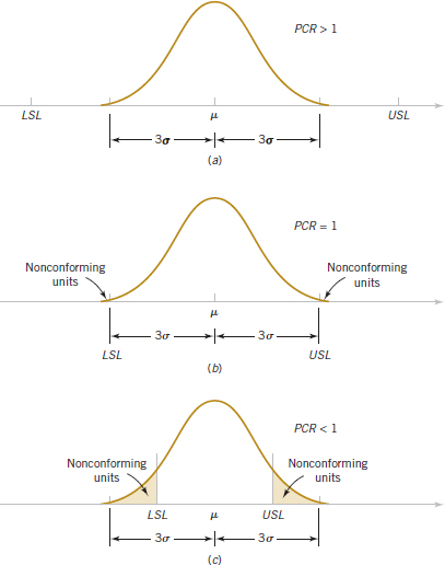
FIGURE 15-14 Process fallout and the process capability ratio (PCR).
The definition of the PCR given in Equation 15-20 implicitly assumes that the process is centered at the nominal dimension. If the process is running off-center, its actual capability is less than indicated by the PCR. It is convenient to think of PCR as a measure of potential capability, that is, capability with a centered process. If the process is not centered, a measure of actual capability is often used. This ratio, called PCRk, is defined next.
PCRk
![]()
In effect, PCRk is a one-sided process capability ratio that is calculated relative to the specification limit nearest to the process mean. For the vane-opening process, we find that the estimate of the process capability ratio PCRk (after deleting the samples corresponding to out-of-control points) is

Note that if PCR = PCRk, the process is centered at the nominal dimension. Because PCRK = 1.05 for the vane-opening process and PCR = 1.55, the process is obviously running off-center, as was first noted in Figs. 15-10 and 15-13. This off-center operation was ultimately traced to an oversized wax tool. Changing the tooling resulted in a substantial improvement in the process.
The fractions of nonconforming output (or fallout) below the lower specification limit and above the upper specification limit are often of interest. Suppose that the output from a normally distributed process in statistical control is denoted as X. The fractions are determined from
![]()
Example 15-3 Electrical Current For an electronic manufacturing process a current has specifications of 100 ± 10 milliamperes. The process mean μ and standard deviation σ are 107.0 and 1.5, respectively. The process mean is nearer to the USL. Consequently,
![]()
and
![]()
The small PCRk indicates that the process is likely to produce currents outside the specification limits. From the normal distribution in Appendix Table II,
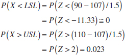
Practical Interpretation: The probability a current is less than the LSL is nearly zero. However, the relatively large probability of exceeding the USL is a warning of potential problems with this criterion even if none of the measured observations in a preliminary sample exceeds this limit. The PCRk would improve if the process mean were centered in the specifications at 100 milliamperes.
We emphasize that the fraction-nonconforming calculation assumes that the observations are normally distributed and the process is in control. Departures from normality can seriously affect the results. The calculation should be interpreted as an approximate guideline for process performance. To make matters worse, μ and σ need to be estimated from the data available, and a small sample size can result in poor estimates that further degrade the calculation.
Table 15-4 relates fallout in parts per million (PPM) for a normally-distributed process in statistical control to the value of PCR. The table shows PPM for a centered process and for one with a 1.5σ shift in the process mean. Many U.S. companies use PCR = 1.33 as a minimum acceptable target and PCR = 1.66 as a minimum target for strength, safety, or critical characteristics.
Some companies require that internal processes and those at suppliers achieve a PCRk = 2.0. Figure 15-15 illustrates a process with PCR = PCRk = 2.0. Assuming a normal distribution, the calculated fallout for this process is 0.0018 parts per million. A process with PCRk = 2.0 is referred to as a 6-sigma process because the distance from the process mean to the nearest specification is 6 standard deviations. The reason that such a large process capability is often required is that maintaining a process mean at the center of the specifications for long periods of time is difficult. A common model that is used to justify the importance of a 6-sigma process is illustrated by referring to Fig. 15-15. If the process mean shifts off-center by 1.5 standard deviations, the PCRk decreases to
![]() TABLE • 15-4 PCR Related to PPM for a Normally Distributed Process
TABLE • 15-4 PCR Related to PPM for a Normally Distributed Process

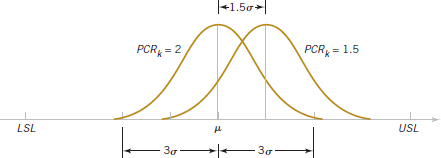
FIGURE 15-15 Mean of a 6-sigma process shifts by 1.5 standard deviations.
![]()
Assuming a normally distributed process, the fallout of the shifted process is 3.4 parts per million. Consequently, the mean of a 6-sigma process can shift 1.5 standard deviations from the center of the specifications and still maintain a minimal fallout.
In addition, some U.S. companies, particularly the automobile industry, have adopted the terminology Cp = PCR and Cpk = PCRk. Because Cp has another meaning in statistics (in multiple regression), we prefer the traditional notation PCR and PCRk.
We repeat that process capability calculations are meaningful only for stable processes; that is, processes that are in control. A process capability ratio indicates whether or not the natural or chance variability in a process is acceptable relative to the specifications.
Exercises FOR SECTION 15-5
![]() Problem available in WileyPLUS at instructor's discretion.
Problem available in WileyPLUS at instructor's discretion.
![]() Go Tutorial Tutoring problem available in WileyPLUS at instructor's discretion.
Go Tutorial Tutoring problem available in WileyPLUS at instructor's discretion.
15-28. ![]() Suppose that a quality characteristic is normally distributed with specifications at 100 ± 20. The process standard deviation is 6.
Suppose that a quality characteristic is normally distributed with specifications at 100 ± 20. The process standard deviation is 6.
(a) Suppose that the process mean is 100. What are the natural tolerance limits? What is the fraction defective? Calculate PCR and PCRk and interpret these ratios.
(b) Suppose that the process mean is 106. What are the natural tolerance limits? What is the fraction defective? Calculate PCR and PCRk and interpret these ratios.
15-29. ![]() Suppose that a quality characteristic is normally distributed with specifications from 20 to 32 units.
Suppose that a quality characteristic is normally distributed with specifications from 20 to 32 units.
(a) What value is needed for σ to achieve a PCR of 1.5?
(b) What value for the process mean minimizes the fraction defective? Does this choice for the mean depend on the value of σ?
15-30. ![]() Suppose that a quality characteristic is normally distributed with specifications from 10 to 30 units. The process standard deviation is 2 units.
Suppose that a quality characteristic is normally distributed with specifications from 10 to 30 units. The process standard deviation is 2 units.
(a) Calculate the natural tolerance limits, fraction defective, PCR, and PCRk when the process mean is 20.
(b) Suppose that the process mean shifts higher by 1.5 standard deviations. Recalculate the quantities in part (b).
(c) Compare the results in parts (a) and (b) and comment on any differences.
15-31. ![]() A normally distributed process uses 66.7% of the specification band. It is centered at the nominal dimension, located halfway between the upper and lower specification limits.
A normally distributed process uses 66.7% of the specification band. It is centered at the nominal dimension, located halfway between the upper and lower specification limits.
(a) Estimate PCR and PCRk. Interpret these ratios.
(b) What fallout level (fraction defective) is produced?
15-32. ![]() A normally distributed process uses 85% of the specification band. It is centered at the nominal dimension, located halfway between the upper and lower specification limits.
A normally distributed process uses 85% of the specification band. It is centered at the nominal dimension, located halfway between the upper and lower specification limits.
(a) Estimate PCR and PCRk. Interpret these ratios.
(b) What fallout level (fraction defective) is produced?
![]() 15-33. Reconsider Exercise 15-1. Suppose that the quality characteristic is normally distributed with specification at 220 ± 40. What is the fallout level? Estimate PCR and PCRk and interpret these ratios.
15-33. Reconsider Exercise 15-1. Suppose that the quality characteristic is normally distributed with specification at 220 ± 40. What is the fallout level? Estimate PCR and PCRk and interpret these ratios.
![]() 15-34. Reconsider Exercise 15-2 in which the specification limits are 14.50 ± 0.50.
15-34. Reconsider Exercise 15-2 in which the specification limits are 14.50 ± 0.50.
(a) What conclusions can you draw about the ability of the process to operate within these limits? Estimate the percentage of defective items that is produced.
(b) Estimate PCR and PCRk. Interpret these ratios.
![]() 15-35.
15-35. ![]() Reconsider Exercise 15-3. Suppose that the variable is normally distributed with specifications at 220 ± 50. What is the proportion out of specifications? Estimate and interpret PCR and PCRk.
Reconsider Exercise 15-3. Suppose that the variable is normally distributed with specifications at 220 ± 50. What is the proportion out of specifications? Estimate and interpret PCR and PCRk.
![]() 15-36. Reconsider Exercise 15-4(a). Assuming that both charts exhibit statistical control and that the process specifications are at 20 ± 5, estimate PCR and PCRk and interpret these ratios.
15-36. Reconsider Exercise 15-4(a). Assuming that both charts exhibit statistical control and that the process specifications are at 20 ± 5, estimate PCR and PCRk and interpret these ratios.
![]() 15-37. Reconsider the diameter measurements in Exercise 15-7. Use the revised control limits and process estimates.
15-37. Reconsider the diameter measurements in Exercise 15-7. Use the revised control limits and process estimates.
(a) Estimate PCR and PCRk. Interpret these ratios.
(b) What percentage of defectives is being produced by this process?
![]() 15-38. Reconsider the copper-content measurements in Exercise 15-8. Given that the specifications are at 6.0 ± 1.0, estimate PCR and PCRk and interpret these ratios.
15-38. Reconsider the copper-content measurements in Exercise 15-8. Given that the specifications are at 6.0 ± 1.0, estimate PCR and PCRk and interpret these ratios.
![]() 15-39. Reconsider the pull-strength measurements in Exercise 15-9. Estimate the fallout level if the specifications are 16 ± 5. Estimate PCR and interpret this ratio.
15-39. Reconsider the pull-strength measurements in Exercise 15-9. Estimate the fallout level if the specifications are 16 ± 5. Estimate PCR and interpret this ratio.
![]()
15-40. Reconsider the syringe lengths in Exercise 15-10. Suppose that the specifications are set at 4.90 and 5.00.
(a) Estimate the process standard deviation.
(b) Calculate PCR and PCRK for the process.
![]()
15-41. Reconsider the hardness measurements in Exercise 15-19. Suppose that the specifications are 45 to 60.
(a) Estimate the process standard deviation.
(b) Calculate PCR and PCRK for the process.
![]()
15-42. ![]() Reconsider the viscosity measurements in Exercise 15-22. The specifications are 500 ± 25. Calculate estimates of the process capability ratios PCR and PCRk for this process and provide an interpretation.
Reconsider the viscosity measurements in Exercise 15-22. The specifications are 500 ± 25. Calculate estimates of the process capability ratios PCR and PCRk for this process and provide an interpretation.
15-43. Suppose that a quality characteristic is normally distributed with specifications at 120 ± 20. The process standard deviation is 6.5.
(a) Suppose that the process mean is 120. What are the natural tolerance limits? What is the fraction defective? Calculate PCR and PCRk and interpret these ratios.
(b) Suppose that the process mean shifts off-center by 1.5 standard deviations toward the upper specification limit. Recalculate the quantities in part (a).
(c) Compare the results in parts (a) and (b) and comment on any differences.
15-44. Suppose that a quality characteristic is normally distributed with specifications at 150 ± 20. Natural tolerance limits for the process are 150 ± 18.
(a) Calculate the process standard deviation.
(b) Calculate PCR and PCRk of the process. Calculate the percentage of the specification width used by the process.
(c) What fallout level (fraction defective) is produced?
15-45. An ![]() control chart with 3-sigma control limits and subgroup size n = 4 has control limits UCL = 28.8 and LCL = 24.6. The process specification limits are (24, 32).
control chart with 3-sigma control limits and subgroup size n = 4 has control limits UCL = 28.8 and LCL = 24.6. The process specification limits are (24, 32).
(a) Estimate the process standard deviation.
(b) Calculate PCR and PCRk for the process.
15-46. A control chart for individual observations has 3-sigma control limits UCL = 1.80 and LCL = 1.62. The process specification limits are (1.64, 1.84).
(a) Estimate the process standard deviation.
(b) Calculate PCR and PCRk for the process.
15-47. A process mean is centered between the specification limits and PCR = 1.33. Assume that the process mean increases by 1.5σ.
(a) Calculate PCR and PCRK for the shifted process.
(b) Calculate the estimated fallout from the shifted process and compare your result to those in Table 15-4. Assume a normal distribution for the measurement.
15-48. The PCR for a measurement is 1.5 and the control limits for an ![]() chart with n = 4 are 24.6 and 32.6.
chart with n = 4 are 24.6 and 32.6.
(a) Estimate the process standard deviation σ.
(b) Assume that the specification limits are centered around the process mean. Calculate the specification limits.
15-6 Attribute Control Charts
15-6.1 P CHART (CONTROL CHART FOR PROPORTIONS)
Often it is desirable to classify a product as either defective or nondefective on the basis of comparison with a standard. This classification is usually done to achieve economy and simplicity in the inspection operation. For example, the diameter of a ball bearing may be checked by determining whether it passes through a gauge consisting of circular holes cut in a template. This kind of measurement would be much simpler than directly measuring the diameter with a device such as a micrometer. Control charts for attributes are used in these situations. Attribute control charts often require a considerably larger sample size than do their variable measurements counterparts. In this section, we discuss the fraction-defective control chart, or P chart. Sometimes the P chart is called the control chart for fraction nonconforming.
At each sample time, a random sample of n units is selected. Suppose that D is the number of defective units in the sample. We assume that D is a binomial random variable with unknown parameter p. The fraction defective
![]()
of each sample is plotted on the chart. Furthermore, the binomial distribution, the variance of the statistic P, is
![]()
Therefore, a P chart for fraction defective could be constructed using p as the center line and control limits at
![]()
However, the true process fraction defective is almost always unknown and must be estimated using the data from preliminary samples.
Suppose that m preliminary samples each of size n are available, and let Di be the number of defectives in the ith sample. Then Pi = Di/n is the sample fraction defective in the ith sample. The average fraction defective is
![]()
Now ![]() may be used as an estimator of p in the center line and control limit formulas.
may be used as an estimator of p in the center line and control limit formulas.
P Chart
The center line and upper and lower control limits for the P chart are
![]()
where ![]() is the observed value of the average fraction defective.
is the observed value of the average fraction defective.
These control limits are based on the normal approximation to the binomial distribution. When p is small, the normal approximation may not always be adequate. In such cases, we may use control limits obtained directly from a table of binomial probabilities. If ![]() is small, the lower control limit obtained from the normal approximation may be a negative number. If this should occur, it is customary to consider zero as the lower control limit.
is small, the lower control limit obtained from the normal approximation may be a negative number. If this should occur, it is customary to consider zero as the lower control limit.
Example 15-4 Ceramic Substrate We wish to construct a fraction-defective control chart for a ceramic substrate production line. We have 20 preliminary samples, each of size 100; the number of defectives in each sample is shown in Table 15-5. Assume that the samples are numbered in the sequence of production. Note that ![]() = (800/2000) = 0.40; therefore, the trial parameters for the control chart are
= (800/2000) = 0.40; therefore, the trial parameters for the control chart are

The control chart is shown in Fig. 15-16. All samples are in control. If they were not, we would search for assignable causes of variation and revise the limits accordingly. This chart can be used for controlling future production.
Practical Interpretation: Although this process exhibits statistical control, its defective rate (![]() = 0.40) is very poor. We should take appropriate steps to investigate the process to determine why such a large number of defective units is being produced. Defective units should be analyzed to determine the specific types of defects present. Once the defect types are known, process changes should be investigated to determine their impact on defect levels. Designed experiments may be useful in this regard.
= 0.40) is very poor. We should take appropriate steps to investigate the process to determine why such a large number of defective units is being produced. Defective units should be analyzed to determine the specific types of defects present. Once the defect types are known, process changes should be investigated to determine their impact on defect levels. Designed experiments may be useful in this regard.
![]() TABLE • 15-5 Number of Defectives in Samples of 100 Ceramic Substrates
TABLE • 15-5 Number of Defectives in Samples of 100 Ceramic Substrates


Computer software also produces an NP chart. This is just a control chart of nP = D, the number of defectives in a sample. The points, center line, and control limits for this chart are simply multiples (times n) of the corresponding elements of a P chart. The use of an NP chart avoids the fractions in a P chart, but it is otherwise equivalent.
15-6.2 U CHART (CONTROL CHART FOR DEFECTS PER UNIT)
It is sometimes necessary to monitor the number of defects in a unit of product rather than the fraction defective. For example, a hospital might record the number of cases of infection per month, or a semiconductor manufacturer might record the number of large contamination particles per wafer. In these situations, we may use the defects-per-unit chart or U chart. If each subgroup consists of n units and there are C total defects in the subgroup, then,
![]()
is the average number of defects per unit. A U chart may be constructed for such data.
Many defects-per-unit situations can be modeled by the Poisson distribution. Suppose that the number of defects in a unit is a Poisson random variable with mean λ. The variance also equals λ. Each point on the chart is an observed value of U, the average number of defects per unit from a sample of n units. The mean of U is λ, and the variance of U is λ/n. Therefore, the control limits for the U chart with known λ are:
![]()
If there are m preliminary samples, and the number of defects per unit in these samples are U1, U2,..., Um, the estimator of the average number of defects per unit is
![]()
Now ![]() is used as an estimator of λ in the center line and control limit formulas.
is used as an estimator of λ in the center line and control limit formulas.
U Chart
The center line and upper and lower control limits on the U chart are

where ![]() is the average number of defects per unit.
is the average number of defects per unit.
These control limits are based on the normal approximation to the Poisson distribution. When λ is small, the normal approximation may not always be adequate. In such cases, we may use control limits obtained directly from a table of Poisson probabilities. If ![]() is small, the lower control limit obtained from the normal approximation may be a negative number. If this should occur, it is customary to use zero as the lower control limit.
is small, the lower control limit obtained from the normal approximation may be a negative number. If this should occur, it is customary to use zero as the lower control limit.
Example 15-5 Printed Circuit Boards Printed circuit boards are assembled by a combination of manual assembly and automation. Surface mount technology (SMT) is used to make the mechanical and electrical connections of the components to the board. Every hour, five boards are selected and inspected for process-control purposes. The number of defects in each sample of five boards is noted. Results for 20 samples are shown in Table 15-6.
The center line for the U chart is
![]()
and the upper and lower control limits are

The control chart is plotted in Fig. 15-17. Because LCL is negative, it is set to 0. From the control chart in Fig. 15-17, we see that the process is in control.
Practical Interpretation: Eight defects per group of five circuit boards are too many (about 8/5 = 1.6 defects/board), and the process needs improvement. An investigation of the specific types of defects found on the printed circuit board needs to be made. This usually suggests potential avenues for process improvement.
![]() TABLE • 15-6 Number of Defects in Samples of Five Printed Circuit Boards
TABLE • 15-6 Number of Defects in Samples of Five Printed Circuit Boards


FIGURE 15-17 U chart of defects per unit on printed circuit boards.
Computer software also produces a C chart. This is just a control chart of C, the total of defects in a sample. The points, center line, and control limits for this chart are simply multiples (times n) of the corresponding elements of a U chart. The use of a C chart avoids the fractions that can occur in a U chart, but it is otherwise equivalent.
![]() Problem available in WileyPLUS at instructor's discretion.
Problem available in WileyPLUS at instructor's discretion.
![]() Go Tutorial Tutoring problem available in WileyPLUS at instructor's discretion.
Go Tutorial Tutoring problem available in WileyPLUS at instructor's discretion.
![]() 15-49.
15-49. ![]() An early example of SPC was described in Industrial Quality Control [“The Introduction of Quality Control at Colonial Radio Corporation” (1944, Vol. 1(1), pp. 4–9)]. The following are the fractions defective of shaft and washer assemblies during the month of April in samples of n = 1500 each:
An early example of SPC was described in Industrial Quality Control [“The Introduction of Quality Control at Colonial Radio Corporation” (1944, Vol. 1(1), pp. 4–9)]. The following are the fractions defective of shaft and washer assemblies during the month of April in samples of n = 1500 each:
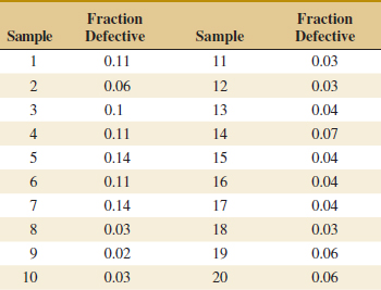
(a) Set up a P chart for this process. Is this process in statistical control?
(b) Suppose that instead of n = 1500, n = 100. Use the data given to set up a P chart for this process. Revise the control limits if necessary.
(c) Compare your control limits for the P charts in parts (a) and (b). Explain why they differ. Also, explain why your assessment about statistical control differs for the two sizes of n.
![]() 15-50.
15-50. ![]() Suppose that the following fraction defective has been found in successive samples of size 100 (read down):
Suppose that the following fraction defective has been found in successive samples of size 100 (read down):
(a) Using all the data, compute trial control limits for a fraction-defective control chart, construct the chart, and plot the data.

(b) Determine whether the process is in statistical control. If not, assume that assignable causes can be found and out-of-control points eliminated. Revise the control limits.
![]()
15-51. ![]() The following are the numbers of defective solder joints found during successive samples of 500 solder joints:
The following are the numbers of defective solder joints found during successive samples of 500 solder joints:

(a) Using all the data, compute trial control limits for a fraction-defective control chart, construct the chart, and plot the data.
(b) Determine whether the process is in statistical control. If not, assume that assignable causes can be found and out-of-control points eliminated. Revise the control limits.
![]()
15-52. ![]() The following represent the number of defects per 1000 feet in rubber-covered wire: 1, 1, 3, 7, 8, 10, 5, 13, 0, 19, 24, 6, 9, 11, 15, 8, 3, 6, 7, 4, 9, 20, 11, 7, 18, 10, 6, 4, 0, 9, 7, 3, 1, 8, 12. Do the data come from a controlled process?
The following represent the number of defects per 1000 feet in rubber-covered wire: 1, 1, 3, 7, 8, 10, 5, 13, 0, 19, 24, 6, 9, 11, 15, 8, 3, 6, 7, 4, 9, 20, 11, 7, 18, 10, 6, 4, 0, 9, 7, 3, 1, 8, 12. Do the data come from a controlled process?
![]()
15-53. ![]() The following represent the number of solder defects observed on 24 samples of five printed circuit boards: 7, 6, 8, 10, 24, 6, 5, 4, 8, 11, 15, 8, 4, 16, 11, 12, 8, 6, 5, 9, 7, 14, 8, 21.
The following represent the number of solder defects observed on 24 samples of five printed circuit boards: 7, 6, 8, 10, 24, 6, 5, 4, 8, 11, 15, 8, 4, 16, 11, 12, 8, 6, 5, 9, 7, 14, 8, 21.
(a) Using all the data, compute trial control limits for a U control chart, construct the chart, and plot the data.
(b) Can we conclude that the process is in control using a U chart? If not, assume that assignable causes can be found, and list points and revise the control limits.
![]()
15-54. Consider the data on the number of earthquakes of magnitude 7.0 or greater by year in Exercise 6-87.
(a) Construct a U chart for this data with a sample size of n = 1.
(b) Do the data appear to be generated by an in-control process? Explain.
![]()
15-55. In a semiconductor manufacturing company, samples of 200 wafers are tested for defectives in the lot. See the number of defectives in 20 such samples in the following table.

(a) Set up a P chart for this process. Is the process in statistical control?
(b) Suppose that instead of samples of size 200, we have samples of size 100. Use the data to set up a P chart for this process. Revise the control limits if necessary.
(c) Compare the control limits in parts (a) and (b). Explain why they differ.
![]() 15-56. The following data are the number of spelling errors detected for every 1000 words on a news Web site over 20 weeks.
15-56. The following data are the number of spelling errors detected for every 1000 words on a news Web site over 20 weeks.

(a) What control chart is most appropriate for these data?
(b) Using all the data, compute trial control limits for the chart in part (a), construct the chart, and plot the data.
(c) Determine whether the process is in statistical control. If not, assume that assignable causes can be found and out-of-control points eliminated. Revise the control limits.
![]()
15-57. A article of Epilepsy Research [“Statistical Process Control (SPC): A Simple Objective Method for Monitoring Seizure Frequency and Evaluating Effectiveness of Drug Interventions in Refractory Childhood Epilepsy,” (2010, Vol 91, pp. 205–213)] used control charts to monitor weekly seizure changes in patients with refractory childhood epilepsy. The following table shows representative data of weekly observations of seizure frequency (SF).

(a) What type of control chart is appropriate for these data? Construct this chart.
(b) Comment on the control of the process.
(c) If necessary, assume that assignable causes can be found, eliminate suspect points, and revise the control limits.
(d) In the publication, the weekly SFs were approximated as normally distributed and an individuals chart was constructed. Construct this chart and compare it to the attribute chart you built in part (a).
![]()
15-58. A article in Graefe's Archive for Clinical and Experimental Ophthalmology [“Statistical Process Control Charts for Ophthalmology,” (2011, Vol. 249, pp. 1103–1105)] considered the number of cataract surgery cases by month. The data are shown in the following table.
(a) What type of control chart is appropriate for these data? Construct this chart.
(b) Comment on the control of the process.
(c) If necessary, assume that assignable causes can be found, eliminate suspect points, and revise the control limits.
(d) In the publication, the data were approximated as normally distributed and an individuals chart was constructed. Construct this chart and compare it to the attribute chart you built in part (a). Why might an individuals chart be reasonable?
15-7 Control Chart Performance
Specifying the control limits is one of the critical decisions that must be made in designing a control chart. By moving the control limits farther from the center line, we decrease the risk of a type I error—that is, the risk of a point falling beyond the control limits, indicating an out-of-control condition when no assignable cause is present. However, widening the control limits also increases the risk of a type II error—that is, the risk of a point falling between the control limits when the process is really out of control. If we move the control limits closer to the center line, the opposite effect is obtained: The risk of type I error increases, and the risk of type II error decreases.
The control limits on a Shewhart control chart are customarily located a distance of plus or minus 3 standard deviations of the statistic plotted on the chart from the center line. That is, the constant k in Equation 15-1 should be set equal to 3. These limits are called 3-sigma control limits.
A way to evaluate decisions regarding sample size and sampling frequency is through the average run length (ARL) of the control chart. Essentially, the ARL is the average number of points plotted to signal an out-of-control condition. For any Shewhart control chart, the ARL can be calculated from the mean of a geometric random variable. Suppose that p is the probability that any point exceeds the control limits. Then
Average Run Length
![]()
Thus, for an ![]() chart with 3-sigma limits, p = 0.0027 is the probability that a normally distributed point falls outside the limits when the process is in control, so
chart with 3-sigma limits, p = 0.0027 is the probability that a normally distributed point falls outside the limits when the process is in control, so
![]()
is the average run length of the ![]() chart when the process is in control. That is, even if the process remains in control, an out-of-control signal is generated every 370 points on average.
chart when the process is in control. That is, even if the process remains in control, an out-of-control signal is generated every 370 points on average.
Consider the piston ring process discussed in Section 15-2.2, and suppose that we are sampling every hour. Thus, we have a false alarm about every 370 hours on average. Suppose that we are using a sample size of n = 5 and that when the process goes out of control, the mean shifts to 74.0135 millimeters. Then, the probability that ![]() falls between the control limits of Fig. 15-3 is equal to
falls between the control limits of Fig. 15-3 is equal to

Therefore, p in Equation 15-28 is 0.50, and the out-of-control ARL is
![]()
That is, the control chart will require two samples to detect the process shift, on the average, so two hours will elapse between the shift and its detection (again, on the average). Suppose that this approach is unacceptable because production of piston rings with a mean diameter of 74.0135 millimeters results in excessive scrap costs and delays final engine assembly. How can we reduce the time needed to detect the out-of-control condition? One method is to sample more frequently. For example, if we sample every half hour, only one hour elapses (on the average) between the shift and its detection. The second possibility is to increase the sample size. For example, if we use n = 10, the control limits in Fig. 15-3 narrow to 73.9905 and 74.0095. The probability of ![]() falling between the control limits when the process mean is 74.0135 millimeters is approximately 0.1, so p = 0.9, and the out-of-control ARL is
falling between the control limits when the process mean is 74.0135 millimeters is approximately 0.1, so p = 0.9, and the out-of-control ARL is
![]() TABLE • 15-7 Average Run Length (ARL) for an
TABLE • 15-7 Average Run Length (ARL) for an ![]() Chart with 3-SigmaControl Limits
Chart with 3-SigmaControl Limits


FIGURE 15-18 Process mean shift of 2σ.
![]()
Thus, the larger sample size would allow the shift to be detected about twice as quickly as the smaller one. If it became important to detect the shift in approximately the first hour after it occurred, two control chart designs would work:

Table 15-7 provides average run lengths for an ![]() chart with 3-sigma control limits. The average run lengths are calculated for shifts in the process mean from 0 to 3.0σ and for sample sizes of n = 1 and n = 4 by using 1/p, where p is the probability that a point plots outside of the control limits (based on a normal distribution). Figure 15-18 illustrates a shift in the process mean of 2σ.
chart with 3-sigma control limits. The average run lengths are calculated for shifts in the process mean from 0 to 3.0σ and for sample sizes of n = 1 and n = 4 by using 1/p, where p is the probability that a point plots outside of the control limits (based on a normal distribution). Figure 15-18 illustrates a shift in the process mean of 2σ.
Exercises FOR SECTION 15-7
![]() Problem available in WileyPLUS at instructor's discretion.
Problem available in WileyPLUS at instructor's discretion.
![]() Go Tutorial Tutoring problem available in WileyPLUS at instructor's discretion.
Go Tutorial Tutoring problem available in WileyPLUS at instructor's discretion.
15-59. ![]() An X chart uses samples of size 1. The center line is at 100, and the upper and lower 3-sigma limits are at 112 and 88, respectively.
An X chart uses samples of size 1. The center line is at 100, and the upper and lower 3-sigma limits are at 112 and 88, respectively.
(a) What is the process σ?
(b) Suppose that the process mean shifts to 96. Find the probability that this shift is detected on the next sample.
(c) Find the ARL to detect the shift in part (b).
15-60. ![]() An
An ![]() chart uses samples of size 4. The center line is at 100, and the upper and lower 3-sigma control limits are at 106 and 94, respectively.
chart uses samples of size 4. The center line is at 100, and the upper and lower 3-sigma control limits are at 106 and 94, respectively.
(a) What is the process σ?
(b) Suppose that the process mean shifts to 96. Find the probability that this shift is detected on the next sample.
(c) Find the ARL to detect the shift in part (b).
15-61. ![]() Consider the
Consider the ![]() control chart in Fig. 15-3. Suppose that the mean shifts to 74.010 millimeters.
control chart in Fig. 15-3. Suppose that the mean shifts to 74.010 millimeters.
(a) What is the probability that this shift is detected on the next sample?
(b) What is the ARL after the shift?
15-62. ![]() Consider an
Consider an ![]() control chart with
control chart with ![]() = 0.344, UCL = 14.708, LCL = 14.312, and n = 5. Suppose that the mean shifts to 14.6.
= 0.344, UCL = 14.708, LCL = 14.312, and n = 5. Suppose that the mean shifts to 14.6.
(a) What is the probability that this shift is detected on the next sample?
(b) What is the ARL after the shift?
15-63. ![]() Consider an
Consider an ![]() control chart with
control chart with ![]() = 34.286, UCL = 242.780, LCL = 203.220, and n = 5. Suppose that the mean shifts to 210.
= 34.286, UCL = 242.780, LCL = 203.220, and n = 5. Suppose that the mean shifts to 210.
(a) What is the probability that this shift is detected on the next sample?
(b) What is the ARL after the shift?
15-64. ![]() Consider an
Consider an ![]() control chart with
control chart with ![]() = 1.40, UCL = 21.71, LCL = 18.29, and n = 6. Suppose that the mean shifts to 17.
= 1.40, UCL = 21.71, LCL = 18.29, and n = 6. Suppose that the mean shifts to 17.
(a) What is the probability that this shift is detected on the next sample?
(b) What is the ARL after the shift?
15-65. ![]() Consider an
Consider an ![]() control chart with
control chart with ![]() = 2.466, UCL = 37.404, LCL = 30.780, and n = 5. Suppose that the mean shifts to 36.
= 2.466, UCL = 37.404, LCL = 30.780, and n = 5. Suppose that the mean shifts to 36.
(a) What is the probability that this shift is detected on the next sample?
(b) What is the ARL after the shift?
15-66. ![]() Consider an
Consider an ![]() control chart with
control chart with ![]() = 2.25, UCL = 17.40, LCL = 12.79, and n = 3. Suppose that the mean shifts to 13.
= 2.25, UCL = 17.40, LCL = 12.79, and n = 3. Suppose that the mean shifts to 13.
(a) What is the probability that this shift is detected on the next sample?
(b) What is the ARL after the shift?
15-67. Consider an ![]() control chart with
control chart with ![]() = 0.000924, UCL = 0.0635, LCL = 0.0624, and n = 5. Suppose that the mean shifts to 0.0625.
= 0.000924, UCL = 0.0635, LCL = 0.0624, and n = 5. Suppose that the mean shifts to 0.0625.
(a) What is the probability that this shift is detected on the next sample?
(b) What is the ARL after the shift?
15-68. Consider the revised ![]() control chart in Exercise 15-8 with
control chart in Exercise 15-8 with ![]() = 0.669, UCL = 7.443, LCL = 5.125, and n = 3. Suppose that the mean shifts to 5.5.
= 0.669, UCL = 7.443, LCL = 5.125, and n = 3. Suppose that the mean shifts to 5.5.
(a) What is the probability that this shift is detected on the next sample?
(b) What is the ARL after the shift?
15-69. An ![]() chart uses a sample of size 3. The center line is at 200, and the upper and lower 3-sigma control limits are at 212 and 188, respectively.
chart uses a sample of size 3. The center line is at 200, and the upper and lower 3-sigma control limits are at 212 and 188, respectively.
(a) Estimate the process σ.
(b) Suppose that the process mean shifts to 195. Determine the probability that this shift is detected on the next sample.
(c) Find the ARL to detect the shift in part (b).
15-70. Consider an ![]() control chart with UCL = 24.802, LCL = 23.792, and n = 3. Suppose that the mean shifts to 24.2.
control chart with UCL = 24.802, LCL = 23.792, and n = 3. Suppose that the mean shifts to 24.2.
(a) What is the probability that this shift is detected on the next sample?
(b) What is the ARL after the shift?
15-71. Consider a P-chart with subgroup size n = 50 and center line at 0.12.
(a) Calculate the LCL and UCL.
(b) Suppose that the true proportion defective changes from 0.12 to 0.18. What is the ARL after the shift? Assume that the sample proportions are approximately normally distributed.
(c) Rework part (a) and (b) with n = 100 and comment on the difference in ARL. Does the increased sample size change the ARL substantially?
15-72. Consider the U chart for printed circuit boards in Example 15-5. The center line = 1.6, UCL = 3.3, and n = 5.
(a) Calculate the LCL and UCL.
(b) Suppose that the true mean defects per unit shifts from 1.6 to 2.4. What is the ARL after the shift? Assume that the average defects per unit are approximately normally distributed.
(c) Rework part (b) if the true mean defects per unit shifts from 1.6 to 2.0 and comment on the difference in ARL.
15-8 Time-Weighted Charts
In Sections 15-3 and 15-4 we presented basic types of Shewhart control charts. A major disadvantage of any Shewhart control chart is that it is relatively insensitive to small shifts in the process, say, on the order of about 1.5σ or less. One reason for this relatively poor performance in detecting small process shifts is that the Shewhart chart uses only the information in the last plotted point and ignores the information in the sequence of points. This problem can be addressed to some extent by adding criteria such as the Western Electric rules to a Shewhart chart, but the use of these rules reduces the simplicity and ease of interpretation of the chart. These rules would also cause the in-control average run length of a Shewhart chart to drop below 370. This increase in the false alarm rate can have serious practical consequences.
15-8.1 CUMULATIVE SUM CONTROL CHART
A very effective alternative to the Shewhart control chart is the cumulative sum control chart (CUSUM). This chart has much better performance (in terms of ARL) for detecting small shifts than the Shewhart chart, but it does not cause the in-control ARL to drop significantly. This section illustrates the use of the CUSUM for sample averages and individual measurements. CUSUM charts for other sample statistics are also available.
The CUSUM chart plots the cumulative sums of the deviations of the sample values from a target value. For example, suppose that samples of size n ≥ 1 are collected, and ![]() j is the average of the jth sample. Then if μ0 is the target for the process mean, the cumulative sum control chart is formed by plotting the quantity
j is the average of the jth sample. Then if μ0 is the target for the process mean, the cumulative sum control chart is formed by plotting the quantity
![]()
against the sample number i. Now Si is called the cumulative sum up to and including the ith sample. Because they combine information from several samples, cumulative sum charts are more effective than Shewhart charts for detecting small process shifts. Furthermore, they are particularly effective with samples of n = 1. This makes the cumulative sum control chart a good candidate for use in the chemical and process industries in which rational subgroups are frequently of size 1, as well as in discrete parts manufacturing with automatic measurement of each part and online control using a computer directly at the work center.
If the process remains in control at the target value μ0, the cumulative sum defined in Equation 15-29 should fluctuate around zero. However, if the mean shifts upward to some value μ1 > μ0, for example, an upward or positive drift develops in the cumulative sum Si. Conversely, if the mean shifts downward to some μ1 < μ0, a downward or negative drift in Si develops. Therefore, if a trend develops in the plotted points either upward or downward, we should consider this as evidence that the process mean has shifted, and a search for the assignable cause should be performed.
This theory can easily be demonstrated by applying the CUSUM to the chemical process concentration data in Table 15-3. Because the concentration readings are individual measurements, we would take ![]() j = Xj in computing the CUSUM. Suppose that the target value for the concentration is μ0 = 99. Then the CUSUM is
j = Xj in computing the CUSUM. Suppose that the target value for the concentration is μ0 = 99. Then the CUSUM is

Table 15-8 shows the computing values, si's for this CUSUM, for which the starting value of the CUSUM, s0, is taken to be zero. Figure 15-19 plots the CUSUM from the last column of Table 15-8. Notice that the CUSUM fluctuates around the value of 0.
The graph in Fig. 15-19 is not a control chart because it lacks control limits. There are two general approaches to devising control limits for CUSUMs. The older of these two methods is the V-mask procedure. A typical V mask is shown in Fig. 15-20(a). It is a V-shaped notch in a plane that can be placed at different locations on the CUSUM chart. The decision procedure consists of placing the V mask on the cumulative sum control chart with the point O on the last value of si and the line OP parallel to the horizontal axis. If all the previous cumulative sums, s1, s2,..., si−1, lie within the two arms of the V mask, the process is in control. The arms are the lines that make angles θ with segment OP in Figure 15-20(a) and are assumed to extend infinitely in length. However, if any si lies outside the arms of the mask, the process is considered to be out of control. In actual use, the V mask would be applied to each new point on the CUSUM chart as soon as it was plotted. The example in Fig. 15-20(b) indicates an upward shift in the mean because at least one of the points that occurred earlier than sample 22 now lies below the lower arm of the mask when the V mask is centered on sample 30. If the point lies above the upper arm, a downward shift in the mean is indicated. Thus, the V mask forms a visual frame of reference similar to the control limits on an ordinary Shewhart control chart. For the technical details of designing the V mask, see Montgomery (2013).
![]() TABLE • 15-8 CUSUM Computations for the Chemical Process Concentration Data in Table 15-3
TABLE • 15-8 CUSUM Computations for the Chemical Process Concentration Data in Table 15-3


FIGURE 15-19 Plot of the cumulative sums for the concentration data.
Although some computer programs plot CUSUMs with the V-mask control scheme, we believe that the other approach to CUSUM control, the tabular CUSUM, is superior. The tabular procedure is particularly attractive when the CUSUM is implemented on a computer.

FIGURE 15-20 The cumulative sum control chart. (a) The V-mask and scaling. (b) The cumulative sum control chart in operation.
Let SH(i) be an upper one-sided CUSUM for period i and SL(i) be a lower one-sided CUSUM for period i. These quantities are calculated from
CUSUM Control Chart
![]()
and
![]()
where the starting values sH(0) = sL(0) = 0.
In Equations 15-30 and 15-30, K is called the reference value, which is usually chosen about halfway between the target μ0 and the value of the mean corresponding to the out-of-control state, μ1 = μ0 + Δ. That is, K is about one-half the magnitude of the shift we are interested in, or
![]()
Notice that SH(i) and SL(i) accumulate deviations from the target value that are greater than K with both quantities reset to zero upon becoming negative. If either SH(i) or SL(i) exceeds a constant H, the process is out of control. This constant H is usually called the decision interval.
Example 15-6 Chemical Process Concentration CUSUM Tabular Cusum We illustrate the tabular CUSUM with the chemical process concentration data in Table 15-8. The process target is μ0 = 99, and we use K = 1 as the reference value and H = 10 as the decision interval. The reasons for these choices are explained later.
Table 15-9 shows the tabular CUSUM scheme for the chemical process concentration data. To illustrate the calculations, note that


Therefore, for observation 1, the CUSUMs are
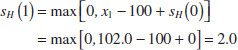
and
![]()
as shown in Table 15-9. The quantities nH and nL in Table 15-9 indicate the number of periods in which the CUSUM sH(i) or sL(i) have been nonzero. Notice that the CUSUMs in this example never exceed the decision interval H = 10. We would therefore conclude that the process is in control.
Next Steps: The limits for the CUSUM charts may be used to continue to operate the chart in order to monitor future productions.
![]() TABLE • 15-9 Tabular CUSUM for the Chemical Process Concentration Data
TABLE • 15-9 Tabular CUSUM for the Chemical Process Concentration Data

When the tabular CUSUM indicates that the process is out of control, we should search for the assignable cause, take any corrective actions indicated, and restart the CUSUMs at zero. It may be helpful to have an estimate of the new process mean following the shift. This can be computed from

Also, an estimate of the time at which the assignable cause occurred is often taken as the sample time at which the upper or lower CUSUM (whichever one signaled) was last equal to zero.
It is also useful to present a graphical display of the tabular CUSUMs, which are sometimes called CUSUM status charts. They are constructed by plotting sH(i) and sL(i) versus the sample number. Figure 15-21 shows the CUSUM status chart for the data in Example 15-6. Each vertical bar represents the value of sH(i) and sL(i) in period i. With the decision interval plotted on the chart, the CUSUM status chart resembles a Shewhart control chart. We have also plotted the sample statistics xi for each period on the CUSUM status chart as the solid dots. This frequently helps the user of the control chart to visualize the actual process performance that has led to a particular value of the CUSUM.
The tabular CUSUM is designed by choosing values for the reference value K and the decision interval H. We recommend that these parameters be selected to provide good average run-length values. There have been many analytical studies of CUSUM ARL performance. Based on them, we may give some general recommendations for selecting H and K. Define H = h![]() and K = k
and K = k![]() where
where ![]() is the standard deviation of the sample variable used in forming the CUSUM (if n = 1,
is the standard deviation of the sample variable used in forming the CUSUM (if n = 1, ![]() = σX). Using h = 4 or h = 5 and k = 1/2 generally provide a CUSUM that has good ARL properties against a shift of about 1
= σX). Using h = 4 or h = 5 and k = 1/2 generally provide a CUSUM that has good ARL properties against a shift of about 1![]() (or 1σX) in the process mean. If much larger or smaller shifts are of interest, set k = δ/2 where δ is the size of the shift in standard deviation units.
(or 1σX) in the process mean. If much larger or smaller shifts are of interest, set k = δ/2 where δ is the size of the shift in standard deviation units.
To illustrate how well the recommendations of h = 4 or h = 5 with k = 1/2 work, consider these average run lengths in Table 15-10. Notice that a shift of 1![]() would be detected in either 8.38 samples (with k = 1/2 and h = 4) or 10.4 samples (with k = 1/2 and h = 5). By comparison, Table 15-7 shows that an
would be detected in either 8.38 samples (with k = 1/2 and h = 4) or 10.4 samples (with k = 1/2 and h = 5). By comparison, Table 15-7 shows that an ![]() chart would require approximately 43.9 samples, on the average, to detect this shift.
chart would require approximately 43.9 samples, on the average, to detect this shift.

FIGURE 15-21 The CUSUM status chart for Example 15-6.
![]() TABLE • 15-10 Average Run Lengths for a CUSUM Control Chart with k = 1/2
TABLE • 15-10 Average Run Lengths for a CUSUM Control Chart with k = 1/2

These design rules were used for the CUSUM in Example 15-6. We assumed that the process standard deviation σ = 2. (This is a reasonable value; see Example 15-2.) Then with k = 1/2 and h = 5, we would use
![]()
in the tabular CUSUM procedure.
Finally, we should note that supplemental procedures such as the Western Electric rules cannot be safely applied to the CUSUM because successive values of SH(i) and SL(i) are not independent. In fact, the CUSUM can be thought of as a weighted average, where the weights are stochastic or random. In effect, all CUSUM values are highly correlated, thereby causing the Western Electric rules to produce too many false alarms.
15-8.2 EXPONENTIALLY WEIGHTED MOVING-AVERAGE CONTROL CHART
Data collected in time order are often averaged over several time periods. For example, economic data are often presented as an average over the last four quarters. That is, at time t, the average of the last four measurements can be written as
![]()
This average places weight of 1/4 on each of the most recent observations and zero weight on older observations. It is called a moving average and in this, case a window of size 4 is used. An average of the recent data is used to smooth the noise in the data to generate a better estimate of the process mean than only the most recent observation. However, in a dynamic environment in which the process mean may change, the number of observations used to construct the average is kept to a modest size so that the estimate can adjust to any change in the process mean. Therefore, the window size is a compromise between a better statistical estimate from an average and a response to a mean change. If a window of size 10 were used in a moving average, the statistic ![]() t(10) would have lower variability, but it would not adjust as well to a mean change.
t(10) would have lower variability, but it would not adjust as well to a mean change.
For statistical process control rather than use a fixed window size it is useful to place the most weight on the most recent observation or subgroup average and then gradually decrease the weights on older observations. An average of this type can be constructed by a multiplicative decrease in the weights. Let 0 < λ ≤ 1 denote a constant and μ0 denote the process target or historical mean. Suppose that samples of size n ≥ 1 are collected and ![]() t is the average of the sample at time t. The exponentially weighted moving-average (EWMA) is
t is the average of the sample at time t. The exponentially weighted moving-average (EWMA) is

Each older observation has its weight decreased by the factor (1 − λ). The weight on the starting value μ0 is selected so that the weights sum to 1. An EWMA is also sometimes called a geometric average.
The value of λ determines the compromise between noise reduction and response to a mean change. For example, the series of weights when λ = 0.8 are
![]()
and when λ = 0.2, the weights are
![]()
When λ = 0.8, the weights decrease rapidly. Most of the weight is placed on the most recent observation with modest contributions to the EWMA from older measurements. In this case, the EWMA does not average noise much, but it responds quickly to a mean change. However, when λ = 0.2, the weights decrease much more slowly and the EWMA has substantial contributions from the more recent observations. In this case, the EWMA averages noise more, but it responds more slowly to a change in the mean. Fig. 15-22 displays a series of observations with a mean shift in the middle on the series. Notice that the EWMA with λ = 0.2 smooths the data more but that the EWMA with λ = 0.8 adjusts the estimate to the mean shift more quickly.
It appears that it is difficult to calculate an EWMA because at every time t a new weighted average of all previous data is required. However, there is an easy method to calculate zt based on a simple recursive equation. Let z0 = μ0. Then it can be shown that
EWMA Update Equation
![]()
Consequently, only a brief computation is needed at each time t.
To develop a control chart from an EWMA, control limits are needed for Zt. The control limits are defined in a straightforward manner. They are placed at 3 standard deviations around the mean of the plotted statistic Zt. This follows the general approach for a control chart in Equation 15-1. An EWMA control chart may be applied to individual measurements or to subgroup averages. Formulas here are developed for the more general case with an average from a subgroup of size n. For individual measurements, n = 1.
Because Zt is a linear function of the independent observations X1, X2,..., Xt (and μ0), the results from Chapter 5 can be used to show that
![]()

FIGURE 15-22 EWMAs with λ = 0.8 and λ = 0.2 show a compromise between a smooth curve and a response to a shift.
where n is the subgroup size. Therefore, an EWMA control chart uses estimates of μ0 and σ in the following formulas:
EWMA Control Chart

Note that the control limits are not of equal width about the center line. The control limits are calculated from the variance of Zt and that changes with time. However, for large t, the variance of Zt converges to
![]()
so that the control limits tend to be parallel lines about the center line as t increases.
The parameters μ0 and σ are estimated by the same statistics used in ![]() or X charts. That is, for subgroups
or X charts. That is, for subgroups
![]()
and for n = 1
![]()
Example 15-7 Chemical Process Concentration EWMA Consider the concentration data shown in Table 15-3. Construct an EWMA control chart with λ = 0.2 with n = 1. It was determined that ![]() = 99.1 and
= 99.1 and ![]() = 2.59. Therefore,
= 2.59. Therefore, ![]() 0 = 99.1 and
0 = 99.1 and ![]() = 2.59/1.128 = 2.30. The control limits for z1 are
= 2.59/1.128 = 2.30. The control limits for z1 are

The first few values of zt along with the corresponding control limits are

The chart generated by computer software is shown in Figure 15-23. Notice that the control limits widen as time increases but quickly stabilize. Each point is within its set of corresponding control limits so there are no signals from the chart.

FIGURE 15-23 EWMA control chart for the chemical process concentration data from computer software.
Similar to a CUSUM chart, the points plotted on an EWMA control chart are not independent. Therefore, run rules should not be applied to an EWMA control chart. Information in the history of the data that is considered by run rules is to a large extent incorporated into the EWMA that is calculated at each time t.
The value of λ is usually chosen from the range 0.1 < λ < 0.5. A common choice is λ = 0.2. Smaller values for λ provide more sensitivity for small shifts and larger values better tune the chart for larger shifts. This performance can be seen in the (ARLs) in Table 15-11. These calculations are more difficult than those used for Shewhart charts, and details are omitted. Here, λ = 0.1 and 0.5 are compared. The multiplier of the standard deviation, denoted L in the table, is adjusted so that the ARL equals 500 for both choices for λ. That is, the control limits are placed at E(Zt) ± L![]() , and L is chosen so the ARL without a mean shift is 500 in both cases.
, and L is chosen so the ARL without a mean shift is 500 in both cases.
The EWMA ARLs in the table indicate that the smaller value for λ is preferred when the magnitude of the shift is small. Also, the EWMA performance is in general much better than results for a Shewhart control chart (in Table 15-7), and the results are comparable to a CUSUM control chart (in Table 15-10). However, these are average results. At the time of an increase in the process mean, zt might be negative, and there would be some performance penalty to first increase zt to near zero and then further increase it to a signal above the UCL. Such a penalty provides an advantage to CUSUM control charts that is not accounted for in these ARL tables. A more refined analysis can be used to quantify this penalty, but the conclusion is that the EWMA penalty is moderate to small in most applications.
![]() TABLE • 15-11 Average Run Lengths for an EWMA Control Chart
TABLE • 15-11 Average Run Lengths for an EWMA Control Chart

![]() Problem available in WileyPLUS at instructor's discretion.
Problem available in WileyPLUS at instructor's discretion.
![]() Go Tutorial Tutoring problem available in WileyPLUS at instructor's discretion.
Go Tutorial Tutoring problem available in WileyPLUS at instructor's discretion.
![]() 15-73.
15-73. ![]() The following data were considered in Quality Engineering [“Parabolic Control Limits for The Exponentially Weighted Moving Average Control Charts in Quality Engineering” (1992, Vol. 4(4)]. In a chemical plant, the data for one of the quality characteristics (viscosity) were obtained for each 12-hour batch's at the batch completion. The results of 15 consecutive measurements are shown in the following table.
The following data were considered in Quality Engineering [“Parabolic Control Limits for The Exponentially Weighted Moving Average Control Charts in Quality Engineering” (1992, Vol. 4(4)]. In a chemical plant, the data for one of the quality characteristics (viscosity) were obtained for each 12-hour batch's at the batch completion. The results of 15 consecutive measurements are shown in the following table.

(a) Set up a CUSUM control chart for this process. Assume that the desired process target is 14.1. Does the process appear to be in control?
(b) Suppose that the next five observations are 14.6, 15.3, 15.7, 16.1, and 16.8. Apply the CUSUM in part (a) to these new observations. Is there any evidence that the process has shifted out of control?
![]() 15-74.
15-74. ![]() The purity of a chemical product is measured every two hours. The results of 20 consecutive measurements are as follows:
The purity of a chemical product is measured every two hours. The results of 20 consecutive measurements are as follows:

(a) Set up a CUSUM control chart for this process. Use σ = 0.8 in setting up the procedure, and assume that the desired process target is 90. Does the process appear to be in control?
(b) Suppose that the next five observations are 90.75, 90.00, 91.15, 90.95, and 90.86. Apply the CUSUM in part (a) to these new observations. Is there any evidence that the process has shifted out of control?
![]()
15-75. ![]() An automatic senson measures the diameter of holes in consecutive order. The results of measuring 25 holes follow.
An automatic senson measures the diameter of holes in consecutive order. The results of measuring 25 holes follow.

(a) Estimate the process standard deviation.
(b) Set up a CUSUM control procedure, assuming that the target diameter is 10.0 millimeters. Does the process appear to be operating in a state of statistical control at the desired target level?
![]()
15-76. ![]() The concentration of a chemical product is measured by taking four samples from each batch of material. The average concentration of these measurements for the last 20 batches is shown in the following table:
The concentration of a chemical product is measured by taking four samples from each batch of material. The average concentration of these measurements for the last 20 batches is shown in the following table:


(a) Suppose that the process standard deviation is σ = 8 and that the target value of concentration for this process is 100. Design a CUSUM scheme for the process. Does the process appear to be in control at the target?
(b) How many batches would you expect to be produced with off-target concentration before it would be detected by the CUSUM control chart if the concentration shifted to 104? Use Table 15-10.
15-77. ![]() Consider a CUSUM with h = 5 and k = 1/2. Samples are taken every two hours from the process. The target value for the process is μ0 = 50 and σ = 2. Use Table 15-10.
Consider a CUSUM with h = 5 and k = 1/2. Samples are taken every two hours from the process. The target value for the process is μ0 = 50 and σ = 2. Use Table 15-10.
(a) If the sample size is n = 1, how many samples would be required to detect a shift in the process mean to μ = 51 on average?
(b) How does increasing the sample size to n = 4 affect the average run length to detect the shift to μ = 51 that you determined in part (a)?
![]() 15-78. Consider the purity data in Exercise 15-74. Use σ = 0.8 and assume that the desired process target is 90.
15-78. Consider the purity data in Exercise 15-74. Use σ = 0.8 and assume that the desired process target is 90.
(a) Construct an EWMA control chart with λ = 0.2. Does the process appear to be in control?
(b) Construct an EWMA control chart with λ = 0.5. Compare your results to part (a).
(c) Suppose that the next five observations are 90.75, 90.00, 91.15, 90.95, and 90.86. Apply the EWMAs in part (a) and (b) to these new observations. Is there any evidence that the process has shifted out of control?
![]() 15-79.
15-79. ![]() Consider the diameter data in Exercise 15-75. Assume that the desired process target is 10.0 millimeters.
Consider the diameter data in Exercise 15-75. Assume that the desired process target is 10.0 millimeters.
(a) Estimate the process standard deviation.
(b) Construct an EWMA control chart with λ = 0.2. Does the process appear to be in control?
(c) Construct an EWMA control chart with λ = 0.5. Compare your results to part (a).
![]() 15-80.
15-80. ![]() Consider the concentration data in Exercise 15-76. Use σ = 8 and assume that the desired process target is 100.
Consider the concentration data in Exercise 15-76. Use σ = 8 and assume that the desired process target is 100.
(a) Construct an EWMA control chart with λ = 0.2. Does the process appear to be in control?
(b) Construct an EWMA control chart with λ = 0.5. Compare your results to part (a).
(c) If the concentration shifted to 104, would you prefer the chart in part (a) or (b)? Explain.
15-81. Consider an EMWA control chart. The target value for the process is μ0 = 50 and σ = 2. Use Table 15-11.
(a) If the sample size is n = 1, would you prefer an EWMA chart with λ = 0.1 and L = 2.81 or λ = 0.5 and L = 3.07 to detect a shift in the process mean to μ = 52 on average? Why?
(b) If the sample size is increased to n = 4, which chart in part (a) do you prefer? Why?
(c) If an EWMA chart with λ = 0.1 and L = 2.81 is used, what sample size is needed to detect a shift to μ = 52 in approximately three samples on average?
15-82. A process has a target of μ0 = 100 and a standard deviation of σ = 4. Samples of size n = 1 are taken every two hours. Use Table 15-10.
(a) Suppose that the process mean shifts to μ = 102. How many hours of production occur before the process shift is detected by a CUSUM with h = 5 and k = 1/2?
(b) It is important to detect the shift defined in part (a) more quickly. A proposal to reduce the sampling frequency to 0.5 hour is made. How does this affect the CUSUM control procedure? How much more quickly is the shift detected?
(c) Suppose that the 0.5 hour sampling interval in part (b) is adopted. How often do false alarms occur's with this new sampling interval? How often did they occur with the old interval of two hours?
(d) A proposal is made to increase the sample size to n = 4 and retain the two-hour sampling interval. How does this suggestion compare in terms of average detection time to the suggestion of decreasing the sampling interval to 0.5 hour?
![]()
15-83. Heart rate (in counts/minute) is measured every 30 minutes. The results of 20 consecutive measurements are as follows:

Suppose that the standard deviation of the heart rate is σ = 3 and the target value is 70.
(a) Design a CUSUM scheme for the heart rate process. Does the process appear to be in control at the target?
(b) How many samples on average would be required to detect a shift of the mean heart rate to 80?
![]()
15-84. The number of influenza patients (in thousands) visiting hospitals weekly is shown in the following table. Suppose that the standard deviation is σ = 2 and the target value is 160.

(a) Design a CUSUM scheme for the process. Does the process appear to be in control at the target?
(b) How many samples on average would be required to detect a shift of the mean to 165?
![]()
15-85. Consider the heart rate data in Exercise 15-83. Use μ = 70 and σ = 3.
(a) Construct an EWMA control chart with λ = 0.1. Use L = 2.81. Does the process appear to be in control?
(b) Construct an EWMA control chart with λ = 0.5. Use L = 3.07. Compare your results to those in part (a).
(c) If the heart rate mean shifts to 76, approximate the ARLs for the charts in parts (a) and (b).
![]()
15-86. Consider the influenza data in Exercise 15-84. Use μ = 160 and σ = 2.
(a) Construct an EWMA control chart with λ = 0.1. Use L = 2.81. Does the process appear to be in control?
(b) Construct an EWMA control chart with λ = 0.5. Use L = 3.07. Compare your results to those in part (a).
15-9 Other SPC Problem-Solving Tools
Although the control chart is a very powerful tool for investigating the causes of variation in a process, it is most effective when used with other SPC problem-solving tools. In this section, we illustrate some of these tools, using the printed circuit board defect data in Example 15-5.
Figure 15-17 shows a U chart for the number of defects in samples of five printed circuit boards. The chart exhibits statistical control, but the number of defects must be reduced. The average number of defects per board is 8/5 = 1.6, and this level of defects would require extensive rework.
FIGURE 15-24 Pareto diagram for printed circuit board defects.

FIGURE 15-25 Cause-and-effect diagram for the printed circuit board flow solder process.
The first step in solving this problem is to construct a Pareto diagram of the individual defect types. The Pareto diagram shown in Fig. 15-24, indicates that insufficient solder and solder balls are the most frequently occurring defects, accounting for (109/160)100 = 68% of the observed defects. Furthermore, the first five defect categories on the Pareto chart are all solder-related defects. This points to the flow solder process as a potential opportunity for improvement.
To improve the surface mount process, a team consisting of the operator, the shop supervisor, the manufacturing engineer responsible for the process, and a quality engineer meets to study potential causes of solder defects. They conduct a brainstorming session and produce the cause-and-effect diagram in Fig. 15-25. The cause-and-effect diagram is widely used to display the various potential causes of defects in products and their interrelationships. They are useful in summarizing knowledge about the process.
As a result of the brainstorming session, the team tentatively identifies the following variables as potentially influential in creating solder defects:
- Flux specific gravity
- Reflow temperature
- Squeegee speed
- Squeegee angle
- Paste height
- Reflow temperature
- Board loading method
A statistically designed experiment could be used to investigate the effect of these seven variables on solder defects.
In addition, the team constructed a defect concentration diagram for the product; it is just a sketch or drawing of the product with the most frequently occurring defects shown on the part. This diagram is used to determine whether defects occur in the same location on the part. The defect concentration diagram for the printed circuit board is shown in Fig. 15-26. This diagram indicates that most of the insufficient solder defects are near the front edge of the board. Further investigation showed that one of the pallets used to carry the boards was bent, causing the front edge of the board to make poor contact with the squeegee.

FIGURE 15-26 Defect concentration diagram for a printed circuit board.
When the defective pallet was replaced, a designed experiment was used to investigate the seven variables discussed earlier. The results of this experiment indicated that several of these factors were influential and could be adjusted to reduce solder defects. After the results of the experiment were implemented, the percentage of solder joints requiring rework was reduced from 1% to under 100 parts per million (0.01%).
15-10 Decision Theory
Quality improvement requires decision making in the presence of uncertainty as do many other management and engineering decisions. Consequently, a framework to characterize the decision problem in terms of actions, possible states, and associated probabilities is useful to quantitatively compare alternatives. Decision theory is the study of mathematical models for decision making. Actions are evaluated and selected based on the model and quantitative criteria.
15-10.1 DECISION MODELS
A simple way to characterize decisions is in terms of actions, states with probabilities, and outcomes as costs (or profits). A decision usually involves a set of possible actions
![]()
For example, one might purchase an extended warranty with the purchase of a vehicle (action a1) or not (action a2).
The possible future situations are represented with a collection of states
![]()
One state occurs, but we are not certain of the future state at the time of our decision. For example, a possible state is that a major repair is required during the extended warranty; another is that no repair is required.
We often associate a probability, for example, pm with each state sm, so that p1 + p2 + ... + pM = 1. The probabilities are important and can be difficult to estimate. Sometimes we have historical data from past performance and can derive estimates. In other cases, we might have to rely on the subjective belief of a collection of experts.
The outcome is often expressed in terms of economic cost (or profit) that depends on the actions and the state that occurs. That is, let
![]()
For example, if we purchases an extended warranty and no repair is required, our loss is only the cost of the warranty. Clearly, if we do not purchase the warranty and a major repair is required, our loss is the cost of the repair.
Example 15-8 Extended Warranty Decision Problem For deciding whether to purchase an extended warranty on a vehicle, we use the following model. The actions are
![]()
Assume that one of three states corresponding to a major, minor, or no repair can occur during the warranty period. We obtain probability estimates for each state. The states and associated probabilities are

Finally, the costs Ckm can be presented in a decision evaluation table in which each row is an action and each column is a state. We assume that the extended warranty coverage costs $200. Table 15-12 formally relates the cost of each action and possible future state.
![]() TABLE • 15-12 Decision Evaluation Table for Example 15-8
TABLE • 15-12 Decision Evaluation Table for Example 15-8

15-10.2 DECISION CRITERIA
The numerical summary of the decision problem is presented with actions, states, and probabilities as illustrated in Example 15-8. However, the question regarding the “best” action still needs to be answered. Because the state is not known at the time of the decision, different costs are possible. Different criteria based on these costs (and the associated probabilities) can be used to select an action, but, as we show, these criteria do not always lead to the same action.
We might be pessimistic and focus on the worst-possible state for each action. In this approach, we compares actions based on the maximum cost that can occur. For example, from Table 15-12, the maximum cost that occurs for action a1 is maxmC1m = $200 (regardless of the state). For action a2, we have maxm C2m = max{1200,300,0} = $1200. A reasonable criterion is to select the action that minimizes this maximum cost, and in this case, the choice is a1. In general, this approach selects the action ak to minimize maxm Ckm.
Minimax Criterion
The minimax criterion selects the action ak that corresponds to
![]()
The name clearly follows from the minimum and maximum that are computed.
The minimax criterion focuses on the worst-case (pessimistic) scenario and ignores the probabilities associated with the states. A state with a high cost for a specific action, even if the state is very unlikely, can penalize and eliminate the action.
An alternative criterion is to focus on the best-case (optimistic) scenario among the states and order the actions based on minimum cost minmCkm.
Minimin Criterion
The minimin criterion select the action ak that corresponds to
![]()
For the warranty example, minmC1m = 200 and minmC2m = 0 so that a2 is selected with this criterion.
The previous criteria ignore the probabilities associated with the states. The most probable criterion evaluates an action based on the cost of the state with the most likely probability.
Most Probable Criterion
The most probable criterion selects the action to minimize the cost of the most probable state.
(15-37)
For the warranty example, the most probable state is a minor repair. Based on this state alone, the cost associated with a1 is $200, and the cost associated with a2 is $300. Consequently, a1 is chosen with this criterion.
An obvious criterion is the expected cost. Here we associate a random variable Xk with each action ak. The distribution of the discrete random variable Xk consists of the costs and the associated probabilities for action ak. The expected cost of ak is defined simply as the expected value E(Xk).
Expected Cost Criterion
The expected cost criterion selects that state to minimize the expected cost. (15-38)
For the warranty example, E(X1) = 200 and E(X2) = 1200(0.1) + 300(0.5) + 0(0.4) = 270. Consequently, the minimum expected cost is produced by action a1.
A decision problem is often represented with a graph known as a decision tree. See Fig. 15-27 for a decision tree of the warranty example. A square denotes a decision node where an action is selected. Each arc from a decision node represents an action. Each action arc terminates with a circular node to indicate that a state has been chosen (outside the control of the decision maker), and the states are represented by the arcs from the circular nodes. Each arc is labeled with the probability of the state. The cost is shown at the end of these arcs. This is the basic structure of the decision problem. Fig. 15-27 computed from Equation 15-38 also shows the expected cost above each circle. Based on the expected costs, action a1 is clearly preferred. We could replace the expected cost with other criterion discussed in this section to summarize the alternative actions.
In more complex problems, there is a series of actions and states (represented as rectangles and circles, respectively, in the decision tree). Probabilities are associated with each state, and a cost is associated with each path through the tree. Fig 15-28 provides an illustration. Given a criterion, we start at the end of a path and apply the criterion to determine the action. We continue the analysis from the end of a path until we reach the initial action node of the tree. This is illustrated in the following example.

FIGURE 15-27 Decision tree for extended warranty example, expected cost of each action shown above circular modes.

FIGURE 15-28 Decision tree for the develop or contract example.
Example 15-9 Develop or Contract Decision Problem In this example, the basic decision task is extended to several decisions. The decision tree is shown in Fig. 15-26. The first decision is whether to develop a new product or contract with a supplier. This is indicated by the box labeled Develop? If a new product is developed, it may be unique, but it may be more typical of what is currently available on the market. This is indicated by the circle labeled Unique? For either a new product or a contracted one, the price needs to be set. Here the decision is indicated by Price? boxes. The choices are either high or low. Finally, the market conditions when the product is available may be favorable or unfavorable to sales as indicated by the circle labeled Sales. Favorable and unfavorable markets are indicated by the arcs labeled + and −, respectively.
The probability of an arc is denoted by the number below it. For example, the probability that a unique product is developed is 0.7. Similarly, the probabilities of favorable or unfavorable markets are shown with the corresponding probabilities. Note that a lower price decision leads to the higher probability of a favorable market. Furthermore, the dollar amount shown in the figure indicates the profit to the corporation for the corresponding path through the decision tree. As mentioned previously, one might base a decision on profits (more generally, gains) rather than costs. In such a case, the objective is to maximize profits.
We can extend the procedure for a single decision node as follows. Start with the dollar amounts at the terminal nodes and work backward through the tree to evaluate a decision based on one of the criteria. Because we work with profits in this example, the pessimistic approach is to select the decision to maximize the minimum profit. For example, suppose that a new product is developed, the result is unique, and the price is set high. The two possible dollar values are $6M and $2M. The pessimistic approach is to value the decision to set the price high in this path as $2M. Similarly, the decision to set the price low is valued at $3M. Consequently, the decision along this path is to set the price low with a worst-case profit of $3M.
Similarly, suppose that a new product is developed, the result is not unique, and the price is set high. The two possible dollar values are $3M and $1M. The pessimistic approach is to value the decision to set the price high in this path as $1M. The decision to set the price low is pessimistically valued at $2M. Consequently, the decision to develop a new product can result in a unique product (which is pessimistically evaluated as $2M with probability 0.7) or a nonunique product (which is pessimistically evaluated at $1M). The pessimistic view is that the decision to develop a new product generates a profit of $1M.
Furthermore, suppose that the product is not developed (but contracted) and the price is set high with the pessimistic profit of $1M. If the price is set low, the pessimistic profit is $1.5M. Consequently, the price decision based on this criterion is to set the price low with a pessimistic profit of $1.5M. Finally, the pessimistic profit from the decision to develop or not develop a new product is $1M and $1.5M, respectively. Therefore, based on this criterion, a new product is not developed.
Note that the probabilities do not enter into this decision. This was mentioned previously as one of the disadvantages of the pessimistic criterion. Alternative criteria are left as exercises.
Exercises FOR SECTION 15-9
![]() Problem available in WileyPLUS at instructor's discretion.
Problem available in WileyPLUS at instructor's discretion.
![]() Go Tutorial Tutoring problem available in WileyPLUS at instructor's discretion.
Go Tutorial Tutoring problem available in WileyPLUS at instructor's discretion.
15-87. Suppose that the cost of a major repair without the extended warranty in Example 15-8 is changed to $1000. Determine the decision selected based on the minimax, most probable, and expected cost criteria.
15-88. Reconsider the extended warranty decision in Example 15-8. Suppose that the probabilities of the major, minor, and no repair states are changed to 0.2, 0.4, and 0.4, respectively. Determine the decision selected based on the minimax, most probable, and expected cost criteria.
15-89. Analyze Example 15-9 based on the most probable criterion and determine the actions that are selected at each decision node. Do any actions differ from those selected in the example?
15-90. Analyze Example 15-9 based on the expected profit criterion and determine the actions that are selected at each decision node. Do any actions differ from those selected in the example?
15-11 Implementing SPC
The methods of statistical process control can provide significant payback to those companies that can successfully implement them. Although SPC seems to be a collection of statistically based problem-solving tools, there is more to its successful use than simply learning and using these tools. Management involvement and commitment to the quality-improvement process is the most vital component of SPC's potential success. Management is a role model, and others in the organization look to management for guidance and as an example. A team approach is also important, for it is usually difficult for one person alone to introduce process improvements. Many of the “magnificent seven” problem-solving tools are helpful in building an improvement team, including cause-and-effect diagrams, Pareto charts, and defect concentration diagrams. The basic SPC problem-solving tools must become widely known and widely used throughout the organization. Continuous training in SPC and quality improvement is necessary to achieve this widespread knowledge of the tools.
The objective of an SPC-based quality-improvement program is continuous improvement on a weekly, quarterly, and annual basis. SPC is not a one-time program to be applied when the business is in trouble and later abandoned. Quality improvement must become part of the organization's culture.
The control chart is an important tool for process improvement. Processes do not naturally operate in an in-control state, and the use of control charts is an important step that must be taken early in an SPC program to eliminate assignable causes, reduce process variability, and stabilize process performance. To improve quality and productivity, we must begin to manage with facts and data, not just rely on judgment. Control charts are an important part of this change in management approach.
In implementing a companywide SPC program, we have found that the following elements are usually present in all successful efforts:
- Management leadership
- Team approach
- Education of employees at all levels
- Emphasis on continuous improvement
- Mechanism for recognizing success
We cannot overemphasize the importance of management leadership and the team approach. Successful quality improvement is a “top-down” management-driven activity. It is also important to measure progress and success and to spread knowledge of this success throughout the organization. Communicating successful improvements throughout the company can provide motivation and incentive to improve other processes and to make continuous improvement a normal part of the way of doing business.
The philosophy of W. Edwards Deming provides an important framework for implementing quality and productivity improvement. Deming's philosophy is summarized in his 14 points for management. The adherence to these management principles has been an important factor in Japan's industrial success and continues to be the catalyst in that nation's quality- and productivity-improvement efforts. This philosophy has also now spread rapidly in the West. Deming's 14 points are as follows.
- Create a constancy of purpose focused on the improvement of products and services. Constantly try to improve product design and performance. Investment in research, development, and innovation will have a long-term payback to the organization.
- Adopt a new philosophy of rejecting poor workmanship, defective products, or bad service. It costs as much to produce a defective unit as it does to produce a good one (and sometimes more). The cost of dealing with scrap, rework, and other losses created by defectives is an enormous drain on company resources.
- Do not rely on mass inspection to “control quality.” All inspection can do is sort out defectives, and at this point, it is too late because we have already paid to produce these defectives. Inspection occurs too late in the process, is expensive, and is often ineffective. Quality results from the prevention of defectives through process improvement, not inspection.
- Do not award business to suppliers on the basis of price alone, but also consider quality. Price is a meaningful measure of a supplier's product only if it is considered in relation to a measure of quality. In other words, the total cost of the item, not jus the purchase price must be considered. When quality is considered, the lowest bidder is frequently not the low-cost supplier. Preference should be given to suppliers who use modern methods of quality improvement in their business and who can demonstrate process control and capability.
- Focus on continuous improvement. Constantly try to improve the production and service system. Involve the workforce in these activities and use statistical methods, particularly the SPC problem-solving tools discussed previously.
- Practice modern training methods and invest in training for all employees. All employees should be trained in the technical aspects of their job, as well as in modern quality- and productivity-improvement methods. The training should encourage all employees to practice these methods every day.
- Practice modern supervision methods. Supervision should not consist merely of passive surveillance of workers but also should be focused on helping the employees improve the system in which they work. The first goal of supervision should be to improve the work system and the product.
- Drive out fear. Many workers are afraid to ask questions, report problems, or point out conditions that are barriers to quality and effective production. In many organizations, the economic loss associated with fear is large; only management can eliminate fear.
- Break down the barriers between functional areas of the business. Teamwork among different organizational units is essential for effective quality and productivity improvement to take place.
- Eliminate targets, slogans, and numerical goals for the workforce. A target such as “zero defects” is useless without a plan as to how to achieve it. In fact, these slogans and “programs” are usually counterproductive. Work to improve the system and provide information on that.
- Eliminate numerical quotas and work standards. These standards have historically been set without regard to quality. Work standards are often symptoms of management's inability to understand the work process and to provide an effective management system focused on improving this process.
- Remove the barriers that discourage employees from doing their jobs. Management must listen to employee suggestions, comments, and complaints. The person who is doing the job is the one who knows the most about it, and usually has valuable ideas about how to make the process work more effectively. The workforce is an important participant in the business, not just an opponent in collective bargaining.
- Institute an ongoing program of training and education for all employees. Education in simple, powerful statistical techniques should be mandatory for all employees. Use of the basic SPC problem-solving tools, particularly the control chart, should become widespread in the business. As these charts become widespread, and as employees understand their uses, they are more likely to look for the causes of poor quality and to identify process improvements. Education is a way of making everyone partners in the quality-improvement process.
- Create a structure in top management that vigorously advocates the first 13 points.
As we read Deming's 14 points, we notice two things. First, there is a strong emphasis on change. Second, the role of management in guiding this change process is of dominating importance. But what should be changed, and how should this change process be started? For example, if we want to improve the yield of a semiconductor manufacturing process, what should we do? It is in this area that statistical methods most frequently come into play. To improve the semiconductor process, we must determine which controllable factors in the process influence the number of defective units produced. To answer this question, we must collect data on the process and see how the system reacts to changes in the process variables. Statistical methods, including the SPC and experimental design techniques in this book, can contribute to this knowledge.
![]() Problem available in WileyPLUS at instructor's discretion.
Problem available in WileyPLUS at instructor's discretion.
![]() Go Tutorial Tutoring problem available in WileyPLUS at instructor's discretion.
Go Tutorial Tutoring problem available in WileyPLUS at instructor's discretion.
![]() 15-91. The diameter of fuse pins used in an aircraft engine application is an important quality characteristic. Twenty-five samples of three pins each are shown as follows:
15-91. The diameter of fuse pins used in an aircraft engine application is an important quality characteristic. Twenty-five samples of three pins each are shown as follows:

(a) Set up ![]() and R charts for this process. If necessary, revise limits so that no observations are out of control.
and R charts for this process. If necessary, revise limits so that no observations are out of control.
(b) Estimate the process mean and standard deviation.
(c) Suppose that the process specifications are at 64 ± 0.02. Calculate an estimate of PCR. Does the process meet a minimum capability level of PCR ≥ 1.33?
(d) Calculate an estimate of PCRk. Use this ratio to draw conclusions about process capability.
(e) To make this process a 6-sigma process, the variance σ2 would have to be decreased such that PCRk = 2.0. What should this new variance value be?
(f) Suppose that the mean shifts to 64.01. What is the probability that this shift is detected on the next sample? What is the ARL after the shift?
![]()
15-92. Rework Exercise 15-91 with ![]() and S charts.
and S charts.
![]()
15-93. ![]() Plastic bottles for liquid laundry detergent are formed by blow molding. Twenty samples of n = 100 bottles are inspected in time order of production, and the fraction defective in each sample is reported. The data are as follows:
Plastic bottles for liquid laundry detergent are formed by blow molding. Twenty samples of n = 100 bottles are inspected in time order of production, and the fraction defective in each sample is reported. The data are as follows:

(a) Set up a P chart for this process. Is the process in statistical control?
(b) Suppose that instead of n = 100, n = 200. Use the data given to set up a P chart for this process. Revise the control limits if necessary.
(c) Compare your control limits for the P charts in parts (a) and (b). Explain why they differ. Also, explain why your assessment about statistical control differs for the two sizes of n.
![]()
15-94. Cover cases for a personal computer are manufactured by injection molding. Samples of five cases are taken from the process periodically, and the number of defects is noted. Twenty-five samples follow:

(a) Using all the data, find trial control limits for a U chart for the process.
(b) Use the trial control limits from part (a) to identify out-of-control points. If necessary, revise your control limits.
(c) Suppose that instead of samples of five cases, the sample size was 10. Repeat parts (a) and (b). Explain how this change alters your responses to parts (a) and (b).
![]() 15-95.
15-95. ![]() An article in Quality Engineering [“Is the Process Capable? Tables and Graphs in Assessing Cpm” (1992, Vol. 4(4)]. Considered manufacturing data. Specifications for the outer diameter of the hubs were 60.3265 ± 0.001 mm. A random sample with size n = 20 was taken and the data are shown in the following table:
An article in Quality Engineering [“Is the Process Capable? Tables and Graphs in Assessing Cpm” (1992, Vol. 4(4)]. Considered manufacturing data. Specifications for the outer diameter of the hubs were 60.3265 ± 0.001 mm. A random sample with size n = 20 was taken and the data are shown in the following table:

(a) Construct a control chart for individual measurements. Revise the control limits if necessary.
(b) Compare your chart in part (a) to one that uses only the last (least significant) digit of each diameter as the measurement. Explain your conclusion.
(c) Estimate μ and σ from the moving range of the revised chart and use this value to estimate PCR and PCRk and interpret these ratios.
![]() 15-96. The following data from the U.S. Department of Energy Web site (www.eia.doe.gov) reported the total U.S. renewable energy consumption by year (trillion BTU) from 1973 to 2004.
15-96. The following data from the U.S. Department of Energy Web site (www.eia.doe.gov) reported the total U.S. renewable energy consumption by year (trillion BTU) from 1973 to 2004.

(a) Using all the data, find calculate control limits for a control chart for individual measurements, construct the chart, and plot the data.
(b) Do the data appear to be generated from an in-control process? Comment on any patterns on the chart.
![]()
15-97. The following dataset was considered in Quality Engineering [“Analytic Examination of Variance Components” (1994–1995, Vol. 7(2)]. A quality characteristic for cement mortar briquettes was monitored. Samples of size n = 6 were taken from the process, and 25 samples from the process are shown in the following table:
(a) Using all the data, calculate trial control limits for ![]() and S charts. Is the process in control?
and S charts. Is the process in control?


(b) Suppose that the specifications are at 580 ± 250. What statements can you make about process capability? Compute estimates of the appropriate process capability ratios.
(c) To make this process a “6-sigma process,” the variance σ2 would have to be decreased such that PCRK = 2.0. What should this new variance value be?
(d) Suppose the mean shifts to 600. What is the probability that this shift is detected on the next sample? What is the ARL after the shift?
15-98. ![]() Suppose that an
Suppose that an ![]() control chart with 2-sigma limits is used to control a process. Find the probability that a false out-of-control signal is produced on the next sample. Compare this with the corresponding probability for the chart with 3-sigma limits and discuss. Comment on when you would prefer to use 2-sigma limits instead of 3-sigma limits.
control chart with 2-sigma limits is used to control a process. Find the probability that a false out-of-control signal is produced on the next sample. Compare this with the corresponding probability for the chart with 3-sigma limits and discuss. Comment on when you would prefer to use 2-sigma limits instead of 3-sigma limits.
![]() 15-99. Consider the diameter data in Exercise 15-91.
15-99. Consider the diameter data in Exercise 15-91.
(a) Construct an EWMA control chart with λ = 0.2 and L = 3. Comment on process control.
(b) Construct an EWMA control chart with λ = 0.5 and L = 3 and compare your conclusion to part (a).
![]() 15-100. Consider the renewable energy data in Exercise 15-96.
15-100. Consider the renewable energy data in Exercise 15-96.
(a) Construct an EWMA control chart with λ = 0.2 and L = 3. Do the data appear to be generated from an incontrol process?
(b) Construct an EWMA control chart with λ = 0.5 and L = 3 and compare your conclusion to part (a).
![]() 15-101.
15-101. ![]() Consider the hub data in Exercise 15-95.
Consider the hub data in Exercise 15-95.
(a) Construct an EWMA control chart with λ = 0.2 and L = 3. Comment on process control.
(b) Construct an EWMA control chart with λ = 0.5 and L = 3 and compare your conclusion to part (a).
![]() 15-102. Consider the data in Exercise 15-20. Set up a CUSUM scheme for this process assuming that μ = 16 is the process target. Explain how you determined your estimate of σ and the CUSUM parameters K and H.
15-102. Consider the data in Exercise 15-20. Set up a CUSUM scheme for this process assuming that μ = 16 is the process target. Explain how you determined your estimate of σ and the CUSUM parameters K and H.
![]() 15-103.
15-103. ![]() Consider the hardness measurement data in Exercise 15-19. Set up a CUSUM scheme for this process using μ = 50 and σ = 2 so that K = 1 and H = 10. Is the process in control?
Consider the hardness measurement data in Exercise 15-19. Set up a CUSUM scheme for this process using μ = 50 and σ = 2 so that K = 1 and H = 10. Is the process in control?
![]()
15-104. Reconsider the viscosity data in Exercise 15-22. Construct a CUSUM control chart for this process using μ0 = 500 as the process target. Explain how you determined your estimate of σ and the CUSUM parameters H and K.
![]()
15-105. The following data were considered in Quality Progress [“Digidot Plots for Process Surveillance” (1990, May, pp. 66–68)]. Measurements of center thickness (in mils) from 25 contact lenses sampled from the production process at regular intervals are shown in the following table.

(a) Construct a CUSUM scheme for this process with the target μ0 = 0.4. Explain how you determined your estimate of σ and the CUSUM parameters H and K. Is the process in control?
(b) Construct an EWMA control chart with λ = 0.5 and L = 3 and compare your conclusions to part (a).
15-106. Suppose that a process is in control and an ![]() chart is used with a sample size of 4 to monitor the process. Suddenly there is a mean shift of 1.5σ.
chart is used with a sample size of 4 to monitor the process. Suddenly there is a mean shift of 1.5σ.
(a) If 3-sigma control limits are used on the ![]() chart, what is the probability that this shift remains undetected for three consecutive samples?
chart, what is the probability that this shift remains undetected for three consecutive samples?
(b) If 2-sigma control limits are in use on the ![]() chart, what is the probability that this shift remains undetected for three consecutive samples?
chart, what is the probability that this shift remains undetected for three consecutive samples?
(c) Compare your answers to parts (a) and (b) and explain why they differ. Also, which limits you would recommend using and why?
15-107. ![]() Consider the control chart for individuals with 3-sigma limits.
Consider the control chart for individuals with 3-sigma limits.
(a) Suppose that a shift in the process mean of magnitude σ occurs. Verify that the ARL for detecting the shift is ARL = 43.9.
(b) Find the ARL for detecting a shift of magnitude 2σ in the process mean.
(c) Find the ARL for detecting a shift of magnitude 3σ in the process mean.
(d) Compare your responses to parts (a), (b), and (c) and explain why the ARL for detection is decreasing as the magnitude of the shift increases.
15-108. Consider a control chart for individuals applied to a continuous 24-hour chemical process with observations taken every hour.
(a) If the chart has 3-sigma limits, verify that the in-control ARL is 370. How many false alarms would occur each 30-day month, on the average, with this chart?
(b) Suppose that the chart has 2-sigma limits. Does this reduce the ARL for detecting a shift in the mean of magnitude σ? (Recall that the ARL for detecting this shift with 3-sigma limits is 43.9.)
(c) Find the in-control ARL if 2-sigma limits are used on the chart. How many false alarms would occur each month with this chart? Is this in-control ARL performance satisfactory? Explain your answer.
![]() 15-109.
15-109. ![]() The depth of a keyway is an important part quality characteristic. Samples of size n = 5 are taken every four hours from the process, and 20 samples are summarized in the following table.
The depth of a keyway is an important part quality characteristic. Samples of size n = 5 are taken every four hours from the process, and 20 samples are summarized in the following table.
(a) Using all the data, find trial control limits for ![]() and R charts. Is the process in control?
and R charts. Is the process in control?
(b) Use the trial control limits from part (a) to identify out-of-control points. If necessary, revise your control limits. Then estimate the process standard deviation.
(c) Suppose that the specifications are at 140 ± 2. Using the results from part (b), what statements can you make about process capability? Compute estimates of the appropriate process capability ratios.
(d) To make this a 6-sigma process, the variance σ2 would have to be decreased such that PCRk = 2.0. What should this new variance value be?
(e) Suppose that the mean shifts to 139.7. What is the probability that this shift is detected on the next sample? What is the ARL after the shift?


15-110. ![]() Consider a control chart for individuals with 3-sigma limits. What is the probability that there is not a signal in 3 samples? In 6 samples? In 10 samples?
Consider a control chart for individuals with 3-sigma limits. What is the probability that there is not a signal in 3 samples? In 6 samples? In 10 samples?
15-111. ![]() Suppose that a process has a PCR = 2, but the mean is exactly 3 standard deviations above the upper specification limit. What is the probability of making a product outside the specification limits?
Suppose that a process has a PCR = 2, but the mean is exactly 3 standard deviations above the upper specification limit. What is the probability of making a product outside the specification limits?
15-112. A process is controlled by a P chart using samples of size 100. The center line on the chart is 0.05.
(a) What is the probability that the control chart detects a shift to 0.08 on the first sample following the shift?
(b) What is the probability that the control chart does not detect a shift to 0.08 on the first sample following the shift, but does detect it on the second sample?
(c) Suppose that instead of a shift in the mean to 0.08, the mean shifts to 0.10. Repeat parts (a) and (b).
(d) Compare your answers for a shift to 0.08 and for a shift to 0.10. Explain why they differ. Also, explain why a shift to 0.10 is easier to detect.
15-113. ![]() Suppose that the average number of defects in a unit is known to be 8. If the mean number of defects in a unit shifts to 16, what is the probability that it is detected by a U chart on the first sample following the shift
Suppose that the average number of defects in a unit is known to be 8. If the mean number of defects in a unit shifts to 16, what is the probability that it is detected by a U chart on the first sample following the shift
(a) if the sample size is n = 4?
(b) if the sample size is n = 10?
Use a normal approximation for U.
15-114. Suppose that the average number of defects in a unit is known to be 10. If the mean number of defects in a unit shifts to 14, what is the probability that it is detected by a U chart on the first sample following the shift
(a) if the sample size is n = 1?
(b) if the sample size is n = 4?
Use a normal approximation for U.
15-115. An EWMA chart with λ = 0.5 and L = 3.07 is to be used to monitor a process. Suppose that the process mean is μ0 = 10 and σ = 2.
(a) Assume that n = 1. What is the ARL without any shift in the process mean? What is the ARL to detect a shift to μ = 12.
(b) Assume that n = 4. Repeat part (a) and comment on your conclusions.
![]()
15-116. The following table provides the costs for gasoline by month in the United States over recent years and the percentage of the cost due to refining, distribution and marketing, taxes, and crude oil. The table is from the U.S. Department of Energy Web site (http://tonto.eia.doe.gov/oog/info/gdu/gaspump.html). There is some concern that the refining or distribution and marketing percentages of the retail price have shown patterns over time.
(a) Construct separate control charts for the refining percentage of the retail price and the distribution and marketing percentage of the retail price. Use control charts for individual measurements. Comment on any signs of assignable causes on these charts.
(b) Construct a control chart for the crude oil percentage of the retail price. Use a control chart for individual measurements. Comment on any signs of assignable causes on this chart.
(c) Another way to study the data is to calculate refining, distribution and marketing, and tax as costs directly. The costs of these categories might not depend strongly on the crude oil cost. Use the percentages provided in the table to calculate the cost associated with refining and distribution and marketing each month. Construct separate control charts for refining and distribution and marketing costs each month. Use control charts for individual measurements. Comment on any signs of assignable causes on these charts and comment on any differences between these charts and the ones constructed in part (a).
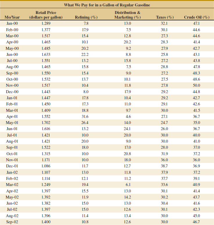


![]() 15-117. The following table shows the number of e-mails a student received each hour from 8:00 A.M. to 6:00 P.M. The samples are collected for five days from Monday to Friday.
15-117. The following table shows the number of e-mails a student received each hour from 8:00 A.M. to 6:00 P.M. The samples are collected for five days from Monday to Friday.
(a) Use the rational subgrouping principle to comment on why an ![]() chart that plots one point each hour with a subgroup of size 5 is not appropriate.
chart that plots one point each hour with a subgroup of size 5 is not appropriate.
(b) Construct an appropriate attribute control chart. Use all the data to find trial control limits, construct the chart, and plot the data.
(c) Use the trial control limits from part (b) to identify out-of-control points. If necessary, revise your control limits, assuming that any samples that plot outside the control limits can be eliminated.
![]() 15-118. The following are the number of defects observed on 15 samples of transmission units in an automotive manufacturing company. Each lot contains five transmission units.
15-118. The following are the number of defects observed on 15 samples of transmission units in an automotive manufacturing company. Each lot contains five transmission units.
(a) Using all the data, compute trial control limits for a U control chart, construct the chart, and plot the data.
(b) Determine whether the process is in statistical control. If not, assume assignable causes can be found and out-of-control points eliminated. Revise the control limits.

15-119. Consider an ![]() control chart with UCL = 32.802, UCL = 24.642, and n = 5. Suppose that the mean shifts to 30.
control chart with UCL = 32.802, UCL = 24.642, and n = 5. Suppose that the mean shifts to 30.
(a) What is the probability that this shift is detected on the next sample?
(b) What is the ARL to detect the shift?
![]()
15-120. The number of visits (in millions) on a Web site is recorded every day. The following table shows the samples for 25 consecutive days.
(a) Estimate the process standard estimation.
(b) Set up a CUSUM control chart for this process, assuming the target is 10. Does the process appear to be in control?

![]()
15-121. An article in Microelectronics Reliability [“Advanced Electronic Prognostics through System Telemetry and Pattern Recognition Methods,” (2007, 47(12), pp. 1865–1873)] presented an example of electronic prognostics (a technique to detect faults in order to decrease the system downtime and the number of unplanned repairs in high-reliability and high-availability systems). Voltage signals from enterprise servers were monitored over time. The measurements are provided in the following table.


(a) Using all the data, compute trial control limits for individual observations and moving-range charts. Construct the chart and plot the data. Determine whether the process is in statistical control. If not, assume that assignable causes can be found to eliminate these samples and revise the control limits.
(b) Estimate the process mean and standard deviation for the in-control process.
(c) The report in the article assumed that the signal is normally distributed with a mean of 1.5 V and a standard deviation of 0.02 V. Do your results in part (b) support this assumption?
![]() 15-122. A article in the Journal of Quality in Clinical Practice [“The Application of Statistical Process Control Charts to the Detection and Monitoring of Hospital-Acquired Infections,” (2001, Vol. 21, pp. 112–117)] reported the use of SPC methods to monitor hospital-acquired infections. The authors applied Shewhart, CUSUM, and EWMA charts to the monitor ESBL Klebsiella pneumonia infections. The monthly number of infections from June 1994 to April 1998 are shown in the following table.
15-122. A article in the Journal of Quality in Clinical Practice [“The Application of Statistical Process Control Charts to the Detection and Monitoring of Hospital-Acquired Infections,” (2001, Vol. 21, pp. 112–117)] reported the use of SPC methods to monitor hospital-acquired infections. The authors applied Shewhart, CUSUM, and EWMA charts to the monitor ESBL Klebsiella pneumonia infections. The monthly number of infections from June 1994 to April 1998 are shown in the following table.
(a) What distribution might be expected for these data? What type of control chart might be appropriate?
(b) Construct the chart you selected in part (a).

(c) Construct a CUSUM chart for these data with k = 0.5 and h = 4. The article included a similarly construced CUSUM chart. What is assumed for the distribution of the data in this chart? Can your CUSUM chart perform adequately?
(d) Repeat part (c) for an EWMA chart with λ = 0.2.
![]() 15-123. The control limits for an
15-123. The control limits for an ![]() chart with n = 4 are 12.8 and 24.8, and the PCR for a measurement is 1.33.
chart with n = 4 are 12.8 and 24.8, and the PCR for a measurement is 1.33.
(a) Estimate the process standard deviation σ.
(b) Calculate the specification limits. Assume that they are centered around the process mean.
![]()
15-124. Consider the turnaround time (TAT) for complete blood counts in Exercise 15-18. Suppose that the specifications for TAT are set at 20 and 80 minutes. Use the control chart summary statistics for the following.
(a) Estimate the process standard deviation.
(b) Calculate PCR and PCRK for the process.
![]()
15-125. Consider the inventory accuracy in Exercise 15-27. Because lower values are better, only the UCL = 0.3 is specified. Use the revised control chart to calculate PCRK.
![]()
15-126. Consider the TAT data in Exercise 15-18.
(a) Construct an CUSUM control chart with the target equal to the estimated process mean, k = 0.5, and h = 4. Does the process appear to be in control at the target?
(b) If the mean increases by 5 minutes, approximate the chart's ARL.
![]()
15-127. An article in Electric Power Systems Research [“On the Self-Scheduling of a Power Producer in Uncertain Trading Environments” (2008, 78(3), pp. 311–317)] considered a self-scheduling approach for a power producer. The following table shows the forecasted prices of energy for a 24-hour time period according to a base case scenario.

(a) Construct individuals and moving-range charts. Determine whether the energy prices fluctuate in statistical control.
(b) Is the assumption of independent observations reasonable for these data?
![]()
15-128. Consider the infectious-waste data in Exercise 15-26. Use the data after the process change only.
(a) Construct an CUSUM control chart with the target equal to the estimated process mean, k = 0.5, and h = 4. Does the process appear to be in control at the target?
(b) If the mean increases by 1.0 lb, approximate the ARL of the chart.
15-129. Reconsider the extended warranty decision in Example 15-8. Determine the cost of the extended warranty so that the expected costs of the actions to either purchase the warranty or not are equal.
15-130. Analyze the develop or contract decision problem in Example 15-9 based on the best-case (optimistic) criterion and determine the actions selected at each decision node. Do any actions differ from those selected in the example?
Mind-Expanding Exercises
15-131. Suppose that a process is in control, and 3-sigma control limits are in use on an ![]() chart. The subgroup size is 4. Let the mean shift by 1.5σ. What is the probability that this shift remains undetected for three consecutive samples? What would its probability be if 2-sigma control limits were used?
chart. The subgroup size is 4. Let the mean shift by 1.5σ. What is the probability that this shift remains undetected for three consecutive samples? What would its probability be if 2-sigma control limits were used?
15-132. Consider an ![]() control chart with k-sigma control limits and subgroup size n. Develop a general expression for the probability that a point plots outside the control limits when the process mean has shifted by δ units from the center line.
control chart with k-sigma control limits and subgroup size n. Develop a general expression for the probability that a point plots outside the control limits when the process mean has shifted by δ units from the center line.
15-133. Suppose that an ![]() chart is used to control a normally distributed process and that samples of size n are taken every n hours and plotted on the chart, which has k-sigma limits.
chart is used to control a normally distributed process and that samples of size n are taken every n hours and plotted on the chart, which has k-sigma limits.
(a) Find a general expression for the expected number of samples and time that is taken until a false signal is generated.
(b) Suppose that the process mean shifts to an out-of-control state, say μ1 = μ0 + δσ. Find an expression for the expected number of samples that is taken until a false action is generated.
(c) Evaluate the in-control ARL for k = 3. How does this change if k = 2? What do you think about the use of 2-sigma limits in practice?
(d) Evaluate the out-of-control ARL for a shift of 1 sigma, given that n = 5.
15-134. Suppose that a P chart with center line at ![]() with k-sigma control limits is used to control a process. There is a critical fraction defective pc that must be detected with probability 0.50 on the first sample following the shift to this state. Derive a general formula for the sample size that should be used on this chart.
with k-sigma control limits is used to control a process. There is a critical fraction defective pc that must be detected with probability 0.50 on the first sample following the shift to this state. Derive a general formula for the sample size that should be used on this chart.
15-135. Suppose that a P chart with center line at ![]() and k-sigma control limits is used to control a process. What is the smallest sample size that can be used on this control chart to ensure that the lower control limit is positive?
and k-sigma control limits is used to control a process. What is the smallest sample size that can be used on this control chart to ensure that the lower control limit is positive?
15-136. A process is controlled by a P chart using samples of size 100. The center line on the chart is 0.05. What is the probability that the control chart detects a shift to 0.08 on the first sample following the shift? What is the probability that the shift is detected by at least the third sample following the shift?
15-137. Consider a process whose specifications on a quality characteristic are 100 ± 15. You know that the standard deviation of this normally distributed quality characteristic is 5. Where should you center the process to minimize the fraction defective produced? Now suppose that the mean shifts to 105, and you are using a sample size of 4 on an ![]() chart.
chart.
(a) What is the probability that such a shift is detected on the first sample following the shift?
(b) What is the average number of samples until an out-of-control point occurs? Compare this result to the average number of observations until a defective occurs (assuming normality).
15-138. NP Control Chart. An alternative to the control chart for fraction defective is a control chart based on the number of defectives or the NP control chart. The chart has center line at n![]() , the control limits are
, the control limits are

and the number of defectives for each sample is plotted on the chart.
(a) Verify that the control limits provided are correct.
(b) Apply this control, chart to the data in Example 15-4.
(c) Will this chart always provide results that are equivalent to the usual P chart?
15-139. C Control Chart. An alternative to the U chart is a chart based on the number of defects. The chart has center line at n![]() , and the control limits are
, and the control limits are
![]()
(a) Verify that the control limits provided are correct.
(b) Apply this chart to the data in Example 15-5.
(c) Will this chart always provide results equivalent to the U chart?
15-140. Standardized Control Chart. Consider the P chart with the usual 3-sigma control limits. Suppose that we define a new variable

as the quantity to plot on a control chart. It is proposed that this new chart has a center line at 0 with the upper and lower control limits at ±3. Verify that this standardized control chart is equivalent to the original P chart.
15-141. Unequal Sample Sizes. One application of the standardized control chart introduced in Exercise 15-140 is to allow unequal sample sizes on the control chart. Provide details concerning how this procedure would be implemented and illustrate using the following data:

Important Terms and Concepts
Assignable causes
Attributes control charts
Average run length (ARL)
C chart
Cause-and-effect diagram
Center line
Chance causes
Control chart
Control limits
Cumulative sum control chart (CUSUM)
Decision theory
Decision tree
Defect concentration diagram
Defects-per-unit chart
Deming's 14 points
Exponentially weighted moving-average control chart (EWMA)
False alarm
Fraction-defective control chart
Implementing SPC
Individuals control chart (X chart)
Moving range
NP chart
Natural tolerance limits
P chart
Pareto diagram
Problem-solving tools
Process capability
Process capability ratio (PCR, PCRk)
Quality improvement
R chart
Rational subgroup
Run rules
S chart
Shewhart control chart
6-sigma process
Specification limits
Statistical process control (SPC)
Statistical quality control
U chart
Variables control charts
Warning limits
Western Electric rules
![]() chart
chart
*Some prefer to include the experimental design methods discussed previously as part of the SPC tool kit. We did not do so because we think of SPC as an online approach to quality improvement using techniques founded on passive observation of the process, and design of experiments is an active approach in which deliberate changes are made to the process variables. As such, designed experiments are often referred to as offline quality control.
†Dr. Walter A. Shewhart developed the terminology chance and assignable causes. Today some writers use common cause instead of chance cause and special cause instead of assignable cause.
* Note that “sigma” refers to the standard deviation of the statistic plotted on the chart (i.e., σW), not the standard deviation of the quality characteristic.