CHAPTER 7 Measuring and Drawing Helpers
More than likely, a project you are beginning is composed to a specific page size. Within the design you’ve envisioned, you have graphics that need to be aligned, spaced, and proportioned to exact dimensions. Moreover, you might need to label what you’ve designed, adding callouts and even the dimensions of parts of a sketch so manufacturing can order the right size of packaging. Today is your lucky day: CorelDRAW not only has more ways of measuring objects than you can shake a stick at, but it also makes it easy for users of all skill levels to turn out professional, tightly composed pieces. In this chapter, you’ll learn how to measure, scale measurements, align objects, work with guidelines, create your own guidelines, add measurements and callouts, and get objects to snap to other objects with pinpoint precision. Leave “a smidgeon,” “a pinch,” and “just a touch to the left” behind as you enter the world of CorelDRAW accuracy and layout perfection.
Using the Ruler
Although property bars and toolbars offer information about the size and position of an object (to three decimal places), something about using rulers bounding a page has tangible and easy to understand qualities. Additionally, CorelDRAW rulers are a resource for pulling nonprinting guidelines. Later in this chapter the Dimension and Connector tools, guides, and guidelines are covered. Now let’s look at how rulers are configured and manipulated, and how they invaluably assist in your design work.
Accessing Rulers and Ruler Properties
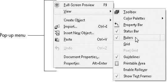
Straight out of the box, CorelDRAW displays rulers on the top and left side of the page window. However, if someone experimented with your installed copy and turned rulers off, it’s easy to restore their visibility. You can choose View | Rulers from the main menu, but a quicker way is via the pop-up menu. With any tool chosen except the Zoom tool, right-click over a blank area of the page (or outside of the page), and then choose View | Rulers from the pop-up menu.
Rulers in CorelDRAW look like physical rulers with major spacing (inches, for example) and minor spacing (the ticks between whole number amounts, such as 3/8 and 1/4). CorelDRAW detects when a mouse scroll wheel is active, and if you zoom the page in and out, you’ll see an additional ruler nicety—the ruler ticks between major spacing have labels for fractional amounts when your zoom level is large enough to display them.
CorelDRAW rulers (see Figure 7-1) can be broken down into three components: the vertical ruler, the horizontal ruler, and the ruler origin. If you ever need the location of your cursor onscreen, you’ll see a dotted line on the rulers, and the numerical value is right at hand on the status bar. CorelDRAW uses the standard convention of displaying horizontal position values as X values on the property bar, and vertical values as Y. For example, you create a rectangle using the Rectangle tool, and you’re not sure you put the rectangle in the center of an 8½×11″ page. A quick glance at the property bar will tell you that if the rectangle’s X position is 4.25″ and the Y position is 5.5″, its center is at the center of the page.
The origin is the intersection of the vertical and horizontal rulers at the top left of the workspace. The origin is the page position reference where all measurements begin, but it does not represent the zero point for measuring the page. By default, the lower-left corner of your page represents the ruler origin 0 position. Try this: Create a shape near the center of the page. Then with the Pick tool move the shape up and to the right, while watching the X, Y position values on the property bar; the values increase. Conversely, if you move the shape down and to the left, the values decrease—eventually, if you move the shape off the page (down and left), you’ll see negative X, Y values on the property bar, as the shape travels beyond the origin.

FIGURE 7-1 Elements of CorelDRAW’s rulers
As with a physical ruler, you can move rulers in CorelDRAW to assist you in your design needs. Additionally, you can leave the rulers where they are and just move the origin of the rulers. This is something that cannot be done with a physical ruler; working with these features is covered in the sections to follow.
Setting the Ruler Origin
Say you’re uncomfortable with measuring from the bottom left and prefer a more conventional set of rulers that start at the upper-left corner of a page. Click-hold your cursor on the origin, and then drag to a point at the upper-left corner of the page. Doing this thwarts the ability to use the property bar for easy-to-read X, Y positions for objects, because by convention—in drawing applications, CAD applications, and most advanced design programs—Y, the vertical measurement of space, always travels up in a positive direction. However, moving the origin not only can make the rulers suit your intuitions, but it’s also a handy technique for measuring relative distance between objects, measured against each other and not as an absolute measurement against the page.
 Two Inches to the Right, Please
1. Create two shapes; any shapes will do.
2. Move the shapes using the Pick tool so that they’re horizontally aligned, and let’s try 5 inches from each other.
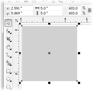
3. You need the centers of the objects to be 2 inches apart. You click-drag the origin so that it’s horizontally centered on the first object. The zero horizontal point is now at the center of the first object.
4. You move the second object so that its center is at the 2-inch major mark on the horizontal ruler.
5. With this shape still selected, take a look at the X, Y fields on the property bar. If the X value is not exactly 2.000, type 2.000 in the X field, and then press ENTER. See Figure 7-2.
It’s easy to undo what you’ve done: to restore the origin of the rulers to the default setting, double-click the origin.
A more dramatic change you can make to the rulers is to actually reposition them in the workspace, not simply change where the units appear. To undock the rulers (they come as a set; you cannot undock only one ruler), hold SHIFT and then drag the ruler origin to where you want the rulers to begin. You’ll see a dashed-line preview onscreen for the intended new location of the rulers; release the mouse button, and the rulers move to this position. To restore the rulers (to dock them), you hold SHIFT and then double-click the ruler origin. See Figure 7-3.
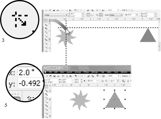
FIGURE 7-2 Specify a different origin for the rulers to measure relative distances between the centers of objects.
FIGURE 7-3 Rulers can be repositioned on the page.
Once the rulers are undocked, you’re free to move them as needed, by holding SHIFT while dragging the origin. Regardless of where you place the rulers in the workspace, the zero for the increments on the rulers remains constant. To see this, move the view of the page by using the scroll bars at the right and bottom of the screen, or use the Hand tool (H); the increments on the undocked rulers move as you move your view. If you need to move the origin while the rulers are undocked, drag the origin.
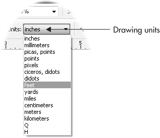
Setting Unit Measure
In CorelDRAW, you have the same unit measurements as in the real world: millimeters, yards, and so on. Units of measure is the name of the setting in CorelDRAW, and they affect the look of the rulers as they increase and decrease in frequency with your view magnification setting. The actual units of measure are specified according to the drawing units currently defined on the property bar. To set the drawing unit measure, choose the Pick tool (click an empty area on your page to make sure nothing is selected), and then use the Units drop-down list on the property bar to specify anything from picas to kilometers.
Drawing units control the units displayed on rulers and also for other areas of CorelDRAW X5 where dimensions are displayed: page size, shape size, and nudge and duplicate offset commands.
Setting Ruler Options
Options for measuring in CorelDRAW can be found in Tools | Options | Document | Rulers; but the faster route is to double-click a page ruler, or to right-click a ruler and then choose Ruler Setup from the pop-up menu. In the Rulers area of the Options box, you’ll find options in addition to the increments displayed on rulers. See Figure 7-4.
Nudging
At the top of the Rulers page are Nudge options, worth covering first here, although indirectly related to the page rulers themselves. When we nudge things in the real world, our intention is to move an object by a small, but fairly arbitrary distance—and we estimate the measurement. In CorelDRAW, however, nudging objects is precise, not at all arbitrary, and on the Rulers page you can set the distance for normal, Super, and Micro nudging. Nudging can be performed on a shape, several shapes at the same time, and even on a node or several nodes on a path when they are selected using the Shape tool.
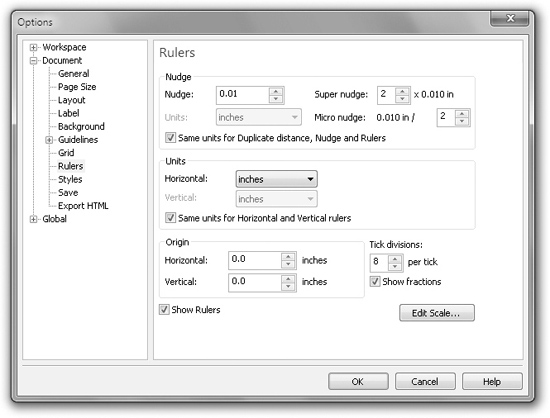
FIGURE 7-4 The Rulers area of Options is where you can set units, the independent display of units on rulers, nudge distance, and more.
Once you’ve specified values for nudging in the Rulers area:
• You set the normal nudge distance of an object by choosing the object(s) with the Pick tool or by choosing the node(s) using the Shape tool, and then pressing the keyboard arrow keys to nudge up, down, or across; one keyboard stroke equals one nudge distance.
• Super-nudging is performed the same way as normal nudging, except you hold the SHIFT key while pressing any arrow key.
• Micro-nudging is performed the same way as regular nudging, except you hold the CTRL key while pressing any arrow key.
The upper limit for nudge distance is 600 inches, which is fair enough, because, for example, nudging a shape 600 inches to move it is more easily accomplished by simply entering the intended position in the property bar’s X and Y fields (then you press ENTER to apply the move).
NOTE
Nudge distance can be set on-the-fly within the workspace, and Super and Micro Nudge scale apply to the new nudge distance. With nothing selected, set a new value in the Nudge Distance box.

TIP
There’s an easy way to remember some modifier keys. In many applications, CTRL means “constrain,” “to limit”—while SHIFT often means “to add to” or “to extend.” So super-nudging can be thought of as an extension to normal nudge distances (you hold SHIFT while pressing arrow keys), and micro-nudging is a constrained version of normal nudging (you hold CTRL).
Specifying Units, Origin, and Tick Divisions for Your Rulers
In the fields below Nudge options, you’ll find all the controls for what appears, and where, on the rulers displayed on your drawing page. Here’s how each option controls ruler appearance:
• Units Units are measurement values. Choose a Horizontal unit measure to specify unit measures for all drawing units in your document. To specify different units of measure for vertical ruler and drawing units, click to deselect the Same Units For Horizontal And Vertical Rulers option, shown in Figure 7-4.
• Origin Although you can manually set the origin as described in the previous section, you can also perform precise origin definition using this field. The origin point can be set anywhere from –50 to 50 yards, in precise increments as small as 0.001 inch.
• Tick Divisions Tick divisions are the evenly spaced numeric labels seen bracketing the smaller increments displayed by your ruler—for example, if you are using inches as the unit, the tick divisions are 1, 2, 3, and so on. Tick divisions are automatically set according to the unit of measure selected. For example, standard measure displays a default of eight divisions per tick, and metric measure displays ten divisions. Desktop publishing and printing units such as didots, picas, points, and ciceros display using six divisions per tick. The option to Show Fractions is also available and set by default while a unit measure is selected. The top of Figure 7-5 shows two divisions per tick; below it is the standard eight subdivisions; and at bottom, with the Show Fractions check box unchecked in the Rulers area of Options, decimals are now shown for ticks.
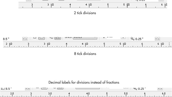
FIGURE 7-5 Choose tick divisions and whether fractions or decimals display on rulers.
TIP
To set the Spacing and Frequency of your ruler, see “Setting Grid Properties” later in this chapter.
Editing Drawing Scales
Scale drawing is used when the dimensions involved in drawing actual sizes are either too large or too small to be practical. For example, a world atlas at 1-to-1 (1:1) scale would be hard to carry around, and almost as hard to print. You can set up a drawing scale by first setting the units; click the Units drop-down on the property bar. Then click the Edit Scale button in the Rulers page of the Options dialog (CTRL+J is the shortcut). In the Drawing Scale dialog, you can quickly apply a scale ratio, or set your own custom scale. By setting 1 foot to equal a mile (5,280 feet), it’s then simple to draw accurate maps and directions around town.

The Typical Scales drop-down list includes a selection of the most commonly used drawing ratios ranging from 100:1 to 1:100, with the most common standard measure scales included. When selecting ratios, the first number represents the object Page Distance; the second number represents the real-world distance, labeled “World Distance.” Usually small objects such as circuitry and clock parts are illustrated using ratios where the Page Distance is larger than the World Distance. Conversely, the best setup for a technical drawing of a skyscraper is to set Page Distance much smaller than World Distance.
The moment you change either the Page Distance or the World Distance, the Typical Scales selection in the drop-down list turns to Custom. Page Distance is the measured distance on your document page, while World Distance refers to the distance represented by your ruler and drawing units in your document. Settings can be made independently of each other and to different units of measure to a range between 1,000,000 and 0.00001 inches in increments of 0.1 inch.
Calibrating Ruler Display
You buy a Lamborghini Gallardo (about $200,000); you pull into a gas station, and you want to put Regular in the tank? No. Similarly, you can’t expect precision when you use CorelDRAW on an uncalibrated monitor. CorelDRAW provides a very simple way to ensure what you see on your monitor screen matches real-world measurements. Occasionally, your display might not show perfectly square pixels, and as a result, your 5-inch line in a very important drawing might measure 4.88″ when you print it. To calibrate the rulers in CorelDRAW to match your screen, to match real-world output, you’ll need a plastic foot-long ruler (clear is better than solid, about $1 at a stationery store), about 30 seconds, and the following steps:
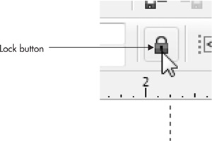
1. In a new document create a 5″-wide square. With the Rectangle tool, hold CTRL (constrains proportions to 1:1), and then drag while watching the size fields on the property bar. If you’re close but not precisely 5″, type 5.0 into either field with the Lock Proportions icon clicked (see following illustration), and then press ENTER.
2. Using the Zoom tool property bar options, set your view magnification to 100 percent.
3. Using your physical $1 ruler, measure the object you created on your screen. If both CorelDRAW’s rulers and your physical ruler agree it’s a 5″ square, your ruler display is accurate. If the measurements don’t match, CorelDRAW’s toolbox Options dialog has the fix.
4. Open the Options dialog (CTRL+J).
5. Click to expand the tree directory under Workspace | Toolbox, and then click Zoom | Hand Tools. This displays the Zoom, Hand options on the right of the dialog. First, click to select the Zoom Relative To 1:1 option.
6. Click Calibrate Rulers to display the ruler calibration reference rulers and Resolution options, shown in Figure 7-6. Notice the vertical and horizontal ruler bars that intersect at the center of your screen. This represents your current ruler drawing units.
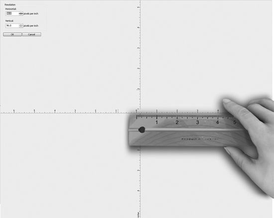
FIGURE 7-6 Clicking Calibrate Rulers displays reference rulers and Resolution options.
7. Using your ruler, measure both the vertical and horizontal rulers on your screen to see that they match. If they don’t match, increase or decrease the Horizontal and/or Vertical options using the spin boxes until the onscreen rulers match your $1 ruler. See Figure 7-6.
8. Click OK to close the calibration dialog, and then click OK again to close the Options dialog. Your rulers are now calibrated.
Introducing the Indispensable CorelDRAW Grids
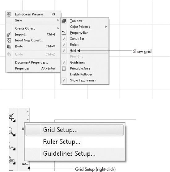
A page grid is a customizable, by default nonprinting, overlay that extends beyond the printable page onto the pasteboard area at all viewing resolutions and viewing qualities. It’s not only an excellent visual reference for scaling and aligning objects vertically and horizontally, but it also can be used in combination with CorelDRAW’s Snap To Grid option. To make the grid visible, right-click with the Pick tool over an empty area of the page, and then choose View | Grid from the pop-up menu. To modify the Grid, right-click over either ruler or the ruler origin, and then choose Grid Setup.
Setting Grid Properties
You’re going to have a variety of designing needs, which will certainly call for different appearances of grids, which is why they’re customizable. Changing grid-line frequency and spacing is often needed. You can use options in the Grid page of the Options dialog to tailor your grid just the way you need it to appear. To open this page, as shown next, choose View | Setup | Grid And Ruler Setup from the command menus, or right-click your ruler and choose Grid Setup.
TIP
Use the Object Manager to set all grid properties, including visible, printable, and/or editable states. Grids are controlled by the Grid layer properties, which is a layer on the master page. To open the Object Manager, choose Window | Dockers | Object Manager (see Chapter 9).
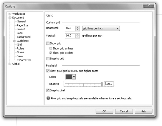
The Grid page’s Grid Lines Per Inch and Inches Apart options for units might look similar, but there’s an important distinction. The Grid Lines Per Inch (“frequency”) option gives you control over the grid appearance according to the number of lines that appear within a given distance. The Inches Apart (called “spacing” in CorelDRAW version X4) option controls the physical space between the grid lines based on distance. Both are set according to the current drawing units choice, and you choose frequency or spacing; choosing both would be impossible. You can also set the horizontal and vertical spacing independently of one another, which is very useful when you have an object such as a tall fluted glass that you want to put etching on. You’d use more horizontal than vertical grid lines, and your design would turn out flawlessly.
TIP
When illustrating or drawing based on a specific unit of measure—such as inches— formatting your grid to match the ruler unit of measure is a smart thing to do. For example, if rulers are set to display inches using a Tick Division of 8 per inch, setting the grid to a Grid Lines Per Inch value of 8 vertical and 8 horizontal lines per inch causes grid lines to appear every eighth of an inch while using a Drawing Scale ratio of 1:1 (actual size).
Display Grid as Lines or Dots
Also on the Grid page of the Options dialog, you control how your grid appears—either as lines or as dots. By default, new documents are set to the Show Grid As Lines option. However, a design, for example, of a checkerboard might make the grid fairly invisible and as a consequence useless; you’d opt for the display of Show Grid As Dots. Conversely, you’re going to lose a solar system or two if dots are chosen for grids when you’re drawing an astronomy chart (use lines)!
Using Snap-To Commands
The Snapping feature helps you move a shape to an exact location when it’s close to grid lines, guidelines, and other objects. Think of snapping as magnetism: you hold a paper clip, for example, close enough to a magnet, and eventually it snaps to the magnet. In CorelDRAW you use the Pick tool and Shape tool to get snapping. The Snap To drop-down menu on the property bar is your ticket to defining what snaps to what on your drawing page.
Snapping is one quick route to precise manual aligning and distribution of table callouts, symmetrical patterns, and just about any design that requires some regularity to placed shapes. And if you don’t need it, it’s easy to turn off.
• Snap To Grid To have your drawing shapes snap and align to the document grid, click the drop-down on the property bar, or press the shortcut CTRL+Y to toggle the feature on and off. When objects snap to a grid, they snap to the grid lines, and you’ll feel an even stronger attraction when you move an object close to grid intersection points.
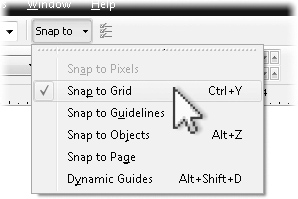
• Snap To Guidelines Guidelines are covered later in this chapter. To cause your objects to snap to any type of guideline, choose this option from the drop-down list.
• Snap To Objects To have objects snap to and align with other objects, choose Snap To Objects from the drop-down list; it’s faster to remember the shortcut ALT+Z. When objects are set to snap to each other, they can use snap points on either the source (the magnet) or target (the object that’s attracted) object. Snap points are set using options and modes in the Snap To Objects page of the Options dialog (see the later section, “Setting Snap Behavior”).
• Snap To Page When you want to draw an object that’s aligned perfectly to any edge of the drawing page, use this Snap To option. Snap To Page is also great for snapping an existing object’s edge or corner to the edge of the page.
• Dynamic Guides This feature in CorelDRAW X5 is akin to object snapping. Press ALT+SHIFT+D, or use the drop-down menu to toggle the dynamic guides on or off. This feature is covered in detail in the next section.
Snapping To It
1. You have a web page to design, with six 1-inch squares (three across, two down), with a ½-inch space between them. Don’t get out a pocket calculator, and don’t resort to colorful language—at their defaults, Snap To Grid and Snap To Objects make this task go like a charm. Enable Snap To Grid and Snap To Objects from the Snap To drop-down list and make sure Grids are turned on.
2. With the Rectangle tool, begin close to a grid intersection, and then drag down and to the right until the property bar tells you either the height or width of the rectangle is very close to 1″. Release the mouse button when your cursor is over a grid intersection.
3. Choose the Pick tool.
4. Drag the rectangle over to the right until you see one vertical grid separating it from the original square, but don’t release the mouse button yet. One space is on each side of this line, and together they represent half an inch.
5. Right-click while the left mouse button is still depressed, and then release both buttons to drop a copy. What you’ve done is duplicate the original square to a new position. This is an important, quick technique for duplicating shapes.
6. Repeat steps 4 and 5 to build the array of evenly spaced squares, as shown in Figure 7-7. Notice that when an object’s edge is on, or even close to, the grid when Snap To is turned on, you’ll see a tiny blue label indicating the snap-to point. You’re not limited to shape edges as the origin of a snapping point; setting behavior for snapping origins is covered later in this chapter.
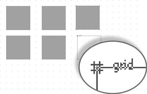
FIGURE 7-7 Duplicating and aligning objects makes accurate composition of a design a breeze.
TIP
Snapping behavior isn’t limited to the grid. In fact, you don’t even have to have the grid turned on to snap objects to one another; press ALT+Z and then all your objects are sticky.
Setting Snap Behavior
On the Snap To Objects page of the Options dialog, you can control snapping behavior in precise detail when moving and drawing lines or objects. You choose Tools | Options (CTRL+J), click to expand the tree directory under Workspace, and then click Snap To Objects.
The Snapping Radius feature requires that you have a shape and a different object (or guideline or grid intersection) to which it snaps. Proximity to the “magnetic” snapping object is important—you can’t have an object snap to a different object that is miles away. However, in the Snap To Objects page, you have control over the strength of the magnetism, by setting the Snapping Radius pixel distance.
To customize snapping behavior to suit the type of drawing you’re building, you enable or disable the following features on the Options page:
• Snap To Objects On Clicking this check box toggles the Snap To Objects feature on or off. You can also do this from the Snap To drop-down list on the property bar.
• Snapping Radius Use this to set snapping sensitivity, based on screen proximity to snap points. Experiment with what works best for you in a specific design situation; you can always return to this area and change the value. For example, choose 10 (the default), or 2 (weak magnetism), or 25 (akin to having chewing gum on the bottom of your shoe).
• Show Snap Location Marks This option is on by default. Snap points are highlighted when your cursor is held over the precise points of a selected object or a target object while moving objects or drawing. When it is activated, you can also choose the Screen Tip option, which identifies the snapping point, highlighted with a text label. With Screen Tip turned on, the blue icons preceding the text labels represent some of the modes you’ve chosen. The types of snapping are covered next.
TIP
When you reposition a shape by dragging it with the Pick tool, before you release the mouse button to finalize the move, the shape remains in the original position, but a blue, outline version of the shape appears at the intended new location. Use this feature as a visual guide for repositioning objects; this preview of a move offers positioning precision because you can “see through” to objects beneath the chosen object before you release the mouse button.
Choosing Object Snapping Modes
The Modes list includes nine object snap points you can define. You can toggle them on or off using the check boxes. Symbols beside the mode names identify the current snapping points on different object types. Use the Select All and Deselect All buttons to quickly activate or deactivate all the options in the list.
At times you might want snapping to occur at certain object points but not others—you can turn specific snap points on or off. Choose options from the Modes list to have objects snap to precise points on other objects in the following ways:
• Node Use this mode to snap where nodes exist on objects or lines. A node is a break point along the path of a shape, and it’s indicated by a very small (but noticeable) black outlined square.
• Intersection Choose this mode to activate snapping where the outline paths of two objects cross, including the original position of an object you’re moving.
• Midpoint This mode snaps to a point equidistant between any two nodes on an object or path.
• Quadrant This mode should only be used with ellipses and circles. It causes snapping to one of the four nodes that were created using the Ellipse tool (F7).
Below these modes are Tangent and Perpendicular; they work only in combination with dynamic guides, covered in the following section:
• Tangent This mode shows a guide at a tangent (a straight line that touches a curve at a point) to a quadrant snap point. This mode applies only to ellipse objects.
• Perpendicular Choose this mode to show a dynamic guide at right angles and to snap to the midpoint between object and segment nodes.
Finally, the following modes apply snapping regardless of whether other, additional snapping points are checked in this Options page:
• Edge Choose this mode to have the outline path of an object act as a dynamic guide for snapping to.
• Center This mode displays the center point (origin) of closed-path objects.
• Text Baseline When snapping, all text objects take on the characteristics of a normal object such as a rectangle and have snapping points for edges, centers, corners, and so on. Additionally, the text baseline (the hypothetical line each character appears to rest on) is included in the snapping action.
Working with Guidelines, Dynamic Guides, and Guide Layers
Like the nonprinting blue pencil marks traditional designers used, CorelDRAW’s page guides, dynamic guides, and objects you put on a guides layer don’t print, but here the similarity ends. Regardless of whether you use one or all of the guide features in your work, you’ll have the precision only a computer application can offer, plus the same speed and ease with guides as any object you’d draw on a page.
The following sections are the operator’s manual for guides: how to use them and how to customize them.
Using Guidelines
Guidelines placed on your document page extend between the top, bottom, left, and right edges of the document window. Guidelines appear as vertical and horizontal dashed lines, but guidelines can also be rotated. In CorelDRAW, guidelines are considered unique objects—they have their own properties, but are manipulated in many ways like objects you draw.
To view and hide the display of guidelines in your document window, right-click an empty area of the page and then choose View | Guidelines. By default, a new document doesn’t have any guidelines—you need to create them, which is shown next. To have objects snap to the guidelines you create, choose from the Snap To drop-down list on the property bar, where you found Snap To Grid earlier in this chapter.
Manipulating Guidelines
The following steps walk you through the tasks you’ll need most often when working with guides:
• Make sure the rulers are visible; they’re where a lot of the guides live. With the Pick tool chosen, and no objects selected, right-click and then choose to View | Rulers. Then, using any toolbox tool you like, click-drag beginning on a ruler, and release the mouse button anywhere in the workspace. Although dropping a guide on the page is most useful, you can certainly create a guide on the pasteboard area to measure and align objects not currently placed on the page.
• To move a place guide, you need the Pick tool selected. Then hover the cursor over the guide you’d like to move; when the cursor turns into a double-headed arrow, all you need to do is drag the guide.
• If you want to eliminate a guide, hover over it with the Pick tool until you see the double-headed arrow cursor (to indicate you’ve selected it), click the guide to confirm the guide is “in focus” in the interface, and then press DELETE or CTRL+X. When a guide is selected, you’ll see an onscreen confirmation before you delete it—the guide turns red.
• If you need a guide that travels uphill or downhill, you create a guide first. Next, click it to select it, and then click a second time, and you’ll see a center and rotation handles. One of the neat things about rotating a guideline is that you can move its center point before dragging on the rotation handles to, for example, rotate a guide around the corner of a shape you have on the page. You move a slanted guideline exactly as you do with a perfectly horizontal or vertical guide—you click-drag it to reposition it. See Figure 7-8, where the design needs cartoonish shafts of light emanating from a center point that is not the default center of a guide that’s put into slant mode. No problem; you change the center of rotation, then drag a rotation handle clockwise or counterclockwise.
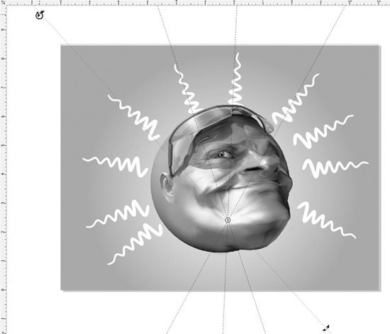
FIGURE 7-8 Make your guides perform at the angle you need for a design piece.
TIP
You can move and rotate several guidelines at once by pressing SHIFT to select or deselect them, and then click-dragging to move them. To rotate one or more guidelines while selected, click one of the guidelines a second time to display rotation handles, and drag one of the rotation handles.
Controlling Guideline Properties
If you need several guidelines exactly spaced, manage all guidelines via the Options dialog (CTRL+J). Separate dialog pages are here for controlling the vertical, horizontal, and slanted guidelines. To see these dialogs, right-click either of the rulers and then choose Guidelines Setup. Additionally, while a guideline is selected in a document, you can open this dialog by clicking the Guidelines Options button on the property bar.
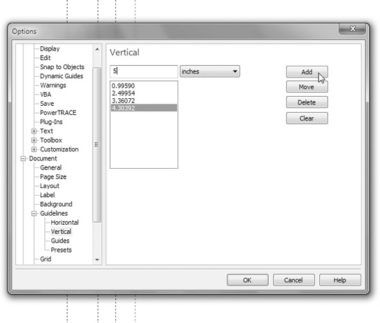
The Options dialog lists each of the guideline types individually on the left side of the dialog. Click one to select it in the tree directory under Guidelines; here’s what the Vertical page looks like when some guides have been defined at 1-inch intervals:
TIP
By default, guidelines are a medium blue when added to the workspace, and their highlight color when they’re selected is red. However, on the main page for Guidelines in Options, you can change the color of a guide as well as the color for preset guides. This is quite handy, for example, if you’re designing a series of medium blue rectangles—naturally, you’d want to choose a contrasting color for the guides!
Adding, Deleting, and Moving Guidelines
You can adjust guides using the features in Guidelines in Options. Each dialog contains a listing of the existing guidelines on your document page. Here are the ways to perform the common tasks:
1. To create a new guideline, enter a value in the top-left num box according to the position where you want the new guideline to be created. Then click the Add button. A new guideline is created where you want it.
2. If you’re in a Guidelines window and you can’t see where to move or add a guideline, go to either the Horizontal or Vertical guidelines dialogs, and you can work there.
3. To move an existing guideline, click it in the list, enter a new value in the top-left num box, and then click Move. The selected guideline has moved, and on the list you can see it’s been thoughtful and left a forwarding address.
4. To delete a specific guideline, select it in the list, and then click the Delete button. The selected guideline is gone from the page, and as you see the page from your current view, your document is immediately updated.
5. To remove all guidelines in the list, click the Clear button. All guidelines are deleted.
Locking and Unlocking Guidelines
All guidelines are editable by default; you can move or delete them using the Pick tool. But occasionally a guide that can move accidentally is as welcome as a friend who is holding your ladder moving accidentally. You can lock it using property bar options:
1. To lock an individual guideline, click the guideline to select it using the Pick tool.
2. Using property bar options, click the Lock button. The selected guideline is locked, and the guide-specific property bar options become unavailable. You can also choose Lock Object from the pop-up menu when you’ve selected a guide using the Pick tool.
3. To unlock a locked guideline, right-click the guideline and choose Unlock Object from the pop-up menu. Your guideline is now unlocked, and the guide-specific property bar options become available again.
Working with Dynamic Guides
Dynamic guides are guides that you first set up with axes of rotation (0°, 15°, and so on), and then when you want a guide at a specific angle for aligning or drawing, it appears onscreen. It can snap the object you’re positioning, and dynamic guides offer onscreen information about the result of a moving or drawing action. When using dynamic guides, drawing or moving your cursor over active object snap points will cause guides to temporarily appear to aid in placement of objects and nodes. You can move your cursor along these “sticky” guides, and view snap points, angle values, and distance measurements relative to object snap points (as shown in Figure 7-9). You can also have your cursor snap to specific points along the guide path, based on a customizable tick value. To activate this feature, choose View | Dynamic Guides (ALT+SHIFT+D).

FIGURE 7-9 From the “sticky” guides, you can view snap points, angle values, and more.
Dynamic guide behavior works in combination with your selected Snap To Objects modes (see “Setting Snap Behavior” earlier in the chapter), but has a unique set of options that control their behavior. To access these options (see the following illustration), choose Tools | Options (CTRL+J), and click Dynamic Guides under Workspace in the tree directory.
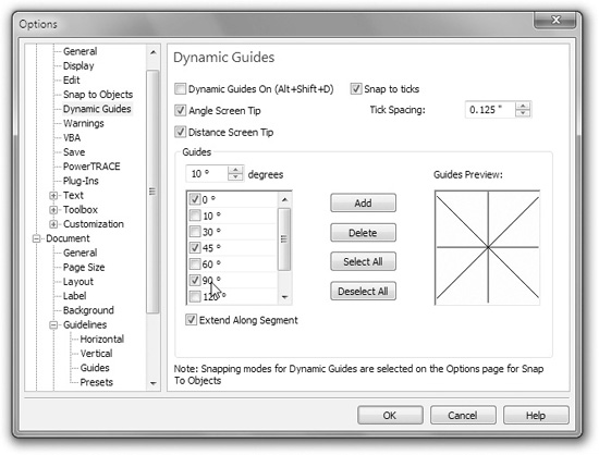
Here’s how choosing each option will affect the behavior of your dynamic guides:
• Dynamic Guides On Click this check box to turn dynamic guides on or off.
• Angle Screen Tip Choose this to display angle values relative to snap points on your object.
• Distance Screen Tip Choose this to display the distance between your cursor position on a guide and the current snap point. Unit measure is based on your currently selected drawing units.
• Snap To Ticks This option offers to snap your cursor position to points along the guide according to the value you enter.
• Guides This area opens up a whole world of possibilities for angles at which dynamic guides appear relative to the active snap point. Clicking a check box activates each of the default angles, which are preset at from 0° to 150° (in 15° and 30° increments), for a total angle of 180°, which effectively covers all possible angles, because Dynamic Guides appear bi-directional. The angle of each guide is displayed in the Guides Preview window on the right of the dialog. Enter a degree value in the num box above the list, and click the Add button to add a new guide. To remove a dynamic guide, click a guide either in the list or in the preview window, and then click Delete. When a new guide is added, it appears in the list; conversely, when you delete a guide, it’s permanently removed from the list.
• Extend Along Segment Choose this to display a guide at the same angle as straight line segments. This option is useful for Bézier and freehand drawing because this makes it easy for you to add new portions to straight lines at a constant angle (as shown in Figure 7-10).
Figure 7-11 shows a logo nearing completion by setting up dynamic guides at 45° increments. Using the Pen tool, the dynamic guides (set to snapping) show exactly when the tool has reached a 45° angle as well as a 90° angle. Try this feature for yourself; this illustration was accomplished using 25 clicks—precision has seldom been achieved so easily.
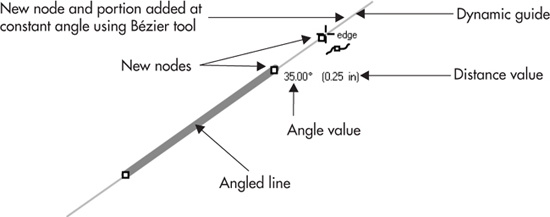
FIGURE 7-10 The Extend Along Segment option is useful for both Bézier and freehand drawing.
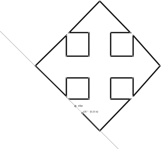
FIGURE 7-11 Use dynamic guides to assist in alignment and drawing when rulers don’t suit the assignment.
Controlling the Guides Layer
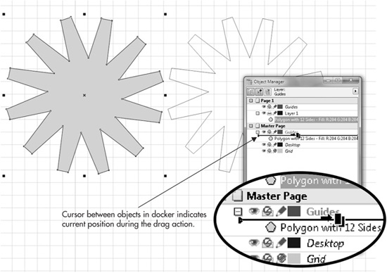
Guides belong to a special layer, named Guides on the Object Manager, reserved just for these assistants. To view the layers in your document, open the Object Manager by choosing either Tools | Object Manager or Window | Dockers | Object Manager, and then click the Layer Manager View button at the top of the docker. The Guides layer is a Master Page layer; you’ll find it with other layers controlling your Desktop and Grid. By default, all guidelines on the Guides layer are set as Visible, Non-Printable, and Editable. If you want, you can change any of these by clicking the symbols to the left of the Guides layer in the Object Manager docker, as shown here:
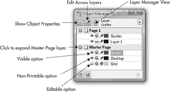
To set all options for a layer at once—including the display color of objects on the Guides layer in the Object Manager docker—right-click the layer name, for example, the Guides layer, and then choose Properties from the pop-up menu. Doing this opens the Guides Properties dialog to reveal further options.
Make an Object a Guideline
Where a straight or slanted guideline doesn’t get you where you want to go, you can make almost any drawing shape into a guideline; going the other way around, you can also turn a guide into a drawing object. To do this, you use the Object Manager docker to move objects between layers. Moving any object to the Guides layer makes for all intents and purposes a guideline, with all the same properties as a typical guideline, except you might call it a guide-curve or a guide-spiral! After an object becomes a guideline, objects and anything you draw in its proximity snap to it, as long as the Snap To Guidelines option is active. Think of the artwork you can clean up and refine when you’re tracing over the original with a drawing tool that snaps to the original.
Moving any guideline to a different layer automatically makes it a printable object. To move an object to the Guides layer, use these steps:
1. Create or select at least one drawing shape that you want to use as a guideline.
2. Open the Object Manager docker by choosing Tools | Object Manager.
3. Expand the tree directories in the Object Manager docker to locate both the Guides layer on the Master Page and the shape you want to make into a guideline, so both are in view.
4. In the Object Manager docker, click-and-drag your shape icon (not the shape on the page) from its current page and layer to any position under the Guides layer on the Master Page. As you drag, notice a horizontal I-beam cursor appears, shown next, indicating the shape’s current position as it is dragged. When your cursor is over a layer—ideally, the layer you want to move the shape to—you’ll see the default cursor replaced with a horizontal arrow “holding” a symbol of graphics content. The following illustration also shows a “before and after” of a star shape when it’s moved to the Master Page Guides layer. Unlike guidelines you drag from rulers, the look of a user-defined guide doesn’t have the dashed lines; it’s a solid line with no fill.
Generally, after moving a shape to the Guides layer, it’s a good practice to lock the layer, as described earlier. A guide that moves when you don’t intend it to is as useful as a crepe paper umbrella in a storm.
Using Guideline Presets
CorelDRAW’s Guidelines feature comes with a group of presets that generate scripts to instantly add guidelines to your document. To use these scripts, press CTRL+J (Options); click to expand the tree directory under Document | Guidelines; and then click Presets, shown here. Click Apply Presets (you can add as many as you like in one fell swoop), and you have instant preset guides on the page. Basic Grid is a very useful preset because unlike with the Grid feature, you can move, and thus customize, any of the guidelines.
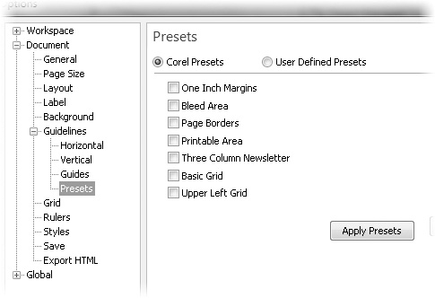
Many of the presets are page margins, many are timesavers, but you can also create your own preset. To define guidelines that automatically populate the page, choose the User Defined Presets option in the Presets page of the Options dialog. This displays a collection of options for you to create your own custom Margins, Columns, or Grid guidelines. To activate any or all of these preset guideline effects, choose the corresponding options and customize the associated preset values.
TIP
To open the Options dialog quickly to the Presets page while you currently have an unlocked guideline selected, click the Preset Guidelines button on the property bar.
Altering Preset Guides and Saving Guides in a Template
Although preset guidelines behave like guidelines you drag from the rulers, if you want to alter the preset arrangement by dragging one with the Pick tool, the action triggers an attention box. This attention box is equivalent in seriousness to the tag you get on new pillows—it’s for your own safety and is simply telling you that you’re modifying a preset, your own or a Corel preset for guidelines. You can check the “Don’t show warning again” box at the bottom-left of the Warning dialog box to avoid it in the future. Basically, you cannot destroy or modify a Corel guideline preset by moving one of the guides on the page—the option is always there from session to session. And there’s really nothing to mess up by altering a user preset guideline on the page after you’ve created one. There is no saved list of user presets; if you’ve created a user preset of grids, margins, or columns and want to save the modified or the original arrangement, you choose File | Save As Template. In the future, you can load a fresh, new document based on the template, and your guides are all in place.
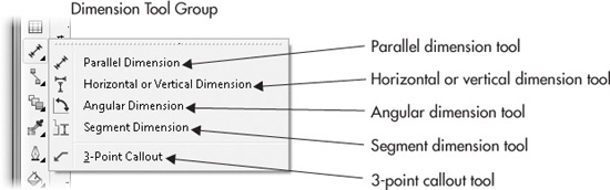
Using the Dimension Tools
If you need to annotate a drawing or an imported bitmap image with dimensions or labels calling out, for example, different parts of a machine, the dimension tools are expressly for this purpose. The lines you create with the four dimension tools will tag the bracketed area with units of measurement of your choice, and they dynamically update when you scale them. The 3-point callout tool is for adding text to a wide selection of arrowhead lines; you can choose a line style for the connector as well as width, a type of arrowhead, and any style of typeface that you have installed on your system. The text labels for callouts are also upright regardless of if you rotate the line, and a callout control line can be edited at any time with the Shape tool (F10).
Working with Callouts
When using the 3-point callout tool, you produce two elements: a line composed of two segments (the callout, as it’s displayed on the status bar), and the control text. Callouts are not bound to an object; they can be moved anywhere on the page. But the text and the line are linked and cannot be moved independently of one another. You have a number of options on the property bar when the tool is active and also when a callout is selected (after one has been drawn):
• Outline width By default, you always begin a callout with a 0.5-point line width in black. It is not recommended to adjust the width before drawing a line; doing so triggers an attention box that asks whether you want the default line width—for any object you draw, not just callouts—to be changed. Instead, create your callout, and then adjust the width while the callout is selected. Because the callout belongs to the general class of line objects in CorelDRAW, you can change the color of the callout line by right-clicking a color well on the Color Palette while the line is selected.
• Start arrowhead This drop-down list will seem familiar if you’ve ever applied an arrowhead to a line by using the property bar. The same basic styles are available as on the Start arrowhead collection. You can even use an arrow tail for a callout.
• Line style Like any other line you draw with the Pen or other drawing tool, the callout can be solid, dashed, a series of dots—choose a style by clicking the pop-up box, and then click a style thumbnail.
• Callout symbol You set the style for the callout text from this pop-up list of presets. The symbol doesn’t affect the font; it’s a style—a rectangle bounding the text, a straight line butted above or below the text—symbols add an element of polish to your presentation.
• Offset Sets the distance between the tail of the callout line and the beginning of the text.
• Character Formatting (CTRL+T) After creating a callout, you can select the text and use the property bar to change the font, font size, and so on, but Character Formatting also provides you with more controls and options. Clicking this button displays Character Formatting as a docker entry, persistent onscreen until you close the box.
To use the 3-point callout tool:
1. Click-drag to create a point where you want the callout to end (the node will eventually have the arrowhead), move the cursor to where you want the “elbow” of the callout line, and then click.
2. Move your cursor to where you want the control text, and then click.
3. Begin typing what you want the callout to read.

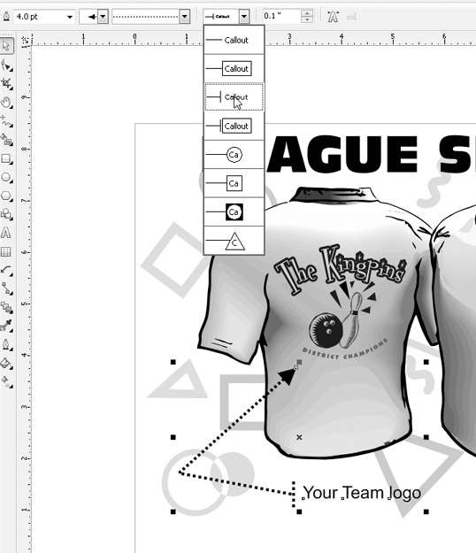
The following steps walk you through an imaginary assignment: you have an illustration of a custom bowling shirt, and you need to call out one or two selling points about the shirt. The shirt in League Shirts.cdr could use a callout for the name of the league that the vendor silk-screens on the shirt’s back. Also, the vendor offers to embroider the name of the player above the front pocket in case the bowler forgets his or her name. These steps are simply a demonstration, and your finished assignment is neither “right” nor “wrong,” but rather an exploration of the 3-point callout tool’s features and ease of use.
Calling Out a Bowling Shirt
1. Open League Shirt.cdr. The layer with the illustration is locked so nothing can accidentally be moved.
2. Choose the 3-point callout tool from the Dimension Tools group on the toolbox.
3. Click-drag from “The Kingpins” logo on the back view of the shirt, and then release the mouse button inside the green bubble graphic. Doing this sets the first of two segments for the callout line.
4. Click below the shirt, and then type Your Team logo.
5. Choose the Pick tool. You cannot press ENTER to toggle to it, because technically, the Artistic text tool is being used by your cursor.
6. Select the callout line; notice that the options for the callout are now available on the property bar.
7. Choose 4 pt. from the Line Width pop-up list, and then choose a dashed line from the Styles pop-up.
8. Choose the third from the top symbol style for the callout. Depending on how the last node is positioned on the page for the callout, your text might have the bar for the symbol to the left or above it. Either is fine in this experiment, and you’ll see shortly how to change the symbol’s orientation.
9. Right-click over any color well you like with the callout line selected to change its color.
10. Choose the Shape tool (F10). Click anywhere on the line to select it.
11. Try moving one node of the line, and then another. Notice that the text is always oriented upright and adjusts to reflect changes you make to the connected callout line.
12. Click on the “elbow” node; let’s say you want a 2-point callout and not this 3-point guy. Either press the minus key on your numeric keypad, or click the Delete Nodes button on the property bar. Voila! You can add a node by clicking the segment and then pressing the + keypad key, and even add a few more nodes. The overall property of the callout isn’t destroyed by editing it. The text is still bound to the callout line.
13. Click a line segment, and then click the Convert To Curve button on the property bar. Then drag the segment with the Shape tool to create an arc.
14. With the Pick tool, select the text; the status bar should read “Control Text on…” Choose a typeface from the installed list of Fonts on the property bar. Try using a different size for the text you typed, and view how the symbol for the callout text adjusts to accommodate the new typeface size.
15. Finish up this assignment by adding a second callout to the front of the shirt, where the name “Spinny” appears. See Figure 7-12 for one of several graphical treatments you can now build with the 3-point callout tool.

FIGURE 7-12 Use the 3-point callout tool for fast, professional-looking labels for graphic designs.
Using Dimension Tools
Four Dimension line tool types are available, each of which creates a different type of line with a specific purpose. When the Dimension tool is selected, the property bar displays options to specify the style, precision, and unit values of your displayed dimensions, and to control the display and appearance of the labeling text, covered next. Figure 7-13 has the names of the areas you can access when using Dimension tools.
• Dimension Style This option is used to set decimal, fractional, or standard measuring conventions, the default of which is decimal.
• Dimension Precision This option is used to set a level of precision. While using Decimal as the measuring style, precision may be specified up to ten decimal places. While using Fractional, precision may be specified using fractions up to 1/1024 of a selected unit measure.
• Dimension Units Use this option to specify the measurement unit with which to display your text labels. You can choose any of the unit measures supported by CorelDRAW X5.
• Show/Hide Units This is a toggle button. If you don’t want units appended to a dimension, leave the button turned off before you create a dimension line.
• Prefix/Suffix For Dimension With this feature, you can enter your own text so that it appears before and after the text label for your dimension line. For example, styles of merchandise, such as “Plastic” or a “Children only” sized garment, are uses for this option. Prefix and Suffix text may be any character you want and may be applied before or after the dimension line has been drawn.
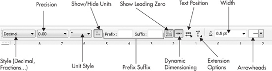
FIGURE 7-13 The four Dimension tools each share a common set of options.
• Show Leading Zero When a value of less than one is a resulting dimension, a tenth of an inch, for example, you can add a zero before the decimal, or choose to leave it off by toggling this button off (the non-depressed state). If you have a series of columns of dimension lines, adding the leading zero will help keep the values aligned to the left or right.
• Dynamic Dimensioning This option lets you specify whether your measurement values are updated automatically as the size of the dimension line is changed. By default, this option is turned on for all new dimension lines. If you plan on resizing or changing the drawing scale of your drawing after creating the dimension lines, disabling this option freezes the values being displayed so that they remain fixed, whether your dimension lines are resized or not.
TIP
If, for some reason, resizing a drawing applied with dimension lines causes the measured values to change, you can right-click the dimension line and choose Break Dimension Apart from the pop-up menu as a workaround.
• Text Position To specify a position for the text labels applied to your dimension line, choose one of the options from the Text Position drop-down list. Choose from top-centered, middle-centered, or bottom-centered for Auto, Vertical, Horizontal, or Callout dimension lines.
Checking Out Dimension Lines
The following steps walk you through the use for, and the technique used to build, dimension lines. Let’s pretend in the “Urn While you Learn.cdr” file that the drawing of the antique urn is to size: it’s 6 ¾″ tall in the real world. Your assignment is a response from the antique dealer that she wants to know the overall height of the urn, the height of the neck, and the angle of the bottom decal on the bowl of the urn, as measured from tip of the bowl where it meets the neck. Moreover, she wants the drawing marked with fractional values and thinks metric amounts are for nerds and scientists. People go a little overboard when it comes to cataloguing antiques, but your success is ensured because you have these steps to guide you.
Using Dimension Lines
1. Open the Urn While You Learn.cdr file, and then select the Horizontal or Vertical dimension tool from the toolbox.
2. On the property bar, set the Style to Fractional.
3. Click-drag from the top of the urn to its bottom, where you release the mouse button. With this tool, direction is set to vertical or horizontal by the direction in which you first drag.
4. Move the cursor to the left without holding either mouse button. Doing this defines a position for the control text, so make sure your cursor position is not over the urn drawing.
5. Click. You’re done and the number value is called out now.
6. Choose the Parallel dimension tool; the neck of the bottle is slightly slanted, so this is the appropriate measuring tool.
7. Click-drag from the top of the neck (below the lip) to the part that joins the neck with the bowl; release the mouse button at this point.
8. Move the cursor to the right, away from the drawing, and then single-click to add the dimension line and number value.
9. Choose the Angular dimension tool.
10. Click-drag from the junction of the neck and bowl, and release the mouse button when your cursor is to the left of the bottom decal on the bowl.
11. Move your cursor to the right so it touches the right side of the decal.
12. Click. You’re not finished yet. You now have the opportunity to set the position of the arc. Move your cursor toward or away from the vertex of the two angular lines, and then click.
13. The measurement probably will not read, being black against the dark urn. No problem: with the Pick tool, select the number value, and then click the white color well on the Color Palette. Figure 7-14 shows the completed assignment.
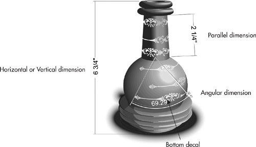
FIGURE 7-14 Use dimension lines to quickly and accurately annotate drawings and images.
Segment Dimensions
Whether you need to discover a value for technical comparison’s sake, or want to make sure a part of a personal illustration is of an exact length, the Segment dimension tool is your ticket. This tool measures the distance between nodes on a path, whether the nodes are on a straight line or a curve.
To use this tool, you first select a line in your composition with the Pick tool. Choose the Segment dimension tool, and then marquee-select the two nodes you want to discover the distance between. Move the cursor away from the selection to create handles that bound the selected nodes and then click. As you can see here, the illustrator was curious about the length of the tips of this cartoon character’s hair. We don’t ask why he wanted to know, but we do know that they are 0.65″.

An Exercise in Dimensioning to Scale
All of the preceding info and examples are fine in theory; now, you’re going to put the theory into practice in the next tutorial. You’re handed a CorelDRAW document with a photo in it. Your boss—or any other person who is intimidating—wants the parts of the toy water pistol called out, but here’s the catch: the image of the water pistol is not 1:1. So how does one measure all the parts of a 7 ½″ long toy that is 6.78″ on the CorelDRAW page?
As follows!
Drawing Scale, Windows Calculator, and Dimension Lines
1. Open The Neptune Soaker.cdr.
2. For laughs, choose the Horizontal or Vertical dimension line tool, and drag it from the beginning of the body of the water pistol to the right, and then release the mouse button at the end of the water plug, the yellow piece of plastic to the left of the red cap. Write this value down.
3. The boss says the body is 7 ½″. In this example, the body length should be 5.76″. You launch Windows Calculator (or use the physical home version in your workshop): 7.5/5.76 = 1.302 percent. This is the value by which this document’s Drawing Scale must be adjusted, as you recall from the example earlier in this chapter.
4. Right-click over a ruler, choose Ruler Setup, and then in the Ruler Options box, click Edit Scale.
5. Page Distance should be 1 inch. Type 1.302 in the World Distance field, and then click OK to apply this new scale. See Figure 7-15.
6. Use the Horizontal or Vertical, the Parallel, and the Angular dimension tools to measure anything asked of you in this or your own drawing.
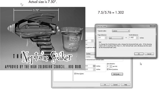
FIGURE 7-15 Adjust the World Distance scale to make measuring areas in photos and drawings accurate to scale.
As Figure 7-16 shows, when Fraction styles are used in combination with reassigning line and fill colors for text, you have a highly detailed, picture-perfect presentation for the manufacturing department and even print ads.
You’ve seen in this chapter that in addition to everyday paths and closed objects, there are also lines for labeling and organizing objects. You’ve also learned how to steer the power of CorelDRAW’s rulers to suit your own design needs. You can now use those old-fashioned wooden rulers you have around the house for what they’re meant for: to stir house paint.
Come explore the basic shapes you can create (and then measure!) in Chapter 8, as you get a feel for the speed and ease of CorelDRAW’s preset shapes—there are a lot of them— and take the next step in creating visually complex illustrations.

FIGURE 7-16 Provide accurate object dimensions for a client—regardless of the print size of a document—with the dimension tools.