
CHAPTER 5 The X5 Test Drive
In very few guides to software applications will you read, as early as Chapter 5, “Okay, are you all ready to get going?” The CorelDRAW X5 Official Guide is one of them: this chapter takes you through the steps to create a finished design and print it!
This chapter builds upon what you know from previous chapters and also serves as a bridge between understanding CorelDRAW’s features and putting them to practical use. If you’re a new user of a graphics program, it’s only natural for you to poke around tools and palettes to get a feel for what you’ve purchased: this chapter is a supervised “poking around session.” You get hands-on experience with some of the advanced features used to create some basic commercial designs and learn how to integrate the features to put together a T-shirt logo for a fictitious company—after which you’ll probably have the knowledge to apply these techniques to your own company logo.
But overall, this chapter is all about the fun you’ll have designing with CorelDRAW. Everyone owns at least one manual whose documentation is dry from cover to cover. However, this book gets your feet wet without going over your head.
Begin a Design with a Concept
One of the most basic rules for creating a good design is to begin with a concept. This might sound strange, and you might be scoffing, “Of course I have a concept! I want to design a logo!” Designing a logo isn’t a concept; it’s a need. To address this need, you’ll want to visualize the logo. In this chapter’s example, you have a fictitious machine parts company, Dyson Gears, and they want all five of their employees to proudly wear the company’s logo on T-shirts. The company has a name, but not a logo; therefore, it’s thinking-cap time before moving on to CorelDRAW’s tools.
One of the simplest and most effective approaches to logo design is through the use of an iconic representation. For example, if you ran an ice cream stand, a very simple and effective logo would be a drawing of an ice cream cone. Don’t let the simplicity of this approach put you off: Apple, Inc., has done very well through the years with a logo of you-know-what! What sets apart a logo from every other logo that’s a drawing of the vendor’s product is the artistic treatment of the design. You can visualize an ice cream cone—it’s basically a ball with a triangle beneath it. In CorelDRAW you can draw a circle and a triangle and then apply Artistic Media strokes to the paths to make the drawing look like a child’s crayon rendering or a Victorian oil painting. You can copy and paste a dozen copies of the ice cream cone and then use the Arrange | Align and Distribute commands to pepper a page with all 12 flavors the ice cream stand sells. You can extrude the simple shapes and make a 3D ice cream cone; you can apply fountain fills to the objects…see how the treatment of a simple geometric shape offers you dozens of logos to choose from?
Along these lines of thinking, a logo for Dyson Gears would be visually outstanding if you took the initials “D” and “G”, whose facing sides are rounded, and put gear teeth on them to reinforce the idea that Dyson Gears is gears, a literary conceit that works in commerce every day. That’s the concept; read on to learn how to draw gears using a bold font as the base, create a visually stunning treatment for the gear design, add some compatible and striking text, and realize a concept.
Setting Up the Page for the Logo
Although CorelDRAW can open a new document by default when you launch the program, you need to set up guidelines on a default page so the T-shirt logo design will print edge to edge on a sheet of inkjet transfer paper. If you measure an average T-shirt, you’ll see that about 7 inches is a good width for a logo. You can pick up T-shirt transfer paper at an office supply store (or even at the supermarket) that measures full-page letter size: 8½×11 inches. So you’re in luck twice: CorelDRAW’s default document size is the same as most T-shirt transfer paper, and the maximum width of the logo will fit the horizontal measure.
The following steps show you how to set up nonprinting guidelines on a default page: T-shirt transfer paper needs about ½ an inch in the clear on all sides so you can peel the transfer from the T-shirt (which still gives you 7½ inches for the maximum design width).
 Setting Up Guidelines
1. Launch CorelDRAW and then from the Welcome screen choose New Blank document. In the Create A New Document dialog, choose CorelDRAW Default from the Preset Destination drop-down list if it’s not already chosen for you, choose Letter (portrait orientation) for the Size, name the file Dyson Gears.cdr, and then click OK.
2. You’ll want to zoom into the ½-inch tick mark on the rulers for precise placement of the guides. Most of us have a scroll wheel on our mouse, and by default, CorelDRAW uses the wheel as a zoom feature. Put your cursor at the top left of the page you see in the drawing window, and then push the wheel away from you to zoom into this area. If your mouse doesn’t have a scroll wheel, choose the Zoom tool from the toolbox (or press Z), and then diagonally click-drag an imaginary rectangle around the corner of the page (the gesture is often called marquee-dragging or marquee-selecting).
3. You can use any tool to drag guidelines from the rulers. Place your cursor first over the horizontal ruler at the top of the drawing window. Click-hold, and then drag from the ruler onto the page, to the vertical ½-inch tick. If you didn’t get it quite right, you need to switch to the Pick tool (press the SPACEBAR), and then click-drag the guideline to the ½-inch tick mark.
4. Similarly, drag a guideline to the bottom ½-inch margin you’ll need. Then drag vertical guidelines out of the vertical ruler (at the left of the drawing window) to create ½-inch vertical margins inside the page. Your screen should look like Figure 5-1 now.
5. Click the Save button on the standard toolbar. Save Dyson Gears.cdr to a location on your hard drive you can find later. Don’t close the document; you’re not having enough fun yet.
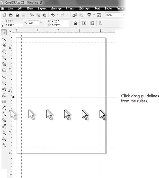
FIGURE 5-1 Set up your page so there is a ½-inch margin on all sides for printing to inkjet transfer paper.
Using the Polygon Tool to Design a Gear Shape
The Polygon tool might not seem like it has features to automatically create a gear shape and this is partially true. The Polygon tool produces symmetrical shapes that can be dynamically edited; they can be dramatically modified and still keep a special base property. Gears are symmetrical. The trick to creating a complex-looking gear to weld to the initials “D” and “G” is to slightly modify a polygon so it becomes a multi-spoke star shape first. Then you add a control node to the object and drag the node to reposition it. This is one of those things it’s easier to see while you do, but in the following steps, you’ll modify a polygon you create so that the spokes end in a blunt, straight edge instead of a point. This gets you 90 percent of the way to creating an elegant gear shape; the other 10 percent is demonstrated in the following sections.
Creating and Modifying a Polygon
1. Choose the Polygon tool from the toolbox (it’s just below the Ellipse tool).
2. On the property bar, set the number of sides to 16. This will produce a polygon with 16 control points and control points in-between.
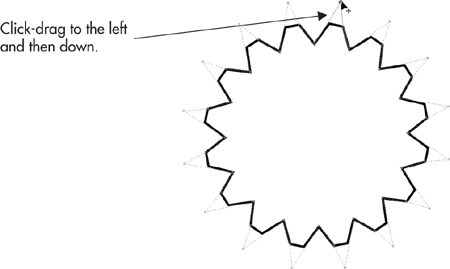
3. Hold CTRL (this constrains the shape to equal width and height), and then click-drag on the page until the width and height fields on the property bar (the second-from-left fields) tell you the shape you’re creating is about 3 inches. At this point, release CTRL and your mouse button. Your polygon should look like the illustration here.

4. Choose the Shape tool; hold CTRL, click one of the control points along the path of the polygon, and then drag until the result is a star shape, shown here. The reason for holding CTRL as you drag is that it keeps the control point from drifting to the left or right as you move it. Otherwise this would produce a radial saw blade shape and not a star whose path segments mirror each other.


FIGURE 5-2 When you add a node to a polygon object, additional nodes are created symmetrically around the shape.
5. With the Shape tool still active, click a point on the path, as shown in Figure 5-2. Then click the Add Node(s) button on the property bar. You’ve created a change in the property of the path, although it doesn’t look like a change yet. The polygon can still be dynamically reshaped. Look closely at the polygon path—you added a control node, but there are actually 16 added control nodes, because you made a change to a dynamic object.
6. Take your time on this step: with the Shape tool, drag the top control node a little to the left and then a little down. Stop when you have the shape shown here. The polygon looks very much like a 16-tooth gear now, doesn’t it?
Welding an Edge to a Typed Character
CorelDRAW has a number of operations you can access from the property bar (and from the Shaping docker) when more than one object is selected; you’ll achieve more dramatic objects that are the result of overlapping objects. These operations can weld two shapes into a single one and can trim the bottom object using the top object. These two operations— Weld and Trim—are used in the following sections to add only part of the gear you created to the rounded side of a capital “D.”
Shaping the Polygon
1. You can substitute any available font you like in the following steps, but if you own Futura XBlk BT—the filename is tt0148m_.ttf and it’s in the Fonts folder on the CorelDRAW installation DVD—install it if you haven’t done so already. It’s a very good workaday typeface with scores of design uses, because it’s very plain and extremely bold, ideal for adding a few gear notches without ruining its legibility.
2. Drag and drop a copy of the gear for future use; with the Pick tool, drag the gear off the page, but before releasing the mouse button, tap the right button to leave a duplicate of the gear.
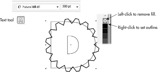
3. Zoom into the original gear shape, choose the Text tool, and then click an insertion point directly over the gear, hold SHIFT, and type D.
4. Choose the Pick tool, and then with the character still selected, choose Futura XBlk BT from the Font list drop-down on the property bar. You can also highlight “24 pt” to the right of the font name and then type 300 in the Font size box. There are approximately 72 points to an inch in typesetting, so a ballpark estimate of the character’s size makes it approximately the size of the gear. Click over the No Fill color well on the Color Palette to remove the fill of the character, and then right-click over the black color well to give the character a black outline. Now you can see both objects to reposition the “D”.
5. With the Pick tool, move the “D” so that its right side aligns to the gear. If necessary, hold SHIFT and then drag a selection handle away from or toward the center of the “D” to proportionately enlarge or shrink the “D” so that its right curve lies just a fraction outside of the gear.
6. Choose the Pen tool from the pen group on the toolbox; drag on the icon of the current tool to access any other tool in the nested group. Click points around the left side of the gear to make an object, shown next, that surrounds the left side of the gear, encompassing the hole in the character “D”. You’re going to remove these areas using this object and the Trim operation.
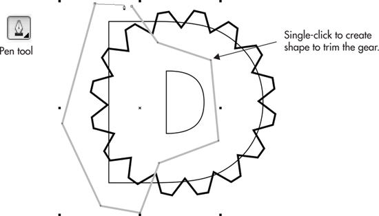
7. With the Pick tool, select the shape first, and then select the gear, holding SHIFT and clicking one object at a time. On the property bar, click the Trim icon.
8. By default, the shape that trims the bottom shape remains in the document, but it’s now unnecessary. Select it and then press CTRL+X to delete it.
9. Select both objects by marquee-dragging with the Pick tool, and then click the Weld icon on the property bar.

You’ve done great. But the “G” needs to be added to the design with the same gear effect. Add a “G” to the page, and use the spare gear you duplicated in the previous Step 2. Alternatively, if you feel you’ve had enough of a workout (you haven’t!), a Dyson Gears partially completed.cdr is available in the Chapter 05.zip file where you downloaded the tutorial files for this book.
A Brief Excursion into Gradient Fills
A linear gradient fill for the characters might make them look a little more metallic and will add to the complexity of the logo with a minimum of effort. For this example, let’s do a little hands-on with the Interactive Fill tool and use the default Linear fountain fill style. The features you use in this test drive are cross-referenced at the end of this chapter; you’ll learn how to expertly use the Interactive Fill tool later in this guide.
Adding Visual Complexity Using Fountain Fills
1. Choose the Interactive Fill tool from the toolbox.
2. Click the “D” gear shape to select it, and then click-drag up and to the right (drag toward about 2 o’clock on the gear shape) and release the mouse button. By default, the “To” color of the Linear fountain fill is the place where you released the mouse. You work “From” your click-drag start point “To” your destination within the object.
3. Let’s say you’re not thrilled with the From and To colors in the fountain fill. To change a color, while the Interactive Fill tool is still selected and you can still see the control handles for the fill above the gear drawing, click the tiny From color marker—it’s marked with the color you chose in the previous tutorial. Now the color is highlighted and available for editing. Click a light gray color well on the Color Palette. Then click the To color marker and click a medium to dark gray color well on the Color Palette.
TIP
If you’re careful, you can drag a color well color and drop it on the selected From and To color markers above the object to recolor them.
4. Now let’s say that the color transition between From and To in the fountain fill isn’t dramatic enough, but you do like the two colors. Adjust the midpoint of the fill by dragging on the midpoint control, shown in Figure 5-3. You drag it toward the From color marker to emphasize the To color in the fill, and vice versa.
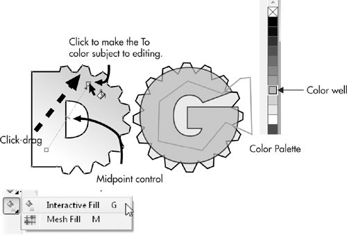
FIGURE 5-3 Use the Interactive Fill tool to embellish your illustration.
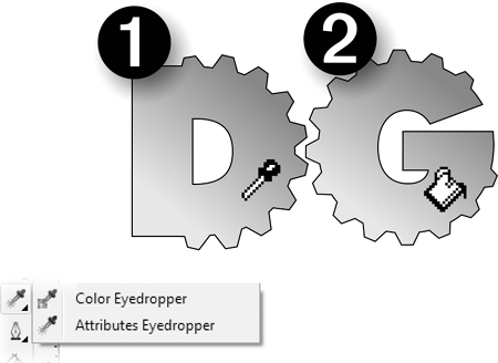
5. The “D” gear is looking terrific now, and it’s going to look more terrific by the end of the chapter. To quickly add the same sort of fill to the “G” gear, choose the Attributes Eyedropper tool from the toolbox. Click over the D gear to sample its properties, and then click over the G gear to apply the sampled properties, as shown next—occasionally, you luck out in Life, and some things are simple… Press CTRL+S to save your work up to this point. In fact, just make it a practice to save your work every 10 minutes or so; it’s only two keystrokes.
TIP
With the exception of the Text tool, pressing the SPACEBAR toggles your current tool to the Pick tool; a second press of the SPACEBAR toggles you back to the last tool you were using.
Going 3D
Although CorelDRAW is a drawing program and not a modeling application such as Autodesk 3D Studio, you can indeed get dimensional effects with the Extrude tool to make a simple drawing such as this logo pop off the page…or off a T-shirt. The following sections take you through a basic and then an advanced editing technique that will make your audience wonder how on earth you accomplished this logo by reading one chapter in a book!
Using the Interactive Extrude Tool
The Interactive Extrude tool is a basic tool for defining edges that appear to extend into the third dimension of space, adding depth to the height and width of the object to which you apply this tool. However, once you’ve added depth to a selected object, it might not be apparent to you or your audience that this is a 3D shape because of the way it’s “posed” on the drawing page. By default, the Interactive Extrude tool creates edges that appear mostly behind the extruded shape, because of an optical principle known as a vanishing point. A vanishing point (tell your friends you know that da Vinci discovered vanishing points) is the point in 3D space where, if you drew lines marking the angles of an object with depth, the lines would converge. You see vanishing points all the time: say you’re standing on train tracks (when a train isn’t coming), and you look straight down the tracks. Where the rails converge is the vanishing point.
Similarly, to get the most out of the Extrude feature in CorelDRAW, you want to view an extruded shape off-axis, not straight-on, because looking at objects directly face-front removes the perspective from the object, flattening its appearance. CorelDRAW has additional features after you’ve made a shape into an extruded shape, one of which is a rotation feature—yes, you can rotate a 3D object on your drawing page—to show off all three possible facing sides of the extruded shape. An object viewed in ¾ view shows off the most visual detail (this is why portrait photographers try to get customers to point their head off-camera), and the following tutorial takes you through object extruding, rotating, and how to interactively adjust the depth of the object you extrude.
TIP
Extruded sides of an object by default inherit the fill from the parent object. Therefore, because the gear in this example has a fountain fill, so do the objects that make up the sides of the gear. Fountain fills aren’t as visible when they’re on the 3D face of a shape that has lighting, which you’ll add in this tutorial. However, you can modify the fill of the control object (the shape you started with), the extrude: CTRL-click to select it from the group of shapes that dynamically make up the extruded object, and then modify the fill.
Making a Logo into a 3D Logo
1. With the D gear selected on the drawing page, click-hold the Effects group button (just above the familiar-shaped Eyedropper tool) on the toolbox to reveal the flyout that has the Extrude tool. Select the Extrude tool from the flyout.
2. Click-drag just a little, straight down on the object, as shown in Figure 5-4. Just a little does the trick—you’re establishing an extruded object and setting a vanishing point for the object at the same time. Stop dragging when one of the sides of the extrude object is visible. Resist the temptation that accompanies the natural thought, “the more I click-drag, the more extruded the gear will be.” Nope—the more you drag, the farther the vanishing point is defined relative to the object, and it’s very easy to set the vanishing point clear off the page, and possibly extend it to the Theophilus crater on the moon.
Double-click the extrude group of objects while the vanishing point and other onscreen indicators are visible. You’re now in a mode where you can rotate the extrude objects onscreen in three dimensions. If you deselected the shape, double-click an extrude area, and then single-click (this can be done with the Extrude or the Pick tool). Point the D gear a little upwards by click-dragging up and just a little to the left on the face of the object, as Figure 5-5 shows. The goal here is to create a visually dynamic logo that the audience is intimidated by, so the audience is looking up at this goliath of a company (yeah, yeah, it’s trite, but it works). If necessary, drag one of the markers along the green ring encircling the D gear to rotate the object parallel to the screen; think of the ticks on a clock face, and you’re rotating the D gear from 9 to 8 o’clock, for example.

FIGURE 5-4 The Extrude tool is used to set a third dimension for your object. Other features help you set an angle of rotation and the depth of the object.
3. Click-drag the marker shown in the following illustration toward the gear to decrease its depth. Dragging it away from the gear makes it deeper, and although this is illuminating advice, you will probably never need to make an extruded shape fatter. Also note that the vanishing-point line, the light blue dotted line, extends way off the page. This is of absolutely no consequence in your design work. The vanishing point does not print, and if your gear illustration looks fine right now, it is fine, regardless of onscreen guides.


FIGURE 5-5 Use the Extrude Rotation feature onscreen to make the gear truly three-dimensional in appearance.
TIP
At any time in the future, you can change the rotation of the extruded shape, as well as the depth—it’s a dynamically editable object. To quickly display the property bar options and the depth control marker on the object, and switch to the Interactive Extrude tool, you can double-click the object with the Pick tool.
Adding Lighting and a Bevel
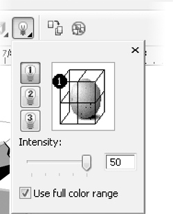
Let’s polish the D gear part of the logo now; the G gear can take on the same look as the D once it’s completed by copying its properties to the G. The Extrusion Lighting feature is available only when an object is extruded and is located on the property bar—it’s the light bulb button. Lighting can be performed using one or up to three individual lights, and each light can occupy one of 16 possible positions around the object.
As an embellishment, you’ll add a very small bevel edge to the front face of the D gear, just to add a little highlight to the edge where the extrude and the object meet. Realistically, industrial gears don’t often have beveled edges, but they also aren’t shaped in alphanumeric characters! This is Art and not a blueprint.
Here’s how to add lighting and the bevel edge to the D gear.
Finessing the Look of the Gear
1. With the D gear selected, right-click the No Fill color well on the Color Palette to remove the outlines. The extruded gear will take on a washed-out look, but you’re not done yet.
2. Click the Extrusion Lighting button on the property bar.
3. Click the marker labeled “1” to add lighting to the extruded object.
4. Drag the “1” light to the front right position on the lighting cage surrounding the proxy sphere shape.
5. Click the Extrusion Bevels button, the cube with the “X” through its front.
6. Check the Use Bevel check box.
7. Put the cursor in the bevel height field and then type 0.07”. Objects that feature concave edges, as this gear shape does, do not take a bevel of a much larger size…and still look recognizable.
8. Put the cursor in the bevel angle field, and then type 30.
9. Click anywhere in the document to apply the new bevel angle.

Because the light is facing the right side of the gear, the lighting on the gear’s teeth looks superb and quite intricate in design. The face, conversely, looks a little dim because it’s facing away from Light 1. This is not a big design flaw; the face looks appropriate when contrasted against its side, but if you want to lighten it:
1. Click the extrude group to select the group. Then CTRL-click the front face to select it separately from the other objects.
2. Choose the Interactive Fill tool; the markers appear for the color stops of the Linear fountain fill.
3. Click a color marker and then choose a different color well from the Color Palette by clicking.
4. Alternatively, if you think a solid color would be better for the gear, deselect the gear and then drag a color well on top of the face of the extruded object. The extruded sides will take on this color. Press CTRL+Z to undo if you prefer your original to your changes.
NOTE
The rotation properties of extruded objects follow the convention of 3D modeling programs. The X axis (top to bottom rotation) runs left to right through the object, the Y axis (rotation from left to right) runs top to bottom through the object, and the Z axis runs around the object parallel to the page in angles of rotation like those of an analog clock. Degrees of rotation are counterclockwise—negative values spin the object in a clockwise direction.
Duplicating the Extrude Properties
When an extrude object is selected, a button is available on the property bar for duplicating the properties of the extruded object to a plain, unextruded one: Copy Extrusion Properties. This feature can change the angle and lighting of an existing extruded object, but that’s not what you need to do right now. You want to get the G gear extruded at the same depth, with the same lighting and bevel, but you then want to change its rotation so it’s facing away from the D in a mirror-like fashion.
Not a big deal! Follow these steps.
Creating Another Gear with the Copy Extrusion Properties Feature
1. Double-click the D gear’s extruded side using the Pick tool to bring up the features on the property bar.
2. Move your cursor over to the G gear, and then click it to select it.
3. Click the Copy Extrusion Properties icon (shown next) on the property bar; because the G object has an outline, the outline remains on all edges of all the objects. Not what you had in mind for the finished art: right-click the No Fill color well on the Color Palette to remove the outline.

4. To precisely mirror the angle of the extruded G gear calls for a different feature than the onscreen interactive rotation: click the Extrude Rotation button on the property bar, the second from the left after the VP Locked To… button.
5. Click the Rotation Values button at the lower right of the “3” (shown next) to go to a number-field view of the current object’s rotation.
6. To mirror the G gear from left to right is a Y axis rotation. Whatever value you see in the Y field, replace it by typing in an equal negative value. In this example, the Y aspect of the G gear (copied from the D gear) is –22, so typing in 22 rotates the G an equal and opposite amount compared to the D gear.

7. Click the Extrusion Light button, and then drag Light 1 from its upper-right position to the upper left. Artistically, it’s usually bad form to mix lighting sources in a single illustration; however, this is a logo, with no real visual clue as to where the light is shining because the scene is incomplete. You can get away with this in the world of logos.
Adding Text to the Logo
You might call this assignment finished; you now have two stunning 3D oddly shaped gears in the document. But this assignment is for a logo, not for an icon that really would serve an advertising purpose only if it were painted on a shingle above a store in a hamlet in the 1600s. You need text to accompany the graphic: a fancy artistic text title above the graphic will serve the purpose of a logo quite well, and in smaller text Dyson Gears’ web address will lessen the need of the viewing audience to ask the person wearing the T-shirt for contact info.
In the following sections, you’ll use another effect, the envelope feature, which can mold a headline into any shape you can imagine, integrating into the overall design and catching an equal amount of audience attention.
Creating an Envelope Shape
CorelDRAW’s Envelope feature is dynamic, just like Extrude and the Polygon tool, so you can shape and reshape an object until you’re happy with the result. For this assignment, a good visual reinforcement of the mirrored gears might be to take “Dyson Gears” and reshape the name to look like a squared-off lozenge, larger in the middle than at either end. To perform this Envelope maneuver, you’ll begin with a default Envelope shape and then customize it so that its sides are straight and not curved.
Making a Headline / Enveloping the Headline
1. Choose the Text tool from the toolbox.
2. Click an insertion point on the page, just above the gears.
3. Type in all caps (hold SHIFT): DYSON GEARS. Artistic text is editable as text, but as far as the envelope effect goes, text is a malleable object, just like any object you’d draw. It’s also by default 24 points in height and Arial, which is not an exciting font. Select the text with the Pick tool, and then choose Futura XBlk BT from the Font list; it should be toward the top of the list as all recently used typefaces are ordered.
4. While holding SHIFT, drag a corner handle away from the text center until the text width is a little narrower than the gears. Alternatively, you can type 60 in the Font Size box to make the text 60 points in height, a little less than 1 inch; this trick is useful, however, only if you’re familiar with how point size corresponds to inches. See Figure 5-6.
5. One entry above the Extrude tool in the Interactive Tools group on the toolbox is the Envelope tool; choose it and then select the text with your cursor. You’ll see a faint dashed blue outline around the text now.
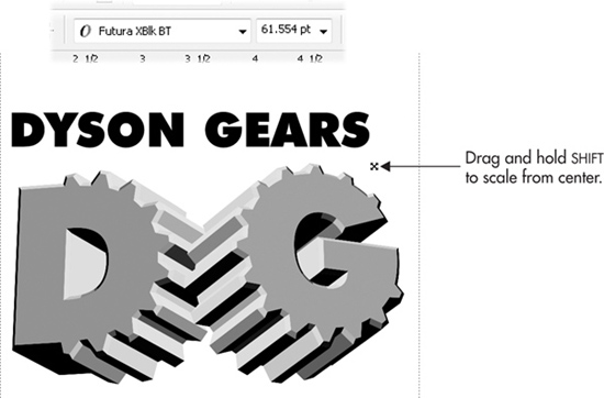
FIGURE 5-6 Use the same font as you used for the gear letters to avoid typeface style clashes.
6. By default, the envelope is in Putty mode, which presents both an advantage and a disadvantage. The advantage is that in Putty mode, you can delete envelope nodes; the disadvantage is that all the segments that join the nodes are curves, and you want straight envelope segments for this text. No problem: with the cursor, marquee-select the 3 and the 9 o’clock nodes. Then either click to remove them by clicking the Delete Nodes button on the property bar, or press – (minus) on the keyboard keypad.
7. Marquee-select all the remaining nodes, and then click the Convert To Line icon on the property bar. Then click inside the envelope to deselect the nodes. See Figure 5-7.
8. Click the top center envelope node, and then hold CTRL (to constrain movement to the first direction in which you drag) and drag upwards to make a peak in the center of the text.
9. Click the bottom center envelope node, hold CTRL, and then drag down until the bottom of the text overlaps the gears just a little, as shown in Figure 5-8.
TIP
You can also nudge envelope nodes by selecting one or more of them, and then pressing the keyboard arrow keys. This technique can provide precise editing of the envelope shape.
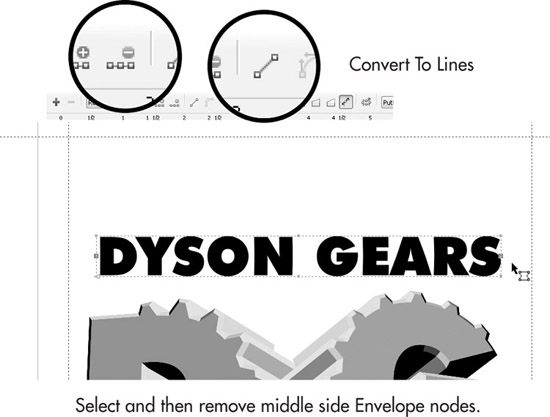
FIGURE 5-7 Make an envelope with custom properties from the default envelope.

FIGURE 5-8 Create a dynamic headline for the T-shirt design by suggesting that the perspective of the text is coming at the audience from the center.
Applying the Conical Fountain Fill
Fountain fills, when used appropriately, can give a feeling of motion to static objects, and occasionally can soften the look of large objects without stealing from their visual importance. The DYSON GEARS is a tad overpowering as is, so a Conical fountain fill type will serve two purposes: to play down its massive presence just a little, and to make the text look a little metallic. Also, the headline should go behind the gears design; it will still be legible, and the slight overlap helps visually integrate the two groups of shapes.
Follow these steps to finish the headline work.
Applying a Custom Fountain Fill
1. Select the enveloped text with the Pick tool, and then press SHIFT+PAGE DOWN to send it to the back of the illustration. Vector objects have a page order; the last-created object is drawn on the top of the stack.
2. Choose the Interactive Fill tool from the toolbox.
3. Choose Conical from the Fill Type drop-down list on the property bar. The text changes color and the color wells for the Conical fill type appear above the text.
4. Drag the white color handle to 6 o’clock relative to the text to set the To position for the fill, and then with the color handle selected, click the 10% black color well on the Color Palette. Cool, eh? See Figure 5-9.
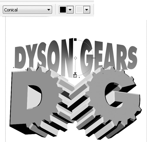
FIGURE 5-9 Add some flair to the text while also reducing its visual importance with a fountain fill.
Adding and Aligning Text
Congratulations! The hard work is behind you now—and it wasn’t really all that hard now, was it? Next stop is adding the URL for Dyson Gears, performing a little alignment work, and then on to setting up the design for printing.
Adding a Visually Compatible Subhead
1. VAG Rounded is a beautiful, fairly serious typeface, and an ideal complement to the no-nonsense design of this logo. It’s on the CorelDRAW Fonts installation CD, and its filename is tt0756m_.ttf. Install it now if you want to use it in the following steps.
2. With the Text tool, click an insertion point to the left and below the gears. Type www.dysongears.com.
3. Choose the Pick tool, and then with the text selected, choose VAG Rounded BT from the Font list, insert your cursor into the Point Size field, and then type 36. Half an inch is a good size for the design when printed to a T-shirt.
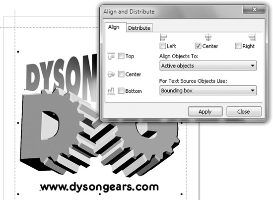
FIGURE 5-10 Use Align And Distribute to perfectly center multiple design elements.
4. Marquee-select the envelope headline text and the gears. Press CTRL+G to group these two groups of objects.
5. Press CTRL+A to select all.
6. Choose Arrange | Align and Distribute | Align and Distribute to make it easiest to see and execute the controls for aligning objects.
7. Click the Center check box, as shown in Figure 5-10, and then click Apply. You can close the Align And Distribute box now. If you needed to do some heavy-duty, multiple aligning work in a design, you’d keep this box open and convenient for future use.
Align, Group, Scale, Flip, and Print
You’re already familiar with most of the techniques covered in the upcoming tutorial that shows how to do one or two minor things to the finished logo to make it printworthy. Yes, you’re coming in to home base and concluding the X5 Test Drive, but let’s make this assignment a top-to-bottom, complete excursion. Follow these steps to brush up the logo design a little, and to set it up for output to an inkjet printer.
Getting Your Logo Design into the Real World
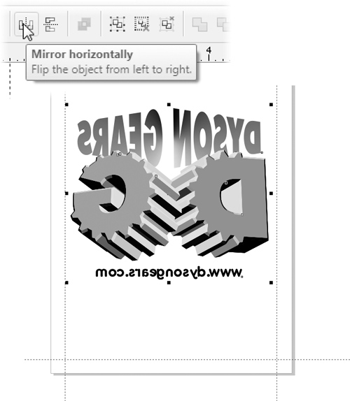
1. Select all (CTRL+A) and then press CTRL+G to group all the selected shapes.
2. Let’s get your money’s worth out of the print by making the logo that 7 inches maximum that was agreed upon at the beginning of the chapter (okay, you might not have actually agreed, but play along here). With the group selected, type 7 in the horizontal width field on the property bar, make sure the Lock Ratio (little lock) icon is depressed, and then press ENTER. Then press P to center the design relative to the page.
3. T-shirt transfers need to be printed as the reverse of the imprint; that is, the text needs to be mirrored so that when the inkjet page is ironed onto the shirt, it reverses back again to legibility. Click the Mirror Horizontally button on the property bar, which is easy enough to undo later if your logo is needed for a promotion other than T-shirts. See the illustration next.
4. Put a piece of regular paper in the inkjet printer, and print a copy of the design. Press CTRL+P, choose the correct printer, and then click Print. This is a “proof of concept” print; T-shirt transfers cost about a dollar each, while plain paper costs significantly less, cheaper still if you print on the backside of a page that has already been printed with something expendable. If everything seems to be satisfactory with the test print, do it for real with the T-shirt transfer paper.
With the exception of that all-night pizzeria around the corner, all good things must come to an end. You’ve passed the test drive. You’re home safe and didn’t dent a fender, and the best part is, you get to pocket the keys. You’re going to need them when you take this high-performance Model X5 out on your own and take the bends and curves in the chapters to come!
The Test Drive Cross-Reference
You haven’t really broken in all the features and tools covered in this chapter, so here are the signposts to learn more about the editing and transforming you performed in this chapter:
• Aligning and Distributing Objects: Chapter 9
• Extruding Objects: Chapter 19
• Guidelines and Rulers: Chapter 7
• The Envelope Tool: Chapter 20
• Working with Text: Chapters 12 and 13
• Filling Objects: Chapter 15
See Chapter 3 for the basics on the Color Palette, and for saving and opening documents. But you probably already know that stuff.