CHAPTER 17 Digital Color Theory Put to Practice
Put away those crayons and fling that color wheel out on the front lawn. Digital color obeys none of the rules we were taught in school. Digital color models are what you use to fill objects that CorelDRAW displays on your monitor, and defining colors is an art that even professionals occasionally struggle with. The good news is that CorelDRAW makes it as simple as can be to apply exactly the color you have in mind to an object, through an extensive collection of industry-standard swatches, color models that are intuitive to use, and color mixers that make color definition more like play than work.
This chapter covers color theory and how it’s put to practice in your CorelDRAW work. If you’ve ever faced picking out a tie to match your shirt at 8:30, in a dimly lit closet, you have an appreciation for the importance of choosing harmonious and intriguing color schemes. Similarly, your color work is out there for the public to evaluate; this chapter guides you through the digital process of choosing colors and making certain what you print is what you see onscreen.
NOTE
Download and extract all the files from the Chapter17.zip archive to follow the tutorials in this chapter.
Digital Color Terms and Definitions
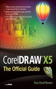
Let’s say you’ve created a rectangle on your page; by default, it has no fill and you have two quick fixes to fill it. You can left-click a color on the Color Palette, which offers a nice selection of preset colors, but let’s say you want a specific color. Double-click the Fill icon on the status bar, shown in the following illustration, and you can work in the Uniform Fill dialog, a combination of interface palettes that has tabs for Models, Mixers, and Palettes.
Where do you get colors in CorelDRAW? From palettes, mixers, and models. Palettes are predefined collections of color swatches. Mixers are covered later in this chapter. Let’s begin with models, an area worth some serious documentation here.
First, the terms that set the stage for color exploration in this chapter are used in digital color descriptions and also to define real-world colors you apply to paper, plastic, and so on. They’ll give you a handle on a variety of attributes that colors have. They’re also somewhat interrelated; when you change a parameter in one, most of the time you change a parameter in a different class of color description.
• Color model A model is a representation of something that’s intangible or too ungainly in other respects to directly manipulate. For example, a child plays with a model airplane because this representation fits in his bedroom better than an actual airplane would, and passengers around the world feel safer. Color models are used in CorelDRAW to make it easy to deal with the relationships between colors; without a model of the intangible qualities of the spectrum of light, it would be a challenge to choose the colors you need. Additionally, a color model scales all the available colors you have when working on CorelDRAW and other programs, in the same way a model airplane can be rotated to see all its sides—which is hard to do with a full-sized airplane. Today, users have at least 16.7 million possible colors from which to choose in design work; a color model makes color selection much easier than choosing colors from a palette containing 16.7 million swatches.
• Color space Think of a color model as a piece of architecture: it’s a structure. If you were having a house built, your structure would need to take up space, usually on some land. A color space is that “land” for your color model “architecture.” Different color models require different color spaces. Let’s say you have a CorelDRAW file you want a commercial press to print. Print presses usually use the CMYK color model as the basis for reproducing the colors you’ve filled objects with in your document; CMYK color is covered later in this chapter. Unfortunately, digital color, the color you see on your monitor, has its structure in a fairly wide color space; RGB colors have a wider range of expression (more possible colors) than CMYK color space. What can happen (unless you read this chapter thoroughly) is that some colors you use in your CorelDRAW document look fine onscreen, but they don’t print as you anticipate. The reason is that CMYK color space is smaller than the color space of your monitor, and some of your original design’s colors are clipped when printed. They’ve been arbitrarily moved to a color that’s similar to the color you used, or they just don’t print, or you get a nice splotch of muddy brown on the printed page. You certainly want more control over how a CorelDRAW design prints, and that’s why CorelDRAW offers a CMYK color picker and also a Gamut Alarm. Gamut is a term that means the expressible range of color; in other words, colors that fall into a specific color space. When you choose a color that falls out of the range of the color space, it’s called an out of gamut color, and these colors won’t print correctly because they’re like a structure that is built on a part of the land you don’t own.
NOTE
The K in “CMYK” indeed stands for “Black,” and it’s fair to ask, “Why don’t we call it CMYB” color?” The K is for “key”; the key plate in CMYK printing is the last plate that is printed. In this case, Cyan is pressed first, then Magenta, then Yellow, and finally the key, Black. In printing, a key plate is the plate that prints the detail in an image. As you can often see in a progressive proof of a print job, C, M, and Y inks don’t provide much image detail. We use the term “key plate” in printing because black is not always used. For example, in two-color print jobs, the key plate is the darker of the two colors. In general, however, K means “Black” and you’ll often see CMYK written as “CMY (black K)” to avoid ambiguity.
• File color capability If the extent of your CorelDRAW work is to create CDR files, print them, and save them, you have no concerns about a file format that can hold all the colors you’ve picked and applied to objects. The CDR file format will retain the colors you’ve used. But if you intend to export a design to bitmap file format, you’ll want to check out Chapter 23. Different bitmap file formats have different ceilings of color capability, which relates to color space in many ways. TIFF images as written by CorelDRAW, for example, can contain 16.7 million unique colors, and this file format can be written to the RGB color model, the CMYK color model, and even to some color modes such as Grayscale, which offers no color at all but instead only brightness values. On the other hand, GIF images continue to be written for the Web, and these images can hold only 256 unique colors, pretty meager when compared with 16.7 million colors, so you need to know how to design using only 256 colors, tops.
The sections that follow are a step-by-step documentation of topics. They range from the structure of digital color, to the space in which color resides, through how you manipulate color models in CorelDRAW to define colors you want, or to match color values a client might have read to you over the telephone.
Subtractive and Additive Color Models
The world of color models has two distinct categories: subtractive and additive color models. You, the designer, use both: when you print something, you use a device that uses the subtractive color model. When you design for the Web or an onscreen presentation, you use an additive color model. How these models are similar, where their differences lie, and how you access these models in CorelDRAW are the subjects of the following sections.
Subtractive Color Models
From the moment the first caveperson depicted an antelope on the family room wall, humans have been using a subtractive color model for painting. Subtractive color is what a lot of artists were brought up on, mixing physical pigments; and as we all know, when you mix a lot of different pigments together, you eventually get black. This is what the traditional subtractive color model is all about: you remove part of the visible spectrum as you overlay one color upon another. CMYK is a subtractive color model used in commercial printing, and in theory, if you put Cyan, Magenta, and Yellow pigments together at full intensity, you should get black—Cyan, Magenta, and Yellow are the primary colors in a subtractive color model. However, due to chemical impurities in physical pigments such as ink and paint, you get a deep brown and not true black. Hence, a black printing plate is used in addition to the C, M, and Y plates to reproduce a wide spectrum of colors available in CMYK color mode.
NOTE
If you take your kids out to a family restaurant where they have crayons and menus that the kids color, notice that the crayon colors are not cyan, magenta, and yellow. More than likely, they’re red, yellow, and blue, and if you’re lucky, green also comes in the little box. You might rightfully wonder why commercial presses use CMYK and your kids are using red, yellow, and blue. The answer is that red, yellow, and blue have traditionally been the primary subtractive colors used by painters throughout history, before scientific color theory proved that cyan is more of a pure subtractive primary than blue, and that magenta describes a component of subtractive color better than red. Green was introduced as a primary subtractive because of the human mind’s perceptual bias that green is a perceptual primary color, although it’s not used at all in CMYK commercial printing.
The RGB Additive Color Model
The additive color model describes color using light, not pigments, and a combination of the primary additive colors Red, Green, and Blue, when combined in equal amounts at full intensity, produces white, not black as subtractive CMYK color does. RGB is a common additive color model, and it is not at all intuitive for an artist to use. However, CorelDRAW has different views of the RGB color model that make it easy and intuitive to work with.
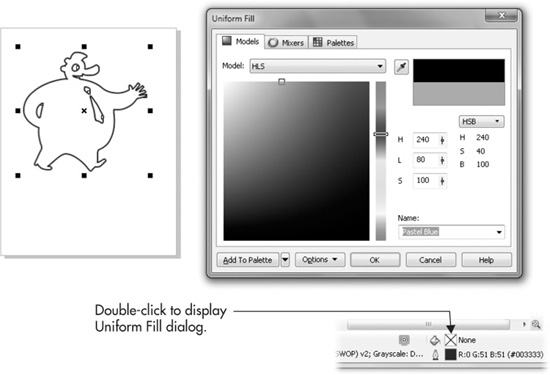
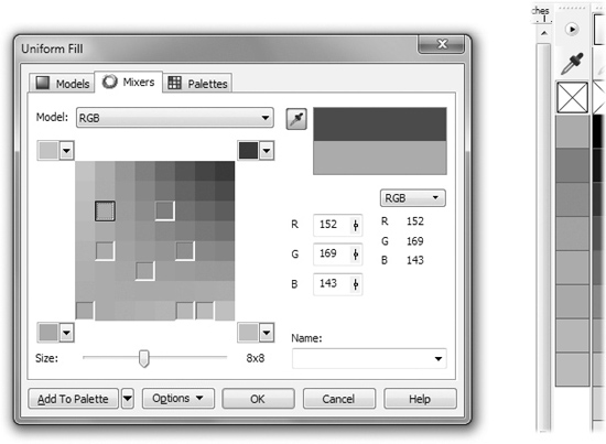
Because a color model only does one thing—it shows a mathematical relationship between values that are intangible—the visualization of the relationship between Red, Green, and Blue can use any model anyone cares to use, with the goal being to make color picking and color relationships as painless as possible to perform! Figure 17-1 shows the default view of the Uniform Fill dialog. This chapter walks you through how to customize your onscreen display and your color choices for both the RGB and CMYK color models.
Let’s take these controls in Figure 17-1 slowly and one at a time. It’s quite likely that a color attribute you’re looking for right now can be defined in this dialog.
• Color Model This selector drop-down list includes CMYK, CMY (as explained earlier, black is more a part of the printing process than a part of the color model), RGB, HSB, HSL, Grayscale, YIQ, LAB, and Registration. These models are covered later in this section. If you’re in a hurry: CMYK should be chosen for ingamut colors for printing, and RGB is the color model for doing work that won’t be printed, such as JPEG images destined for the Web.
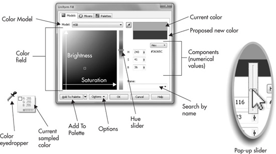
FIGURE 17-1 The Uniform Fill dialog is one of several areas from which you can pick colors in CorelDRAW.
• Color field and Hue slider Here is something tricky, a little confusing, and totally wonderful on the Models tab. A model is a representation of a hard-to-grasp thing or idea. CMYK is an intangible item, and choosing colors using a CMYK model is hardly a fun pastime. Corel Corporation thought ahead on this stumbling block; when you choose CMYK mode, the HSB color-choosing field and slider are presented to you, even though you’re not choosing HSB colors. To manipulate Brightness, you drag the little rectangle up or down in the color field. To manipulate Saturation, you drag left or right; and obviously you can navigate both Brightness and Saturation at the same time. The Hue slider to the right of the color field sets the predominant, recognizable attribute of the color you’re picking. Designers usually set the Hue first, and then play with the amounts of Saturation and Brightness.
• Current Color/New Color The color well at the top shows you the current color of the selected object on the page. The bottom color well shows you any changes you’ve made, and the two together provide a convenient way to compare color changes.
• Components The field at left provides a numerical breakdown of the current color, as expressed in the components of the current color model. In Figure 17-1, the current color is a blue, and its HSB numerical values are H: 240 (degrees on a color wheel), S: 41 (percent), and B: 36 (percent). However, these values are not static; in fact when you click the icon to the right of any value (the icon that looks like a slider), a slider pops up, and you can adjust the color you want by dragging any component value up or down. This offers a more precise adjustment of the filled object’s color; you can also insert your cursor into the number field (it’s a live field), double-click to select the entire value, and then type in a new value. The fields to the right of the current color model fields are a secondary, static readout that gives you the selected color’s equivalent using a different color model. You can see in Figure 17-1 that Hex is chosen, which only requires one component field. You set the secondary field by clicking the button title above the component fields.
• Name The Color Palette, the strip docked to the right of the drawing window, contains colors that are tagged with names such as Desert Blue and Mint Green. To quickly search for a preset color on the Color Palette, you can choose from the drop-down list, or begin typing a name in the Name field—as you type more characters, the dialog narrows the search. If you have a custom palette loaded, you can’t search for it using the Models tab of the Uniform Fill dialog; you conduct a search using the Palettes tab.
• Add To Palette This button adds the current color you’ve created to the Color Palette’s document palette. You can then retrieve this color directly from the Color Palette at any time without visiting the Uniform Fill dialog; choose Window | Color Palettes | Document Palette. This is one way to save a custom color; see “Using the Color Styles Docker” later in this chapter for a more feature-filled way to save a custom color.
• Bring Color Into Gamut This button will not appear in the dialog unless you’ve chosen a color in an additive color model, and then switched to the CMYK color model. There’s a chance that your chosen RGB color might be available in the CMYK color space (in which case you won’t see the button), but intense RGB colors cannot be expressed in CMYK. If the button appears when you’re switching color models, click it to let CorelDRAW bring it into gamut, using the rendering intent you set up under Tools | Color Management | Default Settings. Rendering intent is covered in Chapter 3, and yes, this is a lot to intellectually digest, so take it slowly here!
• Options In this drop-down, you can swap the current color with the old color (if you’ve modified the current color). The Swap Colors option switches the order of the New and Old colors displayed at the top right of this box.
Options also offers a choice of color selection interfaces for your chosen color model. This deserves a little explanation: to represent the components of color models, the various color models necessarily need to be graphically represented in their unique structure. Some color models such as HSB are blessed with a structure that is intuitive for mere mortals to use; others are less intuitive. Figure 17-2 shows the RGB model using the four available models. The HSB Hue Based model is the easiest for artists to use; alternatively, the HSB Brightness Based picker might be popular with those who want to dabble in a large hue-based field instead of using the slider. The HSB Wheel Based picker will make Corel Painter users feel right at home, and the RGB 3D Additive model is offered to accommodate particle physicists and Martians. Try it, you’ll hate it—although the model itself is mathematically sound, it just isn’t user friendly, and a slider is necessary in addition to the 3D picking cube because this model is hard to visualize.
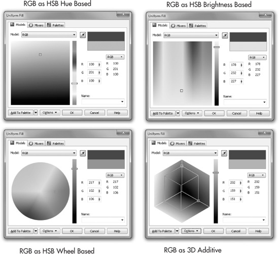
FIGURE 17-2 Many color pickers’ views can be assigned to color models through Options in the Uniform Fill dialog.
NOTE
For reasons unknown, the color wheel in the Uniform color picker travels counterclockwise instead of in the traditional clockwise direction for hue. If you get a little confused that hues run from red to orange to yellow counterclockwise, note that hue is measured in degrees, and this wheel does indeed follow increased degrees for colors counterclockwise. For example, green is at 120 degrees on the color hue wheel in CorelDRAW, the same as it is in Photoshop, the same as it is in Microsoft products. The model might look novel, but the color value is the same and can be easily communicated accurately if you email someone the color values.
The HSB Additive Color Model
The HSB color model is to designers what the RGB color model is to software engineers; HSB serves the non-programming community for intuitively choosing colors, and HSB and RGB occupy the same color space, but use different components. HSB is the acronym for Hue, Saturation, and Brightness. It’s occasionally called HSV (the V is for “Value”), and HSL (L is for “Lightness”), but it all boils down to a user-friendly model for working with digital color. HSB, in fact, was modeled by Dr. Alvy Smith, cofounder of Pixar Studios, former Microsoft Fellow, and an accomplished artist. The HSB color model has the same number of colors (the same color space, discussed later in this chapter) as the RGB color model. However, HSB organizes the relationship between components of colors differently, and in a friendlier fashion, than RGB does. The components of HSB color are as follows:
• Hue The distinguishing characteristic of color. When we tell a friend, “Oh, that’s a very nice blue tie” and “The TV set is a little orange, isn’t it?” we’re describing the hue component of the color. Hue is usually expressed in degrees on a hue wheel; technically, hue is determined by light wavelength.
• Saturation The presence of color, the purity, the predominance of a hue. We often use the component of saturation when we talk about how juicy the colors are in a photograph. If there’s a lot of noticeable blues in a photo or a drawing, the blue hue is said to be quite saturated in that color. Conversely, colors you often see on today’s household appliances, such as “Oyster,” “Putty,” “Ivory,” or “Bisque,” are neutral; they have no strong dominance of hue, and therefore have little saturation. You can’t make out the hue in such an appliance’s color; you usually describe it as off-white or a warm gray. The pages in this chapter have no saturation, but offer a lot of brightness.
• Brightness The amount of illumination a color has. Brightness, as described in digital color terms, is somewhat elusive, but an analogy from traditional painting with pigments (subtractive color) provides some clarity here. When you mix a pure color with white, you’re increasing its brightness; in industries where color description is critical (fashion design, house paints) bright colors are a tint of a pure color, also called a pastel color. Then there are darker colors: a shade is the mixture of a color with black. Mixing with white increases lightness, while mixing with black reduces it. In both digital and traditional color, mixing black, white, or a perfectly neutral value in between black and white leaves hue unchanged.
TIP
X-Rite has emerged as the color industry’s heavy-hitter after adding Pantone (the color-matching people) and Gretag Macbeth (proofing systems, monitor calibration hardware/software) to Munsell and other acquisitions in recent years. If you have any questions about printing, packaging, paints, plastics, or just color in general, Xrite.com is the place to visit. Their website contains not only catalog areas, but also many areas with seminar listings and free downloads of collateral material—all about color.
LAB Color
LAB is both a color space and a color model. CorelDRAW offers LAB as a color model; however, LAB—the color space—is device independent, and therefore it can be used to describe colors you see in the drawing window, on a physical plastic bottle of soda, and even on a basketball. Almost 100 years ago (this was before PCs) the Commission Internationale de l’Eclairage (the CIE, the International Commission on Illumination) was established as a worldwide organ for standardizing and exchanging color specifications. They are responsible for creating the LAB color model. It successfully replicates the spectrum of human vision, and this is why there is a disproportionately large area of green in LAB color space. This is because the human eye responds to this region of the visible spectrum more strongly than to other hues. LAB is modeled after one channel of Luminance, one color channel (named A) that runs from magenta to green, and another channel (named B) from blue to yellow. When you use LAB to describe a color, you’re (theoretically) assured color consistency. LAB, the color space, is frequently used by software engineers as a conversion space. When you want, for example, to convert an RGB bitmap to CMYK, the LAB color space is larger than both, and as a consequence, colors are not driven out of gamut when the pixels in such a bitmap are reassigned new component values.
YIQ
The YIQ color model is similar in its components to LAB color; however, its purpose is for working with designs and text that are video-legal, as defined by the National Television Standards Committee (NTSC). YIQ’s components are one channel of luminosity, and two of chromacity (color). Standard definition TV is brighter than PC monitors, the color range is smaller, and if you get an assignment to draw a logo for a commercial, you’d use this color model. HD television changes a lot of the broadcast rules concerning video-legal colors; check with your client before choosing YIQ as a color space for designing titles or anything for a TV assignment.
Grayscale
You’d use the Grayscale color model (which actually has no hue) if you’re designing for one-color commercial printing and for laser print output. You might find that a color design you’ve drawn doesn’t look right if printed to a laser printer: blue areas seem too faint, and reds look much too dark. By using Grayscale, you take the influence of hue out of the color equation, and what you see onscreen is what you get on paper.
Registration
You do not design with this color model; it’s only one color. Registration is used for an object when you want that object to be printed on all commercial press plates, including spot color plates. As the name suggests, registration applied, for example, to hairline paths around the border of a design helps commercial press operators to see and keep all the printing plates in registration when they review progressive proofs of the plates. Also, if your design calls for spot-color inks, you can use an object with registration color to manually knock out (remove) areas on all other plates. For example, if you want a headline printed using a spot color on top of a photograph, a registration-colored object can be used to knock out the exact area on the C, M, Y, and K plates where printed areas of the underlying photograph would obscure the overprinted spot color.
The following sections bring relevance to all of these explanations of color; you want to put color to use in CorelDRAW, so it’s only fitting to move into where the palettes and other features are located!
Using Color-Related Dockers
If you’ve been doing some independent exploring, you’ve certainly discovered the Uniform fill option on the toolbox, but you’ve also noticed that it doesn’t dock; it is not a persistent part of the interface. The good news is that it’s not supposed to be. Two dockers—covered next—are used to handle almost all commands that define and edit color. These are the Color docker and the Color Palette Manager docker. Let’s examine these features.
Using the Color Docker
The Color docker, shown in Figure 17-3, is extremely convenient to work with and, essentially, it’s the Uniform Fill dialog—smaller, dockable, and persistent in the workspace. When an object is selected, you can specify whether the color applies to the outline or fill color of the object, and any changes to colors are immediately applied. To open the Color docker, click-hold on the Fill tool on the toolbox to reveal the flyout group of tools—Color is at the bottom. It’s also available when you choose Window | Dockers | Color. Unlike with Uniform Fill, you don’t need to have an object selected to call it.
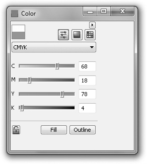
The Color docker is organized into three areas: color viewers and color sliders—as discussed earlier on the Uniform Fill dialog—and fixed palettes (actually, they were never broken…). You can display each area by clicking one of three buttons at the top of the docker. Each area is geared toward specifying a color using its unique parameters, and to then applying that color to the fill and/or outline of a selected object. Here’s how each of the three areas is used for specifying color:
• Color sliders You can mix the components of any color model you choose from the drop-down selector at top by dragging the sliders or entering percentages in the number fields. Notice that the sliders are in color and change dynamically, instantly updating to show you how much of a component affects the overall color, and the relationship between one component and the others.
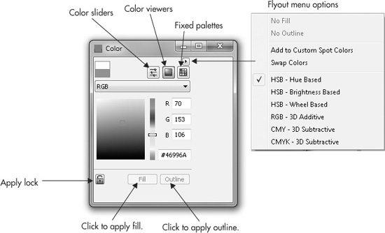
FIGURE 17-3 The Color docker is your one-stop shop for choosing by component values, by using a color model, and for choosing from custom predefined colors on the Palettes area.
• Color viewers The color viewers (occasionally called color pickers in other programs) on the Color docker basically offer the same options as the color viewers on the Uniform Fill dialog; the Options button is simply located in a different place so the palette is more compact onscreen.
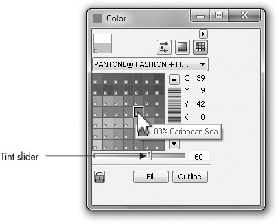
• Fixed palettes Use this area to choose a color from a swatch collection from vendors such as Pantone, Trumatch, Focoltone, and others from the palette selector. Use the flyout options menu to display a color by name; if you have tooltips turned on (Tools | Options | Workspace | Display), the names of the swatches appear when you hover your cursor, as shown in this illustration. The slider at the bottom of this docker is dimmed if you’ve loaded Uniform Colors or any user or custom palette. This slider is for creating a mathematically precise color tint of an industry-standard solid color, such as any swatches in the Pantone Fashion + Home Cotton collection. Solid colors can take tints, thus producing pastels, because the printer or a vendor of paints can mix white into this real-world, solid color according to numerical values. Therefore, you can use this tint slider with solid predefined colors, but not with process colors; process colors are created in the physical world through separate passes of C, M, Y, and K pigments, and as a consequence it’s impractical to tint the four components. However, CorelDRAW professionals make spot colors for designs by applying a tint to a solid. The technique works because a spot color always requires a separate printing plate.
TIP
Solids colors can be turned into a tint when you print by assigning an object a percentage of the solid. For example, if you want a tint of PANTONE 357 green, fill an object with 50% of the solid swatch. When making the separations for your design, solids and percentages of color solids will print to the same plate. Effectively, the white of the paper becomes the “white paint” you mix with the solid to produce the tint.
Solid Colors and Swatches
To quickly set up a tint of a solid CMYK or RGB color, you can click-hold on a swatch, release the mouse button after the flyout appears, and then choose from increments within the pop-up selector from solid at bottom right to white at top left. You click the tint on the flyout, and then click Fill or Outline to apply the tint. When you try this with a spot color, you’ll see one horizontal strip with solid at the left, and 0% at the right. Also, if you choose a color from any of the spot color collections, you can use the Tint slider to create a percentage of the color, because spot colors are considered to be solids, while process colors use a combination of pigments.
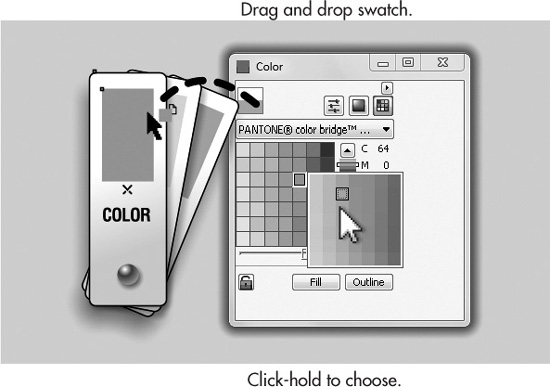
Swatches on the Color docker are “drag and drop”; alternatively, you can click the Fill, Outline, or both buttons in succession for “no miss” object coloring. You can click-drag a color onto an object, selected or unselected, to instantly fill it. If you have good skills with your mouse or other input device, you can set an outline color for an object by dragging and then dropping a color swatch on the edge of an object; even if the object has no outline attributes, the action of drag-dropping a color forces the object to take on a 0.5-point outline. If you miss the edge and the object itself while attempting to apply a color, CorelDRAW lets you know this by changing the cursor’s appearance. If you release the mouse button over an empty area, this is the same action as redefining all object fill and/or outline properties, and you’ll get an onscreen confirmation box about this action. You probably want to Cancel such an action—you might grow bored with having every new object you create filled with Pale Avocado.
Using the Color Palette Manager Docker
The Color Palette Manager docker, shown in Figure 17-4, gives you the option to manage multiple palettes and palette colors. To open the Color Palette Manager docker, choose Window | Dockers | Color Palette Manager. The docker is structured as a tree directory so you can view palettes by folder as you browse, and it includes handy palette command buttons.
To make your own palettes and to work with this docker, which you’ll use frequently in your work, follow these example steps.

FIGURE 17-4 Choose from a wide selection of palettes with the Color Palette Manager docker.
 Accessing Color Palettes
1. Open the Color Palette Manager docker by choosing Window | Dockers | Color Palette Manager. To open a palette—which docks to the left of the default color palette in the workspace—click the eye icon from its closed appearance to an open eye. To close an open palette, click the eye from open to closed. You can float an open palette by dragging the top of the color palette strip into the workspace.
2. Create several objects (seven rectangles are fine), and then fill them with different colors using the (default) Color Palette wells. Just select an object with the Pick tool, and then left-click a color well on the Color Palette.
3. Press CTRL+A to select all, and then click the Creates A New Palette From Selected Objects button on the top of the docker. CorelDRAW prompts you for a new palette name and a location in the Save Palette As dialog. Fill in the required information and then click Save. As a result, all seven colors (plus black, derived from the object outline) now appear on a color palette to the left of the default in the workspace. This is an invaluable method for saving colors you’ve spent a lot of time defining, and the palette can now be used on a new or existing document anytime. If two objects share an identical color, the color is not duplicated on your palette.
4. To open a saved palette, click the Opens A Palette folder icon on the top of the Color Palette Manager.
Using the Color Styles Docker
Color Styles is the route to follow in CorelDRAW to create, name, and apply colors and color relationships to objects.
NOTE
Because all styles are associated with individual documents, you must have at least one document open to use the color tools available in the Color Styles docker.
Color styles are managed completely from within the Color Styles docker, shown in Figure 17-5, which is opened by choosing Tools | Color Styles. The docker features command buttons for creating new styles, child colors, and shades.
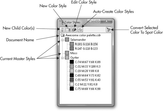
FIGURE 17-5 The Color Styles docker has commands for creating new styles and tints of master colors.
Follow these steps for an introduction to working with color styles.
Saving a Color as a Style
1. Open the Color Styles docker by choosing Tools | Color Styles.
2. Click the New Color Style button in the docker. The New Color Style dialog opens. Select a color and then click OK to create the style.
3. To name your new style, select and then click the default color component label field, enter a new name, and then click outside of the style text field to complete the naming. By default, each style you create is named by its color values. For example, a typical CMYK color would be labeled “C:18 M:45 Y:9 K:0.”
4. To edit a selected style’s color, click the Edit Color Style button to open the Select Color dialog. Click OK to complete the editing operation and close the dialog.
TIP
To apply a master or child color from the Color Styles docker, drag the color directly onto an object in the drawing window. To add an object’s current color as a style, drag the object into the docker window’s field area below the document folder icon.
Creating Child Colors
Child colors have a dynamic relationship with a defined master color style. The child colors remain the same hue as the master color, but their brightness and/or saturation can be different. Any hue changes made to the master color are automatically updated in the child colors, which is the real power of setting up a drawing using master color—in less than 30 seconds you can recolor a drawing so it’s significantly different from your original.
To explore the master/child color relationship controlled using the Color Styles docker, run through these tutorial steps.
Building a Parent-Child Relationship
1. Open the Color Styles docker by choosing Tools | Color Styles.
2. Click the New Color Style button to open the New Color Style dialog. Pick a color for your new style, and then click OK to create the style. Select and click the style name, and then enter a unique name of your own for the color.
3. With your style selected in the list, click the New Child Color(s) button in the docker to open the Create A New Child Color dialog, shown in Figure 17-6.
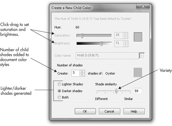
FIGURE 17-6 Control the number of child colors, the diversity of shades, brightness, and saturation through this dialog.
4. By default, the child color is based on the Hue component of the master. You can change the Saturation and Brightness of the child colors by dragging their sliders or by typing a value in their numeric fields.
5. Enter a name for the new style or accept its default name, and click OK to close the dialog. The new child color appears in the Color Styles docker.
6. Select the master once again, and click the Edit Color Style button in the docker to open the Select Color dialog. Change the style’s color to any other color, and click OK to close the dialog. Notice the style’s color is updated, and so is the hue of all the child colors. This same effect applies to any of the objects that feature either the master color style or its associated child color.
TIP
As an alternative to using the docker buttons, you can right-click a color style in the docker, and then select commands from the pop-up menu.
A practical example of the usefulness of master and child colors is in a situation when you know in advance that a client will want to see several different color schemes for an illustration of a product, logo, or package label. You begin with a set of parent colors, create children for these “master” colors, design your design, and then when your client asks for a revision (or several), changing the parent colors automatically changes the child colors. This is a very powerful feature, and for this reason color styles are local to a document—you can edit a parent color in a file without worrying that you’re messing up a color in a different file you also have open.
TIP
You can create up to 20 shades of a master color in the Create A New Child Color dialog. If you need more, try creating a child of a child color. The result is that all the shades appear below the master color, so you could have, hypothetically, scores of child colors based on one master.
Creating Styles from Selections
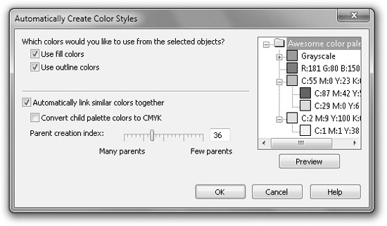
The Auto-Create Color Styles command button in the Color Styles docker lets you create a collection of related color styles based on a selection in your document. Clicking the Auto-Create Color Styles command button opens the Automatically Create Color Styles dialog, shown next.
To create a collection of color styles and child color styles from a selection of existing colored objects in your document is quick and easy, as follows.
Sampling and Saving Colors from a Document
1. Press CTRL+A to select everything on the page, or select individual objects. Open the Color Styles docker by choosing Tools | Color Styles.
2. Click the Auto-Create Color Styles button to open the Automatically Create Color Styles dialog.
3. Choose the properties on which you want to base your new collection of styles by choosing the Use Fill Colors and/or Use Outline Colors check boxes.
4. Choose Automatically Link Similar Colors Together for flexibility in future revisions to your document, or choose Convert Child Palette Colors To CMYK if you think you’ll have a future need to use only CMYK values for objects you’ll add to the drawing.
5. The Many Parents Or Few Parents slider can be used to alleviate the world’s overpopulation crisis. Only kidding—use this slider to limit the number of parent (master) colors generated, which is quite useful if you have hundreds of unique colors in the document.
6. To review the styles that will be automatically created and listed in the Color Styles docker before committing, click the Preview button. The color styles CorelDRAW is about to create are listed in the preview window.
7. To accept the previewed listing and close the dialog, click OK. Your styles are automatically created.
Moving from Color Models to Other Ways to Define Color
Although color models provide the designer with an intuitive device for picking colors, CorelDRAW offers alternative methods in the form of the color mixer and palettes—an extensive collection of swatches that simulate real-world ink, paint, and plastic colors on your monitor to match the colors manufacturers use from Pantone and other vendors. The following sections explore how to “mix it up” with the other tabs on the Uniform Fill dialog.
Using Color Mixers
Color mixers provide ways to create as many coordinated colors as you need automatically. Anytime you find yourself choosing a color in CorelDRAW’s Color dialog, you have access to the color mixers. Mixers create colors using “color harmonies” and color blend tools. Select any object in your document, and press SHIFT+F11 to open the Uniform Fill dialog; then click the Mixers tab.
Mixing with Color Harmonies
Click the Options button at the bottom of the Mixers tab dialog shown in the next illustration, and choose Mixers | Color Harmonies. This is the default mixing type for Mixers. The term color harmony means that the color spectrum is organized using equal emphasis—equal space is devoted—on each color of the spectrum. Think of color harmonies as organization in the same way that color models show structure. To arrive at several colors that work well together in a composition is a manual task; no computer program can decide which colors work well together for you. The harmonies mixer features a color wheel and control handles you drag to choose which hue you want to make variations from, and which other hues, if any, should be used to create variations. Again, the color mixer creates variations you can choose from and can display other hues that have a math relationship to your chosen hue, and the related hues can be used to generate their own variations. However, the mixer is a mixer; it does not generate a “Oh, these colors all work together well in a drawing” color palette.
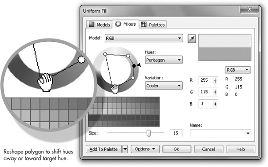
Use the Model drop-down selector to choose a color model on which to base a collection of color variations you can save. Choose one of the configurations from the Hues drop-down list, and then click-drag to rotate the color wheel markers to alter the collection of swatches displayed at bottom left. Choose from Primary, Complementary, Triangle (1 and 2), Rectangle, or Pentagon hues to create color markers that move as you change the primary hue marker around the color wheel; the related color markers range from a single point to five points. Use the Variation drop-down selector to choose among Cooler, Warmer, Lighter, Darker, and Less Saturated “children” of the target color you’ve defined on the color wheel. If you want a preference in your mix of a certain hue—and you’ve chosen Triangle, Rectangle, or Pentagon from the Hues drop-down—you can favor certain hues over others around the wheel.
First choose the hue—drag the black triangle to your choice, and then drag any of the white-circle color markers toward or away from their current location, distorting the polygon.
Color Relationships
It is through color harmonies that you can better see the relationships between primary, secondary, and complementary colors. In the additive color model, the primary colors are red, green, and blue. Complementary colors are the color opposites of primaries and lie at 180 degrees in opposition on a color wheel of hues. For example, the digital complementary color of Red is Cyan; the opposite of Blue is Yellow; and these complements are largely responsible for the A and B color channels in the LAB model, discussed earlier in this chapter. Secondary (additive) colors are the result of mixtures of two primary colors: Red + Green yields Yellow, Green + Blue produces Cyan, and Red + Blue produces Magenta, which is the basis for the CMYK (subtractive) color model. It should be noted, however, that color harmonies, relationships that are described based on math, are not necessarily the sort of “harmony” you think of when designing a scheme, for example, for the living room. The “color explorer” utilities you can download online typically do exactly what CorelDRAW’s mixer does. Usually showing only contrasting colors (color opposites, complementary colors), color mixers have no intelligence; they describe only relationships between hues, and therefore can choose, for example, college sports team colors, but you truly have to use your own mind’s eye when designing an eye-pleasing palette of colors to use in your work.
In RGB, the complementary color of Red is Cyan. Quoting from Wiki:
In the RGB color model (and derived models such as HSV), primary colors and secondary colors are paired in this way:
• red and cyan
• green and magenta
• blue and yellow
However, in art and design, complementary colors are defined differently. Using Wiki again:
Because of the limited range of colors that was available throughout most of the history of art, many artists still use a traditional set of complementary pairs, including:
• white and black
• red and green
• blue and orange
• yellow and violet
(from http://en.wikipedia.org/wiki/Complementary_color)
Here is a set of steps you can use to gain experience with the features of the color mixer’s Color Harmonies mode.
Experimenting with Color Harmonies
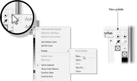
1. You might not want to mess up the default Color Palette in your workspace, so before exploring mixers, create a new palette: click the menu options button on the default palette, as shown at left in the following illustration, and then choose Palette | New. When prompted for a new palette name, name it “Test” or anything you’ll remember later. A new blank palette appears to the left of the default Color Palette at the right edge of the drawing window.
2. With an object selected on the page, open the Uniform Fill dialog (SHIFT+F11), click the Mixers tab, and choose Options | Mixers | Color Harmonies. Choose a color model from the Model drop-down menu.
3. Choose a Hue type—in the illustration shown next, Triangle1 is selected. A four-pointed rectangle shape appears around the color wheel. Click-drag the black marker to change hue, and click-drag the white markers to reshape the rectangle. Triangles and other multi-point harmonies can be reshaped, too. By making the rectangle wide and short, you narrow the range of complementary colors to red (the selected color); yellows, greens, and violets are eliminated from the mixer swatches, in preference for cyans and blues.
4. Choose a Variation type to change the swatch collection below the color model, based on the color marker positions on the model. If you choose None from the Variation drop-down list, only one color per marker appears in the collection, and the Size slider is dimmed. In the case of the Rectangle harmony, four markers appear.
5. Choose a Variation other than None, and then choose a Size for your collection using the Size slider control. Choose up to 20 different variation colors per marker.
6. Work on this color collection using different harmonies and variations until you arrive at something you think you’ll use in the future.
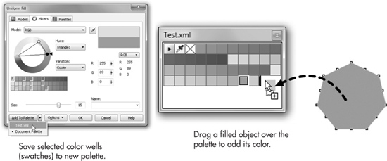
7. To save the collection now to the palette you created in step 1, click the first color well (the color swatch), and then SHIFT-click the last color well to select them all. Alternatively, if you have some colors you feel are useless, CTRL-click only the valuable color wells. Highlighted color wells take on a bevel-edge highlight.
8. With your colors selected, click the down arrow to the right of the Add To Palette button, and then choose your palette. You’re not done yet: click the Add To Palette button, and your collection of colors is saved to your custom color palette.
9. At any time, you can add a color directly to the custom palette by dragging a filled object into the palette, whether it is docked or not. You can also rearrange the order of colors by dragging from one position on the palette, and then releasing the swatch when it’s over its desired position.
TIP
To add an object’s fill and its outline color at the same time to a custom palette, drag the object aboard the palette. A shape with a fountain fill can also add colors to a custom palette. For example, a four-color multi-step fountain fill will add its four primary color transition points to the custom palette if you drag the object onto the palette.
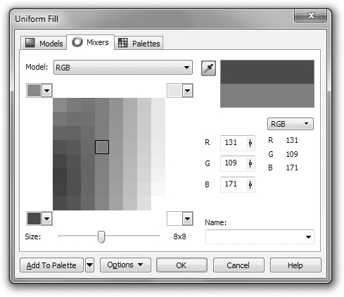
Mixing with Color Blend
The Color Blend mixer (shown in the following illustration) is the other mode of the Mixers module, where you define colors almost literally by mixing them, very much like when you create a multi-stage fountain fill. You can choose four different colors and then generate a collection of up to 1,024 unique values, and then choose the ones you like to create your own color palette. All these color options are easier to mentally sort by task: when you want a specific color, you use the Models module. When you want a palette of colors based around your tastes, you use the Mixers module.
To access the Color Blend feature from within the main Uniform Fill dialog while you’re on the Mixers tab, choose Options | Mixers | Color Blend.
Here’s how to work the Color Blend feature to create a small collection, and then to choose the colors you want to save as a palette.
Using the Color Blend Mixer
1. Create an object, select it, and then double-click the Fill Color button on the status bar to open the Uniform Fill dialog.
2. Click the Mixers tab and then choose Options | Mixers | Color Blend.
3. Choose four colors for your blend by clicking each of the four color selectors in view and choosing a color from the palette displayed. You do not need to blend from four colors: you can choose the same color from two or more of the flyout palettes to home in on a range of colors, making your decisions easier. Each time a selector is changed, the color field changes, as do the available colors from which to choose.
4. Choose a Size for your collection using the Size slider control.
5. Save some of the more useful colors to a palette; let’s use the palette you saved in the previous tutorial. Remember that if you’ve got some eye-pleasing colors in the collection, you don’t have to save a huge, all-inclusive collection; you can create shades of your favorite colors on-the-fly using the child colors feature covered earlier in this chapter. CTRL-click on the color wells in the collection to select only, let’s say, your eight favorite colors. See the following illustration.
6. Choose a palette from the drop-down list, and then click the Add To Palette button. Your color blend collection is saved.
Using Fixed and Custom Palettes
A fixed palette is a collection of ink colors prepared by an ink manufacturer, such as a specific process or spot color. Because these color specialists have spent a good deal of time preparing combinations of inks and other pigments to match as closely as possible between your monitor’s display and how the colors look on real-world packaging and other goods, you don’t edit these colors as you can with models and mixers. However, if you choose a collection made up of one solid ink color (not a process color) such as Pantone Solid Uncoated, you can specify a Tint of this solid color (the Tint slider is below the color samples); the professional mixing the color for you simply adds white pigment. Fixed palettes are like small color catalogs. Manufacturers such as Pantone, Trumatch, and Focoltone have supplied color simulations for CorelDRAW users. You might use only one color collection, but you have a wide variety from which to choose, and these simulations are as faithful in the “What You See Is What Will Print” arena as technology can bring you today.
Using Fixed Palettes
Some of the palettes are for use in commercial print—they provide simulations for metallic inks, inks that will be printed to coated or uncoated stock (in English: glossy and matte finishes), and so on. Other palettes you’ll find in this area of uniform fills are geared for the Web and not for print. The World Wide Web has color specifications, too. Using a specific color palette usually ensures that colors you use in a design fall within the capabilities of the reproduction or display technique used to show off your work.
To apply process color values (CMYK, usually, although Pantone Hexachrome fixed-palette inks use six values) to your work, the very first thing you do is talk with the commercial press operator. They might want to use substitution values (less expensive inks), or they might not even own the physical equipment to reproduce Hexachrome. You always work backwards when your final output is to be printed—you find out what can be reproduced on what budget, and then you choose your colors. Here’s a short tutorial on how to specify a color from the Palettes list.
Choosing Predefined Colors for Print
1. With an object selected on the page, in the Uniform Fill dialog (press SHIFT+F11), click the Palettes tab.
2. Choose a palette from the Palette drop-down menu. Colors appear in the main selector window, and you can pick swatches by clicking them; their names appear in the Name list at bottom right. You can more quickly thumb through colors by choosing Options | Show Color Names; the selector window changes from swatches to larger color samples with the name in the center of the color. The vertical selector to the right of the selector window lets you navigate through the available colors very quickly.
3. Click the color you need.
4. If you’ve chosen a process color collection, the Tint slider is unavailable. However, if you’ve picked a Metallic, Pastel, or other solid color collection, choose a percentage value for your color by using the Tint option. By default, tints of selected colors are set to 100 percent of the ink, but you can specify any value between 0 and 100 percent. However, choosing zero for a Tint just changes the chosen color to white; printing white on white paper probably won’t earn you big bucks with your client!
5. Click OK to apply the palette color or a tinted value of the color.
Information about the Palettes You Can Use for Printing Assignments
Here’s a quick rundown on each of the commercial palettes you can choose in the Palettes tab of the Uniform Fill dialog:
• SVG Colors This collection was designed to address the need for standardized colors for Scalable Vector Graphics (SVG), an emerging technology that allows designers to post vector images as vector images (and not bitmaps) on web pages. These colors were agreed upon by the W3 Consortium.
TIP
For a chart featuring user-friendly names for SVG colors, visit www.w3c.org/TR/SVG11/types.html#ColorKeywords.
• Pantone Pantone dominates the publishing industry with its color-matching system. CorelDRAW offers all of Pantone’s color-matching simulations including coated, uncoated, and matte color versions for solids, as well as process and Hexachrome colors. CorelDRAW also features Pantone’s metallic, GoeBridge, Color Bridge, pastel, solid-to-process EURO, and process-coated EURO palettes.
• HKS (Hostmann, Kast, and Schmincke) This palette collection uses CMY components that occasionally (depending on the color) don’t require a black plate. The HKS collections use a Euroscale color space, ISO 12647:2 2002, the FOGRA standard. If you’re a Westerner, you probably won’t use this color collection. HKS palettes include HKS Colors, HKS E, HKS Z, HKS N, and HKS K.
• Focoltone This 750-color palette was designed from the ground up to be ICC compliant. If your commercial printer supports Focoltone (an abbreviation for “Four-color tone”), your client insists on color consistency between printed material and packaging, and you, the designer, need some flexibility in choosing colors and tints, you might want to try this collection.
• Trumatch The Trumatch process-color palette is made up of more than 2,000 printable colors. Trumatch has specifically customized its color-matching system to suit the digital color industry by using the Computer Electronic Prepress System (CEPS). The palette has 40 tints and shades of each hue. Black is varied in 6-percent increments.
• Web Safe The Web Safe Palette contains the 216 colors of the Web Safe color model. Colors are defined using the hexadecimal scheme; one of the six shades of each color (red, green, and blue) is combined together to create each color in the palette.
• TOYO and DIC The TOYO and DIC color-matching systems are widely used throughout Asia—Japan, in particular. Each system contains its own numbering system and collection of different process colors. The TOYO collection of colors has been developed using its own process ink colors. The DIC (Dainippon Ink and Chemicals, Inc.) brand of process color inks is divided into three categories: DIC, DIC Traditional, and DIC Part II.
“Web Safe” Colors
Although the W3 Consortium publishes standards, you might feel a little confined choosing from only 216 colors that are Web Safe. Web Safe, by definition, means that these colors can be displayed accurately on a VGA monitor without color dithering, and that the colors display somewhat consistently whether you have color management on your computer turned on or off. Realistically, three people on earth still have a VGA monitor and a video card with less than 10MB of RAM. Additionally, designers tend to work with designers, and very few of us don’t run a color management system—color management actually has been at the core of CorelDRAW and Windows since 1995.
There’s something commendable about “playing to the cheap seats,” but in actuality, very few designers bother with Web Safe colors. Every day, millions of people post JPEG images to the Web that look just fine, and these JPEGs decidedly have colors that fall outside of Web Safe standards.
Loading and Creating Custom Palettes
Through dialogs, the Color docker, or an open Color Palette, you can manage your color collections. The fastest way is to click the flyout arrow on a Color Palette and then to choose Palette | Open from the pop-up menu. This displays the Open Palette dialog, where you can browse what’s available. The pop-up menu also includes Save, Save As, Close, and New palette commands.
The Palette Editor, shown in Figure 17-7, is the ideal place to rework custom palettes. In this dialog you can create, save, edit, and manage new and existing palettes using convenient command buttons. While editing palette colors, you can also access CorelDRAW’s other color features.
Refining and redefining your palettes is easy, fun, and often necessary to keep palettes for client colors up-to-date. Try these steps to appreciate the ease of this powerful dialog.
Editing Color Palettes
1. Open the Palette Editor; choose Tools | Palette Editor. Choose a palette by clicking the drop-down selector; open the directory tree for Custom Palettes or User’s Palettes; click a palette name to choose it.
2. To edit an existing palette color, click a color and then click Edit Color. The Select Color dialog opens to offer color models, mixers, and palettes, exactly like the Uniform Fill dialog.
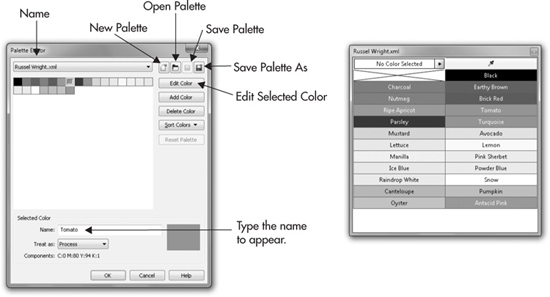
FIGURE 17-7 Manage custom palettes in the Palette Editor.
3. To begin a new palette, click the New Palette button in the Palette Editor dialog to open the New Palette dialog. Enter a name and then click Save. Your new palette is automatically opened, but there are no colors yet.
4. To add colors, click Add Color, which takes you to the Select Color dialog. Define your new color—with the Mixers module, you can choose a whole color range in one fell swoop—then click the Add To Palette button. New colors are immediately added to your new palette.
5. Once your colors have been added, click OK to return to the Palette Editor dialog. In the Name box, here’s where you get to name a new color. When you use the edited color palette, the color name will appear on the status bar and in tooltips pop-ups instead of the component values.
6. To remove a selected color, click Delete Color and confirm your action in the prompt that appears. To reorganize your palette colors, click Sort Colors and then choose from Reverse, Name, Hue, Brightness, Saturation, RGB Value, or HSB Value. You can also click-drag a color well (color swatch) to reorder swatches as they appear on the Color Palette.
7. To name or rename an existing color, select the color in the palette, highlight its current name in the Name box, and then enter a new name. Existing names are automatically overwritten once a new color is selected.
8. Use the Reset Palette button to restore your palette to its original state before any changes were made, or click OK to accept your changes and close the dialog.
NOTE
Now that you know how to create, save, and load color palettes, take a look at Russel Wright.xml. This palette was created by sampling photos of some of the art of historic ceramicist Russel Wright, whose work was exalted as modernist in the 1930s and 1940s. It’s a nice, small, named palette for use when you need a truly retro look to a design.
There’s one more way to make and save a user-defined palette: if you like the color of objects you have on the page, choose Window | Color Palettes | Create Palette From Selection (if you have objects selected in advance), or Create Palette From Document. This opens the Save Palette dialog, where you can name and save the colors you’ve used as a unique palette.
TIP
You can quickly copy color properties between two objects (including groups) by right-click-dragging an object on top of a different object. Release the mouse button once the source object is in position, and then choose Copy Fill Here or Copy Outline Here.
Color and Color Correction
Without defining a master color, creating relationships between parent and child colors, and without getting elaborate, you have another way to change colors in a CorelDRAW design. The Effects | Adjust menu has color and tone (brightness) corrections you can apply to an object—vector or bitmap—so you can modify all or parts of a design, and thus create variations on copies of your work. These changes are permanent; you should use the commands only on copies of your illustrations, or have the Window | Dockers | Undo docker handy in the workspace. These effects are mutually exclusive, and depending on the color solution you seek, you might need to apply one, and then a different one.
NOTE
Be sure every time you use the effects commands to click Reset. All command palettes remember your last used settings.
• Brightness/Contrast/Intensity This command displays a palette where you can compress or expand the range of tones between the lightest and darkest (Contrast), add or subtract illumination from the selected object (Brightness), and use Intensity as an inverse operator to Brightness to make an object’s colors more pronounced—decrease Brightness and then increase Intensity to see a working example of Intensity.
• Color Balance Cyan is the additive color opposite of red, magenta’s the opposite of green, and yellow is the color opposite of blue. Use this command palette to remove color casting in your selection in the three different tone areas. For example, the Compass.cdr file you’ll experiment with shortly has a lot of deep reds toward the top of the grouped objects. Suppose you want to cool down only the deep reds, but not the medium reds. You put a check in the Shadows Range box, and then drag the Cyan-Red slider toward Cyan. Preserve Luminosity is an option when you want to shift the color in the selected object without changing its brightness. Color is linked to brightness, as you’ll observe when using the HSV color model; when you change hue, you frequently also change brightness.
• Gamma In video electronics, there is a “sag” (a non-linearity) when plotting signal to brightness; it’s a physical drop-off that visually affects the midtones in images and designs you work with. The relationship between brightness and signal is called gamma, and the practical (nontechnical) purpose for gamma adjustment is to open up or block in midtones in a selected graphic or photo without impact on the lightest and darkest points in the brightnesses. Drag the Gamma slider to the right to increase the range of midtones, and drag it left to compress the midtone range.
• Hue/Saturation/Lightness Use this command palette to shift certain hues to different ones, increase or decrease the richness of hues, and to increase or decrease the amount of white in the selection.
When you use any of the preceding commands, a pop-up menu offers the other Effects menu items. If you’ve selected a bitmap, you can use any and all of the commands, but if you have a vector object selected, most commands are unavailable, except two:
• Invert This is a one-pop command with no options or command palette. It chromatically reverses color and tone areas. For example, deep red areas become light cyan.
• Posterize This command has one slider marked “Levels.” From a minimum of 2 to a maximum of 23, this effect moves all the colors in the selected object to a small, fixed range of colors. Although its use is perhaps best with photographs that you want to make look like rubber-stamp art or a silk-screened poster, objects with fountain fills and full-color pattern fills can take on an interesting look, too. Posterize and Invert are both under the Effects | Transform menu.
There is no “right” or “wrong” goal in the following steps: the intention here is simply to get you comfortable with adjusting colors in a composition by using the Effects menu. Open Compass.cdr now, and let’s say a client wants a brighter, lighter version of this drawing, and you didn’t create master colors, and the darned thing has over 80 objects you’d have to recolor…
Changing Colors with Effects
1. Duplicate the illustration first and then move it to one side so you can compare your results with the original.
2. Choose Windows | Docker | Undo, so you can undo any effect at any time.
3. With the copy selected, choose Effects | Adjust | Brightness/Contrast/Intensity.
4. Click Reset, as a matter of practice. Drag the Contrast slider to about 25, and then click Preview. Hmm, the colors are more pronounced, but not lighter, so half the request is addressed.
5. Drag the Intensity slider to about 35 and then click Preview. The graphic is improved, but the colors might need some saturation. Click OK to apply this effect.
6. Choose Effects | Adjust | Hue/Saturation/Lightness. Click Reset.
7. Click the Red channel button to correct only the predominantly red areas of the graphic.
8. Drag the Saturation slider to about 45 and then click Preview. Hmmm, better, but the red is now too light.
9. Drag the Lightness slider to –7 and then click Preview. Compare the graphic to its duplicate. For this example, let’s consider the job well done—it’s a much lighter, more lively graphic now, as you can sort of see in Figure 17-8. Click OK to apply the filter.
10. The phone rings, it’s the client, and they decide they like the original. On the Undo docker, click Duplicate to send the original back in steps to before you applied any adjustments. Sure, you could delete the original and use the duplicate, but then you wouldn’t have learned how to use the Undo docker to save time! Charge the client extra for the time they don’t know you saved on revisions.
You’ve seen in this chapter that color is important; color sets a mood for an illustration, and the artistic use of color can actually remedy an illustration that lacks visual interest or complexity. And you now know how to define and save not only a color you need, but also an entire palette. This concludes the section on colors and fills. From here we travel to the land of very special effects—take what you’ve learned, take what you’ve drawn, and bend it, distort it, and in general, make it a unique piece by learning how to sculpt vector shapes.
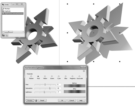
FIGURE 17-8 Change the colors of grouped objects selectively with the Effects | Adjust commands.