CHAPTER 12 Getting Artistic with Text
CorelDRAW is all about communication and expressing yourself; this chapter and the others in this part show you how to use text in a CorelDRAW creation to support and enhance your ideas as expressed on a page. This chapter gets you started with the Text tool and other CorelDRAW type features and shows you how to present your thoughts and ideas invitingly and clearly. Text and graphics go hand in hand in presentations; whether it’s a poster, a newsletter, a banner, or a logo, you have the tools at your disposal. This chapter shows you how to access and work with them.
NOTE
Download and extract all the files from the Chapter12.zip archive to follow the tutorials in this chapter.
CorelDRAW’s Text Tool
All text you want to enter on a page in CorelDRAW is created with the Text tool, the tool with an A as its icon in CorelDRAW’s toolbox. To begin designing, click its button in the toolbox, press F8, or double-click an existing text object. The Text tool cursor is a small crosshair with an A below and to the right, which becomes an I-beam (a text-editing cursor) when it’s over a text object.
TIP
A shortcut to reselect the Pick tool while the Text tool is selected is CTRL+SPACEBAR—for all other tools, you can press either SPACEBAR or CTRL+SPACEBAR.
When you use the Text tool, you can produce two different types of text objects in a document: artistic text and paragraph text. Figure 12-1 shows a simple layout that uses artistic text in combination with the Text | Fit Text To Path command—the path is hidden in this illustration. The smaller body text uses paragraph text; the top paragraph wraps around the top of the image by use of a CorelDRAW envelope (see Chapter 20). Artistic text and paragraph text have different properties, but are added to a document by using the same Text tool. Artistic text, by the way it’s produced in a document, is easy to reshape and distort—you’ll find it simple to do artistic things with it, such as creating a company logo. Conversely, paragraph text is optimized for longer amounts of text, and it’s a great text attribute for quickly modifying columns of, for example, instructions, recipes, short stories, and so on. In short, paragraph text is best used for several paragraphs of text in a composition, while artistic text should be reserved for headlines and just a few lines of text you might want to curve along a path, extrude, or do something else unique and fancy with.
Although artistic text and paragraph text have some similarities, you’re best off using one or the other depending on the type of text element you want in your design.
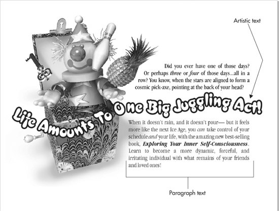
FIGURE 12-1 Artistic text and paragraph text have different attributes, and each is suited for different text treatments in a design.
NOTE
Text copied from the Clipboard can be pasted when the Pick tool is your current tool. Usually, unformatted text—text from a TXT file you copied from Textpad, for example—will import as paragraph text.
• Text imported without a Text tool insertion point entered on the page comes in as paragraph text.
• Text pasted with an insertion point made on the page imports as artistic text.
NOTE
Text copied from word processors will import as a document object; double-clicking the object offers in-place editing exactly as you’d edit a WordPerfect or Microsoft Word document. It’s usually best to choose Edit | Paste Special when pasting Clipboard text, to ensure that correct formatting and the original fonts are used, and to use the Text tool’s I-beam cursor to insert pasted text.
Entering and Editing Artistic Text
Artistic text will serve you best for illustration headlines, callouts, and on any occasion when you want to create text that has a special effect such as extrusion, an envelope, text on a path, and so on. To add a line of artistic text to a document, use the Text tool to click an insertion point, and then type your phrase; alternatively, after clicking an insertion point, press CTRL+V to paste any text you have loaded on Windows’ Clipboard. Creating several lines of artistic text simply involves typing and then pressing ENTER to put a hard return at the end of the line; you then continue typing. By default, all artistic text is set in Arial 24 point; later in this chapter you’ll see how to change the default.
Artistic text is also easy to convert to curves so you can modify a character in a word: for example, Microsoft’s logo has a tick missing in the second “o”. To duplicate this effect (but not Microsoft’s logo!), you’d begin with artistic text for the company name, press CTRL+Q (Arrange | Convert To Curves), and then edit using the Shape tool. Artistic text, as editable text, can be fine-tuned using the features on the property bar when the text is selected using either the Pick tool or the Text tool. The options are shown in Figure 12-2.
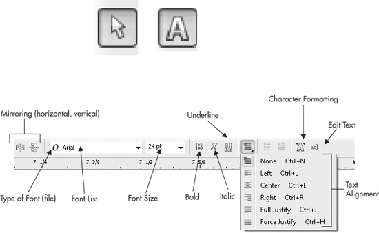
FIGURE 12-2 Use the property bar to get artistic text to look exactly the way you want.
• Mirroring (horizontal and vertical) In addition to creating special effects, the mirroring buttons are also useful when, for example, you want to print a T-shirt transfer with your company name. The name needs to be reversed (mirrored horizontally) to print on the transfer paper, so the un-reversed print on the T-shirt reads correctly (or at least without the need for a mirror).
• Type of Font (file) To the left of the font name displayed in the Font list dropdown box is an icon signifying what file format the font uses: OpenType, Type 1, or TrueType. This is a nicety when you’re sorting your fonts in Bitstream Font Navigator or Windows’ Fonts utility in Control Panel.
• Font Name This is the name of the typeface you select. By default, you’re using Arial 24 point. You change fonts in a new document by selecting text you’ve typed with the Pick tool and then choosing a different font from the Font list drop-down. If a font has family members, a right triangle can be seen to the right of the font name when the drop-down list is extended, and you can choose it by clicking the (flyout) triangle. You can also perform a speed-search by clicking the current name in the Font list box and then typing the first few letters of the font you want. The drop-down list immediately scrolls to the neighborhood of installed fonts, making your selection a fast and effortless one. Note also that on the Font list drop-down, at the top (above the divider bar), are the fonts you’ve chosen recently—from previous documents and even from previous CorelDRAW sessions.
• Font Size Text has traditionally been measured in points; with current digital typeface technology, the traditional 72.27 points has been rounded off to 72 points to the inch. Artistic text used as a headline can ideally be anywhere from 24 points for a flyer headline to 72 points for an impactful newspaper headline to 300 points and up (there’s no hypothetical limit to how large artistic text can be)—which is over 4 inches in height—for headlines that fairly shout at the reader.
• Bold and Italic These buttons on the property bar are shortcuts to defining a whole line of text or only selected characters as bold and italic members of the typeface shown in the Font list box. If a specific font has no family members, CorelDRAW doesn’t “fake” a bold or italic look, and the buttons are dimmed. If you need an italic treatment of a font that has no italic family member, a quick fix is to use the Transformation docker and then to set Skew to about –12° to apply to the artistic text.
• Underline An underline is an effect available for every font you have installed—you click the button when text is selected and CorelDRAW renders an underline. You can modify the style of the underline to your choosing by pressing CTRL+T, and then on the Character formatting docker choose from the Character Effects | Underline drop-down. If you don’t see the preset you want, choose Edit from the list, and then build the underline width and style you need. Underlines are great for professional documents, particularly legal ones, but an underline isn’t the most clever way to emphasize a phrase in an advertisement. Use a bold font instead or a colored outline or a gradient fill to attract attention artistically. Although underlines are effects, they’re very real, and if you convert an underlined phrase to curves (CTRL+Q), the underline becomes an object.
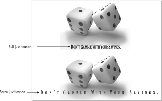
• Text Alignment This drop-down lets you set how lines of text are aligned relative to one another. Although justification will serve you best when using long columns of paragraph text, artistic text takes on a more polished look, too, when you apply, for example, Center justification to two or three lines. By default, there is no justification for newly entered artistic text, but for all intents and purposes, this is left-justified text. Full Justify creates a splendid, professional look for columns of paragraph text, but tends to generate an awkward look for artistic text, because a line containing only one word with only a few characters has to take on very wide character spacing. Similarly, Right justification is not an everyday choice for audiences who read Western languages (from left to right). Right justification is a “slow read”; hyphenations and line breaks between words usually look awkward, and this type of justification should be reserved for a page layout where the right edge of the text needs to align perfectly to the vertical of a graphic and the left side of the column can be flowing and freeform. Force Justify creates lines of text whose left and right edges are perfectly vertical, like with Full Justify, but with an important difference. Force Justify gives equal emphasis to the spacing between characters; although it can sometimes create unsightly gaps (called rivers) in paragraph text, it’s usually a good alignment choice for correcting justified lines of text where there are too few words on a line, and when hyphenation is not used. Force Justify can also be used as an artistic treatment of paragraph text, as shown in this illustration.
• Character Formatting This button will serve the most creative purposes when you have one or only a few characters selected using the Text tool. You can underline a single character, change its font type, family member, point size, and even rotate the selected character(s), all through Character Effects and Character Shift on the Character formatting docker. See the following section, “Character Formatting” for more information.
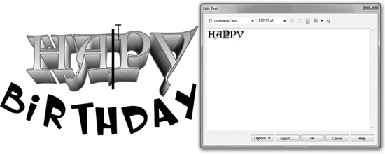
• Edit Text This button displays a text-editing box, which also appears when you click a piece of text to which is applied an effect such as an envelope or an extrude. CorelDRAW is designed with text-editing flexibility in mind, so to transform text using just about any feature—and to allow the text to still be editable—you work in a proxy box so you don’t have to start over when you make a typographic error. Here’s a visual example: You’ve chosen a lovely font to express a lovely sentiment for a card and have extruded the font. In the morning, you find you’ve misspelled “Happy”. No big deal. You click an insertion point in the text where the fix is needed by using the Text tool; the Edit Text dialog appears, you enter the additional characters, and finally click OK. Occasionally, you might need to modify an envelope containing text if you’re adding a lot of characters, but the Edit Text dialog is your friend in a jam, and as you’ll see, you can even change the font of selected characters, the family members, and the point size.
Character Formatting
You’ll often want to change the look of only one or two characters in an artistic text phrase in your document. Character formatting can be accomplished using:
• The Shape tool in combination with the property bar.
• The Text tool in combination with the Character formatting docker.
As you can see in Figure 12-3, you have some options using the Shape tool to select characters, but you have a more complete set of options when you highlight a character with the Text tool and then click the Character Formatting button on the property bar. For quick and simple reformatting, it’s the Shape tool, and for extensive reworking of your artistic text, use the Text tool. You have additional options for lines running under, over, and through selected characters, and if, for example, you’ve used the Character formatting docker to put a Double Thin Underline beneath your text, you can remove this underline later using the property bar while character nodes have been selected using the Shape tool. Character nodes appear black when selected (as shown in Figure 12-3), and your cursor is a clear indication you’re editing text with the Shape tool and not an object path node.
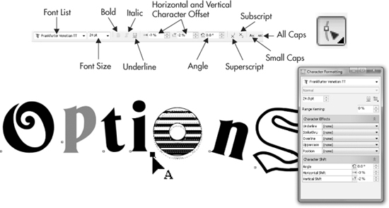
FIGURE 12-3 Format and reformat text characters using the Character Formatting box and the property bar.
Artistic Text and the Shape Tool
The Shape tool can be used to make various changes to the text, including repositioning individual characters within the artistic text object, changing the horizontal and vertical spacing of all the text at once, and selecting nonconsecutive characters, so you change their properties without changing the rest of the text in the object.
Selecting and Moving Characters with the Shape Tool
To select any characters in an artistic text object, select the text object with the Shape tool (F10)—the cursor changes to the Shape tool pointer with an A next to it. With the text object selected in this way, a small, empty box or “control handle” appears at the lower-left corner of each character, as shown in Figure 12-4.
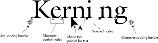
FIGURE 12-4 Set character and line spacing, and reposition individual characters with the Shape tool.
To select any character, click its control handle using the Shape tool. To select nonconsecutive characters, hold SHIFT (not CTRL as you’d anticipate) while clicking. You can also marquee-drag around the nodes you want to select with the Shape tool. With the control handles selected, you can modify the text formatting, fill, outline, and position of those characters.
To move one or more characters selected with the Shape tool, click-drag one of the selected control handles—all the selected characters will move together. Unless you’re striving for a humorous effect, however, it’s usually a good idea to keep the characters you move horizontally aligned: hold CTRL while dragging—vertical moves do not accept the CTRL key for constraining movement.
Moving characters with the Shape tool changes the horizontal-and vertical-shift values of them, and the new values can be seen in the Character Formatting box (CTRL+T). Moving characters with the Shape tool is useful for manually adjusting the position of characters visually to improve the kerning, the inter-character spacing. Although repositioning character nodes can create fun, freeform headlines, it’s also useful if you own a “bum font,” a digital typeface whose poor coding results in certain characters neighboring other characters too tightly or too loosely. Then again, almost every typeface has poor kerning for the word “HAWAII”; at the top of the next illustration is the way the characters align as typed. There is usually too little space between the IIs, and the A and W should tuck into each other, but do not. At bottom, after 30 seconds with the Shape tool, the word not only has a better relationship between negative and positive areas, but the word is also shorter (which is good when design space is cramped).

TIP
The Shape tool can be nudged after selecting character nodes and nodes along object paths. Therefore, you can create better headline kerning by first adjusting the Nudge Distance in Tools | Options | Document | Rulers and then using the keyboard arrows to create a professionally typeset headline.
Adjusting Spacing with the Shape Tool
When an artistic text object is selected with the Shape tool, two additional handles appear at the lower-left and lower-right corners of the object, as shown in Figure 12-5. These two handles modify the line spacing and character spacing for the entire block in one go.
To increase or decrease the word and character spacing, drag the handle at the lower-right corner of the selected text object right or left with the Shape tool. To increase or decrease the line spacing (also the before-paragraph spacing), drag the handle at the lower-left corner of the selected text object down or up with the Shape tool.
All spacing values modified with the Shape tool can be viewed and edited in the Text | Paragraph Formatting Docker.
Combining and Breaking Apart Artistic Text
You can combine several artistic text objects into a single artistic text object: select all the artistic text objects with the Pick tool, and then choose Arrange | Combine or press CTRL+L. Each text object starts a new paragraph in the new text object. Ordinarily, the Combine command converts CorelDRAW objects to simplified ones, but text objects retain their editability as text.
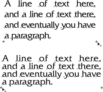
FIGURE 12-5 Leading (inter-line spacing), kerning (inter-character spacing), and inter-word spacing can be tuned using the text handles.
The text objects are combined in the order in which they are selected—if you select several objects in one go by dragging a marquee around them, they will be selected from front to back. Text objects that do not contain spaces are combined onto a single line. If any of the selected objects is not a text object, all the text objects will be converted to curves and combined with the nontext object.
TIP
If the text doesn’t combine in the order you want or expect, you can reverse the stacking order of the original text objects by first pressing CTRL+Z (Edit | Undo) and then choosing Arrange | Order | Reverse Order.
Artistic text can also be broken apart from several lines of stacked text to individual lines, all unique objects. To break apart artistic text, choose Arrange | Break Artistic Text, or press CTRL+K. With multi-line text objects, the break apart command results in one text object for each line or paragraph from the original object.
Also, using the break apart command on single-line text objects results in one text object for each word. As you’d expect, breaking apart single-word text objects results in a new text object for each character.
Converting Artistic Text to Curves
Many effects can be applied directly to artistic text, but you might want to apply effects that cannot be applied as a “live” effect to editable text. To achieve the desired effect, the artistic text objects first need to be converted to curves: choose Arrange | Convert To Curves, or press CTRL+Q. Text that has been converted to curves is no longer editable with the Text tool and must be edited with the Shape tool instead, just like any other curve object. As mentioned earlier, converting text to plain objects with paths and control nodes is a good way to begin creating logos. The following illustration shows a treatment of artistic text converted to curves. With a push of a node here and a pull there, the result is a workable party store sign. See Chapter 11 for the details on how to use the Smudge brush to produce this effect.

Entering and Editing Paragraph Text
Paragraph text is very much like the frames of text that professionals work with in desktop publishing (DTP) applications such as CorelVentura and Adobe InDesign; however, in CorelDRAW you’ll soon see options and features that DTP applications don’t provide. The largest difference between artistic text and paragraph text is that paragraph text is held in a container—a frame—so you don’t directly edit, for example, the width of characters in a paragraph text frame simply by yanking on a bounding box handle with the Pick tool. In Figure 12-6 at top are duplicate paragraph frames; they’re easy to spot and differentiate from artistic text because even when not selected, they have a dashed outline around them signifying the paragraph text frame. The duplicate at top right has been scaled so it’s wider than at left: note that the lines of text flow differently, but the characters remain unchanged, as does the spacing between characters and words. At bottom the same historic American address has been entered as artistic text, and then at right the bounding box was dragged to the right using the Pick tool. The words per line don’t rearrange, but what does happen is that the characters themselves are stretched, which is often unwanted. That’s the biggest difference between paragraph and artistic text: if text doesn’t have a frame, then you’re scaling the text.
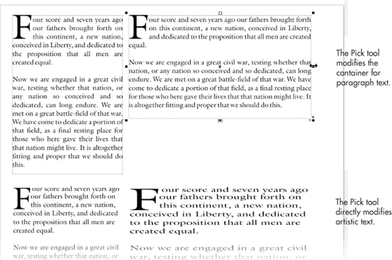
FIGURE 12-6 When you edit paragraph text with the Pick tool, you’re only changing the shape of the frame, not the text itself.
Working with paragraph text can be a challenge, a little more complex than riding a bike but a lot less complex than rocket science. However, once you get the hang of it (and the following sections are your guide), you’ll find paragraph text indispensable for business designs, and those Tri-Fold and Top Fold page presets you learned about in Chapter 6 will spring to life and a new purpose. Your brochures will look as slick as can be.
To create a paragraph text object, select the Text tool in the toolbox, and then click-drag diagonally to create a rectangle into which you’ll enter the text. In the next illustration, the arrow at left shows the click-diagonal drag technique (commonly called a marquee drag), and at right you see the result. The text inside the paragraph frame is simple a visual prompt, and it disappears after you’ve added text. A paragraph text frame has resizing, kerning, and leading handles (artistic text features these as well), discussed later in this chapter. You have three ways to fill a paragraph text frame with text:
• Type in the frame Manually, it’s probably best to leave spell checking on as you go.
• Paste from the Clipboard You’ll see a dialog before you can paste if you press CTRL+V or choose Edit | Paste (and Edit | Paste Special). Here you can choose to keep or discard the formatting of the text on the Clipboard. If your cursor is inserted in a paragraph text block when you choose Paste Special, the result is a new block of artistic text, regardless of your cursor’s insertion point. If you want to paste into existing paragraph text, pressing CTRL+V—the simple Paste command—does the trick.
• Import a text file Depending on the text file type, you might be prompted to install a compatibility pack, especially for older MS Word documents. With a broadband connection, the process takes about 3 minutes, you don’t have to quit CorelDRAW, and you can paste after the compatibility program is installed. In contrast, a plain TXT file with no font or paragraph attributes will import perfectly after you choose a style of import from the Importing/Pasting Text dialog.
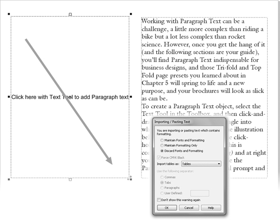
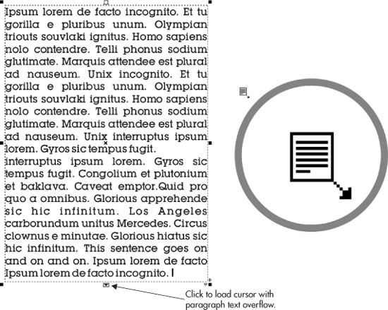
Especially if you’re pasting text from the Clipboard, the frame you drag for paragraph text might not accommodate the amount of text. As a result, the text is hidden; the frame is a dashed red outline instead of black. To reveal the text, drag down the “window-shade handle,” the small square tab (bottom center) on the text frame; when there’s hidden text, the handle has a down arrow in its center.
One of the most useful things you can do with paragraph text frames is to link them; instead of spoiling a design by increasing the size of the frame, you can create a second, third, or any number of additional frames, and flow the excess text into the new frames as you create the frames. The advantage to this is that you can move the linked frames around in your design, and the content (the printed message of the paragraph text) remains in perfect order. For example, if you need to break a paragraph into two frames in the middle of “Now is the time for all good people to come,” you do this, and in the future if you need to resize the first paragraph text frame, the excess of words “pours” into the second frame, regardless of its position on the page. This is too neat to simply describe with words, so let’s try creating linked text frames in the following steps.
 Creating Linked Paragraph Text Frames
1. In a word processor or plain text editor, copy some existing text to the Clipboard; it doesn’t matter what the text is. Highlight a few paragraphs and then press CTRL+C.
2. In CorelDRAW, choose the Text tool and then click-diagonal drag to define a paragraph text frame. Try to make the frame smaller than the text on the Clipboard (eyeball it).
3. Insert your cursor in the frame, and then press CTRL+V to paste the Clipboard text. If you copied from a word processor, CorelDRAW will flash you the Import/Pasting Text dialog, where you have the option of retaining the formatting (if any) created in the word processor—font choice, point size, justification, and tabs are all attributes of text formatting. Go with it; click the Maintain Fonts And Formatting button and then click OK.
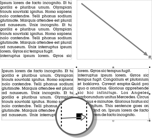
4. Click the bottom-center text handle (the box with the black arrow), and your cursor is now loaded with all the text that was hidden from view because your frame is smaller than the text you pasted into it. Your cursor takes on a new look, shown in the following illustration.
5. Click-diagonal drag to create a new, linked text frame. The excess text from the first frame automatically flows into the new frame, shown here. A light blue line with an arrow indicates the relationship between the text in the first and the second frame (don’t worry, this screen element does not print). Try repositioning the two frames now using the Pick tool. Then try resizing the first frame. You’ll see, dynamically, the second frame take the overflow from the first frame.
Web-Compatible Paragraph Text
If you are designing web pages in CorelDRAW, you should make all paragraph text web compatible. Web-compatible paragraph text will be exported as real text in the final HTML web page. Web-compatible paragraph text has a limited subset of normal paragraph text properties: font, size, bold, italic, underline, alignment, and solid color, but no tabs, bullets, or other advanced features you might find in a DTP program. All other properties are removed from the text. All text that is not web compatible (symbol fonts, certain extended characters, and so on) is exported as bitmaps when the page is published to HTML. Bitmaps do not scale on dynamic HTML pages; they take more time to download than live text and do not render to screen as crisply as actual text.
NOTE
To export text as web-compatible text and not as a bitmap, choose File | Export HTML. Don’t choose Export For Web. See Chapter 28 for the details on exporting text and graphics for website design.
To make paragraph text web compatible, right-click the paragraph text object with the Pick tool, and choose Make Text Web Compatible from the pop-up menu.
Editing Text: The Comprehensive Tour
A few of the basics of text entry and editing have been discussed to get you up and running. However, as your needs arise for more complex character formatting and fancy text layout, you’ll want to become more familiar with the nitty-gritty of everyday typography and publishing. The good news is that CorelDRAW’s text-handling features are very similar to your favorite word processor or desktop publishing program. Just select the Text tool (F8) and begin the exploration.
Navigating with the Insertion Point Cursor
You can use the text cursor to select text a character at a time, by whole words, or even by whole paragraphs, just by dragging to highlight. You can also use the UP, DOWN, LEFT, and RIGHT ARROW keys on your keyboard to quickly navigate the cursor insertion point around large amounts of text.
Selecting Text
To place the text cursor (the I-beam) in the text where you want to start typing, click with the left mouse button. Any text you type will be inserted at that point and will have the same style as the character to the left of the insertion point.
To select text with the Text tool cursor, click-drag with the primary mouse button from the point at which you want the selection to start, and release the mouse button where you want the selection to end. Alternatively, click once to place the cursor in the text where you want the selection to start, and then, while holding down the SHIFT key, click where you want the selection to end—all the text between the two clicks is selected. Double-clicking a word selects that word. Triple-clicking selects the entire paragraph in which you triple-clicked.
You can move the cursor with the cursor keys (the keyboard arrow keys) as well as with the mouse.
• To move left or right a word at a time, hold CTRL while moving the cursor with the LEFT or RIGHT ARROW key.
• To move up or down a paragraph at a time, hold CTRL and press the UP or DOWN ARROW key, respectively.
• To expand or contract the selection, hold SHIFT while moving the endpoint with the arrow keys.
• To move to the beginning or end of the current frame, hold CTRL and press the HOME or END key, respectively. Alternatively, use the PAGE UP or PAGE DOWN key to move up or down a frame.
Moving Text
You can move a selection of text with the mouse by dragging-and-dropping; select the word or phrase you want to move, and then with the primary mouse button click-and-drag the text to its new location in the current text object—or in any other text object. A vertical bar indicates the insertion point at the new location; the cursor becomes the international “no” sign (a circle with a slash through it) if it is not possible to drop the text at the current location.
Dragging with the right mouse button causes a pop-up menu to appear when you drop the text, with options for what to do with the text. The options are Copy Here and Move Here, and Add To Rollover doesn’t do anything unless you have a web-page rollover defined. You can use this special editing gesture to copy and move words within paragraph and artistic text, but you can also put the copied or moved text outside of the body of artistic and paragraph text. In this event, the text is no longer in line with the text from which you copy or move, so only use this command (particularly Move) for a very good reason.
Converting Between Artistic Text and Paragraph Text
To convert a block of artistic text to paragraph text, right-click the artistic text object with the Pick tool; then choose Convert To Paragraph Text from the pop-up menu. The menu command is Text | Convert To Paragraph Text, and the keyboard shortcut is CTRL+F8. All the text formatting is maintained as closely as possible each time you convert between the two text types, although some formatting, such as paragraph text columns and effects, cannot be applied to artistic text and is lost.
Going the other way, from paragraph text to artistic text, is similarly simple. However, all the text in a paragraph text frame must be visible: it cannot be hidden and you cannot convert a linked paragraph text frame. With the Pick tool, right-click over the paragraph text, and then choose Convert To Artistic Text (CTRL+F8 works, too).
NOTE
Paragraph text objects that are web compatible cannot be converted to artistic text. You need to first (with the Pick tool) right-click over web-compatible text, and then uncheck the Make Text Web Compatible check box.
The Text Bar and Special Paragraph Formatting
Let’s dig deeper into paragraph text options and discover new ways to embellish your printed message; create or open a document now that contains a paragraph text frame. Because of the large screen resolutions we enjoy today, we can view pages at almost a 1:1 resolution as they would print, but this also means we might need to scroll and mouse around a document more than is healthy for the wrists. The solution in CorelDRAW is a simple one: if you’re working extensively with text, you float the Text toolbar close to the area of the document in which you’re fine-tuning. Right-click over any area of the property bar, and then choose Text from the pop-up menu. You can drag the Text toolbar to hover over any area you like.
The Text toolbar can be used to edit single characters in artistic text and paragraph text, but its real strength is in the offering of options for making paragraph text look polished and sophisticated. When the Pick tool or the Text tool is active, all the features shown in Figure 12-7 are active and at your disposal. Additional modifications to the available options are described a little later in this chapter.
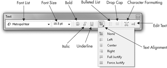
FIGURE 12-7 The Text toolbar is a convenient gateway to the text formatting you need on a daily basis.
TIP
The Text toolbar and the Text options on the property bar when the Pick or the Text tool have selected text are essentially identical. The Text toolbar is simply a more portable device for working closely with text.
Drop Caps and Bulleted Lists Formatting
A drop cap is a dropped capital character at the beginning of a paragraph, much larger than the rest of the text, extending three, four, or more lines down in the paragraph…and it adds a touch of class to a document, particularly if you’re illustrating a fairy tale.
Bulleted lists are a common necessity for page layouts: restaurant menus, assembly instructions, just about anything that’s a list that doesn’t need to be a numbered list! In the following sections, you’ll see not only how to create a bulleted list, but also how to choose any character you like for the bullet and even create a hanging indent for the bulleted list for an ultra-professional presentation.
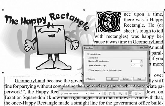
Creating a Drop Cap
You have a lot of options, hence a lot of design opportunities, for drop caps in a CorelDRAW document: you can decide on the drop cap’s height relative to the lines of paragraph text of its neighbors, whether it’s nestled into the body of the text or stands to the left (called a hanging indent), and even choose the font used for the drop cap.
First, the Drop Cap button on the Text toolbar and property bar is available when the Pick tool is used to select paragraph text, and when the Text tool is used to highlight a paragraph within a paragraph text frame. This is a show/hide toggle button: it turns the default attributes for a drop cap on and off within the selected text. Therefore, you can create a drop cap for paragraph text in one click, but if you want to add your own input, you need to additionally work with the Drop Cap options box, as demonstrated in the following steps.
Adding a Drop Cap to Your Paragraph Text
1. Create some paragraph text, as described earlier in this chapter.
2. Use the Text tool to highlight a paragraph that you want to lead off with a drop cap. You can create drop caps by simply selecting a paragraph text frame with the Pick tool, but doing so will put a drop cap at the beginning of every paragraph (after every hard return), which might be overdoing the effect.
3. On the Text toolbar or the property bar, click the Drop Cap button; you’ll get the default drop cap effect, as seen in the illustration below.
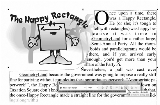
4. The easiest way to make the drop cap into an ornamental drop cap is to toggle the Drop Cap on the property bar to hide it; then highlight the first letter, and change the font for this one character. Then, with the I-beam cursor in front of the letter, click the Drop Cap button once more.
TIP
Barock Caps (a regional spelling of “Baroque,” not the U.S. president) is a wonderfully intricate storybook-style typeface. It’s available for free at http://moorstation.org/typoasis/designers/steffmann/index.htm.
5. Choose Text | Drop Cap to display the options for the drop cap. The most common customizing would be to change how many lines the cap is dropped; by default, it’s three, but four or even five can look interesting, depending on the font you use. If you feel there isn’t enough air between the paragraph text and the drop cap, use the Space After Drop Cap spin box to increase the space to the right of the drop cap. You also have the option to Use Hanging Indent Style For Drop Cap, which casts the drop cap to the left of the paragraph text while the paragraph text then takes on a flush-left indent. The following illustration shows the completed effect; a hanging indent was not used because the design uses paragraph text inside a path (discussed later in this chapter) to wrap the text around the cartoon, and an indent would spoil the overall composition.
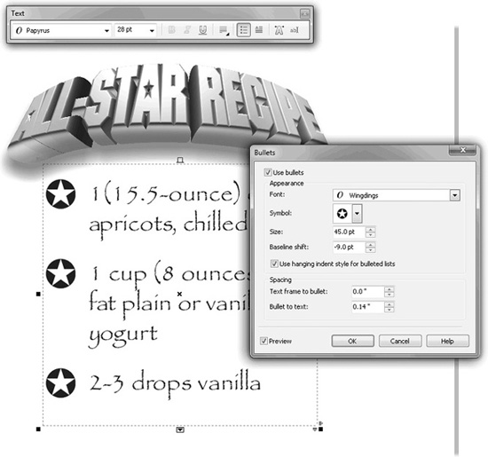
Making Bulleted Paragraph Text
Like the toggling Drop Cap button, the show/hide Bulleted List button can be your one-click stop for creating bulleted lists; however, you’ll surely want a custom bulleted list that looks as artistic as your document layout. On the Text menu you’ll find the Bullets command; it’s straightforward and you’ll quickly achieve great results. Find or create a list of something, and follow along to see how to work the options for bullets.
Creating a Bullet Motif
1. There’s no real harm in simply using the Pick tool to select the paragraph text you want to make a fancy bulleted list: every line break in the list begins a new bulleted item, so select the text and then click the show/hide Bulleted List button on the property bar or on the Text toolbar. See the following illustration.
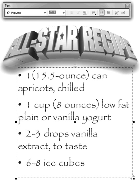
2. Choose Text | Bullets.
3. Choose a typeface that contains a character that works well with the theme of the bulleted list composition. The illustration is an “All-Star Recipe,” so a bullet shaped like a star is appropriate. Microsoft’s Wingdings font is installed with every copy of Windows, and it features some nice symbols: choose Wingdings from the Font drop-down list in this example, and then click the Symbol drop-down arrow, and locate a good star shape.
4. Click the Use Hanging Indent Style For Bulleted Lists check box to get a polished look for the list.
5. Increase the point size by dragging upward in the center of the spin box control for Size.
6. Most likely, the baseline of the enlarged symbol won’t look right compared with the text in the list (it’ll be too high). Drag downward on the Baseline Shift spin box control until the bullets look aligned.
7. Optionally, if your symbol is crowding into the list text, increase the Bullet To Text spacing. Similarly, the paragraph text frame might be too tight to the left of the bullet; in this case, you increase the Text Frame To Bullet amount. See the following illustration for the completed design.
Working with Columns
Although you can manually create flowing columns of paragraph text, it’s often less time-consuming to use the automated Columns feature in CorelDRAW. Text columns divide paragraph text frames into several vertical columns separated by gutters (margins). Multiple columns can be created only in the Text | Columns dialog. This section describes how to manipulate columns with the mouse. You must have paragraph text selected with the Text tool to work with columns: the tabs do not show on the rulers using other tools.
Select the frame in which you want to place columns, choose Text | Columns, and then set the Number Of Columns on the Column Settings dialog. It is always a good idea to keep the number of columns balanced, so each column is neither too wide nor too narrow. A good rule of thumb for legibility is: each line of text should be no wider than 6 inches or 16 words, but it should be wide enough to have at least 4 words per line.
To change the width of the columns and margins, drag the column guides, column-boundary markers, gutter handles, and horizontal-resize handles, as shown in Figure 12-8. When dragging the column guides or boundary markers, if the Equal Column Width option is selected in the Column Settings dialog, all the gutters will be resized together; the gutter handles are available only when this option is not selected.
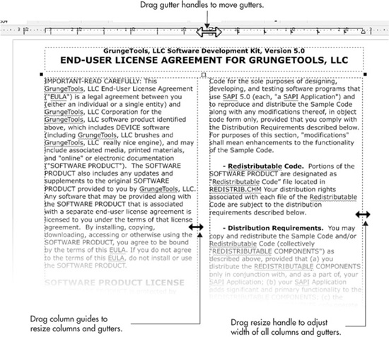
FIGURE 12-8 Column widths can be edited directly by dragging with the mouse.
NOTE
Columns can be applied only to whole paragraph text frames and cannot be applied to individual paragraphs or artistic text.
Column Settings
Once you’ve created a paragraph text object with columns, you can refine and make precise columns and gutter widths through the Column Settings dialog (Text | Columns), shown in Figure 12-9.
To add extra columns, first set the Number Of Columns, and then set the Widths of the columns. The Gutter value is the distance between the selected column and the next one. If Equal Column Width is selected, changing the width of any column or gutter changes the width of all columns or gutters to the same value. If Maintain Current Frame Width is selected, changing the width of any column or gutter will not change the overall width of the frame, so the other columns and gutters will be resized to accommodate the change. A preview of the column settings is shown in the preview frame on the right side of the dialog.
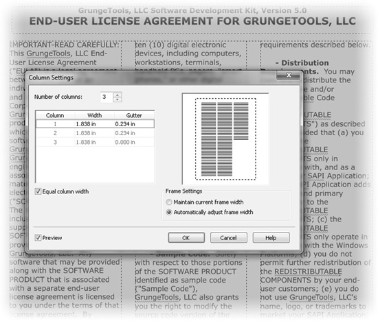
FIGURE 12-9 Use the Column Settings dialog to apply columns to paragraph text.
Text in columns (even if only one column is used) can be justified via the Text toolbar and the Paragraph Formatting box.
TIP
You can have more control over columns by laying them out as multiple text frames, each one containing a single column.
Formatting Paragraph Text
Stepping inside the frame and column formatting of paragraph text, CorelDRAW has extensive options for specifying how lines of text look compared with one another, how tightly characters and words are spaced, and how you want individual paragraphs to separate from each other. The following sections cover the use of the Paragraph Formatting box.
Paragraph Alignment
The Alignment settings on the Paragraph Formatting box affect the spacing for the entire selected paragraph; you can choose the entire paragraph text object using the Pick tool, or choose only pages by highlighting them with the Text tool. Horizontal and Vertical Alignment at the top of this box pertain to the orientation of the language set of the font used; American and European users will want to use Horizontal Alignment.
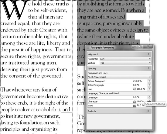
Spacing
Below Alignment on the Paragraph Formatting box are controls for inter-line spacing (leading), for how much space should go before or after a paragraph, for inter-character and inter-word spacing, and finally for indent preferences. Note that proper typographical form dictates that separate paragraphs are usually indicated by either a first-line indent or a line space between paragraphs, but not both.
Paragraph and Line Spacing
Depending on your layout, you might choose to separate paragraphs by using the Before Paragraph or the After Paragraph spin boxes, but not both. The spacing between paragraphs is measured by default as the “% Of Char. Height” (percent of the character height), the total height of a character in a digital font, which is not always easy to discern; typically it’s about 30 percent taller than a capital letter in the font. If this proves to be too time-consuming to calculate, you can always choose Points or “% Of Pt. Size” (percentage of point size) from the drop-down list. In the following illustration, 200% of the character height is chosen to separate paragraphs. This is an option you want to experiment with, depending on the typeface you’re using. Anywhere from 125% to 200% can work from an artistic standpoint.
Line spacing is used to let some “air” into paragraph text and is especially useful when you have a font whose ascenders or descenders are unusually tall. You can also use very wide Line spacing to create an artistic effect when starting, for example, a magazine article. It’s been fashionable in layout for several years now to put about 300% Line spacing in the opening paragraph: it lightens the page when using a bold font and also allows the reader to see more of any decorative background.
Language, Character, and Word Spacing
If you’re typesetting, for example, an article using an Asian font, Language spacing will be useful to space non-left-to-right sentences; if not, you have very little use for this option. You can set how much extra space is added to the default inter-character space for the paragraph as a whole by using the Character spacing. The values are a percentage of a normal space character for the current font. You can also modify the inter-word spacing—this has the effect of adjusting the width of the space character. The following illustration shows some adjusted text at right (highlighted), and you can compare the effect to the default paragraph text at left.
TIP
Remember the control handles on the bounding boxes of paragraph text. They offer less precision when setting character and line spacing than the Paragraph Formatting box, but they’re quick to use and provide a good coarse view of how your layout is shaping up.
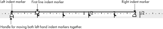
Indentation and Margins of Paragraph Text
You can set the sizes of the indents of the left and right margins, as well as the size of the first-line indentation, just as you do in a word processor. These can be set precisely from the Paragraph Formatting box, or you can set them with a little less precision using the triangular markers on the ruler, which are shown here:
Formatting Tabs
Tab stops for paragraph text can be edited either directly in the ruler or in the Text | Tab Settings dialog, as shown in Figure 12-10. CorelDRAW supports left, right, center, and decimal tabs, just like most word processors do.
Adding, Moving, and Deleting Tabs from the Dialog
Tabs can be added to the current paragraph in the Text | Tab Settings box by first entering a value in the Tab Location spin box, and then by clicking Add. To set the type of the new tab, choose from the drop-down list associated with the tab. Similarly, you can adjust an existing tab by clicking its position (thus opening the value for editing) and then typing in a new value. To delete a tab, select it in the list, and then click the Remove button.
When you create a new paragraph, unless you have modified the default paragraph style, tab stops are positioned every half-inch. To remove all the tabs, click the Remove All button.
Formatting Tab Leaders from the Dialog
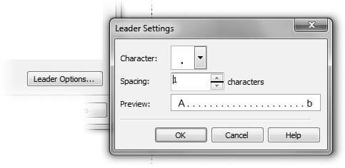
You can choose whether text positioned to any tab has a leader between the tab settings from the Leader Settings box reached by clicking the Leader Options button in Tab Settings. Leading characters are often used in tabulated lists such as tables of contents and menus to join the section titles or menu items on the left with their respective page numbers or prices on the right.
Leaders are usually displayed as a series of dots, but they can be changed to any of the characters shown in the Character drop-down list (unfortunately, you can’t make a leader using a font other than the one used in the paragraph text). To change the leader character, select a Character from the drop-down list. The distance between the leader characters is set with the Spacing setting: this value is the number of space characters to insert between each leader character. A preview of the leaders appears in the Preview box.
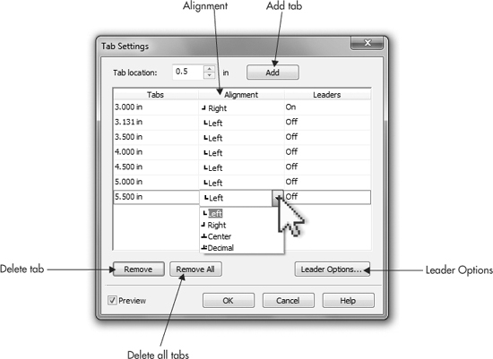
FIGURE 12-10 Edit tab stops by using the Text | Tabs settings.
Using the Ruler to Set Tabs
To edit tab stops on the ruler, the ruler must be visible (choose View | Rulers), you use the Text tool in selecting the paragraph text, and you click to set or edit the tab stops. To view tab characters in the body of your paragraph text, press CTRL+SHIFT+C (Text | Show NonPrinting Characters).
TIP
Before creating new tabs, you should delete all the tabs that are already in place—select Remove All from the Tab Settings dialog.
To create new tabs with the ruler, use the Text tool to select the paragraphs to which you want to add tabs, and then click on the horizontal ruler where you want to add the new tab stop. The type of the tab can be set by right-clicking over the tab. There is also a selector button where the ruler origin usually is when working with paragraph text. Clicking the selector button cycles between the four tab states: left–right–center–decimal. See Figure 12-11.
To move a tab, drag it to its new position on the ruler. To delete a tab, drag it off the ruler and into the workspace. To change the type of a tab, delete it and create a new one of the correct type, right-click it in the ruler, and select a new type from the pop-up menu, or change its type in the Tab Settings dialog. Tabs cannot be added to artistic text.
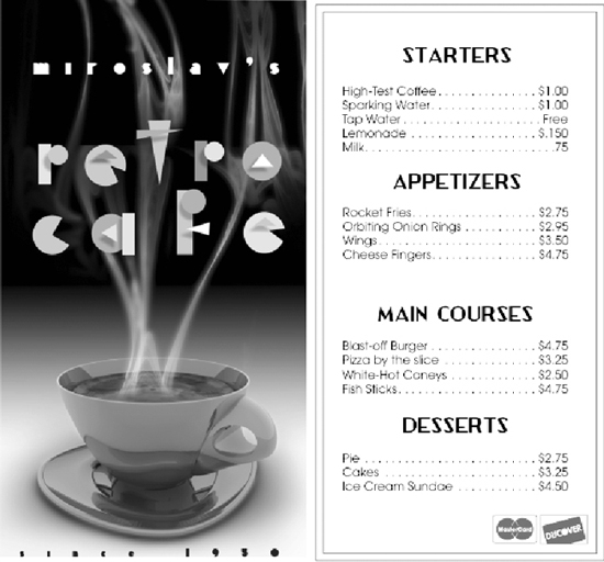
Here’s a practical example of the value in knowing how to set up tabs: create a folding menu design, and then create paragraph text with menu items and their corresponding prices on the same lines (make up anything you like; have fun here!). Here’s how to create a dot leader so the guests can see the prices at far right easily, based on the menu items at far left.
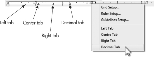
FIGURE 12-11 Tab stops can be edited directly on the horizontal ruler when editing.
Picking Up the Tab
1. With the Text tool cursor inserted in the body of the text, choose Text | Tabs.
2. Create a tab at the end of the line, just short of the end of the paragraph frame; give it the Right tab property.
3. Unfortunately, you can’t have a decimal leader and a regular text leader on the same line of text, but this, for the most part, is okay. With most typefaces the decimal in the price column will line up fairly evenly with a leader tab in place on lines. Click Leader Options.
4. Choose a period as the character, or if you want something fancier, you might try a single right-pointing angle quote (“>”; ALT+155) if your font supports this character.
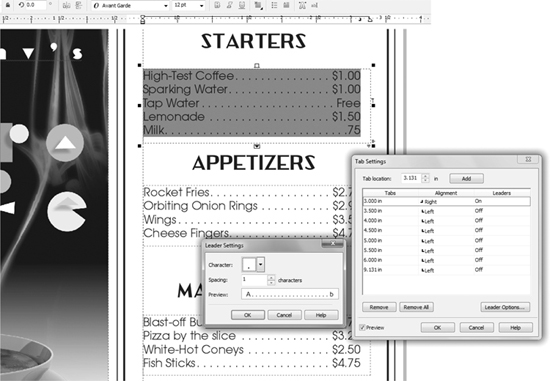
5. Set the Spacing for the leader character. Notice that your document updates live, so you can preview how your dot leader looks before clicking OK.
6. Click OK and the menu will certainly look more appetizing after applying your newfound typographer’s skills.
Wrapping Text Around Other Shapes
You can apply text wrapping to shapes in CorelDRAW so that any paragraph text placed close to the shape will flow around the object instead of over or under it, as shown in the examples in Figure 12-12.
Several types of wrapping are available.
• Contour wrapping The text is wrapped a line at a time around the outline of the object.
• Square wrapping The text is wrapped around an imaginary rectangle that bounds the object with the wrap (its bounding box).
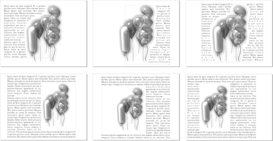
FIGURE 12-12 There are six contour and square text-wrapping options available and one non-wrapping option (None).
In either case, the text can be made to flow down the left or right of the object, or straddle it (flow down both sides). Square wrapping also supports Above/Below, where no text flows to the sides of the object.
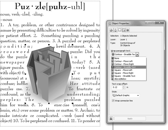
To apply Contour Straddle, right-click the shape and select Wrap Paragraph Text from the pop-up menu. To set a different wrapping type, select it from the General tab of the Object properties docker (press ALT+ENTER). Then set the margin distance, which is the gap between the outline or bounding box of the shape and the paragraph text wrapped around it.
NOTE
Grouped objects will accept Contour Straddle, but not all complex objects will. For example, if you want to straddle text around a blend group, group the blend objects first, or the Wrap Paragraph Text option will be dimmed.
It’s important to understand that text legibility can be at peril when you wrap text around a highly freeform shape; it’s just not good layout, for example, to create a zigzag-shaped wrap, causing the reader’s head to whiplash every other line. Use wrapping text as a creative element, but use your artistic eye to avoid unnecessarily hard-to-read paragraph text.
TIP
Wrapping affects only paragraph text. Text wrapping is not applied to the wrapped text itself, only to the shapes that are wrapped by the text.
Fitting Text to Curve
Wrapping text around an object has its alter ego: putting text inside a shape, so it looks as though the text itself forms a shape. And there’s a third variation called Fit Text To Curve— you can have artistic text follow an arc, a freeform line, an open or closed shape, and you have options for the style in which the text follows your line.
Pouring Text into a Shape
The simplest way to form text so it appears to have a geometry other than rectangular, is to first create a shape, copy some text to the Clipboard if you don’t have a message in mind, and then carefully position your Text tool just inside the line of the shape (perhaps 1/8 of a screen inch inside) until the cursor turns into an I-beam with a tiny text box at its lower right, and then click to start typing, or click and then press CTRL+V to paste your Clipboard text. Text inside a shape is paragraph text, and it obeys all the paragraph text formatting conventions covered in this chapter. Here’s an example of a creative use for shaped paragraph text: the following mock article is about buttons, so the shape of the paragraph text might look appropriate if it was shaped like…a button.
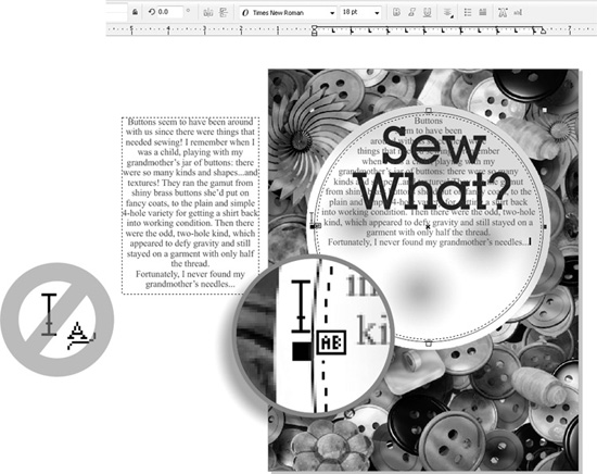
Creating a Round Text Frame
1. Open Sew what.cdr in CorelDRAW. The text has been provided for you in the margin.
2. With the Ellipse tool (F7) hold CTRL to constrain the ellipse to a circle, and then drag a shape in the document about 6” in width. Check the property bar if necessary to get an approximation of the 6” circle.
3. Copy the text at left to the Clipboard. It’s easiest to do this with the Pick tool; the Text tool can also be used. Highlight the text and then press CTRL+C to copy or CTRL+X to cut.
4. With the Text tool, hover the cursor just inside the circle until it turns into an I-beam cursor with a tiny “AB” to the bottom right, and then click. Do not click if the cursor features an “A” with a wavy line—this is the indication that you can put text along a curve, the wrong feature for this example. With the insertion point for text inside the circle, you could start typing, but for these steps, press CTRL+V to paste text from the Clipboard.
5. Choose Text | Paragraph Formatting. If you’d created a half-circle into which you poured the text, it would not obscure the headline in this example. However, the text doesn’t fill the circle container, so you can align the text to the bottom of the circle: choose Bottom from the Alignment | Vertical drop-down list on the Paragraph formatting docker.
6. With the text selected, choose an appropriate typeface from your list of installed fonts, accessed from the property bar. Then choose a font size of your liking. Times New Roman—a Windows system font—works quite well for this short text passage at 18 points.
7. If the text proves to be too large in point height, resize the container using the Pick tool—hold SHIFT to contain the scaling, and magically the text reflows dynamically until you release the object. You don’t always need to scale text; sometimes scaling the text’s container is a more inspired way to finish a design.
8. Make the circle containing the text invisible: select the circle with the Pick tool (check the status line to make sure the circle and not the text is selected), and then right-click the no outline well on the color palette, the top one with the “X” in it. Figure 12-13 shows the assignment nearing completion.
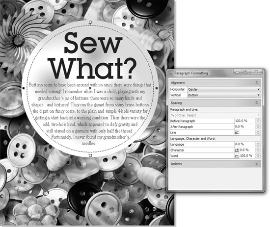
FIGURE 12-13 Create visual gestalt! Make your text look like the graphic.
One very popular treatment for text “bound” to an object is the arc of text. This is accomplished by first creating the arc shape (a circle usually works well) and then instead of clicking inside the shape, hovering your cursor above the shape until your Text tool cursor becomes an I-beam with a tiny swooping curve beneath it.
Follow these steps to flow text in a semicircle.
Text Along a Curve
1. Open Loving Cup.cdr. The graphic of the trophy could use some text surrounding the top.
2. Create a circle using the Ellipse tool.
3. With the Shape tool, drag the Ellipse node away from the center of the circle to create an open arc. Adjust each node until you have an arc centered above the loving cup. See Chapter 8 if you’re unfamiliar with editing CorelDRAW objects.
4. With the Text tool, position the cursor just along the outline of the circle, and then click an insertion point and begin to type. You’ll see that the text follows the curve. What you type is up to you, but “Congratulations” is a solid starter for graphics that involve a trophy!
5. If the text isn’t aligned to your liking, use the Offset spin box on the property bar to correct it.
6. If you’d like the text to be a little off the curve, use the Distance From Path spin box.
7. If you’d like a truly wild and interesting style, a treatment of the text such as a 3D ribbon look, check out the drop-down list at left on the property bar. Click any of the styles to apply them. Figure 12-14 shows an example of an award; the circle still has an outline, but it takes one right-click to correct that.
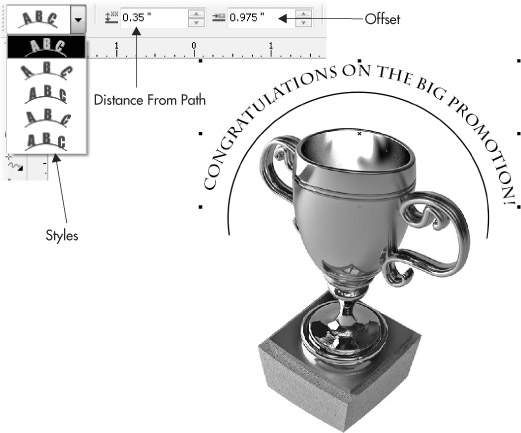
FIGURE 12-14 Use Fit Text To Curve to make your message a flowing one.
Embedding Objects into Text
Graphic objects and bitmaps can be embedded into blocks of artistic and paragraph text—in the layout profession, this is called an inline graphic. This is great for adding special symbols to text such as logotypes, bullet points, or horizontal separators, or for embedding instructional graphics such as mouse cursor images.
You embed an object into text in two ways:
• With the Clipboard Copy or cut the object to the Clipboard (CTRL+C or CTRL+X), click the Text tool in the text where you want the object to be placed, and paste the object (CTRL+V).
• Drag-and-Drop Select the object with the mouse, and then drag it with the right mouse button to the position in the text where you want it to appear—a vertical bar between characters in the text indicates where the object will be placed. Release the mouse button and select Copy Into Text or Move Into Text from the pop-up menu.
Embedded objects are treated as “special characters”—they can be selected only with the Text tool or the Shape tool. To resize an object after it has been embedded, select it and set its point size on the property bar as if it were a typographic character.
To delete an embedded object, select it with the Text tool and press DELETE.
Changing and Proofing Formatted Text
Once you have your text formatted the way you want, it’s still editable text; if you’ve entered it by hand, you should probably proof it before sending it off for printing. There’s no equity in 12,000 four-color posters that proudly exclaim, “Enter The Millyun Dollar Speling Contest!”, right? Proofing for spelling and grammar is easy: you select the text with either the Pick or the Text tool, and then press CTRL+F12 (or right-click and then choose Spell Check from the pop-up menu). You’ll see that you have not only a spelling, but also a grammar checker and a thesaurus right there at your cursor tip.
Spell checking is only one area of CorelDRAW that you can use to put the finishing touches on your text message; the following sections take you through other features and a little text preflight for your work.
Changing Text Case
Occasionally you’ll receive text from a client who doesn’t know where the CAPS LOCK key is on the keyboard, or you have a really, really old plain-text file created using a DOS application. In any event, using all caps in a text message, unless it’s a very brief headline, can be a real eyesore.
To change the case of text you have typed, insert the Text tool cursor in text, and then right-click the text: choose an option from the Change Case submenu. Changing the case of characters replaces the original characters with new characters of the correct case.
Hyphenation
It’s bad form to have two or more consecutive lines of text with a hyphen at the end, and this sometimes happens when you use a specific column width or frame shaping.
• To remove hyphenation from a paragraph, choose the text with either the Pick tool or the Text tool, then choose Text, and then uncheck Use Hyphenation.
• To manually hyphenate a line after hyphenation is turned off, you can put your cursor between the characters you want to break and then press CTRL+-. Alternatively, click the insertion point with the Text tool, and then choose Text | Insert Formatting Code | Optional Hyphen.
Converting Paragraph Text to Curves
It is possible to convert paragraph text to curves. By converting text to curves, the resulting shapes can be extensively modified, reshaped, and restyled. This is also a method for preventing others from making any text modifications to the document. It is also an acceptable way to prepare text-heavy illustrations for sharing when you’re confident that a coworker doesn’t own a font you used in the document.
To convert a paragraph text object to curves, select it and choose Arrange | Convert To Curves. Or, right-click the text object with the Pick tool, and choose Convert To Curves from the pop-up menu or press CTRL+Q. Because paragraph text as curves can have thousands of nodes, don’t perform this sort of thing thoughtlessly, and be prepared to wait a while during the conversion of large paragraphs. CorelDRAW converts paragraph text to curves quite intelligently; it breaks the text into groups, groups almost never consisting of a single shape that has more than 1,000 nodes. PostScript printing language has a complexity threshold of 1,000–1,200 nodes along a single path. If you ever arrive at a single curve shape that has more than this amount, you’re best off breaking the shape (Arrange | Break Curve Apart; CTRL+K) and then joining shapes that should be joined (Arrange | Combine; CTRL+L). Too many nodes, and a PostScript job will fail, and a commercial printer is not likely to thank you for your business.
Text and Styles
After you’ve created a specific look for text, it would be a shame not to be able to save it as a style so it can be reused later. You can create styles for artistic and paragraph text in CorelDRAW. Styles store the text attributes from one object and can be used to apply those attributes to other objects at a later time in the same document (styles are by default local properties). If you edit the properties of a style, all the text formatted with that style is updated immediately.
To save a style, with the Pick tool, choose the text, right-click, and then choose Styles | Save Style Properties, and you’ll get a box that looks like the following illustration. This box is valid for objects as well; object styles can also be applied for fill and outline settings.
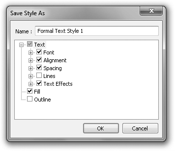
Creating and Editing Styles
In the Save Style As dialog, only select those formatting options that you want as part of the style. If, for example, you select the Text option but clear the Fill and Outline options, then applying this new style to some text will only modify the type-related properties and will keep the existing fill and outline.
Give the style a new, unique name. Click OK, and the style is created and ready for use on the Graphic and text styles docker, which is opened by pressing CTRL+F5 or by choosing Window | Dockers | Graphic And Text Styles. You drag the title of your saved style and drop it onto a text object you want formatted. Alternatively, right-click the text object and choose Styles | Apply in the pop-up menu; then choose the style you want from the list.
Editing Text Styles
To edit a style, right-click its title on the Graphic and text styles docker, and then choose Properties. This opens the Options dialog at the Styles page under Document, with the style selected in the list, from where you can enable and disable features of the style. You can also edit the settings of the style by clicking the Font, Fill, or Outline Edit button in the Options dialog.
To delete a style from the docker, right-click it and choose Delete. You cannot delete default styles.
TIP
To revert some text to its assigned style, either reapply the style, or right-click and choose Styles | Revert To Style from the pop-up menu.
You have in front of you a very handy and thorough documentation of how to make a text message stand out in the marketplace—how to attract attention in a polished, professional manner. From drop caps to justification, leading to indents, these aren’t just a typographer’s tools, but the tools of everyone who needs to communicate visually. After a while, what you used to consider an extraordinary effort to accomplish with text will feel quite natural and even ordinary. Now that you know how to drive CorelDRAW’s text engine, let’s learn the rules of the road in Chapter 13. Fonts are like any artistic element: there are wise and poor uses for typefaces, and you’ll want your message to read as well as it looks.