CHAPTER 23 Bitmap Boot Camp: Working with Photographs
A time will come when you’ll want to set aside the Bézier pen tool and the fountain fill—your layout for a brochure, for example, is all done, and now you want to add a photograph of your product, front page and center. The good news is that CorelDRAW can import just about any bitmap file you have. A photo from your camera, a scan of a photo, a painting you created in PHOTO-PAINT, or an image you snagged off your client’s website—you can crop, rotate, and perform enhancements on it right within CorelDRAW. This chapter takes you first through the structure of pixel-based images (bitmaps): how you can get them to print well, what you can and cannot do with them, special properties, and the difference between this type of graphic and the one you’re more accustomed to: vector artwork. Then you’ll work with some photographed and created bitmap images to learn how to do some basic—and some fairly advanced—image editing and enhancing.
Putting a photo into a CorelDRAW document isn’t very rewarding unless it’s a really good photo, and you feel confident it will print well. This chapter delivers the goods on the whats, whys, and whens for bitmap importing, finessing, and integration to make your documents come alive and communicate.
NOTE
Download and extract all the files from the Chapter23.zip archive to follow the tutorials in this chapter.
The Properties of a Pixel-Based Image
Many of us take the structure of a pixel-based image for granted, without a lot of concern over its structure. We take a photograph with our megapixel camera, we copy the image to hard disk as a JPEG, we email it, and that’s the end of the story.
However, if you want to do something with a digital image, such as incorporate it into a flyer, crop it, resize it, or put something else into it within a CorelDRAW composition, this is only the beginning of the story of pixel-based images and their manipulation. Without a cursory understanding of how pixel-based images are structured, you won’t be able to successfully do as many things as you’d like to with them in CorelDRAW. Therefore, the following sections dig a little into what goes into a pixel-based image, so you can get more out of them as covered in the rest of this chapter.
Pixel Artwork vs. Vector Artwork
Although there are two fundamentally different types of graphics you can work with on a personal computer—vector graphics and pixel graphics—actually 100 percent of what you see onscreen is a pixel-based graphic. Your computer monitor has no easy way to display vectors as vectors, so even when you work with paths in CorelDRAW, what you’re seeing onscreen is a pixel-based representation that CorelDRAW draws to your screen on-the-fly. This truth is not offered to make your life harder, but rather to get you thinking more about pixels as an art form and as a tool.
Vector artwork, the kind of art you create in CorelDRAW, is resolution independent, a term you’ll hear a lot, particularly if you’re around programmers. Resolution independent means that the art you create in CorelDRAW can be scaled up and down, rotated and distorted every which way, and it still retains focus and its structural integrity. Vector artwork can be boiled down to a direction a path travels in, the width of its outline, its fill color—regardless of how complex you make a drawing, it can be explained and saved to file in math terms. And because math can be divided and multiplied without discarding the values you put into an equation, you understand that scaling a vector drawing doesn’t change its core values. For example, 150 × 2 = 300 is an equation that results in twice the 150 value, but the 150 value isn’t really altered to produce a result of 300.
Pixel-based graphics, on the other hand, are resolution dependent. This means that a finite number of pixels goes into what you see onscreen, and it cannot be increased or decreased without making a visible, fundamental change to the structure of such a graphic. Pixel-based images aren’t usually as flexible as vector artwork; until you understand the term resolution, it’s quite possible to irrevocably damage a pixel-based image, throwing it out of focus or adding artifacting (explained in a moment). However, the positives of pixel images outweigh any negatives: while it’s very easy to take a snapshot, it’s quite hard to draw (using vectors) something that looks exactly like a photograph. Pixel-based images can have depth of field, exposure, a source of scene lighting, and other properties; although many talented artists have created CorelDRAW pieces that look almost like a photograph, many of us cannot invest the time and talent to “make photographs” using CorelDRAW. Fortunately, this chapter shows you the easy way to make your CorelDRAW more photographic in nature: you just import a photograph!
Artifacts and Anti-Aliasing
It’s possible to take resolution-dependent bitmap images and make them larger, artificially increasing the size (and the saved file size) of the final image. However, you cannot add detail to an existing photograph by enlarging it: when a computer application is commanded to add pixels to an image, it has no real way of telling what color pixels should be added to the photograph. Not CorelDRAW, not Adobe Photoshop—no application (except those phony forensic computers you see on TV shows) can intelligently, artistically, or accurately add, for example, detail to a photo of a mailbox so the address instantly becomes crisp and legible.
What you get when you perform any “make this photo larger” command is “fake resolution”; the program averages pixel colors neighboring the original pixels to create more, similarly colored pixels. This can often lead to artifacting, what we commonly describe as “there’s some junk in the upper left of this photo near my aunt’s face.” Artifacting can be introduced to a digital photograph at any stage of photography: your camera didn’t write the file correctly, the image became corrupted when you copied it to your hard drive, and/or you tried to enlarge a resolution-dependent image. The cure for the last reason here is, don’t resample important images; instead, print a copy of the image at its original size and see how it looks. From there, increase its size, check for visible artifacts in your print, and if there’s visible corruption, go back to your original, or seriously consider reshooting the image.
One of the methods CorelDRAW, PHOTO-PAINT, and other programs that can import bitmaps use to lessen and occasionally eliminate visible artifacting from resampling a photo is called anti-aliasing, and you have some control over this method, discussed later in this chapter. Anti-aliasing is a math calculation that performs averaging in a resulting photo that’s been altered in areas where there is visual ambiguity (some of the pesky pixels are traveling under an alias). For example, suppose you could photograph a checkerboard plane that extends from your feet way out to the horizon. You look down toward your feet and clearly see black squares and white squares. You look at the horizon, and you do not see clear edges of the black and white squares: actually you’ll see a lot of gray, as your mind blends black and white together because your eyes don’t have photoreceptors fine enough to resolve the very distant black and white squares. Similarly, our computers cannot reconcile black and white areas in a digital image that are smaller than the size of the pixels in the image, so when you resample the image, they create—inaccurately—little black and white squares where they shouldn’t be. The inaccuracy means the black and white squares are traveling as an alias and presenting themselves falsely.
Anti-aliasing comes to the designer’s rescue by averaging pixel colors when you resample such a checkerboard photo, or any photo. The anti-aliasing technique examines, in this example, areas that include both a white square and a black one, understands that both colors can’t be assigned to only one pixel, and so writes a blend of colors—gray—to the new pixel color value. At left in this illustration, you can see some unwanted patterning toward the horizon—this image was not anti-aliased when it was resampled to produce a larger image. At right, the same image was resampled using anti-aliasing; at 1:1 viewing, you can see the smooth transition as the checkerboard extends into the distance—and the close-up shows the result of good anti-aliasing (some applications anti-alias poorly)—gray is substituted for black and white when it’s a tossup for a single pixel color.

Bitmaps and Pixels
Programmers and users alike are accustomed to calling a pixel-based image a bitmap. However, the term “bitmap” is a little like the term “dial phone.” Telephones haven’t had dials in nearly two decades, and similarly, a bitmap—literally a map of bits of information— is inadequate to describe a pixel-based image, but “bitmap” is used as the term for non-vector graphics in this chapter anyway. We’re comfortable with the term, the term is described in the next paragraph, and “bitmap” is shorter to write than “pixel-based image.”
Let’s say you have onscreen a JPEG fresh off your camera. What are you seeing? Of course, you’re probably seeing a friend or relative, but what you’re really seeing is a finite number of placeholders for color—the number of placeholders for color is so large that your mind integrates the placeholders into a familiar image. That’s the “map” part of the term “bitmap”; this map could also be called a “mesh,” a “grid,” or a “canvas.” All the bitmap images you take with a camera or paint in a paint program are composed of information units all lined up in a grid. You don’t see the grid (or the map part of a bitmap); it’s only a figurative thing, intangible—it’s the structure for the visual information. The finer the grid, the less likely you are to see the individual color elements, instead of your mind blending the elements into a photograph. The “bit” part of the term “bitmap” is actually a byte of color information: a bit of information can only have two possible values (usually on or off); the graphics that artists work with today have a byte (8 bits) of information per color channel with which to express a color value. The term bitmap was coined in the days when a monitor could truly only display a color or no color; thus the term bitmap, and the term has stuck with us for more than 30 years.
To extend this explanation further, this unit of information lodged in a map is called a pixel, short for picture element, the smallest unit of color you can see in a bitmap image. A pixel is only a placeholder for a color value; it is not a unit of measurement. It doesn’t even have to be square (digital movie cameras take rectangular-proportioned movie pixels), and it has no fixed size. Other things a pixel is not include:
• A dot Occasionally even professionals will lapse into describing the resolution of a digital image in dots per inch. This is okay if they’re using the term “dot” as slang to mean a pixel, but this is confusing jargon. Printers print dots of toner and other pigment onto a surface (usually paper); a 1,200 dpi printer, for example, renders 1,200 dots of toner per inch of paper, but it is not rendering 1,200 pixels per inch of toner! In fact, a 1,200 dpi laser printer is incapable of rendering 1,200 pixels per inch (ppi). A pixel is not a dot of toner or ink, nor is a dot of ink equal to a pixel— pixels alone have no size.
• A screen phosphor or LED Pixels that make up an image do not correspond 1:1 to whatever the elements on your monitor are made of. With high-quality images, there are many more pixels per inch than there are light units (phosphors, LEDs, and so on) on your screen. This is why CorelDRAW and paint programs such as PHOTO-PAINT and Adobe Photoshop offer zoom tools, so you can get a better look at image areas, mapping small amounts of pixels to your screen, which has a finite number of light-emitting elements. Because resolution is discussed later in this chapter, it’s good to know that the most frequently used resolution for web graphics is 96 ppi (pixels per inch). Therefore, if the resolution of an image is also 96 ppi, this means that when you view it at 100 percent viewing resolution, what your screen’s light-emitting elements are mapping corresponds 1:1 to the image resolution. This means you’re viewing a bitmap graphic exactly as the creator of the bitmap intended it.
• Any sort of ratio The measurement commonly used in bitmap evaluation is pixels per inch, which is a ratio, like mph is a ratio—miles (one unit) per hour (a different unit). A pixel is a unit, but not a ratio, and therefore if someone says they have an image that’s 640×480 pixels, they’ve told you how many pixels are in the image, but not its resolution and not its size. A pixel is a unit, and needs to be contextualized— for example, 120 pixels per inch, or 300 pixels per centimeter—before the unit becomes meaningful and useful to a printer or designer. If you told friends you were driving your car down the autobahn at “200 miles,” they probably wouldn’t be impressed, because you haven’t contextualized this unit into something meaningful such as a measurement. But “200 miles per hour” tells your friends something—that they probably don’t want to ride with you.
Color Depth
In addition to being color value placeholders, pixels also have “depth”—not “depth” as we’d measure a swimming pool, but rather a color “density.” For example, GIF images have a maximum color depth of 256 unique values; grayscale images have a brightness depth of 256 shades.
Because 256 unique colors can’t truly express the beauty we capture with a digital camera (even dull scenes can contain tens of thousands of unique colors), programmers decided early on in the digital-imaging game to structure high-quality images into components, the most common structure being red, green, and blue, like your computer monitor is based on the RGB color model. We usually call these three components color channels: by adding the brightness values of these three channels together, we get the composite view of digital photos and other bitmaps. Channels are a very efficient method for storing bitmap color information—in contrast, GIF images store image colors as explicit color table values, and this is one of the reasons why GIF images are limited to 256 unique colors. By assigning the red, green, and blue color channels in a bitmap image an 8-bit-per-channel color capability, the color capability equals 28, meaning the red, green, and blue channels can each have one of 256 possible brightness values with which to contribute color to the RGB composite image. Eight bits per channel times three color channels adds up to 24-bit images—BMP, PNG, TIFF, TGA (Targa), and Photoshop PSD being the most common file formats that can hold this color information. So, 24-bit images have a maximum unique color capability of 16.7 million colors.
However, color depth doesn’t stop at 24-bit (8 bits per channel). Although monitors today can only display 24-bit image depth, the camera manufacturers anticipate that this will change soon, with the increasing popularity of high dynamic range (HDR) displays and higher-definition monitors. Today, many of the middle-range digital cameras can write photos to the RAW file format, whose specifics (including file extensions) vary from manufacturer to manufacturer, but happily CorelDRAW can import most digital camera RAW files. RAW files (as covered later in this chapter) are “unprocessed film”: they contain exposure settings, f-stops, and other camera data, but they also provide a lot of flexibility and leeway when you import such an image. CorelDRAW has a little utility called Camera RAW Lab where you can color-correct and change image exposure—all after the photo was taken. You can do this because RAW images can contain 16 bits per color channel, to offer a 48-bit image—more than 281 trillion possible colors…indeed this would require a very large crayon box.
Consider it a given that because CorelDRAW can handle such mega-information and has some very good processing tools for imported bitmap images, the compositions you create using bitmaps along with vector designs will print splendidly. Now it’s time to discuss image resolution as it relates to outputting your work.
Resolution and Resolution-Dependent Images
As mentioned earlier, resolution is expressed as a fraction, a ratio between units (pixels) and space (inches, usually). As you’ll see later in Table 23-1, a few image file types such as PSD and TIFF can store image resolution information, and this is good. For example, let’s say you need to inkjet-print a brochure, and the front page needs a photograph. A photograph of insufficient resolution is going to print lousily, pure and simple. However, if the photographer saved the digital photo to PSD, TIFF, PNG, or RAW camera file format (and knows about image resolution), you can import the image and know before you print whether the image needs to be resized (resizing is covered later in this chapter). The rule is that an image’s resolution should be in the neighborhood of your printer’s resolution. Therefore, let’s say that you’ve imported a photo and you know (by looking at the Bitmap page of Object Properties, covered in detail later in this chapter) that it’s 4″ wide, 3″ tall, and 250 pixels per inch in resolution. Your next move is to check the printer manufacturer’s documentation: although manufacturers tend to tap dance around specific printer resolutions, a good working guide is that an inkjet prints about one-third of the stated overall resolution on its box. If the box says the inkjet is a “720 dpi enhanced resolution,” disregard the hype about “enhanced” and cut to the chase: a 720 dpi (dots per inch, not pixels per inch) inkjet can render about 240 pixels per inch. Therefore in this example, you can indeed faithfully print this 4″×3″ image with no loss in image detail.
There is a way to tell the resolution of image file formats that cannot hold resolution information, so don’t worry if you have a bunch of JPEG images you want to use in a composition you need to inkjet-print. As you progress through this chapter, working tutorial files will demonstrate what you want to do and when.
Resolution vs. Image Size
Another digital-image reality that makes many designers pull their hair out is that image resolution is inversely proportional to dimensions: this is another cold, hard fact about bitmap resolution. When you make an image larger in dimensions, its resolution decreases. Viewing resolution and image resolution display the same thing onscreen, but changing viewing resolution—zooming in and out of an image—is nondestructive, whereas changing image resolution is destructive editing and often irreversible. Here’s an example that demonstrates the resolution-dependence properties of bitmaps. Figure 23-1 shows a desktop icon; it’s 48×48 pixels and the widely adopted resolution convention is that screen pixels are 96 per inch. At 1:1 viewing resolution, this icon looks fine, but when you zoom into it to 10:1 viewing resolution, it begins to look coarse. The same effect would be visible if you actually were to change the resolution of the image. Bitmap images are resolution dependent; the pixels you capture of a scene with a camera can’t be added-to later to increase detail—no application can guess what the extra detail and extra pixels would be. At right in Figure 23-1 you can see an extreme enlargement of the icon, and the pixels are so clearly visible that you can’t make out what the design is!

FIGURE 23-1 With resolution-dependent bitmaps, the larger the image, the fewer pixels per inch.
The lesson here is that to take advantage of the unique property of bitmap images—that they accurately portray a photographic scene—you need to take a photo that is high resolution— 3,264 pixels×2,448 pixels is average for an 8-megapixel camera, a little larger than 10″×8″ at 300 ppi. CorelDRAW can resize an image; for example, this same 8-megapixel image could also be expressed as 20″×15″ at 163 ppi without changing any visual information. CorelDRAW can also resample an image, and this is the destructive type of editing; you change pixels when you resample, so generally it’s a good idea to resize and to resample only as a last resort when adding photos to a CorelDRAW composition.
Importing Bitmaps into a Document
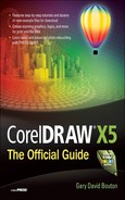
As a CorelDRAW user, you have at your fingertips a vast collection of bitmap import filter selections. Although import commands are discussed in Chapter 3, some of the import options apply specifically to bitmaps and are explained here; you’ll find them useful if your work requires photographs and graphics from the Web. Table 23-1 does not list the bitmap types CorelDRAW can import the way that the Files Of Type drop-down list does in the Import dialog. Although it’s terrific to have a billion different file types available for import, particularly if you have legacy file formats, you’ll probably only use a handful of image types in everyday work. Therefore, the table lists the most common file types first; more exotic and legacy file formats appear toward the bottom of this table. The asterisk after the file extension indicates that a file type can retain resolution information; this is a capability—it doesn’t necessarily mean the person who saved the file actually saved resolution information.
If you intend to print a CorelDRAW composition you’ve created that features a bitmap photo or painting, step 1 is to set up the color management of the document. You can access settings for your document’s color profile through Tools | Color Management | Default Settings. Read Chapter 17 for the details on color management: what it does and why you should use it to increase your chances of faithful color output to print and to the monitor. The following steps aren’t a tutorial but rather a checklist, a workflow based on your need to bring a copy of a photo into a CorelDRAW composition:
1. After launching CorelDRAW, press CTRL+N (File | New) if you’ve set up your copy not to show the Create A New Document dialog after launch.
2. Define the Color Settings after you’ve specified page size, resolution, and other parameters. Your color settings—the color space within which everything on the page “resides”—are not “Oh, yes! I know the answer!” sorts of decisions you make lightly. Generally, you’re safe choosing sRGB IEC61996-2.1 because many digital cameras and scanners use this color profile. If, however, after importing a photo, the photo looks dull or lacks contrast, the color space of the photo doesn’t match the color settings of your CorelDRAW document. This can be changed later; let’s continue the workflow here…
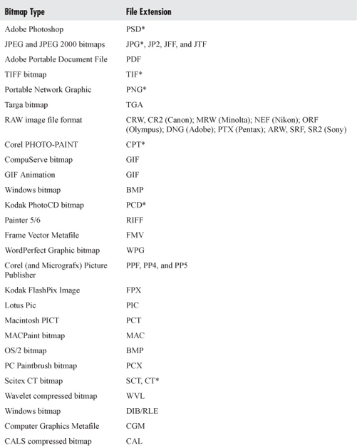
TABLE 23-1 CorelDRAW X5’s Importable Bitmap Formats
3. Before importing a photo, choose Tools | Color Management | Default Settings. Check both the “Warn on color profile mismatch” and the “Warn on missing color profile” boxes in both the Open and the Import And Paste areas in Color Management Policies. You’re all set to import a photo now.

4. When you choose File | Import (or press CTRL+I), you then have the opportunity to scale an image before placing it on the page. More experienced users might want to simply drag an image file into the workspace when CorelDRAW is not maximized. Using either technique, when you import an image, if it has a color profile that doesn’t match your current document—or has no color profile at all—you’ll get an alert box where you have the opportunity to choose the color space for the imported image.

5. Generally, you’ll want to choose the same color space as the document’s color space. However, if you set up your document incorrectly—for example, your client specified Adobe RGB, you had soap in your ears, and thought they said “sRGB”—import the photo using the Adobe RGB choice from the drop-down list. Then choose Tools | Color Management | Document Settings, and choose Adobe RGB from the RGB dropdown list in the Edit Document Color Settings area. Choose “Convert document colors to new color profiles”—do not use “Assign different colors profiles,” because this will introduce color-shifting.
Because the method of dragging an image file into the workspace doesn’t afford scaling options, you might want to stick with CTRL+I for importing. File | Import also gives you the chance to filter for the file types you seek in a Windows folder, and you have other options in the Import dialog (discussed in Chapter 24). Choose your bitmap format from the Files Of Type menu.
After the Import dialog closes, your cursor will change to an import cursor that has two functions: with it you specify the upper-left corner of your new bitmap using a single-click, which in turn imports the image onto a document page at its original size—whatever dimensions, by whatever its original saved resolution. Pressing ENTER instead of using a mouse click imports the image to the center of the page.
Placing and Modifying an Image
The best way to get the hang of inserting an image into a CorelDRAW composition is by example: open Wally’s Wheel’s.cdr, and in the tutorial to follow you’ll place a picture of an auto and then perform a little manual cropping.
In addition to clicking or pressing ENTER with a cursor that’s loaded with an image you import, you can also place and proportionately scale the imported image by click-dragging diagonally. After you specify the size this way, the bitmap is imported and automatically resized to closely fit the defined area with the original proportions of the bitmap preserved, but the resolution will not be the original’s. As you drag, the cursor changes orientation and the image’s bounding box appears, showing the space the new image will occupy. While importing during either operation, the original filename and the image dimensions are displayed beside the cursor. Your goal in the next steps is to place Expensive car.jpg at the top of the 5″×7″ riser card layout. As you work through the steps, you’ll note that the document’s color space isn’t the same as the JPEG image, but you already know how to correct this. The native dimensions of the JPEG are also larger than the CorelDRAW page layout, which affords the perfect opportunity to try out this importing and scaling stuff.
NOTE
You don’t have to import large bitmap images to use them in a CorelDRAW composition. Instead, you can link to images externally, and CorelDRAW displays a low-resolution version of the image on the page. After you choose to Import a photo, click the name of the file in the Import dialog box, and then click the dropdown list arrow on the Import button. Choose Import As Externally Linked Image (in Windows 7 and Windows Vista) or enable the Link Bitmap Externally check box (in Windows XP). You can review externally linked photos in your CorelDRAW documents at any time by choosing Window | Dockers | Links And Bookmarks. Camera RAW images cannot be linked externally, and remember that if you change the location of a linked photo or delete it, your document won’t print correctly. The purpose of externally linking to large bitmap images is to keep CorelDRAW file sizes down while allowing the original bitmap to be modified—usually optimized for high-resolution PostScript output.
 Putting a Picture into a Car Advertisement
1. Click the Import icon on the standard toolbar or press CTRL+I to import the Expensive car.jpg. Locate it on your hard drive, select the file, and then click Import.
2. You’ll now see the attention box that tells you that the Expensive car.jpg is not tagged with the same color space as the Wally’s Wheels.cdr file. Click the Convert From Embedded Profile To The Document Profile radio button, and then click OK. Often you’ll notice a color difference in the image you view on the page if you choose to ignore the color profile (the first option in this attention box) instead of allowing CorelDRAW to convert it to the document’s color space. Another good reason not to ignore a color profile is that if you send this file to a commercial printer with two different color spaces in the document, the commercial printer is not likely to thank you for the time and paper the two of you have wasted. One document requires one color profile for all of its contents.
3. Begin your click as close as possible to the upper-left corner, and then drag down and to the right; don’t release the mouse button yet. When you believe you’re very close to the right edge of the layout, look at the cursor. If the dimensions it reports are close to 5 inches, release the mouse button. In Figure 23-2, if you can read the cursor, it reports a height and width of 4.997 inches, which is close enough for government work. Move your pointing device up and down on the page just a fractional amount until you’re close to 5 inches, and then release the mouse button.
4. If you want this image (or one in your own assignment) to be exactly 5″ wide, now choose Arrange | Transformations | Size. Click the top left check box below the Proportional check box to set the direction in which the image should be scaled, and then type 5 in the H (horizontal, the width) field, press ENTER, and you’ve accomplished precision placement and scaling.
5. Save this file to hard disk, and keep it open for the sections to follow.
TIP
Bitmap images can’t be edited at the pixel level directly in CorelDRAW. For example, if your cousin Flossie’s mascara is a little runny in the photo, this is an isolated photo problem area, and you need to use a bitmap-editing application to make the makeup look better. Not to worry, Flossie: you can open PHOTO-PAINT by clicking the Edit bitmap button on the property bar or by right-clicking the bitmap and then choosing to edit it from the context menu. See Chapters 24 and 25 for details on common—and a few not so common—editing techniques using PHOTO-PAINT.
Switching from Resizing to Resampling
If you had right-clicked the Expensive Car.jpg image in the Import dialog earlier and then chosen Properties | Details, Windows would have told you the image is 1,700×1,700 pixels at a resolution of 266 pixels per inch. Any bitmap’s resolution can be discovered this way, within the Import dialog and anywhere in Windows where you can open a folder. However, if you click the image as placed now, the status bar will tell you that Expensive car.jpg on Layer 1 is currently 340 pixels per inch in resolution. The reason is that image resolution is inversely proportional to image dimensions—you make one smaller and the other one becomes larger, as discussed earlier. This is a function of resizing; by default, CorelDRAW doesn’t change the number of pixels in an imported photo.

FIGURE 23-2 Import a copy of an image you want to use at a specific size by click-dragging in the document.
However, an imaging service bureau or commercial printer might request that an image placed in a CorelDRAW file be of a specific resolution. A lot of services that make full-color business cards, for example, want 300 ppi images in files, and they often reject art or charge extra for processing fees if an image is of higher resolution. When you change the number of pixels in an image, this is not called resizing, but is instead called resampling, and you’re altering the visual content of the copy of the image in your CorelDRAW document.
Let’s pretend that this auto advertisement needs to be sent to a commercial printer with the image at exactly 300 ppi (pixels per inch; alternatively, dots per inch, dpi). Follow these brief steps to prep this file for proper printing.
Resampling a Photo
1. Select the image with the Pick tool.
2. Choose Bitmaps | Resample.
3. While Identical Values is checked, type 300 in either the Horizontal or the Vertical Resolution field.
4. Check Anti-alias (which makes the reduction of the image smooth and basically undetectable from the original image), check Maintain Aspect Ratio, but do not check Maintain Original Size. If you maintained the original size of the image, no resampling would take place; instead resizing would. Compare the Original Image Size and New Image Size in this dialog; this not only provides you with an estimate of how large your saved CorelDRAW file will be, but it’s also intellectual reassurance that you’re down-sampling the photo and not simply resizing it. Click OK and you’re finished. Keep the file open because the layout isn’t done. Yet.

Non-Rectangular Cropping in a Jiffy
This mock advertisement clearly is designed on the diagonal, but the car image—like most bitmap images—is rectangular, somewhat spoiling the look of the ad as it’s currently placed. This isn’t a big design challenge; it’s an opportunity to explore CorelDRAW’s cropping features. CorelDRAW offers a Crop tool on the toolbox, which (as discussed in Chapter 25) performs destructive editing. No, it doesn’t paint a moustache or blacken a front tooth on your portrait photos, but it does permanently remove areas of a bitmap (and vector objects) that lie outside of the crop you define. It’s useful, but unnecessary for this assignment when you learn how to use the Shape tool.
CorelDRAW considers any placed bitmap image to be an object that has four control nodes, one at each corner of the rectangle. Moreover, these control nodes can be moved (inward because there’s nothing outside of the boundary of a bitmap) to change the shape of a bitmap without removing areas of the bitmap—CorelDRAW simply hides them for you. Work through the following steps to hide a triangular area of the placed Expensive Car.jpg image and complete the design.
Cropping with the Shape Tool
1. With the Pick tool, select the image and then press CTRL+PAGE DOWN to put the image behind the text at top.
2. Choose the Shape tool from the toolbox.
3. Click on the image to reveal the control nodes.
4. One approach to removing the slice of the image that’s covering Wally’s name is to hold CTRL (to constrain the direction in which you’ll drag the node) and then to click-drag the left bottom control node way up to about the 5″ tick on the vertical ruler so you can see the underlying stripes. Then while holding CTRL, drag the control node down so it meets the bottom of the top diagonal stripe in the design. Then perform the same action on the bottom right control node. Nodes can be nudged: try saying that three times fast! You can use your UP ARROW and DOWN ARROW keys to nudge a selected image control node up or down. If you choose this method, it offers precision and you don’t have to hold CTRL. You can also use the super nudge option and hold SHIFT while pressing the UP ARROW and DOWN ARROW keys. By default, if you hold SHIFT, your nudges are twice the value you set.
TIP
Although nudge distance isn’t visible on the property bar when the Shape tool is active, you can choose the Pick tool, deselect any selection (click an empty area of the document window), and set a nudge value that will apply to the Shape tool when you switch back to it.
Importing Nonstandard Bitmaps
With kind permission from Nicky Elliott, a small version, Monkey Pants Media.psd, of her Monkey Pants Media poster has been provided so you can get hands-on experience importing and performing a minor edit with a bitmap type that CorelDRAW handles well. Adobe Photoshop and Corel PHOTO-PAINT both can write image files that contain layers; you’ll see the advantages to using a layered bitmap image shortly, tutorial style. When you choose File | Import and then choose PSD, PHOTO-PAINT’s CPT, or even Corel Painter’s RIFF file format, any layers in these file types are imported and nested within an entry on a CorelDRAW layer. You can un-nest the layers, move them, and delete them, and one of the most useful properties of image files that are layered is that the file’s creator probably did so to include partially transparent areas within the bitmap composition.
Let’s say Ms. Elliott wants a change made to the background of the Monkey Pants poster, that she’d prefer a more dramatic treatment than the medium blue solid color. Here’s how to import and edit a layered bitmap image.
Working with Layered Bitmaps
1. Create a new document. Standard letter size is fine—the Monkey Pants Media.psd file is 8″×10″ at 96 ppi resolution, so it will comfortably fit inside standard letter size at its original 100% size.
2. Click the Import button on the standard toolbar, and then in the Import dialog, scout down Monkey Pants Media.psd on your hard drive. Select it, and then click Import.
3. With the cursor loaded and ready to place a copy of the file, press ENTER to place the file at full size, centered on the page.
4. Choose Tools | Object Manager. Click the + icon to the left of the imported image title to open its nest of layers.
5. Click the Background layer item on the list to select it in the document window. This was a thoughtfully prepared file; the layers were named in Photoshop. In your own work, you might not be so fortunate if the creator of the layered file didn’t name the layers. Therefore, always check what’s selected in the drawing window before proceeding.
6. You’re sure the blue background is selected? Then click the trash icon to delete this layer.

7. Choose the Rectangle tool from the toolbox, and then drag a rectangle of about the size of the Background layer you deleted.
8. On the Object Manager, click-drag the Monkey Pants Media.psd entry to above the Rectangle entry. This puts the remaining two nested layers above the rectangle.
9. Choose the Interactive fill tool from the toolbox. Click to select the rectangle, and then choose Radial as the style of the fill from the property bar.
10. Click the inner color marker on the Radial fountain fill, and then click a bright yellow swatch on the Color Palette. Click the outer color marker, and then click a dramatic deep blue on the Color Palette.

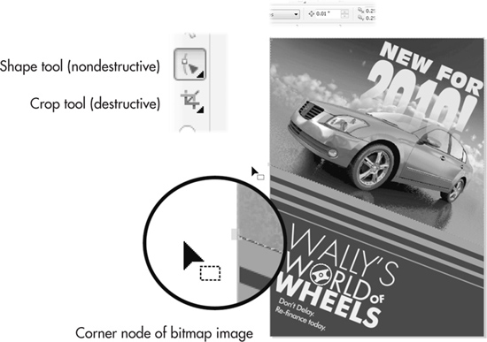
11. The logo layer could use some visual separation from the background. CorelDRAW native effects can be applied to nontransparent areas of imported bitmap layers: choose the Drop Shadow tool from the toolbox, select the logo on the page by clicking on the title “logo” in the Object Manager list, and choose Large Glow from the Presets list on the property bar.
FIGURE 23-3 Combine CorelDRAW objects with layered bitmap file to extensively edit layouts.
12. Large Glow, at its default settings, will not provide much of an effect. So you change the default settings: click the outer color marker, and then choose black from the Shadow color pop-up on the property bar. Then, set the Shadow opacity (also on the property bar) to almost 100% opaque. Finally, set the Shadow feathering to only about 10. Figure 23-3 shows a dramatic transformation of the poster—and because the imported bitmap layers can be edited separately, you can even reposition the Monkey Pants logo on the CorelDRAW page.
Working with RAW Images
Camera RAW is the new generation of high-fidelity imaging; it’s affordable, most cameras you don’t buy at a drugstore can write a RAW file format, and as with any comparatively new technology, there’s a small learning curve we’ll tackle in this section.
A RAW image is similar to an unprocessed physical piece of camera film; although it contains a lot of data about exposure, light temperature, f-stop, lens, and other conditions, the RAW image does not have locked data about pixel colors. RAW offers the ultimate in flexibility—if the light was too low or the wrong temperature, you can adjust for these and other flaws through CorelDRAW’s Camera RAW Lab. The Camera RAW Lab appears after you choose to import a RAW camera image; a RAW image cannot be placed in a CorelDRAW composition before it passes through the lab (even if you choose not to do anything to the image). Depending on your camera settings, you’ll most likely be working with a 48-bit image, 16 bits per channel; this offers a color space of several trillion unique colors and is part of the reason why RAW images can be adjusted to make dramatic lighting changes while retaining high image fidelity.
Working with the Camera RAW Lab
Working with the Camera RAW Lab in CorelDRAW is an experience you won’t want to miss. If you don’t have a RAW image handy or if your camera cannot take RAW file format images, a small DNG file is in the zip archive you downloaded for this chapter.
Because no two manufacturers could agree on a file extension, a RAW image could have .CRW, .DNG, or any of over a dozen other extensions. The good news is that CorelDRAW doesn’t care about the file extension—you just choose All File Formats from the dropdown list in the Import dialog, and then navigate to the location of a RAW image—in the following example, Catch of The Day.dng. The better news is that CorelDRAW can import RAW images from a three-page list of manufacturers—just short of photos on a View-Master reel, you’re assured that CorelDRAW can import most RAW files.
NOTE
The current color space of an open CorelDRAW document is displayed in the Properties tab. Camera RAW has no color space tag, but one is assigned by Camera RAW Lab on its way into the document using the current CorelDRAW document’s color space.
Let’s dig right into the features and options available to you when you import a RAW image; follow these steps and guidelines to import the image, and then perform minor processing enhancements. There’s nothing truly wrong with the image, but this tutorial is instead an opportunity to gain hands-on experience with the Camera RAW Lab features.
Correcting RAW Image Color
1. Choose File | Import, or click the Import button on the standard toolbar.
2. Choose All File Formats, and then choose Catch of The Day.dng from the folder you downloaded the file to. Click Import or press ENTER.
3. The Camera RAW Lab interface appears. First, check the properties of this unprocessed photograph. The Properties tab of the interface tells the day and date of the photo, the camera, whether flash was used, aperture, and ISO-equivalent film speed. If you’re familiar at all with cameras, the info shown here will give you a clue to what, if anything, needs adjusting in the image. For example, the photo has a very shallow depth of field and isn’t truly an “out of focus” picture: at ISO 50 at an f-stop of 2.2 and a shutter speed of 1/25th of a second, the Properties tab confirms this. Also, because a flash wasn’t used, when you get to the Color tab, you can rule out Flash as a choice from the White Balance options.

4. The Detail tab has a slider for sharpening the image as well as sliders for reducing Luminance Noise and overall Color Noise. This photo doesn’t require these enhancements. The Hints area at the bottom of the tab is a handy context-sensitive reminder of what each slider does, and before you take your next RAW image, it’s good practice to “get it right in the camera.” You’ll get less noise in a photo generally if you set your camera to slower ISO speeds. The ISO of 50 in this example image produced very little visible noise (similar to grain in traditional physical film), but an ISO setting of say, 400, for the camera that took this photo would indeed have required noise reduction using the Detail sliders.
5. Click the Color tab; here’s where the fun begins. Follow the callout letters in Figure 23-4 to guide you through which features do what.

FIGURE 23-4 Use the Camera RAW Lab to color- and tone-correct high-quality digital images.
• The A area is for rotating the RAW image before placing the copy into your CorelDRAW document. RAW camera data can also include portrait and landscape orientation, so you might never need to use these buttons if your camera saved orientation info.
• B marks your navigation tools for previewing the image. From left to right you have tools for panning the window (click-drag when your cursor is inside the preview window), zoom in and out, Fit To Window, 100% (1:1) viewing resolution, and finally a slider to zoom your current view in and out.
• C marks the Split Pane view (shown in the previous illustration) so you can compare the original image with any corrections you make.
• D marks the Color Depth. You’d be ill-advised to change this from 48-bit, because only a high-depth image can be adjusted extensively without taking on banding and color clipping (explained shortly). The only reason you’d choose 24-bit from the selector list is if the image were flawless and you wanted to get down to work by placing it in your document and saving space on your hard disk.
• E marks the White Balance selector. You have many choices that influence the color casting of the RAW image. Ideally, you want the placed image to be casting neutral; the grays in the image contain no hues, and the photo looks neither too warm nor too cold. You have selections such as Tungsten, Cloudy, and other lighting conditions that influence the color cast of images. “As Shot” is the default setting, and this image appears to be fine As Shot.
• F is the White Balance eyedropper tool, used to define a completely neutral area in the preview window to better set and possibly neutralize color casting. The cursor for this tool gives you an RGB readout of the current area in the preview photo; this is the true color over a pixel, and not the “ideally neutral color.” You click an area you believe should contain equal amounts of red, green, and blue components (R:64, G:64, B:64, for example), and this action remaps the image to reflect the color casting in the image based on where you clicked. Although it’s a useful tool, you might not have a photo that contains a perfectly white or a perfectly neutral gray area; if this is the case, don’t use this tool.
• G marks color Temperature and Tint, perhaps the least intuitive of RAW digital image properties. The values in the Camera RAW Lab’s color Temperature controls run from low at the left of the slider (cools down warm images) to high at right (warms cool images). The temperature controls, specifically values you enter in the numeric field, are not degrees of Kelvin; they are correction values for you to only refer to and compare with other settings and other images. However, it is correct to think of color temperature in general as measured in degrees Kelvin. You might want to “uncorrect” a perfect image to make it warmer or colder. The Tint slider is the color complement of the color Temperature control; a neutral temperature displays a band on the Tint slider from magenta at left to green at right. You always use Tint after you’ve set Temperature because Tint varies according to temperature.
• H is the Saturation control, which is mostly self-explanatory—it’s used to compensate for dull photographs (you increase Saturation) or for overly colorful images (you desaturate by dragging to the left with the slider).
• I marks the Exposure control. Exposure is not the same as, for example, the brightness/contrast controls on a TV set or the Levels command in image-editing applications. Exposure is the total light that falls on a scene, and it’s set when you take a picture by setting the ISO value. Therefore, it’s always a good idea to double-check the info in the Properties tab: if the ISO is a low value and the picture looks dark or muddy, then Exposure is probably the Color option that needs adjusting.
• J marks Brightness, which you should play with only after setting the best Exposure. If you drag Brightness to the right with this image, you’ll see that the midtones of the image become brighter, but not the shadow areas. So you use this slider to bring out detail in the midranges in an image without ruining the deeper tones.
• K is the Shadow slider, and this option is used only to make deeper areas more pronounced without affecting the midtones and highlights. Shadows might also be called “contrast”; dragging the slider to the right does indeed create a difference between the lighter and darker areas of the overall image.
• L marks both the Shadow and Highlights clipping regions. These two buttons— you need to click these buttons—that frame the histogram (M), will display a bright red overlay in the preview window in areas where the brightest brights have fallen out of range (they can’t be accurately displayed onscreen, and they can’t be accurately printed); and deepest shadows will display a green-tinted overlay. If you see a tint in areas, this means that the Shadow, the Exposure, or the Saturation adjustments you’ve made are too intense. The solution is to choose lesser values for any of these options until the tint disappears in the preview window.
• M is the histogram of the current photograph. A histogram is a visual representation of how many pixels of what color are located at what brightness in the image. Although there are always exceptions to any rule, and all photos have different brightness content, usually a well-toned image will have a lot of color pixels in the mid-region of the histogram—this is where the most visual detail is apparent in digital photographs. If the histogram shows too many pixels—for example, in the lower regions there’s a hump in the histogram curve toward the left—it means your image needs less Shadow or more Exposure.
• N is the area where you can create Snapshots. When you arrive at a good exposure for an image you want to copy into a page, click the Create Snapshot button, and a thumbnail appears at bottom left. Snapshots are not saved; their purpose is for you to compare snapshots and ultimately to choose one you’ll import.
6. Once you’ve made your adjustments, click OK, and you’re then presented with a loaded cursor for placing and scaling the imported image, as discussed earlier in this chapter.
TIP
To import more than one digital image at a time, hold SHIFT while clicking to select contiguous files, or hold CTRL while clicking to select noncontiguous files in the Import dialog. As multiple files are imported, the cursor indicates the file information for each image being placed.
An Everyday Bitmap-Oriented Workflow
In addition to CorelDRAW’s capabilities to import, resize, resample, and develop RAW images, you also have many of PHOTO-PAINT’s effects right within CorelDRAW to filter imported images. And CorelDRAW has an Image Adjustment Lab for enhancing RAW file format images. Once you’re finished working on a composition, whether it’s vector, bitmap, or a combination of these two elements, you probably want to pop a copy of your work off to a friend or a client. The following sections take you through these four stages of CorelDRAW design work; in the process you’ll grow quite comfortable with all this “bitmap stuff” and appreciate CorelDRAW’s power to bring different media together for both your import and export needs.
Creating a Catalog Cover
Lux, a fictitious candle manufacturer, needs a new catalog cover for 2010. As to be expected, they have no money to take a new picture for the cover, but they’ve heard that your copy of CorelDRAW X5 ships with some really cool filters that might put a new spin on an old image. Follow along in the next sections’ steps to take a tour of the Image Adjustment Lab, the Bitmap effects CorelDRAW offers, and as a grand finale, you’ll breeze through the export options for the JPEG file format so you can send a rough layout to the fictitious client.
Working in the Image Adjustment Lab
For “normal” photographs—photos in JPEG, TIFF, and file formats other than Camera RAW— you have under the Bitmaps menu in CorelDRAW a fairly comprehensive Image Adjustment Lab to make practically every global adjustment (but not pixel-editing adjustments) you’ll find in PHOTO-PAINT. This makes it very easy to photo-correct imported bitmaps and to integrate them into a composition without ever leaving CorelDRAW; better still, the features are almost identical to those in the Camera RAW Lab.
Let’s work through the mock assignment now: first, you’ll import and place an image in the layout that’s been designed for you.
Adjusting a PNG Image in the Lab
1. Open LUM catalog.cdr. Choose the Object Manager docker (Tools | Object Manager). Click the “put the photo on this layer” title on the Object Manager to make it the current layer (the background layer with the text is locked).
2. Choose File | Import (CTRL+I), and then choose LUM candles.png from the location where you downloaded it. Click Import.
3. Your cursor is loaded with the image now, and it’s much larger than the place for it within the layout, so you’ll scale the image as you place it. First, make sure Snap To Guidelines is checked on the Snap To list on the standard toolbar. Click an insertion point at the top left of the guides intersection; then drag down until the right edge of the image meets the right guide. You’ve scaled and placed the image now, as shown in Figure 23-5.
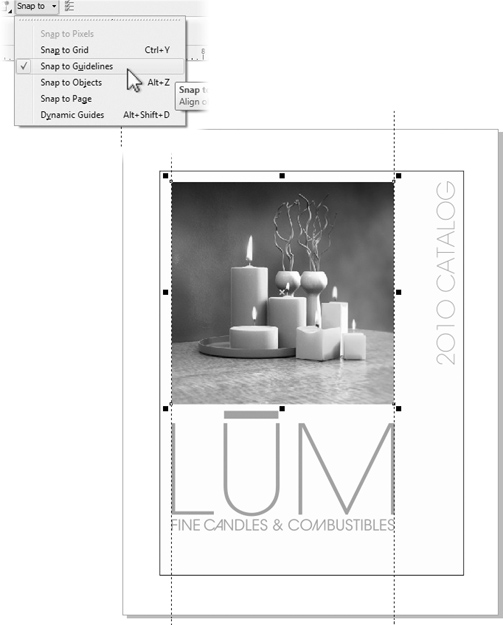
FIGURE 23-5 Scale the imported image as you place it in the design.
4. With the photo selected, choose Bitmaps | Image Adjustment Lab.
5. In Figure 23-6 you’ll see a lot of the same navigation controls as you saw in the Camera RAW Lab. However, the Image Adjustment Lab has slightly different features for color and tone adjustments. Always shoot for tone correction for exposure, and then work on the color if necessary.
• A marks Auto Adjust, a one-step routine that adds contrast to an image; let’s skip this feature—automated routines don’t give “one off” assignments the custom attention they need, and you don’t learn anything from automated routines.
• B marks the White Point eyedropper tool, used to define in the preview window the lightest area that should be in the picture. Click in the center of one of the candle flames (presumably the whitest white in the image) to see if the Lab adjusts the other tones and snaps up the image.

FIGURE 23-6 Color- and tone-correction can be performed on photographs with CorelDRAW.
• C marks the Black Point eyedropper, which redefines the darkest point in the image based on where you click in the preview window. This step is optional; hover your cursor over the top left of the background in the image. Your cursor will tell you that the background toward the top is almost black with a little red tossed in. Click this point with the eyedropper tool. Your artistic judgment might tell you that the preview pane at right shows a better, snappier image. If you disagree, click the “Reverse the last operation” left-arrow button at bottom left.
• D marks the Brightness and Contrast sliders. They basically do what you’d expect; they’re like the controls on a television set, but as with a TV set, brightness and contrast don’t always make an image better. Skip these controls for this assignment.
• E marks the area the professionals use to selectively add contrast and to remove any murkiness the photo might have as a result of too many pixels of similar brightness values neighboring one another in an area of the picture. Leave the Highlights slider alone in this assignment; this brightens the brighter areas in the image without affecting the midtones or shadow areas. However, do drag the Midtones slider up to 2 to open up darker regions to provide image detail without messing up the Shadows region, which is fine as is.
6. Finally, click the Create Snapshot button (F). This creates an entry on the Undo docker in case you want to reverse a correction after exiting the lab. Click OK and your adjusted image is now placed in the layout. Keep the file open and Save (press CTRL+S).
Photo Effects
If you need to do something dramatic to a photo, such as making a film negative version (using the Invert style), you have these options:
• Put an object over the photo, and then use lens effects, covered in Chapter 22. You might not get exactly the effect you want with a lens, so the advantage to this method is that the change isn’t made directly to the photo—a lens effect can be deleted at any time, restoring the normal appearance of objects beneath it.
• Use the effects on the bottom of the Bitmaps menu, as you’ll do in the following tutorial.
Effects you apply via the Bitmaps menu are permanent changes; the bad news is that you can choose to Undo an applied effect only right after you’ve made one. The good news is that all effects are applied only to an image you’ve imported—your original photo is safely tucked away somewhere on hard disk. Effects filters in CorelDRAW are divided into categories, and you’ll be using only two from the Color Transform and Art Strokes categories in this assignment. You should feel free to set aside some time to experiment with the various filters on an image you believe has the potential to look more interesting after a little Distortion or Trace Contour filtering.
It’s important to understand that any filter you apply to a photo removes original image information and occasionally supplies altered image information. Therefore, you need to make a creative and qualitative judgment as to whether an image looks “better” after applying one or more filters. There is no such thing as “Instant Art.” You need to use your artistic taste when allowing a filter to change the original image’s data, and don’t dismiss the possibility that an original image might look better and be more appropriate than a filtered one.
Usually, you’d want to reach for the Bitmaps menu filters for two occasions:
• When a photography session isn’t possible to provide a new photo for a new catalog or brochure. You or the client have to use an older photo, but you want it to look a little different from last year’s photo.
• When a photo is visually boring. It’s not a bad photo, just an uninspired photograph whose composition, geometry, and colors are very staid and simple. The LUX candle image isn’t a bad image; its problems in this example are that it was used last year, and the geometry in the scene is exceptionally simple and looks like any still photo of a bunch of cylinders.
To use a bitmaps effect, you first need to have an imported bitmap selected. The bitmap has to be either an 8-bit (Grayscale mode, for example) or 24-bit image in either RGB or CMYK color mode. RAW images you import—if they are higher than 24-bit—need to be changed to a bit depth the effects can work with. In English, if the effects menus and submenus are dimmed, choose Bitmaps | Mode; then convert the selected image to RGB 24-bit, and life is good. Working with an effect is easy and intuitive: you have different options and sliders depending on the specific effect, but to work an effect, there are four key areas of the dialog that appears when you choose one:
• Preview Even at an effect’s default settings, you need to click Preview to see what the effect will look like on the page.
• Reset Clicking this button removes all changes you’ve made to the sliders and other controls for all effects.
• OK Clicking this applies the effect using the options you’ve defined and closes the dialog.
• Controls To customize an effect, you drag sliders, enter values in num boxes, and/or drag other controls such as the direction of an effect.
Once you’ve made changes to the effect’s values, you click Preview to update the page preview, and when you’re satisfied with the customized effect, you click OK.

In the following steps, you’re going to kick out all the stops and combine two effects to create a unique stylized version of the candles image. You’ll duplicate the image, apply two different filters to the two images, and then use CorelDRAW’s transparency effect to combine the two filtered images. You don’t have to do this in your own work if one effect filter does the job, but these steps show that you can.
Filtering a Photo
1. With the Pick tool, click-drag the candles image to the right and then tap the right mouse button before releasing both buttons to drop a copy of it to the right of the original.
2. With the duplicate selected, choose Effects | Adjust | Hue/Saturation/Lightness. Drag the Saturation slider all the way to the left to make a grayscale version of the image, and then click OK to apply. You do this to prepare the duplicate image for a filter effect; this command could also be done in the Image Adjustment Lab.
3. Choose Bitmaps | Contour | Find Edges. In the Find Edges box, click the Solid button, click Preview, utter some amazement at how neat the outline version of the image looks, and then click OK to apply the effect.
4. Select the original image. Choose Bitmaps | Art Strokes | Crayon. Drag the Size slider to 20, set the Outline slider to 0, click Preview, and then click OK to apply.
5. With the Pick tool, drag the duplicate over so it’s aligned on top of the original. The guides should help snap the duplicate into perfect alignment.
Choose the Transparency tool from the toolbox. Select the top duplicate image and then on the property bar, set the type of transparency to Uniform (from the drop-down list), and then first try the If Lighter operation from the drop-down list. Divide and Texturize operations also produce an interesting effect. It’s your call here, and 50% Uniform transparency seems to work best. Figure 23-7 shows the process of laying the Find Edges version of the bitmap over the Crayon filtered image.

FIGURE 23-7 Add two different filtered images to create a composite by using Transparency.
Exporting Your Composition to Bitmap Format
One of the terrific things about designing using a computer application is that you can repurpose a good design. A good design such as the front cover of the catalog just discussed can yield several different uses from only one investment in time—and from knowing how to export the design.
Although CorelDRAW is a vector drawing program, it can create a bitmap copy of photographs, a bitmap from photos combined with vectors, and it can export vector art only—text, graphics, anything is fair game. When vectors are copied out of CorelDRAW as bitmaps, a process called rasterizing is performed; CorelDRAW examines the vector artwork at the size and resolution you specify and then uses anti-aliasing (unless you specify no anti-aliasing) to create a bitmap that looks as good as what you see onscreen in your CorelDRAW document.
Let’s say you want to feature on your website the front cover of the company catalog. This narrows your export choices down to GIF, PNG, and JPEG (see Chapter 28 for more details on web content creation and exporting). Let’s briefly run through exporting the composition to JPEG now (exporting bitmaps is covered in detail in Chapter 24).
Saving a Bitmap Copy of Your CorelDRAW Composition
1. In the Object Manager, unlock Layer 1 by clicking the pencil icon to remove the red slash mark. With the Pick tool, drag a marquee from outside the top left of the design to the bottom right. Doing this is simply a good practice for exporting designs: if there had been a hidden object or one outside of your workspace view, CorelDRAW’s export filter would not include it in the bitmap version it rendered.
2. Many web browsers expect pictures to be in the sRGB color space. Change the document’s color space to sRGB by clicking Tools| Color Management | Document Settings. In this dialog, check “Convert document colors to new color profiles,” and choose sRGB IE61966-2.1 in the RGB list.
3. Click the Export button on the property bar.
4. In the Export dialog, choose JPG-JPEG Bitmaps as the Save As Type from the dropdown list. Check the Selected Only check box, type a name in the File Name field, use the directory pane to choose a location for the export, and then click Export.
5. You have the option to select a preset export for JPEGs by choosing from the Preset list at top right, but this doesn’t teach you anything. First, set the Color Mode to RGB—JPEGs are increasingly used today for commercial printing, but it’s the wrong color mode for the Web and for email attachments.
6. For starters, set the Compression to 80% (the Quality setting is at High). Choose the Hand tool and use your mouse scroll wheel to zoom in or out of the preview window. Using 50% (Medium) compression produces a smaller file—which is reported at the bottom left of the dialog, but this image shows some JPEG artifacting (noise, corruption) at 50% and not very much at 80%.
7. Uncheck the Embed Color Profile box. Doing this saves in this example more than 500 bytes (about half a K) in file size. Also, web browsers today largely “expect” sRGB color profiles, and Adobe RGB is the current color space for the LUX CorelDRAW layout. If you uncheck the Embed Color Profile option, current browsers such as Firefox and Internet Explorer will display the image as expected. Apple Safari does read color profiles, but if it finds none, it defaults to the Web standard of sRGB.
8. Check Optimize to save on a few K of exported image.
9. Choose Pixels as the Units, and then choose 96 as the Resolution for export. The resolution is meaningless for screen documents, but 96 provides you with a benchmark by which you can calculate the absolute height and width of the exported image—in pixels. The layout’s original size is a little large for the Web and for the reading pane in mail readers such as MS Outlook; type 700 in the Height field to reduce both the Height and Width of the export.
10. The estimated download time shown at bottom left is calculated based on a hypothetical Internet connection you specify by selecting from the drop-down list toward the bottom center of the dialog. By default, it’s set to fast dial-up, which represents an estimated 75 percent (and shrinking) of the United States, but Europe and many other countries are almost entirely on broadband in 2010. ISDN (dial-up) essentially plays to the lowest common denominator—it’s the worst speed you can use to estimate how your audience receives your image files. Therefore, 6.2 seconds—and almost certainly less time for most audiences—is acceptable. Click OK and your work is exported to JPEG file format.

11. Close the document without saving it. If you save it now, you’ll change the document’s color space for print output.
If you’re feeling a little jazzed after reading this chapter, get a friend to pat you on your back, because you deserve it. You’ve taken a serious detour in your “CorelDRAW is a drawing program” education and vaulted right into the arena of design professionals who integrate photos and vector artwork on a daily basis. You now know how to scale an image, to check to see whether its resolution is sufficient to pull a good print, to color-correct both RAW images and regular ones, and how to export your work so friends you’d like to send an email attachment to can see it without necessarily owning CorelDRAW—and the composition is web-worthy, to boot.
This is not the complete story of CorelDRAW and bitmaps. You’ll want to do things as special as you do with vectors, so Chapter 24 covers more advanced bitmap-editing techniques, converting bitmap art to vector art, and working with transparency to better integrate bitmap and vector objects in a composition. Read on and see how to create exactly the effect you need for tomorrow’s assignment at work.