
CHAPTER 24 Advanced Photography Techniques with CorelDRAW
Because people seldom photograph an object or a scene with exactly the elements they want in a composition, the field of retouching has thrived since the day a professional had something to sell using a photograph! This is why professionals trim photographs, and so can you by using the CorelDRAW features covered in this chapter. As objects, photographic areas that have been carefully cut out can be composited with other photos and vector shapes to add a whole new dimension to your posters, flyers, and fine art. Additionally, this chapter demonstrates Corel PowerTRACE, part of CorelDRAW; you’ll learn how to create a vector copy of a bitmap so you can scale and rotate it, edit it, and never lose details or resolution as bitmap images are prone to do.
NOTE
Download and extract all the files from the Chapter24.zip archive to follow the tutorials in this chapter.
Cropping a Placed Photograph
You can perform two types of cropping on placed photos: destructive (permanent) and nondestructive (you can undo what you’ve done). The Crop tool on the toolbox performs destructive cropping. Unless you press CTRL+Z to undo a crop you don’t like, you’re stuck with your crop, and no areas exterior to the image remain that you can expose later. Some users prefer this; you’ll learn both methods in this section. To crop a photo:
1. Bitmap images—for example, photos, paintings done in Corel Painter, and just about any picture off the Web—need to be imported; you do not use File | Open. Choose File | Import, click the Import button on the standard toolbar, or press CTRL+I. In the directory window, scout down the image that you want to place a copy of, and then click Import. Because you’re importing (“placing”) the image and not opening it, you’re always assured that you’re not altering your precious original photo.
2. You define the area you want to crop by click-diagonal dragging the Crop tool from one corner to the opposite corner.
3. You can redefine the crop by click-dragging the resulting bounding-box markers. The corner markers scale the proposed crop area proportionately, while the center markers are used to resize the proposed crop area disproportionately.
4. You can rotate the crop box, which is handy if you want an artistic crop or just want to straighten a horizon in the photo. To do this, first click inside the image; doing this puts the crop area into Rotate mode. Then drag a corner double-headed-arrow marker to rotate the crop. This doesn’t rotate the photo itself, but rather rotates the crop area.
5. Double-click inside the crop area to finish the crop. Figure 24-1 shows the elements you work with onscreen to crop a bitmap image.
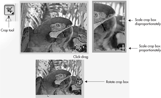
FIGURE 24-1 The Crop tool eliminates the exterior image areas of your defined crop area.
TIP
To quickly see the resolution of a placed bitmap image, select the bitmap and look at the status bar, which displays the file, its color mode, and its current resolution. The rule is: as a bitmap’s dimensions increase, its resolution decreases proportionately.
Nondestructive Cropping
In a nutshell, if you want to hide an area of a photo and not delete it as you do with the Crop tool, use the Shape tool. Try this out with the Macaw.jpg image by following the steps in the tutorial.
 Using the Shape Tool to Crop
1. Create a new (default-sized) document with landscape orientation. Place the image of the Amazon Macaws in a new document by clicking the Import button on the property bar and then selecting the image from the location you downloaded it to. With the loaded cursor, click-diagonal drag to place the image so it fills most of the page.
2. Choose the Shape tool. Notice that the photo, which is still selected, now has control node markers at each corner. These markers behave and operate exactly like control nodes for vector shapes.
3. Just for the fun of it, click a node to select it, and then drag it toward the center of the image. This is not what the pros call an “expert crop,” but you’ve just learned something that will come in very handy in your future work. When you drag a node inside of the outside dimensions of a placed photo, the two sides that meet at this node hide areas of the photograph. Press CTRL+Z to undo this, and now perform a more practical crop.
4. Click-drag so that you’ve marquee-selected two neighboring nodes; they can make up a horizontal or vertical edge of the photo. For this experiment it makes no difference.
5. Use the keyboard arrows to nudge the nodes toward the center of the image. Hold SHIFT to super-nudge the nodes if you like. This is how you can nondestructively crop a placed photo; nudge the nodes in the opposite direction now—you’ve hidden and then unhidden one dimension of the photograph.
6. With two nodes selected, hold CTRL and then drag the nodes toward the center of the photo. The CTRL key constrains movement so the edge you’re cropping remains parallel to the dragging page.
Masking Through Nondestructive Cropping
Go to the head of the class if you’ve already discovered that you can add control nodes to a placed photograph with the Shape tool! CorelDRAW “sees” a bitmap as an object that has a fill—specifically, a bitmap fill. Therefore, this object can be shaped and reshaped by adding nodes and also by changing the segment property between nodes. The following sections take you through some advanced bitmap editing to trim around a photograph so it becomes a floating object in a composition.
Trimming Away Unwanted Image Areas
What you’ll learn in this section goes way beyond the simple cropping of an image. You’re going to trim the background away from an image of a bust of classical composer Johann Sebastian Bach, put a new background behind the bust, and by the end of this section, you’ll have designed a concert poster. There are two nondestructive methods for removing the background from a photo’s subject, and both techniques are described in this section. The elements of the poster have already been created for you, and by working through the tutorials, you’ll see how to make a design with elements in front of and behind each other, just like you do with vector shapes, but using photographs.
To begin at the beginning of this poster design (call it an overture), you need to create a new document (portrait orientation, default page size) and then to place the image of Bach— a little smaller than the page size, but he can be scaled at a later time when needed—to use the Shape tool to trim out the background.
Background Removal, Technique 1
1. Click the Import button on the property bar, and then in the Import dialog, locate JS Bach.tif, select him, and then click Import.
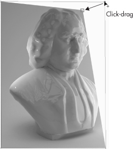
2. Your cursor is loaded with the image: click-drag, as shown in Figure 24-2, and then release the mouse when the cursor reports that the height for the placed image will be about 9 inches.
3. Choose the Shape tool. Begin by clicking the top right node of the image, and then click-drag it toward the center of the image until the top and right edges of the image touch the bust of Bach, as shown next. Clearly, you’re not going to get where you want to go with only four control nodes, because the geometry of the bust is far from perfectly rectangular. This is okay; you’ll add nodes to the outline of the image in the following step.

FIGURE 24-2 Scale and place the image by click-diagonal dragging your loaded cursor.
4. With the Shape tool, click a point on the outline of the photo where there should be a change in direction of the line; Bach’s powdered wig near his forehead is a prime area. Now, either double-click the segment, press the keyboard plus (+) key, or click the Add Node button on the property bar to add a node. While you’re in the vicinity of Bach’s forehead, several additional points will be needed. A quick way to add points in-between existing points is to repeatedly click a point and press the + key.
5. Click-drag points so they visually coincide with the vertices of Bach’s wig. It’s okay if the lines between the nodes hide areas you want exposed.
6. Click a straight line segment that should curve away from the photo. Then click the Convert To Curve button on the property bar. The segment can now curve; click-drag the segment away from the photo, as shown next, until you can see Bach’s locks. You can also right-click a segment and choose To Curve from the pop-up menu.

7. That’s it; all it takes now is about 10 minutes of your time to work around the profile of the bust, hiding areas and creating curve segments where needed. Yes, it’s a lot of work; so is putting on a tuxedo or gown to go and collect an industry award for outstanding design work (prompt, hint, encouragement!).
A good thing to do once you’ve trimmed away the non-essential Bach, because the default color of the page is white, is to put a colored vector shape behind your work to check your edge work. As you can see here, the example looks pretty good; a rectangle was created, filled, and then rotated, and then SHIFT+PAGE DOWN is pressed to put the rectangle to the back of the page’s layer.

If you’d like to confirm that the editing you performed is nondestructive, take the Shape tool and marquee-select several control nodes. Then drag them away from the center of the photo, as shown here. Then press CTRL+Z to undo this nondestructive and unwanted edit!

Boolean Operations as a Trimming Technique
It takes an equal amount of effort, but it might be easier to visualize the nondestructive photo-trimming process by drawing the outline of the image object you want to isolate and then to use the shaping commands to slice out the area you want to use. If you have Bach trimmed now, you don’t have to follow this tutorial, but do read the steps, because you might find this technique easier than editing with the control nodes.
Background Removal, Technique 2
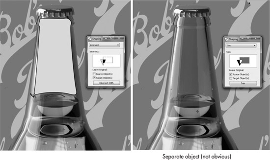
1. Using the Pen tool with which you’re the most comfortable and experienced, draw a silhouette around the object you want to isolate in the photo, as shown in Figure 24-3. It usually helps if you choose a contrasting outline color as you progress; you right-click, in this example, black on the Color Palette after you’ve begun tracing. Choosing outline and fill colors after you’ve begun drawing a shape avoids triggering the attention box asking whether all new objects should get a black outline.
2. After you’ve closed the shape, choose Arrange | Shaping | Shaping to display the docker for performing an Intersect Boolean operation. You could use the property bar shaping buttons to perform this, but the property bar shaping buttons by default leave a copy of the target and source objects after the operation, a minor hassle to clean up later.
3. Select the object you just drew. Choose Intersect from the drop-down selector, and then make sure both of the Leave Original boxes are unchecked. Click Intersect With, click the region of the photograph that is outside of the black outline you just drew, and you’re home free, as shown in Figure 24-4.

FIGURE 24-3 Draw an outline that tightly matches the shape of the object you want to trim.

FIGURE 24-4 Use the Intersect shaping command to remove all regions of the photo outside of the shape you drew.
Compositions with Mixed Media
Creating the poster is going to be fun—you’re going to go beyond arranging and moving both bitmap and vector objects to laying out a finished art composition. What you’ll see in the Concert poster.cdr file are two image objects: the background night image is locked on the bottom layer, and the gold title is an alpha-channel masked image, something covered a little later in this chapter.
Work through the following steps to copy your Bach trimming work to the concert poster document (an unlocked layer is active, so duplicating takes only one step). Then you’ll add a vector shape to the composition to create an air of elegance…it’s a piece of chorale sheet music, actually, not an air.
Composing a Design Using Vector and Image Shapes
1. Open Concert poster.cdr, and then choose Window | Tile Vertically so you have a view of both your Bach work and the Concert poster.cdr file.
2. Hold CTRL and then drag your trimmed bust of Bach into the Concert poster window, as shown in Figure 24-5. This duplicates your work; it doesn’t move it. You can save and then close your Bach image as a CDR file now.
3. Click the Import button on the property bar, and then choose the Bach 4 part Chorale.cdr file from your hard drive. Click Import; your cursor is now loaded with the imported file. You can click anywhere to place it at its original size, but for this example, click-drag beginning about ¾″ from the left edge of the page until the legend at the bottom right of the cursor reads about “w: 7.5 in.”


FIGURE 24-5 Duplicate your work into the Concert poster.cdr window.
4. With the musical notes selected, click the white color well on the Color Palette.
5. Choose Window | Dockers | Object Manager. Click-drag the title “Group of 100 Objects” (the musical notes), and then release the mouse button when the title is below the “JS Bach.tif” object. You should now see the musical notes group of objects on the page behind J.S.
6. Let’s make the music sort of swell behind its composer. Choose the Envelope tool from the Blend group on the toolbox. You’re working in Putty mode by default, a good place to start; now, let’s customize the envelope for a specific distortion. With the Envelope tool, marquee-select the top and bottom center control nodes; while holding SHIFT, marquee-select the left and right middle nodes. Then click the Delete Nodes button on the property bar; see top left, Figure 24-6.

FIGURE 24-6 Shape the music so it appears to extend around the bust toward the audience, as music really does…
7. Click the left side of the Envelope bounding box, and then right-click and choose To Line from the pop-up menu. Then perform the same edit on the right side. The top and bottom default property for Putty mode envelopes is curved segments—they need no editing. See middle left in Figure 24-6.
8. With the Shape tool, one at a time click the control nodes that bound the musical notes, and then drag the top ones up a little and the bottom ones down a little. Then click-drag the bottom line up, and the top line down. Use your artistic eye and Figure 24-6 to guide you. Bach’s compositions are stirring; the musical notes should visually reflect this.
9. A time and place for this concert would help sell it; read Chapter 14 if you haven’t done so already for good text-composition techniques. As you can see in Figure 24-7, the completed poster looks handsome, and most of its visual success is because you now know how to isolate an important subject from a fairly boring background.

FIGURE 24-7 When you can move image objects around on a page as easily as vector shapes, new design opportunities open up to you.
Working with Alpha Channels and Image Transparency
The following sections explain how some professionals trim subjects out of their image backgrounds, why certain file types are imported with transparency, and what transparency really means in your CorelDRAW work. There are more features than you might imagine for working with bitmaps directly in CorelDRAW; for exceptionally tricky image-editing assignments, Chapters 25 and 26 document Corel PHOTO-PAINT.
Using CorelDRAW’s Bitmap Color Mask
On the property bar, whenever a bitmap image is selected, you have the Bitmap Color Mask docker button on the property bar. This docker can help mask areas of a placed bitmap, although it’s a less robust feature than found in PHOTO-PAINT. Here’s the deal: if you have, for example, a scene that has someone who isn’t wearing any green, and they’re surrounded by green, you can remove the green background by hiding this color value. Whenever you have an image with a background whose color is not remotely similar to colors in the foreground person or object in the photo, the Bitmap Color Mask docker can successfully hide the background, too. What the Bitmap Color Mask docker cannot do is distinguish between subtle variations in differing hues. For example, if you have a maroon background with a pink foreground object you want clipped out, no can do. Maroon contains heavy concentrations of tone in its red color channel, and so does pink, although to a lesser extent. The Bitmap Color Mask docker looks at colors in channels in an image; unless you’re trying to mask a GIF indexed color image (a file structure that doesn’t use color channels, but instead uses a color index), your smartest move is to use PHOTO-PAINT or to manually trim the image using the methods described earlier.
However, lots of professionals receive “object against pure color” photos every day— and now you will, too, to experiment with in the following tutorial. This tutorial shows how to auto-mask images such as Beachball.tif for easy compositing work in CorelDRAW.
Removing a Color from Around a Subject
1. Import the Beach.png image to a new document. This is the background for the composition.
2. Import the Beachball.tif image and then place it anywhere you like for the moment. As shown in Figure 24-8, the green area around the beach ball sort of messes up its integration into the beach scene.
3. With the beach ball image selected, click the Bitmap Color Mask button on the property bar.
4. Click the check box to the left of the first black color swatch. This is the first color you’ll mask in the beach ball image.
5. Choose the Color Selector button (Eyedropper tool), and then click over the green area on the beach ball image. Set the Tolerance to about 40%, and then click Apply. The green has become masked—invisible—and you can now use the Pick tool to move and scale the beach ball so it becomes part of the background scene.

FIGURE 24-8 An image without a transparent background can’t be successfully melded into a composition.
6. Let’s try a little more scene integration by adding a slight shadow behind the ball. This also demonstrates how the image mask allows CorelDRAW effects to be placed behind it. Choose the Drop Shadow tool from the Blend group of tools, and then click-drag down and a little to the right on the beach ball. As you can see in Figure 24-9, the beach ball looks like it’s part of the scene. As a little independent experiment (with creative mayhem), try clicking the second check box, and then with the Eyedropper tool, click over a red area of the image and see what disappears. To undo this move, all you need to do is uncheck the red swatch’s check box on the docker and then click Apply.
NOTE
Check out Chapter 22 for detailed information on working with the Drop Shadow tool.
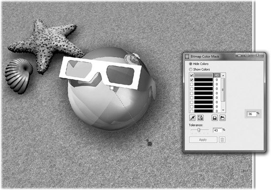
FIGURE 24-9 Use the Tolerance slider on the Bitmap Color Mask docker to increase the mask of the color you chose.
Working with Partial Transparency
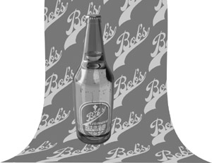
Both alpha channel transparency and image layer transparency offer more than simply 100 percent opaque or 100 percent transparent areas. With 24-bit images, you can have 256 levels of opacity in any area of the image, and this leads to some fascinating visual effects you can create. You’ll work shortly with an image that has semitransparent areas, but right now it’s time to learn how to build semitransparent areas into an image that has none but should have them. Bob’s Beer, a fictitious micro-brewery, has an image of a bottle in PNG file format that is surrounded by transparency. Let’s say Bob wants the bottle to sit in front of a background that has his name repeated far too many times. Visually, his name should partially show through the neck of the bottle where there’s only tinted glass and no beer.
The following tutorial shows you how to trim away the top quarter of the bottle, the most transparent part. Then you’ll see how to make this area only partially opaque so some of the background shows through. And to top it off, you’ll see how to build a shadow that’s cast from the bottle onto the “ground” in the composition.
Creating a Photorealistic Glass Effect
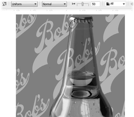
1. Open Bob’s Background.cdr, and then click the Import button and choose Bob’s Beer.png; it’s a domestic beer, but you’ll import it anyway. Click Import and then with the loaded cursor, click-diagonal drag until the bottle is placed in the image as shown here.
2. With a Pen tool (the Bézier pen works fine in this example), create a shape that fits in the top part of the glass, from the fill line to the bottle’s lip, staying slightly inside the neck of the beer bottle so the edge is not part of the trimming operation you’ll perform in a moment. You should fill the object after creating it to better see what you’re doing in the following steps—any color is fine.
3. Select the shape but not the bottle. Choose Arrange | Shaping | Shaping to display the Shaping docker. Choose Intersect from the selector drop-down list, and then check Leave Original Target Object(s), but don’t check Leave Original Source Object(s). Click the Intersect With button, and then click the bottle. The object is deleted because it’s the Source Object, and you didn’t choose to leave it. Apparently the bottle has not changed, but there is a perfect cutout duplicate of the top of the bottle resting on top of an unchanged bottle; you’re halfway there—you need to trim away part of the bottle using the new intersect object. Switch to the Pick tool now.
4. Click on the top of the bottle to select the product of the Intersect operation in step 3 (don’t worry; it’s hard to see that it’s a separate object). Choose Trim from the Shaping docker’s drop-down list, check Leave Original Source Object(s), and uncheck Leave Original Target Object(s). Click the Trim button and then click the bottle, and the beer bottle is now actually two separate pieces. See the following illustration for the docker settings for steps 3 and 4. Now it’s on to transparency.
5. Select the top part of the shape, and then choose the Interactive Transparency tool from the Blend group of tools on the toolbox. Choose Uniform from the selector drop-down on the property bar, and then drag the Opacity slider on the property bar to about 50%. As you can see here, your editing work resulted in quite a convincing illustration. You can see Bob’s logo in the background peeking through semitransparent glass; the background is even tinted a little from the green of the object on top of it.
6. Here’s the piece de resistance: with the bottle selected and not the semitransparent piece, choose the Drop Shadow tool. Click toward the bottom of the bottle image to define an anchor for the shadow and then drag up and to the right.
7. Click-drag the end marker of the shadow so the shadow ends closer to the bottle. Then, because the bottle should be casting a deep green (not black) shadow, click the Shadow Color flyout on the property bar, and then from the palette choose a deep green.

8. Well, oops. The area you trimmed in step 4 is not part of the shadow—there’s a hole in the shadow where there should be a lighter green, because a shadow cast by green glass through beer would be a little darker than a shadow cast through green glass alone. No problem; you draw a fill object for the missing part of the shadow as shown here, fill the object with green, and then give it about 50 to 60% Uniform transparency.

Blending Photos with Transparency
You’ll learn in Chapter 25 how to use PHOTO-PAINT to mask the exterior of an object in a photo. For the moment, let’s imagine that the Tree.png file you’ll work with in the following steps was created by masking everything except the tree in the photo, and then you saved it as a PNG file with transparency using PHOTO-PAINT.
You know now that an image can have transparent areas, and that you can use CorelDRAW’s Transparency tool to make any object on a page partially transparent. The steps that follow show you how to create surreal, completely professional photo-retouching with two images you graft into one another with only one CorelDRAW tool.
Creating a Transition Between Two Images
1. Press CTRL+N to create a new file; accept the default standard letter page size and specify portrait orientation.
2. Import ThumbsUp.jpg. JPEG images do not retain resolution information, so you need to click-drag the loaded cursor after clicking Import to scale the imported image to the 11″ height of the page.
3. Import Tree.png. PNG files can (in some cases) retain image resolution information, so all you need to do is click the loaded cursor on the page.
4. With the Pick tool, position the tree so its trunk fits over the thumb in the underlying photo.
5. Choose the Transparency tool from the Blend group of tools on the toolbox.
6. Click-drag starting from around the thumbnail area in the underlying photo to just above the trunk on the tree. You should see the amazing transformation between the guy’s thumb and the trunk of the tree (see Figure 24-10). If the Start and End points for this Linear transparency aren’t perfect, you can adjust the Start and End points with the Transparency tool cursor.
7. Unfortunately, the guy’s thumb doesn’t taper toward the top like the tree trunk does; some of the thumb is visible, ruining the special effect. Choose the Bezier pen tool from the toolbox, and then draw a closed shape whose right edge matches the contour of the tree trunk’s left side. Fill it with the same color as the background of the thumb photo—choose the Color eyedropper tool from the toolbox, click over the background, and then click the paint bucket cursor on the object you drew.
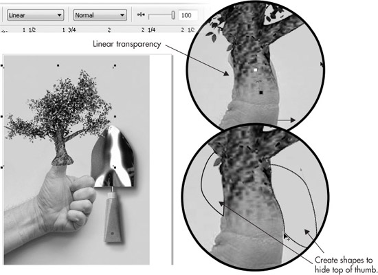
FIGURE 24-10 Create a blend between two photos to present unique and visually arresting imagery.
8. Perform step 7 on the right side of the thumb, after drawing a second object.
9. Remove the outline of both shapes (select them both) by right-clicking the No Fill color well on the Color Palette.
10. With both objects selected, press CTRL+PAGE DOWN to put them behind the tree, yet in front of the thumb photo.
11. Read Chapter 12 on working with text, because this image would make a terrific magazine cover.

Bitmaps to Vector Art: Using PowerTRACE
You can export both vector art and bitmaps to bitmap file format, but once in a while you’ll need to go the other way: taking a bitmap and making vector art from it. Many design professionals are faced daily with clients who want to use their logo for a truck sign or a high-resolution print ad, when all they can provide the designer is a really pathetic GIF copy from their web page.
Fortunately, designers don’t have to reconstruct logos by hand—Corel PowerTRACE has been reworked in version X5 to become a highly accurate utility that often produces a vector equivalent of a placed bitmap that requires no hand-tweaking afterward. What PowerTRACE does is simple: it creates a vector version of the selected bitmap. How PowerTRACE does this is not easy to explain, but if you understand the “how,” you’ll be better prepared to choose options before making a vector copy of an imported bitmap. In a nutshell, PowerTRACE examines the bitmap based on the criteria you specify in the dialog and then seeks edges in the bitmaps that show a clear and marked difference in color and/or brightness between neighboring pixels. PowerTRACE then creates a vector line at this neighboring region, continues to create a closed path (with the Centerline option chosen, it creates open paths), and fills the path with the closest color match to the pixels inside the area it creates. The following sections take you through the operation of PowerTRACE and offer suggestions on settings and when and why you’d use this handy feature.
Bitmap Conversions for Logo Alterations
Sometimes you’ll want to use PowerTRACE to rework an existing logo that’s in bitmap format. Suppose SilverSpoon.png, a good, clean graphic, is the logo for a caterer that was bought out yesterday by Phil Greasy, and Phil likes the logo but wants the name changed to…you guessed it. You use settings for PowerTRACE to make a vector conversion of the logo covered in the following section, but this is a prime example of “knowing your fonts” (covered in Chapter 13). A lot of times it’s a futile endeavor to trace typography in a logo: it’s much easier and provides cleaner results just to recast the text using the same or a similar font.
Pre-Touching: Use PHOTO-PAINT for Cleanup Before Tracing
The Silver Spoon logo you’ll have PowerTRACE convert so you can alter the logo for the new owner is a detailed and complex one. There are four or five areas in the logo that you’ll need to assist PowerTRACE with by manually editing the logo before auto-tracing it. Your own artistic eye is hooked up to your brain, and it can discern the edge between the black outline around “Silver” and the black background checkerboard. PowerTRACE, on the other hand, doesn’t have eyes and doesn’t have a brain (these features are expected in CorelDRAW X475). Therefore, you will make life a lot easier for yourself if you use Corel PHOTO-PAINT to erase the areas—working to the outside of the outline around “Silver”—so there is a gap and so PowerTRACE creates separate objects for the word “Silver” and for the checkerboard background.
This logo is probably the hardest one you’ll encounter professionally to use PowerTRACE on for clean-up work and alterations. If you succeed at this fictitious example, your paying gigs will be a charm. These are really quite easy steps, and shortly you’ll see how little sweat you have to break to dramatically alter the logo.
Working Between CorelDRAW and PHOTO-PAINT
1. In a new document in CorelDRAW, import the Silver Spoon.png image. Click the loaded cursor to place the bitmap at its original size.
2. Click Edit Bitmap on the property bar. In a moment, PHOTO-PAINT loads with Silver Spoon.png displayed in a document window.
3. Choose the Eraser tool from PHOTO-PAINT’s toolbox. On PHOTO-PAINT’s property bar, type 10 in the Size field to set the diameter of the Eraser tool. Then set the Feather amount to zero (0). Doing this gives you a small, hard tool for erasing areas, exposing the default white background color.
4. The bottom left of the S, the dot over the i, the upper left of the l, the top and bottom left of the e where it touches the outline of the spoon, and the bottom and right portions of the r all touch what you can see as black background areas. Refer to the illustration here, and carefully erase areas outside of these characters, creating a white gutter between background elements touching the black border around the letters in “Silver”.

5. When you’re finished, choose File | Exit or press ALT+F4 to close PHOTO-PAINT. Click Yes to save changes, PHOTO-PAINT closes, and you’re returned to CorelDRAW with your edits made to the copy of the logo you imported.
6. With the bitmap selected, click Trace Bitmap, and then choose Outline Trace | High Quality Image. It’s not time to trace yet, but it’s time to explore your options before tracing.
PowerTRACE Options
After you import and select the bitmap, you have the option to Quick Trace the bitmap, or to get more specific about the final traced object’s quality and fidelity.
This logo has no dithering and no aliased edges. Therefore, the PowerTRACE can be set for less smoothing and greater precision. As you can see here, the logo has no transparent background, but because you’ll trace it, you can automatically delete its white background, a little perk for your client.
• Trace Type You can choose Outline or Centerline from this drop-down. Outline is the method that produces objects based on areas of color similarity in the bitmap. Centerline is a good option when your source bitmap is calligraphy or a technical drawing; this option generates open paths to which you can assign different widths and styles after the trace is placed on the page.
• Type of Image This is a convenience based on what many people call different types of bitmap art. Depending on your choice—from Line Art to High Quality Image—PowerTRACE renders a few objects or hundreds. You can customize a Type Of Image setting by altering other settings, and you can also use an “inappropriate” setting type for your imported image. No two images are alike, and you might be surprised at the hi-fi rendering of a piece of clip art you trace using, for example, the Line Art Type Of Image setting.
• Colors On this tab you can set the number of unique colors PowerTRACE evaluates, from 1 (which will render a stencil of your original) to a varying maximum of unique colors, which you can limit by typing in a value. You can specify the color mode for the trace; you’d choose CMYK, for example, if you needed a trace that could be sent as an EPS file to a commercial printer. Generally, your best bet is the RGB color mode. You can also sort the colors to be used by how frequently they appear in the original bitmap, or by similarity. Additionally, if you intend to replace a color when you edit the traced result, you can do so by clicking a color well and then click Edit.
• Settings This tab, shown in Figure 24-11, is used to define how tightly and accurately you want PowerTRACE to render the bitmap as vector object.
• Detail You set the overall complexity of the trace with this slider. Higher values cause PowerTRACE to carefully evaluate the bitmap, while lower Detail settings can produce a stylized, posterized trace with fewer colors and far fewer groups of objects.
• Smoothing This setting controls both the number of nodes along paths and, to a lesser extent, the number of objects the trace yields. A higher smoothing value is good when your bitmap import is a GIF image that contains a lot of noise, dithered colors, and jagged edges.
• Corner Smoothness Use this setting depending on the visual content of your imported bitmap. For example, a photo of a sphere probably doesn’t require any corner smoothness. However, a photo of a bird’s feather will certainly have a lot of abrupt color and geometry changes—you’d want to use a very low Corner Smoothness setting to accurately represent the sharp turns and corners that make up a feather.
• Delete Original Image Upon finalizing the trace, CorelDRAW can delete the image it traced, leaving only the vector objects on the page. This is not usually a good idea—what if you’re unhappy with the first trace you perform? Leave this box unchecked.
• Remove Background Usually you’ll want to check this box. When an imported image such as this logo is floating in a background of white, Remove Background doesn’t make the background a huge white rectangle. Optionally, any color can be removed from the final trace by choosing the Specify Color radio button and then using the eyedropper to choose a color from the preview window.
• Automatically Choose Color This option chooses the color in the image that is removed from the final trace. This option can be useful as a quick method for separating the foreground areas of interest from a background you want removed, but as with anything “automatic” in a software program, you’re best off previewing what’s been chosen before clicking OK.
• Remove Color From Entire Image If you select this option, every instance of the chosen color will not be traced and the result will be empty areas in your vector version of the bitmap. This result is not always desired, so give this item some thought. If, for example, there’s a yellow star on a blue balloon, and the background is also yellow, both the star and the background will not be traced.
• Merge Adjacent Objects of the Same Color This option makes one object instead of several if the bitmap contains areas of almost identical color in neighboring regions. If this option is chosen, Remove Object Overlap cannot be used.
• Remove Object Overlap Most of the time, you’ll want to leave this box unchecked. If you do choose to enable Remove Object Overlap, there might be visible gaps between the resulting grouped vector shapes, making it hard to put a solid background behind your trace without the background color or texture peeking through. If this option is chosen, the Group Objects by Color option cannot be used.
• Group Objects by Color This is a handy feature that automatically groups identically colored objects after you click OK to make the trace. You can then choose a different color and apply it to the entire group, delete an entire group of objects of identical fill, and not have dozens of objects that can be accidentally moved lying all over the page.
• Trace Result Details This area on the dialog predicts how many objects (Curves), how many Nodes, and how many different Colors will be produced. As a guideline, if the results show more than 200 objects will be created, think twice. It’s a large number of objects to edit, and the resulting trace could be a challenge to work with.

FIGURE 24-11 Use the features and settings in PowerTRACE to create an optimized group of vector objects based on the bitmap.
Let’s put all this knowledge into practice in the next section.
Performing a Trace
You’re almost set to click OK and have PowerTRACE convert the Silver Spoon.jpg logo into a set of vector objects.
The original logo’s text was cast in Motter Fem font; if you don’t own it, this is okay. Install Candid.ttf through the Start menu | Control Panel | Fonts before you begin the tutorial. Candid is not a complete typeface; it’s missing punctuation marks and numbers, and it was created after the Candy font by URW. It’s very close in look to Motter Fem, and Candy is a great packaging-design font you might seriously consider purchasing for your collection—Candid is an author-cobbled knockoff whose purpose is solely to get you through the techniques in the following steps.
Reworking a Logo Using Vectors
1. In the PowerTRACE box, set the Detail all the way to the right; a lower setting would ignore details such as the “Catering” text because the text is made up of only a few pixels in character width. Set Smoothing at about 25%; the logo is already fairly smooth and will not benefit from the averaging PowerTRACE would make in defining paths.
2. Set the Corner Smoothness to the far left on the slider (no corner smoothing). You want cusp nodes and sharp corners rendered to keep the checkerboard pieces and serifs on the typefaces sharp. Then, check Remove Background, check “Merge adjacent objects of the same color,” and then look at the Trace Result Details Curves field just as a matter of practice.
3. Click the Colors tab and then set the Number Of Colors to 30—there really aren’t more colors than 30 in the image; more colors will create superfluous additional objects. These settings should yield less than 200 separate objects, so click OK.
4. Move the objects away from the bitmap original; you want to keep the original on the page for reference. Ungroup the group of objects (CTRL+U), and then delete what’s left of the word “Silver”. This will leave a hole in the background in a few places.
5. With the Text tool, type Greasy, and then apply Candid from the Font selector dropdown on the property bar.
6. Apply a white fill to the text, and then press ALT+ENTER to display the Object Properties box. Click the Outline tab and then set the outline to 8 points, and check Behind Fill; this makes the apparent outline width 4 points, but areas are filled in within the characters to give the text a bold look.
7. Choose the Envelope tool from the Blend group on the toolbox, and then perform the same steps as you did earlier with the musical notes in the Bach composition. Use the Envelope tool to massage the text to look arced like the original text. If your design looks like Figure 24-12 now, you’re in good shape with only a step or two to go.
8. Create rectangles that match the color of the missing checkerboard in the logo, rotate them to the same diamond-shaped orientation as the original logo, position them accordingly for your patchwork, and then send them to the back of the page by pressing SHIFT+PAGE DOWN.

FIGURE 24-12 Replace the text in the original design using a similar font choice.
9. With the Shape tool, edit the characters in the word “catering” to make them look more refined. At small image sizes, CorelDRAW does its best to render approximations of small text, but they still often need a little human intervention!

10. You can embellish the revised logo by adding a drop shadow to the new owner’s name, as it appears in the original logo, and you can smooth out the posterized edges on the spoon by overlaying an object that uses a fountain fill of the same colors. But as you can see here, the new logo is pretty faithful to the original, and with the help of PowerTRACE it took ten steps. Think of how many steps and lost nights of sleep you’d have without an auto-tracing utility.
TIP
To get superfluous objects out of a finished PowerTRACE very quickly, use Edit | Find And Replace | Find Objects, and set the criteria for the search to specific unwanted colors. Then you can delete all the selected objects at once.
PowerTRACE for Traditional Artists
Lots of different types of users are attracted to CorelDRAW, and logo and other graphics designers are one category of visual communicators. CorelDRAW’s tracing feature will also appeal to artists who came to the digital world of illustration after years of work with physical pens, pencils, and inks.
If you have a scanner, and have, for example, a pen-and-ink cartoon, PowerTRACE makes child’s play out of re-creating your cartoon as scalable vector art, to which you can apply color fills with a smoothness and precision that enhance your cartoons and can elevate them to the status of Fine Art. Seriously!
Cartoon sneaker drawing.png is a fairly high-resolution scan to get you started with a specific workflow you can adopt to use with scans of your own drawings. One important issue is removing pencil or other marks on the physical paper before you scan; use a kneaded eraser, and even if the paper doesn’t come completely clean, the following steps show you a novel way to use PowerTRACE to remove stray marks.
Here’s how to create a digital cartoon suitable for exporting as either vector or bitmap art to any size you need; this is a perk you don’t have when working with only physical tools.
Digi-tooning
1. In a new document, landscape orientation, click the Import button on the standard toolbar, and then choose Cartoon sneaker drawing.png. Place it by click-dragging the loaded cursor so it fills the page.
2. Click Trace Bitmap, and then choose Outline Trace | Line Art. You’ll receive an attention box that the bitmap size is too large, and that if you choose not to resize the bitmap, the trace process might be on the slow side. This is your artistic call: if you want the pen strokes to look extremely faithful to the author’s original cartoon, click Keep Original Size. If you’re in a hurry, click Reduce Bitmap.
3. In the PowerTRACE window, choose a medium amount of Detail, about 25% Smoothing, no Corner Smoothing, check Remove Background, and check “Merge adjacent objects of the same color.”
4. Click the Colors tab. Set the number of colors to 2. Doing this will generate almost entirely black objects with the exception of one or two areas that are totally enclosed, which should produce a white fill inside a black object. Click OK, and you’ll see that the pencil marks which are not entirely a black color disappear from the trace.

5. Delete the bitmap; you’ll need to move the grouped objects first.
6. Choose Tools | Object Manager. Create a new layer and then drag its title on the list to below Layer 1. You can rename these layers “Coloring” and “Trace” by clicking to select the name, and then click a second time to open the title for editing—type anything you like in the field. Lock the tracing layer.
7. With any Pen tool you’re most comfortable with for creating free-form shapes, create objects that represent the different areas of the cartoon you’d like to color in. For example, the treads of the sneaker would look good in several different shades of warm gray. The solution would be to use the Mesh fill on this object you draw—see Chapter 15 for thorough documentation of object fills. The top of the sneaker could be an interesting Linear fountain fill, traversing from deep orange at bottom to a bright yellow at top. Another great thing about coloring your work digitally is that you never have to decide on a final color.

8. You continue this process until you’ve “colored inside the lines” and filled as much of the drawing as you see artistically fit. Figure 24-13 shows a logo mockup for a children’s footwear store. Clearly the drawing has an organic sense about it, the opposite of the sterile and flawless “computer art” we see occasionally, and yet this is CorelDRAW computer art, with a little ingenuity added to make a symbiosis between the physical and traditional elements.
You can take a look at how this drawing was completed if you open Sneaky kids finished.cdr.

FIGURE 24-13 The best way to execute a hand-drawn look with CorelDRAW is to hand-draw a picture, scan it, and then PowerTRACE it!
This chapter has shown you how to work with bitmaps in almost the same way as you work with vector art in CorelDRAW. Both vectors and bitmaps can happily coexist in a single document. You can shuffle and rearrange objects as if they were made of the same digital materials, and you do need bitmaps in your work when you’re trying to convey any sense of photorealism. Your next stop, in Chapter 25, is to get some hands-on education with PHOTO-PAINT and working directly on bitmap photographs and illustrations. You’ll see shortly that editing bitmaps and drawing with vectors can be a seamless creative process when you put the power of the Corel Graphics Suite to its best use.