(Ray)
(Fogra 39)Job:08-30930 Title:RP-Design Logo
#175 Dtp:225 Page:46
001-272_30930.indd 46 9/2/13 9:56 AM
A Closer Look
(Text)
Good band logos are sometimes a difficult sell with so many strong artistic personalities
in the room. One way to combat the focus of critiquing a logo to death is to create an
entire set of eight fully formed interchangeable and complementary marks. It takes the
focus off of just one logo needing to represent the group.
I was asked to do an identity project encompass-
ing logo development and additional graphic
components to be used for stickers and other
band promotions.
The client, Redcast, is a few guys from Portland,
Oregon, trying to brighten peoples’ day with a
little bit of retro-pop sunshine. The band is made
up of three brothers: Jarrod, Seth, and Darren
Brock, who grew up listening to the oldies
station, and it shows. They’ve somehow fused
their ‘60s rock ‘n’ roll influence with alt-rock
sensibilities, and created something that sounds
like The Format went on a date with Hellogood-
bye and then got mugged by Jet. Redcast has
no Billboard-topping aspirations or delusions
of grandeur—they just want to play their retro
brand of indie pop music and make people
smile. Their first full-length album
Talent Show
Runners Up
was released in 2011.
Art direction from the client read as follows:
We want the Redcast logo to be old and new
at the same time—retro but current, familiar
but still fresh. It should look the way our music
sounds. Above everything else, it needs to be
fun. Visually, we tend to draw inspiration from
vintage advertisements and lo-fi photography.
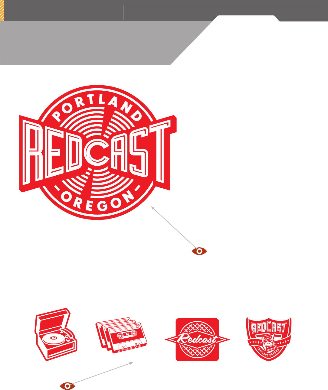
These bold graphic beauties are reducible, retro, red, rockin’, and right on
target. I can visualize each one as a tattoo on my upper arm.
FIRM: TIM FRAME DESIGN
DESIGNER / ILLUSTRATOR: TIM FRAME
CLIENT: REDCAST
(Ray)
(Fogra 39)Job:08-30930 Title:RP-Design Logo
#175 Dtp:225 Page:46
001-272_30930.indd 46 9/2/13 10:59 AM

(Ray)
(Fogra 39)Job:08-30930 Title:RP-Design Logo
#175 Dtp:225 Page:47
001-272_30930.indd 47 9/2/13 9:56 AM
4 7
(Text)
With so much visual excitement, hard-hitting
impact, and perfectly crafted line weight
ratios, it’s easy to forget that they are
all one-color marks.
The main logo, here applied to a red Stra-
tocaster, radiates from a very fortunate
placement of the letter
C
in the name. The
sound waves also can be seen as track lines
on an old vinyl LP. Yeah, that’s right, I said
LP
… Look it up.
(Ray)
(Fogra 39)Job:08-30930 Title:RP-Design Logo
#175 Dtp:225 Page:47
001-272_30930.indd 47 9/2/13 10:59 AM
..................Content has been hidden....................
You can't read the all page of ebook, please click here login for view all page.
