(Ray)
(Fogra 39)Job:08-30930 Title:RP-Design Logo
#175 Dtp:225 Page:26
001-272_30930.indd 26 9/2/13 9:55 AM
A Closer Look
(Text)
Inviting, curious, and diverse—these are the
attributes this mark imbues in a fun and
memorable way.
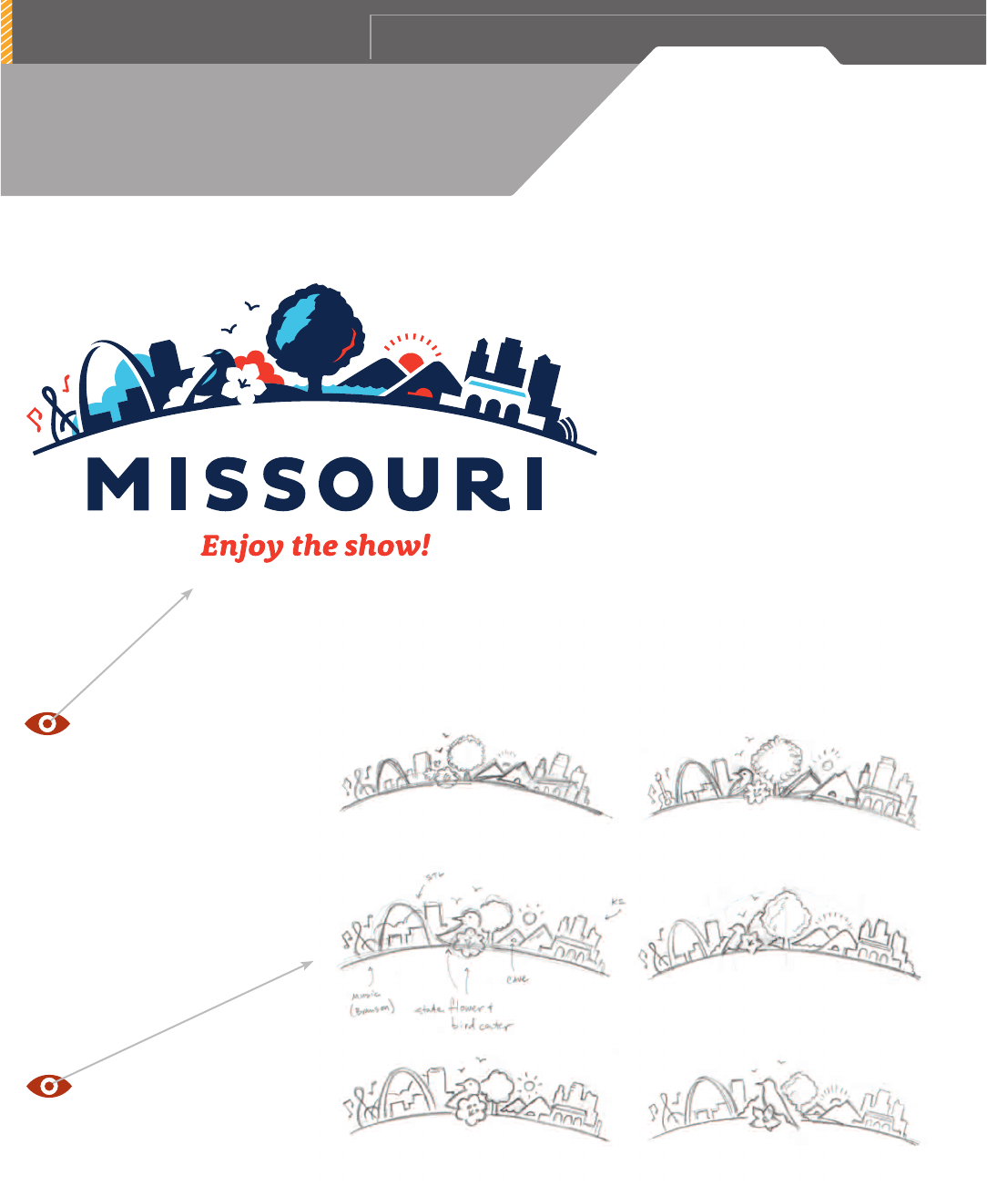
I was contacted by an ad agency tasked with
rebranding the state of Missouri. The concept,
derived from Missouri’s nickname as “The Show-
Me State,” featured an arc filled with a collage
of Missouri attractions. This arc of Missouri
goodies would have to include the cities of St.
Louis, Kansas City, and Branson, in addition to
the state’s natural features such as parks, lakes,
caves, hills, etc.
My first step was to research and gather image
references for all of the logo’s elements. During
this process, I learned Missouri’s state bird and
flower, and immediately knew I wanted to incor-
porate them into the illustration to add warmth
and personality. Next, I started with some very
loose pencil sketches exploring the placement
and composition of all the arc’s elements. After
sharing these roughs with the art director, I was
given feedback and direction to proceed.
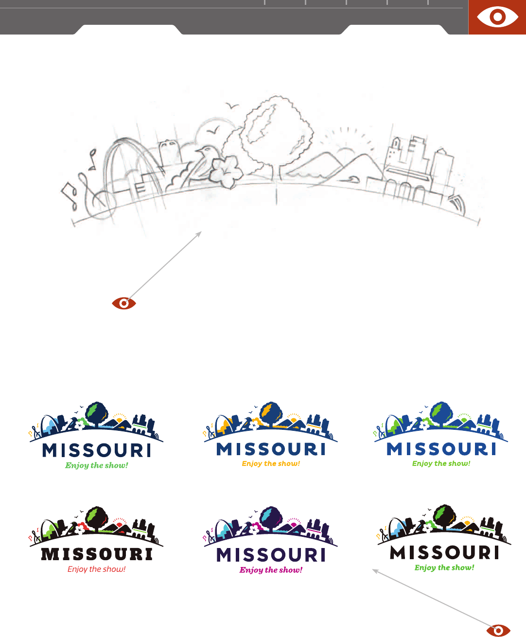
Next, a tight pencil rendering of the line work
details was developed, scanned, and used as a
visual guide for the computer illustration pro-
cess. Once the illustration was complete, type
and color exploration were applied until arriving
at a favorite combination to send along to the
art director for client presentation.
Using the process of thumbnail sketching,
the designer solved the visual challenge of
balancing the gamut of state landmarks
and locations without giving too much
attention to any one.
FIRM: FERNANDEZ STUDIO
DESIGNER / ILLUSTRATOR: CARLOS FERNANDEZ
ART DIRECTOR: STEVE LALIBERTE
CLIENT:
MISSOURI DEPARTMENT OF TOURISM
(Ray)
(Fogra 39)Job:08-30930 Title:RP-Design Logo
#175 Dtp:225 Page:26
001-272_30930.indd 26 9/2/13 10:59 AM

(Ray)
(Fogra 39)Job:08-30930 Title:RP-Design Logo
#175 Dtp:225 Page:27
001-272_30930.indd 27 9/2/13 9:55 AM
2 7
(Text)
The nice splash of color and simple type exploration really button up this
design well without adding more complexity to the design.
It’s nice to see craftsmanship in analog form.
A progressive refinement of an idea predigital
lends to the strength of the final mark and its
skillful execution.
(Ray)
(Fogra 39)Job:08-30930 Title:RP-Design Logo
#175 Dtp:225 Page:27
001-272_30930.indd 27 9/2/13 10:59 AM
..................Content has been hidden....................
You can't read the all page of ebook, please click here login for view all page.
