(Ray)
(Fogra 39)Job:08-30930 Title:RP-Design Logo
#175 Dtp:225 Page:186
001-272_30930.indd 186 9/2/13 10:14 AM
A Closer Look
(Text)
It has been a pleasure to work with DC comics
on various projects through the years. Each
one brings its own unique set of challenges and
results. I have been commissioned to design
two Batgirl logos in my time working with them
(prior to “The New 52” reboot). I was pleased
with how my first redesign came out, but with
the second, the project took a completely
unexpected turn. I gave DC many directions
to choose from initially, but they felt that they
were all too whimsical, feminine, and bouncy.
They noted that they were looking for a good
balance between retro and modern because of
the seriousness of the book series. DC gave me
a look at the new Batgirl costume for additional
reference and decided that it was best to explore
more simple and modern shapes for the bat with
possibly a couple more literal versions thrown in.
In the end, the client chose a redesign that was
a complete departure from the initial redesign
that I did. To finalize the chosen logo I added
additional cuts in the chunky letters and detail
in the bat shape to make it feel less juvenile. The
logo sold through and worked well across the
top of the comics, but I hope someday that we
can revisit the possibility of DC adopting one of
the other directions that was a bit more classic
and feminine.
I can image that DC loved seeing all these tight
explorations enroute to the final design. The
custom-type treatments combined with feminine
batwing variations are diverse, flirty, and engag-
ing. Choosing appropriate design cues from this
set to incorporate into a final logo must have
been difficult—they are all so stellar.
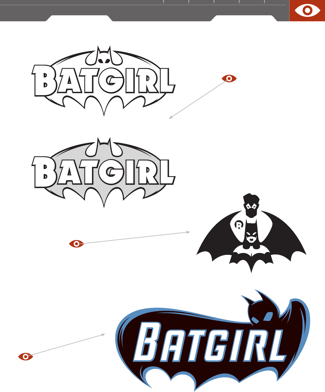
These two Batgirl logo reboots (above; top two,
opposite) each evoke completely different
reactions from viewers. The first redesign for
Cassandra Cain as Batgirl, combines a nontypi-
cal asymmetry with a slightly playful femininity
in the eyes and overall batwing shape. The
bold, masculine type brings a solid heroic feel
to the final mark. This logo is bold enough to be
stenciled in spraypaint, yet sexy enough to be
envied by Wonder Woman. The Yvonne Craig–era
purple-and-gold color palette is a perfect fit for
this logo’s slightly mod ’60s freestyle feel.
FIRM: DEVICE
DESIGNER / ILLUSTRATOR: RIAN HUGHES
ART DIRECTOR: KEN LOPEZ
CLIENT:
DC COMICS
(Ray)
(Fogra 39)Job:08-30930 Title:RP-Design Logo
#175 Dtp:225 Page:186
001-272_30930.indd 186 9/2/13 11:03 AM

(Ray)
(Fogra 39)Job:08-30930 Title:RP-Design Logo
#175 Dtp:225 Page:187
001-272_30930.indd 187 9/2/13 10:14 AM
1 8 7
(Text)
This study of positive and negative space is
brilliant. The logo across Batgirl’s bare chest
makes you wonder if she even needs a logo sewn
into her costume.
The second batgirl reboot logo is much more
traditional in its approach to the batwing
treatment. The custom type is decidedly more
static, but still has some subtle dimensionality
involved.
The logo displayed here plays upon the same
dimensionality seen in the caped logo designs
of the mid ’60s. Along with the blue highlights,
the mark is a more 3-D evolution of Hughes’ first
reboot logo. Personally, this logo could be my
favorite superhero logo in the history of comics.
Too bad it was never utilized.
BatGirl™
©
DC Comics. All Rights Reserved. Used with Permission.
(Ray)
(Fogra 39)Job:08-30930 Title:RP-Design Logo
#175 Dtp:225 Page:187
001-272_30930.indd 187 9/2/13 11:03 AM
..................Content has been hidden....................
You can't read the all page of ebook, please click here login for view all page.
