(Ray)
(Fogra 39)Job:08-30930 Title:RP-Design Logo
#175 Dtp:225 Page:76
001-272_30930.indd 76 9/2/13 9:58 AM
A Closer Look
(Text)
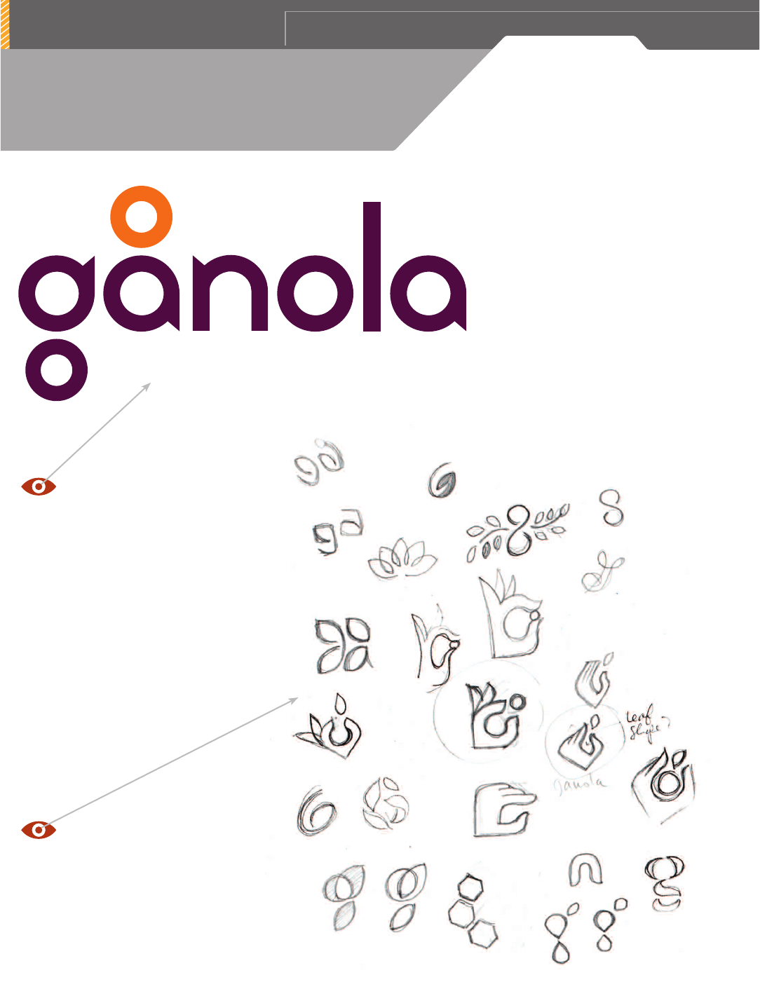
When it comes to natural or earth-friendly sub-
ject matters you normally see design approaches
that are more organic. But this is a nice break
from that predictable approach. The aesthetic
they used is clean, simple, and iconic. This
aligns with Gånola’s underline choice of ingre-
dients and vision in that respect and reinforces
the premise of their name as well.
Gånola claims “If we can’t spell it, we don’t
use it,” peanut butter, honey, oats, coconut,
almonds, whole bran, cranberries, sunflower
seeds, blueberries, green tea, coffee beans,
bacon, apples, real maple syrup, whole oats, and
cinnamon: That’s it.
“Our brand name is derived from the Swedish
term
gå
, which means ‘tread.’ Since, as active
outdoors people and amateur environmentalists,
we firmly believe in utilizing the world as our
playground while treading lightly on the Earth
and leaving as little footprint as possible.”
In an age that is digitally driven, it’s nice to
see ideas thoroughly explored in analog form.
Looking at these thumbnail sketches you can
see several directions that could have equally
been refined and executed into other nice design
solutions on this project as well.
FIRM: JEREMY SLAGLE GRAPHIC DESIGN
DESIGNER / ILLUSTRATOR: JEREMY SLAGLE
WRITERS: CHRISTINE MYERS, VERB GARDEN
CLIENT:
GÅNOLA
(Ray)
(Fogra 39)Job:08-30930 Title:RP-Design Logo
#175 Dtp:225 Page:76
001-272_30930.indd 76 9/2/13 11:03 AM

(Ray)
(Fogra 39)Job:08-30930 Title:RP-Design Logo
#175 Dtp:225 Page:77
001-272_C69934.indd 77
9/2/13 9:58 AM
7 7
(Text)
The established brand colors used on each SKU work well, creating a cohesive product line. Secondary brand elements such as
the iconography used to distinguish flavors and ingredients, brings a nice touch of fun to the branding as a whole. Having the
actual product showing through the diecut window creates a nice visual contrast with the simplified nature of the packaging.
The overall packaging for each individual
flavor works well as a brand family while
distinctly establishing the individuality
of each product member.
I think the shelf presence for this
POS packaging is sophisticated
yet fun. It’s not cluttered with
trite marketing lingo, or annoy-
ing bursts—it lets the branding
do the heavy lifting in regards to
communication, and the iconog-
raphy helps to quickly identify
the specific flavor being sold.
(Ray)
(Fogra 39)Job:08-30930 Title:RP-Design Logo
#175 Dtp:225 Page:77
001-272_30930.indd 77 9/2/13 11:03 AM
..................Content has been hidden....................
You can't read the all page of ebook, please click here login for view all page.
