THE FOUNDATIONS OF ANY PAGE DESIGN are the document dimensions: page size, margins, and the number of columns. While all of these can be changed when the document is in progress, there’s nothing like getting it right to begin with.
Here are some things to consider when creating a new document:
What type of document is it? Is it a novel with one continuous text flow, a magazine or newsletter with multiple stories, a brochure, or a poster? Is the document a travel guide that will need to be compact and quickly accessible, or is it a luxurious coffee table book that will showcase the work of a famous photographer?
Are there images? If so, are they predominantly vertical or horizontal in orientation? Are they photographs, illustrations, maps, icons, or all of the above? Do they need to be integrated into the flow of the text?
Are there headings and subheads? If so, how many levels are there to this hierarchy?
Are there footnotes or endnotes?
Is there an index or appendix?
Is there any quoted matter?
Tip: Standard page sizes
US letter, A4, tabloid, etc., are convenient, but the world is full of documents in these sizes. Use them, but choose them intentionally because they offer the best solution for the design you are creating. Don’t choose them just because they are the default setting. If you opt for a nonstandard page size, be sure to get a cost estimate from your commercial printer before you commit to designing your publication at that size. It’s good to be different, but sometimes being different can come with a big price tag.
Tip
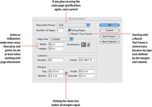
Another nice workflow feature is the ability to save your settings as a preset. Once you’ve keyed in the values you want, choose Save Preset. Thereafter you can choose the preset name from the Document Preset menu.
For as long as humans have been making printed materials they have been searching for the perfect page aspect ratio—the relationship of width to height. Many books have been written about the quest for the perfect page dimension; without getting into the formulas, here are four commonly used aspect ratios:
The Golden Section 1:1.618. This formula is based on the proportions of the human body and is also sometimes expressed as a 3:5 aspect ratio.
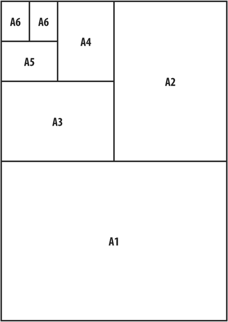
The Silver Section 1:1.4142. (the square root of 2). ISO paper sizes—A4, A3, etc.—are all based on this aspect ratio. It’s a clever and economical system because it allows you to fold one standard size into another, saving wastage on cutting up to make smaller sizes. You can make brochures by using the next size up. For example, fold an A3 page in two and you have two A4 pages; fold an A4 in two and you have two A5 pages, and so on. The standard US letter size (8.5 × 11 inches) is similar in aspect ratio to an A4 page (8.3 × 11.7 inches), but slightly wider and not quite as tall.
Photographic aspect ratio: 1:1.5. This yields sizes such as 4 × 6 inches, 6 × 9 inches, and 8 × 12 inches.
Business Card aspect ratio 2:3.5. This is the ratio of most business cards. Its size, and multiples of it, feel familiar.
The importance of margins is often overlooked. It’s easy to fall back on even margins of 1 inch or 25 mm, but by doing so you can miss a big opportunity to establish the margins of your document as an integral design element. Margins are an essential part of design. Glance at any page—margins are the first space you see and thus play a vital role in determining the reader’s initial impression of a page. Margins serve the following functions:
First and foremost margins are a frame for the page—and if you’ve ever done any picture framing you’ll appreciate how dramatically a frame can increase a picture’s impact.
A place for readers to put their thumbs
A space to write notes
A place to put the page folios—in either the top or bottom margins
Tip: Setting Up a Spread
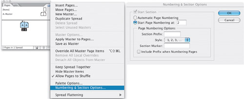
The first page of a two-page document is considered a right-hand page (or recto) meaning that the two pages will not appear next to each other as a spread. To make them do so, define your opening page as being an even-numbered page (or verso). Select the first page, and from the Pages palette fly-out menu choose Numbering and Section options. Choose Start page number, and type an even number.
Margins define the type area or text block but they are not absolute. Certain text elements like drop caps, pull quotes, and captions may hang outside the margins—as will punctuation if you are using Optical Margin Alignment. Pictures frequently break out of the text area, disrupting the rectilinear nature of the page and—potentially—making for a more dynamic layout.
Choosing even margins (click the linking icon to make sure it is unbroken) will make the rectangle of your type area the same aspect ratio as the rectangle of your page. However, an equally proportioned rectangle within a rectangle can look static, and, besides, other factors come into play—like extra space on the outer margins for convenient handling and extra space at the bottom or top for folios. It’s a big generalization, but margins typically progress from smallest to largest in the following order: inside, top, outside, bottom:
Starting with the Inside margin and moving clockwise around your page, this should be the smallest dimension. This margin should be at least 10mm.
Next, comes the Top margin (a.k.a. Head).
Then the Outside margin (a.k.a. Foredge), which should be big enough so the type doesn’t look confined by the page, and to allow space for the reader to handle the document.
Lastly, the Bottom margin (a.k.a. Foot) should be the biggest so as to avoid the type area looking bottom heavy and also to allow room for the folios. The top and bottom margins can be switched if the folios will be placed above the type area.
Note
When setting the inside margin, bear in mind that the binding will change the reader’s perception of the amount of space at the inside of the page. At worst, if the inside margin is too small, text will be “lost” in the shadow between the pages.
Tip: Do a Thumbnail Sketch
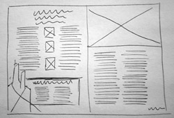
When working on a layout, no matter how zippy you are with InDesign, you’ll save yourself loads of time (and create a better-looking page) if you first draw thumbnails sketches. Don’t be embarrassed—no one but you need see them, but they are the fastest way of trying out ideas and for getting a sense of scale.
Golden Section margins call for a ratio of 3:5:8:13 (starting with the inside margin and moving clockwise). While this makes for harmonious proportions, it also makes for economically impractical margins.
Another popular ratio is 2:3:4:6, which produces margins that are still generous, yet look more familiar to a 21st Century eye.
If you are using a leading grid, the margins should be in increments of the grid. See Chapter 16: Everything in its Right Place: Working with Grids.
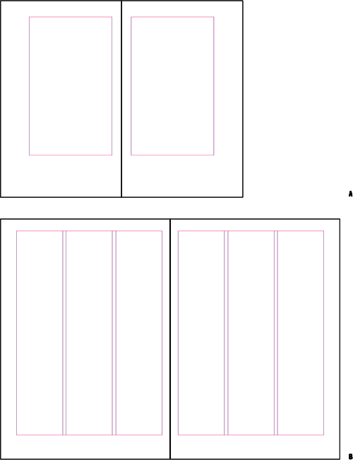
Figure 15.5. A page using Golden Section proportions 1:1.618 and margins 3:5:8:13 (example A) and an A4 page using margin ratios 2:3:4:6 (example B).
When working with single-page designs, like a poster or business card, equal margins at least on the left and right, might be more applicable. Here’s a simple formula that I often use: Find a printed piece that you admire at the same or similar size to the piece you’re working on. Measure its margins, and replicate them. Works like a charm.
The type area defined by your margins may be subdivided into columns. The relationship between the type size and the column width, or measure, is a key factor in determining the readability of your type. There’s no cast-iron rule for determining column width. Some jobs lend themselves to generous columns; often economy dictates narrower columns than are optimal.
As a rough guide, aim for 40 to 70 characters (including the spaces) per line. That’s a big range, so there’s plenty of scope. More than 70 characters and “doubling” can occur—the eye returning to the left column edge only to read the same line again. If you are obligated to work with a measure that is too wide, you can improve its readability by increasing the leading of your type. At the other extreme, if you have less than 25 characters per line, getting evenly spaced type will be next to impossible.
Tip
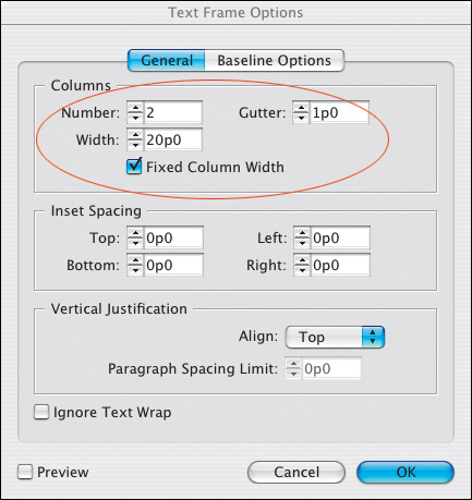
If you already know how wide you want your columns to be you can specify a fixed column width, and InDesign will adjust the size of your text frame accordingly. If you want columns of unequal widths, click and drag the column guides.
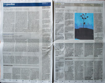
Take a look at your daily newspaper and you’ll find justified columns with a lot less than 50 characters. You’ll probably also find—without looking too hard—that these columns are riddled with huge word spaces. This is due to poor justification as a consequence of the narrow column measure. We’ve gotten used to bad typography in newspapers—which in their defense can say that they are produced under tight deadline pressure—and read them easily despite their typography, not because of it. Historically newspapers used smaller type than they do today. But while the type has gotten bigger, the columns haven’t grown proportionally, hence the justification problems. That said, there are notable exceptions—The Guardian (UK) has significantly raised the bar for newspaper typography in the last few decades.
The issue of column width is more problematic with justified type than with ragged type. If you are working with a narrow measure, do yourself a big favor and choose Left rather than Left Justified alignment.
In multicolumn documents, the separate columns of type should look like they are parts of a unified whole. If the space between your columns, or gutter width, is too wide, those columns will look like they bear no relation to each other. On the other hand, if the gutter width is too narrow, the reader’s eye may mistakenly cross over from one column to the next.
Typically gutter widths (the space between the columns) are 1 pica or 1 pica and 6 points. You might want to use a gutter width relative to the type size. A rule of thumb is that the gutter should be at least 1.5 ems wide so that it is clearly larger than the widest word space in the line. If you are working with a baseline grid, to achieve a uniformity of spacing, set your gutter width to the same value as your baseline grid increment, which in turn will be based on the leading increment of your body text. (See Chapter 16: “Everything in its Right Place: Working with Grids”)
When changing the number of columns here are some things to consider:
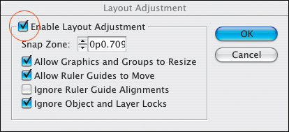
To change the number of columns for all the pages based on a specific Master Page, you should edit the Master Page itself. So that the changes adjust the text frames (and not just the guides) on your document pages, choose Layout > Layout Adjustment and turn on the Enable Layout Adjustment checkbox.
To change the columns for both left- and right-hand pages of a spread, select both page icons in the Pages palette, otherwise you’ll be changing just the left or the right page.
Alternatively, you can change the margins and columns for a range of pages by selecting those pages in your Pages palette.
To reflow your text according to your new column grid, the Layout Adjustment option must be enabled.
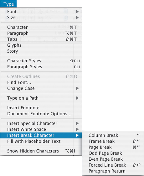
Using the Insert Break Character command, you can control how text flows into multiple frames. When you insert one of these characters, text is forced to the next column in the current frame, to the next threaded frame, to the next page, or to the next even or odd page. Breaks can also be incorporated as part of a style definition. For example, if you always want your Chapter Head style to begin on a new right-hand page, it’s preferable to include this as part of the style definition rather than manually inserting a break character before each of the Chapter Heads.

Page numbers, or folios as they are also known, are signposts to the reader, and as such they need to be positioned on the page where they can be seen easily. Practically, this means placing them outside the text area, either at the top or at the bottom of the page. The page number may be combined with running information—like the name of the magazine and month of publication or the chapter title, and separated from it by an em space—Cmd+Shift+M (Ctrl+Shift+M). The left and right pages of a spread typically mirror each other so that the page number is the outermost element.
Another convention is to put the author’s name at the top of the left-hand (verso) pages and the title of the book or chapter on the right-hand (recto) pages. This may be useful for short story collections or anthologies, which have multiple authors, but it’s unnecessary in a work by a single author. After all, how many times do you need to be reminded of the author’s name when you are reading a novel?
Auto page numbers should be put on the Master Pages so that they show up on all document pages that are based on that specific master page.
Folios on the inner margin make it impossible to quickly flip through the book to find the page you are after, and they are of little use to the reader.
In a novel using running heads at the top of the page, it is common to position the folio at the bottom of the page on chapter heading pages where a running head at the top of the page would interfere with the type treatment of the chapter heading. In such instances, consider making a separate master page for the chapter opening pages.
Folios should be at least a line space away from the text area of the page to differentiate them from the type.
Note
Master Page elements are locked on document pages. To modify a master page element on a document page, hold Cmd+Shift (Ctrl+Shift) and click the object to unlock it. To unlock all master page elements, choose Override All Master pages items from the pages palette menu. (This will mean that the page elements are no longer controlled by the Master Pages).
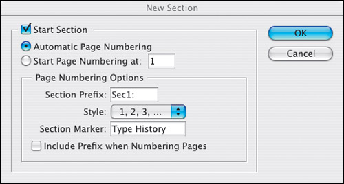
If you’re working with long documents that are divided into different sections, section markers can help simplify your project by cutting down on the number of master pages and/or the number of documents needed. Section markers can be used for different departments in a magazine, different parts of a book, or wherever a document is made up of distinctly different sections (just so long as they’re the same page size). Each section can have its own numbering scheme—Arabic, roman numeral, or abc. And here’s what makes them so useful: A master page can have more than one Section Marker.
Section Markers are easy to use and automatically add the name of a section or chapter to your document folios. You can format (or style) the section marker as you would any piece of text to determine its appearance.
To insert a Section Marker:
Create a text frame for your folio on a master page.
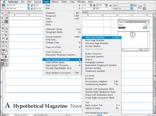
Ctrl+Click (Right Mouse+Click) and choose Insert Special Character > Section Marker from the context menu. The word “Section” will be inserted into your type.
Format the Section Marker the way you want it to look.
To “activate” the Section Marker on a document page, select the page where you want the section to begin in the Pages palette and choose Numbering and Section Options from the Pages palette menu. Type the section name into the Section Marker field and click OK. This section marker will now appear on all pages based on the master page until another section is defined.
If you are familiar with using Layers in either Photoshop or Illustrator, then InDesign’s layers will look very familiar. Layers determine the stacking order of objects on your page. In the example shown below, elements on the Text layer display (and print) on top of any elements on the Pictures or Panels layers. Each individual layer also has a stacking order, which you can control using the Object>Arrange menu. But layers trump Bring to Front and Send to Back. For instance, in the example shown, an object at the front of the Pictures layer is still beneath an object that is at the back of the Text layer. Where there are no objects on a layer you see through to the layer(s) beneath.
You’re under no obligation to use layers in InDesign, but it’s a good idea to do so, especially if you’re working on layouts that involve combining text with graphics. Layers allow you to view and edit specific kinds of content in your document without affecting other kinds of content, significantly speeding up your workflow. For example, you can hide the pictures layer when concentrating on the text and vice versa. You can also use layers when working on multilingual documents, to display the text for different languages.
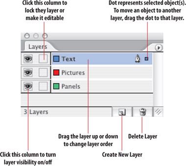
Figure 15.13. The Layers palette. What you name the layers is up to you, and there’s no limit to the number of layers, except common sense. Generally a maximum of five is enough for even the most complex of documents.
Fair enough, but for our purposes—type—layers are necessary to avoid printing problems. The potential for printing problems arises when you use transparent elements in your layout. In InDesign, transparency can mean a drop shadow, feathering, a Photoshop image with an alpha channel, or any object with a blend mode other than Normal and/or an opacity of less than 100 percent (See Chapter 18: “Text Effects”). When a document is printed it is flattened and any text that is in close proximity to a transparent element—for example, a text wrap around a layered Photoshop image—is in danger of being rasterized, and possibly ending up looking rather furry as a result.
The simple step to prevent this from happening is to move all text objects (except those that actually use transparency effects) to the top layer of your document—that way they get flattened last. As an extra security measure, be sure to talk to the person responsible for printing your files, and mention that you’re using transparency. And if you’re unsure about whether you are using transparency, if any of the page icons in the Pages palette display a checkerboard, then you are.