36. Expression Web 4 Add-In Basics
Add-ins in Expression Web
No software application can meet all needs for all people. No matter how many features Microsoft packs into Expression Web, there will always be designers who find that something’s missing. Fortunately, Expression Web is extensible so that users of the application can add functionality.
Previous versions of Expression Web were extensible only using a technology called Component Object Model, or COM. Using Visual Studio, Microsoft’s development studio, a developer can create a COM add-in that adds functionality to Expression Web. (If you’ve used any of my add-ins that I distribute from Jimco Software, you’ve used a COM add-in.) There is a significant barrier to entry for COM add-in development, and most web designers don’t possess the skill set necessary to develop them.
Note
You can view a tutorial on how to create a COM add-in at http://jimcobooks.com/articles/061130/Default.aspx.
Expression Web 4 still allows for COM add-ins, but it adds an exciting new add-in architecture that allows web designers to use existing skills in HTML, XML, and JavaScript to develop add-ins. HTML is used to create user-interfaces, and JavaScript is used to add functionality to Expression Web 4 add-ins.
 For more information on adding functionality to an add-in using JavaScript, see “Adding Functionality with JavaScript,” in the online Chapter 37 on page 673.
In this book, I cover everything you need to know to build add-ins using the new JavaScript and HTML extensibility model. I also cover the basics of how you can call into a COM add-in from a JavaScript add-in.
Note
Microsoft intends for JavaScript add-ins to be used with disk-based sites only. If you use a JavaScript add-in with a server-based site accessed using HTTP or FTP, you may encounter unexpected results.
I’ll provide guidance on what you can expect with server-based sites in Chapter 39, “Expression Web 4 JavaScript API Reference.”
Expression Web 4 JavaScript Add-ins
Using the JavaScript add-in model in Expression Web 4, you can create add-ins with three different main components: panels, dialog boxes, and commands.
Panels are available from the Panels menu. The interface for the panel is developed using HTML code, and functionality is provided using JavaScript. Panels open as floating panels, but users of the add-in can drag and drop the panel to dock it if desired.
Tip
Microsoft’s documentation says that there are three types of add-ins: panel, dialog box, and command add-ins. However, since it’s possible for a single add-in to have any combination of those three, I believe it’s more accurate to call these components of an add-in and not refer to them as types of add-ins.
Dialog boxes are displayed as a modal dialog of a specific size. The dialog box interface is developed using HTML, and functionality is provided using JavaScript. JavaScript can be used to control the functionality of the dialog box itself as well as add functionality for the add-in.
Commands add a menu command or a toolbar button that runs JavaScript code when the menu item or toolbar button is clicked. Commands are also used to launch dialog boxes.
You may already be familiar with using JavaScript to add functionality to a web page running inside a browser. When you use JavaScript to develop Expression Web add-ins, you are not interacting with a web page in the browser. Instead, you are using JavaScript to interact with files (web pages and other files) inside the Expression Web interface. You can also use JavaScript to interact with Expression Web itself.
I’ll explain how to do all of that in the next few chapters, but before we get into the details of implementing an add-in, it’s important to understand some of the basics that make up an Expression Web add-in.
The Makeup of Expression Web Add-ins
Expression Web add-ins are made up of a collection of files. HTML files are used to present a user interface for panels and dialog-boxes. JavaScript code is often included directly in the HTML file, but can also be included as a separate script file with a .js file extension. Add-ins can also include any number of collateral files such as image files, CSS files, and so on.
Tip
Since add-ins can be created right from within Expression Web, the easiest way to create an add-in is to create a new disk-based site and then create your add-in files within that site.
Add-ins also contain a special XML file called a manifest. The add-in manifest (named addin.xml) describes the add-in to Expression Web. It’s used to tell Expression Web the components included with the add-in, the files included with the add-in, and other information necessary for the proper functioning of the add-in. The manifest also includes information such as the add-in’s name, the name of the developer, the version number, and so on.
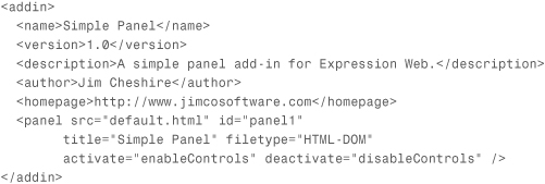
Listing 36.1 shows a simple add-in manifest for an add-in that displays a panel.
Listing 36.1. A Simple Manifest File
Add-in files can be saved into any folder, but the manifest must be inside the root folder for the add-in. Once you’re ready to use an add-in, you simply Zip the folder where the files are located and then rename the Zip file so that it has a .xadd file extension. You can then install the add-in using the Add-ins dialog available by selecting Tools, Add-ins in Expression Web.
I’ll cover all of this in explicit detail in the next few chapters, but what I want you to take away from this is that no specialized tools or complicated skill sets are required to create and deploy Expression Web 4 add-ins. You can create them right inside Expression Web, and you can create an installable package by simply renaming a Zip file. It really couldn’t be simpler.
XML Basics
Before I go into the details of the add-in manifest, you’ll need to know some basics about XML. XML syntax is actually used for the XHTML code with which you are probably at least somewhat familiar.
At the top level of an XML file is the root element. There is exactly one root element; no fewer, no more. Beneath the root element are child elements. There can be any number of child elements in an XML file, and each child element can also have its own child elements. The element directly above a child element is known as the parent element.
In the manifest in Listing 36.1, the <addin> element is the root element. All other elements are child elements.
All elements may contain one or more attributes. An attribute is defined within the XML element itself and consists of the attribute name followed by the attribute value in quotes. The following line of XML shows an attribute called developer with a value of yes.
<addin developer="yes">
Attribute names are case-sensitive, and attribute values must be enclosed in quotes.
Tip
Some XML files use camel case for attribute names. However, in an add-in manifest, all attribute names are lowercase.
All child elements in an XML file may contain attributes or text content. Text content is textual information surrounded by a particular element. In the XML code that follows, Simple Panel is the text content for the <name> element.
<name>Simple Panel</name>
The < and & characters are not legal characters for XML content. If you want to use these characters for attribute or text content, you need to use what’s called an entity reference. The entity reference for < is < and the entity reference for & is &. You might notice that both entity references contain the & character. The only time the & character is valid in an XML file is when it is used with an entity reference.
The following XML snippet defines a name of Jack & Jill Add-ins.
<name>Jack & Jill Add-ins</name>
Armed with this basic information about XML, you are now ready to learn the details about the add-in manifest. This chapter covers all the elements and attributes that you can use in an add-in manifest. Later chapters go into much more detail about how to use specific elements and attributes.
General Manifest Elements and Attributes
As mentioned previously, the <addin> element is the root element of the add-in manifest. Four optional attributes are available for the <addin> element.
Tip
Each element and attribute documented in the following sections includes a graphical representation of where that particular element or attribute fits within the manifest’s hierarchy.
src (optional)
<addin src='script.js'>
The src attribute is used to specify JavaScript source files that contain functions that the manifest references. This attribute is typically used for commands that don’t have a user interface. Scripts that are used with panels and dialog boxes are referenced within the HTML files used with those components.
Source file paths are relative to the add-in’s top-level folder, and you can add multiple source files by separating them with a comma.
legacy (optional)
<addin legacy='yes'>
The legacy attribute is set to yes when an add-in needs to access the legacy object model for Expression Web. The legacy object model provides access to the object model used by add-in developers in previous versions of Expression Web, and it has some additional functionality compared to the JavaScript API.
Use of the legacy object model is outside the scope of this book.
developer (optional)
<addin developer='yes'>
When set to yes, the developer attribute aids in testing and troubleshooting your add-in during development. By default, the context menu that appears when you right-click on a page is disabled for add-in panels and dialog boxes. By including the developer attribute with a value of yes, you can remove this restriction, allowing you to easily refresh the user interface of your panel or dialog box, view the source of your interface, and so on.
There are other benefits to setting the developer attribute to yes when you are developing your add-in. I’ll cover how you can use developer mode to debug your add-in in Chapter 39.
Note
You should not set the developer attribute to yes unless you are in the process of developing your add-in because doing so enables debugging tools that are not meant for end-users.
navigationallowed (optional)
<addin navigationallowed='yes'>
By default, Expression Web does not allow you to navigate away from the current page from within a panel or a dialog box. For example, if your dialog box contains a hyperlink, clicking the hyperlink does nothing by default.
In some situations, it may be necessary to allow a user of your add-in to navigate to other pages within your add-in’s user interface. For example, if your add-in’s interface is in the form of a wizard, you may want to implement each step of the wizard using a separate page. In such a scenario, setting the navigationallowed attribute to yes allows a user to navigate through the pages of your wizard.
<name> (required)
<addin>
<name='My Add-in'/>
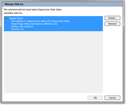
The <name> element specifies the name of your add-in. Once your add-in is installed into Expression Web, the value specified by the <name> attribute is displayed in the Manage Add-ins dialog as shown in Figure 36.1.
Figure 36.1. The name shown in the Manage Add-ins dialog is controlled by the <name> element. This add-in uses the manifest shown in Listing 36.1.
<description> (optional)
<addin>
<description='Simple Add-in'/>
The <description> element is used to provide a description of your add-in that appears in the Manage Add-ins dialog as shown previously in Figure 36.1
The <description> element is optional, but it’s a good idea to include it so that users of your add-in can more easily identify it inside the Manage Add-ins dialog.
<author> (optional)
<addin>
<author='Jim Cheshire'/>
The <author> element provides a means of displaying the add-in author’s name in the Manage Add-ins dialog.
<version> (optional)
<addin>
<version='1.0.21.12'/>
The <version> element allows for the inclusion of a version number for your add-in, and the value specified here is displayed in the Manage Add-ins dialog. The format of the version number is #.#.#.# where the first number is the major version and the others are minor version numbers.
If you include a version element, the major version number is required and minor version numbers are optional.
<homepage> (optional)
<addin>
<homepage='www.jimcobooks.com'/>
The <homepage> element allows you to include a URL where users of your add-in can get additional information. The URL you specify is included in the Manage Add-ins dialog, but it is not displayed as a clickable link.
<minversion> (optional)
<addin>
<minversion='4.5'/>
The <minversion> element is used to specify the minimum version of Expression Web that is required to use your add-in. The version number is specified using the same syntax used with the <version> element.
In the current version of Expression Web, the <minversion> element is ignored.
<guid> (optional)
<addin>
<guid='a85b04a4-1176-4ef6.../>
The <guid> element is used to specify a unique identifier for your add-in in the form of a GUID. The current version of Expression Web doesn’t use this element, but it may be used in the future for helping with upgrading add-ins.
<load> (optional)
<addin>
<load type="MyNs.MyAddin, MyNS" name="myAsmbly"/>
The <load> element is used to load a managed assembly (a .NET Framework DLL) that can add additional functionality to your add-in.
The <load> element has two attributes. The type attribute specifies the namespace and class name of your managed class along with the assembly (the DLL file) that contains the class. The name attribute specifies the JavaScript namespace you want to use to access the managed class from JavaScript.
The following <load> element loads a class called ManagedNamespace.UtilClass in an assembly called myClass.dll. Functions in UtilClass can be called from JavaScript using the util namespace.
<load type="ManagedNamespace.UtilClass, myClass" name="util" />
I cover calling managed classes from JavaScript in much more detail in Chapter 37, “Creating a Basic Add-in,” so if this is somewhat confusing to you at this point, don’t worry.
For more information on accessing managed classes from JavaScript, see “Accessing Managed Classes from JavaScript,” in the online Chapter 37 on page 682.
Commands and Dialog Boxes
As mentioned previously, a command is a menu item or a toolbar item that runs a JavaScript function when clicked. A command can also be used to launch a dialog box. (Panels aren’t launched using a command because they are automatically added to the Panels menu in Expression Web.)
The <command> element is a child of the <addin> element, and it has three attributes.
id (required)
<addin>
<command id='MyAddinCommand'>
The id attribute is a unique string that identifies the command. Expression Web uses the id attribute to correctly identify your command and respond to a user interacting with it.
Tip
It’s a good idea to use a value such as part of your name in your ID so that you don’t end up using the same ID as another add-in. For example, if I use MetaTag as the ID of my command, it’s possible that another add-in developer might use the same value. However, if I use JimcoMetaTag as my ID, it’s almost certainly going to be unique in all cases.
filetype (optional)
<addin>
<command filetype='HTML-DOM'>
It’s likely that your add-in will target specific types of files. For example, if your add-in is designed to generate HTML code for web pages, you wouldn’t want users to be able to access your add-in when a CSS file is active in Expression Web.
The filetype attribute allows you to define which types of files are valid for your add-in. If the type of file that is active in Expression Web matches a type specified in the filetype attribute, any menu items or toolbar buttons for the command are enabled. Otherwise, they are disabled.
Tip
If you don’t specify a value for the filetype attribute, menu items or toolbar items for your command will always be enabled.
The following are valid values for the filetype attribute:
• HTML—A file that has a .htm or .html file extension.
• PHP—A PHP page with a .php file extension.
• ASP—An ASP or ASP.NET page. File extensions can be .asp, .aspx, .asmx, or .ascx.
• CSS—A style sheet file with a .css file extension.
• JS—A JavaScript file with a .js file extension.
• HTML-DOM—Any file that contains an HTML DOM. For example, any .aspx file, .php file, .htm file, and so on.
• TXT—A file with a .txt file extension.
• XML—A file with a .xml file extension.
Note
Keep in mind that the filetype attribute of the <command> element doesn’t affect whether a panel’s menu item is enabled or disabled. Panels are completely separate from commands. I’ll cover panels later in this chapter.
You can specify multiple file types by separating multiple values with a comma.
onclick (optional)
<addin>
<command onclick='myFunction() '>
The onclick attribute is used to run a JavaScript function or expression when a command’s menu item or toolbar button is clicked. The onclick attribute can refer to a function inside an HTML file when using a dialog box or within a JavaScript file specified by the src attribute of the <addin> element.
If your add-in uses a dialog box, the onclick method is used to launch the dialog box by calling the method xweb.application.showModalDialog. In the following example, the onclick attribute specifies that a dialog box will be displayed that contains the contents of default.html, is titled My Dialog, has a width of 400 pixels and a height of 600 pixels, and is resizable and scrollable.
Menus and Toolbars
As mentioned earlier, panels are launched using the Panels menu in Expression Web. However, to run commands or launch dialog boxes, you need to add a menu item or a toolbar button (or both) for your add-in. Menu items are added using the <menuitem> element, and toolbar buttons are added using the <toolbaritem> element, both of which are child elements of the <command> element.
Tip
You may be wondering what you should click to cause the function or expression specified in the onclick attribute to run. I’ll cover that in the next section.
<menuitem> (optional)
<addin>
<command>
<menuitem>
The <menuitem> element is a child of the <command> element and is used to add a menu item to an existing menu in Expression Web. Expression Web will then control whether the menu item is enabled based on the filetype attribute in the <command> element. When the menu item is clicked, the function or expression you specified in the onclick attribute of the <command> element will be executed.
The <menuitem> element has five available attributes.
parent (required)
<addin>
<command>
<menuitem parent='MENU_Tools'>
The parent attribute is used to specify which menu in Expression Web should contain your menu item. The value specified for the parent attribute is the internal ID used by Expression Web for the menu. The internal ID is in the format of MENU_ followed the name of the menu. For example, the internal ID of the File menu is MENU_File.
Unless you also include a value for the before attribute, your command’s menu item appears last on the menu that you specify.
For a complete reference of internal IDs for Expression Web menus, see “Menu and Command Bar Reference,” p. 630, later in this chapter.
before (required)
<addin>
<command>
<menuitem before='MENU_Tools_AddIns'>
The before attribute allows you to specify where to place your menu item on the menu that you specified using the parent attribute. The value used for the before attribute is the internal ID of a menu item. The format is typically the internal ID of the menu followed by the text of the menu item. For example, the internal ID of the Save item on the File menu is MENU_File_Save.
Menus also have horizontal bars that separate groups of menu items. The internal IDs of these separator bars don’t follow the naming convention of other menu items. However, you can refer to the “Menu and Command Bar Reference” section at the end of this chapter to find the internal ID for them.
label (required)
<addin>
<command>
<menuitem label='Cool &Add-in'>
The label attribute is used to set the text that appears on the menu item for your add-in. When specifying a value for the label attribute, you should always define a hotkey for your menu item so that it is accessible for all users. To define a hotkey, add an underscore prior to the letter you want to use for the hotkey.
Tip
There’s no guarantee that your menu item will appear exactly where you specify. For example, if two add-ins are installed and both specify that a menu item should appear before Save on the File menu, the last one to load appears before Save, and the other add-in’s menu item is bumped up one position on the File menu.
imagesrc (optional)
<addin>
<command>
<menuitem imagesrc='MyAddin.png'>
If you’d like for your menu item to include an image, specify the path to the image using the imagesrc attribute. The image you specify appears to the left of the menu item, and it must be 16 pixels by 16 pixels and either JPG or PNG file format. Expression Web does not support JPEG 2000 format, so PNG is the only option if you need a transparent background.
Tip
Hotkeys appear underlined when the Alt key on the keyboard is pressed. Users can select menus and menu items by pressing the hotkey after pressing Alt.
Tip
It’s best to use PNG for your menu item’s image so that you can take advantage of transparency. Expression Web allows a user to use his or her Windows color scheme so you can’t predict the background color of menus in Expression Web. If you use PNG with transparency when you save your menu item’s image, it looks more professional.
tooltip (optional)
<addin>
<command>
<menuitem tooltip='Insert a Widget'>
The tooltip attribute is used to specify the text that should appear in the pop-up tooltip when a user hovers the mouse over your menu item. The tooltip should concisely describe what the menu item does.
<toolbaritem> (optional)
<addin>
<command>
<toolbaritem>
The <toolbaritem> element is a child of the <command> element and is used to define a toolbar button on a toolbar. When the toolbar button is clicked, the function specified in the onclick attribute of the <command> element is executed.
The <toolbaritem> element has five attributes.
parent (required)
<addin>
<command>
<toolbaritem parent="COMMANDBAR_Standard">
The parent attribute specifies which Expression Web toolbar will contain your add-in’s toolbar item. The value you assign to the parent attribute is in the format COMMANDBAR_ followed by the name of the toolbar.
To find the name you should use for a specific toolbar, right-click on a toolbar in Expression Web. The name used for the parent attribute is the name you see on the context menu, but you need to remove any spaces. For example, to add your toolbar item to the Style Application toolbar, use COMMANDBAR_StyleApplication for the parent attribute.
Tip
You can create your own toolbar for your toolbar item by specifying a toolbar name that doesn’t already exist. For example, to create a new toolbar called MyToolbar, use the value MyToolbar for the parent attribute. Spaces are not allowed.
before (optional)
<addin>
<command>
<toolbaritem before="COMMANDBAR_Common_Save">
The before attribute controls where your toolbar item appears on the toolbar specified in the parent attribute. Your toolbar item appears before the item identified by the before attribute.
The value for the before attribute is typically the value of the parent attribute followed by an underscore and the name (without spaces) of the toolbar item before which your toolbar item should appear. Toolbars have vertical separator bars between groups of buttons, and you can use the internal ID of one of these separators for the before attribute as well.
For a complete reference of internal IDs for Expression Web menus, see “Menu and Command Bar Reference,” p. 630, later in this chapter.
label (optional)
<addin>
<command>
<toolbaritem label="Add Widget">
Use the label attribute to set a text label for your toolbar item. A toolbar item can appear either as text or an image. If you want your item to appear as text, specify a value for label and do not specify a value for the imagesrc attribute.
imagesrc (optional)
<addin>
<command>
<toolbaritem imagesrc="addinitem.png">
Use the imagesrc attribute when using an image for your toolbar item. The image should be 16×16 pixels and either in PNG or JPEG format.
Because a toolbar item can be either a text button or an image button, if a value is specified for the imagesrc attribute, a value specified for the label attribute will be ignored.
tooltip (optional)
<addin>
<command>
<toolbaritem tooltip="Insert Widget">
The tooltip attribute allows you to add a textual tooltip that appears when a user hovers the mouse over your toolbar item.
Panels
If your add-in’s user interface is around 275 or fewer pixels wide, it may be suitable for a panel instead of a dialog box. Panels are defined using the <panel> element.
<panel> (optional)
<addin>
<panel>
The <panel> element defines a panel that can be opened using the Panels menu. Panels are floating by default, but a user can dock the panel by dragging and dropping it to an edge in the Expression Web interface.
The <panel> element has nine attributes.
id (required)
<addin>
<panel id="MyPanel">
The id is a unique value that identifies your panel to Expression Web. Just as with the value used for the id attribute of the <command> element, you should ensure that the value is unique by including a common string not likely to be included by another add-in developer.
title (required)
<addin>
<panel title="My Add-in">
The value given for the title attribute appears on both the Panels menu and also in the tab for your panel. Just as with menu items, you can use an underscore to define a hotkey for your panel’s menu item on the Panels menu.
src (required)
<addin>
<panel src="panel.htm">
The src attribute is used to specify the web page that contains the source for your panel’s user interface.
filetype (optional)
<addin>
<panel filetype="HTML-DOM">
The filetype attribute is used to specify when the function or expression that is specified for the activate and deactivate attributes will run. When assigning a value to the filetype attribute, use one of the same values I defined previously for the filetype attribute of the <command> element.
activate (optional)
<addin>
<panel activate="activatePanel()">
Expression Web allows users to open a panel at any time. Therefore, to control whether a user can interact with your panel, you need to control whether the controls in your panel’s user interface are enabled.
Use the filetype attribute to specify which page type is applicable for your panel. You can then use the activate attribute to specify a JavaScript function or expression that enables the necessary control in your panel’s interface.
deactivate (optional)
<addin>
<panel deactivate="deactivatePanel()">
The deactivate attribute is used to deactivate your panel’s user interface when the page that is open in Expression Web doesn’t match a type specified by the filetype attribute. Just as with the activate attribute, the value for the deactivate attribute is a JavaScript function or expression.
ondocumentchanged (optional)
<addin>
<panel ondocumentchanged="resetPanel()">
The activate and deactivate attributes can be used to control two states of your panel: active and inactive. However, your panel’s user interface may also need to be updated in other situations. The ondocumentchanged, ondocumentsaved, and onelementchanged attributes are available for controlling your panel’s interface in other situations.
Note
The name ondocumentchanged makes you think that changing some content in the active document causes the function or expression you specify to execute. In fact, changing the content isn’t what causes a document change event. It’s actually changing the document itself that causes the ondocumentchanged attribute to come into play.
The ondocumentchanged attribute allows you to specify a JavaScript function or expression that executes when the page or file that is open in Expression Web is changed to a new page or a different page. You might, for example, want to use the ondocumentchanged attribute to specify a JavaScript function that resets your panel’s user interface to its initial state.
ondocumentsaved (optional)
<addin>
<panel ondocumentsaved="cleanPanel()">
If you require that your panel’s interface react to the active document being saved, you can use the ondocumentsaved attribute to specify a JavaScript function or expression that should run when the document is saved.
onelementchanged (optional)
<addin>
<panel onelementchanged="evalPanel()">
It’s possible that your panel might not be usable for any element on a page. For example, if your panel is designed to work with HTML tables, it doesn’t make sense for your panel to be available for user interaction unless a table is active in Expression Web. The onelementchanged attribute is designed to handle just such a situation.
Tip
If you need to enable or disable your panel based on the selected element, you can usually use the same JavaScript function or expressions used for the activate and deactivate attributes.
Caution
As a user is editing a document in Expression Web, the onelementchanged event happens often. To prevent performance problems, make sure that the JavaScript function or expression you specify for the onelementchanged attribute is light-weight.
By specifying a JavaScript function or expression in the onelementchanged attribute, you can determine whether the selected element is applicable to your panel and react accordingly.
Once you have an understanding of the add-in manifest, you have all the skills necessary to create menu items and toolbar buttons, control when those menu items and toolbar buttons are enabled or disabled, create panels, and much more.
In the next few chapters, you learn how to control the user interface of your panels and dialog boxes and how to programmatically interact with Expression Web and the web pages open within it.
Menu and Command Bar Reference
When defining menu items and toolbar items in your manifest file, it’s necessary to know the internal ID of Expression Web’s menu items and toolbar items. The following reference allows you to determine the correct value for your parent and before attributes.
Menus
The following tables list the internal IDs of all menus and menu items in Expression Web. Use the value specified in the Parent column for the parent attribute and the value in the Internal ID column for the before attribute in your manifest file.
Table 36.1 shows the internal IDs of all items on the File menu.
Table 36.2 lists the internal IDs of items on the Edit menu.
Table 36.3 lists the internal IDs of items on the View menu.
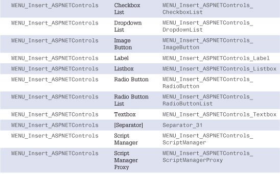
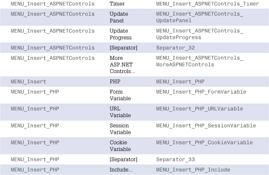
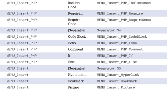
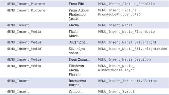
Table 36.4 lists the internal IDs of items on the Insert menu.
Table 36.5 lists the internal IDs of items on the Format menu.
Table 36.6 lists the internal IDs of items on the Tools menu.
Table 36.7 lists the internal IDs of items on the Table menu.
Table 36.8 lists the internal IDs of items on the Site menu.
Table 36.9 lists the internal IDs of items on the Data View menu.
Table 36.10 lists the internal IDs of items on the Window menu.
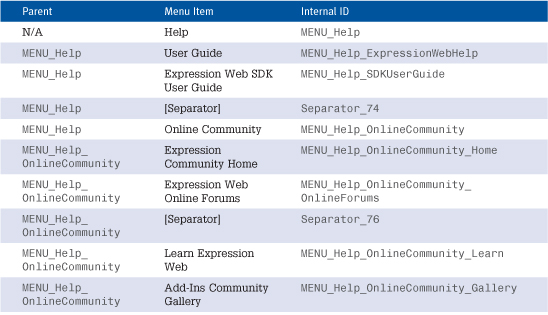
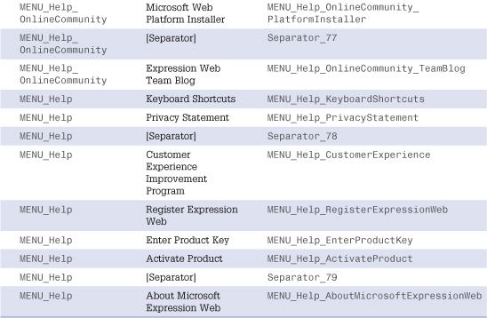
Table 36.11 lists the internal IDs of items on the Help menu.
Table 36.1. File Menu Internal IDs
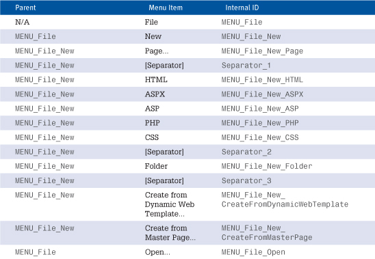
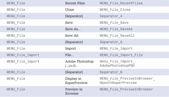
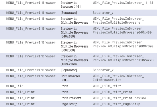
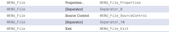
Table 36.2. Edit Menu Internal IDs
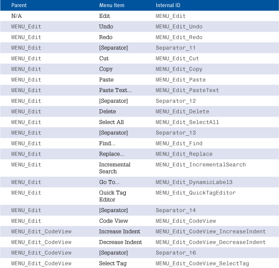
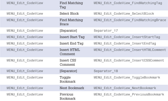
Table 36.3. View Menu Internal IDs
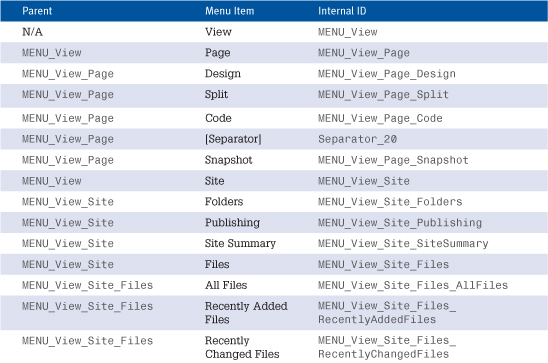
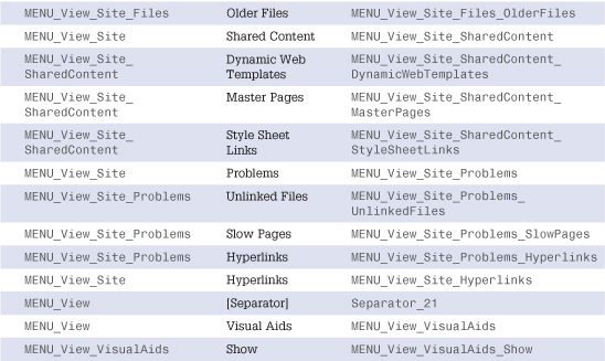
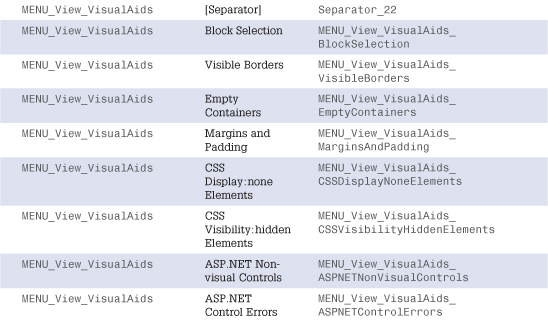
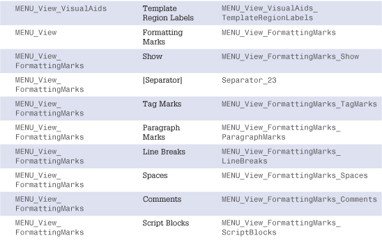
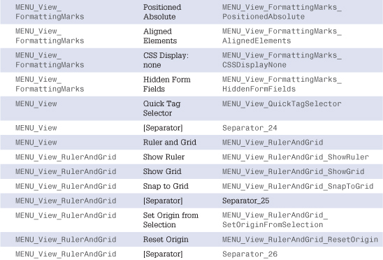
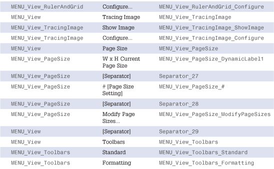
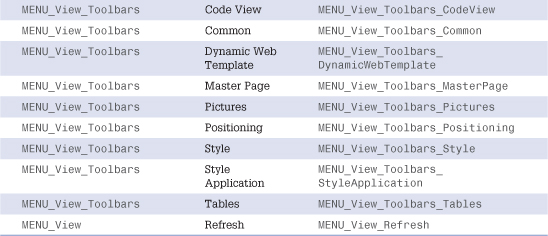
Table 36.4. Insert Menu Internal IDs
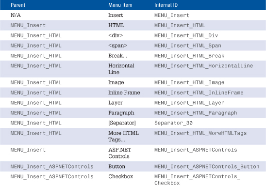
Note
It is not possible to add a new menu item before the Mark of the Web menu item on the Insert, HTML menu.
Table 36.5. Format Menu Internal IDs
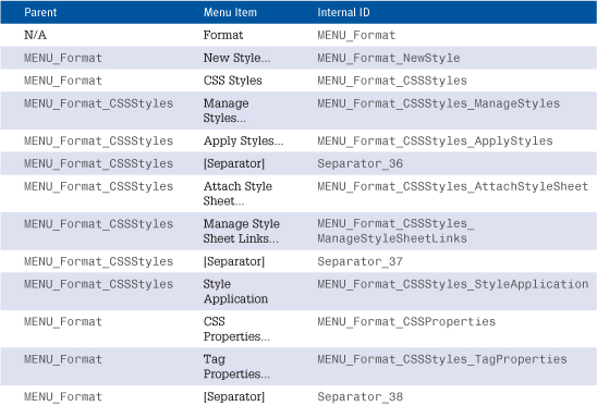
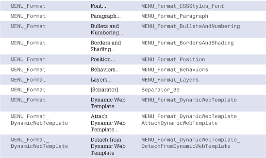
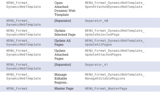
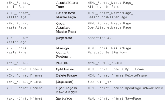
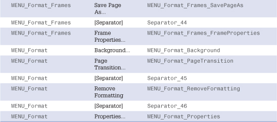
Table 36.6. Tools Menu Internal IDs
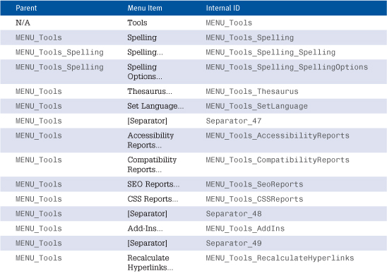
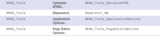
Table 36.7. Table Menu Internal IDs
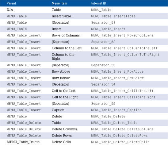
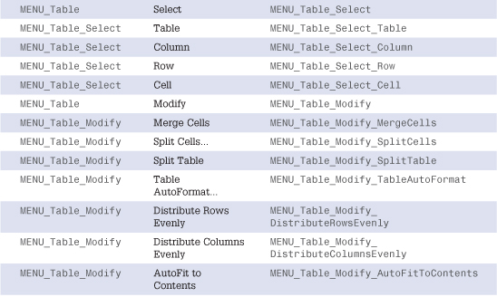
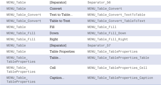
Table 36.8. Site Menu Internal IDs
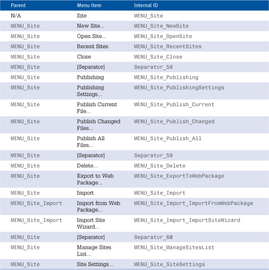
Table 36.9. Data View Menu Internal IDs
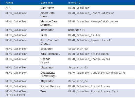
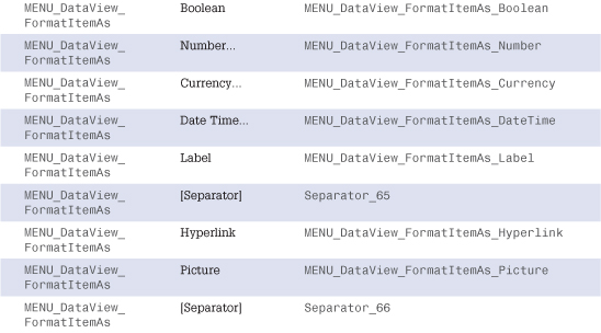
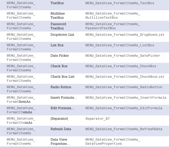
Table 36.10. Window Menu Internal IDs
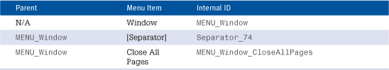
Table 36.11. Help Menu Internal IDs
To add a menu item to the Panels menu, create a Panel using the <panel> element in the manifest.
Toolbars
The following tables list the internal IDs of all toolbars and toolbar buttons in Expression Web.
Table 36.12 shows the internal IDs on the Standard toolbar.
Table 36.13 shows the internal IDs on the Formatting toolbar.
Table 36.14 shows the internal IDs on the Code View toolbar.
Table 36.15 shows the internal IDs on the Common toolbar.
Table 36.16 shows the internal IDs on the Dynamic Web Template toolbar.
Table 36.17 shows the internal IDs on the Master Page toolbar.
Table 36.18 shows the internal IDs on the Pictures toolbar.
Table 36.19 shows the internal IDs on the Positioning toolbar.
Table 36.20 shows the internal IDs on the Style toolbar.
Table 36.21 shows the internal IDs on the Style Application toolbar.
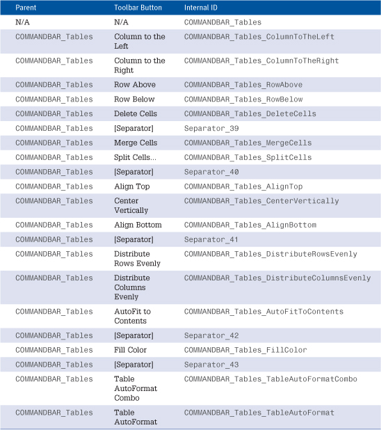
Table 36.22 shows the internal IDs on the Tables toolbar.
Table 36.12. Standard Toolbar Internal IDs
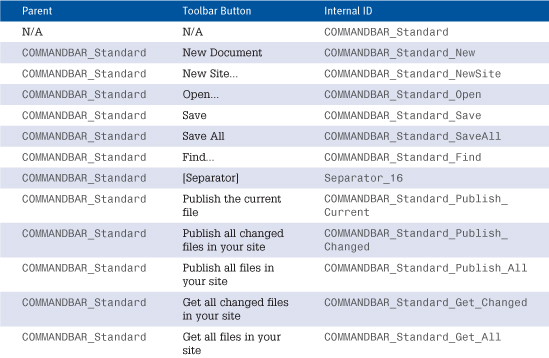
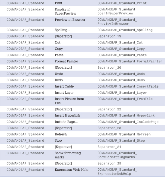
Table 36.13. Formatting Toolbar Internal IDs
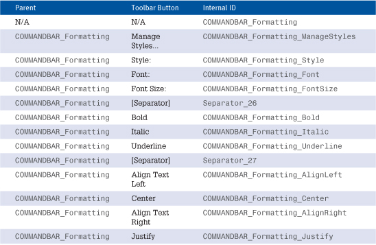
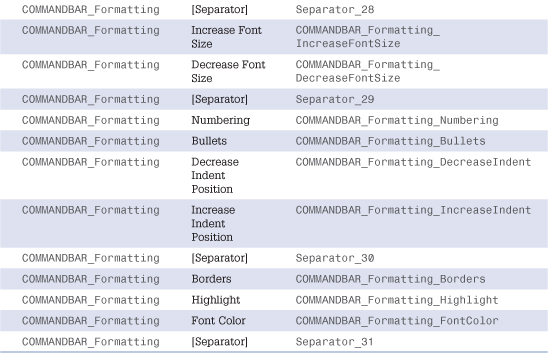
Table 36.14. Code View Toolbar Internal IDs

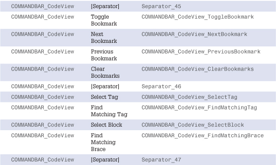
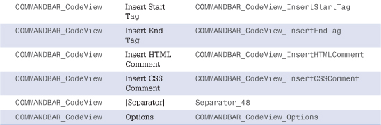
Table 36.15. Common Toolbar Internal IDs
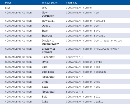
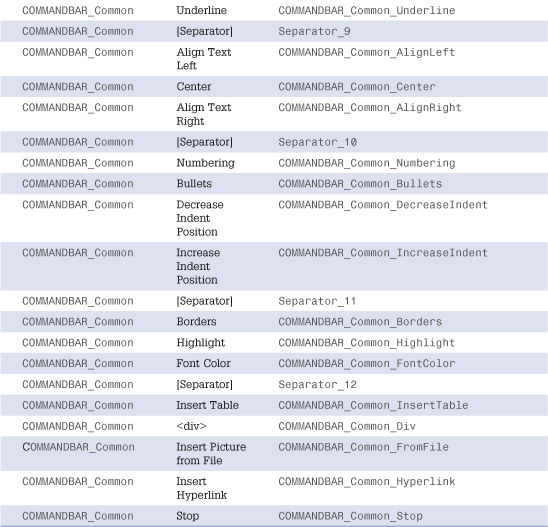
Table 36.16. Dynamic Web Template Toolbar Internal IDs
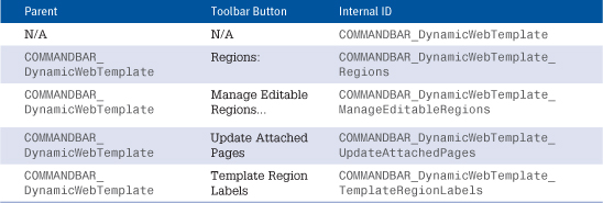
Table 36.17. Master Page Toolbar Internal IDs
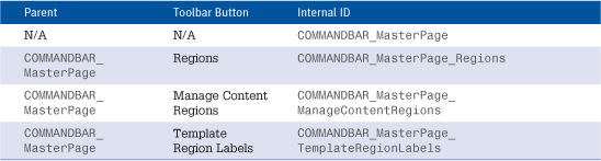
Table 36.18. Pictures Toolbar Internal IDs
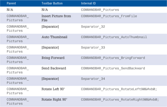
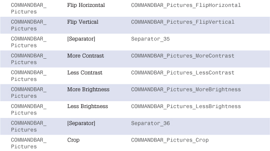
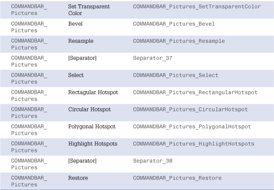
Table 36.19. Positioning Toolbar Internal IDs
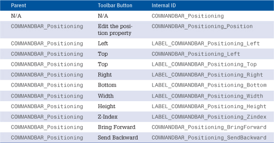
Table 36.20. Style Toolbar Internal IDs
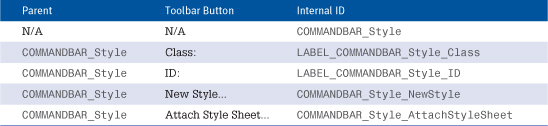
Table 36.21. Style Application Toolbar Internal IDs
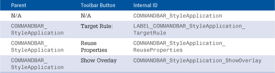
Table 36.22. Tables Toolbar Internal IDs