
5. Using Tables
The Origin of Tables
If you look back at the origins of HTML, you’ll see a handful of particle physicists formulating a method for displaying scientific and educational data. Much of that information lent itself to being displayed in a tabular format, and out of necessity, HTML tables were born.
Tables are an excellent example of the true purpose of HTML. HTML was designed to be a layout language, and within a few years of the invention of HTML, tables began to play an important role in documents on the Web. As the Web progressed and HTML drifted into the hands of a more diverse collection of web developers, it began to be stretched to limits far outside its original intent.
Twenty years later, web developers are still using tables prolifically. Web development has drifted away from using tables for tabular data to using tables for complex layouts. You’d be hard-pressed to find a page these days that doesn’t contain at least one HTML table, and those that don’t are often the work of web developers who are proponents of a building movement to trend away from tables in favor of using Cascading Style Sheets (CSS) for layout.
 For more information on using CSS, see Chapter 17, “Creating Style Sheets.”
Note
I squeezed many years into the preceding history of HTML. HTML was actually created in 1989 by Tim Berners-Lee. The first tables appeared in what was called HTML+ some four years later.
I’m not going into detail about replacing tables with CSS. (I’ll cover some of that in Chapter 17, “Creating Style Sheets.”) I’m going to assume that if you’re reading this chapter, you want to learn how to use tables efficiently, so that’s exactly what we’re going to do starting right now.
The Makeup of an HTML Table Tag
HTML tables are made up of hierarchical tags that define one or more columns and rows. A table begins with an HTML <table> tag that defines the properties of the table. The <table> tag has several optional attributes that can be used to control the table’s appearance.
Note
For details on the many attributes (including notations on which attributes are deprecated), see the W3C’s recommendation at www.w3.org/TR/html401/struct/tables.html.
It’s important to understand the basics of how a table is put together in HTML code. It will help you understand the choices you can make in the Expression Web table dialogs.
The next few pages explain the tags that make up an HTML table. If you’re already familiar with the details of how a table is created in HTML, you can skip ahead to the section “Tables in Expression Web” later in this chapter.
The align Attribute
Barring any other formatting that overrides it, a table is aligned on the left of a page by default. The align attribute allows you to align a table on the right or make it centered in the page.
The following <table> tag aligns a table in the center of the page:
<table align="center">
The align attribute is a deprecated attribute, meaning it has been replaced with a different method of specifying table alignment. The preferred method of aligning tables is to use CSS. However, when you specify alignment while inserting a table in Expression Web, it uses the depreciated align attribute.
Tip
If the default table settings you see in Figure 5.1 don’t suit your needs, you can change them to whatever you want and then check the Set As Default For New Tables check box before you click OK. From then on, the Insert Table dialog defaults to your new settings.
Figure 5.1. The Insert Table dialog in Expression Web provides developers with one dialog for all the options necessary for various table layouts.
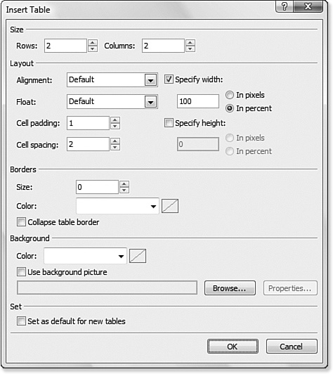
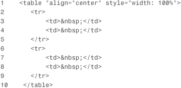
Listing 5.1 is the code that results from selecting Center in the Alignment drop-down of the Insert Table dialog as shown in Figure 5.1.
Listing 5.1. HTML Code for a Table Using the Center Alignment Attribute
Tip
All table attributes can be adjusted using the Tag Properties and (if applied using CSS) CSS Properties panels.
Notice that Expression Web aligned the table using the align attribute. This method of aligning tables is deprecated and the preferred method is to use CSS.
For more information on formatting page elements with CSS, see Chapter 17, “Creating Style Sheets.”
For more information on the Tag Properties and CSS Properties panels, see “Understanding the Tag Properties Panel,” p. 123, and “Using the CSS Properties Panel,” p. 307, respectively.
Table Borders
Expression Web uses the CSS Mode setting to determine how table borders are applied. By default, borders are applied using a CSS class, but you can override that using either the Style Application toolbar or by changing the Borders setting on the CSS tab of the Page Editor Options dialog.
For more information on the Page Editor Options dialog, see Chapter 11, “Configuring Page Editor Options.”
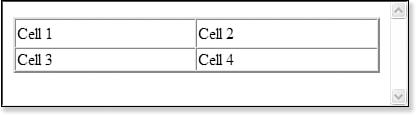
A table border is affected not only by size, but also by the cellspacing attribute. In Figure 5.2, the table shown has a border size of 2 and a cellspacing value of 2. Notice that it appears to have a double border. The table in Figure 5.3, on the other hand, has a solid border without the double border appearance. The only difference between the two tables is that the table in Figure 5.3 has a cellspacing value of 0 instead of 2.
Figure 5.2. A table with a cellspacing value greater than 0 appears to have a double border due to the cellspacing. This table has both a cellspacing and a border setting of 2.
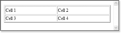
Figure 5.3. In comparison to the table in Figure 5.2, this table has a cellspacing of 0. All the other attributes are the same. Notice the double border is now gone.
The cellpadding Attribute
The cellpadding attribute is a pixel or percentage value that specifies the amount of space between the border of a cell and the contents of the cell.
Note
You can’t set a percentage value in the Expression Web user interface, but the W3C specifies that a percentage value is valid. If you want to use a percentage, you need to modify this property in code.
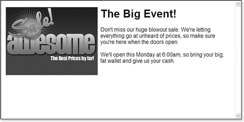
A common use of cellpadding is to provide a buffer for content in separate cells. The table in Figure 5.4 shows a common use of tables in web design. An image is in one table cell, and the accompanying text is in another table cell. In this example, cellpadding is set to 0. Notice that the text in the second cell is touching the right edge of the image, making the presentation look unprofessional.
Figure 5.4. When text runs right up against an image, it looks unprofessional.

Tip
If you’d prefer to use CSS to apply padding to your table cells, you can use the CSS padding property. For more information, see www.w3schools.com/css/css_padding.asp.
In Figure 5.5, I’ve set the cellpadding to 4. All other settings remain the same. Notice that the application of cellpadding has transformed an unprofessional presentation into an attractive and effective one.
Figure 5.5. The application of cellpadding to the same table has transformed the presentation into one that’s professional and effective.
The cellspacing Attribute
The cellspacing attribute controls the space between cells. It can be specified in either pixels or a percentage value.
Tip
If you’d prefer to use CSS to apply spacing to your table cells, you can use the CSS border-spacing property. For more information, see www.w3schools.com/css/pr_tab_border-spacing.asp.
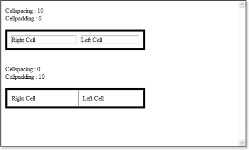
The difference between cellspacing and cellpadding can sometimes be difficult to see. As shown in Figure 5.6, cellspacing adds space between the border of the table and the border of a table cell, as well as adding space between table cells. cellpadding, on the other hand, adds space between the inside border of a cell and the content occupying the cell.
Figure 5.6. When you see cellspacing and cellpadding next to each other, the difference becomes clear.
The frame Attribute
The frame attribute provides for more granular control over how the border of a table is rendered. Without a border, the frame attribute has no effect.
Note
Although the frame attribute designers prefer to use the CSS border properties. See www.w3.org/TR/REC-CSS2/tables.html#borders for specific information.
The frame attribute can be configured in the Tag Properties panel and can have any one of the following values:
• above—The border across the horizontal top of the table appears in the browser. Other borders are ignored.
• below—The border across the horizontal bottom of the table appears in the browser. Other borders are ignored.
• border—A border is drawn around the table as a box. This setting produces the same output as the box setting.
• box—A border is drawn around the table as a box. This setting produces the same output as the border setting.
• hsides—A border is drawn on the horizontal sides of the table. In other words, a border will be visible across the top and bottom of the table.
• lhs—A border is drawn on the left side of the table. (lhs stands for left-hand side.)
• rhs—A border is drawn on the right side of the table. (rhs stands for right-hand side.)
• void—A border is not drawn around the table. Even if a border is explicitly set on the table tag, if the frame attribute is set to void, the border will not appear.
• vsides—A border is drawn on the vertical sides of the table. In other words, a border will be visible along the left and right sides of the table.
Rows, Columns, and Cells
Now that you’re familiar with the makeup of the <table> tag, it’s time to dig into the other tags that make up a table.
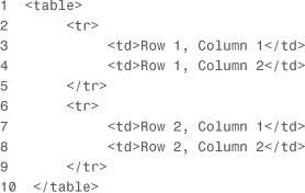
An HTML table is really just a collection of rows and columns. Rows are defined by <tr> tags, and columns are defined by <td> tags. <td> tags cannot exist outside a <tr> tag. The code in Listing 5.2 defines a simple HTML table containing two rows and two columns.
Listing 5.2. Code for Table Containing Two Rows and Two Columns
The colspan and rowspan Attributes
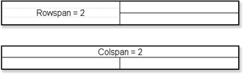
Each <td> tag pair that you see in Listing 5.2 represents one cell in the table. In this example, each column and row contain the same number of cells. In some cases, you might want to combine two or more cells into one cell. When you combine cells in a row, you use the colspan attribute on the row. When you combine cells in a column, you use the rowspan attribute on the column.
Figure 5.7 demonstrates the effect of using the colspan and rowspan attributes on a table.
Figure 5.7. Use the colspan attribute to combine cells in a row and the rowspan attribute to combine cells in a column.
For many people, dealing with the colspan and rowspan attributes in HTML code is difficult and confusing. Fortunately, Expression Web makes it easy, but it’s still helpful to understand what’s going on under the covers.
The code that follows defines the table shown in Figure 5.7, which has a rowspan of 2. Notice that the second <td> pair is missing from the second <tr> tag because the first column spans two rows.
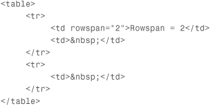
The colspan attribute, on the other hand, merges two or more cells horizontally across two or more columns, as shown previously in Figure 5.7. The code that follows defines the table shown in Figure 5.7, which has a colspan of 2:
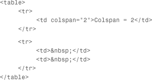
In this table, the second <td> pair is missing from the first row because the colspan attribute causes both cells in that row to be merged into one column.
Aligning Content in Cells
There are several alignment options for table cells. One way to align content in a table cell is by using the align and valign attributes. These attributes are actually deprecated in favor of CSS alignment, but many web developers still use them because of their widespread support by most browsers.
The align attribute aligns content horizontally in a table cell. Valid values are left, right, and center. The valign attribute aligns content vertically. Valid values are detailed in the following sections.
baseline
The baseline value aligns content on a common baseline. This option is best used when a cell contains a single line of text.
If you look at a line of lowercase letters, you’ll see that the bottoms of most letters are aligned horizontally. (Letters such as g, y, and j are exceptions.) That line upon which the letters are aligned is the baseline. Setting the valign attribute to a value of baseline aligns the content in your cell on the baseline.
bottom
When the valign attribute is set to bottom, the cell’s content is aligned at the bottom of the cell, as shown in Figure 5.8.
Figure 5.8. A valign value of bottom aligns a cell’s content nicely along the bottom of the cell.

middle
A valign value of middle centers the cell’s content vertically, as shown in Figure 5.9. This is the default setting. If no valign attribute is specified, cell content is be centered vertically.
Figure 5.9. A valign value of middle is the default setting and centers the cell’s content vertically.

top
The most common valign value is top. The table in Figure 5.10 shows the result of setting the valign value to top.
Figure 5.10. A valign value of top is the most common configuration for most sites.

This setting is often employed when using tables to align sliced images, as you’ll see later in this chapter.
Now that you know the basics of how a table is built in HTML code, let’s dig into how tables are created in Expression Web.
Tables in Expression Web
You have several ways you can work with tables in Expression Web, but you can break them all down into four major methods: the Insert Table dialog, the Table menu, the Tables toolbar, and the Tag Properties panel. Each method is suitable to specific types of tasks, but you might gravitate more toward one than the others. Even so, it’s best to learn the strengths of each method so you can efficiently create and manage your tables.
For more information on using the Tag Properties panel, see Chapter 7, “Editing Tag Properties.”
Inserting Tables
The Insert Table dialog (refer to Figure 5.1) is displayed by selecting Table, Insert Table in Expression Web. If a table has already been inserted on your page, you can access the Table dialog by right-clicking the table and selecting Table Properties from the menu.
The Insert Table dialog is divided into several sections:
• Size—The Size section includes settings for the number of rows and columns.
• Layout—This section includes alignment settings, width and height settings, and cellpadding and cellspacing settings.
• Borders—This section includes settings for border size and border color and a check box that allows you to easily collapse the border.
• Background—This section includes a setting for background image and background color.
• Set—This section includes a check box to configure the default settings for future tables.
Customizing Tables
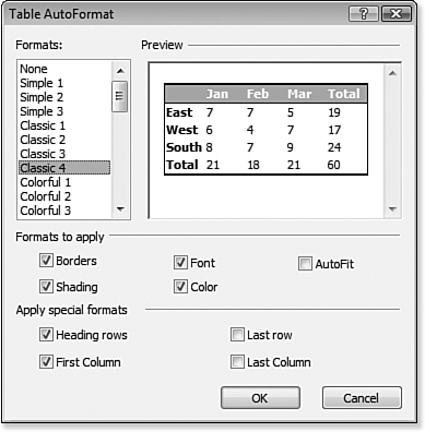
Expression Web can automatically format your table using the AutoFormat feature. Select Table, Modify, Table AutoFormat to access the Table AutoFormat dialog, shown in Figure 5.11. However, you’ll likely want more control over the formatting, and for that, you’ll need to use the options available on the Table menu.
Figure 5.11. The Table AutoFormat feature makes easy work of formatting a table. You have many attractive formats from which to choose.
Tip
You’re not going to want to autoformat your table if you’re using it to control layout. The Table AutoFormat feature is well-suited to displaying data in a table, but it’s not a good choice for a table that defines layout.
The Table menu is actually made up of two menu systems. The Table menu on the main menu bar allows you to insert a new table. After a table has been added to your page, you can use either the Table menu on the main menu bar or the Table context menu (see Figure 5.12), accessed by right-clicking a table, table row, column, or cell.
Figure 5.12. The Table context menu is a convenient way to alter a table that has already been inserted into a page.
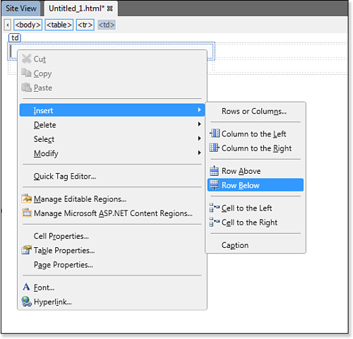
The Table context menu is essentially the same menu you find on the main toolbar. However, when working on a table in the designer, it’s more convenient to be able to simply right-click the table to change it. As we go through the rest of this section, you can use the Table menu on the main menu bar and the Table context menu interchangeably.
Let’s work through some common table tasks using the Table menu. Begin by creating a new page. We’ll use this page to experiment with tables throughout the rest of this chapter.
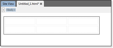
- Add a new table to your page by selecting Table, Insert Table from the main menu.
- Make sure that the number of rows is set to 2, the number of columns is set to 3, and the width is set to 400 pixels.
- Set
cellspacingandcellpaddingto 5. - Set the border color to black, the border size to 1, and click OK to insert the table.
You should now have a table that looks like Figure 5.13.
Figure 5.13. Even a simple HTML table has some pretty complex code behind it, but Expression Web lets you easily create a table.
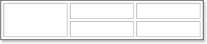
Selecting and Merging Cells
The table you created has two rows and three columns. Say that you want to add a graphic into the left column of this table and you want that graphic to take up the entire column. There are a couple of ways to accomplish that. You could slice the graphic into two pieces and insert one piece in each cell in the column. However, because the table has cellspacing and cellpadding values of 5, that won’t result in the effect you want. Instead, as shown in Figure 5.14, you’ll end up with space around the graphic that makes it painfully obvious that it’s two graphic files.
Figure 5.14. Slicing the Expression Web graphic for this table isn’t a good idea. As you can see, you end up with whitespace that makes it look awful.

Note
The graphics used in this chapter are located in the ch5filesWebsiteimages folder at informit.com/register.
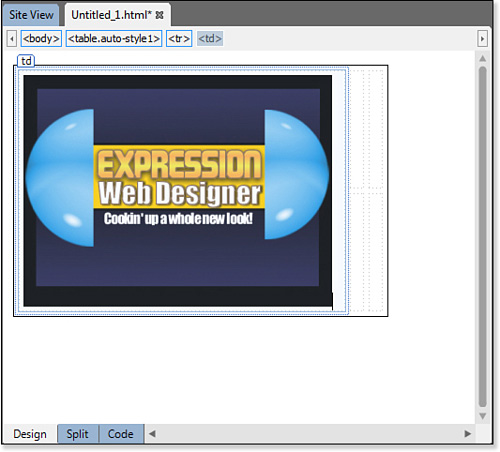
In this case, a better solution is to merge the two cells in the leftmost column into a single cell. You can then insert the Expression Web graphic into that one cell without having to slice it and you’ll end up with exactly what you want.
Tip
An alternative here would be to remove the cellspacing and cellpadding. However, for this example, we want to keep those settings as they are.
The first step in merging the cells in the leftmost column is to select both cells. There are many ways to do that:
• Use the Quick Tag Tools.
• Move the insertion point to the top of the column until the cursor becomes a downward-pointing arrow and click.
• Select the first cell by clicking it, and then drag the mouse down to select the entire column.
• With the insertion point in one of the cells, hold down the Ctrl key and click in the other cell.
• Select the HTML code in Code View.
For more information on using the Quick Tag Tools, see Chapter 8, “Using the Quick Tag Tools.”
For more information on editing HTML code in Code View, see Chapter 4, “Using Page Views.”
I personally prefer to move the insertion point to the top of a column and then click when I see a downward-pointing arrow. After you select the cells, right-click either of them and select Modify, Merge Cells. You should end up with a table similar to what’s shown in Figure 5.15.
Figure 5.15. The leftmost column of the table has now been merged into a single cell. It’s now a perfect spot for our Expression Web graphic.
Click inside the cell you just merged and insert a graphic. You can use the ewd.jpg graphic from the ch5filesWebsiteimages folder at informit.com/register. Your table should now look like Figure 5.16.
Figure 5.16. The image now sits in a column of merged cells and looks perfect.
Note
For the purpose of this example, I created a table that might be too wide for some screen resolutions. We’ll talk more about designing for different resolutions in the “Designing for Multiple Resolutions Using Tables” section of this chapter.
For more information on working with images in Expression Web, see Chapter 14, “Publishing a Site.”
Aligning Content in Cells
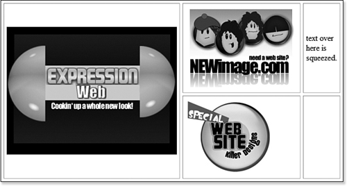
At this point, the alignment in your table looks fine. However, as new content is added, things will change.
- Add the
newimage.jpgimage to the top center cell. - Add the
killer.jpgimage to the bottom center cell. - Add some text to the upper-right and lower-right cells.
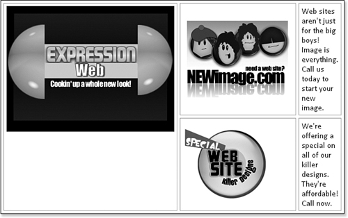
You should now have a table that looks similar to Figure 5.17. Things have obviously gone terribly wrong, and our table doesn’t look good at all at this point.
Figure 5.17. Our table has quickly gone from a nice-looking presentation to a terrible one. Fortunately, we can fix this pretty easily.
Tip
You can split cells into two or more cells by right-clicking in a cell and selecting Modify, Split Cells. You can then split the cell into two rows or two columns.
Fortunately, we can fix this problem with a few tweaks to alignment and a small change in the size of the table.
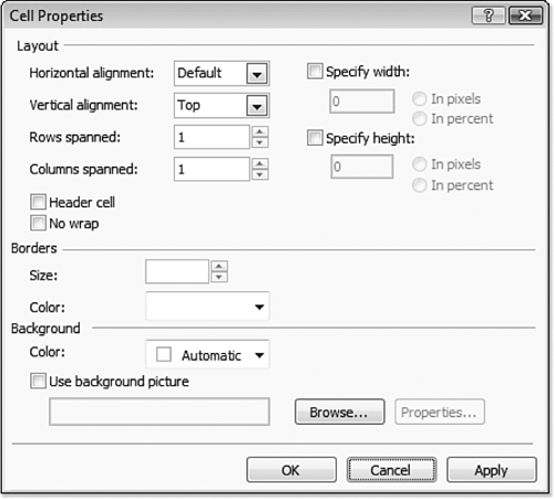
- Right-click the large graphic in the leftmost cell, and select Cell Properties from the menu. The Cell Properties dialog appears.
- Click the Vertical Alignment drop-down and select Top, as shown in Figure 5.18. Click OK.
Figure 5.18. The Cell Properties dialog is a quick and easy way to adjust the properties of a single cell.
- Repeat steps 1 and 2 for both cells in the rightmost column.
Your table should now look like Figure 5.19.
Figure 5.19. The table is starting to take shape now. It’s still a bit narrow, but the alignment looks good.
Adjusting Table Width
The final step is to change the width of the table. Here are several ways to adjust the width of a table:
• Select the table and drag the right edge until the table is the desired width.
• Edit the HTML in Code View.
• Use the Quick Tag Tools.
• Select Table, Table Properties, Table on the main menu to access the Table Properties dialog, where you can modify the width.
• Right-click the table and select Table Properties from the menu to access the Table Properties dialog, where you can modify the width.
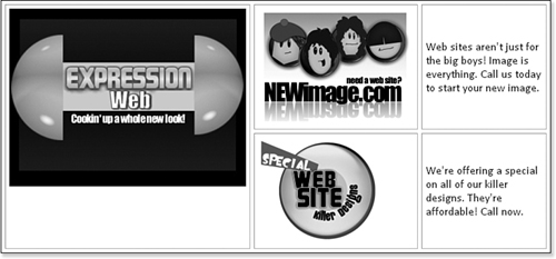
To alter the width of the table in the Table dialog, check the Specify Width check box and enter a new value for the width, as shown in Figure 5.20. I chose a width of 765 and selected the In Pixels radio button so the table will be 765 pixels wide. Your table should now look like Figure 5.21.
Figure 5.20. Increase the table’s width to make the text more readable.
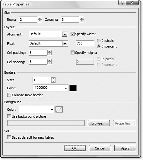
Figure 5.21. The completed table presents the information in a pleasing and well-formatted way.

Adding and Deleting Rows and Columns
In the example we just worked through, we created a table that had just the right number of rows and columns for our needs. In almost all cases in the real world, you need to adjust the number of rows and columns after a table has already been inserted. Fortunately, Expression Web provides numerous ways for doing this.
Tip
There are other ways to add a new row or column. The Table menu provides plenty of options for adding and deleting rows and columns. You also can add a new row by placing the insertion point in the rightmost bottom cell and pressing the Tab key on your keyboard.
It goes without saying that you can open the Table Properties dialog we worked with previously and change the number of rows or columns. Adding a new row using this method always adds the row to the bottom of the table. Adding a new column using this method always adds the new column to the right side of the table. This might not be what you want, so if you want more control, you need to use one of the other methods that Expression Web provides:
- Right-click the leftmost cell in the table; and select Insert, Rows and Columns.
- In the Insert Rows or Columns dialog, select Rows, making sure that the number of rows is set to 1 and that Below Selection is selected, as shown in Figure 5.22.
Figure 5.22. The Insert Rows or Columns dialog gives you full control over where rows or columns are added to your table.
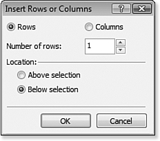
- Click OK to insert a new row to the bottom of the table.
Designing for Multiple Resolutions Using Tables
One of the most frustrating endeavors for web developers is ensuring that a site looks great in all screen resolutions. If you design for a resolution of 1024×768 and someone with a resolution of 800×600 browses your page, it won’t look the same. There are a few different ways you can alleviate this problem.
The first way is the easiest, and that is to set your main content table to a width of around 95%. Why 95% instead of 100%? It will look better if you allow for a small buffer space around the window’s scrollbars, and so on.
The second way is to specify a pixel width for those columns that require it and then have one column that is configured to fill the rest of the available screen space. For example, suppose you have a table with a menu along the left border and some ads along the right border. You would want the left and right borders to be a fixed pixel size so they match the size of the menu and the ads. The center column can be configured to fill the rest of the screen area by setting it to 100%.
The last method is to create your table so it fits nicely in the lowest resolution you believe people will use when visiting your site. If you choose this route, you’ll need to ensure that you account for the fact that you don’t really have 100% of the width of the screen to work with. For example, my wife runs her computer at a resolution of 1024×768, but she also always keeps the Favorites panel open in her web browser. Therefore, she has about 800 pixels in width that is visible to her even though her screen resolution is quite a bit higher.
Which method should you choose? The first two are the best choices. If you go with a percentage value, you can always be sure that most people will be able to view all your content without unnecessary scrolling.