Size Matters: The Importance of Scale
“It’s not the size of the dog, but the size of the dog’s fight.”
—Mark Twain
A character’s scale can vary from sequence to sequence. If you are designing “Jack and the Beanstalk,” your hero will have two size relationships. The first one will be to the objects in his home, and the second to objects in the Giant’s castle. Scale is established by designing the props with the character, but insufficient information can cause confusion.
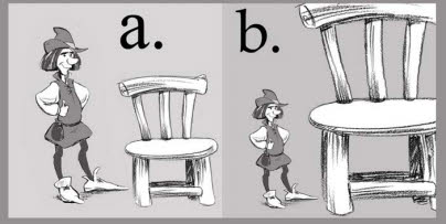
[Fig. 7-1] Jack and two chairs. The scale is ambiguous in (b).
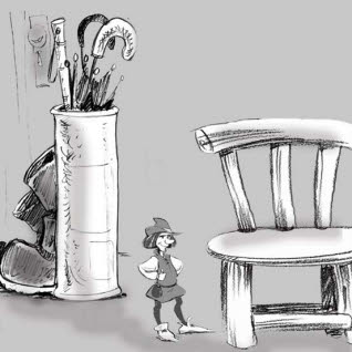
In Figure 7-1(a) we can accept that Jack is a normal-sized man with a normal-sized chair since they appear to work to the same scale. Example (b) is more ambiguous. It is not really clear in the second drawing whether Jack is a normal man with a very large chair, or a tiny man standing next to a normal-sized chair. He is put into proper context in Figure 7-2 by the addition of a background that shares the same scale as the chair.
[Fig. 7-2] The characters’ scale relative to the setting must be worked out at the start of the production. New scales are worked out for different settings, if required.
Scale must be determined at the start of the project. It’s particularly important to get this right when working with CGI characters. In one instance, a student designed and modeled two characters independently of one another and found that when he put them together, the passive character was twice the size of the aggressor. This was not ‘realistic’ but it was extremely funny, and fortunately for him this “mistake” worked out well in the context of his film.
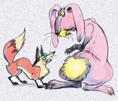
[Fig. 7-3] A very large rabbit chased by a very small fox. The fox was originally planned to be larger than the rabbit. The mistake produced a funnier film. Most scale accidents won’t end this happily.
Designers and story artists create a character ‘lineup’ similar to the one in Figure 7-4 at the start of the production to indicate variations in character size and scale. Many different scale combinations are tried to see which ones work best. Once rough size differences are agreed on, storyboard artists use the rough character sketches as “placeholder” characters on rough boards. The boards may be redrawn when the final character designs are created.
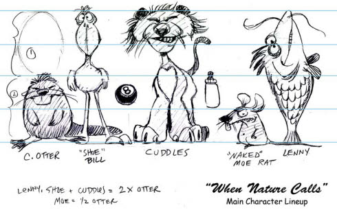
[Fig. 7-4] A ‘lineup’ of characters and typical props is drawn up at the start of the production to provide size and silhouette reference for storyboard artists. The character designs may not be finalized until much later.
Practicing Your Scales
Characters will display scale variations relative to each other, as in the lineup shown in Figure 7-4. Scale is additionally determined by backgrounds and props, as shown in Figures 7-2 and 7-5.
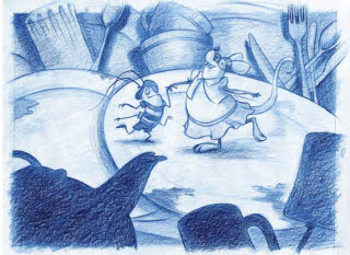
[Fig. 7-5] Props and backgrounds literally put the characters into perspective. Reproduced by permission of William Robinson.
[Fig. 7-6] A ‘giant’ may have large hands and a small head in proportion to the rest of its body. A very fat character might have hands and feet that are smaller than normal. Contrasting shapes within the design scale a character against itself.
Contrasting shapes are used to create visual interest and scale portions of the character against itself. Impressions of gigantism can be created by distorting the scale of the head and hands relative to the body as shown in Figure 7-6. A prop building and tree aids in establishing the giant’s size. A very fat character’s body size may be exaggerated by diminutive feet and hands.
Varied proportions create interesting character designs that read well at a distance. In Figure 7-7, character (a) is evenly proportioned with a smooth surface and no strongly defined forms. The design was drawn as an outline with no variation in the scale of the body parts. The exterior of the character was modeled first and the skeleton added later. Figure (b) was designed from the inside out, beginning with its skeleton. The limbs and body were carefully designed to display an interesting variety of scales and textures. Although the character was very small, its silhouette read well even in long shots.
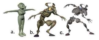
[Fig. 7-7] A symmetrical character and a second design that scales various portions of the character against itself. Reproduced by permission of Nathaniel Hubbell.
Villains are sometimes larger and heavier than the heroes. This makes the villain a more menacing presence and we automatically feel sympathy for the “little guy.” Burly actors playing villains in early comedies were actually known as “heavies” and this tradition continued in some animated cartoons. There were comedians who turned this stereotype on its head. Laurel and Hardy, who were both tall men, often cast very small actors as their villains. These nasty little men and women made their lives miserable in countless films. The villainy was projected by their actions and attitudes, not by their physical presence, and their silhouette contrasted amusingly with that of the two comedians. It is easy to ignore the fact that Stan and Ollie are taller than these menaces since their characters’ mental stature is so small.
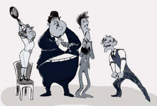
[Fig. 7-8] Caricature of Laurel and Hardy with James Finlayson and Daphne Pollard, two of their small villains.
Tex Avery took particular delight in having small, ‘cute’ characters react ferociously to large intruders, suddenly displaying outsized fangs or claws when annoyed. The scale of a mouth, the eyes, or the entire body would change dramatically in the famous “Tex Avery ‘Take’” and return to normal when it was over.
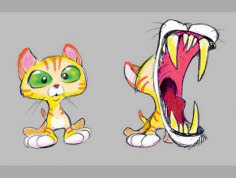
[Fig. 7-9] A cute character doing a Tex Avery “take.” Different parts of the cat’s body can change scale depending on its mood.
You may use or avoid stereotypes of scale as you use or avoid stereotypes of design. All’s fair in love and animation. But what if your hero and your villain are exactly the same size?
Triple Trouble: Working with Similar Character Silhouettes
When designing multiple characters it is common to work with contrasting silhouettes; for example, tall and thin versus short and fat.
What happens when your story decrees that all characters must be the same size and shape? They could be identical in action as well as in silhouette. This was common practice in early animated films. An example appears in Figure 7-11.
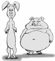
[Fig. 7-10] Two recognizably different pigs.
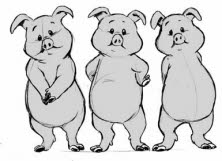
[Fig. 7-11] Three pigs or one pig repeated three times?
Color can differentiate between identical designs. This was also a standard way of working in the early years of animation. Figure 7-12’s pigs show distinct color variations but they’re still just the same pig design repeated three times.
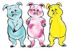
[Fig. 7-12] Three pigs, with color variations.
A more sophisticated method of differentiating the characters varies their body language. Identically designed characters can use distinctive poses, silhouettes, and attitudes to show differing personalities. Each will move differently from the others when they are animated since their attitudes will affect everything they do. An example of varied body language on the ‘standard pig’ is shown in Figure 7-13.
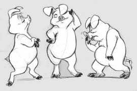
[Fig. 7-13] Prissy Pig, Pulchritudinous Pig, and Piggy Pig. Different body attitudes can create different characters. The middle pig now appears to be female.
You can associate certain props or costumes with each character. In Figure 7-14, props and costumes vary the pigs’ silhouettes so that identical body construction can be used for different personalities. Costumes can also suggest specific locations and time periods.
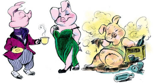
[Fig. 7-14] Piggy Props. Prissy, Pulchritudinous, and Piggy become stronger characters and suggest their settings with the addition of props and costumes.
Show your audience what you want them to see. Avoid telling them about it. The environment and the props associated with a character enable the audience to “read” the story and characters without your having to resort overmuch to filmic devices like voice-overs or explanatory dialogue.
Creative character and props designs will contribute enormously to the audience’s understanding of the story. Characters and props should have readable silhouettes that reinforce the staging and help frame the action.
It is not necessary to use light backgrounds to make your characters read well in the shot. Treat prop and character as part of the same composition and work for good silhouette value on both. It is a good idea to use simple perspective in your staging so that your character and the prop do not appear to be in two different dimensions as we saw in Figure 7-1. But don’t overdo it. Perspective and tonal values can be a doubleedged sword. Figure 7-15 shows a deliberately chaotic and confusing etching by
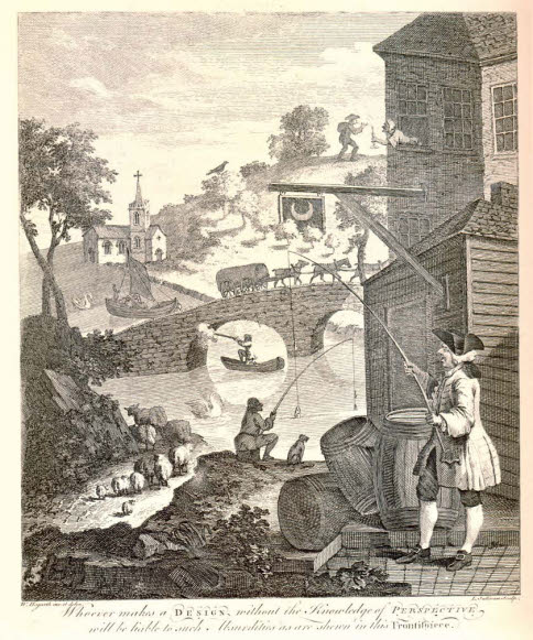
[Fig. 7-15] William Hogarth’s parody illustration has at least 43 perspective errors. The eye is drawn into the picture by the man in the foreground but all other pictorial elements are emphasized equally. As a result, none stands out. The scene’s composition is deliberately chaotic and confusing. (Nancy Beiman collection)
William Hogarth. The perspective is ridiculous and all pictorial elements are emphasized equally so no one element stands out. Compose your designs and compositions with forethought. Use contrast and staging to emphasize the important elements and gray down less important ones so that they do not cancel each other out.
The popular children’s book series Where’s Waldo? deliberately had the characters and the backgrounds drawn and rendered in precisely the same style. Each illustration featured flat lighting with no shadows, hundreds of near-identical characters with flat color, and no center of interest. Where’s Waldo? books were designed to keep small children occupied for hours poring over incredibly complex drawings in search of the central character. You literally don’t know where to look first.
A painting or a book can be looked at for hours at a time. A shot in an animated film will go by in seconds. It is crucial to direct the viewer’s eye precisely where you want it to go, whether you are working on a character design or a storyboard sequence. Test character silhouettes along with relevant props. Place the character on a simple background and shade their silhouettes with the side of a pencil or crayon. Is the character reading well in relation to the other scenic elements? Can you suggest a foreground, a middle ground, and a background with different tones?
Always consider how the character’s silhouette relates to other elements in the shot.
At the beginning of this chapter I discussed how to scale a character to a chair by adding items in the shot to put them into context. An object will scale a character, but they both must work with a background that frames the action and contains good composition. Figure 7-16’s pastoral scene contains strong tonal values and good silhouette value. The three trees in the background scale the pigs adequately but they are all the same size and standing in a row like ducks in a shooting gallery. The two identical pigs and the trees share a common picture plane. The staging is flat and uninteresting.
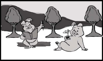
[Fig. 7-16] Everything in the frame is drawn to the same scale on the same picture plane.
The composition is improved when the trees and pigs are rescaled so that some of them are closer to the camera and some farther away. Figure 7-17 reads better than Figure 7-16 even though the tonal values are less dramatic. There is a feeling of depth to the scene. Tonal values are discussed in Chapter 10.
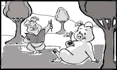
[Fig. 7-17] Varying the scale of the characters creates a feeling of depth and interest in the scene.
Getting Pushy
Animation grew out of illustration, cartooning, and caricature. Character designs that are pushed, or exaggerated slightly from the norm, are often more successful than those that attempt to reproduce reality. This principle also applies to backgrounds and props. A caricatured Victorian chair conveys the peculiarities of the style better than a ‘straight’ version, as shown in Figure 7-18.
[Fig. 7-18] Caricatured props work best with caricatured characters.
Animated camera moves may also be ‘pushed’ and caricatured along with the backgrounds and the characters. For example, exaggerated perspective introduces a whimsical note into the action in Figure 7-19 (B), which is more broadly staged than (a). Caricatured backgrounds can work with exaggerated camera angles to spice up, or “plus” the staging. Animated camera angles are usually stronger than their live-action equivalents since everything about an animation project is a little larger than life.
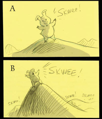
[Fig. 7-19] “Plus-ing” or exaggerating the design of the characters, backgrounds, and camera angles helps establish a whimsical mood.
Make sure that everything—character, setting, and story point—reads clearly at all times during preproduction and production. When the final project is screened your audience will not be able or willing to rewind to see what they missed, and you will not be standing by in their home or in the theater to explain what they should have seen.
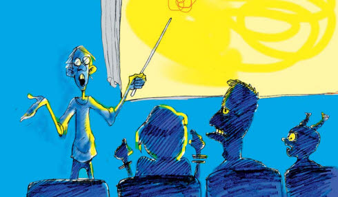
[Fig. 7-20] “What was supposed to happen here was…”