Understanding type basics
Getting to know the Type tools and modes
Entering and editing text
Making type follow a path
Editing text
Rasterizing a Type layer
Exploring masking, shaping, and warping effects
Yes, images are powerful. But so are words. In fact, humans tend to remember images better when they're combined with words. This is why we don't recall our dreams that well — no words are paired with the images. Enough psychobabble. You may never need to pick up a Type tool. But, just in case you need to add a caption, headline, or short paragraph, we want you to be comfortable using the Type tools.
Elements allows you to create, edit, stylize, and even distort type. Keep in mind that this capability is no substitute for a hard-core page-layout or word-processing program. But for small chunks of text here and there, it's surprisingly effective. This chapter is all about adding great-looking snippets of text to great-looking images — an unbeatable combo.
The text you create in Elements can be categorized in several different ways, but ultimately, you're either adding just a little text (such as a word or single line) or a lot (a paragraph or so). Accordingly, Elements can create type in two modes:
Point Type: Use this mode to create a headline or label. You can create point type by clicking in your image and typing; the line appears while you type and grows to whatever length you need. In fact, it even continues past the boundary of your image! Point type never wraps around to a new line. To wrap to the next line, you must press Enter (Return on the Mac).
Paragraph Type: Use this mode to enter longer blocks of text on an image. It's similar to the kind of type you're accustomed to working with in word-processing programs. In Paragraph Type mode, all the text goes into a resizable bounding box, and if a line is too long, Photoshop automatically wraps it around to the next line.
The Point Type and Paragraph Type modes each operate a bit differently, although they share many features and options. We explain each of them separately in the sections "Entering Point Type" and "Entering Paragraph Type," later in this chapter.
In addition to the two Type modes Elements offers (see Point Type and Paragraph Type modes in the preceding section), Elements is also capable of displaying and printing type in two different formats. Each format has its pros and cons, and which format you use depends on your needs. Here's a description of each one:
Vector type: All text in Elements is initially created as vector type. Vector type provides scalable outlines that you can resize without producing jagged edges in the diagonal strokes. You can edit type in this mode, adding or subtracting characters or adjusting attributes, such as kerning and tracking. Vector type is always of optimum quality and appears crisp and clean. (See Book III, Chapter 1 for more details on vector and rasterized images.)
Raster type: When Elements converts vector type into pixels, that text is rasterized. Elements refers to this rasterization process as simplifying. When text is simplified, it's no longer editable, but is converted into a raster image. In essence, it's a frozen graphic of the text. You usually simplify a vector type when you want to apply filters to produce a special effect or when you want to merge the type with the image. You can't resize simplified type without losing some quality or risking jagged edges. For more details, see the section "Rasterizing the Type Layer," later in this chapter.
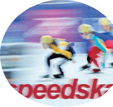
Elements has four Type tools (found in the Tools panel), but two of them are simply vertically oriented versions of the main two text implements, as shown in Figure 3-1. Don't worry about the Vertical Type tools. Although you can use them, they're really designed for the Asian market, to enter Chinese and Japanese characters. The Horizontal and Vertical Type tools are identical in their attributes, so we cover only the two Horizontal Type tools here, and for the sake of simplicity, we call them the Type tool and the Type Mask tool. You can use either the Paragraph or Point Type mode with either of the Type tools:
Type tool: Use this tool to enter point or paragraph type. This tool creates the type on its own type layer, except when used in Bitmap or Indexed Color modes, neither of which supports layers. For more on layers, see Book VI.
Type Mask tool: This tool doesn't create actual type; instead, it creates a selection border in the shape of the type you want to enter. The selection border is added to the active layer. You can do anything with a type selection that you can do with any other selection. For details on selections, see Book IV.
Most of the type you add to Elements will probably consist of point type. Point type is great for headlines, captions, labels, and similar small amounts of text. You can also use it to create logos and headings for Web pages. Point type is so called because it's preceded by a single anchor point, which marks the starting point of the line of type. Remember that point-type lines don't wrap automatically, as shown in Figure 3-2.
To enter point type, just follow these steps:
In the Editor, in Edit Full mode, open an image or create a new, blank document (or choose File

Select either the Type tool from the Tools panel or press the T key to select it, if it's visible.
If the Type tool isn't visible, press Shift+T to cycle through the type tools. Your cursor looks like an I-beam, similar to the one you see in a word-processing program.
Click the area of the image where you want to insert the text.
For horizontal type, a small horizontal line about one-third of the way up the I-beam shows the location of the baseline (on which the line of text rests).
Specify your type options from the Options bar.
All the options are described in the upcoming section, "Using the Options Bar."
Type your text and press Enter (or Return on the Mac) to begin a new line.
When you press Enter (or Return), you insert a hard return that doesn't move. You have to remove hard returns if you want to change the length of the lines you type.
When you finish entering the text, click the Commit (the check mark icon) button on the Options bar.
You can also commit the type by pressing Enter on the numeric keypad or by clicking any other tool on the Tools panel. A new type layer containing your text — indicated by the T icon — is created and appears in your Layers panel.

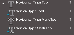
If you have larger chunks of text, it's more practical to enter the text as paragraph type. Paragraph type is similar to the text you enter in a word-processing program, except that it's contained inside a text box or a bounding box. While you type into a text box, the lines of text wrap around to fit the dimensions of the box. If you resize the box, Elements adjusts the wrapped ends to account for the new size.
You can type multiple paragraphs, use typographical controls, and rotate or scale the type. You can easily resize paragraph type (and point type, too) by entering a new point size value in the Options bar without having to reselect all the text. Just make sure the text layer is selected in the Layers panel and the Text tool is active. This approach works for all the other text characteristics, as well.
To enter paragraph type, follow these steps:
Open a saved image or create a new, blank Elements document in the Editor in Edit Full mode.
Select either the Type tool from the Tools panel or press the T key to select it, if it's visible.
If it isn't visible, press Shift+T to cycle through the Type tools.
Your cursor looks like an I-beam, similar to the one you see in a word-processing program.
On the image, insert and size the text box by using one of the following methods:
Drag to create a text box close to the size you want. After you release the mouse button, you can drag any of the handles at the corners and sides of the box to resize the box.
Hold down the Alt (Option on the Mac) key and click the image. The Paragraph Text Size dialog box appears. Enter the exact dimensions of a bounding box. When you click OK, the specified box appears, complete with handles for resizing the box later.
Select Type options from the Options bar.
Options are described in detail in the upcoming section, "Using the Options Bar."
Enter the text. To start a new paragraph, press Enter (Return on the Mac).
Each line wraps around to fit inside the bounding box, as shown in Figure 3-3.
If you type more text than fits in the text box, an overflow icon (plus sign) appears in the bottom-right handle. You can resize the text box by dragging any of the bounding box handles.
Click the Commit button (check mark icon) on the Options bar (or press Enter on the numeric keypad).
Elements creates a new type layer, as indicated by the T icon displayed in the Layers panel.
Several character and paragraph type settings are located on the Options bar, as shown in Figure 3-4. These options enable you to specify the type and pair it with your images.
Here's an explanation of each option, from left to right:
Font Family: Select the font/typeface you want from the drop-down list. Elements provides you with a WYSIWYG (What You See Is What You Get) font menu. After the font name, the word sample is rendered in the actual font. You also find one of these abbreviations before the font name to let you know what type of font it is:
a: Adobe Type 1 (PostScript) fonts
TT: TrueType fonts
O: OpenType fonts
Fonts with no abbreviation are bitmapped fonts.
Font Style: Some font families have additional styles, such as light or semibold. And other styles are assigned as separate typefaces. Only the styles available for a particular font appear in the list. The font style also supports a WYSIWYG menu.
Tip
If a font you want to use doesn't offer bold or italic styles, you can simulate either or both by selecting a faux style in the Options bar (T icons).
Font Size: Select your type size from the drop-down list or just type a size in the text box. Generally, text sizes are shown in points, with 72 points equaling approximately 1 inch.
Tip
If you don't like points, you can switch to millimeters or pixels by choosing Edit
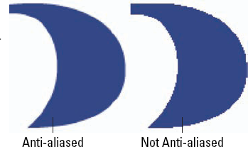
Anti-aliased: Select Anti-aliased to slightly smooth out the edges of your text. Anti-aliasing softens that edge by 1 pixel, as shown in Figure 3-5. For the most part, you want to keep this option turned on. The one occasion when you may want it turned off is if you're creating small type to be displayed onscreen, such as on Web pages. The soft edges can sometimes be tough to read easily.
Faux Bold: Use this option to create a fake bold style when a real bold style (which you'd choose under Font Style) doesn't exist. Be aware that applying faux styles can distort the proportions of a font. You should try to use fonts with real styles, and if they don't exist — oh, well.
Faux Italic: This option creates a phony italic style and carries the same warning as the Faux Bold option.
Underline: This setting obviously underlines your type, like this.
Strikethrough: Choose this option to apply a
strikethroughstyle to your text. In legal applications, strikethrough is widely used to show sections that have been removed, in their original context.Text Alignment: From the Text Alignment drop-down list, choose an option to align horizontal text on the left, center, or right. Left-aligned text is even with the left margin and allowed to be ragged on the right side of the column. Centered text is evenly centered in its column and ragged on both right and left edges. Right-aligned text is even with the right margin and allowed to be ragged on the left side.
If you happen to have vertical text, these options rotate 90 degrees clockwise and change into top, bottom, and center vertical settings.
Leading: Leading (pronounced "ledding") is the amount of space between the baselines of lines of type, usually measured in points. The baseline is the imaginary line on which a line of type rests. You can select a specific amount of leading or allow Elements to determine the amount automatically by choosing Auto. When you select Auto Leading, Elements multiplies the type size by a value of 120 percent to calculate the leading size. Therefore, Elements spaces the baselines of 10-point type 12 points apart. Elements adds that extra 20 percent so that the bottoms of the lowest letters don't "hook" onto the tops of the tallest letters on the line below them.
Tip
Wider line spacing can make text easier to read (as long as you don't go overboard!) or can be used for artistic effect. Tighter line spacing makes for more-compact text but can decrease readability if the tightening goes too far.
Text Color: Click the color swatch to select a color for your type from the Color Picker. You can also choose a color from the Swatches panel.
Create Warped Text: This option lets you warp and bend text by using 15 different types of distortion.
Change the Text Orientation: Select your type layer in the Layers panel and then click this option to switch between vertical and horizontal type orientations.
Cancel: Click this button (or press the Esc key) to cancel the text entry you're making. Use this option or the Commit option only after you click the Type tool on your canvas.
Commit: Click this button to apply the text to a type layer.
You can apply all the options described in this chapter while you enter text, or later, when you're rearranging words or fixing typos and other errors. To make changes to the text itself, just follow these steps:
Open your image in the Editor in Edit Full mode.
Select the Type tool from the Tools panel.
In the Layers panel, select the existing type layer you want to modify. Or click within the text to automatically select the type layer.
Tip
Double-click the T icon in the Layers panel to simultaneously select all the text on that layer and activate your Type tool.
After selecting your desired text, use the Options bar to make your changes:
Change the font family, size, color, or other type option: If you want to change all the text, simply select that type layer on the Layers panel. To select only portions of the text, highlight the text by dragging across it with the I-beam of the Type tool, as shown in Figure 3-6.
Delete text: Highlight the text by dragging across it with the I-beam of the Type tool. Then press the Backspace key When you're done modifying the text, click the Commit button.
Add text: Make an insertion point by clicking the I-beam within the line of text. Then, type new text.
When you're done modifying the text, click the Commit button.
Tip
Occasionally, you may want to transform your text. To do so, make sure that the type layer is selected on the Layers panel. Then, choose Image

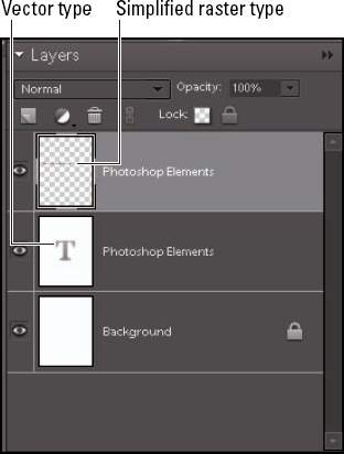
The Type tool creates editable type layers. You can change the wording, spacing, font, font size, and other factors as much as you want as long as the type remains in a type layer, which retains the vector format. (See the section "Understanding Different Kinds of Type," earlier in this chapter for details.)
However, after you make all the changes you want, you may need to convert your vector type layer to pixels in the form of rasterized type. In Elements, this rasterization process is referred to as simplifying. After the type is simplified, you can apply filters, paint on the type, and apply gradients and patterns.
If you're working with layers and flatten your image (merge your layers into a single background image), the type layers are also simplified and merged with the other pixels in the image. By the way, if you try to apply a filter to a vector type layer, Elements barks at you that the type layer must be simplified before proceeding and gives you the opportunity to click OK (if you want to simplify) or Cancel.
To simplify your type, select the type layer on the Layers panel and choose Layer
Note
After you simplify your type, you can no longer edit the type, nor can you resize the text without risking jaggies. Simplify your type only when you're certain you won't need to edit or resize it anymore. Another thing to remember about simplified type is that although it looks identical to vector type onscreen, it may not print as crisply and cleanly as vector type. So, if you're experimenting with painting or filters on type, just make a duplicate of the type layer before simplifying it and then hide that layer in the Layers panel. For details on working with layers, see Book VI.
In addition to its Vertical and Horizontal Type tools that we've been discussing up to this point, Elements includes Vertical and Horizontal Type Mask tools. These tools function almost identically to their conventional counterparts, with one important exception: Type Mask tools don't create a new layer. Instead, they create a selection on the active layer, like the one shown in Figure 3-8.
You can treat the selections created with the Type Mask tools just as you would any other selection. Try the following:
Move type mask selections around your document when any of the selection tools are active.
Store type mask selections for later use by choosing Select
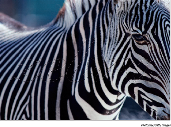
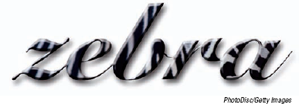
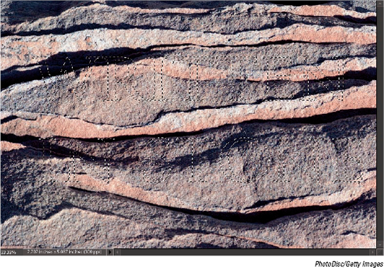
Use the selection to cut or copy portions of an image in text-shaped chunks, as shown in Figure 3-9. You can find out how this last technique works by following the steps in the Putting It Together project, "Carving Your Type out of Stone," coming up next, in which you find out how to literally carve your words in stone.
On a separate layer, fill the selection with a Foreground to Transparent gradient to have your type gradually fade out over the image, as shown in Figure 3-10. For details on gradients, see Book V, Chapter 2.
Carving Your Type out of Stone
You can use a Type tool to create selections shaped like text and then use images themselves as fills for the type. For example, if you're creating a floral-themed Web page, you can use pictures of flowers as the fill for the text. A type selection can cut out any part of a picture for use in any way you want.
Follow these steps to create letters made from stone:
In the Editor, in Edit Full mode, open the stone texture image you want to use.
Tip
We're using a sandstone wall, but you can use other kinds of stone, wood, or any texture that interests you.
Convert your background into a layer by double-clicking the word Background on the Layers panel and then click OK.
This step enables you to stylize the type later.
Select the Horizontal Type Mask tool from the Tools panel and then click the area where you want to enter text.
Select the font, font style, font size, and other text attributes from the drop-down lists on the Options bar.
Click the image and type the text. Then, click the Commit button (the check mark icon) on the Options bar.
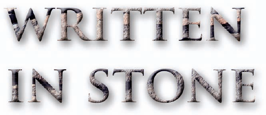
A selection border in the shape of the text appears on your image, as shown in the figure.
Choose Select
Press the Backspace (Delete on the Mac) key to delete everything outside your selection border. Choose Select
Your type is now filled with your stone texture.
Choose Window
Select the Bevels styles library from the drop-down list in the upper-right area of the Effects panel. Double-click the desired bevel.
Select the Drop Shadow styles library from the drop-down list in the upper-right area of the Effects panel. Double-click the desired shadow.
We selected a Simple Inner bevel and Soft Edge drop shadow to produce our stone letters, as shown in the figure.
To get all the details on how to use the other options in the Layer Style dialog box, check out Book VII, Chapter 3.
Tip
If you want to admire your type against a solid background, create a new layer and then choose Edit
You can do a lot more with type than create conventional labels, captions, or paragraphs of text. Type can become an interesting part of your image, especially when you stylize, warp, or otherwise transform it in interesting ways. Your Elements text can help enhance the impact of your image. The text of a beach scene can appear to be wavy, or watery and translucent. Halloween type can take on a ghostly or spooky appearance. Text on a wedding photo can be elegant and romantic. It all depends on how you create and apply various effects.
The following sections show you some of the tricks you can perform by stylizing and warping your type so that your words come to life and add something special to your images.
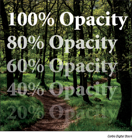
Layers are a digital version of the old analog transparency, or acetate, sheets. (Check out Book VI, Chapter 1 for the scoop on layers.) You can change the transparency of a Type layer — just as you can with any other layer in Elements — by reducing the opacity (transparency) of the type so that it enables the underlying layer to show through. Take a peek at Figure 3-11, which shows type at varying levels of opacity over an image.
The upcoming Putting It Together project, "Ghosting Your Type," shows you a way to use type opacity to create a ghostly effect.
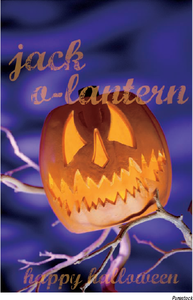
Ghosting Your Type
Need some ghostly, semitransparent type? Using Elements, you can twist, transmogrify, and transform your text. Create your type from scratch in an empty document or add the type to an existing picture or background. Just for the heck of it, these steps show you how to add ghostly writing to an existing image:
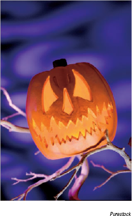
In the Editor, in Edit Full mode, open the image you want to use as a background for the ghost type.
Any image, ectoplasmic or not, will do. We chose a jack-o'-lantern, as shown in the figure.
Click the Foreground color swatch in the Tools panel and select the color you want to use for your text from the Color Picker.
For info on using the Color Picker, see Book III, Chapter 4. Black and orange are good Halloween colors, but you can use any contrasting colors.
You can also sample a color directly from your image by using the Eyedropper tool. Simply click your desired color and it then becomes your new foreground color.
Select the Horizontal Type tool from the Tools panel and then click the area where you want to add the text.
The vertical cursor that appears is the size that the text will be.
Select a font, style, and size from the drop-down lists on the Options bar, as shown in the figure.

Check the Anti-aliasing option on the Options bar to help smooth the edges of your type.
Type your text.
The text appears on top of the background.
Click the Commit button (the check mark icon) on the Options bar to insert the text you've typed into a layer of its own.
To change the opacity of the type, adjust the Opacity setting of the Type layer in the Layers panel.
Tip
To make additional changes to the text, you can apply a filter. For example, if you want to make the text wavy, select the Wave filter in the Filter
When you're satisfied with the look shown in the figure, save your image for additional editing later or choose Layer
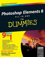
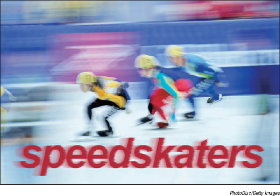
One of the most interesting things you can do with type in Elements that you can't do in a word-processing or page-layout program is apply special effects, such as filters. You can make type look as if it's underwater or on the move, as shown in Figure 3-12, where we applied a motion blur. The only caveat is that type has to be simplified before a filter can be applied. Be sure to do all your text-editing before you get to the filtering stage. Applying the filter is as easy as selecting the simplified type layer on the Layers panel and choosing a filter from the Filter menu. For more on filters, see Book VII, Chapter 1.
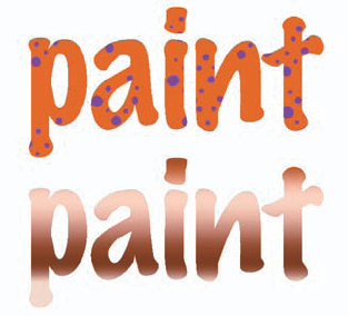
Changing the color of text is as easy as highlighting it and selecting a color from the Color Picker. But what if you want to do something a little more unconventional, such as apply brush strokes of paint randomly across the type, as we did in the first image shown in Figure 3-13? It's really easier than it looks. Again, as with applying filters to text, the only criterion is that the type has to be simplified first. After that's done, select a color, grab the Brush tool with settings of your choice, and paint. In our example, we used a rough, dry brush found in the Brushes presets. We used a diameter of 39, 15, and 6 pixels and just clicked the type a few times.
Tip
If you want the color or gradient to be confined to only the type area, you can select the text by either Ctrl-clicking (
You can also apply a gradient to your type. Here are the steps to follow after simplifying your type:
In the Editor in Edit Full mode, select the Gradient tool from the Tools panel.
On the Options bar, click the down-pointing arrow next to the Gradient Picker to access the Gradient Picker drop-down panel.
Choose a gradient.
If you want to create a custom gradient, find out how in Book V, Chapter 2.
Position the gradient cursor on the text where you want the gradient to start and drag to where you want the gradient to end.
If you're not happy, drag again until you get the look you want. Remember that you can drag at any angle and to any length, even outside your type. In the second image shown in Figure 3-13, we used the copper gradient and just dragged from the top of the letters to the bottom. We also locked the transparent pixels on the layer to confine the gradient to just the type area.
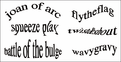
Elements's great automated Warp feature can twist your type in a variety of ways (see Figure 3-14) that are not only repeatable but, thanks to the controls in their dialog boxes, also customizable. The cool part is that even though type has been warped, it remains fully editable until you simplify it.
Type-warping is fun and easy to do. Select the Type tool in the Tools panel and then click the Create Warped Text button at the far-right end of the Options bar. (It's the T with a curved line below it.) This action opens the Warp Text dialog box, where you find a vast array of distortions on the Style pop-up menu with descriptive names such as Bulge, Inflate, and Squeeze.
You can adjust the orientation, amount of bend, and degree of distortion by dragging the sliders. The Bend setting affects the amount of warp, and the Horizontal and Vertical Distortions apply perspective to that warp. Luckily, you can preview the results while you adjust. We could give you technical explanations of these adjustments, but the best way to see what they do is to just play with them. Figure 3-14 shows some of the warp styles. The names speak for themselves.
Warning
Web designers take note: You can't warp text that has a Faux Bold style applied.