Understanding the Histogram panel
Adjusting lighting, color, and clarity
Working with the Smart Brush tools
If you've tried the quick automatic fixes on your photos but they didn't correct them to your satisfaction, this chapter should be of some help. Fortunately, Elements offers multiple ways and multiple levels of correcting and enhancing your images. If an auto fix doesn't work, elevate to a manual fix. Chances are that if you can't find the tools to correct and repair your images in Elements, those images are probably beyond salvaging.
Using this chapter and the information provided in Chapter 1 of this minibook as your jumping-off points, try to employ some kind of logical workflow when you tackle the correction and repair of your images. Personally, we're partial to the following series of steps:
Crop, straighten, and resize your images, if necessary.
After you have the images in their proper physical state, correct the lighting and establish good tonal range for your shadows, highlights, and midtones in order to display the greatest detail possible.
Often, just correcting the lighting solves minor color problems. If not, move on to adjusting the color balance.
Eliminate any colorcasts and adjust the saturation, if necessary.
Grab the retouching tools, such as the healing tools and filters, to retouch any flaws.
Sharpen your image if you feel that it could use a boost in clarity and sharpness.
Apply any enhancements or special effects, if desired.
By following these steps, in this order, you should be able to get all your images in shape to print, post, and share with family and friends.
One of the first things you want to do before you make any color or tonal adjustments to your image is to take a good look at the quality and distribution of the tones throughout your image. We don't mean just eyeballing the composite image on your screen. We're talking about getting inside your image and looking at its guts with the Histogram panel — and keeping it onscreen so you can see its constant feedback on your image adjustments.
A histogram displays the tonal range of an image, as shown in Figure 2-1. It shows how the pixels are distributed by graphing the number of pixels at each of the 256 brightness levels in an image. On this graph, pixels with the same brightness level are stacked in bars along a vertical axis. The higher the line from this axis, the greater the number of pixels at that brightness level. You can view the distribution for the entire image, a selected layer, or an adjustment composite (described in the following section).
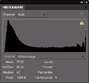
Figure 2.1. The Histogram panel displays how pixels are distributed at each of the 256 brightness levels.
Note
From this graph, you can determine whether the image contains enough detail in the shadow, midtone, and highlight areas. This information helps you determine what image adjustments you may need to make. The following steps walk you through the basics of using the panel and understanding the information you find there:
Choose Window

Choose your desired source of the histogram's display from the Source drop-down list:
Entire Image: Displays a histogram of the entire image.
Selected Layer: Displays a histogram of just the selected layers in the Layers panel.
Adjustment Composite: Displays a histogram of a selected adjustment layer and all the layers below it.
Choose to view isolated portions of your image by choosing an option from the Channel drop-down list:
RGB: Displays a composite image of all color channels — red, green, and blue.
Red, Green and Blue: Displays the histogram of each individual color channel.
Luminosity: Displays the luminance, or intensity, of the RGB composite image.
Colors: Displays the composite RGB histogram by color. Red, green, and blue represent the pixels in each of those channels. Gray represents the area where all three channels overlap.
Examine the tonal range in the histogram.
An image with good tonal range displays pixels in all areas. An image with poor tonal range has gaps in the histogram, as shown in Figure 2-2.
The rest of this chapter explains ways you can correct contrast and color problems that you find.
(Optional) If you're into numbers, check the statistics to evaluate your image, as well:
Drag your cursor within the histogram to see the statistics about a range of values. Or position the cursor within a specific area of the histogram you're interested in.
Some of these statistics, such as Standard Deviation, may be for those who live in the mathematical land of Statistics. But you may be able to get some useful information from the other statistics that can help you in your image-adjusting tasks. Here's a brief explanation of each statistic:
Mean: Average intensity value
Standard Deviation: How much the intensity values vary
Median: Middle value of the intensity value range
Pixels: Total number of pixels used to represent the histogram
Level: Intensity level
Count: The total number of pixels corresponding to that intensity level
Percentile: The number of cumulative pixels (in percentages) at or below that level, from 0% (left) to 100% (right)
Cache Level: The current level of image cache used to calculate the histogram. For more info on cache, see Book I, Chapter 4.
Elements has several simple, manual tools you can use to fix lighting if the Auto tools (that we describe in Book VIII, Chapter 1) don't cut the mustard. The manual tools offer more control for adjusting overall contrast, as well as bringing out details in shadow, midtones, and highlight areas of your images. Note that all lighting adjustments can be found in both Edit Full and Edit Quick modes.
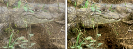
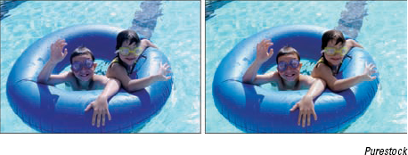
The Shadows/Highlights command offers a quick-and-easy method of correcting over- and underexposed areas. This feature works especially well with images shot in bright, overhead light or in light coming from the back (backlit). These images usually suffer from having the subject partially or completely surrounded in shadows, such as the original image (left) in Figure 2-3.

To use the Shadows/Highlights command, follow these steps:
In Edit Full or Edit Quick mode, choose Enhance
When the Shadows/Highlights dialog box appears, the default correction is applied automatically in your preview.
If the default adjustment doesn't fix the problem, move the sliders (or enter a value) to adjust the amount of correction for your shadows (dark areas), highlights (light areas), and midtones (middle-toned areas).
Try to reveal more detail in the dark and light areas of your image. If, after you do so, your image still looks as if it needs more correction, add or delete contrast in your midtone areas.
Click OK to apply the adjustment and close the dialog box.
If you want to start over, press the Alt (Option on the Mac) key and click the Reset button (previously the Cancel button).
Despite its very descriptive name, the Brightness/Contrast command doesn't do a great job of either brightening (making an image darker or lighter) or adjusting contrast. Initially, users tend to be drawn to this command because of its logical name and ease of use. But after users realize its limitations, they move on to better tools with more controls, such as Shadows/Highlights and Levels.
The problem with the Brightness/Contrast command is that it applies the adjustment equally to all areas of the image. For example, you may have a photo that has some highlights that need darkening, but all the midtones and shadows are okay. The Brightness slider isn't adept enough to recognize that, so when you start to darken the highlights in your image, the midtones and shadows also become darker. To compensate for the unwanted darkening, you try to adjust the Contrast, which doesn't fix the problem.
The moral is, if you want to use the Brightness/Contrast command, select only the areas that need the correction, as shown in Figure 2-4. (For more on selections, see Book IV, Chapters 1 and 2.) After you make your selection, choose Enhance
You can also find the Brightness/Contrast command in Guided mode.

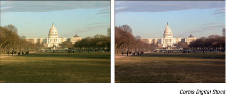
If you want the real deal when it comes to correcting the brightness and contrast (and even the color) in your image, look no further than the Levels command. Granted, the dialog box is a tad more complex than those for the other lighting and color-adjustment commands, but when you understand how it works, the payoff is well worth it.
You can get a taste of what Levels can do by using Auto Levels, explained in Book VIII, Chapter 1. However, the Levels command offers much more control. And, unlike the rudimentary Brightness/Contrast command, Levels enables you to darken or lighten 256 different tones. Keep in mind that Levels can be used on your entire image, a single layer, or a selected area. You can also apply the Levels command by using an adjustment layer, a recommended method, as we describe in Book VI, Chapter 1.
If you're serious about image editing, the Levels command is one tool you want to master. Here's how it works:
In Edit Full or Edit Quick mode, choose Enhance
We recommend using Edit Full mode for this command because you have access to the Info panel needed in Step 2.
The Levels dialog box appears, displaying its own histogram. This graph displays how the pixels of the image are distributed at each of the 256 available brightness levels. Shadows are shown on the left side of the histogram, midtones are in the middle, and highlights are on the right. For details on histograms, see the first section of this chapter.
Tip
Although you generally make changes to the entire document by using the RGB channel, you can apply changes to any one of an image's component color channels by selecting the specific channel in the Channel pop-up menu. You can also make adjustments to just selected areas, which can be helpful when one area of your image needs adjusting and others don't.
In Edit Full mode, choose Window
Set the black and white points manually by using the eyedroppers in the dialog box; first select the White Eyedropper tool and then move the cursor over the image.
Look at the Info panel, try to find the lightest white in the image, and then select that point by clicking it.
The lightest white has the highest RGB values.
Repeat Steps 3 and 4, using the Black Eyedropper tool and trying to find the darkest black in the image.
The darkest black has the lowest RGB values.
When you set the pure black and pure white points, the remaining pixels are redistributed between those two points.
You can also reset the white and black points by moving the position of the white and black triangles on the input sliders (just below the histogram). Or, you can enter values in the Input Levels boxes. The three boxes represent the black, gray, and white triangles, respectively. Use the numbers 0 to 255 in the white and black boxes.
Use the Gray Eyedropper tool to remove any colorcasts by selecting a neutral gray portion of your image, one in which the Info panel shows equal values of red, green, and blue.
Note that if your image is grayscale, you can't use the Gray Eyedropper tool.
Tip
If you're not sure where there's a neutral gray, you can also remove a colorcast by choosing a color channel from the Channel pop-up menu and doing one of the following:
Choose the Red channel and drag the midtone slider to the right to add cyan or to the left to add red.
Choose the Green channel and drag the midtone slider to the right to add magenta or to the left to add green.
Choose the Blue channel and drag the midtone slider to the right to add yellow or to the left to add blue.
If your image has too much contrast, adjust the output sliders at the bottom of the Levels dialog box.
Moving the black triangle to the right reduces the contrast in the shadows and lightens the image. Moving the white triangle to the left reduces the contrast in the highlights and darkens the image.
Adjust the midtones (or gamma values) with the gray triangle input slider.
The default value for gamma is 1.0. Drag the triangle to the left to lighten midtones and drag to the right to darken them. You can also enter a value.
Click OK to apply your settings and close the dialog box.
The contrast in your images should be improved, as shown in Figure 2-5.
Getting the color you want sometimes seems about as attainable as finding a pot of gold at the end of a rainbow. Sometimes, an unexpected colorcast (a shift in color) can be avoided when photographing, for example, by using (or not using, in some cases) a flash or lens filter. After the fact, you can usually do a decent job of correcting the color with one of the many Elements adjustments. Occasionally, you may want to change the color of your image to create a certain special effect. Conversely, you also may want to strip out most of the color from your image to create a vintage feel. Remember that all these color adjustments can be applied to your entire image, a single layer, or just a selection. Whatever your color needs, they'll no doubt be met in Elements.
All color adjustments can be found in either Edit Full or Edit Quick mode except for Defringe Layers, which is available only in Edit Full mode.
Tip
If you shoot your photos in the Camera Raw file format, you can open and fix your files in the Camera Raw dialog box. Remember that Camera Raw files haven't been processed by your camera. You're in total control of the color and the exposure. For more on Camera Raw, see Book III, Chapter 3.
If you ever took a photo in an office or classroom and got a nasty green tint in your image, it was most likely caused by the overhead fluorescent lighting. To eliminate this green tint, or colorcast, you can apply the Remove Color Cast command. This feature is designed to adjust the image's overall color and remove the cast.
Follow these short steps to correct your image:
Choose Enhance
The Remove Color Cast dialog box appears. Move the dialog box to better view your image. Note that this command is also available in Guided mode.
Click an area in your photo that should be white, black, or neutral gray, as shown in Figure 2-6.
The colors in the image are adjusted according to the color you choose. Which color should you choose? The answer depends on the subject matter of your image. Feel free to experiment. Your adjustment is merely a preview at this point and isn't applied until you click OK. If you goof up, click the Reset button, and your image reverts to its unadjusted state.
If you're satisfied with the adjustment, click OK to accept it and close the dialog box.
Tip
If the Remove Color Cast command doesn't fix the problem, try using the Color Variations command or applying a photo filter (as we describe in the section "Adjusting color temperature with photo filters," later in this chapter). For example, if your photo has too much green, try applying a magenta filter.
The Hue/Saturation command enables you to adjust the colors in your image based on their hue, saturation, and lightness. Hue is the color in your image. Saturation is the intensity, or richness, of that color. And lightness controls the brightness value.
Follow these steps to adjust color by using the Hue/Saturation command:
In either Edit Full or Edit Quick mode, choose Enhance
The Hue/Saturation dialog box appears. Be sure to select the Preview check box so that you can view your adjustments. Note that this command is also available in Guided mode.
Select all the colors (Master) from the dialog box's Edit drop-down list or choose one color to adjust.
Drag the slider for one or more of the following attributes to adjust the colors as described:
Hue: Shifts all the colors clockwise (drag right) or counterclockwise (drag left) around the color wheel.
Saturation: Increases (drag right) or decreases (drag left) the richness of the colors. Note that dragging all the way to the left gives you the appearance of a grayscale image.
Lightness: Increases the brightness values by adding white (drag right) or decreases the brightness values by adding black (drag left).
The top color ramp at the bottom of the dialog box represents the colors in their order on the color wheel before you make any changes. The lower color bar displays the colors after you make your adjustments.
Tip
When you select an individual color to adjust, sliders appear between the color bars so that you can define the range of color to be adjusted. You can select, add, or subtract colors from the range by choosing one of the Eyedropper tools and clicking in the image.
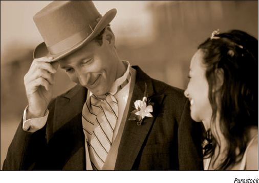
The Hue/Saturation dialog box also lets you colorize images, a useful option for creating sepia-colored images.
(Optional) Check the Colorize option to change the colors in your image to a new, single color. Drag the Hue slider to change the color to the desired hue.
The pure white and black pixels remain unchanged, and the intermediate gray pixels are colorized.
Tip
Use the Hue/Saturation command with the Colorize option to create tinted photos, such as the one shown in Figure 2-7. You can also make selections in a grayscale image and apply a different tint to each selection. This can be especially fun with portraits. Tinted images can create a vintage or moody feel and can greatly improve mediocre photos.
Despite all the talk in this chapter about color, we realize that there may be times when you don't want any color. With the Remove Color command, you can eliminate all the color from an image, layer, or selection. In Figure 2-8, we selected the background and applied the Remove Color command. To use this one-step command, simply choose Enhance

Tip
Sometimes, stripping away color with this command can leave your image flat, or low in contrast. If this is the case, adjust the contrast by using one of many lighting fixes in Elements, such as Auto Levels, Auto Contrast, or Levels.
The Convert to Black and White command (under the Enhance menu) enables you to convert a selection, a layer, or an entire image to grayscale. But, rather than just arbitrarily stripping color (as the Remove Color command does), the Convert to Black and White command enables you to select a conversion method by first choosing an image style. To further refine the results, you can add or subtract colors (red, green, or blue) or contrast by moving the Intensity sliders until your grayscale image looks the way you want. Note that you aren't really adding color; you're simply altering the amount of data in the color channels.
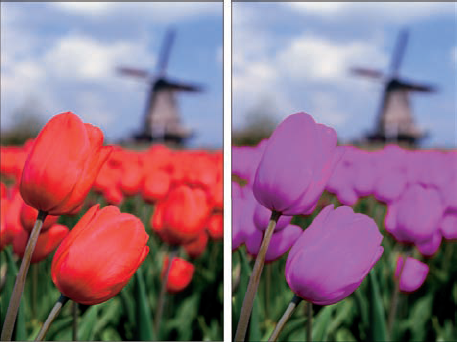
The Replace Color command enables you to replace designated colors in an image with other colors. You first select the colors you want to replace by creating a mask, which is a selection made by designating white (selected), black (unselected), and gray (partially selected) areas. (See Book VI, Chapter 4 for more details on working with masks.) You can then adjust the hue and/or saturation of those selected colors.
Follow these steps to replace colors with others:
In Edit Quick or Edit Full mode, choose Enhance
The Replace Color dialog box appears. Make sure to select the Preview check box.
Choose either Selection or Image:
Selection: Shows the mask in the Preview area. The deselected areas are black, partially selected areas are gray, and selected areas are white.
Image: Shows the actual image in the Preview area.
Click the colors you want to select in either the image or the Preview area.
Shift-click or use the plus sign (+) Eyedropper tool to add more colors.
Press the Alt (Option on the Mac) key or use the minus sign (−) Eyedropper tool to delete colors.
To add colors similar to the ones you select, use the Fuzziness slider to fine-tune your selection, adding or deleting from the selection based on the Fuzziness value.
Move the Hue and/or Saturation sliders to change the color or color richness, respectively. Move the Lightness slider to lighten or darken the image.
Go easy with the Lightness slider. You can reduce the tonal range too much and end up with a mess.
View the result in the Image window.
Click OK to apply the settings and close the dialog box.
Figure 2-9 shows how we substituted the color of our tulips to change them from red to purple.
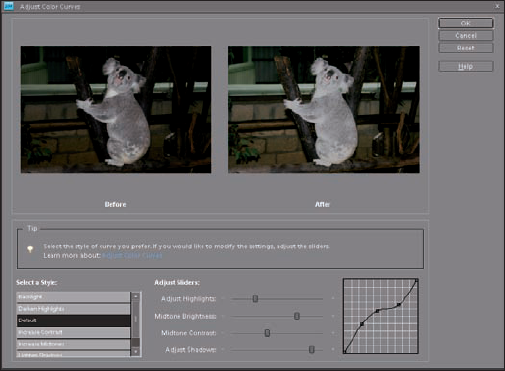
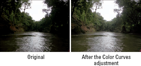
The most sophisticated of the color correctors is the Color Curves command. This adjustment attempts to improve the tonal range in color images by making adjustments to highlights, shadows, and midtones in each color channel. Try using this command on images in which the foreground elements appear overly dark due to backlighting. Conversely, the adjustment is also designed to correct images that appear overexposed and washed out.
Here's how to use this adjustment on a selection, a layer, or an entire image:
In Edit Quick or Edit Full mode, choose Enhance
The Adjust Color Curves dialog box appears. Make sure to select the Preview check box. Move the dialog box to the side so that you can view the Image window while making adjustments.
Various curve adjustments appear in the Select a Style area of the dialog box.
Select a style to make your desired adjustments while viewing your image in the After window.
If you need more precision, use the Adjust Highlights, Midtone Brightness, Midtone Contrast, and Adjust Shadows sliders, as shown in Figure 2-10.
The graph on the right represents the distribution of tones in your image. When you first access the Adjust Color Curves dialog box, the tonal range of your image is represented by a straight line. While you drag the sliders, the straight line is altered, and the tonal range is adjusted accordingly.
Click OK when you've adjusted the image satisfactorily.
To start over, click the Reset button.
See Figure 2-11 for before-and-after images.
Sometimes, the family and friends in your photos appear nauseated (green), sunburned (red), frigid (blue), or have taken on some other non-flesh-colored tone. To fix that problem, Elements provides a command that's designed to adjust the overall color in the image and get skin tones back to more natural and attractive shades.
Here's how to fix those skin tones:
Open your image in Edit Quick or Edit Full mode, select the Preview check box, and do one or both of the following:
Select the layer that needs to be adjusted. If you don't have any layers, your entire image is adjusted.
Select the desired areas of skin that need to be adjusted. Only the selected areas are adjusted. This is recommended if you're satisfied with the color of your other elements and just want to fix the skin tones. For more on selection techniques, see Book IV, Chapter 1.
Choose Enhance
The Adjust Color for Skin Tone dialog box appears. This command can also be found in Guided mode.
In the Image window, click the portion of skin that needs to be corrected.
The command adjusts the color of the skin tone, as well as the color in the overall image, layer, or selection, depending on what you selected in Step 1.
If you're unhappy with the results, click another area or adjust the Skin and Ambient Light sliders:
Tan: Increases or decreases the amount of brown in the skin.
Blush: Increases or decreases the amount of red in the skin.
Temperature: Adjusts the overall color of the skin, making it warmer (right toward red) or cooler (left toward blue).
When you're satisfied with the correction, click OK to apply the adjustment and close the dialog box.
Your improved skin appears, as shown in Figure 2-12.
To start from square one, click the Reset button. And, of course, to bail out completely, click Cancel.
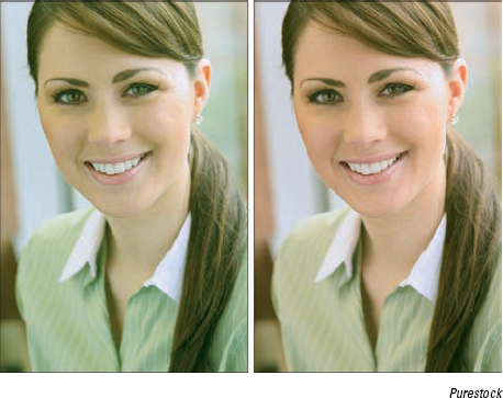
Figure 2.12. Give your friends and family a complexion makeover with the Adjust Color for Skin Tone command.
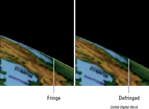
A surefire sign of a sloppily composited image is a selection with a fringe. Don't get us wrong, if the fringe is the kind that is hanging off of your '70s-era buckskin leather jacket, that's fine. You just don't want the fringe that consists of those background pixels surrounding the edges of your selections, as shown in Figure 2-13. Sometimes, when you make a selection, some of the background pixels are picked up in the process. These pixels are referred to as a fringe or halo. Luckily, the Defringe command replaces the color of the fringe pixels with the colors of neighboring pixels that don't contain the background color. In our example, we plucked the globe out of a white background and placed it on a black background. Some of the background pixels were included in our selection and appear as white fringe. When we apply the Defringe command, those white fringe pixels are changed to colors of nearby pixels, as shown in Figure 2-13.
Follow these steps to defringe your selection:
In Edit Full mode only, copy and paste a selection onto a new or existing layer, or drag and drop a selection onto a new document.
Choose Enhance
The Defringe dialog box appears.
Enter a value for the number of pixels that needs to be converted.
Try entering 1 or 2 first to see whether that fixes the fringe problem. If not, you may need to enter a slightly higher value.
Click OK to accept the value and close the dialog box.
Although we give you several ways in this chapter to eliminate colorcasts in an image, here's one more. The Variations command has been around for years and is largely unchanged. That's probably because it's one of those rare features that's easy to use, easy to understand, and is actually effective. The command enables you to make corrections by visually comparing thumbnails of color variations of your image. You might use this command when you're not quite sure what's wrong with the color or what kind of colorcast your image has.
Here's how to use the Color Variations command:
Choose Enhance
The Color Variations dialog box appears, displaying a preview of your original image (before) and the corrected image (after), as shown in Figure 2-14.
Select your desired tonal range or color richness (if you're unsure which range to select, start with the Midtones):
Shadows, Midtones, or Highlights: Adjusts the dark, middle, or light areas in the image, respectively.
Saturation: Adjusts the color intensity or richness, making colors more intense (saturated) or less intense (desaturated). If your image is faded from time, be sure to increase the saturation after you correct any colorcast issues.
Usually, just correcting the midtones is enough to improve your image's color. But if that doesn't do the trick, try adjusting the shadows and highlights as well.
Specify how much adjustment you want with the Adjust Color Intensity slider.
Drag left to decrease the amount of adjustment and drag right to increase the amount.
If you selected Midtones, Shadows, or Highlights in Step 2, adjust the color by clicking the various Increase or Decrease Color buttons.
Click more than once if your initial application wasn't sufficient to correct the problem.
Be sure to keep an eye on the After thumbnail, which reflects your corrections while you make them.
Click the Darken or Lighten buttons to make the colors a little darker or lighter, respectively.
If you selected Saturation in Step 2, click the Less Saturation or More Saturation buttons.
If you make a mistake, click the Undo button.
The Color Variations dialog box supports multiple levels of undo. If you totally mess up things, click the Reset Image button to start again. Keep in mind that you can't undo the Reset Image command after you click it. Click Cancel to abandon ship.
To apply your color adjustments and close the dialog box, click OK.

Tip
Try using the Color Variations command to correct those old, faded, green-tinted photos from back in the day. This feature enables you to easily correct the color and saturation of those memory-filled shots. Remember to either decrease the offending color or add the color that's the opposite of the colorcast in the image. If it's too green, add magenta and vice versa.
Light has its own color temperature. A photo shot in a higher color temperature of light makes an image blue. An image shot in a lower color temperature makes a photo yellow. Photographers sometimes use colored glass filters in front of their camera lenses to adjust the color temperature of the light. They do this to warm up or cool down their photos, or just to add a hint of color for subtle special effects. You can, however, mimic this effect in Elements with the digital versions of these filters.
To apply the Photo Filter adjustment, follow these steps:
In Edit Full mode, choose Filter
The Photo Filter dialog box appears.
In the dialog box, select Filter to choose a preset filter from the drop-down list, or select Color to select your own filter color from the Color Picker.
Here's a brief description of each of the preset filters:
Warming Filter (85), (81), and (LBA): Adjust the white balance in an image to make the colors warmer or more yellow. Filter (81) is like (85) and (LBA), but it's best used for minor adjustments.
Cooling Filter (80), (82), and (LBB): Also adjust the white balance that's shown, but instead of making the colors warmer, they make the colors cooler or bluer. Filter (82) is like (80) and (LBB), but it's designed for slight adjustments.
Red, Orange, Yellow, and so on: The various color filters adjust the hue, or color, of a photo. Choose a color filter to try to eliminate a colorcast or to apply a special effect.
Adjust the Density option to specify the amount of color applied to your image.
Check Preserve Luminosity to prevent the photo filter from darkening your image.
Click OK to apply your filter and close the dialog box.
Figure 2-15 shows the image before and after the application of a photo filter.
Tip
A good way to minimize the need for color adjustments is to be sure to set your camera's white balance for your existing lighting conditions before shooting your photo.
Elements provides some commands referred to as color mappers, which change the colors in your image by mapping them to other values. The color mappers are found in the Filter
This mapper first locates the lightest and darkest pixels in the image and assigns them values of white and black. It then redistributes all the remaining pixels among the grayscale values. The exact effect depends on your individual image.
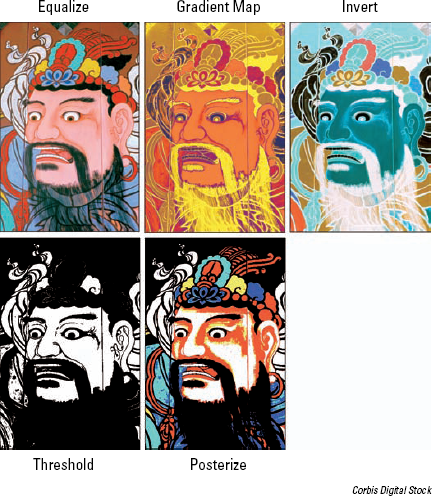
This command maps the tonal range of an image to the colors of your chosen gradient. For example, colors (such as orange, green, and purple) are mapped to the shadows, highlight, and midtone areas.
This command reverses all the colors in your image, creating a kind of negative. Black reverses to white, and colors convert to their complementary hues (blue goes to yellow, red goes to cyan, and so on).
This command reduces the number of colors in your image. Choose a value between 2 and 255 colors. Lower values create an illustrative, poster-like look, and higher values produce a more photo-realistic image.
Threshold makes your image black and white, with all pixels that are brighter than a value you specify represented as white, and all pixels that are darker than that value as black. You can change the threshold level to achieve different high-contrast effects.
Tip
The Threshold command can come in handy when you need to clean up scans of line art, such as hand-drawn sketches, people's signatures, pages from a book, or even sheet music. Often, when you scan things on paper, the slight color from the paper appears as a dull gray background in the scan. By applying the Threshold command, you can adjust the tones in your image to black and white and drop out the gray. Simply move the slider to get your desired balance of white and black areas.
After you've corrected the contrast and color and fixed your major flaws, like scratches, wrinkles and blemishes (as we describe in Chapter 1 of this minibook), you're ready to finally work on the overall clarity of that image. If your image suffers from an overall problem like dust, scratches, or artifacts (blocky pixels or halos), you may need to employ the help of a filter. Then finally, after you totally clean up your image, your last task is to give it a good sharpening. Why wait until the very end to do so? Sometimes improving the contrast and color and getting rid of flaws can reduce the clarity and sharpness of an image. So you want to be sure that your image is as soft as it's going to get before you dive into sharpening. On the other hand, keep in mind that sharpening increases contrast, so (depending on how much of your image you're sharpening) you may need to go back and fine-tune it by using the lighting adjustments described in the section "Adjusting Lighting," earlier in this chapter.
Lastly, we know we've been harping on the value of sharpening but, believe it or not, you may also need to occasionally blur your image. Blurring can eliminate unpleasant patterns that occur during scanning, soften distracting backgrounds to give a better focal point, or even create the illusion of motion.
We know it sounds ironic, but the tools you use to eliminate unwanted garbage from your images are found on the Filter
Despeckle: Decreases the contrast, without affecting the edges, to make the dust in your image less pronounced. You may notice a slight blurring of your image (that's what's hiding the garbage), but the edges should still be sharp.
Dust & Scratches: Hides, well, dust and scratches by blurring those areas of your image that contain the gunk (it looks for harsh transitions in tone). Specify your desired Radius value, which is the size of the area to be blurred. Also, specify the Threshold value, which determines how much contrast between pixels must be present before they're blurred.
Warning
Use restraint with this filter. It can wipe out detail and make your image look like mush.
Median: Reduces contrast around dust spots. The process the filter goes through is rather technical, but basically light spots darken, dark spots lighten, and the rest of the image isn't changed. Specify your desired radius, which is the size of the area to be adjusted.
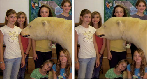
Reduce Noise: Designed to remove luminance noise and artifacts from your images. We used this filter to correct the original image (on the left) in Figure 2-17, which had the nasty blockiness caused by JPEG compression. Luminance noise is grayscale noise that makes images look overly grainy. Specify these options to reduce the noise in your image:
Strength: Specify the amount of noise reduction.
Preserve Details: A higher percentage preserves edges and details but reduces the amount of noise that's removed.
Reduce Color Noise: Remove random colored pixels.
Remove JPEG Artifact: Remove the blocks and halos that can occur from low-quality JPEG compression.
It may sound strange that anyone would intentionally want to blur an image. But, if your photo is overly grainy or suffers from an ugly moiré pattern (described in the following list), you may need to blur the image to correct the problem. Also, often, you may even want to blur the background of an image to deemphasize distractions, or to make the foreground elements appear sharper and provide a better focal point.
All the blurring tools are accessed by choosing Filter
Average: This one-step filter calculates the average value of the image or selection and fills the area with that average value. You can use it for smoothing overly noisy areas in your image.
Blur: Another one-step filter, this one applies a fixed amount of blurring to the whole image.
Blur More: This one-step blur filter gives the same effect as Blur, but more intensely.
Motion Blur: This filter mimics the blur given off by moving objects. Specify the angle of motion and the distance of the blur. Make sure to select the Preview check box to see the effect while you enter the values.
Radial Blur: This filter produces a circular blur effect. Specify the amount of blur you want. Choose the Spin method to blur along concentric circular lines, as shown in the thumbnail. Or choose Zoom to blur along radial lines and mimic the effect of zooming in to your image. Specify the desired Quality level. Because the Radial Blur filter is notoriously slow, Elements gives you the option of Draft (fast but grainy), Good, or Best (slow but smooth). The difference between Good and Best is evident only on large, high-resolution images. Finally, indicate where you want the center of your blur by moving the blur diagram thumbnail.
Smart Blur: This filter provides several options to enable you to specify how the blur is applied. Specify a value for the radius and threshold, both defined in the following section. Start with a lower value for both and adjust from there. Choose a quality setting from the pop-up menu. Choose a mode setting. Normal blurs the entire image or selection. Edge Only blurs only the edges of your elements and uses black and white in the blurred pixels. Overlay Edge also blurs just the edges, but it applies only white to the blurred pixels.
Surface Blur: This filter blurs the surface, or interior, of the image, rather than the edges. If you want to preserve your edge details but blur everything else, this is the filter for you.
Gaussian Blur: The last Blur filter we discuss is probably the one you'll use most often. It offers a Radius setting to let you adjust the amount of blurring you desire.
Tip
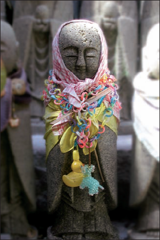
Use the Gaussian Blur filter to camouflage moiré patterns on scanned images. A moiré pattern is caused when you scan halftone images. A halftone is created when a continuous-tone image, such as a photo, is digitized and converted into a screen pattern of repeating lines (usually between 85 and 150 lines per inch) and then printed. When you then scan that halftone, a second pattern results and is overlaid on the original pattern. These two different patterns clash and create an ugly moiré pattern. The Gaussian Blur filter doesn't eliminate the moiré — it just merges the dots and reduces the appearance of the pattern, as shown in Figure 2-18.
Of course, if your images don't need any contrast-, color-, and flaw-fixing, feel free to move right into sharpening. Sometimes, images captured by a scanner or a digital camera are a little soft, and it's not due to any tonal adjustments. Occasionally, you may even want to sharpen a selected area in your image just so that it becomes a better focal point.
Keep in mind that you can't really improve the focus of an image after it's captured. But you can do a decent job of faking it. All sharpening tools work by increasing the contrast between adjacent pixels. This increased contrast causes the edges to appear more distinct, thereby giving the illusion that the focus is improved, as shown in Figure 2-19. Remember that you can also use the Sharpen tool for very small areas, as described in Chapter 1 of this minibook. Here's the lowdown on sharpening commands:
Unsharp Mask: Unsharp Mask, in the Enhance menu in Edit Full or Edit Quick mode, gives you several options that enable you to control the amount of sharpening and the width of the areas to be sharpened. Use them to nail your desired sharpening:
Amount: Specify an amount (from 1 to 500%) of edge sharpening. The higher the value, the more contrast between pixels around the edges. Start with a value of 100 percent (or less), which usually gives good contrast without appearing overly grainy.
Radius: Specify the width (from .1 to 250 pixels) of the edges that the filter will sharpen. The higher the value, the wider the edge. The value you use is largely based on the resolution of your image. Low-resolution images require a smaller radius value. High-resolution images require a higher value.
Be warned that specifying a value that's too high overemphasizes the edges of your image and makes them appear thick and goopy.
Tip
A good rule of thumb in selecting a starting radius value is to divide your image's resolution by 150. For example, if you have a 300-ppi (pixels per inch) image, set the radius at 2 and then use your eye to adjust from there.
Threshold: Specify the difference in brightness (from 0 to 255) that must be present between adjacent pixels before the edge is sharpened. A lower value sharpens edges with very little contrast difference. Higher values sharpen only when adjacent pixels are very different in contrast. We recommend leaving Threshold set at 0 unless your image is very grainy. Increasing the value too much can cause unnatural transitions between sharpened and unsharpened areas.
Adjust Sharpness: Another sharpening option is the Adjust Sharpness command, as shown in Figure 2-20. This feature enables you to control the amount of sharpening applied to shadow and highlight areas. It also allows you to select from various sharpening algorithms.
Specify the following options:
Amount and Radius: See the two descriptions in the preceding Unsharp Mask bullet.
Remove: Choose your sharpening algorithm. Gaussian Blur is the algorithm used for the Unsharp Mask command. Lens Blur detects detail in the image and attempts to respect the details while reducing the nasty halos that can occur with sharpening. Motion Blur tries to sharpen the blurring that occurs when your camera, or your subject, moves.
Angle: Specify the direction of motion for the Motion Blur algorithm, described in the preceding Remove bullet.
More Refined: Runs the algorithm more slowly than the default speed for better accuracy.


The Smart Brush tools — Smart Brush and Detail Smart Brush — are two fun tools that enable you to selectively apply an image adjustment or special effects that then appear on all or part of your image. What's great is that these adjustments and effects are applied via an adjustment layer, meaning that they "hover" over your layers and don't permanently alter the pixels in your image. The adjustments can also be flexibly edited and deleted, if you so desire.
The Smart Brush tool allows you to paint a variety of image adjustments on all or just a portion of your image. The action of the tool is similar to that of the Selection Brush — as you brush, you make a selection and adjust simultaneously. Follow these steps to use the Smart Brush tool:

The tool icon looks like a house paintbrush with an adjacent gear.
Choose your desired brush attributes, such as diameter and hardness, from the Brush Picker drop-down panel.
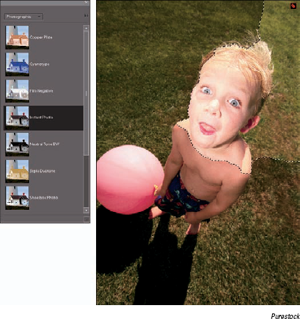
Select your desired adjustment category and then a particular preset adjustment from the Smart Paint panel, as shown in Figure 2-21.
Note that you can "tear off" this panel by grabbing the grip area in the upper-left corner of the panel and dragging it anywhere in your Application window (Windows) or on your screen (Mac). In the Smart Paint menu, choose adjustments ranging from photographic effects, such as a vintage Yellowed Photo, to nature effects, such as Sunset (which gives a warm, orange glow to your image).
Paint an adjustment on a layer in your image.
Note that while you paint, the Smart Brush tool attempts to detect edges in your image and snaps to those edges. In addition, while you brush, a selection border appears.
A new adjustment layer is automatically created with your first paint stroke. The accompanying layer mask also appears on that adjustment layer. For more on adjustment layers, see Book VI, Chapter 1.
Using the Add and Subtract Smart Brush modes, fine-tune your adjusted area by adding and subtracting from it.
When you add and subtract from your adjusted area, you're essentially modifying your layer mask. Adding to the adjusted area adds white to the layer mask, and subtracting from an adjusted area adds black to the layer mask. For more on layer masks, see Book VI, Chapter 4.
Select a different preset adjustment for your selected area, if you want.
In fact, try them all out before you make your final choice.
If you feel you need to refine your selected area, choose the Refine Edges option on the Options bar.
For more on Refine Edges, see Book IV, Chapter 2.
If you'd rather apply the adjustment to your unselected area, select the Inverse option on the Options bar.
If you want to modify your adjustment, double-click the Adjustment Layer pin on your image. The pin is annotated by a small, square black and red gear icon. After you double-click the pin, the dialog box corresponding to your particular adjustment appears. For example, if you double-click the Shoebox photo adjustment (under Photographic), you access the Hue/Saturation dialog box.
Make your necessary adjustments in the dialog box and click OK.
Tip
You can also right-click (Control-click on the Mac) and select Change Adjustment Settings from the contextual menu that appears. Or, you can select Delete Adjustment and Hide Selection from the same menu.
After you finish, simply deselect your selection by choosing Select
Tip
You can add multiple Smart Brush adjustments. After you apply one effect, reset the Smart Brush tool and apply additional adjustments.
The Detail Smart Brush tool also enables you to paint various image adjustments on all or part of your image. The action of the tool is similar to the regular Brush tool, enabling finer control than that of the Smart Brush. Follow these steps to use the Detail Smart Brush tool:

This tool shares the flyout menu with the Smart Brush tool. The tool icon looks like an art paintbrush with an adjacent gear. You can also press the F key, or Shift+F, if the Smart Brush tool is visible.
Choose a brush tip preset and brush size as well as attributes from the Brushes drop-down panel.
Feel free to change your brush tip and size as needed to achieve the desired effect. For more on working with brushes, see Book V, Chapter 1. For better accessibility, you can "tear off" this panel (and the Smart Paint panel in Step 3) by grabbing the grip area in the upper-left corner of the panel and dragging it anywhere in your Application window.
Select your desired adjustment category and then your particular preset adjustment from the Smart Paint panel.
Several of the Special Effects adjustments are shown in Figure 2-22.
Paint an adjustment on the desired layer in your image.
A new adjustment layer is automatically created with your first paint stroke, along with an accompanying layer mask.
Follow Steps 5–8 in the preceding list for the Smart Brush tool.
