
Chapter 10. Getting Started with Reporting
In this chapter
FileMaker Extra: Incorporating Reports into the Workflow
Deriving Meaning from Data
Reporting is an important component of almost every database project. Indeed, the need to create reports that summarize or synthesize data is often the reason many databases exist in the first place. No matter what your database does, it’s a fair bet that you have many reporting needs.
Reports come in many shapes and sizes: There are simple list reports, summarized reports, workflow reports, cross-tabulated reports, variance reports, and graphic reports (to name but a few). There are standard reports that have to be generated periodically; there are ad hoc reports for which the report criteria must be defined on the fly (FileMaker Pro excels at this). Some reports need to be printed and distributed, whereas others are meant to be viewed onscreen.
Despite the wide range of things that can be classified as reports, most reports tend to have a few characteristics in common:
- Reports are generally used for viewing data rather than creating or editing data.
- Reports generally display (or draw on data contained in) multiple records from one or more tables. They are usually designed to provide an overview or higher-level understanding of a data set than you would obtain by looking strictly at data-entry screens.
- Reports capture a snapshot in time and reflect the database’s current state. Running the same report at different times might yield different results if the data in the system has changed.
- Often, but not always, reports are distributed by some means other than FileMaker: on paper, via email, or as an electronic document. FileMaker Pro provides the capability to create PDF documents from reports. In FileMaker Pro 9, this functionality is expanded.
To generate meaningful reports, you should learn several standard reporting techniques. From there, it’s just a matter of coming up with variations that suit your particular needs. This chapter covers working with lists of data and reporting with grouped data (also known as subsummary reports).
In FileMaker, layouts are used to display data and, in some cases, to allow for its printing as well as its entry in Browse or Find mode. The distinction between layouts designed for the displaying or printing of data and layouts designed for interaction with the user has to do with their design (page width, for example) and, in many cases, the mode in which they are viewed. Data entry can be done only in Browse mode, and entry of data to be used in a find operation can only be done in Find mode. Preview mode, which allows no interaction, is often used to display reports. It must be used to display reports with subsummary fields and to be aware of page breaks (which is the first step in using headers and footers and creating page numbers), as you will see in this chapter.
In Layout mode, you can choose New Layout/Report from the Layouts menu to step through the process of creating a report either for the screen or for paper. At the end of the process, you have the option to create a script to perform any necessary sorts, switch to the appropriate layout, and go into Layout or Preview mode. Both the layouts and the script can be modified; it is often best either to start from an existing report and its companion script (if any) or to use the New Layout/Report Wizard to get the basic layout or report constructed and then to modify it as needed.
Begin with the End in Mind
In our experience, one of the keys to creating successful reports is beginning with the end in mind. By this, we mean right at the beginning of a project, you should begin thinking about the reports that a system will have to generate. A system’s intended outputs can have a profound impact on its design and implementation.
Determine Report Requirements
Just as a system’s reporting requirements influence its design, an organization’s business needs influence the design of the reports themselves. When thinking about how you’ll go about generating any given report, ask yourself (or your client/users) the following types of questions:
- What questions is this report trying to answer? Focus first on the purpose the report will serve, not on its design. Is it trying to monitor progress toward a goal? To be an early warning of potential problems? To help spot business trends? The more you know about how a report will be used, the more effective you can make it.
- Who will read this report? Is it going to be used strictly for internal purposes, or might it be presented to customers or vendors? Should the report be accessible to everyone, or should certain users be prohibited from viewing it?
- How will be it read? Will it be distributed in hard copy, emailed to a group of people, or read onscreen 18 times a day? If the report is distributed, should the document be secured with a password or encrypted?
- What media constraints are there in terms of page size, color, and resolution?
- Is this a one-time report, or will it be used on a regular basis? For one-time or special occasion reports, you probably won’t go to the trouble of setting up scripts and/or find screens, but you should do so for reports intended to be run regularly.
- What level of granularity is appropriate? Will the consumers of the report be interested in seeing details or just the big picture?
After you collect answers to questions like these, we strongly recommend writing out a sample report (using whatever tools you choose—pencil and paper and whiteboards are our favorites) and showing it to its appropriate consumers for feedback. Although the report will be implemented in FileMaker, any tool from Excel to InDesign can help people visualize what you are thinking of.
Generic Versus Specific Report Structures
Another part of report planning is determining whether the report is to meet a specific or a generic need. That is, should users be able to select a data set to feed into a report shell, or should the search criteria for the report be hard-coded?
For example, say you have a List view layout that displays customer data. If you feed it a found set of customers obtained since a certain date, it becomes a New Customers report. If you feed the same shell a set of inactive customers, it transforms into an Inactive Customers report.
In instances like this, it’s often helpful to think of a report as consisting of two distinct components: its format and its content. If you can create a generic multipurpose format, you create different reports simply by sending in different content. The point is that in planning reports, you should have the distinction between format and content in mind. You can sometimes save yourself a lot of work if you recognize when a report can be created by simply feeding new data into an existing format.
The simplest way to do this is to use a script for the data selection and sorting and a second script for the report. Sophisticated users can do the sorting and selection manually, whereas others might choose to use the script. The script can be highly interactive, allowing users to choose the data to find and the way it should search. Alternatively, there can be multiple scripts, each of which does a specific set of sorted data for the same report. This is an excellent model for scripting: One script is interactive, and the other—the reporting script—has no interaction whatsoever.
Working with Lists of Data
Many reports are nothing more than simple lists of data. Examples include such things as task lists, customer lists, overdue invoice reports, student test scores, and phone directories. Besides being the most frequently encountered type of report, lists of data are also the easiest type to create. As such, they provide us with a good starting place to begin delving into report creation.
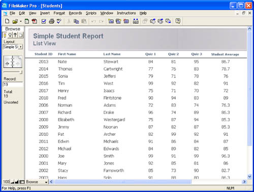
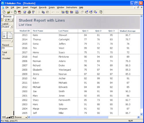
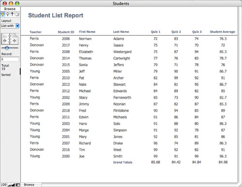
List view layouts can be created with the New Layout/Report Wizard or by hand. Figure 10.1 shows an example of a basic List view layout that displays student names and quiz scores. Depending on your needs and aesthetics, this alone might serve as a report.
Figure 10.1. Basic List view layouts are the simplest types of reports you can create.
![]() For more on creating layouts and working with layout tools, see “Working with Objects on a Layout,” p. 137.
For more on creating layouts and working with layout tools, see “Working with Objects on a Layout,” p. 137.
In addition to being simple to create, List views make nice reports for several other reasons. The first is that they’re very flexible. You can allow users to perform ad hoc finds, or you can write scripts with canned searches and then display the results using your List view.
Users can also view list reports while in Browse mode. We recommend that you consider the final delivery of a report as a separate issue from generating the report for users to view onscreen. We often design systems in which a report displays for a user (in Browse mode) and then the user can, as a second step, send it to a printer, attach it to an email, and so on.
The key benefit of being able to work with a report in Browse mode is that you can place buttons on your report that give the user additional functionality, such as drilling down to additional levels of detail, re-sorting the data without having to regenerate the report, or providing buttons for printing, emailing, and so on.
This isn’t the case with subsummary reports, however: They can only be viewed in Preview mode. Subsummary reports depend on being sorted to group data together. Display of summary fields is a special operation that FileMaker performs in Preview mode. In these cases we still recommend thinking of final output as a second step in the process, but in the case of subsummary reports, you’ll need to build routines that take the user into Preview mode and then back again into Browse mode at the conclusion of the process.
There might be buttons or other objects, such as navigation buttons, on your layout that you wouldn’t want to appear when the report is printed. While building the report in Layout mode, select those objects and then choose Format, Set Sliding/Printing to open the Sliding/Printing dialog, and then select Do Not Print the Selected Objects.
If your users are likely to print from a List view, be sure that you constrain your report to the width of the printed page rather than the monitor screen width. You’ll also find that although 10- to 12-point fonts generally work well for reports that will be viewed onscreen, 8- to 10-point fonts are more appropriate for printed reports. Be sure to actually print your reports to proof them rather than simply relying on what you see onscreen.
 If you have problems printing your reports, see “Printed Reports Show Only a Single Record” in the “Troubleshooting” section at the end of this chapter.
Of course, you can make your List view layout as crafted and attractive as you desire. You might consider employing some common techniques, however, for enhancing List view reports.
Trailing Summaries
A list report in and of itself does little synthesizing of data; it just organizes data for easy review. The main tools at your disposal for synthesizing a set of data are summary fields. Summary fields enable you to perform aggregations across a set of records, including counting, totaling, and averaging.
![]() For more information about creating summary fields, see “Working with Field Types,” p. 95.
For more information about creating summary fields, see “Working with Field Types,” p. 95.
Adding a trailing grand summary part to a basic list report gives you a place to put summary information about the set of records in your report. For example, in a list report that displays invoice data, you might choose to put the total amount invoiced in the trailing grand summary part.
![]() For more information about working with layout parts, see “Working with Parts,” p. 133.
For more information about working with layout parts, see “Working with Parts,” p. 133.
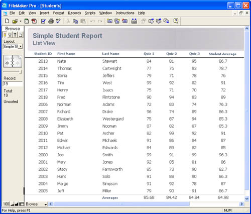
Summary fields placed in a leading or trailing grand summary part summarize the entire found set of data, so as you view different found sets of records on a report layout, your totals change accordingly. Figure 10.2 shows the same report as Figure 10.1, except that here four summary fields (Average_Quiz1, Average_Quiz2, Average_Quiz3, and Average_Overall) have been added to the database and placed in a trailing grand summary.
Figure 10.2. Summary fields placed in a trailing grand summary part act on the entire current found set.
Alternating Row Color
Another enhancement you might want to make to a list report is to alternate the row color. The option to alternate row color is found in the Part Definition dialog, which is shown in Figure 10.3; the quickest way to get there is by double-clicking the body part label while in Layout mode.
Figure 10.3. The option to alternate row colors can be applied only to body parts; it is grayed out as an option for any other type of part.
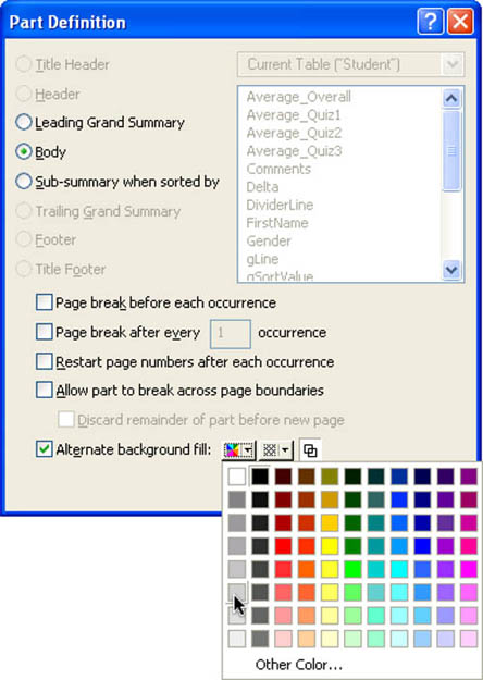
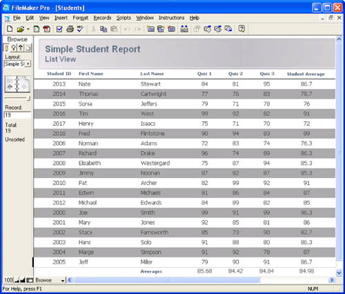
Figure 10.4 shows the effect this feature can have on a list report.
Figure 10.4. Adding a subtle alternating row color can make a list report easier to read.
Colors appear differently on paper and on the screen, and they often differ from printer to printer and from display to display. Text on dark colors can be legible on the screen, but on paper can be unreadable. If you are using color for either the row background or the text, make certain that there is a strong contrast. If the row background color will be alternating, the contrast must be strong with both colors.
Horizontal and Vertical Dividers
Another method of increasing the readability of a list report is to add horizontal and/or vertical lines between the columns and rows. When both are used, the resulting report might resemble a spreadsheet; your perception of whether this is good or bad should guide your use of dividers.
We find that using thin gray lines as dividers is more effective than using solid black lines because it’s easier to differentiate the data on the report from the grid. There’s a risk, though, that too many grid lines, especially in a complex list report, can actually obscure the data. Try to use as many lines and/or field borders as necessary to increase the readability of your report, but no more.
Placing dividers into your report typically involves nothing more than drawing some lines on the layout. When adding a horizontal line between rows of data, we generally put it below the data as a baseline rather than above it. You can then add whatever effect you need under your column headers to set them apart from the first row of data.
Adding vertical dividers to a list report can be a bit tricky until you get the hang of it. The key is that your vertical lines have to be the same height as the height of the body part itself. If they’re too small, you get a dotted-line effect. Use the Object Size palette to ensure an exact fit. The top of your vertical line should begin one pixel below the top of the body part. It usually looks better if there’s some horizontal space between vertical lines and your data cells. If users are allowed to click into fields on the report, however, the field frames that appear might not look aesthetically pleasing. If your List view is truly acting as a report, you should turn off entry into all fields by using the Field Behavior dialog. That also means that your field frames will never be visible, which is a good thing. Your vertical lines can define the space between fields without interference from field frames. If users must be able to click into fields, consider turning off the Show Field Frames When a Record Is Active option in the Layout Setup dialog.
![]() For more on the Layout Setup dialog, see “Creating and Managing Layouts,” p. 122.
For more on the Layout Setup dialog, see “Creating and Managing Layouts,” p. 122.
If you find that having horizontal lines between every row of your report makes the report look too cluttered, it’s possible also to add horizontal lines that appear just, say, every fifth row. Figure 10.5 illustrates this effect.
Figure 10.5. Having lines appear less often provides the visual guide necessary to follow a row across but doesn’t overpower the data itself.
You need to add two new fields to your table to achieve this effect. The first is a global container field, which we’ll call gLine. Place this field on a layout that you can use as a resource area (we generally refer to these as developer or utility layouts), and then draw a horizontal line on your layout. Copy the line to your Clipboard, switch back to Browse mode, and paste the line into the gLine field.
You can also create the line as a graphic element in a program such as Photoshop. This allows you to apply various graphic touches to the line that might make your report more readable as long as they do not overpower the data. Follow the same steps outlined here, except copy the graphic out of Photoshop and then paste it into the gLine field in FileMaker.
The other field you need is a calculation field (set to return a container result) with the following formula:
Case ( Mod ( Get (RecordNumber) ; 5 ) = 0 ; gLine )
In effect, this formula says that for any record that’s a multiple of 5, be the contents of gLine, or else be nothing.
On your list layout, finally, place the calculation field as a long, thin object along the bottom of your body part. You need to reduce the field’s font size to make the object thin. Also, go into the Graphic Format options for the field (by right-clicking it in Windows, Control-clicking it on Mac), and select the Reduce or Enlarge Image to Fit Frame option, uncheck the Maintain Original Proportions option, and set the alignment to be Left, Bottom. Remember, this field has to be in the body part so that it appears on every single line but because of the calculation, it is filled only on every fifth line.
You might be wondering whether you can just use Table view for your list reports; it provides a lot of the functionality discussed here (gridlines, sortable headers) for free. In general, though, Table view isn’t suitable for reports, especially those that need any degree of polish to them. For one thing, the column labels must be the names of your fields; if you use any naming conventions, your field names might not be terribly user friendly. Another issue in some reports is that you can’t have multiple lines of data per row or any objects that overlap one another.
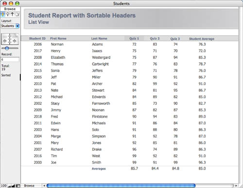
Sorting by Columns
One of the easiest methods to use for sorting reports is to teach users how to make use of the built-in Sort dialog in FileMaker; however, an interface convention that’s been widely adopted by software applications is that of clicking the various column headers of a list report to sort the set of records by that column. It’s relatively easy to add this functionality to your list reports in FileMaker Pro, but it does take some additional development work. You can go about this task in several ways; they’re all essentially variations on the same basic theme, so we present a relatively vanilla method that can be elaborated on as a solution warrants or a developer prefers.
Another easy way to sort a set of records in FileMaker is to (Control-click) [right-click] any field and choose one of the three sort options. You don’t need to know the name of the field or fret about finding it in a long list of available fields. This feature was new in FileMaker Pro 8.
The two components of a sortable column header routine are a script (which does the actual sorting) and a graphic indicator to let the user know by which column the list is sorted. You can use whatever graphic indicator you want for this purpose. One of the simplest is a special background color, but you can also use iconic indicators if you prefer. Figure 10.6 shows an example of what a list layout might look like after you implement sortable column headers. In the example, the set of records has been sorted by the values in the Quiz1 field, and the fourth column header is highlighted with a darker color.
Figure 10.6. Users can re-sort this list report any way they want by clicking the column headers.
An alternative to indicating the sort column graphically is to use text formatting functions to change the appearance of the column labels. It’s quite similar to the approach discussed here, except that you would use calculated text fields rather than calculated container fields. In FileMaker Pro 9, conditional formatting makes this a trivial task. However, you still might want to use graphic indicators in some cases as described in this section.
You have to add several fields to your database to make the graphic indicators for this routine. These fields can be added to whatever table you’re working with (here, Student), but it’s arguably better to place them in a separate resources table. This allows them to be reused in other places and helps to keep your data tables free of clutter. In this example, the utility table is called globals.
![]() This example uses a global variable,
This example uses a global variable, $$columnSort. For information on global and local variables, see Chapter 16, “Advanced Scripting Techniques,” p. 477.
The following fields must be created in the globals table:
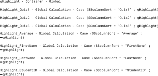
Notice that all the calculation fields have been set to use global storage. This is so that any layout can use them, even those attached to unrelated tables. They should also be set to return a container result. After the variable $$columnSort has been set to the name of a field from the quiz score report (this happens in the script shown in Listing 10.1), one of the seven calculations will resolve to the contents of gHighlight; the other six will be empty.
Note also that we’ve opted in this example to use separate fields for our various functions. You can make this approach a bit more elegant by using repeating fields (and thus reducing the elements you’d be using); for an example of this, see the following discussion.
After defining these fields, you need to put a swatch of color in the gHighlight field. Switch to Layout mode and draw a colored rectangle. Copy it to your Clipboard, return to Browse mode, and paste it into the gHighlight field.
There’s still a little layout work to do on the report itself:
- Position a single gray rectangle behind all the column labels.
- Place horizontal lines on top of the gray bar as necessary to segment the header row.
- On top of the gray bar, but under the column labels, place the seven Highlight calculation fields from the globals table. Size each field to fit its particular label.
- Define each to be a button that calls a script called List Report-Sort, which is shown in Listing 10.1; you must create the script before defining the headers as buttons.
Although all seven buttons call the same script, each passes that script a unique parameter. In this example, the parameters are simply the names of the fields themselves. That is, clicking the Quiz 1 header sends the parameter Quiz1, and clicking the First Name field sends the parameter FirstName. You can also choose to pass a numeric code instead of the field name. This type of abstraction makes the buttons more reusable and means that you don’t have to edit the parameter if your field names change or if you choose to use the same routine for multiple reports, but we think it’s more intuitive to use the actual field names when learning this routine.
![]() For more information about using script parameters, see “Script Parameters,” p. 479.
For more information about using script parameters, see “Script Parameters,” p. 479.
Listing 10.1. List Report-Sort Script
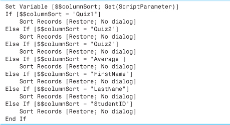
Each of the Sort Records steps is defined to sort by the appropriate field. Because $$columnSort is set in the first step, the correct Highlight field will be turned on in the globals table; after the sort is performed, the column heading will therefore accurately reflect the sort order.
If you have your list report displayed simultaneously in multiple windows, each report can be sorted differently, but the graphic sort indicator highlights the same field in all the windows. That is, if you were to click the Last Name header in the active window, that window’s found set would be sorted appropriately, but all open windows would have Last Name highlighted as the sort order, even when they are sorted differently.
Using Repeating Fields for Column Highlights
It is arguably inelegant to add a field to your database for each column by which you intend to sort. This approach adds clutter, incremental complexity, and time to the development of your solution.
Repeating fields were often misused in the early days of FileMaker; they substituted for relations that, particularly before FileMaker 7, were not as flexible as they could be. Despite the fact that repeating fields have often been misused, there are circumstances such as this one in which they are the best solution to a design problem.
You can collapse the logic presented into just four fields for your entire database. The overall technique is the same, but instead of creating a separate calculation field for each column highlight, use the extend function to compare the name of the column label to the text in the gSort field:
Set the field gColumnHighlight_r to be a calculation field that returns a container result and has an equal number of repetitions to the gColumnLabels_r field. Then enter the names of your columns into the gColumnLabels_r field and use those same names as script parameters attached to your sort script.
FileMaker compares the repeating field labels to the gSortPref contents and applies a highlight to the repeating highlight field as appropriate. If the third repetition of the gColumnLabels_r field contains Last Name and $$gSortPref contains Last Name, the third repetition of gColumnHighlight_r resolves to hold the contents of the gHighlight container field.
Place copies of the gColumnHighlight_r field in the header of your report and use the Field/Control Setup dialog to show only the appropriate repetition. For example, the third column of the report shown in Figure 10.6 (Last Name) would be set to show repetition 3 through 3. The fourth column (Quiz 1) would use repetition 4 through 4.
Notice that we opted to use a global field instead of a variable to store the user’s sort preference. The Extend function works only with fields. If we were to use a variable, this process would work fine for the first value in the repetition, but not for any of the others.
Adding Ascending/Descending Logic for Column Sorting
You can easily extend this example on your own to allow for both ascending and descending sorts. To do so, you need another variable (or field in the globals table) to indicate the direction of the sort. Then add more conditional statements to the script so that a combination of field name and direction determines how to sort the records. Finally, alter the Highlight calculations in the globals table so that they display different images for ascending and descending sorts (perhaps triangles pointing up or down). You can either create a separate global container field to house the descending image, or simply turn gHighlight into a repeating field and have a conditional statement in the calculation resolve to the appropriate repetition. As an example, the definition for Highlight might end up as the following:
Case (gSortField = "Quiz1" Case ( $$sortDirection = "Ascending" ; gHighLight[1] ; ![]() gHighlight[2] )
gHighlight[2] )
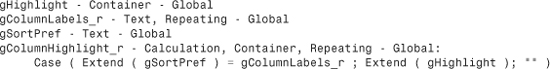
Alternatively, if you prefer to use the repeating field technique described previously, your gColumnHighlight_r field might look like this:
Case ( Extend ( gSortField ) = gColumnLabels_r ; Extend ( gHighlight ); "" )
Finally, because the sort order and the column images are based on global values, this routine is multiuser friendly. Two different users can be viewing the same report but have it sorted differently.
Go to Detail
No matter whether the set of records displayed in your list report is the result of an ad hoc find by a user or a canned report routine, you’ll probably want to enable users to see additional details for a particular record. Typically, if you allow users to enter into fields in the list report, you have a discrete button at the beginning or end of the row that a user can click to get to a detail view. If you don’t allow data entry, it’s common to let a user click anywhere on the row to be taken to a detail screen, or perhaps to format the primary bit of information to look like a blue underlined hyperlink. To make the entire row a clickable button, place a long transparent rectangle (to which you attach a navigation script) on top of the row. It should be the same height as the body itself so that there aren’t any dead spaces between rows.
You have a few choices about how to display the detail record. The easiest thing to do is have the script navigate to a form view data-entry layout. Another option to consider is to have the detail record pop up in its own window. This enables users to go back and forth more easily between detail and list layouts.
![]() For more on scripting techniques like this, see “Window Management Techniques,” p. 518.
For more on scripting techniques like this, see “Window Management Techniques,” p. 518.
Summarized Reports
Subsummary reports are perhaps the most useful of all the reporting techniques in FileMaker Pro. It takes but little effort to extend a list report into a summary report, but the additional amount of information subsummary reports can convey is significant. After you become comfortable with the basic techniques for creating subsummary reports, you’ll find that they form an important part of your reporting repertoire. As a good place to start thinking about subsummary reports, consider the sample data set in Table 10.1.
Table 10.1. Student Demographic Data
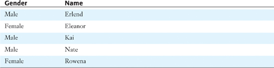
If FileMaker Pro were to present this data set in a subsummary report, it might be structured something like the following:
Female
Eleanor
Rowena
Male
Erlend
Kai
Nate
You can easily see that the difference in the subsummary version is that the data is grouped by gender. The heading for each particular group of data appears only once instead of redundantly on each record of the list.
Each layout has a table that is its base; it can display data from other tables. A big distinction between reports designed for Browse mode and reports designed for Preview mode is in the treatment of related data. In a report designed for interactive use in Browse mode, you can use a portal to display data from a table related to the base table. If you print the layout, the portal prints as it currently appears. If five records are visible, five are printed, no matter how many exist.
In a report intended for printing from Preview mode, you make the base table the related table (that is, the table that would appear in a portal). That table is used for the body of the report.
Using a Break Field
In this example, the Gender field is acting as the break field. Understanding break fields is crucial for understanding subsummary reports. The break field is the column of data that determines what records appear with what grouping of information. The number of unique entries in the break field for the current found set of data (here, two: Male and Female) determines the number of groupings, or subsummaries, that will be present on the report.
The purpose of a break field is to segment your data into useful subdivisions. As such, break fields are almost always categorical, rather than continuous, data elements. They might be categorical summaries of continuous data, such as 1 - 10, which might be the name of a calculation field that categorizes values based on their range.
As an example, in a billing system, you probably wouldn’t choose to use an invoice total or invoice date field as a break field, but you might use an invoice type, invoice status, or invoice month field. The main purpose of subsummary reports is to enable you to roll up data to a less granular level so that you see larger trends in your data that looking at simple lists might obfuscate. The break field defines how those larger trends manifest on your report. As a result, it makes no sense to use a field with unique values (that is, a primary key) as a break field because no grouping of records by common values could possibly take place in such a situation.
![]() For more detail about when you might choose to use a unique field as a break field, see “Subsummary Reports with No Body Part,” p. 340.
For more detail about when you might choose to use a unique field as a break field, see “Subsummary Reports with No Body Part,” p. 340.
Break fields can be text, number, time, date, or timestamp fields, or a calculation that returns one of these data types. Fields with global storage should not be used as break fields because they provide no categorization of the data.
If you develop a report with subsummary fields, you can make a copy of it and delete the body of the report—the detailed data. Then, with almost no additional effort, you will have both a summary and a detailed report. The trick is to do the full, detailed report first and then to delete the report body (and possibly some subsummary fields).
Creating a Subsummary Report
The physical creation of a subsummary report is quite similar to the creation of a simple list report. The Layout Wizard, in fact, has an option within the Columnar List/Report type to make your list a report with grouped data. For our purposes, we discuss how to turn a list report into a subsummary report. You can explore the wizard’s capabilities on your own.
![]() For more on the New Layout/Report Wizard, see “Creating a New Layout,” p. 122.
For more on the New Layout/Report Wizard, see “Creating a New Layout,” p. 122.
Earlier in the chapter, we developed a Student Quiz Scores list report. Now we will extend that example into a subsummary report. Assume that each of the students is assigned to a teacher (Donovan, Ferris, or Young); the present goal is to produce a subsummary report of the scores by teacher. Figure 10.7 shows the data from which the report will be generated (as a simple list).
Figure 10.7. Any time data can be grouped according to a common element, you have the potential for a subsummary report.
The first step in turning this into a subsummary report is to add a new part to the layout. It’s possible to do so simply by clicking on the Part tool in the Status Area (in Layout mode, of course) and dragging a new part into existence. We prefer, however, to use the Part Setup dialog (select Layouts, Part Setup) to create new parts.
![]() For a discussion of why it’s better to use the Part Setup dialog than to drag from the Status Area, see “Working with Parts,” p. 133.
For a discussion of why it’s better to use the Part Setup dialog than to drag from the Status Area, see “Working with Parts,” p. 133.
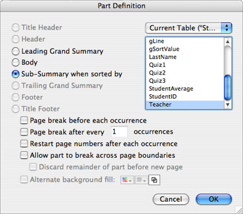
When you add a subsummary part to a layout, you must specify what break field should be represented by that part. In the example shown in Figure 10.8, the Teacher field has been selected as the break field.
Figure 10.8. The only time you can select from the field list in the right side of this dialog is when you choose the Sub-Summary When Sorted By option.
You can place subsummary parts either above or below the body part. The body part presents the most granular individual rows in your report and contains data from each record in your found set. You can change the order of parts from the Part Setup dialog. Place a summary part above the body if you want it to act as a header for the data set; place it below if you want summary information about a subset of records to appear below the data set. You can (and indeed often will) place both a leading and a trailing subsummary part on a layout.
After you add a subsummary part to the layout, you place fields, texts, and/or graphic elements in the part. Any objects you place in the subsummary part appear on your report once for each group of data.
As discussed in Chapter 2, “Using FileMaker Pro,” subsummary parts appear only if the user has sorted by the part’s break field, and only if the user is in Preview mode. This is an important point: Each subsummary part appears in Preview mode only if the user’s database sort order includes the controlling break field in question. It doesn’t matter how it’s sorted—ascending, descending, or by the contents of a value list. By controlling the sort order of your found set, you can make subsummary elements appear and disappear as needed.
One implication of needing to be in Preview mode is that the user can’t directly interact with the report in any way; buttons aren’t functional in Preview mode. Users can, however, still run scripts from the Script menu (or a custom menu).
You will typically place the break field itself in the subsummary part, but doing so isn’t required. Any other fields you place in the subsummary part are generally summary fields; if they are not, they display data from the first record in the applicable set. Figure 10.9 shows what the new Quiz Scores by Teacher report looks like in Layout mode: The Teacher field and a horizontal line have been placed in the subsummary part. Notice also that the Teacher field has been removed from the body part because it would be redundant.
Figure 10.9. A subsummary part is used to display data relating to a set of records.
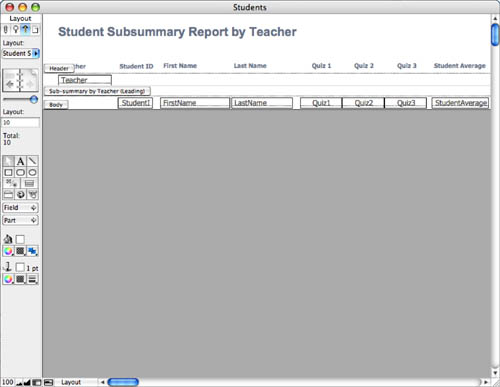
In Layout mode, the part labels can appear either as they do in Figure 10.9—as horizontal blurbs at the lower-left corner of the part—or as rotated text alongside the part. Labels are easier to read as horizontal text, but they tend to get in the way; we usually leave them alongside the parts. You can toggle between the two settings either by clicking on the part label orientation button (the fifth button in from the left at the bottom of your window) or by (![]() -clicking) [Ctrl+clicking] on any of the part labels themselves.
-clicking) [Ctrl+clicking] on any of the part labels themselves.
If you ever have problems getting a subsummary report to work correctly, the first things you should check are that you have the data sorted by the same fields you’re summarizing by and that you’re in Preview mode.
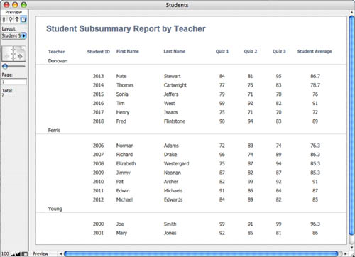
Figure 10.10 shows the completed (for now) subsummary report. By comparing this to Figure 10.7, you can see how simply grouping data together according to a common data element makes it much easier to read.
Figure 10.10. This subsummary report groups records together based on the contents of the Teacher field.
After you have a good grasp of the concepts at work in basic subsummary reports (like the one presented in this section), you can extend them in various ways to produce even more interesting and meaningful reports.
If you are experiencing performance issues when generating subsummary reports, see “Slow Generation of Subsummary Reports” in the “Troubleshooting” section at the end of this chapter.
Using Summary Fields in Subsummary Reports
Earlier in this chapter, we discussed how you could add summary fields to a leading or trailing grand summary part to enhance a basic list report. Summary fields, not surprisingly, are also quite appropriate for use in subsummary reports.
A summary field placed in a subsummary part generates aggregate results for each group of data presented in the report. You need to do nothing in terms of field definitions to make it work this way. After you defined a summary field, you can place it in any subsummary part and it will be intelligent enough to act on the correct group of records.
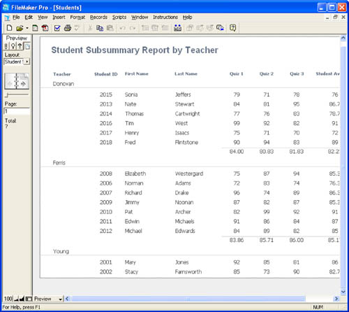
In the sample file we’ve been discussing, for instance, the summary field Average_Quiz1 is defined to be the average of the Quiz1 field across some set of records. When this field is placed in a trailing grand summary, it displays the average of that field across the entire current found set. When placed in a subsummary (by teacher) part, it displays the average across each teacher’s set of students. In Figure 10.11, a trailing subsummary by teacher and a trailing grand summary part have been added to the layout shown previously in Figure 10.9. The same four summary fields appear in both parts. The value of the summary field displayed in the report is determined by the subsummary field in which it appears. Figure 10.12 shows the report generated by this layout.
Figure 10.11. Summary fields placed in a subsummary part calculate aggregate results for each group of data presented in the report.
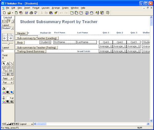
Figure 10.12. The leading and trailing subsummary parts can be thought of as providing a header and footer for each group of data presented in the report.
If another subsummary report were built that summarized on, say, students’ genders or favorite pizza toppings, the same summary fields could be used in that report. Summary fields are thus quite versatile and powerful. You’ll find that after you developed one subsummary report, it’s quite easy to duplicate the layout and change the break field specified for the summary part(s), thereby creating an entirely new and different report. For example, the layouts for generating Quiz Scores by Teacher, Quiz Scores by Gender, and Quiz Scores by Favorite Pizza Topping would be nearly identical to each other; you wouldn’t need to modify the definitions of the summary fields in any way.
Note that if you wanted, you could add all three subsummary parts to a single report and, depending on how your sort order was set, use one layout to present multiple views of your data. This is often an economical way to extend the reporting capabilities of your databases.
If you ever put a summary field into the body part on a layout, it displays, for every record, the aggregated result for the entire found set.
Calculations Involving Summary Fields
After you begin using summary fields on reports, you’re likely to come across situations in which you need to perform some sort of calculation involving a summary field. For instance, in the Student Quiz database, imagine that Quiz 1 is a pretest for a unit and that Quiz 3 is a post-test for the same unit. You might want to find out the change in scores from the pretest to the post-test.
For an individual student, you could generate this information simply by adding a calculation field called something like ScoreIncrease, defined as Quiz3 - Quiz1. But what if you wanted to find out the average increase for each class? Can you do math with summary fields?
The answer to the last question is both yes and no. Summary fields can be, but should not be, used directly in calculation formulas. There’s nothing to prevent you from doing so, but it’s usually nonsensical to do so. Inside a calculation formula, a summary field is evaluated as the aggregate result of the entire found set. Thus, if you were to define a field called Average_ScoreIncrease as Average_Quiz3 - Average_Quiz1, the result would be -0.84 no matter what record you were viewing or in what layout part you placed the field. This formula doesn’t properly generate subsummary values.
The solution to the problem is to use the GetSummary function. GetSummary takes two parameters: a summary field and a break field. When the current found set is sorted by the break field, this function returns the same value that would appear if the summary field were used in a subsummary layout part (based on the same break field, of course). If the found set is not sorted by the break field, the function returns the value of the summary field over the entire found set, which the astute reader might recall is the same value returned by simply putting a summary field in a calculation without the GetSummary function.
In the current situation, to produce a summary ScoreIncrease at the teacher level, the following calculation (called Average_ScoreIncrease_Teacher) would be necessary:
GetSummary (Average_Quiz3 ; Teacher) - GetSummary (Average_Quiz1 ; Teacher)
This field could then be placed in the trailing subsummary part to display the results for each teacher.
The fact that you must explicitly name a break field means that calculations involving summary fields aren’t as reusable as summary fields themselves. If you were making another report showing quiz scores by gender, you would need a new calculation field called Average_ScoreIncrease_Gender that specifies Gender as the break field instead of Teacher. Similarly, for use in a trailing grand summary, you’d need yet another version of the formula that didn’t use GetSummary at all.
If this lack of reusability is a problem for you, there actually is a way around the break field problem. The solution is to make a new field—a global text field—that you set (either manually or via script) to be the name of the break field that you need. Then you can dynamically assemble an appropriate GetSummary function and use the Evaluate function to return the proper value. Using this technique in the present example, you would just define a single Average_ScoreIncrease field with the following formula:
Evaluate ( "GetSummary(Average_Quiz3; " & gSortValue & ")") -![]() Evaluate ( "GetSummary(Average_Quiz1; " & gSortValue & ")")
Evaluate ( "GetSummary(Average_Quiz1; " & gSortValue & ")")
Although the purpose of using a GetSummary function is to produce a value appropriate for display in a subsummary part, the values also display properly when placed in a body part. That is, each of the records of the subgroup knows the aggregate value for its particular set. This is distinctly different from the result of simply placing a summary field into a body part, in which case the value displayed represents an aggregation of the entire found set.
Summarizing on Multiple Criteria
All the examples so far in this chapter have had a single summary criterion. It’s but a small additional effort to produce a report that summarizes on multiple criteria. In fact, there’s no practical limit to the number of subsummary parts you can add to a layout, except perhaps your ability to make sense of the results.
Summarizing based on multiple criteria is simply another way of categorizing a set of data. In the examples you’ve seen here, the student quiz scores have been grouped by teacher—a single criterion. What if within each teacher’s group of students, you wanted to subcategorize by gender?
To accomplish this task, you would add another summary part to your report layout. The subsummary part by gender would be positioned between the subsummary by teacher and the body. If you wanted trailing summary information as well, a second subsummary by gender would be placed between the body and the trailing summary by teacher. Figure 10.13 shows what such a layout would look like.
Figure 10.13. To summarize on multiple criteria, create additional subsummary parts on your layout.
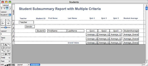
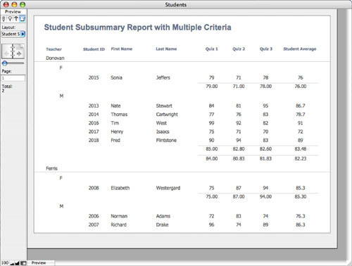
To properly generate this report, you would have to make sure that your found set was sorted first by teacher and then by gender. Figure 10.14 shows the finished report. If you sorted the report by only one of those fields, you would end up with a single-criterion subsummary report; the report would not display the other part. This means that a single layout can generate several different reports, if just the sort criterion is changed.
Figure 10.14. Typically, when you develop a subsummary report based on multiple criteria, you should use dividing lines and/or indentation to clarify the report structure.
If you were to sort the found set first by gender and then by teacher, your report might look a bit strange. That would have the effect of reversing the placement of the two subsummary parts; the data set would be separated first by gender, and then within each gender by teacher. If you built your report with any sort of indentation (as in these examples), reversing the summary hierarchy would mean that the wrong headings would be indented.
Reordering a Report Based on Summary Data
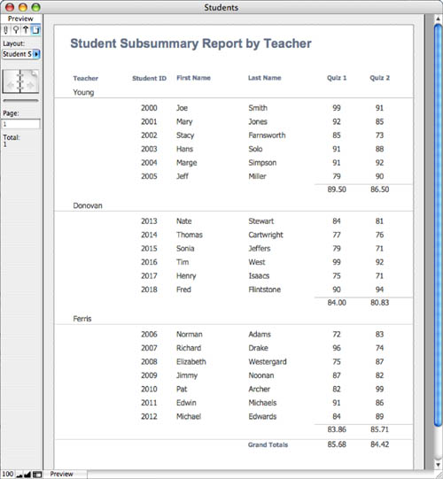
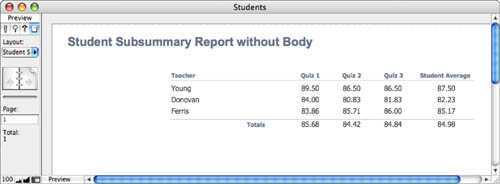
When you create a subsummary report, the groups are ordered according to how you have sorted the break field. For example, in the Quiz Scores by Teacher reports, the groups are ordered as Donovan, Ferris, Young. A descending sort would have resulted in the groups being ordered as Young, Ferris, Donovan.
It’s also possible to reorder the groups based on a summary field. To do this, when you sort the found set, click one of the sort criteria and then select the Reorder Based on Summary Field option. Figure 10.15 shows the Sort Records dialog with this option specified. Note that the order icon in the Sort Order pane of the dialog changes.
Figure 10.15. An option in the Sort Records dialog is the capability to reorder the set based on a summary field. This enables you to generate ranking reports at a group level.
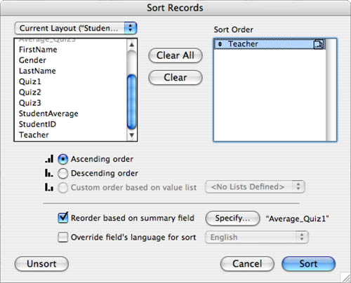
The typical reason you would want to reorder your report based on a summary value is to produce group-level ranking reports. As an example, if the Quiz Scores by Teacher report used the sort shown in Figure 10.15, in which the Teacher sort criteria is reordered by the value of Average_Quiz1, the results would be the report shown in Figure 10.16. Notice that Young is the first group; her student average on Quiz 1 was 89.5. Donovan is next with a student average of 84.0, followed by Ferris at 83.9.
Figure 10.16. Reordering the set by a summary field produces a group-level ranking report.
If you have a subsummary report with multiple summary levels, you can reorder the subgroups at any level of the report. When you do this, keep in mind that you can (and probably will) end up with a situation in which the subgroups are ordered differently within the groups. That is, if you did a secondary sort by gender (reordered by one of the summary fields) on the data in Figure 10.16, you would find that sometimes Male appeared before Female and that other times Female appeared first; each group’s subgroups are ordered independently.
Subsummary Reports with No Body Part
In a typical subsummary report, a subsummary part serves to organize and/or present summary data about a subgroup of data detailed on the report. All the subsummary reports presented so far in this chapter, in fact, fit this structure.
But there’s no reason why you can’t remove the body part from your report, thereby just presenting some sort of listing of the groups themselves. Especially if your groups consist of large record sets, simply presenting the aggregated groups might result in a report that’s much more meaningful. If you require a more detailed view of things, you can either provide it in a different report or simply allow users to perform ad hoc searches.
You can also allow users to toggle the body part on and off by redefining it as a subsummary using the (unique) primary key as a break field. That way, when the found set is sorted by the primary key, the faux body part is visible. When the found set sorts by only the break field, it disappears. Given that the break field contains unique values, no summary function will be performed (the data won’t collapse into groups), but you can control whether the part appears or disappears as you want.
Figure 10.17 shows a quiz scores report in which the body part has been removed. The absence of a body part means that it’s not necessary to have both a leading and a trailing subsummary part; nothing would appear in between them, so it’s not necessary. Similarly, the only columns of the report are the break field (Teacher) and four summary fields. It doesn’t make any sense to have fields such as FirstName or StudentID because they aren’t representative of an entire group of records.
Figure 10.17. Without a body part, a subsummary report becomes a group-level list report.
The subsummary techniques presented in this chapter represent just about everything you can do with a subsummary report. After you fully learn these techniques, you can pick and choose which ones you need to use to produce a given report. You’ll also find that simply knowing the tools at your disposal influences the way you design reports. The more you can design reports that work within the constraints of the tools, the easier it will be to generate those reports.
Charting in FileMaker
FileMaker does not include any native charting capabilities; however, some excellent plug-ins on the market very capably fill the void. We tend to use xmChart from X2max Software in our consulting practice, but Cleveland Consulting’s CC Gantt Chart tool is a specialized application for scheduling, and oAzium Charts from Waves in Motion is an aging but well-regarded plug-in in the industry as well. You can also check out FusionCharts from InfoSoft Global (http://www.fusioncharts.com/FileMaker/). In addition to xmChart, you can merge FileMaker data with an Excel workbook and drive charting in that manner using ODBC queries.
![]() For more information on the Web Viewer, see Chapter 13, “Using the Web Viewer,” p. 401.
For more information on the Web Viewer, see Chapter 13, “Using the Web Viewer,” p. 401.
Delivering Reports
Reports are typically one of the most important things a database solution produces. Workflows often include using a database for data entry and then running a routine of some sort to have that data synthesized and presented as output in the form of a report. After a report has been generated (usually onscreen in Preview mode), users almost always want to take an additional step and deliver that report to some other medium. Often, delivering a report is as simple as clicking a Print menu option; however, FileMaker 9 provides additional capabilities for distributing reports to various users.
Save/Send as PDF
Available from the File menu is the option to Save/Send Records as PDF. For the FileMaker 9 family of products, FileMaker, Inc., offers the complete PDF application programming interface; the new creation features provide comprehensive control over PDFs generated from FileMaker (see Figure 10.18).
Figure 10.18. From any layout in FileMaker, users can save PDF reports directly from the File menu.
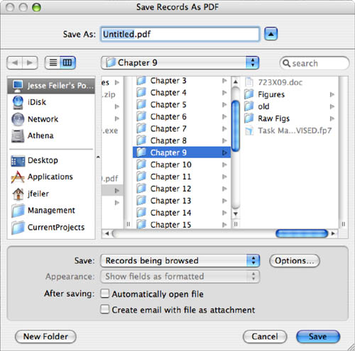
Just as with printing, users can opt to save to PDF a single record, a set of records, or a blank view of their current layout. The end result is a PDF file that can be viewed by anyone with the capability of opening PDF files—virtually everyone with a modern Windows or Mac computer.
Mac OS X includes the capability to save print requests to PDF as well, but FileMaker’s capabilities extend beyond those of the Mac OS, in addition to being fully cross-platform compatible and available on Windows as well. (Windows users would otherwise need to purchase and install a copy of Adobe Acrobat.) FileMaker offers complete access to all file options, as shown in Figure 10.19, and provides access to the full range of PDF security features, as shown in Figure 10.20.
Figure 10.19. Document metadata for PDF files is useful for archival purposes; FileMaker offers access to the full range of PDF features in this regard.
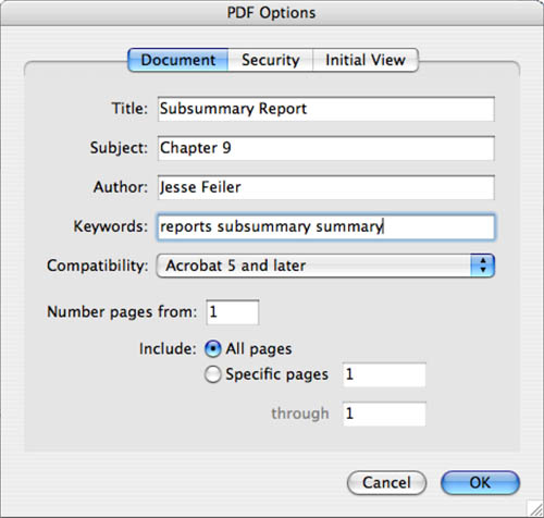
Figure 10.20. FileMaker 9 offers access to a wide range of PDF security features: Users can protect an entire document or choose from various more-specific options.
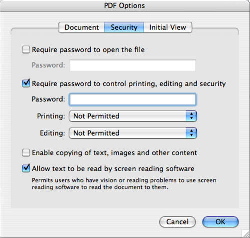
One of the most important things to note about this functionality is that PDF output is fully scriptable via the script step Save Records as PDF. With this script step, a developer can automate the generation of PDF reports complete with metadata options, security, and other PDF features. Each document option, from its title to its password, can be programmatically controlled from a script.
In FileMaker Pro 9, the Save Records as PDF script step now lets you add onto the end of an existing PDF file.
Last but certainly not least, notice the Create Email with File as Attachment option at the bottom of Figure 10.18. When you select this choice, FileMaker creates a PDF and automatically opens a new email message with the PDF document as an attachment. This one-step process makes it simple to send documents directly from FileMaker.
Saving to PDF is a straightforward act and doesn’t warrant pages of explanation. However, it is one of the key new features in FileMaker 9 and dramatically extends the ease with which developers can deliver reports to users in this ubiquitous, convenient package.
Save/Send as Excel
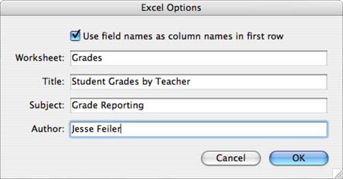
Just as FileMaker allows you to export data, users can now save and email Excel documents directly from the File menu. Users don’t have to manipulate export dialogs; they simply get whatever data columns are available on their current layout, and the resultant file is a native Excel document. No formatting is available, but the document properties can be set from the Excel Options dialog, as shown in Figure 10.21.
Figure 10.21. Saving documents to Excel directly can save multiple steps and delivers information in a form that is often more familiar to other constituents in an organization.
Notice that as with Save/Send Record as PDF, users can opt to create a new email message with the resultant file attached in a single, easy step. Likewise, as with the Save as PDF script step, developers can automate the creation of Excel documents by the Save As Excel script step.
Send Mail
FileMaker has had the capability to send email via the Send Mail script step for many years. Beginning with FileMaker 8, you have the capability to do so directly from the File menu without having to do any scripting or development work.
Although it’s perhaps tangential to the topic of reporting in the traditional sense of getting a printed synthesis of information on an 8 1/2 x 11 sheet of paper, consider that email is simply another means of output.
![]() For a discussion of how to work with the Send Mail dialog, see Chapter 2, “Using FileMaker Pro,” p. 29.
For a discussion of how to work with the Send Mail dialog, see Chapter 2, “Using FileMaker Pro,” p. 29.
Note that the Send Mail dialog allows users to pull calculated values from a database and can send multiple emails—one per record in the found set—in a batch process.
The Send Mail script step has been extended in an identical manner. It allows developers to automate batch email processes and can dynamically generate recipient addresses, subject lines, email body text, and more from the records in a given database.
![]() To learn more about scripting routines, see Chapter 9, “Getting Started with Scripting,” p. 283 and Chapter 16, “Advanced Scripting Techniques,” p. 477.
To learn more about scripting routines, see Chapter 9, “Getting Started with Scripting,” p. 283 and Chapter 16, “Advanced Scripting Techniques,” p. 477.
Troubleshooting
Printed Reports Show Only a Single Record
Sometimes, my printed reports contain only the first record of data. Why is that?
Chances are that your print settings are configured to print the current record rather than the current found count. When printing from a List view, be sure to select the Records Being Browsed option. This configuration can be specified within a script, so be sure to set your print scripts to use this configuration as well.
Slow Generation of Subsummary Reports
I have built several subsummary reports, but many of them take quite a while to generate. Is there anything I can do to speed them up?
This is a common source of performance issues many developers face. Various factors can influence the time it takes to generate a subsummary report. The most important of these is the size of the found set. A subsummary report over a found set of 50,000 records takes considerably longer to generate than one with 100 records. Another factor is the amount of summarization the report performs: A report with one summary field generates faster than one with a dozen.
Consider what a subsummary report is doing in combination with summary fields: It is synthesizing data across multiple records dynamically. In other words, it is calculating up-to-date information based on your found set, sort criteria, and so on. This information is difficult to “prebake” by having it be already calculated or indexed, so FileMaker and other database technologies have to generate this information on demand.
Another potential bottleneck is the complexity of the summarization. Summary fields that operate on plain number fields generally perform better than summary fields that operate on calculations that return number results. This is especially true if the calculations contain complex logic or aggregate functions that operate on large record sets. It’s even more true if any of the calculations is unstored—a performance drain you should strive to avoid if at all possible.
Unfortunately there’s no magic fix here. Subsummary report performance depends entirely on how a given database is structured, on the needs of the organization it serves, and on the hardware and network on which it is deployed. General rules of thumb are to avoid using unindexed fields for sorting and finding and to keep the number of summary type fields to a required minimum.
Beyond that, there are a few things you might try to improve the performance of subsummary reports by building routines that rely less on dynamic, on-demand information. The first is to automate the reports to run during the middle of the night; you can view the results as a PDF in the morning. Another option is to presummarize some of the data. This might involve running a script to set plain number fields to the result of complex calculations. Or you might create utility tables where you can store summarized data. For instance, every month you might run a month-end closing routine that posts monthly totals for each product or salesperson to a utility table. Then, rather than having summary reports based on granular data, you can run reports against the presummarized data.
FileMaker Extra: Incorporating Reports into the Workflow
The focus of this chapter has been on the creation of list and subsummary report layouts. There’s a bit more to creating useful reports, however, than merely setting up nice-looking layouts: You have to incorporate reports into the user workflow, controlling how a user both accesses and exits a report. The methods you choose can vary from solution to solution and your choice is a function of both what the system does and the particular audience. If the users are proficient with FileMaker, they might be comfortable manually finding and sorting a set of records and navigating to the appropriate layout. More often, however, users benefit from your taking some time to set up some infrastructure to help them access the reports properly.
There are many ways you can go about building reports into the workflow of a solution. Following are some of the most common we’ve seen over the years:
- Place buttons to run reports on relevant data-entry layouts— For instance, on an Invoice Entry screen, you might have buttons for creating an Invoice Aging report; on a Contact entry layout, there might be a Callback Report and a Contact Activity Report. Users typically are expected to find whatever data they want included in the report; the script simply goes to the correct layout, sorts, and previews, and then potentially returns the user to the original layout.
- In your report scripts, use custom dialogs to give users certain choices about how the report will be generated— For instance, a dialog might prompt users as to whether they want to produce a report for the current month’s data or the previous month’s.
- You can create a centralized Report Menu layout that can be accessed from anyplace in your solution— By centralizing your reports, you can avoid having to clutter data-entry layouts with report buttons. In addition, you give your users one place to go anytime they want a report, rather than requiring that they memorize which reports they can generate where. A centralized report menu works well when the report scripts run predetermined finds.
- As a variation on the Report Menu concept, you can give users control over finding and sorting the data— You can, for example, place global fields on a layout so that the user can enter a date range on which to search. The find criteria is usually specific to a certain report or group of reports, so you need to branch to the appropriate “finder” layout when a user makes a selection from the report menu.
- A third variation on the Report Menu idea is to literally create a Reports custom menu— A custom menu of reports could offer contextual listings of available reports from a given area of your database, or it might simply offer all the reports available within your solution.
- You can enable users to modify the title of a report or to add a secondary header of their own choice— This typically is done with custom dialogs, but you can also incorporate this element into a report menu or layout dedicated to preparing records sets for reports.
After generating the report, you’ll probably want to return users to wherever they were before running the report. Try to avoid a situation in which a user is stranded on a report layout without any tools to get back to familiar territory.
You should also strive to have some consistency in how reports look and function in your system; this will make using them easier and more intuitive for your users. For instance, you might set up as a convention that reports are always (or never) previewed onscreen, and users are prompted as to whether they want to print a report. Similarly, place layout elements such as the title, page number, and report date and time in consistent locations on your reports so that users don’t have to hunt for them.