

Descriptive Statistics
Statistics is the science of data. An important aspect of dealing with data is organizing and summarizing the data in ways that facilitate its interpretation and subsequent analysis. This aspect of statistics is called descriptive statistics, and is the subject of this chapter. For example, in Chapter 1 we presented eight prototype units made on the pull-off force of prototype automobile engine connectors. The observations (in pounds) were 12.6, 12.9, 13.4, 12.3, 13.6, 13.5, 12.6, and 13.1. There is obvious variability in the pull-off force values. How should we summarize the information in these data? This is the general question that we consider. Data summary methods should highlight the important features of the data, such as the middle or central tendency and the variability, because these characteristics are most often important for engineering decision making. We will see that there are both numerical methods for summarizing data and a number of powerful graphical techniques. The graphical techniques are particularly important. Any good statistical analysis of data should always begin with plotting the data.
After careful study of this chapter, you should be able to do the following:
- Compute and interpret the sample mean, sample variance, sample standard deviation, sample median, and sample range
- Explain the concepts of sample mean, sample variance, population mean, and population variance
- Construct and interpret visual data displays, including the stem-and-leaf display, the histogram, and the box plot
- Explain the concept of random sampling
- Construct and interpret normal probability plots
- Explain how to use box plots and other data displays to visually compare two or more samples of data
- Know how to use simple time series plots to visually display the important features of time-oriented data
- Know how to construct and interpret scatter diagrams of two or more variables
6-1 Numerical Summaries of Data
Well-constructed data summaries and displays are essential to good statistical thinking, because they can focus the engineer on important features of the data or provide insight about the type of model that should be used in solving the problem. The computer has become an important tool in the presentation and analysis of data. Although many statistical techniques require only a handheld calculator, this approach may require much time and effort, and a computer will perform the tasks much more efficiently.
Most statistical analysis is done using a prewritten library of statistical programs. The user enters the data and then selects the types of analysis and output displays that are of interest. Statistical software packages are available for both mainframe machines and personal computers. We will present examples of typical output from computer software throughout the book. We will not discuss the hands-on use of specific software packages for entering and editing data or using commands.
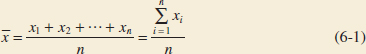
We often find it useful to describe data features numerically. For example, we can characterize the location or central tendency in the data by the ordinary arithmetic average or mean. Because we almost always think of our data as a sample, we will refer to the arithmetic mean as the sample mean.
Sample Mean
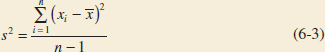
If the n observations in a sample are denoted by x1, x2,..., xn, the sample mean is
Example 6-1 Sample Mean Let's consider the eight observations on pull-off force collected from the prototype engine connectors from Chapter 1. The eight observations are x1 = 12.6, x2 = 12.9, x3 = 13.4, x4 = 12.3, x5 = 13.6, x6 = 13.5, x7 = 12.6, and x8 = 13.1. The sample mean is
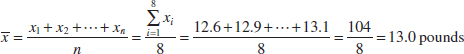
A physical interpretation of the sample mean as a measure of location is shown in the dot diagram of the pull-off force data. See Fig. 6-1. Notice that the sample mean ![]() = 13.0 can be thought of as a “balance point.” That is, if each observation represents 1 pound of mass placed at the point on the x-axis, a fulcrum located at
= 13.0 can be thought of as a “balance point.” That is, if each observation represents 1 pound of mass placed at the point on the x-axis, a fulcrum located at ![]() would exactly balance this system of weights.
would exactly balance this system of weights.
The sample mean is the average value of all observations in the data set. Usually, these data are a sample of observations that have been selected from some larger population of observations. Here the population might consist of all the connectors that will be manufactured and sold to customers. Recall that this type of population is called a conceptual or hypothetical population because it does not physically exist. Sometimes there is an actual physical population, such as a lot of silicon wafers produced in a semiconductor factory.
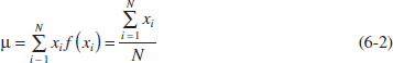
In previous chapters, we have introduced the mean of a probability distribution, denoted μ. If we think of a probability distribution as a model for the population, one way to think of the mean is as the average of all the measurements in the population. For a finite population with N equally likely values, the probability mass function is f(xi) = 1/N and the mean is
The sample mean, ![]() , is a reasonable estimate of the population mean, μ. Therefore, the engineer designing the connector using a 3/32-inch wall thickness would conclude on the basis of the data that an estimate of the mean pull-off force is 13.0 pounds.
, is a reasonable estimate of the population mean, μ. Therefore, the engineer designing the connector using a 3/32-inch wall thickness would conclude on the basis of the data that an estimate of the mean pull-off force is 13.0 pounds.
Although the sample mean is useful, it does not convey all of the information about a sample of data. The variability or scatter in the data may be described by the sample variance or the sample standard deviation.
Sample Variance and Standard Deviation
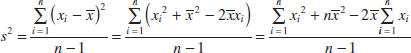
If x1, x2,..., xn is a sample of n observations, the sample variance is
The sample standard deviation, s, is the positive square root of the sample variance.
The units of measurement for the sample variance are the square of the original units of the variable. Thus, if x is measured in pounds, the units for the sample variance are (pounds)2. The standard deviation has the desirable property of measuring variability in the original units of the variable of interest, x.
How Does the Sample Variance Measure Variability?
To see how the sample variance measures dispersion or variability, refer to Fig. 6-2, which shows a dot diagram with the deviations xi − ![]() for the connector pull-off force data. The higher the amount of variability in the pull-off force data, the larger in absolute magnitude some of the deviations xi −
for the connector pull-off force data. The higher the amount of variability in the pull-off force data, the larger in absolute magnitude some of the deviations xi − ![]() will be. Because the deviations xi −
will be. Because the deviations xi − ![]() always sum to zero, we must use a measure of variability that changes the negative deviations to non-negative quantities. Squaring the deviations is the approach used in the sample variance. Consequently, if s2 is small, there is relatively little variability in the data, but if s2 is large, the variability is relatively large.
always sum to zero, we must use a measure of variability that changes the negative deviations to non-negative quantities. Squaring the deviations is the approach used in the sample variance. Consequently, if s2 is small, there is relatively little variability in the data, but if s2 is large, the variability is relatively large.
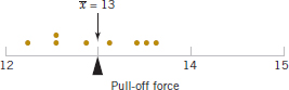
FIGURE 6-1 Dot diagram showing the sample mean as a balance point for a system of weights.
Example 6-2 Sample Variance Table 6-1 displays the quantities needed for calculating the sample variance and sample standard deviation for the pull-off force data. These data are plotted in Fig. 6-2. The numerator of s2 is
![]()
![]() TABLE • 6-1 Calculation of Terms for the Sample Variance and Sample Standard Deviation
TABLE • 6-1 Calculation of Terms for the Sample Variance and Sample Standard Deviation
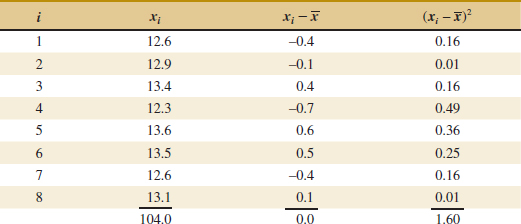
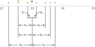
FIGURE 6-2 How the sample variance measures variability through the deviations Xi − ![]() .
.
so the sample variance is
![]()
and the sample standard deviation is
![]()
Computation of s2
The computation of s2 requires calculation of ![]() , n subtractions, and n squaring and adding operations. If the original observations or the deviations xi −
, n subtractions, and n squaring and adding operations. If the original observations or the deviations xi − ![]() are not integers, the deviations xi −
are not integers, the deviations xi − ![]() may be tedious to work with, and several decimals may have to be carried to ensure numerical accuracy. A more efficient computational formula for the sample variance is obtained as follows:
may be tedious to work with, and several decimals may have to be carried to ensure numerical accuracy. A more efficient computational formula for the sample variance is obtained as follows:
and because ![]() = (1/n)
= (1/n)![]() , this last equation reduces to
, this last equation reduces to
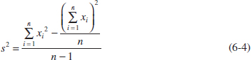
Note that Equation 6-4 requires squaring each individual xi, then squaring the sum of the xi, subtracting (Σxi)2/n from ![]() , and finally dividing by n − 1. Sometimes this is called the shortcut method for calculating s2 (or s).
, and finally dividing by n − 1. Sometimes this is called the shortcut method for calculating s2 (or s).
Example 6-3 We will calculate the sample variance and standard deviation using the shortcut method, Equation 6-4. The formula gives
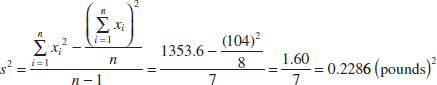
and
![]()
These results agree exactly with those obtained previously.
Analogous to the sample variance s2, the variability in the population is defined by the population variance (σ2). As in earlier chapters, the positive square root of σ2, or σ, will denote the population standard deviation. When the population is finite and consists of N equally likely values, we may define the population variance as
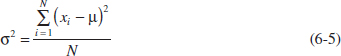
We observed previously that the sample mean could be used as an estimate of the population mean. Similarly, the sample variance is an estimate of the population variance. In Chapter 7, we will discuss estimation of parameters more formally.
Note that the divisor for the sample variance is the sample size minus 1 (n − 1), and for the population variance, it is the population size N. If we knew the true value of the population mean μ, we could find the sample variance as the average square deviation of the sample observations about μ. In practice, the value of μ is almost never known, and so the sum of the square deviations about the sample average ![]() must be used instead. However, the observations xi tend to be closer to their average,
must be used instead. However, the observations xi tend to be closer to their average, ![]() , than to the population mean, μ. Therefore, to compensate for this, we use n − 1 as the divisor rather than n. If we used n as the divisor in the sample variance, we would obtain a measure of variability that is on the average consistently smaller than the true population variance σ2.
, than to the population mean, μ. Therefore, to compensate for this, we use n − 1 as the divisor rather than n. If we used n as the divisor in the sample variance, we would obtain a measure of variability that is on the average consistently smaller than the true population variance σ2.
Another way to think about this is to consider the sample variance s2 as being based on n − 1 degrees of freedom. The term degrees of freedom results from the fact that the n deviations x1 − ![]() , x2 −
, x2 − ![]() ,..., xn −
,..., xn − ![]() always sum to zero, and so specifying the values of any n − 1 of these quantities automatically determines the remaining one. This was illustrated in Table 6-1. Thus, only n − 1 of the n deviations, xi −
always sum to zero, and so specifying the values of any n − 1 of these quantities automatically determines the remaining one. This was illustrated in Table 6-1. Thus, only n − 1 of the n deviations, xi − ![]() , are freely determined. We may think of the number of degrees of freedom as the number of independent pieces of information in the data.
, are freely determined. We may think of the number of degrees of freedom as the number of independent pieces of information in the data.
In addition to the sample variance and sample standard deviation, the sample range, or the difference between the largest and smallest observations, is often a useful measure of variability. The sample range is defined as follows.
Sample Range
If the n observations in a sample are denoted by x1, x2,..., xn, the sample range is
![]()
For the pull-off force data, the sample range is r = 13.6 − 12.3 = 1.3. Generally, as the variability in sample data increases, the sample range increases.
The sample range is easy to calculate, but it ignores all of the information in the sample data between the largest and smallest values. For example, the two samples 1, 3, 5, 8, and 9 and 1, 5, 5, 5, and 9 both have the same range (r = 8). However, the standard deviation of the first sample is s1 = 3.35, while the standard deviation of the second sample is s2 = 2.83. The variability is actually less in the second sample.
Sometimes when the sample size is small, say n < 8 or 10, the information loss associated with the range is not too serious. For example, the range is used widely in statistical quality control where sample sizes of 4 or 5 are fairly common. We will discuss some of these applications in Chapter 15.
In most statistics problems, we work with a sample of observations selected from the population that we are interested in studying. Figure 6-3 illustrates the relationship between the population and the sample.
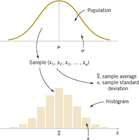
FIGURE 6-3 Relationship between a population and a sample.
![]() Problem available in WileyPLUS at instructor's discretion.
Problem available in WileyPLUS at instructor's discretion.
![]() Go Tutorial Tutoring problem available in WileyPLUS at instructor's discretion.
Go Tutorial Tutoring problem available in WileyPLUS at instructor's discretion.
6-1. Will the sample mean always correspond to one of the observations in the sample?
6-2. Will exactly half of the observations in a sample fall below the mean?
6-3. Will the sample mean always be the most frequently occurring data value in the sample?
6-4. For any set of data values, is it possible for the sample standard deviation to be larger than the sample mean? If so, give an example.
6-5. Can the sample standard deviation be equal to zero? If so, give an example.
6-6. Suppose that you add 10 to all of the observations in a sample. How does this change the sample mean? How does it change the sample standard deviation?
6-7. ![]() Eight measurements were made on the inside diameter of forged piston rings used in an automobile engine. The data (in millimeters) are 74.001, 74.003, 74.015, 74.000, 74.005, 74.002, 74.005, and 74.004. Calculate the sample mean and sample standard deviation, construct a dot diagram, and comment on the data.
Eight measurements were made on the inside diameter of forged piston rings used in an automobile engine. The data (in millimeters) are 74.001, 74.003, 74.015, 74.000, 74.005, 74.002, 74.005, and 74.004. Calculate the sample mean and sample standard deviation, construct a dot diagram, and comment on the data.
6-8. ![]() Go Tutorial In Applied Life Data Analysis (Wiley, 1982), Wayne Nelson presents the breakdown time of an insulating fluid between electrodes at 34 kV. The times, in minutes, are as follows: 0.19, 0.78, 0.96, 1.31, 2.78, 3.16, 4.15, 4.67, 4.85, 6.50, 7.35, 8.01, 8.27, 12.06, 31.75, 32.52, 33.91, 36.71, and 72.89. Calculate the sample mean and sample standard deviation.
Go Tutorial In Applied Life Data Analysis (Wiley, 1982), Wayne Nelson presents the breakdown time of an insulating fluid between electrodes at 34 kV. The times, in minutes, are as follows: 0.19, 0.78, 0.96, 1.31, 2.78, 3.16, 4.15, 4.67, 4.85, 6.50, 7.35, 8.01, 8.27, 12.06, 31.75, 32.52, 33.91, 36.71, and 72.89. Calculate the sample mean and sample standard deviation.
6-9. ![]() The January 1990 issue of Arizona Trend contains a supplement describing the 12 “best” golf courses in the state. The yardages (lengths) of these courses are as follows: 6981, 7099, 6930, 6992, 7518, 7100, 6935, 7518, 7013, 6800, 7041, and 6890. Calculate the sample mean and sample standard deviation. Construct a dot diagram of the data.
The January 1990 issue of Arizona Trend contains a supplement describing the 12 “best” golf courses in the state. The yardages (lengths) of these courses are as follows: 6981, 7099, 6930, 6992, 7518, 7100, 6935, 7518, 7013, 6800, 7041, and 6890. Calculate the sample mean and sample standard deviation. Construct a dot diagram of the data.
6-10. ![]() An article in the Journal of Structural Engineering (Vol. 115, 1989) describes an experiment to test the yield strength of circular tubes with caps welded to the ends. The first yields (in kN) are 96, 96, 102, 102, 102, 104, 104, 108, 126, 126, 128, 128, 140, 156, 160, 160, 164, and 170. Calculate the sample mean and sample standard deviation. Construct a dot diagram of the data.
An article in the Journal of Structural Engineering (Vol. 115, 1989) describes an experiment to test the yield strength of circular tubes with caps welded to the ends. The first yields (in kN) are 96, 96, 102, 102, 102, 104, 104, 108, 126, 126, 128, 128, 140, 156, 160, 160, 164, and 170. Calculate the sample mean and sample standard deviation. Construct a dot diagram of the data.
6-11. ![]() An article in Human Factors (June 1989) presented data on visual accommodation (a function of eye movement) when recognizing a speckle pattern on a high-resolution CRT screen. The data are as follows: 36.45, 67.90, 38.77, 42.18, 26.72, 50.77, 39.30, and 49.71. Calculate the sample mean and sample standard deviation. Construct a dot diagram of the data.
An article in Human Factors (June 1989) presented data on visual accommodation (a function of eye movement) when recognizing a speckle pattern on a high-resolution CRT screen. The data are as follows: 36.45, 67.90, 38.77, 42.18, 26.72, 50.77, 39.30, and 49.71. Calculate the sample mean and sample standard deviation. Construct a dot diagram of the data.
6-12. ![]() The following data are direct solar intensity measurements (watts/m2) on different days at a location in southern Spain: 562, 869, 708, 775, 775, 704, 809, 856, 655, 806, 878, 909, 918, 558, 768, 870, 918, 940, 946, 661, 820, 898, 935, 952, 957, 693, 835, 905, 939, 955, 960, 498, 653, 730, and 753. Calculate the sample mean and sample standard deviation. Prepare a dot diagram of these data. Indicate where the sample mean falls on this diagram. Give a practical interpretation of the sample mean.
The following data are direct solar intensity measurements (watts/m2) on different days at a location in southern Spain: 562, 869, 708, 775, 775, 704, 809, 856, 655, 806, 878, 909, 918, 558, 768, 870, 918, 940, 946, 661, 820, 898, 935, 952, 957, 693, 835, 905, 939, 955, 960, 498, 653, 730, and 753. Calculate the sample mean and sample standard deviation. Prepare a dot diagram of these data. Indicate where the sample mean falls on this diagram. Give a practical interpretation of the sample mean.
6-13. ![]() The April 22, 1991, issue of Aviation Week and Space Technology reported that during Operation Desert Storm, U.S. Air Force F-117A pilots flew 1270 combat sorties for a total of 6905 hours. What is the mean duration of an F-117A mission during this operation? Why is the parameter you have calculated a population mean?
The April 22, 1991, issue of Aviation Week and Space Technology reported that during Operation Desert Storm, U.S. Air Force F-117A pilots flew 1270 combat sorties for a total of 6905 hours. What is the mean duration of an F-117A mission during this operation? Why is the parameter you have calculated a population mean?
6-14. Preventing fatigue crack propagation in aircraft structures is an important element of aircraft safety. An engineering study to investigate fatigue crack in n = 9 cyclically loaded wing boxes reported the following crack lengths (in mm): 2.13, 2.96, 3.02, 1.82, 1.15, 1.37, 2.04, 2.47, 2.60. Calculate the sample mean and sample standard deviation. Prepare a dot diagram of the data.
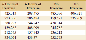
6-15. An article in the Journal of Physiology [“Response of Rat Muscle to Acute Resistance Exercise Defined by Transcriptional and Translational Profiling” (2002, Vol. 545, pp. 27–41)] studied gene expression as a function of resistance exercise. Expression data (measures of gene activity) from one gene are shown in the following table. One group of rats was exercised for six hours while the other received no exercise. Compute the sample mean and standard deviation of the exercise and no-exercise groups separately. Construct a dot diagram for the exercise and no-exercise groups separately. Comment on any differences for the groups.
6-16. ![]() Exercise 6-11 describes data from an article in Human Factors on visual accommodation from an experiment involving a high-resolution CRT screen.
Exercise 6-11 describes data from an article in Human Factors on visual accommodation from an experiment involving a high-resolution CRT screen.
Data from a second experiment using a low-resolution screen were also reported in the article. They are 8.85, 35.80, 26.53, 64.63, 9.00, 15.38, 8.14, and 8.24. Prepare a dot diagram for this second sample and compare it to the one for the first sample. What can you conclude about CRT resolution in this situation?
6-17. ![]() The pH of a solution is measured eight times by one operator using the same instrument. She obtains the following data: 7.15, 7.20, 7.18, 7.19, 7.21, 7.20, 7.16, and 7.18. Calculate the sample mean and sample standard deviation. Comment on potential major sources of variability in this experiment.
The pH of a solution is measured eight times by one operator using the same instrument. She obtains the following data: 7.15, 7.20, 7.18, 7.19, 7.21, 7.20, 7.16, and 7.18. Calculate the sample mean and sample standard deviation. Comment on potential major sources of variability in this experiment.
6-18. ![]() An article in the Journal of Aircraft (1988) described the computation of drag coefficients for the NASA 0012 airfoil. Different computational algorithms were used at M∞ = 0.7 with the following results (drag coefficients are in units of drag counts; that is, one count is equivalent to a drag coefficient of 0.0001): 79, 100, 74, 83, 81, 85, 82, 80, and 84. Compute the sample mean, sample variance, and sample standard deviation, and construct a dot diagram.
An article in the Journal of Aircraft (1988) described the computation of drag coefficients for the NASA 0012 airfoil. Different computational algorithms were used at M∞ = 0.7 with the following results (drag coefficients are in units of drag counts; that is, one count is equivalent to a drag coefficient of 0.0001): 79, 100, 74, 83, 81, 85, 82, 80, and 84. Compute the sample mean, sample variance, and sample standard deviation, and construct a dot diagram.
6-19. ![]() The following data are the joint temperatures of the O-rings (°F) for each test firing or actual launch of the space shuttle rocket motor (from Presidential Commission on the Space Shuttle Challenger Accident, Vol. 1, pp. 129–131): 84, 49, 61, 40, 83, 67, 45, 66, 70, 69, 80, 58, 68, 60, 67, 72, 73, 70, 57, 63, 70, 78, 52, 67, 53, 67, 75, 61, 70, 81, 76, 79, 75, 76, 58, 31.
The following data are the joint temperatures of the O-rings (°F) for each test firing or actual launch of the space shuttle rocket motor (from Presidential Commission on the Space Shuttle Challenger Accident, Vol. 1, pp. 129–131): 84, 49, 61, 40, 83, 67, 45, 66, 70, 69, 80, 58, 68, 60, 67, 72, 73, 70, 57, 63, 70, 78, 52, 67, 53, 67, 75, 61, 70, 81, 76, 79, 75, 76, 58, 31.
(a) Compute the sample mean and sample standard deviation and construct a dot diagram of the temperature data.
(b) Set aside the smallest observation (31°F) and recompute the quantities in part (a). Comment on your findings. How “different” are the other temperatures from this last value?
6-20. The United States has an aging infrastructure as witnessed by several recent disasters, including the I-35 bridge failure in Minnesota. Most states inspect their bridges regularly and report their condition (on a scale from 1–17) to the public. Here are the condition numbers from a sample of 30 bridges in New York State (https://www.dot.ny.gov/main/bridgedata):
![]()
(a) Find the sample mean and sample standard deviation of these condition numbers.
(b) Construct a dot diagram of the data.
6-21. In an attempt to measure the effects of acid rain, researchers measured the pH (7 is neutral and values below 7 are acidic) of water collected from rain in Ingham County, Michigan.
(a) Find the sample mean and sample standard deviation of these measurements.
(b) Construct a dot diagram of the data.
6-22. Cloud seeding, a process in which chemicals such as silver iodide and frozen carbon dioxide are introduced by aircraft into clouds to promote rainfall was widely used in the 20th century. Recent research has questioned its effectiveness [Journal of Atmospheric Research (2010, Vol. 97 (2), pp. 513–525)]. An experiment was performed by randomly assigning 52 clouds to be seeded or not. The amount of rain generated was then measured in acre-feet. Here are the data for the unseeded and seeded clouds:
Unseeded:
![]()
Seeded:
![]()
Find the sample mean, sample standard deviation, and range of rainfall for
(a) All 52 clouds
(b) The unseeded clouds
(c) The seeded clouds
6-23. Construct dot diagrams of the seeded and unseeded clouds and compare their distributions in a couple of sentences.
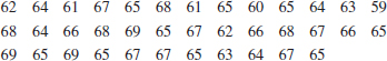
6-24. In the 2000 Sydney Olympics, a special program initiated by IOC president Juan Antonio Samaranch allowed developing countries to send athletes to the Olympics without the usual qualifying procedure. Here are the 71 times for the first round of the 100 meter men's swim (in seconds).
(a) Find the sample mean and sample standard deviation of these 100 meter swim times.
(b) Construct a dot diagram of the data.
(c) Comment on anything unusual that you see.
6-2 Stem-and-Leaf Diagrams
The dot diagram is a useful data display for small samples up to about 20 observations. However, when the number of observations is moderately large, other graphical displays may be more useful.
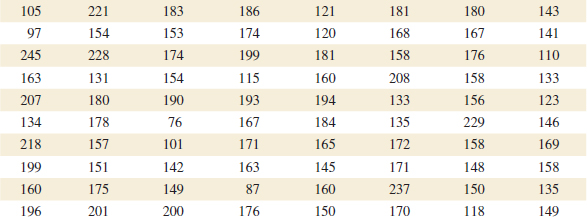
For example, consider the data in Table 6-2. These data are the compressive strengths in pounds per square inch (psi) of 80 specimens of a new aluminum-lithium alloy undergoing evaluation as a possible material for aircraft structural elements. The data were recorded in the order of testing, and in this format they do not convey much information about compressive strength. Questions such as “What percent of the specimens fall below 120 psi?” are not easy to answer. Because there are many observations, constructing a dot diagram of these data would be relatively inefficient; more effective displays are available for large data sets.
![]() TABLE • 6-2 Compressive Strength (in psi) of 80 Aluminum-Lithium Alloy Specimens
TABLE • 6-2 Compressive Strength (in psi) of 80 Aluminum-Lithium Alloy Specimens
A stem-and-leaf diagram is a good way to obtain an informative visual display of a data set x1, x2,..., xn where each number xi consists of at least two digits. To construct a stem-and-leaf diagram, use the following steps.
Steps to Construct a Stem-and-Leaf Diagram
(1) Divide each number xi into two parts: a stem, consisting of one or more of the leading digits, and a leaf, consisting of the remaining digit.
(2) List the stem values in a vertical column.
(3) Record the leaf for each observation beside its stem.
(4) Write the units for stems and leaves on the display.
To illustrate, if the data consist of percent defective information between 0 and 100 on lots of semiconductor wafers, we can divide the value 76 into the stem 7 and the leaf 6. In general, we should choose relatively few stems in comparison with the number of observations. It is usually best to choose between 5 and 20 stems.
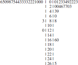
Example 6-4 Alloy Strength To illustrate the construction of a stem-and-leaf diagram, consider the alloy compressive strength data in Table 6-2. We will select as stem values the numbers 7,8,9,...,24. The resulting stem-and-leaf diagram is presented in Fig. 6-4. The last column in the diagram is a frequency count of the number of leaves associated with each stem. Inspection of this display immediately reveals that most of the compressive strengths lie between 110 and 200 psi and that a central value is somewhere between 150 and 160 psi. Furthermore, the strengths are distributed approximately symmetrically about the central value. The stem-and-leaf diagram enables us to determine quickly some important features of the data that were not immediately obvious in the original display in Table 6-2.
In some data sets, providing more classes or stems may be desirable. One way to do this would be to modify the original stems as follows: Divide stem 5 into two new stems, 5L and 5U. Stem 5L has leaves 0, 1, 2, 3, and 4, and stem 5U has leaves 5, 6, 7, 8, and 9. This will double the number of original stems. We could increase the number of original stems by four by defining five new stems: 5z with leaves 0 and 1, 5t (for twos and three) with leaves 2 and 3, 5f (for fours and fives) with leaves 4 and 5, 5s (for six and seven) with leaves 6 and 7, and 5e with leaves 8 and 9.
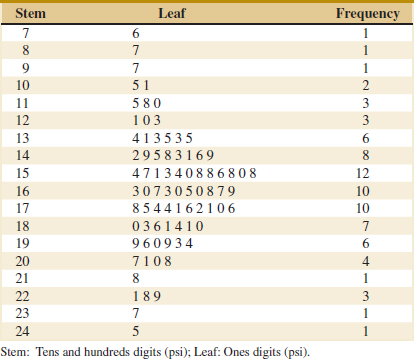
FIGURE 6-4 Stem-and-leaf diagram for the compressive strength data in Table 6-2.
Example 6-5 Chemical Yield Figure 6-5 is the stem-and-leaf diagram for 25 observations on batch yields from a chemical process. In Fig. 6-5(a), we have used 6, 7, 8, and 9 as the stems. This results in too few stems, and the stem-and-leaf diagram does not provide much information about the data. In Fig. 6-5(b), we have divided each stem into two parts, resulting in a display that more adequately displays the data. Figure 6-5(c) illustrates a stem-and-leaf display with each stem divided into five parts. There are too many stems in this plot, resulting in a display that does not tell us much about the shape of the data.
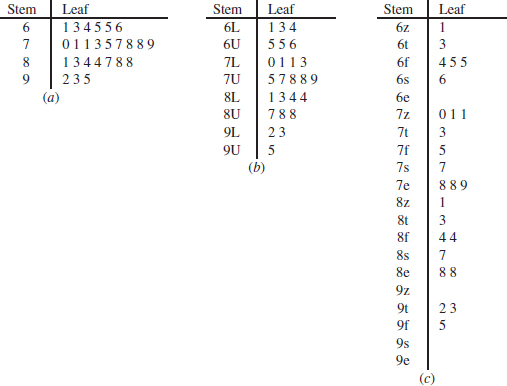
FIGURE 6-5 Stem-and-leaf displays for Example 6-5. Stem: Tens digits. Leaf: Ones digits.
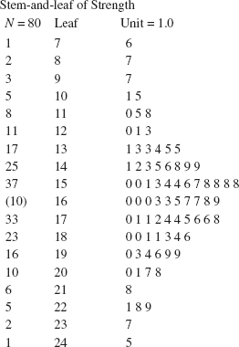
FIGURE 6-6 A typical computer-generated stem-and-leaf diagram.
Figure 6-6 is a typical computer-generated stem-and-leaf display of the compressive strength data in Table 6-2. The software uses the same stems as in Fig. 6-4. Note also that the computer orders the leaves from smallest to largest on each stem. This form of the plot is usually called an ordered stem-and-leaf diagram. This is not usually used when the plot is constructed manually because it can be time-consuming. The computer also adds a column to the left of the stems that provides a count of the observations at and above each stem in the upper half of the display and a count of the observations at and below each stem in the lower half of the display. At the middle stem of 16, the column indicates the number of observations at this stem.
The ordered stem-and-leaf display makes it relatively easy to find data features such as percentiles, quartiles, and the median. The sample median is a measure of central tendency that divides the data into two equal parts, half below the median and half above. If the number of observations is even, the median is halfway between the two central values. From Fig. 6-6 we find the 40th and 41st values of strength as 160 and 163, so the median is (160 + 163)/2 = 161.5. If the number of observations is odd, the median is the central value. The sample mode is the most frequently occurring data value. Figure 6-6 indicates that the mode is 158; this value occurs four times, and no other value occurs as frequently in the sample. If there were more than one value that occurred four times, the data would have multiple modes.
We can also divide data into more than two parts. When an ordered set of data is divided into four equal parts, the division points are called quartiles. The first or lower quartile, q1, is a value that has approximately 25% of the observations below it and approximately 75% of the observations above. The second quartile, q2, has approximately 50% of the observations below its value. The second quartile is exactly equal to the median. The third or upper quartile, q3, has approximately 75% of the observations below its value. As in the case of the median, the quartiles may not be unique. The compressive strength data in Fig. 6-6 contain n = 80 observations. Therefore, calculate the first and third quartiles as the (n + 1)/4 and 3(n + 1)/4 ordered observations and interpolate as needed, for example, (80 + 1)/4 = 20.25 and 3(80 + 1)/4 = 60.75. Therefore, interpolating between the 20th and 21st ordered observation we obtain q1 = 143.50 and between the 60th and 61st observation we obtain q3 = 181.00. In general, the 100kth percentile is a data value such that approximately 100k% of the observations are at or below this value and approximately 100(1 − k)% of them are above it. Finally, we may use the interquartile range, defined as IQR = q3 − q1, as a measure of variability. The interquartile range is less sensitive to the extreme values in the sample than is the ordinary sample range.
Many statistics software packages provide data summaries that include these quantities. Typical computer output for the compressive strength data in Table 6-2 is shown in Table 6-3.
![]() TABLE • 6-3 Summary Statistics for the Compressive Strength Data from Software
TABLE • 6-3 Summary Statistics for the Compressive Strength Data from Software
![]()
Exercises FOR SECTION 6-2
![]() Problem available in WileyPLUS at instructor's discretion.
Problem available in WileyPLUS at instructor's discretion.
![]() Go Tutorial Tutoring problem available in WileyPLUS at instructor's discretion.
Go Tutorial Tutoring problem available in WileyPLUS at instructor's discretion.
6-25. For the data in Exercise 6-20,
(a) Construct a stem-and-leaf diagram.
(b) Do any of the bridges appear to have unusually good or poor ratings?
(c) If so, compute the mean with and without these bridges and comment.
6-26. For the data in Exercise 6-21,
(a) Construct a stem-and-leaf diagram.
(b) Many scientists consider rain with a pH below 5.3 to be acid rain (http://www.ec.gc.ca/eau-water/default.asp?lang=En&n=FDF30C16-1). What percentage of these samples could be considered as acid rain?
6-27. A back-to-back stem-and-leaf display on two data sets is conducted by hanging the data on both sides of the same stems. Here is a back-to-back stem-and-leaf display for the cloud seeding data in Exercise 6-22 showing the unseeded clouds on the left and the seeded clouds on the right.
How does the back-to-back stem-and-leaf display show the differences in the data set in a way that the dotplot cannot?
6-28. When will the median of a sample be equal to the sample mean?
6-29. When will the median of a sample be equal to the mode?
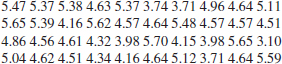
6-30. ![]() An article in Technometrics (1977, Vol. 19, p. 425) presented the following data on the motor fuel octane ratings of several blends of gasoline:
An article in Technometrics (1977, Vol. 19, p. 425) presented the following data on the motor fuel octane ratings of several blends of gasoline:
![]()
Construct a stem-and-leaf display for these data. Calculate the median and quartiles of these data.
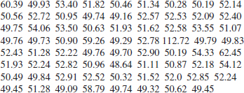
6-31. ![]() Go Tutorial The following data are the numbers of cycles to failure of aluminum test coupons subjected to repeated alternating stress at 21,000 psi, 18 cycles per second.
Go Tutorial The following data are the numbers of cycles to failure of aluminum test coupons subjected to repeated alternating stress at 21,000 psi, 18 cycles per second.
![]()
Construct a stem-and-leaf display for these data. Calculate the median and quartiles of these data. Does it appear likely that a coupon will “survive” beyond 2000 cycles? Justify your answer.
6-32. ![]() The percentage of cotton in material used to manufacture men's shirts follows. Construct a stem-and-leaf display for the data. Calculate the median and quartiles of these data.
The percentage of cotton in material used to manufacture men's shirts follows. Construct a stem-and-leaf display for the data. Calculate the median and quartiles of these data.
![]()
6-33. The following data represent the yield on 90 consecutive batches of ceramic substrate to which a metal coating has been applied by a vapor-deposition process. Construct a stem-and-leaf display for these data. Calculate the median and quartiles of these data.
![]()
![]() 6-34.
6-34. ![]() Calculate the sample median, mode, and mean of the data in Exercise 6-30. Explain how these three measures of location describe different features of the data.
Calculate the sample median, mode, and mean of the data in Exercise 6-30. Explain how these three measures of location describe different features of the data.
![]() 6-35. Calculate the sample median, mode, and mean of the data in Exercise 6-31. Explain how these three measures of location describe different features in the data.
6-35. Calculate the sample median, mode, and mean of the data in Exercise 6-31. Explain how these three measures of location describe different features in the data.
![]() 6-36.
6-36. ![]() Calculate the sample median, mode, and mean for the data in Exercise 6-32. Explain how these three measures of location describe different features of the data.
Calculate the sample median, mode, and mean for the data in Exercise 6-32. Explain how these three measures of location describe different features of the data.
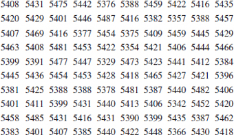
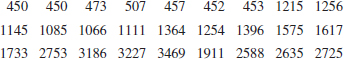
![]() 6-37. The net energy consumption (in billions of kilowatt-hours) for countries in Asia in 2003 was as follows (source: U.S. Department of Energy Web site, www.eia.doe.gov/emeu). Construct a stem-and-leaf diagram for these data and comment on any important features that you notice. Compute the sample mean, sample standard deviation, and sample median.
6-37. The net energy consumption (in billions of kilowatt-hours) for countries in Asia in 2003 was as follows (source: U.S. Department of Energy Web site, www.eia.doe.gov/emeu). Construct a stem-and-leaf diagram for these data and comment on any important features that you notice. Compute the sample mean, sample standard deviation, and sample median.
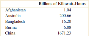
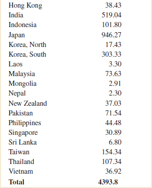
![]()
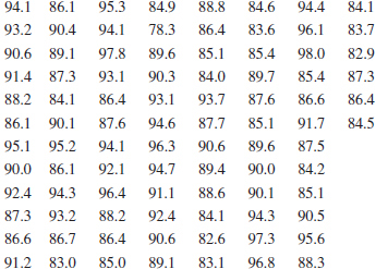
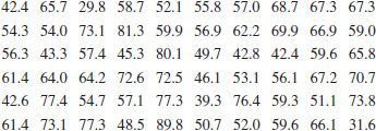
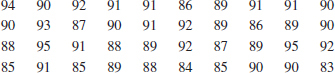
6-38. ![]() The female students in an undergraduate engineering core course at ASU self-reported their heights to the nearest inch. The data follow. Construct a stem-and-leaf diagram for the height data and comment on any important features that you notice. Calculate the sample mean, the sample standard deviation, and the sample median of height.
The female students in an undergraduate engineering core course at ASU self-reported their heights to the nearest inch. The data follow. Construct a stem-and-leaf diagram for the height data and comment on any important features that you notice. Calculate the sample mean, the sample standard deviation, and the sample median of height.
![]()
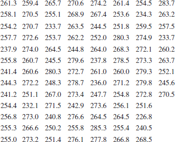
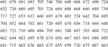
6-39. The shear strengths of 100 spot welds in a titanium alloy follow. Construct a stem-and-leaf diagram for the weld strength data and comment on any important features that you notice. What is the 95th percentile of strength?
![]()
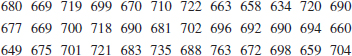
6-40. An important quality characteristic of water is the concentration of suspended solid material. Following are 60 measurements on suspended solids from a certain lake. Construct a stem-and-leaf diagram for these data and comment on any important features that you notice. Compute the sample mean, the sample standard deviation, and the sample median. What is the 90th percentile of concentration?
![]() 6-41. The United States Golf Association tests golf balls to ensure that they conform to the rules of golf. Balls are tested for weight, diameter, roundness, and overall distance. The overall distance test is conducted by hitting balls with a driver swung by a mechanical device nicknamed “Iron Byron” after the legendary great Byron Nelson, whose swing the machine is said to emulate. Following are 100 distances (in yards) achieved by a particular brand of golf ball in the overall distance test. Construct a stem-and-leaf diagram for these data and comment on any important features that you notice. Compute the sample mean, sample standard deviation, and the sample median. What is the 90th percentile of distances?
6-41. The United States Golf Association tests golf balls to ensure that they conform to the rules of golf. Balls are tested for weight, diameter, roundness, and overall distance. The overall distance test is conducted by hitting balls with a driver swung by a mechanical device nicknamed “Iron Byron” after the legendary great Byron Nelson, whose swing the machine is said to emulate. Following are 100 distances (in yards) achieved by a particular brand of golf ball in the overall distance test. Construct a stem-and-leaf diagram for these data and comment on any important features that you notice. Compute the sample mean, sample standard deviation, and the sample median. What is the 90th percentile of distances?
6-42. A semiconductor manufacturer produces devices used as central processing units in personal computers. The speed of the devices (in megahertz) is important because it determines the price that the manufacturer can charge for the devices. The following table contains measurements on 120 devices. Construct a stem-and-leaf diagram for these data and comment on any important features that you notice. Compute the sample mean, the sample standard deviation, and the sample median. What percentage of the devices has a speed exceeding 700 megahertz?
![]()
6-43. ![]() A group of wine enthusiasts taste-tested a pinot noir wine from Oregon. The evaluation was to grade the wine on a 0-to-100-point scale. The results follow. Construct a stem-and-leaf diagram for these data and comment on any important features that you notice. Compute the sample mean, the sample standard deviation, and the sample median. A wine rated above 90 is considered truly exceptional. What proportion of the taste-tasters considered this particular pinot noir truly exceptional?
A group of wine enthusiasts taste-tested a pinot noir wine from Oregon. The evaluation was to grade the wine on a 0-to-100-point scale. The results follow. Construct a stem-and-leaf diagram for these data and comment on any important features that you notice. Compute the sample mean, the sample standard deviation, and the sample median. A wine rated above 90 is considered truly exceptional. What proportion of the taste-tasters considered this particular pinot noir truly exceptional?
![]()
6-44. ![]() In their book Introduction to Linear Regression Analysis (5th edition, Wiley, 2012), Montgomery, Peck, and Vining presented measurements on NbOCl3 concentration from a tube-flow reactor experiment. The data, in gram-mole per liter × 10−3, are as follows. Construct a stem-and-leaf diagram for these data and comment on any important features that you notice. Compute the sample mean, the sample standard deviation, and the sample median.
In their book Introduction to Linear Regression Analysis (5th edition, Wiley, 2012), Montgomery, Peck, and Vining presented measurements on NbOCl3 concentration from a tube-flow reactor experiment. The data, in gram-mole per liter × 10−3, are as follows. Construct a stem-and-leaf diagram for these data and comment on any important features that you notice. Compute the sample mean, the sample standard deviation, and the sample median.
![]()
6-45. In Exercise 6-38, we presented height data that were self-reported by female undergraduate engineering students in a core course at ASU. In the same class, the male students self-reported their heights as follows. Construct a comparative stem-and-leaf diagram by listing the stems in the center of the display and then placing the female leaves on the left and the male leaves on the right. Comment on any important features that you notice in this display.
![]()

6-3 Frequency Distributions and Histograms
A frequency distribution is a more compact summary of data than a stem-and-leaf diagram. To construct a frequency distribution, we must divide the range of the data into intervals, which are usually called class intervals, cells, or bins. If possible, the bins should be of equal width in order to enhance the visual information in the frequency distribution. Some judgment must be used in selecting the number of bins so that a reasonable display can be developed. The number of bins depends on the number of observations and the amount of scatter or dispersion in the data. A frequency distribution that uses either too few or too many bins will not be informative. We usually find that between 5 and 20 bins is satisfactory in most cases and that the number of bins should increase with n. Several sets of rules can be used to determine the member of bins in a histogram. However, choosing the number of bins approximately equal to the square root of the number of observations often works well in practice.
A frequency distribution for the comprehensive strength data in Table 6-2 is shown in Table 6-4. Because the data set contains 80 observations, and because ![]()
![]() 9, we suspect that about eight to nine bins will provide a satisfactory frequency distribution. The largest and smallest data values are 245 and 76, respectively, so the bins must cover a range of at least 245 − 76 = 169 units on the psi scale. If we want the lower limit for the first bin to begin slightly below the smallest data value and the upper limit for the last bin to be slightly above the largest data value, we might start the frequency distribution at 70 and end it at 250. This is an interval or range of 180 psi units. Nine bins, each of width 20 psi, give a reasonable frequency distribution, so the frequency distribution in Table 6-4 is based on nine bins.
9, we suspect that about eight to nine bins will provide a satisfactory frequency distribution. The largest and smallest data values are 245 and 76, respectively, so the bins must cover a range of at least 245 − 76 = 169 units on the psi scale. If we want the lower limit for the first bin to begin slightly below the smallest data value and the upper limit for the last bin to be slightly above the largest data value, we might start the frequency distribution at 70 and end it at 250. This is an interval or range of 180 psi units. Nine bins, each of width 20 psi, give a reasonable frequency distribution, so the frequency distribution in Table 6-4 is based on nine bins.
Choosing the Number of Bins in a Frequency Distribution or Histogram is Important
The second row of Table 6-4 contains a relative frequency distribution. The relative frequencies are found by dividing the observed frequency in each bin by the total number of observations. The last row of Table 6-4 expresses the relative frequencies on a cumulative basis. Frequency distributions are often easier to interpret than tables of data. For example, from Table 6-4, it is very easy to see that most of the specimens have compressive strengths between 130 and 190 psi and that 97.5 percent of the specimens fall below 230 psi.
The histogram is a visual display of the frequency distribution. The steps for constructing a histogram follow.
Constructing a Histogram (Equal Bin Widths)
(1) Label the bin (class interval) boundaries on a horizontal scale.
(2) Mark and label the vertical scale with the frequencies or the relative frequencies.
(3) Above each bin, draw a rectangle where height is equal to the frequency (or relative frequency) corresponding to that bin.
Figure 6-7 is the histogram for the compression strength data. The histogram, like the stem-and-leaf diagram, provides a visual impression of the shape of the distribution of the measurements and information about the central tendency and scatter or dispersion in the data. Notice the symmetric, bell-shaped distribution of the strength measurements in Fig. 6-7. This display often gives insight about possible choices of probability distributions to use as a model for the population. For example, here we would likely conclude that the normal distribution is a reasonable model for the population of compression strength measurements.
![]() TABLE • 6-4 Frequency Distribution for the Compressive Strength Data in Table 6-2
TABLE • 6-4 Frequency Distribution for the Compressive Strength Data in Table 6-2
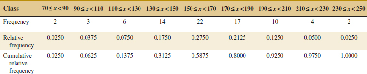
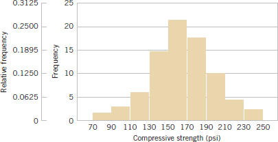
FIGURE 6-7 Histogram of compressive strength for 80 aluminum-lithium alloy specimens.
Sometimes a histogram with unequal bin widths will be employed. For example, if the data have several extreme observations or outliers, using a few equal-width bins will result in nearly all observations falling in just a few of the bins. Using many equal-width bins will result in many bins with zero frequency. A better choice is to use shorter intervals in the region where most of the data fall and a few wide intervals near the extreme observations. When the bins are of unequal width, the rectangle's area (not its height) should be proportional to the bin frequency. This implies that the rectangle height should be
![]()
In passing from either the original data or stem-and-leaf diagram to a frequency distribution or histogram, we have lost some information because we no longer have the individual observations. However, this information loss is often small compared with the conciseness and ease of interpretation gained in using the frequency distribution and histogram.
Histograms are Best for Relatively Large Samples
Figure 6-8 is a histogram of the compressive strength data with 17 bins. We have noted that histograms may be relatively sensitive to the number of bins and their width. For small data sets, histograms may change dramatically in appearance if the number and/or width of the bins changes. Histograms are more stable and thus reliable for larger data sets, preferably of size 75 to 100 or more. Figure 6-9 is a histogram for the compressive strength data with nine bins. This is similar to the original histogram shown in Fig. 6-7. Because the number of observations is moderately large (n = 80), the choice of the number of bins is not especially important, and both Figs. 6-8 and 6-9 convey similar information.
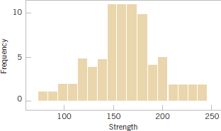
FIGURE 6-8 A histogram of the compressive strength data with 17 bins.
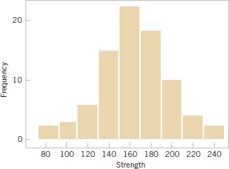
FIGURE 6-9 A histogram of the compressive strength data with nine bins.
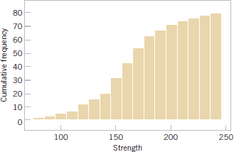
FIGURE 6-10 A cumulative distribution plot of the compressive strength data.
Figure 6-10 is a variation of the histogram available in some software packages, the cumulative frequency plot. In this plot, the height of each bar is the total number of observations that are less than or equal to the upper limit of the bin. Cumulative distributions are also useful in data interpretation; for example, we can read directly from Fig. 6-10 that approximately 70 observations are less than or equal to 200 psi.
When the sample size is large, the histogram can provide a reasonably reliable indicator of the general shape of the distribution or population of measurements from which the sample was drawn. See Figure 6-11 for three cases. The median is denoted as ![]() . Generally, if the data are symmetric, as in Fig. 6-11(b), the mean and median coincide. If, in addition, the data have only one mode (we say the data are unimodal), the mean, median, and mode all coincide. If the data are skewed (asymmetric, with a long tail to one side), as in Fig. 6-11(a) and (c), the mean, median, and mode do not coincide. Usually, we find that mode < median < mean if the distribution is skewed to the right, whereas mode > median > mean if the distribution is skewed to the left.
. Generally, if the data are symmetric, as in Fig. 6-11(b), the mean and median coincide. If, in addition, the data have only one mode (we say the data are unimodal), the mean, median, and mode all coincide. If the data are skewed (asymmetric, with a long tail to one side), as in Fig. 6-11(a) and (c), the mean, median, and mode do not coincide. Usually, we find that mode < median < mean if the distribution is skewed to the right, whereas mode > median > mean if the distribution is skewed to the left.
Frequency distributions and histograms can also be used with qualitative or categorical data. Some applications will have a natural ordering of the categories (such as freshman, sophomore, junior, and senior), whereas in others, the order of the categories will be arbitrary (such as male and female). When using categorical data, the bins should have equal width.
Example 6-6 Figure 6-12 presents the production of transport aircraft by the Boeing Company in 1985. Notice that the 737 was the most popular model, followed by the 757, 747, 767, and 707.
A chart of occurrences by category (in which the categories are ordered by the number of occurrences) is sometimes referred to as a Pareto chart. An exercise asks you to construct such a chart.
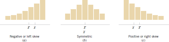
FIGURE 6-11 Histograms for symmetric and skewed distributions.
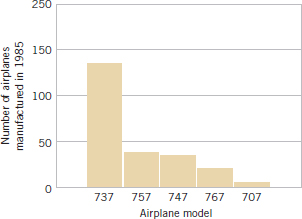
FIGURE 6-12 Airplane production in 1985. (Source: Boeing Company.)
In this section, we have concentrated on descriptive methods for the situation in which each observation in a data set is a single number or belongs to one category. In many cases, we work with data in which each observation consists of several measurements. For example, in a gasoline mileage study, each observation might consist of a measurement of miles per gallon, the size of the engine in the vehicle, engine horsepower, vehicle weight, and vehicle length. This is an example of multivariate data. In section 6.6, we will illustrate one simple graphical display or multivariate data. In later chapters, we will discuss analyzing this type of data.
Exercises FOR SECTION 6-3
![]() Problem available in WileyPLUS at instructor's discretion.
Problem available in WileyPLUS at instructor's discretion.
![]() Go Tutorial Tutoring problem available in WileyPLUS at instructor's discretion.
Go Tutorial Tutoring problem available in WileyPLUS at instructor's discretion.
![]() 6-46.
6-46. ![]() Construct a frequency distribution and histogram for the motor fuel octane data from Exercise 6-30. Use eight bins.
Construct a frequency distribution and histogram for the motor fuel octane data from Exercise 6-30. Use eight bins.
![]() 6-47. Construct a frequency distribution and histogram using the failure data from Exercise 6-31.
6-47. Construct a frequency distribution and histogram using the failure data from Exercise 6-31.
![]() 6-48.
6-48. ![]() Construct a frequency distribution and histogram for the cotton content data in Exercise 6-32.
Construct a frequency distribution and histogram for the cotton content data in Exercise 6-32.
![]() 6-49. Construct a frequency distribution and histogram for the yield data in Exercise 6-33.
6-49. Construct a frequency distribution and histogram for the yield data in Exercise 6-33.
![]() 6-50.
6-50. ![]() Construct frequency distributions and histograms with 8 bins and 16 bins for the motor fuel octane data in Exercise 6-30. Compare the histograms. Do both histograms display similar information?
Construct frequency distributions and histograms with 8 bins and 16 bins for the motor fuel octane data in Exercise 6-30. Compare the histograms. Do both histograms display similar information?
![]() 6-51. Construct histograms with 8 and 16 bins for the data in Exercise 6-31. Compare the histograms. Do both histograms display similar information?
6-51. Construct histograms with 8 and 16 bins for the data in Exercise 6-31. Compare the histograms. Do both histograms display similar information?
![]() 6-52.
6-52. ![]() Construct histograms with 8 and 16 bins for the data in Exercise 6-32. Compare the histograms. Do both histograms display similar information?
Construct histograms with 8 and 16 bins for the data in Exercise 6-32. Compare the histograms. Do both histograms display similar information?
![]() 6-53. Construct a histogram for the energy consumption data in Exercise 6-37.
6-53. Construct a histogram for the energy consumption data in Exercise 6-37.
![]() 6-54.
6-54. ![]() Construct a histogram for the female student height data in Exercise 6-38.
Construct a histogram for the female student height data in Exercise 6-38.
![]() 6-55. Construct a histogram for the spot weld shear strength data in Exercise 6-39. Comment on the shape of the histogram. Does it convey the same information as the stem-and-leaf display?
6-55. Construct a histogram for the spot weld shear strength data in Exercise 6-39. Comment on the shape of the histogram. Does it convey the same information as the stem-and-leaf display?
![]()
6-56. ![]() Construct a histogram for the water quality data in Exercise 6-40. Comment on the shape of the histogram. Does it convey the same information as the stem-and-leaf display?
Construct a histogram for the water quality data in Exercise 6-40. Comment on the shape of the histogram. Does it convey the same information as the stem-and-leaf display?
![]()
6-57. Construct a histogram for the overall golf distance data in Exercise 6-41. Comment on the shape of the histogram. Does it convey the same information as the stem-and-leaf display?
![]()
6-58. Construct a histogram for the semiconductor speed data in Exercise 6-42. Comment on the shape of the histogram. Does it convey the same information as the stem-and-leaf display?
![]()
6-59. Construct a histogram for the pinot noir wine rating data in Exercise 6-43. Comment on the shape of the histogram. Does it convey the same information as the stem-and-leaf display?
6-60. ![]() The Pareto Chart. An important variation of a histogram for categorical data is the Pareto chart. This chart is widely used in quality improvement efforts, and the categories usually represent different types of defects, failure modes, or product/process problems. The categories are ordered so that the category with the largest frequency is on the left, followed by the category with the second largest frequency, and so forth. These charts are named after the Italian economist V. Pareto, and they usually exhibit “Pareto's law”; that is, most of the defects can be accounted for by only a few categories. Suppose that the following information on structural defects in automobile doors is obtained: dents, 4; pits, 4; parts assembled out of sequence, 6; parts undertrimmed, 21; missing holes/slots, 8; parts not lubricated, 5; parts out of contour, 30; and parts not deburred, 3. Construct and interpret a Pareto chart.
The Pareto Chart. An important variation of a histogram for categorical data is the Pareto chart. This chart is widely used in quality improvement efforts, and the categories usually represent different types of defects, failure modes, or product/process problems. The categories are ordered so that the category with the largest frequency is on the left, followed by the category with the second largest frequency, and so forth. These charts are named after the Italian economist V. Pareto, and they usually exhibit “Pareto's law”; that is, most of the defects can be accounted for by only a few categories. Suppose that the following information on structural defects in automobile doors is obtained: dents, 4; pits, 4; parts assembled out of sequence, 6; parts undertrimmed, 21; missing holes/slots, 8; parts not lubricated, 5; parts out of contour, 30; and parts not deburred, 3. Construct and interpret a Pareto chart.
![]() 6-61. Construct a frequency distribution and histogram for the bridge condition data in Exercise 6-20.
6-61. Construct a frequency distribution and histogram for the bridge condition data in Exercise 6-20.
6-62. Construct a frequency distribution and histogram for the acid rain measurements in Exercise 6-21.
![]()
6-63. Construct a frequency distribution and histogram for the combined cloud-seeding rain measurements in Exercise 6-22.
![]()
6-64. Construct a frequency distribution and histogram for the swim time measurements in Exercise 6-24.
6-4 Box Plots
The stem-and-leaf display and the histogram provide general visual impressions about a data set, but numerical quantities such as ![]() or s provide information about only one feature of the data. The box plot is a graphical display that simultaneously describes several important features of a data set, such as center, spread, departure from symmetry, and identification of unusual observations or outliers.
or s provide information about only one feature of the data. The box plot is a graphical display that simultaneously describes several important features of a data set, such as center, spread, departure from symmetry, and identification of unusual observations or outliers.
A box plot, sometimes called box-and-whisker plots, displays the three quartiles, the minimum, and the maximum of the data on a rectangular box, aligned either horizontally or vertically. The box encloses the interquartile range with the left (or lower) edge at the first quartile, q1, and the right (or upper) edge at the third quartile, q3. A line is drawn through the box at the second quartile (which is the 50th percentile or the median), q2 = ![]() . A line, or whisker, extends from each end of the box. The lower whisker is a line from the first quartile to the smallest data point within 1.5 interquartile ranges from the first quartile. The upper whisker is a line from the third quartile to the largest data point within 1.5 interquartile ranges from the third quartile. Data farther from the box than the whiskers are plotted as individual points. A point beyond a whisker, but less than three interquartile ranges from the box edge, is called an outlier. A point more than three interquartile ranges from the box edge is called an extreme outlier. See Fig. 6-13. Occasionally, different symbols, such as open and filled circles, are used to identify the two types of outliers.
. A line, or whisker, extends from each end of the box. The lower whisker is a line from the first quartile to the smallest data point within 1.5 interquartile ranges from the first quartile. The upper whisker is a line from the third quartile to the largest data point within 1.5 interquartile ranges from the third quartile. Data farther from the box than the whiskers are plotted as individual points. A point beyond a whisker, but less than three interquartile ranges from the box edge, is called an outlier. A point more than three interquartile ranges from the box edge is called an extreme outlier. See Fig. 6-13. Occasionally, different symbols, such as open and filled circles, are used to identify the two types of outliers.
Figure 6-14 presents a typical computer-generated box plot for the alloy compressive strength data shown in Table 6-2. This box plot indicates that the distribution of compressive strengths is fairly symmetric around the central value because the left and right whiskers and the lengths of the left and right boxes around the median are about the same. There are also two mild outliers at lower strength and one at higher strength. The upper whisker extends to observation 237 because it is the highest observation below the limit for upper outliers. This limit is q3 + 1.5IQR = 181 + 1.5(181 − 143.5) = 237.25. The lower whisker extends to observation 97 because it is the smallest observation above the limit for lower outliers. This limit is q1 − 1.5IQR = 143.5 − 1.5(181 − 143.5) = 87.25.
Box plots are very useful in graphical comparisons among data sets because they have high visual impact and are easy to understand. For example, Fig. 6-15 shows the comparative box plots for a manufacturing quality index on semiconductor devices at three manufacturing plants. Inspection of this display reveals that there is too much variability at plant 2 and that plants 2 and 3 need to raise their quality index performance.
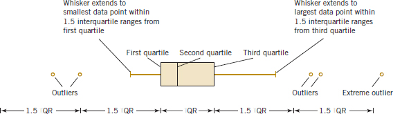
FIGURE 6-13 Description of a box plot.

FIGURE 6-14 Box plot for compressive strength data in Table 6-2.
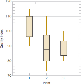
FIGURE 6-15 Comparative box plots of a quality index at three plants.
Exercises FOR SECTION 6-4
![]() Problem available in WileyPLUS at instructor's discretion.
Problem available in WileyPLUS at instructor's discretion.
![]() Go Tutorial Tutoring problem available in WileyPLUS at instructor's discretion.
Go Tutorial Tutoring problem available in WileyPLUS at instructor's discretion.
6-65. Using the data on bridge conditions from Exercise 6-20,
(a) Find the quartiles and median of the data.
(b) Draw a box plot for the data.
(c) Should any points be considered potential outliers? Compare this to your answer in Exercise 6-20. Explain.
6-66. Using the data on acid rain from Exercise 6-21,
(a) Find the quartiles and median of the data.
(b) Draw a box plot for the data.
(c) Should any points be considered potential outliers? Compare this to your answer in Exercise 6-21. Explain.
6-67. Using the data from Exercise 6-22 on cloud seeding,
(a) Find the median and quartiles for the unseeded cloud data.
(b) Find the median and quartiles for the seeded cloud data.
(c) Make two side-by-side box plots, one for each group on the same plot.
(d) Compare the distributions from what you can see in the side-by-side box plots.
6-68. Using the data from Exercise 6-24 on swim times,
(a) Find the median and quartiles for the data.
(b) Make a box plot of the data.
(c) Repeat (a) and (b) for the data without the extreme outlier and comment.
(d) Compare the distribution of the data with and without the extreme outlier.
6-69. ![]() Go Tutorial The “cold start ignition time” of an automobile engine is being investigated by a gasoline manufacturer. The following times (in seconds) were obtained for a test vehicle: 1.75, 1.92, 2.62, 2.35, 3.09, 3.15, 2.53, 1.91.
Go Tutorial The “cold start ignition time” of an automobile engine is being investigated by a gasoline manufacturer. The following times (in seconds) were obtained for a test vehicle: 1.75, 1.92, 2.62, 2.35, 3.09, 3.15, 2.53, 1.91.
(a) Calculate the sample mean, sample variance, and sample standard deviation.
(b) Construct a box plot of the data.
6-70. An article in Transactions of the Institution of Chemical Engineers (1956, Vol. 34, pp. 280–293) reported data from an experiment investigating the effect of several process variables on the vapor phase oxidation of naphthalene. A sample of the percentage mole conversion of naphthalene to maleic anhydride follows: 4.2, 4.7, 4.7, 5.0, 3.8, 3.6, 3.0, 5.1, 3.1, 3.8, 4.8, 4.0, 5.2, 4.3, 2.8, 2.0, 2.8, 3.3, 4.8, 5.0.
(a) Calculate the sample mean, sample variance, and sample standard deviation.
(b) Construct a box plot of the data.
6-71. ![]() The nine measurements that follow are furnace temperatures recorded on successive batches in a semiconductor manufacturing process (units are °F): 953, 950, 948, 955, 951, 949, 957, 954, 955.
The nine measurements that follow are furnace temperatures recorded on successive batches in a semiconductor manufacturing process (units are °F): 953, 950, 948, 955, 951, 949, 957, 954, 955.
(a) Calculate the sample mean, sample variance, and standard deviation.
(b) Find the median. How much could the highest temperature measurement increase without changing the median value?
(c) Construct a box plot of the data.
6-72. Exercise 6-18 presents drag coefficients for the NASA 0012 airfoil. You were asked to calculate the sample mean, sample variance, and sample standard deviation of those coefficients.
(a) Find the median and the upper and lower quartiles of the drag coefficients.
(b) Construct a box plot of the data.
(c) Set aside the highest observation (100) and rework parts (a) and (b). Comment on your findings.
![]()
6-73. Exercise 6-19 presented the joint temperatures of the O-rings (°F) for each test firing or actual launch of the space shuttle rocket motor. In that exercise, you were asked to find the sample mean and sample standard deviation of temperature.
(a) Find the median and the upper and lower quartiles of temperature.
(b) Set aside the lowest observation (31°F) and recompute the quantities in part (a). Comment on your findings. How “different” are the other temperatures from this lowest value?
(c) Construct a box plot of the data and comment on the possible presence of outliers.
![]() 6-74.
6-74. ![]() Reconsider the motor fuel octane rating data in Exercise 6-28. Construct a box plot of the data and write an interpretation of the plot. How does the box plot compare in interpretive value to the original stem-and-leaf diagram?
Reconsider the motor fuel octane rating data in Exercise 6-28. Construct a box plot of the data and write an interpretation of the plot. How does the box plot compare in interpretive value to the original stem-and-leaf diagram?
![]() 6-75. Reconsider the energy consumption data in Exercise 6-37. Construct a box plot of the data and write an interpretation of the plot. How does the box plot compare in interpretive value to the original stem-and-leaf diagram?
6-75. Reconsider the energy consumption data in Exercise 6-37. Construct a box plot of the data and write an interpretation of the plot. How does the box plot compare in interpretive value to the original stem-and-leaf diagram?
![]() 6-76.
6-76. ![]() Reconsider the water quality data in Exercise 6-40. Construct a box plot of the concentrations and write an interpretation of the plot. How does the box plot compare in interpretive value to the original stem-and-leaf diagram?
Reconsider the water quality data in Exercise 6-40. Construct a box plot of the concentrations and write an interpretation of the plot. How does the box plot compare in interpretive value to the original stem-and-leaf diagram?
![]() 6-77. Reconsider the weld strength data in Exercise 6-39. Construct a box plot of the data and write an interpretation of the plot. How does the box plot compare in interpretive value to the original stem-and-leaf diagram?
6-77. Reconsider the weld strength data in Exercise 6-39. Construct a box plot of the data and write an interpretation of the plot. How does the box plot compare in interpretive value to the original stem-and-leaf diagram?
![]() 6-78. Reconsider the semiconductor speed data in Exercise 6-42. Construct a box plot of the data and write an interpretation of the plot. How does the box plot compare in interpretive value to the original stem-and-leaf diagram?
6-78. Reconsider the semiconductor speed data in Exercise 6-42. Construct a box plot of the data and write an interpretation of the plot. How does the box plot compare in interpretive value to the original stem-and-leaf diagram?
![]() 6-79.
6-79. ![]() Use the data on heights of female and male engineering students from Exercises 6-38 and 6-45 to construct comparative box plots. Write an interpretation of the information that you see in these plots.
Use the data on heights of female and male engineering students from Exercises 6-38 and 6-45 to construct comparative box plots. Write an interpretation of the information that you see in these plots.
![]() 6-80.
6-80. ![]() In Exercise 6-69, data were presented on the cold start ignition time of a particular gasoline used in a test vehicle. A second formulation of the gasoline was tested in the same vehicle, with the following times (in seconds): 1.83, 1.99, 3.13, 3.29, 2.65, 2.87, 3.40, 2.46, 1.89, and 3.35. Use these new data along with the cold start times reported in Exercise 6-69 to construct comparative box plots. Write an interpretation of the information that you see in these plots.
In Exercise 6-69, data were presented on the cold start ignition time of a particular gasoline used in a test vehicle. A second formulation of the gasoline was tested in the same vehicle, with the following times (in seconds): 1.83, 1.99, 3.13, 3.29, 2.65, 2.87, 3.40, 2.46, 1.89, and 3.35. Use these new data along with the cold start times reported in Exercise 6-69 to construct comparative box plots. Write an interpretation of the information that you see in these plots.
![]()
6-81. An article in Nature Genetics [“Treatment-specific Changes in Gene Expression Discriminate in Vivo Drug Response in Human Leukemia Cells” (2003, Vol. 34(1), pp. 85–90)] studied gene expression as a function of treatments for leukemia. One group received a high dose of the drug, while the control group received no treatment. Expression data (measures of gene activity) from one gene are shown in Table 6E.1. Construct a box plot for each group of patients. Write an interpretation to compare the information in these plots.
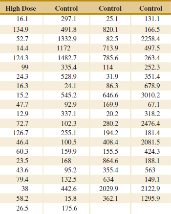
6-5 Time Sequence Plots
The graphical displays that we have considered thus far such as histograms, stem-and-leaf plots, and box plots are very useful visual methods for showing the variability in data. However, we noted in Chapter 1 that time is an important factor that contributes to variability in data, and those graphical methods do not take this into account. A time series or time sequence is a data set in which the observations are recorded in the order in which they occur. A time series plot is a graph in which the vertical axis denotes the observed value of the variable (say, x) and the horizontal axis denotes the time (which could be minutes, days, years, etc.). When measurements are plotted as a time series, we often see trends, cycles, or other broad features of the data that could not be seen otherwise.
For example, consider Fig. 6-16(a), which presents a time series plot of the annual sales of a company for the last 10 years. The general impression from this display is that sales show an upward trend. There is some variability about this trend with some years' sales increasing over those of the last year and some years' sales decreasing. Figure 6-16(b) shows the last three years of sales reported by quarter. This plot clearly shows that the annual sales in this business exhibit a cyclic variability by quarter with the first- and second-quarter sales being generally higher than sales during the third and fourth quarters.
Sometimes it can be very helpful to combine a time series plot with some of the other graphical displays that we have considered previously. J. Stuart Hunter (The American Statistician, 1988, Vol. 42, p. 54) has suggested combining the stem-and-leaf plot with a time series plot to form a digidot plot.
Figure 6-17 is a digidot plot for the observations on compressive strength from Table 6-2, assuming that these observations are recorded in the order in which they occurred. This plot effectively displays the overall variability in the compressive strength data and simultaneously shows the variability in these measurements over time. The general impression is that compressive strength varies around the mean value of 162.66, and no strong obvious pattern occurs in this variability over time.
The digidot plot in Fig. 6-18 tells a different story. This plot summarizes 30 observations on concentration of the output product from a chemical process where the observations are recorded at one-hour time intervals. This plot indicates that during the first 20 hours of operation, this process produced concentrations generally above 85 grams per liter, but that following sample 20, something may have occurred in the process that resulted in lower concentrations. If this variability in output product concentration can be reduced, operation of this process can be improved. Notice that this apparent change in the process output is not seen in the stem-and-leaf portion of the digidot plot. The stem-and-leaf plot compresses the time dimension out of the data. This illustrates why it is always important to construct a time series plot for time-oriented data.
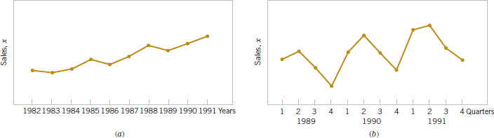
FIGURE 6-16 Company sales by year (a). By quarter (b).
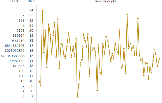
FIGURE 6-17 A digidot plot of the compressive strength data in Table 6-2.
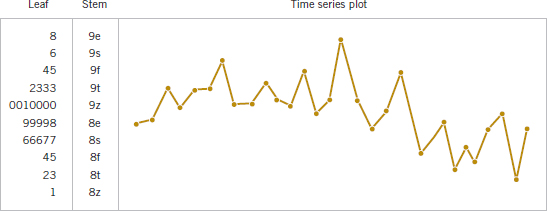
FIGURE 6-18 A digidot plot of chemical process concentration readings, observed hourly.
Exercises FOR SECTION 6-5
![]() Problem available in WileyPLUS at instructor's discretion.
Problem available in WileyPLUS at instructor's discretion.
![]() Go Tutorial Tutoring problem available in WileyPLUS at instructor's discretion.
Go Tutorial Tutoring problem available in WileyPLUS at instructor's discretion.
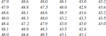
6-82. ![]() The following data are the viscosity measurements for a chemical product observed hourly (read down, then left to right). Construct and interpret either a digidot plot or a separate stem-and-leaf and time series plot of these data. Specifications on product viscosity are at 48 ± 2. What conclusions can you make about process performance?
The following data are the viscosity measurements for a chemical product observed hourly (read down, then left to right). Construct and interpret either a digidot plot or a separate stem-and-leaf and time series plot of these data. Specifications on product viscosity are at 48 ± 2. What conclusions can you make about process performance?
![]()
6-83. ![]() The pull-off force for a connector is measured in a laboratory test. Data for 40 test specimens follow (read down, then left to right). Construct and interpret either a digidot plot or a separate stem-and-leaf and time series plot of the data.
The pull-off force for a connector is measured in a laboratory test. Data for 40 test specimens follow (read down, then left to right). Construct and interpret either a digidot plot or a separate stem-and-leaf and time series plot of the data.
![]()
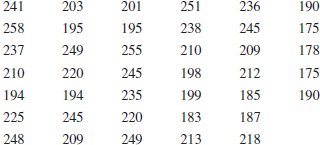
6-84. ![]() In their book Time Series Analysis, Forecasting, and Control (Prentice Hall, 1994), G. E. P. Box, G. M. Jenkins, and G. C. Reinsel present chemical process concentration readings made every two hours. Some of these data follow (read down, then left to right).
In their book Time Series Analysis, Forecasting, and Control (Prentice Hall, 1994), G. E. P. Box, G. M. Jenkins, and G. C. Reinsel present chemical process concentration readings made every two hours. Some of these data follow (read down, then left to right).
![]()
![]()
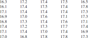
Construct and interpret either a digidot plot or a separate stem-and-leaf and time series plot of these data.
6-85. ![]() The 100 annual Wolfer sunspot numbers from 1770 to 1869 follow. (For an interesting analysis and interpretation of these numbers, see the book by Box, Jenkins, and Reinsel referenced in Exercise 6-84. Their analysis requires some advanced knowledge of statistics and statistical model building.) Read down, then left to right. The 1869 result is 74. Construct and interpret either a digidot plot or a stem-and-leaf and time series plot of these data.
The 100 annual Wolfer sunspot numbers from 1770 to 1869 follow. (For an interesting analysis and interpretation of these numbers, see the book by Box, Jenkins, and Reinsel referenced in Exercise 6-84. Their analysis requires some advanced knowledge of statistics and statistical model building.) Read down, then left to right. The 1869 result is 74. Construct and interpret either a digidot plot or a stem-and-leaf and time series plot of these data.
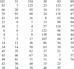
![]() 6-86.
6-86. ![]() In their book Introduction to Time Series Analysis and Forecasting (Wiley, 2008), Montgomery, Jennings, and Kolahci presented the data in Table 6E.2, which are the monthly total passenger airline miles flown in the United Kingdom from 1964 to 1970 (in millions of miles). Comment on any features of the data that are apparent. Construct and interpret either a digidot plot or a separate stem-and-leaf and time series plot of these data.
In their book Introduction to Time Series Analysis and Forecasting (Wiley, 2008), Montgomery, Jennings, and Kolahci presented the data in Table 6E.2, which are the monthly total passenger airline miles flown in the United Kingdom from 1964 to 1970 (in millions of miles). Comment on any features of the data that are apparent. Construct and interpret either a digidot plot or a separate stem-and-leaf and time series plot of these data.
![]() 6-87.
6-87. ![]() Table 6E.3 shows the number of earthquakes per year of magnitude 7.0 and higher since 1900 (source: Earthquake Data Base System of the U.S. Geological Survey, National Earthquake Information Center, Golden, Colorado). Construct and interpret either a digidot plot or a separate stem-and-leaf and time series plot of these data.
Table 6E.3 shows the number of earthquakes per year of magnitude 7.0 and higher since 1900 (source: Earthquake Data Base System of the U.S. Geological Survey, National Earthquake Information Center, Golden, Colorado). Construct and interpret either a digidot plot or a separate stem-and-leaf and time series plot of these data.
![]() 6-88. Table 6E.4 shows U.S. petroleum imports as a percentage of the totals, and Persian Gulf imports as a percentage of all imports by year since 1973 (source: U.S. Department of Energy Web site, www.eia.doe.gov/). Construct and interpret either a digidot plot or a separate stem-and-leaf and time series plot for each column of data.
6-88. Table 6E.4 shows U.S. petroleum imports as a percentage of the totals, and Persian Gulf imports as a percentage of all imports by year since 1973 (source: U.S. Department of Energy Web site, www.eia.doe.gov/). Construct and interpret either a digidot plot or a separate stem-and-leaf and time series plot for each column of data.
![]()
6-89. Table 6E.5 contains the global mean surface air temperature anomaly and the global CO2 concentration for the years 1880–2004. The temperature is measured at a number of locations around the world and averaged annually, and then subtracted from a base period average (1951–1980) and the result reported as an anomaly.
(a) Construct a time series plot of the global mean surface air temperature anomaly data and comment on any features that you observe.
(b) Construct a time series plot of the global CO2 concentration data and comment on any features that you observe.
(c) Overlay the two plots on the same set of axes and comment on the plot.
![]() TABLE • 6E.2 United Kingdom Passenger Airline Miles Flown
TABLE • 6E.2 United Kingdom Passenger Airline Miles Flown
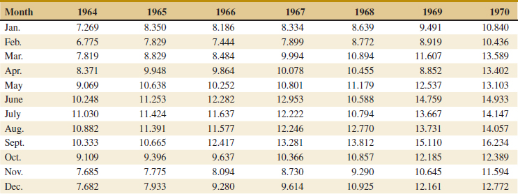
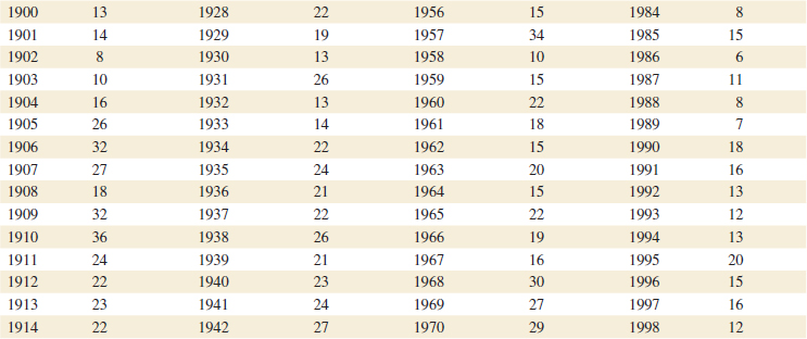
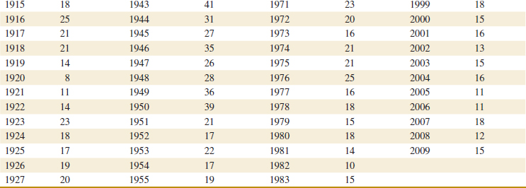
![]() TABLE • 6E.4 Petroleum Import Data
TABLE • 6E.4 Petroleum Import Data
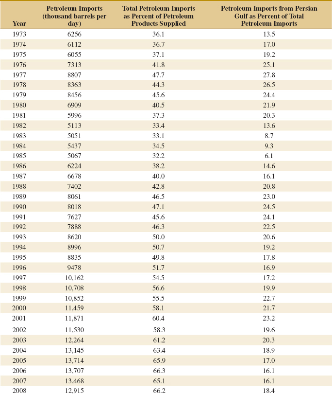
![]() TABLE • 6E.5 Global Mean Surface Air Temperature Anomaly and Global CO2 Concentration
TABLE • 6E.5 Global Mean Surface Air Temperature Anomaly and Global CO2 Concentration
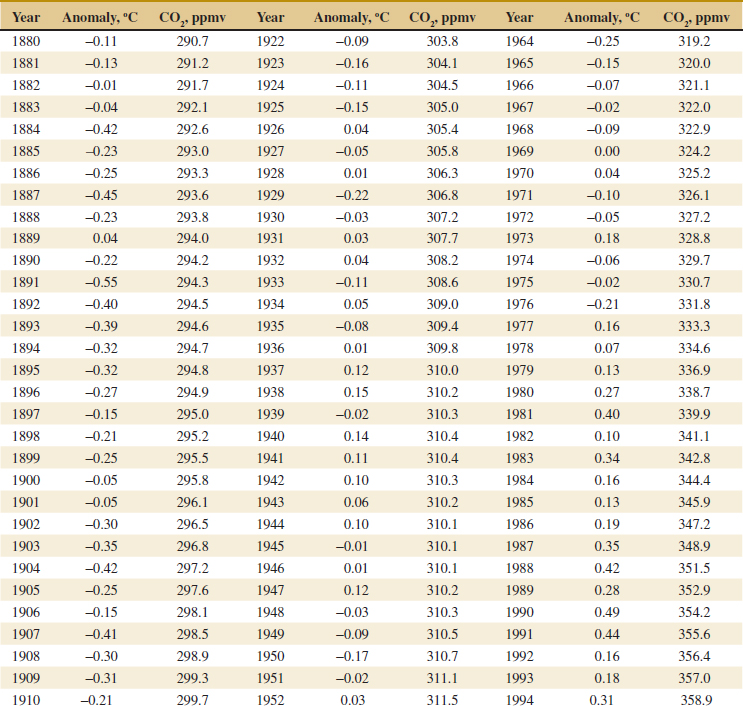
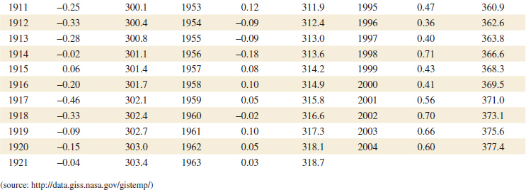
![]() TABLE • 6.5 Quality Data for Young Red Wines
TABLE • 6.5 Quality Data for Young Red Wines
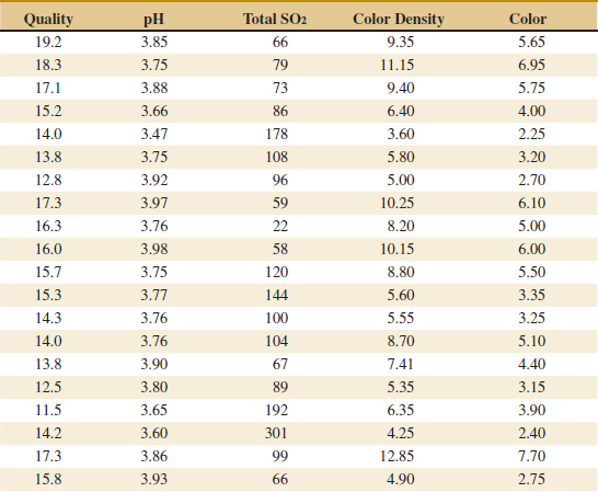
6-6 Scatter Diagrams
In many problems, engineers and scientists work with data that is multivariate in nature; that is, each observation consists of measurements of several variables. We saw an example of this in the wire bond pull strength data in Table 1.2. Each observation consisted of data on the pull strength of a particular wire bond, the wire length, and the die height. Such data are very commonly encountered. Table 6-5 contains a second example of multivariate data taken from an article on the quality of different young red wines in the Journal of the Science of Food and Agriculture (1974, Vol. 25) by T.C. Somers and M.E. Evans. The authors reported quality along with several other descriptive variables. We show only quality, pH, total SO2 (in ppm), color density, and wine color for a sample of their wines.
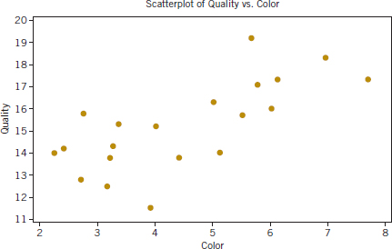
FIGURE 6-19 Scatter diagram of wine quality and color from Table 6-5.
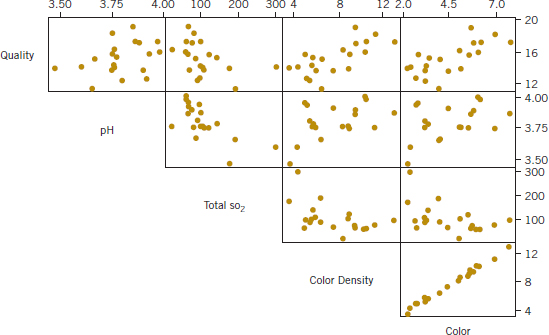
FIGURE 6-20 Matrix of scatter diagrams for the wine quality data in Table 6-5.
Suppose that we wanted to graphically display the potential relationship between quality and one of the other variables, say color. The scatter diagram is a useful way to do this. A scatter diagram is constructed by plotting each pair of observations with one measurement in the pair on the vertical axis of the graph and the other measurement in the pair on the horizontal axis.
Figure 6.19 is the scatter diagram of quality versus the descriptive variable color. Notice that there is an apparent relationship between the two variables with wines of more intense color generally having a higher quality rating.
A scatter diagram is an excellent exploratory tool and can be very useful in identifying potential relationships between two variables. Data in Figure 6-19 indicate that a linear relationship between quality and color may exist. We saw an example of a three-dimensional scatter diagram in Chapter 1 where we plotted wire bond strength versus wire length and die height for the bond pull strength data.
When two or more variables exist, the matrix of scatter diagrams may be useful in looking at all of the pairwise relationships between the variables in the sample. Figure 6-20 is the matrix of scatter diagrams (upper half only shown) for the wine quality data in Table 6-5. The top row of the graph contains individual scatter diagrams of quality versus the other four descriptive variables, and other cells contain other pairwise plots of the four descriptive variables pH, SO2, color density, and color. This display indicates a weak potential linear relationship between quality and pH and somewhat stronger potential relationships between quality and color density and quality and color (which was noted previously in Figure 6-19). A strong apparent linear relationship between color density and color exists (this should be expected).
The sample correlation coefficient rxy is a quantitative measure of the strength of the linear relationship between two random variables x and y. The sample correlation coefficient is defined as
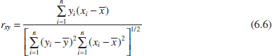
If the two varibles are perfectly linearly related with a positive slope rxy = 1 and if they are perfectly linearly related with a negative slope, then rxy = −1. If no linear relationship between the two variables exists, then rxy = 0. The simple correlation coefficient is also sometimes called the Pearson correlation coefficient after Karl Pearson, one of the giants of the fields of statistics in the late 19th and early 20th centuries.
The value of the sample correlation coefficient between quality and color, the two variables plotted in the scatter diagram of Figure 6-19, is 0.712. This is moderately strong correlation, indicating a possible linear relationship between the two variables. Correlations below |0.5| are generally considered weak and correlations above |0.8| are generally considered strong.
All pairwise sample correlations between the five variables in Table 6-5 are as follows:
Moderately strong correlations exist between quality and the two variables color and color density and between pH and total SO2 (note that this correlation is negative). The correlation between color and color density is 0.996, indicating a nearly perfect linear relationship.
See Fig. 6-21 for several examples of scatter diagrams exhibiting possible relationships between two variables. Parts (e) and (f) of the figure deserve special attention; in part (e), a probable quadratic relationship exists between y and x, but the sample correlation coefficient is close to zero because the correlation coefficient is a measure of linear association, but in part (f), the correlation is approximately zero because no association exists between the two variables.
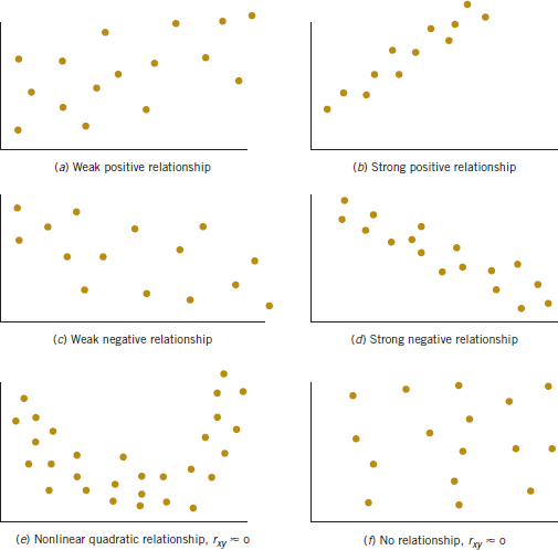
FIGURE 6-21 Potential relationship between variables.
Exercises FOR SECTION 6-6
![]() Problem available in WileyPLUS at instructor's discretion.
Problem available in WileyPLUS at instructor's discretion.
![]() Go Tutorial Tutoring problem available in WileyPLUS at instructor's discretion.
Go Tutorial Tutoring problem available in WileyPLUS at instructor's discretion.
![]() 6-90. Table 6E.6 presents data on the ratings of quarterbacks for the 2008 National Football League season (source: The Sports Network). It is suspected that the rating (y) is related to the average number of yards gained per pass attempt (x).
6-90. Table 6E.6 presents data on the ratings of quarterbacks for the 2008 National Football League season (source: The Sports Network). It is suspected that the rating (y) is related to the average number of yards gained per pass attempt (x).
(a) Construct a scatter plot of quarterback rating versus yards per attempt. Comment on the suspicion that rating is related to yards per attempt.
(b) What is the simple correlation coefficient between these two variables?
![]() 6-91. An article in Technometrics by S. C. Narula and J. F. Wellington [“Prediction, Linear Regression, and a Minimum Sum of Relative Errors” (1977, Vol. 19)] presents data on the selling price and annual taxes for 24 houses. The data are shown in Table 6E.7.
6-91. An article in Technometrics by S. C. Narula and J. F. Wellington [“Prediction, Linear Regression, and a Minimum Sum of Relative Errors” (1977, Vol. 19)] presents data on the selling price and annual taxes for 24 houses. The data are shown in Table 6E.7.
![]() TABLE • 6E.6 2008 NFL Quarterback Rating Data
TABLE • 6E.6 2008 NFL Quarterback Rating Data
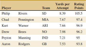
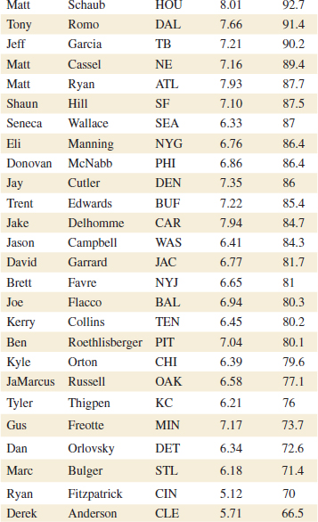
(a) Construct a scatter plot of sales price versus taxes paid. Comment on the widely held belief that price is related to taxes paid.
(b) What is the simple correlation coefficient between these two variables?
![]() 6-92. An article in the Journal of Pharmaceuticals Sciences (1991, Vol. 80, pp. 971–977) presents data on the observed mole fraction solubility of a solute at a constant temperature and the dispersion, dipolar, and hydrogen-bonding Hansen partial solubility parameters. The data are as shown in Table 6E.8, where y is the negative logarithm of the mole fraction solubility, x1 is the dispersion partial solubility, x2 is the dipolar partial solubility, and x3 is the hydrogen bonding partial solubility.
6-92. An article in the Journal of Pharmaceuticals Sciences (1991, Vol. 80, pp. 971–977) presents data on the observed mole fraction solubility of a solute at a constant temperature and the dispersion, dipolar, and hydrogen-bonding Hansen partial solubility parameters. The data are as shown in Table 6E.8, where y is the negative logarithm of the mole fraction solubility, x1 is the dispersion partial solubility, x2 is the dipolar partial solubility, and x3 is the hydrogen bonding partial solubility.
(a) Construct a matrix of scatter plots for these variables.
(b) Comment on the apparent relationships among y and the other three variables?
![]() TABLE • 6E.7 House Price and Tax Data
TABLE • 6E.7 House Price and Tax Data
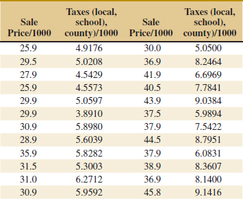
![]() TABLE • 6E.8 Solubility Data for Exercise 6-93
TABLE • 6E.8 Solubility Data for Exercise 6-93
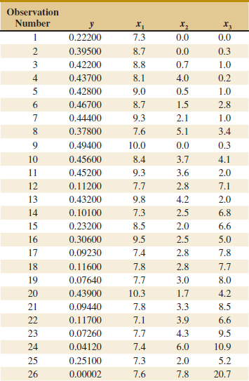
6-7 Probability Plots
How do we know whether a particular probability distribution is a reasonable model for data? Sometimes this is an important question because many of the statistical techniques presented in subsequent chapters are based on an assumption that the population distribution is of a specific type. Thus, we can think of determining whether data come from a specific probability distribution as verifying assumptions. In other cases, the form of the distribution can give insight into the underlying physical mechanism generating the data. For example, in reliability engineering, verifying that time-to-failure data come from an exponential distribution identifies the failure mechanism in the sense that the failure rate is constant with respect to time.
Some of the visual displays we used earlier, such as the histogram, can provide insight about the form of the underlying distribution. However, histograms are usually not really reliable indicators of the distribution form unless the sample size is very large. A probability plot is a graphical method for determining whether sample data conform to a hypothesized distribution based on a subjective visual examination of the data. The general procedure is very simple and can be performed quickly. It is also more reliable than the histogram for small- to moderate-size samples. Probability plotting typically uses special axes that have been scaled for the hypothesized distribution. Software is widely available for the normal, lognormal, Weibull, and various chi-square and gamma distributions. We focus primarily on normal probability plots because many statistical techniques are appropriate only when the population is (at least approximately) normal.
To construct a probability plot, the observations in the sample are first ranked from smallest to largest. That is, the sample x1, x2,..., xn is arranged as x(1), x(2),..., x(n), where x(1) is the smallest observation, x(2) is the second-smallest observation, and so forth with x(n) the largest. The ordered observations x(j) are then plotted against their observed cumulative frequency (j − 0.5)/n on the appropriate probability paper. If the hypothesized distribution adequately describes the data, the plotted points will fall approximately along a straight line; if the plotted points deviate significantly from a straight line, the hypothesized model is not appropriate. Usually, the determination of whether or not the data plot is a straight line is subjective. The procedure is illustrated in the following example.
Example 6-7 Battery Life Ten observations on the effective service life in minutes of batteries used in a portable personal computer are as follows: 176, 191, 214, 220, 205, 192, 201, 190, 183, 185. We hypothesize that battery life is adequately modeled by a normal distribution. To use probability plotting to investigate this hypothesis, first arrange the observations in ascending order and calculate their cumulative frequencies (j − 0.5)/10 as shown in Table 6-6.
![]() TABLE • 6-6 Calculation for Constructing a Normal Probability Plot
TABLE • 6-6 Calculation for Constructing a Normal Probability Plot
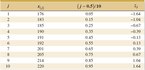
The pairs of values x(j) and (j − 0.5)/10 are now plotted on normal probability axes. This plot is shown in Fig. 6-22. Most normal probability plots have 100(j − 0.5)/n on the left vertical scale and (sometimes) 100[1 − (j − 0.5)/n] on the right vertical scale, with the variable value plotted on the horizontal scale. A straight line, chosen subjectively, has been drawn through the plotted points. In drawing the straight line, you should be influenced more by the points near the middle of the plot than by the extreme points. A good rule of thumb is to draw the line approximately between the 25th and 75th percentile points. This is how the line in Fig. 6-22 was determined. In assessing the “closeness” of the points to the straight line, imagine a “fat pencil” lying along the line. If all the points are covered by this imaginary pencil, a normal distribution adequately describes the data. Because the points in Fig. 6-19 would pass the “fat pencil” test, we conclude that the normal distribution is an appropriate model.
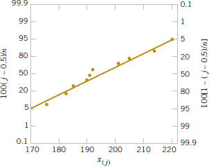
A normal probability plot can also be constructed on ordinary axes by plotting the standardized normal scores zj against x(j) where the standardized normal scores satisfy
![]()
For example, if (j − 0.5)/n = 0.05, Φ(zj) = 0.05 implies that zj = −1.64. To illustrate, consider the data from Example 6-4. In the last column of Table 6-6 we show the standardized normal scores. Figure 6-23 is the plot of zj versus x(j). This normal probability plot is equivalent to the one in Fig. 6-22.
We have constructed our probability plots with the probability scale (or the z-scale) on the vertical axis. Some computer packages “flip” the axis and put the probability scale on the horizontal axis.
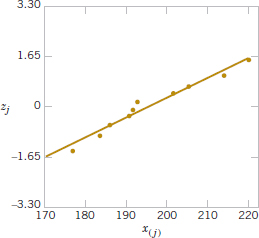
FIGURE 6-23 Normal probability plot obtained from standardized normal scores.
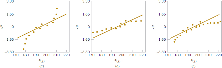
FIGURE 6-24 Normal probability plots indicating a nonnormal distribution. (a) Light-tailed distribution. (b) Heavy-tailed distribution. (c) A distribution with positive (or right) skew.
Normal Probability Plots of Small Samples Can Be Unreliable
The normal probability plot can be useful in identifying distributions that are symmetric but that have tails that are “heavier” or “lighter” than the normal. They can also be useful in identifying skewed distributions. When a sample is selected from a light-tailed distribution (such as the uniform distribution), the smallest and largest observations will not be as extreme as would be expected in a sample from a normal distribution. Thus, if we consider the straight line drawn through the observations at the center of the normal probability plot, observations on the left side will tend to fall below the line, and observations on the right side will tend to fall above the line. This will produce an S-shaped normal probability plot such as shown in Fig. 6-24(a). A heavy-tailed distribution will result in data that also produce an S-shaped normal probability plot, but now the observations on the left will be above the straight line and the observations on the right will lie below the line. See Fig. 6-24(b). A positively skewed distribution will tend to produce a pattern such as shown in Fig. 6-24(c), where points on both ends of the plot tend to fall below the line, giving a curved shape to the plot. This occurs because both the smallest and the largest observations from this type of distribution are larger than expected in a sample from a normal distribution.
Even when the underlying population is exactly normal, the sample data will not plot exactly on a straight line. Some judgment and experience are required to evaluate the plot. Generally, if the sample size is n < 30, there can be significant deviation from linearity in normal plots, so in these cases only a very severe departure from linearity should be interpreted as a strong indication of nonnormality. As n increases, the linear pattern will tend to become stronger, and the normal probability plot will be easier to interpret and more reliable as an indicator of the form of the distribution.
Exercises FOR SECTION 6-7
![]() Problem available in WileyPLUS at instructor's discretion.
Problem available in WileyPLUS at instructor's discretion.
![]() Go Tutorial Tutoring problem available in WileyPLUS at instructor's discretion.
Go Tutorial Tutoring problem available in WileyPLUS at instructor's discretion.
![]() 6-93.
6-93. ![]() Construct a normal probability plot of the piston ring diameter data in Exercise 6-7. Does it seem reasonable to assume that piston ring diameter is normally distributed?
Construct a normal probability plot of the piston ring diameter data in Exercise 6-7. Does it seem reasonable to assume that piston ring diameter is normally distributed?
![]() 6-94.
6-94. ![]() Construct a normal probability plot of the insulating fluid breakdown time data in Exercise 6-8. Does it seem reasonable to assume that breakdown time is normally distributed?
Construct a normal probability plot of the insulating fluid breakdown time data in Exercise 6-8. Does it seem reasonable to assume that breakdown time is normally distributed?
![]() 6-95.
6-95. ![]() Construct a normal probability plot of the visual accommodation data in Exercise 6-11. Does it seem reasonable to assume that visual accommodation is normally distributed?
Construct a normal probability plot of the visual accommodation data in Exercise 6-11. Does it seem reasonable to assume that visual accommodation is normally distributed?
![]()
6-96. ![]() Construct a normal probability plot of the solar intensity data in Exercise 6-12. Does it seem reasonable to assume that solar intensity is normally distributed?
Construct a normal probability plot of the solar intensity data in Exercise 6-12. Does it seem reasonable to assume that solar intensity is normally distributed?
![]()
6-97. Construct a normal probability plot of the O-ring joint temperature data in Exercise 6-19. Does it seem reasonable to assume that O-ring joint temperature is normally distributed? Discuss any interesting features that you see on the plot.
![]()
6-98. ![]() Construct a normal probability plot of the octane rating data in Exercise 6-30. Does it seem reasonable to assume that octane rating is normally distributed?
Construct a normal probability plot of the octane rating data in Exercise 6-30. Does it seem reasonable to assume that octane rating is normally distributed?
![]() 6-99.
6-99. ![]() Construct a normal probability plot of the cycles to failure data in Exercise 6-31. Does it seem reasonable to assume that cycles to failure is normally distributed?
Construct a normal probability plot of the cycles to failure data in Exercise 6-31. Does it seem reasonable to assume that cycles to failure is normally distributed?
![]() 6-100. Construct a normal probability plot of the suspended solids concentration data in Exercise 6-40. Does it seem reasonable to assume that the concentration of suspended solids in water from this particular lake is normally distributed?
6-100. Construct a normal probability plot of the suspended solids concentration data in Exercise 6-40. Does it seem reasonable to assume that the concentration of suspended solids in water from this particular lake is normally distributed?
![]() 6-101. Construct two normal probability plots for the height data in Exercises 6-38 and 6-45. Plot the data for female and male students on the same axes. Does height seem to be normally distributed for either group of students? If both populations have the same variance, the two normal probability plots should have identical slopes. What conclusions would you draw about the heights of the two groups of students from visual examination of the normal probability plots?
6-101. Construct two normal probability plots for the height data in Exercises 6-38 and 6-45. Plot the data for female and male students on the same axes. Does height seem to be normally distributed for either group of students? If both populations have the same variance, the two normal probability plots should have identical slopes. What conclusions would you draw about the heights of the two groups of students from visual examination of the normal probability plots?
6-102. It is possible to obtain a “quick-and-dirty” estimate of the mean of a normal distribution from the 50th percentile value on a normal probability plot. Provide an argument why this is so. It is also possible to obtain an estimate of the standard deviation of a normal distribution by subtracting the 84th percentile value from the 50th percentile value. Provide an argument explaining why this is so.
Supplemental Exercises
![]() Problem available in WileyPLUS at instructor's discretion.
Problem available in WileyPLUS at instructor's discretion.
![]() Go Tutorial Tutoring problem available in WileyPLUS at instructor's discretion.
Go Tutorial Tutoring problem available in WileyPLUS at instructor's discretion.
![]() 6-103. The National Oceanic and Atmospheric Administration provided the monthly absolute estimates of global (land and ocean combined) temperature index (degrees C) from 2000. Read January to December from left to right in www.ncdc.noaa.gov/oa/climate/research/anomalies/anomalies.html). Construct and interpret either a digidot plot or a separate stem-and-leaf and time series plot of these data.
6-103. The National Oceanic and Atmospheric Administration provided the monthly absolute estimates of global (land and ocean combined) temperature index (degrees C) from 2000. Read January to December from left to right in www.ncdc.noaa.gov/oa/climate/research/anomalies/anomalies.html). Construct and interpret either a digidot plot or a separate stem-and-leaf and time series plot of these data.
6-104. ![]() The concentration of a solution is measured six times by one operator using the same instrument. She obtains the following data: 63.2, 67.1, 65.8, 64.0, 65.1, and 65.3 (grams per liter).
The concentration of a solution is measured six times by one operator using the same instrument. She obtains the following data: 63.2, 67.1, 65.8, 64.0, 65.1, and 65.3 (grams per liter).
(a) Calculate the sample mean. Suppose that the desirable value for this solution has been specified to be 65.0 grams per liter. Do you think that the sample mean value computed here is close enough to the target value to accept the solution as conforming to target? Explain your reasoning.
(b) Calculate the sample variance and sample standard deviation.
(c) Suppose that in measuring the concentration, the operator must set up an apparatus and use a reagent material. What do you think the major sources of variability are in this experiment? Why is it desirable to have a small variance of these measurements?
![]()
6-105. ![]() Table 6E.10 shows unemployment data for the United States that are seasonally adjusted. Construct a time series plot of these data and comment on any features (source: U.S. Bureau of Labor Web site, http://data.bls.gov).
Table 6E.10 shows unemployment data for the United States that are seasonally adjusted. Construct a time series plot of these data and comment on any features (source: U.S. Bureau of Labor Web site, http://data.bls.gov).
6-106. A sample of six resistors yielded the following resistances (ohms): x1 = 45, x2 = 38, x3 = 47, x4 = 41, x5 = 35, and x6 = 43.
(a) Compute the sample variance and sample standard deviation.
(b) Subtract 35 from each of the original resistance measurements and compute s2 and s. Compare your results with those obtained in part (a) and explain your findings.
(c) If the resistances were 450, 380, 470, 410, 350, and 430 ohms, could you use the results of previous parts of this problem to find s2 and s?
6-107. ![]() Consider the following two samples:
Consider the following two samples:
Sample 1: 10, 9, 8, 7, 8, 6, 10, 6
Sample 2: 10, 6, 10, 6, 8, 10, 8, 6
(a) Calculate the sample range for both samples. Would you conclude that both samples exhibit the same variability? Explain.
(b) Calculate the sample standard deviations for both samples. Do these quantities indicate that both samples have the same variability? Explain.
(c) Write a short statement contrasting the sample range versus the sample standard deviation as a measure of variability.
![]() TABLE • 6E.9 Global Monthly Temperature
TABLE • 6E.9 Global Monthly Temperature
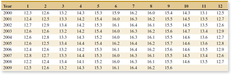
![]() TABLE • 6E.10 Unemployment Percentage
TABLE • 6E.10 Unemployment Percentage
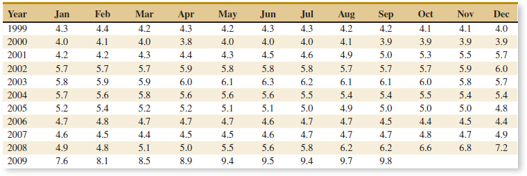
![]() 6-108. An article in Quality Engineering (1992, Vol. 4, pp. 487–495) presents viscosity data from a batch chemical process. A sample of these data is in Table 6E.11.
6-108. An article in Quality Engineering (1992, Vol. 4, pp. 487–495) presents viscosity data from a batch chemical process. A sample of these data is in Table 6E.11.
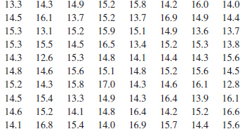
(a) Reading left to right and up and down, draw a time series plot of all the data and comment on any features of the data that are revealed by this plot.
(b) Consider the notion that the first 40 observations were generated from a specific process, whereas the last 40 observations were generated from a different process. Does the plot indicate that the two processes generate similar results?
(c) Compute the sample mean and sample variance of the first 40 observations; then compute these values for the second 40 observations. Do these quantities indicate that both processes yield the same mean level? The same variability? Explain.
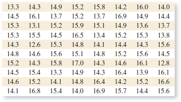
6-109. ![]() The total net electricity consumption of the United States by year from 1980 to 2007 (in billion kilowatt-hours) is in Table 6E.12. Net consumption excludes the energy consumed by the generating units.
The total net electricity consumption of the United States by year from 1980 to 2007 (in billion kilowatt-hours) is in Table 6E.12. Net consumption excludes the energy consumed by the generating units.
![]()
![]() TABLE • 6E.12 U.S. Electricity Consumption
TABLE • 6E.12 U.S. Electricity Consumption
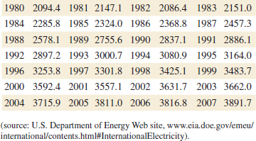
Construct a time series plot of these data. Consruct and interpret a stem-and-leaf display of these data.
![]()
6-110. Reconsider the data from Exercise 6-108. Prepare comparative box plots for two groups of observations: the first 40 and the last 40. Comment on the information in the box plots.
![]()
6-111. The data shown in Table 6E.13 are monthly champagne sales in France (1962–1969) in thousands of bottles.
(a) Construct a time series plot of the data and comment on any features of the data that reveals by this plot.
(b) Speculate on how you would use a graphical procedure to forecast monthly champagne sales for the year 1970.
6-112. ![]() The following data are the temperatures of effluent at discharge from a sewage treatment facility on consecutive days:
The following data are the temperatures of effluent at discharge from a sewage treatment facility on consecutive days:
![]()
![]()
(a) Calculate the sample mean, sample median, sample variance, and sample standard deviation.
(b) Construct a box plot of the data and comment on the information in this display.
![]() TABLE • 6E.13 Champagne Sales in France
TABLE • 6E.13 Champagne Sales in France
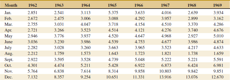
![]() 6-113.
6-113. ![]() A manufacturer of coil springs is interested in implementing a quality control system to monitor his production process. As part of this quality system, it is decided to record the number of nonconforming coil springs in each production batch of size 50. During 40 days of production, 40 batches of data were collected as follows:
A manufacturer of coil springs is interested in implementing a quality control system to monitor his production process. As part of this quality system, it is decided to record the number of nonconforming coil springs in each production batch of size 50. During 40 days of production, 40 batches of data were collected as follows:
Read data across and down.
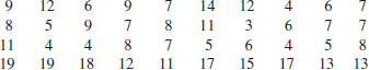
(a) Construct a stem-and-leaf plot of the data.
(b) Find the sample average and standard deviation.
(c) Construct a time series plot of the data. Is there evidence that there was an increase or decrease in the average number of nonconforming springs made during the 40 days? Explain.
6-114. A communication channel is being monitored by recording the number of errors in a string of 1000 bits. Data for 20 of these strings follow:
Read data across and down
![]()
(a) Construct a stem-and-leaf plot of the data.
(b) Find the sample average and standard deviation.
(c) Construct a time series plot of the data. Is there evidence that there was an increase or decrease in the number of errors in a string? Explain.
![]() 6-115. Reconsider the golf course yardage data in Exercise 6-9. Construct a box plot of the yardages and write an interpretation of the plot.
6-115. Reconsider the golf course yardage data in Exercise 6-9. Construct a box plot of the yardages and write an interpretation of the plot.
![]() 6-116. Reconsider the data in Exercise 6-108. Construct normal probability plots for two groups of the data: the first 40 and the last 40 observations. Construct both plots on the same axes. What tentative conclusions can you draw?
6-116. Reconsider the data in Exercise 6-108. Construct normal probability plots for two groups of the data: the first 40 and the last 40 observations. Construct both plots on the same axes. What tentative conclusions can you draw?
![]()
6-117. Construct a normal probability plot of the effluent discharge temperature data from Exercise 6-112. Based on the plot, what tentative conclusions can you draw?
![]()
6-118. Construct normal probability plots of the cold start ignition time data presented in Exercises 6-69 and 6-80. Construct a separate plot for each gasoline formulation, but arrange the plots on the same axes. What tentative conclusions can you draw?
![]()
6-119. Reconsider the golf ball overall distance data in Exercise 6-41. Construct a box plot of the yardage distance and write an interpretation of the plot. How does the box plot compare in interpretive value to the original stem-and-leaf diagram?
6-120. Transformations. In some data sets, a transformation by some mathematical function applied to the original data, such as ![]() or log y, can result in data that are simpler to work with statistically than the original data. To illustrate the effect of a transformation, consider the following data, which represent cycles to failure for a yarn product: 675, 3650, 175, 1150, 290, 2000, 100, 375.
or log y, can result in data that are simpler to work with statistically than the original data. To illustrate the effect of a transformation, consider the following data, which represent cycles to failure for a yarn product: 675, 3650, 175, 1150, 290, 2000, 100, 375.
(a) Construct a normal probability plot and comment on the shape of the data distribution.
(b) Transform the data using logarithms; that is, let y*(new value) = log y (old value). Construct a normal probability plot of the transformed data and comment on the effect of the transformation.
![]()
6-121. In 1879, A. A. Michelson made 100 determinations of the velocity of light in air using a modification of a method proposed by the French physicist Foucault. Michelson made the measurements in five trials of 20 measurements each. The observations (in kilometers per second) are in Table 6E.14. Each value has 299,000 subtracted from it.
The currently accepted true velocity of light in a vacuum is 299,792.5 kilometers per second. Stigler (1977, The Annals of Statistics) reported that the “true” value for comparison to these measurements is 734.5. Construct comparative box plots of these measurements. Does it seem that all five trials are consistent with respect to the variability of the measurements? Are all five trials centered on the same value? How does each group of trials compare to the true value? Could there have been “startup” effects in the experiment that Michelson performed? Could there have been bias in the measuring instrument?
![]()
![]() TABLE • 6E.14 Velocity of Light Data
TABLE • 6E.14 Velocity of Light Data
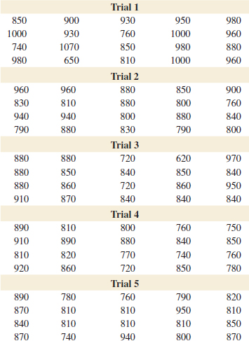
6-122. ![]() In 1789, Henry Cavendish estimated the density of the Earth by using a torsion balance. His 29 measurements follow, expressed as a multiple of the density of water.
In 1789, Henry Cavendish estimated the density of the Earth by using a torsion balance. His 29 measurements follow, expressed as a multiple of the density of water.
![]()
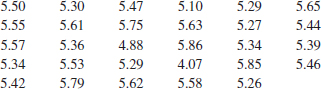
(a) Calculate the sample mean, sample standard deviation, and median of the Cavendish density data.
(b) Construct a normal probability plot of the data. Comment on the plot. Does there seem to be a “low” outlier in the data?
(c) Would the sample median be a better estimate of the density of the earth than the sample mean? Why?
6-123. In their book Introduction to Time Series Analysis and Forecasting (Wiley, 2008), Montgomery, Jennings, and Kulahci presented the data on the drowning rate for children between one and four years old per 100,000 of population in Arizona from 1970 to 2004. The data are: 19.9, 16.1, 19.5, 19.8, 21.3, 15.0, 15.5, 16.4, 18.2, 15.3, 15.6, 19.5, 14.0, 13.1, 10.5, 11.5, 12.9, 8.4, 9.2, 11.9, 5.8, 8.5, 7.1, 7.9, 8.0, 9.9, 8.5, 9.1, 9.7, 6.2, 7.2, 8.7, 5.8, 5.7, and 5.2.
(a) Perform an appropriate graphical analysis of the data.
(b) Calculate and interpret the appropriate numerical summaries.
(c) Notice that the rate appears to decrease dramatically starting about 1990. Discuss some potential reasons explaining why this could have happened.
(d) If there has been a real change in the drowning rate beginning about 1990, what impact does this have on the summary statistics that you calculated in part (b)?
6-124. Patients arriving at a hospital emergency department present a variety of symptoms and complaints. The following data were collected during one weekend night shift (11:00 P.M. to 7:00 A.M.):
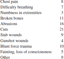
(a) Calculate numerical summaries of these data. What practical interpretation can you give to these summaries?
(b) Suppose that you knew that a certain fraction of these patients leave without treatment (LWOT). This is an important problem because these patients may be seriously ill or injured. Discuss what additional data you would require to begin a study into the reasons why patients LWOT.
6-125. One of the authors (DCM) has a Mercedes-Benz 500 SL Roadster. It is a 2003 model and has fairly low mileage (currently 45,324 miles on the odometer). He is interested in learning how his car's mileage compares with the mileage on similar SLs. Table 6E.15 contains the mileage on 100 Mercedes-Benz SLs from the model years 2003–2009 taken from the Cars.com website.
![]()
(a) Calculate the sample mean and standard deviation of the odometer readings.
(b) Construct a histogram of the odometer readings and comment on the shape of the data distribution.
(c) Construct a stem-and-leaf diagram of the odometer readings.
(d) What is the percentile of DCM's mileage?
![]()
6-126. The energy consumption for 90 gas-heated homes during a winter heating season is given in Table 6E.16. The variable reported is BTU/number of heating degree days.
(a) Calculate the sample mean and standard deviation of energy usage.
(b) Construct a histogram of the energy usage data and comment on the shape of the data distribution.
(c) Construct a stem-and-leaf diagram of energy usage.
(d) What proportion of the energy usage data is above the average usage plus 2 standard deviations?
![]() 6-127. The force needed to remove the cap from a medicine bottle is an important feature of the product because requiring too much force may cause difficulty for elderly patients or patients with arthritis or similar conditions. Table 6E.17 presents the results of testing a sample of 68 caps attached to bottles for the force (in pounds) required for removing the cap.
6-127. The force needed to remove the cap from a medicine bottle is an important feature of the product because requiring too much force may cause difficulty for elderly patients or patients with arthritis or similar conditions. Table 6E.17 presents the results of testing a sample of 68 caps attached to bottles for the force (in pounds) required for removing the cap.
![]()
(a) Construct a stem-and-leaf diagram of the force data.
(b) What are the average and the standard deviation of the force?
(c) Construct a normal probability plot of the data and comment on the plot.
(d) If the upper specification on required force is 30 pounds, what proportion of the caps do not meet this requirement?
(e) What proportion of the caps exceeds the average force plus 2 standard deviations?
(f) Suppose that the first 36 observations in the table come from one machine and the remaining come from a second machine (read across the rows and the down). Does there seem to be a possible difference in the two machines? Construct an appropriate graphical display of the data as part of your answer.
(g) Plot the first 36 observations in the table on a normal probability plot and the remaining observations on another normal probability plot. Compare the results with the single normal probability plot that you constructed for all of the data in part (c).
![]()
6-128. Consider the global mean surface air temperature anomaly and the global CO2 concentration data originally shown in Table 6E.5.
(a) Construct a scatter plot of the global mean surface air temperature anomaly versus the global CO2 concentration Comment on the plot.
(b) What is the simple correlation coefficient these two variables?
![]() TABLE • 6E.15 Odometer Readings on 100 Mercedes-Benz SL500 Automobiles, Model Years 2003–2009
TABLE • 6E.15 Odometer Readings on 100 Mercedes-Benz SL500 Automobiles, Model Years 2003–2009
![]() TABLE • 6E.16 Energy Usage in BTU/Number of Heating Degree Days
TABLE • 6E.16 Energy Usage in BTU/Number of Heating Degree Days
![]() TABLE • 6E.17 Force to Remove Bottle Caps
TABLE • 6E.17 Force to Remove Bottle Caps
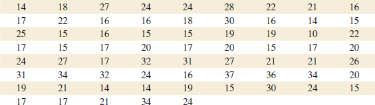
6-129. Consider the airfoil data in Exercise 6-18. Subtract 30 from each value and then multiply the resulting quantities by 10. Now compute s2 for the new data. How is this quantity related to s2 for the original data? Explain why.
6-130. Consider the quantity ![]() (xi − a)2. For what value of a is this quantity minimized?
(xi − a)2. For what value of a is this quantity minimized?
6-131. Using the results of Exercise 6-130, which of the two quantities ![]() (xi −
(xi − ![]() )2 and
)2 and ![]() (xi − μ)2 will be smaller, provided that
(xi − μ)2 will be smaller, provided that ![]() ≠ μ?
≠ μ?
6-132. Coding the Data. Let yi = a + bxi, i = 1,2,...,n, where a and b are nonzero constants. Find the relationship between ![]() and
and ![]() , and between sx and sy.
, and between sx and sy.
6-133. A sample of temperature measurements in a furnace yielded a sample average (°F) of 835.00 and a sample standard deviation of 10.5. Using the results from Exercise 6-132, what are the sample average and sample standard deviations expressed in °C?
6-134. Consider the sample x1, x2,..., xn with sample mean ![]() and sample standard deviation s. Let zi = (xi −
and sample standard deviation s. Let zi = (xi − ![]() )/s, i = 1,2,..., n. What are the values of the sample mean and sample standard deviation of the zi?
)/s, i = 1,2,..., n. What are the values of the sample mean and sample standard deviation of the zi?
6-135. An experiment to investigate the survival time in hours of an electronic component consists of placing the parts in a test cell and running them for 100 hours under elevated temperature conditions. (This is called an “accelerated” life test.) Eight components were tested with the following resulting failure times:
75, 63, 100+, 36, 51, 45, 80, 90
The observation 100+ indicates that the unit still functioned at 100 hours. Is there any meaningful measure of location that can be calculated for these data? What is its numerical value?
6-136. Suppose that you have a sample x1, x2,..., xn and have calculated ![]() n and
n and ![]() for the sample. Now an (n + 1)st observation becomes available. Let
for the sample. Now an (n + 1)st observation becomes available. Let ![]() n+1 and
n+1 and ![]() be the sample mean and sample variance for the sample using all n + 1 observations.
be the sample mean and sample variance for the sample using all n + 1 observations.
(a) Show how ![]() n + 1 can be computed using
n + 1 can be computed using ![]() n and xn + 1.
n and xn + 1.
(b) Show that ![]()
(c) Use the results of parts (a) and (b) to calculate the new sample average and standard deviation for the data of Exercise 6-38, when the new observation is x38 = 64.
6-137. Trimmed Mean. Suppose that the data are arranged in increasing order, T% of the observations are removed from each end, and the sample mean of the remaining numbers is calculated. The resulting quantity is called a trimmed mean, which generally lies between the sample mean ![]() and the sample median
and the sample median ![]() . Why? The trimmed mean with a moderate trimming percentage (5% to 20%) is a reasonably good estimate of the middle or center. It is not as sensitive to outliers as the mean but is more sensitive than the median.
. Why? The trimmed mean with a moderate trimming percentage (5% to 20%) is a reasonably good estimate of the middle or center. It is not as sensitive to outliers as the mean but is more sensitive than the median.
![]()
(a) Calculate the 10% trimmed mean for the yield data in Exercise 6-33.
(b) Calculate the 20% trimmed mean for the yield data in Exercise 6-33 and compare it with the quantity found in part (a).
(c) Compare the values calculated in parts (a) and (b) with the sample mean and median for the yield data. Is there much difference in these quantities? Why?
6-138. Trimmed Mean. Suppose that the sample size n is such that the quantity nT/100 is not an integer. Develop a procedure for obtaining a trimmed mean in this case.
Important Terms and Concepts
Box plot
Degrees of freedom
Frequency distribution and histogram
Histogram
Interquartile range
Matrix of scatter plots
Quartiles, and percentiles
Multivariate data
Normal probability plot
Outlier
Pareto chart
Percentile
Population mean
Population standard deviation
Population variance
Probability plot
Relative frequency distribution
Sample correlation coefficient
Sample mean
Sample median
Sample mode
Sample range
Sample standard deviation
Sample variance
Scatter diagram
Stem-and-leaf diagram
Time series