
STORYTELLING WITH IDEAS8
This chapter will focus on story for sharing ideas.
The big day.
Annie had it scheduled on her calendar for months. It was the day she would finally present her capstone project. Now, the big day was just a few short weeks away.
While her classmates tackled their drawings at seemingly breakneck speed, Annie wanted to reflect on her work and her audience before deciding on how to tackle her final package. In doing so, she thought it might save her time in the long run and make for a more meaningful presentation.
INTRODUCTION
While design outcomes are real-world creations – full of dimensionality and nuance, designers tend to communicate the intent of their ideas – at least initially, via paper and screens, which leaves some wrestling with how best to document, communicate, and ultimately celebrate their designs. To aid in this process, designers can use props to share their solution and convey its benefits. That said, there are many manners in which to share design ideas – each presenting their own challenges and opportunities. This chapter will explore these tactics, including outcome diagrams, various drawings types, and some multi-modal strategies that can be used as props in telling a compelling design story.
EXPRESSING IDEAS
Idea in head – pen in hand, was the traditional path toward design expression. While this route remains both relevant and valuable, today, there are many props that designers can use to inspire, orientate, and build their audience’s understanding.
What is included in a design story and the manner in which it is done (i.e., the character and tone of the imagery) are largely functions of a number of considerations:
Quantity of Elements
How many props should be included?
| Level of audience: | |
| expertise | How much do know? |
| interest | How much do they care? |
| expectations | What do they expect? |
| time available | How much time is available for viewing & comprehension? |
| Your goals for: | |
| audience feedback | What elements do you want/need feedback on? |
| The project’s level of: | |
| completion | How much is already known about the project? |
| complexity | How many components of the project should be included? |
Character of Elements
What is the best media & level of development for those props?
| Level of audience: | |
| expertise | What will they be able to understand? |
| interest | What elements pique interest? |
| expectations | What do they expect? |
| Your goals for: | |
| audience feedback | Are you seeking formative feedback or final approval? |
| time management | How much time do you have to produce elements? |
| The project’s level of: | |
| completion | How much is already known about the project? |
| complexity | How many aspects about the project should be included? |
Following these decisions, aim tobe consistent with these characteristics, since the audience may incorrectly infer that characteristic changes imply a change in the design.
QUANTITY CONSIDERATIONS
All designers face constraints of time and budget. The key is to maximize our opportunities when telling our stories, so each image needs to have a purpose. A few powerful images will likely be more effective than many mediocre ones. So prioritize your efforts — remember to refer to your goals and your knowledge of the audience when determining what props you will need to tell your design story.
CHARACTER CONSIDERATIONS
Since the fate of a project can rest upon a client’s interpretation of design illustrations, the persuasive sway of various media types should bear consideration. In other words, what subliminal messages do sketches, hybrid drawings, or photo-realistic representations convey to viewers?
AUTHOR’S NOTES The Influence of Rendering Style
To investigate this, I conducted a study that explored the responses of both interior designers and proxy clients to images of the same design – the only difference being the style of the rendering itself.1
The results revealed that experts and non-experts evaluate architectural renderings differently. The client group was more inclined to value the most realistic rendering higher. This might be due to their having less design expertise, making it more difficult for them to “imagine” design outcomes from seemingly vague imagery. However, realistic images can cause misunderstandings, especially in the early stages of design.
One design leader who participated in the study noted how competition renderings for a recent project essentially locked in design decisions in the client’s mind before their team was able to explore and finalize options. This experience led him to conclude that it was critical to align the design progress with the fidelity of the renderings. For example, schematic sketches should be used in early design meetings, thus allowing the designer to maintain some flexibility (and time) for specific design considerations. So, unless your design is nearly complete or you desire specific feedback, it may be best to represent ideas abstractly. On the other hand, in a competition scenario where the goal might be to awe the decision makers, advanced realism might make for a memorable experience.
While designers might prefer to use familiar tools or those thought to make a visual significant impact, it’s best to examine your goals before choosing which rendering style to use for a presentation. Is the goal to provide conceptual or informative depictions?
| Conceptual Low fidelity |
Informative High fidelity |
|
|---|---|---|
| Use when there is |
little need for realism | greater need for realism |
| Consider for |
preliminary sharing & idea development |
later stages of a design |
| Examples | sketches, study models, & mock ups |
computer renderings, animations, final models, & prototypes |
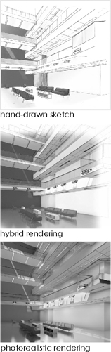
Figure 8.0
The images (above), which were used in the study, suggest that an image’s rendering characteristics can convey subliminal messages
DESIGN OUTCOMES DIAGRAMS
Outcomes diagrams can be a quick way to focus on a particular aspect of the design. When creating diagrams, consider what idea you’re aiming to depict, then focus solely on what is needed to represent this idea. Avoid including unnecessary information so that the viewer can concentrate on your message.
When information is potentially confusing or complicated, consider framing the diagram around a metaphor, which can make seemingly unfamiliar information more understandable.
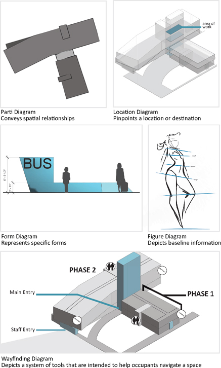
Figure 8.1
Outcomes diagrams can focus viewers’ attention toward a specific aspect of the design
DIAGRAMMING TOOLS & TECHNIQUES
Outcomes diagrams are great for highlighting a specific issue in the design, and they take little time to create. Creating an outcomes diagram can be as simple as sketching a few forms to serve as abstract representations of ideas, or they can be created in robust software programs. Either way, the best diagrams are clear, simple, and focused.
There are many ways to create a diagram, including:
Manual Drawings
Traditional sketching is a timeless tool for conveying information. If this is your method of choice, consider how to digitize your sketch outcomes so that you can include them in presentations. Some tools to consider include:
| Pen & paper digitized with a scanner | Watercolor digitzed with scanner |
Tablet Apps
Tablet Apps are a great way to bring the fluidity of hand drawn images into digital formats. Some tools to consider include:
| Sketching Apps | Chart/Icon Builders |
| Adobe Illustrator Draw | Flowdia |
| Autodesk Sketchbook | Graphia |
| Moleskin Tablet | Icona |
| Paper by Fiftythree | |
| Tayasui Sketches |
Computer Software/Websites
Software programs can be a powerful tool for graphic production. Some tools to consider include:
| Drawing & Symbols | Flow Charts | Icons/Vector Art |
| Adobe Illustrator | Diagramo | Flat Icon |
| Corel Draw | Microsoft Visio | Illustrio |
| Dingbats font | Icon Finder | |
| Noun Project |
EXERCISE 8.0 OUTCOMES DIAGRAMS
Find 10–12 design diagrams from websites, apps, or magazines in your field.
Analyze each diagram for clarity, simplicity, and focus on the message. Discuss your findings with a peer.
CONCEPTUAL IMAGERY
Conceptual drawings are often used early in the design process. They are frequently more evocative and imaginative than subsequent imagery and can be generated via hand sketches, collaging, and hybrid images.

Figure 8.2
Conceptual images can take on a range of styles
CONCEPTUAL IMAGERY TOOLS & TECHNIQUES
You can use conceptual imagery when you want to inspire an audience but don’t want to yet burden them with the constraints of reality. An important consideration for conceptual imagery is tone. Should the tone be futuristic, awe-inspiring, galvanizing, etc? This decision can say a lot about your design.
Consider your tone when selecting your media. While many of the same tools can be used in both conceptual drawing and diagrams, it may be useful to consider a wider range of tools that may allow for more nuance in color and form.
Manual Drawings
A greater range of pen thicknesses may be useful, allowing for shading and shadow. Some tools to consider include:
| Multiliner SP | Sakura Pigma Micron |
| Faber Castell pens | Staedtler Pigment Liner |
| Prismacolor Premier Illustration Markers | Uni Pin Fineliner |
| Rapidograph pens |
Tablet Apps
Tablet apps can be an excellent way to bring the fluidity of your hand into digital formats. Some tools to consider include:
| Sketching Apps | Photo Manipulation | Chart/Icon Builders |
| Adobe Illustrator Draw | Adobe Ideas | Easel.ly |
| Autodesk Sketchbook | Adobe Photoshop Touch | Flowdia |
| Moleskin Tablet | FX Photo Studio | Graphia |
| Paper by Fiftythree | Layers | Icona |
| Tayasui Sketches | Vector Snap | |
| Photo Collage | ||
| Photomontage | ||
| Pic Collage | ||
| Photomontager |
Computer Software/Websites
Software programs can be a powerful tool for graphic production. Some tools to consider include:
| Adobe Photoshop | Pixlr | Entourage |
| Blender | PhotoPlus X7 | Howard Models |
| Corel DRAW | Vectr | Immediate Entourage |
| Corel Paintshop Pro | Xara Photo & Graphic Designer | Skal Gubbar |
| GIMP | Textures | |
| Krita | Vyonyx |
EXERCISE 8.1 CONCEPTUAL DIAGRAMS
Locate 5–7 conceptual design diagrams that are aimed to inspire or galvanize an audience early in the design process.
Analyze each diagram for message clarity.
Discuss your findings with a peer.
ORTHOGRAPHIC DRAWINGS
Orthographic drawings are a series of separate but related views. There is no foreshortening in orthographic views so that they can be drawn to an accurate scale. Orthographic drawings often illustrate more technical aspects about a design.

Figure 8.3
Showing orthographic views simultaneously can help viewers understand spatial relationships
ORTHOGRAPHIC TOOLS & TECHNIQUES
Orthographic drawings can be produced via manual drafting or computer software.
Manual Drawings
Since orthographic views are drawn to an accurate scale, they are drafted using either a T-square and triangle or parallel bars. Typical methods of doing so include using graphite pencils on vellum paper, or ink and mylar.

Line Weights
Since there is no foreshortening (and little shade and shadow) in orthographic drawings, line weights are critical to legibility. There are a few universally accepted conventions for both manual and digital drawings:

Digital Drawings
Today, there are many software programs available to create orthographic drawings. The earliest software programs were fashioned after traditional 2D orthographic drafting techniques using layers to distinguish line types and line weights. More recently developed tools, however, model elements digitally on the computer. Orthographic views can then be captured from these models by rotating around them on screen. The most recent software programs even make use of algorithms to create parametric, or flexible forms that respond to various inputs.
MODELING
While the role of physical models has shifted given new technologies, models remain an important tool for studying design decisions and for communicating design intent.
For industrial and fashion designers working with true-to-life scales, physical prototypes provide an invaluable tool to test form and function. At the same time, for designers and architects working in the built environment — where full-scale prototyping remains largely unfeasible — physical models continue to be a vital tool to illustrate macro relationships between forms and objects.

Parti models, study models, concept models, and maquettes can be built at a reduced size to depict large-scale projects.

Form models and prototypes can be built at full scale to test form & function. Photo courtesy of Emily Swerdloff.
Figure 8.4
Physical models can be used to both study the design & share it with others
MEANS OF MAKING
When determining how to make the model, first reflect on the desired form and consider whether it would be constructed most easily through additive, subtractive, or cast-in-place model-making methods.

Figure 8.5
Methods of model making
Whatever method you choose, be sure to protect your lungs and extremities during model building. Ensure proper ventilation and use respiratory masks when sanding and painting. Also, aim to cut with high-quality equipment and fresh blades, and only do so when you are rested and alert.
MODELING TOOLS & TECHNIQUES
Important considerations in model building include access to materials and tools.
Material
When selecting materials, consider whether the goal is to convey materiality or to emphasize form. For materiality, use materials that mimic final selections. If the emphasis is on form, select materials that are uniform and nondescript.
Nondescript model materials include:
| museum board | plaster | wire |
| bass or balsa wood | acrylic | thread |
| chip board | epoxy | rods |
| masonite | plywood | putty or filler |
Tools
Depending on your construction method (i.e., additive, subtractive, or cast-in-place), different tools may be necessary. Before starting, consider the need for and access to the following:
| Measuring | Adhering or Forming | Finalizing |
| digital & laser capturing devices | 3D printer | putty |
| Cutting | cast-in-place forms | sander/sandpaper |
| X-acto blades with sharp edges | straight pins | appropriate paints |
| laser cutter | quick-set glue or 2-part epoxy | |
| router (manual or CNC) | ||
| band saw | ||
| rotary tools |
MODEL AS STORYTELLING PROP
One of the biggest mistakes a designer can make is putting enormous effort into crafting their story props and then failing to leverage them in the presentation. If you choose to build a physical model, be sure to place the model in a location where your audience can see it. However, keep in mind that whenever the model is visible, your audience will likely be looking at it, even if you’re not, so, consider revealing the model at a predetermined time. Not only will this help focus the audience’s attention, but doing so can add a bit of mystery, drama, and charisma to your presentation.
When you are discussing the model, gesture towards it. You may need to hold it up or project it on-screen. Also, consider building the model in a way that maximizes your storytelling opportunities by adding interactive features such as removable layers, and building it at scales that make it easy to use, view, or manipulate. Keep in mind that unless the model is encased, the audience will likely want to pick it up, so craft the model accordingly.
When your presentation is over, expect the audience to draw closer so that they can view the model from different angles. Finally, remember that your final rehearsal should include all of your props, this will help you become comfortable with using them, thus making your model building efforts worthwhile.
VIRTUAL MODELING
The frontiers of design communication are both vast and changing. At the time of this printing, tools such as holograms and technologies that capture gestural movements and provide multi-sensory experiences are being developed. The path forward is hard to predict, but some technologies are already being integrated into design storytelling, and bear explanation.
Thanks to new user-friendly software programs and less expensive hardware, digital models are growing in popularity. Such models can be shared via virtual and augmented reality experiences. While each method presents limitations, they offer newfound potential to bring design stories to life.
AUGMENTED REALITY (AR)
 |
AR is the enhancement of an existing environment by superimposing new information over it. These augmented scenes are made visible as a response to
a marker, or with GPS coordinates. Some retail stores are already using augmented reality to show their products within existing environments. |
VIRTUAL REALITY (VR)
 |
VR can be thought of as a total immersion within a virtual environment. To view this environment, users wear a steroscopic headset and sometimes use hand-held devices for haptic feedback. Inexpensive headsets make use of a mobile phone and allow the user to view a design from many angles, while high-end sets allow for locomotion, or movement within a virtual space. |
Figure 8.6
Augmented reality (top) & virtual reality (bottom) provide new opportunities for design storytelling
THREE-DIMENSIONAL DRAWINGS
Three-dimensional drawings give viewers a sense of spatial relationships. These drawings can be created with parallel projection, where there is no foreshortening of distant objects, such as in Isometrics and Axonometrics, or by making use of a vanishing point(s), such as in perspective drawings, which allows viewers to perceive depth, thus giving a realistic view.
PROJECTED DRAWINGS
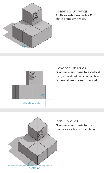
Figure 8.7
3-Dimensional drawings give viewers a sense of spatial relationships
PERSPECTIVES
There are several types of perspectives you may opt to use based on your goals and desired viewing angle. Consider where the “viewer” is located relative to the objects featured.

Figure 8.8
Perspectives can have either one, two, or three vanishing points
OTHER THREE-DIMENSIONAL VIEWS
Section perspectives, section obliques, and exploded views can also serve as useful props in telling design stories.
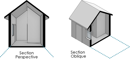
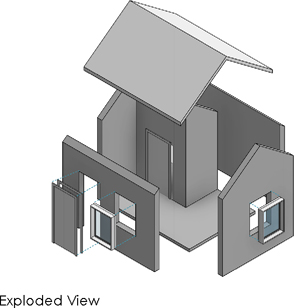
Figure 8.9
Section perspectives & exploded views show design components
DRAWINGS AIDES
There are numerous tools to help create 3-Dimensional Drawings.
| Manual | Digital | |
| Compose It Grids | 3Ds Max | Sculptris |
| Gridvu Drawing Tool | Autodesk 123D | SketchUp |
| John Pike Perspective Machine | Form Z | Solidworks |
| Perspective Grids Underlays | Inventor | |
| Maya | ||
| Hybrid (programs/apps with grid underlays) |
Optitex | |
| Adobe Photoshop Sketch | Revit | |
| Illustrator Underlay | Rhino | |
| Illustrator Underlay | ||
| Gridvu | ||
| Procreate |
RENDERING
Rendering adds a great deal of dimensionality to your design depictions. A rendered image gives viewers a sense of color, light, material, and texture. Entire volumes have been written on how to generate inspired design renderings. Below is an overview of rendering considerations:
Focus
Use color and saturation for emphasis; aim to focus viewers’ eyes on the center of the image, not its edges.
Realism
Align the level of detail and realism with your project’s stage of development
Media
Select media that aligns with the audience’s interest and your skills & ability.
Consistency
Aim for a consistent rendering style throughout the design presentation; the audience will infer that style changes are indicative of design changes.
RENDERING TOOLS
There are numerous tools to help you render a perspective drawing:
| Manual | |
| Dry Media | Wet Media |
| Color Pencils (Prisma Color) | Markers (Prisma Color, AD, or Copic) |
| Pastels (Rembrandt) | Water Color |
PAPER
Select paper based on media, tooth (graininess), color, & weight:
| Dry Media Options | Wet Media Options |
| Tracing Paper | Marker Paper |
| translucent, inexpensive, expect marker bleed | translucent, no marker bleed |
| Bond Paper-copy paper; | Mylar |
| opaque, inexpensive | translucent paper with smooth plastic film, best for ink drawings |
| Toned Paper | |
| high tooth & high contrast, available in a range of colors | Water Color Paper |
| translucent paper, comes in multiple finishes | |
| Bristol Paper | |
| dense paper with a relatively smooth finish | |
| Vellum-translucent | |
| Ingres Paper | |
| textured paper, available in a range of colors, great for pastels |
DRAWING AIDES
There are numerous tools and programs to help with rendering.
| Hybrid | Digital | |
| Stylus with Sketching Apps | Indigo Renderer | Menta Ray |
| Photoshop Filters | Lumion | Octane Renderer |
| Maxwell | VRay |
FOUR-DIMENSIONAL DEPICTIONS
The fourth dimension is time, and technological advances now allow designers to represent their designs over a duration. Designers have long benefited from before and after images as well as sequential depictions that illustrate how a design is assembled. Today, there are many opportunities to showcase how a design responds to various inputs and constraints. For instance, architects and interior designers can generate daylight studies, illustrating daylighting patterns over the course of a day, week, month, or year. Or, using RFID (Radio-Frequency Identification) devices and the internet of things, design researchers can track and display the locations of building occupants, highlighting patterns of use. Similarly, industrial designers might show force animations depicting how a product can withstand user demands. At the same time, fashion designers might show how a garment responds to the movement of its wearer.
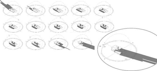
Figure 8.10
Dayligh studies can show light pattern over a period of time
GIFs, Graphic Interchange formats, are compressed image files that allow for short animations. GIFs are often the format of choice for websites and blogs that feature quick, looping animations. Software plug-ins enable the study of various inputs which can then be shared with project stakeholders. Additionally, many designers are now creating videos and animations, which are discussed in Chapter 9.
As a design storyteller, it will be imperative to keep abreast of new technology — both within design and from other fields. With a bit of vision and thoughtful planning, these tools can provide the vivid props your story needs to make for a memorable and persuasive audience experience. The key is to keep the story focused on the message at-hand.
SUMMARY
The “props” designers use to convey their ideas are essential components of any design story since they can inspire, orientate, and build audience understanding. To determine the quality and quantity of your props, consider your goals, your audience’s characteristics, and the project’s stage of development. To avoid miscommunication, aim to align the fidelity of your design’s representations to your stage in the project (i.e., early stages would likely utilize more schematic representations, while later stages may benefit from added realism).
There are a variety of props that you may opt to include in your story:
| Diagrams convey specific points. |
3-Dimensional Drawings illustrate spatial relationships & realism. |
| Conceptual Images inspire & evoke abstract thinking. |
Physical Models depict spatial relationships. |
| Orthographic Drawings depict technical information & scale. |
4-Dimensional Depictions illustrate a design over of time. |
Today, designers can create these representations using a range of manual, hybrid, and digital tools. While it is important to stay abreast of new communication technologies, the key is to keep the goals and the audience in mind when determining what to create and how to do it.
FOR CONSIDERATION
“Have a big idea and/or unifying concept and clearly communicate that at the outset of your presentation. If you have a goal, state that to keep your audience on track. Present your concepts in a sensible order to support your efforts to communicate, persuade or gain approvals. And don’t rely on the quality of your visuals to make up for a weak idea.
Great images of a poor design won’t last.”
Eric Ibsen,
chief design officer for Forge
TERMS
| additive making | haptic | section oblique |
| augmented reality | isometric | section perspective |
| cast-in-place making | maquette | stereoscopic |
| concept model | marker | study model |
| dry media | orthographic views | subtractive making |
| exploded view | parallel projection | virtual reality |
| form model | parti model | wet media |
| GIFs | prototype |
APPLICATION 8.0
To enhance the Sharing the Solution portion of your presentation, consider the following:
1 Reflect on your audience and your design. To determine the quantity of your visual messages, identify 2–3 of the most compelling benefits for your audience. Consider how best to frame these benefits for your audience (See Chapter 2) and how knowledge of these benefits might encourage the audience change you are seeking.
2 Based on your stage in the project, your goals, and the characteristics of your audience determine which representations methods (drawing type & level of fidelity) would best convey these benefits.
3 Similar to Chapter 7, for each iteration, establish where viewers should begin, how they should navigate the content, and what they will need to remember about it.
4 Determine what cues will help viewers to do this. Test several methods of integrating navigational cues into your depictions. The goal is to produce 2–3 versions of each.
5 Quickly sketch out your ideas and discuss them with a trusted peer prior to beginning any final iterations.
6 Based on your reviewer’s feedback, generate your ideas by whichever means you feel most appropriate; aim to create 2–3 iterations for each.
7 To understand how others might approach and interpret these depictions, review them with several people without providing verbal explanations.
8 Ask your reviewers to explain their responses to the images. If these explanations do not align with your goals, revise your work accordingly.
Rehearsal
9 If you are not generating a video for your presentation, rehearse your presentation once more in front of an audience using your entire visual package.
10 Adjust and refine your presentation and your visual messages based on your audience’s comments and your own experience.