
STORYTELLING WITH INFORMATION7
This chapter will focus on story for sharing information.
Maggie was a talented student who had artfully composed a portfolio showcasing outstanding designs, though on the day of her internship interview, she was nervous and had slept very little the night before. When her name was called, she walked in, smiled, and shook each interviewer’s hand. After she sat, the first interviewer commented …
“We were impressed by your skills, and we’d like to
know more about how you arrived at your design.”
Being nervous, she drew a blank and stumbled through a response. The interviewers quietly started to question her thought process and her communication skills. A simple diagram of her process may have not only outlined her key decisions but also trigger her memory, prompting an engaging discussion about her unique approach.
INTRODUCTION
Designers make hundreds, if not thousands, of decisions during any given project. Since many of these decisions have lasting impacts, potential employers and clients alike increasingly want to know more about them. As such, it is critical for designers to negotiate information en masse, to communicate aspects of the problem at hand, and their process for resolving it. Visual messages can be a powerful asset in this process as they distill complex information, helping the audience to see the nuances surrounding a problem without being buried in it.
This chapter will explore how diagrams can aid in design storytelling by highlighting a designer’s unique process, their resulting findings, and information about the project itself. These story props not only work to build a designer’s credibility but also to ensure a shared understanding of the project’s goals.
THE SIGNIFICANCE OF INFORMATION DELIVERY
We all live busy lives – school, jobs, and activities fill our time. Your audiences will be no different. They may be running a company and dealing with a myriad of business matters involving employees, shareholders, and colleagues, or they may be responding to the conflicting opinions of their constituents as they battle to make their own deadlines. Consequently, their capacity for editing, highlighting, grouping, categorizing, cataloging, and anumber of other tasks necessary for comprehension is limited, and our opportunities to share valuable information in design meetings, quite brief. So designers must work quickly to garner attention and succinctly distill valuable information that supports the design story.
THE ROLE OF VISUAL MESSAGES
While there is no empirical research supporting the adage that a picture is worth a thousand words, the ubiquity of this phrase demonstrates the potential of visual messages for balancing economy with insight through illustrated relationships. Yet, they present unique challenges concerning how much information to display and how to do so. The key is to eliminate clutter and present information clearly and cleanly. Acclaimed educator and author Edward Tufte noted that graphic excellence in information design “gives to the viewer the greatest number of ideas in the shortest time with the least ink in the smallest space.”1 This can only be done after proper consideration of the audience and the evidence at hand. What is needed to build a case for the audience change you are seeking?
APPROACHING INFORMATION
Each person approaches content differently, and it is hard to predict with reasonable accuracy how an audience will interpret information. This is due in part to our preferences, environment, and our conditioning. One fundamental difference is that some of us are more apt to use mental shortcuts, also known as heuristics, for the quickest path to comprehension, (especially when we are pressed for time).2 Others, however, prefer to take a more exhaustive approach to gaining understanding by reviewing the entirety of an information source.3 This means the amount of evidence necessary to build a plausible case may vary based upon your audience’s preferences.
HOW WE APPROACH & CONVEY INFORMATION
Research has suggested that differences in how we approach information might also stem from our gender, age, and cultural background.
Studies have found that, even as babies, boys and girls view information differently.4 As we grow, our conditioning often intensifies these differences. Boys are often taught to be competitive and girls to be social.5 Consequently, men and women may respond differently to content.
Even if we may not care to admit it, our age can impact how we interpret and react to information.6 Each generation has grown up amongst a different set of world events which influence how they view the world around them.7 In practical terms, younger generations have used technology from a very early age, while those with older eyes may benefit from larger labels and greater color contrast.
Our cultural background also influences how we process information. Mannerisms, childrearing practices, and educational systems vary, which can have practical implications for designers. For instance, Europeans are accustomed to green exit signs, while in the U.S., red exit signs are most common.8 Bear in mind, however, that there are exceptions to every rule, and designers need to consider the specifics of their audience when designing information for them.

Figure 7.0
Even relatively similar cultures can have different approaches to information design.
top photo by Lisa Waxman, Ph.D.
Feeling overwhelmed by the many differences in how we process information? Scholars have offered useful strategies for developing information graphics.
STRATEGIES OF INFORMATION DESIGN
Simplicity
For a viewer to understand information, they must first be able to find it. This means that depictions should be void of unnecessary information, in other words, clutter. Tufte referred to this as design efficiency.9
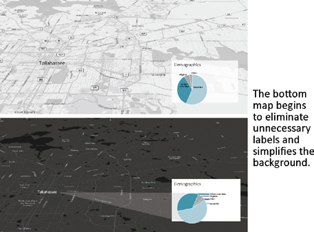
Figure 7.1
Remove unnecessary information to support legibility
STRATEGIES OF INFORMATION DESIGN
Provide the Capacity to Compare
Some information can be grasped on its own, while other evidence is best understood when shown in context. This is known as micro and macro reading. Tufte defined micro reading as individual stories about the data,10 whereas macro reading is scanning information for patterns.

Figure 7.2
Arrange content to allow for comparison
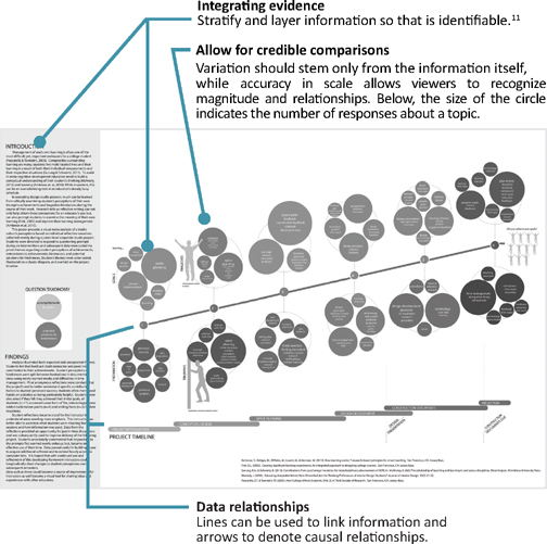
Figure 7.3
In the image below, the timeline and the responses align, thus showing when responses were collected
MEDIA FOR SHARING INFORMATION
When presenting information, it is important to consider the potential opportunities and inherent challenges of various media.
SCREEN-BASED PRESENTATIONS
Screen-based presentations generally follow a linear structure, wherein the speaker dictates the speed at which information is seen. Considerations for screen-based presentations include alignment between visual cues and talking points, as well as maintaining viewer attention.
PRINT MEDIA
In these media, viewers can scan information at their own pace. However, since the entirety of information is viewable on the page at any given time, viewers can be overwhelmed with too much of it. That means that designers working in print formats need to consider how much information to place on a page, and what cues such as color-coding and seriation (i.e., numbering) could be offered to help viewers navigate the content.
ENVIRONMENTAL INFORMATION DESIGN
Environmental information design includes large-scale installations like signs, advertisements, and exhibitions. Due to the physicality of these environments, designers need to determine the appropriate scale for users, and consider the suitability of a more complete sensory experience by engaging sight, sound, hearing, and touch.
INTERACTIVE MEDIA
What distinguishes interactive media like apps, websites, and augmented reality experiences from other sources is the element of choice. Interactive sources allow viewers to scan through and dip into information, which means that they can choose both the pace of their viewing and what they see. For this to happen effectively, however, designers working in interactive formats need to study the flow of their information and then provide intuitive navigation cues, such as tabs, hyperlinks, and buttons, so that viewers do not miss out on valuable information.
VIDEOS
While videos provide a multi-sensory experience, they can be a tricky media for sharing information since the video’s producer dictates both the orchestration and timing of content. As such, any information presented with a video needs to be easy to comprehend within the given time constraints.
REPRESENTATION TACTICS IN DESIGN ANALYSIS
Information can reveal a powerful message, but only if we can unearth the right evidence to tell the story.
Design analysis is crucial to ensuring that the right problem is being solved, by addressing the right concerns. Analysis tasks vary and largely depend on the project at hand as well as the skills and motivations of the designer. Such tasks include examining similar environments through precedent studies, speaking with project stakeholders via interviews and focus groups, or recording the behaviors and actions of project stakeholders. The findings from this process can be a very potent communication tool, especially when shared with the client before commencing design work. Doing so will help to engender a mutual understanding about the project, and add to your credibility.
TYPES OF INFORMATION
Designers will often arrive at different types of information, or data when analyzing a design problem. This information can include quantitative data, which stems from numerical figures, like population size or percentages. Data may also be qualitative, where findings are described in narratives such as interview transcripts, written feedback, or observation notes. Chances are, designers will call upon both sources to form an accurate definition of the project.
DIAGRAMMING DESIGN ANALYSIS
Diagrams can be a simple but potent tool for communicating findings, since they can answer the following questions:

Figure 7.4
Ways to document design analysis
PROCESS DIAGRAMS
We encounter depictions of process every day; timelines and schedules illustrate a series of steps or the timing of an event. Since life and the design process aren’t always a linear process, diagrams can also include feedback showing how one may return to previous steps as new information becomes known, or as changes occur. Process diagrams can also have a second layer of information that may summarize what was learned or uncovered during each step. Consider the following case study:
Case Study
A design team is collecting information about a company’s staff before beginning a redesign of their corporate headquarters. As part of their pre-design services, the team undertook a multifaceted process to improve their understanding of underlying issues. During this process, they distributed surveys to employees, conducted interviews with representatives from each department, and observed workers’ behaviors. They then analyzed this information and arrived at design criteria and suggestions for the new space. They could illustrate their process in several ways, as seen below:
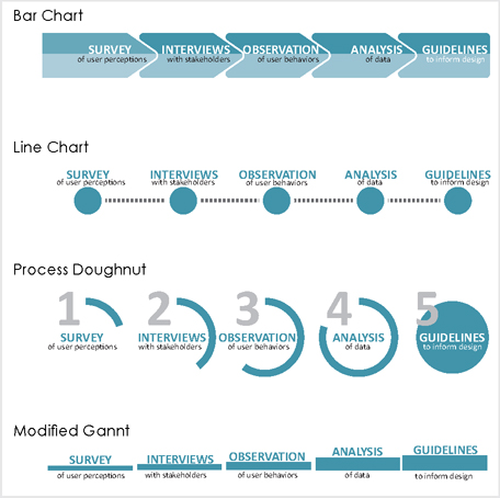
Figure 7.5 - Use process diagrams for steps or methods
Exercise 7.0 PROCESS DIAGRAMS
Sketch 2–3 ideas representing other ways to convey the steps outlined in the case study above.
DATA OF MAGNITUDE
Data of magnitude show relationships between value, size, or quantities of information. This information is often given in either percentages, if reporting a portion of a whole, or quantities, if revealing the actual number of responses. Refer to the case study below:
Case Study
Recall that the design team began their analysis by issuing a survey to employees. This survey asked 200 workers about their current workspace and their thoughts on its strengths and weaknesses. One question revealed that 52% of employees felt their current space hindered their required work activities; 33% felt it somewhat hindered their work; 10% felt their current workspace somewhat supported their work; while 5% indicated their current workspace supported their work. These percentages indicate magnitude, so it’s important to accurately illustrate the relative size of the value to help viewers perceive relationships between the given quantities.
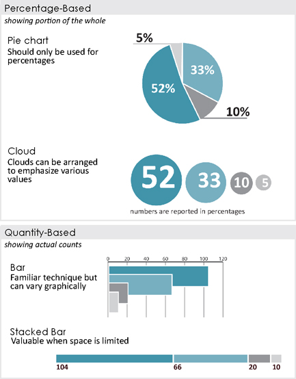
Figure 7.6
Use magnitude diagrams when sharing percentages or quantities (See Diagrams Appendix for more iterations)
STAKEHOLDER CRITERIA
Stakeholder diagrams describe the characteristics of those involved in a project, which can include demographic variables like age and gender, or qualitative characteristics such as work titles, preferences, likes or dislikes, and how they spend their time. Even if the client already has a general sense of this information, it is often important for designers to document these variables to confirm understanding.
Case Study Con’t.
Following the interview process, the design team found that employees of the company spent their time doing one of four things: collaborating, performing focus work, learning new tasks, or socializing with their colleagues. They were also able to determine the approximate percentages of time spent doing each. This describes two layers of information – what the tasks were, and the relative time allocation to each. These layers of information can be represented in various ways:
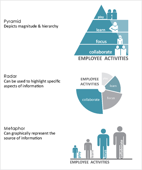
Figure 7.7
Use stakeholder diagrams when conveying information about people (See Diagrams Appendix for more iterations)
ORGANIZATIONAL INFORMATION
Another way to document project stakeholders is to note their relative presence in an organization, civic group, or community. These types of diagrams depict organizational hierarchy, and relationships between different groups can be indicated with lines and adjacencies.
Case Study Con’t.
The design team also interviewed department leaders and wanted to show an organizational chart reflecting these individuals’ positions and their relative location within the company. Below shows an option for doing so:
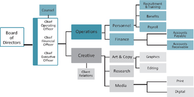
Figure 7.8
Use organizational diagrams when portraying relationships between groups of people
LOCATION
Location diagrams, such as maps and plans, can display position, place, proximity, and spatial relationships. These diagrams can represent macro environments (such as the entire planet), down to small-scale scenes, such as a floor or individual workstation.
Case Study Con’t.
Following their surveys and interviews, our fearless design team observed the current office for a week, watching how people worked, who they worked with, and what tools they used. They found that employees collaborated in some surprising locations. Below are a few ways to illustrate their findings:

Figure 7.9
Use location diagrams when portraying locations & spatial relationships
TRENDS
Designers often encounter longitudinal trends, or patterns over time, such as monthly sales throughout a fiscal year, or hotel occupancy during peak travel season. These types of diagrams often have two axes, one for the information and the other for the time period. However, they do not have to follow a traditional X-, Y-axis diagram format.
Case Study Con’t.
The design team also wanted to portray how many staff members were in the office during a typical business day. Several options include:

Figure 7.10
Use trends diagram when displaying information over time
EXERCISE 7.1 FINDINGS DIAGRAMS
Sketch 2–3 ideas representing other ways to convey the findings outlined in the case study above.
DESIGN CRITERIA
Design criteria outline any goals and requirements deemed necessary for the project’s success. Such items can include desired features, essential items, best practices, or even things to avoid. Communicating this information via diagrams can help establish mutual understanding and confirm project particulars before moving forward.
Case Study Con’t.
Using their findings from surveys, interviews, and observations, the design team is ready to formulate design criteria to highlight how each of the major spaces should accommodate its users.

Figure 7.11
Use design criteria diagrams to show goals or requirements
SUGGESTIONS
The goal of design analysis is to provide suggestions for the new space or determine next steps in future research. This information is likely to be the most important to the client and, depending on their level of expertise, it can be communicated using abstract or concrete symbols.
Case Study Con’t.
From the information collected during their research, the team prepared several key suggestions for the new design. They feel their insights will be important in moving forward and they can illustrate them in several ways:

Figure 7.12
Use suggestions diagrams for showing the path forward
EXERCISE 7.2 SUGGESTIONS DIAGRAMS
Sketch 2–3 ideas representing other ways to convey the suggestions outlined in the case study above.
DIAGRAM CONSIDERATIONS
When determining how to construct a diagram, consider the following:
1 What should viewers notice first?
Recall that visual hierarchy can provide cues as to where the viewer should begin in a composition. And these tactics apply within diagrams as well.
| Text | |
| The visual hierarchy of text can be influenced by the character of the font, and the color of the text. | Smaller text is considered less important; larger text is often read first. |
| Text should be in close proximity to the relevant information. | Negative space around a text can give it more prominence. |
| Images | |
| Negative space around an image can give it more prominence. | Larger and more saturated images will often be noticed first. |
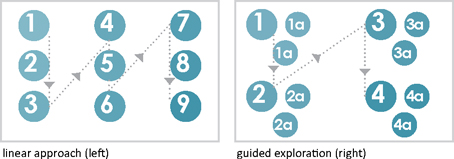
2 How should viewers progress through the information?
After the viewer initially engages with an information source, they need to determine their sequence for navigating the information quickly. In some instances, text can guide a more structured and linear approach, or it may be best to provide options for the viewer. Research has shown that viewers prefer a combination of both approaches (known as guided exploration), which allows viewers to choose their paths within a more structured system.12
Headings, grouping, and numbers can guide a viewer’s navigation of the diagram.
3 What do they need to remember?
Unfortunately, everything cannot be the answer to this question. It is important to acknowledge that, despite a designer’s best efforts, viewers are not likely to remember everything, so they will need to determine what the important “take-aways” are and highlight them accordingly. See Chapter 6 for tools of emphasis.
EXERCISE 7.3 EVALUATING INFORMATION DESIGN
Review trade publications, blogs, and websites to find 5–7 informative diagrams.
Analyze these diagrams per the three questions from above.
Then discuss your assessment with a peer.
DIAGRAM ANNOTATION STRATEGIES
Words serve to support the comprehension of visual information. Well-placed labels, headings, and descriptions can reduce ambiguity and clarify meaning. Even short headings can mean the difference between confusion and understanding. Some research has suggested that integrative visuals (i.e., those relying on both images and text) are more engaging than messages using text or illustrations alone.13 However, studies also have suggested an inverse relationship between the number of words in a message and the reader’s enjoyment in viewing it.14 As such, the appropriate use and integration of text components are important for both viewer perceptions and comprehension.
When determining how to annotate your diagrams, consider the following:
| How the information will be shared. Diagrams that will be accompanied by a verbal presentation will require less annotation. |
The complexity of the content. Complicated data sets like multivariate analyses (having three or more inputs), will likely require more annotation. |
| The background knowledge of the audience. If the content is familiar or they have seen similar diagrams in the past, the diagrams may require less annotation. |
DIAGRAM CREATION STRATEGIES
Ideally, creating diagrams won’t require a significant investment of time. In fact, creating diagrams can be as simple as a quick, but thoughtful annotated sketch. However, some planning can direct your efforts and save you some time. Start broad by determining content and overall form before adding details like navigational cues and annotation. Software programs and websites can also make the process quick and easy.
DRAWINGS AIDES
There are numerous tools and programs to help you generate diagrams digitally.
| Sketching | Photo Manipulation | Chart/Icon Builders |
| Adobe Illustrator Draw | Adobe Ideas | Easel.ly |
| Autodesk Sketchbook | Adobe Photoshop Touch | Flowdia |
| Paper by Fiftythree | FX Photo Studio | Graphia |
| Tayasui Sketches | Layers | Icona |
| Vector Snap | ||
| Map Generation | Data Display | Photo Collage |
| Carto | Diagramo | Photomontage |
| iSpatial | Grafio | Pic Collage |
| Mapbox | Grapholite | Photomontager |
| Mango | Microsoft Visio |
TESTING DIAGRAMS
Even the most beautiful depictions of information will be unsuccessful if they fail to build understanding. With this in mind, it’s critical to test the clarity of your depictions. It’s especially important to understand how information will be approached and interpreted if you will not be there to explain it.
To avoid confusion or misunderstandings, review your work with others. Find reviewers with a similar level of expertise to those in your audience. During their evaluations, avoid explaining the information; let the diagrams do the talking and then ask reviewers to describe their understanding of the information. Should their interpretations be inaccurate or questions arise during their viewing, the diagrams should be revised, and additional annotation may be needed.
SUMMARY
Informed design choices are increasingly important in all design fields. Conducting design analysis and sharing subsequent findings both establishes a mutual understanding of project parameters and helps build credibility. However, this is no small undertaking since designers often have little time to construct representations and share information, and since meaning-making is such a multifaceted process, influenced by an audience member’s biology, environment, and conditioning.
To overcome some of these issues, information design scholars have suggested that visual representations remain free of unnecessary information and ornamentation, while still providing viewers with enough information to make credible comparisons and see relationships for themselves. To do so, designers may opt to create diagrams that focus the viewer’s attention on specific issues, such as the designer’s process, the magnitude of their findings, criteria about the project and its stakeholders, organizational or locational information, longitudinal trends, and, ultimately, suggestions for moving forward.
When creating diagrams, designers should consider where viewers should begin in the information, how they will then navigate the content, and what they need to later recall about it. There are cues to aid viewers in this process including compositional tactics such as visual hierarchy, placement, and negative space, as well as the inclusion of objects like numbers, lines, and arrows, and text-based annotation including labels, headings, and descriptions.
Yet, even the most beautiful representations of information fail if viewers fail to understand them. Designers need to test their representations by reviewing them with others. What lies at stake is not only the accuracy of the viewers’ interpretations, but also the credibility of the designer, and, at times, the future of the project itself.
FOR CONSIDERATION
Start your own reference library of diagrams by clipping examples or posting them to digital boards.
Then sort your collection by their underlining principles (the type of content, organization, structure, tone, etc.).
When working on your own projects, reference these underlining principles as a starting point for creating your own story props.
Terms
| data | longitudinal | qualitative data |
| interactive media | multivariate | quantitative data |
| heuristics |
APPLICATION 7.0
To enhance the Exploration of the Problem portion of your presentation, consider the following:
1Explore your content. Identify 2–3 findings or insights that informed crucial decisions. Consider how your audience would benefit from knowing about this information and how this knowledge might encourage the audience change you are seeking.
2Determine which diagrams might best represent this information, either process, magnitude, criteria, organizational, locational, or suggestions diagrams.
3Review the information design strategies listed earlier in the chapter, along with any diagrams you have been saving. With these strategies in mind, conceptualize 2–3 ways of representing the selected information.
4Generate your ideas through sketching or by creating diagrams digitally.
5For each iteration, establish where viewers should begin, how they should navigate the content, and what they will need to remember about it.
6Determine what cues will help viewers navigate the content. Test several methods of integrating navigational cues into each diagram. The goal is to produce 2–3 versions of each.
7To understand how others might approach and interpret these diagrams, review them with others without providing verbal explanations of the information.
8Ask your reviewers to explain their interpretations of the information. If these explanations are inaccurate or they have questions about the information, revise the diagrams, adding additional cues or annotation to reduce ambiguity.
9Test your refined diagrams to ensure they are clear and align with your presentation talking points.
PRACTICALLY SPEAKING
The diagrams in this
chapter were created in
Adobe Illustrator.