Building Page Layouts and Publishing Pages
In this chapter we investigate how to add content pages to our site and how content pages link to page layouts whether they be out-of-the-box (OOTB) or custom page layouts. We begin with a look at content types, both OOTB and custom, that we will leverage when creating custom page layouts. We review the value and properties of content types and why we create our own custom content types, as well as where they are stored in SharePoint 2013. We review OOTB page layouts as well as create custom HTML page layouts using Design Manager. We also learn how to link page layouts to both OOTB and custom content types. We continue with a look at the properties of a page layout that allow it to be responsive, and conclude by learning how to utilize a page layout in a new content page.
 Note Learn how to use custom content types with Cross-Site Collection Publishing in Chapter 8.
Our Scenario
Public-facing web sites normally intend to provide information to visitors, and the public Specter Group web site is no different. Specter Group requires different types of web pages based on the type of information a particular page should contain. Specter Group also wants to not only make a web page easy to edit by an author, but also control what kind of content may be placed on a particular page type. By using content types and page layouts, we will build a custom content type stored in the Managed Metadata Hub we created in Chapter 6 that our custom page layouts will use to provide a diverse set of page layouts authors can use when creating content pages. Of course, all custom page layouts must flow within our responsive framework as well.
An Introduction to Layouts and Content Types
Page layouts provide web developers the ability to control how content will be displayed on a particular content page. Recall that master pages control the outside shell of a site, such as the header, footer, general background, and navigation. Page layouts provide the layout or flow for the given “content” on a particular page. Page layouts are stored by SharePoint in the Master Page Gallery and are only available when the site collection-based Publishing Infrastructure feature and site-based Publishing feature are enabled. Sites without Publishing enabled, such as collaboration sites, use the “text layout” or “wiki layout.” The “text layout” limits our ability to provide reusable, custom layouts and are thus normally not acceptable for public-facing sites or larger Intranets and Extranets.
Note Learn how to create a responsive master page in Chapter 5 and responsive navigation in Chapter 6.
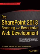
There are at least fifteen OOTB page layouts provided in SharePoint 2013. If you worked with the SharePoint 2010 publishing infrastructure, the SharePoint 2013 OOTB page layouts will look similar. You can view a list of available OOTB page layouts multiple ways, including the following: (1) via the Master Page Gallery in a browser, (2) by connecting to your site using WebDav and using a web editor such as Dreamweaver to view the ∼ sitecollection/_catalogs/masterpage directory, or (3) by loading your site in SharePoint Designer 2013 and viewing the Page Layouts Site Object (seen in Figure 7-1).
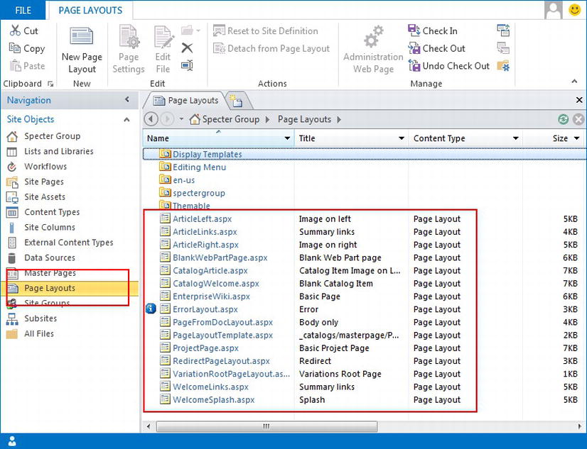
Figure 7-1. Out-of-the-box page layouts viewed in SharePoint Designer 2013
Note Two OOTB page layouts are hidden by default, PageLayoutTemplate.aspx and VariationRootPageLayout.aspx.
All page layouts must be linked to a content type. A valid page layout content type should have as its parent content type the “Page” content type or another content type that inherits from the “Page” content type, such as the “Article Page” content type. We must understand content types before we can truly understand how page layouts work. Specifically we must know what content types are, how they are built and stored, and how they are utilized by page layouts.
Note If you are familiar with content types, content type hubs, and the Managed Metadata Service, skip ahead to the page layout sections later in this chapter including “Out-of-the-Box Page Layouts,” “Custom Page Layouts,” and “Making a Page Layout Responsive.”
Content Types
Content types were first introduced in WSS 3.0/SharePoint Server 2007/MOSS and have become the cornerstone of all content in SharePoint 2013. Effectively all content in one way or another is associated with a content type. A content type defines the attributes or metadata that an object in SharePoint may contain or store. All lists and libraries are associated with a content type, thus any item that is created for a list or library will have the ability to store and utilize content associated with each attribute within the associated content type.
We can visualize content types by comparing an individual content type to a simple spreadsheet, in particular the first header row of a spreadsheet. We refer to each attribute of a content type as either a Content Type Column or Content Type Field, which we can think of as a column header in a spreadsheet. A column or field can be configured to store many types of data including text, numbers, dates or time, choices, HTML, images, GPS location, managed metadata, and more. Refer to Figure 7-2 for a full list of OOTB column types. You can even create your own column types to store your own types of data. To further our analogy of content types and spreadsheets, an actual spreadsheet would equate to the list where the list data is stored in cells within the spreadsheet, but our column headers (e.g., content type) specify the columns’ names and types of data each column may store.
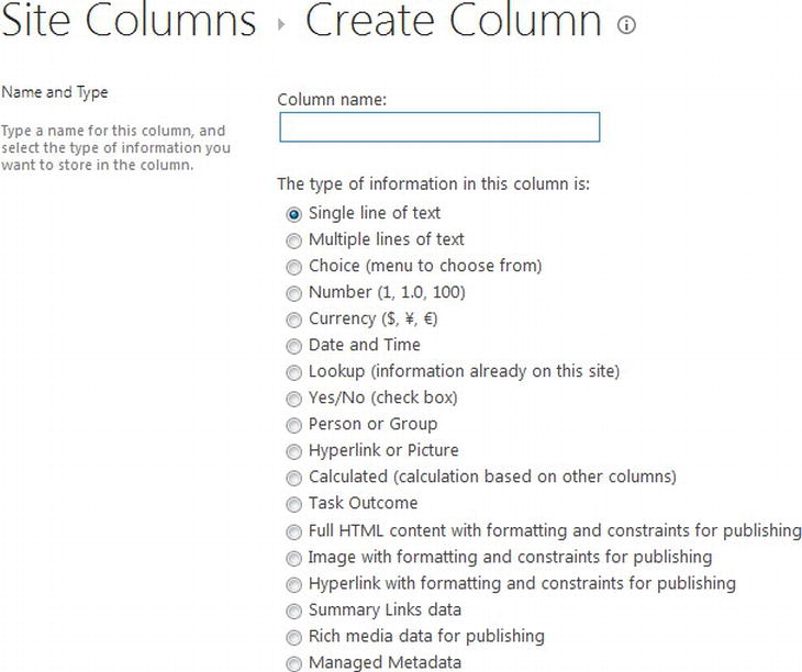
Figure 7-2. OOTB column types as provided by ∼ sitecollection/_layouts/15/fldnew.aspx
Note We present content types only in regard to basic Web Content Management. For a deeper look at content types and Enterprise Content Management with SharePoint, consider Practical SharePoint 2010 Information Architecture by Ruven Gotz (Apress, 2012; www.apress.com/9781430241768). Although written for SharePoint 2010, the information is still useful for SharePoint 2013.
Content types also provide the ability to inherit from existing content types, which in turn can inherit from other content types. Just as in programming inheritance, inheritance in SharePoint’s content types allows content types to reuse its parent content type columns without having to readd them themselves. In fact all content types but one will inherit from a previously defined content type. The one root content type in SharePoint is the System content type that has an ID of 0x, and then only one content type exists that inherits from the System content type, the Item content type with an ID of 0x01. In general, all other content types including custom content types will inherit from either the Item content type or from one of its many descendants.
Tip Learn more about Base content type hierarchy at http://sprwd.com/86zebtp.
Content types are a very powerful tool, used for much more than just WCM, and an in-depth review is beyond of the scope of this book. Moving forward we consider content types only in their basic form and in regard to how they can be used in a WCM system.
Tip Learn how to plan content types at http://sprwd.com/a3cfg6x.
Content pages stored within our SharePoint 2013 Publishing sites are stored within a Pages library. The Pages library, as with all lists and libraries in SharePoint 2013, inherits a primary content type, in this case the Document content type. The Pages library has been configured to allow multiple content types and by default the Page content type. A particular list item, or content page stored within the Pages library, can also be associated with any additional content type allowed by the Pages library.
Note The Page content type has the following content type inheritance. System  Item Document System Page Page (self).
We can create our own custom page content types that we can then include in our Pages library and then have our custom page layouts inherit from those custom page content types.
Where to Store Custom Content Types
All content types must be stored within SharePoint. Although content types are a site-level feature, multiple storage locations exist for storing content types. OOTB content types are stored within the SharePoint farm itself. If we want to create custom content types, we have an option as to where to create them, depending on where we would like them to be accessible. We may store content types in a site, a site collection or in a content type hub. A site may inherit content types from its parent site, thus where we store a content type will dictate where a given content type may be used.
Custom Content Types Stored in a Site
At the most shallow level, a custom content type can be created and stored in a given site. Once the content type has been created in a site, it would then be available for use in that site and any descendent site as well. If we want to create a custom content type that its parent sites will not see or be allowed to use, then a custom content type stored within a site might be a good solution. If, on the other hand, all sites within a site collection should use and share a given custom content type, storing a custom content type within a subsite will fail.
Custom Content Types Stored in a Site Collection
Moving one level deeper, a custom content type may be created and stored in the root site of a site collection. Essentially this is the same as storing a content type in a site as previously discussed, just note that storing a content type in a site collection’s root site makes that content type available throughout the entire site collection. If we want to share a custom content type across site collections, for example in Cross-Site Collection Publishing, we will need a deeper way to store our custom content types.
Note We review Cross-Site Collection Publishing in detail in Chapter 8.
Custom Content Types Stored in a Content Type Hub
SharePoint 2013 provides a mechanism for us to create content types that can be shared across site collections or even web applications, via a content type hub. A content type hub is a site collection, with its set of OOTB and custom content types, linked to a particular Managed Metadata Service Application. We can then associate other web applications with a Managed Metadata Service Application to inherit the content type from the content type hub.
Note You can learn more about the Managed Metadata Service in Chapter 6.
The value of a content type hub includes the ability to create a custom content type once that can then be used across multiple site collections. We will find this invaluable when configuring and utilizing Cross-Site Collection Publishing.
Configuring a Content Type Hub
As we just saw, a content type hub is a site collection that is referenced by a Managed Metadata Service Application. In Chapter 6 we reviewed how to create and manage a Managed Metadata Service Application that we then linked our web application to. We will now carry this process one step further and link our Managed Metadata Service Application to a site collection that will store custom content types that may be utilized across multiple web applications and site collections. The content type hub site collection could be any site collection in your SharePoint farm including your Central Admin site collection, and you can create as many content type hubs as you need, although you will need to create a new Metadata Service Application for each content type hub you require. In the case of Specter Group requirements, we want to be able to modify our custom content types without having to log into the Central Admin site collection, so we are going to have our authoring site collection (authoring.spectergroup.com) be our content type hub for our entire Specter Group site architecture.
Prerequisite
A content type hub is associated with a Managed Metadata Service Application. To learn how to create a Managed Metadata Service Application, refer to Chapter 6. The site collection that will store the content types that you wish to be in your content type hub must already have been created. This site collection does not yet need to have your custom content types at this point. Because by default a Managed Metadata Service Application is made available to all web applications, we will assume this is still the case. Second, the site collection that will be the content type hub must also have the site collection feature Content Type Syndication Hub already enabled.
Note Each content type hub included in your SharePoint farm will require its own Managed Metadata Service Application.
A site collection may be configured as a content type hub for a particular Managed Metadata Service in Central Admin:
- 1. Verify the site collection feature Content Type Syndication Hub has been enabled for the site collection that will become a content type hub.
- a. Navigate to the Site Collection Features page found on the Site Settings page of the site collection that will become the content type hub.
- b. Activate the feature Content Type Syndication Hub if it is not yet active (see Figure 7-3).
Figure 7-3. Verify the Content Type Syndication Hub feature is active
- 2. Open Central Admin and click Application Management in the left menu.
- 3. Found in the Service Applications group, click Manage service applications.
- 3. Scroll down the list of applications and find the Managed Metadata Service your web application(s) are configured to use for their managed metadata, in our case, Managed Metadata Service. Now click Properties in the ribbon, found in the Operations group.
- 4. In the Service’s Properties dialog box, scroll to the bottom and provide the full URL of the site collection that will be your content type hub (see Figure 7-4).
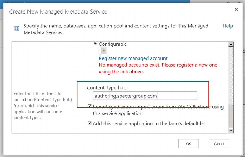
Figure 7-4. Providing a content type hub site collection
- 5. Click OK to save your changes.
All web applications that have a service connection to this Managed Metadata Service are now using this site collection’s list of content types as a content type hub. We are now ready to create custom content types that we want shared across site collections and even web applications.
Creating a Custom Content Type
As we have mentioned, custom content types are associated with a site, a site collection, or a content type hub. The process of creating a custom content type will always be the same no matter where we store the content type because a content type hub is just a site collection. When we add custom content types to a site collection, we are simply creating our custom content types in the root site of a site collection.
Note We review adding a custom content type via a browser. You can also deploy content types via features developed in Visual Studio as well as create content types with PowerShell, but these topics are beyond the scope of this book.
Creating a Custom Content Type Column
Before we create a custom content type, let us review the structure of content types. Again consider a content type as a spreadsheet of data. In this spreadsheet the columns represent the different types of information we can store and the row represents a particular item or document associated with this content type. A given column must be associated with a field, and that field dictates the type of content that column may store. SharePoint provides an extensive list of content type columns, which we saw in Figure 7-2.
Although there is a large list of site columns already available, there are reasons why you might want to create your own custom site columns for your custom content types. You might want site columns named a particular way or maybe you want to set the default value to your own calculated value. A common reason for a custom column is to provide a custom list of choices or to link a column to managed metadata. In the next example, we will create a custom site column. We want our custom site columns to be available in our content type hub; therefore, we will create the custom site column in our authoring.spectergroup.com root site.
- Open the site in which you want to add a custom site column.
- Click the Settings icon and then Site settings in the Settings drop-down list.
- On the Site Settings page, under Web Designer Galleries, click Site columns, as shown in Figure 7-5.
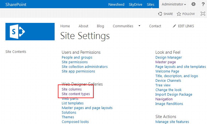
Figure 7-5. Site Settings
Site columns and Site content types location - You will see a list of all site columns currently available to this site. Click Create at the top of the Site Columns page shown in Figure 7-6.
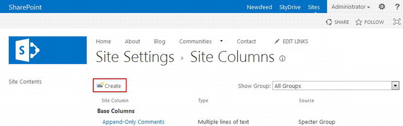
Figure 7-6. Site Settings
Site Columns Create button - The Create Column page will appear, allowing you to configure your custom site column. A full explanation of every possible site column setting is beyond the scope of this book. In our example, we wish to create a custom site column to store the property type of a particular property. Refer to Figure 7-7 for our custom column property values.
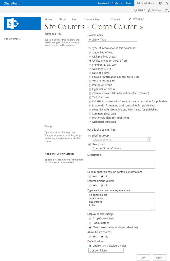
Figure 7-7. Sample custom column properties
Note A column name must be unique within the site in which you are creating the custom column, including any inherited column names. - Click OK to create your new column.
Creating a Custom Content Type
Creating a custom content type is not much more difficult than creating a custom column. Custom content types may be created via the browser, by a custom feature included in an app developed in Visual Studio or with PowerShell. In our case we use a browser to provide a visual, direct example.
Note Because redeploying a content type created in the browser is difficult, content types that need to be shared should be placed in your content type hub.
- Open the site in which you want to add a custom content type and navigate to the Site Settings page.
- On the Site Settings page, under Web Designer Galleries, click Site content types.
- You will see a list of all content types currently available to this site. Click Create at the top of the Site Content Types page (see Figure 7-8).
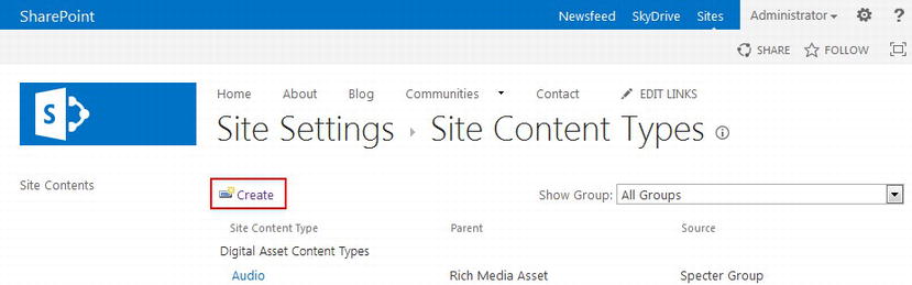
Figure 7-8. Site Settings
Site Content Types Create button - The New Site Content Type page will appear. Here you can provide the necessary properties to create your custom content type. Refer to Figure 7-9 for our sample custom content type property values.
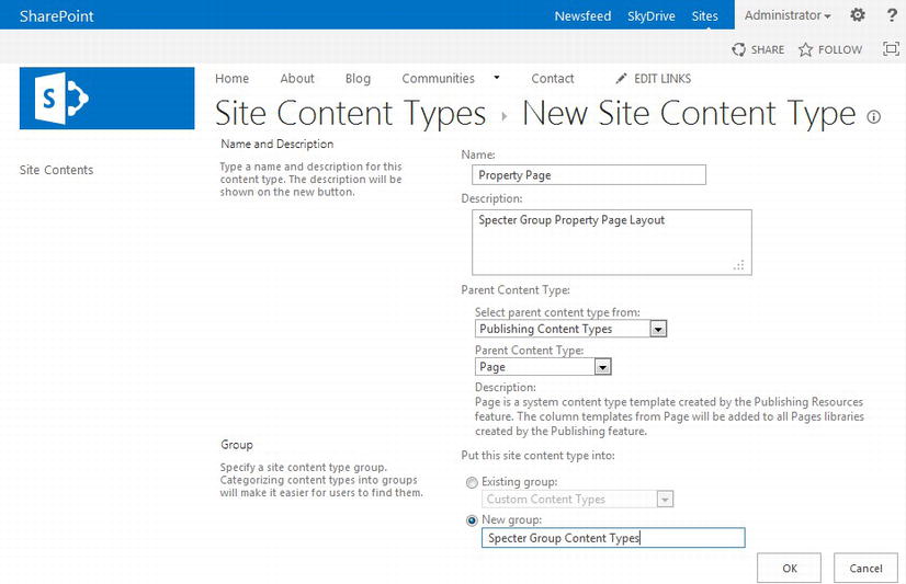
Figure 7-9. Custom content type properties
Note All custom content types must inherit from an existing content type. In our example we wish to create a new content type that inherits from the Page content type, as we will be using this content type for custom page layouts. Therefore we select a parent content type group of Publishing Content Types with a parent content type of Page. - Click OK to create your new content type.
Once a content type has been created, you can return to the Site Contents Type page (∼site/_layouts/15/mngctype.aspx) and view your custom content type within the content type group you selected or provided. Remember, all subsites of the site you create a content type in can reference the custom content type. Further, if this content type was created at the root site of a site collection configured as a content type hub, all web applications connected to the Managed Metadata Service Application using this site collection will also have access to this content type once replication has completed.
Tip SharePoint will generate a content type ID for a custom content type. A content type ID provides information regarding its inheritance. To learn more about custom IDs, please refer to http://sprwd.com/7d79dsn.
Out-of-the-Box Page Layouts
As we have already stated, there are fifteen page layouts provided by SharePoint 2013 for sites with the Publishing feature enabled, although two of these page layouts are hidden by default. We find that for custom public-facing sites as well as many intranets and extranets, custom page layouts are required, especially when creating responsive sites.
Ideally we will attempt to utilize OOTB assets provided by SharePoint 2013. In particular, we have seen how OOTB content types can serve as a basis for our custom content types. The same is true for OOTB page layouts. Having examples of how page layouts employ content types to expose metadata can help provide a starting place for our own custom page layouts.
Note OOTB page layouts are page layouts, not HTML page layouts. SharePoint 2013 does not provide any OOTB HTML page layouts, although we can easily create one. We review HTML page layouts later in this chapter in the section “Custom Page Layouts with Design Manager.”
For a list of the seven OOTB page content types used by OOTB page layouts, refer to Figure 7-10. In Figure 7-11 we can see the thirteen visible OOTB page layouts.
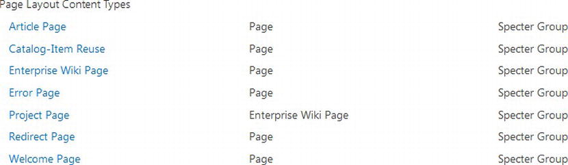
Figure 7-10. The seven OOTB content types used by the thirteen OOTB page layouts
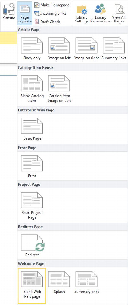
Figure 7-11. The thirteen visible OOTB SharePoint 2013 page layouts
All page layouts, including the two hidden ones, can be viewed in a site collection’s Master Page Gallery as well, as seen in Figure 7-12. Note that page layouts all end with the extension .aspx.
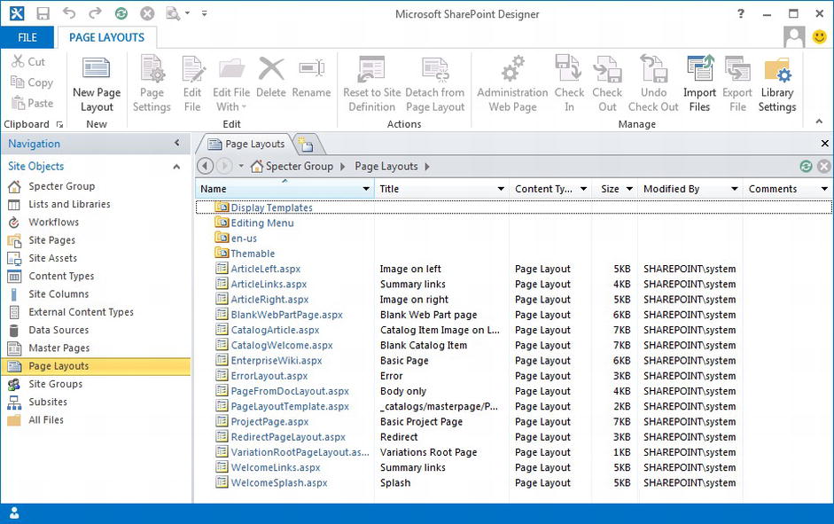
Figure 7-12. All OOTB page layouts as seen in the Master Page Gallery
Custom Page Layouts
OOTB page layouts might provide the layouts and metadata we need for sites built with SharePoint, but more often than not, we require customized page layouts that can store and display custom content and metadata. Custom page layouts tied together with existing or custom content types can satisfy these goals while still leveraging the power of SharePoint and its publishing infrastructure. This is not to say that OOTB page layouts do not provide a great resource, as you might find an OOTB page layout that is close to what you need. All that a page layout might need are a few minor modifications. No problem: You can create a content type that inherits from the Page content type, or even from the page content type that you want to customize, create a copy of the page layout you wish to customize, associate it with your custom content type, and finally customize your new page layout.
Tip You should never edit an OOTB file provided by SharePoint, including the OOTB master pages, page layouts, or content types. Always create your own copy of the original and create a new content type that inherits from an existing content type. If a patch or service pack for SharePoint is applied, OOTB files and assets might be overwritten, and thus you might lose your modifications.
Previous versions of SharePoint provided the ability to create and utilize custom page layouts. With the addition of Design Manager, managing page layouts has become easier and thus makes them more useful. In the world of responsive design, custom page layouts become a necessity, as we need to control our responsive grid. Although OOTB page layouts in SharePoint 2013 use a div-based structure, we would prefer to leverage a framework’s structure. Custom page layouts also provide us the chance to tap into the power of custom content types that allow our page layouts to store metadata for a given layout.
There are two preferred methods to create and manage a page layout. First we can work directly with a .NET .aspx page layout in the Master Page Gallery. Better yet, we can take advantage of Design Manager and work with HTML page layouts. We examine both techniques and at the same time see how we can use both an OOTB page layout content type as well as the custom content type we created earlier in this chapter.
After we learn how to create page layouts, we will link our page layouts to their content types. Using SharePoint Designer and Design Manager we will reference and surface our content type field values for editing, displaying, or both. Finally we will expand our example site by creating new pages for Specter Group that use our custom page layout linked to our custom content type. Both scenarios build on the master page and navigation we already built in Chapter 5 and Chapter 6.
Note To review how to add a content type, refer to the section “Content Types” earlier in this chapter.
Custom Page Layouts Without Design Manager
Custom page layouts were available to us in SharePoint 2010 and we can work with custom page layouts in SharePoint 2013 in a similar fashion. Page layouts are stored in the Master Page Gallery. When we connect to a site collection using a web editor tool such as SharePoint Designer, we can not only see all of our page layouts, but easily create and manage custom page layouts. When we create our own custom page layouts, we do not always have to create a custom content type for that page layout. In fact it is often best to utilize an existing content type if it has the columns our page layout requires and if it’s being used in a similar manner as other page layouts that are associated with the content type.
Therefore in our first example of creating a custom page layout, we create a custom page layout for the Specter Group About page. The page requirements include one left-aligned image, a container to hold text along with the page title, and finally two web part zones beneath the content box. Because the requirements for this page only require a page image as well as one large rich text editor, we use the existing Article Page content type. We will start by looking at the HTML only version of this page provided by our design team at the end of Chapter 3 as seen in Figure 7-13.
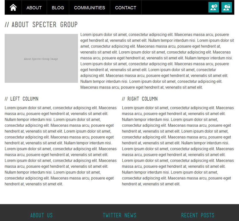
Figure 7-13. About Us page mockup
In Listing 7-1 we can see the HTML that provides the structure and content for the About Us page seen in Figure 7-13.
Listing 7-1. HTML Mockup of About Us Content Area
<!-- page-content -->
<div class = "page-content">
   <!-- entry-content -->
   <div class = "section noborder cf">

      <h2 class = "heading" > About Specter Group</h2>

      <div class = "floatleft">
         <img src=http://placehold.it/300x200&text = About + Specter + Group + Image
            alt = "" />
      </div>
      <p > Lorem ipsum dolor sit amet, consectetu... < !--additional content-- > </p>

      <!-- 2 cols -->
      <div class = "one-half">
         <h4 class = "heading" > Left column</h4>
         <p > Lorem ipsum dolor sit amet, consecte... < !--additional content-- > </p>
      </div>
      <div class = "one-half last">
         <h4 class = "heading" > Right column</h4>
         <p > Lorem ipsum dolor sit amet, consect... < !--additional content-- > </p>
      </div>

      <div class = "clearfix" > </div>

      <!-- ENDS 2 cols -->
   </div>
   <!-- ENDS section -->
</div>
<!-- ENDS page-content -->
To create a new .NET .aspx page layout, follow these steps.
- Open the root site of your site collection in SharePoint Designer 2013.
- In the Site Objects left pane, click All Files. Navigate to _catalogs and then to its subfolder, masterpage.
- We can create a new page layout from scratch, or by copying an existing page layout. An obvious choice should be to copy from the PageLayoutTemplate.aspx page layout. This OOTB page layout was designed as a starting place for custom page layouts. In our case, it would be advantageous for us to use one of the preexisting article page layouts, as our page layout requires a similar layout as the ArticleLeft.aspx page layout.
- Right-click ArticleLeft.aspx and select Copy.
- We recommend keeping branding assets organized by branding effort. For this example, paste the page layout copy in the spectergroup folder we created in Chapter 4, i.e. ∼sitecollection/_catalogs/masterpage/spectergroup.
- A new copy of ArticleLeft.aspx is now in your spectergroup folder. To rename this file, right-click ArticleLeft.aspx and select Rename. Rename this file about-pagelayout.aspx.
- Right-click about-pagelayout.aspx and select Edit in Advanced Mode so that you can edit the page layout.
Review the code in Listing 7-2 for the updated about-pagelayout.aspx contents. Note that we only updated the PlaceHolderMain ContentPlaceHolder, so only that aspect of the code is provided in Listing 7-2. Further, you will notice no snippets like we saw in previous chapters, as we are not using the Design Manager at this point. All of the code for .aspx page layout is HTML and ASP.NET markup. We replaced title and content blocks with a combination of SharePoint controls such as EditModePanel, TextField, FieldValue, RichImageField, and WebPartZone to provide a page layout that can house content, images, and additional web parts as required by page authors.
Listing 7-2. PlaceHolderMain of about-pagelayout.aspx
<asp:Content ContentPlaceholderID = "PlaceHolderMain" runat = "server">
   <!-- page-content -->
   <div class = "page-content">
      <!-- entry-content -->
      <div class = "section noborder cf">

         <PublishingWebControls:EditModePanel runat = "server"
            PageDisplayMode = "Edit" CssClass = "edit-mode-panel">
           <SharePointWebControls:TextField runat = "server" FieldName = "Title"/>
         </PublishingWebControls:EditModePanel>
         <PublishingWebControls:EditModePanel runat = "server"
            PageDisplayMode = "Display">
           <h2 class = "heading">
               <SharePointWebControls:FieldValue id = "PageTitle"
                  FieldName = "Title" runat = "server"/>
           </h2>
         </PublishingWebControls:EditModePanel>

         <PublishingWebControls:EditModePanel runat = "server"
            CssClass = "edit-mode-panel">
           <SharePointWebControls:TextField runat = "server"
               FieldName = "SeoMetaDescription"/>
         </PublishingWebControls:EditModePanel>

         <div class = "floatleft">
           <PublishingWebControls:RichImageField
               FieldName = "PublishingPageImage" runat = "server"/>
         </div>

         <PublishingWebControls:RichHtmlField FieldName = "PublishingPageContent"
             runat = "server"/>

         <!-- 2 cols -->
         <div class = "one-half">
           <WebPartPages:WebPartZone runat = "server" Title = "LeftZone"
               ID = "LeftColumn">
             <ZoneTemplate > </ZoneTemplate>
           </WebPartPages:WebPartZone>
         </div>
         <div class = "one-half last">
           <WebPartPages:WebPartZone runat = "server" Title = "RightZone"
               ID = "RightColumn">
             <ZoneTemplate > </ZoneTemplate>
           </WebPartPages:WebPartZone>
         </div>

         <div class = "clearfix" > </div>
         <!-- ENDS 2 cols -->
      </div>
      <!-- ENDS section -->
   </div>
   <!-- ENDS page-content -->
</asp:Content>
If you compare the HTML prototype layout in Listing 7-1 with the page layout in Listing 7-2, you will notice that the basic HTML structure of the two blocks of code is essentially the same. They both use the same div structure. The difference is that the “content” from Listing 7-1, such as the heading < h2 class = "heading" > About Specter Group</h2>, has been replaced by SharePoint controls. We will break down the changes that we had to make to produce Listing 7-2.
Note We discuss creating content pages and linking them to our custom page layouts later in this chapter, in the section “Creating and Publishing New Pages Based on Custom Page Layouts.”
- The main heading of the page, <h2 class = "heading" > About Specter Group</h2>, gets replaced with three different types of SharePoint controls. The first control, EditModePanel, found in the Microsoft.SharePoint.Publishing.WebControls namespace, provides a panel that appears only while in edit mode or display mode. By default the EditModePanel will only display in edit mode unless the PageDisplayMode property is set to "Display". These panels are used to allow an author to edit the page heading while in edit mode, yet display the heading in an <h2> tag while in display mode.
The next controls used are the FieldValue and TextField controls, both found in the Microsoft.SharePoint.WebControls namespace. These controls will either display the value of a metadata field (FieldValue) or provide a text box (TextField) to edit the metadata field while in edit mode.
- The main page layout image from Listing 7-1 gets replaced by another control, RichImageField, also found in the Microsoft.SharePoint.Publishing.WebControls namespace. This control will display an image while in display mode. While in edit mode an author has the ability to replace the image, all within the browser. This image control can be seen in Figure 7-14, where the text “Click here to insert a picture from SharePoint.” is displayed.
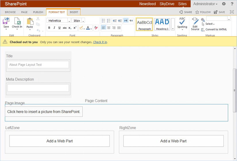
Figure 7-14. Sample page layout, about-pagelayout.aspx, applied to an empty content page while in edit mode
- The third interesting block in Listing 7-2 is the RichHtmlField control. As you might be able to notice, this too is in the Microsoft.SharePoint.Publishing.WebControls namespace. Just like the RichImageField, the RichHtmlField will display the contents of the field it is tied to. In our case this is the PublishingPageContent field in our pages associated content type. While in edit mode though, an author is provided a rich text editor. In Figure 7-14, the Page Content control has been highlighted. Notice how the ribbon includes text formatting tools.
- The final block of code in Listing 7-2 of interest replaces the two columns of text below the image. To provide for more flexibility, Listing 7-2 uses two WebPartZone controls found in the Microsoft.SharePoint.WebPartPages namespace. Web part zones allow for a large number of web parts within each zone, including the Content Editor Web Part, Content Search Web Parts, and much more. We could have created custom fields in a custom content type and displayed the field values instead. WebPartZone controls provide more flexibility to page authors, but possibly too much control. If a content block in a page layout will only contain text, you will lean toward custom fields, whereas if a content block requires a large number of web parts, a WebPartZone would be more appropriate.
Editing Page Layout Properties
Before we can use a page layout for a particular content page, we must first set its properties. We can accomplish this via the browser.
Note At a minimum, be sure to review and set the content type for a new page layout.
- 1. Open your site collection in a browser. You must log in with an account that has permission to access and update the Master Page Gallery.
- 2. Navigate to your site collection Site Settings page. In the Web Designer Galleries section, click Master pages and page layouts.
- 3. In the Master Page Gallery, click the spectergroup folder created in Chapter 4.
- 4. In the spectergroup folder you should see the page layout we just created in SharePoint Designer. Click the about-pagelayout.aspx file and in the drop-down menu that appears, select Edit Properties.
- 5. Set your page layout properties and click Save in the ribbon when complete. Refer to Figure 7-15 for our example page layout edit properties page.
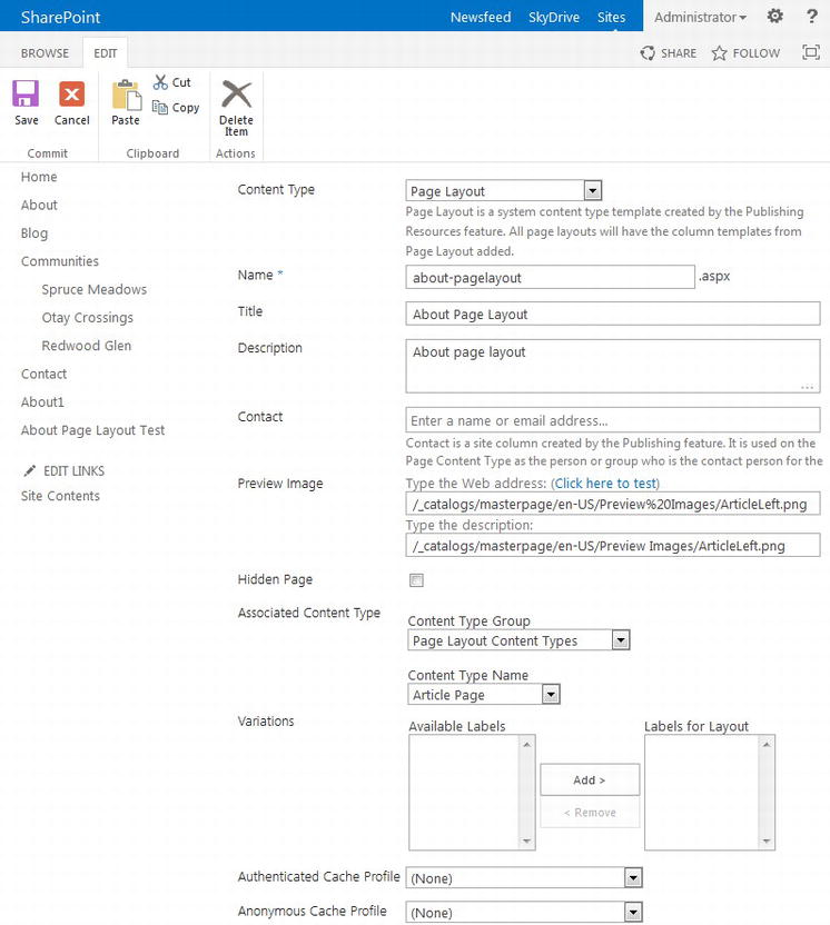
Figure 7-15. Edit the page layout properties
- a. Content Type: We can set the primary content type for this file. In our case this must be Page Layout, although when working with Design Manager we will see how we can use a different content type.
- b. Name: This is the file name. We will leave this the same, but if you wish to rename the file, you can change the Name property.
- c. Title: The title of this page layout as displayed throughout the site. Because we copied this page layout from the ArticleLeft.aspx OOTB page layout, the Title will have been preset. We want to change this to a title that is more meaningful. Our title will be About.
- d. Description: The optional description of the page layout.
- e. Contact: Provide the name or e-mail address of the primary contact for this page layout.
- f. Preview Image: You can provide a preview image and description for this page layout. Learn how in the section “Creating a Page Layout Preview Icon” later in this chapter.
- g. Hidden Page: If this check box is left cleared, this page layout will be hidden. We will leave this cleared.
- h. Associated Content Type: Here is where we actually specify what content type we wish to link this page layout to. In this case we want this page layout associated with the Article Page content type found in the Page Layout Content Types group.
- i. Variations: If we have variations of our site, we can set labels here. We review multilingual sites and variations in Chapter 14.
- j. Cache Profiles: You can set cache profiles to increase page load performance. We will leave both fields set to (None).
Publishing a Page Layout
Before a page layout can be available for use by a content page, the page layout must be checked in and published. In the days of SharePoint 2010, out of the box there was a strict check-in, publish, and approval workflow. In SharePoint 2013 this has been simplified to a single step. You might start to notice that you do not have to check out a file to begin editing it either. SharePoint 2013 still allows us to check out and check in files, but this is no longer a requirement.
- In your browser, navigate to the spectergroup folder in the Master Page Gallery.
- Click the about-pagelayout.aspx file (see Figure 7-16).
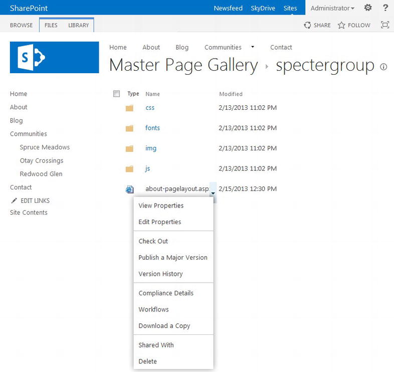
Figure 7-16. Publishing a page layout in the Master Page Gallery
- If you did not check out this file before editing its properties, click Publish a Major Version to publish a major version of this page layout.
- If you did check out this file before editing its properties, click Check In.
- a. In the Check in dialog box, select the Major version (publish) option, decide if you wish to keep the file checked out, and add any comments.
- b. When you are ready, click OK to check in and publish a major version.
Your page layout is now ready for use by content pages. We review how to utilize a page layout in a content page in the later section, “Creating and Publishing New Pages Based on Custom Page Layouts.”
Note If you make a change to a page layout, you must publish a major version before other users, including anonymous users, observe your modifications including changes to code or properties.
Creating a Page Layout Preview Icon
In the earlier section “Editing Page Layout Properties,” we discussed one of the properties, the Preview Image property. Every page layout can be associated with a preview or thumbnail image that is useful when distinguishing one layout from the next in the page layout preview pane. We will see how quickly we can create a page preview icon, which will improve the authoring experience and provide a better branded site.
To get started, we should first see what preview icons SharePoint 2013 provides us. Your preview icons can be stored almost anywhere in your site collection, although you will find SharePoint’s default preview icons in your Master Page Gallery. For U.S. English installations, you will find preview icons in ∼ sitecollection/_catalogs/masterpage/en-us/PreviewImages. For other language packages you will need to replace en-us with your standard language code.
Complete the following steps to create a page preview icon:
- Using WebDAV, or SharePoint Designer if you wish, open your site collection and navigate to ∼ sitecollection/_catalogs/masterpage/en-us/PreviewImages. We recommend opening the PreviewImages folder in Windows Explorer using WebDAV because you can more easily manipulate files using external tools.
- There exist approximately eleven preview icons used by OOTB master pages and page layouts. Create a copy of a preview image (WelcomeTOC.png in this case) to provide a template image to work with. Select WelcomeTOC.png, copy it to the clipboard, and then paste the file back into the same directory. Select the newly created file and rename it SpecterAbout.png.
- Open your preview icon in your favorite image editor (we use Photoshop for this walkthrough). You will notice that a page layout icon image has a resolution of 72 px by 54 px at ∼96 dpi. The icon itself is smaller, leaving a padding around all sides. Using Photoshop we can make this icon appear however we like, although ideally we want it to resemble the page layout it will represent. For the About page we created the icon in Figure 7-17 and placed in the PreviewImages folder.
Figure 7-17. Custom About page layout preview icon
- We can now edit the properties of our page layout to link to our new preview icon. Refer to the earlier section, “Editing Page Layout Properties,” to learn how to update page layout properties.
Creating a custom preview icon for a custom page layout or even a custom master page is not necessary, but authors and administrators appreciate the consistent user interface, which we know always helps drive user adoption through an improved user experience.
Custom Page Layouts With Design Manager
As we saw with mpster Pages, the Design Manager opens up a new technique in which we can create, modify, and manage page layouts. No longer are we stuck with the .NET .aspx page and SharePoint Designer. Now we can take an HTML-only page created during the mockup phase (i.e., created by our design department, or even created by an outside agency) and quickly integrate this into SharePoint.
Note Remember that Design Manager allows us to quickly create a design package as well to quickly package and redeploy a branding initiative to another site collection, say, when moving from a development site to a production site.
When we converted our HTML page to a master page in Chapter 4, we uploaded the HTML file to the Master Page Gallery. SharePoint then converted this HTML file to an HTML master page for us with its corresponding .master file. With page layouts we have to follow a slightly different technique because a page layout in Design Manager must be first associated with a master page.
In this walkthrough we are going to expand on our Specter Group site by converting a Specter Property page prototype to a page layout in Design Manager. We will link this page layout to the custom content type we created earlier in this chapter. We will review the original HTML file to find what part of the source will be a part of our page layout. We will then create a new page layout in Design Manager and move this to our spectergroup folder in the Master Page Gallery. After the page layout file has been created, we will modify the page layout to include the property layout by using snippets to access additional SharePoint content. Finally we will link the page layout to our custom content type and make our page layout available for use by a content page.
Preparing an HTML Prototype for Page Layout Conversion
Remember how when we created a master page in Design Manager in Chapter 4, we had to separate the aspects of a page between that which is a part of the master page and that which is a part of the page content? We had to move a ContentPlaceHolder markup tag added by Design Manager from the bottom of the converted master page to its proper location, and then move what would become the sample content into this ContentPlaceHolder preview section. When you create a new page layout, you will be transferring the content aspect of a given HTML prototype into a page layout. This is why it is a best practice to include SharePoint component placement comments in the original HTML prototype to make this transfer easier with less confusion.
Note To review how to convert an HTML page into a master page in Design Manager, refer to Chapter 4.
For the scenario just outlined, we start by looking at the HTML-only version of this page provided by our design team at the end of Chapter 3, as seen in Figure 7-18. We limit our look at just what is a part of the page layout and not what would be a part of the master page.
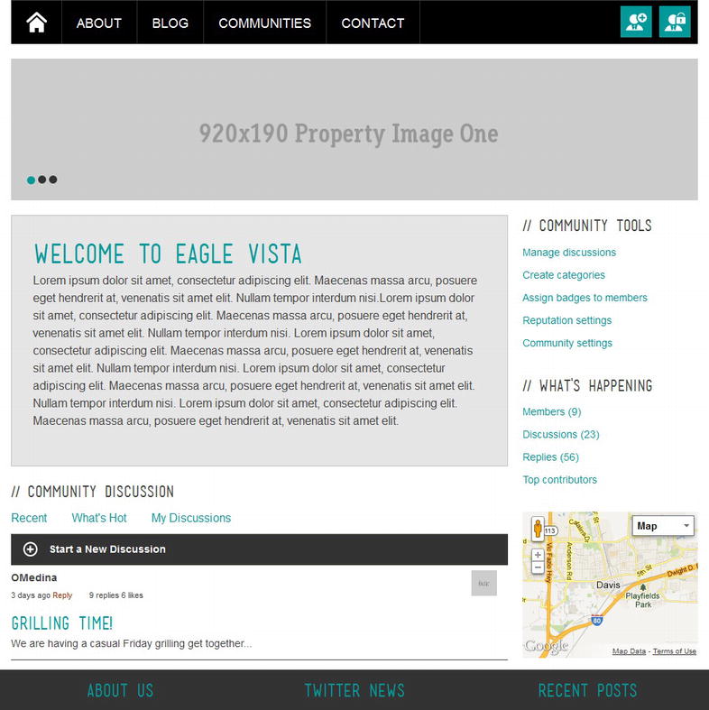
Figure 7-18. Sample property page layout without full header and footer
In Listing 7-3 we can see the HTML required for just the page layout portion of Figure 7-18.
Listing 7-3. HTML Mockup, General Property Page (Some HTML Has Been Removed for Brevity)
<!--Page content-->
<!-- SLIDER -->
<div class = "slider-wrapper theme-nivo-specter theme-default slider-community">
   <div class = "ribbon" > </div>
   <div id = "slider-property" class = "nivoSlider">
      <img src=http://placehold.it/920x190&text = 920x190 + Property + Image + One
        alt = "" />
      <!--more images - removed for brevity-->
   </div>
</div>
<!-- ENDS SLIDER -->

<div id = "posts-list" class = "community-listing cf">
   <!--community listing-->
   <div class = "page-content cf">
      <article>
         <!-- property content -->
         <h2 > Welcome to Eagle Vista</h2>
         <p > Lorem ipsum dolor sit amet, consectetur adipiscing elit...</p>
         <!-- end property content -->
      </article>
   </div>
   <!-- end community list -->

   <div id = "comments-wrap">
      <h4 class = "heading" > Community Discussion</h4>

      <ul class = "comments-links-horizontal">
         <li > <a href = "#" > Recent</a > </li>
         <li > <a href = "#" > What's Hot</a > </li>
         <li > <a href = "#" > My Discussions</a > </li>
      </ul>

      <div class = "toggle-trigger" > <i class = "simple" > </i>
          Start a New Discussion
      </div>
      <div class = "toggle-container form">
         <!--new discussion form - removed for brevity-->
      </div>

      <ol class = "commentlist">
         <li class = "comment even thread-even depth-1" id = "li-comment-1">
            <div id = "comment-1" class = "comment-body cf">
               <img alt = '' src = 'http://placehold.it/560x300&text=Avatar'
                  class = 'avatar avatar-35 photo' />
               <div class = "comment-author vcard" > OMedina</div>
               <div class = "comment-meta commentmetadata">
                  <span class = "comment-date" > 3 days ago  </span>
                  <span class = "comment-reply-link-wrap">
                     <a class = 'comment-reply-link' href = '#' > Reply</a>
                  </span>
                  <span class = "comment-replies" > 9 replies</span>
                  <span class = "comment-likes" > 6 likes  </span>
               </div>
               <div class = "comment-inner">
                  <h4 > <a href = "#" > Grilling Time!</a > </h4>
                  <p > We are having a casual Friday grilling get together...</p>
               </div>
            </div>
         </li>
         <!--Additional comments - removed for brevity -->
      </ol>
   </div>
</div>
<!--end post listing-->

<!-- sidebar -->
<aside id = "sidebar" class = "community-listing">
   <ul>
      <li class = "block">
         <h4 class = "heading" > Community Tools</h4>
         <ul>
            <li class = "page-item" > <a href = "#" > Manage discussions</a > </li>
            <!--additional tools-->
         </ul>
      </li>
      <li class = "block">
         <h4 class = "heading" > What's Happening</h4>
         <ul>
            <li class = "cat-item" > <a href = "#" title = "title">
               Members < span class = "post-counter" > (9)</span > </a>
            </li>
            <!--additional links - removed for brevity -->
         </ul>
      </li>
      <li class = "block">
         <div id = "map_canvas" > </div>
         <!-- GOOGLE MAPS Script - removed for brevity-->
      </li>
   </ul>
</aside>
<!-- ENDS sidebar -->
<!--end page content-->
Creating a New Page Layout in Design Manager
HTML mockup pages cannot be converted directly to page layouts as we did with master pages because a page layout only contains content, markup, and other HTML for content placeholders in the master page. We saw this same structure in page layouts not managed by Design Manager in the earlier section, “Custom Page Layouts Without Design Manager.” In Design Manager, we manage an HTML-only file associated with the HTML Page Layout content type. This HTML file is in turn associated with the actual .aspx page layout that we do not manage, nor can we edit.
Note We only manage the HTML page layout; we do not, nor should not, manage or edit the associated .aspx page layout ourselves.
The HTML page layout that we manage is built from a master page we select when we create the HTML page layout. This allows the HTML page layout to contain all of the HTML necessary to manage the layout using any HTML editor such as Dreamweaver, at the same time having additional code necessary to allow Design Manager to know how to create the associated .aspx page layout. Because SharePoint would have difficulty knowing where the content within an HTML mockup resides, we cannot convert an HTML mockup in Design Manager. We must create a new page layout and then add our content and layout to this new page layout to meet our needs. Once we create an HTML page layout, we can create a copy of just this HTML page layout and Design Manager will automatically associate it with its own .aspx page layout.
To create a new page layout using Design Manage, follow these steps:
- Open Design Manager in a browser. In the left menu in Design Manager click Edit Page Layouts.
- On the Edit Page Layouts page, click Create a page layout found in the middle of page.
- A Create a Page Layout dialog box opens. You need to provide a name, the master page on which this page layout should be based, and finally the content type this page layout should use. For our example, we use the following settings.
- a. Name: Community Property.
- b. Master Page: spectergroup/spectergroup (notice how Design Manager includes the folder that Master Page is found in as well).
- c. Content Type: Property Page (Your page layouts may be associated with whichever content type you require, assuming that the content type is based on the Page content type, or based on another content type that has the Page content type in its lineage.)
- Click OK to create the new page layout.
Once the page layout has been created you should see a page similar to Figure 7-19. The page layout was added to your Master Page Gallery so you can use your web editor (SharePoint Designer, Dreamweaver, etc.) to access the .html file.
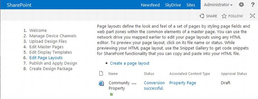
Figure 7-19. A new page layout in Design Manager
SharePoint will automatically set the file name of your new page layout to be the same as the name you provided when creating the page layout. Spaces will be replaced with the underscore (_) character. For our example, SharePoint creates a page layout with a file name of Community_Property.html.
In the next few subsections we review how to move the page layout to our branding folder as well as how to modify the page layout and use page layout snippets.
Moving a Page Layout to Another Location in Design Manager
As we just noticed when creating a page layout in Design Manager, the page layout was added to the root of the Master Page Gallery. Often you will want to move your page layouts to a specific branding directory, in our demo the spectergroup subfolder in the Master Page Gallery. Moving a page layout is not difficult, but there is a correct way to do it.
- The key to moving a page layout in Design Manager is to note that you only need to move the .html file; Design Manager will handle the .aspx file for you. Open the Master Page Gallery in SharePoint Designer, or even quicker, map your Master Page Gallery as a drive in Windows Explorer.
- Find the page layout you wish to move, in our case Community-Property.html, cut (Ctrl-c) the file, and move it to your clipboard. Notice how the space in our page layout title Community Property was replaced with a hyphen for our page layout file name.
- Navigate to the subdirectory to which you wish to move the page layout, in our example, spectergroup, and paste (Ctrl-v) the Community-Property.html file.
- After the transfer has been completed, refresh the folder and you will see that not only did your .html file get transferred, but the .aspx file was moved as well.
Just to be clear, we only need to move the .html page layout and not the .aspx file. Design Manager handles the .aspx file for us. Once we move the .html page layout, Design Manager automatically removes the original .aspx file and creates a new .aspx for us in our subdirectory.
Customizing a Page Layout
Now that we have our blank page layout in the correct folder, it is time to customize it. Let’s start by reviewing the page layout created for us by Design Manager. Open the Master Page Gallery in your web editor or Windows Explorer. We want to open the .html file we just created. In our case we need to drill down to the spectergroup folder and open the Community_Property.html page layout. Have we said this enough? Do not touch the .aspx file.
Look at the HTML code of the page layout, and you will see much of the HTML from the master page. Beware that just because this looks like a fully valid HTML file, it is not. Just like with standard .aspx page layouts, in HTML page layouts, you can only edit content within content placeholders. Content placeholders are easy to find.
Start by reviewing the < head > section. Right away you will notice comment tags that start with < !--MS:<asp:ContentPlaceHolder... > similar to the one shown in Listing 7-4.
Listing 7-4. Sample ContentPlacerHolder Comment Code in HTML Page Layout Managed by Design Manager
<!--MS:<asp:ContentPlaceHolder id = "PlaceHolderPageTitle" runat = "server" > -->
   <!--MS:<SharePoint:ProjectProperty Property = "Title" runat = "server" > -->
   <!--ME:</SharePoint:ProjectProperty > -->
   <!--CS: Start Page Field: Title Snippet-->
   <!--SPM:<%@Register Tagprefix = "PageFieldFieldValue"
         Namespace = "Microsoft.SharePoint.WebControls"
         Assembly = "Microsoft.SharePoint, Version = 15.0.0.0, Culture = neutral,
         PublicKeyToken = 71e9bce111e9429c"% > -->
      <!--MS:<PageFieldFieldValue:FieldValue
            FieldName = "fa564e0f-0c70-4ab9-b863-0177e6ddd247" runat = "server" > -->
      <!--ME:</PageFieldFieldValue:FieldValue > -->
   <!--CE: End Page Field: Title Snippet-->
<!--ME:</asp:ContentPlaceHolder > -->
Important When editing an HTML page layout, you can only change content found within the tags:
<!--MS:<asp:ContentPlaceHolder id = "PlaceHolderID" runat = "server" > -->
<!--ME:</asp:ContentPlaceHolder > -->
Do not edit or modify any HTML or code outside of a ContentPlaceHolder block as it will be ignored.
Page layouts will contain many ContentPlaceHolder tags that correspond to the content placeholders found in the Master Page. In fact if there is a content placeholder in the master page that was not included automatically when the page layout was created, you can add the following block to your page layout; just replace "PlaceHolderID" with the actual “ID” from the master page for the correct ContentPlaceHolder you wish to add:
<!--MS:<asp:ContentPlaceHolder id = "PlaceHolderID" runat = "server" > -->
<!--ME:</asp:ContentPlaceHolder > -->
Let’s look at how Design Manager processes the code block in Listing 7-4 in the page layout’s .aspx file. Open the corresponding .aspx file, in our example Community_Property.aspx, in your editor. It is fine to open an .html page layout’s corresponding .aspx file, we will just not edit the .aspx file. Look for the ID PlaceHolderPageTitle. You will find this ID is now in an <asp:Content> tag as shown in Listing 7-5.
Listing 7-5. Content Block, PlaceHolderPageTitle Found in .aspx Page Layout
<asp:Content runat = "server" ContentPlaceHolderID = "PlaceHolderPageTitle">
   <SharePoint:ProjectProperty Property = "Title"
         runat = "server">
   </SharePoint:ProjectProperty>
   <PageFieldFieldValue:FieldValue
         FieldName = "fa564e0f-0c70-4ab9-b863-0177e6ddd247"
         runat = "server">
   </PageFieldFieldValue:FieldValue>
</asp:Content>
If you worked with page layouts in SharePoint 2010 this will look very familiar to you. Design Manager took the tag
<!--MS:<asp:ContentPlaceHolder id = "PlaceHolderPageTitle" runat = "server" > -->
and converted this to the correct ASP.NET markup:
<asp:Content runat = "server" ContentPlaceHolderID = "PlaceHolderPageTitle" > .
Design Manager then took the Markup Start (MS) tags and created their corresponding ASP.NET markup, in our case the Sharepoint:ProjectProperty and PageFieldFieldValue:FindValue tags.
You should notice one other interesting comment tag in Listing 7-4, <!--SPM: (SharePoint Markup). This tag allows us to register assemblies, such as SharePoint assemblies or even our own custom assemblies, that our markup requires. In the preceding example, we are registering the namespace Microsoft.SharePoint.WebControls found in Microsoft.SharePoint assembly because we want to use the FieldValue control. To access controls found within a namespace, a tag prefix must be provided. In this example a tax prefix of PageFieldFieldValue was provided. This means we can now use the FieldValue control with the tag < PageFieldFieldValue:FieldValue />.
The < !--SPM: comment allows us to register different namespaces and tag prefixes throughout our page layout. In fact it is a best practice to always register all tag prefixes needed within a given content placeholder. Design Manager will handle any case in which you register the same tag prefix in the same namespace in one page layout for you.
Further down our example HTML page layout you will find the < body > tag. Here exist a few more < !--MS:<asp:ContentPlaceHolder > -- > comment tags. In our example we see the code shown in Listing 7-6.
Listing 7-6. Body Tag in HTML Page Layout (Certain Tags Have Had Some Properties Removed for Brevity)
<body>
    <!--MS:<asp:ContentPlaceHolder ID = "PlaceHolderTopNavBar" runat = "server" > -->
        <!--MS:<SharePoint:AspMenu ID = "TopNavigationMenu" runat = "server" > -->
            <!--PS: Start of READ-ONLY PREVIEW (do not modify)-->
            <!--PE: End of READ-ONLY PREVIEW-->
        <!--ME:</SharePoint:AspMenu > -->
    <!--ME:</asp:ContentPlaceHolder > -->
    <!--MS:<asp:ContentPlaceHolder ID = "PlaceHolderPageTitleInTitleArea"
       runat = "server" > -->
        <!--CS: Start Page Field: Title Snippet-->
        <!--SPM:<%@Register Tagprefix = "PageFieldFieldValue"% > -->
        <!--MS:<PageFieldFieldValue:FieldValue
            FieldName = "fa564e0f-0c70-4ab9-b863-0177e6ddd247" runat = "server" > -->
        <!--ME:</PageFieldFieldValue:FieldValue > -->
        <!--CE: End Page Field: Title Snippet-->
    <!--ME:</asp:ContentPlaceHolder > -->
    <!--MS:<asp:ContentPlaceHolder ID = "PlaceHolderMain" runat = "server" > -->
        <div>
            <!--CS: Start Page Field: Title Snippet-->
            <!--SPM:<%@Register Tagprefix = "PageFieldTextField"% > -->
            <!--SPM:<%@Register Tagprefix = "Publishing" % > -->
            <!--MS:<Publishing:EditModePanel runat = "server"
                CssClass = "edit-mode-panel" > -->
                <!--MS:<PageFieldTextField:TextField
                    FieldName = "fa564e0f-0c70-4ab9-b863-0177e6ddd247"
                    runat = "server" > -->
                <!--ME:</PageFieldTextField:TextField > -->
            <!--ME:</Publishing:EditModePanel > -->
            <!--CE: End Page Field: Title Snippet-->
        </div>
    <!--ME:</asp:ContentPlaceHolder > -->
</body>
Note If you select an OOTB content type when creating an HTML page layout, the PlaceHolderMain ContentPlaceHolder will contain snippets to some content type columns. These snippet blocks are not included when creating a HTML page layout associated with a custom content type but can be quickly added with snippets. Learn more about snippets later in this chapter in the section “Page Layout Snippets.”
By now the HTML in Listing 7-6 should look familiar. There are three ContentPlaceHolder blocks within the <body> tag, the first two replacing our top navigation bar, PlaceHolderTopNavBar, and the second replacing the Title in the header, PlaceHolderPageTitleInTitleArea. These two might be of interest to us, but if you look in our HTML master page this page layout uses, you will find that these content placeholders are not referenced. That is strange, isn’t it?
If you open the associated .master file for our master page, though, you will find these two content placeholders at the bottom of the .master file, but with their visibility property set to false, thus hiding the content placeholder. If you worked with master pages in SharePoint 2010, you might remember that you can never remove a content placeholder from a master page just because you are not going to use it. Rather you had to hide it somehow because the content placeholder may still be referenced and is thus needed. Design Manager handles content placeholders we do not intend to use so we do not have to concern ourselves with unused content placeholders with Design Manager. Another plus!
Because we are not using PlaceHolderTopNavBar and PlaceHolderPageTitleInTitleArea, we can remove them from our <body> section. We now need to add our actual layout to the final Content Placeholder, PlaceHolderMain. If we review the PlaceHolderMain ContentPlaceHolder, we will see there is already a snippet, or snippets, provided. In Listing 7-6 a snippet is included to display the page title. We are going to replace this for now with the content layout from our mockup HTML provided in Listing 7-3. When this is complete, the <body> section will look similar to Listing 7-7. If everything goes correctly, this HTML page layout should look the same as Figure 7-18 when viewed in Design Manager’s Page Layout Preview. Refer to Figure 7-20 for the beginning of such a view.
Listing 7-7. New Body Section (Many Tags Have Had Properties Temoved for Brevity)
<body>
    <!--MS:<asp:ContentPlaceHolder ID = "PlaceHolderMain" runat = "server" > -->
        <!--Page content-->
        <!-- SLIDER -->
        ...
        <!-- ENDS SLIDER -->

        <div id = "posts-list" class = "community-listing cf">
            <!--community listing-->
            ...
            <!-- end community list -->

            <div id = "comments-wrap">
            ...
            </div>
        </div>
        <!--end post listing-->

        <!-- sidebar -->
        <aside id = "sidebar" class = "community-listing">
        ...
        </aside>
        <!-- ENDS sidebar -->
        <!--end page content-->
    <!--ME:</asp:ContentPlaceHolder > -->
</body>
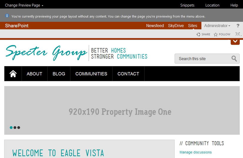
Figure 7-20. Community property page layout with static page content, viewed in Design Manager's Page Layout Preview
A few notes are in order. First, we did remove the Title snippet. We cover snippets in the next section. The content placeholder now has only static content; there is no way to use this page layout for a content page and have that content page have its own content. This, too, will be solved with page layout snippets. Third, you do not need to copy and paste HTML from a mockup HTML file. You could skip the prototype stage and create your page layout directly in the HTML page layout file. Finally later in this chapter we show how to copy an HTML page layout to speed up the process of creating a new page layout in the section, “Copying an HTML Page Layout From an Existing Page Layout.”
HTML Page Layout Errors and Warnings
Just as we saw when converting an HTML mockup to an HTML master page in Chapter 4, our HTML page layouts can also contain errors that SharePoint will reject. SharePoint will throw errors and warnings on the Edit Page Layouts page in Design Manager. Detailed error messages are available on a Page Layout Preview page. See Figure 7-21 for a common page layout error.
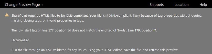
Figure 7-21. Sample HTML Page Layout Preview Error Message
More often than not, the errors will be caused by XML compliancy issues just as we saw with HTML master pages. We find and fix these errors in a similar manner. The key to solving any page layout error is to read the error message thoroughly.
SharePoint is not well known for detailed error messages, but with SharePoint 2013 messages have improved. In Figure 7-21, we see an error about XML compliancy, but what is of more interest is the line numbers given, 177 and 179. That is where to start your investigation. The position might not be too helpful, but the line number is likely close. Remember that in XML, all tags must close either by self-closing (i.e., <link />) or with a close tag (i.e., <div > </div>).
For more information on fixing common errors and warnings, refer to Chapter 4.
Publishing an HTML Page Layout
Before an HTML page layout can be used by a content page, a major version of the HTML page layout must be checked in and published. This can be accomplished in a similar manner as for page layouts not managed by Design Manager. The Design Manager can also be used to publish a page layout.
To check in and publish a major version of a HTML page layout, follow these steps.
- Open Design Manager in a browser and click Edit Page Layouts in the left menu.
- On the Edit Page Layouts page, next to the page layout you wish to publish, you will see an ellipsis (. . .). This symbol is used by SharePoint 2013 to reference a menu for a particular item. Click . . . next to the page layout you wish to publish and a page layout property dialog box opens. In this dialog box, click . . . found in the lower left.
- In the drop-down that appears, click Publish a Major Version to publish this page layout, thus making it available for content pages.
Note If you customize a page layout after it has been published, you must publish a major version again before all users will see your modifications.
Page Layout Snippets
Page layout snippets provide access to SharePoint and .NET controls in HTML page layouts. These snippets are exactly like the HTML master page snippets covered in Chapter 4, and in fact we have already seen page layout snippets in the previous section.
We continue our example by expanding on the HTML page layout code block we created in Listing 7-7. We can use snippets to allow our content pages that use our page layout to have dynamic content.
First we review the different snippets available to us and then we create a few snippets and add them to our page layout.
Available Page Layout Snippet Overview
We need to load the Snippet Manager for the page layout we wish to update.
- Open Design Manager in a browser and in the left menu click Edit Page Layouts.
- On the Edit Page Layouts page, click Conversion Successful next to the page layout you wish to update. If you don’t see Conversion Successful, refer to the earlier section, “HTML Page Layout Errors and Warnings.”
- The Preview Page Layout will load, providing a preview of the page layout. In the Preview ribbon, shown in Figure 7-22, click Snippets, which will load the Snippet Gallery in a new tab.
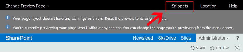
Figure 7-22. Page Layout Preview Page, Snippet Gallery location
The Snippet Gallery provides us access to a very large set of snippets that we can heavily customize, copy, and paste into our HTML page layout. The snippets are broken into four main sections: Page Fields, Containers, Web Parts, and Custom ASP.NET Markup, as shown in Figure 7-23.
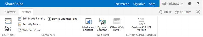
Figure 7-23. Snippet Gallery snippet categories
Note Once you customize a snippet’s attributes, be sure to click Update at the bottom of the customization page before copying the HTML snippet code to the clipboard.
Page Fields
The Page Fields section contains one snippet type, that being page fields. Page fields provide us access to all fields within the content type and its lineage that this page layout is associated with. The list of page fields will change depending on which content type a page layout is associated with. Clicking on the Page Fields icon causes a list of fields to appear. You may select a particular field you wish to make available on a page layout. Once you load a page field, there are quite a few attributes you can customize in the Behavior and Misc menus found to the right. Refer to Figure 7-24 for a list of page fields for the Article Page content type along with the page field properties.
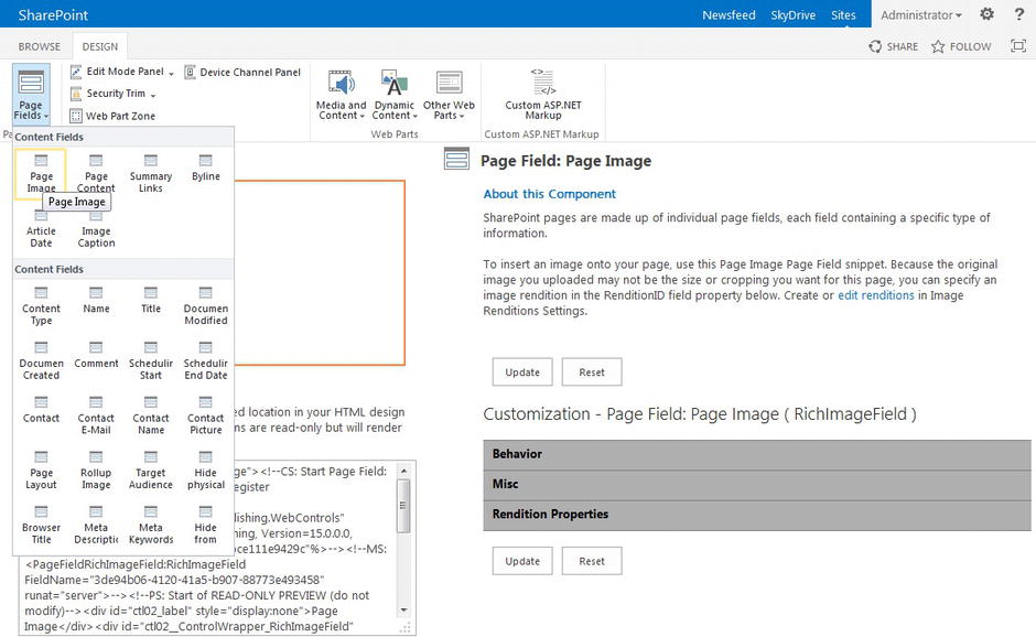
Figure 7-24. Snippet Manager: List of page fields for Article Page content type
Containers
You will find four snippet types within the Containers section, these being snippets that are designed as containers that might hold other snippets, web parts, content, markup, and so on. Therefore once you add one of these container snippets to your page layout, you can further customize them by adding additional markup and other snippets, within its code block.
- Edit Mode Panel: The Edit Mode Panel provides the ability to control if a particular block of code will be displayed only in edit mode, or in display (regular) mode. This is often used to allow access to edit metadata such as the page title, meta description, keywords, and other such page fields that would not be displayed on the content page, but should be editable without having to load the content page’s properties.
- Security Trim: The Security Trim container allows us to control if a particular block of code will be displayed based on the permission level of the current user. We can create blocks that will show or hide a block of code to all users, only anonymous users, or only authenticated users. Once we select the Authentication Restriction, we can then provide a further level of permission requirements based on whether a particular user has permissions to perform a specific action. This is another powerful container if we want to provide additional information or controls for, say, authors only.
- Web Part Zone: This is self-explanatory. The Web Part Zone snippet allows us to create a web part zone for our page layout that authors can use to add web parts as needed via the browser, unique to each content page.
- Device Channel Panel: Device channels are new to SharePoint 2013 and allow us to create a particular channel that is associated with a device, say an iPad, Surface tablet, Windows Phone, and so on. Device channel panels allow us to create a particular panel in a page layout that can be associated with a particular device channel. The content, HTML code and snippets added to a particular device channel panel would only be displayed for that device channel.
Note To learn more about device channels and device channel panels please refer to http://sprwd.com/yysdg3 or Chapter 5.
Web Parts
The Web Parts container provides us access to many web parts available in SharePoint. Each web part snippet can be heavily customized as with other snippets.
- Media and Content: Web parts that provide quick access to media such as the Image Viewer Web Part and content such as the ever popular and seemingly boundless Content Editor Web Part.
- Dynamic Content: Web parts that provide access to dynamic content based on your SharePoint site’s existing content or structure. Examples include the Content Query Web Part we used in previous versions of SharePoint as well as the new, extremely powerful Content Search Web Part. We review the Content Search Web Part in more detail in Chapter 9 in conjunction with search-driven content.
- Other Web Parts: A very long set of other common Web Parts that we might need, including the HTML Form Web Part, Social Collaboration Web Parts, and additional Search Web Parts.
Custom ASP.NET Markup
The final section of snippets, the Custom ASP.NET Markup section, provides access to one snippet. The Custom ASP.NET Markup provides us the ability to have the Snippet Manager convert any ASP.NET markup we might have and need in our page layout in a snippet-friendly format. This could be very useful if you are moving over ASP.NET markup from your existing SharePoint 2010 page layouts. Although you could create the proper snippet code yourself using the <!--MS--> comment code, the Custom ASP.NET Markup generator will make this process much easier and take care of the details for you. This tool is the final catch-all that will allow us to create a snippet based on existing ASP.NET markup or from a custom Web Part.
Customizing a Page Layout with Snippets
Now that we have seen all of the available snippets available for page layouts, we look at how we select a particular snippet, customize its properties, and finally add a snippet to a page layout. For this demonstration we take the page layout we created in Listing 7-7 and replace the static content with the proper snippets.
In each section, we review which snippet we choose, the page layout HTML code block it replaces, as well as any attributes we customized. At the end we look at the final page layout <body> tag.
Editing Title and Meta Description
We would like to edit the page title and meta description inline, but this should only be visible while in edit mode. We therefore generate an Edit Mode Panel and then add two page fields. The snippets are found in the Snippet ribbon (see Figure 7-24). Also note that we are looking to create the same controls we described previously in “Custom Page Layouts Without Design Manager,” just using Design Manager’s snippet syntax.
- We need to add an Edit Mode Panel snippet. This snippet will eventually contain our page field snippets. In the ribbon’s Containers section, click the down arrow next to Edit Mode Panel. In the drop-down list, select Show only in Edit Mode to generate an Edit Mode Panel that will only display while in edit mode.
- For page fields, look in the Page Fields section and click the Page Fields icon. This will cause a drop-down to appear (see Figure 7-24). Under Content Fields, select Title. Once you generate this snippet and copy the HTML snippet to your HTML page layout, return to the Content Fields section and create a Meta Description Page Field snippet as well.
Note When you create page field snippets, SharePoint will link to your page field by its Content Type ID, such as fa564e0f-0c70-4ab9-b863-0177e6ddd247 for Title. You can replace this ID with the text-based FieldName. You can also remove duplicate < !--SPM: tags if they register the same namespaces.
Refer to Listing 7-8 to see how the page field snippets we generated earlier can be included within a Edit Mode Panel snippet.
Listing 7-8. Snippet Code for Page Title and Meta Description in Edit Mode Panel
<!--SPM:<%@Register Tagprefix = "Publishing"
      Namespace = "Microsoft.SharePoint.Publishing.WebControls"
      Assembly = "Microsoft.SharePoint.Publishing, Version = 15.0.0.0,
      Culture = neutral, PublicKeyToken = 71e9bce111e9429c"% > -->
<!--MS:<Publishing:EditModePanel runat = "server" CssClass = "edit-mode-panel" > -->
    <!--SPM:<%@Register Tagprefix = "PageFieldTextField"
          Namespace = "Microsoft.SharePoint.WebControls"
          Assembly = "Microsoft.SharePoint, Version = 15.0.0.0, Culture = neutral,
          PublicKeyToken = 71e9bce111e9429c"% > -->
    <!--MS:<PageFieldTextField:TextField FieldName = "Title" runat = "server" > -->
    <!--ME:</PageFieldTextField:TextField > -->

    <!--MS:<PageFieldTextField:TextField FieldName = "SeoMetaDescription"
          runat = "server" > -->
    <!--ME:</PageFieldTextField:TextField > -->
<!--ME:</Publishing:EditModePanel > -->
Rotating Images
There are quite a few methods we could utilize to display a jQuery-based rotating banner in a page layout. The SharePoint 2013 way would be to use the Content Search Web Part and a custom list to store rotating images. We could create a custom list based on a custom content type to store images. A Content Search Web Part could then be generated to query a filtered list of images and using display templates we could have SharePoint format the proper JavaScript and jQuery code necessary for the rotating banner to work. We review this type of process in Chapter 9 on search-driven content.
For now, we generate and include a simple Web Part Zone that an author could use to add a Content Editor Web Part, a Content Search Web Part, and so on, to provide the actual rotating banner in a content page.
In the Snippet ribbon, within the Containers section, click Web Part Zone, and keep the default properties. Listing 7-9 shows the snippet for a general Web Part Zone.
Listing 7-9. Snippet Code for Web Part Zone
<!--SPM:<%@Register Tagprefix = "WebPartPages"
      Namespace = "Microsoft.SharePoint.WebPartPages"
      Assembly = "Microsoft.SharePoint, Version = 15.0.0.0, Culture = neutral,
      PublicKeyToken = 71e9bce111e9429c"% > -->
<!--MS:<WebPartPages:WebPartZone runat = "server" AllowPersonalization = "false"
      ID = "x5bb499f3b1df4f469fd12354190fd2a1" FrameType = "TitleBarOnly"
      Orientation = "Vertical" > -->
    <!--MS:<ZoneTemplate > -- > <!--ME:</ZoneTemplate > -->
<!--ME:</WebPartPages:WebPartZone > -->
Editing and Displaying Field Columns
To display a content type column in both edit and display modes, we can use the same Page Fields snippet we saw before. Note that based on the column type, Design Manager might render a slightly different snippet for us. Let’s look at the Page Content column and add that to our page layout.
In the Snippet ribbon, in the Page Fields group, click the Page Fields icon. Under Content Fields, select Page Content. Keep the default properties for the snippet. In Listing 7-10 we can see the snippet code generated for our Page Content field.
Listing 7-10. Snippet Code for Page Field With a RichHTMLField Control
<!--SPM:<%@Register Tagprefix = "PageFieldRichHtmlField"
       Namespace = "Microsoft.SharePoint.Publishing.WebControls"
       Assembly = "Microsoft.SharePoint.Publishing, Version = 15.0.0.0,
       Culture = neutral, PublicKeyToken = 71e9bce111e9429c"% > -->
<!--MS:<PageFieldRichHtmlField:RichHtmlField
      FieldName = "PublishingPageContent" runat = "server" > -->
<!--ME:</PageFieldRichHtmlField:RichHtmlField > -->
Notice how although we used the same Page Field snippet for the Title and Page Content column, Design Manager knew to create the correct control for the Page Content field. The proper control for the Title field is a TextField control, whereas for the Page Content field, we must use the RichHtmlField control. Design Manager is able to use the field’s content type to generate the correct control.
Sample Page Layout With Snippets
The remaining snippets in our sample page layout are a combination of what we have seen along with Content Search Web Parts for the discussion and What’s Happening, which we discuss in greater detail in Chapter 9. A Summary Links Web Part or the Summary Links column could be used for Community Tools. Review Listing 7-11 for a complete overview of the sample page layout; for readability, we refer to previous listings so as not to repeat ourselves. We have also removed some additional properties of the snippets, so be sure to re-create your own snippets from the Snippet Manager.
Listing 7-11. Final Page Layout Body Tag With Some Tag Properties Removed for Brevity
<body>
   <!--MS:<asp:ContentPlaceHolder ID = "PlaceHolderMain" runat = "server" > -->
   <!--Page content-->
   <!--Listing 7.8 goes here-->

   <!-- SLIDER -->
   <!--Listing 7.9 goes here-->
   <!-- ENDS SLIDER -->

   <div id = "posts-list" class = "community-listing cf">
      <!--community listing-->
      <div class = "page-content cf">
         <article>
            <!-- property content -->
            <!--Listing 7.10 goes here-->
            <!-- end property content -->
         </article>
      </div>
      <!-- end community list -->

      <div id = "comments-wrap">
         <h4 class = "heading" > Community Discussion</h4>

         <ul class = "comments-links-horizontal">
            <li > <a href = "#" > Recent</a > </li>
            ...
         </ul>

         <div class = "toggle-trigger" > <i class = "simple" > </i > Start a New
            Discussion</div>
         <div class = "toggle-container form">
            <!-- CSOM or Form Web Part snippet-->
         </div>

         <!--NOTE: Content Search Snippet coding shorted for brevity-->
         <!--CS: Start Content Search Snippet-->
         <!--SPM:<%@Register Tagprefix = "spsswc"
            Namespace = "Microsoft.Office.Server.Search.WebControls"% > -->
         <!--SPM:<%@Register Tagprefix = "a2e"
            Namespace = "Microsoft.Office.Server.Search.WebControls"% > -->
         <!--MS:<spsswc:ContentBySearchWebPart runat = "server" ... > -->
         <!--ME:</spsswc:ContentBySearchWebPart > -->
         <!--CE: End Content Search Snippet-->
      </div>
   </div>
   <!--end post listing-->

   <!-- sidebar -->
   <aside id = "sidebar" class = "community-listing">
      <ul>
         <li class = "block">
          <h4 class = "heading" > Community Tools</h4>

          <!--NOTE: Summary Links Snippet coding shorted for brevity-->
          <!--CS: Start Page Field: Summary Links Snippet-->
          <!--SPM:<%@Register
                Tagprefix = "PageFieldSummaryLinkFieldControl"% > -->
          <!--MS:<PageFieldSummaryLinkFieldControl:SummaryLinkFieldControl
                FieldName = "SummaryLinks" > -->
          <!--ME:</PageFieldSummaryLinkFieldControl:SummaryLinkFieldControl > -->
          <!--CE: End Page Field: Summary Links Snippet-->

         </li>
         <li class = "block">
            <h4 class = "heading" > What's Happening</h4>

            <!--Use Content Search Web Part and Display Templates-->
            <!--NOTE: Content Search Snippet coding shorted for brevity-->
            <!--CS: Start Content Search Snippet-->
            <!--SPM:<%@Register Tagprefix = "spsswc"
                  Namespace = "Microsoft.Office.Server.Search.WebControls"% > -->
            <!--MS:<spsswc:ContentBySearchWebPart runat = "server"
                  AlwaysRenderOnServer = "False" ... > -->
            <!--ME:</spsswc:ContentBySearchWebPart > -->
            <!--CE: End Content Search Snippet-->

         </li>
      </ul>
   </aside>

   <!-- ENDS sidebar -->
   <!--end page content-->
   <!--ME:</asp:ContentPlaceHolder > -->
</body>
In Figure 7-25 we can see how a content page that utilizes this page layout would appear while in edit mode.
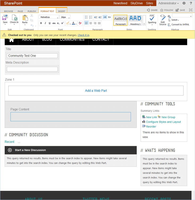
Figure 7-25. Page layout described in Listing 7-11, used by a content page in edit mode
HTML Page Layout Limitations and Considerations
There are a few known HTML page layout limitations that could preclude their extended use in certain branding deployments.
Inline Scripts and Styles
Inline scripts and inline styles within a ContentPlaceHolder block, such as in Listing 7-12, can cause results you might not expect.
Listing 7-12. Inline < script > and < style > Blocks in HTML Page Layout
<!--MS:<asp:ContentPlaceHolder ID = "PlaceHolderMain" runat = "server" > -->
   <style type = "text/css">
      #sideNavBox {
         display: none;
      }
   </style>
   <script>
      jQuery.ready(function($) {
         $('#sideNavBox').css('display','none'),
      });
   </script>
<!--ME:</asp:ContentPlaceHolder > -->
In Listing 7-13 we see how the <style> and <script> blocks from Listing 7-12 are parsed and interpreted by Design Manager when it generates the .aspx page layout.
Listing 7-13. Converted < script > and < style > Blocks in .aspx Page Layout
<asp:ContentPlaceHolder ID = "PlaceHolderMain" runat = "server">
   <style type = "text/css">
      //<![CDATA[
      #sideNavBox {
         display: none;
      }
      //]]>
   </style>
   <script>
      //<![CDATA[
      jQuery.ready(function($) {
         $('#sideNavBox').css('display','none'),
      });
      //]]>
   </script>
<!--ME:</asp:ContentPlaceHolder > -->
Unfortunately for us, what the //<![CDATA[ //]]> block does is turn the inline style as well as the JavaScript into comments in most browsers. This obviously won’t work if we want to include inline styles or scripts in HTML page layouts.
Fortunately we can use snippet markup to get around this limitation, as seen in Listing 7-14.
Listing 7-14. Inline < script > and < style > Blocks in HTML Page Layout Using SharePoint Markup
<!--MS:<asp:ContentPlaceHolder ID = "PlaceHolderMain" runat = "server" > -->
   <!--MS:<style type = "text/css" > -->
      #sideNavBox {
         display: none;
      }
   <!--ME:</style > -->
   <!--MS:<script > -->
      jQuery.ready(function($) {
         $('#sideNavBox').css('display','none'),
      });
   <!--ME:</script > -->
<!--ME:</asp:ContentPlaceHolder > -->
Disassociating an HTML Page Layout
We have seen that HTML page layouts are useful for managing our site page layouts. We have also seen that HTML page layouts have limitations. You might also find additional frustrations with your particular branding requirements around XML validation or long inline scripts or styles. You might decide to package your branding in your own custom feature instead of a design package. To make this deployment more direct you might want to include only the .aspx page layout in your feature. None of these concerns should mean that HTML page layouts should be ignored.
SharePoint allows us to disassociate an HTML page layout with its corresponding .aspx file. Once the HTML page layout is disassociated, we may edit the .aspx page layout directly. Disassociation also means that edits to the HTML page layout will not be realized by your sites. Be aware that any modifications you make to the .aspx file would be overwritten if you ever wish to reassociate the .html and .aspx files again.
To disassociate a HTML page layout follow these steps.
- Open the Master Page Gallery in a browser (Settings Site Settings Web Designer Galleries Master pages and page layouts).
- In the Master Page Gallery, find the HTML page layout file you wish to disassociate with the .aspx file. In our example, we drill down to the spectergroup subfolder and find the CommunityProperty.html file.
- Hover over the HTML page layout and click the down arrow to open the file’s menu.
- On the drop-down menu that appears, select Edit Properties to load the HTML page layout’s properties page.
- Scroll down near the bottom of the properties page and find the Associated File check box (see Figure 7-26). If you clear this check box and save the settings then your HTML page layout and its corresponding .aspx file are not long associated.
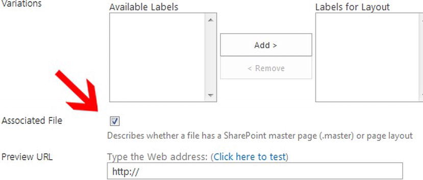
Figure 7-26. HTML page layout edit properties, Associated File property
You can now edit the .aspx page layout directly and any changes made to the .html HTML page layout will not be reflected by the .aspx page. As already mentioned, if you edit the HTML page layout’s properties again to reestablish the Associated File status, any changes you made to the .aspx page layout will be overwritten.
Even if you plan to not use HTML page layouts as your long-term method to manage page layouts, HTML page layouts might still be useful when converting your prototype to page layouts. HTML page layouts allow you to treat your page layout as a functioning web page instead of just content placeholders during development. Further, initially adding SharePoint and .NET controls with snippets is often easier then looking up a valid control elsewhere. Utilize Design Manager and HTML page layouts to get started and then disassociate a layout if you need more control.
Copying an HTML Page Layout From an Existing Page Layout
We previously stated that you cannot convert a mockup HTML file to an HTML page layout in Design Manager. Instead we showed how to create an HTML page layout, move it to a subfolder, and finally modify the HTML page layout in a web editor using snippets and custom code. Let’s say that you have a page layout already built in Design Manager but wish to create a similar new page layout. You can create a new page layout based on a copy of an existing page layout.
- Open the Master Page Gallery in SharePoint Designer or even in Windows Explorer using WebDAV.
- Find the HTML page layout you wish to copy. For our example we create a copy of CommunityProperty.html in the spectergroup subfolder.
- Copy the .html file (i.e., CommunityProperty.html) to the clipboard, then paste this back into the same folder. This will create a new file, CommunityProperty - Copy.html. Refresh the folder to see this new file.
Note As with moving HTML page layouts, we only want to select and copy the .html file; we let Design Manager handle the .aspx for us.
- Right-click the CommunityProperty - Copy.html file to rename it, say to CommunityPropertyRental.html. Notice that Design Manager will also rename the .aspx file for us as well.
- Return to Design Manager in a browser and navigate to the Edit Page Layouts page. You will see your new page layout listed. If you edit its properties you will see that it will have the same properties as the page you copied this from including its associated content type. You can now edit the new HTML page layout, just do not forget to publish a major version when you are done.
Making a Page Layout Responsive
In Chapter 5 we reviewed how to convert a standard site into a responsive site utilizing a framework, in our case the Twitter Bootstrap framework. As we saw in Chapter 5, a framework is not necessary in responsive design, but can definitely help the process of creating a responsive site by prebuilding a grid that provides responsive features.
Because the master page provides the basic responsive features of a general site, including the general wrapper, header, footer, and primary navigation, let us now consider what we need to do within a page layout to further the responsive aspects of a given content page.
A page layouts primary function is to replace the PlaceHolderMain ContentPlaceHolder snippet. The other content placeholders available within a page layout are important and may provide us ample opportunity to customize a particular page, but most content and layout will be placed in the PlaceHolderMain ContentPlaceHolder. There are two different methods of coding a master page to work with page layouts to allow it to be responsive; we can provide a wrapper container in the master page that itself has responsive styling, or we can force the page layouts to provide their own responsive nature.
We next consider an example. In the Bootstrap framework we provide a container div, and within this container we can have rows and within each row a mix of twelve columns. Bootstrap, as with most frameworks, provides this sort of row and column grid structure. Now let’s say that we only provide the container in the master page and we force the page layouts to provide the rows and the span columns. Not a problem; this should work just fine. As we have learned, the row-fluid within Listing 7-16 would get placed inside of the PlaceHolderMain seen in Listing 7-15.
Listing 7-15. HTML Master Page With Only a Container Around PlaceHolderMain
<div class = "container-fluid">
   <!--MS:<SharePoint:AjaxDelta ID = "DeltaPlaceHolderMain" IsMainContent = "true" runat = "server" > -->
      <!--MS:<asp:ContentPlaceHolder ID = "PlaceHolderMain" runat = "server" > -->
      <!--ME:</asp:ContentPlaceHolder > -->
   <!--ME:</SharePoint:AjaxDelta > -->
</div>
Listing 7-16. HTML Page Layout With Primary Row in PlaceHolderMain ContentPlaceHolder
<!--MS:<asp:ContentPlaceHolder ID = "PlaceHolderMain" runat = "server" > -->
   <div class = "row-fluid">
      <div class = "span3">
         <!--left column in page layout-->
      </div>
      <div class = "span9">
         <!--right column in page layout-->
      </div>
   </div>
<!--ME:</asp:ContentPlaceHolder > -->
The potential issue for this approach is twofold. First, OOTB page layouts might not work correctly within the framework because they will not have any framework-based rows and spans to provide for a responsive site. Second, non-page-layout-based pages such as any site settings or list pages will also not have responsive properties built in, again, directly within the framework. It is possible to provide additional CSS to account for these deficiencies, but it is not ideal.
Now, let us consider if we provide both the container, a primary row, and even initial spans within the master page itself and let page layouts provide subrows and subspans. This is an interesting approach that offers a new technique. Here any non-page-layout-based page will be forced to have all of its content bound within a responsive framework-based span, while page layouts could then have subrows and subspans to provide additional rows and columns.
In Listing 7-17 we have an HTML master page that provides a framework-based, responsive, full-width column. This one column contains the content placeholder, PlaceHolderMain. The partial HTML page layout provided in Listing 7-18 then provides a subrow and subcolumns that will replace the HTML master page’s PlaceHolderMain.
Listing 7-17. HTML Master Page With Only a Container Around PlaceHolderMain
<div class = "container-fluid">
   <div class = "row-fluid">
      <div class = "span12">
         <!--MS:<SharePoint:AjaxDelta ID = "DeltaPlaceHolderMain"
               IsMainContent = "true" runat = "server" > -->
            <!--MS:<asp:ContentPlaceHolder ID = "PlaceHolderMain"
               runat = "server" > -->
            <!--ME:</asp:ContentPlaceHolder > -->
         <!--ME:</SharePoint:AjaxDelta > -->
      </div>
   </div>
</div>
Listing 7-18. HTML Page Layout With Primary Row in PlaceHolderMain ContentPlaceHolder
<!--MS:<asp:ContentPlaceHolder ID = "PlaceHolderMain" runat = "server" > -->
   <!--some content, additional snippets, etc could replace this comment-->
   <div class = "row-fluid">
      <!--Then another row could be added to provide additional columns-->
      <div class = "span3">
         <!--left column in page layout-->
      </div>
      <div class = "span9">
         <!--right column in page layout-->
      </div>
   </div>
<!--ME:</asp:ContentPlaceHolder > -->
Why would we do this? An easy example is if site requirements included the need for left navigation based on SharePoint’s built in quick launch or vertical navigation that is included in the v4 master as well as SharePoint 2013 Seattle and Oslo master pages. If we wanted to build one master page for both our custom and default master pages, then we would need to include the left, vertical navigation bar for site setting and site pages, while building a mechanism for custom page layouts to hide the left navigation. This is what we see in OOTB page layouts such as Welcome page layouts that provide an inline style in an <asp:Content> tag to hide the left navigation bar while making the main content div full width.
In general there are a few key points to keep in mind while making the content areas in a page layout responsive. First, review Chapter 5. Adding a framework such as Bootstrap to an HTML mockup is basically the same with a master page as it is for a page layout. In particular you will separate the components of your page layout into your grid.
As an example we will take the HTML we added to our HTML page layout in Listing 7-2 and integrate Bootstrap’s rows and columns grid. Based on the HTML master page in Listing 7-14, the new HTML page layout is found in Listing 7-19.
Listing 7-19. PlaceHolderMain of About-pagelayout.aspx With Bootstrap
<!--MS:<asp:ContentPlaceHolder ID = "PlaceHolderMain" runat = "server" > -->
   <!-- page-content -->
   <div class = "row-fluid">
      <div class = "span12 page-content">
         <!--title and meta description in edit mode-->
         <!--Listing 7.8 goes here-->

         <!-- entry-content -->
         <div class = "row-fluid section noborder">
            <div class = "span12">

               <!--Main image, floating to the left-->
               <div class = "floatleft">
                 <!--SPM:<%@Register Tagprefix = "PageFieldRichImageField"
                       Namespace = "Microsoft.SharePoint.Publishing.WebControls"
                       Assembly = "Microsoft.SharePoint.Publishing,
                       Version = 15.0.0.0, Culture = neutral,
                       PublicKeyToken = 71e9bce111e9429c"% > -->
                 <!--MS:<PublishingWebControls:RichImageField
                       FieldName = "PublishingPageImage" runat = "server" > -->
                 <!--ME:</PublishingWebControls:RichImageField > -->
               </div>

               <!--Content from page layout Content Type Meta Data-->
               <!--SPM:<%@Register Tagprefix = "PageFieldRichHtmlField"
                     Namespace = "Microsoft.SharePoint.Publishing.WebControls"
                     Assembly = "Microsoft.SharePoint.Publishing, Version = 15.0.0.0,
                     Culture = neutral, PublicKeyToken = 71e9bce111e9429c"% > -->
               <PublishingWebControls:RichHtmlField
                     FieldName = "PublishingPageContent" runat = "server"/>

               <!-- 2 cols -->
               <div class = "row-fluid section noborder">
                  <div class = "span6">
                     <!--Web Part Zone with ID: LeftZone-->

                     <!--SPM:<%@Register Tagprefix = "WebPartPages"
                           Namespace = "Microsoft.SharePoint.WebPartPages"
                           Assembly = "Microsoft.SharePoint, Version = 15.0.0.0,
                           Culture = neutral, PublicKeyToken = 71e9bce111e9429c"% > -->
                     <!--MS:<WebPartPages:WebPartZone runat = "server"
                           AllowPersonalization = "false" ID = "LeftZone"
                           FrameType = "TitleBarOnly" Orientation = "Vertical" > -->
                        <!--MS:<ZoneTemplate > -- > <!--ME:</ZoneTemplate > -->
                     <!--ME:</WebPartPages:WebPartZone > -->
                  </div>
                  <div class = "span6">
                     <!--Web Part Zone with ID: RightZone-->

                     <!--SPM:<%@Register Tagprefix = "WebPartPages"
                           Namespace = "Microsoft.SharePoint.WebPartPages"
                           Assembly = "Microsoft.SharePoint, Version = 15.0.0.0,
                           Culture = neutral, PublicKeyToken = 71e9bce111e9429c"% > -->
                     <!--MS:<WebPartPages:WebPartZone runat = "server"
                           AllowPersonalization = "false" ID = "RightZone"
                           FrameType = "TitleBarOnly" Orientation = "Vertical" > -->
                        <!--MS:<ZoneTemplate > -- > <!--ME:</ZoneTemplate > -->
                     <!--ME:</WebPartPages:WebPartZone > -->
                  </div>
               </div>
               <!-- ENDS 2 cols -->
            </div > <!--end span12-->
         </div > <!--end sub row-->
      </div > <!-- ENDS page-content -->
   </div > <!-- ENDS fluid-row-->
<!--ME:</asp:ContentPlaceHolder > -->
When we compare Listing 7-2 with Listing 7-19, we replaced all SharePoint controls with snippets. We also added a primary row and within this row a primary column that is twelve columns wide. We had to move the Title to above the “section” because we wanted to create another row to hold just the float left image and the text to its right.
For our <!-- 2 cols --> we add a subrow split into two equal width columns, again totaling twelve columns wide. Leveraging the framework for our grid relieves us yet again of the nitty-gritty of the responsive nature our of site design.
Consider How a Page Layout Will Respond
Creating a simple page layout with responsive design properties in mind is fairly straightforward, as we just saw in Listing 7-19. The primary goal is to break up the content area of your prototype into rows and columns. More complex page layouts might require more considerations.
Flow of Content on the Page and in the HTML
The horizontal and vertical flow of content and content containers may differ between viewports. As an example, take the current navigation, often placed on the left side of a web site when seen on a standard desktop monitor. Now consider where you might want that left navigation to appear on a mobile device. If this left navigation is added to the first Bootstrap span within a row, then by default this navigation menu would appear above other content on a mobile device.
Because the left navigation might not be as important as the content on a mobile device, or imagine a left navigation with many menu items, we might want to have this left navigation move below the main content. With Bootstrap this is not easy OOTB because the framework does not provide us the toolset to move elements in this manner.
One option might be to leave the left navigation above the main content. Then using a media query, collapse the left navigation in a mobile view similar to what we saw in Chapter 6 with collapsing navigation. Another option might be to utilize a media query once again and take the left navigation out of the flow of content by setting the position of the left navigation to “absolute,” also providing positioning styles such as “bottom” and “left,” to move the navigation to the bottom of the content box.
The best option is to consider the flow of content during your wireframing, mockup, and prototyping stages so that when it is time to add your framework to your prototype, you have already made the difficult decisions.
Viewport Utilization
Ideally page layouts will utilize a particular viewport to its fullest. There are seemingly a countless number of viewport resolutions, from the smaller smart phones to very wide monitors with well over 2,000 pixels across. Designers should strive to utilize as much of the vertical viewport space as possible and attempt to limit the vertical scrolling. With page layouts that might have a large amount of content in any given content page, this might be difficult to achieve, but it should be your goal.
As prices for larger monitors continue to fall and older desktops are replaced, we can assume that a larger portion of our site visitors will have viewports in excess of 1,200 pixels across. Be sure to consider how your site will work and function with these larger viewports, as leaving large gutters of unused space to the left and right of your main content could be a waste. Further it might distract from the look of your site. In Figure 7-27, notice the extra wide white space on either side of the site content on a wide monitor. This extra space can be distracting but could also be used to pull more content above the fold.
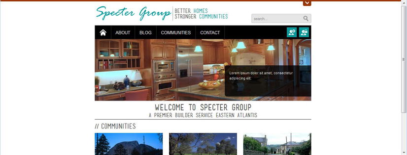
Figure 7-27. Sample site as viewed on a extra wide monitor
Note Need help knowing what resolutions to target? Besides searching your own web site logs, w3schools.com maintains a summary of their visitors’ resolutions over the years at http://sprwd.com/42kklqh. You might also want to try StatCounter.com, which maintains browser and resolution statistics compiled every month at http://sprwd.com/d2z6vcv.
Content Container Vertical Dimensions
Continuing the thread of using a viewport to its fullest, you might also want to consider the vertical utilization of your page layouts. As an example, consider a landing page page layout. Landing pages might often contain many blocks of teaser content that is not intended to tell the whole story. Rather, these tease blocks are intended to help site visitors find the content they are looking for.
On larger viewports these blocks of teaser content might take up one-third to one-half the vertical space of a page on a desktop monitor. On a smart phone, this could cause excessive vertical scrolling. If your design allows, you could add maximum heights to some content containers and hide the overflow using a media query targeted toward smaller resolution viewports.
In Listing 7-20 we see a specific row within a HTML page layout. This may go within the PlaceholderMain ContentPlaceHolder and there could be additional rows before and after.
Listing 7-20. HTML Page Layout Excerpt With Three Columns
<!--additional rows before this row-->
<!-- Row with three Bootstrap fluid columns -->
<div class = "row-fluid mobile-contain-height">
   <!--SPM:<%@Register Tagprefix = "WebPartPages"
         Namespace = "Microsoft.SharePoint.WebPartPages"
         Assembly = "Microsoft.SharePoint, Version = 15.0.0.0, Culture = neutral,
         PublicKeyToken = 71e9bce111e9429c"% > -->

   <div class = "span4">
      <!--Web Part Zone with ID: ColumnOne-->
      <!--MS:<WebPartPages:WebPartZone runat = "server"
            AllowPersonalization = "false" ID = " ColumnOne"
            FrameType = "TitleBarOnly" Orientation = "Vertical" > -->
         <!--MS:<ZoneTemplate > -- > <!--ME:</ZoneTemplate > -->
      <!--ME:</WebPartPages:WebPartZone > -->
   </div>
   <div class = "span4">
      <!--Web Part Zone with ID: ColumnTwo-->
      <!--MS:<WebPartPages:WebPartZone runat = "server"
            AllowPersonalization = "false" ID = " ColumnTwo "
            FrameType = "TitleBarOnly" Orientation = "Vertical" > -->
         <!--MS:<ZoneTemplate > -- > <!--ME:</ZoneTemplate > -->
      <!--ME:</WebPartPages:WebPartZone > -->
   </div>
   <div class = "span4">
      <!--Web Part Zone with ID: ColumnThree-->
      <!--MS:<WebPartPages:WebPartZone runat = "server"
            AllowPersonalization = "false" ID = " ColumnThree "
            FrameType = "TitleBarOnly" Orientation = "Vertical" > -->
         <!--MS:<ZoneTemplate > -- > <!--ME:</ZoneTemplate > -->
      <!--ME:</WebPartPages:WebPartZone > -->
   </div>
</div > <!--end row-->
<!--additional rows, etc-->
With Bootstrap, the three columns provided in the divs with the class “span4” in Listing 7-20 will not float next to each other in mobile viewports. On tablets the vertical scrolling might be minimal depending on the web parts that are added to the web part zones. But let’s say we want to limit the maximum height of a span4 div in Listing 7-20 for viewports under 600 pixels wide. With the help of the additional class we added at the top, mobile-contain-height and a media query, this is simple. The media query and styles are provided in Listing 7-21.
Listing 7-21. Media Query and Styles for Maximum Height Containers in Mobile Views
/*style only for viewports under 600 pixels wide*/
@media (max-width: 599px) {
   /*target just span4 containers within .mobile-contain-height*/
   .mobile-contain-height .span4 {
      max-height: 200px; /*set a maximum height*/
      overflow-y: hidden; /*hide any additional overflow*/
   }
}
Hiding the Current Navigation in a Page Layout
A new feature added to the SharePoint 2013 ribbon is the Focus on Content icon found in the ribbon and highlighted in Figure 7-28. In the OOTB master pages, when this icon is clicked, the left navigation bar is hidden and the main content fills in the space. This is accomplished with some very simple JavaScript provided by SharePoint along with the addition of one class to the main <body> tag. This one class added when Focus on Content is selected is ms-fullscreenmode.
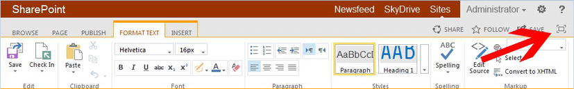
Figure 7-28. The new Focus on Content feature in SharePoint 2013
Using this additional class, we can provide a simple style to hide the horizontal navigation. When working with a grid, though, we must also consider how to tell our main content column or columns to fill in the additional space.
Listing 7-22 shows the HTML for the PlaceHolderMain ContentPlaceHolder. This HTML page layout includes the Vertical Navigation snippet rather than the snippet being included in the master page. The general principle will work for either location of the snippet but is dependent on how the grid is applied to the master page and page layouts. Listing 7-22 assumes the PlaceHolderMain ContentPlaceHolder from Listing 7-14.
Listing 7-22. HTML Page Layout With Vertical Navigation
<div class = "row-fluid">
   <div class = "span3" id = "sideNavBox">
      <!--CS: Start Vertical Navigation Snippet-->
      <!--For simplicity we removed the default vertical navigation snippet-->
      <!--CE: End Vertical Navigation Snippet-->
   </div>
   <div class = "span9" id = "mainbody">
      <!--replace with additional page layout content areas and column-->
   </div>
</div>
In Listing 7-22 the Quick Launch in the form of the default Vertical Navigation snippet is bound to the first three columns. We supply the left three column container with the ID sideNavBox. This ID is the new OOTB ID for the left navigation in SharePoint 2013. We include a second container that spans nine columns, which we also provided a new ID of mainbody.
When the Focus on Content icon is clicked, the left navigation will automatically hide because we provided the ID of sideNavBox. What we would like to add is a style that will tell our mainbody div to not span nine columns, but rather to span twelve columns. It would be difficult to replace the class span9 with span12, so instead we can simply add span12 properties to the ID mainbody when the <body> tag includes ms-fullscreenmode. See Listing 7-23 for this style.
Listing 7-23. Style to Increase Width of Content for Focus on Content
/*override #mainbody from a span9 to the properties of a span12
.ms-fullscreenmode #mainbody {
   width: 100%;
}
Creating and Publishing New Pages Based on Custom Page Layouts
At this point we have reviewed content types and how we can use them in conjunction with page layouts. We investigated how we can manage our page layouts using Design Manager as well as what special considerations are needed to make page layouts responsive within our master pages. We are now ready to use our custom page layouts in a content page.
Creating a New Content Page
Start by loading the default page of the site you wish to add a content page. In this example we are going to add the About page to our root web.
- Click the settings icon in the ribbon and click Add a page.
- In the Add a page dialog box, you must give your new page a name. This will be translated to the file name of the page; the title of the page can be changed at a later time. The name for our example will be About.
After the new content page has been created, it will be associated with your default page layout. We will learn how to manage visible and default page layouts in the section “Verifying and Controlling a Page Layout’s Availability” later in this chapter.
- To change the page layout for the page we just created, while in edit mode, in the ribbon, click the Page tab. When the Page ribbon appears, in the fourth section entitled Page Actions, click Page Layout.
- A drop-down list will appear displaying all valid page layouts. Select the page layout you wish this page to use.
Note If your custom page layout does not appear in the Page Layout drop-down list, ensure that you published a major version of the custom page layout. If you have and the page layout still does not appear, refer to the section “Verifying and Controlling a Valid Page Layout’s Availability” later in this chapter.
- Click Save on the ribbon to save the page.
You can also add a new content page directly in the Pages document library.
- Load the default page of the site to which you wish to add a new content page.
- Click the Settings icon on the ribbon and click Site contents.
- Your Site Contents page will load. Under Lists, Libraries, and other Apps, click the Pages Library.
- To add a new page, on the ribbon, click Files.
- On the Files ribbon, click New Document, and then click Page.
- The Create Page page will load. You can now provide the Title and Description as well as the page’s file name. Finally you set the page layout you wish this new content page to utilize. When you have entered the required information, click Create to create the page.
- The Pages library will appear once the page has been created. You can click on the new page’s title to load the content page so that you can begin editing the page’s content.
Tip You can have your custom content types appear in the New Document drop-down list by customizing the Pages document library list of allowed content types.
Checking in and Publishing a Content Page
After you create a new content page, it will not be available to all users until you publish the page. There are two primary methods to check in and publish a content page, although this process might vary depending on any workflows that might have been created. We review two OOTB methods of publishing content pages.
Note that OOTB, the Publishing workflow in SharePoint 2013 has been simplified. You might not need to check in, publish, and approve a content page as you did OOTB with SharePoint 2010. This could be changed by your site administrator based on your organization’s requirements. We review the OOTB simplified workflow.
Publish a Page via a Content Page Ribbon
A content page can be checked in and published directly from the ribbon on the content page you wish to publish. In fact in SharePoint 2013 you can skip checking in a content page and publish in one step. Refer to Figure 7-29 for a content page ribbon.
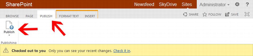
Figure 7-29. Content page Publish tab and Publish icon
- Load the content page you wish to publish.
- If there is a version of the page to publish, the content page will be checked out, or checked in without having been published. Either way, the ribbon will load with the page. The last tab should be Publish. Click Publish to load the Publish ribbon.
- On the Publish ribbon, click the Publish icon.
- The content page has been published and should be available to visitors.
Publish a Page via the Pages Library
Alternatively, a content page can be checked in and published directly in the Pages document library.
- Load the Pages library as we did when creating a new content page.
- Next to the content page you wish to publish, click the ellipsis (…) to load the content page properties popup. On the properties popup, click the ellipses (…) found in the bottom bar.
- On the Page menu, click Check In.
- In the Check In dialog box, select Major version (publish). If you would like to keep the file checked out even after publishing it, select Yes under Retain your check out after checking in. Finally provide comments if you wish before clicking OK to check in and publish a major version.
Verifying and Controlling a Valid Page Layout’s Availability
Often you will find a need to control which page layouts should be available within a given site, on a site-by-site basis. We have seen how we can hide a page layout by editing a given page layout’s properties, but that will hide the page layout for the entire site collection. What if you wish to hide a page layout within a particular site? What if you wish to hide OOTB page layouts quickly without having to edit each page layout’s property, or remove the actual page layout from the site collection? There is a mechanism available to us to control which page layouts are available in a given site as well as control which page layout is the default page layout for new content pages.
Tip If a page layout is not available when selecting the page layout for a content page, and yet the page layout has a published major version, the page layout might have been hidden using the following process.
- Navigate to your site’s Site Settings page (Settings Site Settings on the ribbon).
- On the Site Settings page, under Look and Feel, click Page layouts and site templates.
- On the Page Layout and Site Template Settings page, you can set which site templates this site and all subsites (if you wish) can use.
- You can also set which Page Layouts are available; that is, all page layouts, inherit allowed page layouts from this site’s parent, or only specific page layouts. If you select Pages in this site can only use the following layouts:, you can select and Add the specific page layouts you wish to make available to this site. If you also select Reset all subsites to inherit these preferred page layout settings, all subsites will be updated with this site’s preferred page layout settings.
- You can also set the default page layout for new content pages.
- Click OK to save your Page Layout settings.
Summary
In this chapter we started with an overview of content types and how they relate to page layouts. We reviewed where content types are stored and how we can leverage a Content Type Hub to centrally store our custom content types across sites, site collections, and web applications. We continued by reviewing OOTB page layouts, how to create custom page layouts, and how to bind a custom page layout to a custom content type. Leveraging the power of responsive design, we utilized OOTB page layouts as well as modified custom page layout with snippets that produce content type field data that looks good and provide an optimized version based on device viewport.