
Integrating Search-Driven Content
In Chapter 1, we introduced new features in SharePoint 2013 that use the power of search to surface dynamic content across sites. SharePoint 2013 is the first release of SharePoint to fully integrate FAST search into the core product. In this chapter, we learn how to integrate dynamic content from other sites and present the content with the same user interface by utilizing new out-of-the-box search web parts as well as HTML, JavaScript, CSS, display templates, query rules, and result types. We first review how to get content from other sites by using the new SharePoint 2013 cross-site publishing feature. Then we create a content rollup solution by creating custom display templates for SharePoint’s Content Search web part. Last, we look at how to fine-tune search queries and customize the display of results in search. We demonstrate how to use query rules and result types to improve the search experience.
Our Scenarios
For the public Specter Group site, we have two scenarios that use search-driven content.
In the first scenario, we want to show potential buyers a rollup of all the available Specter Group properties for sale from all the communities, such as floor plans, description, and property type. Because only builders and architects at Specter Group can author and manage floor plans, we want to have a dedicated and separate site just for floor plans (www.spectergroup.com/sites/floorplan). Meanwhile, we want to present all the floor plans to site visitors of www.spectergroup.com in a seamless manner. To accomplish this, we need to perform the following steps (for a process diagram of the scenario, refer to Figure 9-1):
- We need to make the floor plan content in the authoring site available to search so that other sites can consume the content.
- We need to ensure search is periodically indexing the authoring content to ensure the dynamic content is up to date.
- From the public spectergroup.com site, we need to consume the floor plan content from search.
- From the public spectergroup.com site, we need to customize the display of the rolled up content.
In this chapter, we focus on the design and the implementation of the solution for this scenario. First we demonstrate how to pull the floor plan content from the Floor plan site collection. Then, we will show how to customize the content search web part on the Floor Plans page to display search results with our own design using custom display templates.
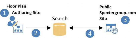
Figure 9-1. Content publishing process for Spectergroup.com floor plans
In the second scenario, we want to customize the search experience when users search for “floor plans”. We are going to create a query rule and a result type for floor plans, such that when users search for the keyword “floor plans”, the following things happen:
- We will show a block of results that are all floor plans.
- We will promote a few beachfront properties to the top of the results if the current month is in the summer.
- We will render the block of results for floor plans with its own user interface to distinguish these results from all other results in the list.
In this chapter, we look at how to fine-tune search queries and customize the display of floor plan results in search. We demonstrate how to use query rules and result types to improve the search experience.
Publishing Content to Search
In Chapter 8, we used the Cross-Site Collection Publishing feature to allow http://spectergroup.com to consume publishing pages and page layouts from http://authoring.spectergroup.com. For more information on how to set up cross-site publishing, refer to Chapter 8. In this chapter, we look at how to use the Cross-Site Collection Publishing feature to consume content, such as documents. Then in the section “Custom Display Templates for Specter Design” later in this chapter, we demonstrate in detail how to customize the display of results by creating custom display templates.
 Note Learn how to configure and use Cross-Site Collection Publishing in Chapter 8.
Configuring Content for Search
Before we can consume the floor plan content, we need to make sure the content is available to SharePoint search. The floor plan content resides in a picture library called Specter Group Community Floor Plans in the http://spectergroup.com/sites/floorplan site collection. Table 9-1 shows the metadata that describes a floor plan document. For more information on Specter Group TermSets and the Managed Metadata feature, refer to Chapter 7.
Table 9-1. Specter Group Community Floor Plan Metadata
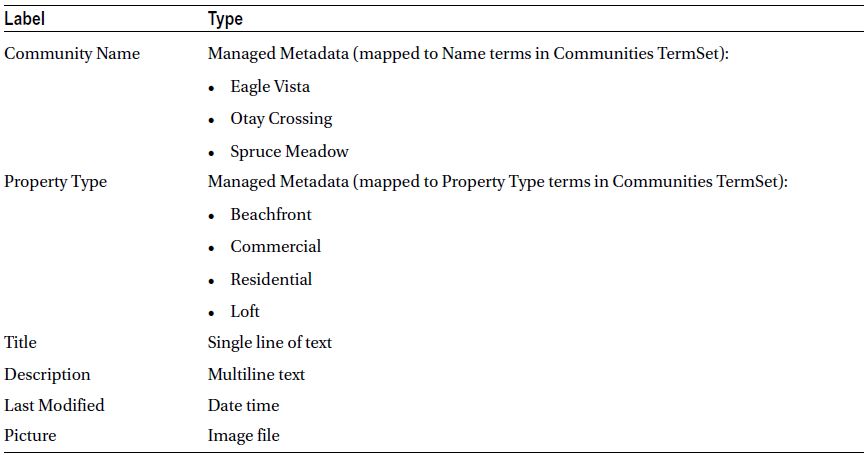
As shown in Table 9-1, all floor plan documents have a set of properties that describe each floor plan. Because we are working with search, we need to think about how to expose these properties to SharePoint search so that users can search against them and view these properties in the search results. To ensure these properties can be searched against and can be used as refiners and filters, we need to create Search Managed Properties for each floor plan property. To learn how to create managed properties, refer to the section “Creating Search Managed Properties for Content” later in this chapter, where we demonstrate how to create a search managed property, SpecterPropertyType, based on the Managed Metadata column property type. We later use the SpecterPropertyType managed property as a refiner and a filter in our solution.
As floor plan files are added to the library, users identify and tag metadata (such as Community Name and Property Type information) for each file (see Figure 9-2).
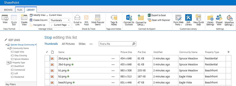
Figure 9-2. To enhance search ability of content, tag content with metadata when authoring content
Once the content is ready for publishing, we need to enable the content’s library as a catalog. For the purpose of demonstration, please refer to Chapter 7 for detailed steps for configuring a catalog.
Note Before we can enable a library as a catalog, we need to enable the Cross-Site Collection Publishing feature. For more information on how to get started with Cross-Site Collection Publishing and how to configure a library as a catalog, refer to Chapter 8.
After we configure the catalog, the Catalog Settings page should look like Figure 9-3, which shows the top section of the page.
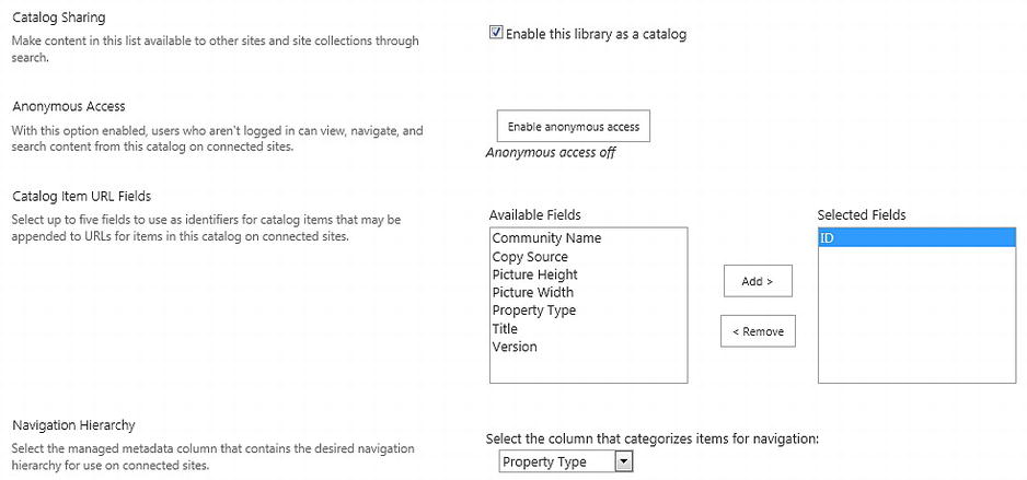
Figure 9-3. Catalog Settings page for Specter Group Community Floor Plans document library
Once the catalog is created, before this content becomes available for consumption from other site collections, we must perform a full or an incremental crawl on the content source.
- From Central Administration, navigate to the SharePoint Search Service application.
- Click the arrow next to the content source you want to crawl.
- Select Start Full Crawl (see Figure 9-4).
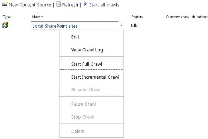
Figure 9-4. Perform a full or an incremental crawl to get all new content and updates in search index
To ensure the target site gets fresh and up-to-date content, we need to configure the Search Service application to make sure SharePoint search is continuously crawling content in the authoring site, as seen in Figure 9-5. For more information on how to configure and schedule full crawl, incremental crawl, and continuous crawl in SharePoint search through Central Administration, refer to http://sprwd.com/6uhfguy.
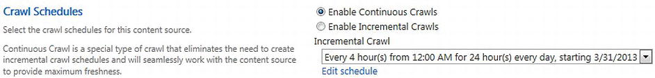
Figure 9-5. From Central Administration, enable continuous crawls on the content source that contains this catalog to ensure freshness of the content
Tip Cross-site publishing is dependent on the search feature to index the content. New and updated content is only available for consumption after it has been crawled. In a production environment, we need to make sure SharePoint search is continuously crawling the authoring sites to get the latest content to appear in the consuming sites quicker. If the Search Service application gets corrupted or gets deleted for some reason, we need to configure the consuming site to reconnect to the catalog to reestablish connection with the content.
Creating Search Managed Properties for Content
Now that we have the content and the properties of the content available in the search index, we can create search managed properties for each property we want to use as refiners and filters.
- 1. Similar to SharePoint 2010, to get the content’s properties, referred to as crawled properties, we need to perform a crawl of the content.
- 2. Once the crawled properties are available in search, we can create new managed properties that map to the corresponding crawled properties.
- 3. After we have created the new managed properties, we have to do another crawl on the content to get the property-value mapping established.
- 4. In the case where we want to perform a full crawl on just a library, the site collection administrator can go to the library settings and mark the library for a full crawl during the SharePoint farm’s next scheduled crawl.
- a. On the Catalog Settings page, click the Advanced settings page link shown in Figure 9-6 to configure full reindexing of the content.
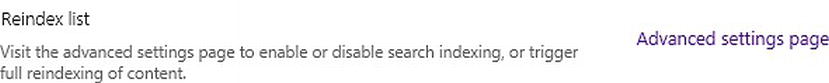
Figure 9-6. Enable full indexing of content in the library
- b. To trigger a full reindex of the content during the next schedule crawl, on the Advanced Settings page, click Reindex Document Library (see Figure 9-7).
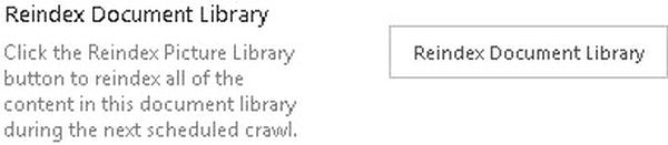
Figure 9-7. Mark the library for a full crawl during the next scheduled crawl
- 5. To create new search managed properties, navigate to Central Administration.
- 6. From Application Management
 Manage Service Applications, select the current Search Service application (see Figure 9-8).

Figure 9-8. Navigate to SharePoint Central Administration's current Search Service application
- 7. On the Search Administration page, click Search Schema under the Queries and Results group shown in Figure 9-9.
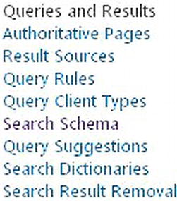
Figure 9-9. Click Search Schema to view Managed Properties page
- 8. Once the Managed Properties page is loaded, click New Managed Property below the filter (see Figure 9-10).
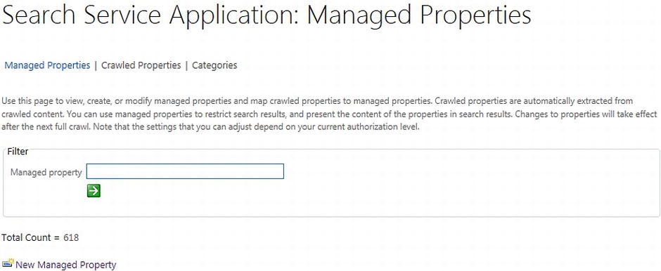
Figure 9-10. Create a new managed property from the Managed Properties page
- 9. Next, enter a name and select a data type (Text) for the new managed property, SpecterPropertyType (see Figure 9-11).
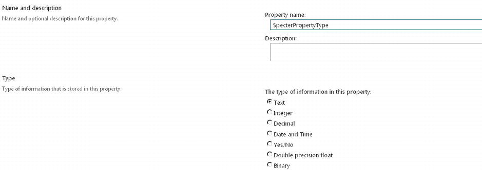
Figure 9-11. Create new managed property page
- 10. Next, we need to ensure the property is searchable by checking the Searchable check box, as shown in Figure 9-12. Now users can query against the content containing this property.
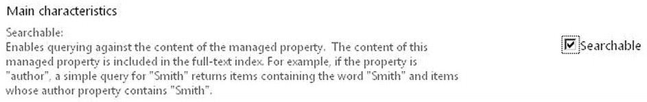
Figure 9-12. Mark the new managed property as searchable
- 11. Then, we need to configure the property as Queryable to allow users to make queries specifically against the new managed property (see Figure 9-13).
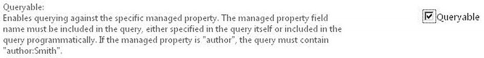
Figure 9-13. Mark the new managed property as queryable
- 12. Besides allowing users to query against the property, we also need to ensure the property can be retrieved as part of the search result if it contains relevant data that need to be displayed (see Figure 9-14).

Figure 9-14. Mark the new managed property as retrievable
- 13. In the case where the managed property is mapped to a column that allows multiple values, it’s a good idea to select the Allow multiple values check box as shown in Figure 9-15, so that each tagged value will be stored as a separate key/value pair in the managed property.
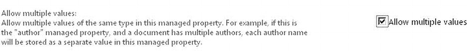
Figure 9-15. Mark the new managed property to allow multiple values to be mapped
- 14. If the managed property is going to be used as a refiner for users to refine search results, then we need to select Yes - active from the Refinable drop-down list seen in Figure 9-16.
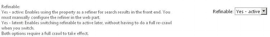
Figure 9-16. Mark the new managed property as refinable
- 15. Finally, we need to map the new managed property with a crawled property returned from the most recent full crawl of the search content. Under the Mappings to crawled properties section, click Add a Mapping to the right (see Figure 9-17).
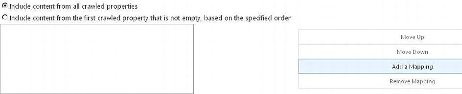
Figure 9-17. Map the new managed property with a crawled property
- 16. Once the Crawled property selection page is launched, enter a keyword of the crawled property (name of the column from the Floor plan library). Then click Find to get all the crawled properties containing the key word (see Figure 9-18). Note the crawled property name is the same as the SharePoint internal property name for the library column of Property Type.
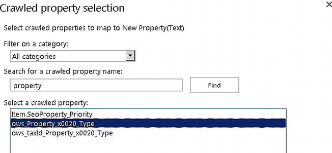
Figure 9-18. Find the crawled property, then map to it
- 17. Click OK to create the managed property. New in SharePoint 2013, we can quickly verify the creation of the new managed property by providing a keyword in the filter box on the Managed Properties page. Then the new managed property should be shown on the page as seen in Figure 9-19.

Figure 9-19. Quickly find the new managed property and view its properties
- 18. Once we are done creating all the new managed properties, we need to navigate to the Content Sources page from the Search administration to perform a full crawl.
- a. From Central Administration, navigate to the SharePoint Search Service Application.
- b. Click the arrow next to the content source you want to crawl.
- c. From the shortcut menu, click Start Full Crawl as shown in Figure 9-20 to ensure all new managed properties contain data so that we can query against them.
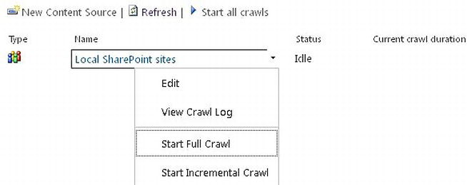
Figure 9-20. Start a full crawl to get values for the new managed properties
Getting Content from a Catalog
Now that we have the content as well as new managed properties in the search index, we need to make the content available for users to see in the Specter Group public-facing site. For our scenario, we need to enable the Specter Group public-facing site to connect to the Floor Plan catalog created in the previous section.
- On the Specter Group public-facing site, click Site Settings.
- Under Site Administration, click Manage catalog connections.
- Click the Connect to a Catalog link on the page to view all the available published catalogs.
- For our scenario, click the Connect link next to the Floor Plan - Specter Group Community Floor Plans catalog in Figure 9-21.

Figure 9-21. From the Specter Group public-facing site, connect to the published Floor plan catalog
Note For more information on how to configure and connect to a catalog, refer to Chapter 8. - The catalog configuration process makes the content available in the Specter Group public-facing site. When connecting to a catalog, we have the option to integrate the catalog with the whole site by selecting Integrate the catalog into my site or we can select Connect, but do not integrate the catalog to allow less integration. Because we are exposing the Floor plan content specifically on one page, the Floor Plans page, we will not be integrating with the Specter Group public-facing site’s navigation. Select the Connect, but do not integrate the catalog option shown in Figure 9-22.
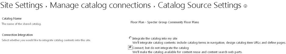
Figure 9-22. Connect to the catalog without integrating navigation
- Because we are presenting the search results to public users, they will not have access to the authoring site, http://spectergroup.com/sites/floorplan site collection. Under the Catalog Item URL Behavior section, ensure the Make URLs relative to this site option is selected as shown in Figure 9-23.

Figure 9-23. Make catalog item's URL relative to the Specter Group public-facing site
Note For more information on how to create catalog item pages for a catalog, refer to Chapter 8.
Creating a Content Rollup Solution
In the following sections, we create a page for content rollup. We add a Content Search web part and configure it to get the right results by using the Query Builder.
Creating a Landing Page for Floor Plans
First, we need to create a landing page for our floor plans so that users can view all floor plans by navigating to the http://spectergroup.com/communities/floor-plans URL or by clicking Floor Plans on the Home Page menu flyout as shown in the wireframe in Chapter 3 and Figure 9-24.

Figure 9-24. Wireframe for Floor Plans landing page and menu flyout
- On the Specter Group public-facing site, click Site Settings, then select Add a page from the shortcut menu.
- In the Add a page dialog box, enter Floor Plans as the name of the new page, as shown in Figure 9-25. Click Create to generate a new page in the Pages library.
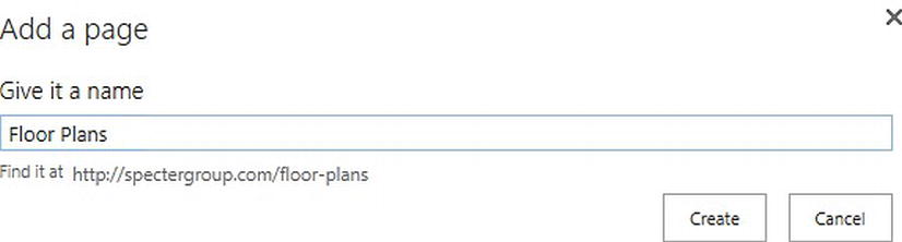
Figure 9-25. Create a new landing page for Floor Plans
- For navigation, because we are using the Specter Global Navigation TermSet for the Specter Group public site’s navigation, we need to create a new term, Floor Plans, under the Communities term in the Specter Global Navigation TermSet as shown in Figure 9-26.
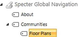
Figure 9-26. Add a new term for Floor Plans under the Communities term in the global navigation TermSet
Note For more information on how to configure navigation using the Managed Navigation feature, refer to Chapter 6. - We need to configure the new page to use a friendly URL that maps to the new term in the site navigation. Navigate to the new page and click Edit Page in the upper right corner.
- To configure the page’s friendly URL, on the top ribbon, on the Page tab, click the Page URLs icon, as seen in Figure 9-27.
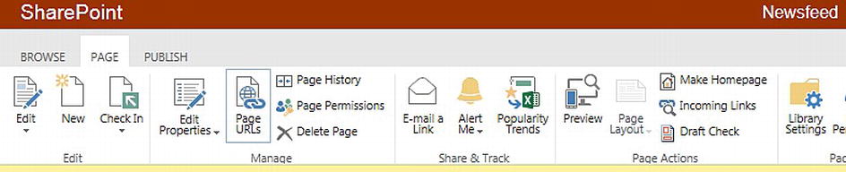
Figure 9-27. Configure the page’s friendly URL by clicking the Page URLs icon
- On the Page URLs page, add a friendly URL that is mapped to the Communities Floor Plans term in the navigation (see Figure 9-28).
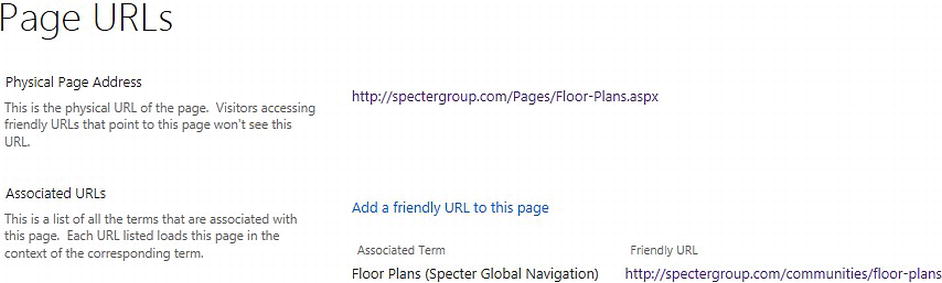
Figure 9-28. On the Page URLs page, add a friendly URL that maps to the Floor Plan term in the navigation TermSet
Exposing Search Results Using Content Search Web Part
Now that we have the Floor Plan’s landing page as well as its friendly URL configured, we need to add the Content Search web part to the page to display all the results from the Floor Plan catalog.
- On the Floor Plans page, click the Settings icon at the top right corner of the page, then select Edit Page from the shortcut menu, as shown in Figure 9-29.
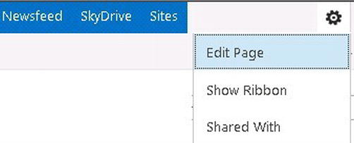
Figure 9-29. To add a web part to a page, we must first edit the page
- Once the page is in the edit mode, click the inside of the Page Content area on the page.
- On the ribbon at the top of the page, click the Insert tab, then select the Web Part icon to add a web part to the page.
- Under Categories, select Content Rollup, then select Content Search web part, as shown in Figure 9-30. Click Add at the bottom right of the ribbon to add the web part to the page.
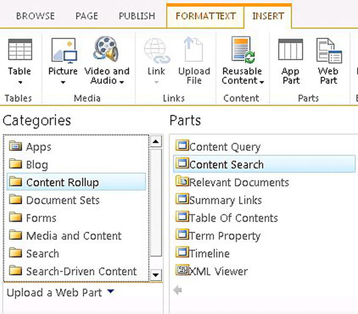
Figure 9-30. Add a Content Search web part to the content rollup page
- Once the web part is on the page, at the top right corner of the web part, click the down arrow to the left of the check box. Then select Edit Web Part from the drop-down menu to configure the web part (see Figure 9-31).
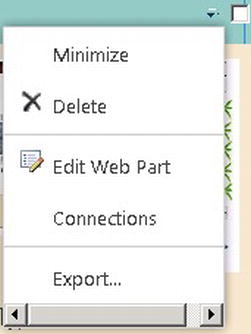
Figure 9-31. To configure the web part, we must select Edit Web Part
Now that we have the Content Search web part on the page, we next need to configure the web part.
Query Building
The Content Search web part allows you to restrict the results by limiting the query to a given set of content, whether it’s content from the search index or content from the site collection. To get to the right content, we need to formulate the query just right and we need to ensure the query works under different dynamic conditions for different users.
- The web part configuration panel shows up on the right side of the page.
- Launch Query Builder to get the results you want. In the Properties section, click Change query to launch Query Builder to specify your query. You can also specify how many results to show in the web part (see Figure 9-32).
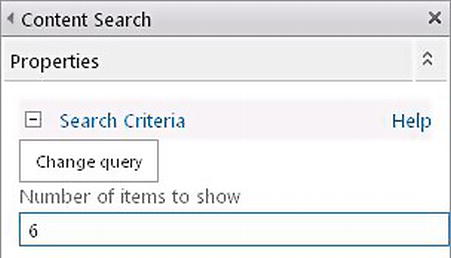
Figure 9-32. Click Change query to launch Query Builder
The full-screen Query Builder allows users to create and test queries without having to learn keyword query syntax. It shows a real-time preview of the search result on the right. It is also fully integrated with result sources and query rules. The web part allows dynamic values to be substituted at query time to enable query by dynamic values such as the current user’s profile properties or the current web’s properties.
- On the Basics tab, click the drop-down control next to Select a query (see Figure 9-33). Note there are many options for contents to choose from. Most of the result sources are content stored in the current site collection; for instance, all documents using the Documents content type stored in the Specter Group public-facing site. If you do not see your result source in the list, click the result source link below Select a query.
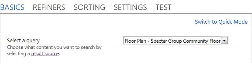
Figure 9-33. In Query Builder, select a result source for its query
- a. To view all the available result sources in the site collection, under Select a query click the result source link or navigate to Site Settings, then click Result Sources.
- b. By default, SharePoint sets Local SharePoint Results as the default result source. If you want to set a different result source as the default source for the site, on the Manage Result Sources page, click a result source, then select Set as Default from the drop-down menu shown in Figure 9-34.
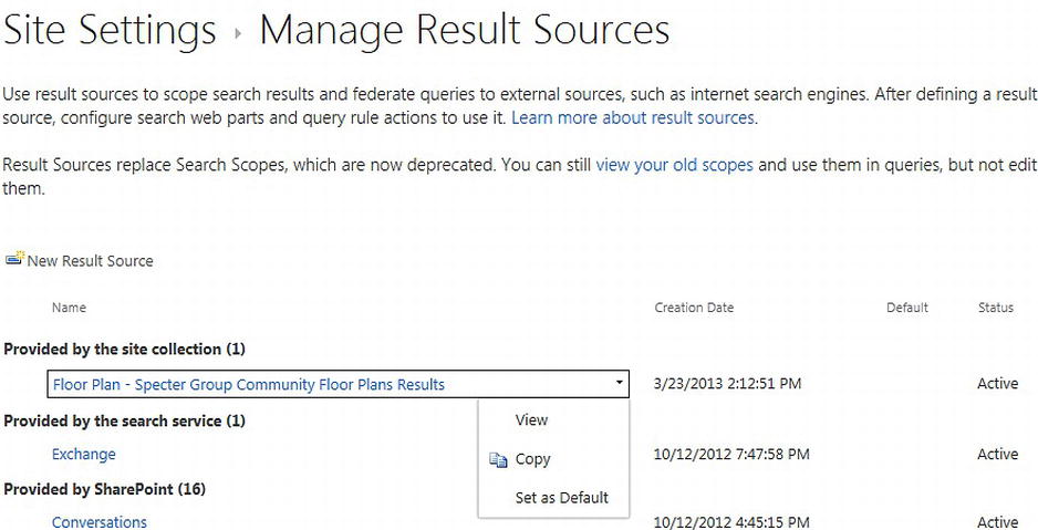
Figure 9-34. Select a resource source as the default source for the site
- Back in Query Builder, we select the Floor Plan catalog we published in the previous section as our result source. Notice the search result preview pane to the right automatically displays all the relevant results from that result source, in this case, floor plans (see Figure 9-35).
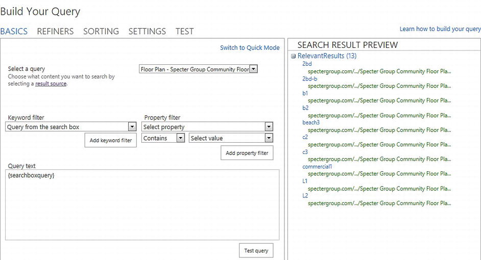
Figure 9-35. In Query Builder, select a result source and specify terms to limit the query. The Search result preview automatically updates as the the query changes
- In Query Builder, we can also construct filters to trim down the results. For our scenario, we leave the filters blank, as we want to have all the results returned.
- For the sort order of our results, we can pick from any of the options in the Sort results drop-down list. For example, for an e-commerce site we could select the ViewLifeTimeUniqueUsers option to get the most popular items. For our scenario, we select the Last Modified option to sort results in descending order to show the most recent properties at the top (see Figure 9-36).
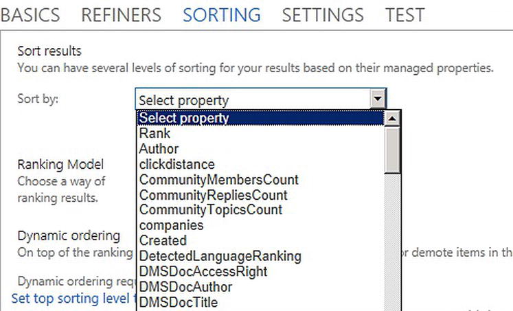
Figure 9-36. Define sort order for results
- To add refiners, we can use our new managed properties to refine our search query. Click the Refiners tab. From the list of refiners, select the new managed property, SpecterPropertyType. Note in Figure 9-37 that all the values for the managed property are automatically populated in the list for you to choose from (e.g., Residential, Commercial, Loft, and Beachfront).
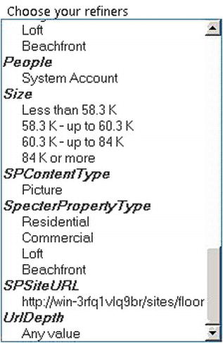
Figure 9-37. Select refiners to use for your results
- From the list of refiners, select Residential under SpecterPropertyType to create a refiner. Click Apply. Note that the results shown in the search result preview on the right in Figure 9-38 are automatically updated with fewer results based on the new refiner. For our scenario, however, we leave the Refiners blank because we want to show all of the floor plans.
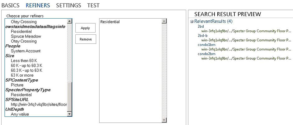
Figure 9-38. Using managed properties as refiners will filter out search results
- At this point, looking at the results returned in the search result preview, we are pretty confident with the query we have built. Click the Test tab. There you can take a look at the query text the web part has constructed based on your preferences (see Figure 9-39).
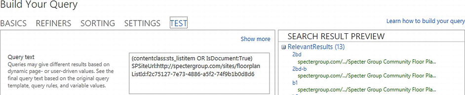
Figure 9-39. System-generated query based on configurations specified in Query Builder
- Click OK to apply your changes for the query. This closes the Query Builder and allows us to continue to configure the rest of the Content Search web part.
Introduction to Display Templates
SharePoint 2013 uses Display templates in search web parts to display search results. Each display template controls what managed properties to show and how to render them in the web part.
Note Display templates are only available to Search web parts. For example, the Content Query web part cannot use display templates because it is not search-driven.
Display templates can be used to control the format and presentation of search results. We can also use display templates when we want to customize how content displays on our site. There are two major types of display templates: Control and Item (see Figure 9-40).
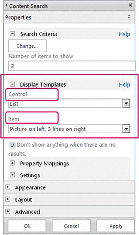
Figure 9-40. In the Content Search web part configuration tool pane, select a Control display template and an Item display template for the web part
- A Control template is used to provide HTML to customize how the overall structure of search results is presented. This template defines the look and feel around the results, the layout of the results, paging options if any, the display of results count, a heading for the list if any, and even the display of when no results are found. For more information about how to create a custom Control display template, refer to the section “Creating a Custom Control Display Template” later in this chapter.
- Item templates provide HTML that determines how each result item is displayed. This template defines the look and feel of each item, the managed properties to display for each item, and the display of each managed property. It might be displaying text, images, or videos. Every item in the search result set is going to render the item display template once. So, the item display template creates its section of HTML as many times as the number of results. For more information about how to create a custom Item display template, refer to the section “Creating a Custom Item Display Template” later in this chapter.
Less common types of display templates include the Hover over template and the Filter template. Hover over templates are used to customize the look and feel of an item to show additional values when users hover over the result. For example, hover over templates for people results show additional user profile properties and hover over templates for document results show document previews. Filter templates are used when you want to show options for filtering the search results by configuring the refiners.
Out-of-the-Box Display Templates
SharePoint offers various out-of-the-box display templates to provide rendering of results.
- 1. Continue with the Content Search web part used in our scenario. Moving down the web part configuration panel, in the Display Templates section, for Control display template, choose the List Control display template from the list of out-of-the-box Control display templates shown in Figure 9-41. The List template shows all the results in a list.
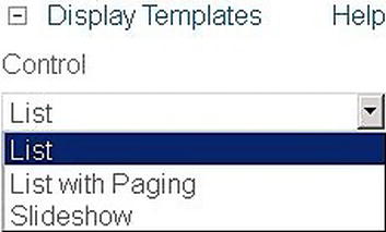
Figure 9-41. From the list of out-of-the-box Control display templates, select the List Control display template to use for the rendering of the structure of the entire result set
For out-of-the-box Control display templates, List with Paging is useful when dealing with a large result set that needs to be displayed across multiple pages. The Content Search web part has a limit of displaying 50 items per page. The Slideshow Control display template is useful when dealing with images in the result set, such that they can be displayed in a slideshow format.
- 2. For the Item display template section, choose the Large picture Item display template from the list of out-of-the-box Item display templates (see Figure 9-42).
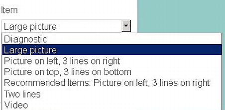
Figure 9-42. From the list of out-of-the-box Item display templates, select the Large picture Item display template to use for the rendering of a result item
The Large picture Item display template shows all the results in a single-column list with a thumbnail image as well as a hover-over effect.
Although for our scenario, we are using the Large picture display template, note there are other out-of-the-box Item display templates:
- Diagnostic is useful for debugging and troubleshooting our search-driven solution as it provides a diagnostic view of all the mapped managed properties and the values used in the web part.
- The Picture on left, 3 lines on right, Picture on top, 3 lines on bottom, and Recommended Items display templates are useful when dealing with images in the result set, such that the results can be displayed in a single-column list of thumbnail images and text.
- The Two lines display template is useful when dealing with documents or lists in the result set, such that they can be displayed in a single-column list of text and an image for the document type.
- The Video display template is useful when dealing with video files, such that they can be displayed in a horizontal layout with thumbnails of the files and the text below the image.
Note For more information on all different types of out-of-the-box display templates, refer to http://sprwd.com/5nbp9ss.
- 3. Click Apply on the tool pane of the Content Search web part. Reload the page, which should then look similar to Figure 9-43.
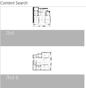
Figure 9-43. Floor Plans page with out-of-the-box display templates
We have configured the Content Search web part to get the right results from the Floor Plan catalog to appear on our Specter Group public-facing site and we have demonstrated the look and feel with out-of-the-box display templates. Let’s enrich the end user experience. In SharePoint 2010, if you wanted to change the look and feel of a particular search result item, it required a lot of work to modify the XSLT of the Core Results Search web part. Now we have the ability to craft the perfect look in HTML, CSS, and JavaScript by creating custom display templates in SharePoint 2013.
Before we create custom display templates, let’s review the design we would like to use for our floor plan page and the different components of the design. Figure 9-44 shows the design wireframe from Chapter 3 that we use to display the floor plans.
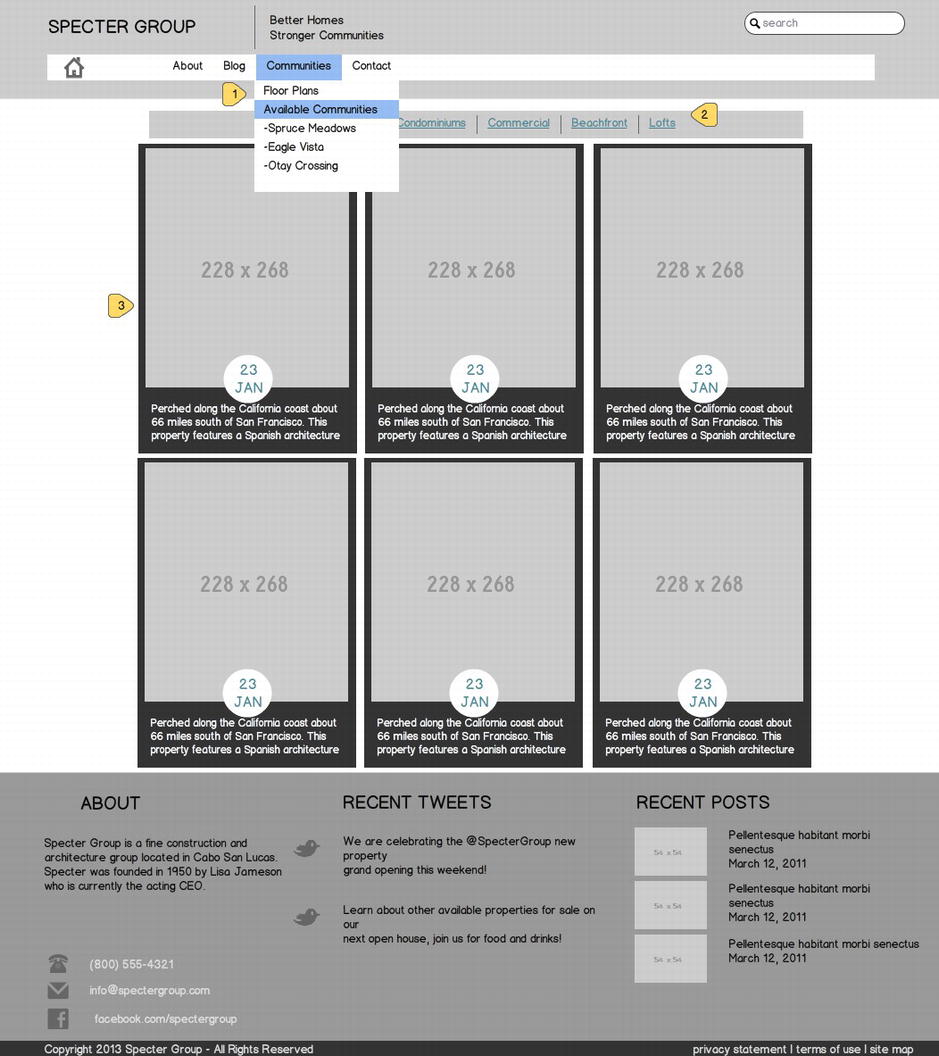
Figure 9-44. Design wireframe for the floor plan landing page as described in Chapter 3
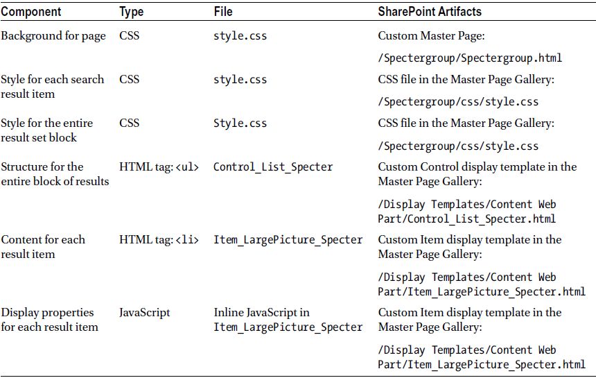
This wireframe is the design we want to apply to the floor plans. The different components of the design are listed in Table 9-2. The list describes markup of all the components as well as how each component can be mapped into SharePoint.
Table 9-2. Design Components and Mappings in SharePoint
Because we have covered how to create custom master pages in Chapters 4 and 5, we focus here on the rest of the components in the design.
Display templates are used to tell SharePoint what content we want to show and how we want the content to be rendered on the page dynamically. During runtime, SharePoint renders HTML tags and CSS class to render the search results based on the configurations in the display templates. Before we dive into creating custom display templates, we need to first understand how we are styling our results so that they look like the wireframe design. Display templates render results as an HTML list, made of a <ul> tag and many <li> tags for each result item. To style the result set and each item in the set, we need to add a CSS class to style them.
To reference the CSS used for each design component, use the numbered items in Figure 9-45 and reference the corresponding Listings as outlined here.
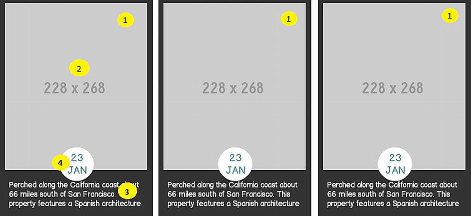
Figure 9-45. CSS for each design component to style the result set
- Style to set the layout of the result set in a three-column table (Listings 9-1 and 9-2).
- Style for the thumbnail image of the item (Listing 9-3).
- Style for the caption of the item (Listing 9-4).
- Style for the date of the item (Listing 9-5).
As we described in Table 9-2, we have style elements for the entire result set. To set the width of the entire result set and the layout of the results in a table layout, add the following CSS for the <ul> tag with the feature class.
Listing 9-1. CSS to Set the Width and Layout of the Entire Result Set
.feature {
        width: 940px;
        display:table;
}
Each item in the list has a CSS class to reference for its style. To set the background and width for each item and to set the layout of the results as inline-block so that results are rendered in a three-column table, add the following CSS for the <li> tags under the <ul> tag with the feature class.
Listing 9-2. CSS to Set the Background, Width, and Layout of Each Item in the Results List
.feature li {
        background: #333333 none;
        margin-bottom: 20px;
        margin-left: 13px;
        position: relative;
        width: 300px;
        display:inline-block;
}
To configure the display of the thumbnail of each item, we need to add the following CSS to style.css.
Listing 9-3. CSS to Set the Display of Thumbnail Images of Each Item
.feature li .thumb {
        display: block;
        position: relative;
        width: 280px;
        margin: 10px;
}
.feature li .thumb img {
        max-width: 100%;
}
To configure the style of the caption and padding for the caption under the thumbnail of each item, add the following CSS.
Listing 9-4. CSS to Set the Style of Caption for Each Item
.feature li .caption {
        padding: 20px 10px 20px 10px;
        text-align: center;
        color: #fff;
}
To configure the style of the background area for the date and month values for each item, add the following CSS. Note, border-radius creates the top semicircle.
Listing 9-5. CSS to Set the Style of the Date for Each Item
.feature li .thumb .date {
        background: none repeat scroll 0 0 #fff;
        display: block;
        position: absolute;
        left: 110px;
        bottom: -25px;
        width: 60px;
        height: 50px;
        float: left;
        padding-top: 10px;
        font-family: mensch;
        border-radius: 40px;
        -moz-border-radius: 40px;
        -webkit-border-radius:40px;
}
.feature li .thumb .date div {
        display: block;
        font-size: 20px;
        line-height: 20px;
        text-align: center;
}
Custom Display Templates for Specter Design
In the previous section, we walked through the steps of implementing our design with an HTML list of items. Now, let’s see how we can integrate the design into SharePoint by creating custom display templates that can be used by the Content Search web part.
Before we dive into implementations of our own display templates, let’s review the basics of working with display templates.
Display Template Hierarchy
As discussed earlier, SharePoint uses two basic types of display templates to render results. When the Control display template and the Item display template are combined, the HTML output generated looks like Figure 9-46.
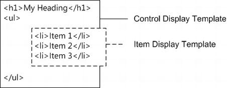
Figure 9-46. HTML output after adding a Control display template and an Item display template
To see what a Control display template generates during runtime, from your browser, inspect the entire result set on the page by clicking on the border of the result set. As you can see in Figure 9-47, the out-of-the-box Control_List Control display template (used in the previous section) renders a <ul> tag with the cbs-List class, which is included in the Searchv15.css file. This display template tells SharePoint the layout and structure of the results.
Note The content inside of the <ul> tag is configured by the Item display template and the hover over content is configured by the Hover display template.
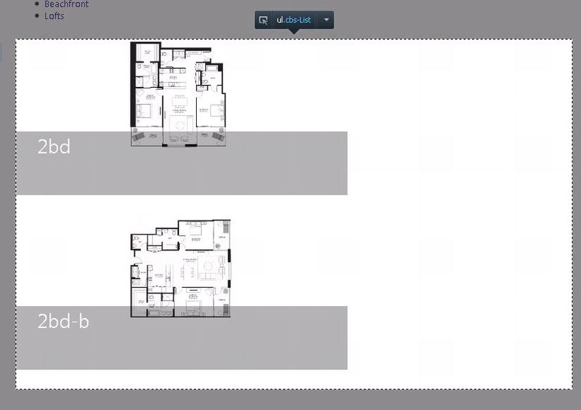
Figure 9-47. The Control_List Control display template renders a <ul> element with the cbs-List class for the layout of the results on the page
Similarly, to see what an Item display template generates during runtime, from your browser, inspect a result item on the page by clicking on the border of the item. As you can see in Figure 9-48, the out-of-the-box Item_LargePicture Item display template (used in the previous section) renders an empty <li> tag, and under the <li> tag, there is a <div> tag with the cbs-largePictureContainer class, which is included in the Searchv15.css file. This display template tells SharePoint what properties to display for the item and how to display it.
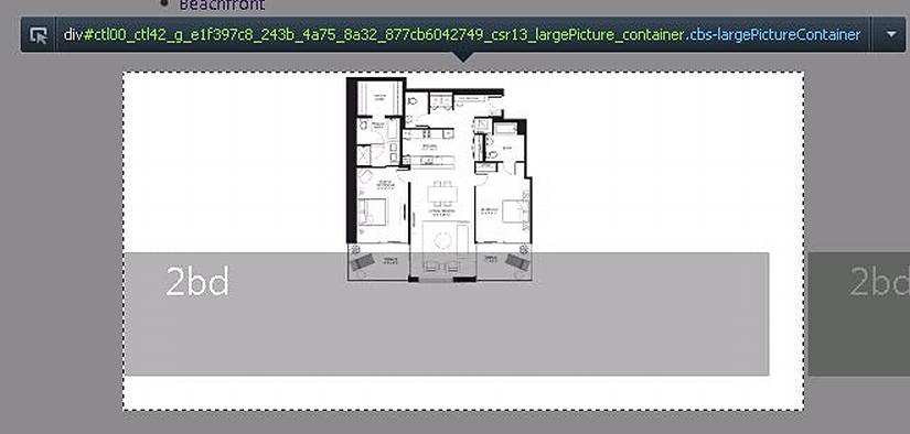
Figure 9-48. The Item_LargePicture Item display template renders an empty <li> element, and under the <li> element, there is a <div> tag with the cbs-LargePictureContainer class for each result item on the page
Display templates work in a hierarchy in the following order:
Each level in the hierarchy has an associated content type in the Master Page Gallery. To identify the content type for each display template file, use the appropriate prefix in the file name. For example, Control_ListWithPaging.html and Control_ListWithPaging.js are files associated with the List with Paging Control display template residing in the Master Page Gallery. To find all the files associated with an out-of-the-box display template, we can follow this file naming convention to find the associated files in the Master Page Gallery.
In Figure 9-49, there is a list of out-of-the box Control display templates in the Display Templates folder under the Master Page Gallery. Note that when configuring the Content Search web part, each option in the Control display template drop-down list maps to an HTML display template file in the Master Page Gallery. For example, from the editor pane of the Content Search web part, the List with Paging option refers to the Control_ListWithPaging.html and Control_ListWithPaging.js files and the Slideshow option refers to the Control_Slideshow.html and the Control_Slideshow.js files.
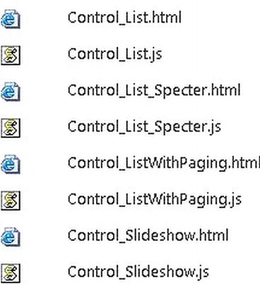
Figure 9-49. Out-of-the-box Control display templates
Note All display templates consist of an HTML file and a SharePoint-generated JavaScript file. When creating or updating a display template, we should always modify the content in the HTML file, never the JavaScript file. Once the changes are made in the .html file, SharePoint compiles the changes into a .js file that has the same name as the .html file. SharePoint uses the new .js file to render the web part on the page. In the HTML file, we can add placeholders for where the managed properties and custom properties created in JavaScript should be displayed, and then SharePoint will emit the values during runtime.
Figure 9-50 shows a list of out-of-the-box Item display templates. Note that each one of these files maps to an option in the Item drop-down list below the Display Templates section in the configuration pane of the Content Search web part; for example, the Large picture option map to the Item_LargePicture.html and Item_LargePicture.js files and the Picture on left, 3 lines on right option map to the Item_Picture3Lines.html and Item_Picture3Lines.js files.
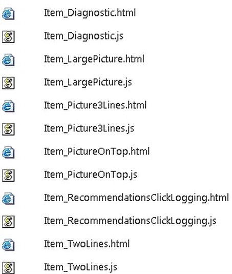
Figure 9-50. Out-of-the-box Item display templates
Note For the purpose of this chapter, we are focusing on display templates for Content web parts. If you want to learn more about all the display templates and their HTML and JavaScript files, including display templates for Search and Refiners, refer to http://sprwd.com/5nbp9ss.
As a side note, when we configure to consume a catalog from a publishing site, if we choose to let the catalog integration process create category pages, then the default category page created by SharePoint contains a Content Search web part. The default Control display template for the Content Search web part on the default category page is List with Paging, which is mapped to the Control_ListWithPaging files in the Master Page Gallery. The default Item display template used by that Content Search web part is Picture on top, 3 lines on bottom, which is mapped to the Item_Picture3Lines files in the Master Page Gallery.
Creating a New Display Template
The recommended approach to create a custom display template is to create a new HTML file for a new display template that is based on an existing display template. We do not want to override any out-of-the-box display templates because we want to keep the out-of-the-box design intact in case we want to use it again or use it as a reference design.
There are four components to implement when creating a custom display template.
- We need to specify all the managed properties we want to retrieve at query time so that we can use these properties in our HTML.
- We can externalize and add all the JavaScript and CSS files we use in the display template.
- For any inline JavaScript we use in the display template, we need to make sure they are below the first <div> tag in the display template.
- Within the custom display template, we need to add HTML markups to render the results.
Note To create a new display template, always make the changes in the .html file; never make any changes directly in the .js file. For the conversion process to succeed, always make sure the .html file is XML compliant. For example, unclosed tags such as <br> instead of <br/> will make the HTML file XML noncomplaint.
For our custom display template, first we make a copy of an existing display template that has the same Content type and is similar to the look and feel we want to create. Based on our design as described in the section “Specter Design Components” earlier in this chapter, we need to customize how the entire search result set looks as well as the rendering of each individual search result. Therefore, we need to create a custom Control display template and a custom Item display template.
- On the Specter Group public-facing site, click Site Settings.
- Click the Master Pages and page layouts link.
- Under the Master Page Gallery library, click the Display Templates folder. Then under the Display Templates folder, click the Content Web Parts folder. Within the Content Web Parts folder, you will see all the out-of-the-box display templates and their .html and .js files (refer to Figures 9-49 and 9-50).
- For our custom display template, we make our own .html file; the .js file is generated automatically when we upload the .html file.
- Download a local copy of the Control_List.html file and a copy of the Item_LargePicture.html file.
- Rename these local copies Control_List_Specter.html and Item_LargePicture_Specter.html, respectively.
- Open the files in any HTML designer, Dreamweaver, SharePoint Designer, Visual Studio, or Notepad for editing.
Note We do not get the full WYSIWIG experience in our HTML editor as we do not get the style sheets and images used in the site.
Display Template Structure
Before we make any changes to our custom display templates, let’s review the basic structure of a display template. Please follow along with this section by referencing the local copy of the custom display template file. There are four main sections of a display template:
- Title section: At the top of the HTML file, the <title> tag is used to identify the display name of this display template as seen in search web parts. For an example, refer to Figure 9-51.

Figure 9-51. An example of the Title section in display templates
- Header section: Below the <title> tag, there is an <xml> tag with a group of elements in CustomDocumentProperties that can be modified in the display template to provide SharePoint information about this display template. For example, one of the most commonly referenced elements is the ManagedPropertyMapping element. It maps fields exposed by search result items to properties available for JavaScript. This property is used to provide SharePoint the list of managed properties it needs to reference in this display template (see Listing 9-6). The ManagedPropertyMapping element is only used in Item display templates.
Listing 9-6. An Example of the ManagedPropertyMapping Element in Display Templates
<mso:ManagedPropertyMapping msdt:dt="string">
        'LastModifiedTime':'LastModifiedTime',
        'Specter Property Type'{Specter Property Type}:'SpecterPropertyType',
        'Picture URL'{Picture URL}:'PublishingImage;PictureURL;PictureThumbnailURL',
        'Link URL'{Link URL}:'Path',
        'Line 1'{Line 1}:'Title',
        'Line 2'{Line 2}:'Description',
        'SecondaryFileExtension',
        'ContentTypeId'
</mso:ManagedPropertyMapping>
Note Not all elements are used in every display template. For a list of CustomDocumentProperties elements, refer to http://sprwd.com/79gd4jr. To learn more about the ManagedPropertyMapping element, refer to the section “Creating Search Managed Properties for Content.” - Script section: Within the <body> tag, you will see a <script> tag, which is used to reference JavaScript and CSS files outside of the display template. To add a reference to outside JavaScript files that are part of the current site collection, we need to do the following:
$includeScript(this.url, "∼sitecollection/_catalogs/masterpage/custom.js");To add a reference to an outside CSS file that is in a location relative to the current display template, we need to do the following:
$includeCSS(this.url, "../../style.css"); - DIV section: Below the <script> tag, there is a <div> tag. This <div> tag is never rendered on the page. All the HTML or JavaScript code we want to render on the page must be included inside of this <div> tag.
Note To learn more about how to add content to the DIV section, refer to Listing 9-11.
Basics of Working with JavaScript, HTML, and CSS
When creating custom display templates, we often need to work with JavaScript, HTML, and CSS to provide customizations. To see examples of how these are used, refer to the following two sections.
Inline JavaScript is very useful when we need to create variables to hold data and then output values in the HTML markup. When creating inline JavaScript in display templates, for it to execute, we need to add the JavaScript code after the first <div> tag in the template and it needs to be added between an opening and closing tag set. This is specific to display templates.
<!--#_ and _#-->
In HTML markup, to view the value of a managed property or a variable created from inline JavaScript, we need to enclose the code in an opening and closing tag set.
_#= somefield =#_
To access the current SharePoint context, use the ctx object. To access information of the current search result item, use the ctx.CurrentItem object. This object contains references to all of its managed properties. To get a managed property’s value of a result item, use the following in the HTML section:
_#=ctx.CurrentItem.SpecterPropertyType=#_
To work with managed properties as local variables in JavaScript, we can reference the property as follows:
var myPropertyType = "This is for property type: " + ctx.CurrentItem. SpecterPropertyType + ".";
Tip When creating the display template, it’s much faster and easier to test the look and feel by keeping the style tags under the <style> tag in the <head> section of the display template. Once the design is completed, we can move the style tags to a separate CSS file, then reference the CSS file in the <script> tag.
Creating a Custom Control Display Template
For our scenario, let’s see how we can integrate the design we have implemented in the section “Specter Design Components” earlier in this chapter with our custom display templates. Let’s start with the Control display template.
- At the top of the Control_List_Specter.html file, change the value inside the <title> tag, which is the name displayed in the Display Template drop-down list when configuring the Content Search web part. We change it to List Specter as shown in Figure 9-52.

Figure 9-52. Define a name for the custom Control display template
Recall from Chapter 4 that we created a custom style sheet, style.css, which contains custom styles for the site. The file was then added to the Specter Group public-facing site’s Master Page Gallery and has been included in the master page so that it can be referenced throughout the site.
- From Listing 9-1, we created CSS code blocks based on the Specter design components for displaying search results. To tell SharePoint to use those CSS styles, we need to add all the CSS code blocks created earlier to the style.css file.
- Because the Floor Plan landing page is using the Specter Group master page, style.css has already been included. If you decide to create a separate CSS file that is not included in the master page, you would need to include the CSS file within the <script> section of the display template, as described in step 3 in the section “Display Template Structure” earlier in this chapter.
- From the CSS code block in Listing 9-1, to ensure a list of items is displayed in a three-column table, we need to add the feature class to the list. To do this, we need to update the custom Control display template file, Control_List_Specter.html, to ensure the <ul> tag within the <div> tag in the display template is using the feature class, as shown in Listing 9-7.
Listing 9-7. Add the Feature Class to the <ul> Tag to Ensure Results Are Displayed in a Three-Column Table
<ul class="feature">
        _#=ctx.RenderGroups(ctx) =#_
</ul> - We will leave the rest of the display template as is. Calling the ctx.RenderGroups(ctx) function triggers the rendering of all the search results.
- At this point, we have made all the necessary changes for the custom Control display template, Control_List_Specter, to render results in a three-column table. For other scenarios, if you have a different look and feel for the search results block, you would need to add specific CSS and HTML markup in the custom Control display template HTML file.
- From the custom Control display template file, save the Control_List_Specter.html file and upload it to the same location as the rest of the display templates.
- After uploading the file, note the Content Type is automatically selected as Control Display Template as a result of the file naming convention (see Figure 9-53). Also note that the title is automatically generated with the same text as the one we have indicated in the <title> tag in the HTML file. Under Target Control Type, make sure the Content Search Web Parts check box is selected, as this display template is specifically created for the Content Search web part. Click Save.
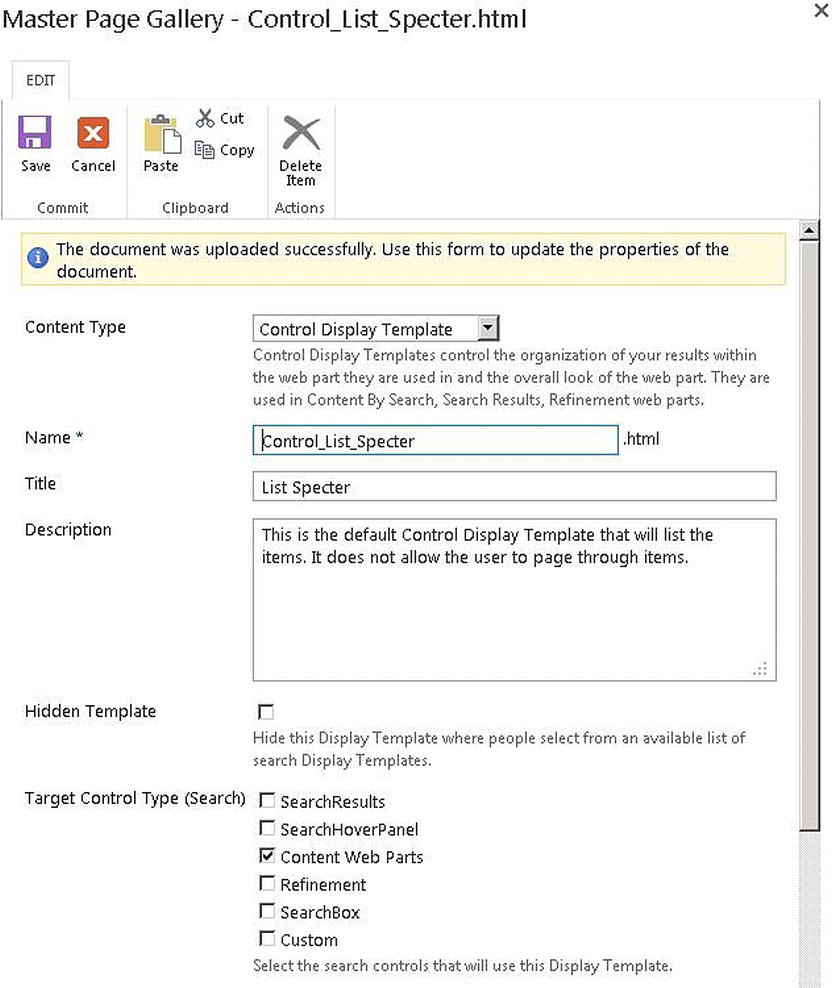
Figure 9-53. Properties to set when uploading a custom display template file to the Master Page Gallery
- As soon as the file is uploaded, a corresponding .js file is created next to the HTML file. Let’s verify the Control_List_Specter display template was created correctly.
- Navigate to the Floor Plan page and click Edit Page.
- Edit the Content Search web part on the page.
- In the web part tool panel on the right, in the Display template section, click the Control drop-down list. The new display template List Specter should be in the list as shown in Figure 9-54.
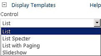
Figure 9-54. New display template is added to the Control display template drop-down list in the web part
Creating a Custom Item Display Template
Next, we customize the rendering of each search result by creating our own Item display template.
From the top of the Item_LargePicture.html page we created in a prior section, the value inside the <title> tag is the name displayed in the Item display template drop-down list when configuring the Content Search web part. We change it to Specter Large picture as in Figure 9-55.
Figure 9-55. Define a name for the custom Item display template
With the Item display template in place, next we need to tell the display template what to display for each item and how to display it.
Adding Search Managed Properties
Every Item display template contains information about the managed properties it needs to display. To update the managed properties referenced in the display template, we need to change the value of the ManagedPropertyMapping field, as shown in Listing 9-8. We need to add a tag called mso:ManagedPropertyMapping to include any out-of-the-box managed properties as well as any custom managed properties we have created in search (such as the one we created in the section “Creating Search Managed Properties for Content” earlier in this chapter). The ManagedPropertyMapping tag is a comma-separated list of managed property names and the properties in the UI to which they are mapped (see Listing 9-8). The UI properties can be mapped to multiple managed properties, other than the ones specified using the Property Mappings section of the Content Search web part tool pane.
For example, within the ManagedPropertyMapping tag, both PictureURL and PictureThumbnailURL are mapped to Image URL.
'Image URL': 'PictureURL;PictureThumbnailURL', 'Line 1':'Title', 'Line 1 Link':'Path',...
For our custom Item display template, we need to add two managed properties (see Listing 9-8).
Listing 9-8. Add Managed Properties to the Display Template and Map the Property to a Property in the UI
<mso:ManagedPropertyMapping msdt:dt="string">
        'LastModifiedTime':'LastModifiedTime',
        'Specter Property Type'{Specter Property Type}:'SpecterPropertyType',
        'Picture URL'{Picture URL}:'PublishingImage;PictureURL;PictureThumbnailURL',
        'Link URL'{Link URL}:'Path',
        'Line 1'{Line 1}:'Title',
        'Line 2'{Line 2}:'Description',
        'SecondaryFileExtension',
        'ContentTypeId'
</mso:ManagedPropertyMapping>>
Adding Inline JavaScript
As mentioned earlier all the HTML and JavaScript code we want to render on the page must be included inside of the first <div> tag.
Continue with the Item_LargePicture.html page, below the first <div> tag, and add the inline JavaScript code in Listing 9-9 to get data for each item.
Listing 9-9. Inline JavaScript Added to the Custom Item Display Template to Get Data for Each Result Item
var encodedId = $htmlEncode(ctx.ClientControl.get_nextUniqueId() + "_largePicture_Specter_");
var linkURL = $getItemValue(ctx, "Link URL");
linkURL.overrideValueRenderer($urlHtmlEncode);
var line1 = $getItemValue(ctx, "Line 1");
var line2 = $getItemValue(ctx, "Line 2");
var pictureURL = $getItemValue(ctx, "Picture URL");
var pictureId = encodedId + "picture";
var pictureMarkup = Srch.ContentBySearch.getPictureMarkup(pictureURL, 468, 220,
                                 ctx.CurrentItem, "cbs-largePictureImg", line1, pictureId);
var specterPropertyType = $getItemValue(ctx, "SpecterPropertyType");
var lastModifiedTime = $getItemValue(ctx, "LastModifiedTime");

var m_names = new Array("Jan", "Feb", "Mar",
    "Apr", "May", "Jun", "Jul", "Aug", "Sep",
    "Oct", "Nov", "Dec");

var d = new Date(lastModifiedTime);
var date = d.getDate();
var d_month = d.getMonth();
var month = m_names[d_month];
For the purpose of demonstration, let’s break the inline JavaScript in our solution into three sections.
- Get properties for the current item:
- Get the encoded client ID of the current result item
var encodedId = $htmlEncode(ctx.ClientControl.get_nextUniqueId() + "_largePicture_Specter_"); - Get the encoded URL of the detail page for the current item. linkURL is derived from the Link URL UI property, which is mapped to the Path managed property in our solution
var linkURL = $getItemValue(ctx, "Link URL");
linkURL.overrideValueRenderer($urlHtmlEncode); - Get all the properties that will be displayed for the current item. line1 is derived from the Line 1 UI property, which is mapped to the SpecterPropertyType managed property
var line1 = $getItemValue(ctx, "Line 1");
var line2 = $getItemValue(ctx, "Line 2"); - Get the URL of the picture that will be displayed for the item
var pictureURL = $getItemValue(ctx, "Picture URL");
var pictureId = encodedId + "picture";
- Create HTML markups for content to be displayed
The pictureMarkup value is derived from the getPictureMarkup function, which retrieves the HTML markup of an image with the image’s URL and ID
var pictureMarkup = Srch.ContentBySearch.getPictureMarkup(pictureURL, 468, 220,
ctx.CurrentItem, "cbs-largePictureImg", line1, pictureId); - Process the values of managed properties before we display them
- Get the Specter Property Type values for the current item. specterPropertyType is derived from the SpecterPropertyType managed property
var specterPropertyType = $getItemValue(ctx, "SpecterPropertyType"); - Get lastModifiedTime for the item and translate the value into Month and Date
var lastModifiedTime = $getItemValue(ctx, "LastModifiedTime"); - Utility function used to created “date” and “month” from the LastModifiedTime managed property. It gets translated into short month names
var m_names = new Array("Jan", "Feb", "Mar",
    "Apr", "May", "Jun", "Jul", "Aug", "Sep",
    "Oct", "Nov", "Dec");

var d = new Date(lastModifiedTime);
var date = d.getDate();
var d_month = d.getMonth();
var month = m_names[d_month];
Adding HTML Markup
Now we are ready to add some HTML markup to the custom item display template file to display data for each item. Scroll down the Item template HTML file to find the original HTML we want to remove (see Listing 9-10).
Listing 9-10. Out-of-the-Box HTML Markup in the Item_LargePicture HTML File
<div class="cbs-largePictureContainer" id="_#= containerId =#_"
        data-displaytemplate="ItemLargePicture">
            <div class="cbs-largePictureImageContainer" id="_#= pictureContainerId =#_">
                <a class="cbs-pictureImgLink" href="_#= linkURL =#_"
                     title="_#= $htmlEncode(line1) =#_" id="_#= pictureLinkId =#_">
                    _#= pictureMarkup =#_
                </a>
            </div>
            <div class="cbs-largePictureDataOverlay"  id="_#= dataContainerOverlayId =#_"></div>
            <div class="cbs-largePictureDataContainer" id="_#= dataContainerId =#_">
                <a class="cbs-largePictureLine1Link" href="_#= linkURL =#_"
                     title="_#= $htmlEncode(line1) =#_" id="_#= line1LinkId =#_">
                    <h2 class="cbs-largePictureLine1 ms-noWrap" id="_#= line1Id =#_">
                            _#= line1 =#_
                    </h2>
                </a>
                <div class="cbs-largePictureLine2 ms-noWrap" title="_#= $htmlEncode(line2) =#_"
                        id="_#= line2Id =#_" > _#= line2 =#_</div>
            </div>
        </div>
Before we remove it, however, let’s review the out-of-the-box HTML. Note the out-of-the-box template uses the ID from the search result as unique identifiers for some of the HTML tags. It displays the Title and Description managed properties for each result. It also shows pictureMarkup, which is a variable that was created from inline JavaScript shown previously that gets the HTML markup of the image for each search result. The inline JavaScript lives right above this code as shown in the previous section.
Let’s first replace this HTML markup with the HTML markup in Listing 9-11 to render each search result with the responsive design we implemented in the previous section. The HTML in Listing 9-11 generates the HTML markup for the Item display template while referencing the custom CSS for look and feel.
Listing 9-11. New HTML Markup for the New Item Display Template
<span class="_#= specterPropertyType=#_">
            <a href="_#= linkURL =#_" class="thumb">
                _#= pictureMarkup =#_
                <div class="date">
                        <div class="d">_#= date=#_</div>
                        <div class="m">_#= month=#_</div>
                </div>
            </a>
            <div class="caption">Property Type: _#= specterPropertyType=#_</div>
</span>
The end product of this HTML markup is Figure 9-56. As you can see, the display template displays an image, the last modified date, and the property type of a Floor Plan item.
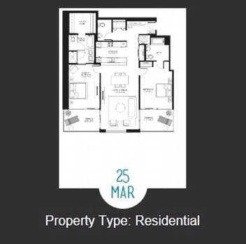
Figure 9-56. End product of the HTML markup for the custom Item display template
Let’s discuss each part of the HTML markup in detail.
- <li>
Recall from earlier that we talked about each Item display template renders an empty <li> tag, and under the <li> tag is where the content for each item goes. Inside of the Item display template, you will not see the actual <li> tag because it is generated for each item by SharePoint during runtime. Hence we cannot add any style, ID, or CSS class to this <li>. Recall from the Style for Each Item section, we created the CSS style for an <li> tag under a <ul> tag that has a feature class. Because we have already added the feature class to the <ul> tag, the <li> generated by SharePoint will automatically pick up the style we have created under the .feature li CSS code block demonstrated in Listing 9-2. As a result, each item will now be displayed in a three-column table.
- <a href="_#= lineURL =#_ class="thumb">
- For each search result, we want the image to link to the URL of the search result. lineURL is a variable created from inline JavaScript, which is mapped to the Path managed property (as described in the previous section). The thumb class is added to style the display of each result item as specified by the CSS code block (Listing 9-3) in the style.css file we have in the Master Page Gallery.
- _#= pictureMarkup =#_
For each search result, we want to display an image of the floor plan. pictureMarkup is a variable that was created from inline JavaScript that gets the HTML markup of the image for each search result (as described in the previous section).
- <div class="date"><div class="d">_#= date =#_</div><div class="m">_#= month =#_</div></div>
For each search result, we want to show the date the floor plan was modified. Both "date" and "month" are variables created from inline JavaScript that gets the date and month values from the LastModified managed property. The date and month class are added to style each result item with a circle for the date as specified in a CSS code block (Listing 9-5) in the style.css file we have in the Master Page Gallery.
- <div class="caption">Property Type: _#= specterPropertyType=#_</div>
For each search result, we want to show the property type of each floor plan. specterPropertyType is a variable created from inline JavaScript that gets the value from the SpecterPropertyType managed property (as described in the previous section). The caption class is added to style each result item with a circle for the date as specified in a CSS code block (Listing 9-4) in the style.css file we have in the Master Page Gallery.
As you can see, we are displaying the values of many managed properties throughout the template. We have plugged these values using the _#= and =#_ tags into the appropriate DIV or SPAN tags for formatting.
Integrating Search Results with the Custom Item Display Template
We have made all the necessary changes for the custom Item display template, Item_LargePicture_Specter.html, to render each result based on the Specter design. For other scenarios, if you have a different look and feel for each item, you would need to add specific CSS and HTML markup in the custom Item display template HTML file.
- Continue with the Item_LargePicture_Specter.html file, save the file, and upload it to the same location as the rest of the display templates.
- After uploading the file, note the Content Type is automatically selected as Item Display Template as a result of the file naming convention (see Figure 9-57). Also note that the title is automatically generated with the same text as the one we have indicated in the <title> tag in the HTML file. Under Target Control Type, make sure the Content Search Web Parts check box is selected, as this display template is specifically created for the Content Search web part. Click Save.
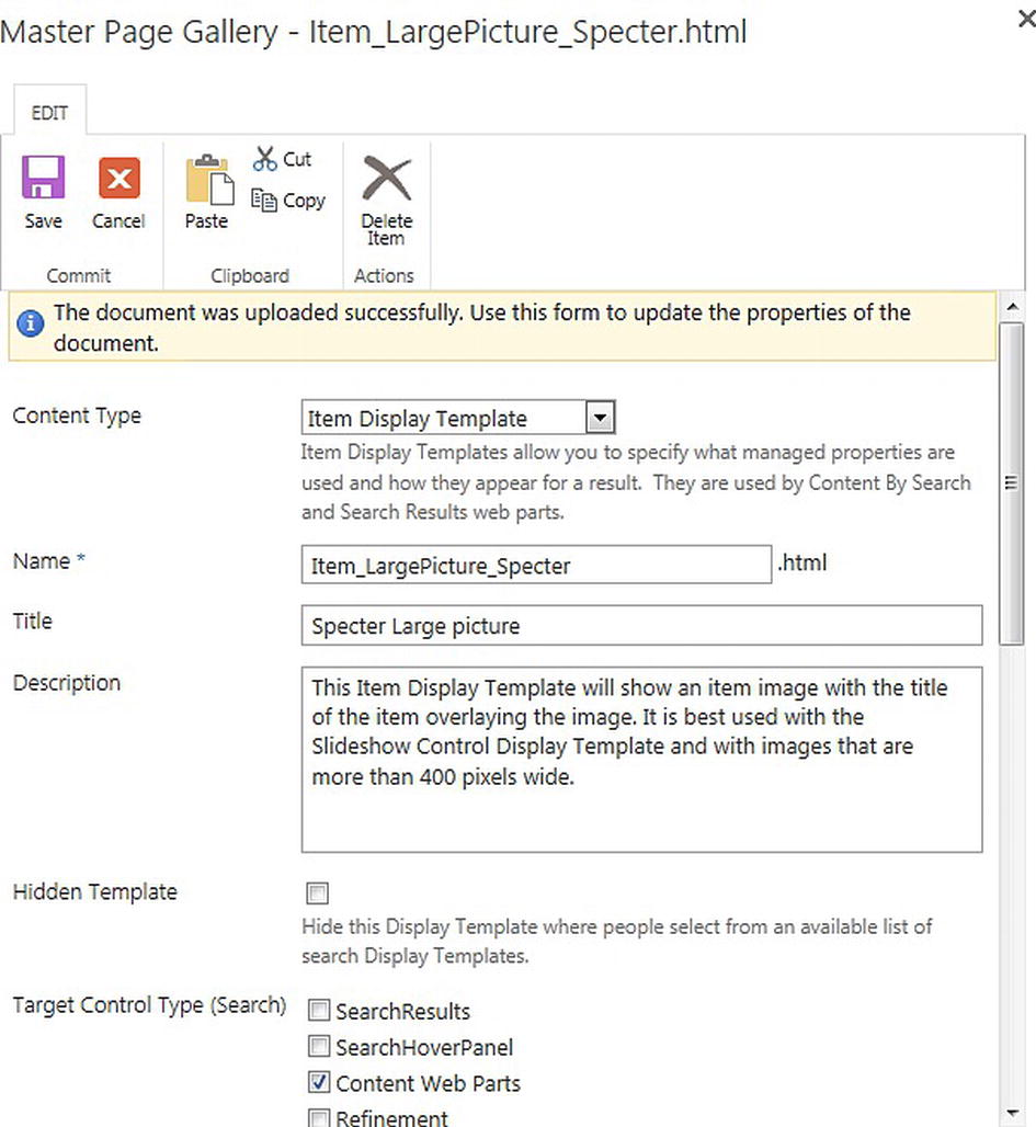
Figure 9-57. Properties to set when uploading a custom Item display template file to the Master Page Gallery
- After we have deployed both the Control and the Item display templates, we need to integrate them with our search solution. We can integrate by configuring the Content Search web part.
- Navigate to the Floor Plans page and click Edit page.
- Edit the Content Search web part. Once the web part configuration pane is opened on the right, in the Display Templates section, select List Specter in the Control drop-down list and select Specter Large Picture in the Item drop-down list (see Figure 9-58). Click Apply.
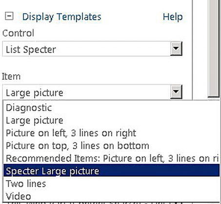
Figure 9-58. Change Control display template to List Specter and Item display template to Specter Large Picture
Note To get the same branding as the Specter design, make sure you are using the same Specter Group master page from Chapter 5 because we need to reference styles added to the style.css file, which is included in the Specter Group master page.
Once the page is saved, the result page should look like Figure 9-59.
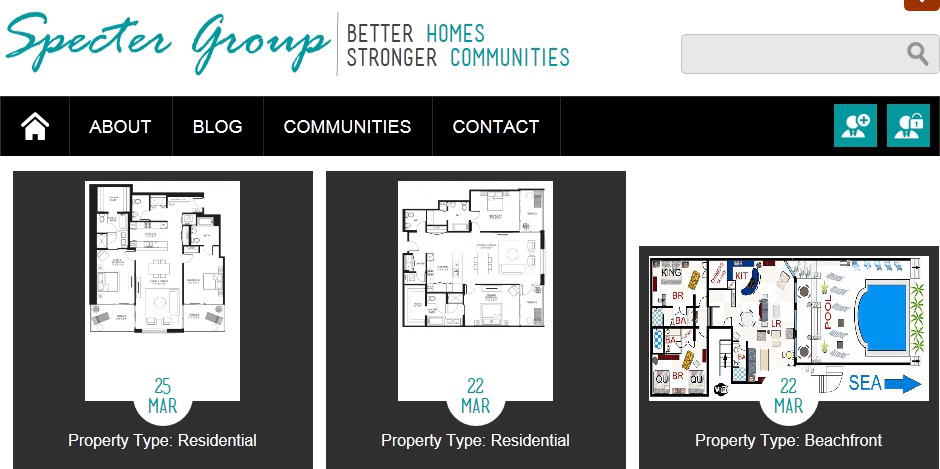
Figure 9-59. Result Floor Plans page after adding custom Control and custom Item display templates
Limitations of Display Templates
Earlier, we learned that each Item display template generates its own <li> tag during runtime. This means we cannot add ID, CSS class, or styles to the <li> tag because it does not exist in the display template at design time. When designing an HTML page, there are times when it requires us to add a CSS class to the <li> tag for each item; for example, when dealing with jQuery plug-ins, such as Isotope to provide dynamic filtering features to a list. In the case of Isotope, to make the filtering feature work, we need to add a CSS class to a <ul> tag and its immediate children <li> tags. Because we are working with display templates in SharePoint, when SharePoint renders each item with a given Item display template, an <li> tag will be automatically generated. Hence, when designing the display template, we cannot configure the <li> tag with any CSS class or ID, as required by the Isotope plug-in. As a result, the filtering feature provided by the Isotope jQuery plug-in does not work in display templates in SharePoint without changing the plug-in’s code.
Query Rules, Result Types, and Display Templates
In the previous section, we looked at how to create a content rollup solution using custom display templates and the cross-site publishing feature. Now we are going to look at how floor plans are rendered in search. We look at how we can fine-tune search queries and customize the display of results when users search for floor plans. SharePoint 2013 provides new features like query rules, result types, and display templates to allow better tuning and better presentation of search results based on the intent of the user’s query.
For the Specter Group Floor Plans scenario, we are going to create a query rule and a result type for floor plans, such that when users search for the keyword “floor plans,” the following things happen:
- We create a condition for the query rule to match on the keyword “floor plans.”
- Once the condition is matched, we promote a few beachfront properties to the top of the results if the current month is in the summer by configuring the publishing criteria of the query rule.
- We render the block of results for floor plans with its own user interface by creating a result type for floor plans.
For an example of how to configure query rules and result types, refer to the sections “Create a Query Rule to add a Summer Promotion for Beachfront Properties” and “Adding a Result Type for Floor Plans to Use Best Bet Item Display Templates,” respectively.
Query Rules
In SharePoint 2010, one query has one set of results. In SharePoint 2013, we are able to fine-tune search results based on the intent of the user’s query. When users enter a query, we help them find what they are really looking for by fine-tuning the query and adding additional information to offer results that we think the users are looking for. We can create query rules to trigger multiple queries and multiple results sets for a user’s search requests. All matching query rules can generate results. The query orchestration engine retrieves all the different sets of results and renders them to the user. The results are then rendered in a specific user interface based on their result types and the display templates associated with it. For more information on result types and associated display templates, refer to the section “Result Types” later in this chapter.
When creating a new query rule, there are three components to configure:
- Condition: Set of conditions to match for this rule to fire (example: no conditions means the rule will be fired every time).
- Action: What to do when this rule is applied (when conditions are matched).
- Publishing: When should the rule be active.
Query rules can be created at various levels, in the Search Service application from Central Admin or at the site collection level. They are inherited by default, such that query rules created in the Search Service application are inherited by all the site collections and query rules created at the site collection level are inherited by all sites within the site collection. They can also be deactivated at a level to ensure the rule is never applied for queries submitted at that level.
Note If multiple query rules are active and more than one rule can be matched for a given query, then the rules will be executed in no specific order because there is no prescribed order for execution. To ensure query rules are ranked for orders of execution, a custom group needs to be created to organize the query rules. Refer to http://sprwd.com/4czkg54 for more information.
Conditions allow us to define the criterion under which the query rule should apply. Each query rule can have multiple conditions. If no condition is specified, the query rule is triggered every time. If multiple conditions are specified, as long as one of the conditions is matched, then the query rule will be invoked. There are six types of conditions to choose from when creating a query rule:
- Query Matches Keyword Exactly: Query contains a specific word or words.
- Query Matches Dictionary Exactly: Query contains a word in a specific dictionary.
- Query Contains Action Term: Query contains an action word that matches a specific phrase or term set.
- Query More Common in Source: Query is common in a different source (like Videos Results Source).
- Result Type Commonly Clicked: Results include a common result type (like file type).
- Advanced Query Text Match: Advanced rule to match across a set of terms, dictionary, regular expression, and so on.
Note For more information on all the query rule conditions, refer to http://sprwd.com/sqs8jgt.
For the Specter Group Floor Plans scenario, we are going to configure our query rule for Floor Plans with the condition to match keyword “Floor plans.” Refer to the section “Creating a Query Rule to Add a Summer Promotion for Beachfront Properties” later in this chapter for more detail.
Query Rule Actions
Next, we need to configure actions to specify what happens when the query rule is applied. We can add multiple actions for each query rule. There are three options for actions:
- Assign promoted results: A promoted result is a result that appears at the top of the search results. This is similar to Best Bets in SharePoint 2010 or Visual Best Bets in FAST Search for SharePoint 2010. We can promote a result as a link or as a banner, which is a quick and easy way to visually present a certain result to users.
- Add result block: A result block is several search results displayed as a group. Similar to promoting a search result, we can promote a result block.
- A result block specifies an additional query to run and how to display the results.
- A result block uses a result source, which can be results from the local search index or results from outside of SharePoint, such as Exchange or OpenSearch. Both search scopes and federated locations features from SharePoint 2010 have evolved into result sources. An example of a result source using OpenSearch is federating search results from Bing by providing the OpenSearch URL for its search service. An example of an out-of-the-box result source, Documents, returns all files from the local SharePoint index.
- While configuring a result block, this feature includes a full query designer for building and testing queries, similar to Query Builder in the Content Search web part.
- A result block can be configured to use specific custom display templates.
- Change ranked results by changing the query: Change the way SharePoint handles a particular query by supplementing a query with additional keywords or managed property restrictions. This feature can be used to tune search results. The original query can be changed by modifying the query terms, adding additional terms, applying an XRANK formula to the query, and so on.
Caution Expanding the original query increases the time needed to execute the search query because additional queries are executed and additional result sets are returned. Be cautious when designing a query, as it might return too many search results, such that the query gets timed out or takes a really long time to finish.
Note When ranking a result block, the ranking applies to the entire block, not to individual items within the block. Every individual query made by every individual user is logged, as well as the user’s click-through choices. As items in a result block are clicked, the entire result block shows up higher in the search results. In time, the entire result block can start to percolate up to the top of the search results if users continue to select items in it.
For the Specter Group Floor Plans scenario, we are going to configure our query rule for Floor Plans with an action to add promoted results for a few beachfront properties.
The publishing options for a query rule determine when the rule can be used. By default, a rule is active until it is deactivated. We can also configure a rule to be active during a certain time. A good application of this is when a rule is set up for commerce scenarios. For example, we can set up a rule to promote certain products to the top for sale during a particular period of time, such as the holiday period.
In the Specter Group’s scenario, we want to show beachfront properties in the summer period. Refer to the section “Creating a Query Rule to Add a Summer Promotion for Beachfront Properties” later in this chapter for more detail.
We have created query rules to help us get the results. Now let’s see how we can display the results. SharePoint 2013 introduces a new framework, result types, for presenting search results to end users. Each result type has its own display template, making different types of results look distinct from each other and surfacing properties that are most relevant to that type of results. We can create result types to invoke display templates based on a set of rules. Each result type has the following elements.
- We need to create rules for the result type to determine when it should be applied. Each rule is based on a set of criteria such as content type, managed property, or result source. To create a result type, add a condition for ContentType that equals YourContentTypeValue. Depending on the complexity of the logic, result types can contain multiple conditions to match multiple values for multiple properties.
- Once we have defined the conditions for our result type, we need to configure the Action for the result type. For a given result type, we can choose our display template from the Action drop-down list, which includes all the available display templates. Display templates define the visual layout of a result type. For more information on display templates, refer to the section “Introduction to Display Templates” earlier in this chapter.
By default, SharePoint offers several out-of-the-box result types. For example:
- Documents result type: Rich document results for Word, Excel, and PowerPoint.
- Conversation result type: Rich conversation results for newsfeed, comments, replies, and community discussions.
- Video result type: Rich video results for video content.
For the Specter Group Floor Plans scenario, we create a custom result type for floor plans to point the Floor Plans result type to the Best Bet Item display template. Now when users issue a query, each result is evaluated against the result type rules. If the item is a result from the Floor Plan result source, the result item will be displayed using the Best Bet Item display template to distinguish it from all other results in the list. Otherwise, the result item will be displayed using another default template.
Creating a Query Rule to Add a Summer Promotion for Beachfront Properties
For the Specter Group search scenario, when users search for “floor plans,” we want to create a query rule to promote beachfront properties during the summer season. Because our query rules are used to display results to site visitors of the Specter Group public-facing site, we create the query rule at the site level for the public-facing site. Figure 9-60 shows the default search results page when a user enters “floor plans.” As you can see, results of all types from the search index are interleaved based on their ranking. Each result has a result type, which determines how the item is rendered in the Search Results web part.
Figure 9-60. Search results with out-of-the-box configurations
Let’s create a query rule to promote beachfront properties during the summer promotion season.
- On the Specter Group public-facing site, click Site Settings.
- Under the Search section, click Query Rules.
- On the Manage Query Rules page, on the Select a Result Source menu, select the Floor Plan result source for the new query rule (see Figure 9-61).
- Click New Query Rule.
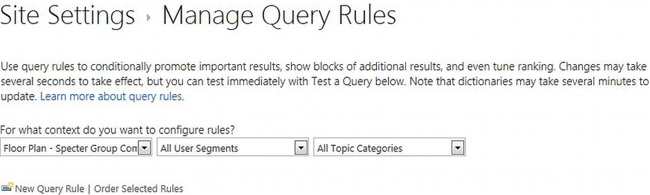
Figure 9-61. Create a new query rule for a result source
- On the Add Query Rule page, in the General Information section, in the Rule name field, type Summer Promotion as the name of the new query rule (see Figure 9-62).
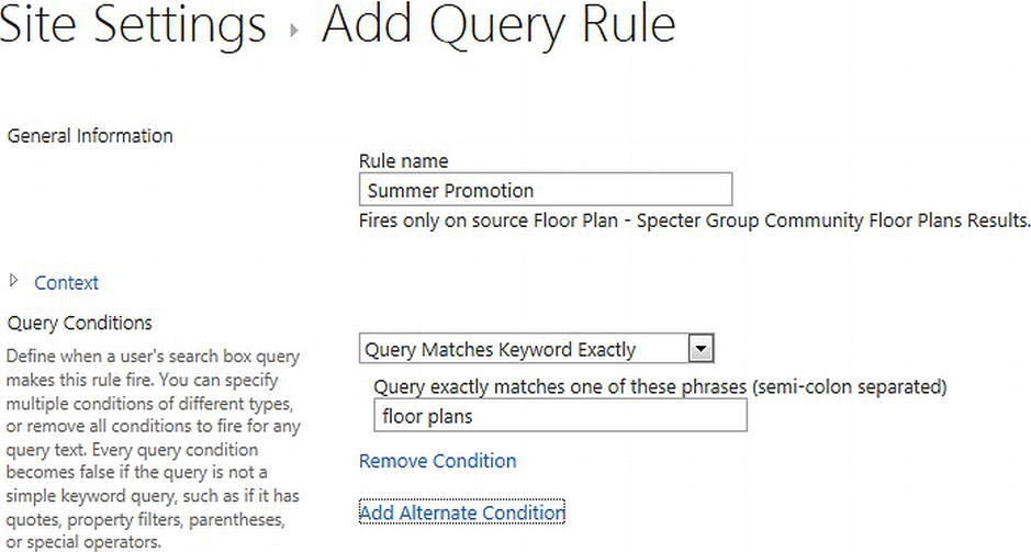
Figure 9-62. Add a condition to a query rule
- Expand the Context section and note that the Floor Plan result source is selected by default.
- Going down the page, in the Query Conditions section, ensure Query Matches Keyword Exactly is selected in the drop-down list. Enter floor plans in the text box as the query phrase to match (see Figure 9-62).
- In the Actions section, click the Add Promoted Result link to add promotion for a few beachfront properties.
- In the Add Promoted Result window, shown in Figure 9-63, select the Add new promoted result option. Enter Beachfront property in the Title field, then enter the URL for the promotion banner. Select the Render the URL as a banner instead of as a hyperlink check box to render the image as a banner. Click Save to continue.
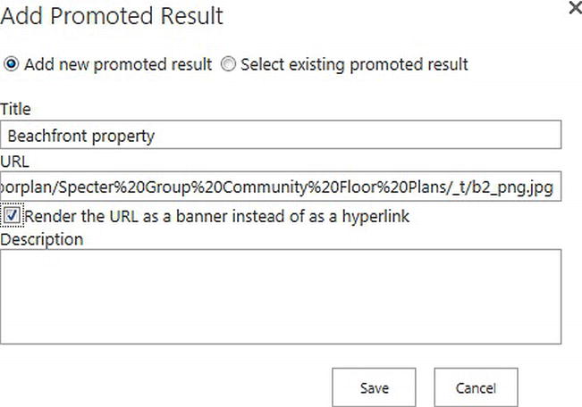
Figure 9-63. Add a promoted result as the query rule’s action
- Perform the same steps for a few beachfront properties in the Actions setting of the new query rule. Once that is completed, the Actions setting should look like Figure 9-64.
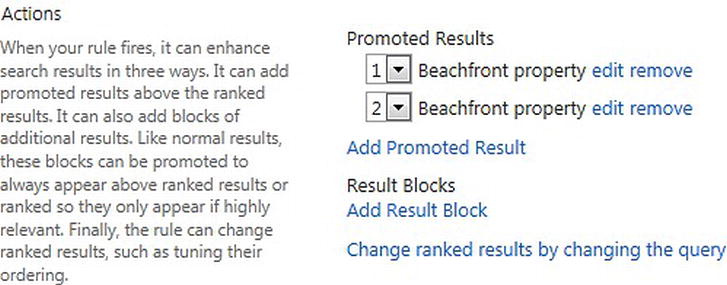
Figure 9-64. Configure Actions for a query rule
- Continue down the page and expand the Publishing section. Ensure the Is Active check box is selected and enter date values for Start Date and End Date to make sure this query rule is only active during certain dates (see Figure 9-65). Click Save to create the new query rule.
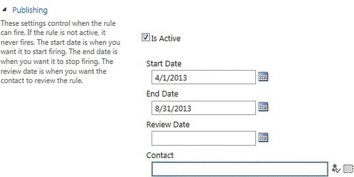
Figure 9-65. Configure Publishing for a query rule to specify when the rule is active
- Once the query rule is created, we see a summary of the query rule from the Manage Query Rules page like that shown in Figure 9-66, when filtered by the Floor Plan result source. This is a quick way to view all query rules that can be invoked at this site.
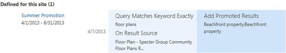
Figure 9-66. Summary of the new query rule
- To test the query rule, navigate to the search page to ensure the new query rule is applied. On the search page, enter floor plans in the search box. You should see the promoted results shown in Figure 9-67 appear at the top of the page.
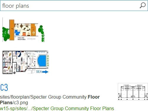
Figure 9-67. Search results page with promoted results after the new query rule is triggered
Adding a Result Type for Floor Plans to Use Best Bet Item Display Templates
Our next scenario is to create a result type for Floor Plans so that when users search for floor plans, they will be able to quickly spot the results in the Floor Plans result source from all other results in the list.
- From the Specter Group public-facing site, click Site Settings.
- Under the Search section, click Result Types.
- On the Manage Result Types page, click New Result Type at the top. Enter Floor Plans as the name of the new result type. Next to Conditions, select the Floor Plan result source to match (see Figure 9-68). By configuring the result source as its only condition, any result item in the Floor Plan result source will use this result type for rendering.
Figure 9-68. Create a new result type for all items in a result source
- Next, for the Actions property, we need to select the Best Bet Item display template from the drop-down list to highlight the floor plan results the users are interested in (see Figure 9-69).
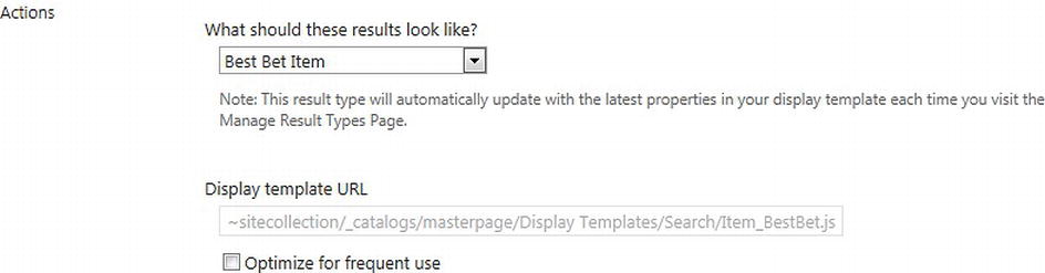
Figure 9-69. Configure the new result type to use the Best Bet Item display template
- Click Save to create the result type. On the Manage Result Types page, we can view a summary of the new result type (see Figure 9-70).

Figure 9-70. Summary of the new result type
- To test the new Floor Plans result type, navigate to the search page and enter Floor Plans in the search box. You should see the results shown in Figure 9-71.
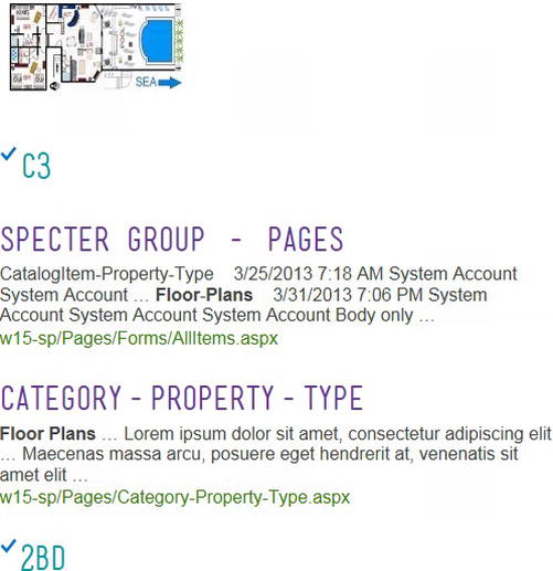
Figure 9-71. Search results page with promoted results at the top and best bet rendering of all floor plan items after the new query rule is triggered and the new result type is added
Now we have the promoted results at the top of the page and each floor plan result is rendered using the Best Bet Item display template so that they are distinguished from the rest of the results in the list.
Summary
With the new publishing and search features in SharePoint 2013, we are able to use the power of search to surface dynamic web content on sites. In this chapter, we learned how to create beautiful search experiences using the new user experience framework in SharePoint 2013 by using the new Content Search web part combined with HTML, JavaScript, CSS, query rules, result types, and display templates. We created a content rollup solution by creating custom display templates for SharePoint’s Content Search web part. Then, we look at how to fine-tune search queries and customize the display of results in a search by using query rules and result types to improve the search experience.