Chapter Goal: While gradients and gradient meshes have been used for many years in Illustrator, how do they compare to freeform gradients? During this project, this will be explored, along with the Transparency panel.
In Photoshop, gradients can be used to enhance a pattern or even a layer mask. However, on their own in Photoshop they really do not warp and distort, only blend one image into the next. This is not the case in Illustrator. In this chapter, we will look at how to warp our gradients on a shape using a few gradient-related tools, and then at how a gradient can interact on a Opacity mask and how opacity and transparency can be used in brushes as well.
Note
You can find the projects for this chapter in the Chapter 8 folder.
Throughout this chapter, we will be looking first at the various panels and tools, and then at how we can apply what we have learned to the picture of the girl at the farm.
Working with Gradient Panel and Gradient Tool
Gradients are often a blend of two or more colors, and they can be used to create shadow and highlights on the fill or the stroke of an object. When multiple gradients are used together, we can achieve in our illustrations a level of realism or, at the very least, create artwork that does not look flat or two-dimensional.
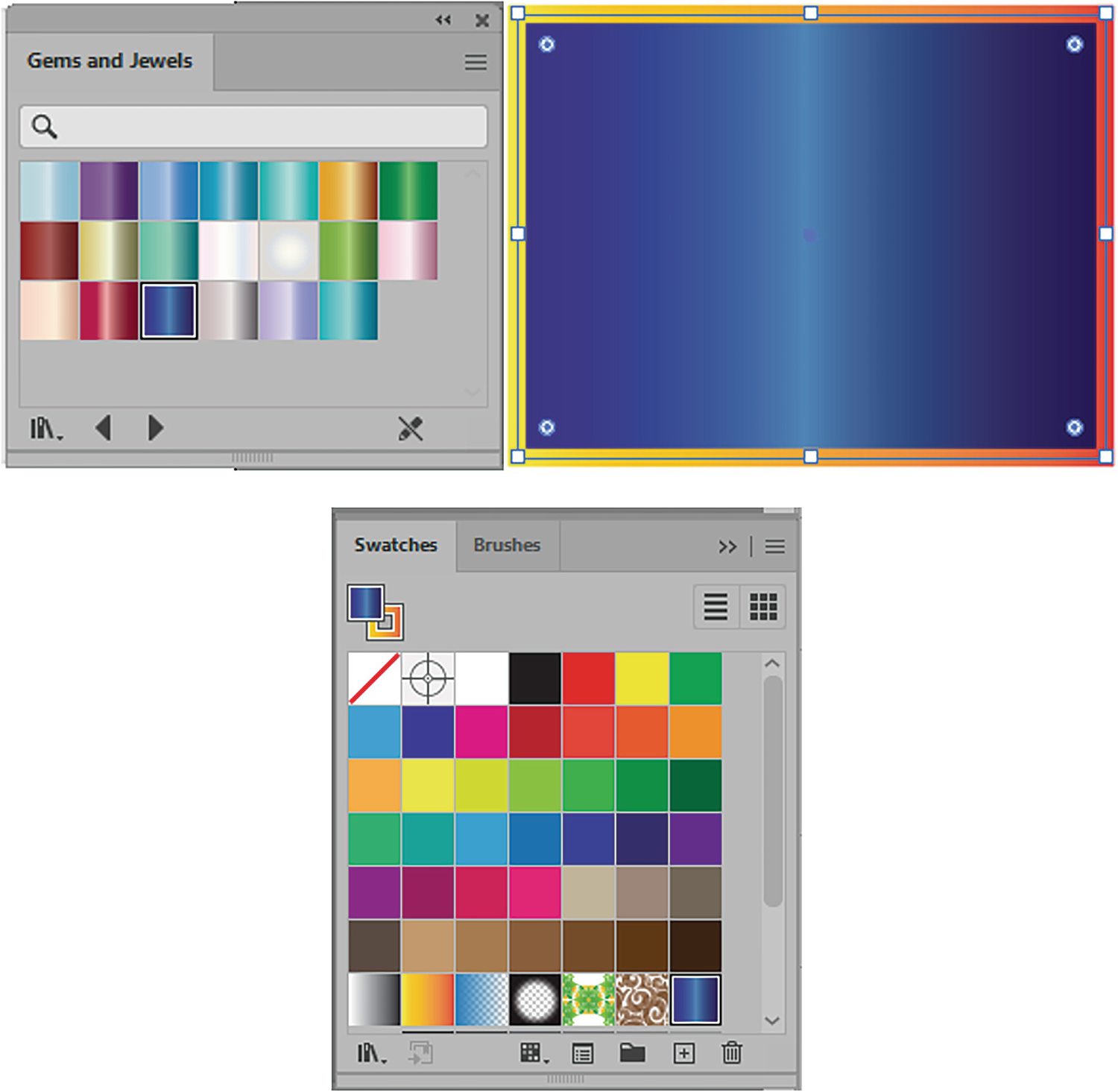
Gradients, like patterns in Illustrator, are stored in the Swatches panel. There are a few default gradients available next to the patterns when you open a new file. These are ones that Adobe has decided that you might use or that might be a good starting point when learning about gradients. Refer to Figure 8-1.
Figure 8-1
Swatches panel with four default gradients
To work with a gradient, you can draw out a rectangle or other shape with one of the Shape tools or create an open or closed path with the Pen tool. Refer to Figure 8-2.
Figure 8-2
Toolbars panel Shape tools and Pen tool, with rectangle on Artboard
Then, while the path is selected, either click on the gradient in the Swatches panel to add it to the path’s currently selected fill or stroke, or use the Control or Properties panel to add it to the fill or stroke or both. Refer to Figure 8-3.
Figure 8-3
Gradient stroke in Toolbars panel, gradient accessed for fill and stroke from Control panel, rectangle with gradients applied, and same settings found in Properties panel
Note
You can also use the area below the Toolbars panel’s fill and stroke options to add a recent gradient. Refer to Figure 8-4.
Figure 8-4
Setting a current gradient using the Toolbars panel
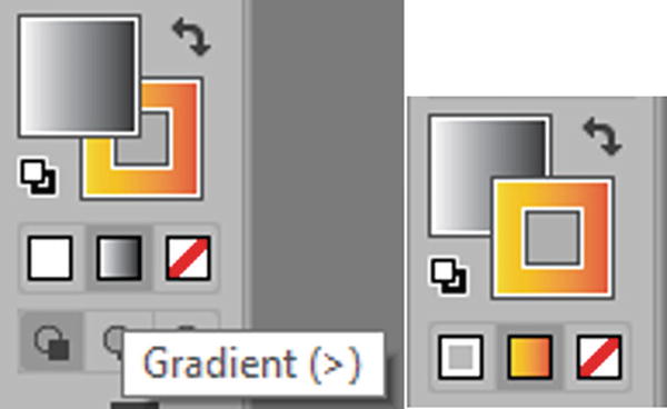
If you want to acquire additional gradients for your Swatches panel, you can find them under Window ➤ Swatch Libraries ➤ Gradients or via the Library icon at the bottom of the Swatches panel. Refer to Figure 8-5.
Figure 8-5
Accessing Gradient menu through Swatches panel Libraries menu and sub-menus
There are about 21 gradient libraries you can choose from. As with the pattern libraries, once you open a library you can click on a gradient swatch to add it to your Swatches panel and apply it at the same time to a selected object. Refer to Figure 8-6.
Figure 8-6
Swatch libraries gradient Gems and Jewels can be added to the current path and the Swatches panel
Note
If you need to remove a recently added swatch, you can either use Edit ➤ Undo (Ctrl/CMD+Z) or use the History panel right away; or, while the swatch is selected, click the Delete Swatch Icon in the Swatches panel and click Yes to delete the selection or No to cancel the deletion. Refer to Figure 8-7.
Figure 8-7
Swatches panel Delete Swatch button and alert message
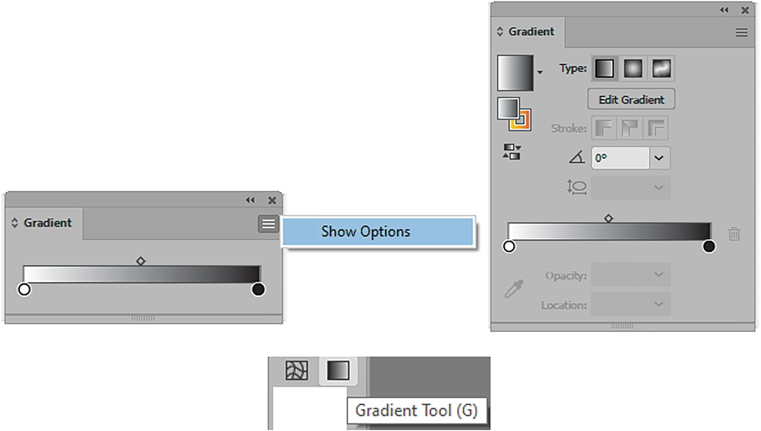
However, if you want to create your own custom gradient then you need to use two items in Illustrator: the Gradient panel and the Toolbars panel Gradient tool. We will look at these together next and see how they can be used to create three types of gradients. Refer to Figure 8-8.
Figure 8-8
Gradient panel with Show Options set to show more in the Gradient panel, and Gradient tool in Toolbars panel
Note
If you cannot see the same options as shown in my Gradient panel, make sure to click Show Options in the Gradient panel menu. Refer to Figure 8-8.
On your own, you can practice creating a selected shape in a File ➤ New Document as you did in Chapter 1 and try working along with the Gradient tool and panel.
Linear Gradient
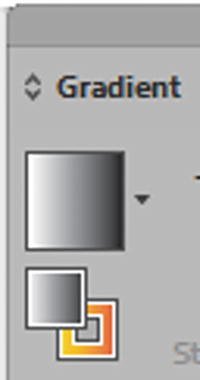
When you look at the Gradient panel you will find on the right the current active gradient. In this example, it is a linear gradient, and it is the one that is applied to the fill of the shape. Refer to Figure 8-9.
Figure 8-9
Gradient panel with Linear Gradient fill set
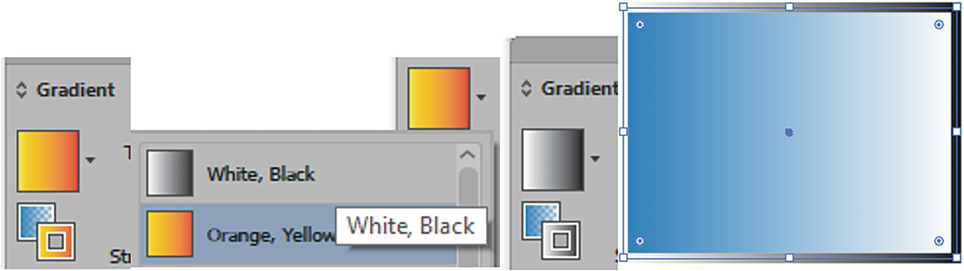
Linear Gradient Fill and Stroke
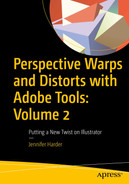
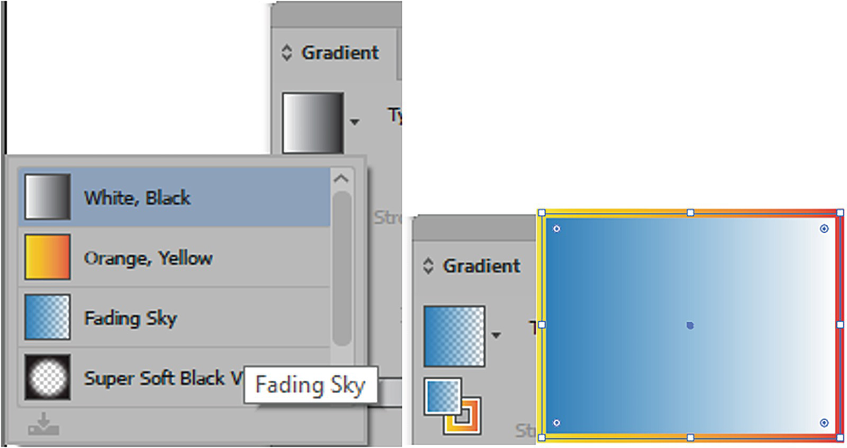
From the dropdown list of current gradients within the document, you can select another gradient to switch to. This will then update the current gradient for both the fill and the selected object. I used Fading Sky. Refer to Figure 8-10.
Figure 8-10
Setting a new linear gradient fill from the Gradient menu; it updates in the fill of the shape
You can then select the stroke in the Gradient panel and use the same menu to change that as well to a different gradient. Then the stroke is updated on the selected shape. I used White, Black. Refer to Figure 8-11.
Figure 8-11
Setting a new linear gradient stroke from the Gradient menu; it updates in the stroke of the shape
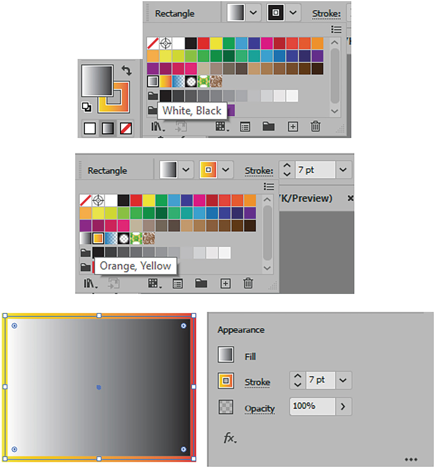
You can then use the Reverse Gradient button, located below the current fill and stroke, to swap either the selected stroke or fill gradient’s direction. This will update on the selected shape. Refer to Figure 8-11 and Figure 8-12.
Figure 8-12
Reverse the gradient order, and it appears in the shape in the opposite direction
Note
To swap the gradients between fill and stroke you need to use the Toolbars panel as you do with solid fills (Shift+ X).
Now select the fill gradient, for the moment, and look at the options to the right in the Gradient panel. Not all options are currently available. Refer to Figure 8-13.
Figure 8-13
Gradient panel with gradient fill selected
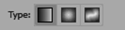
Type: Currently, the selected type of gradient is linear; a linear gradient follows a straight horizontal, vertical, or angled line. One color stop flows to the other; we will look at how to adjust that in a moment. There are two other types of gradients, radial and freeform, which we’ll look at later in this chapter. Refer to Figure 8-14.
Figure 8-14
Gradient panel linear gradient
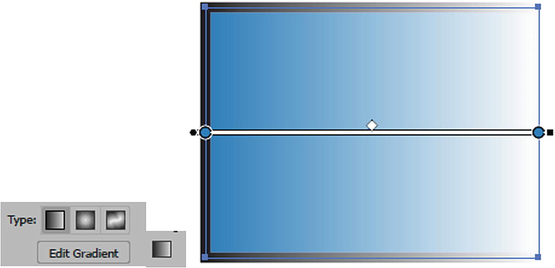
Edit Gradient: When this button is clicked it automatically brings up the Gradient tool settings annotator on the selected object. The button also temporarily disappears from the panel, and the focus in the panel is only on this fill gradient, not the stroke. Refer to Figure 8-15.
Figure 8-15
Linear gradient with Edit Gradient clicked, and the Gradient tool is selected with its annotator
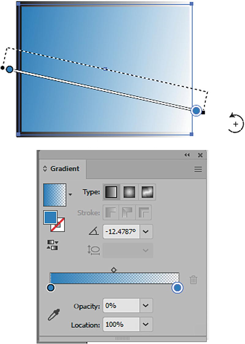
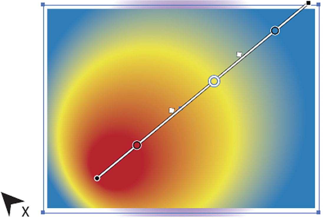
Gradient Tool (G)
The Gradient tool’s annotator allows us to move and modify the gradient angle using the various handles. In this case, we are editing the fill. These same settings will be reflected in the Gradient panel as well.
Note
If you cannot see the annotator, go to View ➤ Show Gradient Annotator.
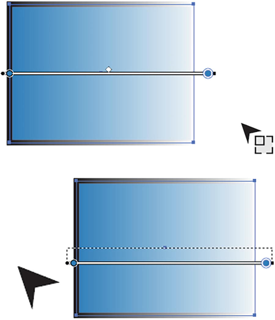
For example, drag on the right-side black square point handle of the Gradient tool to stretch or scale the gradient, or on the left-side black circle to move the gradient by dragging on the starting point either inside or outside of the rectangle. Refer to Figure 8-16.
Figure 8-16
Use the Gradient tool to scale and move a gradient when the cursor changes
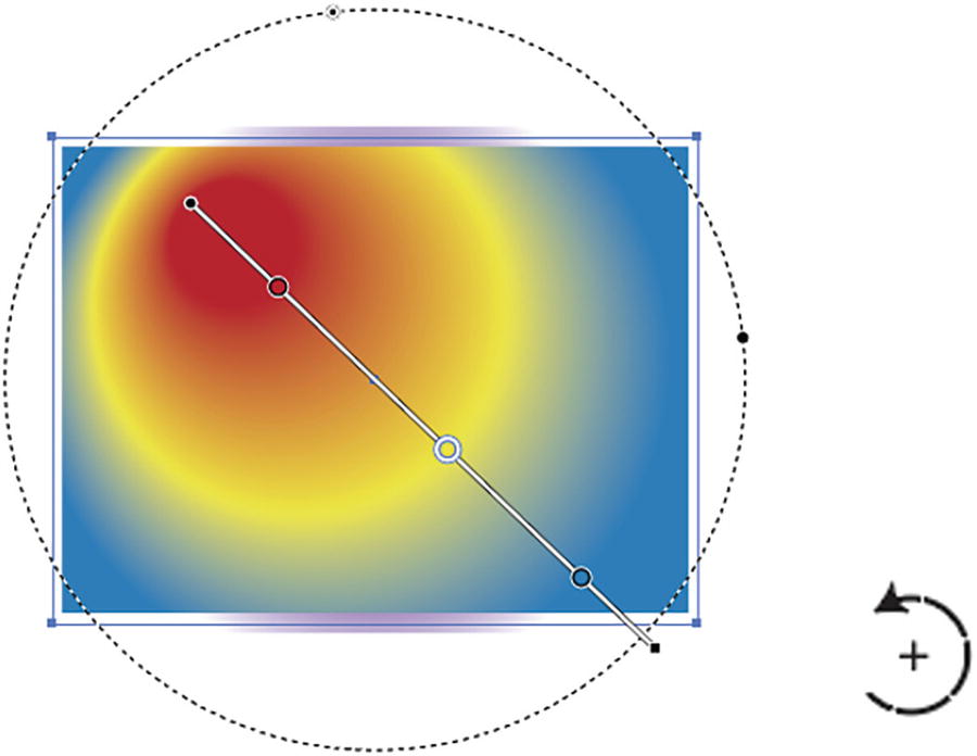
When the pointer turns to a rotation cursor near the black square end you can rotate the gradient on the end point as well, and this rotation is noted in the Gradient panel under the Angle section. You can also drag out the gradient at a new angle and starting point with the annotator. Refer to Figure 8-17.
Figure 8-17
Use the Gradient tool to alter the angle of the gradient, and the angle appears in the Gradient panel
Likewise, you can adjust the angle (-180°,0°,180°) in the Gradient panel using the text box or dropdown list, and that will be reflected in the Gradient tool for the selected shape. Refer to Figure 8-18.
Figure 8-18
Setting the angle of the gradient using the Gradient panel
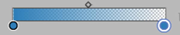
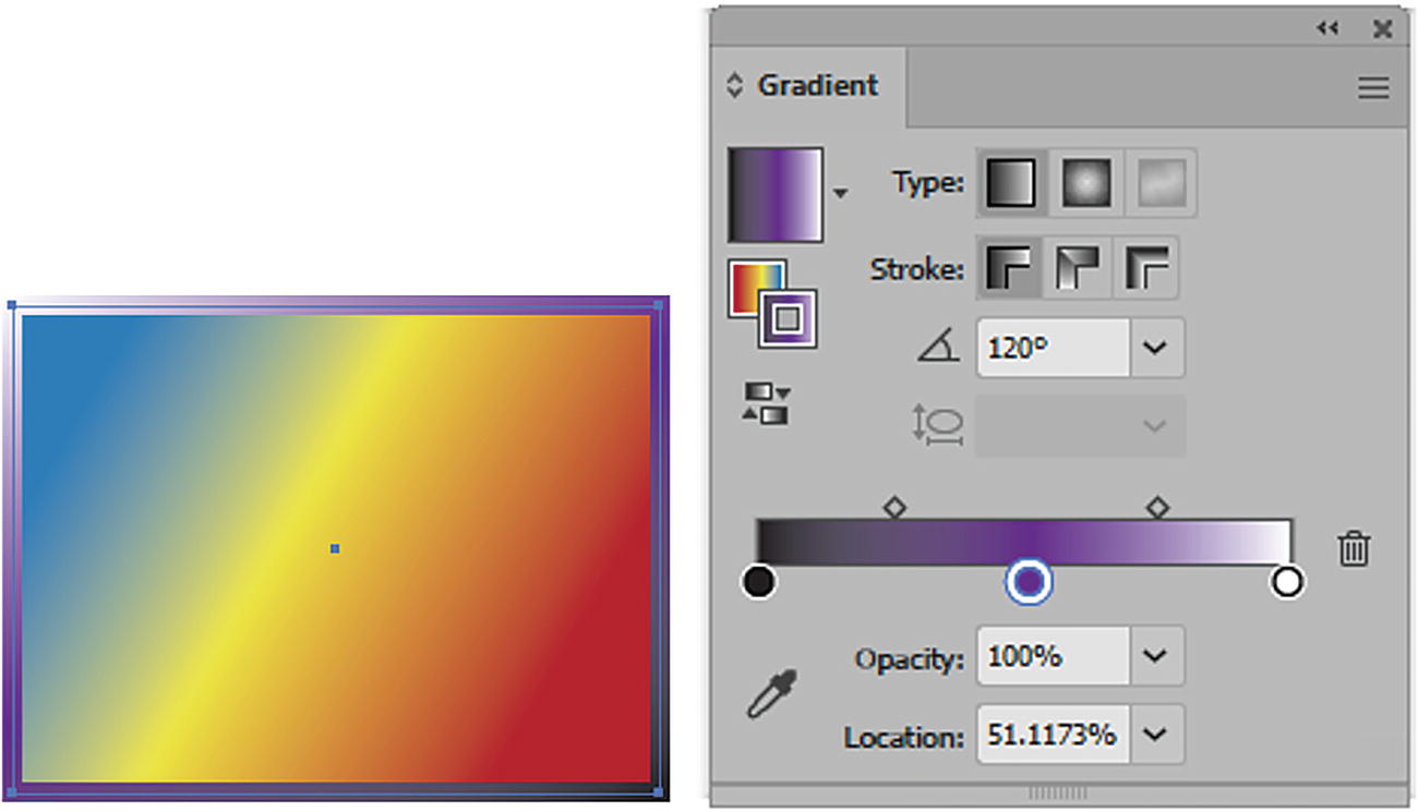
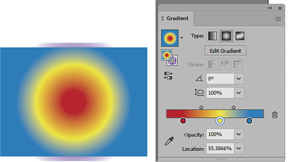
For the fill’s linear gradient in the Gradient panel, you can set the colors of the Gradient annotator slider using the circular slider color stops currently seen here in blue in the gradient panel. In the middle of them is the diamond shaped mid point slider. The control how a gradient start, stops and transitions. Refer to Figure 8-19.
Figure 8-19
Gradient panel circular color stops and diamond midpoint slider
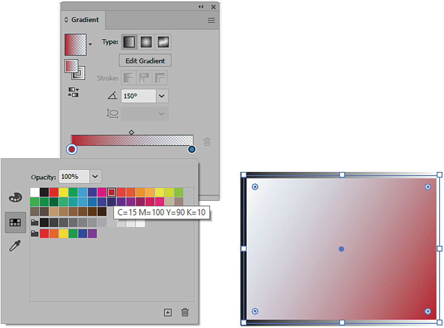
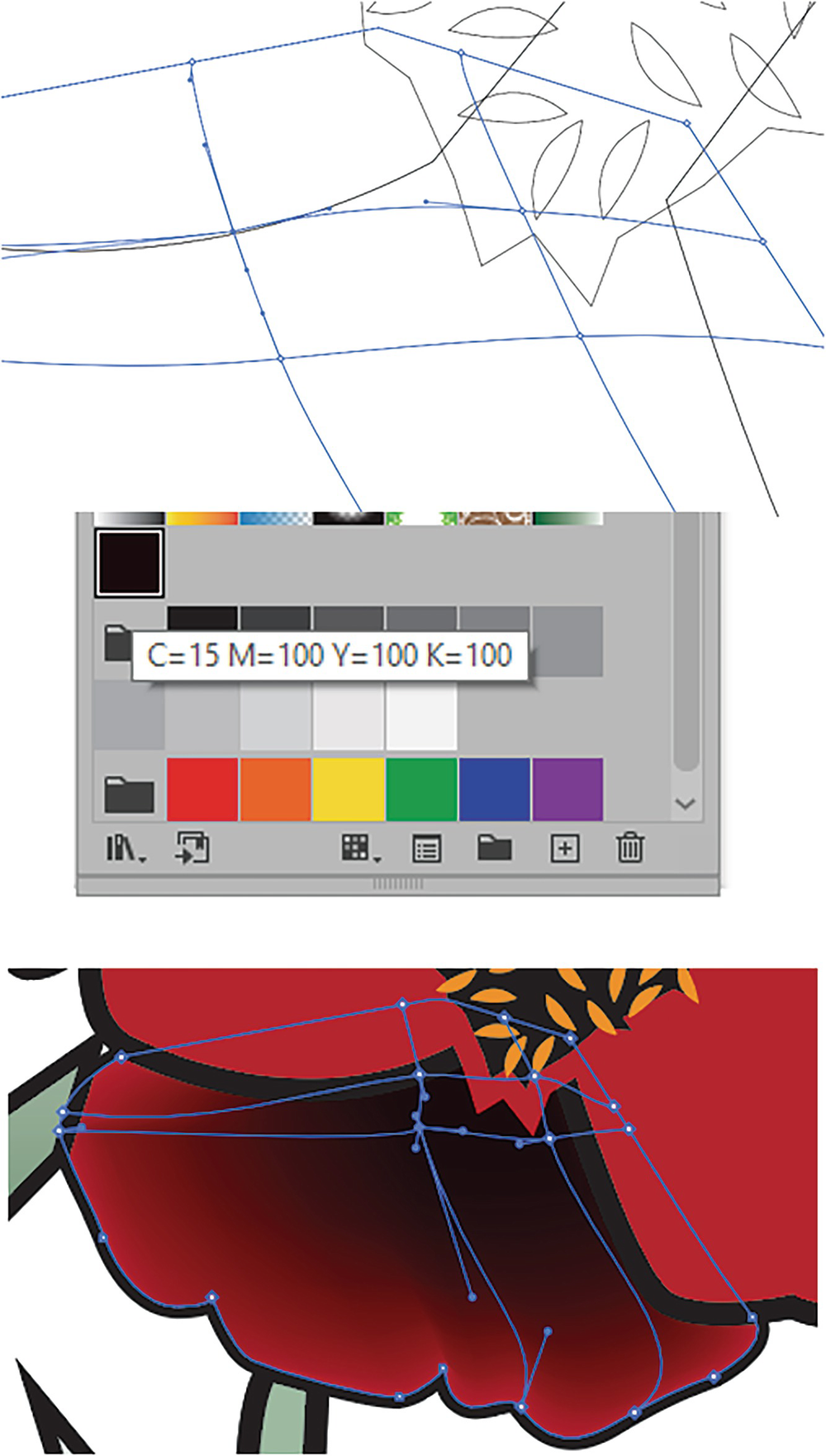
You can alter a gradient sliders color swatch stop by double-clicking on it so that you can view the current swatches in the Swatches panel, and then you can select a swatch to alter the gradient. In this case I used C=15, M=100, Y=90, K=10. Refer to Figure 8-20.
Figure 8-20
Gradient panel with new color stop selected and changed in the panel and in the fill of the shape on the Artboard
Note
To add a new color you can also use your color or color picker (eyedropper) options. Refer to Figure 8-20.
In this case, the current selected color stop has an opacity of 100% and is sitting at the far left location of 0% in the panel, though because of the angle the color will show up on the right side of the rectangle. Refer to Figure 8-20 and Figure 8-21.
Figure 8-21
Gradient panel, color stop’s current opacity and location
However, if you click on the other blue color on the right side of the panel, you will see that it has an opacity of 0% and is at the location of 100%, as seen on the upper far left of the rectangle due to angle. In the panel you can double-click on this color to change it, but because the color is faded to an opacity of 0% and location of 100%, the color change may not be that noticeable on a white Artboard. Refer to Figure 8-22.
Figure 8-22
Setting the new color for the second color stop in the Gradient panel
In this case, set the Opacity option to 100%, and then you can see the red and blue, or set it between the range of 0% and 100% for a gradual fade. Refer to Figure 8-23.
Figure 8-23
Setting the Opacity and Location options for the second color stop in the Gradient panel, changing the fill color in the shape
In this case, I changed the Opacity setting to 20%. Refer to Figure 8-23.
Note
Clicking on the eyedropper next to the Opacity and Location fields is the same as when you select the eyedropper when you double-click to find a new swatch. This allows you to use a color-picker eyedropper to select a color from an object on the Artboard for the selected color stop. Press the Esc button to exit the color picker and continue working with the Gradient panel and Gradient tool. Refer to Figure 8-23.
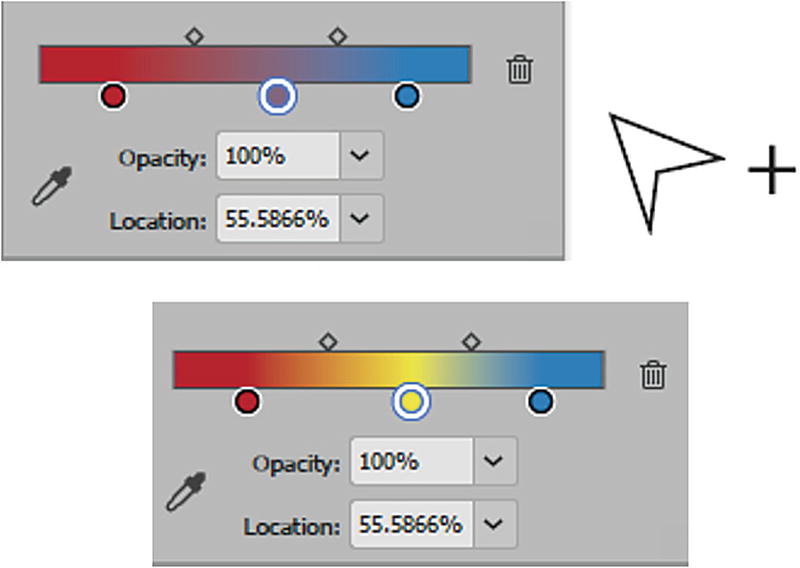
The white diamond-shaped slider between the two colors in the Gradients panel allows you to move the midpoint between the two colors to a new location. When it is selected, it changes to black. You can see this change on the shape too when the Gradient tool is active, and you can adjust these same settings while on the shape by moving the annotator circular color stop sliders away from the start and end points and moving the diamond midpoint as well. Refer to Figure 8-24.
Figure 8-24
Using the Gradient panel and annotator to set the new location for the diamond midpoint slider and circular color stops
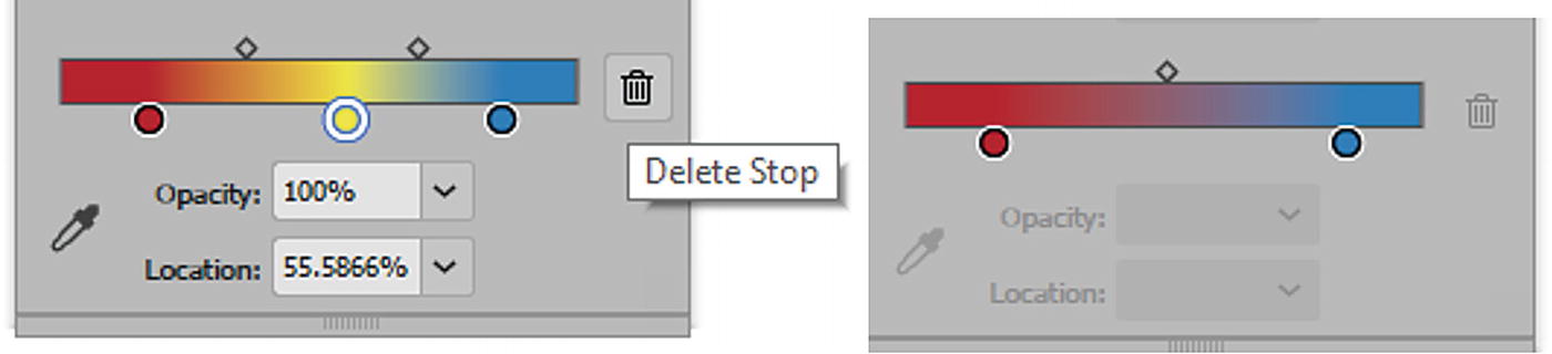
A gradient slider needs a minimum of two colors. You can add more by clicking just below the gradient when the pointer adds a plus icon. This adds a new color that you can set to a new color swatch when you double-click on it. Then you can set a new opacity and location for it as well. Refer to Figure 8-25.
Figure 8-25
Adding a new color stop to the Gradient panel and changing its color
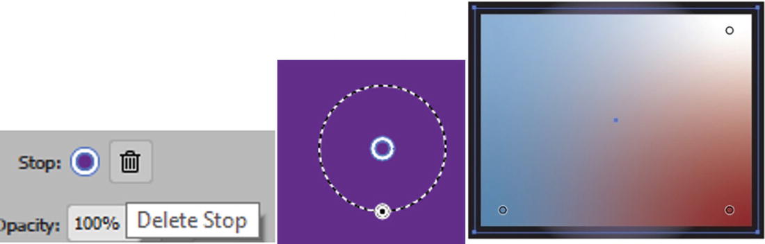
You can then adjust the diamond midpoint sliders in between the stops as well to a new location. You can set more color sliders as well. To remove them either drag them off the gradient or, when they are selected, click the Trashcan icon (Delete Stop). Refer to Figure 8-26.
Figure 8-26
Delete a selected stop to remove it from the Gradient panel
You can use Edit ➤ Undo to undo that last step and add back the stop you deleted. Refer to Figure 8-27.
Figure 8-27
The selected stop added back to the Gradient panel and then adjusted using the gradient annotator
Once a gradient is complete it can be saved in the Swatches panel from the Gradient menu by clicking on the dropdown menu Add to Swatches icon. Refer to Figure 8-28.
Figure 8-28
Saving the new linear gradient created from the Gradient panel and storing it in the Swatches panel
Once you have created a linear swatch you can double-click on it in the Swatches panel and rename it. I called mine Red Yellow Blue Gradient. Click OK to commit the name. Refer to Figure 8-29.
Figure 8-29
Naming the new gradient for the Swatches panel
Linear Gradient Strokes
When the gradient stroke is selected in the Gradient panel, you have access to some other options for the stroke itself. Gradient strokes are more apparent with a larger stroke weight. Refer to Figure 8-30.
Figure 8-30
Creating a stroke gradient in the Gradient panel
By default, the stroke is set to Apply Gradient within Stroke. Refer to Figure 8-31.
Figure 8-31
Gradient panel stroke setting Apply Gradient within Stroke, and as it appears on shape
However, it can also be set to Apply Gradient Along Stroke for a more beveled effect. Refer to Figure 8-32.
Figure 8-32
Gradient panel stroke setting Apply Gradient Along Stroke, and as it appears on shape
Or Apply Gradient Across Stroke, for a more rounded frame edge. Refer to Figure 8-33.
Figure 8-33
Gradient panel stroke setting Apply Gradient Across Stroke, and as it appears on shape
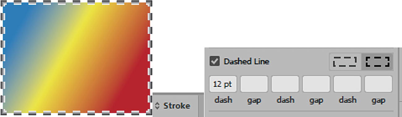
Tip
You can use your Stroke panel if you want to create a dashed gradient stroke. Refer to Figure 8-34.
Figure 8-34
Using the Stroke panel to create a dashed line gradient
For the stroke in the Gradient panel, you can use all the other settings, adjust the angle, alter the gradient’s color, as well as set new stops with different opacities and circular slider stop locations and move the diamond midpoint sliders. Refer to Figure 8-35.
Figure 8-35
Adjust the Angle, Opacity, and Location settings of the stroke gradient using only the Gradient panel
However, when you select the Gradient tool, you will notice that the Gradient tool annotator is not available for strokes, only fills.
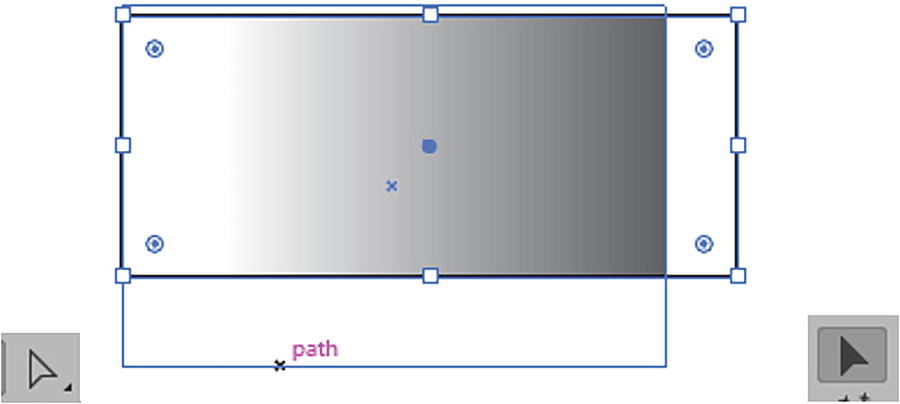
Note
You can also apply a linear fill gradient with the Gradient tool across multiple selected paths and then drag across them to create a unifying origin point and angle for all. Shift-drag to constrain the angle to 45° increments. Refer to Figure 8-36.
Figure 8-36
Use the Gradient tool to adjust multiple selected gradient fills at once or leave as separate gradients
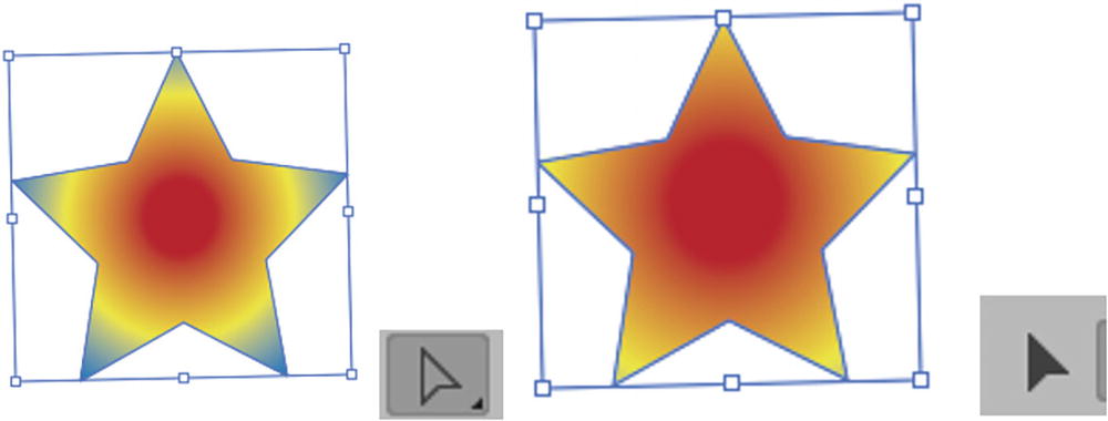
As you scale, the object the gradient is in will scale as well.
One way to get around this issue would be to create a gradient on a separate path with the Gradient panel. And then create another path with no fill over the top. Then, select both and create an Object ➤ Clipping Mask ➤ Make. Then you could scale one path separate from the other using the Direct Selection tool and then the Selection tool. Otherwise, you must use your Gradient tool and its annotator to drag out a new gradient. Refer to Figure 8-37.
Figure 8-37
Use the Selection tool to select a path within a clipping mask and to scale it
Project: Blowing in the Wind, Part 6, Adding Linear Gradients
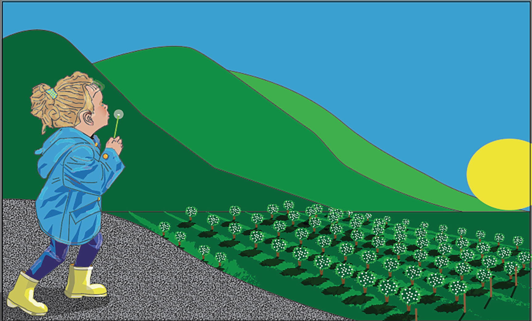
In this part of the project of the girl at the farm, we will first begin by adding linear gradients to parts of the scenery. Refer to Figure 8-38.
Figure 8-38
Girl on the Farm image upon opening the file
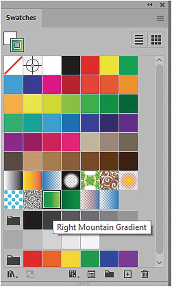
Open Landscape1_6_start.ai. Save a copy if you want to follow along. In this case the gradients have already been added to the Swatches panel, and I have named them so that it will be easy for you to apply them to the various parts of the landscape. Refer to Figure 8-39.
Figure 8-39
Gradients have been named in the Swatches panel
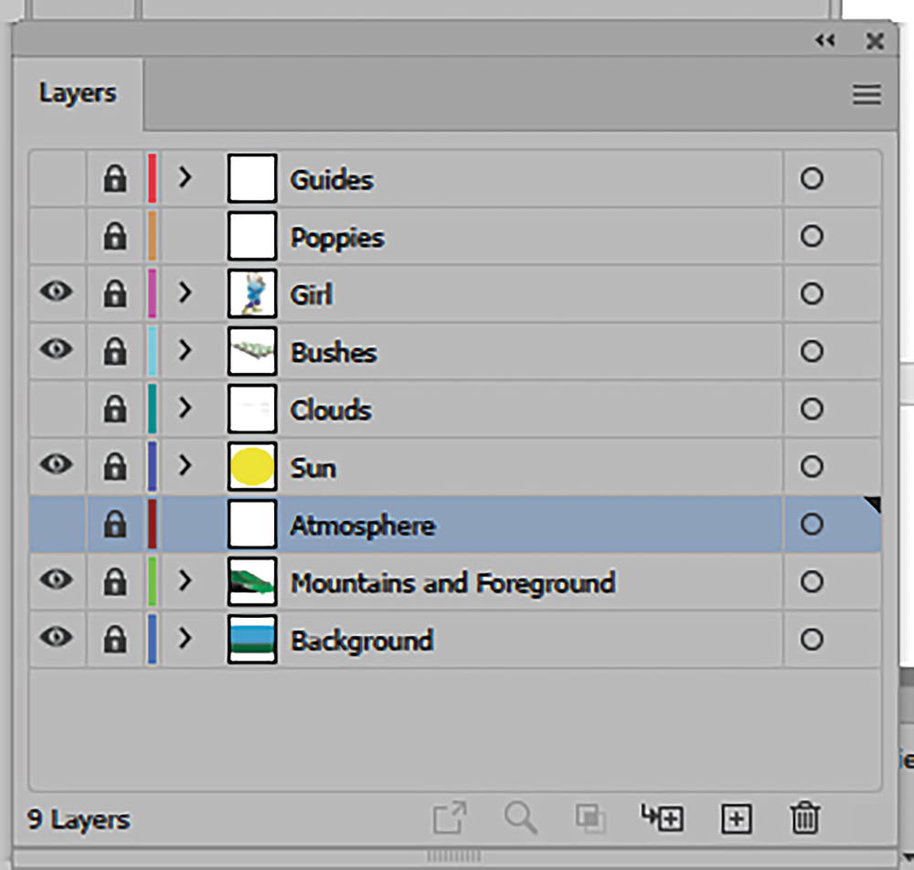
Also, there are some new layers that have been added to the Layers panel. I will explain those later. For now, leave them locked and their visibility turned off as you work. Refer to Figure 8-40.
Figure 8-40
New layers have been added to the Layers panel
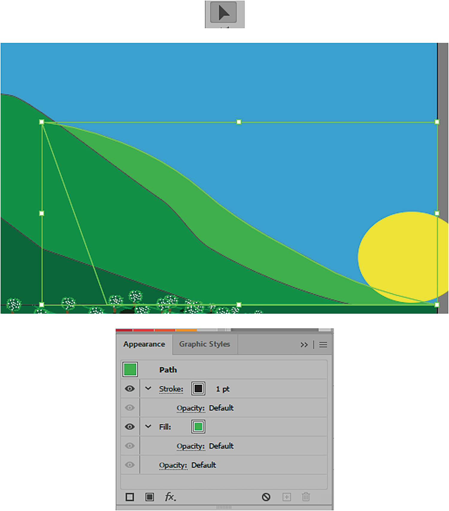
Select and unlock the layer Mountains and Foreground. Refer to Figure 8-41.
Figure 8-41
Unlock the Mountains and Foreground layer
Now, with the Selection tool, select the mountain on the right and make sure that you have the Appearance panel active. Refer to Figure 8-42.
Figure 8-42
Select the mountain and look at the fill and stroke properties in the Appearance panel
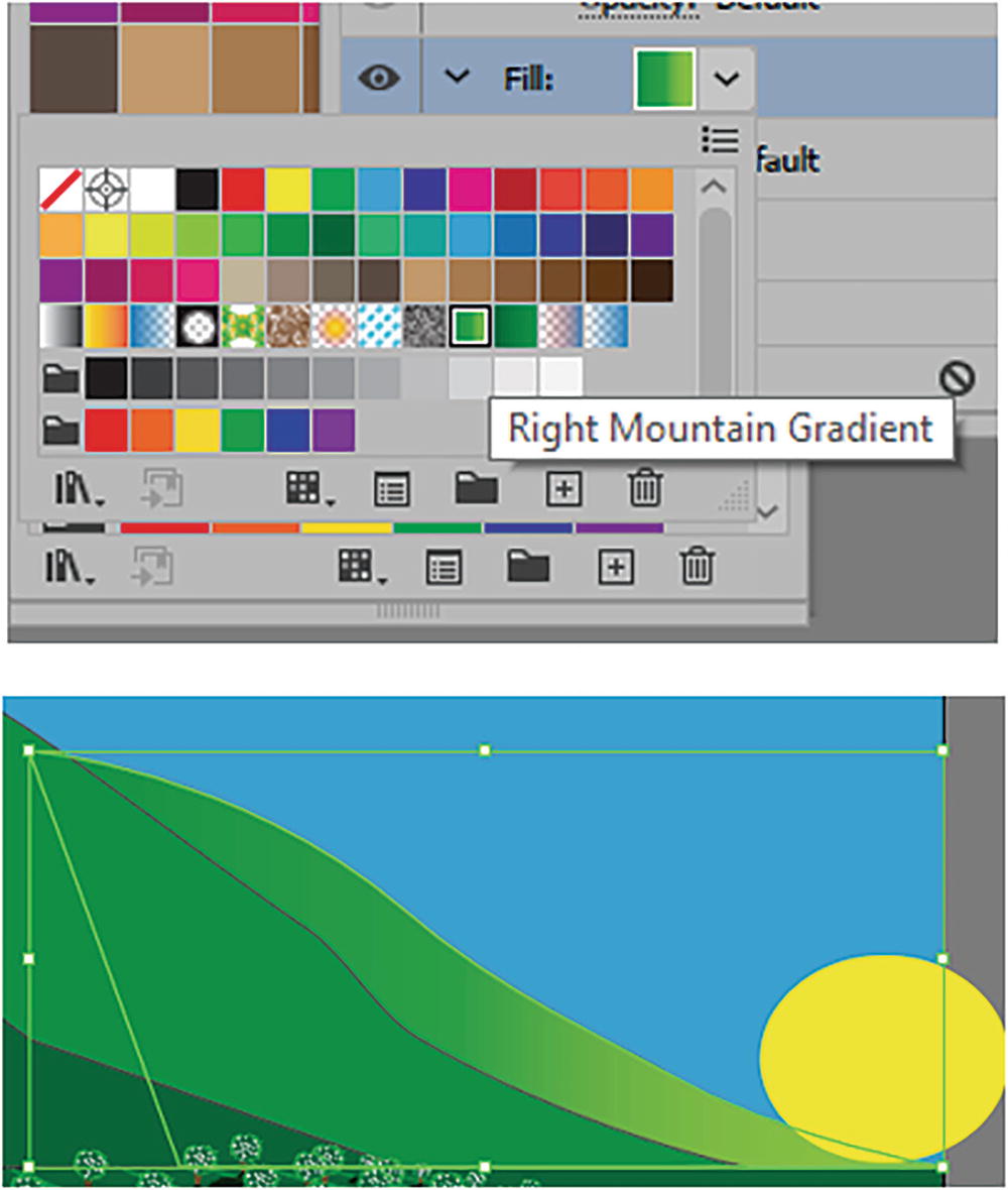
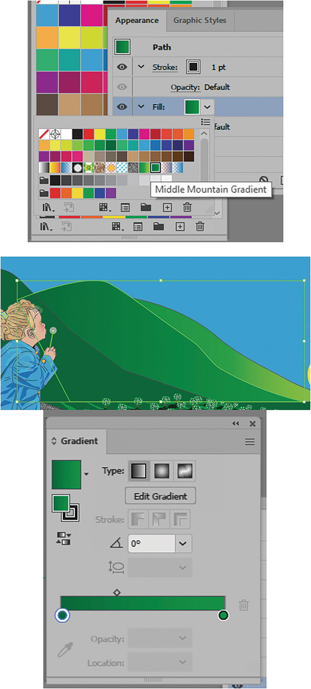
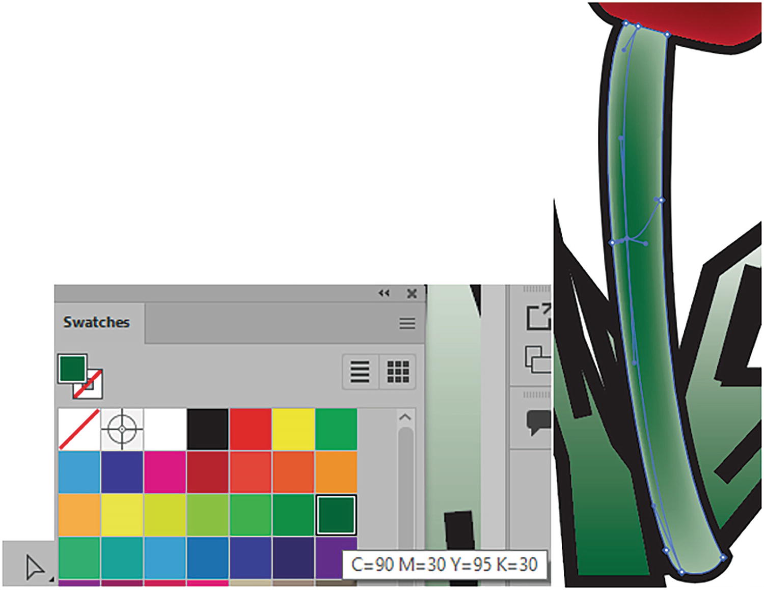
Now, as you did in Chapter 7, select the green fill, and this time replace it with the gradient that I called Right Mountain Gradient. Refer to Figure 8-43.
Figure 8-43
Use the Appearance panel to change the color of the mountain to a gradient
The gradient is now updated on the mountain.
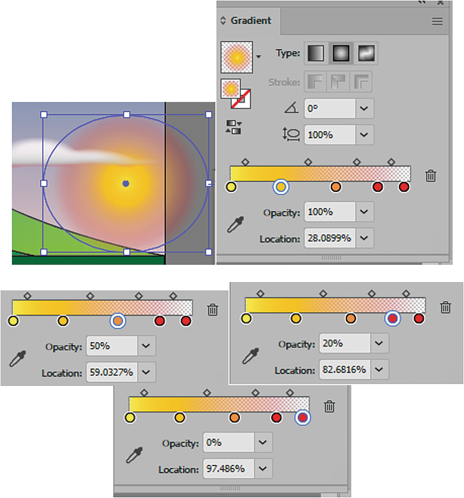
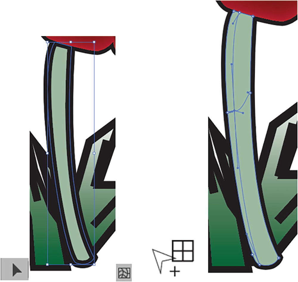
Look at the setting in the Gradient panel. It is a linear gradient consisting of three color stops and two midpoints, and the angle is at 0°. This will make it appear that light is coming from the sun. We will fix the sun later in the chapter. Refer to Figure 8-44.
Figure 8-44
View the current gradient in the Gradient panel
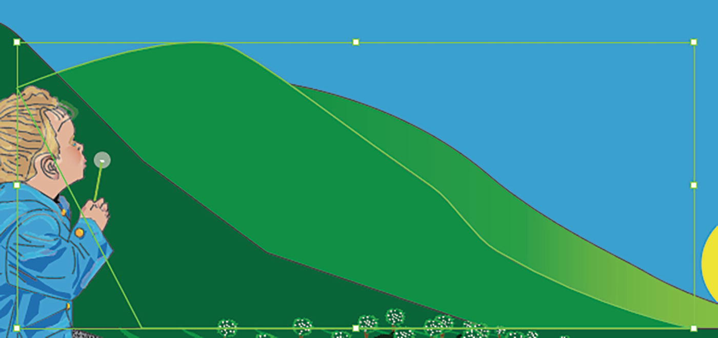
Now, with the Selection tool, select the middle mountain. Refer to Figure 8-45.
Figure 8-45
Select the middle mountain in the image
This time, using the Appearances panel, for the fill choose the gradient that I called Middle Mountain Gradient. You can see the two color stops in the Gradient panel, and it too has an angle of 0°. Refer to Figure 8-46.
Figure 8-46
Use the Appearance panel to change the fill to a gradient, and view it in the Gradient panel
We could also add a third gradient to the mountain on the left, or even to the green ground or gray foreground. But for now, we will leave them at the current solid swatches. However, we will enhance that more in Chapter 11 when we add effects. For now, lock your Mountains and Foreground layer. Refer to Figure 8-47.
Figure 8-47
View the image and lock the Mountains and Foreground layer
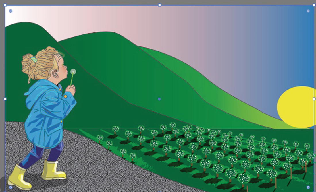
Now select and unlock the Background layer. The sky is boring, so we will use a gradient to make it appear more like a sunrise or sunset, since the sun is lower on the horizon. Refer to Figure 8-48.
Figure 8-48
Unlock the Background layer
With the Selection tool, select the blue sky and use the Appearance panel to change the blue fill to the gradient that I called Background Sky. Refer to Figure 8-49.
Figure 8-49
Use the Appearance panel to change the fill to a new gradient color
This sky needs a bit of correction, as the color has moved to the wrong angle. Refer to Figure 8-50.
Figure 8-50
View the new gradient color in the image
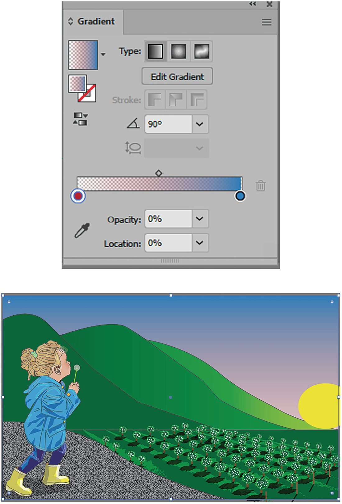
While the sky is selected, go to the Gradient panel. You can see this gradient has a bit of opacity for the red and moves from a red-pink to blue. Now change the angle from 0° to 90°. Refer to Figure 8-51.
Figure 8-51
Use the Gradient panel to change the angle of the sky
This is better, but the light is still a bit too high for me on the horizon. You are going to fix that with another gradient on another layer. You can lock the Background layer for now. Refer to Figure 8-52.
Figure 8-52
Lock the Background layer
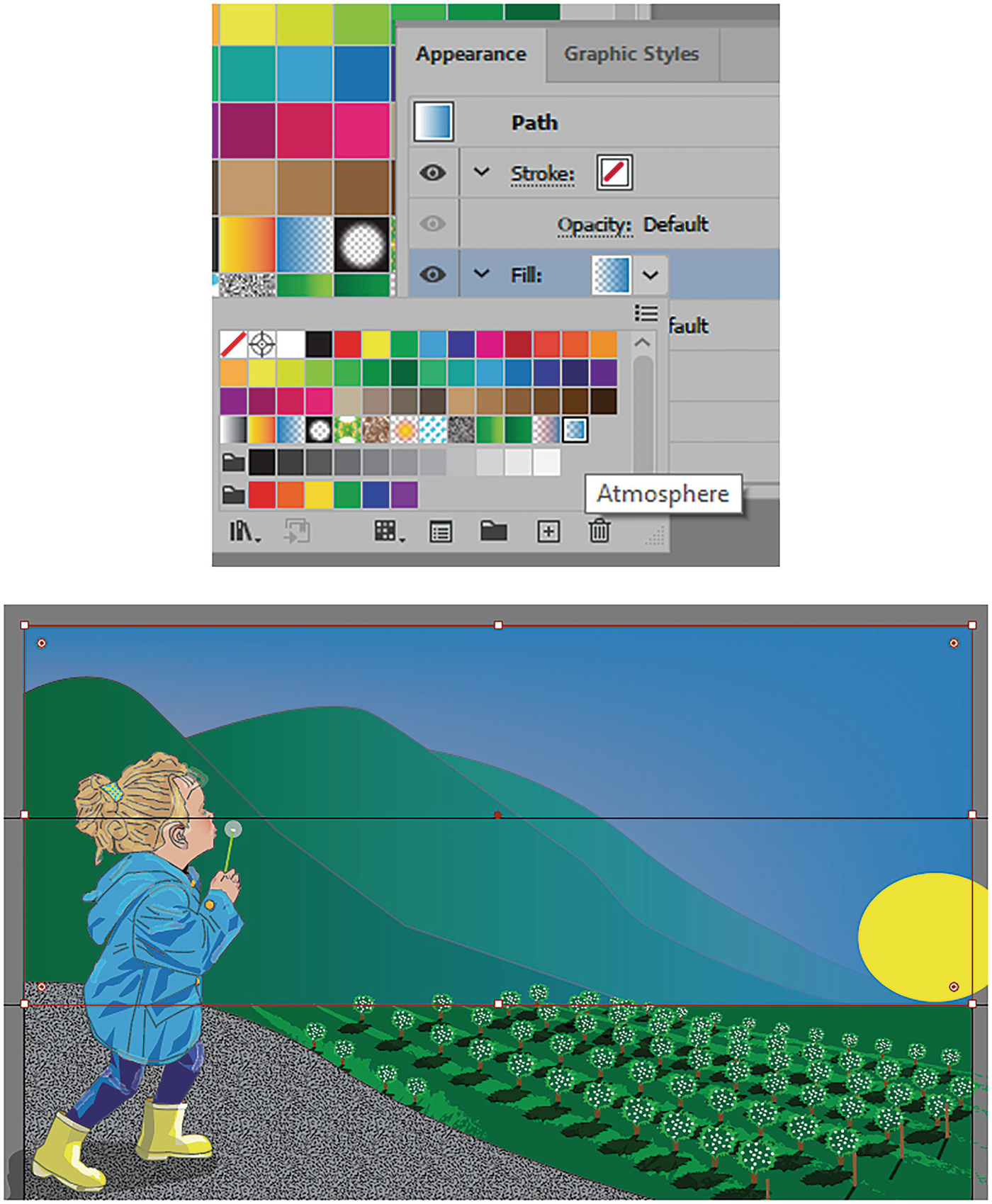
Select the new layer called Atmosphere, make it visible, and unlock it. Currently, it is a blank layer with nothing on it. Refer to Figure 8-53.
Figure 8-53
Unlock the Atmosphere layer
Make visible your Guides layer as well, but do not select it. Stay on the Atmosphere layer for now. Refer to Figure 8-54.
Figure 8-54
Make the Guides layer visible
Using the Rectangle tool with a white fill and stroke of none, drag out a rectangle that goes down two-thirds of your image. Refer to Figure 8-55.
Figure 8-55
Use the Rectangle tool and the Control panel to add a rectangle onto the scene, using the guides to assist you
The size should be about W: 14 in by H: 5.6 in and with the reference point in the center sitting at X: 7 in and Y: 2.8 in, as seen in the Properties panel in the Transform area. Refer to Figure 8-56.
Figure 8-56
View the coordinates and size in the Properties panel
Now choose your Selection tool, and in the Appearance panel change the Fill setting to the gradient I called Atmosphere. Refer to Figure 8-57.
Figure 8-57
Use the Appearance panel to change the fill color to the selected gradient
Hide the Guides layer for now so that you can see the gradient better. Refer to Figure 8-58.
Figure 8-58
Hide the Guides layer
The gradient does make the mountains appear more distant, but it is currently in the wrong direction. Using the Gradient panel, change the angle from 0° to 90°. The transparency of the gradient is now at the bottom, giving some atmosphere at the top and covering some of the pinkness of the sky. Refer to Figure 8-59.
Figure 8-59
View the gradient in the Gradients panel and on the image
We will add more details to this area in Chapter 11 so that the mountains stand out more, but I think adding this atmosphere does make the mountains appear more distant and causes the girl to stand out more in the picture.
Lock the Atmosphere layer for now. Refer to Figure 8-60.
Figure 8-60
Lock the Atmosphere layer
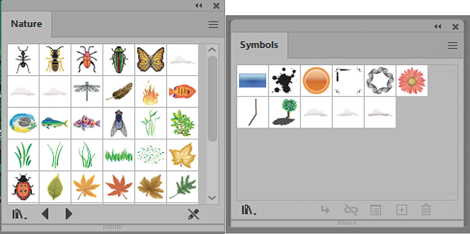
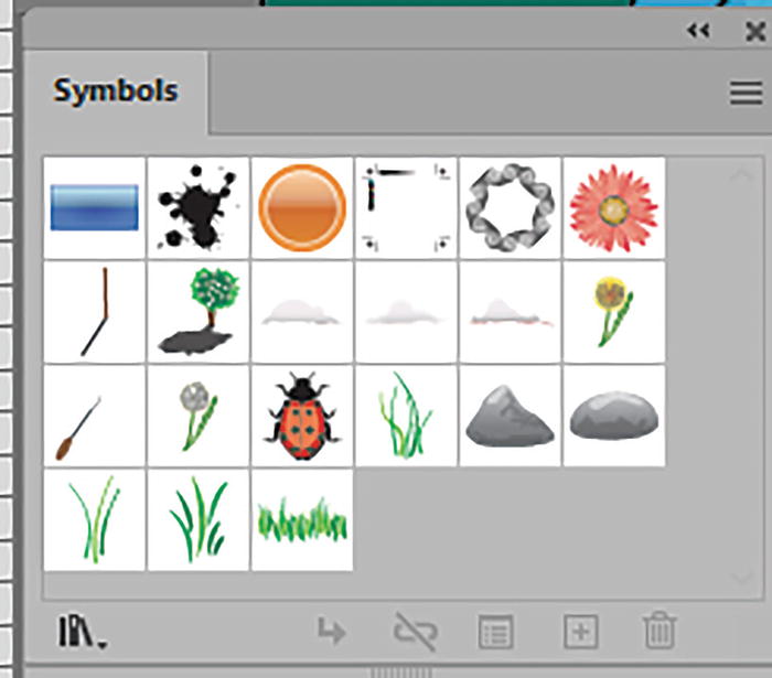
To add some interest to the sky, I added a few clouds using symbols that I found in my Window ➤ Symbol Libraries ➤ Nature. I then clicked on the Symbols Cloud 1, 2, and 3 and added them to my Symbols panel. Refer to Figure 8-61.
Figure 8-61
Adding symbols from one Symbol library to the Symbol panel
I then entered Symbol Editing mode by double-clicking on each cloud in the Symbols panel. When I selected the cloud, I altered the gradient with the Gradient panel, adding a bit of pink with another color stop to the bottom of the clouds. Refer to Figure 8-62.
Figure 8-62
Altering the selected cloud’s linear gradient while in Symbol Editing mode using the Gradient panel and Color panel
The same gradient was used for each cloud at an angle of -89.6883°.
After I made my changes, I exited Symbol Editing mode for each symbol by clicking on the left-pointing arrow next to the instance name below the ruler. Refer to Figure 8-63.
Figure 8-63
Exiting Symbol Editing mode
If you make visible the Clouds layer you can see how I placed and scaled my clouds using the Selection tool after dragging them out of the Symbols panel onto the layer. Refer to Figure 8-64.
Figure 8-64
Making visible the Clouds layer
Some clouds go off the Artboard, and some are larger than others to make them appear different.
At this point, lock your layers and save your copy of the document.
We will look at the next type of gradient and then continue the project from there.
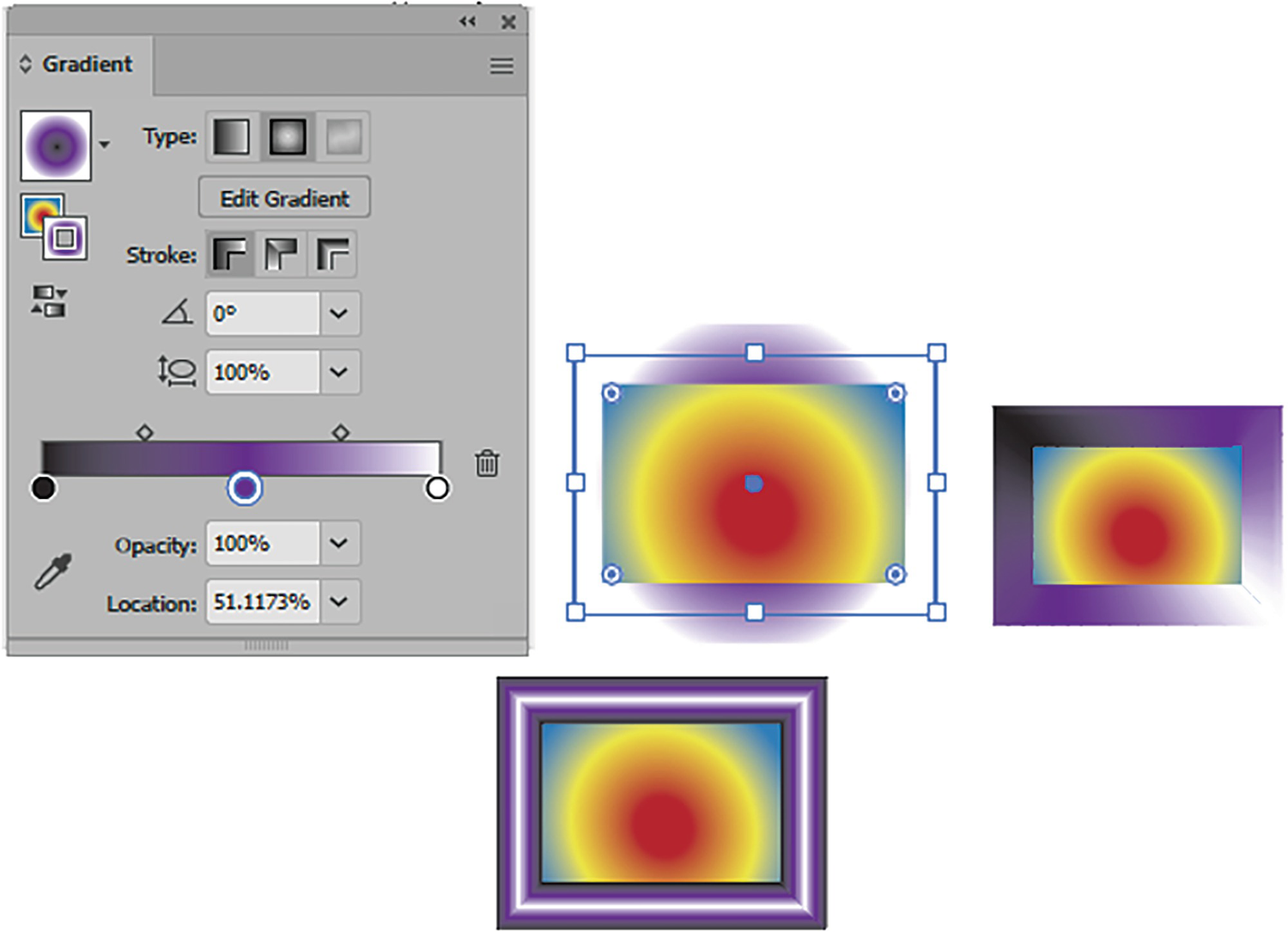
Radial Gradient
Continuing with the Gradient panel, the next type of gradient available is the radial gradient for both stroke and fill. This time it takes on a more circular appearance, with color moving from the inside origin to the outside end point.
Create a new document if you want to practice with the Gradient panel before we start the next part of the project. Refer to Figure 8-65.
Figure 8-65
Radial gradients can be applied to fills and strokes when the radial gradient type is selected in the Gradient panel
What you have learned about the linear gradients in regards to color stops, midpoints, opacity, and location you can also apply to the radial gradient, so refer to that section for more details. However, I will point out a few key differences.
Radial Gradient Fill
You can reverse the order of the gradients for the fill and stroke when you click on the Reverse Gradient button. However, to swap them from fill to stroke use Shift + X. Refer to Figure 8-65 and Figure 8-66.
Figure 8-66
Reverse the order of the radial gradient for either the selected fill or stroke
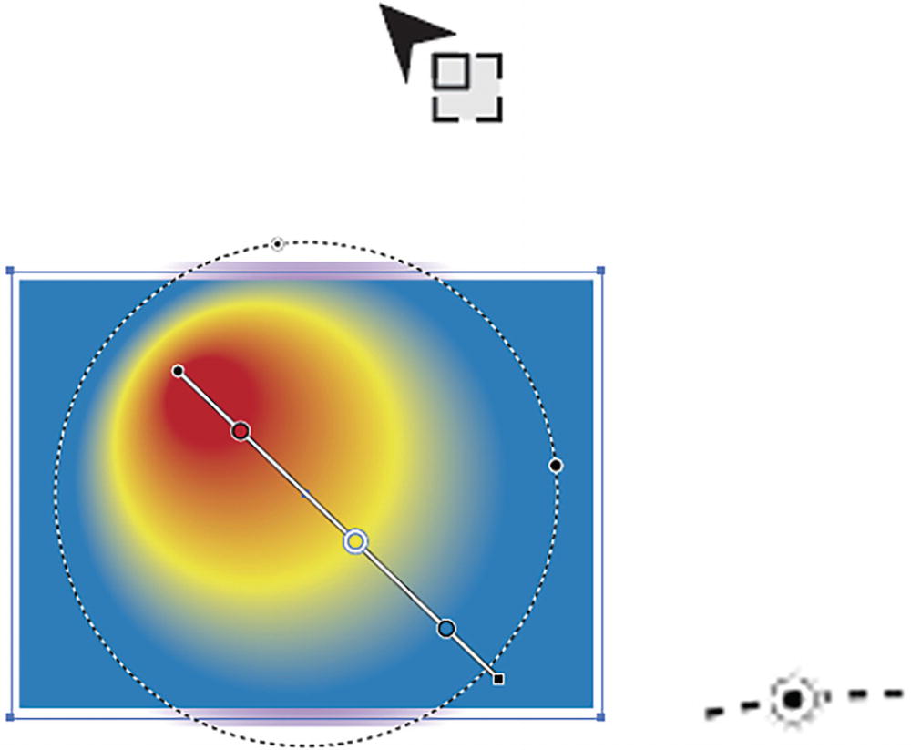
Gradient Tool (G)
When you click on the Edit Gradient button or Gradient tool, the radial gradient annotator for the fill is set for a circle shape, indicated by the dotted ring. The color stops and midpoint sliders are also available. Refer to Figure 8-67.
Figure 8-67
Gradient tool with radial gradient annotator on the shape’s fill
Like with the linear gradient options, you can scale or increase the range of the gradient with the end of the square point, currently on the right. Refer to Figure 8-68.
Figure 8-68
Scaling the radial gradient with the annotator when the cursor changes
On the left handle, or circular origin point, you can drag and adjust the angle of the starting point. Refer to Figure 8-69.
Figure 8-69
Adjusting the angle of starting point for the radial gradient with the annotator
You can also rotate, using the rotation circle, when the pointer changes on the black square end point to the rotation cursor. Refer to Figure 8-70.
Figure 8-70
Change the angle of the radial gradient by using the annotator when the cursor changes
You can use the circle to scale the rotation by dragging on the white point with the black center. Refer to Figure 8-71.
Figure 8-71
Change the scale of the radial gradient using the annotator circle
Or you can use the larger black point to scale the radial gradient to make it more elliptical, which alters the aspect ratio. Refer to Figure 8-72.
Figure 8-72
Change the aspect ratio of the radial gradient using the annotator circle
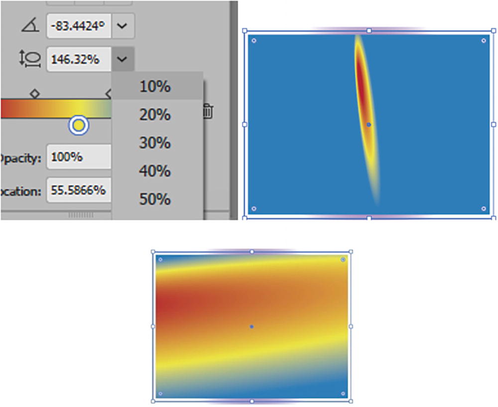
This settings for the angle (-180°,0°,180°) and aspect ratio of the radial gradient is then shown in the Gradients panel. Refer to Figure 8-73.
Figure 8-73
New angle and aspect ratio appear in the Gradient panel
Aspect ratio (0.5%–32767%): Can also be set using the text box or dropdown list of preset settings. Refer to Figure 8-74.
Figure 8-74
The aspect radio of the radial gradient can be set using the list in the Gradient panel, and changes update the shape’s fill
Note
You can also, with the Gradient tool and annotator, drag out a new origin location for the gradient to start from within the object. Refer to Figure 8-75.
Figure 8-75
Drag out a new point of origin using the Gradient tool
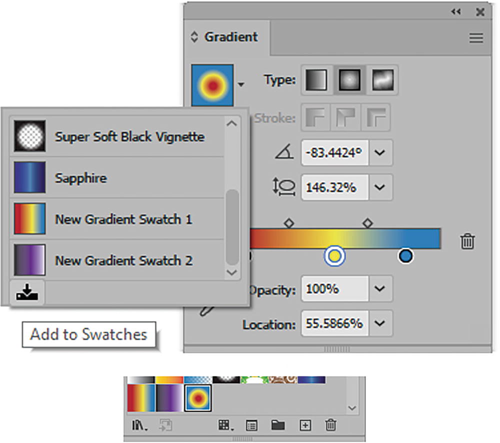
Once you create a radial gradient, you can then store it in the Swatches panel using the Add to Swatches button in the dropdown menu of the Gradient panel. Refer to Figure 8-76.
Figure 8-76
Add your new gradient to the Swatches panel using the Gradient panel’s Add to Swatches button
Like the linear gradient, once you have created a radial swatch you can double-click on it in the Swatches panel and rename it. Click OK to commit the name. Refer to Figure 8-77.
Figure 8-77
Rename the radial gradient to a name you will remember in the Swatches panel
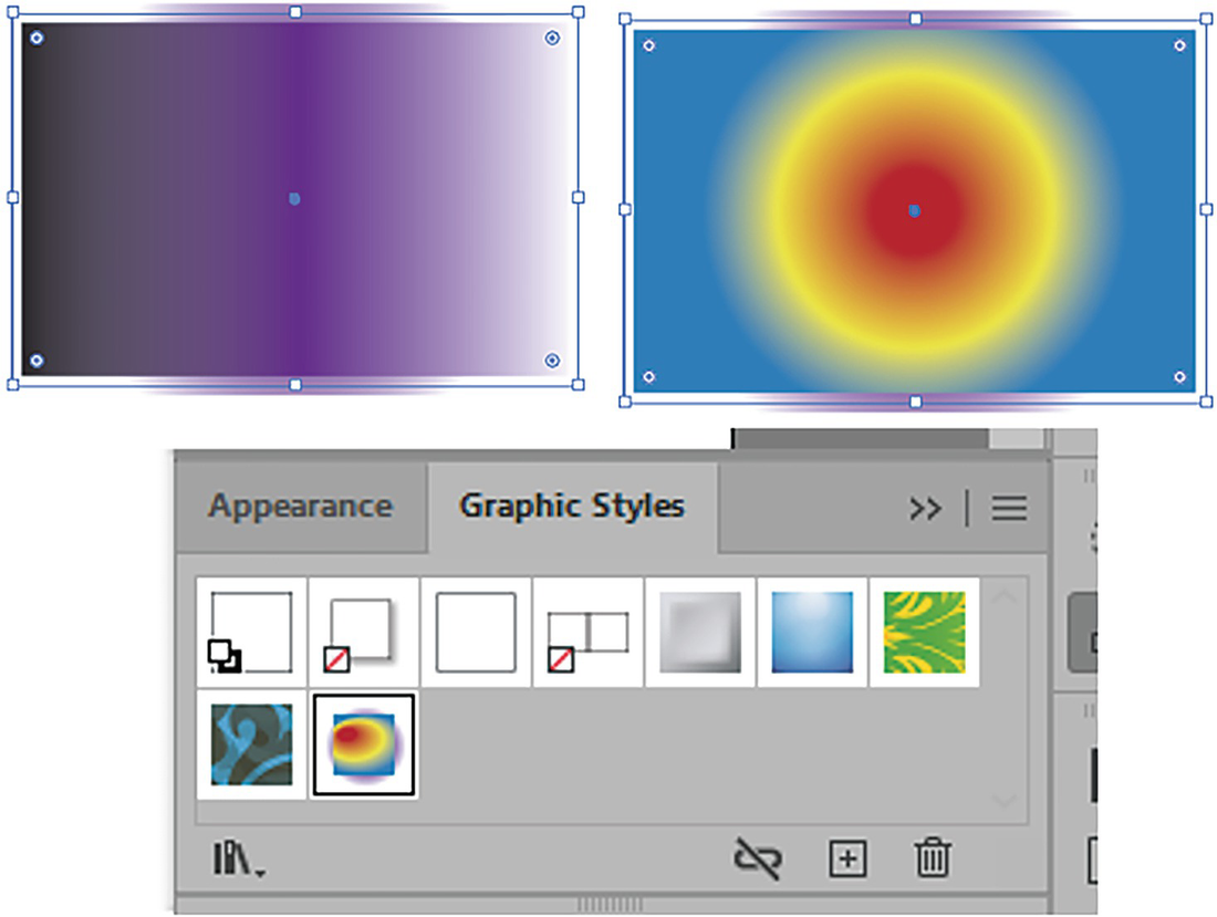
However, if you switch to another gradient from the radial gradient and then select the radial gradient again in the Swatch panel you will lose the angle and aspect ratio when you apply it. This information is not stored in the Swatches panel, and it would in that case be better to store that information as a graphic style in that panel. We will look at that panel more closely in Chapter 11 when we need to save appearances that we created. Refer to Figure 8-78.
Figure 8-78
Gradients with complex angles can also be stored in the Graphic Styles panel
Radial Gradient Stroke
Like the linear gradient stroke, you will not have access to the Gradient tool’s annotator, but you can use the Gradient panel to set the same three settings for your stroke, including angle and aspect ratio. Refer to Figure 8-79.
Figure 8-79
Use the Gradient panel to adjust your radial gradient stroke settings
Note
Some radial gradient strokes will show up better when the gradient is fill or stroke reversed.
You can also apply the radial gradient, with the Gradient tool, across multiple selected paths and then drag across them to create a unifying origin point and angle. Shift-drag to constrain the angle to 45° increments. Refer to Figure 8-80.
Figure 8-80
Use the Gradient tool to set a radial gradient for multiple shapes
As you scale the object the gradient will scale as well.
Tip
One way to get around this issue would be to create a gradient on a separate path with the Gradient panel. Then create another path with no fill over the top, then select both and create an Object ➤ Clipping Mask ➤ Make. Then you could scale one path separate from the other, using the Direct Selection tool and then the Selection tool. Or use the Gradient tool and its annotator to drag out and scale the gradient. Refer to Figure 8-81.
Figure 8-81
Use the Direct Selection tool to select one of the paths in the clipping mask and then use the Selection tool to scale that path
Project: Blowing in the Wind, Part 6, Adding a Radial Gradient
With the current copy of the file Landscape1_6_start.ai still open, continue with the project of the girl at the farm, and this time we will add a radial gradient to the sun. It will make the sun appear more real, as if light were coming out of it, and not just a yellow ellipse. Refer to Figure 8-82.
Figure 8-82
The sun is a solid color in the current project
Adding the Radial Gradient to the Sun
Select and unlock the Sun layer. Refer to Figure 8-83.
Figure 8-83
Unlock the Sun layer
With the Selection tool, select the sun. Refer to Figure 8-84.
Figure 8-84
Use the Selection tool to select the sun
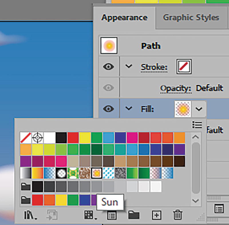
Now use the Appearance panel to set the fill color to the radial gradient that I called Sun. Refer to Figure 8-85.
Figure 8-85
Use the Appearance panel to change the fill to a new radial gradient
The sun should now have a nice glow to it. Also, the five color stops have varying opacity settings of 100%, 100%, 50%, 20%, and then 0%. You can see how for many color stops that I used in the Gradient panel the angle is at 0° and the aspect ratio is at 100%. But because I used an ellipse shape, some of the gradient is cut off at the top and bottom, which is what I wanted, and some of the design goes off the Artboard. Refer to Figure 8-86.
Figure 8-86
Look at the Opacity settings for the color stops of the sun’s radial gradient
I then locked my Sun layer again and previewed the result. Refer to Figure 8-87.
Figure 8-87
Lock the Sun layer and view the current picture
Save the document at this point. Later in this chapter, I will talk about a few more areas on other layers, in relation to gradient mesh and then transparency.
One other final note I will mention about the benefits of the Appearance panel is if you have multiple gradients with transparency, you can overlap them within the Appearance panel to blend them together. Refer to Figure 8-88.
Figure 8-88
Use the Appearance panel when you want to apply multiple gradients
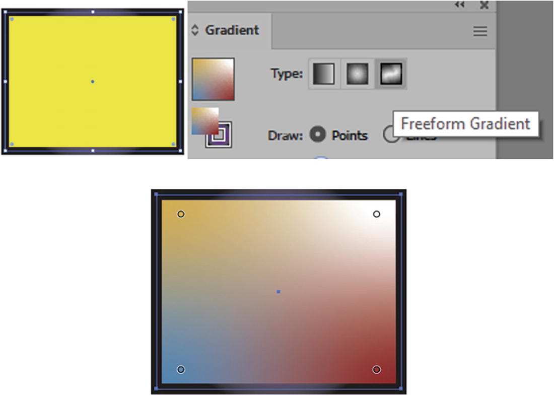
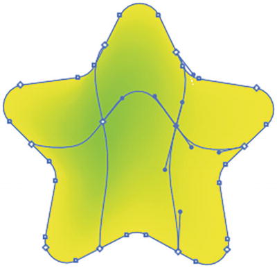
Freeform Gradient
The last type of gradient in the Gradient panel is the freeform gradient. It can only be applied to the object’s fills and not its strokes. However, the path can be open or closed even if the freeform gradient is applied to the fill. Closed paths, I find, are best. Freeform also does not use the Gradient tool or its annotator. Refer to Figure 8-89.
Figure 8-89
Freeform gradients can appear on open or closed paths
Create a new document if you want to practice with the Gradient panel before we start the next part of the project.
This is a newer gradient type in Illustrator and in many ways is similar to the Mesh tool, which we will look at next. However, if you want smooth, airbrushed gradients for skin to create a 3D effect, then you may find this tool useful. Refer to Figure 8-90.
Figure 8-90
Use the Gradient panel to create a freeform gradient only for the fill
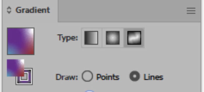
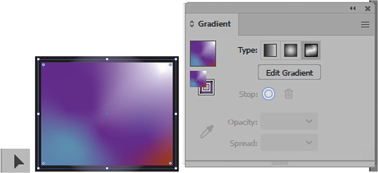
To use the freeform gradient, you can start with a shape that already has a solid or gradient fill. It does not really matter, as the freeform gradient is going to choose its own set of points that you can modify. While the path or shape is selected, using the Gradient panel, set Type to Freeform Gradient. Refer to Figure 8-91.
Figure 8-91
When the Freeform Gradient type is selected, a solid fill turns into a freeform gradient automatically
Working with the freeform gradient is simlar to working with the Puppet Warp tool, seen in Chapter 4.
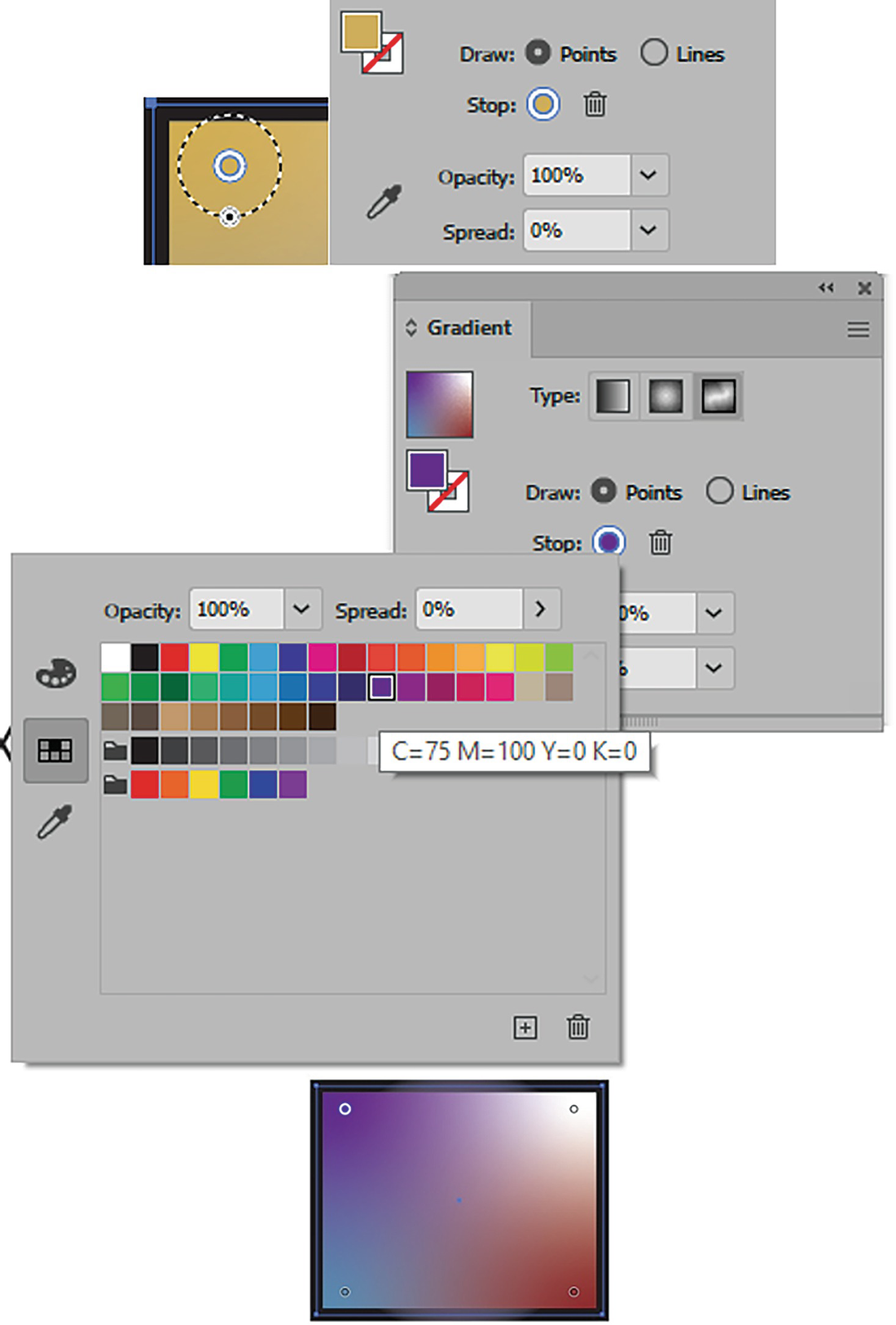
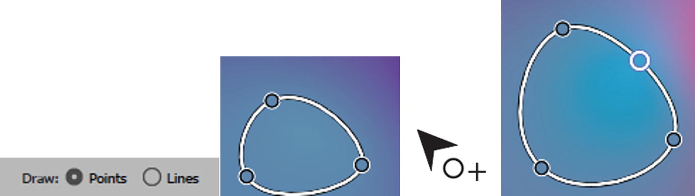
Currently, four points are drawn in the square. This setting allows you to add and edit color points. Refer to Figure 8-92.
Figure 8-92
Gradient panel Freeform Gradient setting for drawing point and lines
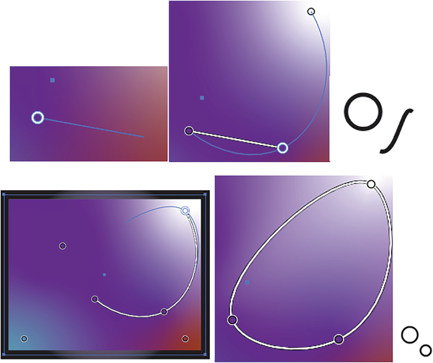
You can select one of the points and change the color stop using the Gradient panel. To do that you can either in the panel, Double-click in the stop or double-click on a selected stop found on the actual shape, to access the swatches. Refer to Figure 8-93.
Figure 8-93
Color stop on freeform gradient selected, and then use the Gradient panel to change the color of the color stop
From the menu, as with the other gradients, you can use the eyedropper tool (color picker) to copy a color from another shape, or use the Colors panel to find a color, then use the Esc key to exit. Refer to Figure 8-93.
A selected stop can be removed by clicking on the Trashcan icon. Or, while the stop is selected, press the Backspace/Delete key, or drag it outside the path. Use Edit ➤ Undo to add the stop back right away. Refer to Figure 8-94.
Figure 8-94
Delete a selected color stop when selected using the Gradient panel
The Gradient menu also allows you to adjust the opacity (0%–100%) and spread (0%–100%) for the color stop using the dropdown lists. Another way to adjust the spread is to, while the color stop is selected, drag on the black-and-white point of the spread radius and pull outward; this will change the spread setting in the Gradient panel. Refer to Figure 8-95.
Figure 8-95
Change the spread of the selected color stop on the fill when dragging on the spread circle or using the Gradient panel
You can also move a stop to a new location by dragging on the center of the stop. Refer to Figure 8-96.
Figure 8-96
Move the color stop to a new location
To add additional stops, you can click somewhere in the freeform gradient and then edit the new stops. Refer to Figure 8-97.
Figure 8-97
Add another color stop to the fill when the cursor changes, and click
The other draw setting in the freeform gradient is Lines. This allows you to create gradient color points over a line segment. Refer to Figure 8-98.
Figure 8-98
In the Gradient panel, use the Draw Lines settings
It’s a bit like working with connect the dots and the curvature tool, in that you can click to add color stops that are connected or connect color stops that are already present in the freeform gradient, creating a curved path, or hold down the Alt/Option key to create a straight path and the Shift key to keep the path at a set angle. You can click on the original point to close the path. Refer to Figure 8-99.
Figure 8-99
Use the Lines settings and cursor changes to guide you on how to create color stops on the line
To keep the path open and create a new path, press the Esc key. Refer to Figure 8-100.
Figure 8-100
Use the Esc key to exit adding color stops and keep the path open
Color stop points that are part of a line do not allow you to set a spread setting. If you find that one of your single points has lost its spread setting, you may need to delete it and create a new point. Refer to Figure 8-101.
Figure 8-101
Only the Opacity field and not the spread of the color stop on a line can be adjusted
Return to the Draw Points setting when you want to move or edit the points without creating more lines. However, you can still click and add points to the lines. Refer to Figure 8-102.
Figure 8-102
In the Gradient panel, switch back to Draw: Points, but you can still add points to the lines
You can also use the Gradient panel to delete a selected stop, or you can use the Backspace/Delete key.
Note
If you deselect your path at some point and want to return to the freeform gradient, then make sure to select the object again with the Selection tool. Then, in the Gradient panel, click on the Edit Gradient button. Refer to Figure 8-103.
Figure 8-103
To enter deselected freeform gradient again, select it and then choose Edit Gradient
The freeform gradient stops will be visible again, and you can continue to edit them. Refer to Figure 8-104.
Figure 8-104
The Freeform Gradient setting is visible again
Like linear and radial gradients, the freeform gradient will scale with the path when selected with the Selection tool. To move one freeform gradient to another shape, select the shape and then use the Eyedropper tool in the Toolbars panel, then click on the freeform gradient you want to copy. Refer to Figure 8-105.
Figure 8-105
Use the Eyedropper tool in the Toolbars panel when you want to transfer a freeform gradient to another selected path
The freeform gradient gets removed if you click on another gradient type, and you need to Edit ➤ Undo right away so you do not lose your original settings. Refer to Figure 8-106.
Figure 8-106
Be careful that you do not lose your freeform gradient if you accidently click on another type of gradient
Where can you store these gradients? Because they are not considered a swatch and are more like a patterned graphic, I find the best way to store these freeform gradients once applied to a path is in the Symbols panel. Refer to Figure 8-107.
Figure 8-107
Use the Symbols panel to store your paths that contain freeform gradients
Another option could be to store them in the Graphic Styles panel, which we will look at in Chapter 11.
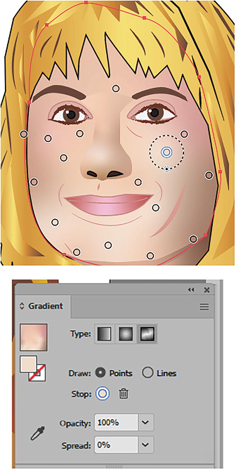
Freeform Gradient Example
While I did not use the freeform gradient in the current landscape project that we are working on in this chapter, if you would like to see an example of one, you can refer to my Chapter 6 example, wolf_girl_blend.ai. Refer to Figure 8-108.
Figure 8-108
The Wolf Girl images contain multiple gradients created with the Gradient panel
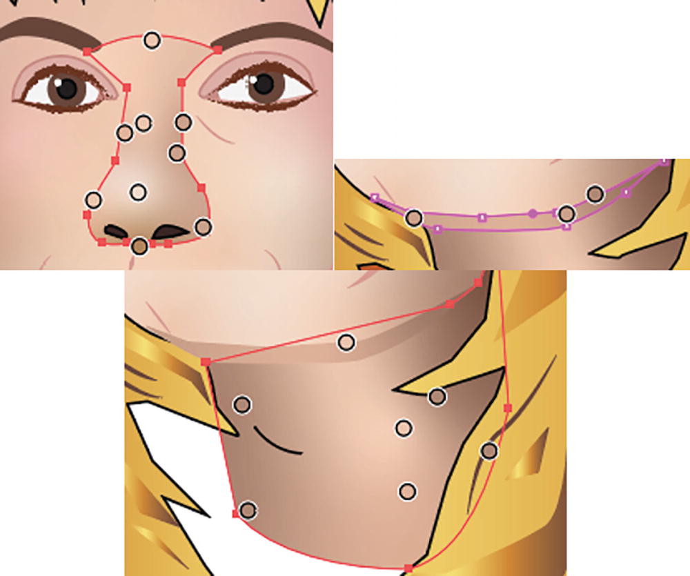
The wolf is made of various linear and radial gradients, and the girl’s hair is as well. The skin on her face, nose, under the chin, and neck are actually several different freeform gradients. Refer to Figure 8-109 and Figure 8-110.
Figure 8-109
The girl’s face has multiple freeform gradient color stops
Figure 8-110
Other paths also contain freeform gradients
You can study this file if you like, for your own reference, if you plan to create a similar kind of portrait. I achieved accurate highlights when I worked from a scanned picture that I kept on a separate layer in Illustrator to refer to. Then I made some alterations afterward to the freeform gradient. Now you can create illustrations of your models with flawless skin.
However, don’t expect to get this type of project done all in one evening, as you may need to play with the colors and move the points around until you get the level of realism you are looking for. You may also need to draw separate paths as I did to get all the right shading.
Tip
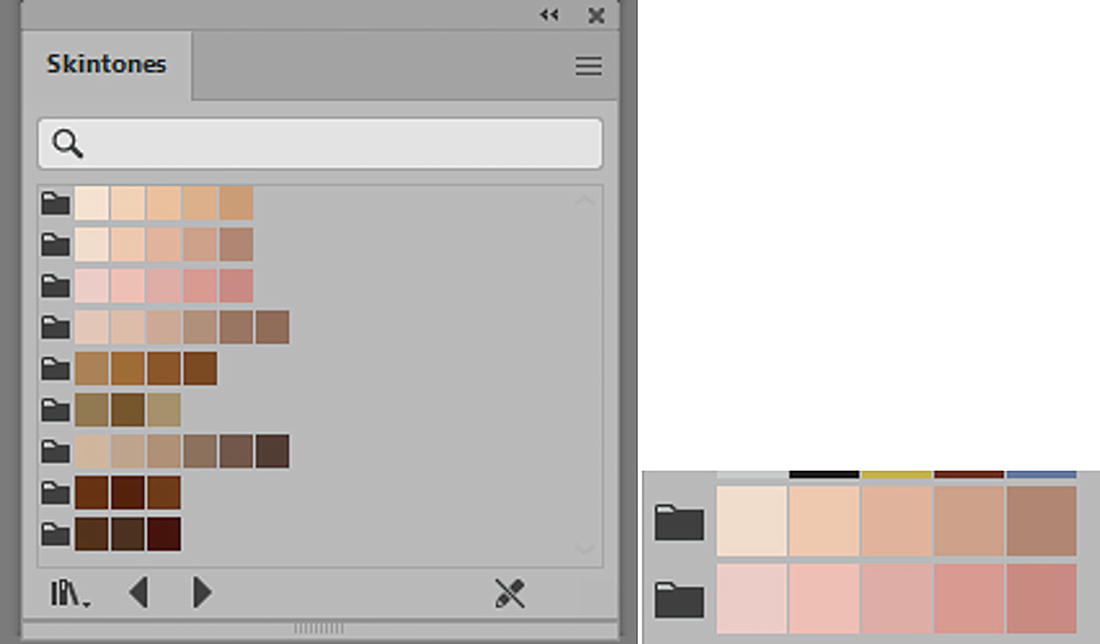
If you’re not sure on your own project how to get the right skintone colors, you can add color groups to your Swatches panel from Window ➤ Swatch Libraries ➤ Skintones. I then clicked on the color group folders that I needed to add them to my Swatches panel. Refer to Figure 8-111.
Figure 8-111
Skintones library swatches and the color groups are added to the Swatches panel
In my case, I originally worked with Skin Tone 2 and Skin Tone 3 color group folders and then made modifications. However, you may require different skintones for your project.
Additional ideas for using the Gradient panel and Gradient tool can be found here:
The Mesh tool in the Toolbars panel, as mentioned, is in many ways similar to the freeform gradient tool and is an older tool that has been in Illustrator for some time. It too can be used to create a smooth gradient effect. However, being able to twist and manipulate individual points of color on the mesh can give a slightly different organic effect.
Create a new document if you want to practice with the Mesh tool before we start the next part of the project. Refer to Figure 8-112.
Figure 8-112
Mesh tool next to the Gradient tool in the Toolbars panel
To create a color mesh, you need to select with the Selection tool either an open or a closed path that has a fill. I prefer to work with closed paths and then click somewhere inside of the object with the Mesh tool. Refer to Figure 8-113.
Figure 8-113
Use the Mesh tool to edit the selected path when the cursor changes
This causes the stroke to disappear, creating a mesh object and a diamond shaped mesh point. Currently, the mesh point is the same color as the rest of the object, but while the point is selected and the fill is in the foreground on your Toolbars panel, you can use the Swatches panel to add a new color swatch to that point. Refer to Figure 8-114.
Figure 8-114
Note that the current mesh point is yellow on the path as seen in the Toolbars panel, but you can use the Swatches panel to set a new color for the mesh point
You can also use the Control panel to adjust the opacity of that point. Refer to Figure 8-115.
Figure 8-115
Mesh Point settings in the Control panel
With the Mesh tool, you can continue to click to add more mesh points and then edit the colors with the Swatches panel. The areas between the mesh points are known as mesh patches. Refer to Figure 8-116.
Figure 8-116
Add another point using the Mesh tool and color it using the Swatches panel
Shift + Click to add a mesh point if you do not want to alter the current or nearest fill color. Refer to Figure 8-117.
Figure 8-117
Faded mesh point color when mesh point added
With the Mesh tool you can select the points of the mesh and drag to move them, or twist the handles. Alternatively, you can use the Direct Selection tool to manipulate points and handles. When you hold down the Ctrl/CMD key while using the Mesh tool, you can use the Selection tool to move the mesh or selected point handle. Using the Mesh tool, you can also Shift-drag on an anchor point to keep it on the mesh line. Refer to Figure 8-118.
Figure 8-118
Use the Mesh tool or Direct Selection tool to alter points on the mesh
Select mesh points going around the edge of the path if you want to color them separately. This is similar to working with the Direct Selection tool in that you can also move and warp the edges of the shape on the points using the handles. You can use this tool as well as the Anchor Point tool to modify the mesh while the handles are active. Refer to Figure 8-119.
Figure 8-119
Use the Anchor Point tool to alter diamond mesh point and square anchor points and handles on the mesh
Use Edit ➤ Undo if you need to go back a step while creating the mesh.
You can remove parts of the mesh, when selected, by pressing the Backspace/Delete key, or Alt/Option + Click on a selected anchor point. Refer to Figure 8-120.
Figure 8-120
Use the Mesh tool to remove mesh lines and points
Create Gradient Mesh
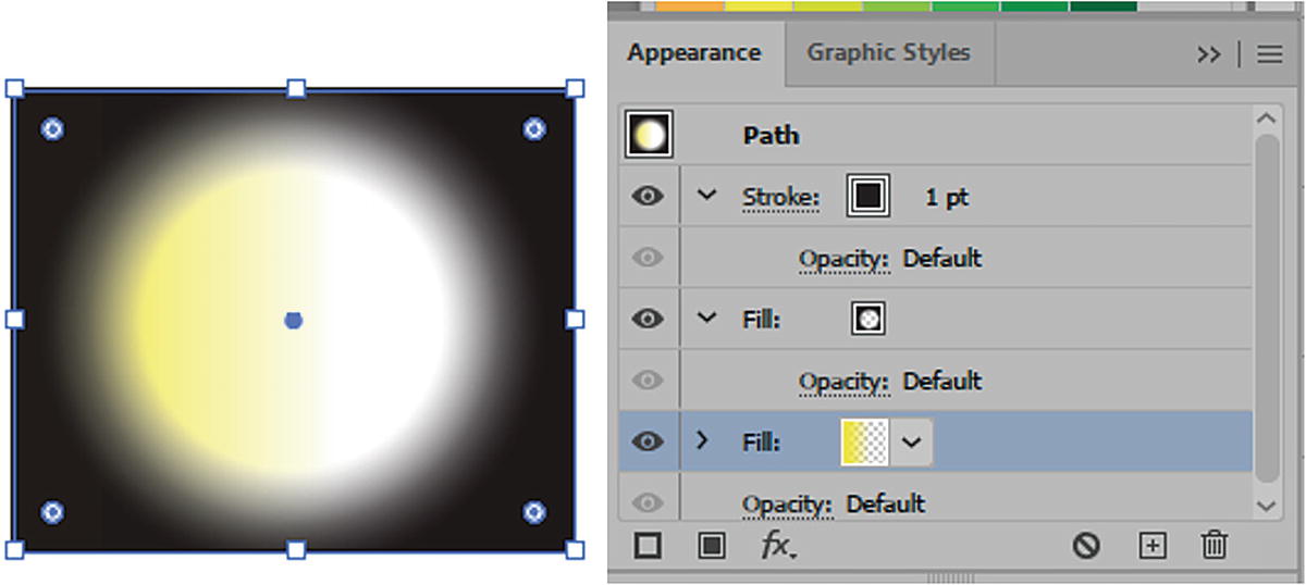
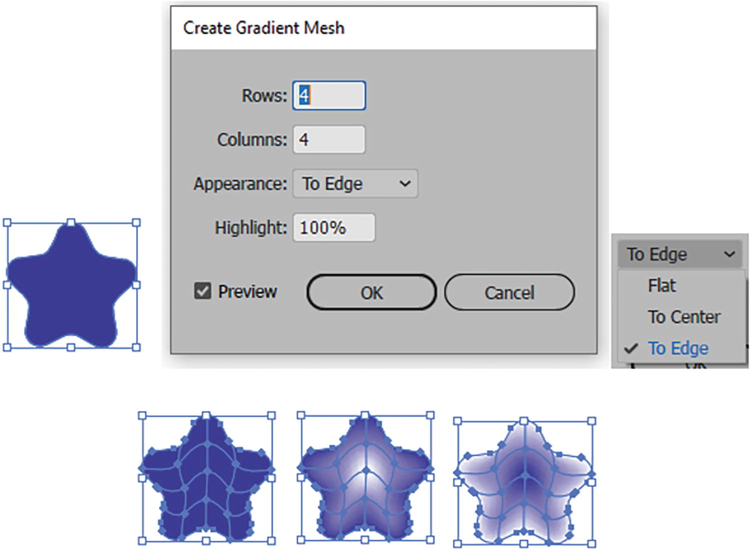
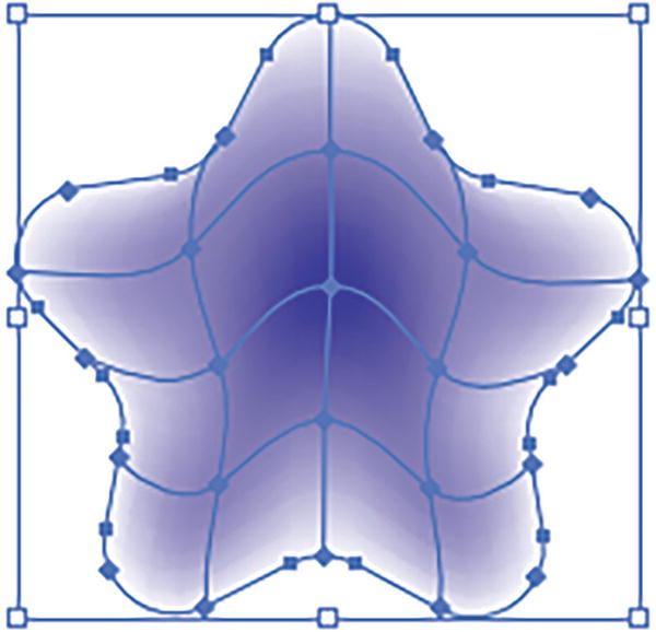
Another way to use this tool quickly is to select a shape and choose Object ➤ Create Gradient Mesh. This opens the dialog box. Within this dialog box, with Preview enabled, you can evenly set the number of rows and columns, as well as the following Appearance settings:
Flat: This retains the object’s original color, and there is no highlight added to the mesh.
To Center: A highlight color from the Highlight settings is added to the center of the object.
To Edge: A highlight color from the highlight settings is added to the edge of the object.
Highlight area of (0%–100%) is a white highlight. The lower the percentage, the less highlight appears; 0% is no highlight.
Choose an option and click OK. Refer to Figure 8-121.
Figure 8-121
Use the Create Gradient Mesh dialog box and settings to create your mesh quickly with Appearance settings of Flat, To Center, or To Edge
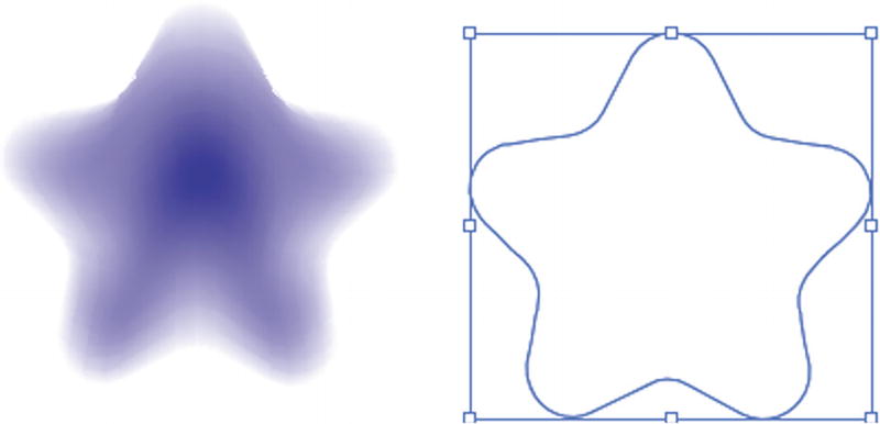
Often, when using the mesh tool, it’s best to keep the number of points as few as possible for fast redrawing with Illustrator. Refer to Figure 8-121 and Figure 8-122.
Figure 8-122
Find the Mesh tool next to Gradient tool in Toolbars panel
To make one of your linear or radial gradients into a mesh, you can choose Object ➤ Expand, choose Expand Gradient to Gradient Mesh, and click OK. Refer to Figure 8-123.
Figure 8-123
Expanding a gradient mesh sometimes produces unusual results
This transforms the gradient into a complex gradient mesh. However, be aware that it works better with linear than radial gradients, and you may get some unusual results. Refer to Figure 8-123.
How to Separate the Gradient Mesh from a Path
If you need to remove a gradient mesh from a copy of the original, you can select the entire mesh with the Selection tool. Refer to Figure 8-124.
Figure 8-124
A gradient mesh path with color selected
Select Object ➤ Path ➤ Offset Path.
In the Offset Path dialog box, enter 0 for the Offset, leave the other options at the default settings, and then click OK. Refer to Figure 8-125.
Figure 8-125
Select the mesh and view settings in the Control panel, then set new settings in the Offset Path dialog box
You will then have created a path object copy without a mesh. You can then select, with the Selection tool, the mesh and Backspace/Delete the original mesh if you do not want to keep it. Refer to Figure 8-126.
Figure 8-126
New offset path copy that you can use for another project
To review more about gradient meshes you can visit:
In Chapter 9, the Mesh tool will be used again for another kind of warp.
Project: Blowing in the Wind, Part 6, Working with the Mesh Tool on Flowers
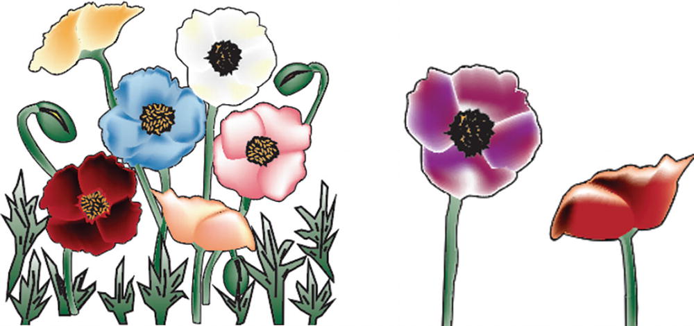
Continuing with the project of the girl at the farm, we are now going to edit some flowers, using the Mesh tool to create petals with multiple colors for some poppies that we will later add to a copy of the Landscape1_6_start.ai file that you have been working on. For now, set that file aside.
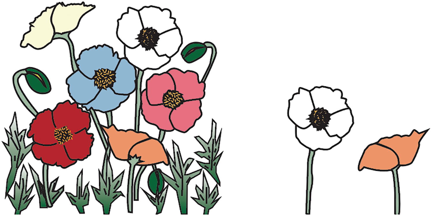
Open flowers_mesh_start.ai and save a copy if you want to follow along. Refer to Figure 8-127.
Figure 8-127
Illustrations of some poppies in various colors
I created a file to draw some poppies in that I plan to add to my landscape picture later. I made the file the same size as my landscape document so that I could get the size and placing figured out right away, However, for your own projects you may have to scale the flowers afterward with the Selection tool while you hold down the Shift key or use one of the Transform tools that I talked about in Chapter 3.
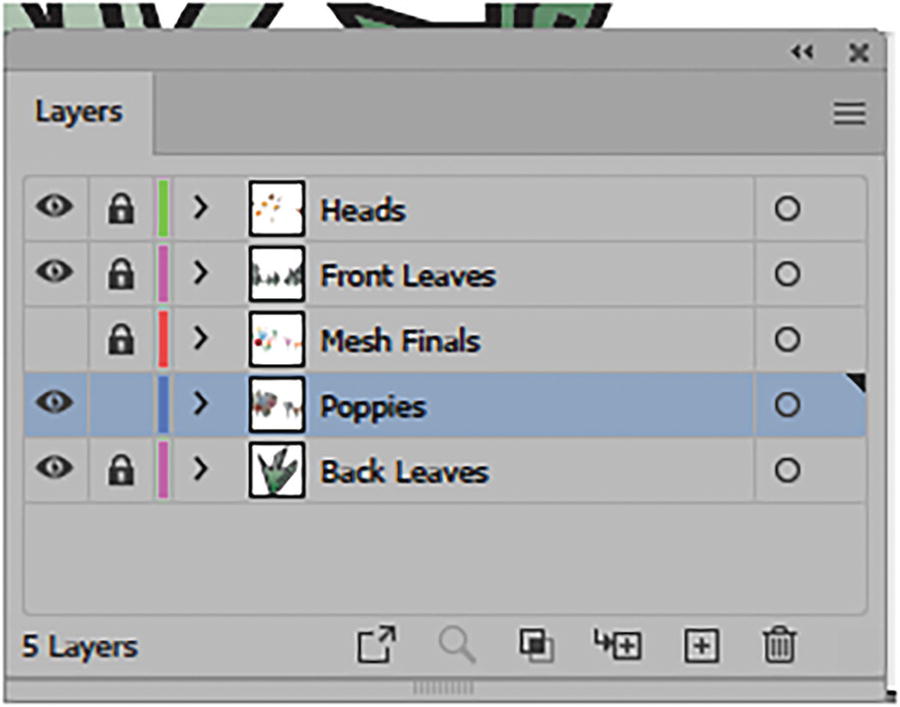
If you look at the Layers panel, you will see that there are several layers. I did that to keep organized so that I didn’t apply the Mesh tool to the wrong layers and could also go back a step if something with the Mesh tool did not turn out as expected. Refer to Figure 8-128.
Figure 8-128
Select the Poppies layer in the Layers panel
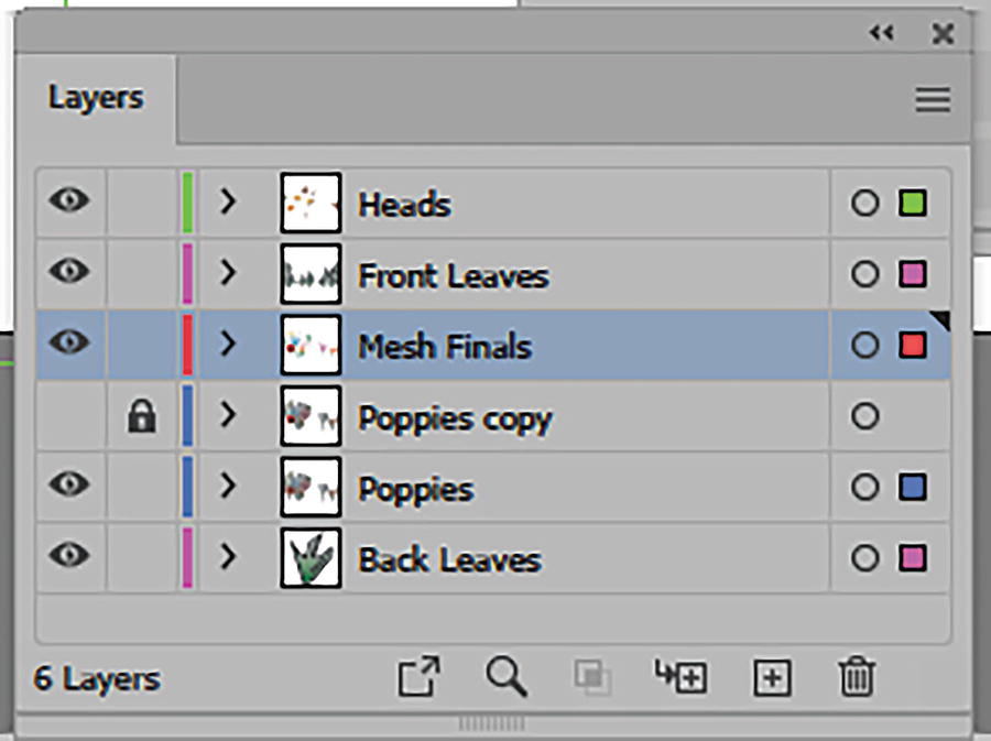
The Mesh Finals layer’s visibility is currently turned off as we will look at that layer later. For now, just select the unlocked layer called Poppies.
While the leaves in the image have already had a linear gradient applied to them, the poppy’s petals and branches are a solid color and do not appear very three-dimensional. Refer to Figure 8-129.
Figure 8-129
Select a petal on one of the poppies
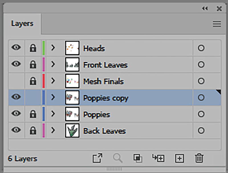
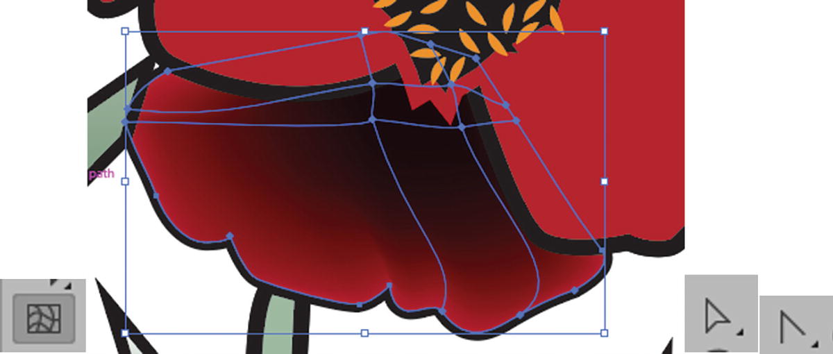
One thing that I have discovered while working with the Mesh tool is that when it creates a mesh the stroke around my path disappears. There is also no direct way of releasing the mesh afterward if I want to keep the original path. The only way to make a copy of paths, once they are a mesh, is to use the Object ➤ Path Offset method I mentioned earlier. But recreating color again takes time. So, once I established the base fill and stroke color of my poppies, I made sure they were on their own layer, which kept the paths and colors safe. Refer to Figure 8-130.
Figure 8-130
Select the Poppies layer
Then I dragged this Poppies layer over my Create New Layer button to create a copy. Refer to Figure 8-131.
Figure 8-131
Create a copy of the Poppies layer
The Copy layer is the one I used to work with my Mesh tool.
I locked the original layer and selected the Poppies copy layer instead. Refer to Figure 8-132.
Figure 8-132
Lock the Poppies layer and work on the Poppies copy layer
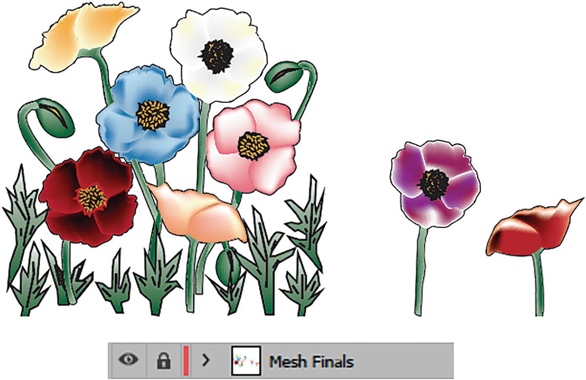
Now I am going to show you how to color one of the poppies using the Mesh tool. However, you can continue to color the other poppies and their branches on your own. You can refer to the Mesh Finals layer by turning on and off the visibility of that layer if you get stuck. But your poppies do not have to look the same as mine—be as creative as you want to be. Refer to Figure 8-133.
Figure 8-133
Use the Mesh Finals layer when you need guidance on how a color should look in the mesh
We are going to work on the red poppy in this example, as well as its stem.
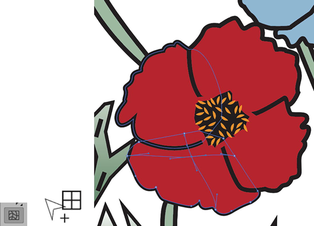
Petal 1
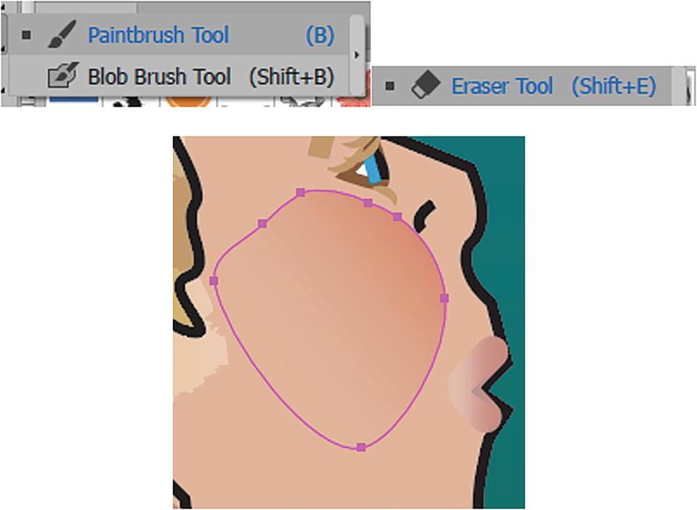
To begin on your Poppies copy layer, with the Selection tool select the lower petal. You may need to zoom in with Ctrl/CMD++, or use the Zoom tool or Hand tool (spacebar) to navigate closer to the flower, and as you work on other areas throughout the project. Refer to Figure 8-134.
Figure 8-134
Select the lower petal of the red poppy with the Selection tool, zoom in with the Zoom tool, and use the Hand tool to navigate
Now select the Mesh tool and click to create a mesh point near the middle of the petal. Refer to Figure 8-135.
Figure 8-135
Use the Mesh tool to start creating a mesh on the poppy’s petal
Note
If you are not exactly on the same point as myself, you can drag the mesh point with the Shift key to move it. This is good for moving mesh points near the edge of the petal without distorting the mesh, now that the stroke has disappeared but the red of the petal remains, as seen from the change in the Toolbars panel. However, because I kept my original layer some of that path’s stroke can still be seen below. Refer to Figure 8-135 and Figure 8-136.
Figure 8-136
The mesh points of the fill are currently red, and the stroke is gone, as seen in the Toolbars panel
Now, with the Mesh tool, click another point on the petal slightly to the right. Refer to Figure 8-137.
Figure 8-137
Use the Mesh tool to create another mesh point
Add another mesh point on that same mesh line, but above. This creates a type of grid. Refer to Figure 8-138.
Figure 8-138
Use the Mesh tool to create a third mesh point
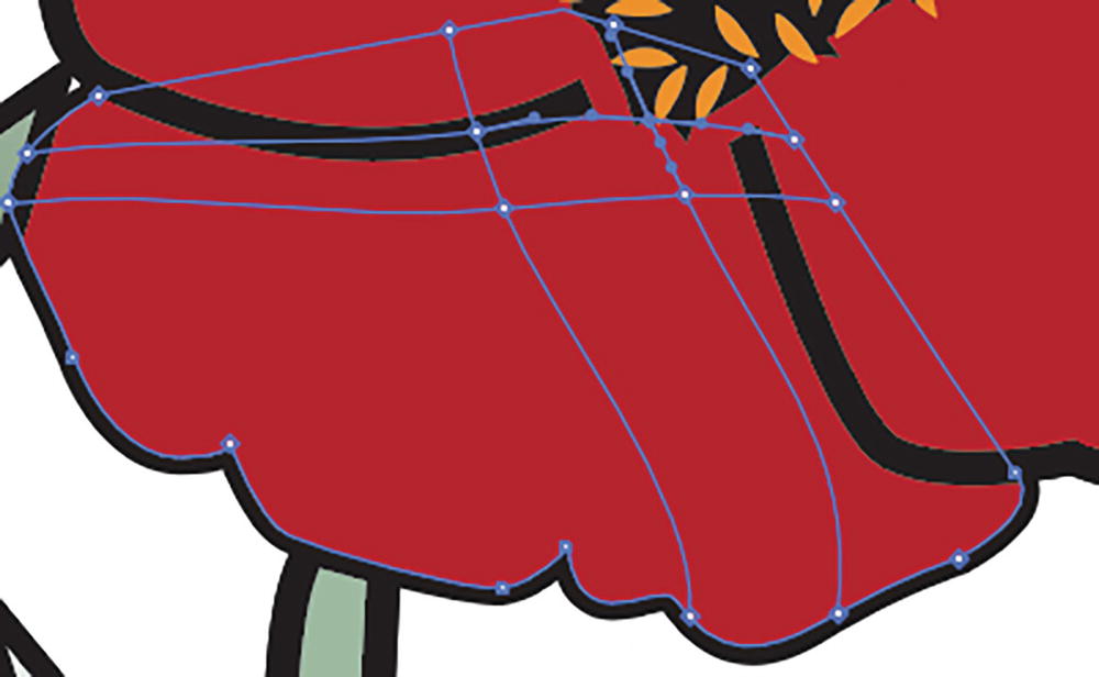
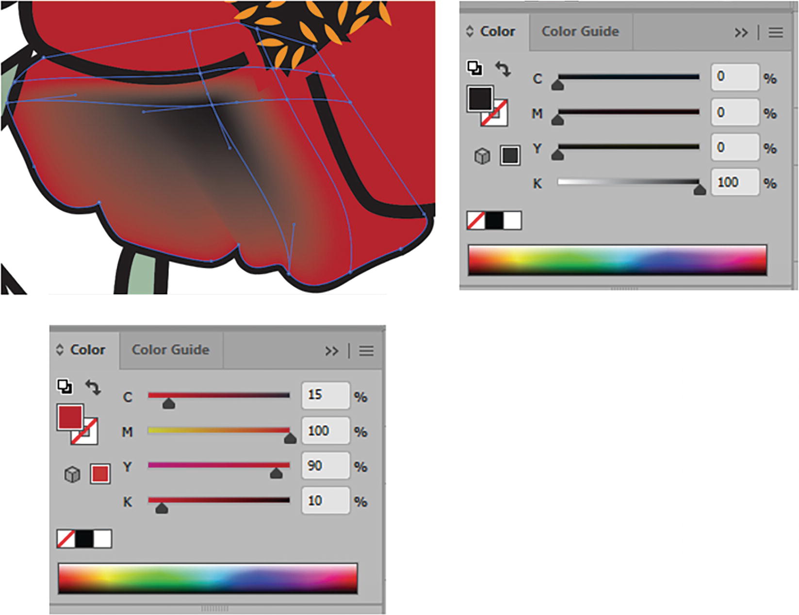
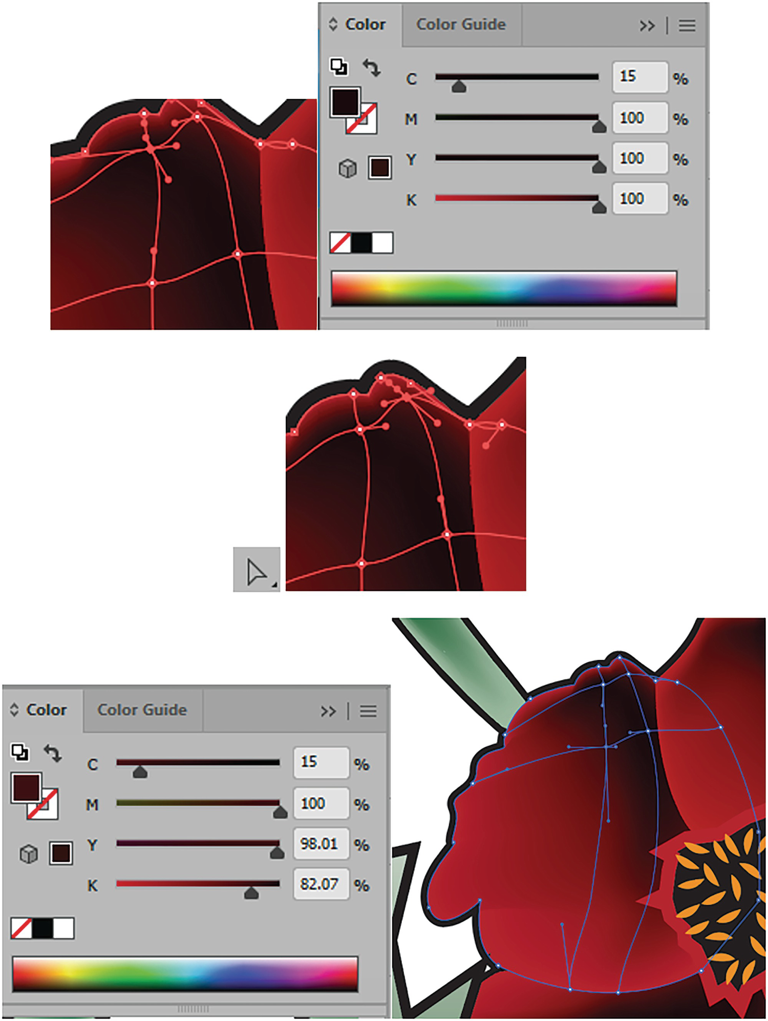
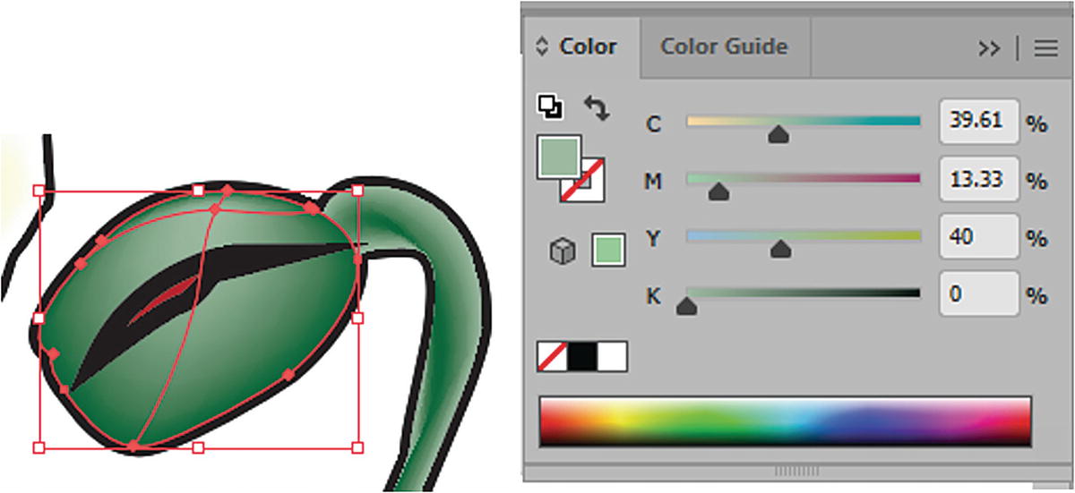
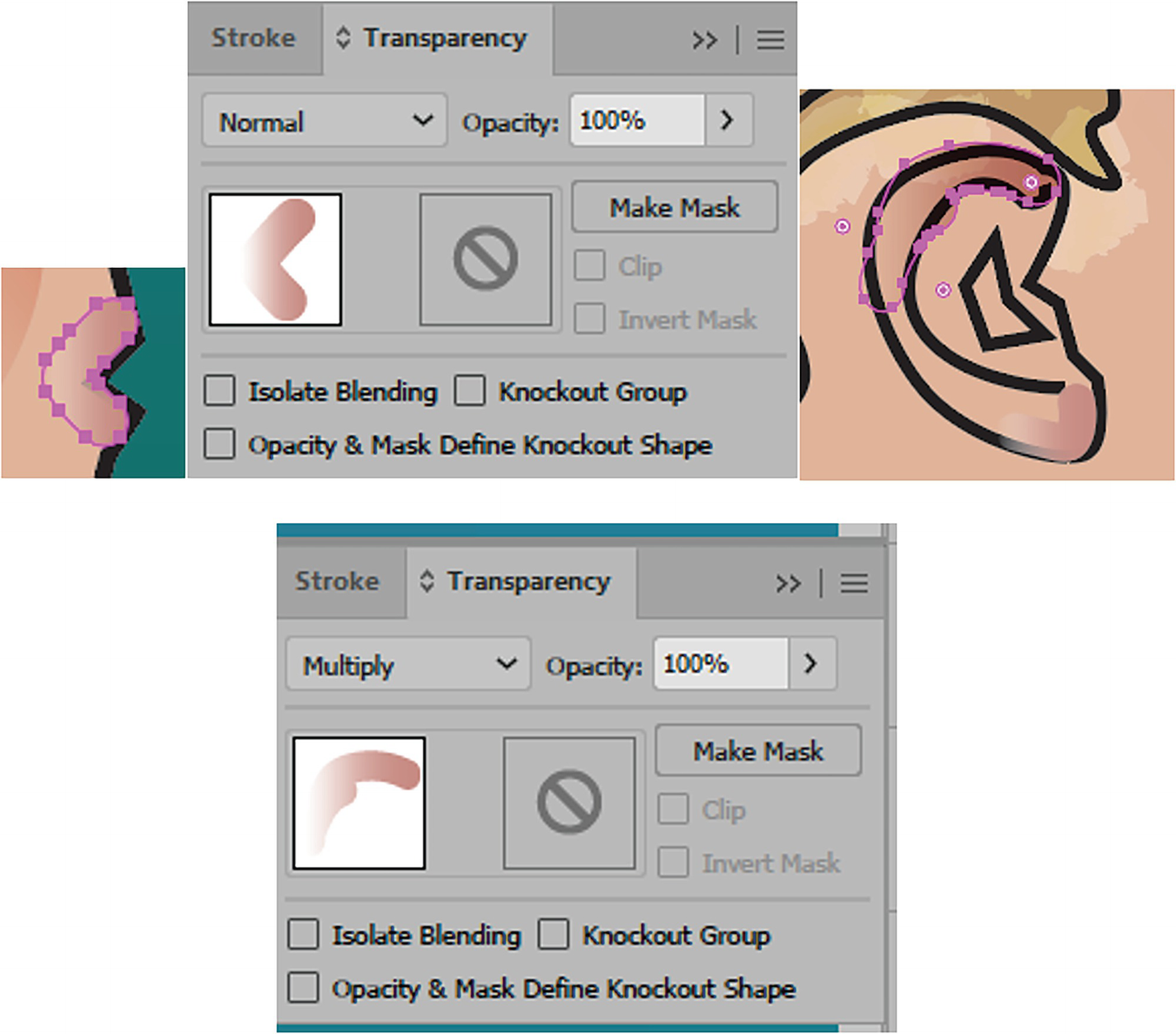
Now you will color the petal. Use the Direct Selection tool and click on the lower mesh point on the left. Using the Swatches panel to change the red swatch, click on the black swatch to add a shadow as you would with a gradient to create a transition from red to black. Refer to Figure 8-139.
Figure 8-139
Select a mesh point with the Direct Selection tool and change the color to black using the Swatches panel
The problem with 100% black is that it is trying to transition to the red, which is made up of CMYK (cyan magenta, yellow, and black), and so you get a gray mess and it does not look very vibrant. You can see that when you refer to the Color panel. Refer to Figure 8-140.
Figure 8-140
Use the Color panel to note the black-to-red transition
To create a richer black color, while the point is still selected, use the Colors panel to up the Cyan to 15%, Magenta to 100%, and Yellow to 100%, and leave the Black (K) at 100%. Refer to Figure 8-141.
Figure 8-141
Use the Color panel to add more of the colors found in the red to the black for a better blend
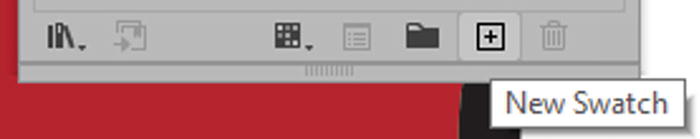
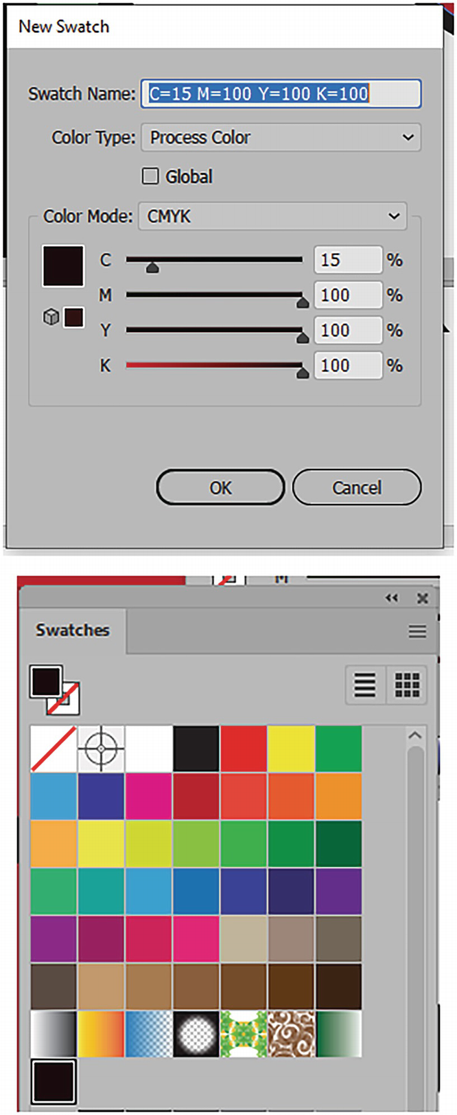
That looks much better. Then save that color by clicking on the Swatches panel’s New Swatch button to add it to your swatch collection. Refer to Figure 8-142.
Figure 8-142
Add the new swatch you create to the Swatches panel
You can give the swatch a new name in the New Swatch dialog box or leave it at the default name and click OK. It is now added to the Swatches panel so you can apply it to the next point on your mesh. Refer to Figure 8-143.
Figure 8-143
Commit the newly made swatch using the New Swatch dialog box and click OK so it is added to the Swatches panel
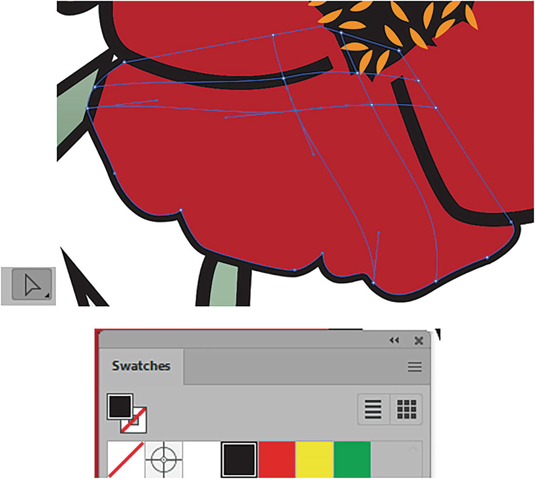
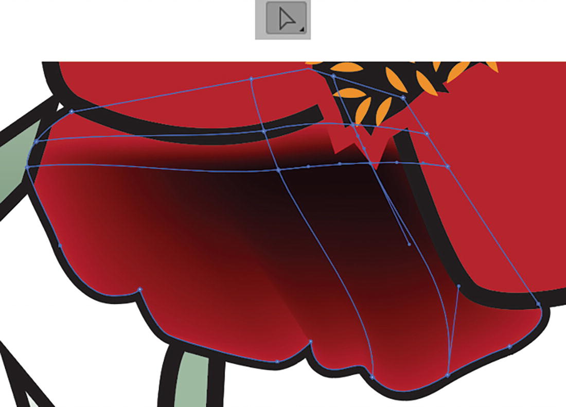
Now, with the Direct Selection tool, select the next point to the right in the mesh and apply the red-black colored swatch again. Refer to Figure 8-144.
Figure 8-144
Use the Direct Selection tool to select another point and color it
Then move on to the above two points on the left and right. Because this petal is below the other petals, to better access the hidden mesh points you may have to use View ➤ Outline (Ctrl/CMD+Y) to get a better selection of points, and then apply the color using the Swatches panel while in outline mode. In this case, I applied the same dark-red color to those points. Then, from the menu, select View ➤ Preview to exit and see the result. Refer to Figure 8-145.
Figure 8-145
The upper mesh points are behind the other path, and you need to go into Outlines mode to select them first and then alter the color
Return to the Mesh tool. You can then twist and adjust the handles, using them if you want to get more curve or a three-dimensional result. Or use the Direct Selection tool and Anchor Point tool to make additional adjustments. Again, you can also use View ➤ Outline and View ➤ Preview to assist you as you alter the points, and in the end you should have grid or mesh similar to what is shown in the next figure. Refer to Figure 8-146.
Figure 8-146
Use the Mesh tool, Direct Selection tool, or Anchor Point tool to alter the mesh lines
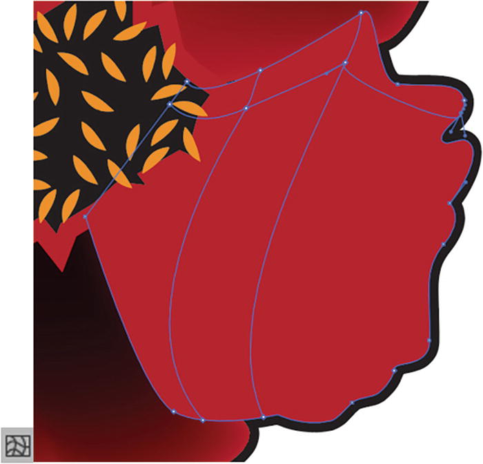
Now continue with the other three petals.
Petal 2
First, select the petal with the Selection tool and then with the Mesh tool to add more points and lines to the mesh. Then, modify with the Mesh tool, Direct Selection tool, or Anchor Point tool.
The petal on the left, in my case, needed three clicks to create the mesh. Refer to Figure 8-147.
Figure 8-147
Add mesh points with the Mesh tool to the second petal on the left
I did use the red-black swatch I created on the upper-left and lower-right points. Then I created a lighter red shade for the lower-left and upper-right points of the grid while they were each selected with the Direct Selection tool. I then used my Color panel’s sliders to make minor adjustments to the CMYK sliders, altering the red. Refer to Figure 8-148 and Figure 8-149.
Figure 8-148
Use the black-red color and the Color panel’s sliders to alter the color for some of the mesh points that you select with the Direct Selection tool
Figure 8-149
Use the Color panel to alter the color for the selected point
Petal 3
The petal on the top requires three clicks with the Mesh tool to create the mesh. Refer to Figure 8-150.
Figure 8-150
Use the Mesh tool to create mesh points for the third petal
Now adjust the points with the earlier mentioned tools and with the Direct Selection tool, and set the colors for each mesh point using the Swatches panel. I used the dark red in the upper-left and lower-right points, and for the lower-left point used a slight shade variation that I created with the Color panel. Refer to Figure 8-151.
Figure 8-151
Color mesh points on the third petal, and use of the Swatches and Color panels
Bear in mind that your mesh and colors may flow slightly differently than mine, depending on how the mesh flows when you clicked to create it. You may have additional points that you want add color to and enhance the shading further later.
Petal 4
For the right-most petal, I clicked twice with the Mesh tool to create this grid in the upper area of that petal. Refer to Figure 8-152.
Figure 8-152
Use the Mesh tool to create mesh points for the fourth petal
I applied my dark-red-colored swatch to those two points using my Direct Selection tool and the Swatches and Color panels. Refer to Figure 8-153.
Figure 8-153
Use the Direct Selection tool to select a point and Swatches panel and Color panel to edit the color further
Stem
To finish this poppy, select the stem with the Selection tool and click once on it with the Mesh tool about halfway up the stem. Refer to Figure 8-154.
Figure 8-154
Use the Selection tool to select the poppy’s stem and the Mesh tool to add an anchor point
To this point, with the Direct Selection tool, I applied a green swatch from the Swatches panel of C=90, M=30, Y=95, and K=30. This makes it match with the leaves. Refer to Figure 8-155.
Figure 8-155
Select the point with the Direct Selection tool and color using a swatch from the Swatches panel
You can then preview your completed poppy mesh and compare it to mine on the Mesh Finals layer. Refer to Figure 8-156.
Figure 8-156
The final colored red poppy
If it’s not the same as mine, that is OK. You might like your poppy better. Then, keep on practicing on your Poppies copy layer with the Mesh Finals layer hidden. Refer to Figure 8-157.
Figure 8-157
Keep working on your Poppies copy layer to color more flowers
Make Poppies and Group the Poppies
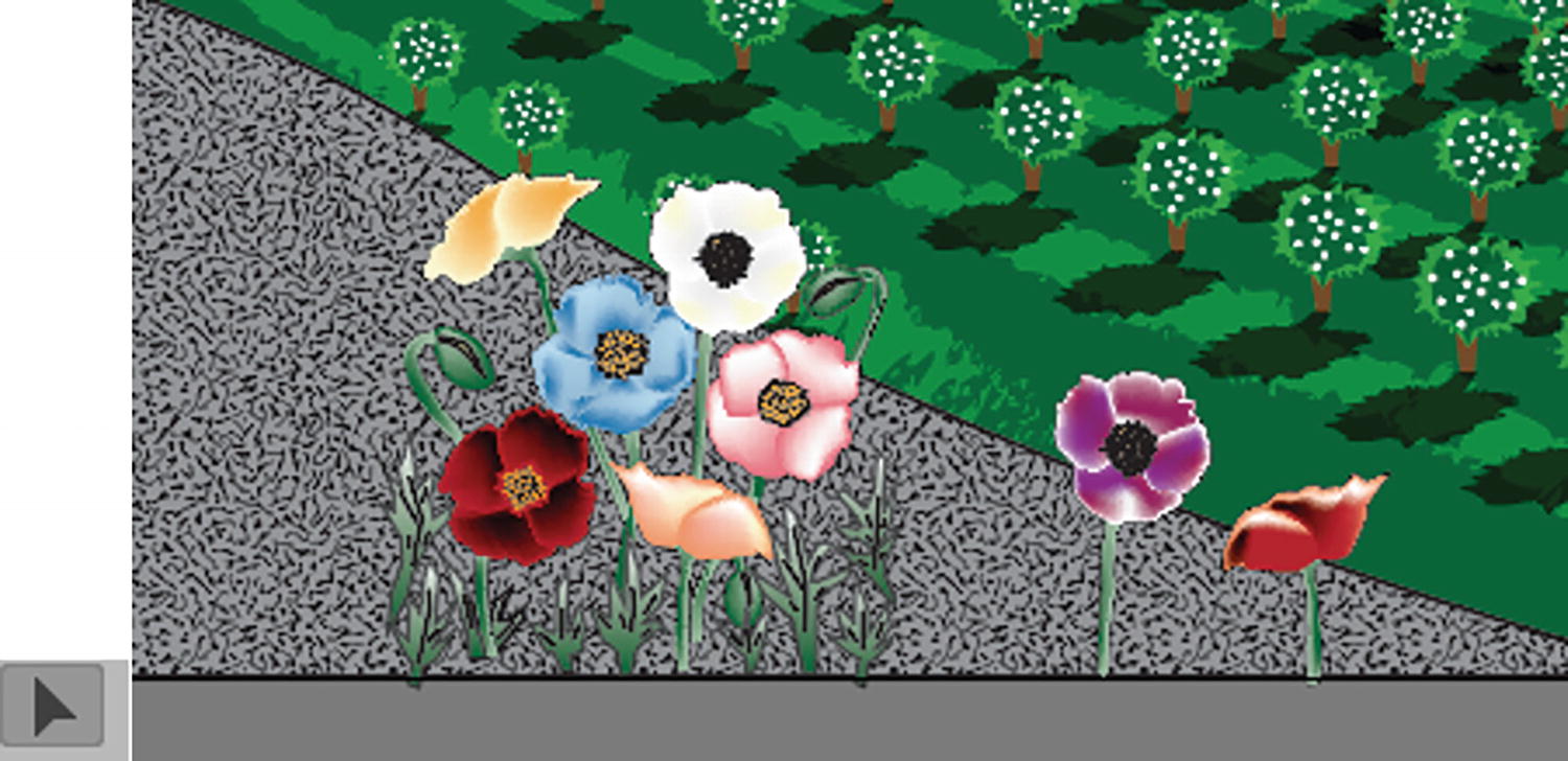
Make poppies that are blue, yellow, cream, peach, purple, and pink or orange, as they come in many colors. Refer to Figure 8-158.
Figure 8-158
Create your poppies in a variety of colors
Also, besides coloring the stems with a gradient mesh, you can color the unopened heads of the poppy with the mesh tool and the same green and lighter greens I used for stems to make them appear more rounded and give some highlights. Refer to Figure 8-159.
Figure 8-159
Color the heads of the poppies using the Gradient mesh tools
When you are done, make sure to save your work on this file.
Copy the Poppies
In my case, when I was done, I unlocked all the relevant layers that I had created. If you don’t want to use your flowers, you can use my Mesh Finals Layer as an alternative. Refer to Figure 8-160.
Figure 8-160
Use the Layers panel to select which layers you want to have as part of your final poppies, and lock the other layers
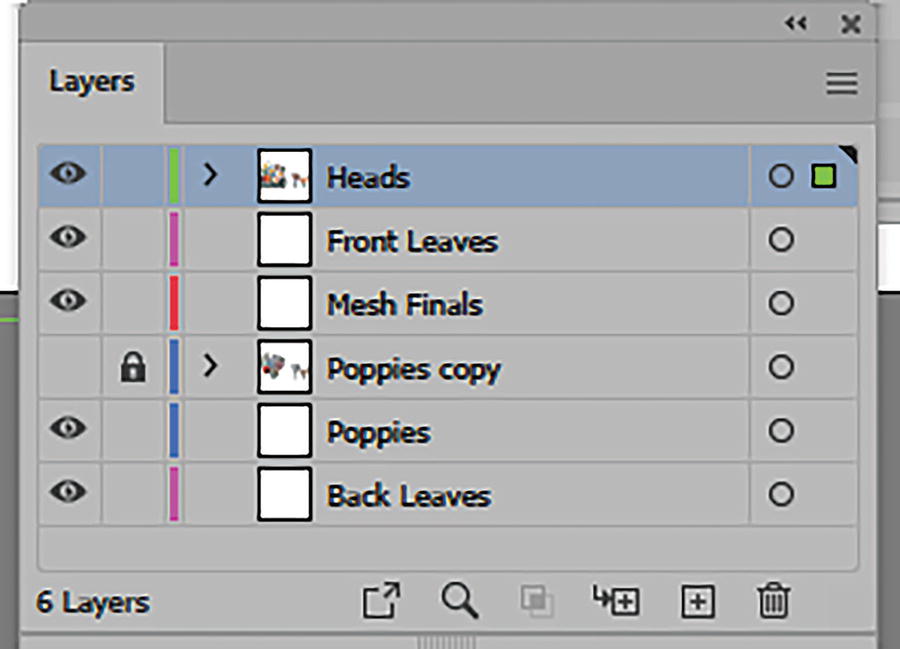
Unlock the layers Heads, Front Leaves, Mesh Finals, Poppies, and Back Leaves.
Then choose, from the menu, Select ➤ All (Ctrl/CMD+A) and then Object ➤ Group. Refer to Figure 8-161 and Figure 8-162.
Figure 8-161
Select all the items on those unlocked layers
Figure 8-162
The grouped object is now on a single layer
This groups all the parts onto the top Heads layer. Refer to Figure 8-162.
Then choose Edit ➤ Copy (Ctrl/CMD+C) and return to your copy of the file Landscape1_6_start.ai.
Then unlock the layer called Poppies and select it. Refer to Figure 8-163.
Figure 8-163
Return to your other document and unlock the Poppies layer
Then choose Edit ➤ Paste In Place. Doing this should get the Poppies close to where you want them to be. But use the Selection tool to select the group if you need to adjust the positioning. Refer to Figure 8-164.
Figure 8-164
Paste the poppies onto the Poppies layer
Save your document at this point and lock the Poppies layer.
Closed the other document flowers_mesh_start.ai with the original poppies you created; however, before you save that file, you may want to Edit ➤ Undo the last Group step so that the paths return to the original layers. Refer to Figure 8-165.
Figure 8-165
You may want to undo the group to return your poppy parts to their original layers in your original flower mesh file
Add More Flowers and Grasses
Additionally, after I added the flowers to my Poppies layer, in the file Landscape1_6_start.ai I added a few additional symbols to the layer for grasses, seeds, rocks, some dandelions, and even a ladybug. Refer to Figure 8-166.
Figure 8-166
On the Poppies layer you can add more flowers to cover the stems as well as grasses from the Symbols panel
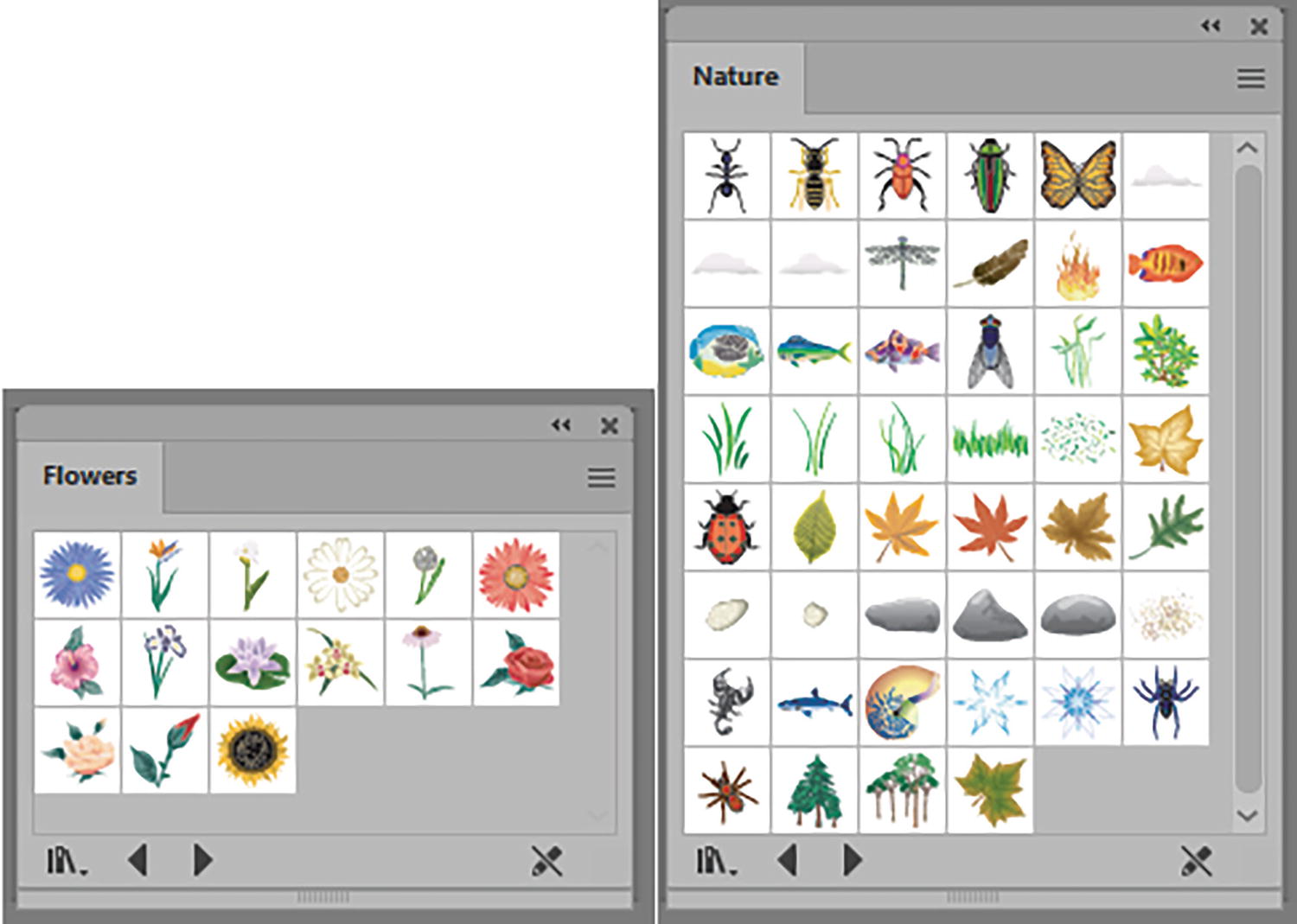
You can find many of these symbols in the Window ➤ Symbol Libraries ➤ Flowers and Nature folders. Refer to Figure 8-167.
Figure 8-167
Symbol libraries of flowers and nature are good resources for this picture
I clicked on some of them and added them to my Symbols panel. Refer to Figure 8-168.
Figure 8-168
Collection of symbols that I added to the Symbols panel and then edited
You can find the symbols that I added and edited in the Landscape1_6_final.ai file, and you can select and Edit ➤ Copy and Edit ➤ Paste those items into your own project, if you select them from my Poppies layer.
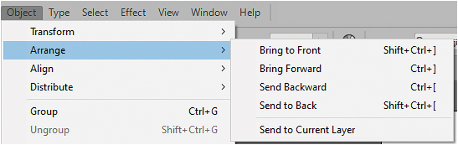
In your case, you may have to move some of the symbols around. Remember to use the Object ➤ Arrange menu on your selected items as required. Refer to Figure 8-169.
Figure 8-169
Your project may require that you arrange some of the symbols to get them in the right order on the layer
Lock your layers and save your document at this point. You can see how it is looking so far in my file Landscape1_6_final.ai. Refer to Figure 8-170.
Figure 8-170
Locked layers in the Layers panel, and the image on the Artboard
We will now look at the Transparency panel and how it affects opacity and blending.
Transparency Panel
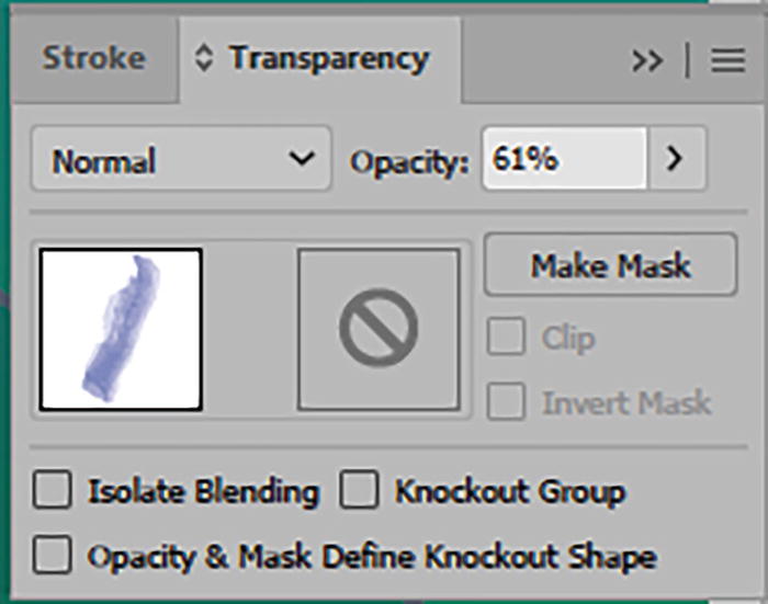
In addition to working with the overall opacity of an object using the Control or Properties panels, and areas of opacity in a gradient using the Gradient panel, you can use the Transparency panel to alter not only the opacity, but also the blending mode and to create what is known as a Opacity mask. We will look at the mask shortly. To make sure that you can see all the options of the Transparency panel, click the Show Options item in the panel’s menu.
Create a new document if you want to practice with the Transparency panel. Refer to Figure 8-171.
Figure 8-171
Transparency panel with Show Options set and its menu settings
Here are the parts of the panel:
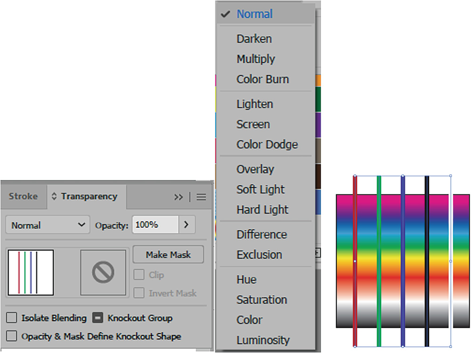
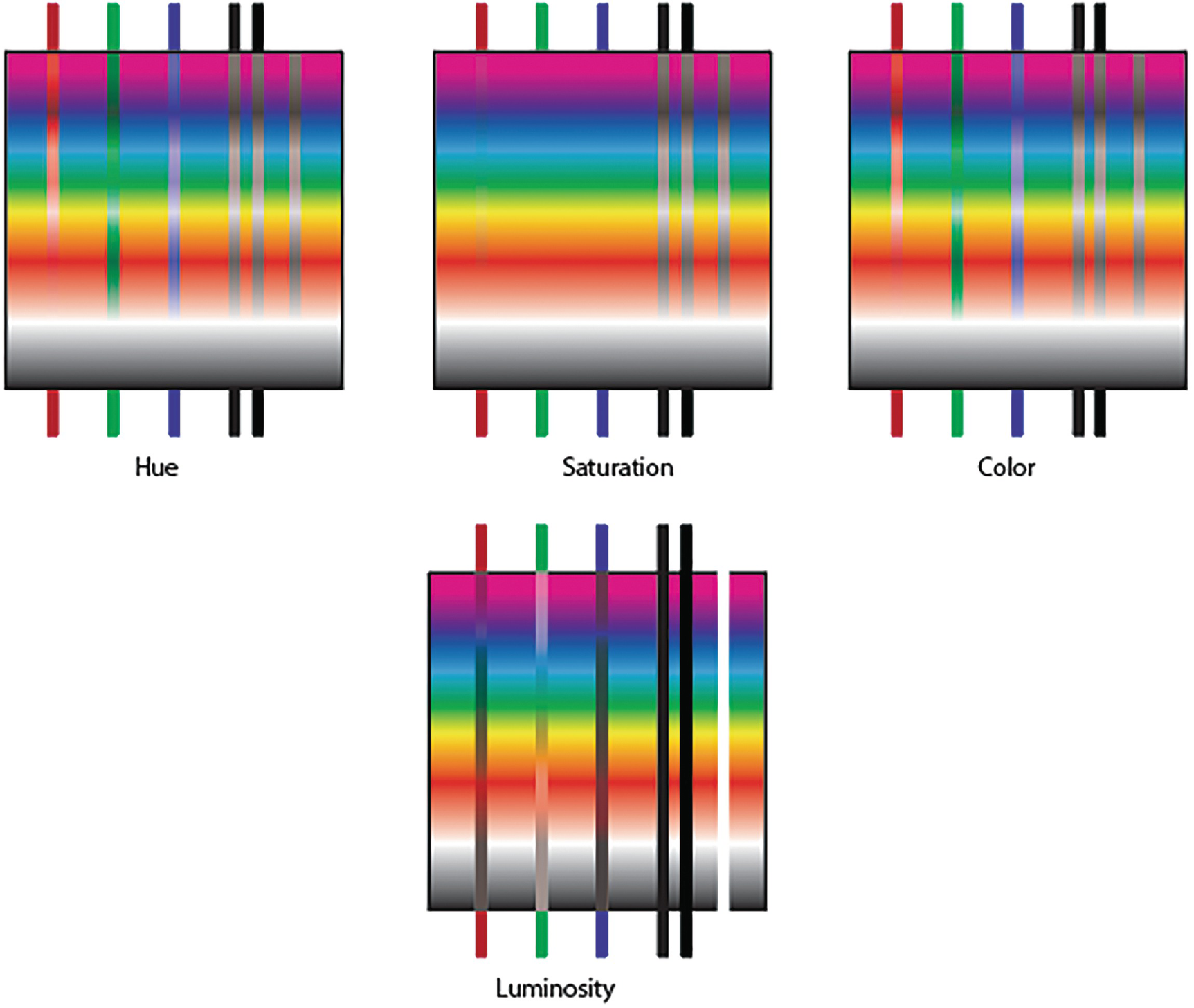
Blending Modes: Like the Photoshop Layers panel, the Transparency panel in Illustrator has a number of blending modes that allow you to blend the colors of a lower or base shape with the colors of the overlying shape. These include Normal, Darken, Multiply, Color Burn, Lighten, Screen, Color Dodge, Overlay, Soft Light, Hard Light, Difference, Exclusion, Hue, Saturation, Color, and Luminosity. Refer to Figure 8-172.
Figure 8-172
Use the Transparency panel to set new blending modes for paths
For a more detailed explanation of how to use blending modes in Photoshop for layers and brushes, you can refer to the books mentioned in the introduction or the following link:
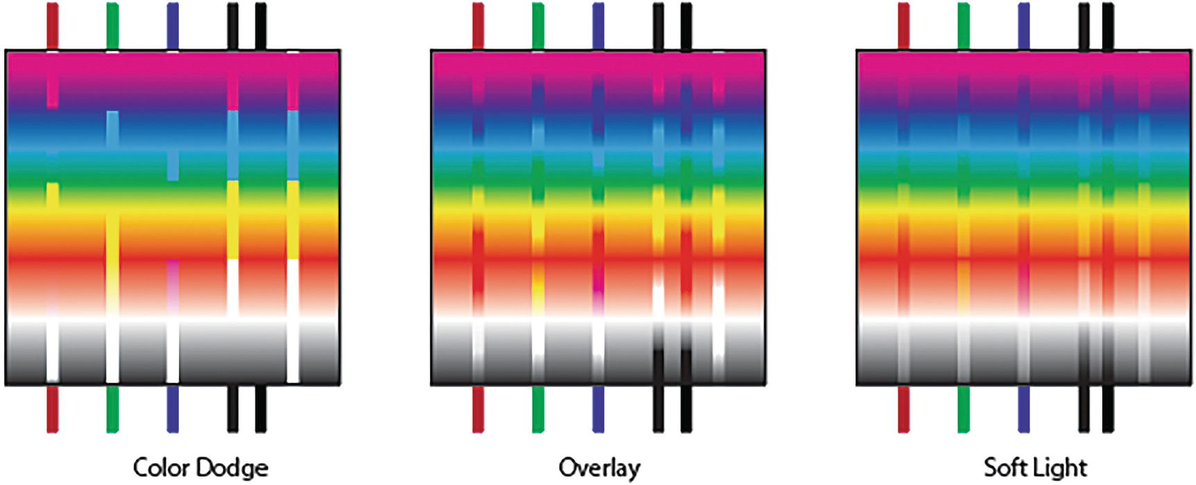
But in this chapter, I will present how these blends would appear in Illustrator. In this case, brush stroke and blending modes are the same; there is no separation between the two. Over a rainbow background I put lines with a stroke of CMYK red, green, blue, black (K=100%), rich black (C=100, M=100, Y=100, K=100), and white to show you how having different blending modes applied to these lines will blend over the background base colors. See my file Blend_examples.ai for reference. In some cases, the white or black lines disappear entirely or turn black. The resultant color is the blend and base combined. Refer to Figures 8-173 to 8-177.
Figure 8-173
Blending modes on lines of Normal, Darken, and Multiply
Figure 8-174
Blending modes on lines of Color Burn, Lighten, and Screen
Figure 8-175
Blending modes on lines of Color Dodge, Overlay, and Soft Light
Figure 8-176
Blending modes on lines of Hard Light, Difference, and Exclusion
Figure 8-177
Blending modes on lines of Hue, Saturation, Color, and Luminosity
Note
Photoshop has an additional 11 blending modes in its Layers panel and two additional ones when working with brushes. Blending modes in Illustrator can vary slightly in how they affect color when we compare them to the blending modes in Photoshop layers, so this is something to consider if you plan to blend that Illustrator layer as a Smart Object layer in Photoshop and results turn out slightly different than what you tried in Illustrator.
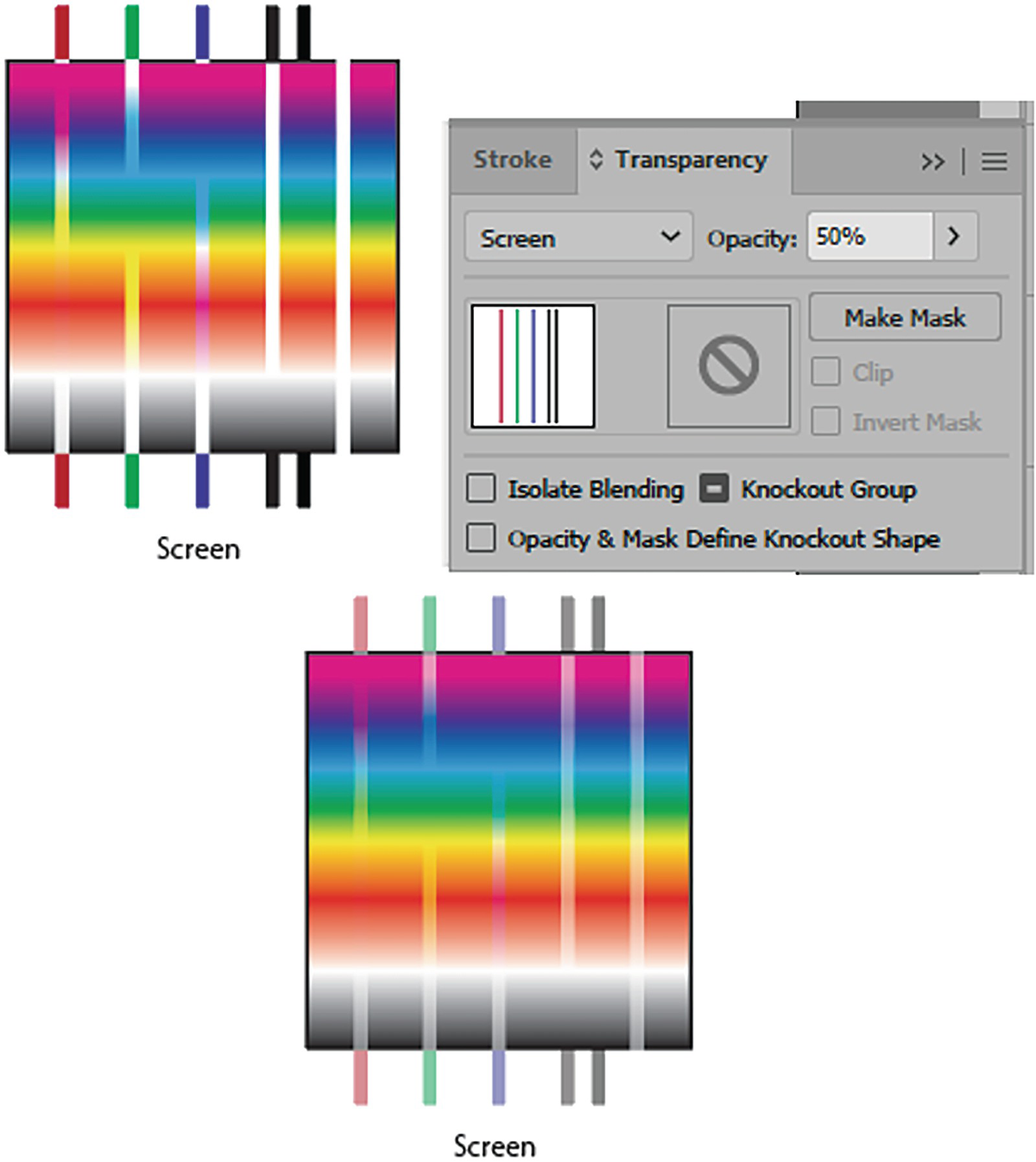
Opacity: With the addition of opacity (0%–100%) you can also alter how the base and blend colors are affected and what colors show through. I will point out an example of that in the project shortly. However, here we can see how the blending mode of Screen is affected simply by lowering the blending mode lines to 50% opacity. Refer to Figure 8-178.
Figure 8-178
A blending mode of Screen can be faded with opacity changes
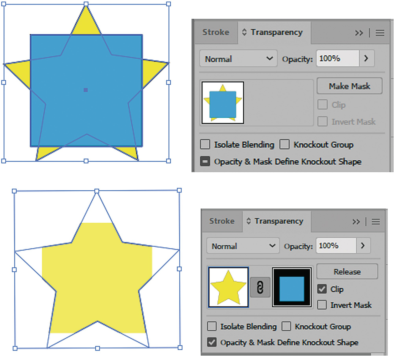
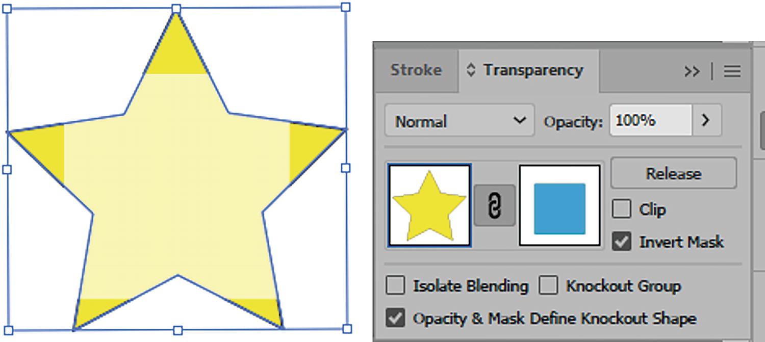
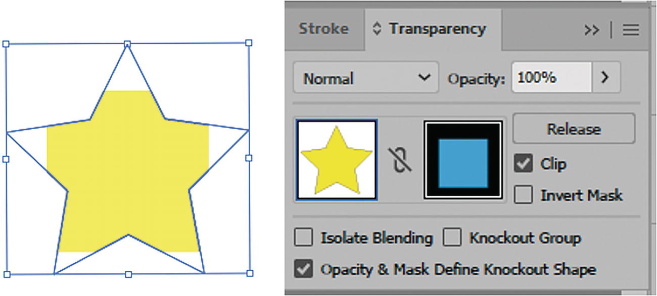
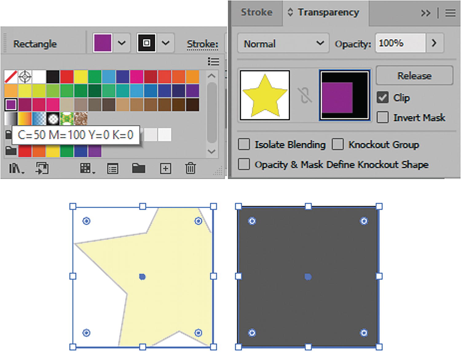
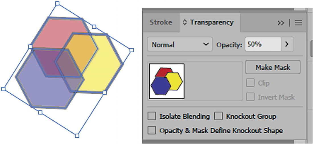
Opacity Mask: Creates a mask from two overlapping objects of different colors when they are selected and the Make Mask button is clicked. Or, from the panel’s menu, choose Make Opacity Mask. This creates a linked mask, with the topmost object acting as the mask. Refer to Figure 8-179.
Figure 8-179
Use the Transparency panel to create a Opacity mask from two selected paths
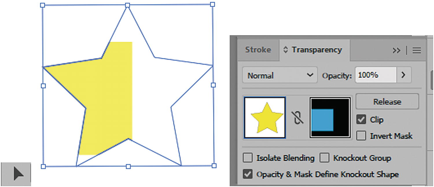
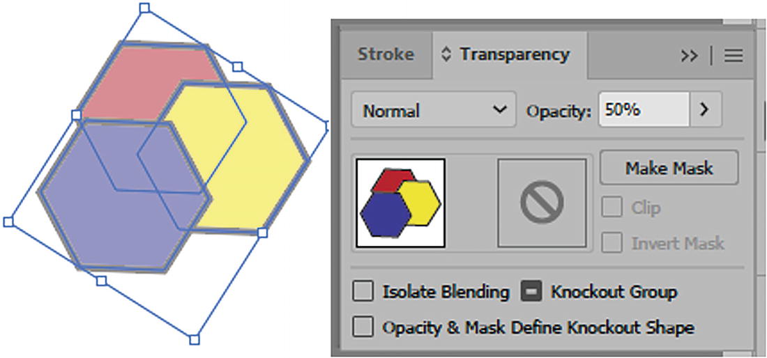
This kind of mask is similar to working with a clipping mask, when two shapes are selected and you choose Object ➤ Clipping Mask ➤ Make. However, with the clipping mask the stroke around the star remains. Refer to Figure 8-180.
Figure 8-180
Example of a clipping mask over the path
Note
In this case I used a shape that had a fill color other than black so that you could see the opacity mask at work. Black areas turn what you are trying to mask invisible. I did, however, leave the stroke color of the opacity mask black so that you could see how black does affect the mask. Refer to Figure 8-181.
Figure 8-181
The Opacity mask has a color so that you can see it in the Transparency panel
Currently, the opacity mask is set to Clip. This is set as a default in the menu when a new opacity mask is made and gives the mask a black background, cropping the artwork to the boundaries of the opacity mask.
However, by adding Invert Mask you can reverse the luminosity values of the masked object, which will in turn affect the opacity of the underlying artwork and partly show the mask’s stroke. Refer to Figure 8-182.
Figure 8-182
View the opacity mask on the Artboard with the Clip and Inverted Mask settings enabled and the menu default setting of New Opacity Masks Are Clipping set
Note
From the menu you can also set that new opacity masks are inverted before you create the opacity mask. Refer to Figure 8-182.
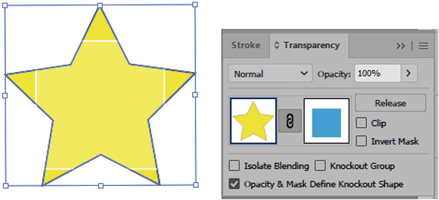
Disabling Clip causes the entire star area to fill with yellow, but you can still see the outline of the opacity mask fill and stroke. Refer to Figure 8-183.
Figure 8-183
View the opacity mask on the Artboard with the Inverted Mask setting enabled
Disabling both Clip and Invert Mask reveals the star and shows the outline of the opacity mask’s stroke within the star. Refer to Figure 8-184.
Figure 8-184
View the opacity mask on the Artboard with the Clip and Inverted Mask settings disabled
In this case I will enable the Clip checkbox again.
In Photoshop, masks and art are linked so that they can move together. However, in Illustrator, if you click on the mask even while linked, you can move the mask separately from the artwork.
When you need to move the object on the layer separately from the mask, you can click on the link to unlink the art and mask, and then click on either the art or mask first in the Transparency panel. A dark blue line will appear around the current selection in the panel—in this case, the artwork. Refer to Figure 8-185.
Figure 8-185
View the opacity mask on the Artboard with Clip enabled and Invert Mask disabled, and the mask unlinked
Then, with the Selection tool, you can move that item separately. Refer to Figure 8-186.
Figure 8-186
Use the Selection tool to move the art separately from the mask while unlinked
Likewise, if you select the mask, you can change its color. Use the Control panel to change the color, which will affect how the mask blends over the art.
To see just the mask, Alt/Option + Click on it in the Transparency panel. It appears in a gray tone. All colors take on a grayscale equivalent when they become an opacity mask. Refer to Figure 8-187.
Figure 8-187
When the opacity mask is selected you can alter it and preview it on the Artboard
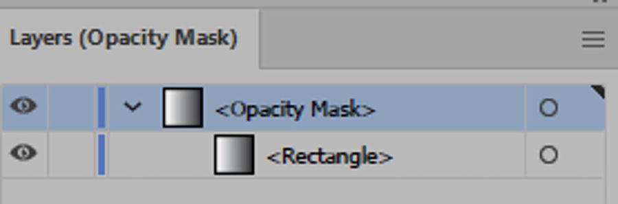
Note
While the opacity mask is selected, you will in the Layers panel be in Opacity Mask mode. This is good to check if you are not sure if you are in the opacity mask. Refer to Figure 8-188.
Figure 8-188
When the opacity mask is selected you can see you are in that mode in the Layers panel
Alt/Option + Click again on the opacity mask in the Transparency panel to exit Edit mode but remain on the opacity mask.
Changing the mask to a gradient swatch can also cause different blending effects and make parts of the star shape fade away. Refer to Figure 8-189.
Figure 8-189
Adding a gradient to the opacity mask using the Control panel can cause the underlying image to fade or you can use a pattern on the mask instead
An opacity mask can also be a pattern swatch. Refer to Figure 8-189.
Link the mask again at this point when you select the art again in the Transparency panel to complete the blend. Refer to Figure 8-190.
Figure 8-190
Select the art in the Transparency panel and link it with the opacity mask again, and view the result on the Artboard
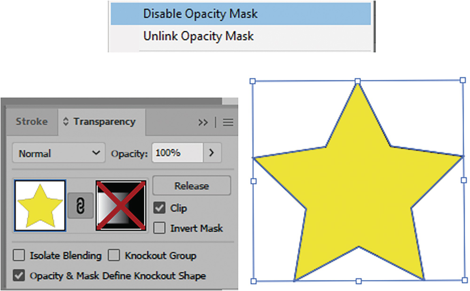
You can also see a before and after if you choose Disable Opacity Mask from the menu. This puts a red cross though the mask, so you see just the art. Refer to Figure 8-191.
Figure 8-191
Using the Transparency panel and menu, you can disable the opacity mask to see only the art
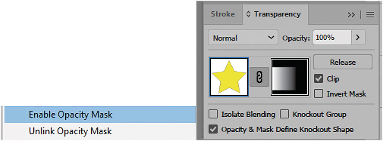
Choose Enable Opacity Mask from the panel’s menu to add the opacity mask back. Alternatively, you can Shift + Click on the mask to enable and disable it. Refer to Figure 8-192.
Figure 8-192
Using the Transparency panel and menu, you can enable the opacity mask again
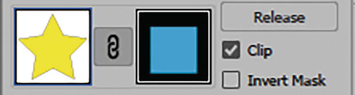
To release the art from the opacity mask, click the Release button. If you want to combine it again while both are selected, then click the Make Mask button as you did earlier. Refer to Figure 8-193.
Figure 8-193
Use the Transparency panel to release the mask
The final three options in the Transparency panel are as follows:
Isolate Blending: Disabled by default. It prevents blending modes from being applied past the bottom of a group.
Separate ungrouped objects will display separate blending modes, each affecting the other. However, with grouped objects the blending mode, when applied to the group, is contained as one unit within the group. However, to isolate the blend of the group further, you can enable Isolate Blending. Refer to Figure 8-194.
Figure 8-194
Transparency panel with Isolate Blending selected for a grouped object
Note
You can apply separate blending modes to each shape in the group by selecting them with the Direct Selection tool. Refer to Figure 8-195.
Figure 8-195
Select each shape separately with the Direct Selection tool and use the Transparency panel to give each a different blending mode
Knockout Group: Disabled by default. When objects are separate and the same opacity is applied to them, they will each show it separately. Refer to Figure 8-196.
Figure 8-196
Separate shapes show their colors through each other when they have similar opacity
However, when opacity is applied to a grouped object, then an automatic knockout or neutral knockout is applied with a dashed line rather than a check. This knockout prevents elements of the group from showing through each other. Refer to Figure 8-197.
Figure 8-197
Grouped objects show their colors as one unit when they have similar opacity
If the opacity of one of the shapes differs within the group, leaving the knockout group neutral or leaving the check disabled is OK as it does not interfere with the knockout behavior determined by the group. However, you can then click the knockout group to turn it into a check, so that as a group they are all uniform. Refer to Figure 8-198.
Figure 8-198
When grouped shapes have different opacities, you many need to check the knockout group to unify them
Opacity & Mask Define Knockout Shape: Enabled by default. In knockout groups, this causes an element to be shaped by its opacity setting and mask. We saw how this earlier affected a single path, and this is similar when a grouped object has an opacity mask applied. However, the opacity mask itself can have its own opacity applied that is different from that for the artwork. Having a separate blending mode for an opacity mask appears in this example to make no difference. Refer to Figure 8-199.
Figure 8-199
Transparency panel with opacity mask and Opacity & Mask Define Knockout Shape enabled, and the mask with its own separate opacity
Make sure to click on your artwork in the Transparency panel so that you do not draw extra paths on the opacity mask by mistake.
The final two options in the menu, Page Isolated Blending and Page Knockout Group, can affect how the grouped object blends in relation to the page rather than independently. Refer to Figure 8-200.
Figure 8-200
Transparency panel additional settings
Tip
If you need to see transparent items more accurately on the white Artboard, you can choose View ➤ Show Transparency Grid (Shift+ Ctrl/CMD+ D) and then to exit, View ➤ Hide Transparency Grid. Refer to Figure 8-201.
Figure 8-201
Show Transparency Grid option
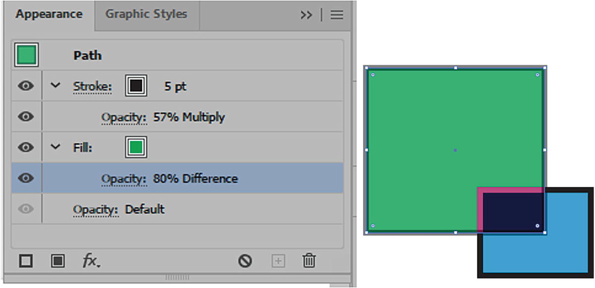
In situations where you want to affect the opacity for the object’s fill and stroke separately, you need to use the Appearance panel. Click on the Opacity option, below the fill or stroke, to enter the Transparency panel and change the opacity and blending mode. Refer to Figure 8-202.
Figure 8-202
Setting the stroke’s and fill’s opacity settings separately using the Appearance panel
Adding a different opacity and blending mode to the fill can affect how underlying objects will show through. Refer to Figure 8-203.
Figure 8-203
Setting the stroke’s and fill’s Blending Mode settings separately using the Appearance panel
For more detail on working with transparency and blending modes you can visit the following link:
Project: Blowing in the Wind, Part 6, Examples of Working with the Transparency Panel
Come back to the project of the girl on the farm and your copy of the file Landscape1_6_start.ai.
While there are no actual steps that you need to do in this part of the project, I will just point out here that I created the symbols of the bushes and the posts on the bushes layer. Refer to Figure 8-204.
Figure 8-204
Unlock the Bushes layer
I then entered Symbol Editing mode through the Symbols panel when I double-clicked on the bush symbol. Refer to Figure 8-205.
Figure 8-205
Symbols panel with the bush symbol
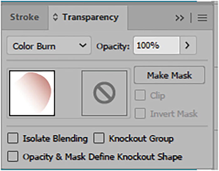
Using the Direct Selection tool, I selected the group shadow’s center and then used the Transparency panel to set the blending mode of the shadow from Normal to Multiply. Refer to Figure 8-206.
Figure 8-206
The shadow was selected with the Direct Selection tool and its blending mode changed using the Transparency panel
The 79%opacity I had already set using the Control panel, but, as mentioned earlier, you can set it here as well. If we compare the blending mode of Normal to that of Multiply, we can see that even with the set opacity it darkens the shadow and gives it a richer color. Refer to Figure 8-206 and Figure 8-207.
Figure 8-207
Shadow with blending mode of Normal and blending mode of Multiply
You may also notice that within my groups one of the sub-levels is set to 85% opacity. This gives the bush area in the center a slightly transparent effect, so that you can see some of the shadows from the next row, as bushes are not entirely solid. This area can be hard to notice at first, but here it is in my sub-layers. Refer to Figure 8-208.
Figure 8-208
Part of the grouped bush had an opacity applied to it
This just points out how different parts of a group can have different opacites as you build complex symbols.
I then adjusted the shadow on the four posts, including the symbol on the Artboard. They were set to a blending mode of Multiply as well, with an opacity of 78%. Refer to Figure 8-209.
Figure 8-209
The shadow of the post also has a blending mode of Multiply
After you have finished looking at the file you can lock the layer, but you do not have to save any changes. Refer to Figure 8-210.
Figure 8-210
Lock the Bushes layer
Gradients and Transparency in Brushes Panel
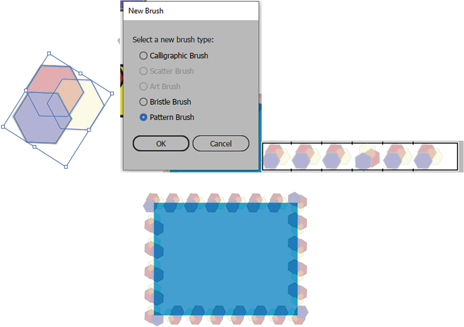
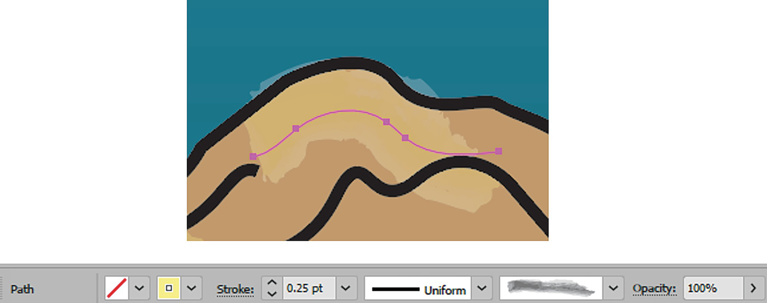
Earlier, in Chapter 7, we looked at one of the brushes in the Brushes panel known as the Pattern brush.
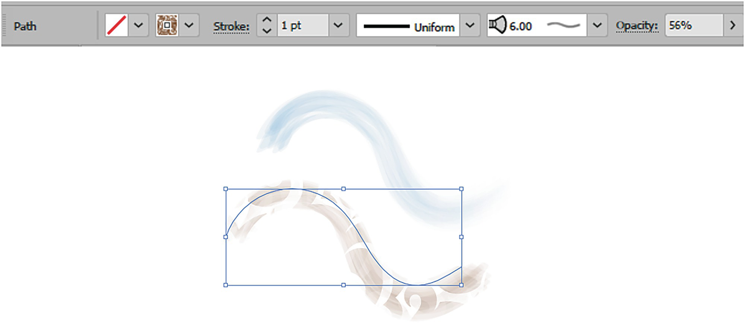
If objects already have levels of opacity within their patterns, they will also appear transparent when they are added to a Pattern brush and applied to the stroke. Refer to Figure 8-211.
Figure 8-211
Objects with Transparency can be added to a Pattern brush and modified. They can then me applied as a border or stroke to another path
However, adding a pattern brush with a gradient is not availble, and you would need to Object ➤ Expand the gradient before it could be used in a pattern brush.
With the Calligraphic brush type, after you paint with the brush you could select the strokes and set the opacity, or change the stroke to a gradient or pattern swatches using the Control panel. Refer to Figure 8-212.
Figure 8-212
Calligraphic brush setting can be preset using the Control panel, and then you could use the Pen tool to create the brush strokes, or set them afterward
Or set additional blending modes using the Transparency panel. Refer to Figure 8-213.
Figure 8-213
You can then set the blending mode using the Transparency panel
You cannot store these gradients, patterns, and opacites within the brush; they must be added after, or while the settings are present, in the Control panel.
Scatter brushes and art brushes, as mentioned in Chapter 7, have selected objects added directly to the brush. When you select the shapes and click on the New Brush button, choose either Scatter or Art. Refer to Figure 8-214.
Figure 8-214
Create either a new scatter brush or a new art brush from your current shapes with opacity
These can include items with opacity. However, like the pattern brush, they cannot contain a gradient, and you will get a warning message if you try to add an object with a gradient. You must expand the gradient first. Refer to Figure 8-215.
Figure 8-215
Art and scatter brushes will show a warning if you try to add a gradient pattern. Only solid or transparent swatches are allowed
Note
Like pattern brushes, scatter brushes and art brushes can have colorization settings added as well, to determine if they will be affected by the current stroke color. This can give added color enhancement as well. We will see an example of this in the next part of the project. Refer to Figure 8-216.
Figure 8-216
Art and scatter brush dialog box Colorization options
Addionally, you can adjust these brushes and strokes by using the Opacity settings in the Control panel or Transparency panel.
Lastly, the Bristle brush, like the Calligraphic brush after you paint with it, can have the opacity and blending modes of its stroke’s swatch altered by using the Control panel and the Transparency panel. Refer to Figure 8-217.
Figure 8-217
Use the Control panel to set the final settings for the Bristle brush
You can discover what controls the brush strokes’ blurriness within the Bristle Brush Options dialog box, which you get to by double-clicking on a Bristle brush in the Brushes panel. Refer to Figure 8-218.
The brush’s Shape (10 options), Size (1mm–10mm), Bristle Length (25%–300%), Density (1%–100%), Thickness (1%–100%), Paint Opacity (1%–100%), and Stiffness (1%–100%) settings all impact how the effect appears on the Artboard. Refer to Figure 8-218.
Figure 8-218
Bristle Brush Options dialog box
Using Tools Such as Pen Tool, Paintbrush Tool, Blob Brush Tool, and Eraser Tool
Besides using my Pen tool to create strokes for my design, other brush-related tools can be used to enhance your artwork. These include the following found in the Toolbars panel:
Paintbrush Tool: Used for painting open path strokes that you do not need to connect
Blob Brush Tool:Used for creating a closed object as you would if you were painting, using the current stroke setings
Eraser Tool: Used for erasing parts of a selected path or object
However, I will point out the basics here, and if you want to use any of the options in these tools then you need to double-click on them in the Toolbars panel to edit their dialog box settings. These could include Fidelity, Angle, Roundness, and Size of brush or eraser. Refer to Figure 8-220.
Figure 8-220
When you double-click on the Eraser tool in the Toolbars panel you can see its tool options
Like the Pen tool, after you create a stroke or objects with the Paintbrush tool or Blob Brush tool you can then select that area with the Selection tool and use either the Control panel to further edit colors, gradients, patterns, and opacity, or the Transparency panel to further adjust blending modes. We will look at an example of how I did that next. Refer to Figure 8-221.
Figure 8-221
Use the Transparency panel to adjust the selected paths afterward
Project: Blowing in the Wind, Part 6, Using the Brush Tool
We will continue with the project of the girl at the farm and your copy of the file Landscape1_6_start.ai.
I will just point out a few of the transparent brush strokes that I added to the girl when I constructed her.
You can unlock the Girl layer if you want to follow along. Refer to Figure 8-222.
Figure 8-222
Unlock the Girl layer
As mentioned, the girl is made up of many paths and brush strokes. After using the Pen tool to construct the main parts of her, to add final details I used the Paintbrush tool, Blob Brush tool, and Eraser tool. These helped me to create many of her shadows and highlights. Refer to Figure 8-223.
Figure 8-223
I used various brushes to create details on the girl
Afterward, I selected these paths and then used the Control panel and Transparency panel to adjust the opacity and blending mode.
While selecting with the Direct Selection tool, let’s examine some key areas.
Let’s begin with the girl’s blond hair. In the Control panel, we can see that this is a yellow stroke. Refer to Figure 8-224.
Figure 8-224
The Control panel reveals what brush and setting were using for the selected path for the hair
The Opacity setting is at 100%, and I used a brush or brush definition of Watercolor Stroke 5. This is found in Window ➤ Brush Libraries ➤ Artistic ➤ Artistic_Watercolor, which I added to my Brushes panel when I clicked on it. Refer to Figure 8-225.
Figure 8-225
Brush library Artistic Watercolor, and the brush added to the Brushes library
It is an art brush that was created from various gray shades, and because it has a colorization method of Tints, it picks up the yellow rather than remaining grayscale, giving painterly and hair-like effects. Refer to Figure 8-226.
Figure 8-226
Art Brush Options dialog box
If we were to take apart the brush, we would also discover that grouped areas of it also have an opacity of 85%, and this is what emulates the watercolor and transparent effect. Refer to Figure 8-227.
Figure 8-227
The extracted brush reveals that it has area of opacity to create a watercolor effect
After the brush stroke was applied to the Artboard, I further enhanced it in the Transparency panel after selecting it, giving it a blending mode of Soft Light and blending it in with the rest of the hair. Refer to Figure 8-228.
Figure 8-228
Applying a blending mode using the Transparency panel further adds to the effect on the hair
This brush was used again on the girl’s pants and boots with different swatch colors and different opacities throughout. Refer to Figure 8-229.
Figure 8-229
The Control panel reveals other settings for the selected stroke
However, the blending mode in the Transparency panel was kept at Normal. Refer to Figure 8-230.
Figure 8-230
The Transparency panel shows this stroke has a blending mode of Normal
To create areas of color for her cheeks, I used the Blob Brush tool to create a round area. Refer to Figure 8-231.
Figure 8-231
Using the Blob Brush and Eraser tools to create the cheek on the girl
I then applied a linear gradient to this area using my Swatches panel as well as swatches from the Skintones library. See my Wolf Girl Freeform Gradient example earlier in this chapter if you need more details on this. I also set the angle to about 37.3° to adjust for the cheek. Refer to Figure 8-232.
Figure 8-232
Creating a gradient with the Gradient panel and using swatches from the Skintones library
The Gradient color stop in this example also has some opacity on the left and helps fade the color into the main part of the skin, giving the girl a pink cheek. I also applied a blending mode of Color Burn to the path using the Transparency panel. Refer to Figure 8-233.
Figure 8-233
Use the Transparency panel to set to a blending mode of Color Burn
Other areas on the face where I also used the Blob Brush tool with the same gradient were on the lips and ears. I left the blending mode at Normal for some areas and at Multiply for the top of the ear. Refer to Figure 8-234.
Figure 8-234
Various Transparency panel settings for the blending mode on various parts of the face
Lastly, another area where I used the Blob Brush and the Eraser tool was on the shadow, below the girl. Refer to Figure 8-235.
Figure 8-235
Using the Blob Brush and Eraser tools to create the shadow
The Blob Brush tool, I find, is very good for creating a shadow area very quickly in a big area, as I do not have to spend time trying to figure out the angles or roundness of the strokes with the Pen tool. Once I create a Blob path, I like to select it and use the Eraser tool to smooth out large areas quickly. I find this similar to painting in Photoshop.
Though not required for this book, remember to check out my book Accurate Layer Selections Using Photoshop Selection’s Tools if you need more details on these brushes, as well as other related Illustrator tools. While building the girl in the original file and using these tools to add detail, I worked on separate layers, which made it easier to control the Brush and Eraser tools, and then later grouped the girl onto one layer as you did with the poppies.
Once I had the path for the shadow selected, I changed the fill to a gradient shadow fill using the Gradient panel. I then used the Transparency panel to set the blending mode to Multiply and the opacity to 47%. Refer to Figure 8-236.
Figure 8-236
Use the Gradient and Transparency panels to adjust the shadow’s settings
Additional opacity adjustments were also added to shadows on the yellow boots and the dandelion ellipse. But no additional blending modes were applied. Refer to Figure 8-237.
Figure 8-237
Other areas of the grouped image also have Opacity settings in the Transparency panel
Once you have finished looking at the Girl layer and the gradient and transparency options that were used, you can lock the layer, but don’t save any changes as we did not make any in this part of the project.
You can see our progress so far in the file Landscape1_6_final.ai. Refer to Figure 8-238.
Figure 8-238
The final image so far with the new parts of the image added
Summary
Gradients can be used to create the illusion of a 3D effect based on the placement of color. We adjust this in the Gradient panel with the Gradient tool or the Mesh tool. The Transparency panel can also be used to adjust and blend color. Transparency and gradients can then be applied to paths and edited using the Appearance panel. Brushes and related tools can be used to apply transparency as well. However, in the next chapter, we will be looking at another object distortion tool command, one similar to Edit ➤ Transform ➤ Warp in Photoshop.