
Chapter Goal: Review how to create patterns and then enter the pattern through the Swatches panel to distort it further. Also, work with the new feature, Object ➤ Repeating Shapes.
In this chapter, we will be reviewing the Pattern Options panel that I briefly discussed in my book, Graphics and Multimedia for the Web with Adobe Creative Cloud. However, since the writing of that book I have discovered a few additional features that can enhance the repeating patterns that we can use with this panel. In addition, we will be working with the Libraries panel, as well as discussing ways to work with repeating shapes and do custom borders and brushes.
You can find the projects for this chapter in the Chapter 7 folder.
Pattern Introduction
Whether you have used Photoshop in the past or Illustrator while reading this book, once you start using the Pen, Shape, Rotation, and Liquify tools, you can create all kinds of geometric shapes and patterns.
Patterns can be very simple or quite complex. They are often meant to repeat so that they can be used in the cloth or fashion industry, on printed paper backgrounds for advertisements, and in other areas of the manufacturing industry. If you take the time to look around your house or in a magazine, you’ll probably see a lot of repeating patterns.
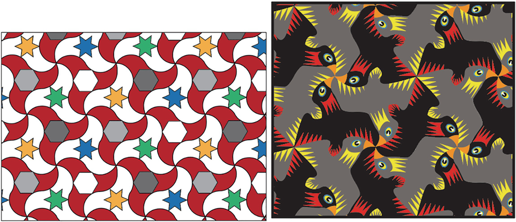
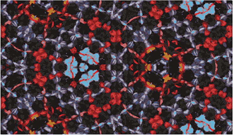
Recreation of Moorish tiles, and an Illustrator pattern in the style of MC Escher
Though I’m sure it would take many years of study to achieve his level of work and understanding of geometry, if we look at very basic repeating patterns, they will often at their core use some very simple geometric shapes that we can later build upon to create our own inspired works.
Shapes that often work well with tessellation tiles, with no gaps or overlaps, include the following:
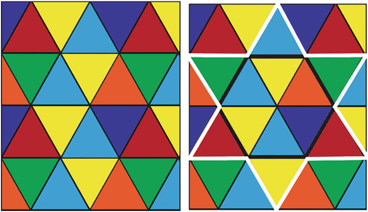
Triangle patterns often have more than one hidden shape
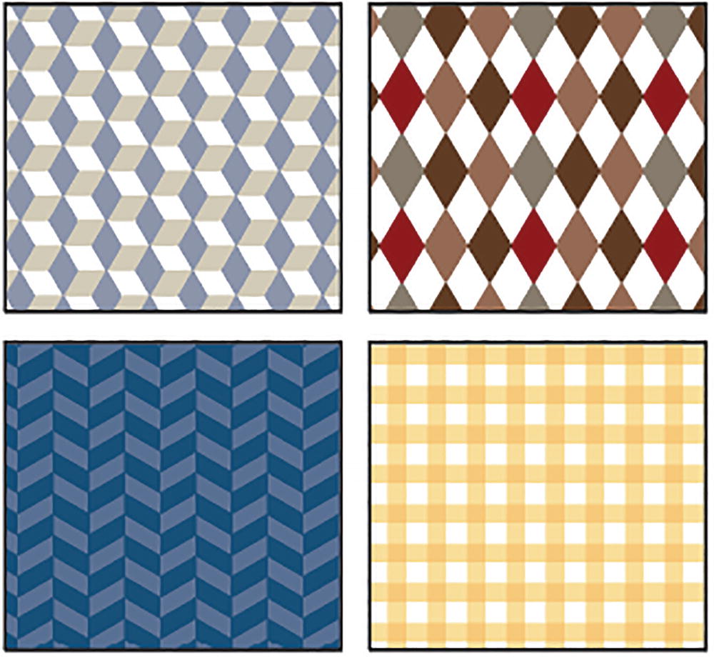
There are many variations of square patterns

When basic shapes are used in combination the possibilities are endless
The possibilities are endless. Escher himself was even noted to have said in his journals about tessellations that creating them, and patterns, could become an addictive activity. Here is a link that talk a bit more about Escher’s life and works.
https://mathshistory.st-andrews.ac.uk/Biographies/Escher/
Imagine what would have happened back then if he’d had access to a computer and Adobe Illustrator.
Some of the patterns I am using here were likely inspired by Escher’s work and that of other similar pattern designers; they can be found in Illustrator’s library under Window ➤ Swatch Libraries ➤ Patterns.
Swatches Panel for Patterns
Additional Illustrator pattern libraries can be accessed, and patterns can be added to the Swatches panel
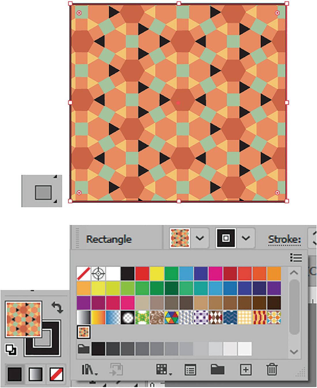
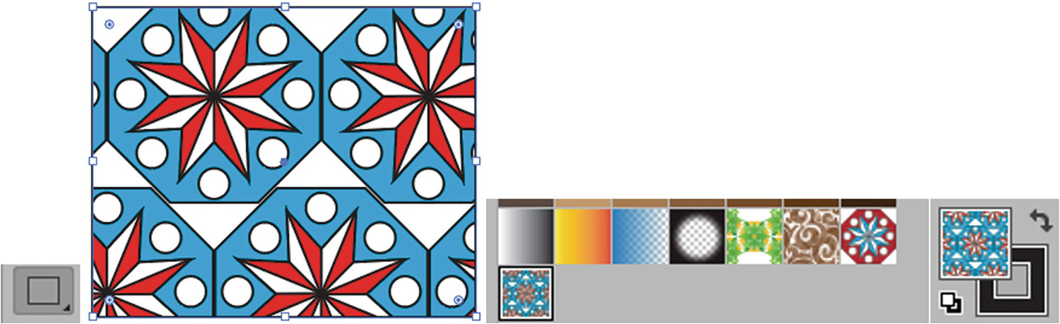
Create a rectangle to store and test your pattern, and add the pattern to the fill using the Control panel
Add the pattern to the stroke or to both the fill and the stroke, and see how it appears in the Toolbars panel
You’ll also notice that in some of these patterns, rather than solidly filling up the tessellations, blank areas are left so that some underlying color can show through. This can be very useful when you want to have alternating or solid colors show behind the pattern, as we will see later. Refer to Figure 7-7.
So, while it’s nice to use patterns supplied by Adobe Illustrator, you may be wondering how to build or modify patterns to suit the needs of your project. This requires using the Swatches panel and Pattern Options panel, which we will look at next.
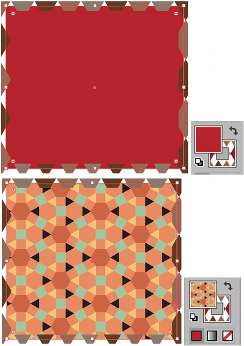
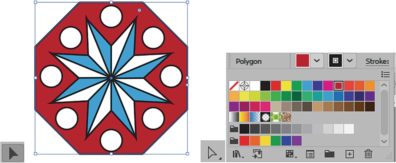
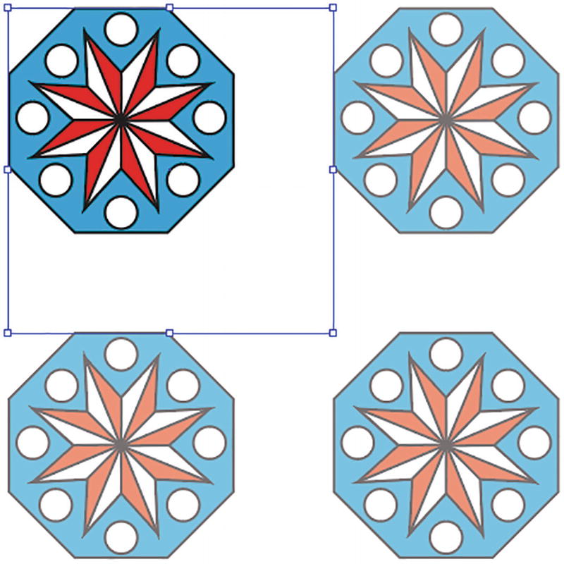
Before I started working with the Swatches panel on the Artboard, I created a simple pattern using a few geometric shapes and overlapped them.
You can see these two starting patterns when you open pattern_start.ai. Save a copy if you want to follow along for practice.
Use various Shape and Pen tools to create the start of your pattern
Use the Control panel to align various paths in your shape
Select a copy of your grouped object so that you can colorize it and create alternative variations
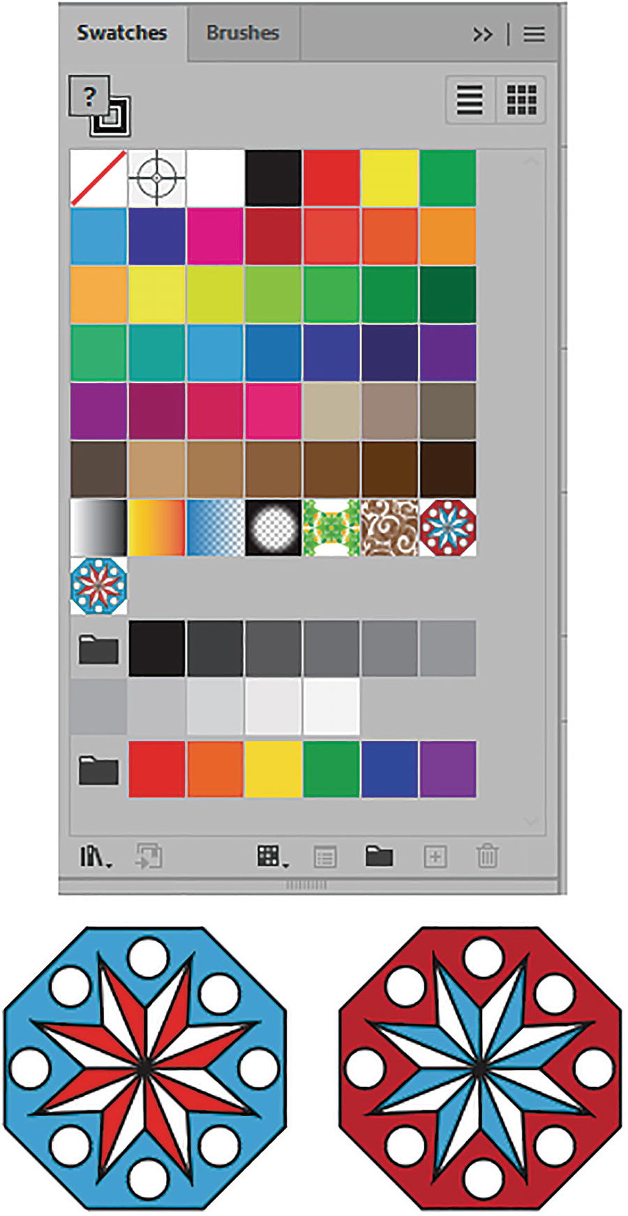
Drag the grouped objects into the Swatches panel one at a time
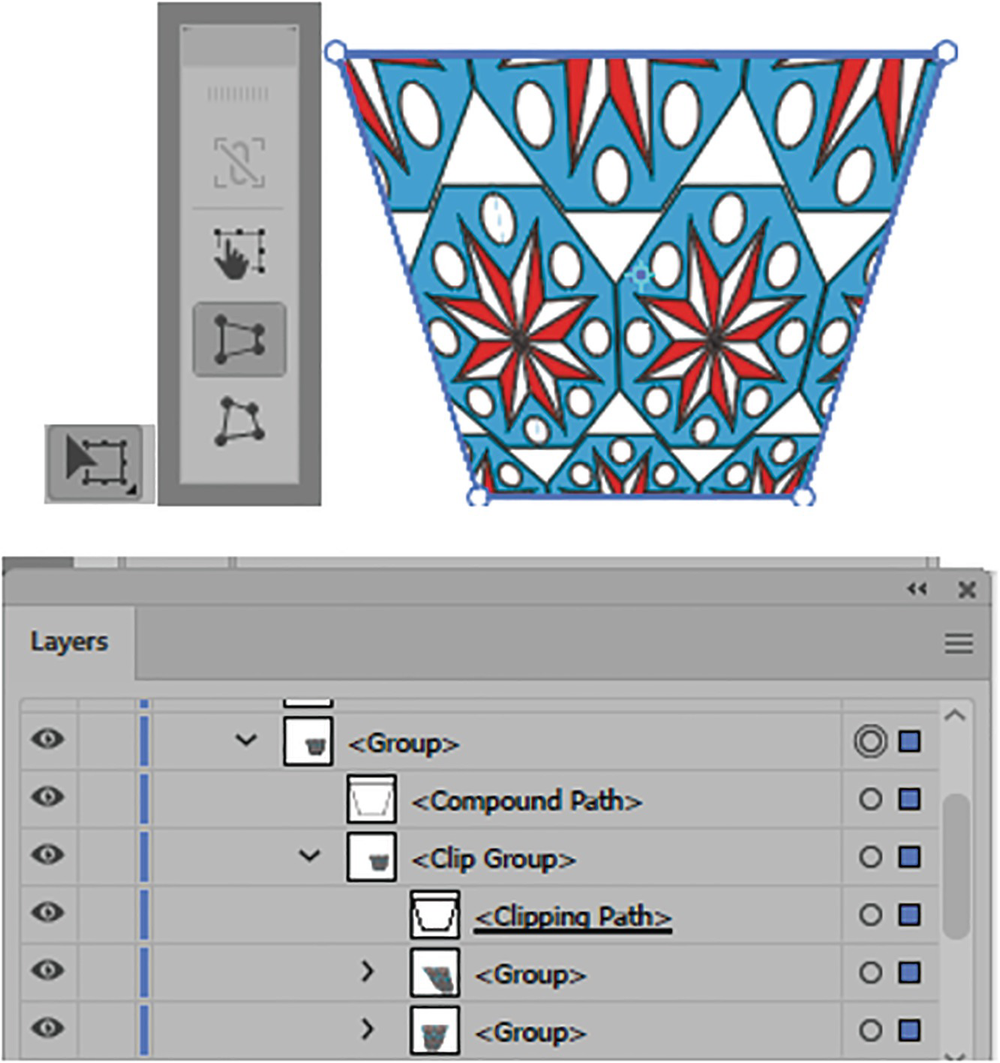
You cannot drag a pattern into the Color Group folder, only to the end of the main swatches with the other patterns and gradients. To delete a pattern from the Swatches panel, while it is selected you can click on the Delete Swatch Icon (trashcan icon) and click Yes to the message about your delete-a-swatch selection. Refer to Figure 7-10.You can also drag a copy pattern out of the Swatches panel to edit it like you did with the Brushes panel in Chapter 4. However, I find working in Pattern Editing mode a better solution.
Pattern Editing Mode
Now, so that you do not apply your patterns by mistake to the original, make sure you click off the pattern with your Selection tool to deselect all artwork.
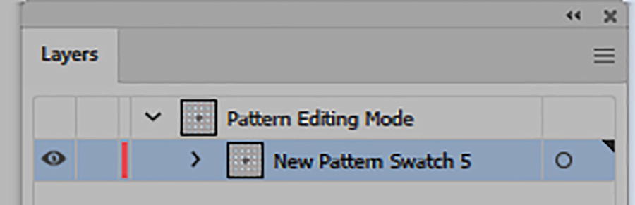
The Layers panel will let you know you are in Pattern Editing mode
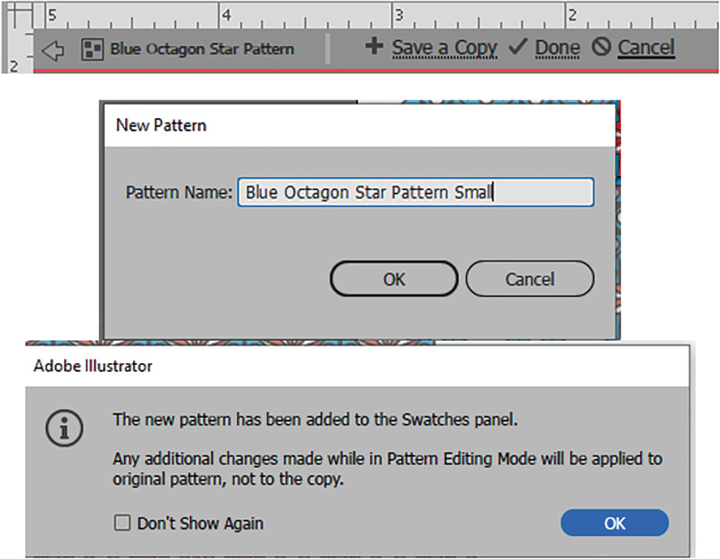
An alternative way to create a pattern with solid colors is to select an object and then choose Object ➤ Pattern ➤ Make. This will also add the pattern to the Swatches panel, and a message will appear, indicating that you will be in Pattern Editing mode and that changes will be applied upon exit. Click OK to enter the mode. Refer to Figure 7-13.
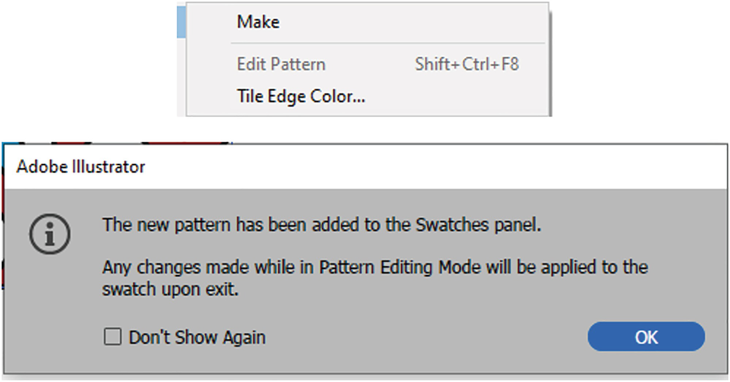
Use Object ➤ Pattern ➤ Make instead if you want to edit in Pattern Editing mode, and then read the info message and click OK
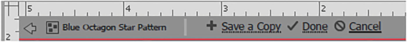
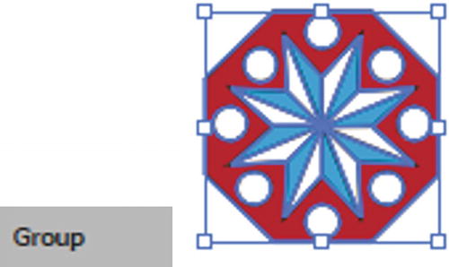
In my case, to enter Pattern Editing mode, I selected the blue hexagon pattern in the Swatches panel and double-clicked.
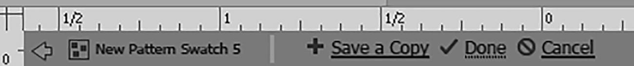
Use the icons on the upper-left near the rulers to exit Pattern Editing mode
You can save a copy of the pattern, or work on the original. When finished, click the Done button to confirm your pattern in the swatch, or click Cancel to exit and not create or edit a pattern at all. For now, you will stay in Pattern Editing mode. At this point, the Pattern Options panel is available, which we will look at next.
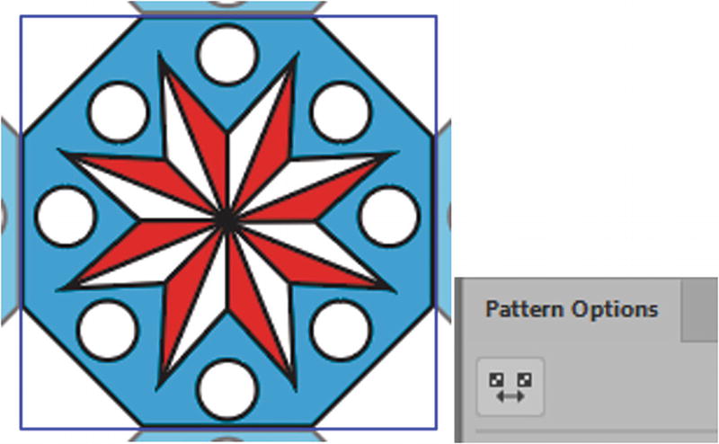
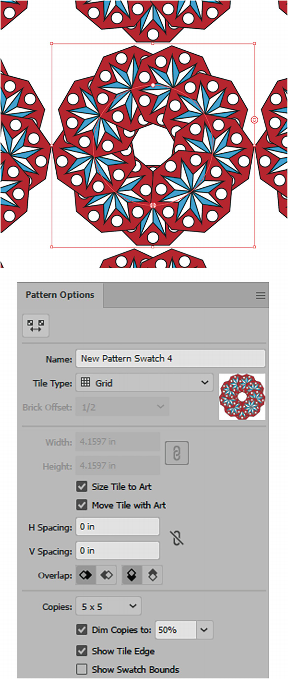
Pattern Options Panel
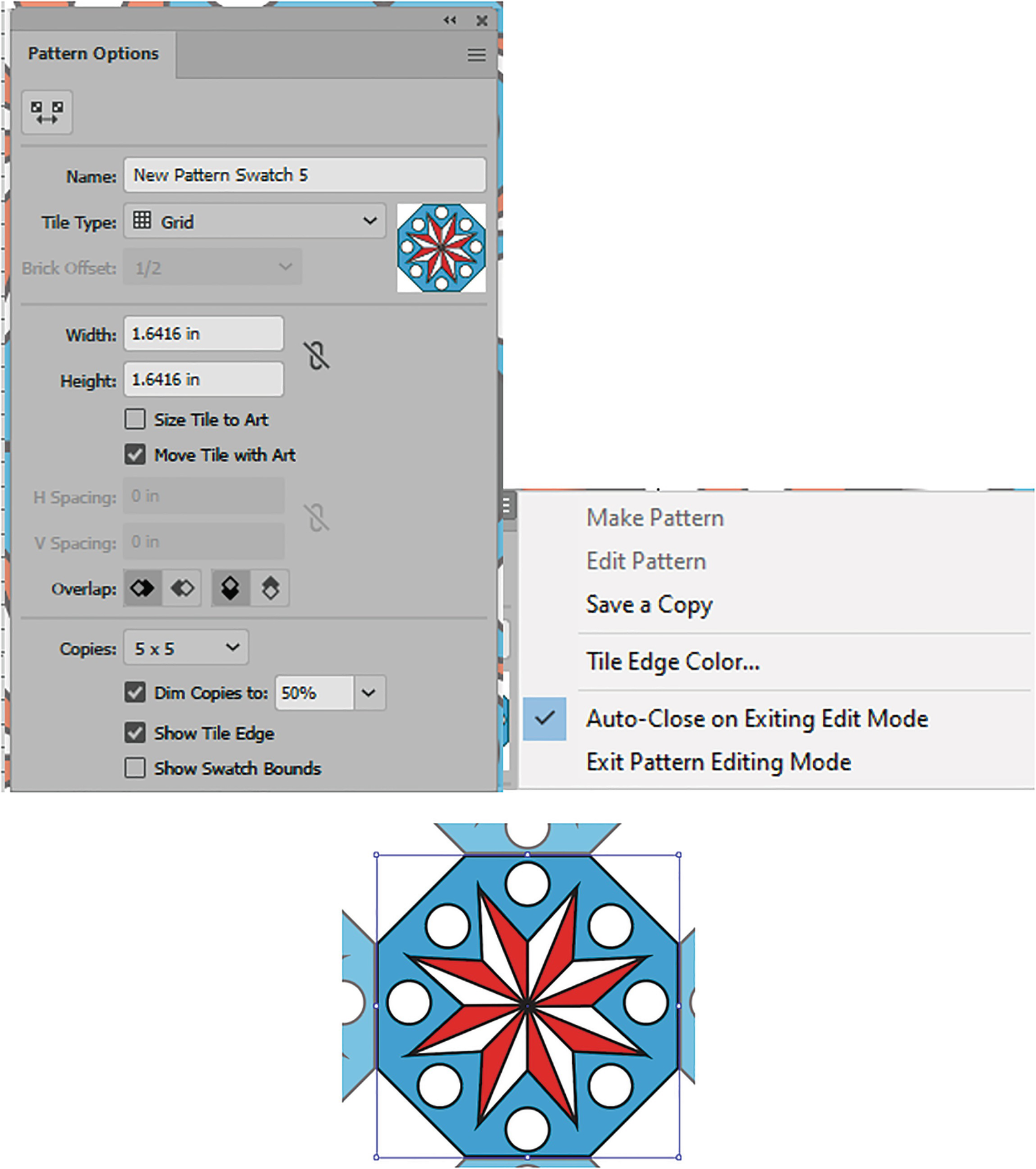
The Pattern Options panel and menu with the object currently within the tile
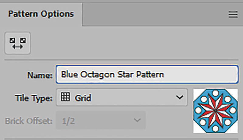
Pattern Options panel with new name and Tile Type of Grid
Using the Pattern Tile tool icon to control the pattern
Adjusting the area of the tile

Dragging out a new tile area in the lower right and changing the pattern at the same time
Undo those last steps and turn off the Pattern Tile tool bounding box handles
When you are done, turn it off with the Pattern Tile tool icon so that you can make other adjustments within the panel.
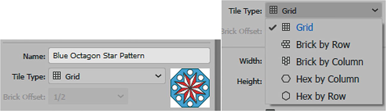
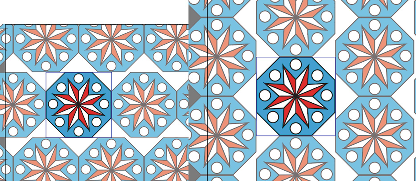
Pattern Options panel with Tile Type options
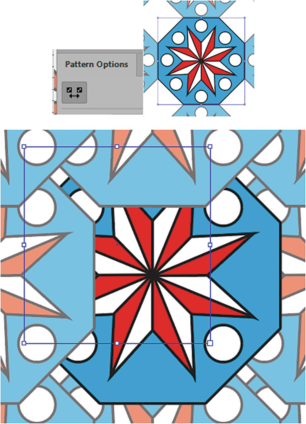
Grid: The default. It provides evenly spaced squares or spaces within the pattern; however, it does not make for a very compact pattern. This is, however, ideal if you want to leave some transparent space around the octagon for background colors to show through. Alternatively, you could add another geometric square or diamond within the gap, using the rectangle tool to fill in the area. In this example, I will leave this area transparent and blank for now. Refer to Figure 7-22.
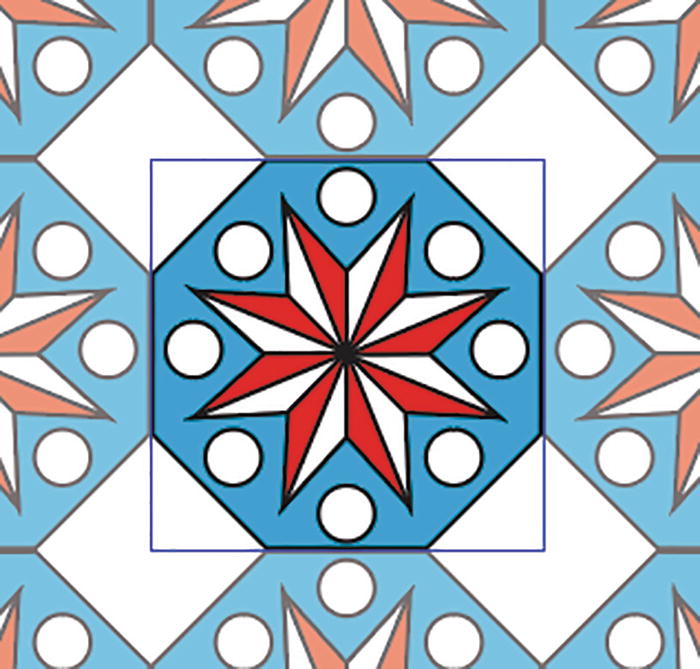
Tile with the Tile Type option of Grid
Brick by Row and Brick by Column: Have a square tile and allow you to adjust the Brick Offset setting by degrees. The tiles are shifted vertically or horizontally, depending on what option you choose, as we will look at shortly. Refer to Figure 7-23.
Tile with the Tile Type options of Brick by Row and Brick by Column
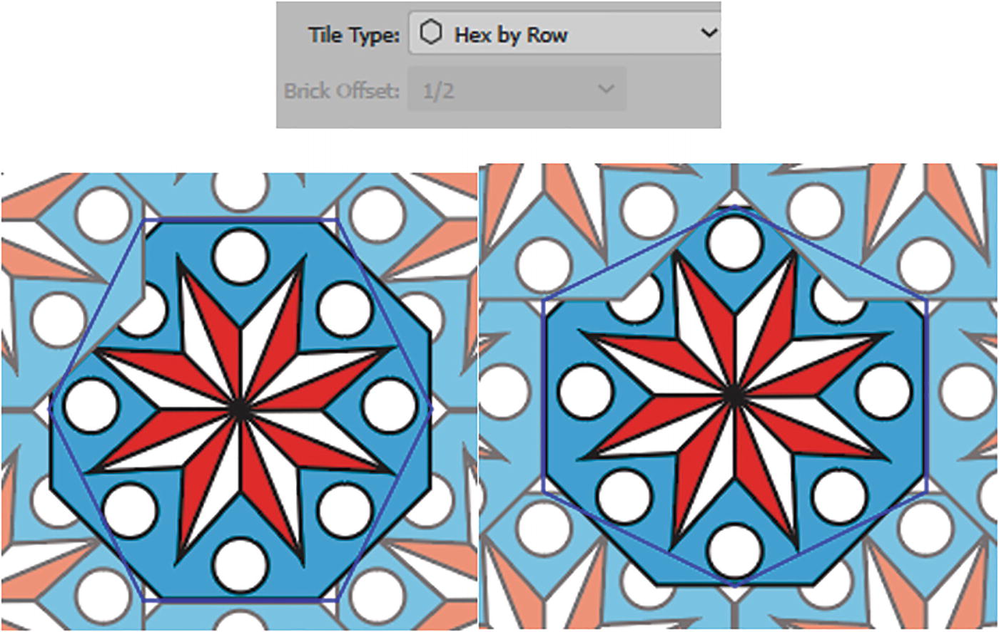
Tile with the Tile Type of Hex by Row and Hex by Column
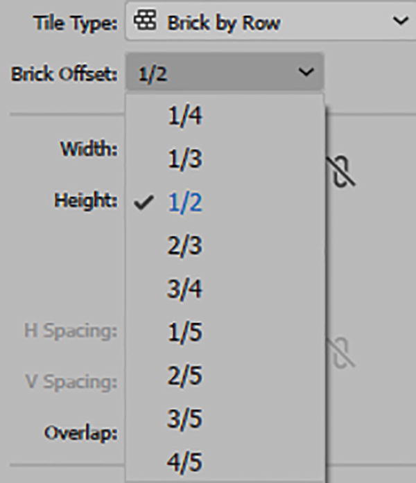
Pattern Options panel Brick Offset options
Brick Offset tiles are shifted either vertically or horizontally, depending on what option you chose in Tile Type. Currently, it is set to the default of 1/2. However, choosing another option like 1/4, 1/3, or 1/5 would give you a different gap and offset between the tiles. Refer to Figure 7-26.
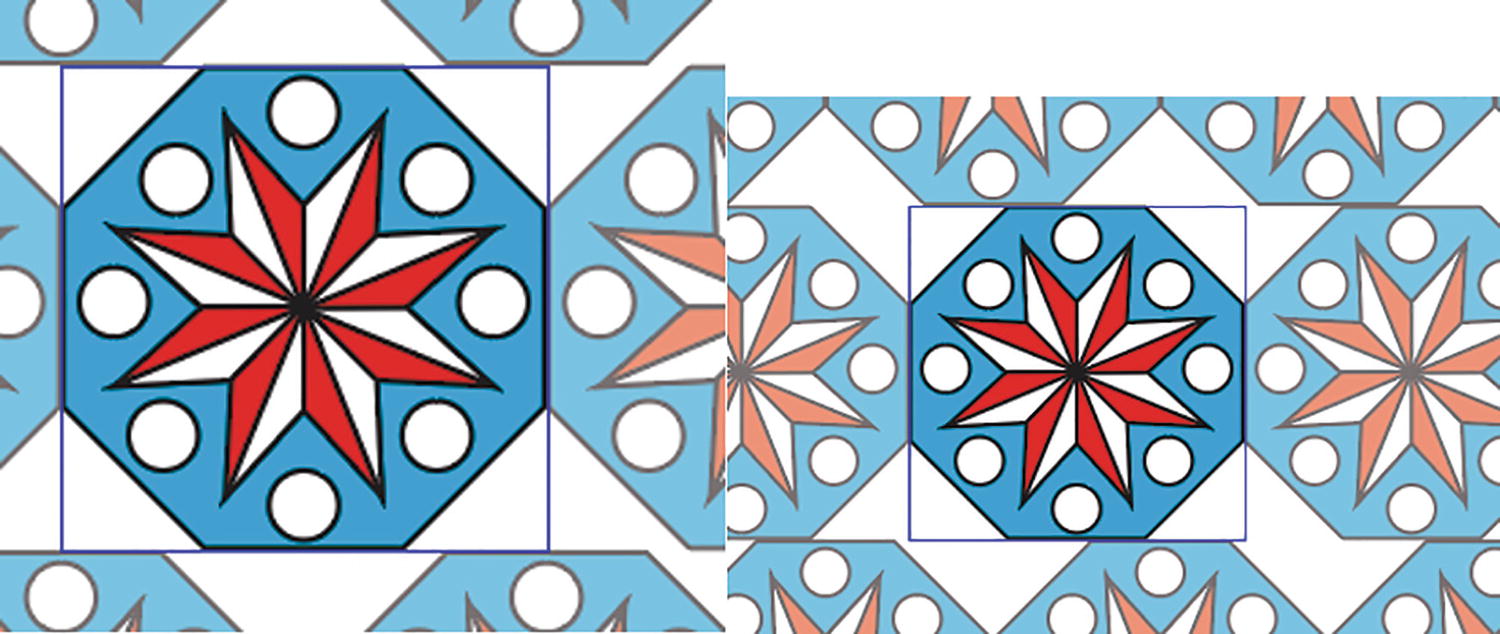
Changing the pattern’s Brick Offset options

Pattern Options panel, setting the Tile Type to Brick by Row and Brick Offset to 1/2
Setting the width and height is similar to setting the Pattern Tile tool icon, except rather than enabling the button and manually using the handles you can enter a number to increase or decrease spacing. Refer to Figure 7-28.
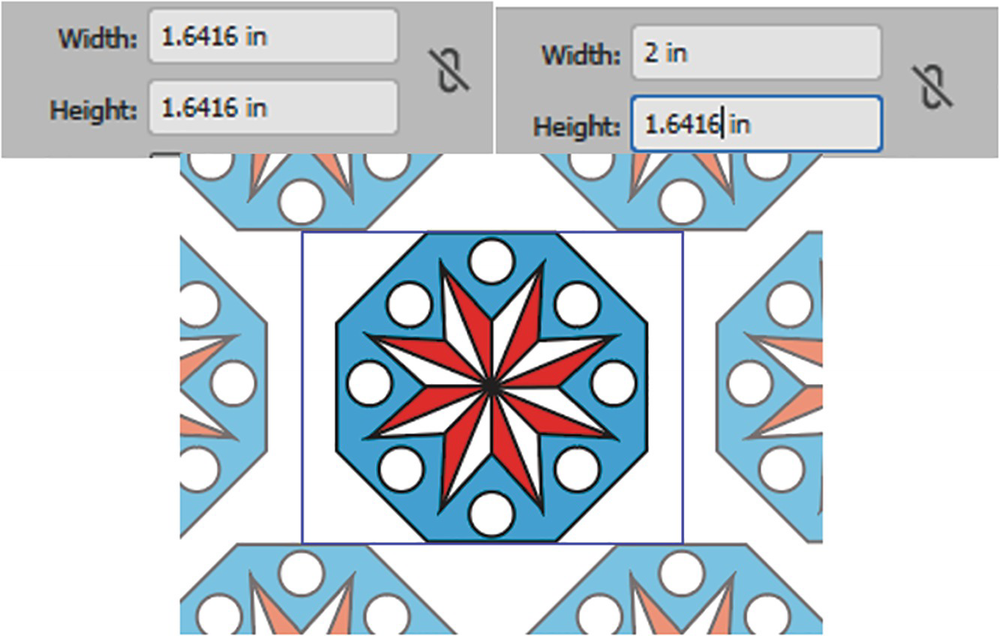
Setting the width and height of the tile area
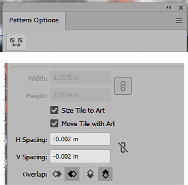
Pattern Options panel setting for width and height, with Lock icon enabled
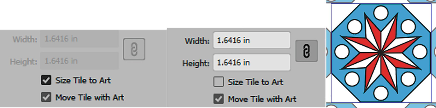
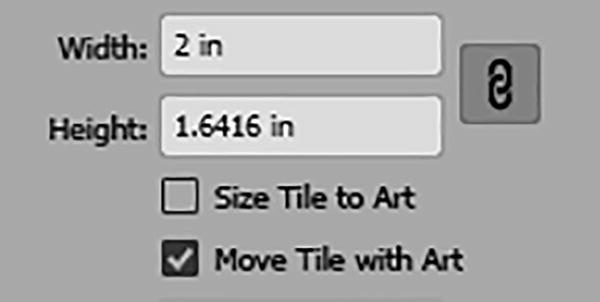
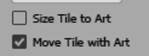
Enabling and disabling Size Tile to Art option will reset the tile around the object
When Size Tile to Art is checked, you can use H Spacing or V Spacing, which adds or removes spacing between each shape in the pattern. A positive number spreads the space, while a negative number shrinks the space. You can also link the spacing so that you maintain spacing proportions as you scale up or down. Refer to Figure 7-31.
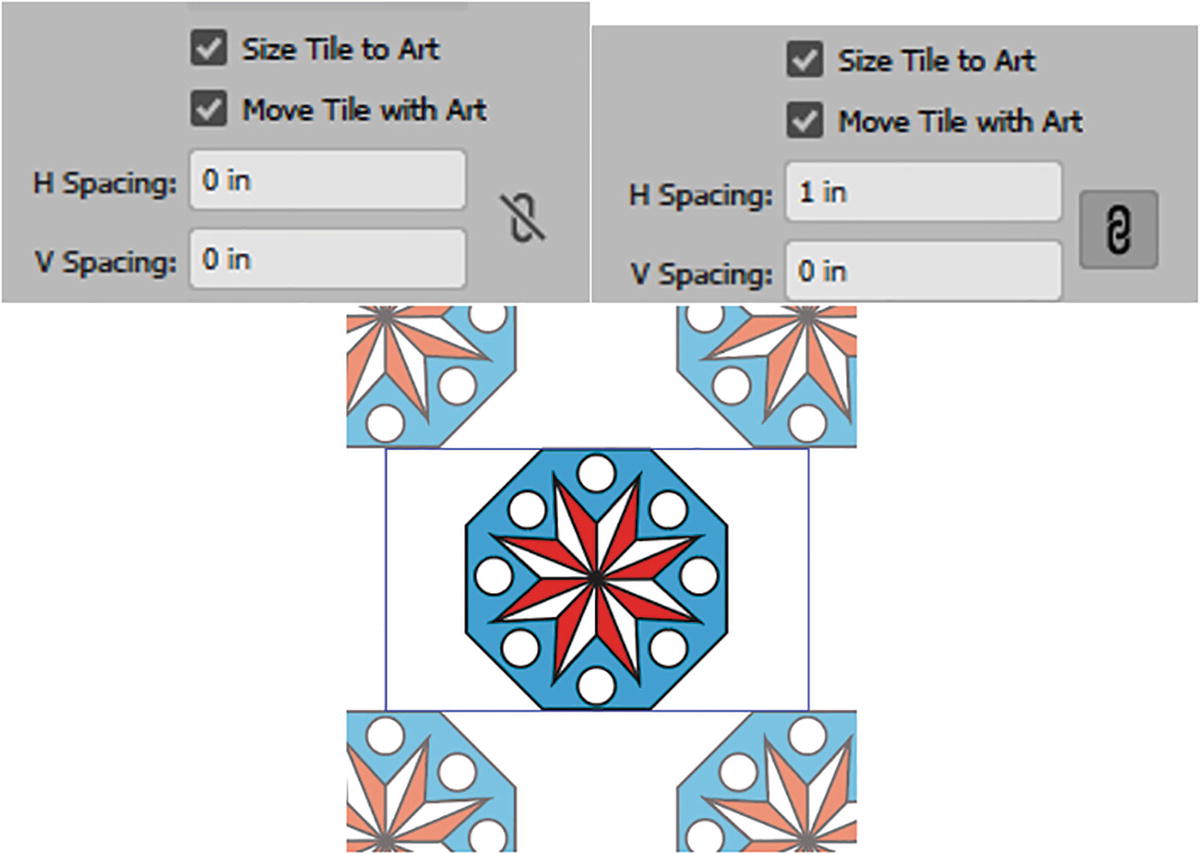
Checking Set Tile to Art enables the H and V Spacing fields, and you can use the link to maintain spacing proportions
Move Tile with Art, when enabled, allows you to move the preview pattern tile with the selected part of art; if unchecked, the tiles or art can be moved independently. Refer to Figure 7-32.
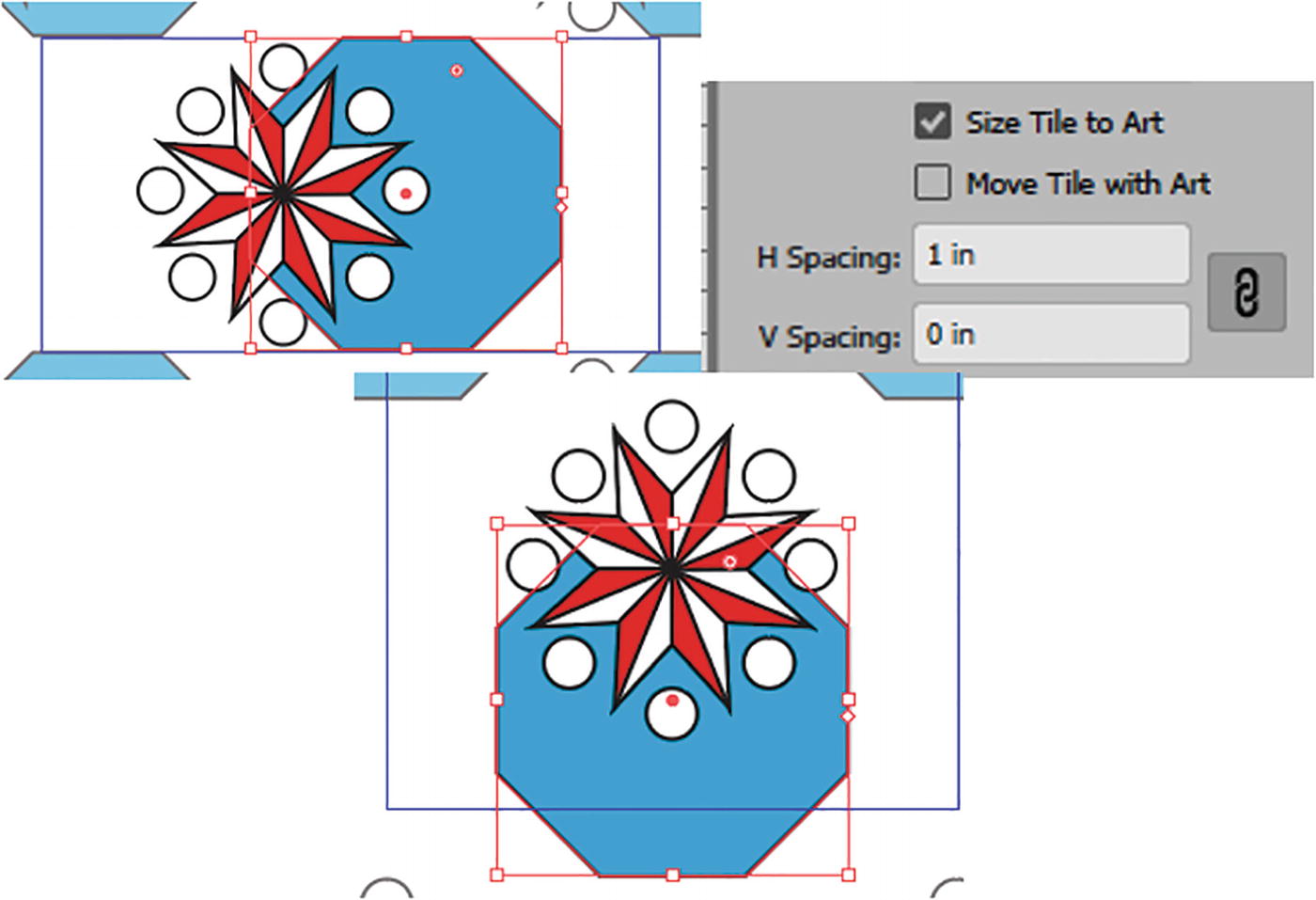
With Move Tile with Art disabled, the art can be moved separately from the tile
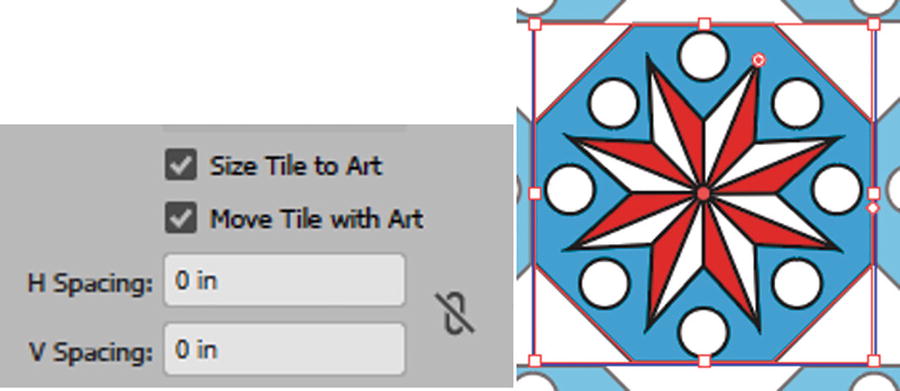
Enabled Move Tile with Art
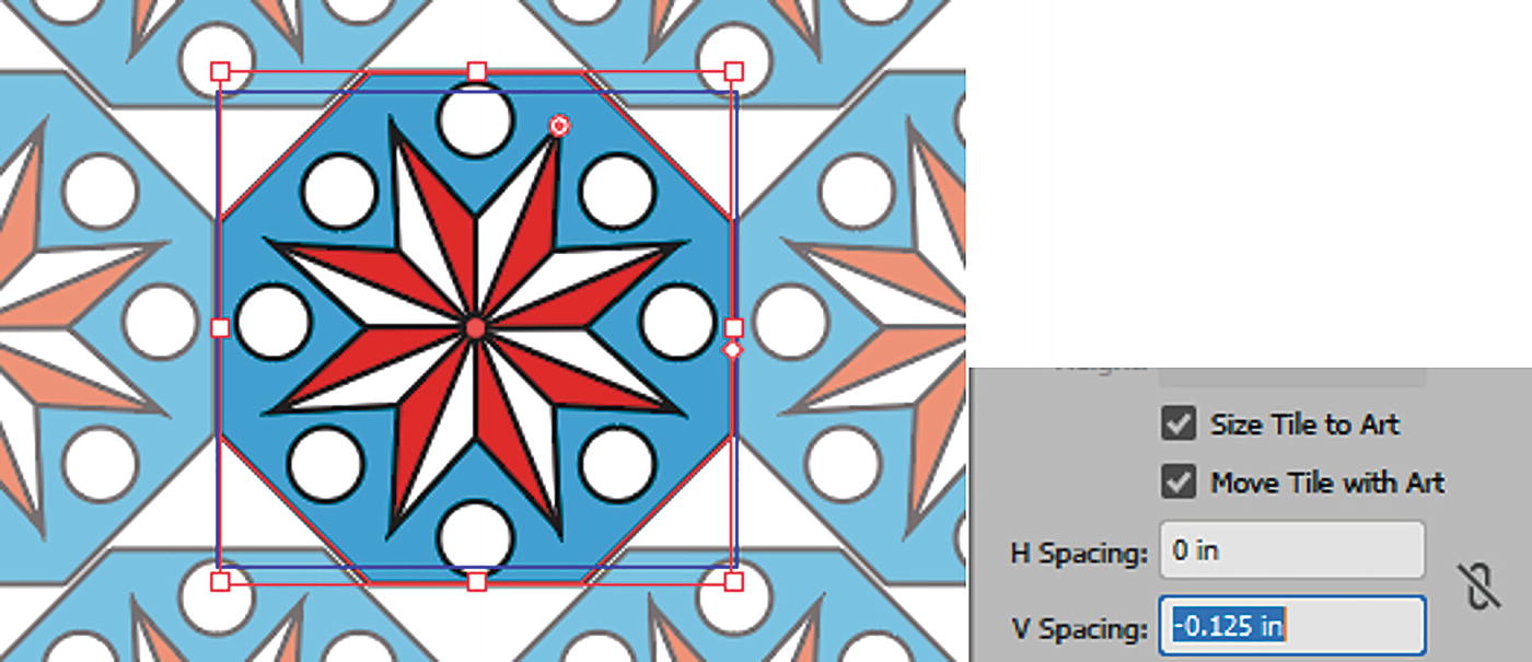
Negative spacing moves the art closer together
You can use the up and down arrow keys while in the Width, Height, H or V Spacing text boxes to edit more accurately the spacing without disrupting the artwork. Refer to Figure 7-35.

Use the up and down arrow keys when you want to change scaling increments in the Pattern Options panel
Overlap is how the shapes or objects overlap when they are compressed together. Refer to Figure 7-36.

Pattern Options panel Overlap options
Left in Front
Right in Front
Top in Front
Bottom in Front
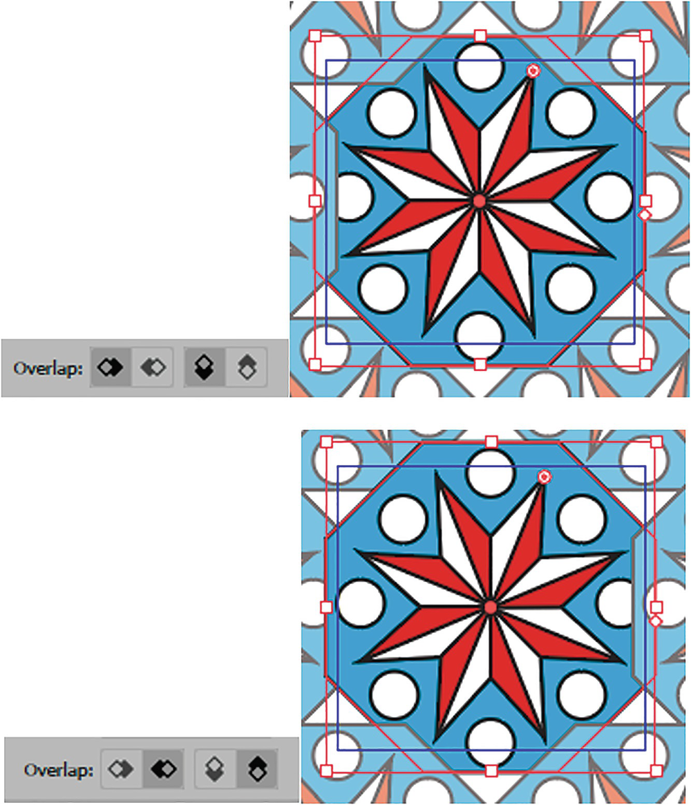
Pattern Options panel Overlap options, and previewing the pattern
This type of overlapping may not be evident unless the shapes are touching, using the H and V Spacing. Refer to Figure 7-38.
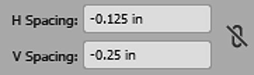
Setting the H Spacing and V Spacing
The Copies section has to do with the preview, or the number of copies that are on the screen, while you edit the pattern. This does not affect the final pattern layout. The default is 5×5, but you can set it to any number of copies from the dropdown list. Refer to Figure 7-39.
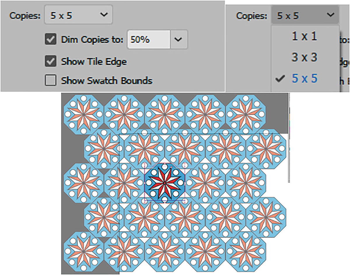
Preview copies help you visualize the pattern overall
Dim Copies to: Allows you to dim the preview pattern so that you can distinguish it from the original shape. The range is 0%–100% and does not affect the final pattern outcome. Refer to Figure 7-39.
Show Tile Edge: Lets you turn on or off the tile so that you can preview the pattern as one unit. I leave it enabled so I can see the pattern. Refer to Figure 7-40.
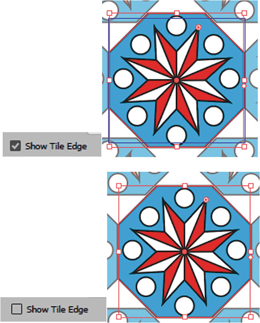
Pattern Options panel preview of Show Tile Edge enabled and disabled
Show Swatch Bounds shows which areas will or will not be repeated in order to have a seamless pattern. Anything outside the bounds is not repeated, except in this preview unless it is required to make the pattern seamless. Along with the tile, the swatch bounds are saved as a transparent box guide within the pattern swatch. When enabled, it appears as a very fine dotted line. By default, I leave this setting disabled and hide the bounds. Refer to Figure 7-41.

Pattern Options panel, Show Swatch Bounds disabled
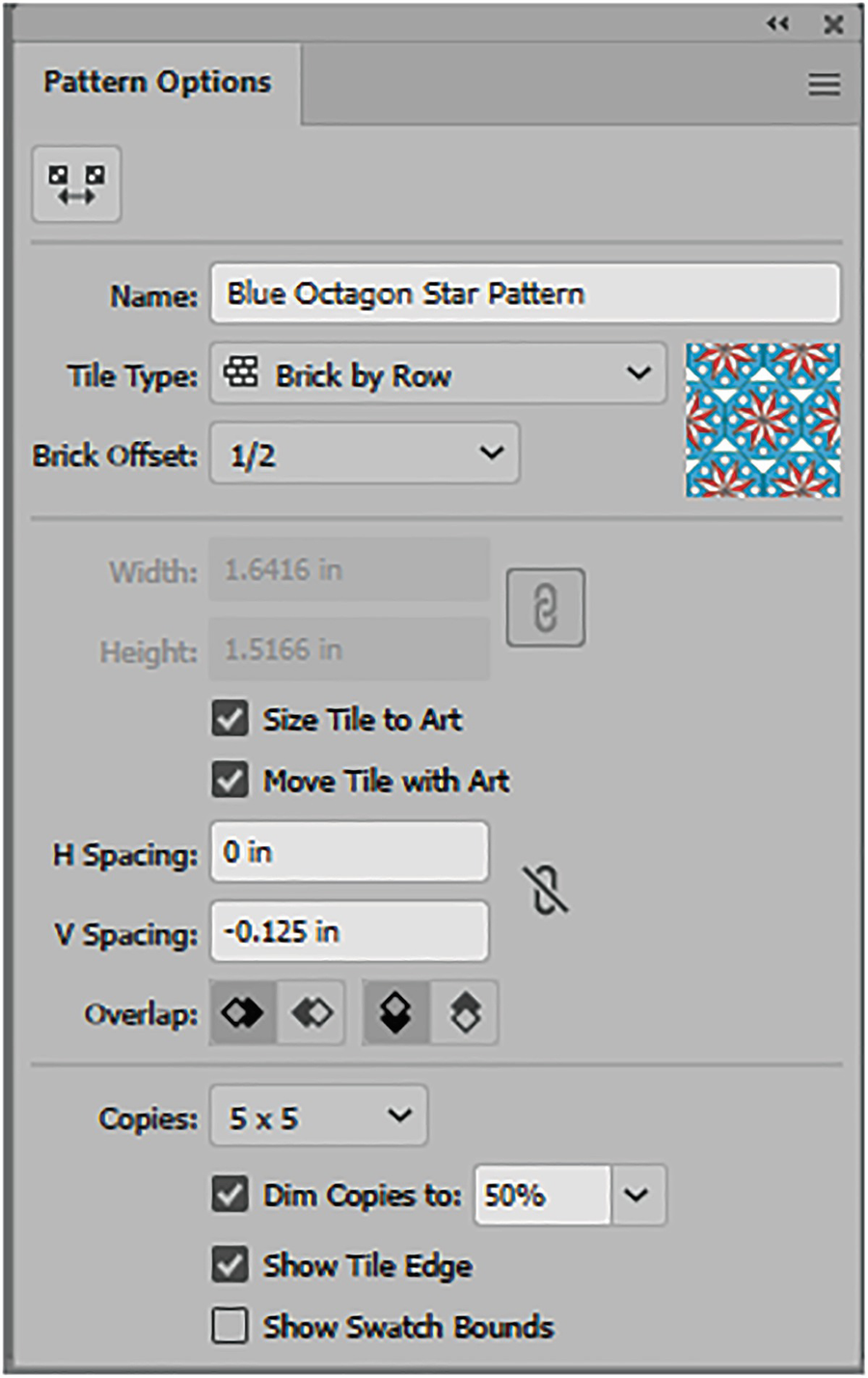
Pattern Options panel, reviewing the current settings
Exiting Pattern Editing mode
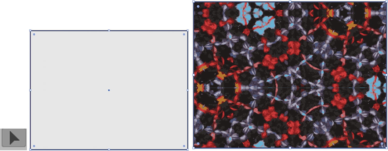
Draw with the Rectangle tool an area to display your pattern that you selected from the Swatches panel
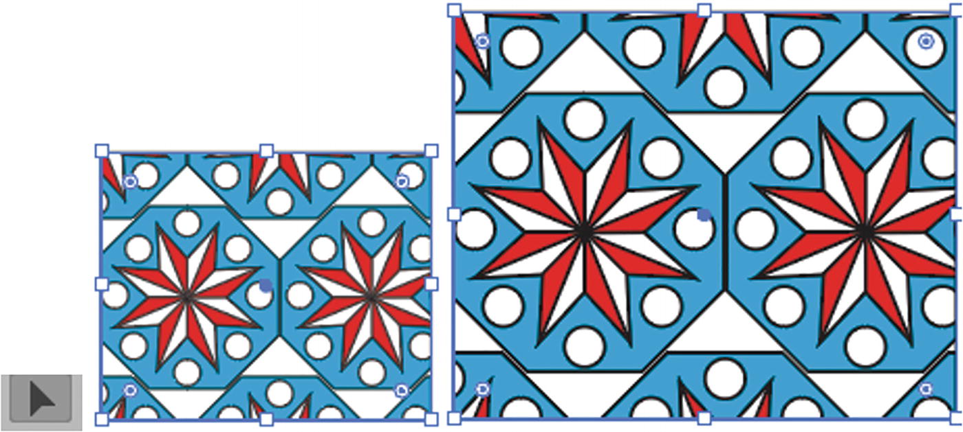
Scaling Your Pattern
Maybe you find this pattern to be a bit too large and would like it to be smaller.
You can also use the following steps in this example to edit patterns from Illustrator’s pattern libraries.

Pattern in the Swatches panel; you can use Object ➤ Pattern ➤Edit Pattern to enter the editing mode as well
Object ➤ Pattern ➤ Tile Edge Color refers to the color of the guide that appears when you are previewing the pattern. The default is medium blue, but you can change it to another color if you find it hard to see, or if it clashes with your pattern. You can use the Pattern Options panel menu to change this setting as well, and can also set the color from the dialog box color list or computer system’s color picker. Refer to Figure 7-46.
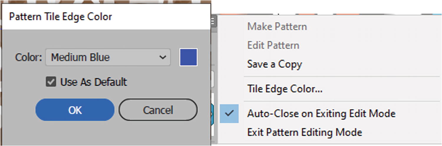
Pattern Tile Edge Color dialog box, and same option in the Pattern Options panel menu
Scaling the pattern with the Selection tool, as well as the pattern tile

Scale Tile to Art is selected and the V Spacing has been set to a negative setting to keep the pattern overlapping and close
Save a copy of the current pattern so as not to override the original, and click OK to the message

Use Cancel button to exit Pattern Editing mode without altering the original
This creates, upon exit, a copy of your now smaller pattern. The larger pattern is still available in the Swatches panel.
The updated pattern in the fill of the rectangle and added to the Swatches panel
You can copy this rectangle as a Smart Object layer into Photoshop and do further editing or cropping there.
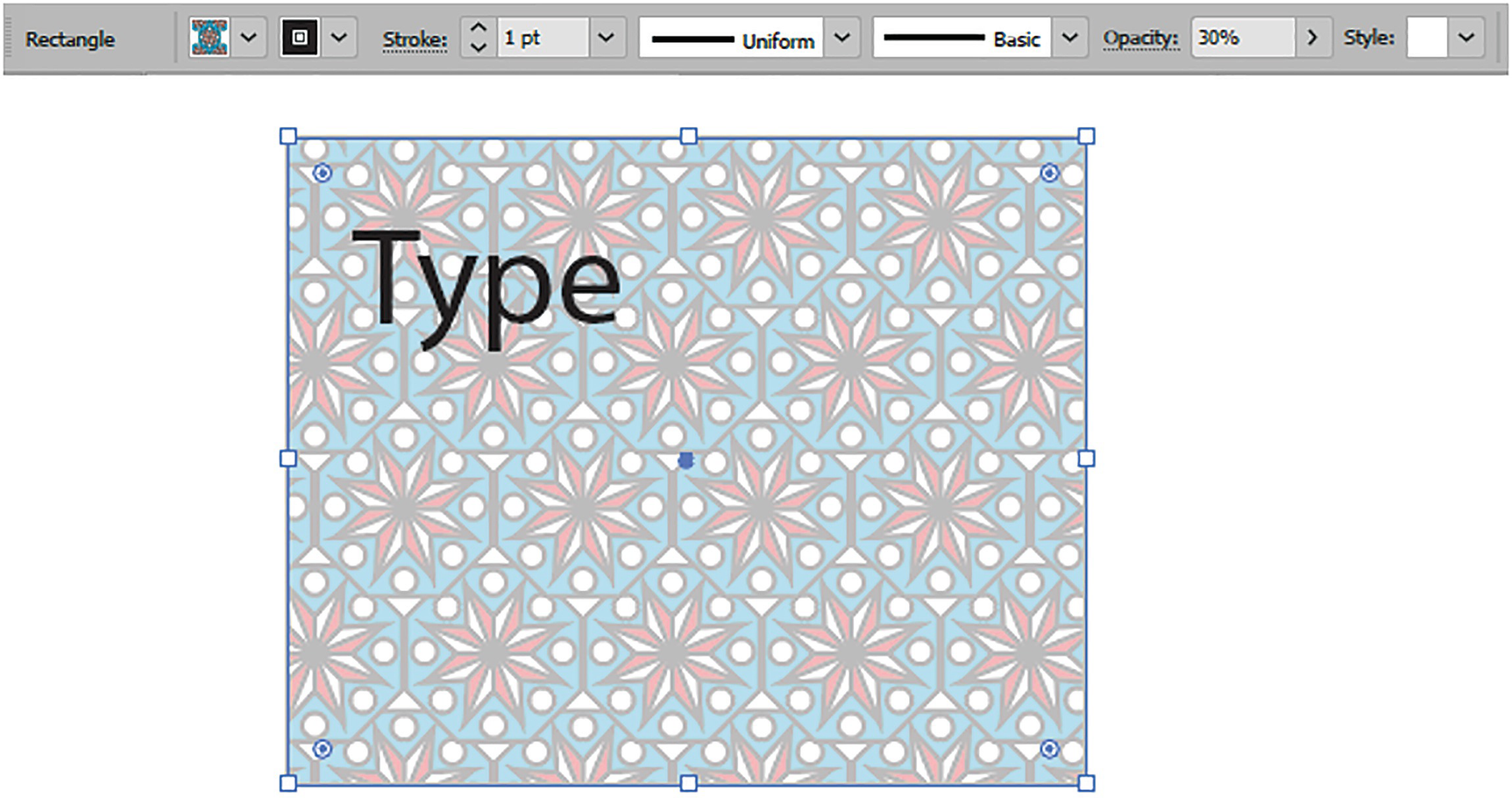
With the rectangle’s opacity reduced, it is much easier to read type over the pattern
This is often a good idea, especially if you decide at some point to place type over the pattern, as it will be easier to read. As well, a faded pattern may not be as overwhelming, depending on the look you are trying to achieve.
We will look more into opacity and the Transparency panel in Chapter 8.
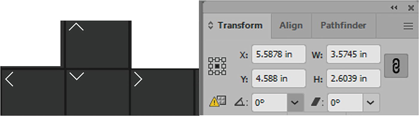
Transform and Scale the Pattern with the Transform Panel
The pattern and the object scale at the same time
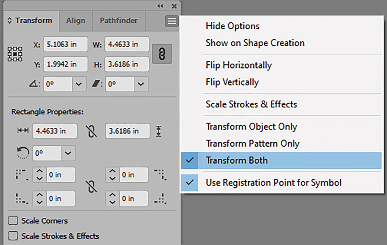
Transform panel with the menu set to Transform Both
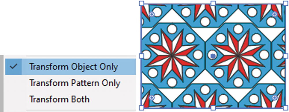
Transform panel with the menu set to Transform Object Only, and only the rectangle is scaled—not the pattern
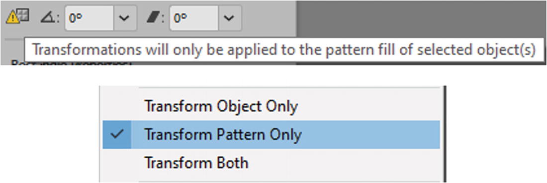
Transform panel with the menu set to Transform Pattern Only, and the warning in the panel
With the option of Transform Pattern Only set in the menu, you can now scale the pattern and rotate it without scaling or rotating the object
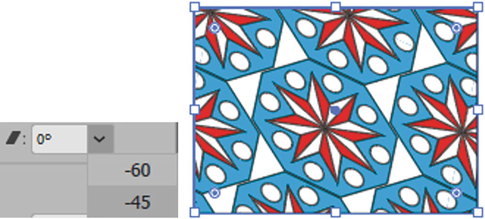
With the option of Transform Pattern Only set in the menu, you can now shear it without shearing the object
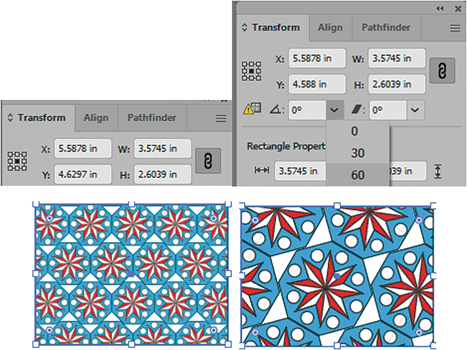
Use the up and down arrow keys on your keyboard while in the text boxes to scale, rotate, and shear the pattern. Also, you can set the reference point to a location other than center to affect the scaling within the shape. Refer to Figure 7-59.
Use the up and down arrow keys to make transform adjustments in the text boxes of the Transform panel

Click on the warning icon to set the Transform panel back to Transform Both without resetting the pattern
While generally you will use the default setting of Transform Both, as you can see, these options allow you to scale your shape or pattern separately, setting one or the other and not both at same time. The pattern can be reset if you click again on the same pattern in the Swatches panel.
Object Transform and Patterns
Various Transform dialog boxes allow you to separately transform patterns, preview the result, and make a copy as well
You may prefer to use these options, instead of the Transform panel, to control the direction of your pattern as you adjust or create a copy afterward.
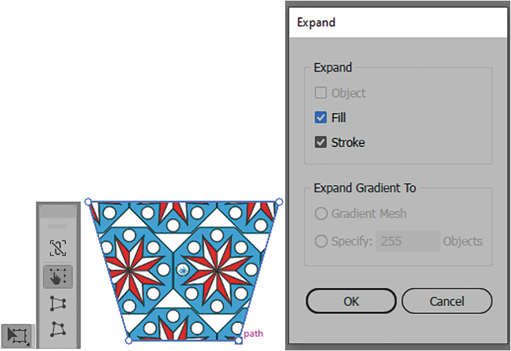
The Free Transform tool will allow you to scale, shear, and rotate the path and pattern, but will not allow you to distort or adjust the perspective the pattern within—only the path. You need to expand it first with the dialog box so that you an alter the fill
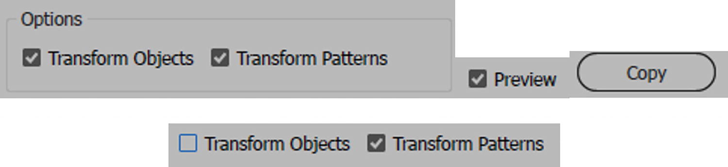
An alternative is to select the shape with the pattern and, from the main menu, choose Object ➤ Expand. In the dialog box, expand both the fill and the stroke and click OK. Refer to Figure 7-62.
Once the pattern is a grouped object, you can use the Free Transform tool to further distort it
But this way is destructive, and if you want to adjust the entire pattern later, this is not ideal. See Chapter 9 on how to warp patterns using envelopes and meshes.
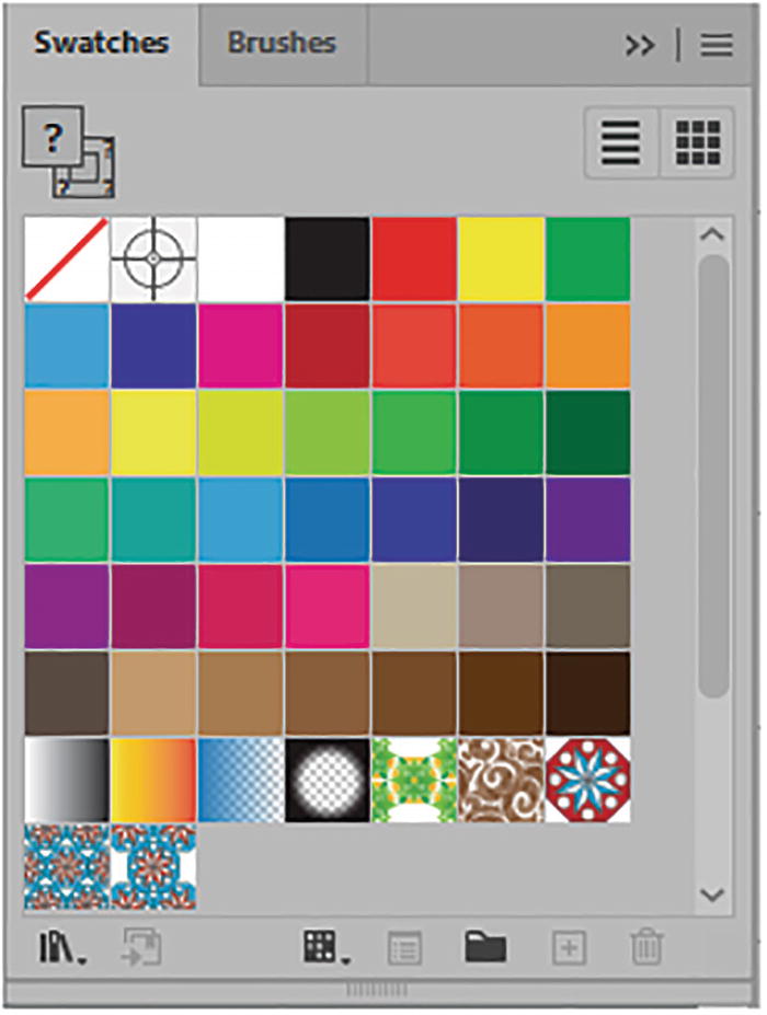
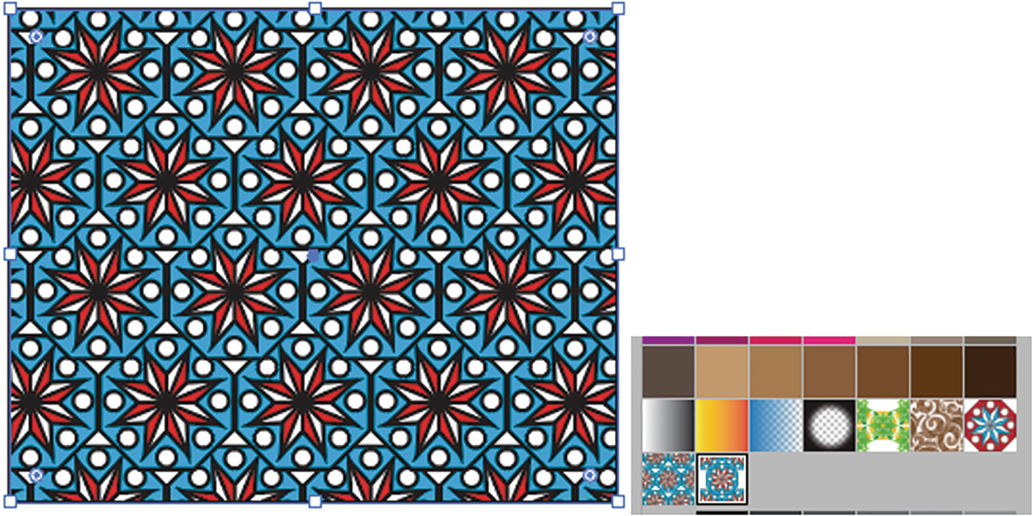
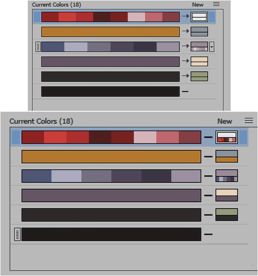
The Swatches panel with the stored patterns
Repeating Patterns with the Object Menu

Object ➤ Repeat submenu
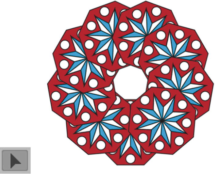
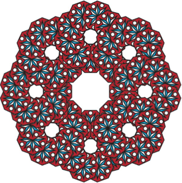
Radial Repeat
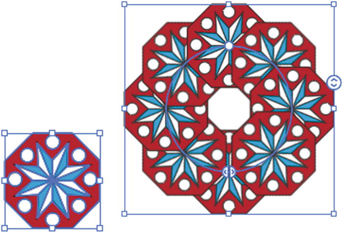
Radial Repeat set to a grouped object
This option appears to be very much like using the Rotate tool, except those multiple copies are created for you.

Radial Repeat options in the Control panel

Number of instances slider on the bounding box
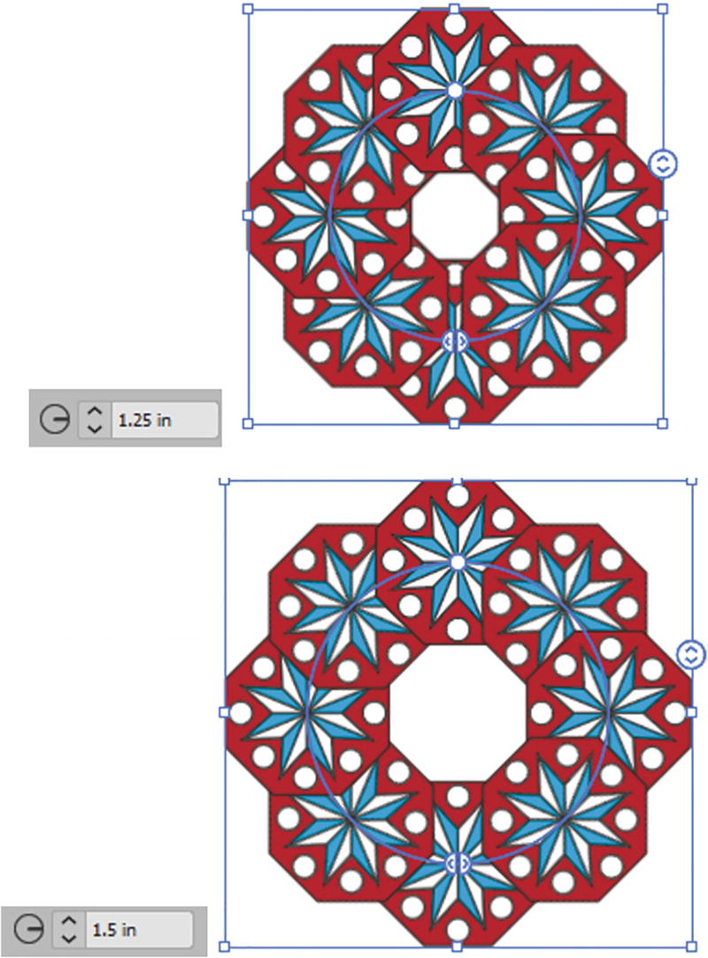
Radial Repeat options for radius
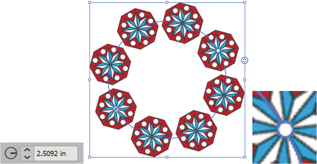
Radial Repeat options for radius using the rotation circle

Radial Repeat options for radius, using the split circle to reduce the number of instances on the radius
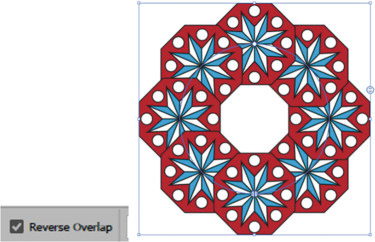
Radial Repeat options in the Control panel with Reverse Overlap enabled
While working with the Radial Repeat, you also have access to other options in the Control panel, such as stroke weight, which will update at the same time all instances in your pattern. Refer to Figure 7-73.
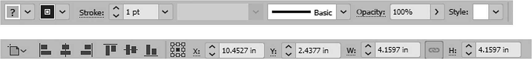
Additional options in the Control panel while using Radial Repeat
For this project, we will leave them at the current settings.
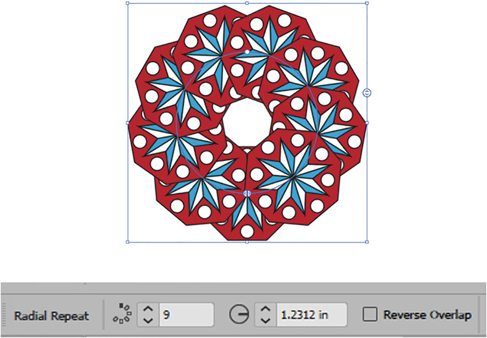
Radial Repeat options set for the design
Then you can, while the repeat is selected, try this trick: Select it with the Selection tool, then use Edit ➤ Copy (Ctrl/CMD+C).
While using the Selection tool, you can still move, scale, and rotate your Radial Repeat.
Deselect your radial repeat so that pattern is not applied to it by mistake
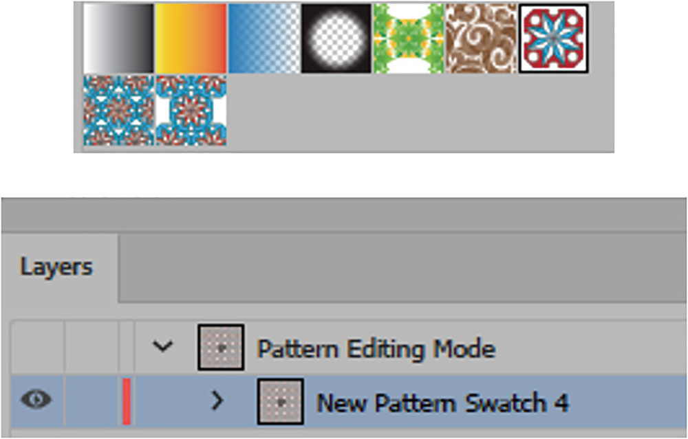
Use the Swatches panel to enter Pattern Editing mode, as seen in the Layers panel
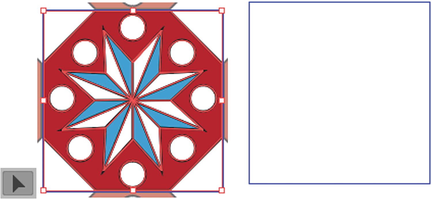
Delete the current pattern after you select it with the Selection tool
Paste in the Radial Repeat pattern
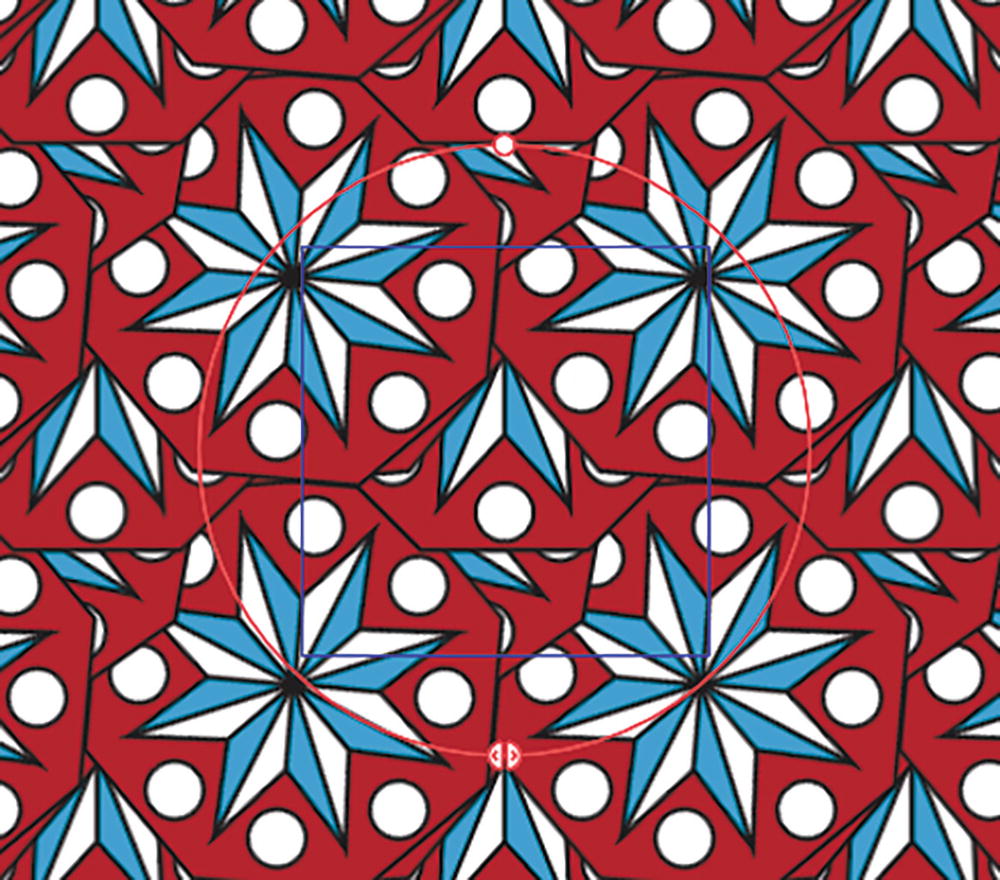
In the Pattern Options panel, check Size Tile to Art option so that the Radial Repeat has more space

Radial Repeat is still available while in Pattern Editing mode
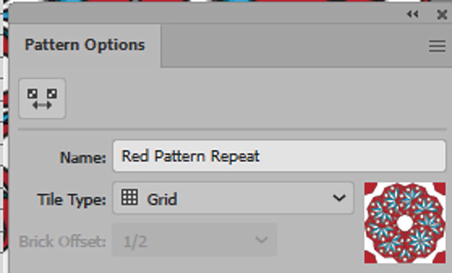
Renaming the pattern in the Pattern Options panel
Disable Size Tile to Art before you add more shapes
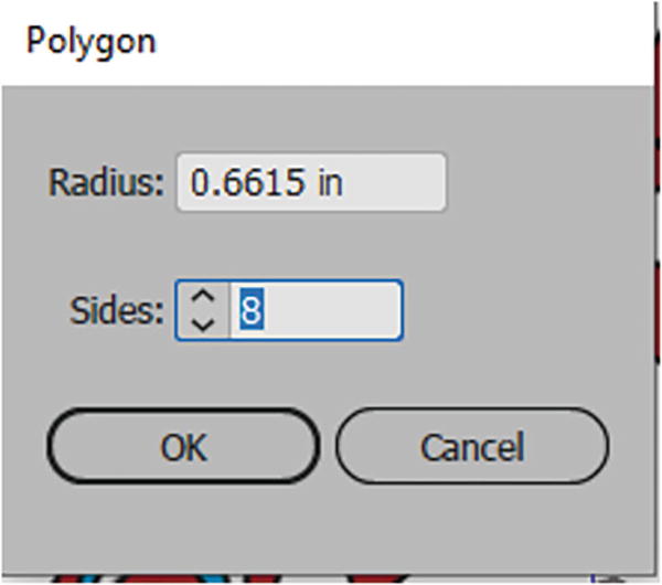
Create a polygon with the dialog box
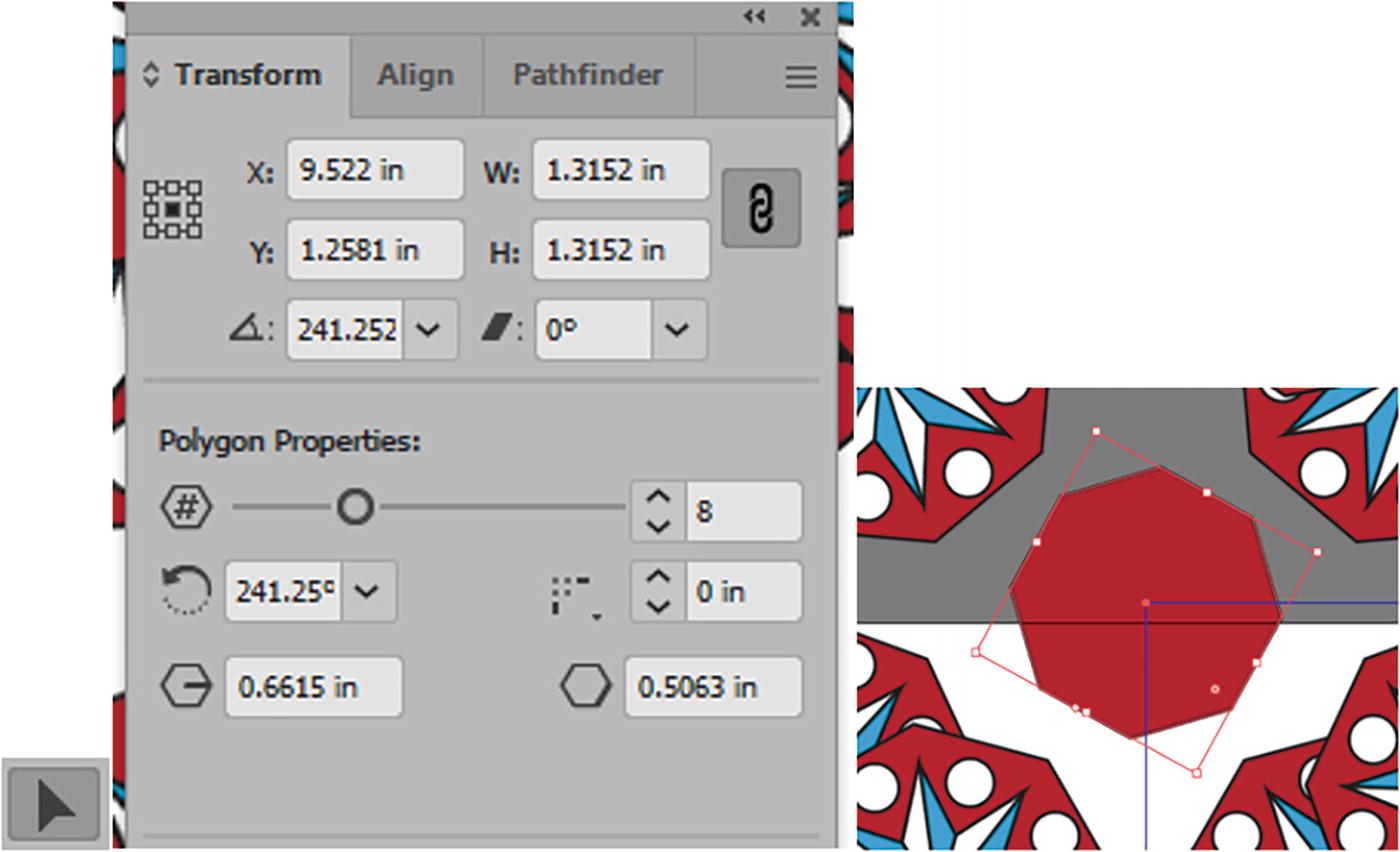
Use the Transform tool to move, rotate, and scale the polygon into place, as well as the Selection tool to adjust near the tile
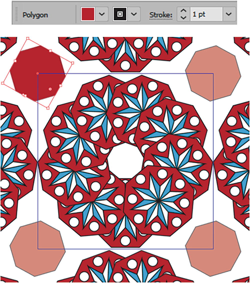
The setting used in the Control panel for the new polygon, and its final placement partly outside the tile so that it will repeat on all four sides
For your own patterns, you could use other shape tools as well to enhance the design.
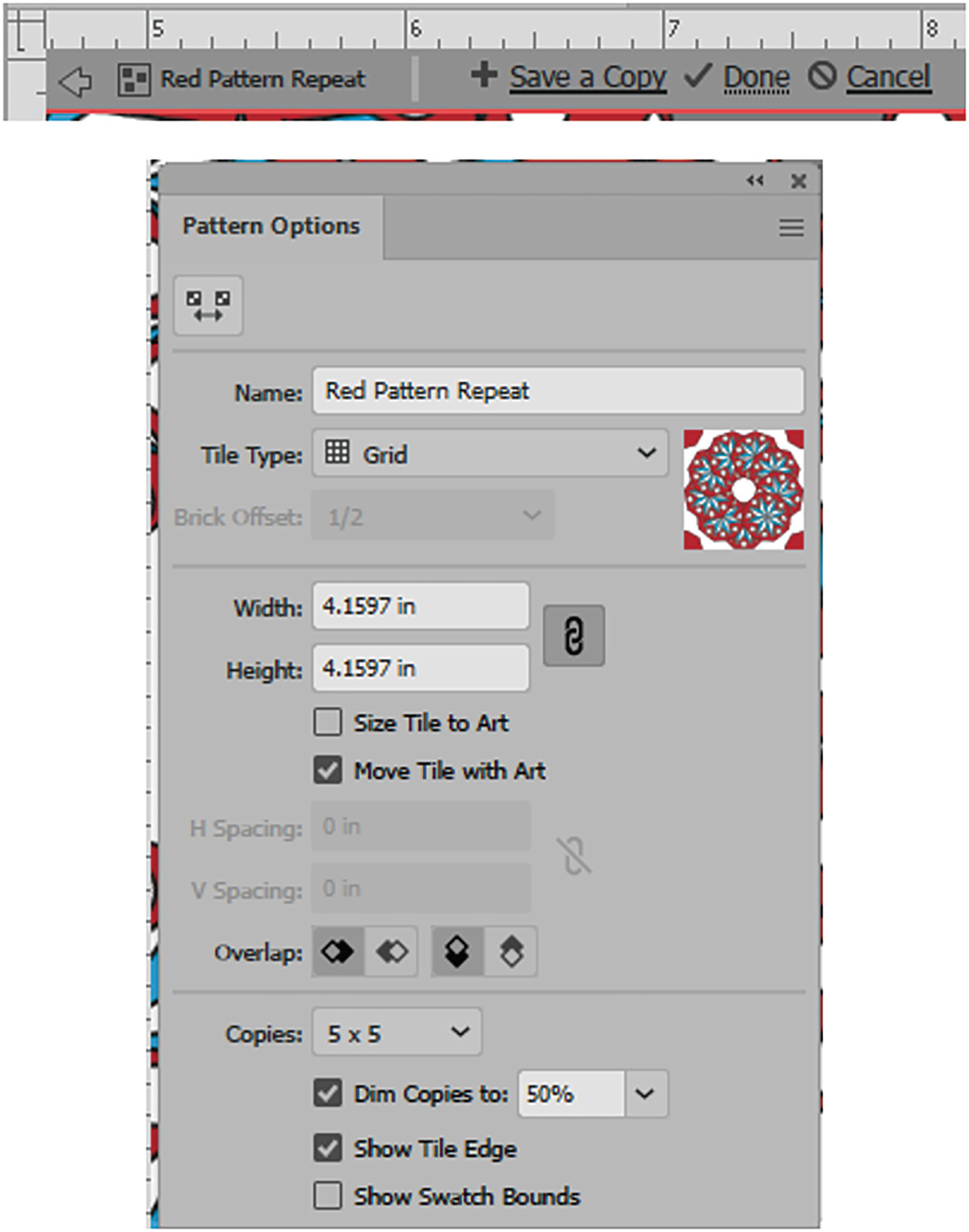
Review the Pattern Options panel and then click Done to exit and commit the changes

Swatches panel with updated pattern
One other great thing you can try is applying the pattern to a copy of your Radial Repeat outside of Pattern Editing mode. This produces a pattern within a pattern. Refer to Figure 7-88.
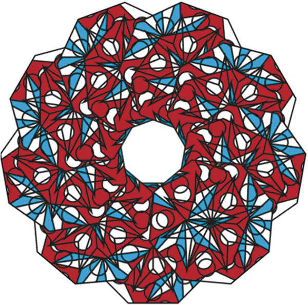
Swatch applied to another Radial Repeat
We’ll come back to these patterns in an upcoming project in this chapter, but for now let’s continue to look briefly at the other two object repeat options.
Grid Repeat
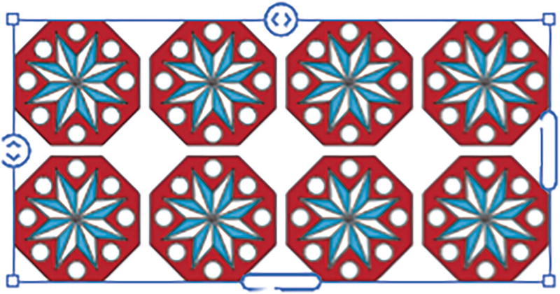
Example of Grid Repeat
While not exactly for pattern creation, this is very useful if you need to create a grid of repeating items in a hurry. I can see how this would be helpful for print production of labels or stickers, so that you do not have to Alt/Option-drag a copy multiple times and then rely on your Align panel to line everything up.
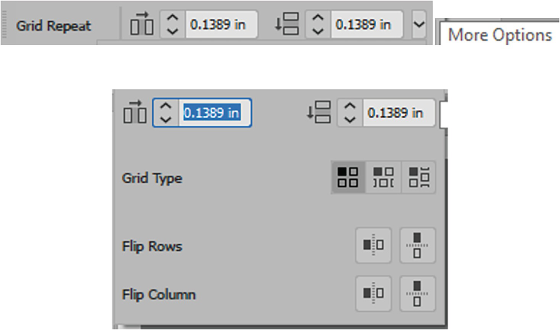
Grid Repeat Control panel

Grid Repeat settings with horizontal spacing in grid using the Control panel or slider on the bounding box
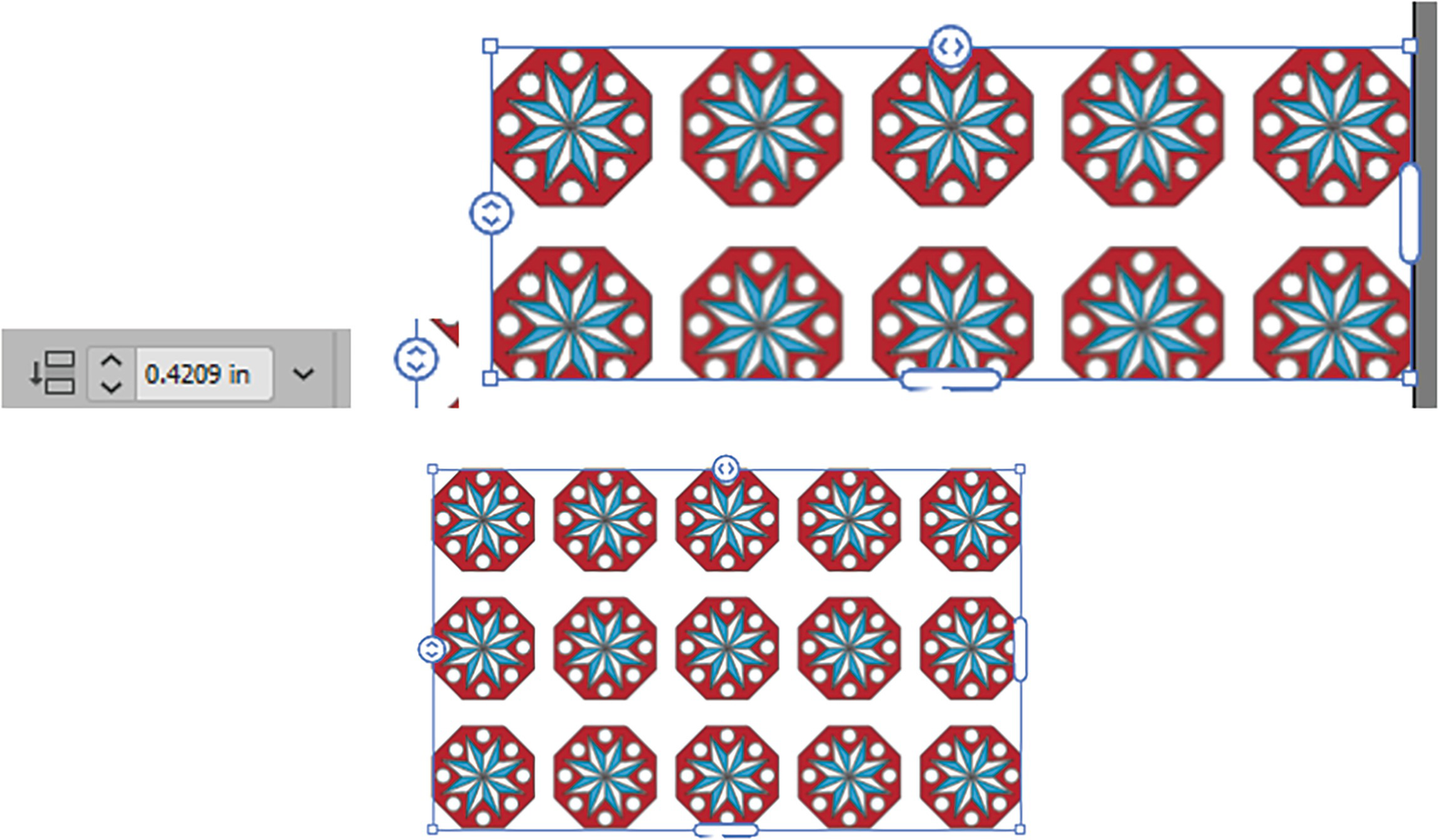
Grid Repeat settings with vertical spacing in grid using Control panel or slider on the bounding box
In the More Options dropdown in the Control panel are the other three options:
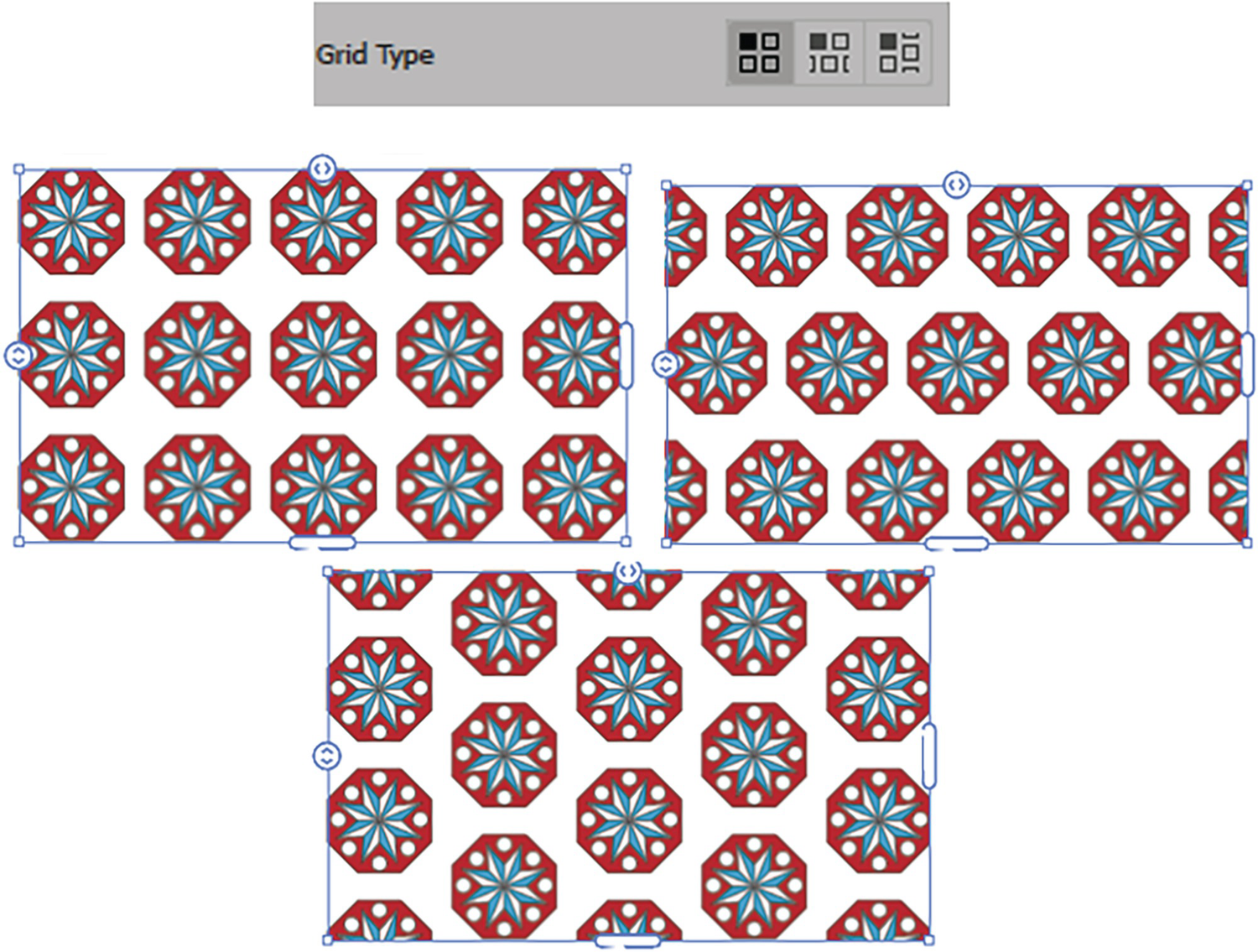
Grid Repeat settings for Grid Type of Grid, Brick by Row, and Brick by Column
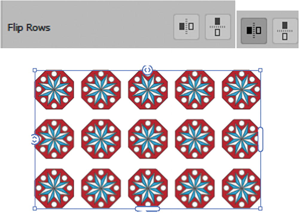
Grid Repeat settings for Flip Rows, with Flip Horizontal enabled
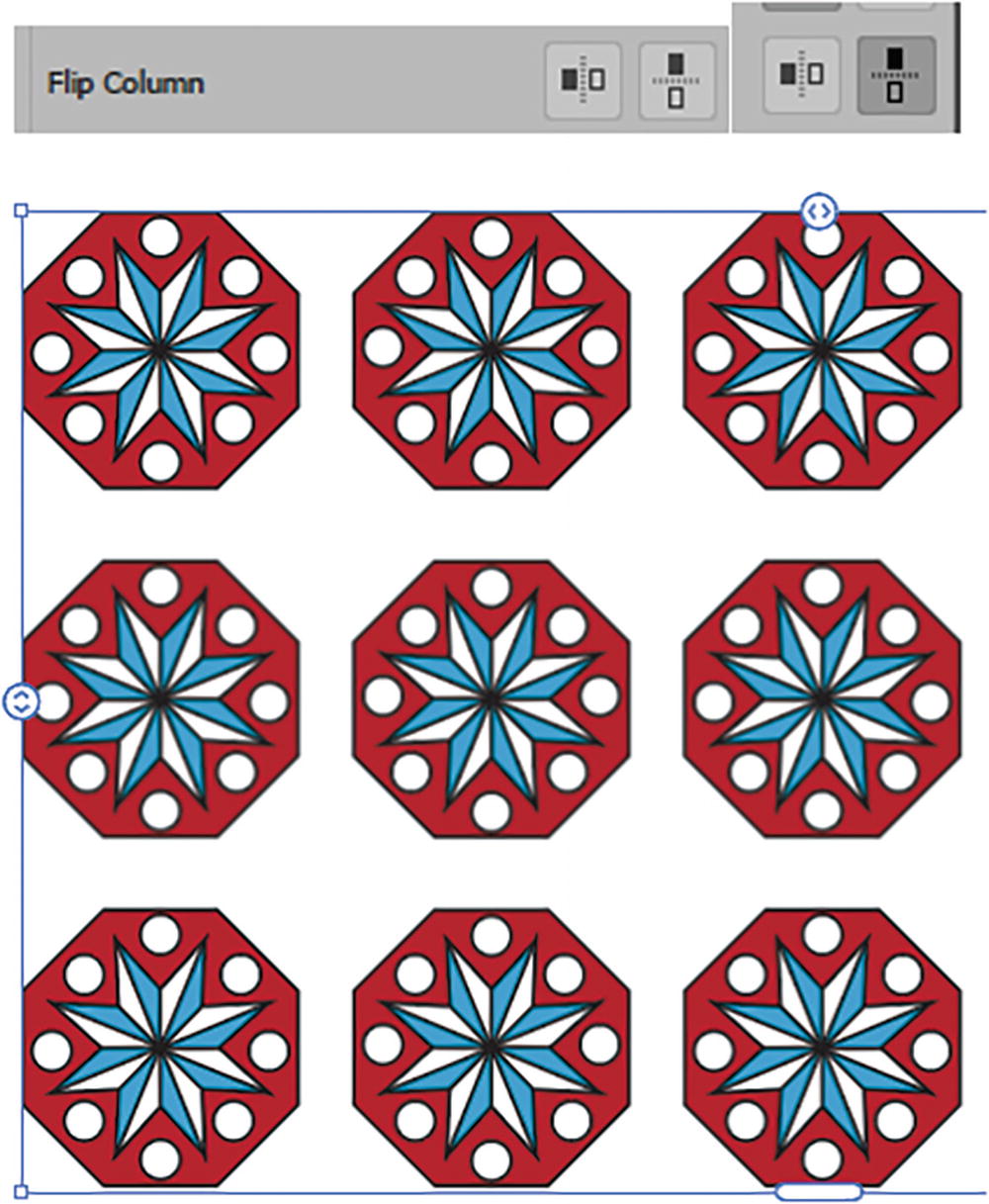
Grid Repeat settings for Flip Column, with Flip Vertical enabled
While in Grid Repeat, you can still use the Selection tool to move, scale, and rotate the grid.
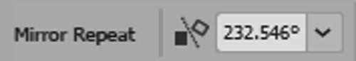
Mirror Repeat
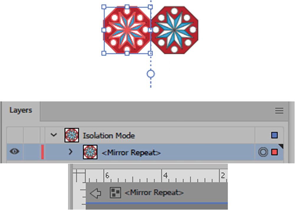
A Mirror Repeat is set in Isolation mode, and when complete you need to exit it
Mirror Repeat Control panel
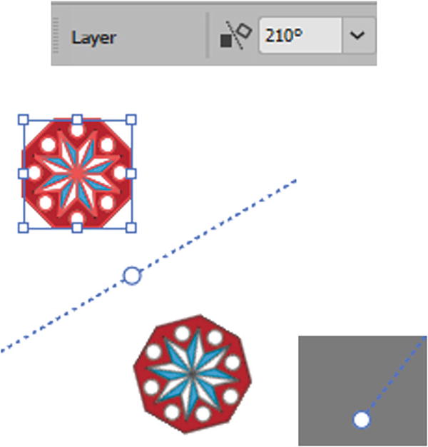
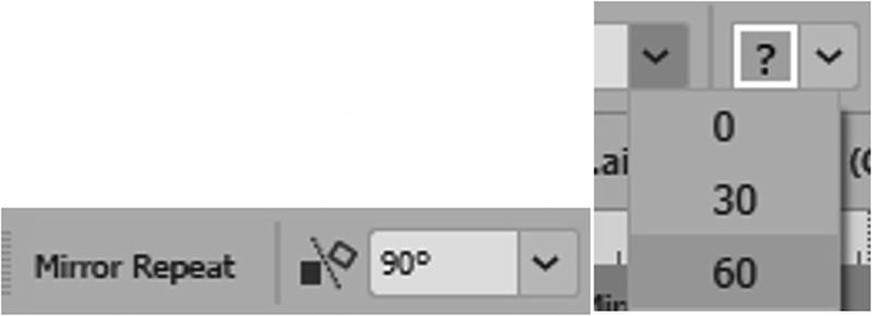
Use Mirror Repeat to set the angle of the mirror axis
By dragging on the center circle you can adjust the spacing, and dragging on the end circle handles will adjust the angle.
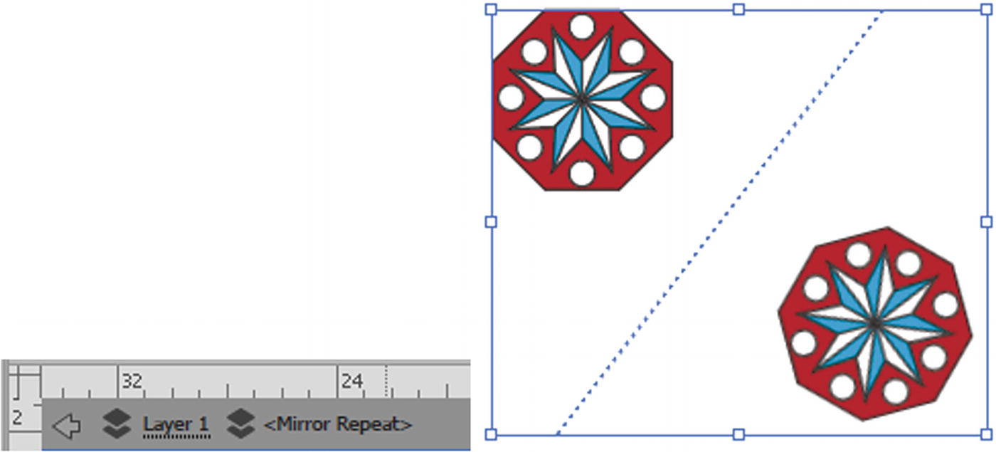
Exit Isolation mode when you complete the Mirror Repeat
You can still access the Mirror Repeat outside of Isolation mode
While in Mirror Repeat (Isolation mode) you can still use the Selection tool to move, scale, and rotate the original, and the Mirror Repeat will adjust as well.
Further Repeat Menu Options
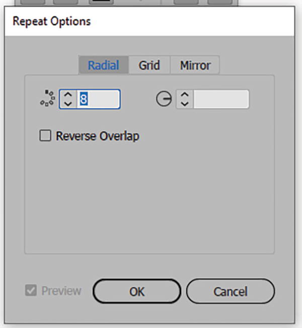
Repeat Options dialog box
Release the grouped object from the repeat
You can use any of the three repeats multiple times on an object or in combination with each other. However, in that case you may have to use Object ➤ Repeat ➤ Release a few times to return to the original group shape. Refer to Figure 7-103.
Apply multiple repeats for a more complex effect
You can see some of my examples in the file pattern_final.ai. I expanded the Artboard so you can see the examples I created. You can save your examples at this point.
For some additional visual examples from Adobe, you can visit https://helpx.adobe.com/illustrator/using/repeat-patterns-desktop.html.
You can now experiment with a new feature Object ➤ Intertwine to edit you patterns further. To learn more about this item refer to this link:https://helpx.adobe.com/illustrator/using/intertwine-objects.html
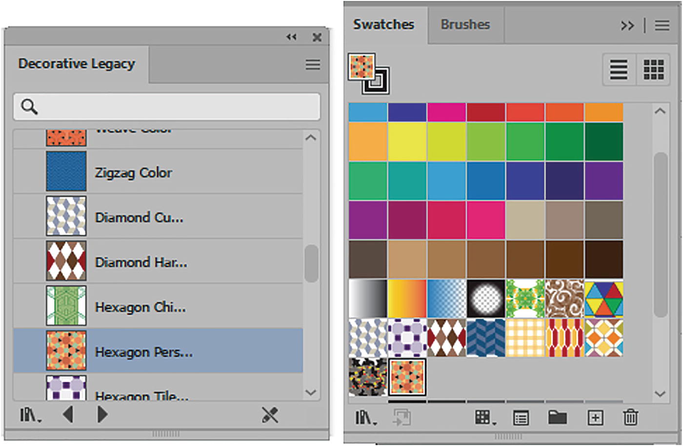
Pattern Library and the Pattern Options Panel
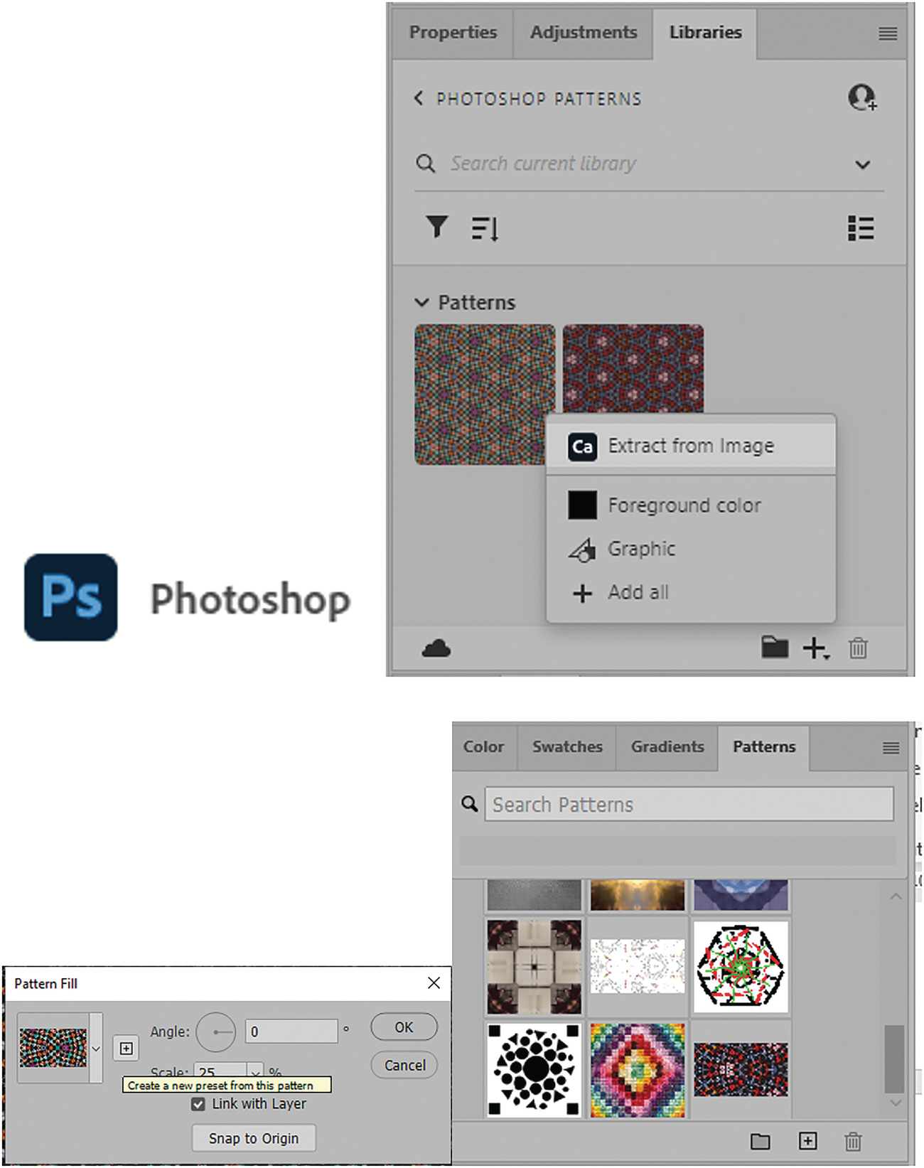
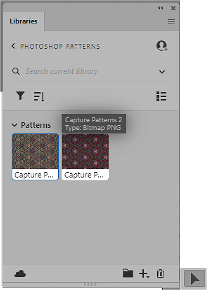
Photoshop with the Libraries panel and its access to patterns later stored in the Patterns panel
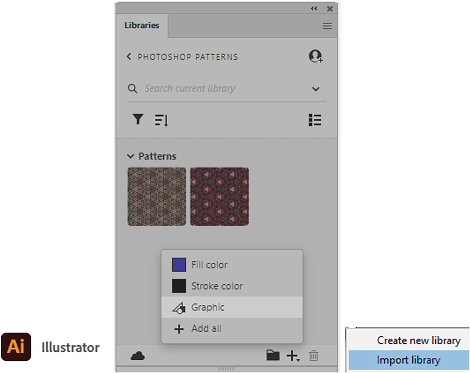
Illustrator’s Libraries panel can store patterns as graphics only, but you can import libraries with pattern assets created by others using Photoshop
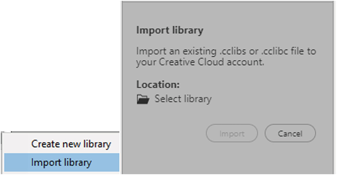
Use the Libraries panel to import my library of patterns
Extracting Photoshop Patterns from the Creative Cloud Libraries Panel
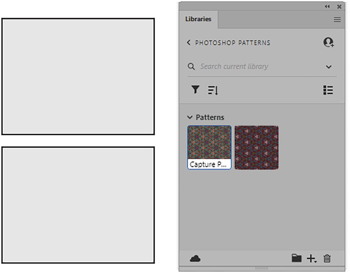
These two blank rectangles are ready for Capture patterns from the Libraries panel to be added
Select the rectangle with the Selection tool
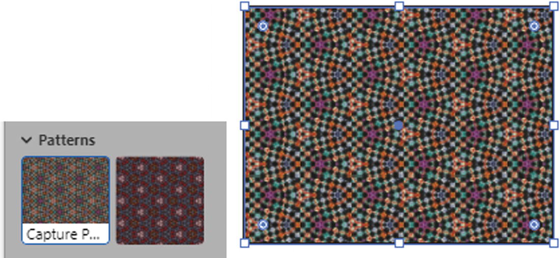
Double-click on the first pattern in the Libraries panel to add it to the selected rectangle

The pattern is also added to the Swatches panel
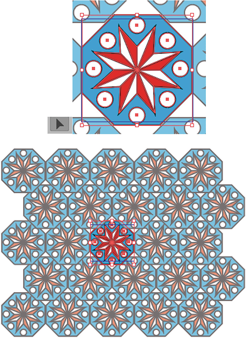
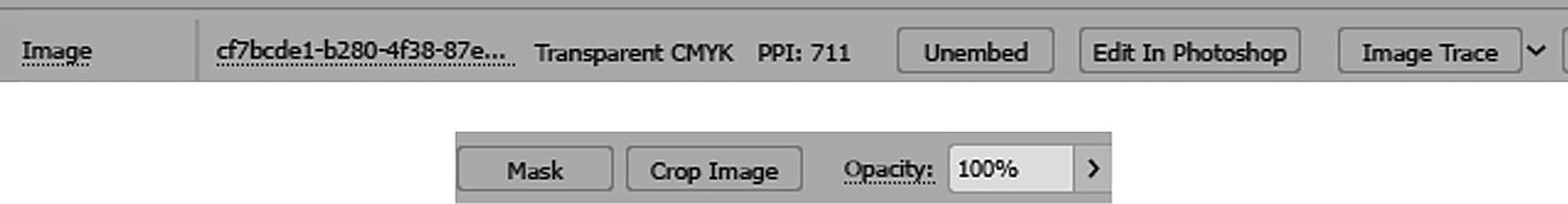
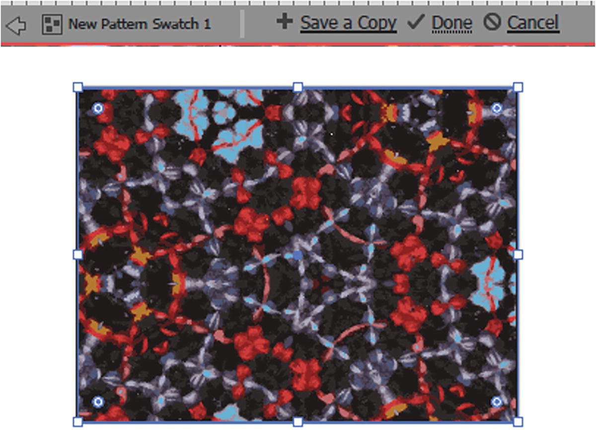
In Pattern Editing mode, you can discover the pattern is an image
If we check the pattern by double-clicking on it in the Swatches panel, going into Pattern Editing mode, and selecting it, we can see from the Control panel that it is an image.
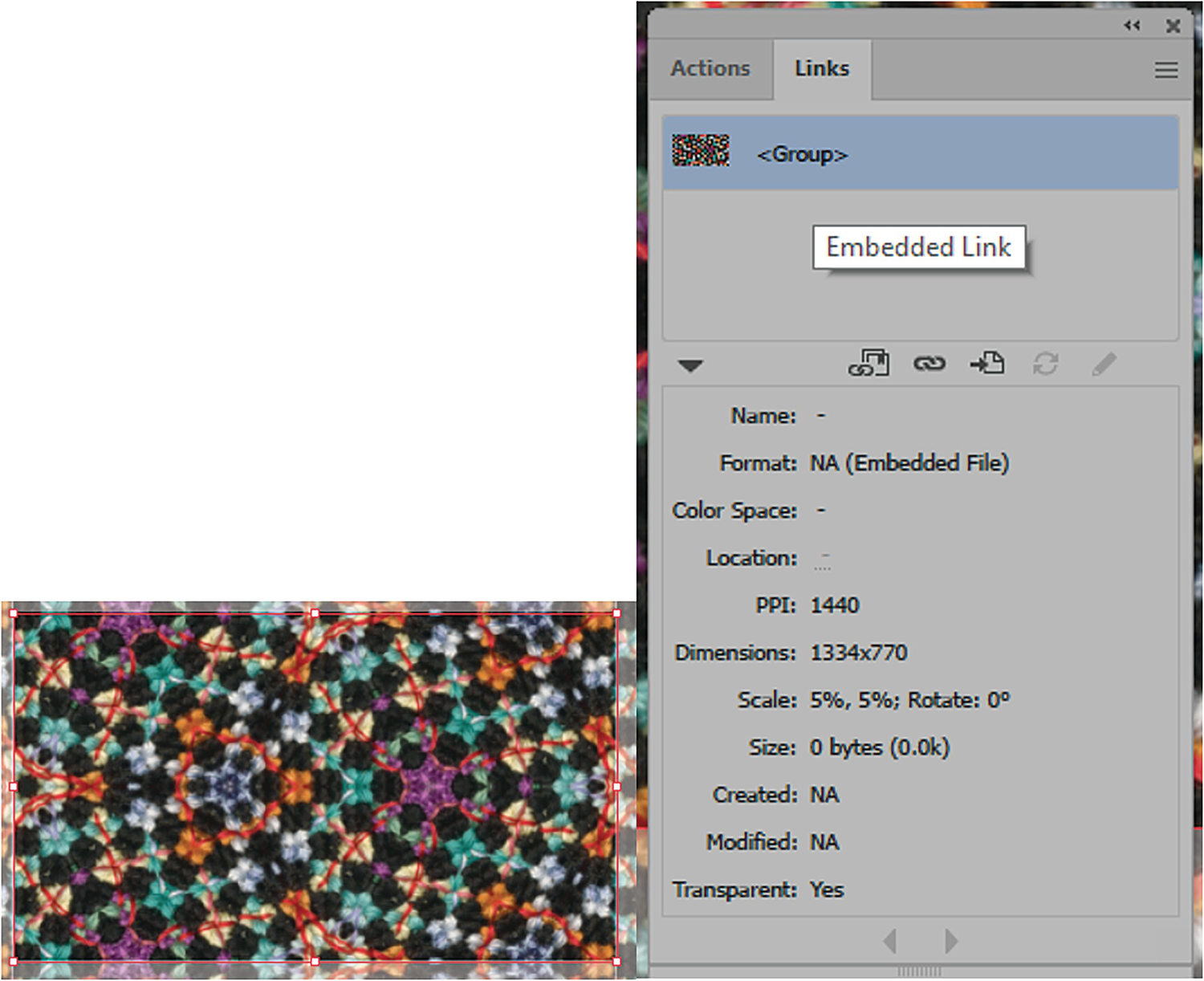
While selected, use the Links panel to discover more about the image, such as its resolution
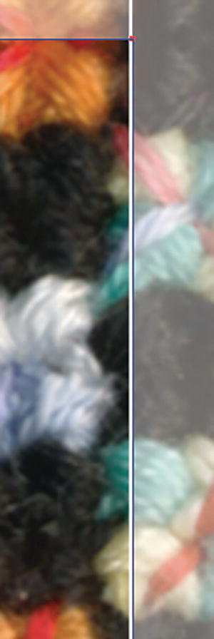
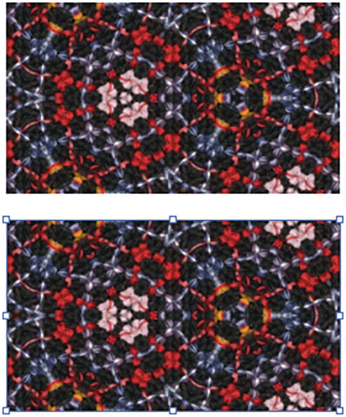
One edge of the pattern has a tiny white seam
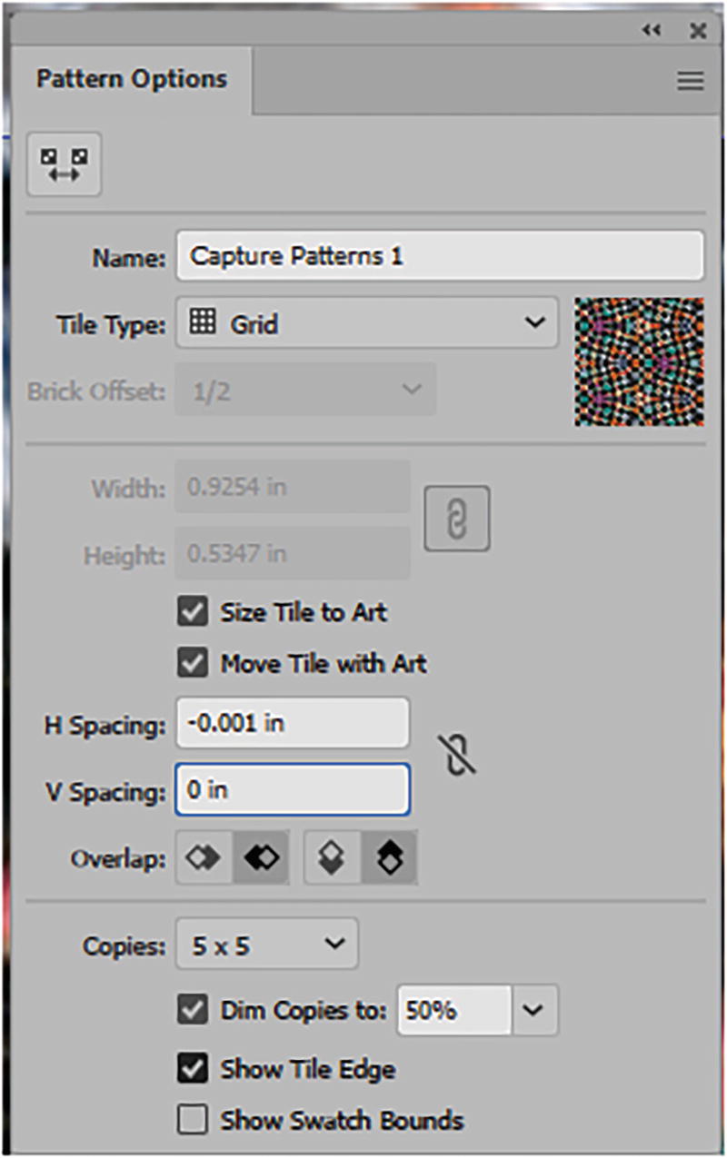
Use the Pattern Options panel to adjust the spacing and overlap to cover the white seam

Click Done to commit the change and exit Pattern Editing mode
You might still see a white line on the preview, but if you zoom in with your Zoom tool it should be gone. I always make a test print to confirm this with any pattern I create.
Customizing a Capture Pattern and Modifying It
However, what if you want to edit the color of the pattern in some way, as well as simplify it? Let’s look at that possibility next.

Image Trace and Color Guide panels
However, I will point out the basic steps that I would use to customize one of my Libraries panel’s Capture patterns should I want to use it in Illustrator for other projects.
Drag a copy of the second pattern out of the Libraries panel
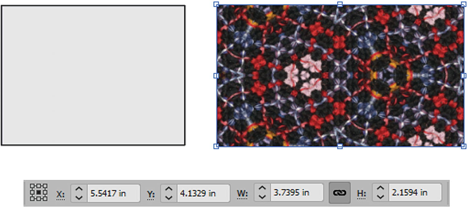
Use the Control panel to size the pattern as it is very large
Alt/Option-drag a copy of the selected pattern on to the Artboard
Locate the Image Trace button for the selected image in the Control panel
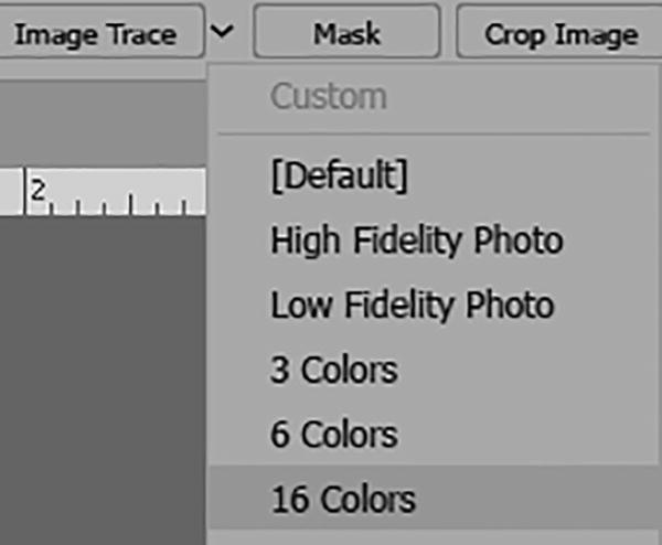
Select one of the Image Trace default options, like 16 Colors
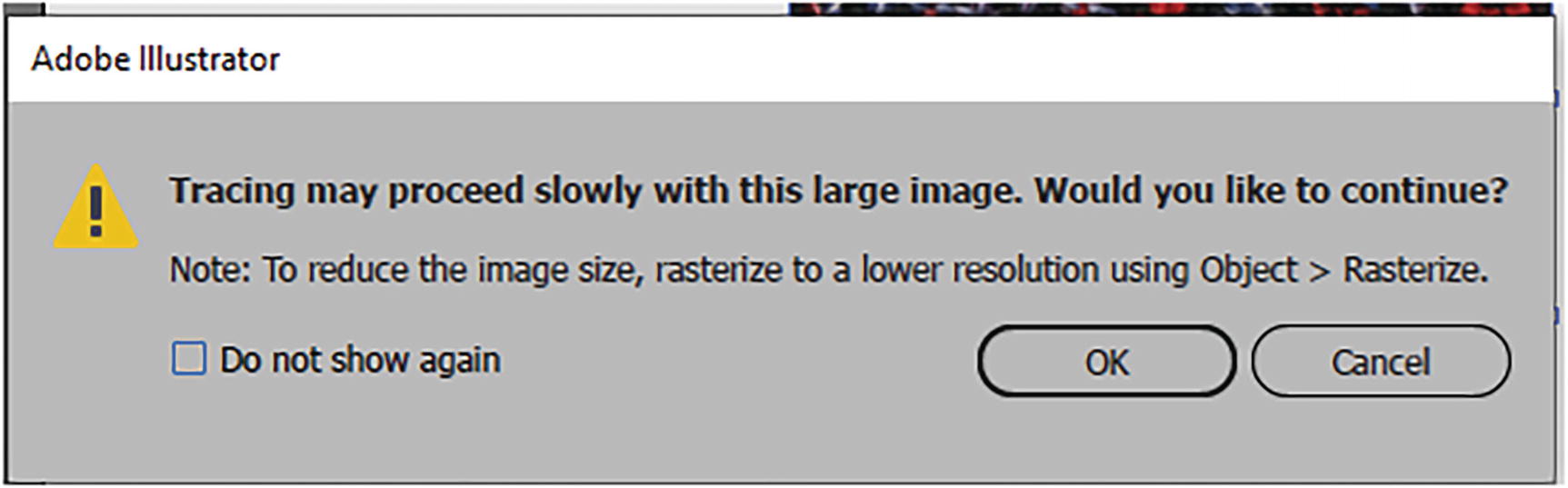
Read the alert message before you click OK to tracing the image
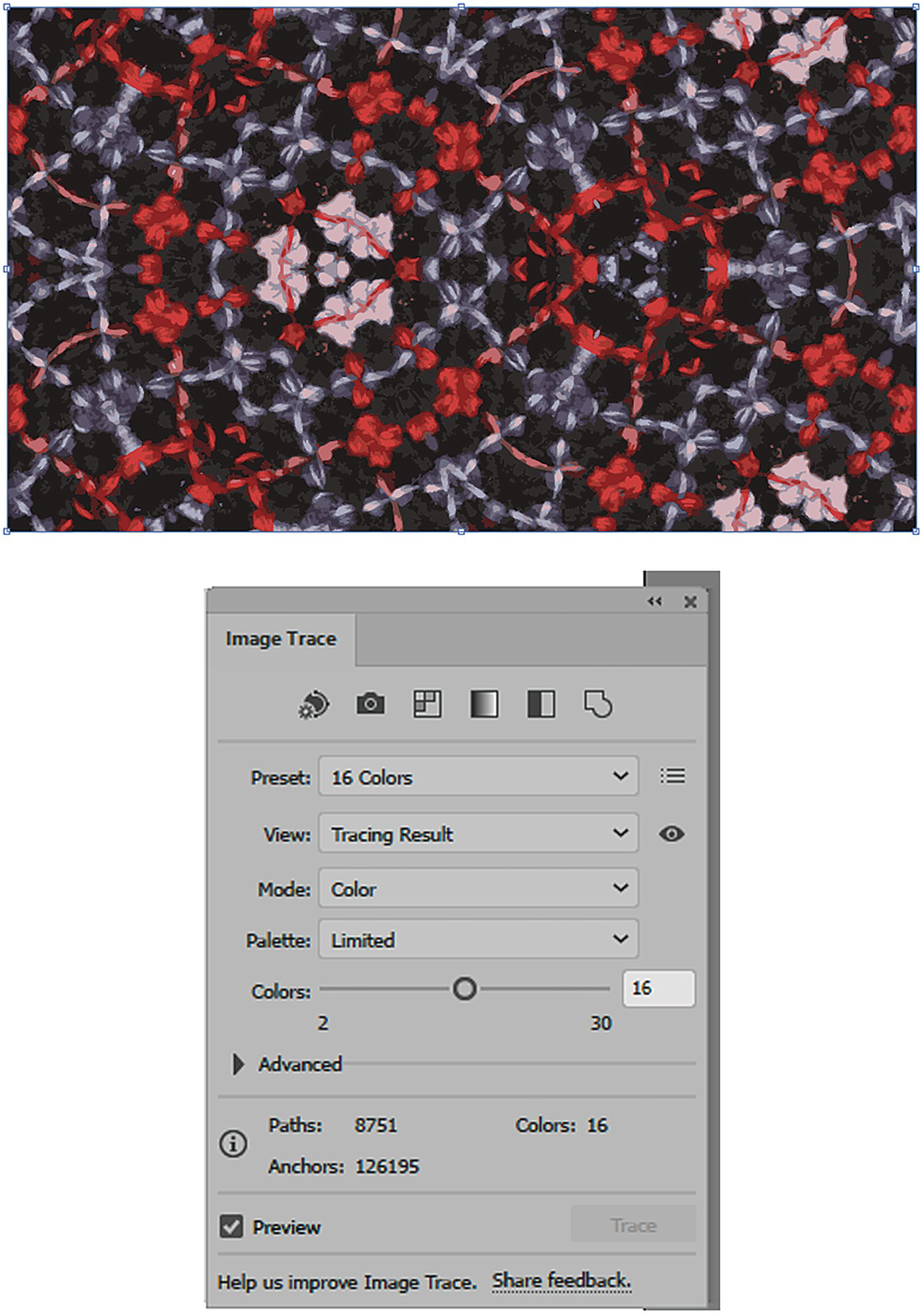
Once the image is traced you can use the Image Trace panel to adjust the Colors setting further
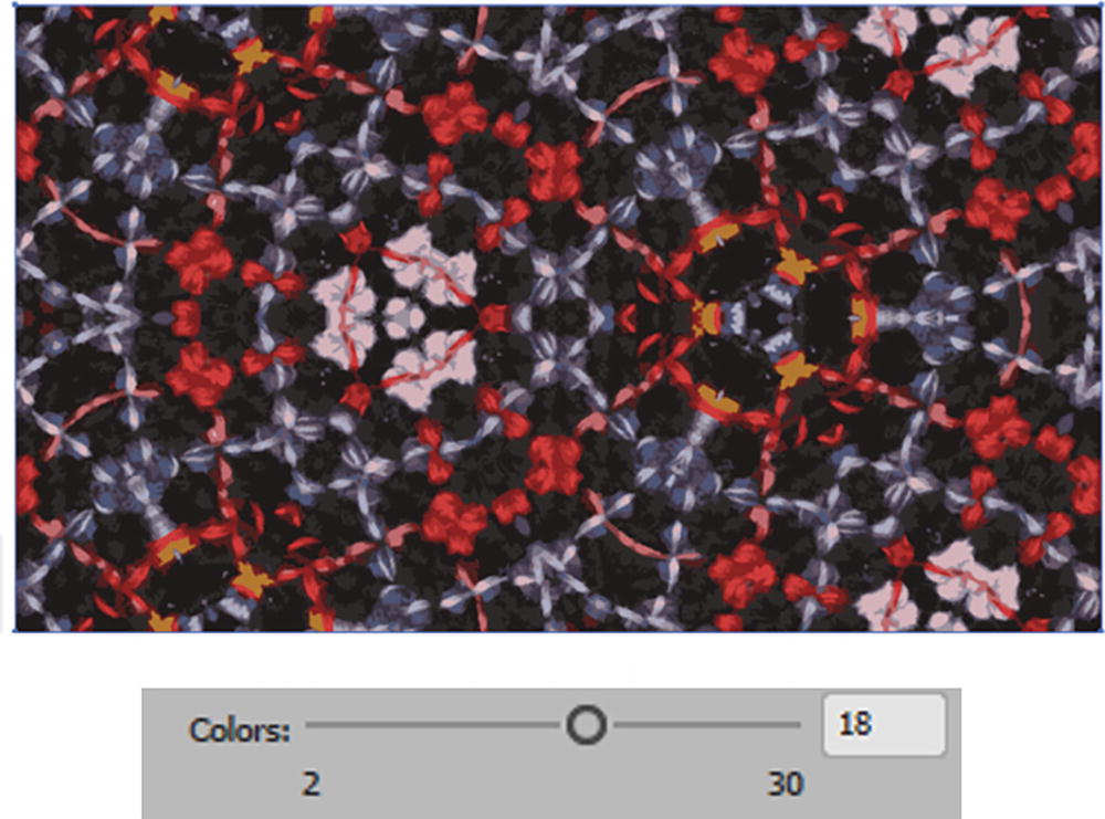
Set the Colors setting in the Image Trace dialog box to 18
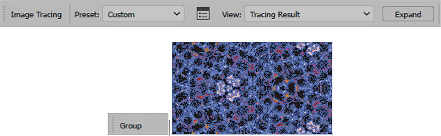
In the Control panel, click the Expand button to commit the image trace and create the grouped paths

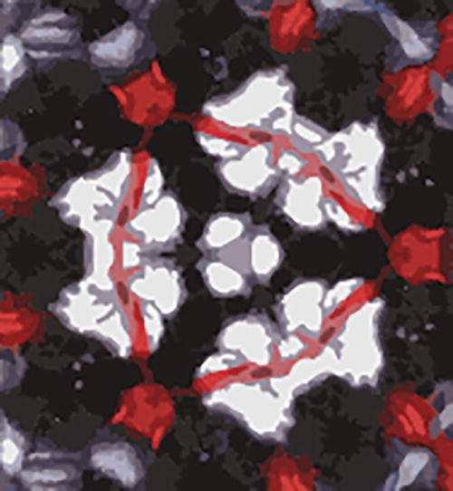
The image traced group with no paths selected
So, that is good for simplifying the pattern and its colors for Illustrator. However, now I want to alter some of the colors. In this case, I want the pink areas to be blue instead.
Altering Colors
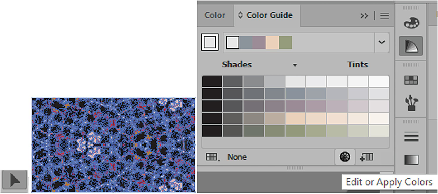
Use the Selection tool to select the grouped object and the Color Guide panel to adjust colors
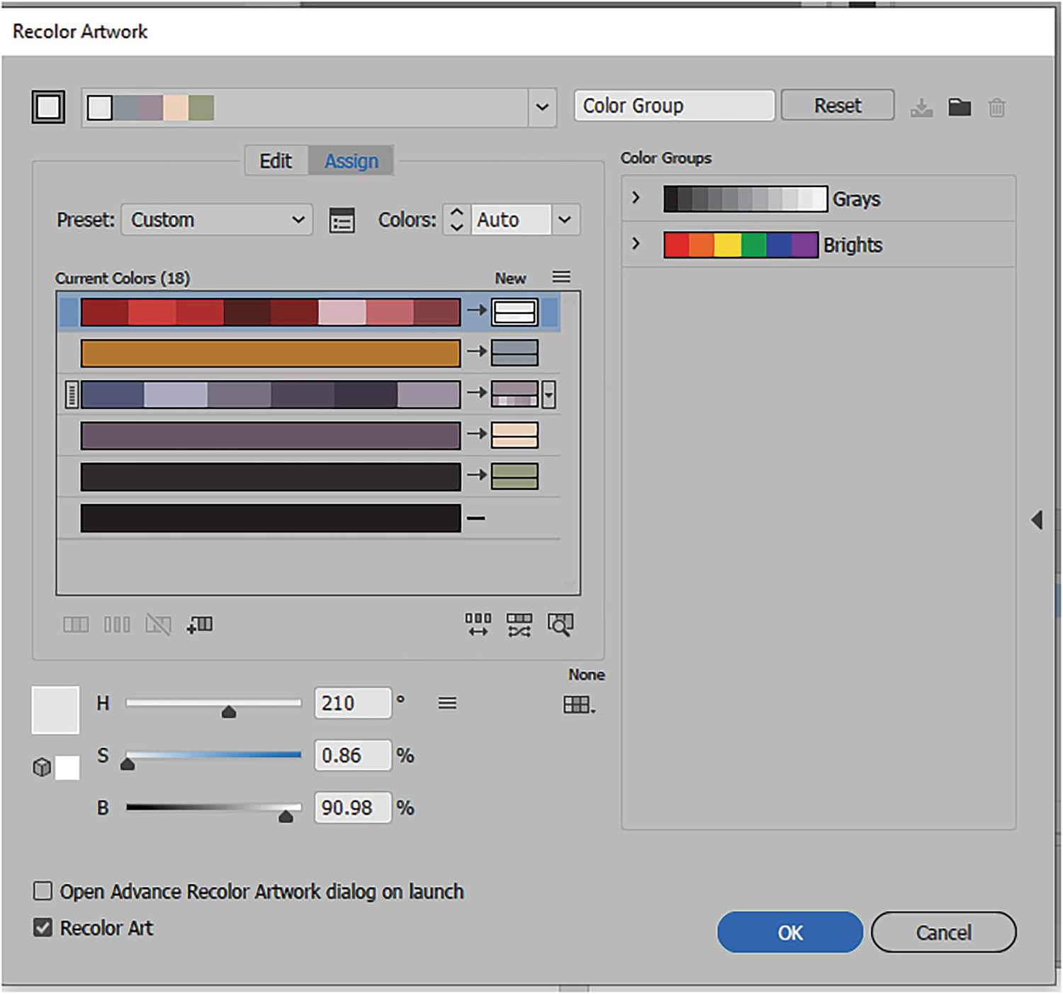
Recolor Artwork panel with colors applied
New colors on the grouped object are not always what you expect
Your project you may have different colors than mine. This project can only give you a basic idea of how to alter your color, and you may need to swap some colors as you proceed to match my figures as closely as possible.
Make sure to decide which of the current colors will recolor to the new colors

Setting the colors back to the original with no color change
Selecting the current color that you intend to change
Adding a new row to the Recolor Artwork dialog box
The new row is above the other rows
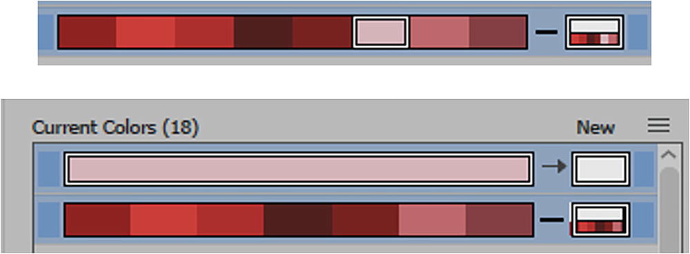
The pink color is being dragged into the new row
Currently, the new color is white
Now, to change the color to a blue, double-click on the new swatch to enter the Color Picker dialog box, then find a light blue color that you like. Refer to Figure 7-135.
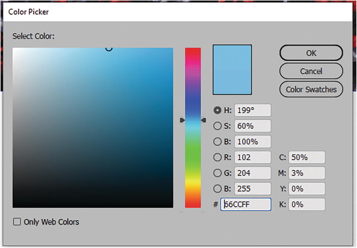
Enter the Color Picker dialog box to find the ideal blue color
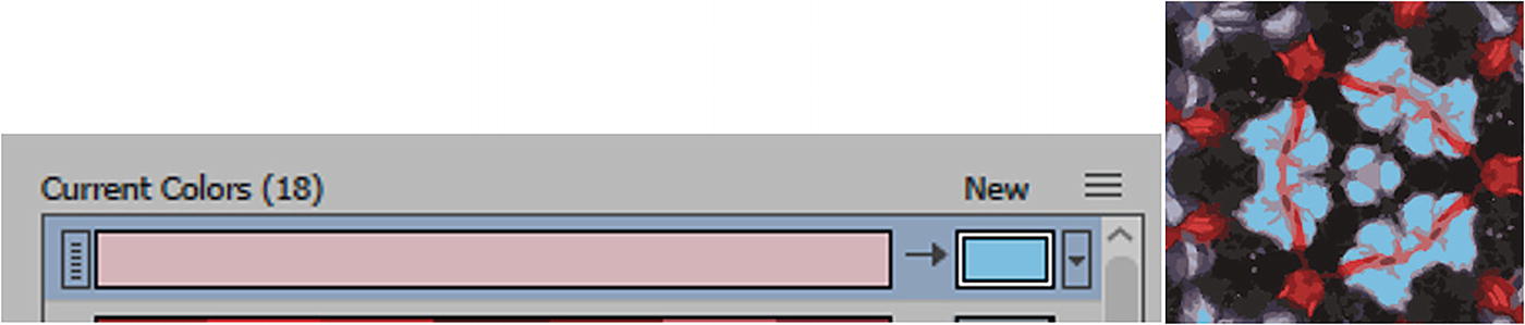
The new replacement color is now blue, and you can see the change in the preview

Click OK to commit changes and exit the Recolor Artwork dialog box
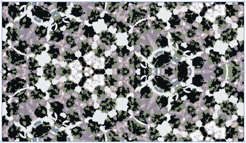
Preview the color change of the group object
Drag the object into the Swatches dialog box
Use the Selection tool to select the blank rectangle and apply the swatch
In my case, there was again a slight seam issue in the width and height, so afterward I double-clicked on the pattern in the Swatches panel to enter Pattern Editing mode.
Pattern Options panel with Size Tile to Art, H Spacing, V Spacing, and Overlap
Click Done to exit Pattern Editing mode
As mentioned earlier, you can also set—in the Transform panel—the option to Transform Object Only if you want to scale the path without scaling the pattern, and this will allow you to cover part of the thin seam as well. Then, return the setting to Transform Both, and scale your pattern and path.
Selecting an area of a path with the Direct Selection tool in a grouped pattern and then altering the swatch color can improve complex seam issues as well.
So, as you can see, you can use the Image Trace panel and the Color Guide panel to simplify patterns and edit the colors as well. The more simplified the pattern, with fewer paths, the easier it will be for the Pattern Options panel to adjust, and the smaller the file size. So, these are all things to consider when you create a pattern, first using Photoshop Capture settings to create a pattern, and then later for use in Illustrator.
You can look at my final examples in the file Library_Pattern_final.ai.
Use Your Patterns for Some Brushes
Patterns do not have to be used just for backgrounds; you can also use them for creating borders with the Brushes panel. I’ll point out a few basic examples, and you can refer to my file brush_border.ai if you need more.
In this case, with my Selection tool, I drag a copy of my grouped objects into the Swatches panel. I will not edit them using Pattern Editing mode, though technically they are still a pattern.
Add your objects to the Swatches panel and then in the Brushes panel click on the New Brush button
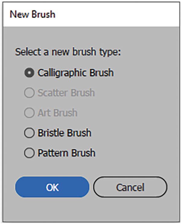
New Brush dialog box
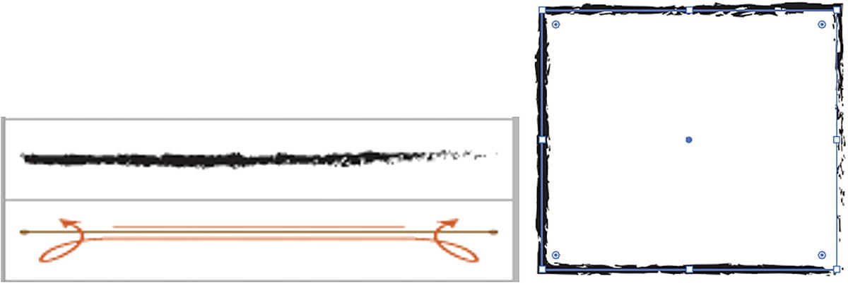
Calligraphic Brush: Use for a calligraphy pen–like appearance when you paint with the Paintbrush tool or Pen tool to give the strokes a more angled look. Refer to Figure 7-147.
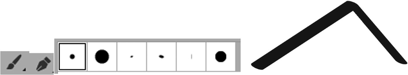
Paintbrush tool and Pen tool with various calligraphic brushes and a preview of one of the brushes on a path
Scatter Brush: Brushes used to scatter art objects that have been added directly to the Brushes panel and applied on paths when you use the Paintbrush tool or Pen tool. Refer to Figure 7-148.

Scatter Brush example with it going around a path
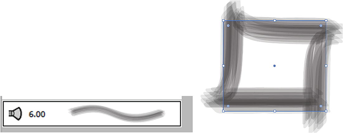
Art Brush: Art added directly to the Brushes panel and used as borders and applied on paths when you use the Paintbrush tool, Pen tool, or a Shape tool. Refer to Figure 7-149.
Art Brush example with it going around a path
Bristle Brush: Can be used to create painterly effect–type paths when you use the Paintbrush tool, Pen tool, or Shape tool to make it appear that you painted with a brush with natural bristles. Refer to Figure 7-150.
Bristle Brush example with it going around a path
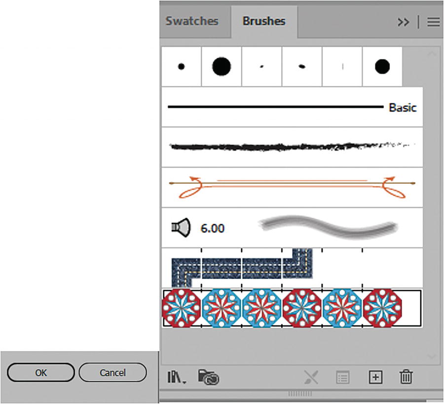
Pattern Brush: This is ideal if you want to create a patterned border using patterns from your Swatches panel; they are applied to the path’s strokes as tiles. We will look at this option now. Refer to Figure 7-151.
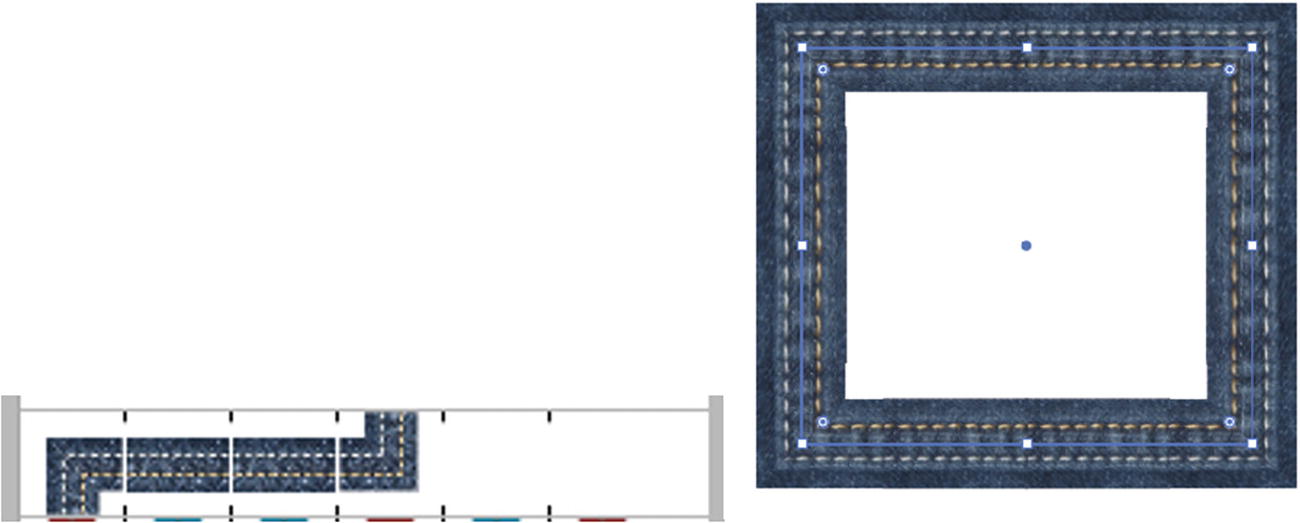
Pattern Brush example with it going around a path
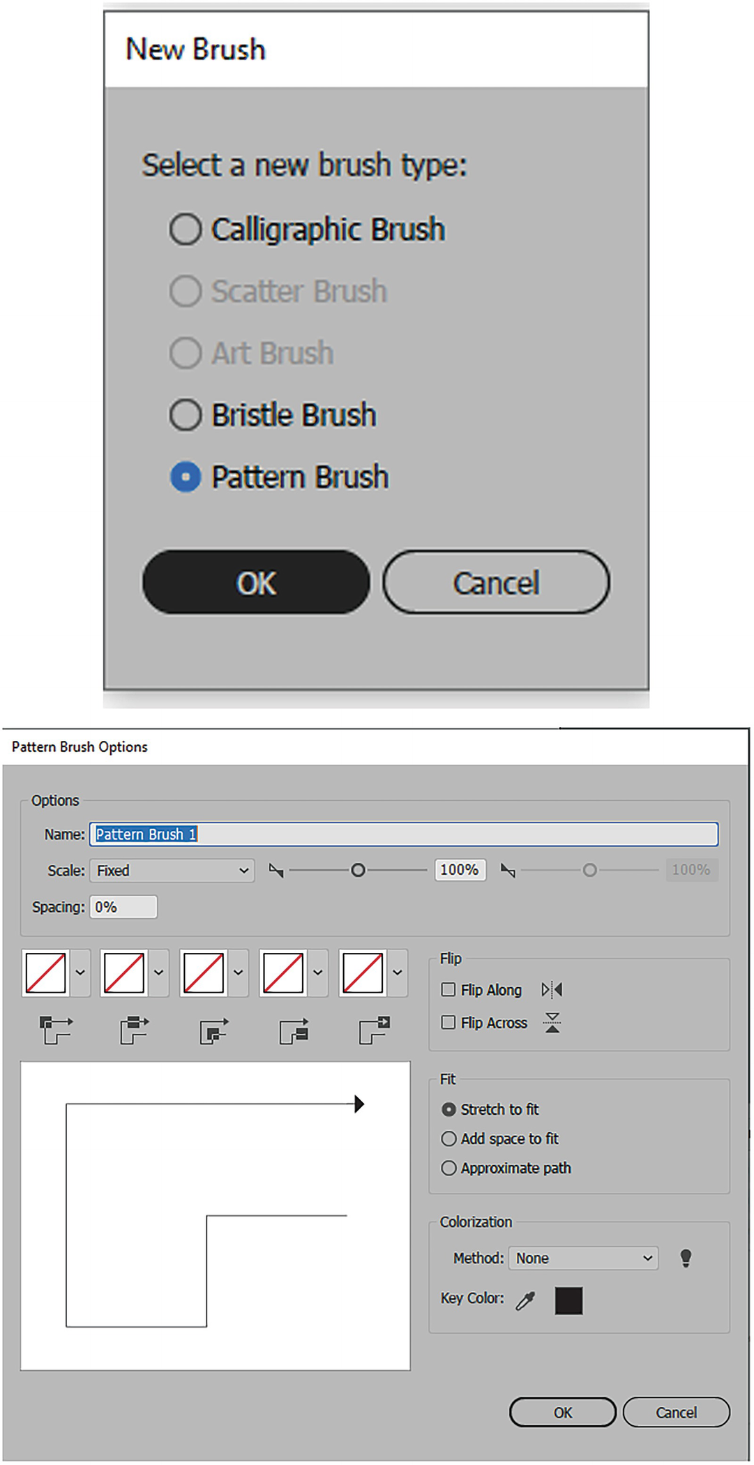
Choose Pattern Brush from the dialog box and enter the Pattern Brush Options dialog box
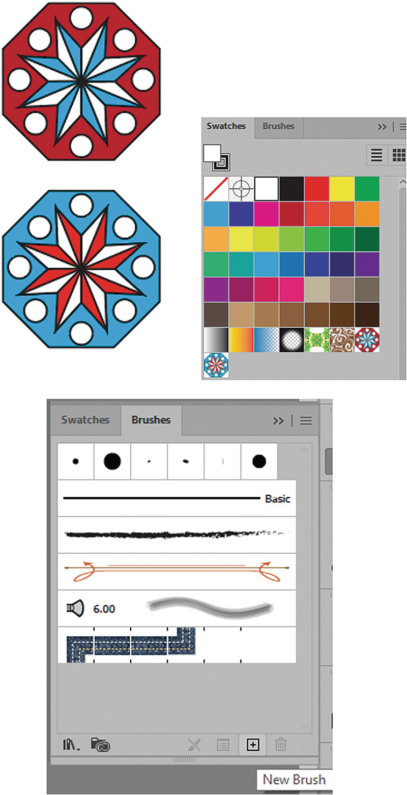
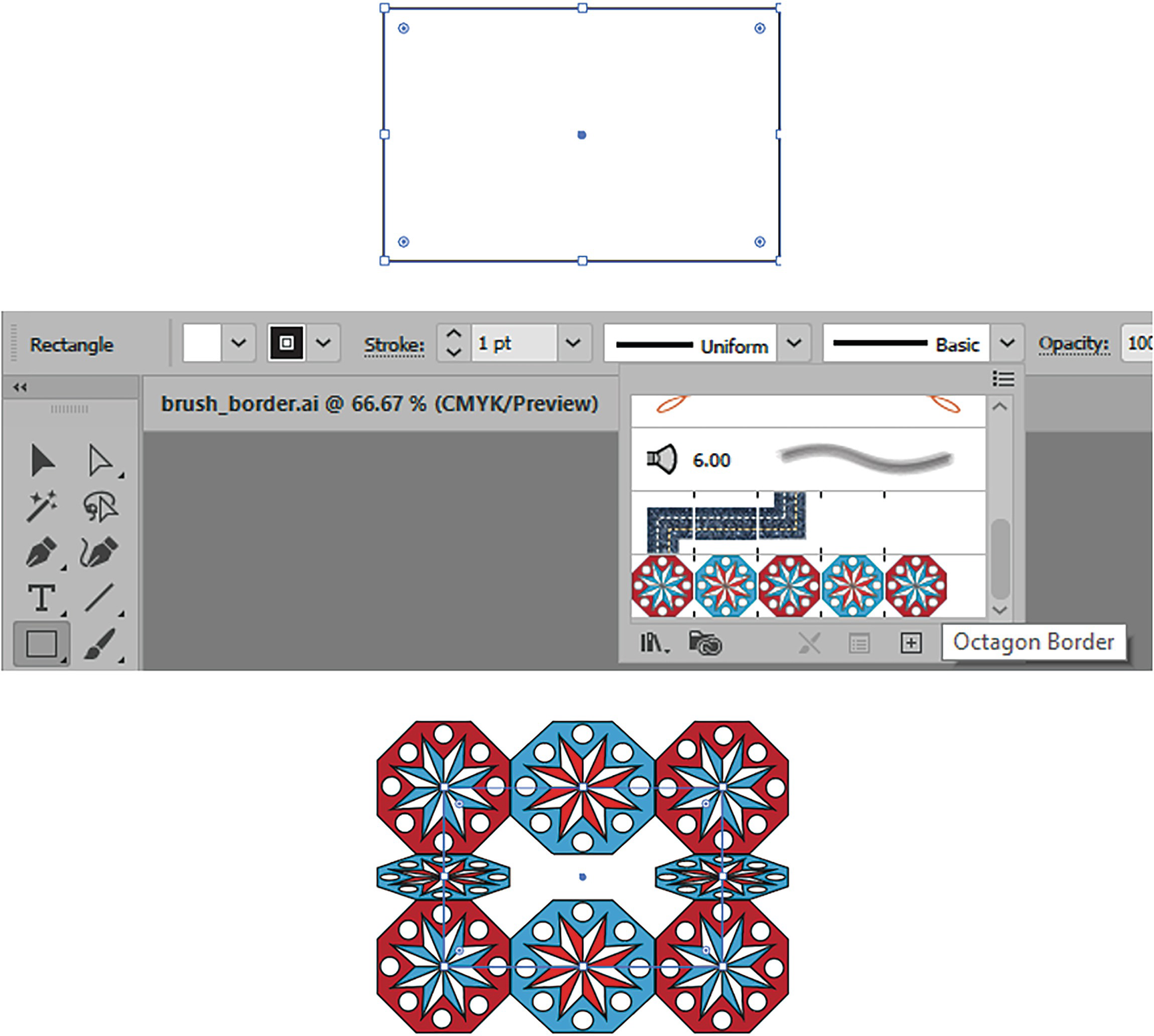
You can then give your brush a name: Octagon Border.

Pattern Brush Options dialog box, adjusting the scale settings

Pattern Brush Options dialog box, adjusting the Spacing setting
Pattern Brush Options dialog box, the tile settings
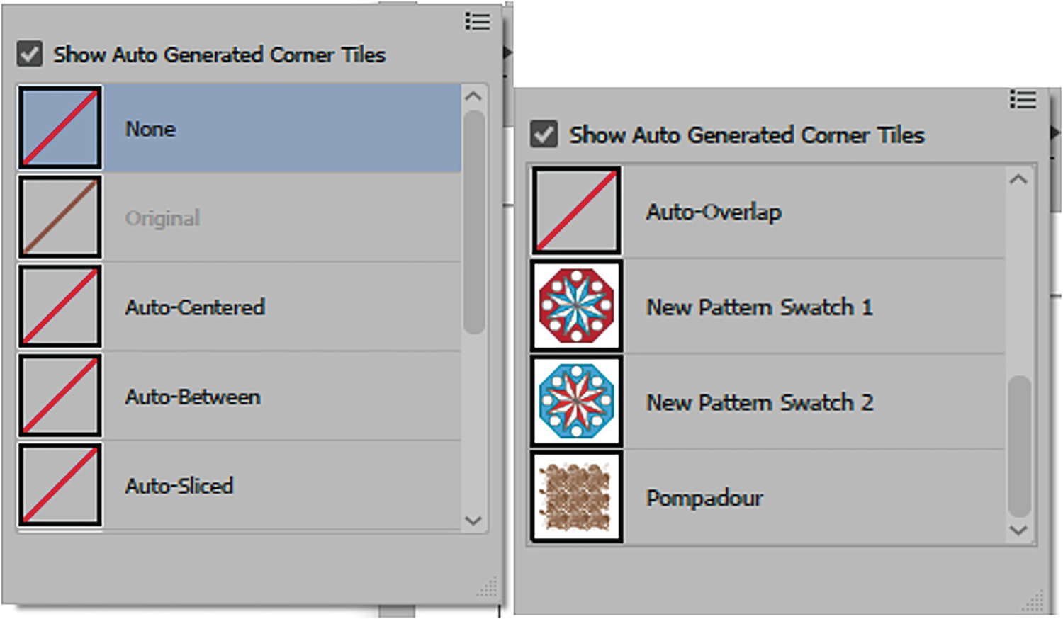
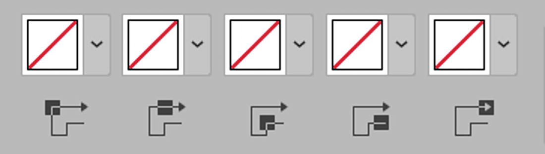
Pattern Brush Options dialog box, adjusting the scale settings for each menu and selecting a swatch
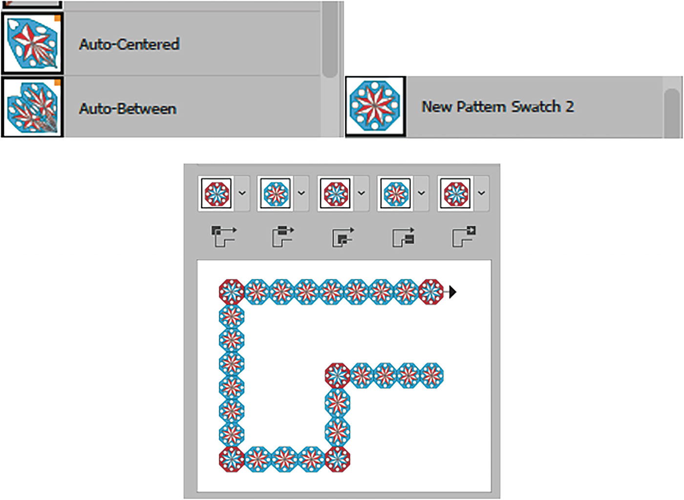
Some corner options are too warped, so I just used the original pattern swatch and previewed it first

Pattern Brush Options dialog box, Flip options of Along and Across disabled
Additional options also allow me to do the following:
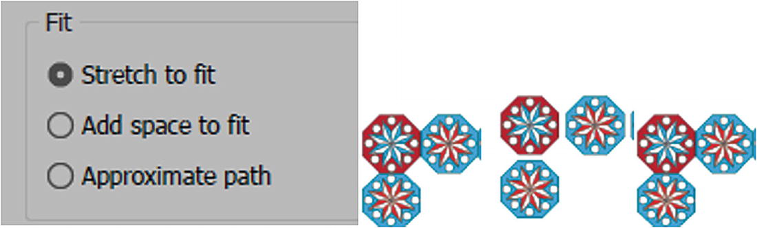
Pattern Brush Options dialog box, Fit options, with previews of Stretch to Fit, Add Space to Fit, and Approximate Path
Fit: You can choose Stretch to Fit, Add Space to Fit, or Approximate Path. I left it at the default of Stretch to Fit. Refer to Figure 7-159.
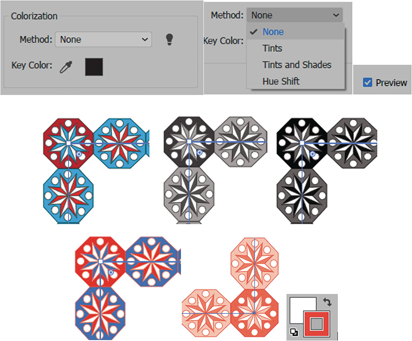
Pattern Brush Options dialog box for colorization when the path stroke is a different color and you set the Method to None, Tints, Tints and Shades, or Hue Shift, with the preview enabled When set to Tints, the color of the pattern is altered, as the stroke in the Toolbars panel is orange
Click OK to exit the dialog box, and the brush is added to the Brushes panel
Apply the border to the selected path using the Control panel and the Brush Definition menu
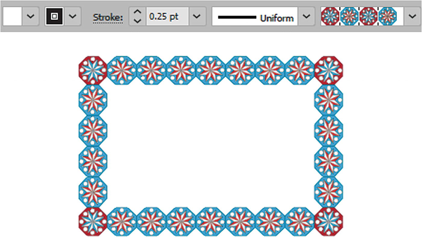
Use the Control panel to change the stroke weight of the path and make the pattern more uniform
Brushes can be duplicated if dragged over the New Brush icon in the Brushes panel, and then you can set alternate settings in the copy of the brush. We will look at brushes a bit more in Chapter 8.
Project: Blowing in the Wind, Part 5
To continue with our project of the girl on the farm, we can apply what we will learn now about the Appearance panel to modify areas of the illustration with additional patterns.
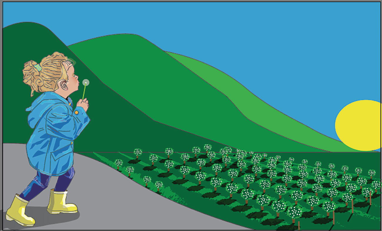
The girl on the farm with a patterned bow clip in her hair
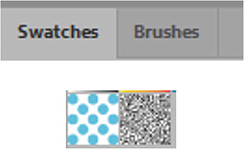
The Swatches panel contains two new patterns that I created

Unlock and look at the Girl layer in the Layers panel and use the Group Selection tool and Control panel to examine the bow

The warning message that currently the topmost fill is not active on the bow
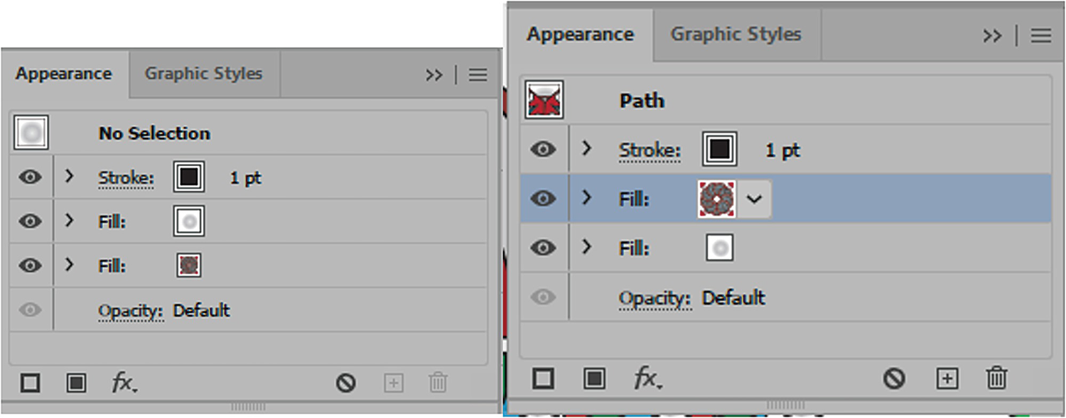
In this case, do not click the warning triangle, but instead look in the Appearance panel.
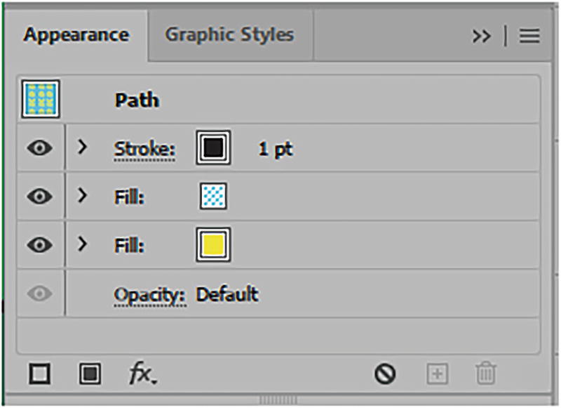
Looking at the Appearance panel to figure out how many fills and strokes there are
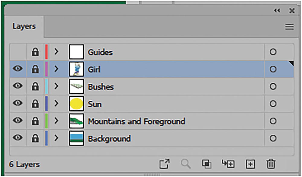
Lock the Girl layer after you have examined the bow
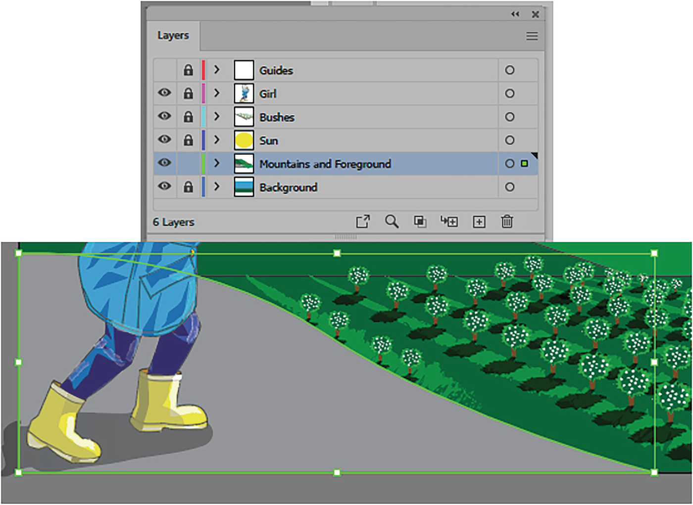
Unlock the Mountains and Foreground layer and select the gray foreground
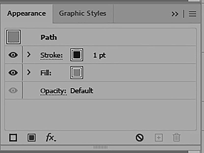
Look at the Appearance panel; there is only one fill and stroke
We need to add another fill above the current fill so that we can blend the pattern in with the ground, to create a more textured effect.
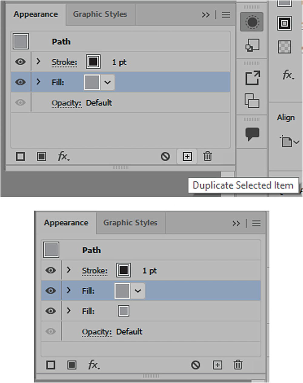
Use the Appearance panel to duplicate the selected fill
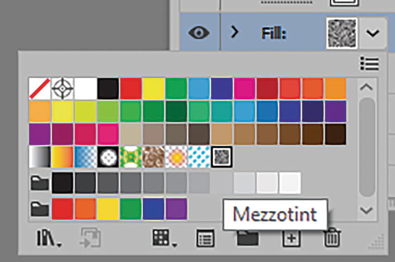
Use the Appearance panel to find the Mezzotint pattern for the fill
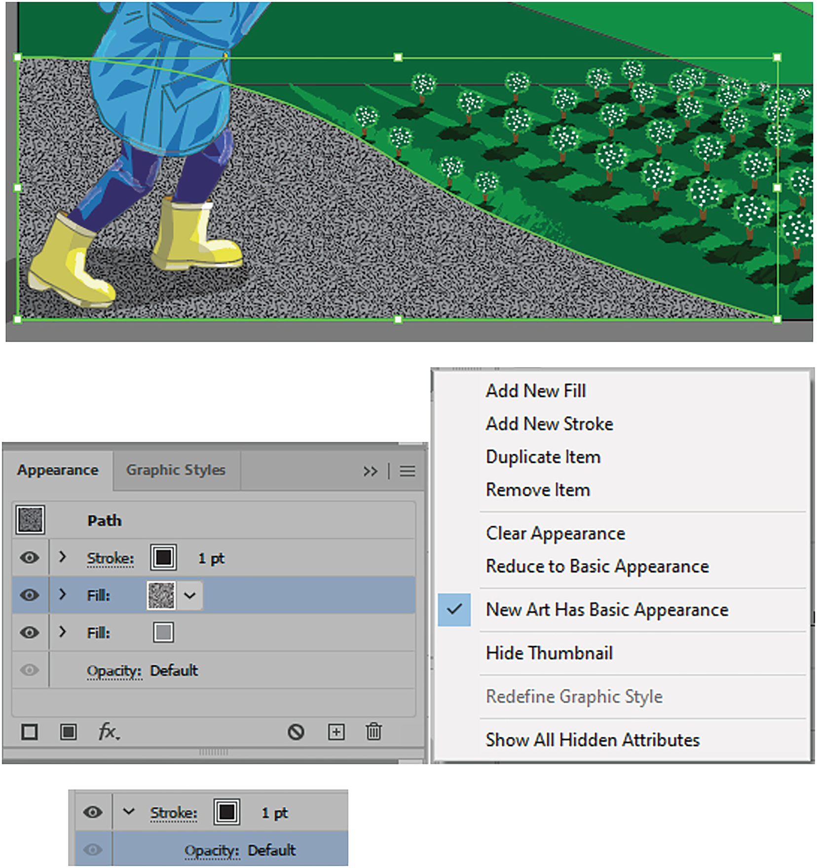
The Mezzotint pattern is applied in the Appearance panel, and you can use this panel to add additional effects
Besides fills, you can use the Appearance panel to add additional stroke effects, alter the opacity overall or for individual fills and strokes, and other filter effects.
We will look at that a bit more in this next project and in Chapter 8, as well as in Chapter 11.
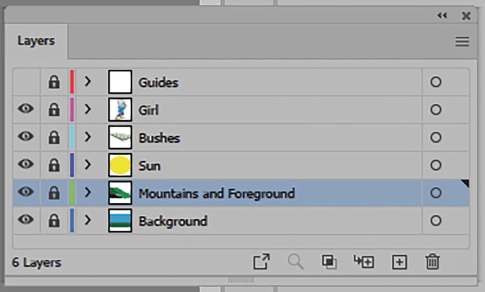
Lock the Mountains and Foreground layer when you are done making changes
Project: Colorizing the Circus Tent
For additional practice with patterns and the Appearance panel, you can use the file Circus_Tent.ai. Save a copy to practice.
You will see the tent again in Chapter 10 with a very similar project when the clowns get ready for their next circus performance.
The Swatches panel with patterns and gradients
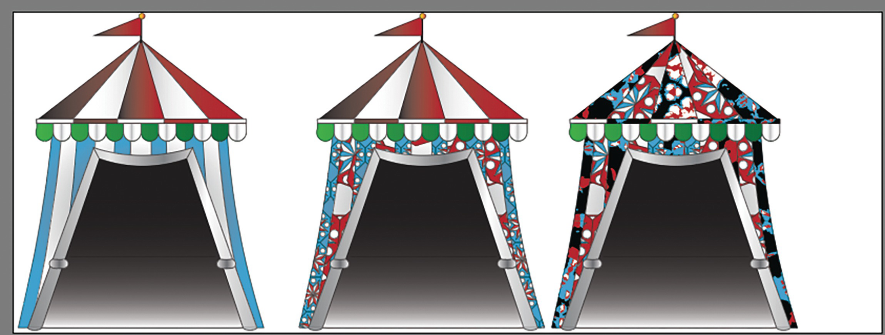
Three tents, two have already been colored with patterns
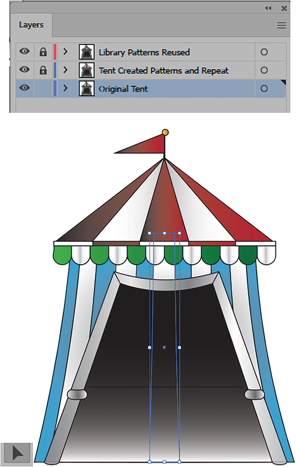
On the unlocked layer select parts of the tent with the Selection tool
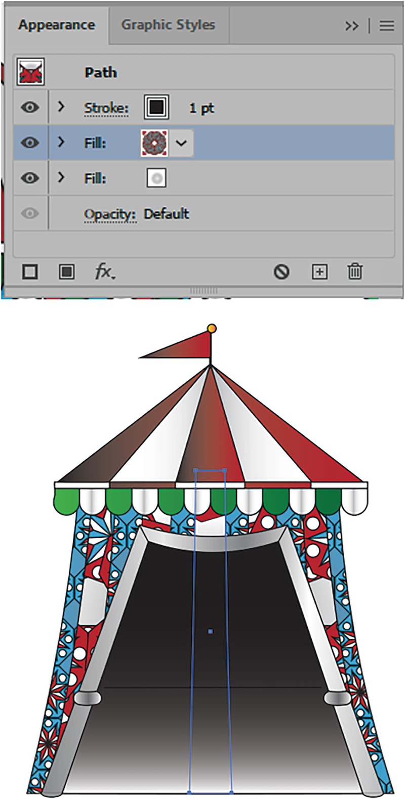
Use your Appearance panel to color parts of the tent with the patterns
If your pattern is below the gradient, you can drag it above the gradient fill in the Appearance panel
As mentioned, if you want to distort the pattern on the top of the tent, I will explain how to do this in Chapter 9. For now, just use different patterns with the Appearance panel.
When you are done, save your project.
Summary
We looked at patterns that can be created in Illustrator, as well as ones that can be modified from Photoshop. We also looked at the repeat options and how they can be incorporated into patterns. The Swatches panel patterns can be reused for brushes as well. And the Appearance panel allows us to blend patterns over the top of solid colors or gradients.
As you can see, you can create many unusual patterns for all your print projects.
In the next chapter, we will explore gradients.