Chapter Goal: Work with type on paths and see how you can distort the lettering and the text path going around a vector logo.
In this chapter, we will first review some of the basic text tools—Type, Area Type, Type on a Path, and Touch Type—and see how we can use them and their options to warp either the letter character, the area the text is within, or the path itself. Though not necessary for this book, to compare these to similar settings in Photoshop, you can refer to Perspective Warps and Distorts with Adobe Tools: Volume 1. In that project, I worked with the clowns and type.
Here, we will be working on a similar poster. However, this time all the work with the text will be done in Illustrator on separate layers. In some situations, you may not be able to do the type work in Photoshop and use Smart Object layers, so it is good to practice using similar type settings and know where they can be found in Illustrator.
You can find the projects for this chapter in the Chapter 10 folder.
Toolbars panel type tools collection
Before you start the project, create a new document as you did in Chapter 1 so that you can practice along.
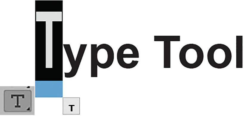
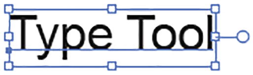
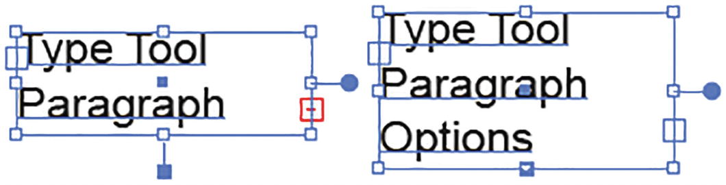
Type Tool (T)

Toolbars panel Type tool
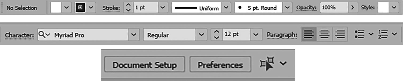
Type tool settings in the Control panel
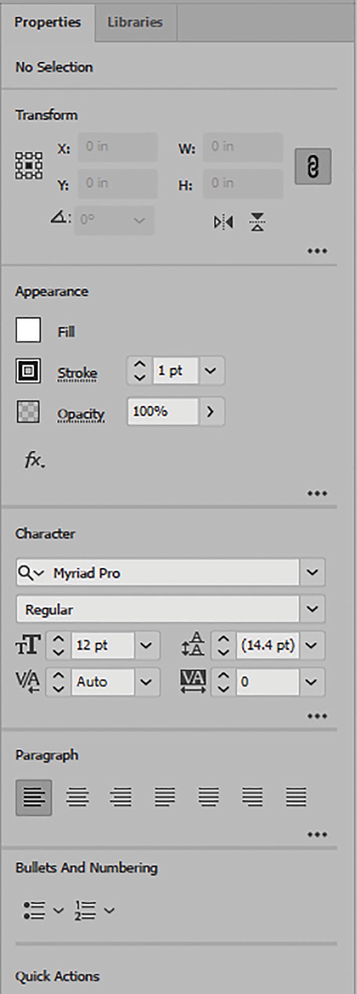
Type tool settings in the Properties panel
Control Panel and Properties Panel Options

Type tool settings in the Control panel for color fill, stroke, opacity, and graphic style; currently nothing has been typed and only the tool is selected
We will look at the Graphic Styles panel in more detail in Chapter 11.

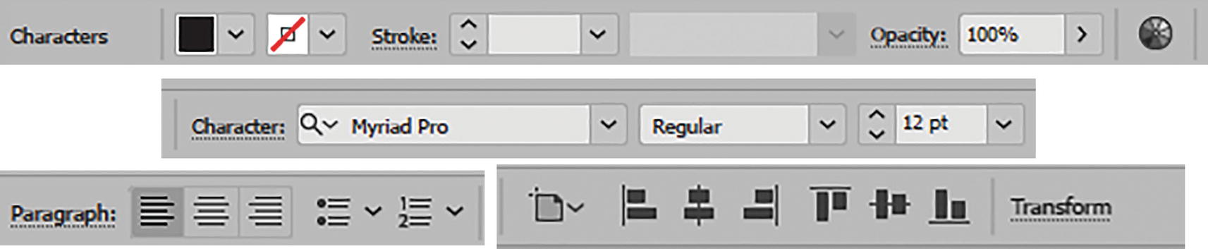
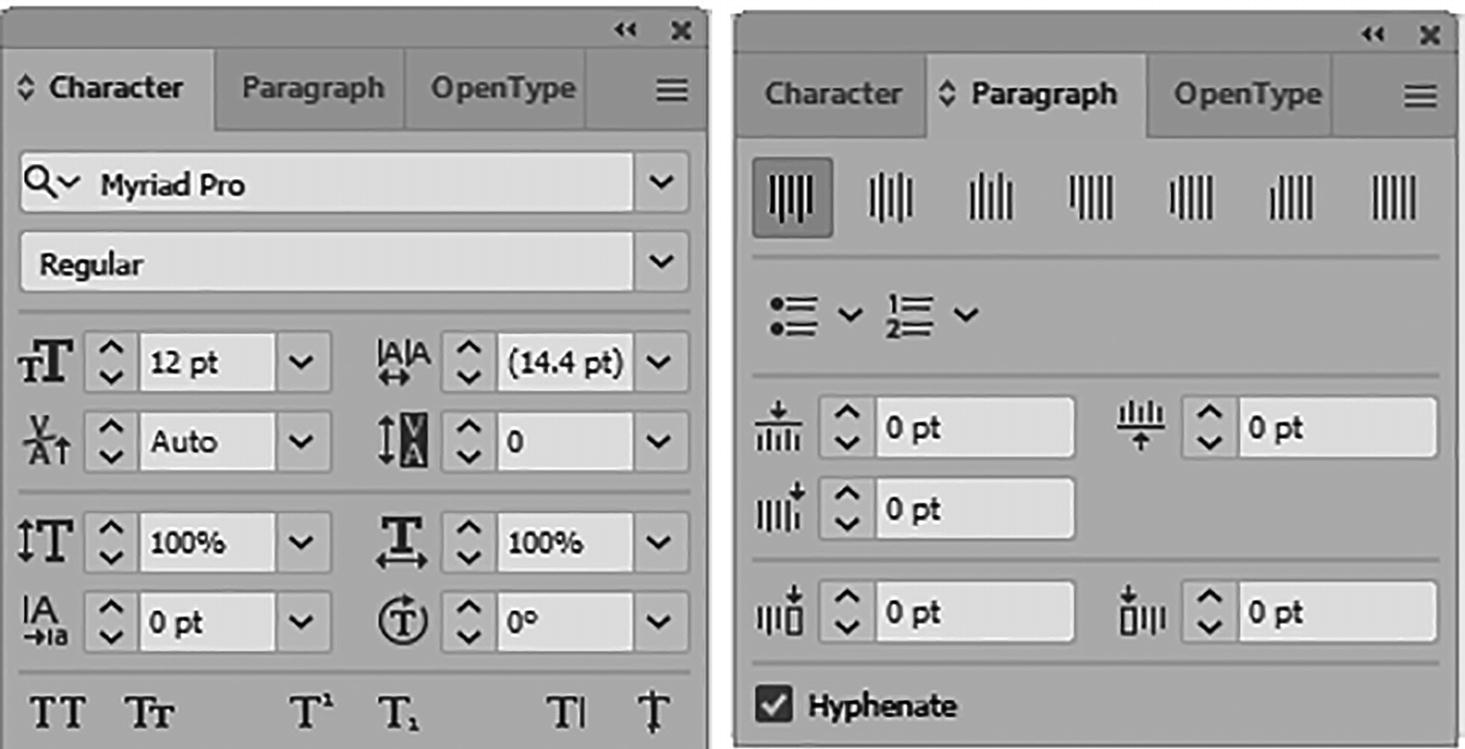
Control panel Character and Paragraph options
Properties panel Character and Paragraph options
Click a location on the Artboard and start typing with the Type tool
Current Character settings in the Control panel

Current Character settings in the Properties panel

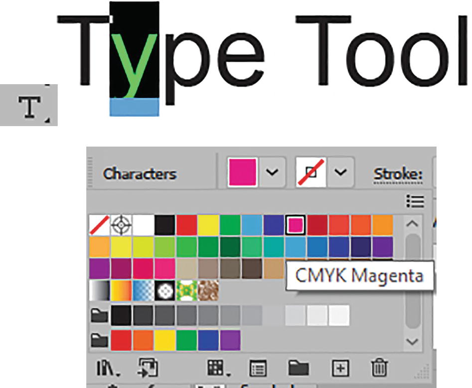
Control panel settings for Character color

Control panel setting a stroke color for highlighted type
This will give you access to the Stroke Weight field, currently at 1 pt, and the Variable Width Profile field, set currently to Uniform.
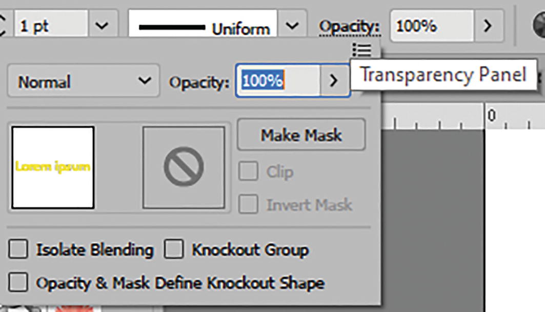
Control panel Opacity setting for highlighted type
I talked about blending modes and the Transparency panel in Chapter 8.
From the Control panel, you can also recolor the artwork of the type. Though not required for this book, for more information on the topic of recoloring and the color guide you can refer to the following site: https://helpx.adobe.com/illustrator/using/recolor-artwork.html.

Control panel Recolor Artwork option

Select the type with the Selection tool
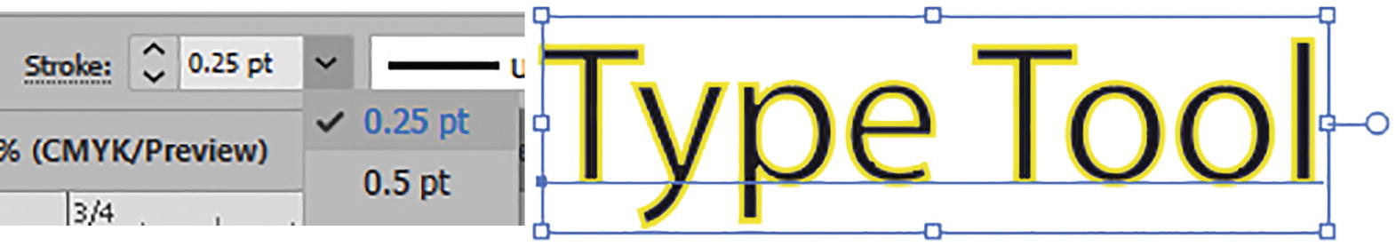
Use the Control panel to lower the stroke weight
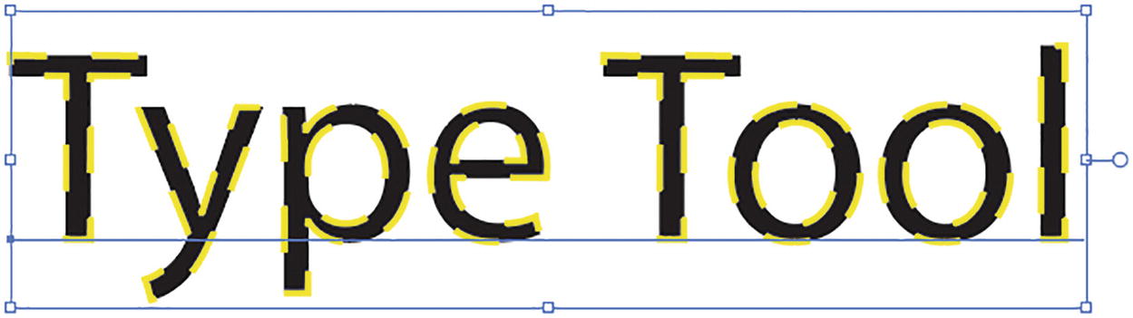
Type with a dashed stroke

Stroke panel with the Dashed Line option enabled
For now, let’s return the color of the stroke to None and continue to look at the rest of the options in the Control and Properties panels.

Control panel; use the Selection tool to set the Stroke field to None
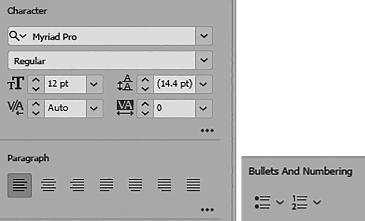
Character

Control panel Character settings

Use the Control panel to find a font family
I am choosing the font family Arial.
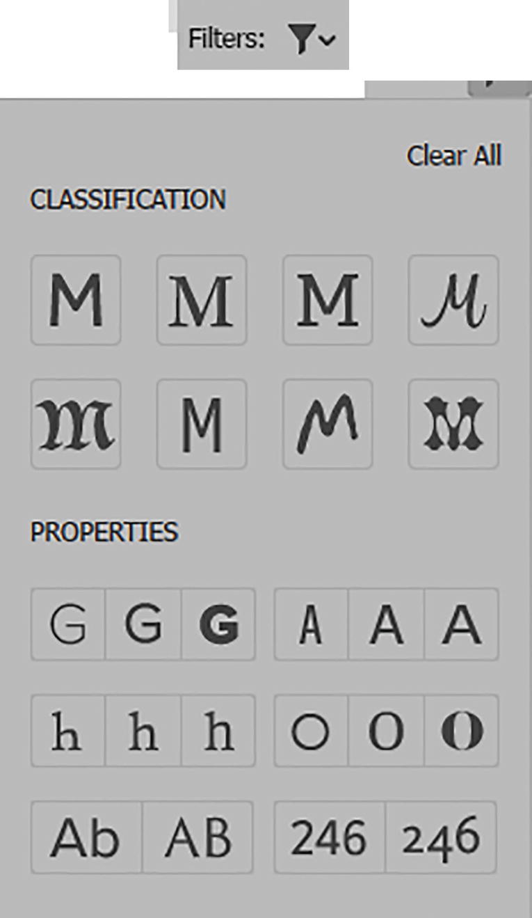
Filters used to find a specific font family

Additional filters used to find a specific font family
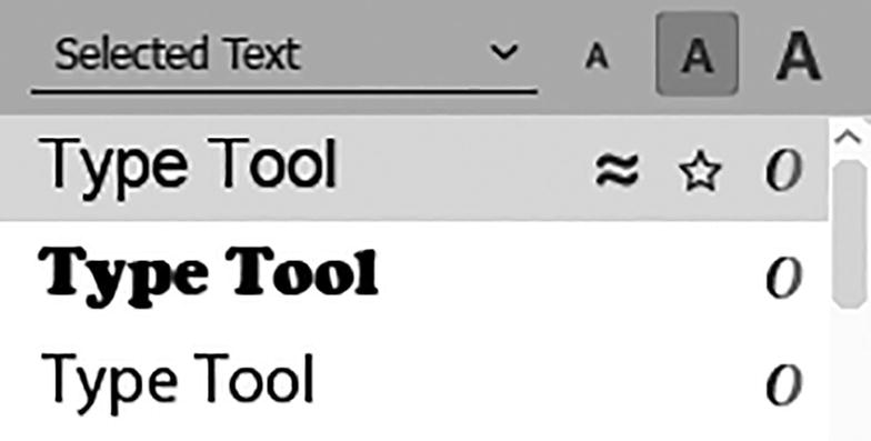
Set a preview text and a preview font size
Currently, I am previewing using the selected text, with a preview size of medium.

Search for a font style within the font family

Control panel with new font family and font style updated
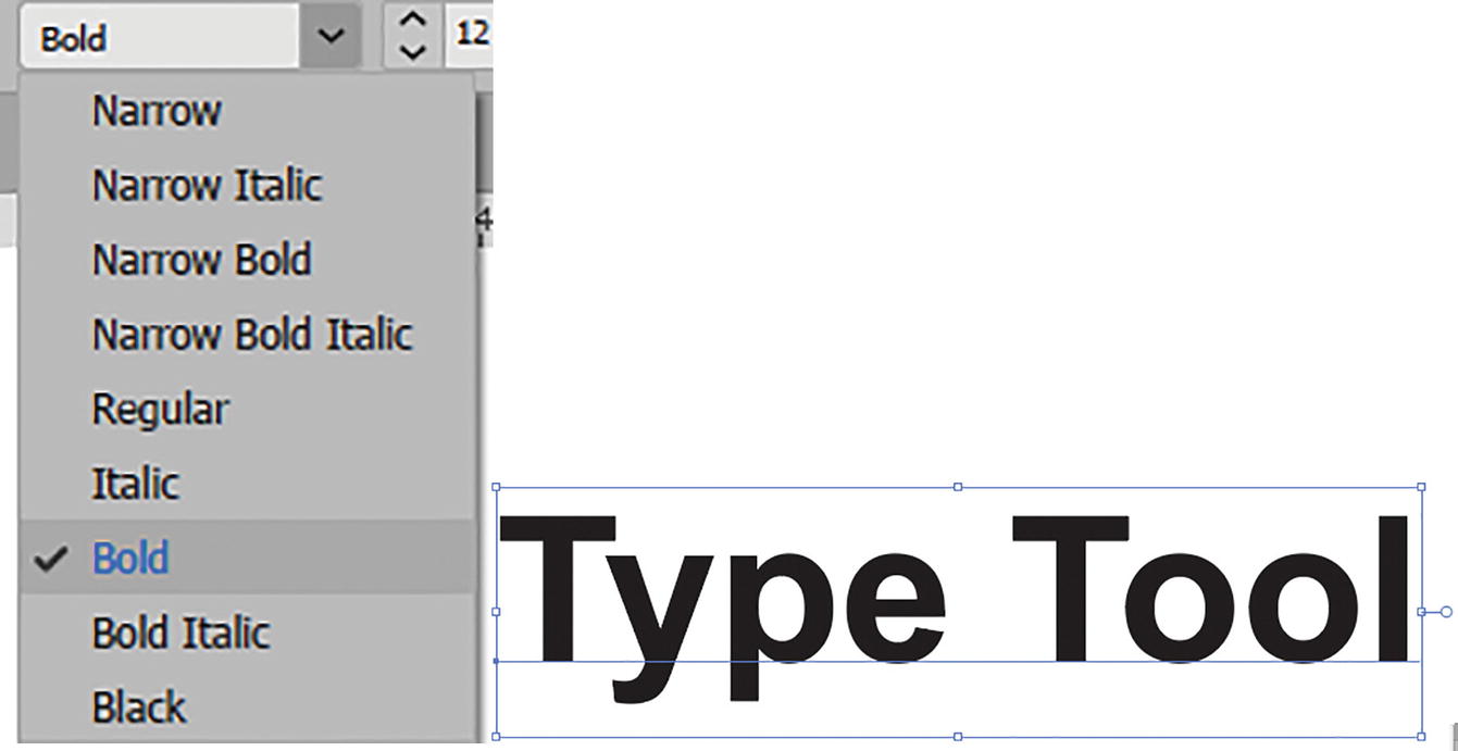
Use the Control panel to locate a font style
Some fonts will only have one style, such as Regular; however, most will have the additional three other styles of Bold, Italic, and Bold Italic. Other fonts will have further options, such as Black and Narrow with additional bold and italic style subsets.
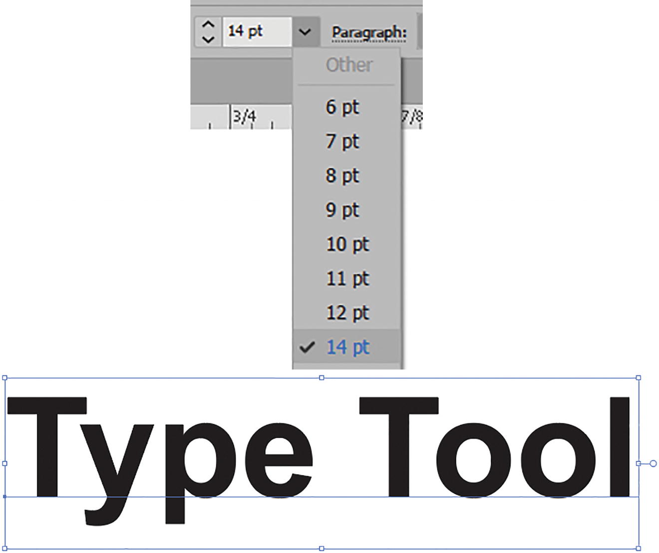
Use the Control panel to change the font size
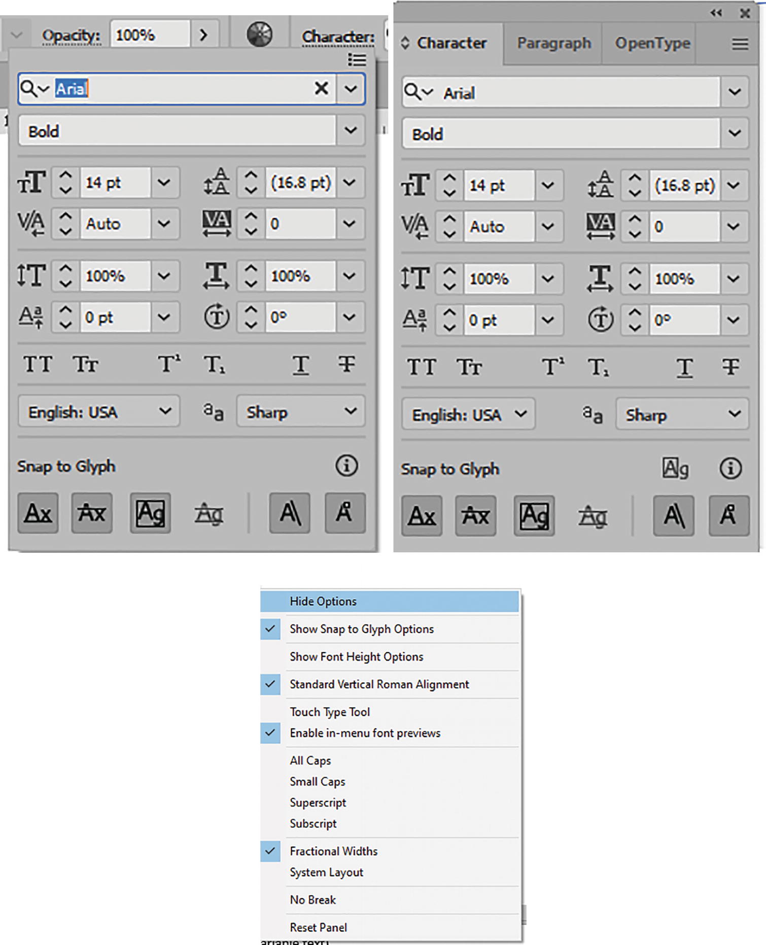
Locate additional Character settings in the Control panel menu or in the Character panel and its menu
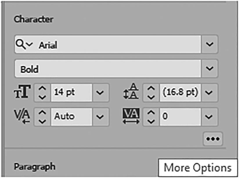
When using the Properties panel, you can access similar settings while clicking on the ellipses button (More Options). Refer to Figure 10-30.
Similar Character settings can be accessed in the Properties panel

Character panel settings for Font Size, Leading, Kerning, and Tracking
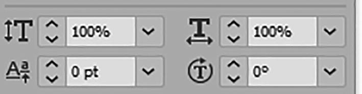
Character panel settings of Vertical Scale, Horizontal Scale, Baseline Shift, and Character Rotation
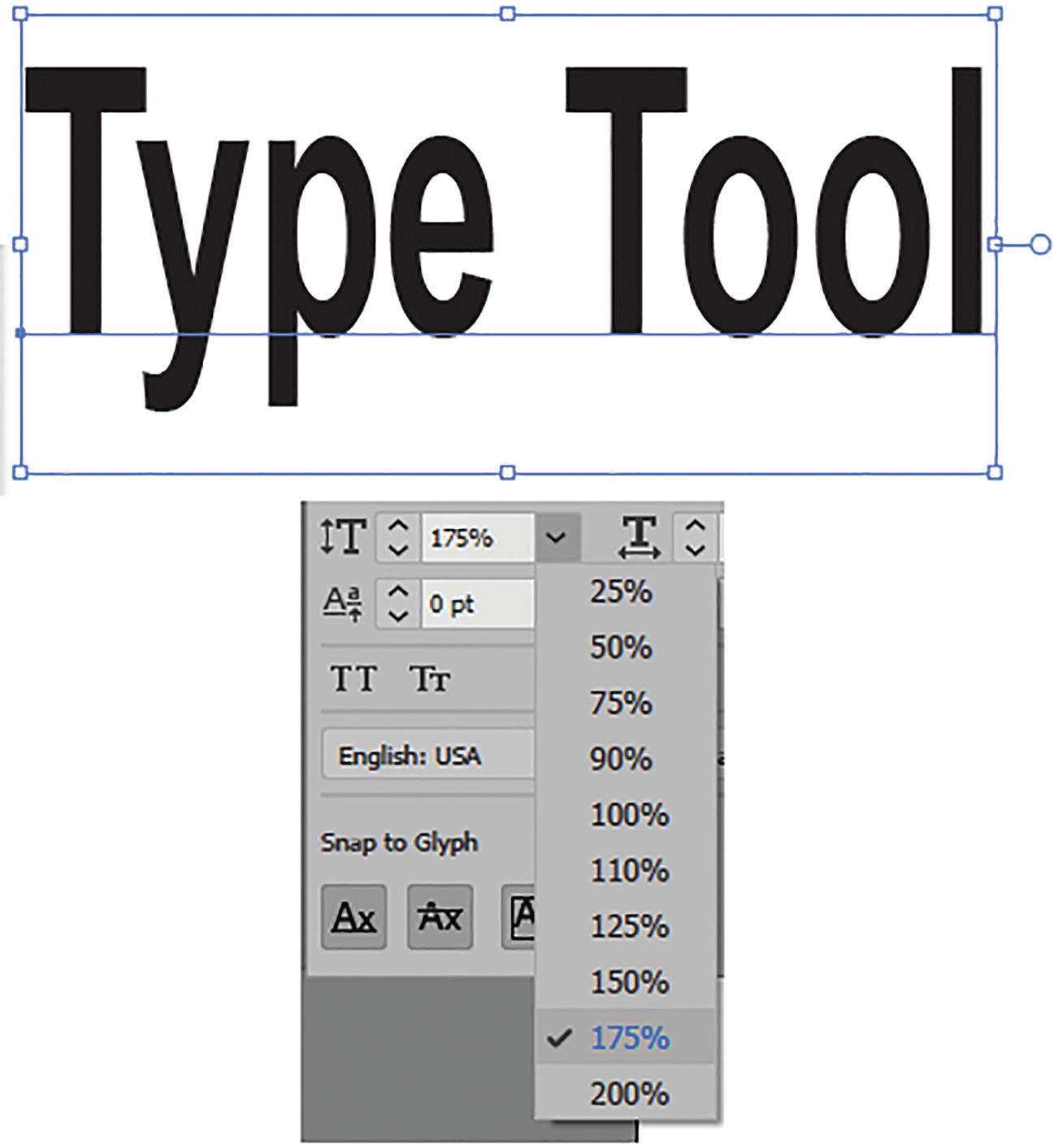
Character panel setting for the type’s vertical scale
Character panel setting for the vertical scale of a single character

Character panel setting for the type’s horizontal scale

Character panel setting for the horizontal scale of a single character

Character panel, set the baseline shift of a single character
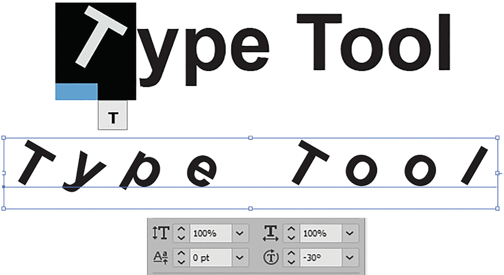
Character panel settings for character rotation
Variable Font

Character and Control panels’ settings for the variable font options, and menu
This will include the slider settings for Weight, Width, and Slant; some variable fonts may even have additional options such as Optical Size.
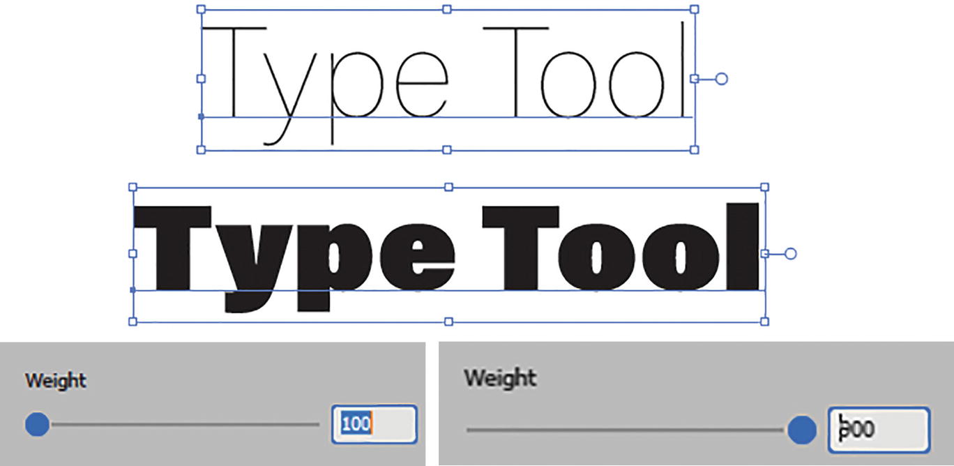
Examples of variable font weight with slider settings
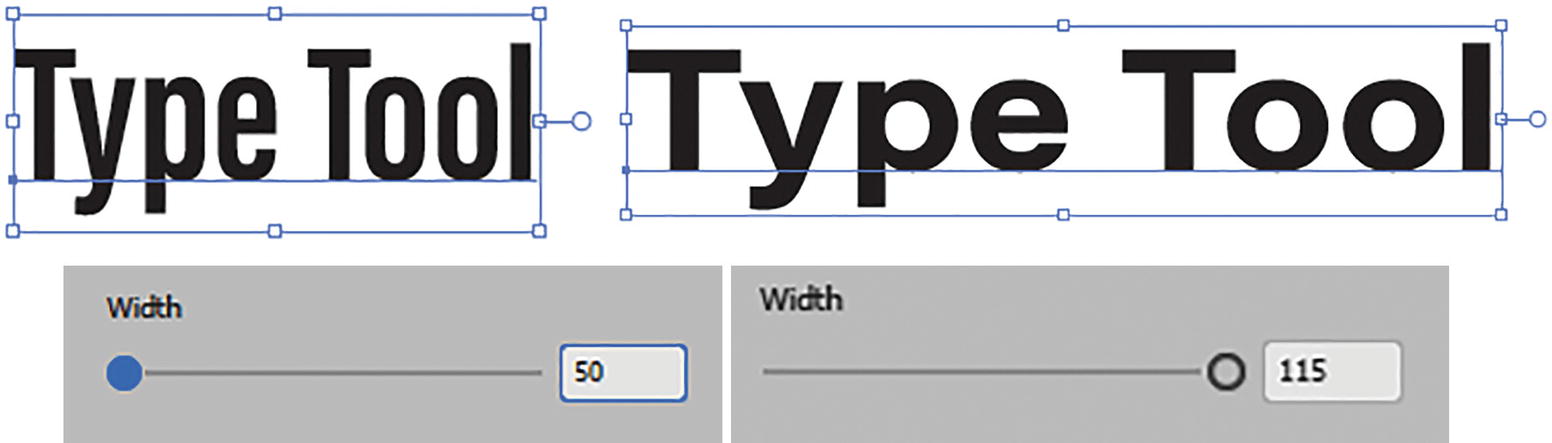
Examples of variable font width with slider settings
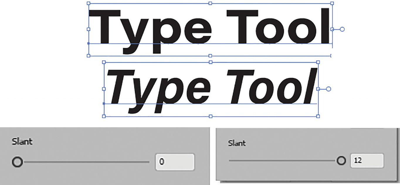
Examples of variable font slant with slider settings
Returning to the Arial font and the Control and Character panels, as mentioned, if you need more details on additional settings for all caps or superscript and subscript in the panel, you can refer to https://helpx.adobe.com/illustrator/using/formatting-type.html.

Character panel additional Character settings
We will come back to the Character panel again later in the chapter.
Open Type Panel

Photoshop Character panel and some of those settings found in the Illustrator OpenType panel
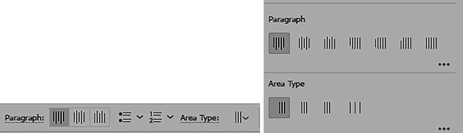
Paragraph
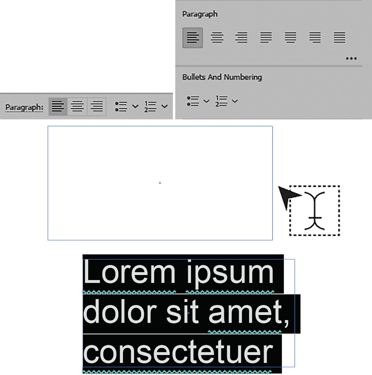
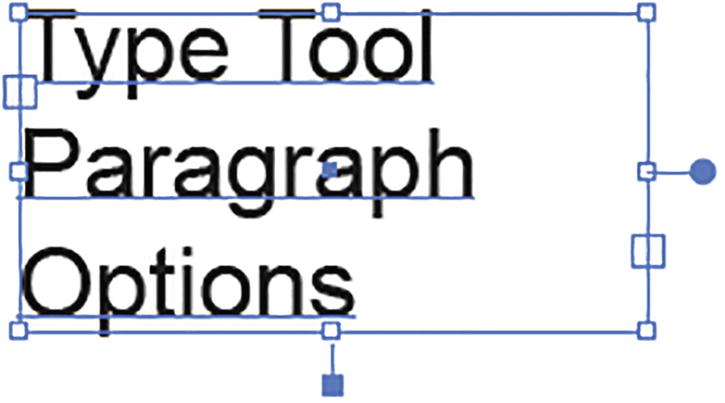
Control panel and Properties panel Paragraph settings; a type area drawn out with the Type tool and filled with highlighted placeholder text

Type some new text in the type area

Text area selected with the Selection tool
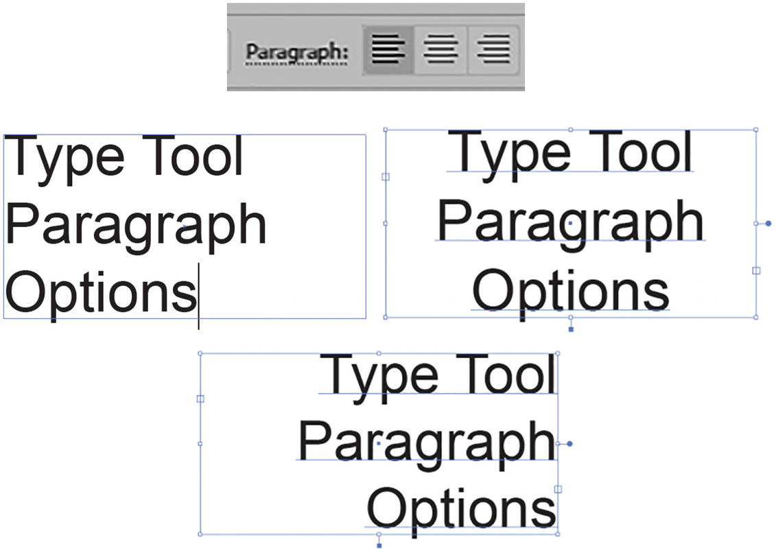
Setting the paragraph alignment using the Control panel’s three settings
By default, it is set to align left.
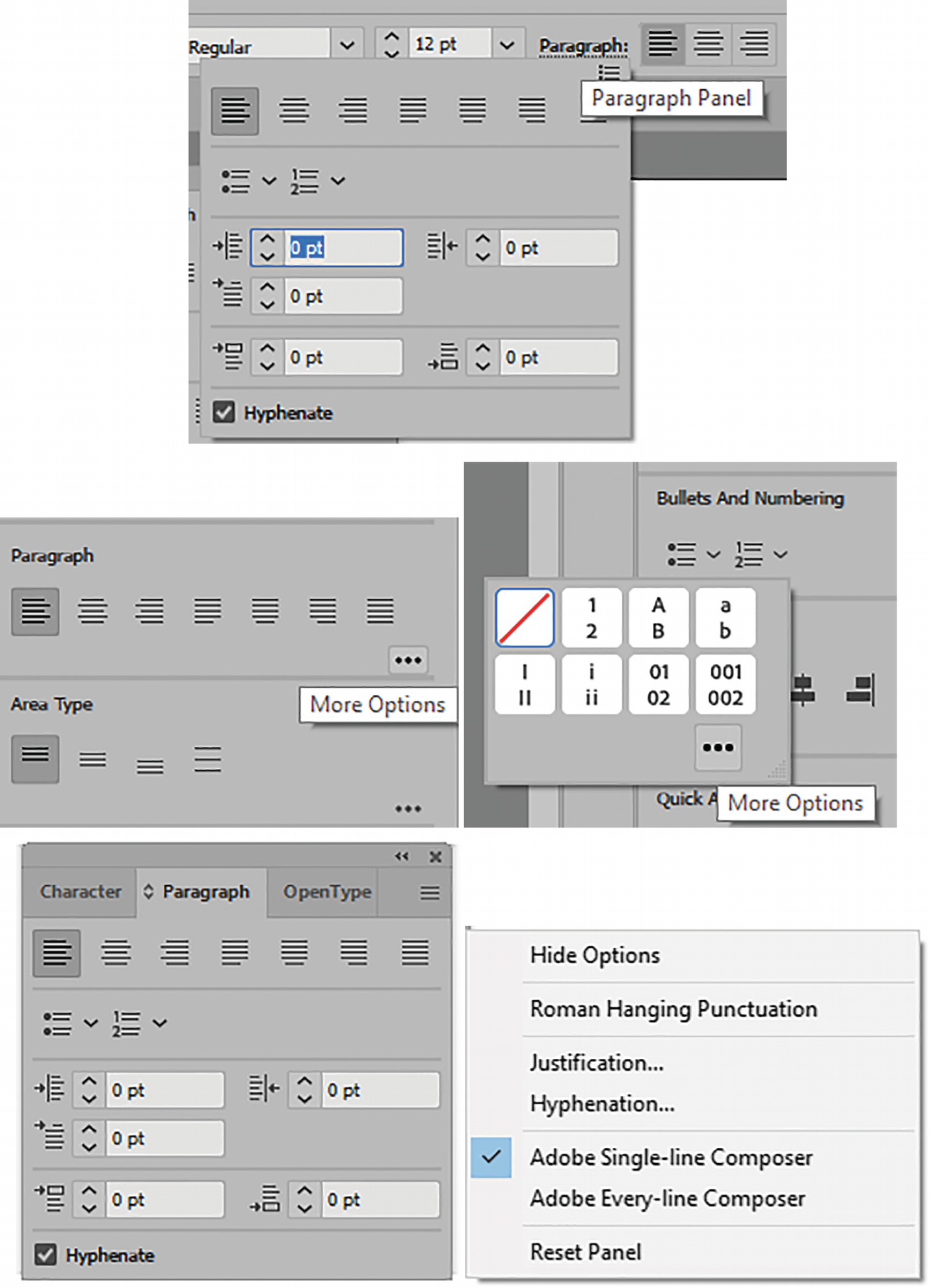
Accessing the Paragraph panel through the Control panel, Properties panel, and the Paragraph panel with its menu options
New options have now been added to the Paragraph panel that make creating either bulleted or numbered lists with your highlighted text easier; these additional options can be found when you click on the ellipses. Refer to Figure 10-49.
For more details on working with the Paragraph panel, you can visit the following:
https://helpx.adobe.com/illustrator/using/formatting-paragraphs.html
https://helpx.adobe.com/illustrator/using/bullets-numbering.html
Area Type
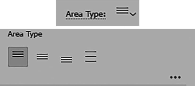
Control panel and Properties panel Area Type settings
These are used to control the spacing of the type within the area of box, and we will look at that in more detail when we look at the Area Type tool in the next section.
Make Envelope

Warp options in the Control panel for Make with Warp and Make with Mesh, their dialog boxes, and a preview of the type
Align
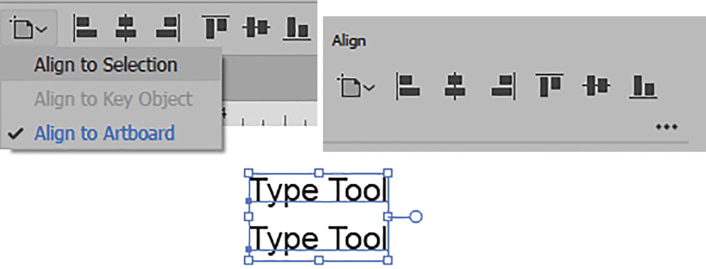
Control panel Align options for selected type while selected with the Selection tool
While text is selected with the Selection tool, you can Alt/Option-drag to create a copy, and then you can Shift + Click to select each text and choose an Align option.
Transform
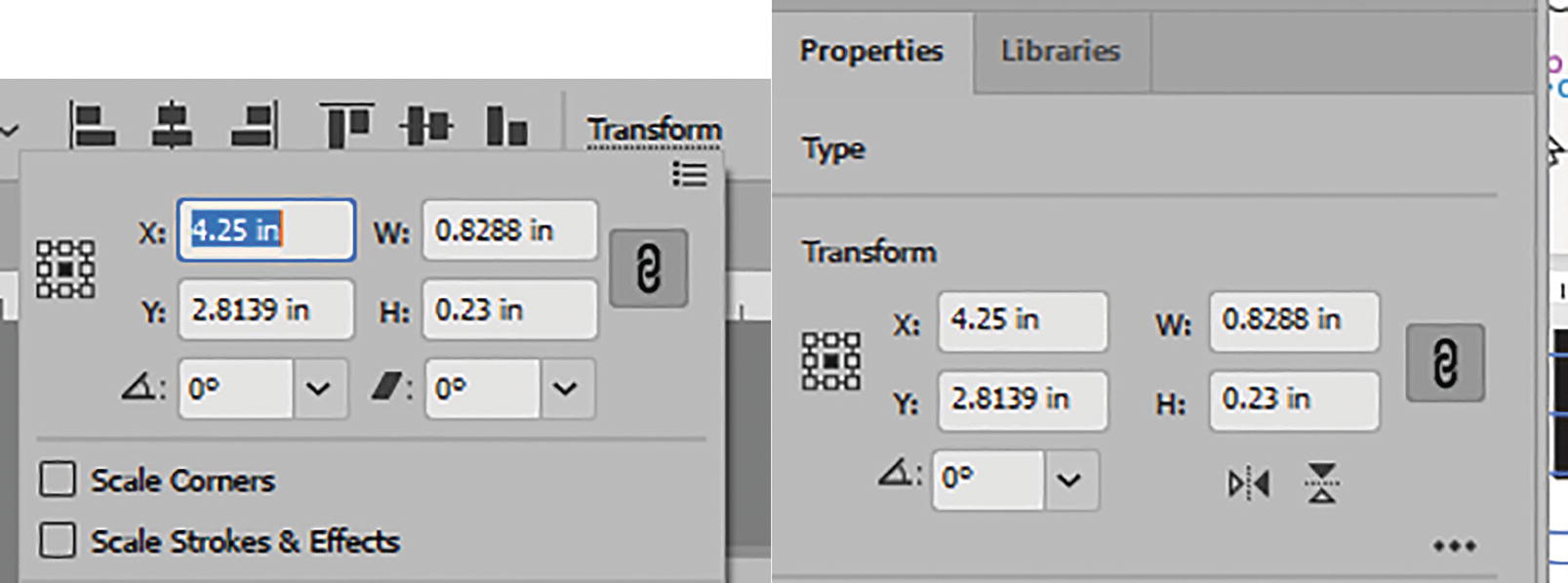
Control panel Transform options for selected type
Many of the same options you saw when working with paths in Chapters 2 and 3 apply to type as well.
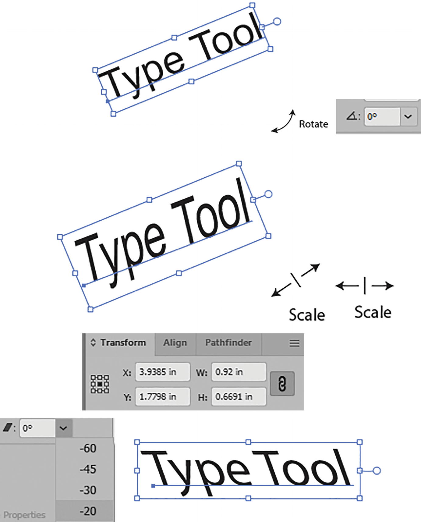
Use the Transform panel options and bounding box handles to rotate, scale, and shear
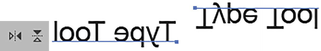
Use the Properties panel to flip the type
Selected type in bounding box
Changing Text Color
Changing a single text color line using the Control panel

In the Control panel a setting of mixed fill colors with a [?]
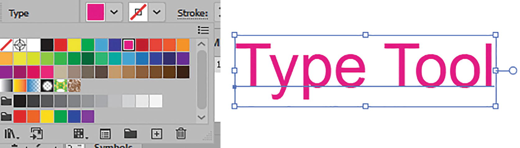
Setting the same color using the Control panel for all the selected type
Type can be set to a solid or patterned swatch, but not directly to a gradient swatch. We will see how to do that later, in Chapter 11.
Glyphs Panel

Glyphs panel and changing a highlighted character with the Type tool and panel

Undo the last change to the highlighted letter
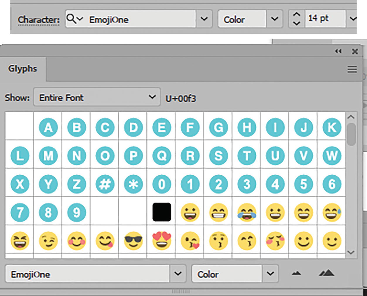
Use the Control panel and Glyphs panel to locate color fonts
Resetting Character, Paragraph, and Open Type Panels

Use the menu in the Character, Paragraph, and OpenType panels to reset the options
If you want to know how to save your Character and Paragraph settings as styles for the Libraries panel, you can check out https://helpx.adobe.com/illustrator/using/character-paragraph-styles.html.
Vertical Type Tool

Toolbars panel Vertical Type tool

Click on the Artboard with the Vertical Type tool to add some text, and type when highlighted
Use the Vertical Type tool to create a text area for larger amounts of text
The type flows backward, and, as mentioned, it is meant for Asian characters. Refer to Figure 10-67.
Control panel and Property panel settings for vertical type in Paragraph and Area Type menus
Vertical Type settings in the Character and Paragraph panels

Make Envelope options in the Control panel and Warp Options dialog box with preview of type
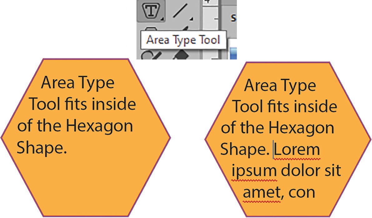
Area Type Tool and Vertical Area Type Tools
Area Type for type

Point type converted to area type
Double-clicking on it again will set it back to point type (Type ➤ Convert to Point Type).
Adjust the area where the box is overflowing, and expand the text area

Control panel Type Area options, and examples of Top, Center, Bottom, and Justify
Toolbars panel Tools Area Type tool and Vertical Area Type tool
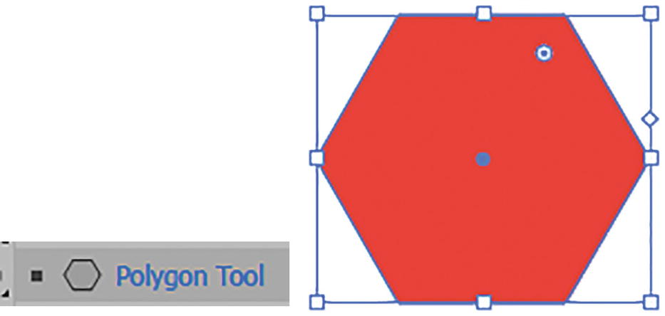
Toolbars Polygon tool with created polygon

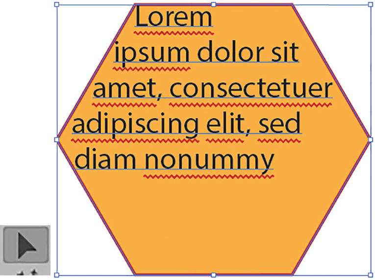
Use the Area Type tool or Vertical Area Type tool to click on a path to create an area

Adjust the color and stroke of the selected path area by first selecting the path with the Direct Selection tool. Note that it should say “Anchor Point” in the Control panel. Using the Appearance panel, set the new fill and stroke colors
Expand the type area using the Selection tool

Use the Area Type tool to highlight the text and the Control panel to reduce the font size

Adjusting text using the Vertical Area Type tool
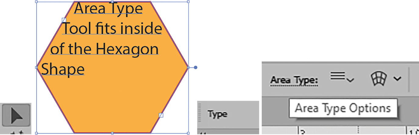
Select the type area and access the Area Type Options from the Control panel
Area Type Options
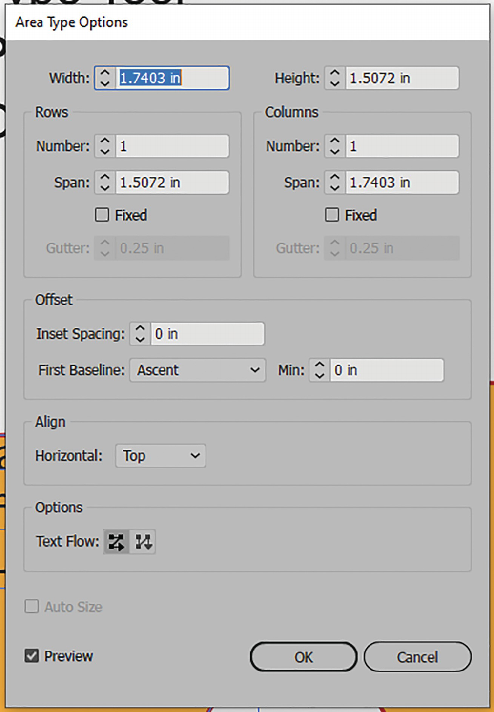
Area Type Options dialog box

Area Type Options dialog box, set the width and height and preview the result

Area Type Options dialog box; set the Rows options and preview the result
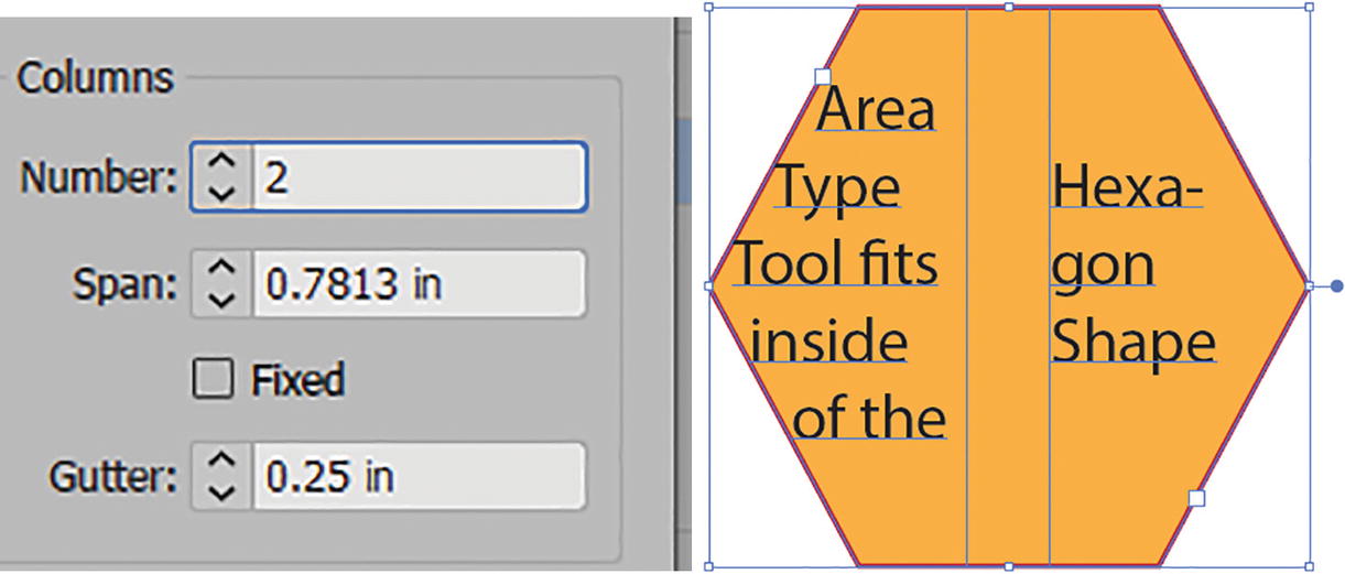
Area Type Options dialog box; set the Columns options and preview the result

Area Type Options dialog box, set the row and column options and preview the result

Set back to one row and one column and preview the result in the text area

Area Type Options dialog box Offset settings

Preview the result of altering the inset spacing

Area Type Options dialog box, First Baseline settings

Area Type Options dialog box, First Baseline settings with Min setting and preview

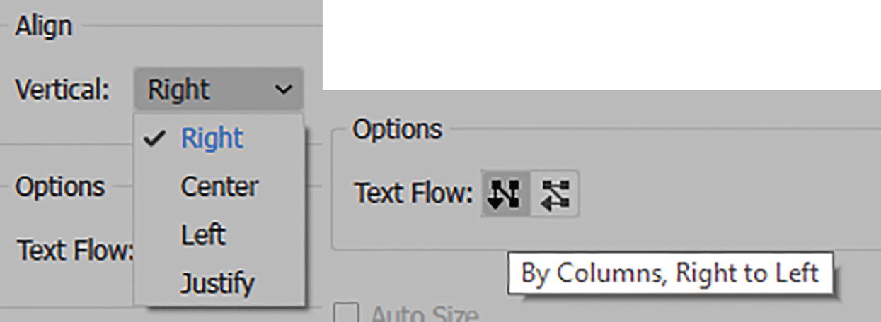
Area Type Options dialog box Align settings and options
Leave set to Horizontal Top.
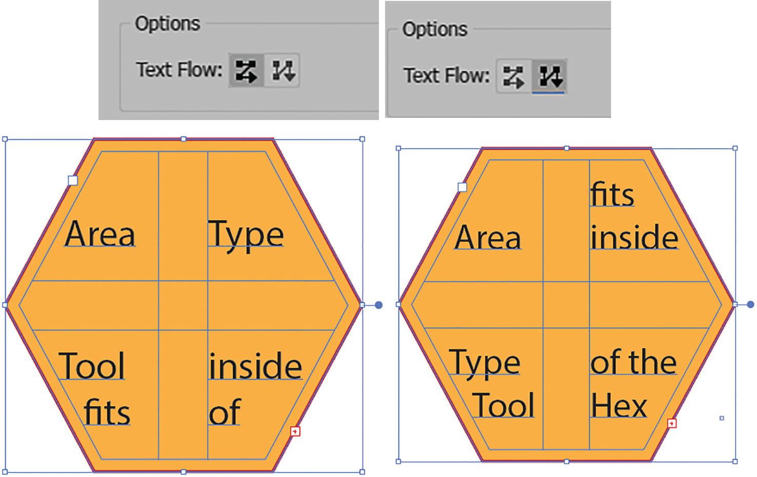
Area Type Options dialog box options for text flow and preview

Click OK to exit the Area Type Options dialog box and review the result
For the Vertical Area Type tool, the Area Type Options are the same, except for Align Vertical (Right, Center, Left, and Justify) and the Text Flow options, which are now By Columns, Right to Left and By Rows, Right to Left. Refer to Figure 10-96.
Area Type Options for Vertical Area Type tool
For more detail on Area Type options, visit https://helpx.adobe.com/illustrator/using/manage-text-area.html.
Additional Tips for Working with the Area Type Tools
Add additional placeholder text to the type area with the Area Type tool
Or, type your own text to fill the space.

Adjust the threading of text between two type areas

Type ➤ Threaded Text menu options
Use Edit ➤ Undo or use the History panel if you need to undo a step while working with these options.
Project: Text Wrap Around a Shape with Type Area
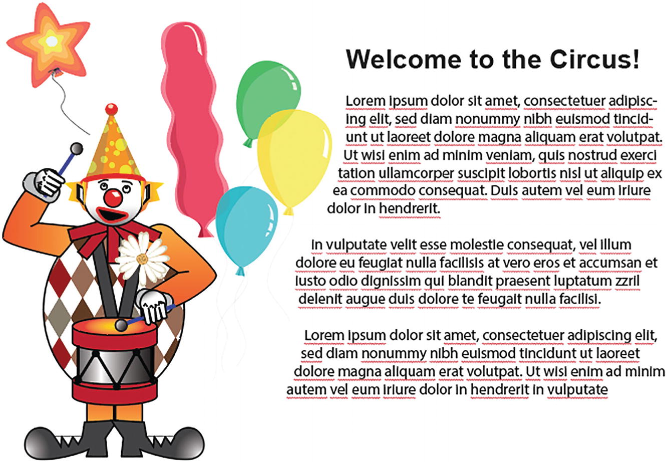
Image of clown with text wrapping around one side of the image
There are two ways of creating a text wrap, and you may prefer one over the other, depending on your project.
Text Wrap Option 1
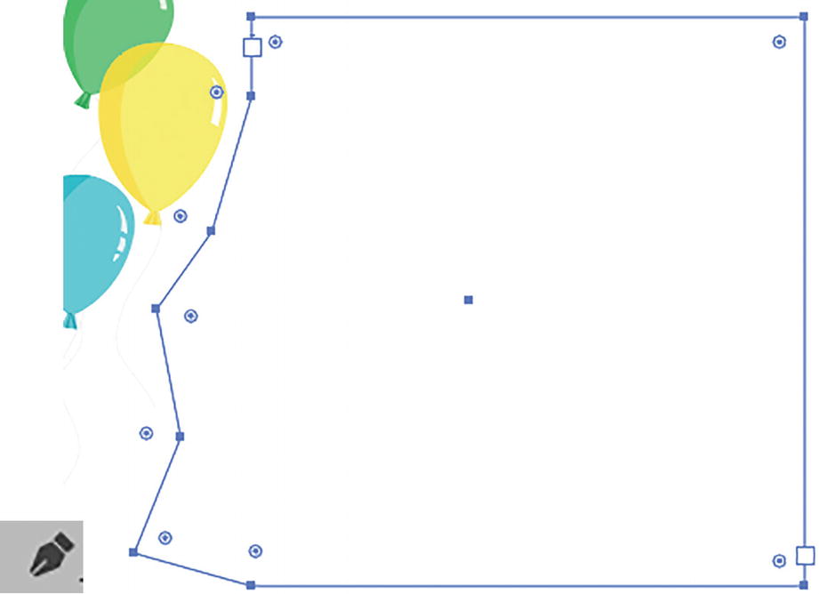
Use the Pen tool to create a potential type area

Use the Area Type tool to fill the area with placeholder text and format it

Toolbars panel Add Anchor Point tool and Direct Selection tool
Text Wrap Option 2

Use the Type tool to create a text area and placeholder text, then size it and place it behind the clown

Use the Selection tool to select both the clown and text and use the Object ➤ Text Wrap ➤ Make command

Info alert message that appears before you see the text wrap and result

Text Wrap Options dialog box with info alert
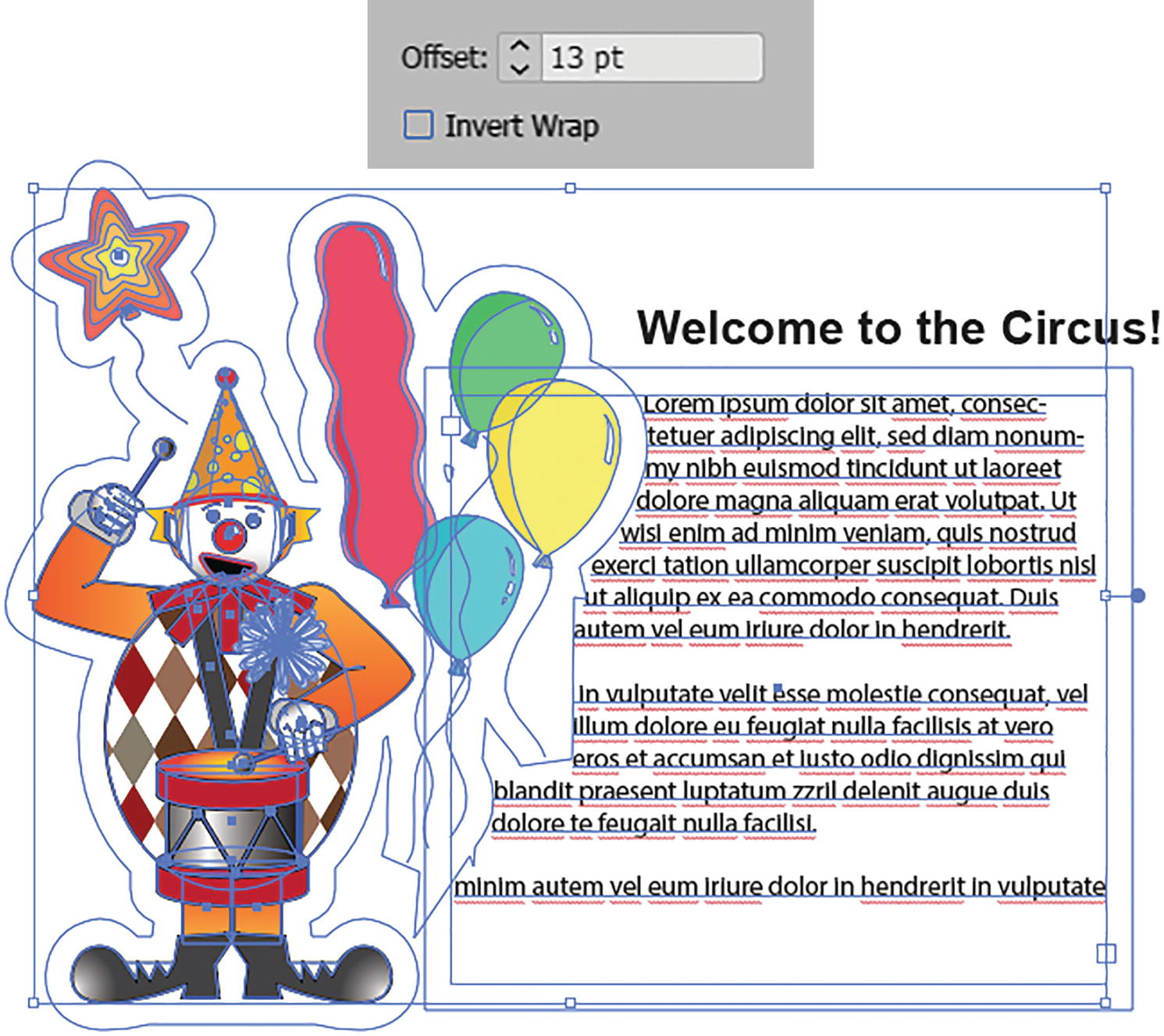
Offset setting for text to wrap around clown grouped object
Now the text flows around the balloons more evenly. Refer to Figure 10-108.
If you need to release a wrap, make sure that both the grouped object and the text are selected, and then choose Object ➤ Text Wrap ➤ Release. Refer to Figure 10-109.
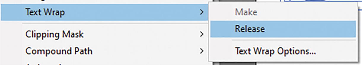
Additional Object ➤ Text Wrap commands
Both must also be selected if you need to fix your Text Wrap options.
Type on a Path Tool and Vertical Type on a Path Tool
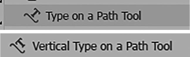
Toolbars panel Type on a Path and Vertical Type on a Path tools
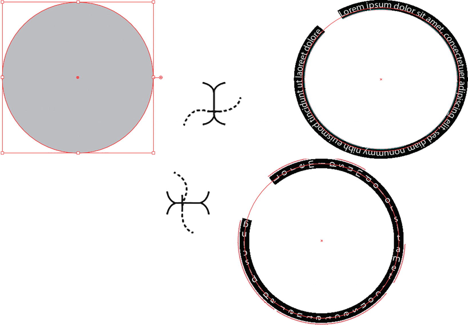
Click on the edge of a shape with either the Type on a Path tool or Vertical Type on a Path tool to see the placeholder text go around the path
Path with new text typed, and then highlighted and adjusted using the Control panel
Like when adding an area with the Area Type tools, the original stroke and fill colors disappear once the text is on the path.
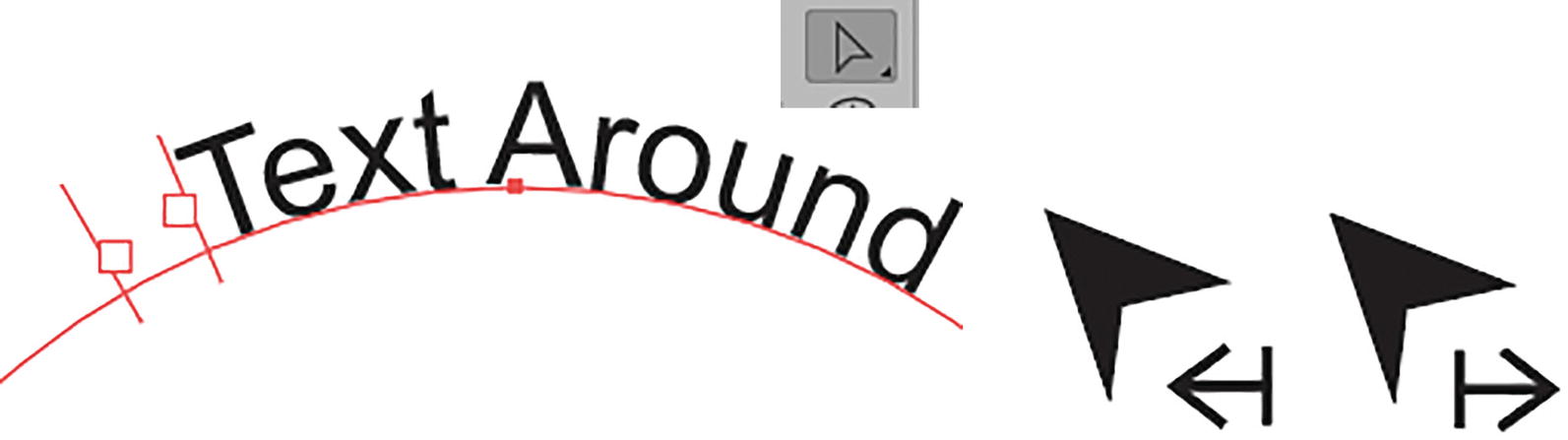
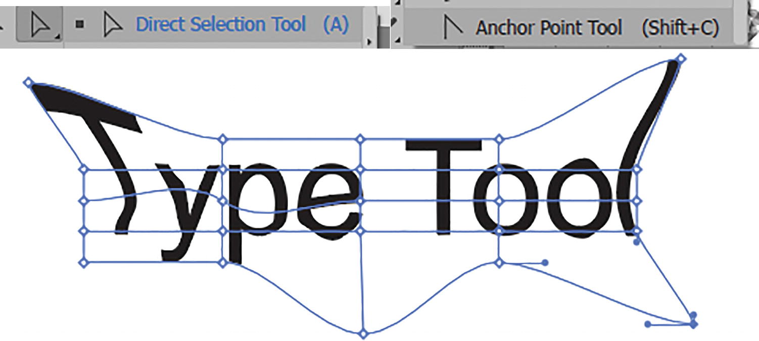
Use the Direct Selection tool to adjust the brackets on the path
While doing this, do not click on the squares, as this will cause you to switch back to the Text tool and create a potential text thread, which you do not want to do. If this happens, Edit ➤ Undo right away, or use the History panel, and then choose the Direct Selection tool again. Refer to Figure 10-113.

Adjust the center bracket on the path to move it from outward to inward
Hold down the Ctrl/CMD key if you do not want the text to flip while you drag and rotate with the center bracket.
Type on a Path Options
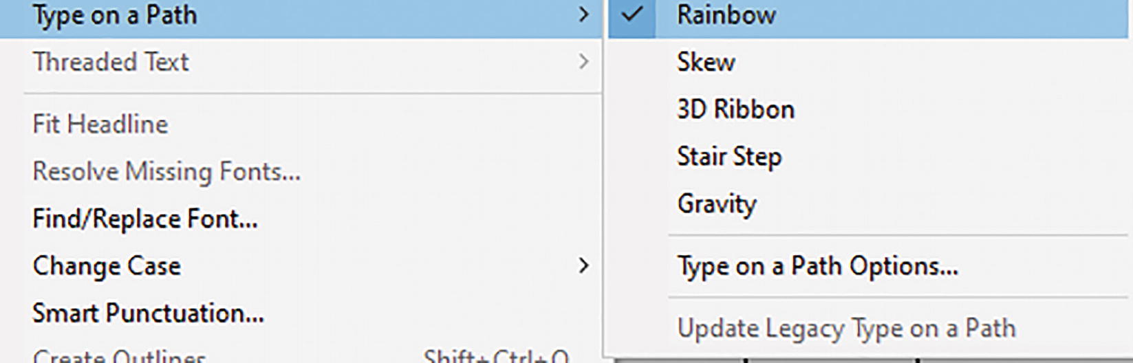
Type ➤ Type on a Path menu commands
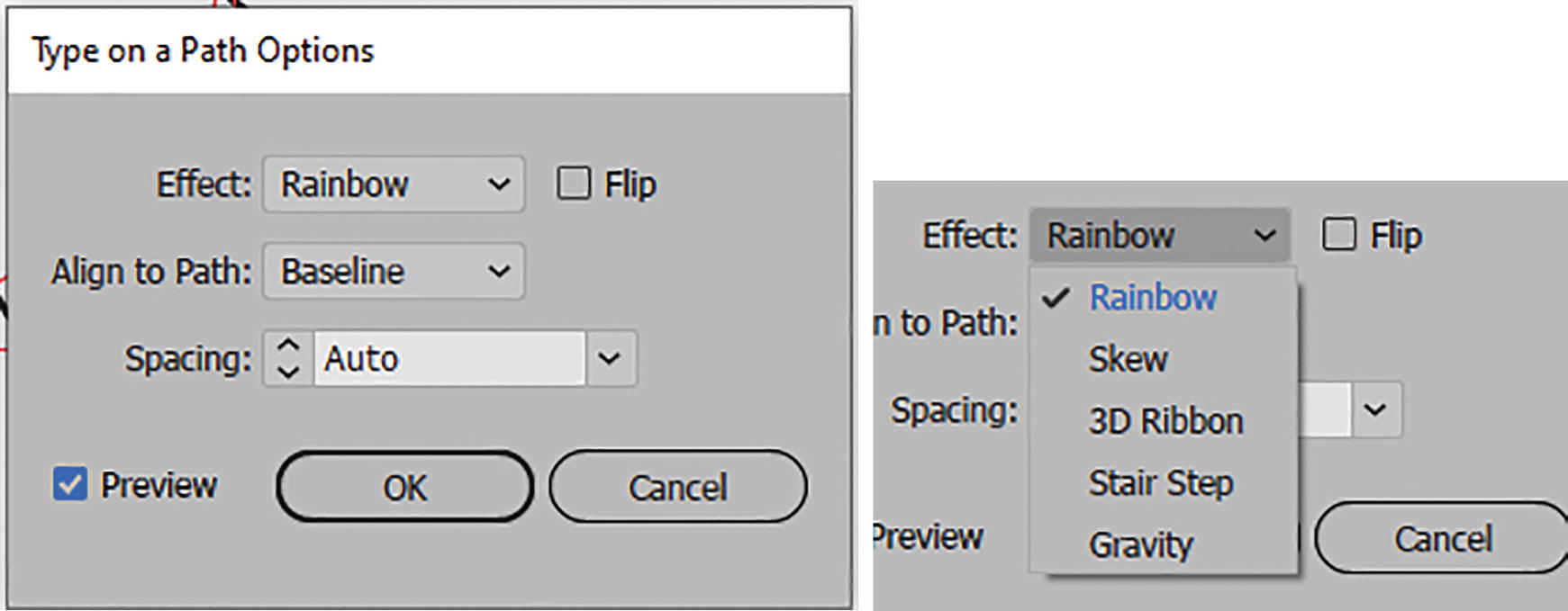
Type on a Path Options dialog box with Effect menu
In the dialog box, make sure Preview is enabled. Try several Effect options, which are also in the Type on a Path menu. Refer to Figure 10-116.

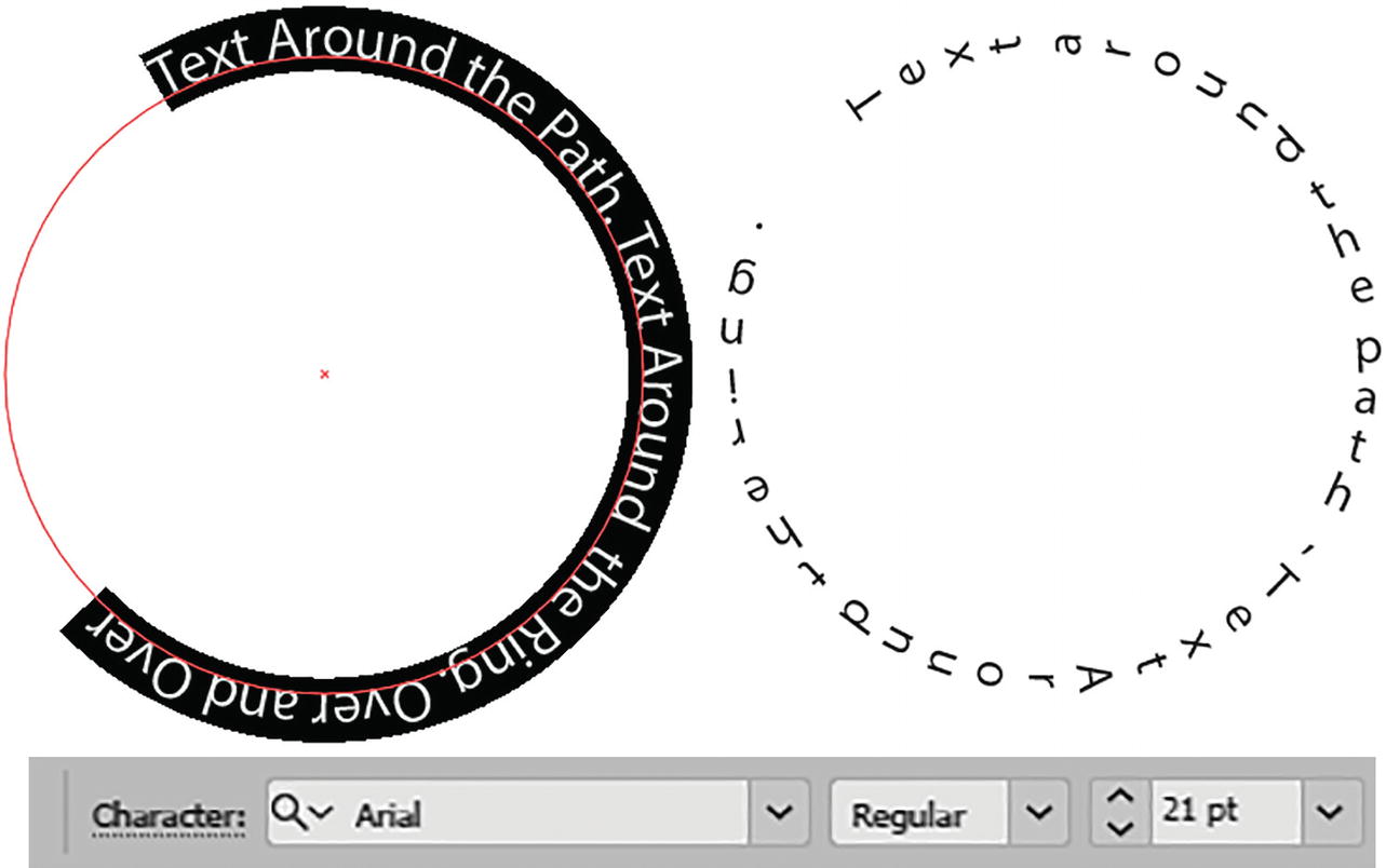
Type on a path with the Rainbow effect

Type on a path with the Skew, 3D Ribbon, Stair Step, and Gravity effects
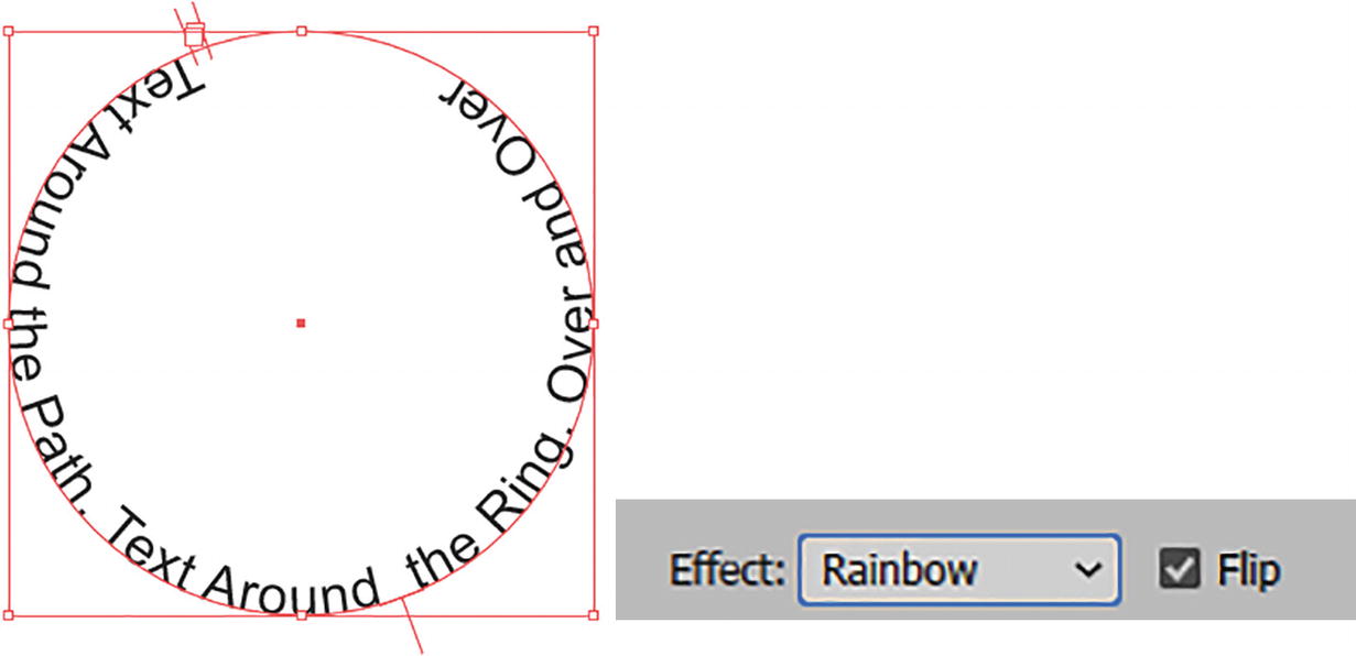
Type on a Path with the Rainbow effect and Flip setting enabled
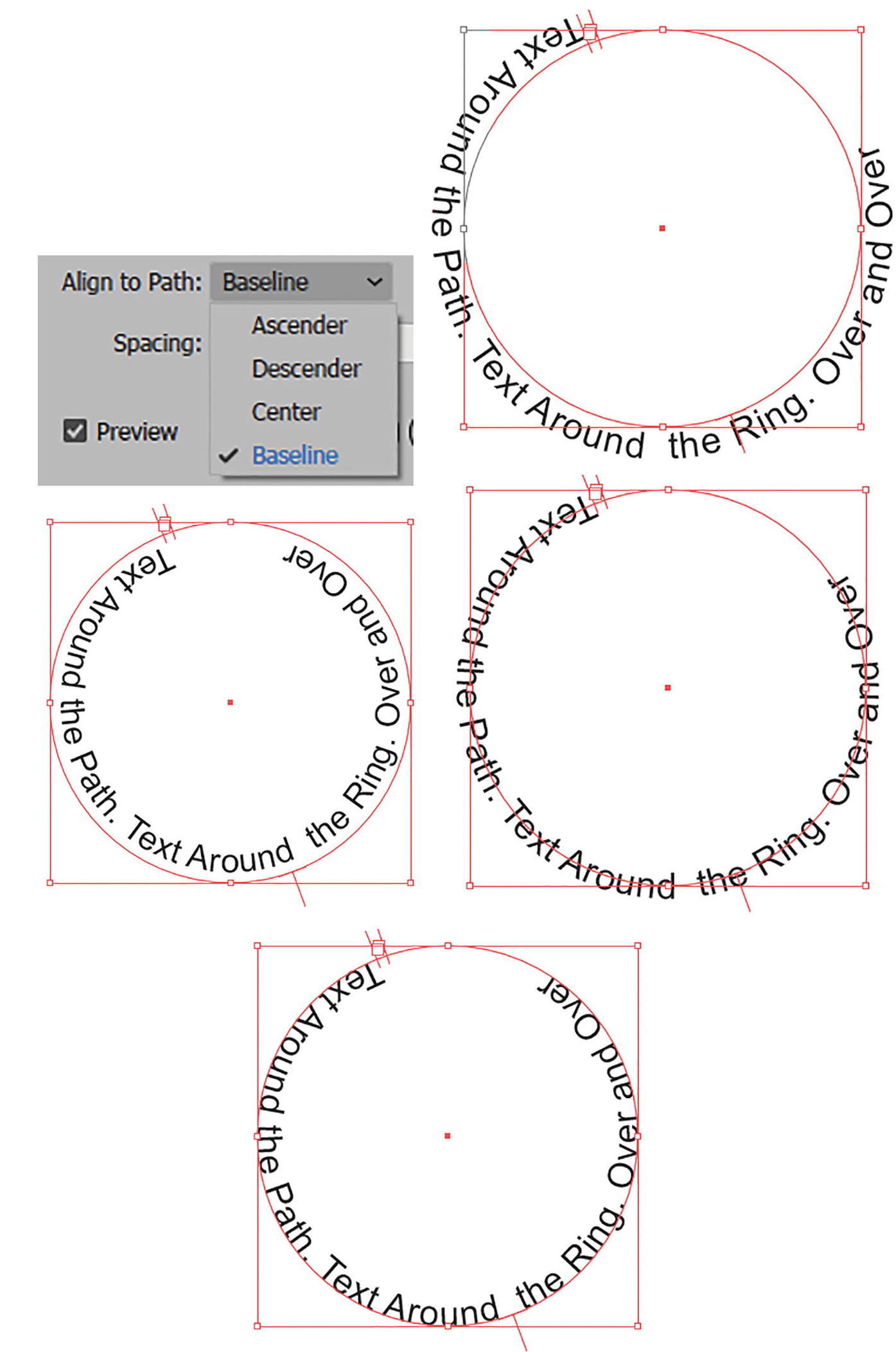
Type on a Path with Align to Path options of Ascender, Descender, Center, and Baseline
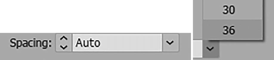
Type on a Path Spacing options
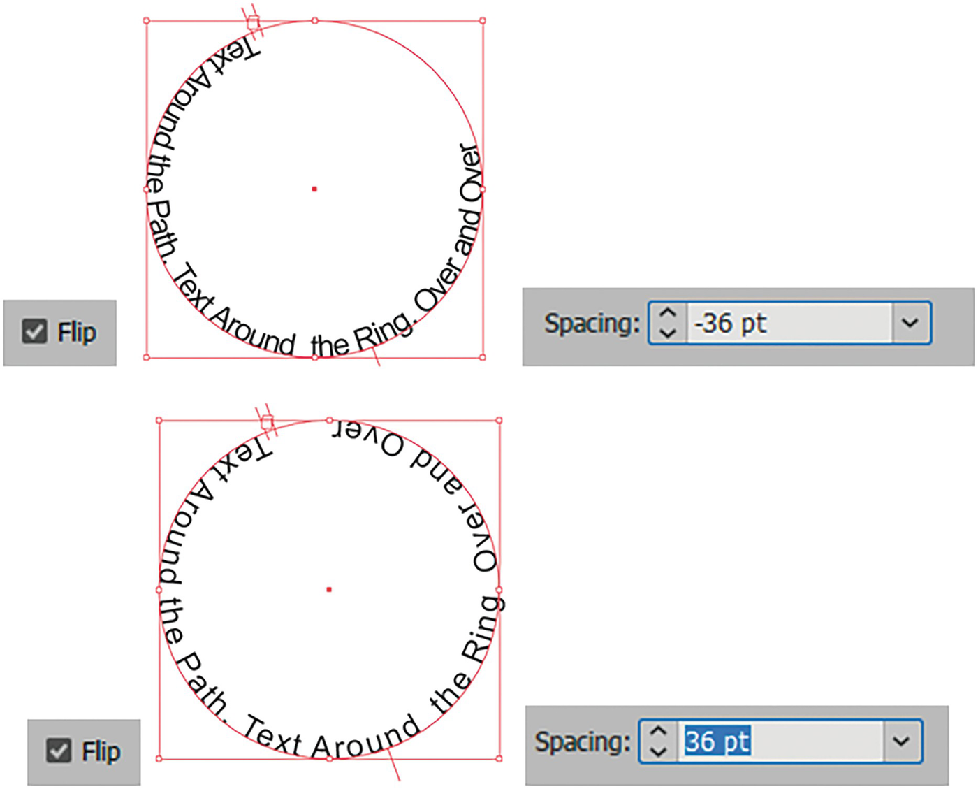
Type on a Path Spacing options, negative and positive, with flip enabled
However, when Flip is disabled then the opposite is true of the spacing; with negative numbers the spacing is more spread out and with positive numbers it is closer.
Click OK to exit the Type on a Path Options dialog box
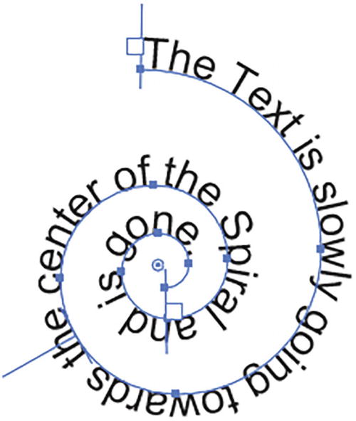
Type on an open path created with the Spiral tool
Further details on this dialog box can be found here: https://helpx.adobe.com/illustrator/using/creating-type-path.html.
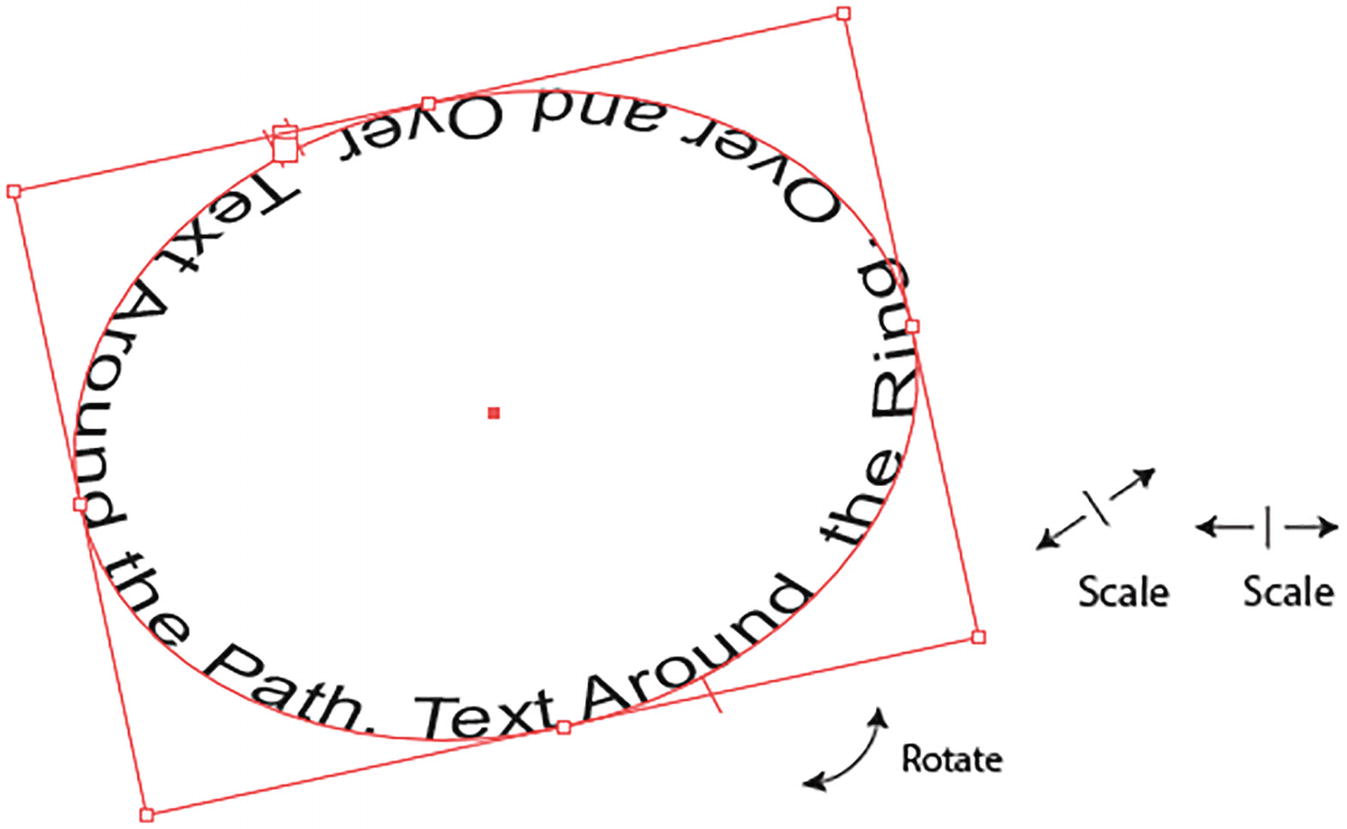
A path selected with the Selection tool can be rotated and scaled
You can also use the Envelope Warp options, like Make with Warp, in the Control panel for additional warping effects of the path. Refer to Figure 10-126.

You can warp a path further with the Control panel and Envelope Warp options
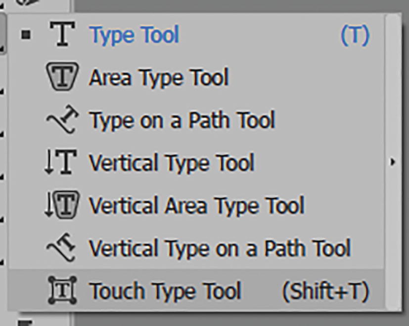
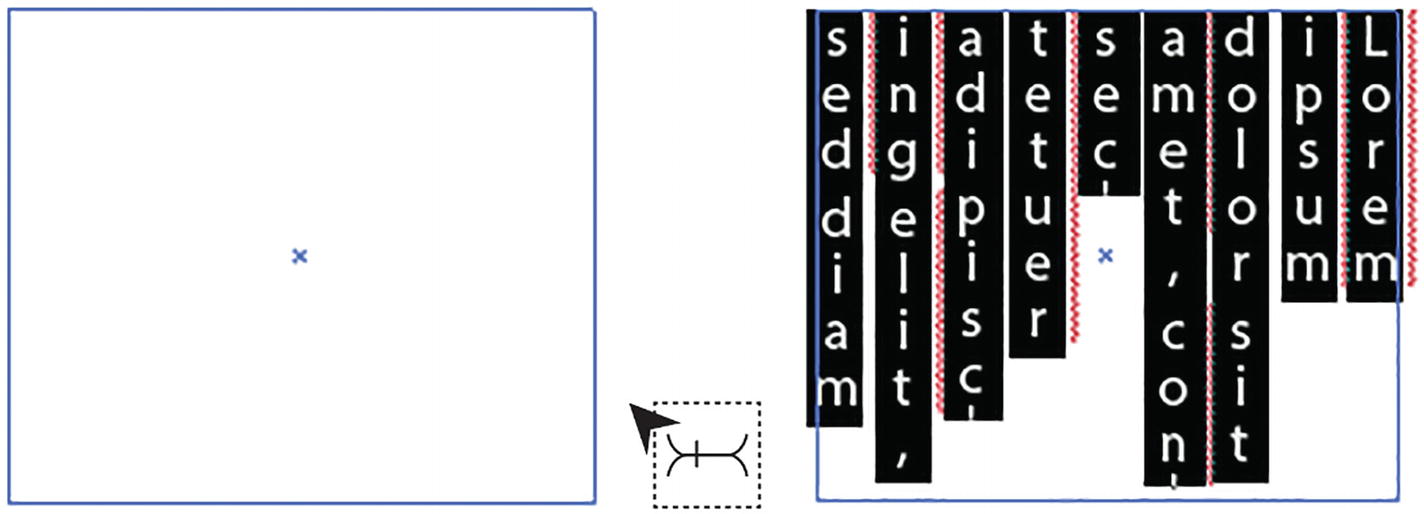
Touch Type Tool (Shift + T)

Toolbars panel Touch Type tool

Rotating, moving, and scaling a single character in a line of type
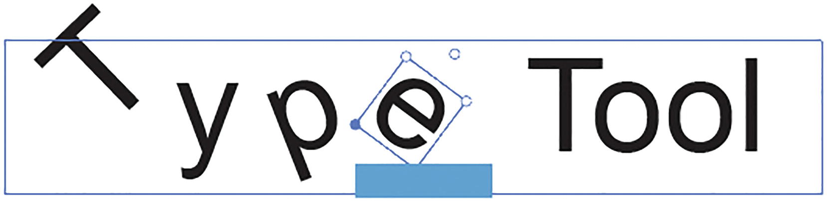
Other characters selected and adjusted on the line of type
These settings will be reflected in the Character panel.
Type into Outlines

Use the Expand dialog box to expand and make selected type into outlines
You can create outlines quickly using the Properties panel Quick Actions button. Refer to Figure 10-130.
You are sending the file to a print company or a client and are not sure if they have that font. You do not want them to get a missing font error message when they open the file. Refer to Figure 10-131.
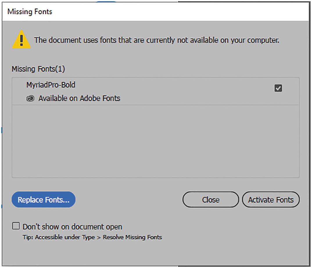
Missing Fonts dialog box that appears if fonts are missing when the document opens
Some of the warped design is going to be quite complicated, and you want to use the Puppet Warp tool we looked at in Chapter 4, or one of the Liquify tools we used in Chapter 5.
You want to add a gradient to the text, which you saw an example of in Chapter 9. To add a gradient to text it must first be made into an outline. Refer to Figure 10-132.

Text that is now an outline so that a gradient can be applied to the fill and stroke
However, warping as we saw with patterned text is fine. With the Envelope Mesh tool an outline is not required. For more information on how to add a gradient to type with graphic styles, see Chapter 11.
Project: The Juggling Clown Circus Tent Poster and Letters Around the Ring
In this project, we are going to warp some text on a poster in Illustrator, similar to how it might be done in Photoshop.
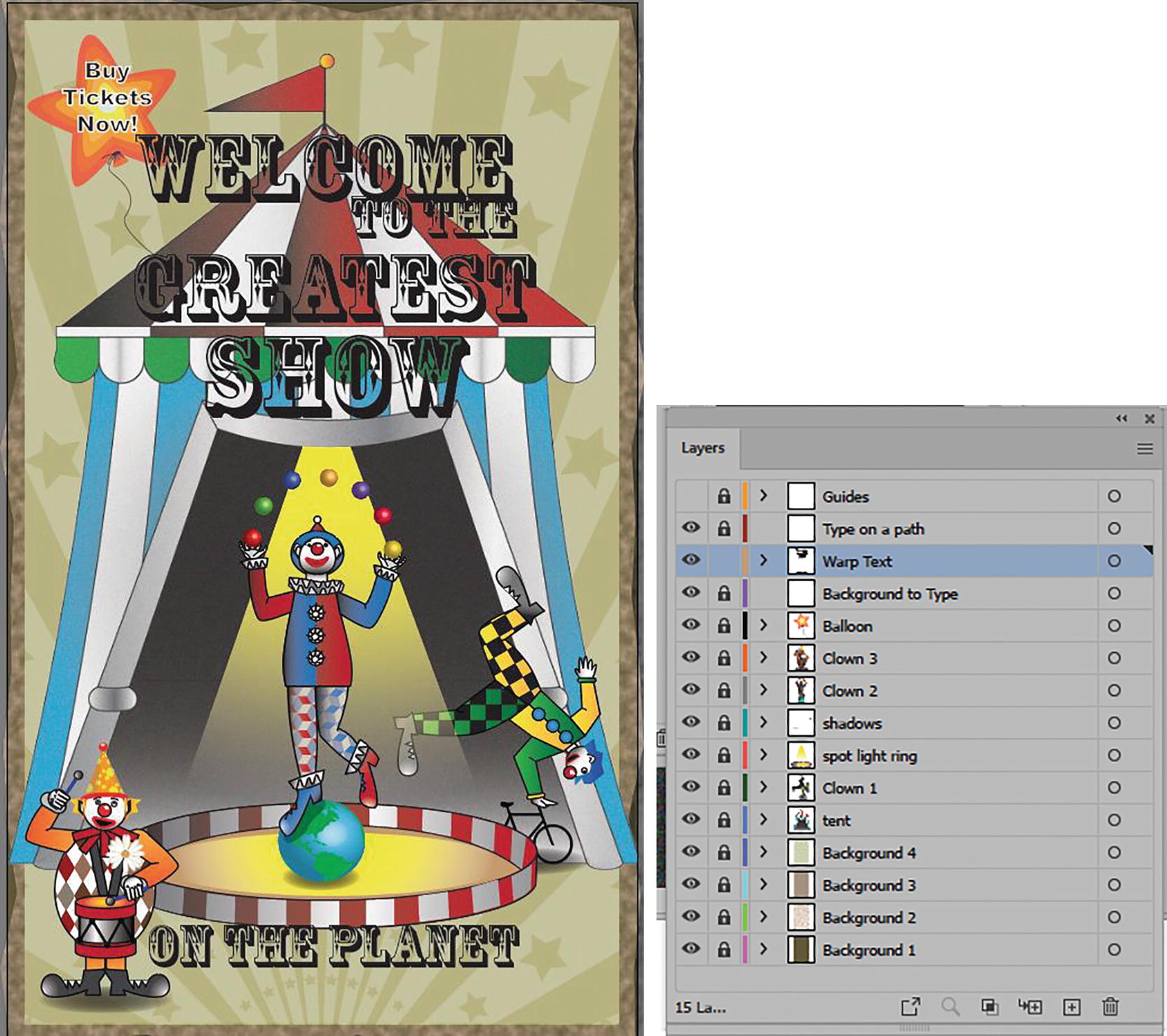
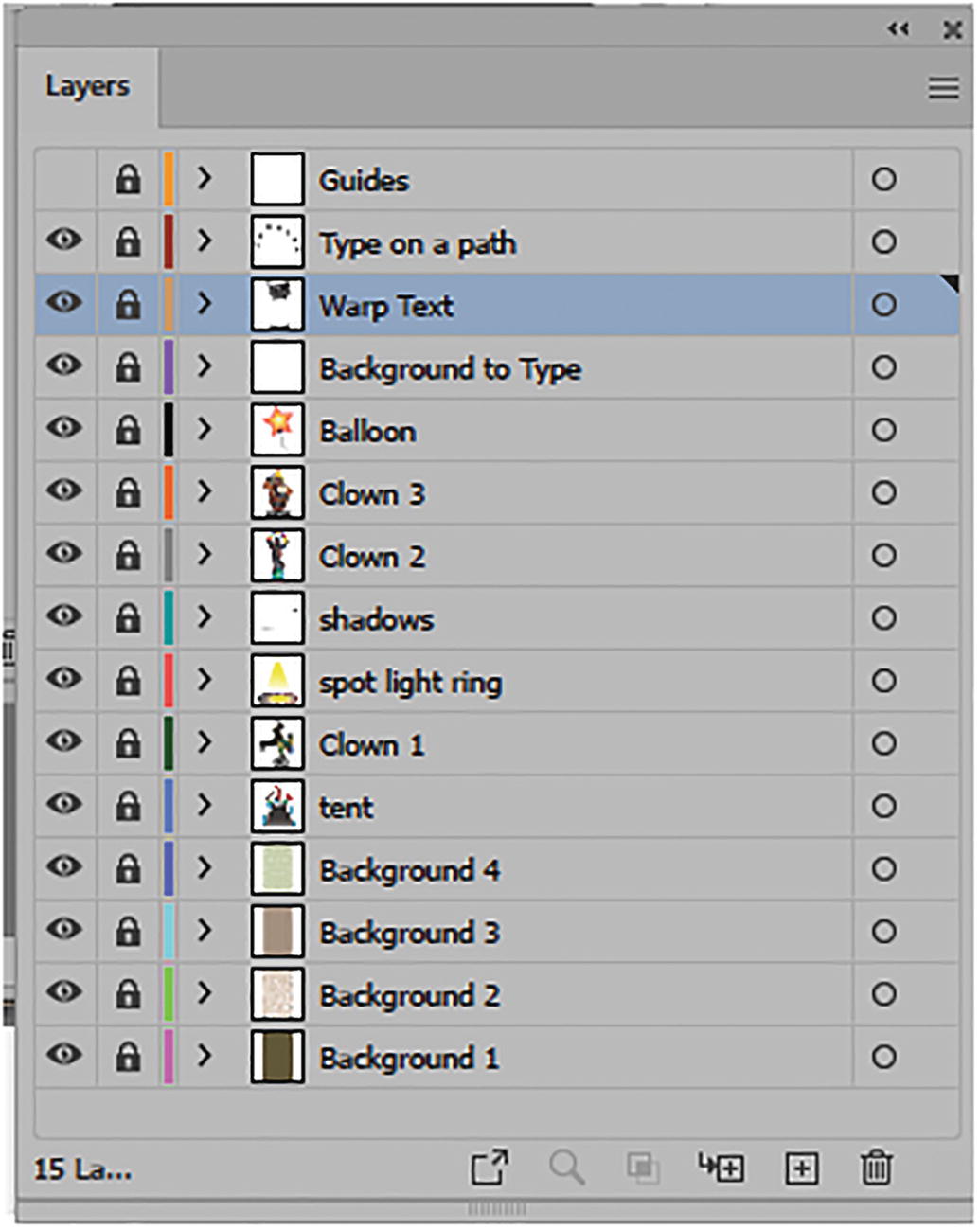
Circus poster with its many layers in the Layers panel
This example has quite a few layers. In this project, you are only going to be working with the type; however, feel free to explore the additional warp and pattern settings I used. Refer to Figure 10-133.
The layers in the Layers panel that we will be using to edit the type
Remember to use the Zoom tool and Hand tool (spacebar) if you need to navigate around the image. Refer to Figure 10-135.
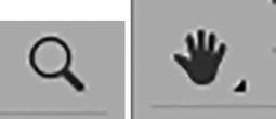
Toolbars panel Zoom tool and Hand tool
Envelope Warp Type
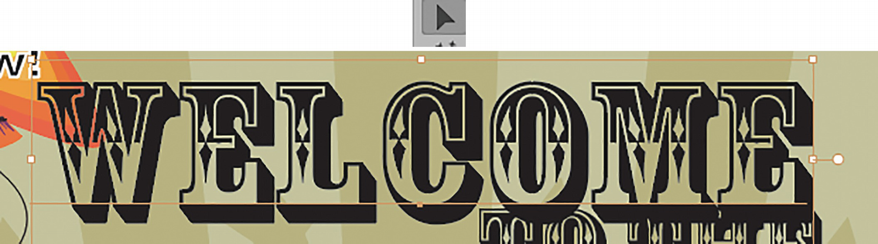
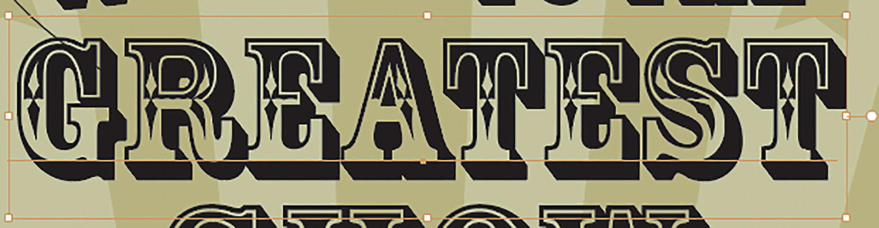
Select the text with the Selection tool
Control panel setting for text
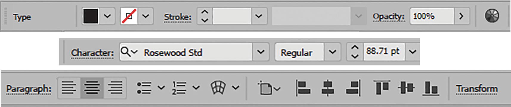
Current font family of Rosewood Std in the Control panel
The font is 88.71 pt, and the text for the paragraph is centered; all the following text is centered as well, though the text size will vary. Refer to Figure 10-137.

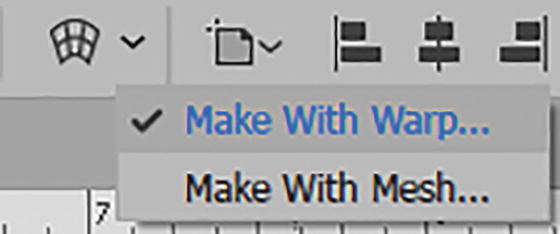
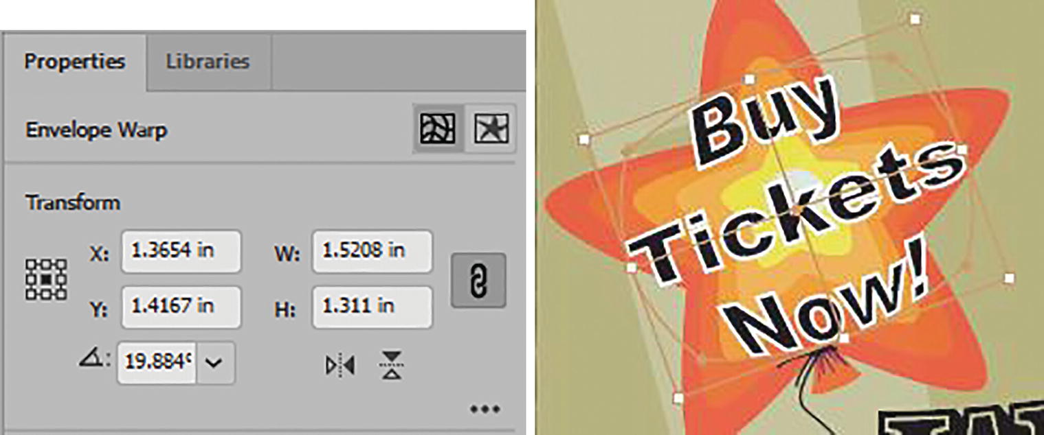
In the Control panel, use the Make with Warp setting
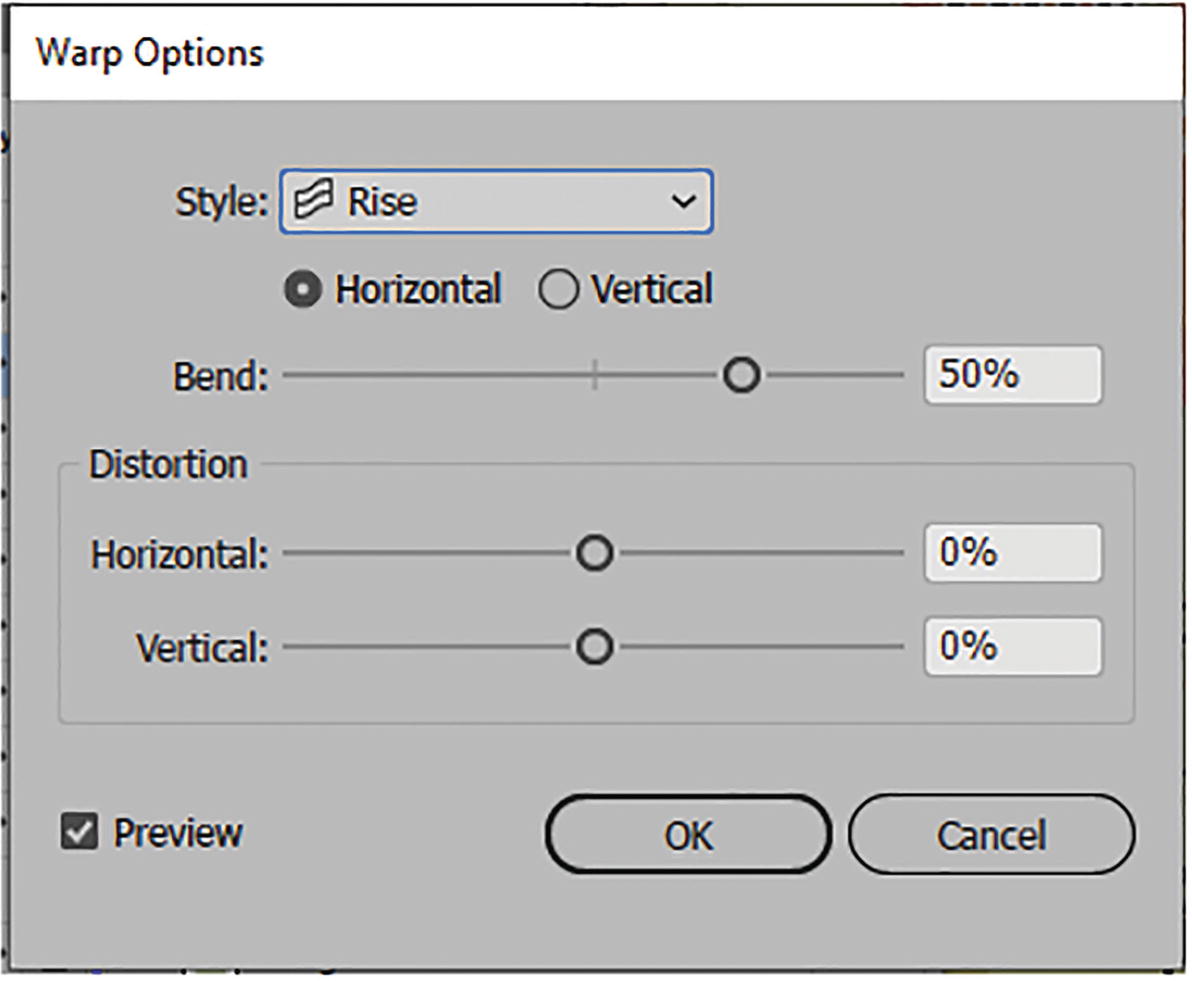
Warp Options dialog box

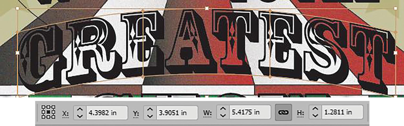
Warped text and Edit Envelope mode in the Control panel
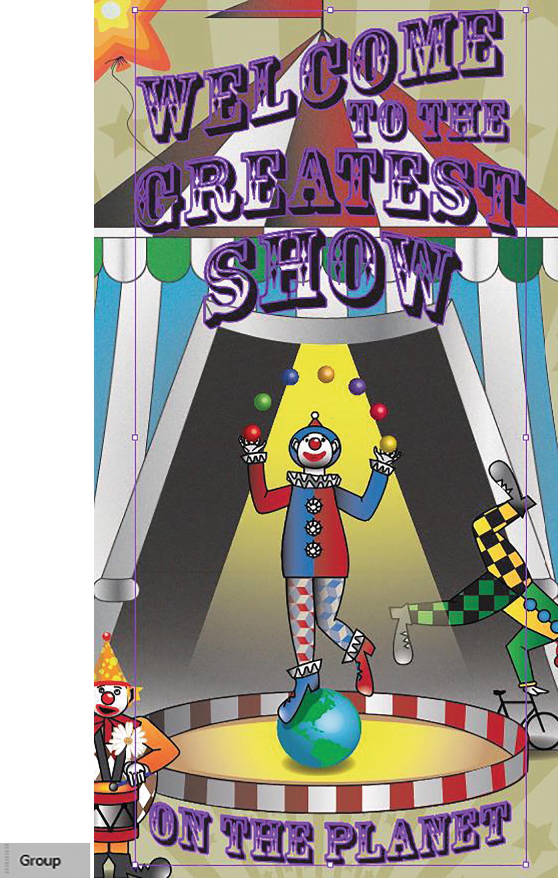
Use the Selection tool to move the text up a bit so that it sits near the top of the tent.

Text on the page and its coordinates and size settings in the Control panel
Now, skip over the words “TO THE,” as we will not be editing them yet.
Select the text with the Selection tool
In the Control panel use the Make with Warp setting

Warp Options dialog box

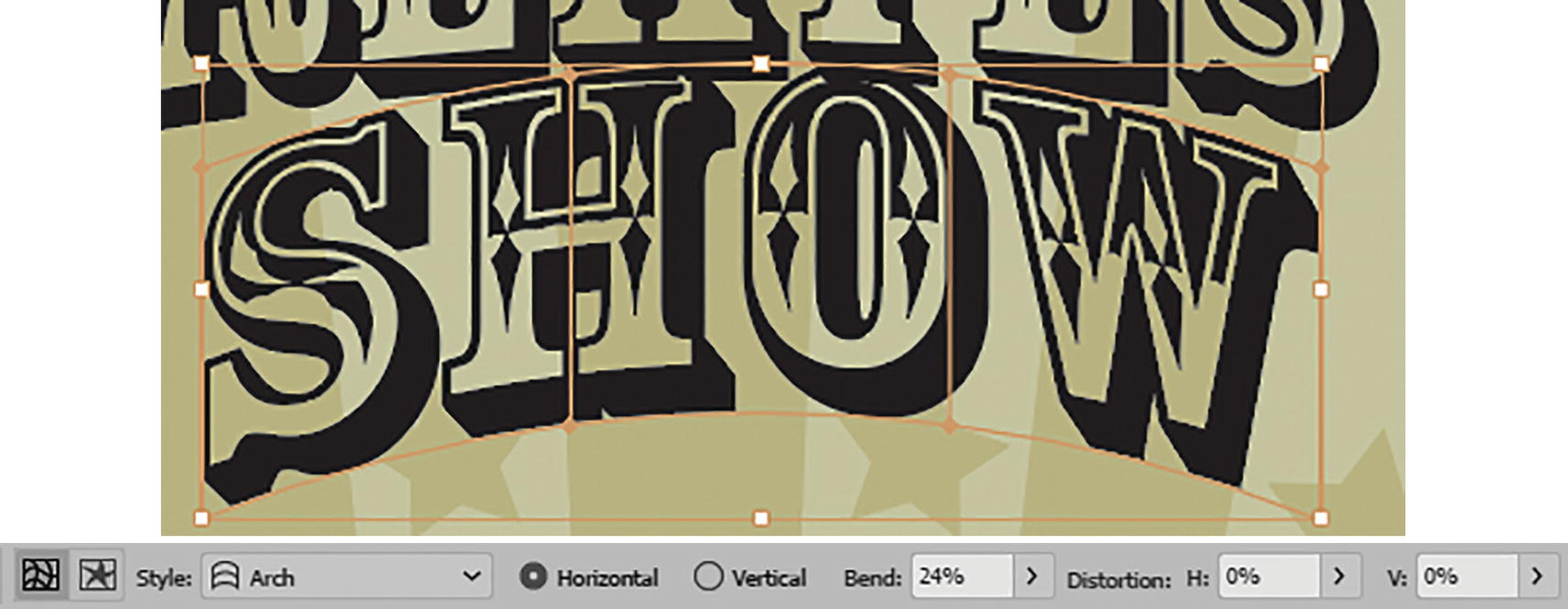
Warped text and Edit Envelope mode in the Control panel
The text now appears on the poster, distorted, and you can see the settings in the Control panel. Refer to Figure 10-146.
Text on the page and its coordinate and size settings in the Control panel
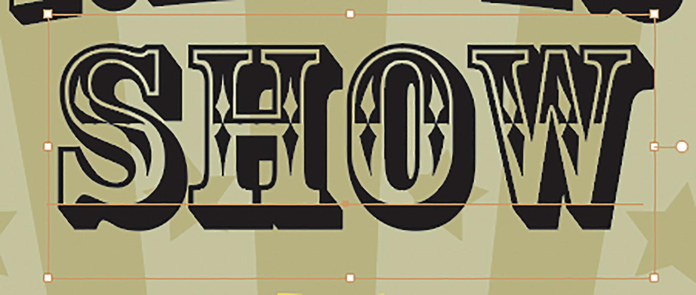
Select the text with the Selection tool

In the Control panel use the Make with Warp setting

Warp Options dialog box
Warped text and Edit Envelope mode in the Control panel

Text on the page and its coordinate and size settings in the Control panel

Select the text with the Selection tool

In the Control panel, use the Make with Warp setting
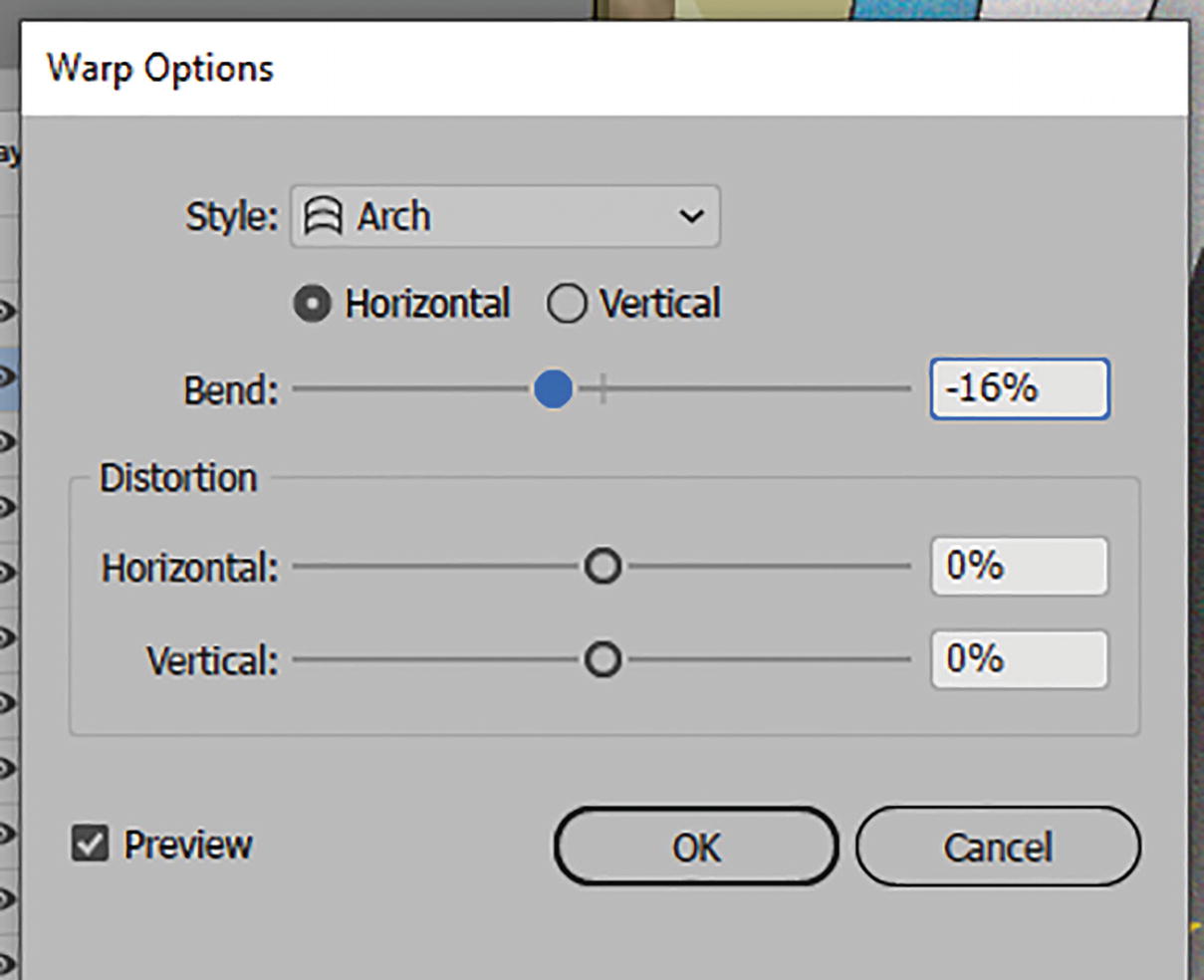
Warp Options dialog box

Warped text and Edit Envelope mode in the Control panel

Text on the page and its coordinate and size settings in the Control panel
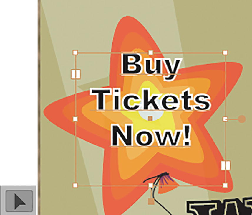
Select the text area with the Selection tool

Control panel settings for the type area

In the Control panel, use the Make with Warp setting
Warp Options dialog box

Warped text and Edit Envelope mode in the Control panel
Text on the page and its coordinate, rotation, and size settings in the Properties panel

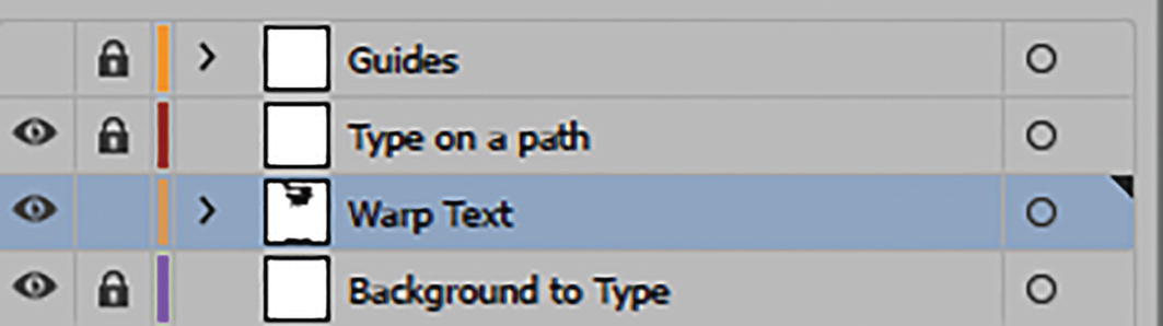
Warp Text layer in the Layers panel
In Chapter 11, we will look at a similar text warp effect.
Fixing Hollow Text Issues
As you may have noticed, the text has some blank areas that make some of background show through, which is not ideal in this case. Adding a fill or a stroke does not help. There is, however, a way that you can deal with this quickly.

Select the main text on the poster
Now choose Edit ➤ Copy.
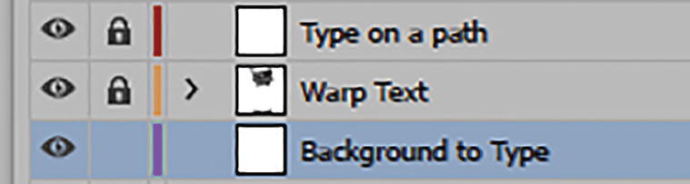
Lock the Warp Text layer and unlock and select the Background to Type layer
Choose Edit ➤ Paste in Place.

Paste a copy of the text on the layer
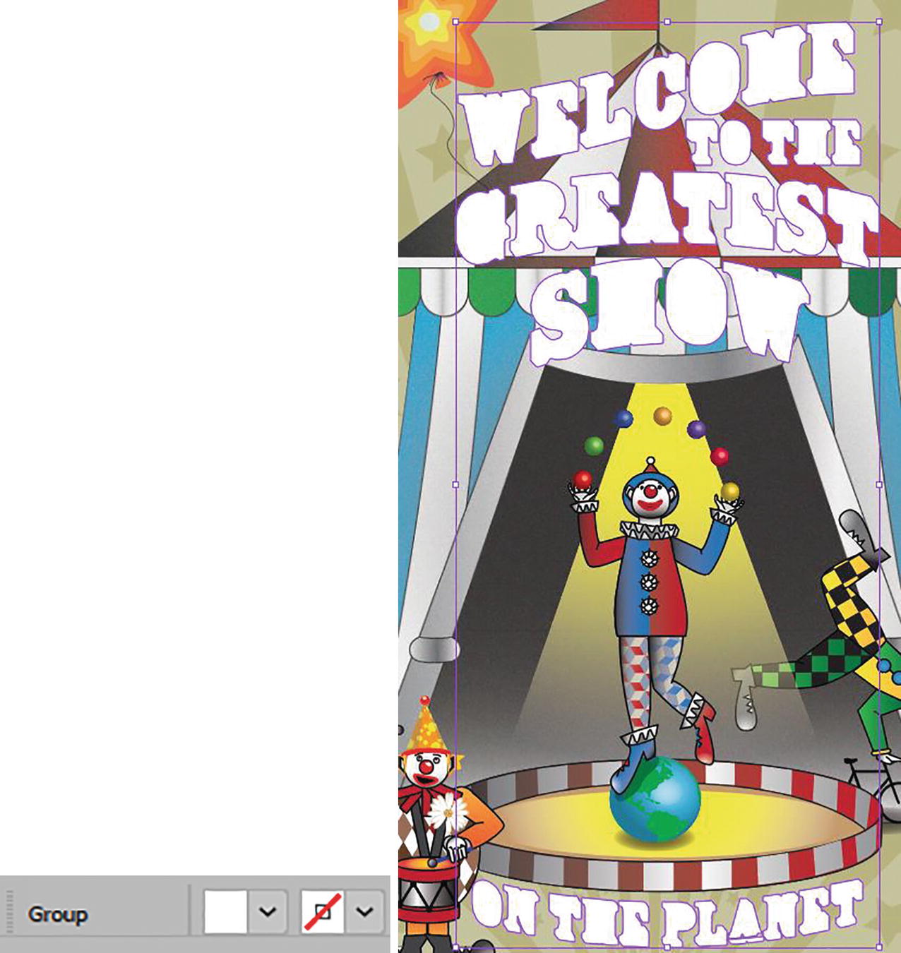
Turn off the visibility of the Warp Text layer

Expand dialog box
The copy text is now in an outline state
Now we need to make this background text solid.
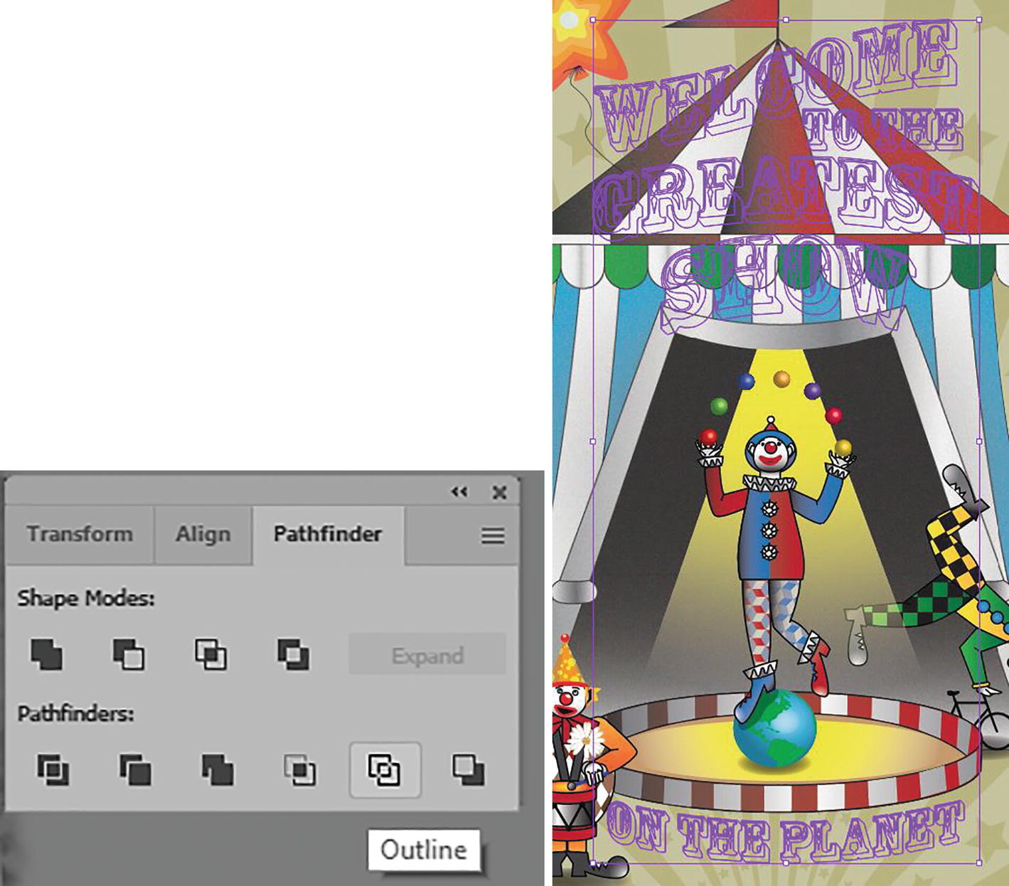
Pathfinder panel with the selected outlines set to Outline

Pathfinder panel with the selected outlines set to Unite
Use the Control panel to set a new white fill color for the selected text
On your own, you could now edit the path further if required with your Pen tool and Direct Selection tool and Pathfinder panel. However, what I demonstrated is good for quickly creating a white area behind the text so that the tent does not show through the letters.

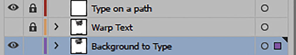
Turn on the visibility for the Warp Text layer and lock the Background to Type layer to see how the white now fills in the hollow areas of the type
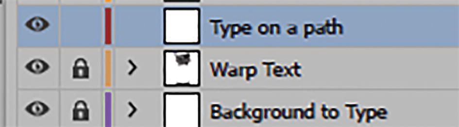
Layers panel, unlock the Type on a Path layer
Type on a Path Layer
Now select and unlock the Type on a Path layer. Refer to Figure 10-115.

Look at the area where the clown is juggling with the Zoom tool

Use the Control panel to set a cyan stroke and stroke weight

Create a path with the Pen tool
The path has three points. Click + Drag to create a curve. Then Ctrl/CMD + Click on the Artboard to keep the path open.

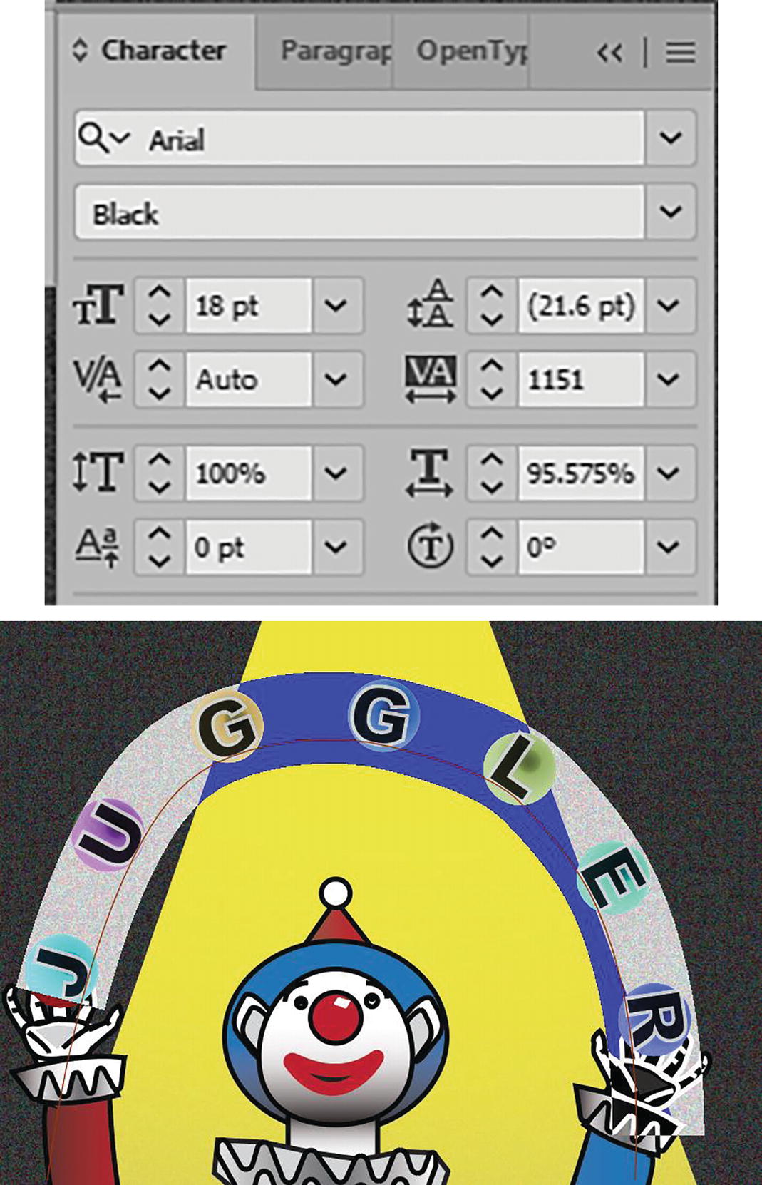
Use the Type on a Path tool and set the settings for the fill and stroke color, character, and paragraph in the Control panel
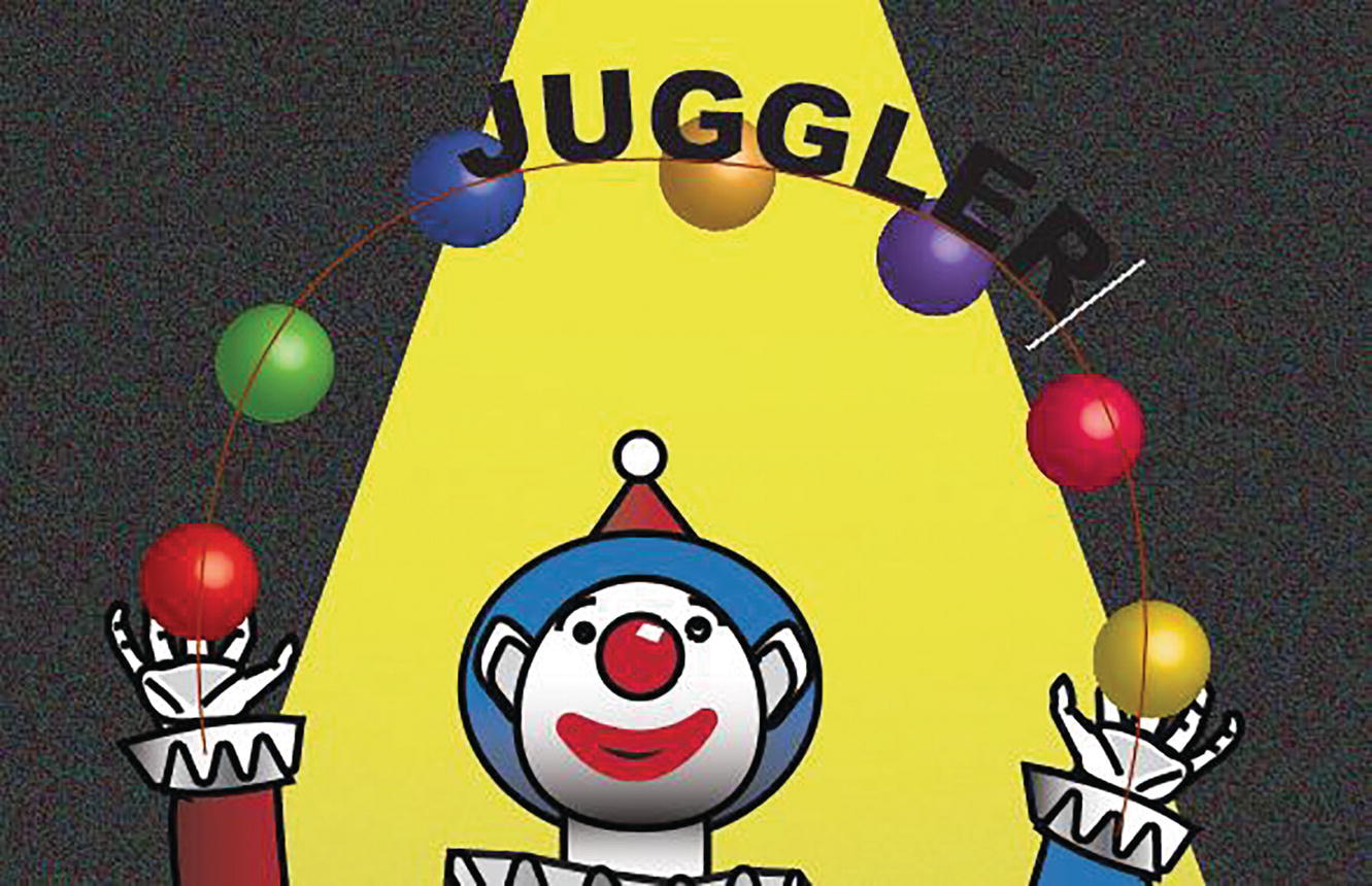
Click on the path and type the word “Juggler”
In this case, the text set itself back to Black fill with no stroke, so highlight the text again with the Type on a Path tool, and in the Control panel set the fill to white, the stroke to black, and the stroke weight to 0.75 pt. Refer to Figure 10-181.
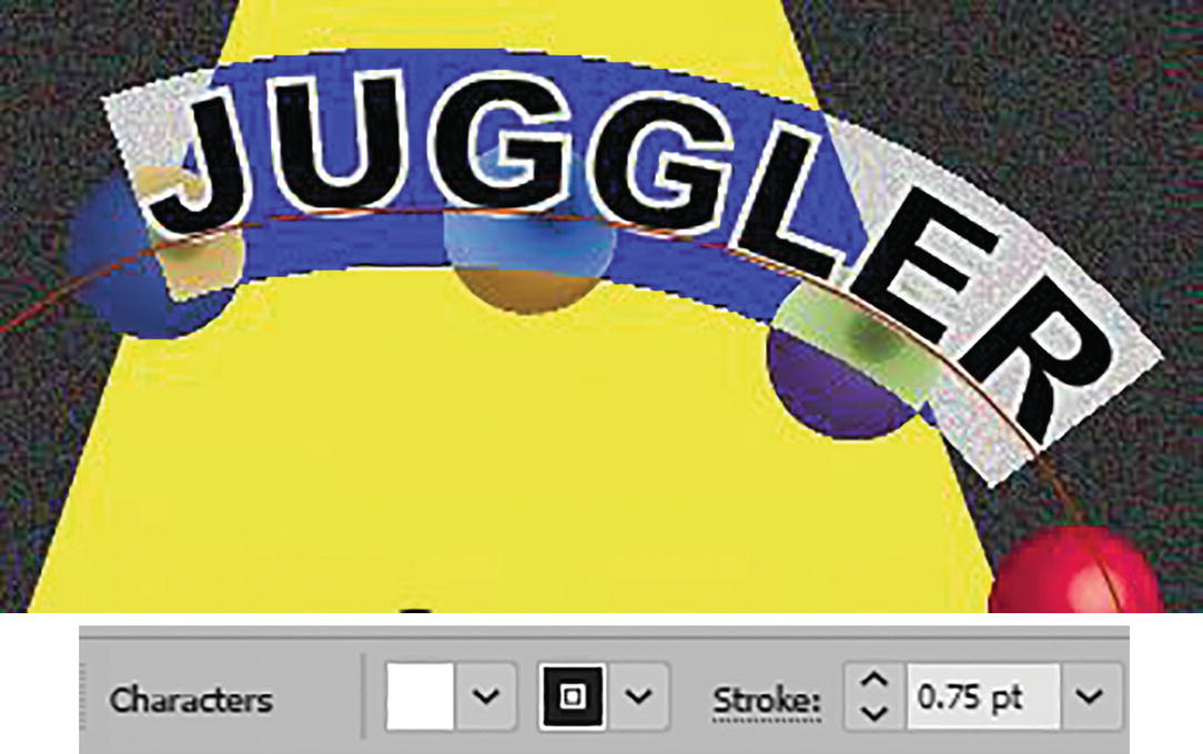
Highlight the text and change the settings in the Control panel
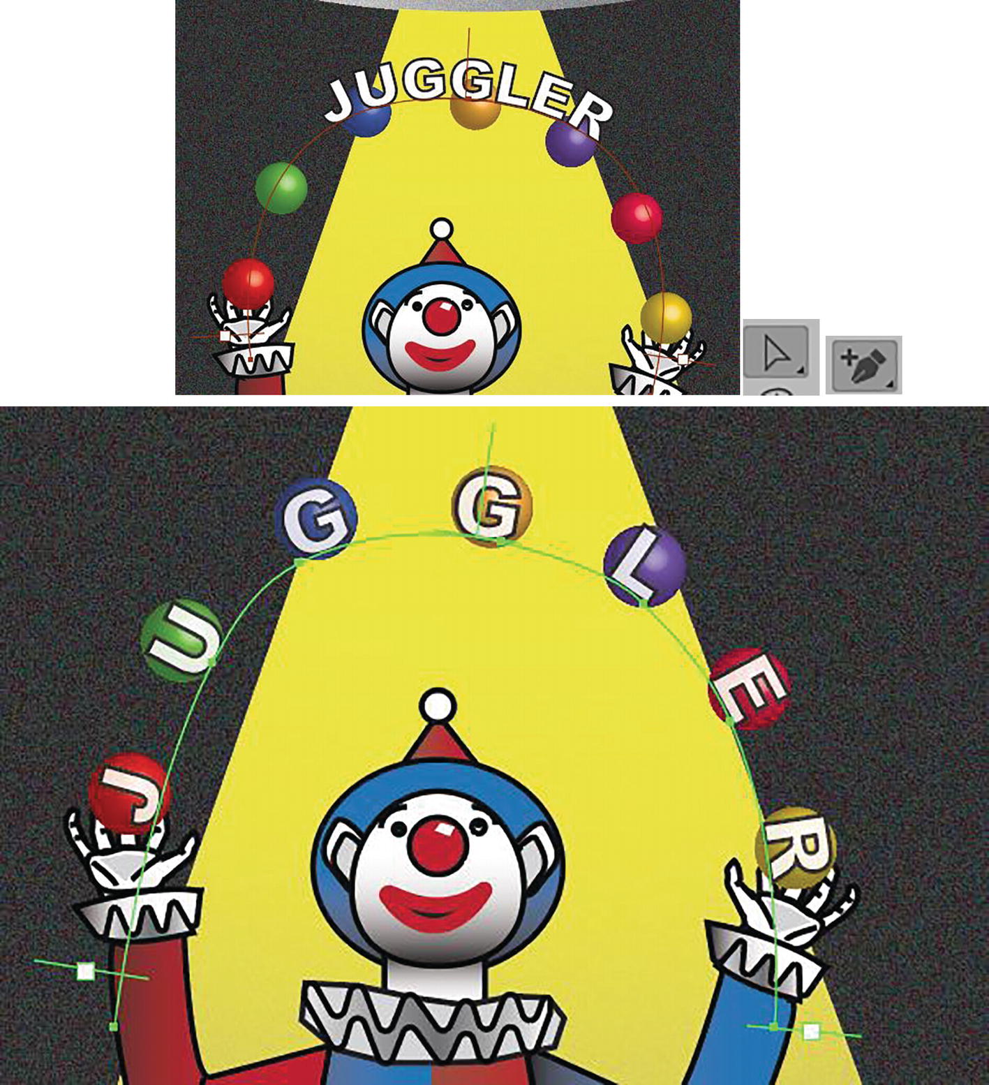
Use the Direct Selection tool when you want to edit the path and the brackets
You may also have to use the Add Anchor Point tool to add a few more points so that the letters sit better on the path. In my case, I added another four points. Refer to Figure 10-182.
Character panel settings and highlighted text for “Juggler”
You could also use the Touch Type tool if you needed to adjust the letters a bit more.

Adjusted text for “Juggler” on path

Setting the Transparency panel Opacity for type on path when selected with Selection tool
Lock your layer for Type on Path and save your work.

Summary
In this chapter, we warped and wrapped type using the various type tools in the Toolbars panel as well as the panels that help you modify your type. Then we used Envelope distortions on the type to warp the text or text area further.
In the next chapter, you will see that you can then add effects to shapes in your design that can further distort or add texture.