
With NGUI, buttons are easy to create and configure.
Let's create our first one by performing the following steps:
- Select the Panel GameObject.
- Create a new child with Alt + Shift + N and perform the following steps:
- Rename it as
Buttons. It will be our buttons container.
- Rename it as
- Navigate to NGUI | Open | Widget Wizard and perform the following steps:
- Select the Button Template.
- For the Background field, select the sprite named Button.
- With the Buttons GameObject selected, click on the Add To button.
A button has just been created and centered on the screen. If you look at the Hierarchy view, you will see that a button is composed of a container GameObject named Button and two children: a Background sprite and Label. That's how NGUI works; templates are simply assembled components and widgets. If you wanted to, you could build a button from scratch using the right components on empty GameObjects.
Click on the Play button. You can see that hover and click are already set! Turn off the Play mode, select the new Button GameObject, and look at the Inspector view.
Interactive widgets have a box collider attached to them, and that is the case with this button. The collider is used to detect collisions with the cursor.
A button has a UIButton
component that handles seven button parameters:
- Target: This GameObject is transformed and modified when the user hovers or presses the button. By default, this is Background.
- Normal: This is the color tint when nothing is happening.
- Hover: This is the color tint when the user's cursor is over the button.
- Pressed: This is the color tint when the user clicks on the button.
- Disabled: This is the color tint when the button is disabled (can't be clicked).
- Duration: This is the duration of transitions between states.
- Notify: This is the parameter that lets you choose a method to call when the button is clicked. You must first drag a GameObject into the Notify field. A Method field will then appear, listing the GameObject's attached script methods, as shown in the following screenshot:
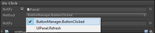
In the previous example, I dragged the Panel GameObject into the Notify field. My Panel GameObject has a ButtonManager.cs script attached to it—this script has a ButtonClicked() method. I can now select it in the Method field. It will be called on click.
There is also a PlaySound component attached to this button. It lets you choose an audio clip to play when the selected event occurs. You can edit the Pitch and Volume parameters.
We will now add two buttons to our window that will exit or launch the game. They will appear as shown in the following screenshot:

We need a GameObject that will manage the game. It will contain the GameManager.cs script attached in order to manage generic behaviors such as exiting or launching the game. Let's create it first; follow these steps to do so:
- Create a new GameObject at the root of Hierarchy with Ctlr + Shift + N and perform the following steps:
- Rename it as
GameManager.
- Rename it as
- Create and attach a new
GameManager.csC# script to it and perform the following steps:- Open this new
GameManager.csscript. - Inside this new script, add this new method called
ExitPressed()with the following code lines:public void ExitPressed() { //Exit Now Application.Quit(); }
- Open this new
Tip
Downloading the example code
You can download the example code files for all Packt books you have purchased from your account at http://www.packtpub.com. If you purchased this book elsewhere, you can visit http://www.packtpub.com/support and register to have the files e-mailed directly to you.
Now that the exit method is ready, let's create and configure the two buttons as shown in the following steps:
- Select the Button GameObject and perform the following steps:
- Rename it as
Exit. - Drag the GameManager GameObject into the Notify field.
- Choose GameManager.ExitPressed in the Method field.
- In the Normal color tint parameter, change R to
185, G to255, B to255, and A to255. - In the Hover color tint parameter, change R to
0, G to220, B to255, and A to255.
- Rename it as
- Attach a component to it by navigating to NGUI | Attach | Anchor and perform the following steps:
- Drag our Window GameObject into the Container field.
- Set the Side parameter to BottomLeft.
- Set Pixel Offset to {
135,60}.
- Select our Exit button's child Background GameObject and perform the following steps:
- Enter Depth as
2.
- Enter Depth as
- Select our Exit button's child Label GameObject and perform the following steps:
- Change its text to
Exit. - Enter Depth as
3.
- Change its text to
Ok, we have our Exit button. Let's create our Play button as follows:
- Duplicate the Exit button and perform the following steps:
- Rename this new duplicate as
Play. - Click on the Minus button next to the UIButton's Notify field to remove the GameManager GameObject from it.
- Set its Side parameter to BottomRight.
- Set Pixel Offset to {
-135,60}.
- Rename this new duplicate as
- Attach a Component to it by navigating to Component | NGUI | Examples | Load Level On Click, and set its Level Name string parameter to Game.
- Select our Play button's child Label GameObject, and change its text to
Play.
Perfect, now if you build your scene, you will have a functional Exit button with only one line of code! The Pixel Offset parameter maintains our buttons at the same distance from the window's borders even if you change resolutions or the window's dimensions. We will create our game scene later.