
In Chapter 2, Making a Style Statement, we learned about some of Bootstrap's core features, such as the grid system, and built out the print sizes component of MyPhoto. In this chapter, we are going to put this knowledge to further use by building out the layout of MyPhoto.
First, we will split the page into five sections, as we discussed in the previous chapters. These would be Welcome, Services, Gallery, About, and Contact Us, along with a footer placeholder. Here, we will use the grid system to create distinct sections on the page. We will add content to these sections using the Bootstrap components jumbotron, tabs, carousel, and wells.
Furthermore, we will discover how to integrate Bootstrap's navbar component into our page to provide single-page, app-like navigation, while also using it to surface Bootstrap modal windows.
As we learn about and implement these different components, we will also introduce how to customize the components to integrate with the styling conventions of MyPhoto.
In this chapter, we shall cover the following topics:
- Learning how to lay out a page using Bootstrap's grid system
- Learning how to integrate Bootstrap jumbotron, wells, tabs, and carousel
- Learning how to integrate Bootstrap's navbar
- Learning how to create and surface Bootstrap's modal windows
- Learning how to extend Bootstrap's component styles
The MyPhoto webpage consists of five sections: Welcome, Services, Gallery, About, and Contact Us. The first thing we want to do is split our page into these distinct sections.
Each section will be a distinct container, so we can practically treat each section as a standalone component on the page. We want the container to take up 100% of the available horizontal space. Therefore, we will apply the container-fluid class. As we learned earlier, container-fluid allows its contents to be responsive across all resolutions, relying on the percentage width of the page, unlike the standard container class, which uses predefined horizontal breakpoints. To provide a visual cue that these are separate parts of the page, we will apply Bootstrap's contextual background classes to each section. We will also include a footer element in the page. The footer will contain miscellaneous bits of information, like legal information, but for now we will just include a placeholder:
    <body>
        <div class="container-fluid bg-primary">
            <div class="row">
                <h3>Welcome</h3>
            </div>
        </div>
        <div class="container-fluid bg-info">
            <div class="row">
                <h3>Services</h3>
            </div>
        </div>
        <div class="container-fluid bg-success">
            <div class="row">
                <h3>Gallery</h3>
            </div>
        </div>
        <div class="container-fluid bg-warning">
            <div class="row">
                <h3>About</h3>
            </div>
        </div>
        <div class="container-fluid bg-danger">
            <div class="row">
                <h3>Contact Us</h3>
            </div>
        </div>
        <footer>Footer placeholder</footer>
    </body>
So, we have five distinct containers, each with a distinct contextual background class and an inner row element, with an appropriate heading, along with a footer, producing the following screenshot:
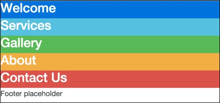
Figure 3.1: Five distinct containers, each with a different contextual background
Okay, great. All sections of our site are in place. Let's add some custom CSS to give each section some space to breathe. Create a file, styles/myphoto.css, and add the following rules to set the minimum height of the section:
    .myphoto-section {
        min-height: 500px;
    }
The myphoto-section class will set the height of the section to a minimum height of 500px. Add this class to each section, except for the footer:
    <div class="container-fluid myphoto-section bg-primary">
        <div class="row">
            <h3>Welcome</h3>
        </div>
    </div>
The addition of the myphoto-section class results in the following screenshot:
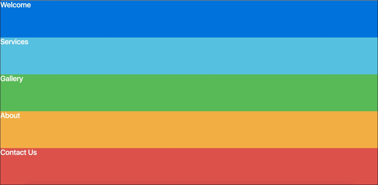
Figure 3.2: Five distinct containers with a minimum height of 500 pixels each
Now each section is easily distinguishable. The page bears a striking resemblance to a rainbow, though. Let's apply a color scheme here. We will apply a classic dark/light style, alternating between dark and light with each section. Update myphoto.css with the following classes:
    .bg-myphoto-dark {
        background-color: #504747;
        color: white;
    }
    .bg-myphoto-light {
        background-color: white;
        color: #504747;
    }
These new classes adhere to the Bootstrap .bg naming convention and offer contrasting styles, a dark background with light text, and vice versa. Apply these to the container elements, in an even-odd manner:
    <div class="container-fluid myphoto-section bg-myphoto-light">
        <div class="row">
            <h3>Welcome</h3>
        </div>
    </div>
    <div class="container-fluid myphoto-section bg-myphoto-dark">
        <div class="row">
            <h3>Services</h3>
        </div>
    </div>
    ...
The Welcome section should now appear with a light background, the Services section with a dark background, and so on. Take a look at the following screenshot:

Figure 3.3: Five sections with alternating background colors
Pretty classy, right? Now, we have a responsive page, split into individual sections, powered by the grid system, with our own styling. Nothing wild here, but a nice start. Let's go ahead and add some content.