Bootstrap also provides some utility classes, which Bootstrap refers to as helper classes. The helper classes provide some basic styles to accentuate information on a page. Their purpose is to give the user some context to the information they are receiving and to provide the developer with styling techniques, outside of the grid system.
Bootstrap defines six context types to give a visual indicator to the user of what type of information is being conveyed: muted, primary, success, info, warning, and danger, as well as providing the developer with simple classes to assign context to elements via text color, text-<context> or background color, bg-<context>.
Let's apply some context to our example. We will add two prices to each size: a regular price and a special offer price. We will apply a success context to the special offer price and a muted context to the regular price. Print sizes with prices reduced by €10 or more will be given an info context background. The code should look similar to the following code snippet:
    <div class="container">
        <h1 class="hidden-lg-down">Our Print Sizes</h1>
        <div class="row">
            <div class="col-xs-6 col-sm-3 push-sm-3">
                <img src="images/small.jpg" class="img-fluid img-circle
                hidden-md-down">
                <h5 class="hidden-lg-down">Small</h5>
                <div class="row">
                    <div class="col-sm-4 bg-info">6x5
                        <div class="row">
                            <div class="col-sm-3 text-muted">€15</div>
                            <div class="col-sm-3 text-success">€8</div>
                        </div>
                    </div>
                    <div class="col-sm-4">8x10
                        <div class="row">
                            <div class="col-sm-3 text-muted">€18</div>
                            <div class="col-sm-3 text-success">€11</div>
                        </div>
                    </div>
                    <div class="col-sm-4">11x17
                        <div class="row">
                            <div class="col-sm-3 text-muted">€25</div>
                            <div class="col-sm-3 text-success">€20</div>
                        </div>
                    </div>
                </div>
            </div>
            <div class="col-xs-6 col-sm-3 push-sm-3">
            <img src="images/medium.jpg" class="img-fluid img-rounded
            hidden-md-down">
            ...
    </div>
Take a look at the following screenshot:
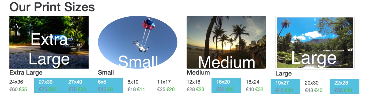
Figure 2.20: Bootstrap's context classes in action: note the changes in color for the various dimension and price blocks
As you can see, regular prices are gray, the special offer prices are green, and sizes with large discounts have a blue background.
Bootstrap also provides handy classes for centering and floating elements.
Bootstrap 3 had a center-block class, which used margins to align an element centrally and sets the display property to block. This comes in very useful outside of the grid system. This has been removed from Bootstrap 4, in favor of two other classes, d-block and m-x-auto. The d-block class is responsible for setting the element's display property to block, while the m-x-auto class sets the margin properties to auto. As you may imagine, Bootstrap 4 also comes with the d-inline and d-inline-block classes, as well as an array of m-*-* classes for various margin options. More than that, there are also various padding options, with the p-*-* convention. Let us update our example with a new heading, Special Offers, inside a div we want to take up 50% of the viewport and we'll give it a primary background using the contextual classes.
Let's see it without the use of m-x-auto first. Observe the following code:
    <div style="width:50%">
        <h1 class="bg-primary">Special Offers</h1>
    </div>
    <div class="container">
        <h1 class="hidden-lg-down">Our Print Sizes</h1>
        <div class="row">
Take a look at the following screenshot:
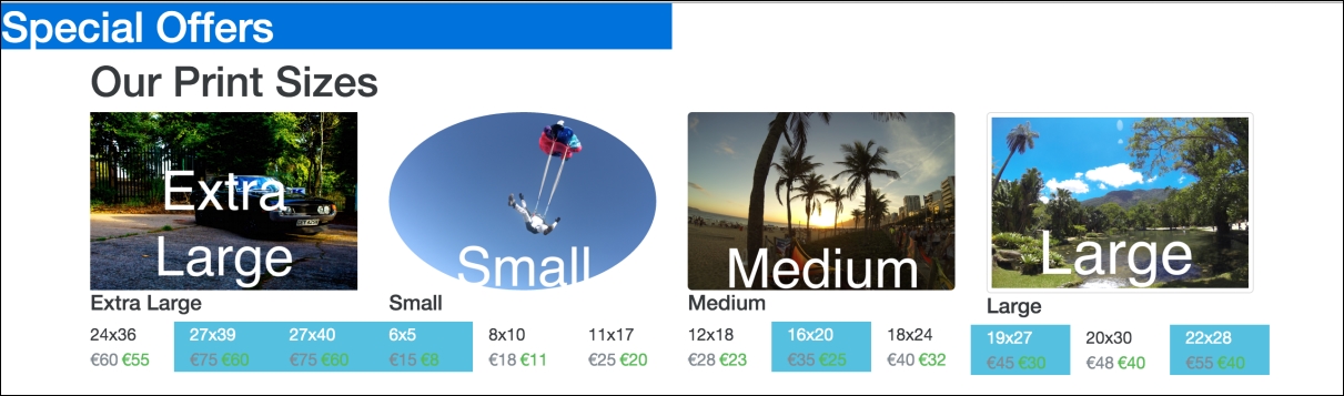
Figure 2.21: Applying Bootstrap's bg-primary class
Pretty ugly. Let's make it a little less ugly by centering the heading using center-block and text-xs-center. In Bootstrap 3, we would have used center-block, but as the element already has the display: block property, we can just use m-x-auto instead to control the margins. This can be done in the following manner:
    <div class="m-x-auto" style="width:50%">
        <h1 class="bg-primary text-xs-center">Special Offers</h1>
    </div>
For the time being, we have also used inline styles here to set the width of Special Offers to 50%. Inline styles should in general be avoided as they decrease maintainability of the code base. Ideally, we should use a class here to apply this style rule. We will address this in a later chapter. Let's check out the result in the following screenshot:
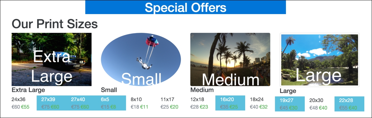
Figure 2.22: Applying Bootstrap's m-x-auto, text-xs-center and bg-primary classes
Nice, a little less ugly.
Along with this, Bootstrap gives us useful classes for floating elements left and right: pull-*-right and pull-*-left. These classes follow the same semantics as the previously discussed hidden classes and simply result in the appropriate float property being applied to the element together with an !important rule. The rules only get applied when the display is at or above the given breakpoint (the supported breakpoints are: xs, sm, md, lg, and xl).
Let's add a caveat to the page, indicating that Terms and Conditions Apply. We will use the pull-xs-right class to float it to the far right, the contextual danger class to indicate that it is worth noting to the user, and Bootstrap's label class to make the text look a little prettier. Since pull-xs-right floats elements to the right when the display is extra small or larger, the Terms and Conditions element will be floating to the right for all display sizes. Take a look at the following code:
    <div class="bg-danger pull-xs-right">
        <p class="label">Temperatures may not be accurate</p>
    </div>
Take a look at the following screenshot:
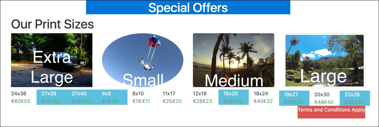
Figure 2.23: Using pull-xs-right to align an element to the right, for all display sizes
Nice and neatly docked to the right-hand side.
None of these utility classes are very complex. Nor would a developer not be able to implement the required logic themselves. However, they greatly help speed up development. The classes Bootstrap provides to toggle content visibility are a clear example of this. The invisible class simply sets the elements visbility property to hidden, with an !important rule. However, there are a few very useful display utility classes that are slightly more complex such as text-hide, sr-only, and sr-only-focusable.
The sr-only class hides an element except from screen-readers. sr-only-focusable extends this functionality to become visible when the element becomes focused, for instance in the case of keyboard access.
The text-hide class allows the developer to couple an image with a text element. The text will be read by a screen-reader, but by using text-hidden, it is not visible. Let's see this in action with the images in our example. Replace the hidden-** classes we added to our category text elements with text-hide. Have a look here:
<h5 class="text-hide">Small</h5>
Give it a try with a screen-reader to see (actually, hear!) the results.