Much has changed since Twitter's Bootstrap was first released on August 19th, 2011. In essence, Bootstrap 1 was a collection of CSS rules offering developers the ability to lay out their website, create forms, buttons, and help with general appearance and site navigation. With respect to these core features, Bootstrap 4 Alpha 4 is still much the same as its predecessors. In other words, the framework's focus is still on allowing developers to create layouts, and helping to develop a consistent appearance by providing stylings for buttons, forms, and other user interface elements. How it helps developers achieve and use these features, however, has changed entirely. Bootstrap 4 is a complete rewrite of the entire project, and, as such, ships with many fundamental differences to its predecessors. Along with Bootstrap's major features, we will be discussing the most striking differences between Bootstrap 3 and Bootstrap 4 in the sub-sections that follow.
Possibly the most important and widely used feature is Bootstrap's ability to lay out and organize your page. Specifically, Bootstrap offers the following:
- Responsive containers
- Responsive breakpoints for adjusting page layout in response to differing screen sizes
- A 12 column grid layout for flexibly arranging various elements on your page
- Media objects that act as building blocks and allow you to build your own structural components
- Utility classes that allow you to manipulate elements in a responsive manner. For example, you can use the layout utility classes to hide elements, depending on screen size
We will be discussing each of these features in detail in Chapter 2 , Making a Style Statement and Chapter 3 , Building the Layout.
Just like its predecessor, Bootstrap 4 overrides the default browser styles. This means that many elements, such as lists or headings, are padded and spaced differently. The majority of overridden styles only affect spacing and positioning; however, some elements may also have their border removed. The reason behind this is simple: to provide users with a clean slate upon which they can build their site.
Building on this clean slate, Bootstrap 4 provides styles for almost every aspect of your web page such as buttons (Figure 1.2), input fields, headings, paragraphs, special inline texts, such as keyboard input (Figure 1.3), figures, tables, and navigation controls. Aside from this, Bootstrap offers state styles for all input controls, for example, styles for disabled buttons or toggled buttons. Take a look at the following screenshot:

Figure 1.2: The six button styles that come with Bootstrap 4 are btn-primary, btn-secondary, btn-success, btn-danger, btn-link, btn-info, and btn-warning
Take a look at the following screenshot:

Figure 1.3: Bootstrap's content styles. In the preceding example, we see inline styling for denoting keyboard input
Aside from layout and content styling, Bootstrap offers a large variety of reusable components that allow you to quickly construct your website's most fundamental features. Bootstrap's UI components encompass all of the fundamental building blocks that you would expect a web development toolkit to offer: modal dialogs, progress bars, navigation bars, tooltips, popovers, a carousel, alerts, drop-down menus, input groups, tabs, pagination, and components for emphasizing certain contents.
Let's have a look at the following modal dialog screenshot:
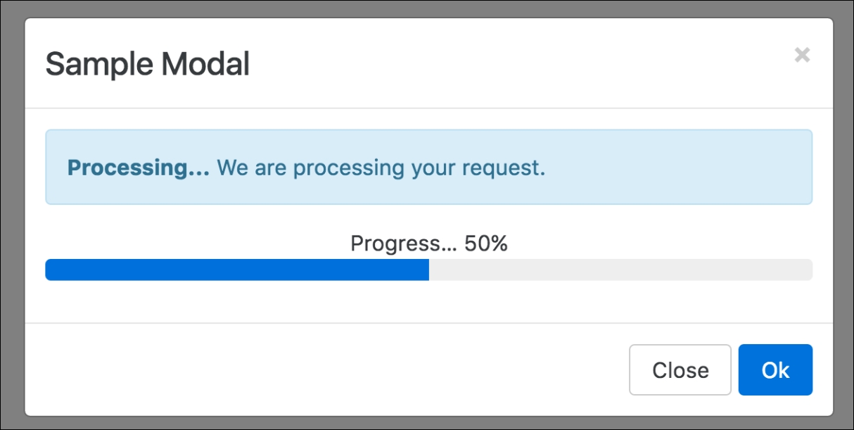
Figure 1.4: Various Bootstrap 4 components in action. In the preceding screenshot we see a sample modal dialog, containing an info alert, some sample text, and an animated progress bar.
Similar to its predecessor, Bootstrap 4 allows you to create mobile-friendly websites without too much additional development work. By default, Bootstrap is designed to work across all resolutions and screen sizes, from mobile, to tablet, to desktop. In fact, Bootstrap's mobile-first design philosophy implies that its components must display and function correctly at the smallest screen size possible. The reasoning behind this is simple. Think about developing a website without consideration for small mobile screens. In this case, you are likely to pack your website full of buttons, labels, and tables. You will probably only discover any usability issues when a user attempts to visit your website using a mobile device only to find a small web page that is crowded with buttons and forms. At this stage, you will be required to rework the entire user interface to allow it to render on smaller screens. For precisely this reason, Bootstrap promotes a bottom-up approach, forcing developers to get the user interface to render correctly on the smallest possible screen size, before expanding upwards.
Aside from ready-to-go components, Bootstrap offers a large selection of utility classes that encapsulate the most commonly needed style rules. For example, rules for aligning text, hiding an element, or providing contextual colors for warning text.
Bootstrap 4 supports the vast majority of modern browsers, including Chrome, Firefox, Opera, Safari, Internet Explorer (version 9 and onwards; Internet Explorer 8 and below are not supported), and Microsoft Edge.
Both Less and Sass (Syntactically Awesome Stylesheets) are CSS extension languages. That is, they are languages that extend the CSS vocabulary with the objective of making the development of many, large, and complex style sheets easier. Although Less and Sass are fundamentally different languages, the general manner in which they extend CSS is the same, both rely on a preprocessor. As you produce your build, the preprocessor is run, parsing the Less/Sass script and turning your Less or Sass instructions into plain CSS.
Less is the official Bootstrap 3 build, while Bootstrap 4 has been developed from scratch, and is written entirely in Sass. Both Less and Sass are compiled into CSS to produce a single file, bootstrap.css. It is this CSS file that we will be primarily referencing throughout this book (with the exception of
Chapter 3
, Building the Layout). Consequently, you will not be required to know Sass in order to follow this book. However, we do recommend that you take a 20 minute introductory course on Sass if you are completely new to the language. Rest assured, if you already know CSS, you will not need more time than this. The language's syntax is very close to normal CSS, and its elementary concepts are similar to those contained within any other programming language.
Unlike its predecessor, Bootstrap 4 no longer uses pixel (px) as its unit of typographic measurement. Instead, it primarily uses root em (rem). The reasoning behind choosing rem is based on a well known problem with px; websites using px may render incorrectly, or not as originally intended, as users change the size of the browser's base font. Using a unit of measurement that is relative to the page's root element helps address this problem, as the root element will be scaled relative to the browser's base font. In turn, a page will be scaled relative to this root element.
Note
Typographic units of measurement
Simply put, typographic units of measurement determine the size of your font and elements. The most commonly used units of measurement are px and em. The former is an abbreviation for pixel, and uses a reference pixel to determine a font's exact size. This means that, for displays of 96 dots per inch (dpi), 1 px will equal an actual pixel on the screen. For higher resolution displays, the reference pixel will result in the px being scaled to match the display's resolution. For example, specifying a font size of 100 px will mean that the font is exactly 100 pixels in size (on a display with 96 dpi), irrespective of any other element on the page.
Em is a unit of measurement that is relative to the parent of the element to which it is applied. So, for example, if we were to have two nested div elements, the outer element with a font size of 100 px and the inner element with a font size of 2 em, then the inner element's font size would translate to 200 px (as in this case 1 em = 100 px). The problem with using a unit of measurement that is relative to parent elements is that it increases your code's complexity, as the nesting of elements makes size calculations more difficult.
The recently introduced rem measurement aims to address both em's and px's shortcomings by combining their two strengths; instead of being relative to a parent element, rem is relative to the page's root element.
As was already implicit in the preceding feature summary, the latest version of Bootstrap no longer supports Internet Explorer 8. As such, the decision to only support newer versions of Internet Explorer was a reasonable one, as not even Microsoft itself provides technical support and updates for Internet Explorer 8 anymore (as of January 2016). Furthermore, Internet Explorer 8 does not support rem, meaning that Bootstrap 4 would have been required to provide a workaround. This in turn would most likely have implied a large amount of additional development work, with the potential for inconsistencies. Lastly, responsive website development for Internet Explorer 8 is difficult, as the browser does not support CSS media queries. Given these three factors, dropping support for this version of Internet Explorer was the most sensible path of action.
Bootstrap's grid system consists of a series of CSS classes and media queries that help you lay out your page. Specifically, the grid system helps alleviate the pain points associated with horizontal and vertical positioning of a page's contents and the structure of the page across multiple displays. With Bootstrap 4, the grid system has been completely overhauled, and a new grid tier has been added with a breakpoint of 480 px and below. We will be talking about tiers, breakpoints, and Bootstrap's grid system extensively in Chapter 2 , Making a Style Statement.
Bootstrap 3 shipped with a nice collection of over 250 font icons, free of use. In an effort to make the framework more lightweight (and because font icons are considered bad practice), the GLYPHICON set is no longer available in Bootstrap 4.
The default font size in Bootstrap 4 is 2 px bigger than in its predecessor, increasing from 14 px to 16 px. Furthermore, Bootstrap 4 replaced panels, wells, and thumbnails with a new concept: cards. To readers unfamiliar with the concept of wells, a well is a UI component that allows developers to highlight text content by applying an inset shadow effect to the element to which it is applied. A panel also serves to highlight information, but by applying padding and rounded borders. Cards serve the same purpose as their predecessors, but are less restrictive as they are flexible enough to support different types of content, such as images, lists, or text. They can also be customized to use footers and headers. Take a look at the following screenshot:
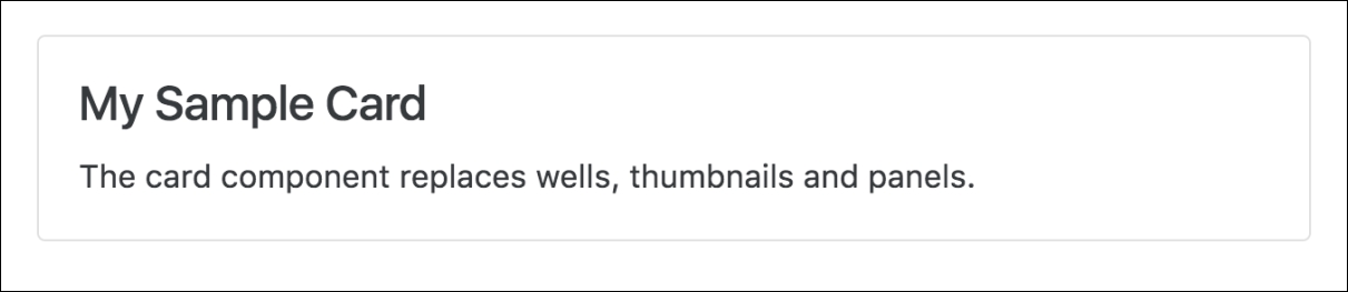
Figure 1.5: The Bootstrap 4 card component replaces existing wells, thumbnails, and panels
Bootstrap 4 introduces new form input controls: a color chooser, a date picker, and a time picker. In addition, new classes have been introduced, improving the existing form input controls. For example, Bootstrap 4 now allows for input control sizing, as well as classes for denoting block and inline level input controls. However, one of the most anticipated new additions is Bootstrap's input validation styles, which used to require third-party libraries or a manual implementation, but are now shipped with Bootstrap 4 (see Figure 1.6). Take a look at the following screenshot:
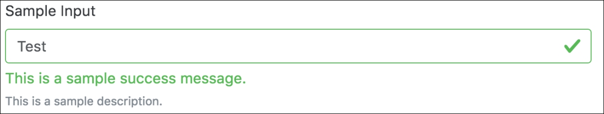
Figure 1.6: The new Bootstrap 4 input validation styles, indicating the successful processing of input
Last but not least, Bootstrap 4 also offers custom forms in order to provide even more cross-browser UI consistency across input elements (Figure 1.7). As noted in the Bootstrap 4 Alpha 4 documentation, the input controls are "built on top of semantic and accessible markup, so they're solid replacements for any default form control" (source: http://v4-alpha.getbootstrap.com/components/forms/). Take a look at the following screenshot:

Figure 1.7: Custom Bootstrap input controls that replace the browser defaults in order to ensure cross-browser UI consistency
The developers behind Bootstrap 4 have put specific emphasis on customization throughout the development of Bootstrap 4. As such, many new variables have been introduced that allow for the easy customization of Bootstrap. Using the $enabled-*- Sass variables, one can now enable or disable specific global CSS preferences.